 Edit on GitHub
3.5.2.1.28. OptionsGroup
This is a component that allows a user to choose from a list of options. Radio buttons are used to select a single value; a group of checkboxes is used to select multiple values.
XML name of the component: optionsGroup.
-
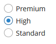
The simplest case of using
OptionsGroupis to select an enumeration value for an entity attribute. For example, aCustomerentity has thegradeattribute of theCustomerGradetype, which is an enumeration. Then you can useOptionsGroupto edit this attribute as follows:<data> <instance id="customerDc" class="com.company.app.entity.Customer" view="_local"> <loader/> </instance> </data> <layout> <optionsGroup id="gradeField" property="grade" dataContainer="customerDc"/> </layout>In the example above, the
customerDcdata container is defined for theCustomerentity. In theoptionsGroupcomponent, the link to the data container is specified in the dataContainer attribute and the name of the entity attribute is set in the property attribute.As a result, the component will be as follows:
-
The list of component options can be specified arbitrarily using the
setOptionsList(),setOptionsMap()andsetOptionsEnum()methods, or using the XMLoptionsContaineroroptionsEnumattributes.
-
setOptionsList()allows you to specify programmatically a list of component options. To do this, declare a component in the XML descriptor:<optionsGroup id="optionsGroupWithList"/>Then inject the component into the controller and specify a list of options in the
onInit()method:@Inject private OptionsGroup<Integer, Integer> optionsGroupWithList; @Subscribe protected void onInit(InitEvent event) { List<Integer> list = new ArrayList<>(); list.add(2); list.add(4); list.add(5); list.add(7); optionsGroupWithList.setOptionsList(list); }The component will be as follows:

Depending on the selected option, the
getValue()method of the component will returnIntegervalues: 2, 4, 5, 7.
-
setOptionsMap()allows you to specify string names and option values separately. For example, we can set the following options map for theoptionsGroupWithMapcomponent, described the XML descriptor, in theonInit()method of the controller:@Inject private OptionsGroup<Integer, Integer> optionsGroupWithMap; @Subscribe protected void onInit(InitEvent event) { Map<String, Object> map = new LinkedHashMap<>(); map.put("two", 2); map.put("four", 4); map.put("five", 5); map.put("seven", 7); optionsGroupWithMap.setOptionsMap(map); }The component will be as follows:

Depending on the selected option, the
getValue()method of the component will returnIntegervalues: 2, 4, 5, 7, and not the strings that are displayed on the screen.
-
setOptionsEnum()takes a class of enumeration as a parameter. The options list will consist of localized names of enum values, the value of the component will be an enum value. -
The component can take a list of options from a data container. For this purpose, the optionsContainer attribute is used. For example:
<data>
    <collection id="coloursDc"
                class="com.haulmont.app.entity.Colour"
                view="_local">
        <loader id="coloursLoader">
            <query>
                <![CDATA[select c from app_Colour c]]>
            </query>
        </loader>
    </collection>
</data>
<layout>
    <optionsGroup id="coloursField" optionsContainer="coloursDc"/>
</layout>
In this case, the
coloursFieldcomponent will display instance names of theColourentity, located in thecoloursDcdata container, and itsgetValue()method will return the selected entity instance.With the help of the captionProperty attribute entity attribute to be used instead of an instance name for a string option names can be defined.
-
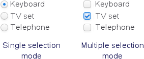
The
multiselectattribute is used to switchOptionsGroupto a multiple-choice mode. Ifmultiselectis turned on, the component is displayed as a group of independent checkboxes, and the component value is a list of selected options.For example, if we create the component in the XML screen descriptor:
<optionsGroup id="roleTypesField" multiselect="true"/>and set a list of options for it –
RoleTypeenumeration values:@Inject protected OptionsGroup roleTypesField; @Subscribe protected void onInit(InitEvent event) { roleTypesField.setOptionsList(Arrays.asList(RoleType.values())); }then the component will be as follows:

In this case, the
getValue()method of the component will return ajava.util.List, containingRoleType.READONLYandRoleType.DENYINGvalues.The example above also illustrates the ability of the
OptionsGroupcomponent to display localized values of enumerations included in the data model.You can also make some values selected programmatically by passing a
java.util.Listof values to thesetValue()method:optionsGroup.setValue(Arrays.asList(RoleType.STANDARD, RoleType.ADMIN));
-
The
orientationattribute defines the orientation of group elements. By default, elements are arranged vertically. Thehorizontalvalue sets the horizontal orientation.
The appearance of the OptionsGroup component can be customized using SCSS variables with $cuba-optiongroup-* prefix. You can change these variables in the visual editor after creating a theme extension or a custom theme.
- Attributes of optionsGroup
-
align - box.expandRatio - caption - captionAsHtml - captionProperty - colspan - contextHelpText - contextHelpTextHtmlEnabled - css - dataContainer - description - descriptionAsHtml - editable - enable - icon - id - multiselect - height - htmlSanitizerEnabled - optionsContainer - optionsEnum - orientation - property - required - requiredMessage - responsive - rowspan - stylename - tabIndex - visible - width
- Elements of optionsGroup
- API
-
addValueChangeListener - setContextHelpIconClickHandler - setOptionCaptionProvider - setOptionsEnum - setOptionsList - setOptionsMap