3.5.2.1.25. LookupField
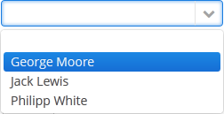
This is a component to select a value from drop-down list. Drop-down list provides the filtering of values as the user inputs some text, and the pagination of available values.

XML name of the component: lookupField.
-
The simplest case of using
LookupFieldis to select an enumeration value for an entity attribute. For example, aRoleentity has atypeattribute of theRoleTypetype, which is an enumeration. Then you can useLookupFieldto edit this attribute as follows:<data> <instance id="roleDc" class="com.haulmont.cuba.security.entity.Role" view="_local"> <loader/> </instance> </data> <layout expand="editActions" spacing="true"> <lookupField dataContainer="roleDc" property="type"/> </layout>In the example above, the screen defines
roleDcdata container for theRoleentity. In thelookupFieldcomponent, a link to a data container is specified in the dataContainer attribute, and a name of an entity attribute is specified in the property attribute. In this case, the entity attribute is an enumeration, and the drop-down list will display localized names of all enumeration values.
-
Similarly,
LookupFieldcan be used to select an instance of a related entity. optionsContainer attribute is used to create a list of options:<data> <instance id="carDc" class="com.haulmont.sample.core.entity.Car" view="carEdit"> <loader/> </instance> <collection id="colorsDc" class="com.haulmont.sample.core.entity.Color" view="_minimal"> <loader id="colorsDl"> <query> <![CDATA[select e from sample_Color e]]> </query> </loader> </collection> </data> <layout> <lookupField dataContainer="carDc" property="color" optionsContainer="colorsDc"/> </layout>In this case, the component will display instance names of the
Colorentity located in thecolorsDcdata container, and the selected value will be set into thecolorattribute of theCarentity, which is located in thecarDcdata container.captionProperty attribute defines which entity attribute can be used instead of an instance name for string option names.
-
The
setOptionCaptionProvider()method allows you to define captions for string option names displayed byLookupFieldcomponent:lookupField.setOptionCaptionProvider((item) -> item.getLocalizedName()); -
The list of component options can be specified arbitrarily using the
setOptionsList(),setOptionsMap()andsetOptionsEnum()methods, or using the XMLoptionsContainerattribute.-
setOptionsList()allows you to programmatically specify a list of component options. To do this, declare a component in the XML descriptor:<lookupField id="numberOfSeatsField" dataContainer="modelDc" property="numberOfSeats"/>Then inject the component into the controller and specify a list of options in the
onInit()method:@Inject protected LookupField<Integer> numberOfSeatsField; @Subscribe public void onInit(InitEvent event) { List<Integer> list = new ArrayList<>(); list.add(2); list.add(4); list.add(5); list.add(7); numberOfSeatsField.setOptionsList(list); }In the component’s drop-down list the values 2, 4, 5 and 7 will be displayed. Selected number will be put into the
numberOfSeatsattribute of an entity located in themodelDcdata container.
-
setOptionsMap()allows you to specify string names and option values separately. For example, in thenumberOfSeatsFieldcomponent in the XML descriptor, specify an option map inonInit():@Inject protected LookupField<Integer> numberOfSeatsField; @Subscribe public void onInit(InitEvent event) { Map<String, Integer> map = new LinkedHashMap<>(); map.put("two", 2); map.put("four", 4); map.put("five", 5); map.put("seven", 7); numberOfSeatsField.setOptionsMap(map); }In the component’s drop-down list,
two,four,five,sevenstrings will be displayed. However, the value of the component will be a number that corresponds to the selected option. It will be put into thenumberOfSeatsattribute of an entity located in themodelDcdata container.
-
setOptionsEnum()takes the class of an enumeration as a parameter. The drop-down list will show localized names of enum values, the value of the component will be an enum value.
-
-
setPopupWidth()allows you to set the drop-down list’s width, which is passed to the method as a string. By using relative units (e.g.,"50%") it’s possible to set the drop-down list’s width relative to theLookupFielditself. By default, this width is set tonullso that the drop-down list’s width can be greater than a component width to fit the content of all displayed items. By setting the value to"100%"the drop-down list’s width will be equal to the width of theLookupField.
-
setOptionStyleProvider()enables you to use separate style names for the the options displayed by the component:lookupField.setOptionStyleProvider(entity -> { User user = (User) entity; switch (user.getGroup().getName()) { case "Company": return "company"; case "Premium": return "premium"; default: return "company"; } });
-
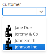
Each drop-down list component can have an icon on the left. Use the
setOptionIconProvider()method in the screen controller:lookupField.setOptionIconProvider(entity -> { if (entity.getType() == LegalStatus.LEGAL) return "icons/icon-office.png"; return "icons/icon-user.png"; });
If you use SVG icons, set the icon size explicitly to avoid icons overlay.
<svg version="1.1"
     id="Capa_1"
     xmlns="http://www.w3.org/2000/svg"
     xmlns:xlink="http://www.w3.org/1999/xlink"
     xml:space="preserve"

     style="enable-background:new 0 0 55 55;"
     viewBox="0 0 55 55"

     height="25px"
     width="25px">
-
The
setOptionImageProvider()method allows you to define images for the options displayed by theLookupFieldcomponent. This method sets a function that accepts one of the resource types.@Inject private LookupField<Customer> lookupField; @Inject private Image imageResource; @Subscribe private void onInit(InitEvent event) { lookupField.setOptionImageProvider(e -> imageResource.createResource(ThemeResource.class).setPath("icons/radio.svg")); } -
If the
LookupFieldcomponent is not required and if the related entity attribute is not declared as required, the list of component options has an empty row. If this row is selected, the component returnsnull. The nullName attribute allows you to specify a row to be displayed in this case instead of an empty one. Below is an example:<lookupField dataContainer="carDc" property="colour" optionsContainer="colorsDs" nullName="(none)"/>In this case, instead of an empty row,
(none)will be displayed. If this row is selected,nullwill be set to a related entity attribute.If you specify a list of options programmatically using
setOptionsList(), you can pass one of the options intosetNullOption()method. Then, if the user selects it, the component value will benull.- LookupField filters:
-
-
Using the
filterModeattribute, option filtering type can be defined for the user input:-
NO− no filtering. -
STARTS_WITH− by the beginning of a phrase. -
CONTAINS− by any occurrence (is used by default).
-
-
The
setFilterPredicate()method enables to setup how items should be filtered. The predicate tests whether an item with the given caption matches to the given search string. For example:BiFunction<String, String, Boolean> predicate = String::contains; lookupField.setFilterPredicate((itemCaption, searchString) -> predicate.apply(itemCaption.toLowerCase(), searchString));The functional interface
FilterPredicatehas thetestmethod that enables implementing custom filtering logic, for example, to escape accents or special characters:lookupField.setFilterPredicate((itemCaption, searchString) -> StringUtils.replaceChars(itemCaption, "ÉÈËÏÎ", "EEEII") .toLowerCase() .contains(searchString));
-
-
The
LookupFieldcomponent is able to handle user input if there is no suitable option in the list. In this case,setNewOptionHandler()is used. For example:@Inject private Metadata metadata; @Inject private LookupField<Color> colorField; @Inject private CollectionContainer<Color> colorsDc; @Subscribe protected void onInit(InitEvent event) { colorField.setNewOptionHandler(caption -> { Color color = metadata.create(Color.class); color.setName(caption); colorsDc.getMutableItems() .add(color); colorField.setValue(color); }); }The new options handler is invoked if the user enters a value that does not coincide with any option and presses Enter. In this case, a new
Colorentity instance is created in the handler, itsnameattribute is set to the value entered by the user, this instance is added to the options data container and selected in the component.Instead of using
setNewOptionHandler()method for processing user input, the controller method name can be specified in thenewOptionHandlerXML attribute. This method should have two parameters, one ofLookupFieldtype, and the other ofStringtype. They will be set to the component instance and the value entered by the user, accordingly. ThenewOptionAllowedattribute is used to enable adding new options.
-
The
nullOptionVisibleXML attribute sets visibility for the null option in the drop-down list. It allows you to makeLookupFieldnot required but still without the null option.
-
The
textInputAllowedXML attribute can be used to disable filtering options from keyboard. It can be convenient for short lists. The default value istrue.
-
The
pageLengthXML attribute allows you to redefine the number of options on one page of the drop-down list, specified in the cuba.gui.lookupFieldPageLength application property. -
In Web Client with a Halo-based theme, you can set predefined styles to the
LookupFieldcomponent using thestylenameattribute either in the XML descriptor or in the screen controller:<lookupField id="lookupField" stylename="borderless"/>When setting a style programmatically, select one of the
HaloThemeclass constants with theLOOKUPFIELD_prefix:lookupField.setStyleName(HaloTheme.LOOKUPFIELD_BORDERLESS);LookupField styles:
-
align-center- align the text inside the field to center.
-
align-right- align the text inside the field to the right.
-
borderless- removes the border and background from the text field.
-
- Attributes of lookupField
-
align - caption - captionAsHtml - captionProperty - contextHelpText - contextHelpTextHtmlEnabled - css - dataContainer - description - descriptionAsHtml - editable - enable - box.expandRatio - filterMode - height - htmlSanitizerEnabled - icon - id - inputPrompt - newOptionAllowed - newOptionHandler - nullName - nullOptionVisible - optionsContainer - optionsEnum - pageLength - property - required - requiredMessage - stylename - tabIndex - textInputAllowed - visible - width
- Elements of lookupField
- Predefined styles of lookupField
-
align-right - align-center - borderless - huge - large - small - tiny
- API
-
addValueChangeListener - commit - discard - isModified - setContextHelpIconClickHandler - setFilterPredicate - setOptionCaptionProvider - setOptionImageProvider - setOptionsEnum - setOptionsList - setOptionsMap - setOptionsStyleProvider - setPopupWidth