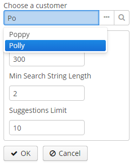
3.5.2.1.44. SuggestionPickerField
The SuggestionPickerField component is designed to search for entity instances according to a string entered by a user. It differs from SearchPickerField in that it refreshes the list of options on each entered symbol without the need to press Enter. The list of options is loaded in background according to the logic defined by the application developer on the server side.
SuggestionPickerField is also a PickerField and can contain actions represented by buttons on the right.

XML name of the component: suggestionPickerField.
SuggestionPickerField is used to select reference entity attributes, so you usually set its dataContainer and property attributes:
<data>
    <instance id="orderDc"
              class="com.company.sales.entity.Order"
              view="order-with-customer">
        <loader id="orderDl"/>
    </instance>
</data>
<layout>
<suggestionPickerField id="suggestionPickerField"
                       captionProperty="name"
                       dataContainer="orderDc"
                       property="customer"/>
</layout>
suggestionPickerField attributes:
-
asyncSearchDelayMs- sets the delay between the last key press action and asynchronous search.
-
metaClass- sets the link to the component’sMetaClassif the component is used without binding to a data component, i.e., without setting dataContainer and property.
-
minSearchStringLength- sets the minimal string length which is required to perform suggestions search.
-
popupWidth- sets the width of the suggestion popup.Possible options:
-
auto- the popup width will be equal to the maximum width of suggestions, -
parent- the popup width will be equal to the width of main component, -
absolute (e.g.
"170px") or relative (e.g."50%") value.
-
-
suggestionsLimit- sets the limit of suggestions to be displayed.
|
The appearance of |
suggestionPickerField elements:
-
actions- an optional element describing the actions related to the component. In addition to custom arbitrary actions,suggestionPickerFieldsupports the following standard PickerField actions:picker_lookup,picker_clear,picker_open.
- Base SuggestionPickerField usage
-
In the most common case, it is sufficient to set
SearchExecutorto the component.SearchExecutoris a functional interface that contains a single method:List<E extends Entity> search(String searchString, Map<String, Object> searchParams):suggestionPickerField.setSearchExecutor((searchString, searchParams) -> { return Arrays.asList(entity1, entity2, ...); });The
search()method is executed in a background thread so it cannot access visual or data components. Call DataManager or a middleware service directly; or process and return data loaded to the screen beforehand.The
searchStringparameter can be used to filter candidates using the string entered by the user. You can use theescapeForLike()method to search for the values that contain special symbols:suggestionPickerField.setSearchExecutor((searchString, searchParams) -> { searchString = QueryUtils.escapeForLike(searchString); return dataManager.load(Customer.class) .query("e.name like ?1 order by e.name escape '\\'", "%" + searchString + "%") .list(); });
- ParametrizedSearchExecutor usage
-
In the previous examples,
searchParamsis an empty map. To define params, you should useParametrizedSearchExecutor:suggestionPickerField.setSearchExecutor(new SuggestionField.ParametrizedSearchExecutor<Customer>(){ @Override public Map<String, Object> getParams() { return ParamsMap.of(...); } @Override public List<Customer> search(String searchString, Map<String, Object> searchParams) { return executeSearch(searchString, searchParams); } });
- EnterActionHandler and ArrowDownActionHandler usage
-
Another way to use the component is to set
EnterActionHandlerorArrowDownActionHandler. These listeners are fired when a user presses Enter or Arrow Down keys when the popup with suggestions is hidden. They are also functional interfaces with single method and single parameter -currentSearchString. You can set up your own action handlers and useSuggestionField.showSuggestions()method which accepts the list of entities to show suggestions.suggestionPickerField.setArrowDownActionHandler(currentSearchString -> { List<Customer> suggestions = findSuggestions(); suggestionPickerField.showSuggestions(suggestions); }); suggestionPickerField.setEnterActionHandler(currentSearchString -> { List<Customer> suggestions = getDefaultSuggestions(); suggestionPickerField.showSuggestions(suggestions); });
- Attributes of suggestionPickerField
-
align - asyncSearchDelayMs - caption - captionAsHtml - captionProperty - colspan - contextHelpText - contextHelpTextHtmlEnabled - css - dataContainer - description - descriptionAsHtml - editable - enable - box.expandRatio - height - htmlSanitizerEnabled - icon - id - inputPrompt - metaClass - minSearchStringLength - popupWidth - property - required - requiredMessage - responsive - rowspan - stylename - suggestionsLimit - tabIndex - visible - width
- Elements of suggestionPickerField
- Predefined styles of suggestionPickerField
- API
-
addValueChangeListener - setContextHelpIconClickHandler - setOptionCaptionProvider - setOptionIconProvider - setOptionsStyleProvider