 Edit on GitHub
3.5.2.1.49. TokenList
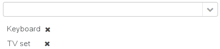
TokenList component offers a simplified way of working with lists: instance names are listed vertically or horizontally, adding is done using drop-down list, removal – using the buttons located near each instance.
XML-name of the component: tokenList
Below is an example description of TokenList in an XML-descriptor of a screen:
<data>
    <instance id="orderDc" class="com.company.sales.entity.Order" view="order-edit">
        <loader/>
        <collection id="productsDc" property="products"/>
    </instance>
    <collection id="allProductsDc" class="com.company.sales.entity.Product" view="_minimal">
        <loader id="allProductsDl">
            <query><![CDATA[select e from sales_Product e order by e.name]]></query>
        </loader>
    </collection>
</data>
<layout>
    <tokenList id="productsList" dataContainer="orderDc" property="products" inline="true" width="500px">
        <lookup optionsContainer="allProductsDc"/>
    </tokenList>
</layout>
In the example above, the nested productsDc data container which includes a collection of products within an order is defined, as well as allProductsDs data container containing a collection of all products available in the database. The TokenList component with productsList identifier displays the content of the productsDc container and enables changing the collection by adding instances from allProductsDc.
tokenList attributes:
-
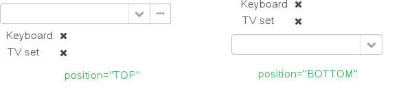
position– sets the position for the drop-down list. The attribute can take two values:TOP,BOTTOM. Default isTOP.
-
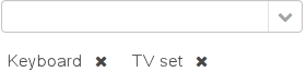
inlineattribute defines how the list with selected items will be displayed: vertically or horizontally.truecorresponds to horizontal alignment,false– to vertical. An example of a component with horizontal alignment:
-
simple– when set totrue, the items selection component will be hidden with only the Add button left. Clicking the Add button opens the screen with the list of entity instances which type is defined by the data container. Selection screen identifier is selected according to the rules for thePickerFieldstandard lookup action. Clicking the Clear button will remove all elements from theTokenListcomponent’s container.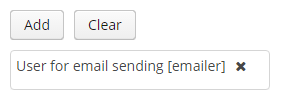
-
clearEnabled- when set tofalse, the Clear button is hidden.
tokenList elements:
-
lookup− values selection component descriptor.Attributes of the
lookupelement:-
lookupattribute makes it possible to select items using an entity lookup screen: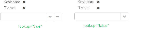
-
inputPrompt- a textual prompt that is displayed in the lookup field to prompt the user for input. If not set, the lookup is empty.<tokenList id="linesList" dataContainer="orderItemsDс" property="items" width="320px"> <lookup optionsContainer="allItemsDс" inputPrompt="Choose an item"/> </tokenList>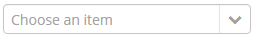
-
lookupScreenattribute sets the identifier of the screen used for items selection inlookup="true"mode. If this attribute is not set, screen identifier is selected according to the rules for thecom.haulmont.cuba.gui.actions.picker.LookupActionstandard action. -
openTypeattribute defines how the lookup screen will be opened, similar to what is described for thecom.haulmont.cuba.gui.actions.picker.LookupActionstandard action. Default value –THIS_TAB.
-
multiselect- if this attribute’s value is set totrue, then the entity lookup screen will be set into multiple selection mode. Every screen that is intended to change a lookup component selection mode must implementcom.haulmont.cuba.gui.screen.MultiSelectLookupScreeninterface. TheStandardLookupprovides the default implementation of this interface. In case you need to provide the custom implementation, override thesetLookupComponentMultiSelectmethod, for example:public class ProductsList extends StandardLookup { @Inject private GroupTable<Product> productsTable; @Override public void setLookupComponentMultiSelect(boolean multiSelect) { productsTable.setMultiSelect(multiSelect); } }
-
The component can take a list of options from a data container: for this purpose, the optionsContainer attribute is used. Arbitrarily, the list of component options can be specified using the setOptions(), setOptionsList() and setOptionsMap() methods. In this case, the <lookup> attribute value in the XML descriptor can be empty.
-
setOptionsList()enables specifying programmatically a list of entities to be used as component options. To do this, declare a component in the XML descriptor:<tokenList id="tokenList" dataContainer="orderDc" property="items" width="320px"> <lookup/> </tokenList>Then inject the component into the controller and specify a list of options for it:
@Inject
private TokenList<OrderItem> tokenList;
@Inject
private CollectionContainer<OrderItem> allItemsDc;

@Subscribe
public void onAfterShow(AfterShowEvent event) {
    tokenList.setOptionsList(allItemsDc.getItems());
}
The same result will be achieved using the
setOptions()method which enables working with all types of options:@Inject private TokenList<OrderItem> tokenList; @Inject private CollectionContainer<OrderItem> allItemsDc; @Subscribe public void onAfterShow(AfterShowEvent event) { tokenList.setOptions(new ContainerOptions<>(allItemsDc)); }
The TokenList component is able to handle user input if there is no suitable option in the list. The new options handler is invoked if the user enters a value that does not coincide with any option and presses Enter.
There are two ways to use newOptionHandler:
-
Declaratively using the
@Installannotation in the screen controller:@Inject private CollectionContainer<Tag> tagsDc; @Inject private Metadata metadata; @Install(to = "tokenList", subject = "newOptionHandler") private void tokenListNewOptionHandler(String string) { Tag newTag = metadata.create(Tag.class); newTag.setName(string); tagsDc.getMutableItems().add(newTag); } -
Programmatically with the help of the
setNewOptionHandler()method:@Inject private CollectionContainer<Tag> tagsDc; @Inject private Metadata metadata; @Inject private TokenList<Tag> tokenList; @Subscribe public void onInit(InitEvent event) { tokenList.setNewOptionHandler(string -> { Tag newTag = metadata.create(Tag.class); newTag.setName(string); tagsDc.getMutableItems().add(newTag); }); }
tokenList listeners:
-
ItemClickListenerallows you to track the click ontokenListitems. -
ValueChangeListenerenables tracking the changes of thetokenListvalue, as well as of any other components implementing theFieldinterface. The origin of theValueChangeEventcan be tracked using isUserOriginated() method.
- Attributes of tokenList
-
align - caption - captionAsHtml - captionProperty - clearEnabled - contextHelpText - contextHelpTextHtmlEnabled - css - dataContainer - description - descriptionAsHtml - editable - enable - box.expandRatio - height - htmlSanitizerEnabled - icon - id - inline - position - simple - stylename - tabIndex - visible - width
- Elements of tokenList
- Attributes of lookup
-
captionProperty - filterMode - inputPrompt - lookup - lookupScreen - multiselect - openType - optionsContainer
- Attributes of button
- API
-
addValueChangeListener - setContextHelpIconClickHandler - setItemClickListener - setNewOptionHandler - setOptionCaptionProvider