 Edit on GitHub
3.5.2.1.13. DatePicker
DatePicker is a field to display and choose a date. It has the same view as the drop-down calendar in DateField.
XML name of the component: datePicker.
The DatePicker component is implemented for Web Client.
-
To create a date picker associated with data, you should use the dataContainer and property attributes:
<data>
    <instance id="orderDc"
              class="com.company.sales.entity.Order"
              view="_local">
        <loader/>
    </instance>
</data>
<layout>
    <datePicker id="datePicker"
                dataContainer="orderDc"
                property="date"/>
</layout>
In the example above, the screen has the
orderDcdata container for theOrderentity, which has thedateproperty. The reference to the data container is specified in the dataContainer attribute of thedatePickercomponent; the name of the entity attribute which value should be displayed in the field is specified in the property attribute.
-
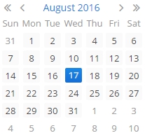
You can specify available dates to select by using
rangeStartandrangeEndattributes. If you set them, all the dates that are outside the range will be disabled.<datePicker id="datePicker" rangeStart="2016-08-15" rangeEnd="2016-08-19"/>
-
Date accuracy can be defined using a
resolutionattribute. An attribute value should match theDatePicker.Resolutionenumeration −DAY,MONTH,YEAR. Default resolution isDAY.<datePicker id="datePicker" resolution="MONTH"/>
<datePicker id="datePicker" resolution="YEAR"/>
-
Today’s date in the calendar is determined against current timestamp in a user’s web browser, which depends on the OS time zone settings. User’s time zone doesn’t affect this behaviour.
- Attributes of datePicker
-
align - caption - captionAsHtml - contextHelpText - contextHelpTextHtmlEnabled - css - dataContainer - datatype - description - descriptionAsHtml - editable - enable - box.expandRatio - height - htmlSanitizerEnabled - id - property - rangeEnd - rangeStart - resolution - stylename - tabIndex - visible - width
- API