3.5.9.3. Creating a Custom Theme
You can create one or several application themes in the project and give the users an opportunity to select the most appropriate one. Creating new themes also allows you to override the variables in the *-theme.properties files, which define a few server-side parameters:
-
Default dialog window size.
-
Default input field width.
-
Dimensions of some components (Filter, FileMultiUploadField).
-
Correspondence between icon names and constants of the
com.vaadin.server.FontAwesomeenumeration for using Font Awesome in standard actions and screens of the platform, if cuba.web.useFontIcons is enabled.
New themes can be easily created in CUBA Studio, in CUBA CLI or manually. Let’s consider all the three ways taking Hover Dark custom theme as an example.
- In CUBA Studio:
-
-
In the main menu, click CUBA > Advanced > Manage themes > Create custom theme. Enter the name of the new theme: hover-dark. Select the hover theme in the Base theme dropdown.
The required file structure will be created in the web module. The
webThemesModulemodule and its configuration will be automatically added to thesettings.gradleand build.gradle files. Also, the generateddeployThemesgradle task allows you to see the changes without server restart.
-
- Manually:
-
-
Create the following file structure in the web module of your project:
web/ src/ themes/ hover-dark/ branding/ app-icon-login.png app-icon-menu.png com.haulmont.cuba/ app-component.scss favicon.ico hover-dark.scss hover-dark-defaults.scss styles.scss -
The
app-component.scssfile:@import "../hover-dark"; @mixin com_haulmont_cuba { @include hover-dark; } -
The
hover-dark.scssfile:@import "../hover/hover"; @mixin hover-dark { @include hover; } -
The
styles.scssfile:@import "hover-dark-defaults"; @import "hover-dark"; .hover-dark { @include hover-dark; } -
Create the
hover-dark-theme.propertiesfile in the web subdirectory of your web module:@include=com/haulmont/cuba/hover-theme.properties -
Add the
webThemesModulemodule to thesettings.gradlefile:include(":${modulePrefix}-global", ":${modulePrefix}-core", ":${modulePrefix}-web", ":${modulePrefix}-web-themes") //... project(":${modulePrefix}-web-themes").projectDir = new File(settingsDir, 'modules/web/themes') -
Add the
webThemesModulemodule configuration to the build.gradle file:def webThemesModule = project(":${modulePrefix}-web-themes") configure(webThemesModule) { apply(plugin: 'java') apply(plugin: 'maven') apply(plugin: 'cuba') appModuleType = 'web-themes' buildDir = file('../build/scss-themes') sourceSets { main { java { srcDir '.' } resources { srcDir '.' } } } } -
Finally, create the
deployThemesgradle task inbuild.gradleto see the changes without server restart:configure(webModule) { // . . . task buildScssThemes(type: CubaWebScssThemeCreation) task deployThemes(type: CubaDeployThemeTask, dependsOn: buildScssThemes) assemble.dependsOn buildScssThemes }
-
- In CUBA CLI:
-
-
Run the
themecommand, then select the hover theme.The specific file structure will be created in the web module of the project.
-
Modify the generated file structure and the files' contents so that they correspond to the files from above.
-
Create the
hover-dark-theme.propertiesfile in the source directory of your web module:@include=com/haulmont/cuba/hover-theme.properties
The
build.gradleandsettings.gradlefiles will be updated automatically by CLI. -
See also the example in Creating Facebook Theme section.
- Modifying server-side theme parameters
-
In Halo theme, Font Awesome icons are used for standard actions and platform screens by default (if cuba.web.useFontIcons is enabled). In this case, you can replace a standard icon by setting the required mapping between the icon and the font element name in
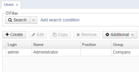
<your_theme>-theme.propertiesfile. For example, to use "plus" icon for thecreateaction in the new Facebook theme, thefacebook-theme.propertiesfile should contain the following:@include=com/haulmont/cuba/halo-theme.properties cuba.web.icons.create.png = font-icon:PLUSThe fragment of the standard users browser screen in the Facebook theme with the modified
createaction: