 Edit on GitHub
3.5.2.1.53. TwinColumn
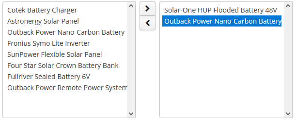
TwinColumn is a twin list component for multiple items selection. The left part of the list contains available unselected values, the right part – selected values. Users select the values by transferring them from the left to the right and backward using double click or dedicated buttons. A unique representation style and an icon can be defined for each value.
XML name of the component: twinColumn
Below is an example of a twinColumn component usage to select entity instances:
<data>
    <instance id="orderDc" class="com.company.sales.entity.Order" view="order-edit">
        <loader id="orderDl"/>
    </instance>
    <collection id="allProductsDc" class="com.company.sales.entity.Product" view="_minimal">
        <loader>
            <query>
                <![CDATA[select e from sales_Product e]]>
            </query>
        </loader>
    </collection>
</data>
<layout>
    <twinColumn id="twinColumn"
                dataContainer="orderDc"
                property="products"
                optionsContainer="allProductsDc"/>
</layout>
In this example, the twinColumn component will display instance names of Product entity instances located in the allProductsDc data container, and its getValue() method will return a collection of selected instances.
addAllBtnEnabled attribute shows the buttons moving all items between the lists.
columns attribute is used to set the number of characters in a row, and the rows attribute – to set the number of rows in each list.
The reorderable attribute specifies whether the items should be reordered after selection. Reordering is enabled by default. In this case, the items will be reordered after selection to match the order of the elements in the data source. If the attribute value is false, the items will be added in the order in which they are selected.
leftColumnCaption and rightColumnCaption attributes can be used to set captions for the columns.
The presentation of the items can be defined by implementing the TwinColumn.StyleProvider interface and returning a style name and icon path for each entity instance displayed in the component.
The list of component options can be specified arbitrarily using the setOptionsList(), setOptionsMap() and setOptionsEnum() methods as described for the CheckBoxGroup component.
- Attributes of twinColumn
-
align - addAllBtnEnabled - caption - captionAsHtml - captionProperty - columns - contextHelpText - contextHelpTextHtmlEnabled - css - dataContainer - description - descriptionAsHtml - editable - enable - box.expandRatio - height - htmlSanitizerEnabled - icon - id - leftColumnCaption - optionsContainer - property - reorderable - required - requiredMessage - rightColumnCaption - rows - stylename - tabIndex - visible - width
- Elements of twinColumn
- API
-
addValueChangeListener - setContextHelpIconClickHandler - setOptionCaptionProvider