 Edit on GitHub
3.5.14. Composite Components
A composite component is a component consisting of other components. Like screen fragments, composite components allow you to reuse some presentation layout and logic. We recommend using composite components in the following cases:
-
The component functionality can be implemented as a combination of existing Generic UI components. If you need some non-standard features, create a custom component by wrapping a Vaadin component or JavaScript library, or use Generic JavaScriptComponent.
-
The component is relatively simple and does not load or save data itself. Otherwise, consider creating a screen fragment.
The class of a composite component must extend the CompositeComponent base class. A composite component must have a single component at the root of the inner components tree. The root component can be obtained using the CompositeComponent.getComposition() method.
Inner components are usually created declaratively in an XML descriptor. In this case, the component class should have the @CompositeDescriptor annotation which specifies the path to the descriptor file. If the annotation value does not start with /, the file is loaded from the component’s class package.
|
Pay attention that IDs of inner components must be unique in the screen to avoid collisions in listeners and injections. Use identifiers with some prefixes like |
Alternatively, the inner components tree can be created programmatically in a CreateEvent listener.
CreateEvent is sent by the framework when it finishes the initialization of the component. At this moment, if an XML descriptor is used by the component, it is loaded, and getComposition() method returns the root component. This event can be used for any additional initialization of the component or for creating the inner components without XML.
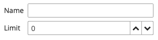
Below we demonstrate the creation of Stepper component which is designed to edit integer values in the input field and by clicking on up/down buttons located next to the field.
Let’s assume the project has com/company/demo base package.
- Component layout descriptor
-
Create an XML descriptor with the component layout in the
com/company/demo/web/components/stepper/stepper-component.xmlfile of thewebmodule:<composite xmlns="http://schemas.haulmont.com/cuba/screen/composite.xsd"> (1) <hbox id="rootBox" width="100%" expand="valueField"> (2) <textField id="valueField"/> (3) <button id="upBtn" icon="font-icon:CHEVRON_UP"/> <button id="downBtn" icon="font-icon:CHEVRON_DOWN"/> </hbox> </composite>1 - XSD defines the content of the component descriptor 2 - a single root component 3 - any number of nested components
- Component implementation class
-
Create the component implementation class in the same package:
package com.company.demo.web.components.stepper;

import com.haulmont.bali.events.Subscription;
import com.haulmont.cuba.gui.components.*;
import com.haulmont.cuba.gui.components.data.ValueSource;
import com.haulmont.cuba.web.gui.components.*;

import java.util.Collection;
import java.util.function.Consumer;

@CompositeDescriptor("stepper-component.xml") (1)
public class StepperField
        extends CompositeComponent<HBoxLayout> (2)
        implements Field<Integer>, (3)
                    CompositeWithCaption, (4)
                    CompositeWithHtmlCaption,
                    CompositeWithHtmlDescription,
                    CompositeWithIcon,
                    CompositeWithContextHelp {

    public static final String NAME = "stepperField"; (5)

    private TextField<Integer> valueField; (6)
    private Button upBtn;
    private Button downBtn;

    private int step = 1; (7)

    public StepperField() {
        addCreateListener(this::onCreate); (8)
    }

    private void onCreate(CreateEvent createEvent) {
        valueField = getInnerComponent("valueField");
        upBtn = getInnerComponent("upBtn");
        downBtn = getInnerComponent("downBtn");

        upBtn.addClickListener(clickEvent -> updateValue(step));
        downBtn.addClickListener(clickEvent -> updateValue(-step));
    }

    private void updateValue(int delta) {
        Integer value = getValue();
        setValue(value != null ? value + delta : delta);
    }

    public int getStep() {
        return step;
    }

    public void setStep(int step) {
        this.step = step;
    }

    @Override
    public boolean isRequired() { (9)
        return valueField.isRequired();
    }

    @Override
    public void setRequired(boolean required) {
        valueField.setRequired(required);
        getComposition().setRequiredIndicatorVisible(required);
    }

    @Override
    public String getRequiredMessage() {
        return valueField.getRequiredMessage();
    }

    @Override
    public void setRequiredMessage(String msg) {
        valueField.setRequiredMessage(msg);
    }

    @Override
    public void addValidator(Consumer<? super Integer> validator) {
        valueField.addValidator(validator);
    }

    @Override
    public void removeValidator(Consumer<Integer> validator) {
        valueField.removeValidator(validator);
    }

    @Override
    public Collection<Consumer<Integer>> getValidators() {
        return valueField.getValidators();
    }

    @Override
    public boolean isEditable() {
        return valueField.isEditable();
    }

    @Override
    public void setEditable(boolean editable) {
        valueField.setEditable(editable);
        upBtn.setEnabled(editable);
        downBtn.setEnabled(editable);
    }

    @Override
    public Integer getValue() {
        return valueField.getValue();
    }

    @Override
    public void setValue(Integer value) {
        valueField.setValue(value);
    }

    @Override
    public Subscription addValueChangeListener(Consumer<ValueChangeEvent<Integer>> listener) {
        return valueField.addValueChangeListener(listener);
    }

    @Override
    public void removeValueChangeListener(Consumer<ValueChangeEvent<Integer>> listener) {
        valueField.removeValueChangeListener(listener);
    }

    @Override
    public boolean isValid() {
        return valueField.isValid();
    }

    @Override
    public void validate() throws ValidationException {
        valueField.validate();
    }

    @Override
    public void setValueSource(ValueSource<Integer> valueSource) {
        valueField.setValueSource(valueSource);
        getComposition().setRequiredIndicatorVisible(valueField.isRequired());
    }

    @Override
    public ValueSource<Integer> getValueSource() {
        return valueField.getValueSource();
    }
}
1 - the @CompositeDescriptorannotation specifies the path to the component layout descriptor which is located in the class package.2 - the component class extends CompositeComponentparameterized by the type of the root component.3 - our component implements the Field<Integer>interface because it is designed to display and edit an integer value.4 - a set of interfaces with default methods to implement standard Generic UI component functionality. 5 - name of the component which is used to register the component in ui-component.xmlfile to be recognized by the framework.6 - fields containing references to inner components. 7 - component’s property which defines the value of a single click to up/down buttons. It has public getter/setter methods and can be assigned in screen XML. 8 - component initialization is done in the CreateEventlistener.
- Component loader
-
Create the component loader which is needed to initialize the component when it is used in screen XML descriptors:
package com.company.demo.web.components.stepper;

import com.google.common.base.Strings;
import com.haulmont.cuba.gui.xml.layout.loaders.AbstractFieldLoader;

public class StepperFieldLoader extends AbstractFieldLoader<StepperField> { (1)

    @Override
    public void createComponent() {
        resultComponent = factory.create(StepperField.NAME); (2)
        loadId(resultComponent, element);
    }

    @Override
    public void loadComponent() {
        super.loadComponent();
        String incrementStr = element.attributeValue("step"); (3)
        if (!Strings.isNullOrEmpty(incrementStr)) {
            resultComponent.setStep(Integer.parseInt(incrementStr));
        }
    }
}
1 - loader class must extend AbstractComponentLoaderparameterized by the class of the component. As our component implementsField, use more specificAbstractFieldLoaderbase class.2 - create the component by its name. 3 - load the stepproperty value from XML if it is specified.
- Registration of the component
-
In order to register the component and its loader with the framework, create the
com/company/demo/ui-component.xmlfile of thewebmodule:<?xml version="1.0" encoding="UTF-8" standalone="no"?> <components xmlns="http://schemas.haulmont.com/cuba/components.xsd"> <component> <name>stepperField</name> <componentLoader>com.company.demo.web.components.stepper.StepperFieldLoader</componentLoader> <class>com.company.demo.web.components.stepper.StepperField</class> </component> </components>Add the following property to
com/company/demo/web-app.properties:cuba.web.componentsConfig = +com/company/demo/ui-component.xmlNow the framework will recognize the new component in XML descriptors of application screens.
If an application that has a composite component is registered as a application component, you must recreate its descriptor.
- Component XSD
-
XSD is required to use the component in screen XML descriptors. Define it in the
com/company/demo/ui-component.xsdfile of thewebmodule:<?xml version="1.0" encoding="UTF-8" standalone="no"?> <xs:schema xmlns="http://schemas.company.com/demo/0.1/ui-component.xsd" attributeFormDefault="unqualified" elementFormDefault="qualified" targetNamespace="http://schemas.company.com/demo/0.1/ui-component.xsd" xmlns:xs="http://www.w3.org/2001/XMLSchema" xmlns:layout="http://schemas.haulmont.com/cuba/screen/layout.xsd"> <xs:element name="stepperField"> <xs:complexType> <xs:complexContent> <xs:extension base="layout:baseFieldComponent"> (1) <xs:attribute name="step" type="xs:integer"/> (2) </xs:extension> </xs:complexContent> </xs:complexType> </xs:element> </xs:schema>1 - inherit all base field properties. 2 - define an attribute for the stepproperty.
- Usage of the component
-
The following example shows how the component can be used in a screen:
<?xml version="1.0" encoding="UTF-8" standalone="no"?>
<window xmlns="http://schemas.haulmont.com/cuba/screen/window.xsd"
        xmlns:app="http://schemas.company.com/demo/0.1/ui-component.xsd" (1)
        caption="msg://caption"
        messagesPack="com.company.demo.web.components.sample">
    <data>
        <instance id="fooDc" class="com.company.demo.entity.Foo" view="_local">
            <loader/>
        </instance>
    </data>
    <layout>
        <form id="form" dataContainer="fooDc">
            <column width="250px">
                <textField id="nameField" property="name"/>
                <app:stepperField id="ageField" property="limit" step="10"/> (2)
            </column>
        </form>
    </layout>
</window>| 1 | - the namespace referencing the component’s XSD. |
| 2 | - the composite component connected to the limit attribute of an entity. |
- Custom styling
-
Now let’s apply some custom styles to improve the component look.
First, change the root component to CssLayout and assign style names to the inner components. Besides custom styles defined in the project (see below), the following predefined styles are used: v-component-group, icon-only.
<composite xmlns="http://schemas.haulmont.com/cuba/screen/composite.xsd">
    <cssLayout id="rootBox" width="100%" stylename="v-component-group stepper-field">
        <textField id="valueField"/>
        <button id="upBtn"
                icon="font-icon:CHEVRON_UP"
                stylename="stepper-btn icon-only"/>
        <button id="downBtn"
                icon="font-icon:CHEVRON_DOWN"
                stylename="stepper-btn icon-only"/>
    </cssLayout>
</composite>
Change the component class accordingly:
@CompositeDescriptor("stepper-component.xml")
public class StepperField
        extends CompositeComponent<CssLayout>
        implements ...
Generate theme extension (see here how to do it in Studio) and add the following code to the
modules/web/themes/hover/com.company.demo/hover-ext.scssfile:@mixin com_company_demo-hover-ext { .stepper-field { display: flex; .stepper-btn { width: $v-unit-size; min-width: $v-unit-size; } } }Restart the application server and open the screen. The form with our composite Stepper component should look as follows: