 Edit on GitHub
3.5.2.1.24. LinkButton
LinkButton is a button that looks like a hyperlink.
XML name of the component: linkButton
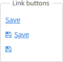
The link button can contain text or icon (or both). The figure below shows different types of buttons.
By default, the caption for LinkButton is split into multiple lines if its length exceeds the width value. Therefore, to display a multiline link button, it is sufficient to specify an absolute value of width. If the link button’s caption is too long and the value of width is not specified, the caption will be truncated.
The user can change the default behavior to display LinkButton caption in one row:
-
Create a theme extension or a custom theme.
-
Define the SCSS variable
$cuba-link-button-caption-wrap:$cuba-link-button-caption-wrap: false
The link button differs from regular Button only in its appearance. All properties and behavior are identical to those described for Button.
Below is an example of XML description of a link button that invokes the someMethod() method of a controller. The link button has a caption (the caption attribute), a tooltip (the description attribute) and an icon (the icon attribute):
<linkButton id="linkButton"
            caption="msg://linkButton"
            description="Press me"
            icon="SAVE"
invoke="someMethod"/>- Attributes of linkButton
-
action - align - caption - captionAsHtml - css - description - descriptionAsHtml - enable - box.expandRatio - htmlSanitizerEnabled - icon - id - invoke - stylename - visible - width