 Edit on GitHub
3.5.2.1.35. RadioButtonGroup
This is a component that allows a user to select a single value from a list of options using radio buttons.
XML name of the component: radioButtonGroup.
The RadioButtonGroup component is implemented for Web Client.
The list of component options can be specified using the setOptions(), setOptionsList(), setOptionsMap() and setOptionsEnum() methods, or using an optionsContainer attribute.
-
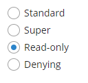
The simplest case of using
RadioButtonGroupis to select an enumeration value for an entity attribute. For example, aRoleentity hastypeattribute of theRoleTypetype, which is an enumeration. Then you can useRadioButtonGroupto display this attribute as follows, using theoptionsEnumattribute:<radioButtonGroup optionsEnum="com.haulmont.cuba.security.entity.RoleType" property="type"/>The
setOptionsEnum()takes a class of enumeration as a parameter. The options list will consist of localized names of enum values, the value of the component will be an enum value.radioButtonGroup.setOptionsEnum(RoleType.class);The same result will be achieved using the
setOptions()method which enables working with all types of options:radioButtonGroup.setOptions(new EnumOptions<>(RoleType.class));
-
setOptionsList()enables specifying programmatically a list of component options. To do this, declare a component in the XML descriptor:<radioButtonGroup id="radioButtonGroup"/>Then inject the component into the controller and specify a list of options for it:
@Inject
private RadioButtonGroup<Integer> radioButtonGroup;

@Subscribe
protected void onInit(InitEvent event) {
    List<Integer> list = new ArrayList<>();
    list.add(2);
    list.add(4);
    list.add(5);
    list.add(7);
    radioButtonGroup.setOptionsList(list);
}
The component will be as follows:
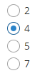
Depending on the selected option, the
getValue()method of the component will returnIntegervalues: 2, 4, 5, 7.
-
setOptionsMap()enables specifying string names and option values separately. For example, we can set the following options map for theradioButtonGroupcomponent injected in the controller:@Inject private RadioButtonGroup<Integer> radioButtonGroup; @Subscribe protected void onInit(InitEvent event) { Map<String, Integer> map = new LinkedHashMap<>(); map.put("two", 2); map.put("four", 4); map.put("five", 5); map.put("seven", 7); radioButtonGroup.setOptionsMap(map); }The component will be as follows:
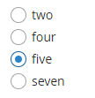
Depending on the selected option, the
getValue()method of the component will returnIntegervalues: 2, 4, 5, 7, and not the strings that are displayed on the screen.
-
The component can take a list of options from a data container. For this purpose, the
optionsContainerattribute is used. For example:<data> <collection id="employeesCt" class="com.company.demo.entity.Employee" view="_minimal"> <loader> <query><![CDATA[select e from demo_Employee e]]></query> </loader> </collection> </data> <layout> <radioButtonGroup optionsContainer="employeesCt"/> </layout>In this case, the
radioButtonGroupcomponent will display instance names of theEmployeeentity, located in theemployeesCtdata container, and itsgetValue()method will return the selected entity instance.
With the help of captionProperty attribute entity attribute to be used instead of an instance name for string option names can be defined.
Programmatically, you can define the options container using the
setOptions()method ofRadioButtonGroupinterface:@Inject private RadioButtonGroup<Employee> radioButtonGroup; @Inject private CollectionContainer<Employee> employeesCt; @Subscribe protected void onInit(InitEvent event) { radioButtonGroup.setOptions(new ContainerOptions<>(employeesCt)); }
You can use OptionDescriptionProvider to generate optional descriptions (tooltips) for the options. It can be used via the setOptionDescriptionProvider() method or the @Install annotation:
@Inject
private RadioButtonGroup<Product> radioButtonGroup;

@Subscribe
public void onInit(InitEvent event) {
    radioButtonGroup.setOptionDescriptionProvider(product -> "Price: " + product.getPrice());
}@Install(to = "radioButtonGroup", subject = "optionDescriptionProvider")
private String radioButtonGroupOptionDescriptionProvider(Experience experience) {
switch (experience) {
case HIGH:
return "Senior";
case COMMON:
return "Middle";
default:
return "Junior";
}
}The orientation attribute defines the orientation of group elements. By default, elements are arranged vertically. The horizontal value sets the horizontal orientation.
- Attributes of RadioButtonGroup
-
align - box.expandRatio - caption - captionAsHtml - captionProperty - colspan - contextHelpText - contextHelpTextHtmlEnabled - css - dataContainer - description - descriptionAsHtml - editable - enable - height - htmlSanitizerEnabled - icon - id - optionsContainer - optionsEnum - orientation - property - required - requiredMessage - responsive - rowspan - stylename - tabIndex - visible - width
- API
-
addValueChangeListener - setContextHelpIconClickHandler - setOptionCaptionProvider - setOptionDescriptionProvider - setOptions - setOptionsEnum - setOptionsList - setOptionsMap