 Edit on GitHub
3.5.2.1.20. GroupTable
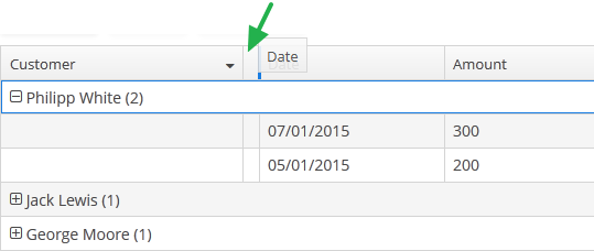
GroupTable component is a table with an ability to group information dynamically by any field. In order to group a table by a column the required column should be dragged to the left and dropped on the  element of the table header. Grouped values can be expanded and collapsed using
  /
/ buttons.
XML name of the component: groupTable.
A data container of CollectionContainer type must be specified for GroupTable, otherwise, grouping will not work. Example:
<data>
    <collection id="ordersDc"
                class="com.company.sales.entity.Order"
                view="order-with-customer">
        <loader id="ordersDl">
            <query>
                <![CDATA[select e from sales_Order e]]>
            </query>
        </loader>
    </collection>
</data>
<layout>
    <groupTable id="ordersTable"
                width="100%"
                dataContainer="ordersDc">
        <columns>
            <group>
                <column id="date"/>
            </group>
            <column id="customer"/>
            <column id="amount"/>
        </columns>
        <rowsCount/>
    </groupTable>
</layout>
group is an optional element that can be present in a single instance inside columns. It contains a set of column elements, by which grouping will be performed initially when opening a screen.
In the example below, we will use the includeAll attribute of the columns element along with the group element.
<groupTable id="groupTable"
            width="100%"
            height="100%"
            dataContainer="customersDc">
    <columns includeAll="true">
        <group>
            <column id="address"/>
        </group>
        <column id="name"
                sortable="false"/>
    </columns>
</groupTable>
So a specific attribute is added to the name column, and a GroupTable is grouped by the address column.
Each column element can contain the groupAllowed attribute with boolean value. This attribute controls whether a user can group by this column.
If aggregatable attribute is true, the table shows aggregation results for each group and results for all rows in an additional row on the top. If showTotalAggregation attribute is false, results for all rows are not shown.
If multiselect attribute is true, the click to the group row holding down the Ctrl key will expand the group (if collapsed) and set the selection to all rows of this group. The converse is not true: if the whole group is selected, Ctrl+click will not deselect all the group. You still can deselect certain rows using the common Ctrl key behaviour.
-
Methods of the
GroupTableinterface: -
-
groupByColumns()- performs grouping by the given table columns.The example below will group the table first by the department name, and then by city:
groupTable.groupByColumns("department", "city");
-
ungroupByColumns()- resets grouping by the given columns.The following example will ungroup the table by department, while grouping by city from the previous snippet will be kept.
groupTable.ungroupByColumns("department");
-
ungroup()- resets grouping at all.
-
The
setAggregationDistributionProvider()method is similar to the same method for theTablecomponent with the only difference that when creating a provider, theGroupAggregationDistributionContext<V>object is used, which contains additional:-
GroupInfo groupInfo– an object with information about the grouping row: properties of the grouped columns and their values.
-
-
The
getAggregationResults()method returns a map with aggregation results for the specified GroupInfo object, where map keys are table column identifiers, and values are aggregation values.
-
The
setStyleProvider()method allows setting table cell display style. For theGroupTable, it will accept aGroupTable.GroupStyleProvider, which extendsTable.StyleProvider.GroupStyleProviderhas a specific method for styling grouping rows with the GroupInfo parameter. This method will be invoked for every grouping row in theGroupTable.Example of setting a style:
@Inject
private GroupTable<Customer> customerTable;

@Subscribe
public void onInit(InitEvent event) {
    customerTable.setStyleProvider(new GroupTable.GroupStyleProvider<Customer>() {

        @SuppressWarnings("unchecked")
        @Override
        public String getStyleName(GroupInfo info) {
            CustomerGrade grade = (CustomerGrade) info.getPropertyValue(info.getProperty());
            switch (grade) {
                case PREMIUM:
                    return "premium-grade";
                case HIGH:
                    return "high-grade";
                case STANDARD:
                    return "standard-grade";
            }
            return null;
        }

        @Override
        public String getStyleName(Customer customer, @Nullable String property) {
            if (Boolean.TRUE.equals(customer.getActive())) {
                return "active-customer";
            }
            return null;
        }
    });
}
Then the styles set in the application theme should be defined. Detailed information on creating a theme is available in Themes. For web client, new styles are defined in the
styles.scssfile. Style names defined in the controller, form CSS selectors. For example:.active-customer { font-weight: bold; } .premium-grade { background-color: red; color: white; } .high-grade { background-color: green; color: white; } .standard-grade { background-color: blue; color: white; }
-
The rest of the GroupTable functionality is similar to a simple Table.
- Attributes of groupTable
-
align - aggregatable - aggregationStyle - caption - captionAsHtml - columnControlVisible - contextHelpText - contextHelpTextHtmlEnabled - contextMenuEnabled - css - dataContainer - description - descriptionAsHtml - editable - emptyStateLinkMessage - emptyStateMessage - enable - box.expandRatio - height - htmlSanitizerEnabled - id - metaClass - multiLineCells - multiselect - presentations - reorderingAllowed - settingsEnabled - showTotalAggregation - sortable - stylename - tabIndex - textSelectionEnabled - visible - width
- Elements of groupTable
-
actions - buttonsPanel - columns - rows - rowsCount
- Attributes of columns
- Elements of columns
- Attributes of column
-
align - caption - captionProperty - collapsed - dateFormat - editable - expandRatio - groupAllowed - id - link - linkInvoke - linkScreen - linkScreenOpenType - maxTextLength - optionsContainer - resolution - sort - sortable - visible - width
- Elements of column
- Attributes of aggregation
- API
-
addColumnCollapseListener - addSelectionListener - getAggregationResults - groupByColumns - setAggregationDistributionProvider - setClickListener - setEmptyStateLinkClickHandler - setItemDescriptionProvider - setStyleProvider - ungroup - ungroupByColumns