 Edit on GitHub
3.5.2.1.31. PickerField
PickerField displays an entity instance in a text field and performs actions when a user clicks buttons on the right.

XML name of the component: pickerField.
-
As a rule,
PickerFieldis used for working with reference entity attributes. It is sufficient to specify dataContainer and property attributes for the component:<data> <instance id="carDc" class="com.haulmont.sample.core.entity.Car" view="carEdit"> <loader/> </instance> </data> <layout> <pickerField dataContainer="carDc" property="color"/> </layout>In the example above, the screen defines
carDcdata container for aCarentity having thecolorattribute. In thepickerFieldelement, a link to a data container is specified in thedataContainerattribute, and a name of an entity attribute is set in thepropertyattribute. The entity attribute should refer to another entity, in the example above it isColor.
-
For
PickerField, you can define an arbitrary number of actions, displayed as buttons on the right.It can be done either in the XML descriptor using the
actionsnested element, or programmatically in the controller usingaddAction().-
The framework provides a set of standard PickerField actions:
picker_lookup,picker_clear,picker_open. They perform the selection of a related entity, clearing the field and opening the edit screen for a selected related entity, respectively. When declaring standard actions in XML, you should define the action identifier and its type using thetypeattribute.If no actions are defined in the
actionselement when declaring the component, the XML loader will definelookupandclearactions for it. To add a default action, for example,open, you need to define theactionselement as follows:<pickerField dataContainer="carDc" property="color"> <actions> <action id="lookup" type="picker_lookup"/> <action id="open" type="picker_open"/> <action id="clear" type="picker_clear"/> </actions> </pickerField>The
actionelement does not extend but overrides a set of standard actions. Identifiers of all required actions have to be defined explicitly. The component looks as follows:
Use
addAction()to set standard actions programmatically. If the component is defined in the XML descriptor withoutactionsnested element, it is sufficient to add missing actions:@Inject protected PickerField<Color> colorField; @Subscribe protected void onInit(InitEvent event) { colorField.addAction(actions.create(OpenAction.class)); }If the component is created in the controller, it will get no default actions and you need to explicitly add all necessary actions:
@Inject
private InstanceContainer<Car> carDc;
@Inject
private UiComponents uiComponents;
@Inject
private Actions actions;

@Subscribe
protected void onInit(InitEvent event) {
    PickerField<Color> colorField = uiComponents.create(PickerField.NAME);
    colorField.setValueSource(new ContainerValueSource<>(carDc, "color"));
    colorField.addAction(actions.create(LookupAction.class));
    colorField.addAction(actions.create(OpenAction.class));
    colorField.addAction(actions.create(ClearAction.class));
    getWindow().add(colorField);
}
You can customize the standard actions behavior by subscribing to the
ActionPerformedEventand providing your own implementation. For example, you can use a specific lookup screen as follows:@Inject private ScreenBuilders screenBuilders; @Inject private PickerField<Color> pickerField; @Subscribe("pickerField.lookup") protected void onPickerFieldLookupActionPerformed(Action.ActionPerformedEvent event) { screenBuilders.lookup(pickerField) .withScreenClass(CustomColorBrowser.class) .build() .show(); }For more information, see Opening Screens section.
-
Arbitrary actions in the XML descriptor can also be defined in the
actionsnested element, and the action logic should be implemented in this action’s event, for example:<pickerField dataContainer="orderDc" property="customer"> <actions> <action id="lookup"/> <action id="show" icon="PICKERFIELD_OPEN" caption="Show"/> </actions> </pickerField>@Inject private PickerField<Customer> pickerField; @Subscribe("pickerField.show") protected void onPickerFieldShowActionPerformed(Action.ActionPerformedEvent event) { CustomerEdit customerEdit = screenBuilders.editor(pickerField) .withScreenClass(CustomerEdit.class) .build(); customerEdit.setDiscount(true); customerEdit.show(); }The declarative and programmatic creation of actions is described in Actions. The Action Interface section.
-
-
PickerFieldcan be used without binding to entities, i.e., without setting dataContainer/datasource and property. In this case,metaClassattribute should be used to specify an entity type forPickerField. For example:<pickerField id="colorField" metaClass="sample_Color"/>You can get an instance of a selected entity by injecting the component into a controller and invoking its
getValue()method.For proper operation of the
PickerFieldcomponent you need either set ametaClassattribute, or simultaneously set dataContainer/datasource and property attributes. -
You can use keyboard shortcuts in PickerField, see Keyboard Shortcuts for details.
-
PickerFieldcomponent can have an icon on the left. Below is an example of using a function in thesetOptionIconProvider()method in the screen controller. The"cancel"icon should be installed when a field value equalsnull; else the"chain"icon should be installed.@Inject private PickerField<Customer> pickerField; protected String generateIcon(Customer customer) { return (customer!= null) ? "icons/chain.png" : "icons/cancel.png"; } @Subscribe private void onInit(InitEvent event) { pickerField.setOptionIconProvider(this::generateIcon); }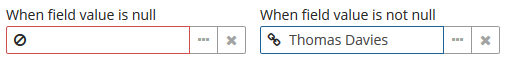
- Attributes of pickerField
-
align - caption - captionAsHtml - captionProperty - contextHelpText - contextHelpTextHtmlEnabled - css - dataContainer - datasource - description - descriptionAsHtml - editable - enable - box.expandRatio - height - icon - id - metaClass - property - required - requiredMessage - stylename - tabIndex - visible - width
- Elements of pickerField
- API
-
addAction - addValueChangeListener - commit - discard - isModified - setContextHelpIconClickHandler - setOptionCaptionProvider - setOptionIconProvider