 Edit on GitHub
3.5.2.1.3. Button
A button performs an action when a user clicks on it.

Component’s XML-name: button
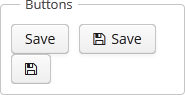
Buttons can contain a caption, an icon, or both. The figure below shows different button types.
An example of a button with a tooltip and a caption retrieved from a localized message pack:
<button id="textButton" caption="msg://someAction" description="Press me"/>The button’s caption is set using the caption attribute, the tooltip – using the description attribute.
If the disableOnClick attribute is set to true the button will be automatically disabled when clicked, typically to prevent (accidental) extra clicks on a button. You can later return the button to the enabled state by invoking the setEnabled(true) method.
The icon attribute defines icon location in theme catalog or the icon name in the icon set. Detailed information on recommended icon placement is available in Icons.
Example of creating a button with an icon:
<button id="iconButton" caption="" icon="SAVE"/>The button’s main function is to perform an action on a click. Controller method that should be invoked after a click can be defined using invoke attribute. The attribute value should contain name of the controller method satisfying the following conditions:
-
The method should be
public. -
The method should return
void. -
The method should not have any arguments, or should have a single argument of
Componenttype. If the method has aComponentargument, then an instance of the invoking button will be passed in it.
Below is the example of a button invoking someMethod:
<button invoke="someMethod" caption="msg://someButton"/>A method named someMethod should be defined in the screen controller:
public void someMethod() {
    //some actions
}
The invoke attribute is ignored if action attribute is set. The action attribute contains the name of action corresponding to the button.
Example of a button with an action:
<actions>
    <action id="someAction" caption="msg://someAction"/>
</actions>
<layout>
    <button action="someAction"/>
</layout>
Any action present in the component implementing Component.ActionsHolder interface can be assigned to a button. This applies to Table, GroupTable, TreeTable, Tree. The way of adding actions (declaratively in the XML descriptor or programmatically in the controller) is irrelevant. In any case, for using an action, the name of the component and the identifier of the required action must be specified in the action attribute, separated by dot. For instance, in the next example the create action of the coloursTable table is assigned to a button:
<button action="coloursTable.create"/>Button actions can also be created programmatically in the screen controller by deriving them from BaseAction class.
|
If an If |
- Button styles
-
The
primaryattribute is used to set the highlighting for the button. The highlighting is applied by default if the action invoked by this button is primary.<button primary="true" invoke="foo"/>The highlighting is available by default in the Hover theme; to enable this feature in a Halo-based theme, set
truefor the$cuba-highlight-primary-actionstyle variable.
Next, in Web Client with a Halo-based theme, you can set predefined styles to the Button component using the
stylenameattribute either in the XML descriptor or in the screen controller:<button id="button" caption="Friendly button" stylename="friendly"/>When setting a style programmatically, select one of the
HaloThemeclass constants with theBUTTON_prefix:button.setStyleName(HaloTheme.BUTTON_FRIENDLY);The appearance of the
Buttoncomponent can be customized using SCSS variables with$cuba-button-*prefix. You can change these variables in the visual editor after creating a theme extension or a custom theme.
- Attributes of button
-
action - align - caption - captionAsHtml - css - description - descriptionAsHtml - disableOnClick - enable - box.expandRatio - icon - id - invoke - stylename - tabIndex - visible - width
- Predefined styles of button
-
borderless - borderless-colored - danger - friendly - huge - icon-align-right - icon-align-top - icon-only - large - primary - quiet - small - tiny