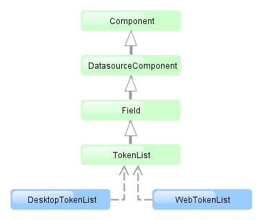
4.5.2.1.29. TokenList
TokenList component offers a simplified way of working with lists: instance names are listed vertically or horizontally, adding is done using drop-down list, removal – using the buttons located near each instance.

XML-name of the component: tokenList

The component is implemented for both Web Client and Desktop Client.
Below is an example description of TokenList in an XML-descriptor of a screen:
<dsContext>
    <datasource id="orderDs"
                class="com.sample.sales.entity.Order"
                view="order-edit">
        <collectionDatasource id="productsDs" property="products"/>
    </datasource>
    <collectionDatasource id="allProductsDs"
                          class="com.sample.sales.entity.Product"
                          view="_minimal">
        <query>select p from sales$Product p order by p.name</query>
    </collectionDatasource>
</dsContext>
<layout>
    <tokenList id="productsList" datasource="productsDs" inline="true" width="500px">
        <lookup optionsDatasource="allProductsDs"/>
    </tokenList>
In the example above, the nested productsDs datasource which includes a collection of products within an order is defined, as well as allProductsDs datasource containing a collection of all products available in the database. The TokenList component with productsList identifier displays the content of the productsDs datasource and enables changing the collection by adding instances from allProductsDs.
tokenList attributes:
-
position– sets the position for the drop-down list. The attribute can take two values:TOP,BOTTOM. Default isTOP.

-
inlineattribute defines how the list with selected items will be displayed: vertically or horizontally.truecorresponds to horizontal alignment,false– to vertical. An example of a component with horizontal alignment:

-
simple– when set totrue, the items selection component will be hidden with only the Add button left. Clicking the Add button opens the screen with the list of entity instances which type is defined by the datasource. Selection screen identifier is selected according to the rules for thePickerField.LookupActionstandard action.

tokenList elements:
-
lookup− values selection component descriptor.Attributes of the
lookupelement:-
lookupattribute makes it possible to select items using an entity lookup screen:
-
lookupScreenattribute sets the identifier of the screen used for items selection inlookup="true"mode. If this attribute is not set, screen identifier is selected according to the rules for thePickerField.LookupActionstandard action. -
openTypeattribute defines how the lookup screen will be opened, similar to what is described for thePickerField.LookupActionstandard action. Default value –THIS_TAB.
-
multiselect- if this attribute’s value is set totrue, thentruewill be passed to parameters map of the lookup screen for theMULTI_SELECTkey. This flag can be used to set the screen into multiple selection mode. This flag is defined in theWindowParamsenum so it is convenient to work with it in the following way:@Override public void init(Map<String, Object> params) { if (WindowParams.MULTI_SELECT.getBool(getContext())) { usersTable.setMultiSelect(true); } }The
multiselectattribute works only if thesimpleattribute is set totrue.
-
- Attributes of tokenList
-
align - caption - captionProperty - datasource - description - editable - enable - height - icon - id - inline - position - simple - stylename - visible - width
- Elements of tokenList
- Attributes of lookup
-
captionProperty - filterMode - lookup - lookupScreen - multiselect - openType - optionsDatasource
- Attributes of button