4.5.2.1.14. LookupField
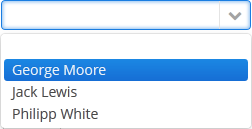
This is a component to select a value from drop-down list. Drop-down list provides the filtering of values as the user inputs some text, and the pagination of available values.

XML name of the component: lookupField.

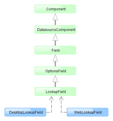
The LookupField component is implemented for Web Client and Desktop Client.
-
The simplest case of using
LookupFieldis to select an enumeration value for an entity attribute. For example, aRoleentity has atypeattribute of theRoleTypetype, which is an enumeration. Then you can useLookupFieldto edit this attribute as follows:<dsContext> <datasource id="roleDs" class="com.haulmont.cuba.security.entity.Role" view="_local"/> </dsContext> <layout> <lookupField datasource="roleDs" property="type"/>In the example above, the screen defines
roleDsdata source for theRoleentity. In thelookupFieldcomponent, a link to a data source is specified in the datasource attribute, and a name of an entity attribute is specified in the property attribute. In this case, the entity attribute is an enumeration and the drop-down list will display localized names of all enumeration values. -
Similarly,
LookupFieldcan be used to select an instance of a related entity. optionsDatasource attribute is used to create a list of options:<dsContext> <datasource id="carDs" class="com.company.sample.entity.Car" view="_local"/> <collectionDatasource id="coloursDs" class="com.company.sample.entity.Colour" view="_local"> <query>select c from sample$Colour c</query> </collectionDatasource> </dsContext> <layout> <lookupField datasource="carDs" property="colour" optionsDatasource="coloursDs"/>In this case, the component will display instance names of the
Colourentity located in thecolorsDsdata source, and the selected value will be set into thecolourattribute of theCarentity, which is located in thecarDsdata source.captionProperty attribute defines which entity attribute can be used instead of an instance name for string option names.
-
The list of component options can be specified arbitrarily using the
setOptionsList(),setOptionsMap()andsetOptionsEnum()methods, or using the XMLoptionsDatasourceattribute.-
setOptionsList()allows you to programmatically specify a list of component options. To do this, declare a component in the XML descriptor:<lookupField id="numberOfSeatsField" datasource="modelDs" property="numberOfSeats"/>Then inject the component into the controller and specify a list of options in the
init()method:@Inject protected LookupField numberOfSeatsField; @Override public void init(Map<String, Object> params) { List<Integer> list = new ArrayList<>(); list.add(2); list.add(4); list.add(5); list.add(7); numberOfSeatsField.setOptionsList(list); }In the component’s drop-down list the values 2, 4, 5 and 7 will be displayed. Selected number will be put into the
numberOfSeatsattribute of an entity located in themodelDsdata source. -
setOptionsMap()allows you to specify string names and option values separately. For example, in thenumberOfSeatsFieldcomponent in the XML descriptor, specify an option map ininit():@Inject protected LookupField numberOfSeatsField; @Override public void init(Map<String, Object> params) { Map<String, Object> map = new LinkedHashMap<>(); map.put("two", 2); map.put("four", 4); map.put("five", 5); map.put("seven", 7); numberOfSeatsField.setOptionsMap(map); }In the component’s drop-down list,
two,four,five,sevenstrings will be displayed. However, the value of the component will be a number that corresponds to the selected option. It will be put into thenumberOfSeatsattribute of an entity located in themodelDsdata source. -
setOptionsEnum()takes the class of an enumeration as a parameter. The drop-down list will show localized names of enum values, the value of the component will be an enum value.
-
-
Using the
filterModeattribute, option filtering type can be defined for the user input:-
NO− no filtering. -
STARTS_WITH− by the beginning of a phrase. -
CONTAINS− by any occurrence (is used by default).
-
-
If the
LookupFieldcomponent is not required and if the related entity attribute is not declared as required, the list of component options has an empty row. If this row is selected, the component returnsnull. The nullName attribute allows you to specify a row to be displayed in this case instead of an empty one. Below is an example:<lookupField datasource="carDs" property="colour" optionsDatasource="coloursDs" nullName="(none)"/>In this case, instead of an empty row,
(none)will be displayed. If this row is selected,nullwill be set to a related entity attribute.If you specify a list of options programmatically using
setOptionsList(), you can pass one of the options intosetNullOption()method. Then, if the user selects it, the component value will benull. -
The
LookupFieldcomponent is able to handle user input if there is no suitable option in the list. In this case,setNewOptionAllowed()andsetNewOptionHandler()are used. For example:@Inject protected LookupField colourField; @Inject protected CollectionDatasource<Colour, UUID> coloursDs; @Override public void init(Map<String, Object> params) { colourField.setNewOptionAllowed(true); colourField.setNewOptionHandler(new LookupField.NewOptionHandler() { @Override public void addNewOption(String caption) { Colour colour = new Colour(); colour.setName(caption); coloursDs.addItem(colour); colourField.setValue(colour); } }); }The
NewOptionHandlerhandler is invoked if the user enters a value that does not coincide with any option and presses Enter. In this case, a newColourentity instance is created in the handler, itsnameattribute is set to the value entered by the user, this instance is added to the options data source and selected in the component.Instead of implementing the
LookupField.NewOptionHandlerinterface for processing user input, the controller method name can be specified in thenewOptionHandlerXML-attribute. This method should have two parameters, one ofLookupFieldtype, and the other ofStringtype. They will be set to the component instance and the value entered by the user, accordingly. ThenewOptionAllowedattribute is used to enable adding new options instead of thesetNewOptionAllowed()method.
-
The
textInputAllowedXML attribute can be used to disable filtering options from keyboard. It can be convenient for short lists. The default value istrue.
-
The
pageLengthXML attribute allows you to redefine the number of options on one page of the drop-down list, specified in the cuba.gui.lookupFieldPageLength application property.
- Attributes of lookupField
-
align - caption - captionProperty - datasource - description - editable - enable - filterMode - height - icon - id - inputPrompt - newOptionAllowed - newOptionHandler - nullName - optionsDatasource - pageLength - property - required - requiredMessage - stylename - textInputAllowed - visible - width
- Elements of lookupField