4.5.2.1.1. Button
A button performs an action when a user clicks on it.
Component’s XML-name: button
Button component is implemented for both Web and Desktop clients.
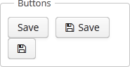
Buttons can contain a caption, an icon, or both. The figure below shows different button types.
An example of a button with a tooltip and a caption retrieved from a localized message pack:
<button id="textButton" caption="msg://someAction" description="Press me"/>The button’s caption is set using the caption attribute, the tooltip – using the description attribute.
The icon attribute defines icon location in theme catalog. Detailed information on recommended icon placement is available in Themes.
Example of creating a button with an icon:
<button id="iconButton" caption="" icon="icons/save.png"/>The button’s main function is to perform an action on a click. Controller method that should be invoked after a click can be defined using invoke attribute. The attribute value should contain name of the controller method satisfying the following conditions:
-
The method should be
public. -
The method should return
void. -
The method should not have any arguments, or should have a single argument of
Componenttype. If the method has aComponentargument, then an instance of the invoking button will be passed in it.
Below is the example of a button invoking someMethod:
<button invoke="someMethod" caption="msg://someButton"/>A method named someMethod should be defined in the screen controller:
public void someMethod() {
    //some actions
}
The invoke attribute is ignored if action attribute is set. The action attribute contains the name of action corresponding to the button.
Example of a button with an action:
<actions>
    <action id="someAction" caption="msg://someAction"/>
</actions>
<layout>
    <button action="someAction"/>
Any action present in the component implementing Component.ActionsHolder interface can be assigned to a button. This applies to Table, GroupTable, TreeTable, Tree. The way of adding actions (declaratively in the XML descriptor or programmatically in the controller) is irrelevant. In any case, for using an action, the name of the component and the identifier of the required action must be specified in the action attribute, separated by dot. For instance, in the next example the create action of the coloursTable table is assigned to a button:
<button action="coloursTable.create"/>Button actions can also be created programmatically in the screen controller by deriving them from BaseAction class.
If an Action instance is defined for a Button, the button will take the following properties from it: caption, description, icon, enable, visible. caption and description properties will be imported from Action only if they are not set in the Button itself. All other listed Action properties have priority over the Button properties. If Action properties are changed after the Action is set for a Button, then Button properties also change accordingly, i.e. the button listens to the changes in Action properties. In this case, the caption`and `description properties will change even if they was initially assigned to the button itself.