5.5.2.1.6. ColorPicker
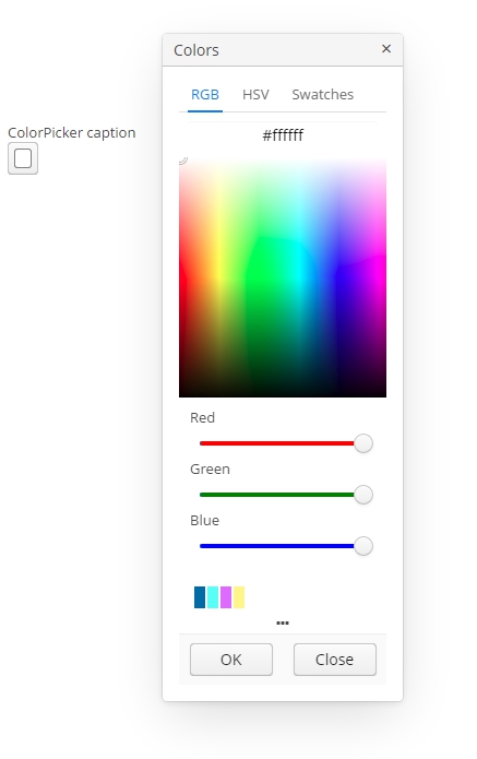
ColorPicker is a field that allows a user to preview and select a color. Component returns a hexadecimal (HEX) value of the color as a string.

An example of a color picker with a caption retrieved from the localized messages pack:
<colorPicker id="colorPicker" caption="msg://colorPickerCaption"/>The figure below shows an example of the color picker with the popup closed.

To create a color picker connected to data, use datasource and property attributes.
<dsContext>
    <datasource id="carsDs" class="com.sample.sales.entity.Cars" view="_local"/>
</dsContext>
<layout>
    <colorPicker id="colorPicker" datasource="carsDs" property="color"/>
Attributes of сolorPicker:
-
defaultCaptionEnabled- if set totrueandbuttonCaptionis not set, displays HEX value as a button caption.
-
historyVisible- determines the visibility of history of recently picked colors in the popup window.
You can determine visibility of the popup tabs using the following attributes:
-
rgbVisible- determines the visibility of the RGB tab. -
hsvVisible- determines the visibility of the HSV tab. -
swatchesVisible- determines the visibility of the swatches tab.
By default, only the RGB tab is visible.
Also, if you want to redefine the labels in popup, you can use caption attributes:
-
popupCaption- caption of the popup window. -
confirmButtonCaption- caption of the confirm button. -
cancelButtonCaption- caption of the cancel button. -
swatchesTabCaption- swatches tab caption. -
lookupAllCaption- caption of lookup item for all colors. -
lookupRedCaption- caption of lookup item for red color. -
lookupGreenCaption- caption of lookup item for green color. -
lookupBlueCaption- caption of lookup item for blue color.
getValue() method of the component returns a string, containing a HEX code of the selected color.
- Attributes of colorPicker
-
align - buttonCaption - cancelButtonCaption - caption - confirmButtonCaption - datasource - defaultCaptionEnabled - editable - height - historyVisible - hsvVisible - icon - id - lookupAllCaption - lookupBlueCaption - lookupGreenCaption - lookupRedCaption - popupCaption - rgbVisible - required - stylename - swatchesTabCaption - swatchesVisible - tabIndex - visible - width
- API