4.5.2.1.35. TextField
TextField is a component for text editing. It can be used both for working with entity attributes and entering/displaying arbitrary textual information.
XML-name of the component: textField
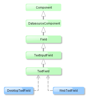
TextField is implemented for both Web Client and Desktop Client.
-
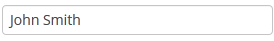
An example of a text field with a caption retrieved from the localized messages pack:
<textField id="nameField" caption="msg://name"/>The figure below shows an example of a simple text field.
-
In Web Client with a Halo-based theme, you can set predefined styles to the TextField component using the
stylenameattribute either in the XML descriptor or in the screen controller:<textField id="textField" stylename="borderless"/>When setting a style programmatically, select one of the
HaloThemeclass constants with theTEXTFIELD_prefix:textField.setStyleName(HaloTheme.TEXTFIELD_INLINE_ICON);Textfield styles:
-
align-center- align the text inside the field to center.
-
align-right- align the text inside the field to the right.
-
borderless- removes the border and background from the text field.
-
inline-icon- moves the default caption icon inside the text field.
-
-
To create a text field connected to data, use datasource and property attributes.
<dsContext>
    <datasource id="customerDs" class="com.sample.sales.entity.Customer" view="_local"/>
</dsContext>
<layout>
    <textField datasource="customerDs" property="name" caption="msg://name"/>
As you can see in the example, the screen describes the
customerDsdatasource forCustomerentity, which hasnameattribute. The text field component has a link to the data source specified in the datasource attribute; property attribute contains the name of the entity attribute that is displayed in the text field.
-
If the field is not connected to an entity attribute (i.e. the data source and attribute name are not set), you can set the data type using the
datatypeattribute. It is used to format field values. The attribute value accepts any data type registered in the application metadata – see Datatype. Typically,TextFielduses the following data types:-
decimal -
double -
int -
longAs an example, let’s look at a text field with an
Integerdata type.<textField id="integerField" datatype="int" caption="msg://integerFieldName"/>If a user enters a value that cannot be interpreted as an integer number, then when the field looses focus, the application will show an error message and revert field value to the previous one.
-
-
Text field can be assigned a validator – a class implementing
Field.Validatorinterface. The validator limits user input in addition to what is already done by thedatatype. For example, to create an input field for positive integer numbers, you need to create a validator class:public class PositiveIntegerValidator implements Field.Validator { @Override public void validate(Object value) throws ValidationException { Integer i = (Integer) value; if (i <= 0) throw new ValidationException("Value must be positive"); } }and assign it as a validator to the text field with
intdatatype:<textField id="integerField" datatype="int"> <validator class="com.sample.sales.gui.PositiveIntegerValidator"/> </textField>Unlike input check against the data type, validation is performed not when the field looses focus, but after invocation of the field’s
validate()method. It means that the field (and the linked entity attribute) may temporarily contain a value that does not satisfy validation conditions (a non-positive number in the example above). This should not be an issue, because validated fields are typically used in editor screens, which automatically invoke validation for all their fields before commit. If the field is located not in an editing screen, the field’svalidate()method should be invoked explicitly in the controller. -
TextFieldsupportsTextChangeListenerdefined in its parentTextInputFieldinterface. Text change events are processed asynchronously after typing in order not to block the typing.textField.addTextChangeListener(event -> { int length = event.getText().length(); textFieldLabel.setValue(length + " of " + textField.getMaxLength()); }); textField.setTextChangeEventMode(TextInputField.TextChangeEventMode.LAZY);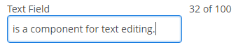
-
The
TextChangeEventModedefines the way the changes are transmitted to the server to cause a server-side event. There are 3 predefined event modes:-
LAZY(default) - an event is triggered when there is a pause in editing the text. The length of the pause can be modified withsetInputEventTimeout(). A text change event is forced before a possibleValueChangeEvent, even if the user did not keep a pause while entering the text. -
TIMEOUT- an event is triggered after a timeout period. If more changes are made during this period, the event sent to the server-side includes the changes made up to the last change. The length of the timeout can be set withsetInputEventTimeout().If a
ValueChangeEventwould occur before the timeout period, aTextChangeEventis triggered before it, on the condition that the text content has changed since the previousTextChangeEvent. -
EAGER- an event is triggered immediately for every change in the text content, typically caused by a key press. The requests are separate and are processed sequentially one after another. Change events are nevertheless communicated asynchronously to the server, so further input can be typed while event requests are being processed.
-
-
EnterPressListenerallows you to define an action executed when Enter is pressed:textField.addEnterPressListener(e -> showNotification("Enter pressed")); -
If a text field is linked to an entity attribute (via
datasourceandproperty), and if the entity attribute has alengthparameter defined in the@ColumnJPA-annotation, then theTextFieldwill limit the maximum length of entered text accordingly.If a text field is not linked to an attribute, or if the attribute does not have
lengthvalue defined, or this value needs to be overridden, then the maximum length of the entered text can be limited usingmaxLengthattribute. The value of "-1" means there are no limitations. For example:<textField id="shortTextField" maxLength="10"/>
-
By default, text field trims spaces at the beginning and at the end of the entered string. I.e. if user enters " aaa bbb ", the value of the field returned by the
getValue()method and saved to the linked entity attribute will be "aaa bbb". You can disable trimming of spaces by setting thetrimattribute tofalse.It should be noted that trimming only works when users enter a new value. If the value of the linked attribute already has spaces in it, the spaces will be displayed until user edits the value.
-
Text field always returns
nullinstead of an entered empty string. Therefore, with thetrimattribute enabled, any string containing spaces only will be converted tonull. -
The
setCursorPosition()method can be used to focus the field and set the cursor position to the specified 0-based index.
- Attributes of textField
-
align - caption - datasource - datatype - description - editable - enable - height - icon - id - inputPrompt - maxLength - property - required - requiredMessage - stylename - trim - visible - width
- Elements of textField
- Predefined styles of textField