4.5.2.1.19. LookupPickerField
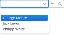
The LookupPickerField component enables to display an entity instance in a text field, select an instance in a drop-down list and perform actions by pressing buttons on the right.

XML name of the component: lookupPickerField.

The component is implemented for Web Client and Desktop Client.
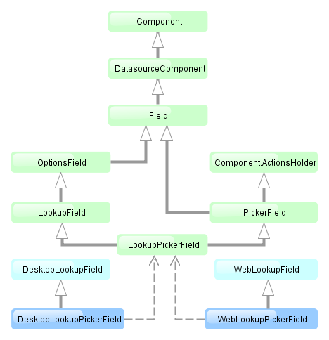
In fact, LookupPickerField is a hybrid of LookupField and PickerField. Thus it has the same features except the default list of actions added when determining the component in XML: for LookupPickerField these are lookup  and
and open  actions.
Below is an example of using LookupPickerField to select a value of the colour reference attribute of the Car entity:
<dsContext>
    <datasource id="carDs" class="com.company.sample.entity.Car" view="_local"/>
    <collectionDatasource id="coloursDs" class="com.company.sample.entity.Colour" view="_local">
        <query>select c from sample$Colour c</query>
    </collectionDatasource>
</dsContext>
<layout>
<lookupPickerField datasource="carDs" property="colour" optionsDatasource="coloursDs"/>- Attributes of lookupPickerField
-
align - caption - captionProperty - datasource - description - editable - enable - filterMode - height - icon - id - inputPrompt - metaClass - newOptionAllowed - newOptionHandler - nullName - optionsDatasource - pageLength - property - required - requiredMessage - stylename - visible - width
- Elements of lookupPickerField