4.5.2.1.7. DateField
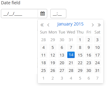
DateField is a field to display and enter date and time. It is an input field, inside which there is a button with a drop-down calendar. To the right, there is a time field.

XML name of the component: dateField.

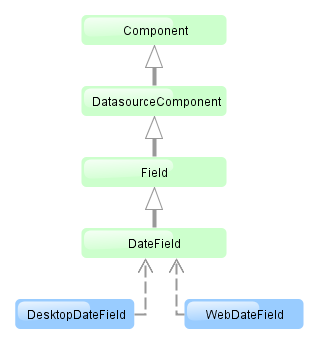
The DateField component is implemented for Web Client and Desktop Client.
-
To create a date field associated with data, you should use the datasource and property attributes:
<dsContext>
    <datasource id="orderDs" class="com.sample.sales.entity.Order" view="_local"/>
</dsContext>
<layout>
    <dateField datasource="orderDs" property="date"/>
In the example above, the screen has the
orderDsdata source for theOrderentity, which has thedateproperty. The reference to the data source is specified in the datasource attribute of thedateFieldcomponent; the name of the entity attribute which value should be displayed in the field is specified in the property attribute. -
If the field is associated with an entity attribute, it will automatically take the appropriate form:
-
If the attribute has the
java.sql.Datetype or the@Temporal(TemporalType.DATE)annotation is specified, the time field will not be displayed. The date format is defined by thedatedatatype and is specified in the main localized message pack in thedateFormatkey. -
Otherwise, the time field with hours and minutes will be displayed. The time format is defined by the
timedatatype and is specified in the main localized message pack in thetimeFormatkey.
-
-
You can change the date and time format using the
dateFormatattribute. An attribute value can be either a format string itself or a key in a message pack (if the value starts withmsg://).The format is defined by rules of the
SimpleDateFormatclass (http://docs.oracle.com/javase/8/docs/api/java/text/SimpleDateFormat.html). If there are noHorhcharacters in the format, the time field will not be displayed.<dateField dateFormat="MM/yy" caption="msg://monthOnlyDateField"/> Warning
DateFieldis primarily intended for quick input by filling placeholders from keyboard. Therefore the component supports only formats with digits and separators. Complex formats with textual representation of weekdays or months will not work.
-
You can specify available dates by using
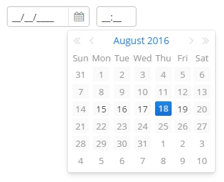
rangeStartandrangeEndattributes. If a range is set, all dates outside the range will be disabled. You can set range dates in the "yyyy-MM-dd" format in XML or programmatically by using corresponding setters.<dateField id="dateField" rangeStart="2016-08-15" rangeEnd="2016-08-19"/>
-
Date and time accuracy can be defined using a
resolutionattribute. An attribute value should match theDateField.Resolutionenumeration −SEC,MIN,HOUR,DAY,MONTH,YEAR. Default isMIN, i.e., to within a minute.If
resolution="DAY"anddateFormatis not specified, the format will be taken from one specified in the main message pack with thedateFormatkey.If
resolution="MIN"anddateFormatis not specified, the format will be taken from one specified in the main message pack with thedateTimeFormatkey. Below is a field definition for entering a date up to within a month.<dateField resolution="MONTH" caption="msg://monthOnlyDateField"/>

-
DateFieldcan perform timestamp value conversions between server and user time zones if the user’s time zone is set bysetTimeZone()method. The time zone is assigned automatically from the current user session when the component is bound to an entity attribute of the timestamp type. If the component is not bound to such attribute, you can callsetTimeZone()in the screen controller to make theDateFieldperform required conversions..
-
In Web Client with a Halo-based theme, you can set predefined
borderlessstyle name to the DateField component to remove borders and background from the field. This can be done either in the XML descriptor or in the screen controller:<dateField id="dateField" stylename="borderless"/>When setting a style programmatically, select the
HaloThemeclass constant with theDATEFIELD_prefix:dateField.setStyleName(HaloTheme.DATEFIELD_BORDERLESS);
- Attributes of dateField
-
align - caption - datasource - dateFormat - description - editable - enable - height - icon - id - property - stylename - required - rangeEnd - rangeStart - requiredMessage - resolution - visible - width
- Elements of dateField
- Predefined styles of dateField