3.6.3.1. Dialogs
|
This is a legacy API. For new data API available since release 7.0, see Dialogs section. |
- General-purpose dialogs
-
General-purpose dialogs are invoked by
showMessageDialog()andshowOptionDialog()methods of theFrameinterface. This interface is implemented by screen controller, so these methods can be invoked directly in the controller code.-
showMessageDialog()is intended to display a message. The method has the following parameters:-
title– dialog title. -
message- message. For HTML type (see below), you can use HTML tags for formatting the message. When using HTML, make sure you escape data loaded from the database to avoid code injection in web client. You can use\ncharacters for line breaks in non-HTML messages. -
messageType– message type. Possible types:-
CONFIRMATION,CONFIRMATION_HTML– confirmation dialog. -
WARNING,WARNING_HTML– warning dialog.The difference in message types is reflected in desktop user interface only.
Message type can be set with parameters:
-
width- the dialog width, -
modal- if the dialog is modal, -
maximized- if the dialog should be maximized across the screen, -
closeOnClickOutside- if the dialog can be closed by clicking on area outside the dialog.An example of showing a dialog:
showMessageDialog("Warning", "Something is wrong", MessageType.WARNING.modal(true).closeOnClickOutside(true));
-
-
-
-
showOptionDialog()is intended to display a message and buttons for user actions. In addition to parameters described forshowMessageDialog(), the method takes an array or a list of actions. A button is created for each dialog action. After a button is clicked, the dialog closes invokingactionPerform()method of the corresponding action.It is convenient to use anonymous classes derived from
DialogActionfor buttons with standard names and icons. Five types of actions defined by theDialogAction.Typeenum are supported:OK,CANCEL,YES,NO,CLOSE. Names of corresponding buttons are extracted from the main message pack.Below is an example of a dialog invocation with
YesandNobuttons and with a caption and messages taken from the message pack of the current screen:showOptionDialog( getMessage("confirmCopy.title"), getMessage("confirmCopy.msg"), MessageType.CONFIRMATION, new Action[] { new DialogAction(DialogAction.Type.YES, Status.PRIMARY).withHandler(e -> copySettings()), new DialogAction(DialogAction.Type.NO, Status.NORMAL) } );The
Statusparameter ofDialogActionis used to assign a special visual style for a button representing the action.Status.PRIMARYhighlights the corresponding button and makes it selected. TheStatusparameter can be omitted, in this case default highlighting is applied. If multiple actions withStatus.PRIMARYare passed to theshowOptionDialog, only the first action’s button will get thecuba-primary-actionstyle and focus.
-
- File upload dialog
-
The
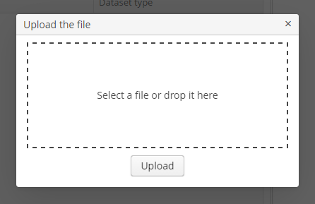
FileUploadDialogwindow provides the base functionality for loading files into the temporary storage. It contains the drop zone for drag-and-dropping files from outside of the browser and the upload button.
The dialog is opened with the
openWindow()method, in case of successful upload it is closed withCOMMIT_ACTION_ID. You can track the close action of the dialog withCloseListenerorCloseWithCommitListenerand use thegetFileId()andgetFileName()methods to get the UUID and the name of uploaded file. Then you can create aFileDescriptorfor referencing the file from the data model objects or implement any other logic.FileUploadDialog dialog = (FileUploadDialog) openWindow("fileUploadDialog", OpenType.DIALOG); dialog.addCloseWithCommitListener(() -> { UUID fileId = dialog.getFileId(); String fileName = dialog.getFileName(); FileDescriptor fileDescriptor = fileUploadingAPI.getFileDescriptor(fileId, fileName); // your logic here });
The appearance of the Dialogs can be customized using SCSS variables with $cuba-window-modal-* prefix. You can change these variables in the visual editor after creating a theme extension or a custom theme.