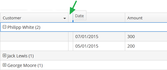
5.5.2.1.17. GroupTable
GroupTable component is a table with an ability to group information dynamically by any field. In order to group a table by a column the required column should be dragged to the left and dropped on the ![]() element of the table header. Grouped values can be expanded and collapsed using
element of the table header. Grouped values can be expanded and collapsed using  /
/ buttons.

XML name of the component: groupTable.
Component is implemented only for Web Client. In Desktop Client it behaves like a regular table.
groupDatasource must be specified for GroupTable in the datasource attribute of the rows element. Otherwise, grouping will not work. Example:
<dsContext>
    <groupDatasource id="ordersDs" class="com.sample.sales.entity.Order"
                     view="order-with-customer">
        <query>
            select o from sales$Order o order by o.date
        </query>
    </groupDatasource>
</dsContext>
<layout>
    <groupTable id="ordersTable" width="100%">
        <columns>
            <group>
                <column id="date"/>
            </group>
            <column id="customer.name"/>
            <column id="amount"/>
        </columns>
        <rows datasource="ordersDs"/>
    </groupTable>
group is an optional element that can be present in a single instance inside columns. It contains a set of column elements, by which grouping will be performed initially when opening a screen.
Each column element can contain the groupAllowed attribute with boolean value. This attribute controls whether a user can group by this column.
If aggregatable attribute is true, the table shows aggregation results for each group and results for all rows in an additional row on the top. If showTotalAggregation attribute is false, results for all rows are not shown.
If multiselect attribute is true, the click to the group row holding down the Ctrl key will expand the group (if collapsed) and set the selection to all rows of this group. The converse is not true: if the whole group is selected, Ctrl+click will not deselect all the group. You still can deselect certain rows using the common Ctrl key behaviour.
The rest of the GroupTable functionality is similar to a simple Table.
- Attributes of groupTable
-
align - aggregatable - aggregationStyle - columnControlVisible - contextMenuEnabled - editable - enable - height - id - multiLineCells - multiselect - presentations - reorderingAllowed - settingsEnabled - showTotalAggregation - sortable - stylename - tabIndex - textSelectionEnabled - visible - width
- Elements of groupTable
-
actions - buttonsPanel - columns - rows - rowsCount
- Elements of columns
- Attributes of column
-
align - caption - captionProperty - collapsed - dateFormat - editable - groupAllowed - id - link - linkInvoke - linkScreen - linkScreenOpenType - maxTextLength - optionsDatasource - resolution - sortable - visible - width
- Elements of column
- Attributes of rows
- API