5.5.2.1.9. DataGrid
DataGrid, similarly to the Table component, is designed to display and sort tabular data, and provides means to manipulate rows and columns with greater performance due to lazy loading of data while scrolling.
XML name of the component: dataGrid.
The component is implemented for Web Client.
An example of component definition in an XML-descriptor of a screen:
<dsContext>
    <collectionDatasource id="ordersDs"
                          class="com.sample.sales.entity.Order"
                          view="order-with-customer">
        <query>
            select o from sales$Order o order by o.date
        </query>
    </collectionDatasource>
</dsContext>
<dataGrid id="ordersDataGrid"
          datasource="ordersDs"
          height="100%"
          width="100%">
    <columns>
        <column id="date" property="date"/>
        <column id="customerName" property="customer.name"/>
        <column id="amount" property="amount"/>
    </columns>
</dataGrid>
In the example above the id attribute is a column identifier, and the property is the name of the entity attribute from the data source that populates the column with data.
dataGrid elements:
-
columns- mandatory element that defines theDataGridcolumns set. Each column is described in the nestedcolumnelement with the following attributes:-
id- an optional attribute with the column identifier. If not set, the string with thepropertyvalue will be used as the column identifier. In this case setting thepropertyvalue is mandatory, otherwise theGuiDevelopmentExceptionexception will be thrown. Theidattribute is still mandatory for the columns created in the screen controller.
-
property- contains the entity attribute’s name. Can be either an attribute of the entity from the data source or a linked entity – object graph traversal is indicated with a dot. For example:<columns> <column id="date" property="date"/> <column id="customer" property="customer"/> <column id="customerName" property="customer.name"/> <column id="customerCountry" property="customer.address.country"/> </columns> -
caption- an optional attribute containing the column caption. If not specified, a localized attribute name will be displayed.
-
expandRatio- sets the column width ratio. By default, all columns have equal width (i.e.expandRatio = 1). If another value is set for at least one column, all implicit values are ignored, and only set values are considered.
-
collapsible- defines whether a user can hide or show columns using the sidebar menu in the top right ofDataGrid. The default value istrue
-
collapsed- an optional attribute; hides the column by default when set totrue. The default value isfalse.
-
collapsingToggleCaption- sets the column’s caption in the sidebar menu. By default its value isnull, in this case the caption remains the same as the column’s caption.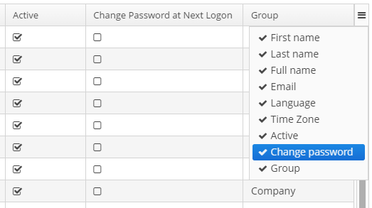
-
resizable- defines whether a user can change the column’s size.
-
sortable- an optional attribute to disable sorting of the column. Takes effect if the wholeDataGridhassortableattribute set totrue(which is by default). -
width- an optional attribute controlling default column width. May contain only numeric values in pixels.
-
minimumWidth- sets the minimal column width in pixels.
-
maximumWidth- sets the maximal column width in pixels.
The
columnelement may contain a nested formatter element that allows you to represent the attribute value in a format different from the standard for this DataType:<column id="date"> <formatter class="com.haulmont.cuba.gui.components.formatters.DateFormatter" format="yyyy-MM-dd HH:mm:ss"/> </column> -
-
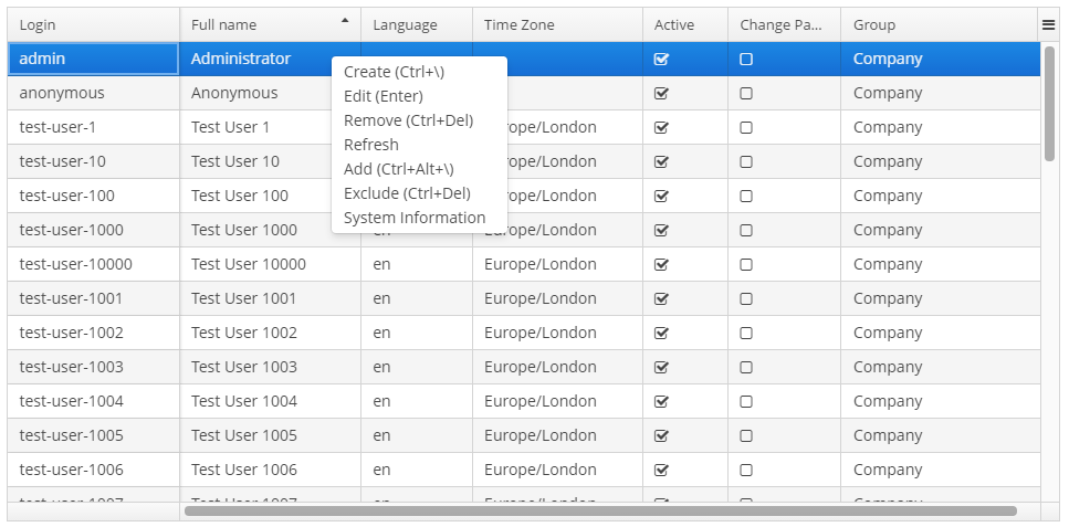
actions- optional element to define actions forDataGrid. Besides custom actions, the standard actions from theListActionTypeenumeration are also supported: create, edit, remove, refresh, add, exclude.
-
rowsCount- optional element that creates aRowsCountcomponent for theDataGrid.RowsCountenables pagination of data, the page size is set by limitation of records in the data source with the help ofCollectionDatasource.setMaxResults()method from the screen controller. Another way to do this is to use a universalFiltercomponent bound with the same data source as theDataGrid.
The RowsCount component can also display the total number of records returned by current data request without loading these records. When a user clicks the "?" button, it calls the AbstractCollectionDatasource.getCount() method that passes to the database a request with the same parameters as current but with COUNT(*) aggregation function instead of getting results. The returned number is displayed in place of "?" symbol.
dataGrid attributes:
-
columnResizeMode- sets the mode of columns resizing by user. Two modes are supported:-
AMINATED- the columns size follows the mouse when dragging (default mode). -
SIMPLE- the columns size is changed after the dragging is finished.
The column size changes can be tracked with
ColumnResizeListener. -
-
columnsCollapsingAllowed- defines whether a user can hide columns in the sidebar menu. Displayed columns are checked in the menu. When a column name is checked/unchecked, the value ofcollapsedattribute of each column is updated. When set tofalse, thecollapsedattribute of any column cannot be set totrue.The column collapsing changes can be tracked with
ColumnCollapsingChangeListener.
-
contextMenuEnabled- enables turning on and off the context menu. Default value istrue.The right mouse clicks on the
DataGridcan be tracked withContextClickListener.
-
editorBuffered- sets the buffered editor mode. The default mode is buffered (true).
-
editorCancelCaption- sets the caption on the cancel button in theDataGrideditor.
-
editorEnabled- enables the item inline editor UI. Default value isfalse. IfdataGridis bound to ValueCollectionDatasource, it is supposed to be read-only, andeditorEnabledattribute becomes nonsense.
-
editorSaveCaption- sets the caption on the save button in theDataGridinline editor.
-
frozenColumnCount- sets the number of fixedDataGridcolumns. The0value means that no columns will be fixed except the predefined column with checkboxes for multiple choice if the multiselect mode is used. The-1value makes even multiselect column not fixed.
-
headerVisible- defines if theDataGridheader is visible. The default value istrue.
-
reorderingAllowed- defines whether a user can change the columns order by dragging them with a mouse. The default value istrue.The column order changes can be tracked with
ColumnReorderListener.
-
selectionMode- sets the rows selection mode. There are 4 predefined selection modes:-
SINGLE- single record selection. -
MULTI- multiple selection as in any table. -
MULTI_CHECK- multiple selection using the embedded column with checkboxes. -
NONE- selection is disabled.Rows selection events can be tracked by
SelectionListener.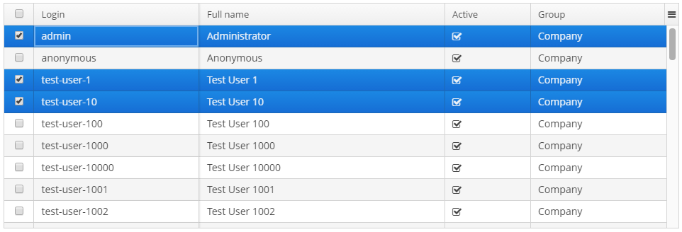
-
-
sortable- enables or disables theDataGridsorting. The default value istrue. When the sorting is enabled, the click on the column name will display the sorting icon to the right of che column caption. Sorting of any specific column can be disabled by this column’ssortableattribute.The
DataGridsorting events can be tracked bySortListener.
-
textSelectionEnabled- enables or disables text selection in theDataGrid cells. The default value isfalse.
Methods of the DataGrid interface:
-
getColumns()- returns the current set ofDataGridcolumns in their current display order. -
getSelected(),getSingleSelected()- return instances of the entities corresponding to the selected rows of the table. A collection can be obtained by invoking getSelected(). If nothing is selected, the application returns an empty set. IfSelectionMode.SINGLEis set, it is more convenient to use getSingleSelected() method returning one selected entity or null, if nothing is selected. -
getVisibleColumns()- returns the current set of visibleDataGridcolumns in their current display order.
-
scrollTo()- method allows you to scroll theDataGridto the specified row. It takes an entity instance identifying the row as a parameter. Besides the entity instance, an overridden method can take aScrollDestinationparameter with the following possible values:-
ANY- scroll as little as possible to show the required record. -
START- scroll to place the required record in the beginning of theDataGridvisible area. -
MIDDLE- scroll to place the required record in the centre of theDataGridvisible area. -
END- scroll to place the required record in the end of theDataGridvisible area.
-
-
scrollToStart()andscrollToEnd()- scroll theDataGridto the top and to the end respectively.
-
setCellStyleProvider()- enables setting theDataGridcell display style.
-
setRowStyleProvider()- enables setting theDataGridrow display style.
-
setEnterPressAction()- method allows you to define an action executed when Enter is pressed. If such action is not defined, the table will attempt to find an appropriate one in the list of its actions in the following order:-
The action defined by the
setItemClickAction()method. -
The action assigned to the Enter key by the
shortcutproperty. -
The
editaction. -
The
viewaction.
If such action is found, and has
enabled = trueproperty, the action is executed. -
-
setItemClickAction()- method allows you to define an action that will be performed when a table row is double-clicked. If such action is not defined, the table will attempt to find an appropriate one in the list of its actions in the following order:-
The action assigned to the Enter key by the
shortcutproperty. -
The
editaction. -
The
viewaction.
If such action is found, and has
enabled = trueproperty, the action is executed.Item click events can be tracked with
ItemClickListener. -
-
sort()- sorts the data for the specified column in the sort direction chosen from 2 values of theSortDirectionenum:-
ASCENDING- ascending (e.g. A-Z, 1..9) sort order. -
DESCENDING- descending (e.g. Z-A, 9..1) sort order.
-
Usage of description providers:
-
setCellDescriptionProvider()methods allows to set theCellDescriptionProviderinstance for generating optional descriptions (tooltips) for individual DataGrid cells. The description may contain HTML markup.customersDataGrid.setRowDescriptionProvider(Instance::getInstanceName);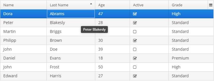
-
setRowDescriptionProvider()sets theRowDescriptionProviderinstance for generating optional descriptions (tooltips) for DataGrid rows. If aCellDescriptionProvideris also set, the row description generated by provider is used for cells for which the cell description provider returns null.customersDataGrid.setCellDescriptionProvider((entity,columnId)->{ if ("name".equals(columnId)||"lastName".equals(columnId)){ return null; } String description="<strong>"+ messages.getTools().getPropertyCaption(entity.getMetaClass(),columnId)+ ": </strong>"; if ("grade".equals(columnId)){ description += messages.getMessage(entity.getGrade()); } else if ("active".equals(columnId)){ description += getMessage(entity.getActive() ? "trueString":"falseString"); } else { description += entity.getValue(columnId); } return description; });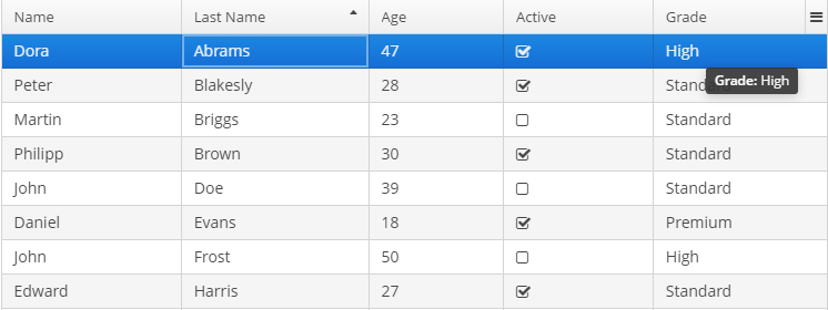
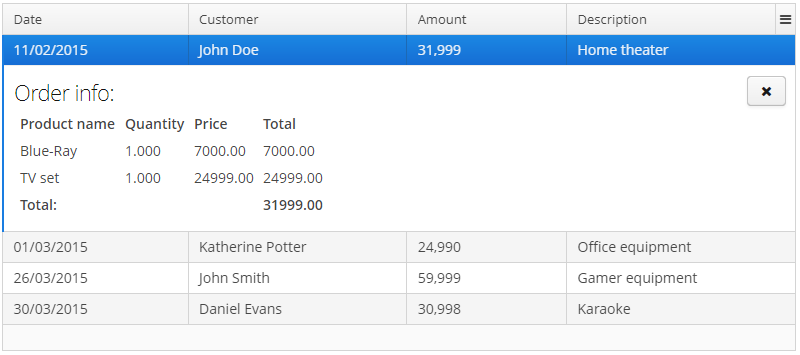
Usage of the DetailsGenerator interface:
The DetailsGenerator interface allows you to create a custom component to display the details of a particular row using the setDetailsGenerator() method:
ordersGrid.setDetailsGenerator(new DataGrid.DetailsGenerator<Order>() {
    @Nullable
    @Override
    public Component getDetails(Order entity) {
        VBoxLayout mainLayout = componentsFactory.createComponent(VBoxLayout.class);
        mainLayout.setWidth("100%");
        mainLayout.setMargin(true);

        HBoxLayout headerBox = componentsFactory.createComponent(HBoxLayout.class);
        headerBox.setWidth("100%");

        Label infoLabel = componentsFactory.createComponent(Label.class);
        infoLabel.setHtmlEnabled(true);
        infoLabel.setStyleName("h1");
        infoLabel.setValue("Order info:");

        Component closeButton = createCloseButton(entity);
        headerBox.add(infoLabel);
        headerBox.add(closeButton);
        headerBox.expand(infoLabel);

        Component contentLabel = getContentLabel(entity);

        mainLayout.add(headerBox);
        mainLayout.add(contentLabel);
        mainLayout.expand(contentLabel);

        return mainLayout;
    }
});
Result:
Usage of DataGrid inline editor:
The DataGrid component has an API for inline editing of records in the cells. When an item is being edited, the inline edit UI with default save and cancel buttons is displayed.
Methods of inline editor API:
-
getEditedItemId()- returns theidof the item that is currently being edited. -
isEditorActive()- returns whether an item is currently being edited in the editor.
-
editItem(Object itemId)(Deprecated) - opens the editor interface for the provided itemid. Scrolls the Grid to bring the item to view if it is not already visible.
-
edit(Entity entity)- opens the editor interface for the provided entity. Scrolls the Grid to bring the entity to view if it is not already visible.
You can add and remove listeners to the editor using the following methods:
-
addEditorOpenListener(),removeEditorCloseListener()-DataGrideditor open listener.This listener is triggered by a double click on the
DataGridarea that instantiates the inline editor and enables to get the fields of the edited row. This enables to update some fields depending on other fields' values without closing the editor.For example:
customersTable.addEditorOpenListener(event -> {
    Map<String, Field> fieldMap = event.getFields();
    Field active = fieldMap.get("active");
    Field grade = fieldMap.get("grade");

    ValueChangeListener listener = e ->
            active.setValue(true);
    grade.addValueChangeListener(listener);
});
-
addEditorCloseListener(),removeEditorCloseListener()-DataGrideditor close listener.
-
addEditorPreCommitListener(),removeEditorPreCommitListener()-DataGrideditor pre commit listener.
-
addEditorPostCommitListener(),removeEditorPostCommitListener()-DataGrideditor post commit listener.
The changes are committed to the datasource only. The logic to save these changes in the database should be added separately.
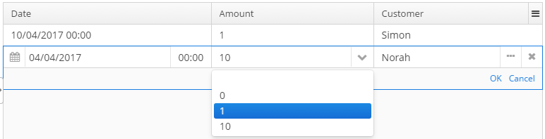
The editor field can be customized with the help of ColumnEditorFieldGenerator interface. Apply the setEditorFieldGenerator() to a column in order to set a custom component for editing this column:
ordersGrid.getColumnNN("amount").setEditorFieldGenerator((datasource, property) -> {
    LookupField lookupField = componentsFactory.createComponent(LookupField.class);
    lookupField.setDatasource(datasource, property);
    lookupField.setOptionsList(Arrays.asList(BigDecimal.ZERO, BigDecimal.ONE, BigDecimal.TEN));

    return lookupField;
});
The result:
Usage of the ColumnGenerator interface:
DataGrid enables adding generated columns with the help of the methods:
-
addGeneratedColumn(String columnId, ColumnGenerator generator) -
addGeneratedColumn(String columnId, ColumnGenerator generator, int index)
ColumnGenerator is a special interface that defines the generated, or calculated, column:
-
value of each column’s row,
-
the type of value - common for the whole column.
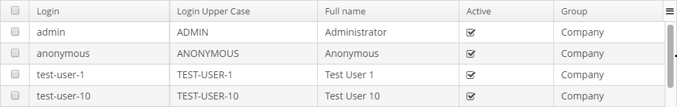
Below is an example of generating a column that displays users' login in the upper case:
@Override
public void init(Map<String, Object> params){
    DataGrid.Column column = usersGrid.addGeneratedColumn("loginUpperCase",new DataGrid.ColumnGenerator<User, String>(){
        @Override
        public String getValue(DataGrid.ColumnGeneratorEvent<User> event){
            return event.getItem().getLogin().toUpperCase();
        }

        @Override
        public Class<String> getType(){
            return String.class;
        }
    },1);
    column.setCaption("Login Upper Case");
}
The result:
ColumnGeneratorEvent, passed in the getValue method, contains information on the entity, displayed in the current DataGrid row, and the column propertyId.
By default, the generated column is added to the end of the table. There are two possible ways to manage the column’s position: either using an index in the code or adding a column in advance in the XML descriptor and pass its id to the addGeneratedColumn method.
Usage of renderers:
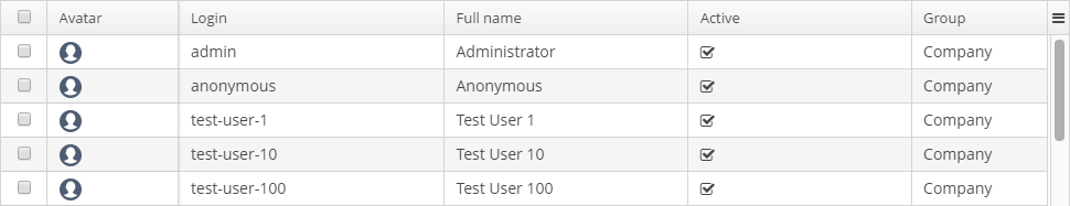
The way the data is displayed in columns can be customized by means of renderers. For example, to display icons as pictures in the cells, the path to an icon can be used together with the ImageRenderer class:
@Override
public void init(Map<String, Object> params){
    DataGrid.Column avatar = usersGrid.addGeneratedColumn("userAvatar", new DataGrid.ColumnGenerator<User, String>() {
        @Override
        public String getValue(DataGrid.ColumnGeneratorEvent<User> event) {
            return "icons/user.png";
        }

        @Override
        public Class<String> getType() {
            return String.class;
        }
    }, 0);
    avatar.setCaption("Avatar");
    avatar.setRenderer(usersGrid.createRenderer(DataGrid.ImageRenderer.class));
}
The result:
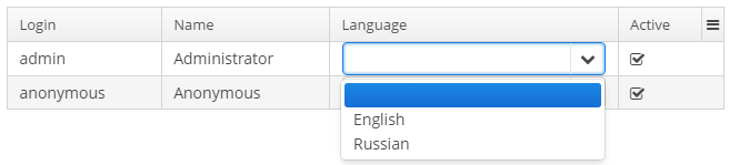
The WebComponentRenderer interface allows you to display components of different web components types in the DataGrid cells. This interface is implemented only in the Web Module. Below is an example of creating a column with the LookupField component:
import com.haulmont.cuba.core.global.Configuration;
import com.haulmont.cuba.core.global.GlobalConfig;
import com.haulmont.cuba.gui.components.AbstractWindow;
import com.haulmont.cuba.gui.components.Component;
import com.haulmont.cuba.gui.components.DataGrid;
import com.haulmont.cuba.gui.components.LookupField;
import com.haulmont.cuba.gui.xml.layout.ComponentsFactory;
import com.haulmont.cuba.security.entity.User;
import com.haulmont.cuba.web.gui.components.renderers.WebComponentRenderer;

import javax.inject.Inject;
import java.util.Locale;
import java.util.Map;
import java.util.TreeMap;

public class Users extends AbstractWindow {
    @Inject
    private ComponentsFactory componentsFactory;
    @Inject
    private Configuration configuration;
    @Inject
    private DataGrid<User> usersGrid;

    @Override
    public void init(Map<String, Object> params) {

        Map<String, Locale> locales = configuration.getConfig(GlobalConfig.class).getAvailableLocales();
        Map<String, Object> options = new TreeMap<>();
        for (Map.Entry<String, Locale> entry : locales.entrySet()) {
            options.put(entry.getKey(), messages.getTools().localeToString(entry.getValue()));
        }

        DataGrid.Column column = usersGrid.addGeneratedColumn("language",
                new DataGrid.ColumnGenerator<User, Component>() {
                    @Override
                    public Component getValue(DataGrid.ColumnGeneratorEvent<User> event) {
                        LookupField component = componentsFactory.createComponent(LookupField.class);
                        component.setOptionsMap(options);
                        component.setWidth("100%");

                        User user = event.getItem();
                        component.setValue(user.getLanguage());

                        component.addValueChangeListener(e -> user.setLanguage((String) e.getValue()));

                        return component;
                    }

                    @Override
                    public Class<Component> getType() {
                        return Component.class;
                    }
                });

        column.setRenderer(new WebComponentRenderer());
    }
}
The result:
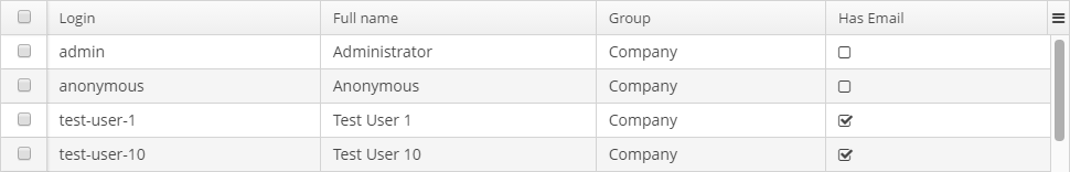
When the field type does not match the data type that can be processed by a renderer, one can use the converters to match data types of the model and the view. For example, to display a boolean value as an icon, it would be handy to use the HtmlRenderer to display HTML layout and a converter, which will convert a boolean value to the layout for icons' display.
@Override
public void init(Map<String, Object> params){
    DataGrid.Column hasEmail = usersGrid.addGeneratedColumn("hasEmail", new DataGrid.ColumnGenerator<User, Boolean>() {
        @Override
        public Boolean getValue(DataGrid.ColumnGeneratorEvent<User> event) {
            return StringUtils.isNotEmpty(event.getItem().getEmail());
        }

        @Override
        public Class<Boolean> getType() {
            return Boolean.class;
        }
    });
    hasEmail.setCaption("Has Email");
    hasEmail.setRenderer(usersGrid.createRenderer(DataGrid.HtmlRenderer.class));
    hasEmail.setConverter(new DataGrid.Converter<String, Boolean>() {
        @Override
        public Boolean convertToModel(String value, Class<? extends Boolean> targetType, Locale locale) {
            return null;
        }

        @Override
        public String convertToPresentation(Boolean value, Class<? extends String> targetType, Locale locale) {
            return BooleanUtils.isTrue(value)
                    ? FontAwesome.CHECK_SQUARE_O.getHtml()
                    : FontAwesome.SQUARE_O.getHtml();
        }

        @Override
        public Class<Boolean> getModelType() {
            return Boolean.class;
        }

        @Override
        public Class<String> getPresentationType() {
            return String.class;
        }
    });
}
The result:
The renderers can be created in two ways:
-
passing a renderer interface to the fabric method of the
DataGridinterface. Suits for GUI and Web modules. -
directly creating a renderer implementation for the corresponding module:
dataGrid.createRenderer(DataGrid.ImageRenderer.class) → new WebImageRenderer()For the moment this way is suitable only for the Web module.
The list of renderers supported by the Platform:
-
TextRenderer- displays plain text. -
HtmlRenderer- displays HTML layout. -
ProgressBarRenderer- displaysdoublevalues between 0 and 1 as aProgressBarcomponent. -
DateRenderer- displays dates in the defined format. -
NumberRenderer- displays numbers in the defined format. -
ButtonRenderer- displays string values as a button caption. -
ImageRenderer- uses the path to an image to display the image. -
CheckBoxRenderer- displays boolean values as a checkbox icon.
Header and Footer:
HeaderRow and FooterRow interfaces are used to represent header and footer cells respectively. They can be a merged cell for multiple columns.
The following methods of DataGrid allow to create and manage the DataGrid header and footer:
-
appendHeaderRow(),appendFooterRow()- adds a new row at the bottom of the header/footer section. -
prependHeaderRow(),prependFooterRow()- adds a new row at the top of the header/footer section. -
addHeaderRowAt(),addFooterRowAt()- inserts a new row at the given position to the header/footer section. Shifts the row currently at that position and any subsequent rows down incrementing their indices. -
removeHeaderRow(),removeFooterRow()- removes the given row from the header/footer section. -
getHeaderRowCount(),getFooterRowCount()- gets the row count for the header/footer section. -
setDefaultHeaderRow()- sets the default row of the header. The default row is a special header row providing a user interface for sorting columns.
HeaderCell and FooterCell interfaces provide means of customization of static DataGrid cells:
-
setStyleName()- sets a custom style name for this cell. -
getCellType()- returns the type of content stored in this cell. There are 3 types ofDataGridStaticCellTypeenumeration available:-
TEXT -
HTML -
COMPONENT
-
-
getComponent(),getHtml(),getText()- returns the content displayed in this cell depending on its type.
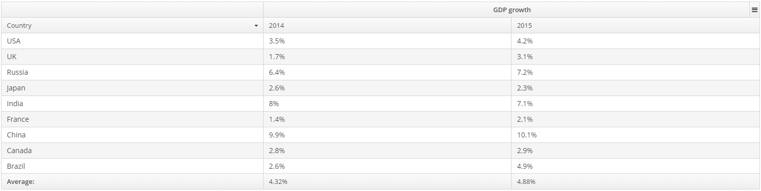
Below is an example of DataGrid the header that contains merged cells, and the footer displaying calculated values.
<dataGrid id="dataGrid"
          datasource="countryGrowthDs"
          width="100%">
    <columns>
        <column property="country"/>
        <column property="year2014"/>
        <column property="year2015"/>
    </columns>
</dataGrid>
public class DataGridHeaderFooterFrame extends AbstractFrame {
@Inject
private DataGrid<CountryGrowth> dataGrid;
@Inject
private CollectionDatasource<CountryGrowth, UUID> countryGrowthDs;
@Inject
private UserSessionSource userSessionSource;
private DecimalFormat percentFormat;
@Override
public void init(Map<String, Object> params) {
countryGrowthDs.refresh();
initPercentFormat();
initHeader();
initFooter();
initRenderers();
}
private DecimalFormat initPercentFormat() {
percentFormat = (DecimalFormat) NumberFormat.getPercentInstance(userSessionSource.getLocale());
percentFormat.setMultiplier(1);
percentFormat.setMaximumFractionDigits(2);
return percentFormat;
}
private void initRenderers() {
dataGrid.getColumnNN("year2014").setRenderer(new WebNumberRenderer(percentFormat));
dataGrid.getColumnNN("year2015").setRenderer(new WebNumberRenderer(percentFormat));
}
private void initHeader() {
HeaderRow headerRow = dataGrid.prependHeaderRow();
HeaderCell headerCell = headerRow.join("year2014", "year2015");
headerCell.setText("GDP growth");
headerCell.setStyleName("center-bold");
}
private void initFooter() {
FooterRow footerRow = dataGrid.appendFooterRow();
footerRow.getCell("country").setHtml("<strong>" + getMessage("average") + "</strong>");
footerRow.getCell("year2014").setText(percentFormat.format(getAverage("year2014")));
footerRow.getCell("year2015").setText(percentFormat.format(getAverage("year2015")));
}
private double getAverage(String propertyId) {
double average = 0.0;
Collection<CountryGrowth> items = countryGrowthDs.getItems();
for (CountryGrowth countryGrowth : items) {
Double value = countryGrowth.getValue(propertyId);
average += value != null ? value : 0.0;
}
return average / items.size();
}
}
- Attributes of dataGrid
-
align - caption - colspan - columnResizeMode - columnsCollapsingAllowed - contextMenuEnabled - datasource - description - editorBuffered - editorCancelCaption - editorEnabled - editorSaveCaption - enable - frozenColumnCount - headerVisible - height - icon - id - reorderingAllowed - responsive - rowspan - selectionMode - settingsEnabled - sortable - stylename - tabIndex - textSelectionEnabled - visible - width
- Elements of dataGrid
-
actions - buttonsPanel - columns - rowsCount
- Attributes of column
-
caption - collapsed - collapsible - collapsingToggleCaption - editable - expandRatio - id - maximumWidth - minimumWidth - property - resizable - sortable - width
- Elements of column
- API
-
addGeneratedColumn - applySettings - createRenderer - edit - saveSettings - getColumns - setCellDescriptionProvider - setCellStyleProvider - setConverter - setDetailsGenerator - setEnterPressAction - setItemClickAction - setRenderer - setRowDescriptionProvider - setRowStyleProvider - sort
- Listeners of dataGrid
-
ColumnCollapsingChangeListener - ColumnReorderListener - ColumnResizeListener - ContextClickListener - EditorCloseListener - EditorOpenListener - EditorPostCommitListener - EditorPreCommitListener - ItemClickListener - SelectionListener - SortListener