4.3.1.1. Positioning of Components
- Size types
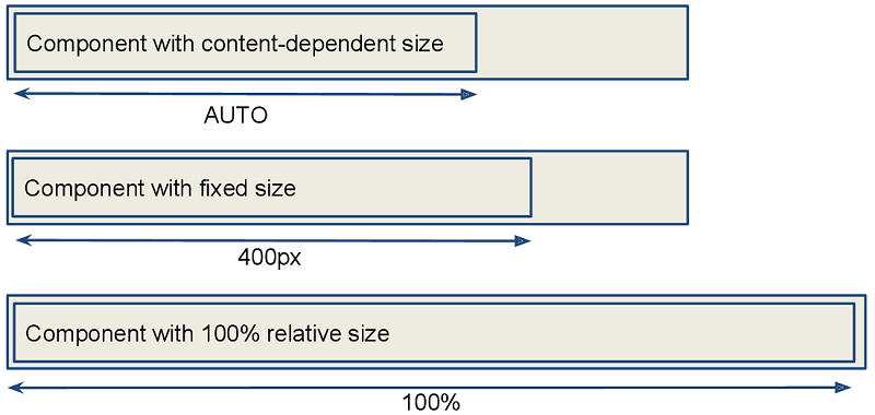
- Content-dependent size
-
The component will take enough space to fit its content.
Examples:
-
For Label, the size is defined by text length.
-
For containers, the size is defined by the sum of all component sizes inside a container.
XML<label width=”AUTO”/>Javalabel.setWidth(Component.AUTO_SIZE);Components with content-dependent size will adjust their dimensions during screen layout initialization or when the content size is changed.

-
- Fixed size
-
Fixed size implies that the component dimensions will not change at runtime.
XML<vbox width=”320px” height=”240px”/>Javavbox.setWidth(”320px”);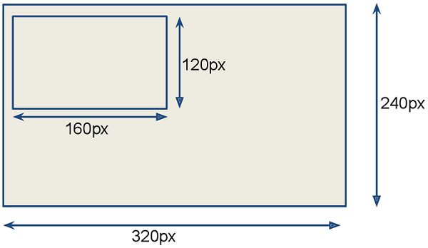
- Relative size
-
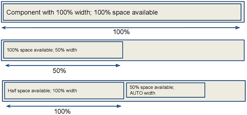
Relative size indicates the percentage of available space that will be occupied by the component.
XML<label width=”100%”/>Javalabel.setWidth(”50%”);Components with relative size will react to changes in the amount of the available space and adjust their actual size on the screen.
- Container specifics
-
By default, containers without the expand attribute provide equal space for all nested components. Exceptions: flowBox and htmlBox.
For example:
<layout>
    <button caption="Button"/>
    <button caption="Button"/>
</layout>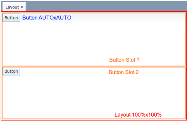
Components and containers width and height are content-dependent by default. Some containers have different default dimensions:
Container Width Height 100%
AUTO
100%
AUTO
100%
AUTO
The root layout element is a vertical container (
VBox), which has 100% width and height. The height can beAUTOin dialog mode.Tabs within a TabSheet are VBox containers.
GroupBoxcomponent contains aVBoxor anHBox, depending on the orientation property value.Example of a container with content-based size:
<layout>
    <vbox>
        <button caption="Button"/>
        <button caption="Button"/>
    </vbox>
</layout>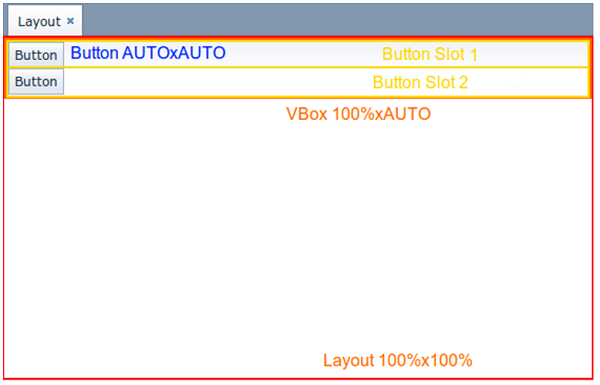
Example of a container with relative size:
<layout spacing="true">
    <groupBox caption="GroupBox"
              height="100%"/>
    <button caption="Button"/>
</layout>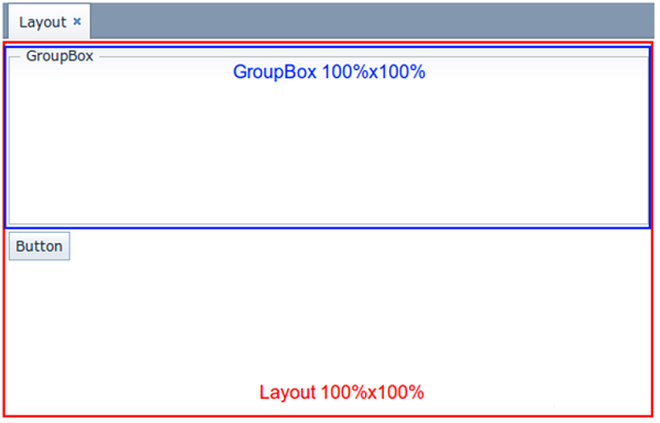
Here,
layout, as well asvboxorhbox, provides equal space to all nested components, andgroupBoxhas 100% height. In addition to that,groupBoxhas 100% width by default and takes all the available space.
- Component specifics
-
It is recommended to set the absolute or relative height for Table and Tree. Otherwise, a table/tree can take unlimited size, if there are too many rows or nodes.
ScrollBox must have fixed or relative (but not AUTO) width and height. Components inside
ScrollBox, positioned in the scrolling direction, may not have relative dimensions.The following examples show the correct use of horizontal and vertical
ScrollBoxcontainers. If scrolling is required in both directions, bothheightandwidthmust be set for the components (AUTO or absolute).
- The expand option
-
The container’s expand attribute allows specifying the component that will be given maximum available space.
The component specified in
expandwill have 100% size in the direction of the component expansion (vertically - forVBox, horizontally - forHBox). When container size is changed, the component will change its size accordingly.<vbox expand="bigBox"> <vbox id="bigBox"/> <label value="Label"/> </vbox>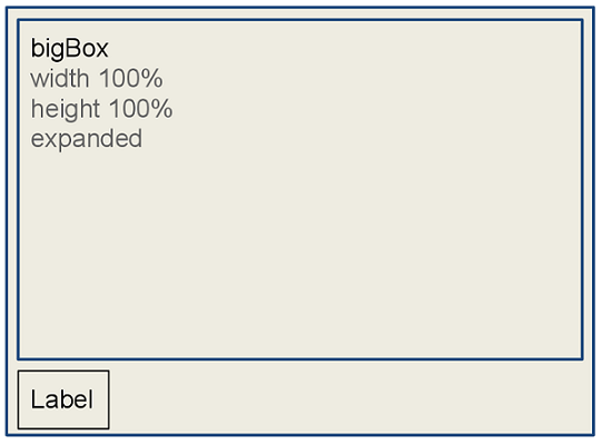
expandworks relatively to component expansion, for example:<layout spacing="true" expand="groupBox"> <groupBox id="groupBox" caption="GroupBox" width="200px"/> <button caption="Button"/> </layout>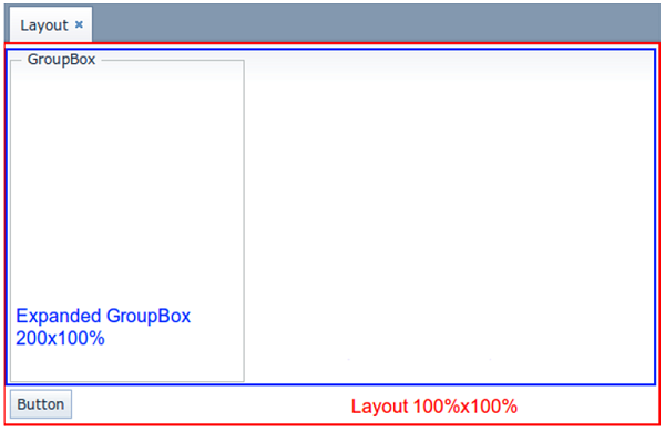
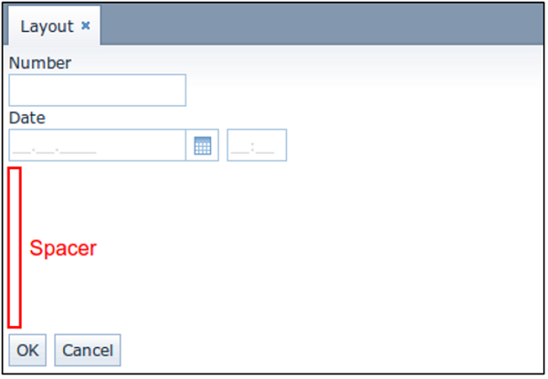
In the following example, the auxiliary Label element (spacer) is used. Due to applied
expand, it takes all the space left in the container.<layout expand="spacer"> <textField caption="Number"/> <dateField caption="Date"/> <label id="spacer"/> <hbox spacing="true"> <button caption="OK"/> <button caption="Cancel"/> </hbox> </layout>