4.3.1.4. Common Layout Mistakes
- Common mistake 1. Setting relative size for a component within a container with content-based size
-
Example of incorrect layout with relative size:

In this example, a
labelhas 100% height, while the default height forVBoxis AUTO, i.e. content-based.Example of incorrect layout with expand:

Expand implicitly sets relative 100% height for the label, which is not correct, just like in the example above. In such cases, the screen may not look as expected. Some components may disappear or have zero size. If you encounter any layout problems, check that relative sizes are specified correctly first of all.
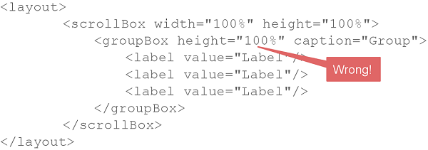
- Common mistake 2. Components inside a ScrollBox have 100% dimensions
-
Example of incorrect layout:

As a result of such mistake, scroll bars in
ScrollBoxwill not appear even if the size of nested components exceeds the scrolling area.
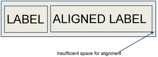
- Common mistake 3. Aligning components with insufficient space
-
Example of incorrect layout:

In this example,
HBoxhas content-dependent size, therefore the label alignment has no effect.