5.5.2.1.30. PopupButton
This is a button with a popup. Popup may contain a drop-down list of actions or a custom content.

XML name of the component: popupButton.
The component is implemented for Web Client and Desktop Client.
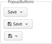
PopupButton can contain text, which is specified using the caption attribute, or icon (or both). A tooltip can be defined in the description attribute. The figure below shows different types of buttons:

popupButton elements:
-
actions- specifies the drop-down actions list.Only the following action properties are displayed:
caption,enable,visible. Thedescriptionandshortcutproperties are ignored. Handling of theiconproperty depends on the cuba.gui.showIconsForPopupMenuActions application property and theshowActionIconsattribute of the component. The latter has priority.Below is an example of a button with a drop-down list containing two actions:
<popupButton id="popupButton" caption="msg://popupButton" description="Press me">
    <actions>
        <action id="popupAction1" caption="msg://action1" invoke="someAction1"/>
        <action id="popupAction2" caption="msg://action2" invoke="someAction2"/>
    </actions>
</popupButton>
-
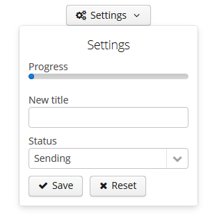
popup- sets custom inner content for the popup. Actions are ignored if a custom popup content is set.Below is an example of a custom popup layout:
<popupButton id="popupButton"
             caption="Settings"
             align="MIDDLE_CENTER"
             icon="font-icon:GEARS"
             closePopupOnOutsideClick="true"
             popupOpenDirection="BOTTOM_CENTER">
    <popup>
        <vbox width="250px"
              height="AUTO"
              spacing="true"
              margin="true">
            <label value="Settings"
                   align="MIDDLE_CENTER"
                   stylename="h2"/>
            <progressBar caption="Progress"
                         width="100%"/>
            <textField caption="New title"
                       width="100%"/>
            <lookupField caption="Status"
                         optionsEnum="com.haulmont.cuba.core.global.SendingStatus"
                         width="100%"/>
            <hbox spacing="true">
                <button caption="Save" icon="SAVE"/>
                <button caption="Reset" icon="REMOVE"/>
            </hbox>
        </vbox>
    </popup>
</popupButton>
popupButton attributes:
-
autoClose- defines if the popup should be closed automatically after the action triggerring.
-
closePopupOnOutsideClick- if set totrue, clicking on the outside the popup closes it. This does not affect clicking on the button itself.
-
popupOpenDirection- sets the opening direction for the popup. Possible values:-
BOTTOM_LEFT, -
BOTTOM_RIGHT, -
BOTTOM_CENTER.
-
-
showActionIcons- enables displaying icons for action buttons.
-
togglePopupVisibilityOnClick- defines whether sequential click on the popup should toggle popup visibility.
Methods of the PopupButton interface:
-
addPopupVisibilityListener()- adds a listener to intercept the events of the component’s visibility changes.popupButton.addPopupVisibilityListener(popupVisibilityEvent -> { showNotification("Popup visibility changed"); });
- Attributes of popupButton
-
align - autoClose - caption - closePopupOnOutsideClick - description - enable - icon - id - menuWidth - popupOpenDirection - showActionIcons - stylename - tabIndex - togglePopupVisibilityOnClick - visible - width
- Elements of popupButton
- API