5.5.2.2.7. GroupBoxLayout
GroupBoxLayout is a container that enables framing the embedded components and setting a universal header for them. Additionally, it can collapse content.

Component XML-name: groupBox.
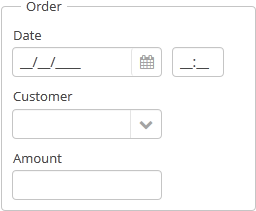
An example container description in a screen XML-descriptor:
<groupBox caption="Order">
    <dateField datasource="orderDs" property="date" caption="Date"/>
    <lookupField datasource="orderDs" property="customer"
                 optionsDatasource="customersDs" caption="Customer"/>
    <textField datasource="orderDs" property="amount" caption="Amount"/>
</groupBox>
groupBox attributes:
-
caption– group header.
-
orientation– defines components placement direction − horizontal or vertical. The default value isvertical.
-
collapsable– if the value is set totrue, the component’s content can be hidden using /
/ buttons.
-
collapsed– if set totrue, component’s content will be collapsed initially. It is used withcollapsable="true".An example of a collapsed
GroupBox:
The expanded state change events of the
groupBoxcomponent can be intercepted with the help of theExpandedStateChangeListenerinterface.
-
outerMargin- sets the outer margins outside the border ofgroupBox. If set totrue, the outer margins will be added on all sides of the component. To set the outer margins for all sides individually, settrueorfalsefor each side ofgroupBox:<groupBox outerMargin="true, false, true, false">If the
showAsPanelattribute is set to true,outerMarginis ignored.
-
showAsPanel– if set totrue, the component will look like Vaadin Panel. The default value isfalse.
By default, the groupBox container is 100% wide, similar to vbox.
In Web Client with a Halo-based theme, you can set predefined styles to the groupBox component using the stylename attribute either in the XML descriptor or in the screen controller. When setting a style programmatically, select one of the HaloTheme class constants with the LAYOUT_ or GROUPBOX_ prefix. The following styles should be used combined with showAsPanel attribute set to true:
-
borderlessstyle removes borders and the background color of thegroupBox:groupBox.setShowAsPanel(true); groupBox.setStyleName(HaloTheme.GROUPBOX_PANEL_BORDERLESS);
-
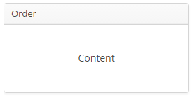
cardstyle name makes a layout look like a card.
-
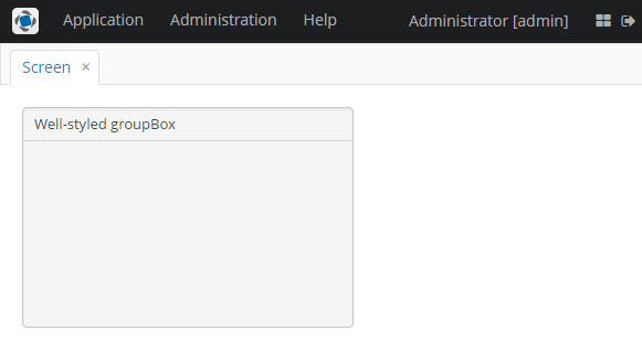
wellstyle makes container look "sunken" with shaded background:<groupBox caption="Well-styled groupBox" showAsPanel="true" stylename="well" width="300px" height="200px"/>
You can use keyboard shortcuts in Groupbox. Set the shortcut and the action to be performed using the addShortcutAction() method:
groupBox.addShortcutAction(new ShortcutAction("SHIFT-A", shortcutTriggeredEvent ->
showNotification("SHIFT-A action" )));- Attributes of groupBox
-
align - caption - collapsable - collapsed - expand - height - id - orientation - outerMargin - settingsEnabled - showAsPanel - spacing - stylename - width
- Predefined styles of groupBox
-
borderless - card - well
- API
-
add - addExpandedStateChangeListener - addShortcutAction - applySettings - getComponent - getComponentNN - getComponents - getOwnComponent - getOwnComponents - indexOf - remove - removeAll - saveSettings - setOuterMargin - setSpacing