4.5.2.2.6. GridLayout
GridLayout container places components on a grid.
XML-name of the component: grid.
Example container usage:
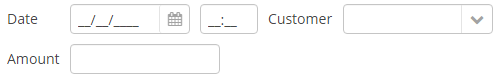
<grid spacing="true">
    <columns count="4"/>
    <rows>
        <row>
            <label value="Date" align="MIDDLE_LEFT"/>
            <dateField datasource="orderDs" property="date"/>
            <label value="Customer" align="MIDDLE_LEFT"/>
            <lookupField datasource="orderDs" property="customer"
                         optionsDatasource="customersDs"/>
        </row>
        <row>
            <label value="Amount" align="MIDDLE_LEFT"/>
            <textField datasource="orderDs" property="amount"/>
        </row>
    </rows>
</grid>
grid elements:
-
columns– a required element, describes grid columns. It should have either acountattribute, or a nestedcolumnelement for each column.In the simplest case, it is enough to set the number of columns in the
countattribute. Then, if the container width is explicitly defined in pixels or percents, free space will be divided between the columns equally.In order to divide screen space non-equally, a
columnelement with aflexattribute should be defined for each column.An example of a grid where the second and the fourth columns take all extra horizontal space and the fourth column takes three times more space:
<grid spacing="true" width="100%">
    <columns>
        <column/>
        <column flex="1"/>
        <column/>
        <column flex="3"/>
    </columns>
    <rows>
        <row>
            <label value="Date"/>
            <dateField datasource="orderDs" property="date" width="100%"/>
            <label value="Customer"/>
            <lookupField datasource="orderDs" property="customer"
                         optionsDatasource="customersDs" width="100%"/>
        </row>
        <row>
            <label value="Amount"/>
            <textField datasource="orderDs" property="amount" width="100%"/>
        </row>
    </rows>
</grid>
If
flexis not defined, or is set to 0, the width of the column will be set according to its contents given that at least one other column has a non-zeroflex. In the example above, the first and the third columns will get the width according to the maximum text length.TipIn order for the free space to appear, the entire container width should be set in either pixels or percents. Otherwise, column width will be calculated according to content length, and
flexattribute will have no effect.
-
rows− a required element, contains a set of rows. Each line is defined in its ownrowelement.rowelement can have aflexattribute similar to the one defined forcolumn, but affecting the distribution of free vertical space with a given total grid height.rowelement should contain elements of the components displayed in the grid’s current row cells. The number of components in a row should not exceed the defined number of columns, but it can be less.
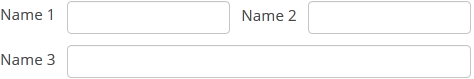
Any component located in a grid container can have colspan and rowspan attributes. These attributes set the number of columns and rows occupied by the corresponding component. For example, this is how Field3 field can be extended to cover three columns:
<grid spacing="true">
    <columns count="4"/>
    <rows>
        <row>
            <label value="Name 1"/>
            <textField/>
            <label value="Name 2"/>
            <textField/>
        </row>
        <row>
            <label value="Name 3"/>
            <textField colspan="3" width="100%"/>
        </row>
    </rows>
</grid>
As a result, the components will be placed in the following way: