4.5.2.1.3. CheckBox
CheckBox is a component with two states: selected or deselected.

Component’s XML-name: checkBox.

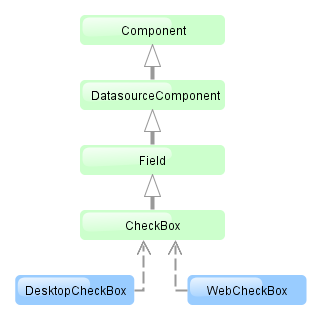
CheckBox component is implemented for Web Client and Desktop Client.
An example of a checkbox with a label retrieved from a localized messages pack:
<checkBox id="accessField" caption="msg://accessFieldCaption"/>Selecting / deselecting of the checkbox changes its value: Boolean.TRUE or Boolean.FALSE. The value can be retrieved using getValue() method and set using setValue(). Submitting null using setValue() will change the value to Boolean.FALSE and uncheck the checkbox.
Changes of the checkbox value, as well as of any other components implementing the Field interface, can be tracked using a ValueChangeListener. For example:
@Inject
private CheckBox accessField;

@Override
public void init(Map<String, Object> params) {
    accessField.addValueChangeListener(event -> {
        if (Boolean.TRUE.equals(event.getValue())) {
            showNotification("set", NotificationType.HUMANIZED);
        } else {
            showNotification("not set", NotificationType.HUMANIZED);
        }
    });
}
The datasource and property attributes should be used to create a checkbox associated with data.
<dsContext>
    <datasource id="customerDs" class="com.sample.sales.entity.Customer" view="_local"/>
</dsContext>
<layout>
    <checkBox datasource="customerDs" property="active"/>
According to the example the screen includes the description of customerDs data source for a Customer entity with active attribute. The datasource attribute of the checkBox component should contain a reference to a data source; the property attribute should contain the name of an entity attribute which value should be displayed in the checkbox. The attribute should have Boolean type. If the attribute value is null the checkbox is deselected.