 Edit on GitHub
3.5.17.4.5. Support for Custom Visual Components and Facets in CUBA Studio
Screen Designer of the CUBA Studio allows developers to integrate a custom UI component (or facet) implemented in an add-on or project by adding special metadata annotations to the component’s definition.
|
Custom UI components and facets are supported in the CUBA Studio starting from Studio version |
Support for the UI component in the Screen Designer includes the following features:
-
Displaying component item in the Palette panel.
-
Scaffolding XML code for the component when it is added from the Palette. Automatically adding XSD namespace import if it is configured in the component metadata.
-
Displaying icon corresponding to the added component in the Hierarchy panel.
-
Displaying and editing component properties in the Inspector panel. Scaffolding XML tag attributes when component properties are modified.
-
Providing suggestions for property values.
-
Validating property values.
-
Injecting component to the screen controller.
-
Generating event handlers and delegate methods declared by the component.
-
Displaying component stub in the Layout Preview panel.
-
Re-directing to the web documentation if the link is provided by the developer.
- Prerequisites
Note that the result of the Screen Designer’s work is the scaffolded XML code in the screen descriptor. However, for the custom component or custom facet to be successfully loaded from the XML to the screen in the running application, the following additional code should be implemented in your project:
-
Component or Facet interface is created.
-
For components - the component loader is implemented. For facets, the facet provider is created - a Spring bean implementing the
com.haulmont.cuba.gui.xml.FacetProviderinterface parameterized by the facet class. -
Component and its loader are registered in the
cuba-ui-component.xmlfile. -
Optional: defined the XML schema describing the structure and restrictions on component (facet) definition in the screen descriptor.
These steps are described in the Integrating a Vaadin Component into the Generic UI section.
- Stepper sample project
Fully implemented example of custom UI component with metadata annotations can be found in the Stepper Vaadin addon integration sample. Its source code can be found here: https://github.com/cuba-labs/vaadin-stepper-addon-integration.
The files you should pay attention to:
-
Metadata annotations have been added to the component interface:
com.company.demo.web.gui.components.Stepper. -
Component palette icons (
stepper.svgandstepper_dark.svg) are placed to themodules/web/src/com/company/demo/web/gui/components/iconsfolder. -
The
customer-edit.xmlscreen descriptor usessteppercomponent in the layout.
import com.haulmont.cuba.gui.meta.*;

@StudioComponent(category = "Samples",
        unsupportedProperties = {"description", "icon", "responsive"},
        xmlns = "http://schemas.company.com/demo/0.1/ui-component.xsd",
        xmlnsAlias = "app",
        icon = "com/company/demo/web/gui/components/icons/stepper.svg",
        canvasBehaviour = CanvasBehaviour.INPUT_FIELD)
@StudioProperties(properties = {
        @StudioProperty(name = "dataContainer", type = PropertyType.DATACONTAINER_REF),
        @StudioProperty(name = "property", type = PropertyType.PROPERTY_PATH_REF, options = "int"),
}, groups = @PropertiesGroup(
        properties = {"dataContainer", "property"}, constraint = PropertiesConstraint.ALL_OR_NOTHING
))
public interface Stepper extends Field<Integer> {

    @StudioProperty(name = "manualInput", type = PropertyType.BOOLEAN, defaultValue = "true")
    void setManualInputAllowed(boolean value);

    boolean isManualInputAllowed();

// ...

}
If you open the customer-edit.xml screen in the Screen Designer, you will see how the component has been integrated into designer’s panels.
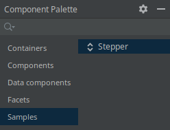
The Component Palette panel contains Stepper component:
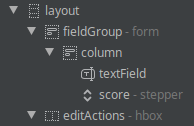
The Component Hierarchy panel displays component along with other components in the tree:
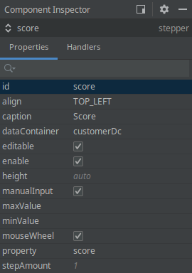
The Component Inspector panel displays and provides editing for the component properties:
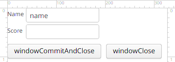
Finally, the layout preview panel displays component in the shape of text field:
Now let’s take a look at annotations and attributes that should be added to the component interface in order to achieve such integration.
- Metadata annotation list
All UI metadata annotations and related classes are located in the com.haulmont.cuba.gui.meta package. UI metadata annotations are supported for the following types of UI elements:
-
Visual Components - marked with
@StudioComponent. -
Facets - marked with
@StudioFacet. -
Actions - marked with
@StudioAction. Action annotations are described in the Custom Action Types section.
Full list of annotations is the following:
-
@StudioComponent- indicates that the annotated UI component interface should be available in the Screen Designer. Provides necessary attributes for panels of the Screen Designer. The annotated interface must be a direct or indirect subclass of thecom.haulmont.cuba.gui.components.Component. -
@StudioFacet- indicates that the annotated interface should be available in the Screen Designer as a facet. Provides necessary attributes for panels of the Screen Designer. The annotated interface must be a direct or indirect sub-interface of thecom.haulmont.cuba.gui.components.Facet. The facet should have an associatedFacetProviderbean defined in the project. -
@StudioProperty- indicates that the annotated setter method should be shown in the Inspector panel as the property of the UI component or Facet. -
@StudioProperties- declares additional properties and property groups of the UI component or Facet. Can be used to declare additional properties not related to component property setter methods, to override inherited properties and to validate semantically related pairs of properties. -
@PropertiesGroup- declares a property group: list of dependent properties that must be used only together or mutually exclusive. -
@StudioElementsGroup- indicates that the annotated setter method should be shown in the Screen Designer as a nested group of elements of the UI component or Facet, e.g. columns, actions or property map. -
@StudioElement- indicates that the annotated class or interface should be available in the Screen Designer as a part of the UI Component or Facet, e.g. column, action or property map. -
@StudioEmbedded- used for cases when a set of component parameters is extracted into a separate POJO. -
@StudioCollection- declares metadata for nested group of sub-elements that should be supported in the Screen Designer, e.g. columns, actions, fields.
- UI component definition
Declaring that UI component should become available in the Screen Designer is performed by marking the component interface with the com.haulmont.cuba.gui.meta.StudioComponent annotation.
@StudioComponent(caption = "GridLayout", xmlElement = "bgrid", category = "Containers")
private interface BGridLayout extends BLayout {
    // ...
}
The @StudioComponent annotation has the following attributes:
-
caption- component caption displayed in the Palette panel. -
description- description of the component displayed as a mouse-over tooltip in the Palette panel. -
category- category in the Palette panel (Containers, Components etc) where the component will be placed to. -
icon- path to the component icon used in the Palette and Hierarchy panels, SVG or PNG format, relative to the component module root. Note that component icon may have two variants: for light and dark IDE themes. File name of the dark icon variant is determined by adding the_darkpostfix to the icon file name, for example:stepper.svgandstepper_dark.svg. -
xmlElement- name of the XML tag that will be added to the screen descriptor XML when the component is added to the screen. -
xmlns- XML namespace required for the component. When the component is added to the screen, Studio automatically adds namespace import to the root element of the screen descriptor. -
xmlnsAlias- XML namespace alias required for the component. E.g. if the namespace alias istrackand the XML tag name isgoogleTrackerthen the component will be added to the screen as<track:googleTracker/>tag. -
defaultProperty- name of the default component property, it will be automatically selected in the Inspector panel when the component is selected in the layout. -
unsupportedProperties- the list of properties that are inherited from the component parent interfaces but are not actually supported by the component. These properties will be hidden from the Inspector panel. -
canvasBehavior- defines behaviour how the UI component will look like on the layout preview panel. Possible options are:-
COMPONENT- the component is displayed in the preview as a simple box with an icon. -
INPUT_FIELD- the component is displayed in the preview as a text field. -
CONTAINER- the component is displayed in the preview as a component container.
-
-
canvasIcon- path to the icon displayed in the preview as a placeholder if thecanvasBehaviourattribute hasCOMPONENTvalue. Icon file should be in SVG or PNG format. Theiconproperty is used if this value is not specified. -
canvasIconSize- size of the icon displayed in the preview as a placeholder. Possible values are:-
SMALL- small icon. -
LARGE- the icon is large, and the componentidis displayed under the icon.
-
-
containerType- type of the container layout (vertical, horizontal or flow) if thecanvasBehaviourattribute hasCONTAINERvalue. -
documentationURL- URL pointing to the documentation page for the UI component. Used by the CUBA Documentation action in the Screen Designer. If the path to the documentation is version dependent, use the%VERSION%as a placeholder. It will be replaced with the minor version (e.g.1.2) of the library containing the UI component.
- Facet definition
Declaring that custom facet should become available in the Screen Designer is performed by marking the facet interface with the com.haulmont.cuba.gui.meta.StudioFacet annotation.
|
For support of the custom facet in the Screen Designer, an associated FacetProvider implementation should be created in the project. |
FacetProvider is a Spring bean implementing the com.haulmont.cuba.gui.xml.FacetProvider interface parameterized by the facet class. See the com.haulmont.cuba.web.gui.facets.ClipboardTriggerFacetProvider platform class as an example.
The attributes of the @StudioFacet annotation are similar to the attributes of the @StudioComponent annotation described in the previous section.
Example:
@StudioFacet(
        xmlElement = "clipboardTrigger",
        category = "Facets",
        icon = "icon/clipboardTrigger.svg",
        documentationURL = "https://doc.cuba-platform.com/manual-%VERSION%/gui_ClipboardTrigger.html"
)
public interface ClipboardTrigger extends Facet {

    @StudioProperty(type = PropertyType.COMPONENT_REF, options = "com.haulmont.cuba.gui.components.TextInputField")
    void setInput(TextInputField<?> input);

    @StudioProperty(type = PropertyType.COMPONENT_REF, options = "com.haulmont.cuba.gui.components.Button")
    void setButton(Button button);

    // ...
}- Standard component properties
Component properties are declared by using two annotations:
-
@StudioProperty- indicates that the annotated method (setter, setXxx) should be shown in the Inspector panel as a component property. -
@StudioProperties- declares on an interface definition additional properties and property groups of a component not related to setter methods.
Example:
@StudioComponent(caption = "RichTextArea")
@StudioProperties(properties = {
        @StudioProperty(name = "css", type = PropertyType.CSS_BLOCK)
})
interface RichTextArea extends Component {
    @StudioProperty(type = PropertyType.CSS_CLASSNAME_LIST)
    void setStylename(String stylename);

    @StudioProperty(type = PropertyType.SIZE, defaultValue = "auto")
    void setWidth(String width);

    @StudioProperty(type = PropertyType.SIZE, defaultValue = "auto")
    void setHeight(String height);

    @StudioProperty(type = PropertyType.LOCALIZED_STRING)
    void setContextHelpText(String contextHelpText);

    @StudioProperty(type = PropertyType.LOCALIZED_STRING)
    void setDescription(String description);

    @StudioProperty
    @Min(-1)
    void setTabIndex(int tabIndex);
}
The setter method can be annotated with @StudioProperty without any additional data. In this case:
-
the name and the caption of the property will be inferred from setter name.
-
the type of the property will be inferred from setter parameter.
The @StudioProperty annotation has the following attributes:
-
name- name of the property. -
type- defines which content is stored in the property, e.g. it can be a string, an entity name or a reference to other component in the same screen. Supported property types are listed below. -
caption- caption of the property to be displayed in the Inspector panel. -
description- additional description for the property that will be displayed in the Inspector panel as a mouse-over tooltip. -
category- category of the property in the Inspector panel. (Not implemented in the Screen Designer yet as of Studio 14.0.) -
required- the property is required, in this case Screen Designer will not allow component declaration with an empty value. -
defaultValue- specifies the value of the property that is implicitly used by the component when the corresponding XML attribute is omitted. The default value will be omitted from XML code. -
options- context dependent list of options for the component property:-
For
ENUMERATIONproperty type - enumeration options. -
For
BEAN_REFproperty type - list of allowed base classes for the Spring bean. -
For
COMPONENT_REFproperty type - list of allowed base component classes. -
For
PROPERTY_PATH_REFproperty type - list of allowed entity attribute types. Use registered Datatype names for the datatype properties orto_oneandto_manyfor the association properties.
-
-
xmlAttribute- target XML attribute name, if not set then equal to the property name. -
xmlElement- target XML element name. By using this attribute you can declare component property mapped to a sub-tag of the main component XML tag, see below. -
typeParameter- specifies the name of the generic type parameter provided by this property for the component. See description below.
- Component property types
The following property types (com.haulmont.cuba.gui.meta.PropertyType) are supported:
-
INTEGER,LONG,FLOAT,DOUBLE,STRING,BOOLEAN,CHARACTER- primitive types. -
DATE- date in theYYYY-MM-DDformat. -
DATE_TIME- date with time in theYYYY-MM-DD hh:mm:ssformat. -
TIME- time in thehh:mm:ssformat. -
ENUMERATION- enumerated value. List of enumeration options is provided by theoptionsannotation attribute. -
COMPONENT_ID- identifier of a component, sub-component or action. Must be a valid Java identifier. -
ICON_ID- icon path or ID of icon predefined in CUBA or defined in the project. -
SIZE- size value, e.g. width or height. -
LOCALIZED_STRING- localized message represented by String value or by message key withmsg://ormainMsg://prefix. -
JPA_QUERY- JPA QL string. -
ENTITY_NAME- name of the entity (specified by thejavax.persistence.Entity#nameannotation attribute) defined in the project. -
ENTITY_CLASS- fully-qualified class name of the entity defined in the project. -
JAVA_CLASS_NAME- fully-qualified class name of any Java class. -
CSS_CLASSNAME_LIST- list of CSS classes separated with space symbol. -
CSS_BLOCK- inline CSS properties. -
BEAN_REF- ID of a Spring bean defined in this project. The list of allowed base Spring bean classes is provided by theoptionsannotation attribute. -
COMPONENT_REF- ID of a component defined in this screen. The list of allowed base component classes is provided by theoptionsannotation attribute. -
DATASOURCE_REF- ID of a datasource defined in the screen (legacy API). -
COLLECTION_DATASOURCE_REF- ID of a collection datasource defined in the screen (legacy API). -
DATALOADER_REF- ID of a data loader defined in the screen. -
DATACONTAINER_REF- ID of a data container defined in the screen. -
COLLECTION_DATACONTAINER_REF- ID of a collection data container defined in the screen. -
PROPERTY_REF- name of an entity attribute. The list of allowed entity attribute types is provided by theoptionsannotation attribute. In order to display suggestions for this attribute, this component property should be associated with another component property defining a data container or datasource with the help of properties group. -
PROPERTY_PATH_REF- name of an entity attribute or list of nested attributes separated with dot symbol, e.g.user.group.name. The list of allowed entity attribute types is provided by theoptionsannotation attribute. In order to display suggestions for this component property in the Inspector panel, this component property should be associated with another component property defining a data container or datasource with the help of properties group. -
DATATYPE_ID- ID of a Datatype, e.g.stringordecimal. -
SHORTCUT- keyboard shortcut, e.g.CTRL-SHIFT-U. -
SCREEN_CLASS- fully-qualified name of a screen controller class defined in this project. -
SCREEN_ID- ID of a screen defined in this project. -
SCREEN_OPEN_MODE- screen open mode.
- Component property validation
Inspector panel supports validation of the component properties with limited set of BeanValidation annotations:
-
@Min,@Max,@DecimalMin,@DecimalMax. -
@Negative,@Positive,@PosizitiveOrZero,@NegativeOrZero. -
@NotBlank,@NotEmpty. -
@Digits. -
@Pattern. -
@Size,@Length. -
@URL.
Example:
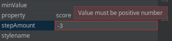
@StudioProperty(type = PropertyType.INTEGER)
@Positive
void setStepAmount(int amount);
int getStepAmount();
If user tries to input invalid property value, the following error message is displayed:
- @StudioProperties and property groups
The metadata defined with the @StudioProperty can be overridden with the @StudioProperties annotation on the component interface.
The @StudioProperties annotation can have zero or more declarations in the groups attribute with the @PropertiesGroup type. Each group defines a property group whose type is determined by the @PropertiesGroup#constraint attribute:
-
ONE_OF- group specifies properties that are mutually exclusive. -
ALL_OR_NOTHING- a list of dependent properties that must be used together.
One specific important application of the property group is the specification of the dataContainer and property attribute pair for the components that can be bound to the data container. These properties must be included into the ALL_OR_NOTHING group. See example of the component with such property group:
@StudioComponent(
        caption = "RichTextField",
        category = "Fields",
        canvasBehaviour = CanvasBehaviour.INPUT_FIELD)
@StudioProperties(properties = {
        @StudioProperty(name = "dataContainer", type = PropertyType.DATACONTAINER_REF),
        @StudioProperty(name = "property", type = PropertyType.PROPERTY_PATH_REF, options = "string")
}, groups = @PropertiesGroup(
        properties = {"dataContainer", "property"}, constraint = PropertiesConstraint.ALL_OR_NOTHING
))
interface RichTextField extends Component {
    // ...
}- Declaring sub-element metadata with @StudioCollection
Compound components such as table, pickerField or charts are defined in the screen descriptor by several nested XML tags. Sub-tags represent parts of the component and are loaded to the screen by the parent component’s ComponentLoader. You have two options how to declare metadata for sub-elements:
-
With
@StudioCollection- sub-element metadata is specified right in the component interface. -
With
@StudioElementGroupand@StudioElement- sub-element metadata is specified on separate classes that represent XML sub-tags.
The com.haulmont.cuba.gui.meta.StudioCollection annotation has the following attributes:
-
xmlElement- XML tag name of the collection. -
itemXmlElement- XML tag name of the elements (collection items). -
documentationURL- URL pointing to the documentation page for the sub-element. Used by the CUBA Documentation action in the Screen Designer. If the path to the documentation is version dependent, use the%VERSION%as a placeholder. It will be replaced with the minor version (e.g.1.2) of the library containing the UI component. -
itemProperties- collection of@StudioPropertyannotations defining item properties.
See the example below.
This is the desired XML structure in the screen descriptor:
<layout>
    <langPicker>
        <options>
            <option caption="msg://lang.english" code="en" flagIcon="icons/english.png"/>
            <option caption="msg://lang.french" code="fr" flagIcon="icons/french.png"/>
        </options>
    </langPicker>
</layout>
Component class with @StudioCollection declaration:
@StudioComponent(xmlElement = "langPicker", category = "Samples")
public interface LanguagePicker extends Field<Locale> {
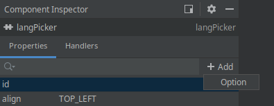
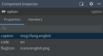
@StudioCollection(xmlElement = "options", itemXmlElement = "option",
itemProperties = {
@StudioProperty(name = "caption", type = PropertyType.LOCALIZED_STRING, required = true),
@StudioProperty(name = "code", type = PropertyType.STRING),
@StudioProperty(name = "flagIcon", type = PropertyType.ICON_ID)
})
void setOptions(List<LanguageOption> options);
List<LanguageOption> getOptions();
}The Inspector panel for the main component’s element additionally displays the Add → {element caption} button that adds additional sub-element to the XML:
If the sub-element is selected in the layout, the Inspector panel contains its properties specified in the StudioCollection annotation:
- Declaring sub-element metadata with @StudioElementGroup and @StudioElement
The @StudioElementGroup is used to mark setter method in the component interface. It gives a hint to the Studio that it should search for sub-element metadata in the referenced class.
@StudioElementsGroup(xmlElement = "subElementGroupTagName")
void setSubElements(List<ComponentSubElement> subElements);
The @StudioElementGroup annotation has the following attributes:
-
xmlElement- XML tag name of the sub-element group. -
icon- path to the icon used in the Palette and Hierarchy panels for the sub-element group, SVG or PNG format, relative to the component module root. -
documentationURL- URL pointing to the documentation page for the sub-element group. Used by the CUBA Documentation action in the Screen Designer. If the path to the documentation is version dependent, use the%VERSION%as a placeholder. It will be replaced with the minor version (e.g.1.2) of the library containing the UI component.
The @StudioElement is used to mark the class that represents component’s sub-element. Available attributes of the XML tag represented by this element are declared by using the @StudioProperty and @StudioProperties annotations.
@StudioElement(xmlElement = "subElement", caption = "Sub Element")
public interface SubElement {
    @StudioProperty
    void setElementProperty(String elementProperty);
    // ...
}
Attributes of the @StudioElement annotation are similar to ones of the @StudioComponent:
-
xmlElement- XML tag name of the sub-element. -
caption- caption of the element to be displayed in the Inspector panel. -
description- additional description for the element that will be displayed in the Inspector panel as a mouse-over tooltip. -
icon- path to the sub-element icon used in the Palette and Hierarchy panels, SVG or PNG format, relative to the component module root. -
xmlns- XML namespace required for the element. When the element is added to the screen, Studio automatically adds namespace import to the root element of the screen descriptor. -
xmlnsAlias- XML namespace alias required for the element. E.g. if the namespace alias ismapand the XML tag name islayerthen the element will be added to the screen as<map:layer/>tag. -
defaultProperty- name of the default element property, it will be automatically selected in the Inspector panel when the element is selected in the layout. -
unsupportedProperties- the list of properties that are inherited from the element’s parent interfaces but are not actually supported by the element. These properties will be hidden from the Inspector panel. -
documentationURL- URL pointing to the documentation page for the UI component. Used by the CUBA Documentation action in the Screen Designer. If the path to the documentation is version dependent, use the%VERSION%as a placeholder. It will be replaced with the minor version (e.g.1.2) of the library containing the UI component.
See the example below.
This is the desired XML structure in the screen descriptor:
<layout>
    <serialChart backgroundColor="#ffffff" caption="Weekly Stats">
        <graphs>
            <graph colorProperty="color" valueProperty="price"/>
            <graph colorProperty="costColor" valueProperty="cost"/>
        </graphs>
    </serialChart>
</layout>
Component class with @StudioElementsGroup declaration:
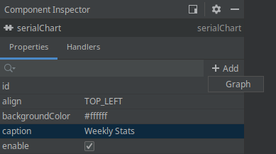
@StudioComponent(xmlElement = "serialChart", category = "Samples")
public interface SerialChart extends Component {

    @StudioProperty
    void setCaption(String caption);
    String getCaption();

    @StudioProperty(type = PropertyType.STRING)
    void setBackgroundColor(Color backgroundColor);
    Color getBackgroundColor();

    @StudioElementsGroup(xmlElement = "graphs")
    void setGraphs(List<ChartGraph> graphs);
    List<ChartGraph> getGraphs();
}
Sub-element declaration annotated with @StudioElement:
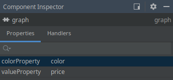
@StudioElement(xmlElement = "graph", caption = "Graph")
public interface ChartGraph {

    @StudioProperty(type = PropertyType.PROPERTY_PATH_REF)
    void setValueProperty(String valueProperty);
    String getValueProperty();

    @StudioProperty(type = PropertyType.PROPERTY_PATH_REF)
    void setColorProperty(String colorProperty);
    String getColorProperty();
}
The Inspector panel for the main component’s element additionally displays the Add → {element caption} button that adds additional sub-element to the XML:
If the sub-element is selected in the layout, the Inspector panel displays its properties specified in the element declaration:
- Declaring sub-tag attributes
It is possible to declare some of component attributes not in the main tag, but in a single sub-tag of the main component XML tag in the screen descriptor. As an example, consider the following XML layout of the component:
<myChart>
    <scrollBar color="white" position="TOP"/>
</myChart>
Here the scrollBar is a part of the main myChart component and not an independent component, and we want to declare attributes metadata in the main component interface.
Metadata annotations defining attributes of the sub-tag can be declared right in the component interface using the xmlElement attribute of the @StudioProperty annotation. This attribute defines the name of the sub-tag. The annotated component definition looks as follows:
@StudioComponent(xmlElement = "myChart", category = "Samples")
public interface MyChart extends Component {

    @StudioProperty(name = "position", caption = "scrollbar position",
            xmlElement = "scrollBar", xmlAttribute = "position",
            type = PropertyType.ENUMERATION, options = {"TOP", "BOTTOM"})
    void setScrollBarPosition(String scrollBarPosition);
    String getScrollBarPosition();

    @StudioProperty(name = "color", caption = "scrollbar color",
            xmlElement = "scrollBar", xmlAttribute = "color")
    void setScrollBarColor(String scrollBarColor);
    String getScrollBarColor();
}- Declaring tag attributes extracted into a POJO with @StudioEmbedded
There are some cases when you might want to extract a set of component properties into a separate POJO (plain old Java object). At the same time in the xml schema extracted properties are still specified as attributes of the main XML tag. In this case the @StudioEmbedded annotation can help. You should mark the setter method that accepts the POJO object with @StudioEmbedded to declare that this POJO contains additional component properties.
The com.haulmont.cuba.gui.meta.StudioEmbedded annotation has no attributes.
Usage example is presented below.
The desired XML structure, note that all attributes are specified for the main component tag:
<layout>
    <richTextField textColor="blue" editable="false" id="rtf"/>
</layout>
POJO class with annotated properties:
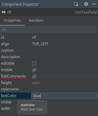
public class FormattingOptions {
    private String textColor = "black";
    private boolean foldComments = true;

    @StudioProperty(defaultValue = "black", description = "Main text color")
    public void setTextColor(String textColor) {
        this.textColor = textColor;
    }

    @StudioProperty(defaultValue = "true")
    public void setFoldComments(boolean foldComments) {
        this.foldComments = foldComments;
    }
}
Component interface:
@StudioComponent(category = "Samples",
        unsupportedProperties = {"icon", "responsive"},
        description = "Text field with html support")
public interface RichTextField extends Field<String> {

    @StudioEmbedded
    void setFormattingOptions(FormattingOptions formattingOptions);
    FormattingOptions getFormattingOptions(FormattingOptions formattingOptions);
}
The Component Inspector panel shows embedded properties along with others:
- Support for events and delegate methods
Studio provides the same support for events and delegate methods in custom UI components (or facets) as for built-in UI components. No annotations are required for declaring an event listener or delegate method in a component interface.
Example of the component declaring an event handler with its own event class:
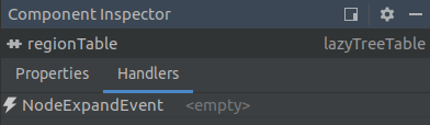
@StudioComponent(category = "Samples")
public interface LazyTreeTable extends Component {

    // ...

    Subscription addNodeExpandListener(Consumer<NodeExpandEvent> listener);

    class NodeExpandEvent extends EventObject {
        private final Object nodeId;

        public NodeExpandEvent(LazyTreeTable source, Object nodeId) {
            super(source);
            this.nodeId = nodeId;
        }

        public Object getNodeId() {
            return nodeId;
        }
    }
}
Declared event handler becomes available in the Inspector panel:
Event handler implementation method’s stub generated by the Studio will be the following:
@UiController("demo_Dashboard")
@UiDescriptor("dashboard.xml")
public class Dashboard extends Screen {
    // ...

    @Subscribe("regionTable")
    public void onRegionTableNodeExpand(LazyTreeTable.NodeExpandEvent event) {

    }
}
The next example demonstrates how to declare delegate methods in the facet with generic type parameter:
@StudioFacet
public interface LookupScreenFacet<E extends Entity> extends Facet {

    // ...

    void setSelectHandler(Consumer<Collection<E>> selectHandler);

    void setOptionsProvider(Supplier<ScreenOptions> optionsProvider);

    void setTransformation(Function<Collection<E>, Collection<E>> transformation);

    @StudioProperty(type = PropertyType.COMPONENT_REF, typeParameter = "E",
            options = "com.haulmont.cuba.gui.components.ListComponent")
    void setListComponent(ListComponent<E> listComponent);
}- Support for generic type parameters
Studio supports parameterizing component interface with generic type parameter. The parameter can be the entity class, screen class or any other Java class. Type parameter is used when the component is injected to the screen controller and when delegate method stubs are generated.
Studio infers generic type used by particular component by looking at its properties assigned in the XML. Component property can specify generic type directly or indirectly. E.g. the table component displays list of entities and is parameterized by the entity class. To determine actual entity type used, Studio looks at the dataContainer attribute, and then at the collection container definition. If all attributes are assigned then entity class used by the collection container is determined to be table’s generic parameter.
The typeParameter parameter of the @StudioProperty annotation specifies the name of the type parameter for the generic UI component or facet that is provided by the property. The actual class for the type parameter can be resolved for the following property types:
-
PropertyType.JAVA_CLASS_NAME- the specified class is used. -
PropertyType.ENTITY_CLASS- the specified entity class is used. -
PropertyType.SCREEN_CLASS_NAME- the specified screen class is used. -
PropertyType.DATACONTAINER_REF,PropertyType.COLLECTION_DATACONTAINER_REF- the entity class of the specified data container is used. -
PropertyType.DATASOURCE_REF,PropertyType.COLLECTION_DATASOURCE_REF- the entity class of the specified datasource is used. -
PropertyType.COMPONENT_REF- the class of the entity that the given field is bound to is used (entity class is determined via the bound data container or datasource).
Usage example is presented below.
Component interface for the UI component that displays collection of entities provided by the collection container:
@StudioComponent(category = "Samples")
public interface MyTable<E extends Entity> extends Component { (1)

    @StudioProperty(type = PropertyType.COLLECTION_DATACONTAINER_REF,
            typeParameter = "E") (2)
    void setContainer(CollectionContainer<E> container);

    void setStyleProvider(@Nullable Function<? super E, String> styleProvider); (3)
}| 1 | - component interface is parameterized with the E parameter which represents the entity class of items displayed in the table. |
| 2 | - by specifying the typeParameter annotation attribute on the property of the COLLECTION_DATACONTAINER_REF type you can direct Studio to infer actual entity type by looking at the associated collection container. |
| 3 | - generic type parameter is also used by the component’s delegate method. |
To allow Studio automatically infer component’s type parameter, this component should be associated with the collection container in the screen descriptor:
<?xml version="1.0" encoding="UTF-8" standalone="no"?>
<window xmlns="http://schemas.haulmont.com/cuba/screen/window.xsd"
        caption="msg://dashboard.caption"
        messagesPack="com.company.demo.web.screens">
    <data>
        <collection id="regionsDc" class="com.company.demo.entity.Region">
            <!-- ... -->
        </collection>
    </data>
    <layout>
        <myTable id="regionTable" container="regionsDc"/>
    </layout>
</window>
The following code will be generated by the Studio in the screen controller:
@UiController("demo_Dashboard")
@UiDescriptor("dashboard.xml")
public class Dashboard extends Screen {
    @Inject
    private MyTable<Region> regionTable; (1)

    @Install(to = "regionTable", subject = "styleProvider")
    private String regionTableStyleProvider(Region region) { (2)
        return "bold-text";
    }
}| 1 | - component is injected to the controller with the correct type parameter. |
| 2 | - correct type parameter is used for the delegate method’s signature. |