 Edit on GitHub
3.5.17.4.4. Creating a GWT component
In this section, we will cover the creation of a simple GWT component (a rating field consisting of 5 stars) and its usage in application screens.
Create a new project in CUBA Studio and name it ratingsample.
Create the web-toolkit module. A convenient way to do this is to use CUBA Studio: in the main menu, click CUBA > Advanced > Manage modules > Create 'web-toolkit' Module.
In order to create a GTW component, we need to create the following files:
-
RatingFieldWidget.java- a GWT widget in the web-toolkit module. -
RatingFieldServerComponent.java- a Vaadin component class. -
RatingFieldState.java- a component state class. -
RatingFieldConnector.java- a connector that links the client code with the server component. -
RatingFieldServerRpc.java- a class that defines a server API for the client.
Let’s create required files and make necessary changes in them.
-
Create the
RatingFieldWidgetclass in the web-toolkit module. Replace its content with the following code:package com.company.ratingsample.web.toolkit.ui.client.ratingfield; import com.google.gwt.dom.client.DivElement; import com.google.gwt.dom.client.SpanElement; import com.google.gwt.dom.client.Style.Display; import com.google.gwt.user.client.DOM; import com.google.gwt.user.client.Event; import com.google.gwt.user.client.ui.FocusWidget; import java.util.ArrayList; import java.util.List; public class RatingFieldWidget extends FocusWidget { private static final String CLASSNAME = "ratingfield"; // API for handle clicks public interface StarClickListener { void starClicked(int value); } protected List<SpanElement> stars = new ArrayList<>(5); protected StarClickListener listener; protected int value = 0; public RatingFieldWidget() { DivElement container = DOM.createDiv().cast(); container.getStyle().setDisplay(Display.INLINE_BLOCK); for (int i = 0; i < 5; i++) { SpanElement star = DOM.createSpan().cast(); // add star element to the container DOM.insertChild(container, star, i); // subscribe on ONCLICK event DOM.sinkEvents(star, Event.ONCLICK); stars.add(star); } setElement(container); setStylePrimaryName(CLASSNAME); } // main method for handling events in GWT widgets @Override public void onBrowserEvent(Event event) { super.onBrowserEvent(event); switch (event.getTypeInt()) { // react on ONCLICK event case Event.ONCLICK: SpanElement element = event.getEventTarget().cast(); // if click was on the star int index = stars.indexOf(element); if (index >= 0) { int value = index + 1; // set internal value setValue(value); // notify listeners if (listener != null) { listener.starClicked(value); } } break; } } @Override public void setStylePrimaryName(String style) { super.setStylePrimaryName(style); for (SpanElement star : stars) { star.setClassName(style + "-star"); } updateStarsStyle(this.value); } // let application code change the state public void setValue(int value) { this.value = value; updateStarsStyle(value); } // refresh visual representation private void updateStarsStyle(int value) { for (SpanElement star : stars) { star.removeClassName(getStylePrimaryName() + "-star-selected"); } for (int i = 0; i < value; i++) { stars.get(i).addClassName(getStylePrimaryName() + "-star-selected"); } } }A widget is a client-side class responsible for displaying the component in the web browser and handling events. It defines interfaces for working with the server side. In our case these are the
setValue()method and theStarClickListenerinterface. -
RatingFieldServerComponentis a Vaadin component class. It defines an API for the server code, accessor methods, event listeners and data sources connection. Developers use the methods of this class in the application code.package com.company.ratingsample.web.toolkit.ui; import com.company.ratingsample.web.toolkit.ui.client.ratingfield.RatingFieldServerRpc; import com.company.ratingsample.web.toolkit.ui.client.ratingfield.RatingFieldState; import com.vaadin.ui.AbstractField; // the field will have a value with integer type public class RatingFieldServerComponent extends AbstractField<Integer> { public RatingFieldServerComponent() { // register an interface implementation that will be invoked on a request from the client registerRpc((RatingFieldServerRpc) value -> setValue(value, true)); } @Override protected void doSetValue(Integer value) { if (value == null) { value = 0; } getState().value = value; } @Override public Integer getValue() { return getState().value; } // define own state class @Override protected RatingFieldState getState() { return (RatingFieldState) super.getState(); } @Override protected RatingFieldState getState(boolean markAsDirty) { return (RatingFieldState) super.getState(markAsDirty); } } -
The
RatingFieldStatestate class defines what data are sent between the client and the server. It contains public fields that are automatically serialized on server side and deserialized on the client.package com.company.ratingsample.web.toolkit.ui.client.ratingfield; import com.vaadin.shared.AbstractFieldState; public class RatingFieldState extends AbstractFieldState { { // change the main style name of the component primaryStyleName = "ratingfield"; } // define a field for the value public int value = 0; } -
The
RatingFieldServerRpcinterface defines a server API that is used from the client-side. Its methods may be invoked by the RPC mechanism built into Vaadin. We will implement this interface in the component.package com.company.ratingsample.web.toolkit.ui.client.ratingfield; import com.vaadin.shared.communication.ServerRpc; public interface RatingFieldServerRpc extends ServerRpc { //method will be invoked in the client code void starClicked(int value); } -
Create the
RatingFieldConnectorclass in the web-toolkit module. Connector links client code with the server.package com.company.ratingsample.web.toolkit.ui.client.ratingfield; import com.company.ratingsample.web.toolkit.ui.RatingFieldServerComponent; import com.vaadin.client.communication.StateChangeEvent; import com.vaadin.client.ui.AbstractFieldConnector; import com.vaadin.shared.ui.Connect; // link the connector with the server implementation of RatingField // extend AbstractField connector @Connect(RatingFieldServerComponent.class) public class RatingFieldConnector extends AbstractFieldConnector { // we will use a RatingFieldWidget widget @Override public RatingFieldWidget getWidget() { RatingFieldWidget widget = (RatingFieldWidget) super.getWidget(); if (widget.listener == null) { widget.listener = value -> getRpcProxy(RatingFieldServerRpc.class).starClicked(value); } return widget; } // our state class is RatingFieldState @Override public RatingFieldState getState() { return (RatingFieldState) super.getState(); } // react on server state change @Override public void onStateChanged(StateChangeEvent stateChangeEvent) { super.onStateChanged(stateChangeEvent); // refresh the widget if the value on server has changed if (stateChangeEvent.hasPropertyChanged("value")) { getWidget().setValue(getState().value); } } }
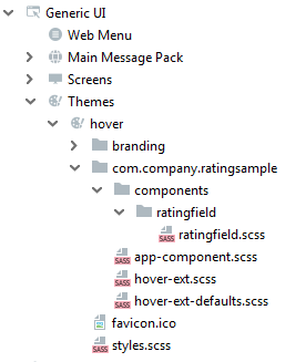
The RatingFieldWidget class does not define the component appearance, it only assigns style names to key elements. To define an appearance of the component, we’ll create stylesheet files. A convenient way to do this is to use CUBA Studio: in the main menu, click CUBA > Advanced > Manage themes > Create theme extension. Select the hover theme in the popup window. Another way is to use the extend-theme command in CUBA CLI. The hover theme uses FontAwesome font glyphs instead of icons. We’ll use this fact.
It is recommended to put component styles into a separate file componentname.scss in the components/componentname directory in the form of SCSS mixture. Create the components/ratingfield directories structure in the themes/hover/com.company.ratingsample directory of the web module. Then create the ratingfield.scss file inside the ratingfield directory:
@mixin ratingfield($primary-stylename: ratingfield) {
  .#{$primary-stylename}-star {
    font-family: FontAwesome;
    font-size: $v-font-size--h2;
    padding-right: round($v-unit-size/4);
    cursor: pointer;

    &:after {
          content: '\f006'; // 'fa-star-o'
    }
  }

  .#{$primary-stylename}-star-selected {
    &:after {
          content: '\f005'; // 'fa-star'
    }
  }

  .#{$primary-stylename} .#{$primary-stylename}-star:last-child {
    padding-right: 0;
  }

  .#{$primary-stylename}.v-disabled .#{$primary-stylename}-star {
    cursor: default;
  }
}
Include this file in the hover-ext.scss main theme file:
@import "components/ratingfield/ratingfield";

@mixin com_company_ratingsample-hover-ext {
  @include ratingfield;
}
To demonstrate how the component works let’s create a new screen in the web module.
Name the screen rating-screen.
Open the rating-screen.xml file in the IDE. We need a container for our component. Declare it in the screen XML:
<?xml version="1.0" encoding="UTF-8" standalone="no"?>
<window xmlns="http://schemas.haulmont.com/cuba/screen/window.xsd"
        caption="msg://caption"
        messagesPack="com.company.ratingsample.web.screens.rating">
    <layout expand="container">
        <vbox id="container">
            <!-- we'll add vaadin component here-->
        </vbox>
    </layout>
</window>
Open the RatingScreen.java screen controller and add the code that puts the component to the screen.
package com.company.ratingsample.web.screens.rating;
import com.company.ratingsample.web.toolkit.ui.RatingFieldServerComponent;
import com.haulmont.cuba.gui.components.VBoxLayout;
import com.haulmont.cuba.gui.screen.Screen;
import com.haulmont.cuba.gui.screen.Subscribe;
import com.haulmont.cuba.gui.screen.UiController;
import com.haulmont.cuba.gui.screen.UiDescriptor;
import com.vaadin.ui.Layout;
import javax.inject.Inject;
@UiController("ratingsample_RatingScreen")
@UiDescriptor("rating-screen.xml")
public class RatingScreen extends Screen {
@Inject
private VBoxLayout container;
@Subscribe
protected void onInit(InitEvent event) {
RatingFieldServerComponent field = new RatingFieldServerComponent();
field.setCaption("Rate this!");
container.unwrap(Layout.class).addComponent(field);
}
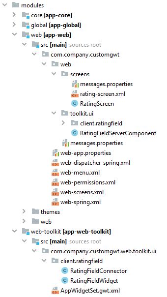
}The picture below shows the completed project structure:
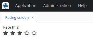
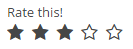
Start the application server and see the result.