5.5.2.2.7. GroupBoxLayout
GroupBoxLayout is a container that enables framing the embedded components and setting a universal header for them. Additionally, it can collapse content.

Component XML-name: groupBox.
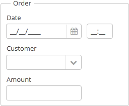
An example container description in a screen XML-descriptor:
<groupBox caption="Order">
    <dateField datasource="orderDs" property="date" caption="Date"/>
    <lookupField datasource="orderDs" property="customer"
                 optionsDatasource="customersDs" caption="Customer"/>
    <textField datasource="orderDs" property="amount" caption="Amount"/>
</groupBox>
groupBox attributes:
-
caption– group header.
-
orientation– defines components placement direction − horizontal or vertical. The default value isvertical.
-
collapsable– if the value is set totrue, the component’s content can be hidden using /
/ buttons.
-
collapsed– if set totrue, component’s content will be collapsed initially. It is used withcollapsable="true".An example of a collapsed
GroupBox:
The expanded state change events of the
groupBoxcomponent can be intercepted with the help of theExpandedStateChangeListenerinterface.
-
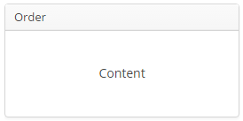
showAsPanel– if set totrue, the component will look like Vaadin Panel. The default value isfalse.
By default, the groupBox container is 100% wide, similar to vbox.
In Web Client with a Halo-based theme, you can set predefined styles to the groupBox component using the stylename attribute either in the XML descriptor or in the screen controller. When setting a style programmatically, select one of the HaloTheme class constants with the LAYOUT_ or GROUPBOX_ prefix. The following styles should be used combined with showAsPanel attribute set to true:
-
borderlessstyle removes borders and the background color of thegroupBox:groupBox.setShowAsPanel(true); groupBox.setStyleName(HaloTheme.GROUPBOX_PANEL_BORDERLESS);
-
cardstyle name makes a layout look like a card.
-
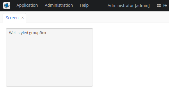
wellstyle makes container look "sunken" with shaded background:<groupBox caption="Well-styled groupBox" showAsPanel="true" stylename="well" width="300px" height="200px"/>
You can use keyboard shortcuts in Groupbox. Set the shortcut and the action to be performed using the addShortcutAction() method:
groupBox.addShortcutAction(new ShortcutAction("SHIFT-A", shortcutTriggeredEvent ->
showNotification("SHIFT-A action" )));- Attributes of groupBox
-
align - caption - collapsable - collapsed - expand - height - id - orientation - settingsEnabled - showAsPanel - spacing - stylename - width
- Predefined styles of groupBox
-
borderless - card - well
- API
-
add - addExpandedStateChangeListener - addShortcutAction - applySettings - getComponent - getComponentNN - getComponents - getOwnComponent - getOwnComponents - indexOf - remove - removeAll - saveSettings - setSpacing