4.5.2.2.4. CssLayout
CssLayout is a container that enables full control over placement and styling of enclosed components using CSS.
XML-name of the component: cssLayout.
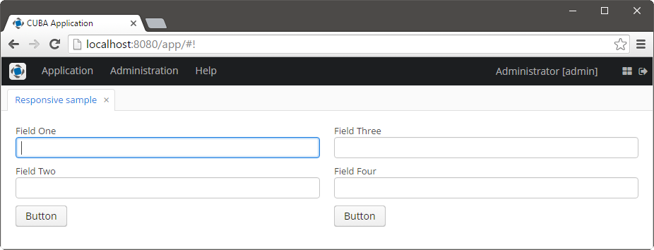
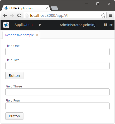
Below is an example of using cssLayout for simple responsive screen.
Displaying components on a wide screen:

Displaying components on a narrow screen:

Screen’s XML-descriptor:
<cssLayout responsive="true"
           stylename="responsive-container"
           width="100%">
    <vbox margin="true"
          spacing="true"
          stylename="group-panel">
        <textField caption="Field One" width="100%"/>
        <textField caption="Field Two" width="100%"/>
        <button caption="Button"/>
    </vbox>
    <vbox margin="true"
          spacing="true"
          stylename="group-panel">
        <textField caption="Field Three" width="100%"/>
        <textField caption="Field Four" width="100%"/>
        <button caption="Button"/>
    </vbox>
</cssLayout>
Content of modules/web/themes/halo/halo-ext.scss file (see Extending an Existing Theme for how to create this file):
@import "../halo/halo";

@mixin halo-ext {
  @include halo;

  .responsive-container {
    &[width-range~="0-900px"] {
      .group-panel {
        width: 100% !important;
      }
    }

    &[width-range~="901px-"] {
      .group-panel {
        width: 50% !important;
      }
    }
  }
}-
responsiveattribute indicates that the component should react on change in the available space. It isfalseby default. -
stylenameattribute enables setting predefined styles to theCssLayoutcomponent either in the XML descriptor or in the screen controller.-
v-component-groupstyle is used to create a grouped set of components, i.e. a row of components which are joined seamlessly together:Unresolved directive in gui_vcl.adoc - include::../../source/gui_vcl/cssLayout_3.xml[]
-
wellstyle makes container look "sunken" with shaded background. -
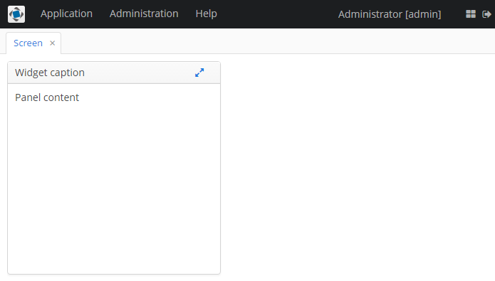
cardstyle name makes a layout look like a card. Combined with an additionalv-panel-captionstyle name for any enclosed layout, it provides a possibility to create enhanced composite layouts, for example:Unresolved directive in gui_vcl.adoc - include::../../source/gui_vcl/cssLayout_4.xml[]and result will be the following:

-