4.5.7.1.2. Extending an Existing Theme
A platform theme can be modified in the project. In the modified theme, you can:
-
Change branding images.
-
Add icons to use them in visual components.
-
Create new styles for visual components and use them in the stylename attribute. This requires some expertise in CSS.
-
Modify existing styles of the visual components.
-
Modify common parameters, such as background color, margins, spacing, etc.
Themes are defined in SCSS files. To modify (extend) a theme in the project, you should create a specific file structure in the web module. A convenient way to do this is to use CUBA Studio: open the Project properties section and click Create theme extension. Select the theme you want to extend in the popup window. As a result, the following directory structure will be created in the modules/web directory (for Halo theme extension):
themes/
  halo/
    branding/
      app-icon-login.png
      app-icon-menu.png
    favicon.ico
    halo-ext-defaults.scss
    halo-ext.scss
    styles.scss
Apart from that, the build.gradle script will be complemented with the buildScssThemes task, which is executed automatically each time the web module is built. The optional deployThemes task can be used to quickly apply changes in themes to the running application.
- Changing branding
-
You can configure some branding properties, such as icons, login and main application window captions, and the website icon (
favicon.ico).To use custom images, replace default ones in the
modules/web/themes/halo/brandingdirectory.To set window captions and the login window welcome text, edit Project properties in CUBA Studio and click Branding at the bottom of the page. Set window captions and the login window welcome text using the appropriate links.
These parameters are saved in the main message pack of the gui module (i.e the
modules/gui/<root_package>/gui/messages.propertiesfile and its variants for different locales). Message packs allow you to use different image files for different user locales. The samplemessages.propertiesfile:application.caption = MyApp application.logoImage = branding/myapp-menu.png loginWindow.caption = MyApp Login loginWindow.welcomeLabel = Welcome to MyApp! loginWindow.logoImage = branding/myapp-login.pngThe path to
favicon.icois not specified since it must be located in the root directory of the theme. - Adding icons
-
Image files that will be used in the icon properties for actions and visual components, e.g. Button, can be added to your theme extension.
For example, to add an icon to the Halo theme extension, you have to add the image file to the
modules/web/themes/halodirectory described above (it is recommended to create a subfolder):themes/ halo/ images/ address-book.pngAfter that, you can use the icon in the application by specifying the path relatively to the theme directory in the icon property:
<action id="adresses"
        icon="images/address-book.png"/>
Font elements of Font Awesome can be used instead of icons. You should specify the name of the required constant of the
com.vaadin.server.FontAwesomeclass in theiconproperty with afont-icon:prefix, for example:<action id="adresses" icon="font-icon:BOOK"/> - Adding icons from other font libraries
-
To enhance your theme extension, you may need to create icons and embed them into fonts, as well as use any external icons library.
In the web module create the
enumclass implementingcom.vaadin.server.FontIconinterface for the new icons:import com.vaadin.server.FontIcon; import com.vaadin.server.GenericFontIcon; public enum IcoMoon implements FontIcon { HEADPHONES(0XE900), SPINNER(0XE905); public static final String FONT_FAMILY = "IcoMoon"; private int codepoint; IcoMoon(int codepoint) { this.codepoint = codepoint; } @Override public String getFontFamily() { return FONT_FAMILY; } @Override public int getCodepoint() { return codepoint; } @Override public String getHtml() { return GenericFontIcon.getHtml(FONT_FAMILY, codepoint); } @Override public String getMIMEType() { throw new UnsupportedOperationException(FontIcon.class.getSimpleName() + " should not be used where a MIME type is needed."); } public static IcoMoon fromCodepoint(final int codepoint) { for (IcoMoon f : values()) { if (f.getCodepoint() == codepoint) { return f; } } throw new IllegalArgumentException("Codepoint " + codepoint + " not found in IcoMoon"); } }Add new styles to the theme extension. We recommend creating a special subfolder
fontsin the main folder of theme extension, for example,modules/web/themes/halo/com.company.demo/fonts. Put the styles and font files in their own subfolders, for example,fonts/icomoon. Files of fonts are represented by the following extensions:.eot,.svg,.ttf,.woff. The set of fontsicomoonfrom an open library, used in this example, consists of 4 joint used files:icomoon.eot,icomoon.svg,icomoon.ttf,icomoon.woff.Create a file with styles that includes
@font-faceand a CSS class with the icon style. Below is an example of theicomoon.scssfile, whereIcoMoonclass name corresponds to the value returned byFontIcon#getFontFamilymethod:@mixin icomoon-style { /* use !important to prevent issues with browser extensions that change fonts */ font-family: 'icomoon' !important; speak: none; font-style: normal; font-weight: normal; font-variant: normal; text-transform: none; line-height: 1; /* Better Font Rendering =========== */ -webkit-font-smoothing: antialiased; -moz-osx-font-smoothing: grayscale; } @font-face { font-family: 'icomoon'; src:url('icomoon.eot?hwgbks'); src:url('icomoon.eot?hwgbks#iefix') format('embedded-opentype'), url('icomoon.ttf?hwgbks') format('truetype'), url('icomoon.woff?hwgbks') format('woff'), url('icomoon.svg?hwgbks#icomoon') format('svg'); font-weight: normal; font-style: normal; } .IcoMoon { @Include icomoon-style; }Create a reference to the file with font styles in
halo-ext.scssor other file of theme extension:@import "fonts/icomoon/icomoon";Create new class
App.javaextendingDefaultAppin the root package of your web module and register it in web-spring.xml as thecuba_Appbean to override the bean for central class of the application infrastructure, for example:<bean name="cuba_App" class="com.company.sample.web.App" scope="prototype"/>Register new alias for icons in
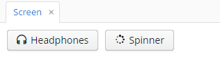
App.java:import com.haulmont.cuba.web.DefaultApp; import com.haulmont.cuba.web.gui.components.WebComponentsHelper; public class App extends DefaultApp { static { WebComponentsHelper.registerFontIcon("ico-moon-icon", IcoMoon.class); } }Now you can use new icons by direct reference to their class and
enumelement in XML-descriptor of the screen:<button caption="Headphones" icon="ico-moon-icon:HEADPHONES"/>or in the Java controller:
spinnerBtn.setIcon("ico-moon-icon:SPINNER");As a result, new icons are added to the buttons:
- Creating new styles
-
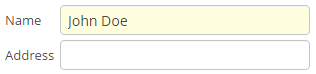
Consider the example of setting the yellow background color to the field displaying the customer’s name.
In an XML descriptor, the FieldGroup component is defined:
<fieldGroup id="fieldGroup" datasource="customerDs">
    <field id="name"/>
    <field id="address"/>
</fieldGroup>
The
fieldelements ofFieldGroupdo not have the stylename attribute, therefore we have to set the field’s style name in the controller:@Named("fieldGroup.name") private TextField nameField; @Override public void init(Map<String, Object> params) { nameField.setStyleName("name-field"); }In the
halo-ext.scssfile, add the new style definition to thehalo-extmixin:@import "../halo/halo"; @mixin halo-ext { @include halo; .name-field { background-color: lightyellow; } }After rebuilding the project, the fields will look as follows:
- Modifying existing styles of the visual components
-
To modify style parameters of existing components, add the corresponding CSS code to the
halo-extmixin of thehalo-ext.scssfile. Use developer tools of your web browser to find out CSS classes assigned to the elements of visual components. For example, to display the application menu items in bold, the contents of thehalo-ext.scssfile should be as follows:@import "../halo/halo"; @mixin halo-ext { @include halo; .v-menubar-menuitem-caption { font-weight: bold; } } - Modifying common parameters
-
Themes contain a number of SCSS variables that control application background colour, component size, margins and other parameters.
Below is the example of a Halo theme extension, since it is based on Valo theme from Vaadin, and provides the widest range of options for customization.
The
themes/halo/halo-ext-defaults.scssfile is intended for overriding theme variables. Most of the Halo variables correspond to those described in the Valo documentation. Below are the most common variables:$v-background-color: #fafafa; /* component background colour */ $v-app-background-color: #e7ebf2; /* application background colour */ $v-panel-background-color: #fff; /* panel background colour */ $v-focus-color: #3b5998; /* focused element colour */ $v-error-indicator-color: #ed473b; /* empty required fields colour */ $v-line-height: 1.35; /* line height */ $v-font-size: 14px; /* font size */ $v-font-weight: 400; /* font weight */ $v-unit-size: 30px; /* base theme size, defines the height for buttons, fields and other elements */ $v-font-size--h1: 24px; /* h1-style Label size */ $v-font-size--h2: 20px; /* h2-style Label size */ $v-font-size--h3: 16px; /* h3-style Label size */ /* margins for containers */ $v-layout-margin-top: 10px; $v-layout-margin-left: 10px; $v-layout-margin-right: 10px; $v-layout-margin-bottom: 10px; /* spacing between components in a container (if enabled) */ $v-layout-spacing-vertical: 10px; $v-layout-spacing-horizontal: 10px; /* basic table dimensions */ $v-table-row-height: 30px; $v-table-header-font-size: 13px; $v-table-cell-padding-horizontal: 7px; /* input field focus style */ $v-focus-style: inset 0px 0px 5px 1px rgba($v-focus-color, 0.5); /* required fields focus style */ $v-error-focus-style: inset 0px 0px 5px 1px rgba($v-error-indicator-color, 0.5); /* animation for elements is enabled by default */ $v-animations-enabled: true; /* popup window animation is disabled by default */ $v-window-animations-enabled: false; /* inverse header is controlled by cuba.web.useInverseHeader property */ $v-support-inverse-menu: true; /* show "required" indicators for components */ $v-show-required-indicators: false !default;The sample
halo-ext-defaults.scssfor a theme with a dark background and slightly minimized margins is provided below:$v-background-color: #444D50; $v-font-size--h1: 22px; $v-font-size--h2: 18px; $v-font-size--h3: 16px; $v-layout-margin-top: 8px; $v-layout-margin-left: 8px; $v-layout-margin-right: 8px; $v-layout-margin-bottom: 8px; $v-layout-spacing-vertical: 8px; $v-layout-spacing-horizontal: 8px; $v-table-row-height: 25px; $v-table-header-font-size: 13px; $v-table-cell-padding-horizontal: 5px; $v-support-inverse-menu: false; - Changing the application header
-
Halo theme supports the cuba.web.useInverseHeader property, which controls the colour of the application header. By default, this property is set to
true, which sets a dark (inverse) header.You can make a light header without any changes to the theme, simply by setting this property tofalse.