4.5.2.2.1. Accordion
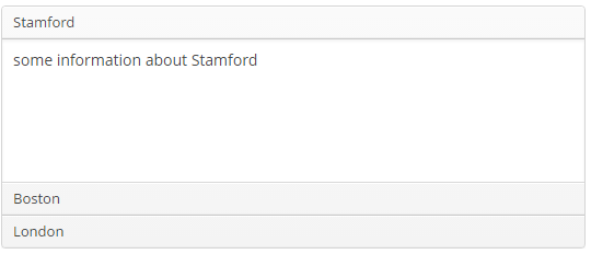
Accordion is a container for collapsible content that allows you to toggle between hiding and showing large amount of content. The Accordion container is implemented for Web Client.

XML-name of the component: accordion. An example description of an accordion in a screen XML-descriptor:
<accordion id="accordion" height="100%">
    <tab id="tabStamford" caption="msg://tabStamford" margin="true" spacing="true">
        <label value="msg://sampleStamford"/>
    </tab>
    <tab id="tabBoston" caption="msg://tabBoston" margin="true" spacing="true">
        <label value="msg://sampleBoston"/>
    </tab>
    <tab id="tabLondon" caption="msg://tabLondon" margin="true" spacing="true">
        <label value="msg://sampleLondon"/>
    </tab>
</accordion>
The accordion component should contain nested tab elements describing tabs. Each tab is a container with a vertical components layout similar to vbox. Accordion container can be used if the application page is limited in space or the tab title is too long to be displayed in the TabSheet. Accordion is featured with a smooth transition animation.
tab element attributes:
-
id– tab identifier. Please note that tabs are not components and their IDs are used only within theAccordionin order to work with tabs from the controller. -
caption – tab caption.
-
icon - defines icon location in theme catalog. Detailed information on recommended icon placement is available in Themes.
-
lazy– sets lazy loading for tab content.Lazy-tabs do not load their content when the screen is opened, which reduces the number of components in memory. Components within a tab are loaded only when a user selects the tab. Additionally, if a lazy-tab includes visual components linked to a datasource containing a JPQL query, this query is not executed as well. As a result, screen opens faster, and data is loaded only when the user requests it by selecting this tab.
Please note that the components located on a lazy tab do not exist when the screen is opened. Therefore they cannot be injected into a controller and cannot be obtained by invoking
getComponent()in the controller’sinit()method. The lazy tab components can be accessed only after the user opens the tab. This moment may be intercepted usingAccordion.TabChangeListener, for example:@Inject private Accordion accordion; private boolean tabInitialized; @Override public void init(Map<String, Object> params) { accordion.addListener(new Accordion.TabChangeListener() { @Override public void tabChanged(Accordion.Tab newTab) { if ("tabCambridge".equals(newTab.getName())) { initCambridgeTab(); } } }); } private void initCambridgeTab() { if (tabInitialized) { return; } tabInitialized = true; // initialization code here // use getComponentNN("comp_id") here to get lazy tab's components }By default, tabs are not
lazy, which means that all their content is loaded when a screen is opened. -
In Web Client with a Halo-based theme, the
stylenameattribute allows you to set the predefinedborderlessstyle to theaccordioncomponent to remove borders and background:accordion.setStyleName(HaloTheme.ACCORDION_BORDERLESS);
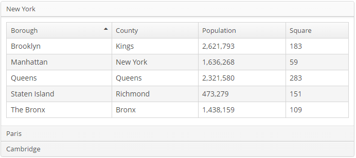
An accordion tab can contain any other visual container, such as table, grid etc:
<accordion id="accordion" height="100%" width="100%" enable="true">
    <tab id="tabNY" caption="msg://tabNY" margin="true" spacing="true">
        <table id="nYTable" width="100%">
            <columns>
                <column id="borough"/>
                <column id="county"/>
                <column id="population"/>
                <column id="square"/>
            </columns>
            <rows datasource="newYorkDs"/>
        </table>
    </tab>
</accordion>