4.5.7.2. Themes in Desktop Applications
The base theme for desktop applications is Nimbus.
To add any changes to the standard theme, you need to create a res.nimbus package in the com.sample.sales.desktop package of the desktop module. Theme files will be stored in the res.nimbus package.
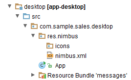
The icons folder contains icon files, the nimbus.xml file contains the description of the theme style.
The properties file of a desktop application should have cuba.desktop.resourceLocations property defined (defines a set of folders containing the style files):
cuba.desktop.resourceLocations = \
com/haulmont/cuba/desktop/res \
com/sample/sales/desktop/res
Below are examples of common tasks.
- Adding an icon
-
If you need to add a new icon to a desktop application, for example an icon for a button, you should create a
res.nimbus.iconspackage within thecom.sample.sales.desktoppackage of the desktop module and put the corresponding icon there.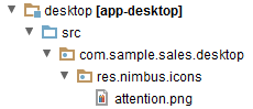
Description of a button in the descriptor with a path to an icon set in the icon attribute:
<button id="button1" caption="Attention" icon="icons/attention.png"/>Below you can see a button with the attention.png icon.

- Redefining default values of theme properties
-
For example, let us change text field background color for mandatory fields.
The
nimbus.xmlfile with the following content should be created in theres.nimbuspackage:<theme xmlns="http://schemas.haulmont.com/cuba/desktop-theme.xsd"> <ui-defaults> <color property="cubaRequiredBackground" value="#f78260"/> </ui-defaults> </theme>The
ui-defaultselement redefines the values of platform theme properties set by default.The
ui-defaultselement includes both the properties contained in a standardNimbus(http://docs.oracle.com/javase/tutorial/uiswing/lookandfeel/_nimbusDefaults.html) theme and the properties created in the CUBA platform.In this example, we redefined the value of the CUBA property –
cubaRequiredBackground, which stores the background color for required fields. This change will affect all required input fields. - Creating a style for an element using standard tools
-
Let’s consider an example of highlighting a text in bold.
To create a style like that you need to define
styleelement in the theme filenimbus.xmlin the following way:<theme xmlns="http://schemas.haulmont.com/cuba/desktop-theme.xsd"> <style name="boldlabel"> <font style="bold"/> </style> </theme>styleelement can also contain other elements which can define different properties:background,foreground,icon.You should add stylename attribute with the name of the created style into the description of the corresponding label in an xml-descriptor.
<label id="label1" value="msg://labelVal" stylename="boldlabel"/>In such way the style will be applied only to the labels that have stylename attribute with the value of
boldlabel. - Creating a custom style
-
If standard style adjustment capabilities are insufficient, you can create a custom style.
Let us create a custom style that will be applied to the Button component. With this style, the the button caption will be underlined.
First, create a decorator class
UnderlinedLabelDecorator:public class UnderlinedButtonDecorator implements ComponentDecorator { @Override @SuppressWarnings("unchecked") public void decorate(Object component, Set<String> state) { DesktopButton item = (DesktopButton) component; JButton jButton = (JButton) item.getComponent(); Font originalFont = jButton.getFont(); Map attributes = originalFont.getAttributes(); attributes.put(TextAttribute.UNDERLINE, TextAttribute.UNDERLINE_ON); jButton.setFont(originalFont.deriveFont(attributes)); } }Define a custom style in
nimbus.xml:<theme xmlns="http://schemas.haulmont.com/cuba/desktop-theme.xsd"> <style name="button-underlined" component="com.haulmont.cuba.desktop.gui.components.DesktopButton"> <custom class="com.sample.sales.desktop.gui.decorators.UnderlinedButtonDecorator"/> </style> </theme>The
componentattribute of thestyleelement contains the name of the component that the style with the namebutton-underlinedcan be applied to.The
customelement should contain a path to the decorator class defined above.When creating an XML element for a button that should have the custom style, specify the style name in the
stylenameattribute:<button stylename="button-underlined" caption="decorated"/>The button with the custom style:
