4.5.2.2.2. ButtonsPanel
ButtonsPanel is a container that streamlines the use and placement of the components (usually, buttons) for data management in a table.
XML-name of the component: buttonsPanel.
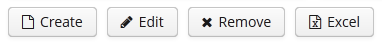
A sample description of a ButtonsPanel in screen XML-descriptor:
<table id="customersTable"
       editable="false" width="100%">
    <actions>
        <action id="create"/>
        <action id="edit"/>
        <action id="remove"/>
        <action id="excel"/>
    </actions>
    <buttonsPanel>
        <button action="customersTable.create"/>
        <button action="customersTable.edit"/>
        <button action="customersTable.remove"/>
        <button action="customersTable.excel"/>
    </buttonsPanel>
    <columns>
        <column id="name"/>
        <column id="email"/>
    </columns>
    <rows datasource="customersDs"/>
</table>
buttonsPanel element can be located either inside a table, or in any other place of a screen.
If the buttonsPanel is located in a table, it is combined with the table’s rowsCount component thus using vertical space more effectively. Additionally, if a lookup screen is opened using Frame.openLookup() (for example, from the PickerField component) the buttons panel becomes hidden.
alwaysVisible attribute disables panel hiding in a lookup screen when it is opened by Frame.openLookup(). If the attribute value is true, the buttons panel is not hidden. By default, the attribute value is false.