4.5.2.2.7. SplitPanel
SplitPanel − a container divided into two areas by a movable separator.
Component XML-name: split.
An example description of a split panel in a screen XML-descriptor:
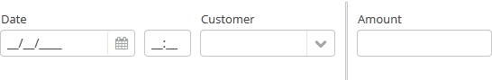
<split orientation="horizontal" pos="30" width="100%" height="100%">
    <vbox margin="true" spacing="true">
        <dateField datasource="orderDs" property="date" caption="Date"/>
        <lookupField datasource="orderDs" property="customer" optionsDatasource="customersDs" caption="Customer"/>
    </vbox>
    <vbox margin="true" spacing="true">
        <textField datasource="orderDs" property="amount" caption="Amount"/>
    </vbox>
</split>
split container must contain two nested containers or components. They will be displayed on both sides of the separator.
split attributes:
-
orientation– defines component orientation.horizontal– nested components are placed horizontally,vertical– they are placed vertically.
-
pos– an integer number defining percentage of the first component area compared to the second one. For example,pos="30"means that the areas ration is 30/70. By default the areas are divided 50/50.
-
reversePosition- indicates that theposattribute specifies a position of the splitter from the opposite side of the component.
-
If the
lockedattribute is set totrue, users are unable to change the separator position.
- Attributes of split
-
align - height - id - locked - orientation - pos - reversePosition - width