 Edit on GitHub
3.5.2.2.12. TabSheet
TabSheet container is a tabbed panel. The panel shows content of one tab at a time.
XML-name of the component: tabSheet.
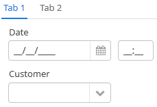
An example description of a tabbed panel in a screen XML-descriptor:
<tabSheet>
    <tab id="mainTab" caption="Tab1" margin="true" spacing="true">
        <dateField dataContainer="orderDc" property="date" caption="Date"/>
        <lookupField dataContainer="orderDc" property="customer" optionsContainer="customersDc" caption="Customer"/>
    </tab>
    <tab id="additionalTab" caption="Tab2" margin="true" spacing="true">
        <textField dataContainer="orderDc" property="amount" caption="Amount"/>
    </tab>
</tabSheet>
The description attribute of tabSheet defines a hint which is displayed in a popup when a user hovers the mouse cursor over or clicks on the tabs area.
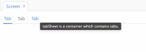
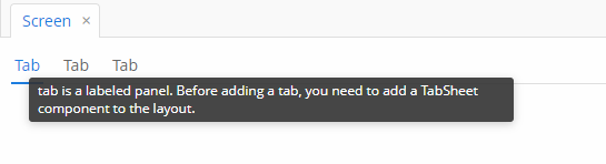
The tabSheet component should contain nested tab elements describing tabs. Each tab is a container with a vertical components layout similar to vbox.
tab element attributes:
-
id– tab identifier. Please note that tabs are not components and their IDs are used only within aTabSheetin order to work with tabs from the controller. -
caption – tab caption.
-
description - the text of a hint which is displayed in a popup when a user hovers the mouse cursor over or clicks on the concrete tab.
-
lazy– sets lazy loading for tab content.Lazy tabs do not load their content when the screen is opened, which reduces the number of components in memory. Components within a tab are loaded only when a user selects the tab. Additionally, if a lazy-tab includes visual components linked to a data container with a loader, the loader will not be triggered. As a result, screen opens faster, and data is loaded only when the user requests it by selecting this tab.
Please note that the components located on a lazy tab do not exist when the screen is opened. Therefore they cannot be injected into a controller and cannot be obtained by invoking
getComponent()in the controller’sinit()method. The lazy tab components can be accessed only after the user opens the tab. This moment may be intercepted usingTabSheet.SelectedTabChangeListener, for example:@Inject private TabSheet tabSheet; private boolean detailsInitialized, historyInitialized; @Subscribe protected void onInit(InitEvent event) { tabSheet.addSelectedTabChangeListener(selectedTabChangeEvent -> { if ("detailsTab".equals(selectedTabChangeEvent.getSelectedTab().getName())) { initDetails(); } else if ("historyTab".equals(selectedTabChangeEvent.getSelectedTab().getName())) { initHistory(); } }); } private void initDetails() { if (detailsInitialized) { return; } detailsInitialized = true; (1) } private void initHistory() { if (historyInitialized) { return; } historyInitialized = true; (2) }1 use getComponentNN("comp_id")here to get tab’s components2 use getComponentNN("comp_id")here to get tab’s componentsBy default, tabs are not
lazy, which means that all their content is loaded when a screen is opened.The origin of the
SelectedTabChangeEventcan be tracked using isUserOriginated() method.- TabSheet styles
-
In Web Client with a Halo-based theme, you can set predefined styles to the
TabSheetcontainer using thestylenameattribute either in the XML descriptor or in the screen controller:<tabSheet stylename="framed"> <tab id="mainTab" caption="Framed tab"/> </tabSheet>When setting a style programmatically, select one of the
HaloThemeclass constants with theTABSHEET_prefix:tabSheet.setStyleName(HaloTheme.TABSHEET_COMPACT_TABBAR);-
centered-tabs- centers the tabs inside the tab bar. Works best if all the tabs fit completely in the tab bar (i.e. no tab bar scrolling).
-
compact-tabbar- reduces the whitespace around the tabs in the tab bar.
-
equal-width-tabs- gives equal amount of space to all tabs in the tab bar (i.e. expand ratio == 1 for all tabs). The tab captions will be truncated if they do not fit into the tab. Tab scrolling will be disabled when this style is applied (all tabs will be visible at the same time).
-
framed- adds a border around the whole component as well as around individual tabs in the tab bar.
-
icons-on-top- displays tab icons on top of the tab captions (by default the icons are place on the left side of the caption).
-
only-selected-closeable- only the selected tab has the close button visible. Does not prevent closing the tab programmatically, it only hides the button from the end user.
-
padded-tabbar- adds a small amount of padding around the tabs in the tab bar, so that they don’t touch the outer edges of the component.
-
The appearance of the TabSheet component can be customized using SCSS variables with $cuba-tabsheet-* prefix. You can change these variables in the visual editor after creating a theme extension or a custom theme.
- Attributes of tabSheet
-
caption - captionAsHtml - contextHelpText - contextHelpTextHtmlEnabled - css - box.expandRatio - height - id - description - descriptionAsHtml - stylename - tabCaptionsAsHtml - tabIndex - tabsVisible - visible - width
- Attributes of tab
-
caption - closable - description - enable - expand - margin - icon - id - lazy - spacing - stylename - visible
- Predefined styles of tabSheet
-
centered-tabs - compact-tabbar - equal-width-tabs - framed - icons-on-top - only-selected-closeable - padded-tabbar
- API
-
add - addSelectedTabChangeListener - getComponent - getComponentNN - getComponents - getOwnComponent - getOwnComponents - remove - removeAll