 Edit on GitHub
3.5.2.6. XML-Attributes of Components
- align
-
Defines the component position relative to the parent container. Possible values are:
-
TOP_RIGHT -
TOP_LEFT -
TOP_CENTER -
MIDDLE_RIGHT -
MIDDLE_LEFT -
MIDDLE_CENTER -
BOTTOM_RIGHT -
BOTTOM_LEFT -
BOTTOM_CENTER
-
- box.expandRatio
-
In vbox and hbox containers, components are placed in slots. The
box.expandRatioattribute specifies the expand ratio for each slot. The ratio must be greater than or equal to 0.<hbox width="500px" expand="button1" spacing="true"> <button id="button1" box.expandRatio="1"/> <button id="button2" width="100%" box.expandRatio="3"/> <button id="button3" width="100%" box.expandRatio="2"/> </hbox>If we specify
box.expandRatio=1to one component and its height or width is 100% (depends on layout), this component will be expanded to use all available space in the direction of component placement.By default, all slots for components have equal width or height (i.e.
box.expandRatio = 1). If another value is set for at least one component, all implicit values are ignored, and only explicitly assigned values are considered.See also the expand attribute.
- caption
-
Sets the component’s caption.
The attribute value can either be a message or a key in a message pack. In case of a key, the value should begin with the
msg://prefix.There are two ways of setting a key:
-
A short key – in this case the message will be searched in the package of the current screen:
caption="msg://infoFieldCaption" -
Full key including package name:
caption="msg://com.company.sample.gui.screen/infoFieldCaption"
-
- captionAsHtml
-
Defines whether HTML is enabled in the component’s caption. If set to
true, the captions are rendered in the browser as HTML, and the developer is responsible for ensuring no harmful HTML is used. If set tofalse, the content is rendered in the browser as plain text.Possible values −
true,false. Default isfalse.
- captionProperty
-
Defines the name of an entity attribute which is displayed by a component.
captionPropertycan only be used for entities contained in a datasource (for example, defined by the optionsDatasource property of the LookupField component).If
captionPropertyis not defined, instance name is shown.
- colspan
-
Sets the number of grid columns that the component should occupy (default is 1).
This attribute can be defined for any component located immediately within a GridLayout container.
- contextHelpText
-
Sets the context help text. If set, then a special ? icon will be added for a field. If the field has an external caption, i.e. either caption or icon attribute is set, then the context help icon will be displayed next to the caption text, otherwise next to the field itself:
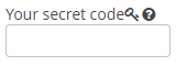
In the web client, the context help tooltip appears when the users hovers over the ? icon.
<textField id="textField"
           contextHelpText="msg://contextHelp"/>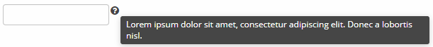
- contextHelpTextHtmlEnabled
-
Defines if context help text can be presented as HTML.
<textField id="textField"
           description="Description"
           contextHelpText="<p><h1>Lorem ipsum dolor</h1> sit amet, <b>consectetur</b> adipiscing elit.</p><p>Donec a lobortis nisl.</p>"
           contextHelpTextHtmlEnabled="true"/>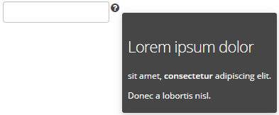
Possible values −
true,false.
- css
-
Provides a declarative way to set CSS properties for UI components. This attribute can be used together with the stylename attribute, see an example below.
XML definition:<cssLayout css="display: grid; grid-gap: 10px; grid-template-columns: 33% 33% 33%" stylename="demo" width="100%" height="100%"> <label value="A" css="grid-column: 1 / 3; grid-row: 1"/> <label value="B" css="grid-column: 3; grid-row: 1 / 3;"/> <label value="C" css="grid-column: 1; grid-row: 2;"/> <label value="D" css="grid-column: 2; grid-row: 2;"/> </cssLayout>Additional CSS:.demo > .v-label { display: block; background-color: #444; color: #fff; border-radius: 5px; padding: 20px; font-size: 150%; }
- dataContainer
-
Sets a data container defined in the
datasection of the screen XML descriptor.When setting the
dataContainerattribute for a component, the property attribute should also be set.
- dataLoader
-
Sets a data loader defined for a data container in the
datasection of the screen XML descriptor.
- datasource
-
Sets a data source defined in the
dsContextsection of the screen XML descriptor.When setting the
datasourceattribute for a component implementing theDatasourceComponentinterface, the property attribute should also be set.
- datatype
-
Sets a data type if the field is not connected to an entity attribute (i.e. the data container and attribute name are not set). The attribute value accepts a data type registered in the application metadata − see Datatype.
The attribute is used for TextField, DateField, DatePicker, TimeField components.
- description
-
Defines a hint which is displayed in a popup when a user hovers the mouse cursor over or clicks on the component area.
- descriptionAsHtml
-
Defines whether HTML is allowed in the component’s description. If set to
true, the captions are rendered in the browser as HTML, and the developer is responsible for ensuring no harmful HTML is used. If set tofalse, the content is rendered in the browser as plain text.Possible values −
true,false. Default isfalse.
- editable
-
Indicates that the component’s content can be edited (do not confuse with enable).
Possible values −
true,false. Default value istrue.Ability to edit content of a component bound to data (inheritor of
DatasourceComponentorListComponent) is also influenced by the security subsystem. If the security subsystem information indicates that the component should not be editable, the value of itseditableattribute is ignored.
- enable
-
Defines the component’s enabled/disabled state.
If a component is disabled, it does not accept input focus. Disabling a container disables all of its components as well. Possible values are
true,false. By default all components are enabled.
- expand
-
Defines a component within the container that should be expanded to use all available space in the direction of component placement. For a container with vertical placement, this attribute sets 100% height to a component; for the containers with horizontal placement - 100% width. Additionally, resizing a container will resize the expanded component. See also box.expandRatio.
- height
-
Sets the component’s height. Can be set in pixels or in percents of the parent container height. For example:
100px,100%,50. If it is specified without units, pixels are assumed.Setting a value in
%means that the component will occupy the corresponding height within an area provided by the parent container.When set to
AUTOor-1px, a default value will be used for the component height. For a container, default height is defined by the content: it is the sum of the heights of all nested components.
- icon
-
Sets a component icon.
The attribute value should contain a path to an icon file relative to the themes folder:
icon="icons/create.png"or the icon name in an icon set:
icon="CREATE_ACTION"If different icons should be displayed depending on the user’s language, you can set paths to the icons in the message pack and specify a message key in the
iconattribute, for example:icon="msg://addIcon"Font elements of Font Awesome can be used instead of files in web client with Halo theme (or derived from it). For this, specify the name of the required constant of the
com.vaadin.server.FontAwesomeclass in the icon property with thefont-icon:prefix, for example:icon="font-icon:BOOK"For more details on the usage of icons see the Icons section.
- id
-
Sets an identifier of the component.
It is recommended to create identifiers according to the rules for Java-identifiers and use camelСase, for example:
userGrid,filterPanel. Theidattribute can be specified for any component and should be unique within a screen.
- inputPrompt
-
Defines a string which is displayed in the field when its value is
null.<suggestionField inputPrompt="Let's search something!"/>The attribute is used for TextField, LookupField, LookupPickerField, SearchPickerField, SuggestionPickerField components in web client only.
- margin
-
Defines indentation between the outer borders and the container content.
It can take value of two types:
-
margin="true"− enables margins for all sides. -
margin="true,false,true,false"− enables only the top and the bottom margin (the value format is "top,right,bottom,left").
By default margins are disabled.
-
- nullName
-
Selection of the option defined in the
nullNameattribute is equal to setting thenullvalue to the component.The attribute is used for LookupField, LookupPickerField, and SearchPickerField components.
Example of setting an attribute value in an XML-descriptor:
<lookupField datasource="orderDs"
             property="customer"
             nullName="(none)"
             optionsDatasource="customersDs" width="200px"/>
Example of setting an attribute value in a controller:
<lookupField id="customerLookupField" optionsDatasource="customersDs" width="200px" datasource="orderDs" property="customer"/>customerLookupField.setNullOption("<null>");
- openType
-
Defines how a related screen will be opened. Corresponds to the
WindowManager.OpenTypeenumeration with the valuesNEW_TAB,THIS_TAB,NEW_WINDOW,DIALOG. Default value isTHIS_TAB.
- optionsContainer
-
Sets the name of a data container which contains a list of options.
captionProperty attribute can be used together with
optionsContainer.
- optionsDatasource
-
Sets the name of a data source which contains a list of options.
captionProperty attribute can be used together with
optionsDatasource.
- optionsEnum
-
Sets the enumeration class name which contains a list of options.
- property
-
Sets the name of an entity attribute which value will be displayed and edited by this visual component.
propertyis always used together with the datasource attribute.
- required
-
Indicates that this field requires a value.
Possible values −
true,false. Default isfalse.The requiredMessage attribute can be used together with
required.
- requiredMessage
-
Used together with the required attribute. It sets a message that will be displayed to a user when the component has no value.
The attribute can contain a message or a key from a message pack, for example:
requiredMessage="msg://infoTextField.requiredMessage"
- responsive
-
Indicates that the component should react on change in the available space. Reaction can be customized with the help of styles.
Possible values −
true,false. Default isfalse.
- rowspan
-
Sets the number of grid lines that the component should occupy (default is 1).
This attribute can be set for any component located immediately within a GridLayout container.
- settingsEnabled
-
Defines if user settings for the component should be saved/restored. Settings are saved only if the component’s id is set.
Possible values −
true,false. Default istrue.
- spacing
-
Sets spacing between components within a container.
Possible values −
true,false.By default spacing is disabled.
- stylename
-
Defines a style name for a component. See Themes for details.
There are several predefined styles in
halotheme available for the components:-
huge- sets the field size to 160% of its default size.
-
large- sets the field size to 120% of its default size.
-
small- sets the field size to 85% of its default size.
-
tiny- sets the field size to 75% of its default size.
-
- tabCaptionsAsHtml
-
Defines whether HTML is allowed in the tab captions. If set to
true, the captions are rendered in the browser as HTML, and the developer is responsible for ensuring no harmful HTML is used. If set tofalse, the content is rendered in the browser as plain text.Possible values −
true,false. Default isfalse.
- tabIndex
-
Specifies whether the component is focusable and sets the relative order of the component in the sequence of focusable components on the screen.
It can can take integer values of positive or negative range:
-
negative valuemeans that the component should be focusable, but should not be reachable via sequential keyboard navigation; -
0means that the component should be focusable and reachable via sequential keyboard navigation, but its relative order follows its relative position on the screen; -
positive valuemeans the component should be focusable and reachable via sequential keyboard navigation; its relative order is defined by the value of the attribute: the sequential follows the increasing number of thetabIndex. If several components share the sametabIndexvalue, their relative order follows their relative position on the screen.
-
- tabsVisible
-
Sets whether the tab selection part should be shown in the UI.
Possible values −
true,false. Default istrue.
- textSelectionEnabled
-
Defines if text selection is enabled in table cells.
Possible values −
true,false. Default isfalse.
- visible
-
Sets visibility of the component. Possible values −
true,false.If a container is invisible all its components are invisible. By default all components are visible.
- width
-
Defines component’s width.
The value can be set in pixels or in percents of the width of the parent container. For example:
100px,100%,50. If specified without units, pixels are assumed. Setting a value in%means that the component will occupy the corresponding width within an area provided by the parent container.When set to
AUTOor-1px, a default value will be used for a component width. For a container, the default width is defined by the content: it is the sum of the widths of all nested components.