4.5.2.1.26. PopupButton
This is a button with a drop-down list of actions.

XML name of the component: popupButton.

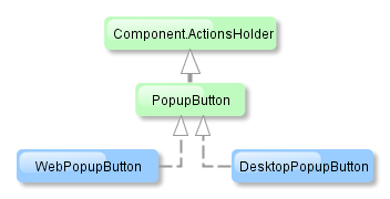
The component is implemented for Web Client and Desktop Client.
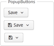
PopupButton can contain text or icon (or both). The figure below shows different types of buttons.

Below is an example of a button with a drop-down list containing two actions.
<popupButton id="popupButton" caption="msg://popupButton" description="Press me">
    <actions>
        <action id="popupAction1" caption="msg://action1" invoke="someAction1"/>
        <action id="popupAction2" caption="msg://action2" invoke="someAction2"/>
    </actions>
</popupButton>
The button has a caption, which is specified using the caption attribute, and a tooltip defined in the description attribute. The drop-down actions list is specified in the actions element. PopupButton displays only the following action properties: caption, enable, visible. The description and shortcut properties are ignored. Handling of the icon property depends on the cuba.gui.showIconsForPopupMenuActions application property and the showActionIcons attribute of the component. The latter has priority.