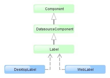
4.5.2.1.16. Label
Label is a text component that displays static text or value of an entity attribute.
XML name of the component: label

The Label component is implemented for Web Client and Desktop Client.
Below is an example of setting a label with text taken from the localized message pack:
<label value="msg://orders"/>The value attribute sets text for a label.
In a web client, the text contained in value will be split into multiple lines if its length exceeds the width value. Therefore, to display a multiline label, it is sufficient to specify an absolute value of width. If the label text is too long and the value of width is not specified, the text will be truncated.
<label value="Label, which should be split into multiple lines"
       width="200px"/>
You can set label parameters in the screen controller. To do this, you should specify a component identifier and get a reference to the component in the controller:
<label id="dynamicLabel"/>@Inject
private Label dynamicLabel;
public void init(Map<String, Object> params) {
dynamicLabel.setValue("Some value");
}The Label component can display value of an entity attribute. For this purpose, datasource and property attributes are used. For example:
<dsContext>
    <datasource id="customerDs" class="com.sample.sales.entity.Customer" view="_local"/>
</dsContext>
<layout>
    <label datasource="customerDs" property="name"/>
In the example above, component displays the name attribute of the Customer entity located in the customerDs data source.
htmlEnabled attribute indicates the way the value attribute will be interpreted: if htmlEnabled="true", the attribute will be treated as HTML code, otherwise as a plain string. Note that the desktop implementation of the screen does not support all HTML tags.
- Label styles
-
In Web Client with a Halo-based theme, you can set predefined styles to the
Labelcomponent using thestylenameattribute either in the XML descriptor or in the screen controller:<label value="Label to be styled" stylename="colored"/>When setting a style programmatically, select one of the
HaloThemeclass constants with theLABEL_prefix:label.setStyleName(HaloTheme.LABEL_COLORED);-
bold- bolder font weight. Suitable for important/prominent UI text.
-
colored- colored text.
-
failure- failure badge style. Adds a border around the label and an icon next to the text. Suitable for UI notifications that need to be used in the direct context of some component.
-
h1- header style for main application headings.
-
h2- header style for different sections in the application.
-
h3- header style for different sub-sections in the application.
-
h4- header style for different sub-sections in the application.
-
light- lighter font weight. Suitable for additional/supplementary UI text.
-
no-margin- removes default margins from the header.
-
spinner- spinner style. Add this style name to an emptyLabelto create a spinner.
-
success- success badge style. Adds a border around the label and an icon next to the text. Suitable for UI notifications that need to be used in the direct context of some component.
-