4.5.2.2.2. BoxLayout
BoxLayout is a container with sequential placement of components.
There are three types of BoxLayout, identified by the XML-elements:
-
hbox− components are placed horizontally.
<hbox spacing="true" margin="true">
    <dateField datasource="orderDs" property="date"/>
    <lookupField datasource="orderDs" property="customer" optionsDatasource="customersDs"/>
    <textField datasource="orderDs" property="amount"/>
</hbox>
-
vbox− components are placed vertically.vboxhas 100% width by default.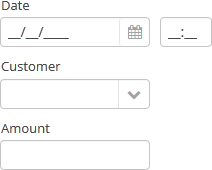
<vbox spacing="true" margin="true">
    <dateField datasource="orderDs" property="date"/>
    <lookupField datasource="orderDs" property="customer" optionsDatasource="customersDs"/>
    <textField datasource="orderDs" property="amount"/>
</vbox>
-
flowBox− components are placed horizontally with line wrapping. If there is not enough space in a line, the components that do not fit will be displayed in the next line (the behavior is similar to SwingFlowLayout).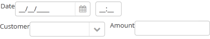
<flowBox spacing="true" margin="true">
    <dateField datasource="orderDs" property="date"/>
    <lookupField datasource="orderDs" property="customer" optionsDatasource="customersDs"/>
    <textField datasource="orderDs" property="amount"/>
</flowBox>
In Web Client with a Halo-based theme, BoxLayout may be used to create enhanced composite layouts. The stylename attribute with card or well value along with stylename="v-panel-caption" for an enclosed container will make a component look like Vaadin Panel.
-
cardstyle name makes a layout look like a card. -
wellstyle makes the card look "sunken" with shaded background.
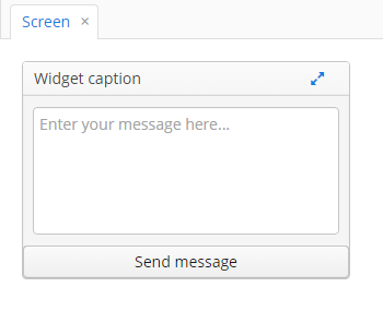
<vbox stylename="well"
      height="200px"
      width="300px"
      expand="message"
      spacing="true">
    <hbox stylename="v-panel-caption"
          width="100%">
        <label value="Widget caption"/>
        <button align="MIDDLE_RIGHT"
                icon="font-icon:EXPAND"
                stylename="borderless-colored"/>
    </hbox>
    <textArea id="message"
              inputPrompt="Enter your message here..."
              width="280"
              align="MIDDLE_CENTER"/>
    <button caption="Send message"
            width="100%"/>
</vbox>