- @PrimaryKeyJoinColumn
-
Is used in the case of
JOINEDinheritance strategy to specify a foreign key column for the entity which refers to the primary key of the ancestor entity.Parameters:
-
name– the name of the foreign key column of the entity -
referencedColumnName– the name of primary key column of the ancestor entity
Example:
@PrimaryKeyJoinColumn(name = "CARD_ID", referencedColumnName = "ID") -
A new generation of the platform is Jmix.
Preface
This manual provides the reference information for the CUBA platform and covers the most important topics of developing business applications with it.
Knowledge of the following technologies is required to use the platform:
-
Java Standard Edition
-
Relational databases (SQL, DDL)
Additionally, knowledge of the following technologies and frameworks will be helpful to get a deeper understanding of the platform:
If you have any suggestions for improving this manual, feel free to report issues in the source repository on GitHub. If you see a spelling or wording mistake, a bug or inconsistency, don’t hesitate to fork the repo and fix it. Thank you!
1. Setup
- System requirements
-
-
64-bit operating system: Windows, Linux or macOS.
-
Memory – 8 GB for development with CUBA Studio.
-
Hard drive free space – 10 GB.
-
- Java SE Development Kit (JDK)
-
-
Install JDK 8 and check it by running the following command in the console:
java -versionThe command should return the Java version, e.g.
1.8.0_202.CUBA 7.2 supports Java 8, 9, 10 and 11. If you don’t need to work with projects based on previous CUBA versions (including migration to CUBA 7.2), then we recommend using Java 11.
Pay attention that OpenJ9 JVM is not supported.
-
Set the path to the JDK root directory in the
JAVA_HOMEenvironment variable, e.g.C:\Java\jdk8u202-b08.-
On Windows, you can do this at Computer → Properties → Advanced System Settings → Advanced → Environment variables. The value of the variable should be added to the System variables list.
-
On macOS, it is recommended to install JDK in the
/Library/Java/JavaVirtualMachinesfolder, for example/Library/Java/JavaVirtualMachines/jdk8u202-b08, and setJAVA_HOMEin~/.bash_profilewith the following command:export JAVA_HOME="$(/usr/libexec/java_home -v 1.8)"
-
-
If you connect to the internet via a proxy server, some Java system properties must be passed to the JVM running development tools and Gradle. These properties are explained here: http://docs.oracle.com/javase/8/docs/technotes/guides/net/proxies.html (see properties for HTTP and HTTPS protocols). It is recommended to set the properties system-wide in the
JAVA_OPTSenvironment variable.
-
- Development Tools
-
The following tools facilitate development with the CUBA framework:
-
CUBA Studio - an integrated development environment built on the IntelliJ platform and tailored specifically for CUBA projects. You can install it as a separate application for your operating system, or as a plugin to IntelliJ IDEA (Community or Ultimate). See more information in the CUBA Studio User Guide.
-
CUBA CLI - a command line tool that provides basic scaffolding of projects and their elements: entities, screens, services, etc. This tool allows you to use any Java IDE for development of CUBA applications. See more information on the CUBA CLI GitHub page.
If you are new to Java, we strongly recommend using CUBA Studio as it is the most advanced and intuitive tool.
-
- Database
-
In the most basic scenario, the built-in HyperSQL (http://hsqldb.org) can be used as the database server. This is sufficient for exploring the platform capabilities and application prototyping. For building production applications, it is recommended to install and use one of the full-featured DBMS supported by the platform, like PostgreSQL for instance.
- Web browser
-
The web interface of the platform-based applications supports all popular browsers, including Google Chrome, Mozilla Firefox, Safari, Opera 15+, Internet Explorer 11, Microsoft Edge.
2. Quick Start
|
Visit Quick Start page on the platform website to learn the main things for creating any web application: how to create a project and database, how to design data model and how to create user interface. Make sure that the necessary software is already installed and set up on your computer, see Setup. You can go further in studying CUBA with help of training examples on the Learn page on the CUBA Platform website. The next essential step of developing can be putting business logic into your application. See the following guide: To design more complicated data model see the following guides: Get an overview on how to read and write data in CUBA applications with the help of this guide: The more information on how to work with events, localize messages, provide user access and test your application you can find on the Guides page. The most code examples in this manual are based on the data model used in Sales Application. |
More Information |
Tutorials and webinars that explain concepts and techniques in detail |
|
Let you be guided through different aspects of the platform |
|
Live applications demonstrating Platform functionality |
3. The Framework
This chapter contains detailed description of the platform architecture, components and mechanisms.
3.1. Architecture
This section covers the architecture of CUBA applications in different perspectives: by tiers, blocks, modules, and components.
3.1.1. Application Tiers and Blocks
The framework enables building multi-tiered applications with the distinct client, middle and database tiers. Further on, we will consider mainly the middle and client tiers, so the words "all tiers" will refer to these tiers only.
An application can have one or more blocks on each tier. A block is a separate executable program interacting with other blocks of the application. Usually, a block is a web application running on JVM.

Figure 1. Application Tiers and Blocks
- Middleware
-
The middle tier contains core business logic of the application and provides access to the database. It is represented by a separate web application running on a Java servlet container. See Middleware Components.
- Web Client
-
A main block of the client tier. It contains the interface designed primarily for internal (back-office) users. It is represented by a separate web application running on a Java servlet container. The user interface is based on the Vaadin framework. See Generic User Interface.
- Web Portal
-
An additional block of the client tier. It can contain an interface for external users and entry points for integration with mobile devices and third-party applications. It is represented by a separate web application running on a Java servlet container. The user interface is based on the Spring MVC framework. See Portal Components.
- Frontend UI
-
An optional UI layer designed for external users. Unlike Web Portal, it is a client-side application (for example, a JavaScript application executed in the web browser). It communicates with the middleware via REST API running either in Web Client or in Web Portal blocks. It can be powered by React or other libraries/frameworks. See Frontend User Interface.
Middleware is the mandatory block for any application. User interface can be implemented by one or several blocks, such as Web Client and Web Portal.
All of the Java-based client blocks interact with the middle tier uniformly via HTTP protocol which enables deploying the middle tier arbitrarily, behind a firewall as well. In the simplest case, when the middle tier and the web client are deployed on the same server, local interaction between them can bypass the network stack for better performance.
3.1.2. Application Modules
A module is the smallest structural part of a CUBA application. It is a single module of an application project and the corresponding JAR file with executable code.
Standard modules:
-
global – includes entity classes, service interfaces, and other classes common for all tiers. It is used in all application blocks.
-
core – implements services and all other components of the middle tier.
-
gui – contains components of the generic user interface. It is used in the Web Client block.
-
web – the implementation of the generic user interface based on Vaadin.
-
portal – an optional module – implementation of Web Portal based on Spring MVC.
-
front – an optional module – implementation of Frontend User Interface in JavaScript.

Figure 2. Application Modules
3.1.3. Application Components
The framework enables splitting the application functionality into components. Each application component (AKA add-on) can have its own data model, business logic and user interface. The application uses the component as a library and includes its functionality.
The concept of application components allows us to keep the framework relatively small, while delivering optional business functionality in the components like Reporting, Full-Text Search, Charts, WebDAV and others. At the same time, the application developers can use this mechanism to decompose large projects into a set of functional modules which can be developed independently and have a different release cycle. Of course, application components can be reusable and provide a domain-specific layer of abstraction on top of the framework.
Technically, the core framework is also an application component called cuba. The only difference is that it is mandatory for any application. All other components depend on cuba and can also have dependencies between each other.
Below is a diagram showing dependencies between the standard components typically used in an application. Solid lines demonstrate mandatory dependencies, dashed lines mean optional ones.

The following diagram illustrates a possible structure of dependencies between standard and custom application components.

Any CUBA application can be easily turned into a component and provide some functionality to another application. In order to be used as a component, an application project should contain an app-component.xml descriptor and a special entry in the manifest of the global module JAR. CUBA Studio allows you to generate the descriptor and manifest entry for the current project automatically.
See the step-by-step guide to working with a custom application component in the Example of Application Component section.
3.1.4. Application Structure
The above-listed architectural principles are directly reflected in the structure of the assembled application. Suppose we have a simple application which has two blocks – Middleware and Web Client; and includes the functionality of two application components - cuba and reports.

Figure 3. The structure of a simple application
The figure demonstrates the contents of several directories of the Tomcat server with the deployed application.
The Middleware block is represented by the app-core web application, the Web Client block – by the app web application. The web applications contain the JAR files located in the WEB-INF/lib directories. Each JAR (artifact) is a result of building a single module of an application or one of its components.
For instance, the set of JAR files of the app-core web application is determined by the fact that the Middleware block includes global and core modules; and the application uses cuba and reports components.
3.2. Common Components
This chapter covers platform components, which are common for all tiers of the application.
3.2.1. Data Model
Data model entities are divided into two categories:
-
Persistent – instances of such entities are stored in the database using ORM.
-
Non-persistent – instances exist only in memory, or are stored somewhere via different mechanisms.
|
See our guides to learn about data modeling in CUBA applications. Data Modelling: Many-to-Many Association guide shows different use cases of many to many associations. Data Modelling: Composition guide shows various examples of a composition relationship between entities. |
The entities are characterized by their attributes. An attribute corresponds to a field and a pair of access methods (get / set) of the field. If the setter is omitted, the attribute becomes read-only.
Persistent entities may include attributes that are not stored in the database. For a non-persistent attribute, the field is optional and you can create only access methods.
The entity class should meet the following requirements:
-
Be inherited from one of the base classes provided by the platform (see below).
-
Have a set of fields and access methods corresponding to attributes.
-
The class and its fields (or access methods if the attribute has no corresponding field) must be annotated to provide information for the ORM (in case of a persistent entity) and metadata frameworks.
The following types can be used for entity attributes:
-
java.lang.String -
java.lang.Boolean -
java.lang.Integer -
java.lang.Long -
java.lang.Double -
java.math.BigDecimal -
java.util.Date -
java.time.LocalDate -
java.time.LocalTime -
java.time.LocalDateTime -
java.time.OffsetTime -
java.time.OffsetDateTime -
java.sql.Date -
java.sql.Time -
java.util.UUID -
byte[] -
enum -
Entity
Base entity classes (see below) override equals() and hashCode() methods to check entity instances equivalence by comparing their identifiers. I.e., instances of the same class are considered equal if their identifiers are equal.
3.2.1.1. Base Entity Classes
The base entity classes and interfaces are described in detail in this section.
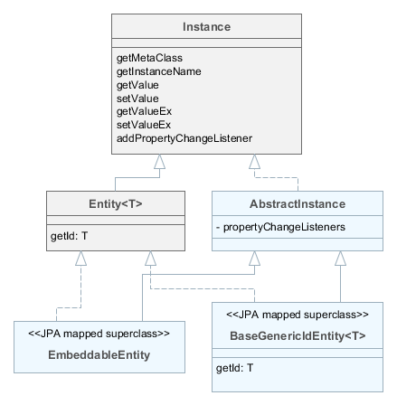
-
Instance– declares the basic methods for working with objects of application domain:-
getting references to the object meta-class;
-
generating the instance name;
-
reading/writing attribute values by name;
-
adding listeners receiving notifications about attribute changes.
-
-
Entity– extendsInstancewith entity identifier; at the same timeEntitydoes not define the type of the identifier leaving this option to descendants. -
AbstractInstance– implements the logic of working with attribute change listeners.AbstractInstancestores the listeners inWeakReference, and if there are no external references to the added listener, it will be immediately destroyed by garbage collector. Normally, attribute change listeners are visual and data components that are always referenced by other objects, so there is no problem with listeners dropout. However, if a listener is created by application code and no objects refer to it in a natural way, it is necessary to save it in a certain object field apart from just adding it toInstance. -
BaseGenericIdEntity– base class of persistent and non-persistent entities. It implementsEntitybut does not specify the type of the identifier (i.e. the primary key) of the entity. -
EmbeddableEntity- base class of embeddable persistent entities.
Below we consider base classes recommended for inheriting your entities from. Non-persistent entities should be inherited from the same base classes as persistent ones. The framework determines if the entity is persistent or not by the file where it is registered: persistence.xml or metadata.xml.
- StandardEntity
-
Inherit from
StandardEntityif you want a standard set of features: the primary key of UUID type, the instances have information on who and when created and modified them, require optimistic locking and soft deletion.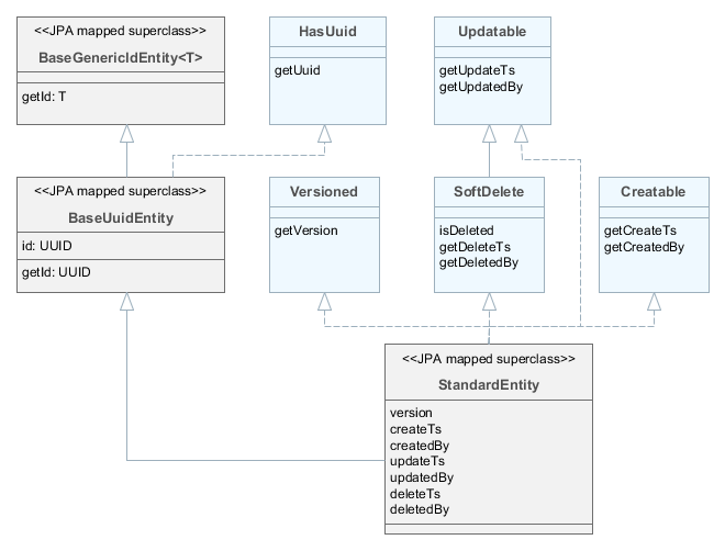
-
HasUuid– interface for entities having a globally unique identifier. -
Versioned– interface for entities supporting optimistic locking. -
Creatable– interface for entities that keep the information about when and by whom the instance was created. -
Updatable– interface for entities that keep the information about when and by whom the instance was last changed. -
SoftDelete– interface for entities supporting soft deletion.
-
- BaseUuidEntity
-
Inherit from
BaseUuidEntityif you want an entity with the primary key of UUID type but you don’t need all features ofStandardEntity. You can implement some of the interfacesCreatable,Versioned, etc. in your concrete entity class.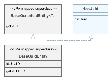
- BaseLongIdEntity
-
Inherit from
BaseLongIdEntityorBaseIntegerIdEntityif you want an entity with the primary key of theLongorIntegertype. You can implement some of the interfacesCreatable,Versioned, etc. in your concrete entity class. ImplementingHasUuidis highly recommended, as it enables some optimizations and allows you to identify your instances uniquely in a distributed environment.
- BaseStringIdEntity
-
Inherit from
BaseStringIdEntityif you want an entity with the primary key of theStringtype. You can implement some of the interfacesCreatable,Versioned, etc. in your concrete entity class. ImplementingHasUuidis highly recommended, as it enables some optimizations and allows you to identify your instances uniquely in a distributed environment. The concrete entity class must have a string field annotated with the@IdJPA annotation.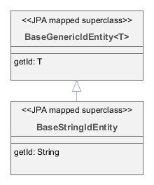
- BaseIdentityIdEntity
-
Inherit from
BaseIdentityIdEntityif you need to map the entity to a table with IDENTITY primary key. You can implement some of the interfacesCreatable,Versioned, etc. in your concrete entity class. ImplementingHasUuidis highly recommended, as it enables some optimizations and allows you to identify your instances uniquely in a distributed environment. Theidattribute of the entity (i.e.getId()/setId()methods) will be of typeIdProxywhich is designed to substitute the real identifier until it is generated by the database on insert.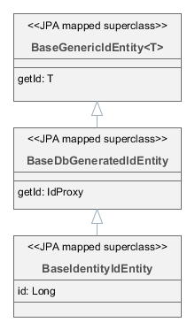
- BaseIntIdentityIdEntity
-
Inherit from
BaseIntIdentityIdEntityif you need to map the entity to a table with IDENTITY primary key ofIntegertype (compared toLonginBaseIdentityIdEntity). In other respects,BaseIntIdentityIdEntityis similar toBaseIdentityIdEntity.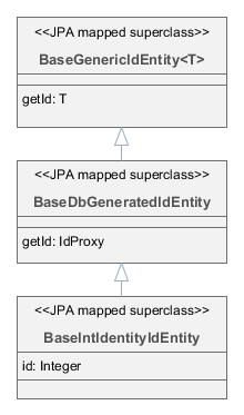
- BaseGenericIdEntity
-
Inherit from
BaseGenericIdEntitydirectly if you need to map the entity to a table with a composite key. In this case, the concrete entity class must have a field of the embeddable type representing the key, annotated with the@EmbeddedIdJPA annotation.
3.2.1.2. Entity Annotations
This section describes all annotations of entity classes and attributes supported by the platform.
Annotations from the javax.persistence package are required for JPA, annotations from com.haulmont.* packages are designed for metadata management and other mechanisms of the platform.
In this manual, if an annotation is identified by a simple class name, it refers to a platform class, located in one of the com.haulmont.* packages.
3.2.1.2.1. Class Annotations
- @Embeddable
-
Defines an embedded entity stored in the same table as the owning entity.
@MetaClass annotation should be used to specify the entity name.
- @EnableRestore
-
Indicates that the entity instances are available for recovery after soft deletion on the
core$Entity.restorescreen available through the Administration > Data Recovery main menu item.
- @Entity
-
Declares a class to be a data model entity.
Parameters:
-
name– the name of the entity, must begin with a prefix, separated by a_sign. It is recommended to use a short name of the project as a prefix to form a separate namespace.
Example:
@Entity(name = "sales_Customer") -
- @Extends
-
Indicates that the entity is an extension and it should be used everywhere instead of the base entity. See Functionality Extension.
- @DiscriminatorColumn
-
Is used for defining a database column responsible for the distinction of entity types in the cases of
SINGLE_TABLEandJOINEDinheritance strategies.Parameters:
-
name– the discriminator column name -
discriminatorType– the discriminator column type
Example:
@DiscriminatorColumn(name = "TYPE", discriminatorType = DiscriminatorType.INTEGER) -
- @DiscriminatorValue
-
Defines the discriminator column value for this entity.
Example:
@DiscriminatorValue("0")
- @IdSequence
-
Explicitly defines the name of a database sequence that should be used for generating identifiers if the entity is a subclass of
BaseLongIdEntityorBaseIntegerIdEntity. If the entity is not annotated, the framework creates a sequence with an automatically generated name.Parameters:
-
name– sequence name. -
cached- optional parameter which defines that the sequence should be incremented by cuba.numberIdCacheSize to cache intermediate values in memory. False by default.
By default, the sequences are created in the main data store. However, if the cuba.useEntityDataStoreForIdSequence application property is set to
true, sequences are created in the data store the entity belongs to. -
- @Inheritance
-
Defines the inheritance strategy to be used for an entity class hierarchy. It is specified on the entity class that is the root of the entity class hierarchy.
Parameters:
-
strategy– inheritance strategy,SINGLE_TABLEby default
-
- @Listeners
-
Defines the list of listeners intended for reaction to the entity instance lifecycle events on the middle tier.
The annotation value should be a string or an array of strings containing bean names of the listeners. See Entity Listeners.
Examples:
@Listeners("sample_UserEntityListener")@Listeners({"sample_FooListener","sample_BarListener"})
- @MappedSuperclass
-
Defines that the class is an ancestor for some entities and its attributes must be used as part of descendant entities. Such class is not associated with any particular database table.
Data Modelling: Entity Inheritance guide shows the mechanism to define entity inheritance.
- @MetaClass
-
Is used for declaring non-persistent or embedded entity (meaning that
@javax.persistence.Entityannotation cannot be applied)Parameters:
-
name– the entity name, must begin with a prefix, separated by a_sign. It is recommended to use a short name of the project as prefix to form a separate namespace.
Example:
@MetaClass(name = "sales_Customer") -
- @NamePattern
-
Defines how to create a string which represents a single instance of the entity. Think of it as of an application level
toString()method. It is used extensively in UI when displaying an entity instance in a single field likeTextFieldorLookupField. You can also get the instance name programmatically using theMetadataTools.getInstanceName()method.The annotation value should be a string in the
{0}|{1}format, where:-
{0}– format string which can be one of two types:-
A string with
%splaceholders for formatted values of entity attributes. Attribute values are formatted to strings according to their datatypes. -
A name of this object’s method with the
#prefix. The method should returnStringand should have no parameters.
-
-
{1}– a list of attribute names separated by commas, corresponding to{0}format. If a method is used in{0}, the list of fields is still required as it forms the_minimalview.
Examples:
@NamePattern("%s|name")@NamePattern("%s - %s|name,date")@NamePattern("#getCaption|amount,customer") ... public String getCaption(){ String prefix = ""; if (amount > 5000) { prefix = "Grade 1 "; } else { prefix = "Grade 2 "; } return prefix + customer.name; } -
- @PostConstruct
-
This annotation can be specified for a method. The annotated method will be invoked right after the entity instance is created by the Metadata.create() method or similar
DataManager.create()andDataContext.create()methods.See Initial Entity Values guide for an example of defining initial values directly in the entity class using the
@PostConstructannotation.The annotated method can accept Spring beans available in the
globalmodule as parameters. For example:@PostConstruct public void postConstruct(Metadata metadata, SomeBean someBean) { // ... }
- @PublishEntityChangedEvents
-
Indicates that EntityChangedEvent should be sent by the framework when the entity is changed in the database.
- @SystemLevel
-
Indicates that the entity is system only and should not be available for selection in various lists of entities, such as generic filter parameter types or dynamic attribute type.
- @Table
-
Defines database table for the given entity.
Parameters:
-
name– the table name
Example:
@Table(name = "SALES_CUSTOMER") -
- @TrackEditScreenHistory
-
Indicates that editor screens opening history will be recorded with the ability to display it on the
sec$ScreenHistory.browse. The screen can be added to the main menu using the following element of web-menu.xml:
<item id="sec$ScreenHistory.browse" insertAfter="settings"/>3.2.1.2.2. Attribute Annotations
Attribute annotations should be set for the corresponding fields, with the following exception: if there is a need to declare read-only, non-persistent attribute foo, it is sufficient to create getFoo() method and annotate it with @MetaProperty.
- @CaseConversion
-
Indicates that automatic case conversion should be used for text input fields bound with annotated entity attribute.
Parameters:
-
type- the conversion type:UPPER(default),LOWER.
Example:
@CaseConversion(type = ConversionType.UPPER) @Column(name = "COUNTRY_CODE") protected String countryCode; -
- @Column
-
Defines DB column for storing attribute values.
Parameters:
-
name– the column name. -
length– (optional parameter,255by default) – the length of the column. It is also used for metadata generation and ultimately, can limit the maximum length of the input text in visual components bound to this attribute. Add the@Lobannotation to remove restriction on the attribute length. -
nullable– (optional parameter,trueby default) – determines if an attribute can containnullvalue. Whennullable = falseJPA ensures that the field has a value when saved. In addition, visual components working with the attribute can request the user to enter a value.
-
- @Composition
-
Indicates that the relationship is a composition, which is a stronger variant of the association. Essentially this means that the related entity should only exist as a part of the owning entity, i.e. be created and deleted together with it.
Data Modelling: Composition guide shows various examples of a composition relationship between entities.
For example, a list of items in an order (
Orderclass contains a collection ofIteminstances):@OneToMany(mappedBy = "order") @Composition protected List<Item> items;Another example is a one-to-one relationship:
@Composition @OneToOne(fetch = FetchType.LAZY) @JoinColumn(name = "DETAILS_ID") protected CustomerDetails details;Choosing
@Compositionannotation as the relationship type enables making use of a special commit mode for datasources in edit screens. In this mode, the changes to related instances are only stored when the master entity is committed. See Composite Structures for details.
- @CurrencyValue
-
Indicates that a field which is marked by this annotation contains currency value. If used, the CurrencyField is generated by Studio for this attribute in a Form of the entity editor screen.
Parameters:
-
currency– currency name: USD, GBP, EUR, $, or another currency sign. -
labelPosition- currency label position:RIGHT(default),LEFT.
Example:
@CurrencyValue(currency = "$", labelPosition = CurrencyLabelPosition.LEFT) @Column(name = "PRICE") protected BigDecimal price; -
- @Embedded
-
Defines a reference attribute of embeddable type. The referenced entity should have
@Embeddableannotation.Example:
@Embedded protected Address address;
- @EmbeddedParameters
-
By default, ORM does not create an instance of embedded entity if all its attributes are null in the database. You can use the
@EmbeddedParametersannotation to specify a different behavior when an instance is always non-null, for example:@Embedded @EmbeddedParameters(nullAllowed = false) protected Address address;
- @Id
-
Indicates that the attribute is the entity primary key. Typically, this annotation is set on the field of a base class, such as BaseUuidEntity. Using this annotation for a specific entity class is required only in case of inheritance from the
BaseStringIdEntitybase class (i.e. creating an entity with a string primary key).
- @IgnoreUserTimeZone
-
Makes the platform to ignore the user’s time zone (if it is set for the current session) for an attribute of the timestamp type (annotated with
@javax.persistence.Temporal.TIMESTAMP).
- @JoinColumn
-
Defines DB column that determines the relationship between entities. Presence of this annotation indicates the owning side of the association.
Parameters:
-
name– the column name
Example:
@ManyToOne(fetch = FetchType.LAZY) @JoinColumn(name = "CUSTOMER_ID") protected Customer customer; -
- @JoinTable
-
Defines a join table on the owning side of
@ManyToManyrelationship.Parameters:
-
name– the join table name -
joinColumns–@JoinColumnelement in the join table corresponding to primary key of the owning side of the relationship (the one containing@JoinTableannotation) -
inverseJoinColumns–@JoinColumnelement in the join table corresponding to primary key of the non-owning side of the relationship.
Example of the
customersattribute of theGroupclass on the owning side of the relationship:@ManyToMany @JoinTable(name = "SALES_CUSTOMER_GROUP_LINK", joinColumns = @JoinColumn(name = "GROUP_ID"), inverseJoinColumns = @JoinColumn(name = "CUSTOMER_ID")) protected Set<Customer> customers;Example of the
groupsattribute of theCustomerclass on non-owning side of the same relationship:@ManyToMany(mappedBy = "customers") protected Set<Group> groups; -
- @Lob
-
Indicates that the attribute does not have any length restrictions. This annotation is used together with the
@Columnannotation. If@Lobis set, the default or explicitly defined length in@Columnis ignored.Example:
@Column(name = "DESCRIPTION") @Lob private String description;
- @Lookup
-
Defines the lookup type settings for the reference attributes.
Parameters:
-
type- the default value isSCREEN, so a reference is selected from a lookup screen. TheDROPDOWNvalue enables to select the reference from a drop-down list. If the lookup type is set toDROPDOWN, Studio will generate options collection container when scaffolding editor screen. Thus, the Lookup type parameter should be set before generation of an entity editor screen. Besides, the Filter component will allow a user to select parameter of this type from a drop-down list instead of lookup screen. -
actions- defines the actions to be used in a PickerField component inside the FieldGroup by default. Possible values:lookup,clear,open.
@Lookup(type = LookupType.DROPDOWN, actions = {"open"}) @ManyToOne(fetch = FetchType.LAZY) @JoinColumn(name = "CUSTOMER_ID") protected Customer customer; -
- @ManyToMany
-
Defines a collection attribute with many-to-many relationship type.
Data Modelling: Many-to-Many Association guide shows different use cases of many to many associations.
Many-to-many relationship can have an owning side and an inverse, non-owning side. The owning side should be marked with additional
@JoinTableannotation, and the non-owning side – withmappedByparameter.Parameters:
-
mappedBy– the field of the referenced entity, which owns the relationship. It must only be set on the non-owning side of the relationship. -
targetEntity– the type of referenced entity. This parameter is optional if the collection is declared using Java generics. -
fetch– (optional parameter,LAZYby default) – determines whether JPA will eagerly fetch the collection of referenced entities. This parameter should always remainLAZY, since retrieval of referenced entities in CUBA-application is determined dynamically by the views mechanism.
The usage of
cascadeannotation attribute is not recommended. The entities persisted and merged implicitly using such declaration will bypass some system mechanisms. In particular, the EntityStates bean does not detect the managed state correctly and entity listeners are not invoked at all. -
- @ManyToOne
-
Defines a reference attribute with many-to-one relationship type.
Parameters:
-
fetch– (EAGERby default) parameter that determines whether JPA will eagerly fetch the referenced entity. This parameter should always be set toLAZY, since retrieval of referenced entity in CUBA-application is determined dynamically by the views mechanism. -
optional– (optional parameter,trueby default) – indicates whether the attribute can containnullvalue. Ifoptional = falseJPA ensures the existence of reference when the entity is saved. In addition, the visual components working with this attribute can request the user to enter a value.
For example, several
Orderinstances refer to the sameCustomerinstance. In this case theOrder.customerattribute should have the following annotations:@ManyToOne(fetch = FetchType.LAZY) @JoinColumn(name = "CUSTOMER_ID") protected Customer customer;The usage of JPA
cascadeannotation attribute is not recommended. The entities persisted and merged implicitly using such declaration will bypass some system mechanisms. In particular, the EntityStates bean does not detect the managed state correctly and entity listeners are not invoked at all. -
- @MetaProperty
-
Indicates that metadata should include the annotated attribute. This annotation can be set for a field or for a getter method, if there is no corresponding field.
This annotation is not required for the fields already containing the following annotations from
javax.persistencepackage:@Column,@OneToOne,@OneToMany,@ManyToOne,@ManyToMany,@Embedded. Such fields are included in metadata automatically. Thus,@MetaPropertyis mainly used for defining non-persistent attributes of the entities.Parameters (optional):
-
mandatory- determines whether the attribute can containnullvalue. Ifmandatory = true, visual components working with this attribute can request the user to enter a value. -
datatype- explicitly defines a datatype that overrides a datatype inferred from the attribute Java type. -
related- defines the array of related persistent attributes to be fetched from the database when this property is included in a view. Also, if the annotation is applied to a getter method, i.e. the entity attribute is read-only, changes of related attributes generatePropertyChangeEventfor the given read-only attribute. This feature helps to update UI components displaying read-only attributes that depend on some other mutable attributes.
Field example:
@Transient @MetaProperty protected String token;Method example:
@MetaProperty(related = "firstName,lastName") public String getFullName() { return firstName + " " + lastName; } -
- @NumberFormat
-
Specifies a format for an attribute of the
Numbertype (it can beBigDecimal,Integer,LongorDouble). Values of such attribute will be formatted and parsed throughout the UI according to the provided annotation parameters:-
pattern- format pattern as described for DecimalFormat. -
decimalSeparator- character used as a decimal sign (optional). -
groupingSeparator- character used as a thousands separator (optional).
If
decimalSeparatorand/orgroupingSeparatorare not specified, the framework uses corresponding values from the format strings for the current user’s locale. The server system locale characters are used in this case for formatting the attribute values with locale-independent methods.For example:
@Column(name = "PRECISE_NUMBER", precision = 19, scale = 4) @NumberFormat(pattern = "0.0000") protected BigDecimal preciseNumber; @Column(name = "WEIRD_NUMBER", precision = 19, scale = 4) @NumberFormat(pattern = "#,##0.0000", decimalSeparator = "_", groupingSeparator = "`") protected BigDecimal weirdNumber; @Column(name = "SIMPLE_NUMBER") @NumberFormat(pattern = "#") protected Integer simpleNumber; @Column(name = "PERCENT_NUMBER", precision = 19, scale = 4) @NumberFormat(pattern = "#%") protected BigDecimal percentNumber; -
- @OnDelete
-
Determines related entities handling policy in case of soft deletion of the entity, containing the attribute. See Soft Deletion.
Example:
@OneToMany(mappedBy = "group") @OnDelete(DeletePolicy.CASCADE) private Set<Constraint> constraints;
- @OnDeleteInverse
-
Determines related entities handling policy in case of soft deletion of the entity from the inverse side of the relationship. See Soft Deletion.
Example:
@ManyToOne @JoinColumn(name = "DRIVER_ID") @OnDeleteInverse(DeletePolicy.DENY) private Driver driver;
- @OneToMany
-
Defines a collection attribute with one-to-many relationship type.
Parameters:
-
mappedBy– the field of the referenced entity, which owns the relationship. -
targetEntity– the type of referenced entity. This parameter is optional if the collection is declared using Java generics. -
fetch– (optional parameter,LAZYby default) – determines whether JPA will eagerly fetch the collection of referenced entities. This parameter should always remainLAZY, since retrieval of referenced entities in CUBA-application is determined dynamically by the views mechanism.
For example, several
Iteminstances refer to the sameOrderinstance using@ManyToOnefieldItem.order. In this case theOrderclass can contain a collection ofIteminstances:@OneToMany(mappedBy = "order") protected Set<Item> items;The usage of JPA
cascadeandorphanRemovalannotation attributes is not recommended. The entities persisted and merged implicitly using such declaration will bypass some system mechanisms. In particular, the EntityStates bean does not detect the managed state correctly and entity listeners are not invoked at all. TheorphanRemovalannotation attribute does not respect the soft deletion mechanism. -
- @OneToOne
-
Defines a reference attribute with one-to-one relationship type.
Parameters:
-
fetch– (EAGERby default) determines whether JPA will eagerly fetch the referenced entity. This parameter should be set toLAZY, since retrieval of referenced entities in CUBA-application is determined dynamically by the views mechanism. -
mappedBy– the field of the referenced entity, which owns the relationship. It must only be set on the non-owning side of the relationship. -
optional– (optional parameter,trueby default) – indicates whether the attribute can containnullvalue. Ifoptional = falseJPA ensures the existence of reference when the entity is saved. In addition, the visual components working with this attribute can request the user to enter a value.
Example of owning side of the relationship in the
Driverclass:@OneToOne(fetch = FetchType.LAZY) @JoinColumn(name = "CALLSIGN_ID") protected DriverCallsign callsign;Example of non-owning side of the relationship in the
DriverCallsignclass:@OneToOne(fetch = FetchType.LAZY, mappedBy = "callsign") protected Driver driver; -
- @OrderBy
-
Determines the order of elements in a collection attribute at the point when the association is retrieved from the database. This annotation should be specified for ordered Java collections such as
ListorLinkedHashSetto get a predictable sequence of elements.Parameters:
-
value– string, determines the order in the format:
orderby_list::= orderby_item [,orderby_item]* orderby_item::= property_or_field_name [ASC | DESC]Example:
@OneToMany(mappedBy = "user") @OrderBy("createTs") protected List<UserRole> userRoles; -
- @Temporal
-
Specifies the type of the stored value for
java.util.Dateattribute: date, time or date+time.Parameters:
-
value– the type of the stored value:DATE,TIME,TIMESTAMP
Example:
@Column(name = "START_DATE") @Temporal(TemporalType.DATE) protected Date startDate; -
- @Transient
-
Indicates that field is not stored in the database, meaning it is non-persistent.
The fields supported by JPA types (See http://docs.oracle.com/javaee/7/api/javax/persistence/Basic.html) are persistent by default, that is why
@Transientannotation is mandatory for non-persistent attribute of such type.@MetaProperty annotation is required if
@Transientattribute should be included in metadata.
- @Version
-
Indicates that the annotated field stores a version for optimistic locking support.
Such field is required when an entity class implements the
Versionedinterface (StandardEntitybase class already contains such field).Example:
@Version @Column(name = "VERSION") private Integer version;
3.2.1.3. Enum Attributes
The standard use of JPA for enum attributes involves an integer database field containing a value obtained from the ordinal() method. This approach may lead to the following issues with extending a system in production:
-
An entity instance cannot be loaded, if the value of the enum in the database does not equal to any
ordinalvalue. -
It is impossible to add a new value between the existing ones, which is important when sorting by enumeration value (order by).
CUBA-style approach to solving these problems is to detach the value stored in the database from ordinal value of the enumeration. In order to do this, the field of the entity should be declared with the type, stored in the database (Integer or String), while the access methods (getter / setter) should be created with the actual enumeration type.
Example:
@Entity(name = "sales_Customer")
@Table(name = "SALES_CUSTOMER")
public class Customer extends StandardEntity {
@Column(name = "GRADE")
protected Integer grade;
public CustomerGrade getGrade() {
return grade == null ? null : CustomerGrade.fromId(grade);
}
public void setGrade(CustomerGrade grade) {
this.grade = grade == null ? null : grade.getId();
}
...
}In this case, the enumeration class can look like this:
public enum CustomerGrade implements EnumClass<Integer> {
PREMIUM(10),
HIGH(20),
MEDIUM(30);
private Integer id;
CustomerGrade(Integer id) {
this.id = id;
}
@Override
public Integer getId() {
return id;
}
public static CustomerGrade fromId(Integer id) {
for (CustomerGrade grade : CustomerGrade.values()) {
if (grade.getId().equals(id))
return grade;
}
return null;
}
}For correct reflection in metadata, the enumeration class must implement the EnumClass interface.
As the examples show, grade attribute corresponds to the Integer type value stored in the database, which is specified by the id field of CustomerGrade enumeration, namely 10, 20 or 30. At the same time, the application code and metadata framework use CustomerGrade enum through access methods, which perform the actual conversion.
A call to getGrade() method will simply return null, if the value in the database does not correspond to any of the enumeration values. In order to add a new value, for example, HIGHER, between HIGH and PREMIUM, it is sufficient to add new enumeration value with id = 15, which ensures that sorting by Customer.grade field remains correct.
The Integer field type provides the ordered list of constants and enables sorting in JPQL and SQL queries (>, <, >=, ⇐, order by), not to mention the negligible issue of database space and performance. On the other hand, Integer values are not self-explanatory in query results, that complicates debugging and using raw data from the database or in serialized formats. In this regard, the String type is more convenient.
Enumerations can be created in CUBA Studio using Data Model > New > Enumeration menu. To be used as an entity attribute, choose ENUM in the Attribute type field of the attribute editor and select the Enumeration class in the Type field. Enumeration values can be associated with localized names that will be displayed in the user interface of the application.
3.2.1.4. Soft Deletion
CUBA platform supports soft deletion mode, when the records are not deleted from the database, but instead, marked in a special way, so that they become inaccessible for common use. Later, these records can be either completely removed from the database using some kind of scheduled procedure or restored.
Soft deletion mechanism is transparent for an application developer, the only requirement is for entity class to implement SoftDelete interface. The platform will adjust data operations automatically.
Soft deletion mode offers the following benefits:
-
Significantly reduces the risk of data loss caused by incorrect user actions.
-
Enables making certain records inaccessible instantly even if there are references to them.
Using Orders-Customers data model as an example, let’s assume that a certain customer has made several orders but we need to make the customer instance inaccessible for users. This is impossible with traditional hard deletion, as deletion of a customer instance requires either deletion of all related orders or setting to null all references to the customer (meaning data loss). After soft deletion, the customer instance becomes unavailable for search and modification; however, a user can see the name of the customer in the order editor, as deletion attribute is purposely ignored when the related entities are fetched.
The standard behavior above can be modified with related entities processing policy.
The deleted entity instances can be manually restored on the Restore Deleted Entities screen available from the Administration menu of an application. This functionality is designed only for application administrators supposed to have all permissions to all entities, and should be used carefully, so it is recommended to deny access to this screen for simple users.
The negative impact of soft deletion is increase in database size and likely need for additional cleanup procedures.
3.2.1.4.1. Use of Soft Deletion
To support soft deletion, the entity class should implement SoftDelete interface, and the corresponding database table should contain the following columns:
-
DELETE_TS– when the record was deleted. -
DELETED_BY– the login of the user who deleted the record.
The default behavior for instances implementing SoftDelete interface, is that soft deleted entities are not returned by queries or search by id. If required, this behavior can by dynamically turned off using the following methods:
-
Calling
setSoftDeletion(false)for the current EntityManager instance. -
Calling
setSoftDeletion(false)forLoadContextobject when requesting data via DataManager. -
On the data loaders level – calling
DataLoader.setSoftDeletion(false)or settingsoftDeletion="false"attribute ofloaderelement in the screen’s XML-descriptor.
In soft deletion mode, the platform automatically filters out the deleted instances when loading by identifier and when using JPQL queries, as well as the deleted elements of the related entities in collection attributes. However, related entities in single-value (*ToOne) attributes are loaded, regardless of whether the related instance was deleted or not.
3.2.1.4.2. Related Entities Processing Policy
For soft deleted entities, the platform offers a mechanism for managing related entities when deleting, which is largely similar to ON DELETE rules for database foreign keys. This mechanism works on the middle tier and uses @OnDelete, @OnDeleteInverse annotations on entity attributes.
@OnDelete annotation is processed when the entity in which this annotation is found is deleted, but not the one pointed to by this annotation (this is the main difference from cascade deletion at the database level).
@OnDeleteInverse annotation is processed when the entity which it points to is deleted (which is similar to cascade deletion at foreign key level in the database). This annotation is useful when the object being deleted has no attribute that can be checked before deletion. Typically, the object being checked has a reference to the object being deleted, and this is the attribute that should be annotated with @OnDeleteInverse.
Annotation value can be:
-
DeletePolicy.DENY– prohibits entity deletion, if the annotated attribute is notnullor not an empty collection. -
DeletePolicy.CASCADE– cascade deletion of the annotated attribute. -
DeletePolicy.UNLINK– disconnect the link with the annotated attribute. It is reasonable to disconnect the link only in the owner side of the association – the one with@JoinColumnannotation in the entity class.
Examples:
-
Prohibit deletion of entity with references:
DeletePolicyExceptionwill be thrown if you try to deleteCustomerinstance, which is referred to by at least oneOrder.Order.java@ManyToOne(fetch = FetchType.LAZY) @JoinColumn(name = "CUSTOMER_ID") @OnDeleteInverse(DeletePolicy.DENY) protected Customer customer;Customer.java@OneToMany(mappedBy = "customer") protected List<Order> orders;Messages in the exception window can be localized in the main message pack. Use the following keys:
-
deletePolicy.caption- notification caption. -
deletePolicy.references.message- notification message. -
deletePolicy.caption.sales_Customer- notification caption for concrete entity. -
deletePolicy.references.message.sales_Customer- notification message for concrete entity.
-
-
Cascade deletion of related collection elements: deletion of
Roleinstance causes allPermissioninstances to be deleted as well.Role.java@OneToMany(mappedBy = "role") @OnDelete(DeletePolicy.CASCADE) protected Set<Permission> permissions;Permission.java@ManyToOne(fetch = FetchType.LAZY) @JoinColumn(name = "ROLE_ID") protected Role role; -
Disconnect the links with related collection elements: deletion of
Roleinstance leads to setting to null references to thisRolefor allPermissioninstances included in the collection.Role.java@OneToMany(mappedBy = "role") protected Set<Permission> permissions;Permission.java@ManyToOne(fetch = FetchType.LAZY) @JoinColumn(name = "ROLE_ID") @OnDeleteInverse(DeletePolicy.UNLINK) protected Role role;
Implementation notes:
-
Related entities policy is processed on Middleware when saving entities implementing
SoftDeleteto the database. -
Be careful when using
@OnDeleteInversetogether withCASCADEandUNLINKpolicies. During this process, all instances of the related objects are fetched from the database, modified and then saved.For example, if
@OnDeleteInverse(CASCADE)policy is set onJob.customerattribute in aCustomer–Jobassociation with many jobs to one customer, if you set@OnDeleteInverse(CASCADE)policy onJob.customerattribute, all jobs will be retrieved and modified when deleting a Customer instance. This may overload the application server or the database.On the other hand, using
@OnDeleteInverse(DENY)is safe, as it only involves counting the number of the related objects. If there are more than0, an exception is thrown. This makes use of@OnDeleteInverse(DENY)suitable forJob.customerattribute.
3.2.1.4.3. Unique Constraints at Database Level
In order to apply unique constraints for certain value in the soft deletion mode, at least one non-deleted record with this value and an arbitrary number of deleted records with the same value may exist in database.
This logic can be implemented in a specific way for each database server type:
-
If database server supports partial indexes (e.g. PostgreSQL), unique restrictions can be achieved as follows:
create unique index IDX_SEC_USER_UNIQ_LOGIN on SEC_USER (LOGIN_LC) where DELETE_TS is null -
If database server does not support partial indexes (e.g. Microsoft SQL Server 2005), DELETE_TS field can be included in the unique index:
create unique index IDX_SEC_USER_UNIQ_LOGIN on SEC_USER (LOGIN_LC, DELETE_TS)
3.2.2. Metadata Framework
Metadata framework is used to support efficient work with data model in CUBA-applications. The framework:
-
provides API for obtaining information about entities, their attributes and relations between the entities; it is also used for traversing object graphs;
-
serves as a specialized and more convenient alternative for Java Reflection API;
-
controls permitted data types and relationships between entities;
-
enables implementation of universal mechanisms for operations with data.
3.2.2.1. Metadata Interfaces
Let’s consider the basic metadata interfaces.
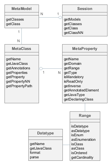
Figure 4. Metadata Framework Interfaces
- Session
-
Entry point of the metadata framework. Enables obtaining
MetaClassinstances by name and by the corresponding Java class. Note the difference in methods:getClass()methods can returnnullwhilegetClassNN()(Non Null) methods cannot.Sessionobject can be obtained using the Metadata infrastructure interface.Example:
@Inject
protected Metadata metadata;
...
Session session = metadata.getSession();
MetaClass metaClass1 = session.getClassNN("sec$User");
MetaClass metaClass2 = session.getClassNN(User.class);
assert metaClass1 == metaClass2;- MetaModel
-
Rarely used interface intended to group meta-classes.
Meta-classes are grouped by the root name of Java project package specified in metadata.xml file.
- MetaClass
-
Entity class metadata interface.
MetaClassis always associated with the Java class which it represents.Basic methods:
-
getName()– entity name, according to convention the first part of the name before_sign is the namespace code, for example,sales_Customer. -
getProperties()– the list of meta-properties (MetaProperty). -
getProperty(),getPropertyNN()– methods return meta-properties by name. If there is no attribute with provided name, the first method returnsnull, and the second throws an exception.Example:
MetaClass userClass = session.getClassNN(User.class); MetaProperty groupProperty = userClass.getPropertyNN("group");
-
getPropertyPath()– allows you to navigate by references. This method accepts string parameter – path in the format of dot-separated attribute names. The returnedMetaPropertyPathobject enables accessing the required (the last in the path) attribute by invokinggetMetaProperty()method.Example:
MetaClass userClass = session.getClassNN(User.class); MetaProperty groupNameProp = userClass.getPropertyPath("group.name").getMetaProperty(); assert groupNameProp.getDomain().getName().equals("sec$Group"); -
getJavaClass()– entity class, corresponding to thisMetaClass. -
getAnnotations()– collection of meta-annotations.
-
- MetaProperty
-
Entity attribute metadata interface.
Basic methods:
-
getName()– property name, corresponds to entity attribute name. -
getDomain()– meta-class, owning this property.
-
-
getType()- the property type:-
simple type:
DATATYPE -
enumeration:
ENUM -
reference type of two kinds:
-
ASSOCIATION− simple reference to another entity. For example, Order-Customer relationship is an association. -
COMPOSITION− reference to the entity, having no consistent value without the owning entity.COMPOSITIONis considered to be a "closer" relationship thanASSOCIATION. For example, the relationship between Order and its Items is aCOMPOSITION, as the Item cannot exist without the Order to which it belongs.The type of
ASSOCIATIONorCOMPOSITIONreference attributes affects entity edit mode: in the first case the related entity is persisted to the database independently, in the second case – only together with the owning entity. See Composite Structures for details.
-
-
-
getRange()–Rangeinterface providing detailed description of the attribute type. -
isMandatory()– indicates a mandatory attribute. For instance, it is used by visual components to signal a user that value is mandatory. -
isReadOnly()– indicates a read-only attribute. -
getInverse()– for reference-type attribute, returns the meta-property from the other side of the association, if such exists. -
getAnnotatedElement()– field (java.lang.reflect.Field) or method (java.lang.reflect.Method), corresponding to the entity attribute. -
getJavaType()– Java class of the entity attribute. It can either be the type of corresponding field or the type of the value returned by corresponding method. -
getDeclaringClass()– Java class containing this attribute.-
Range -
Interface describing entity attribute type in detail.
Basic methods:
-
-
isDatatype()– returnstruefor simple type attribute. -
asDatatype()– returns Datatype for simple type attribute. -
isEnum()– returnstruefor enumeration type attribute. -
asEnumeration()– returns Enumeration for enumeration type attribute. -
isClass()– returnstruefor reference attribute ofASSOCIATIONorCOMPOSITIONtype. -
asClass()– returns metaclass of associated entity for a reference attribute. -
isOrdered()– returnstrueif the attribute is represented by an ordered collection (for exampleList). -
getCardinality()– relation kind of the reference attribute:ONE_TO_ONE,MANY_TO_ONE,ONE_TO_MANY,MANY_TO_MANY.
3.2.2.2. Metadata Building
The main source for metadata structure generation are annotated entity classes.
Entity class will be present in the metadata in the following cases:
-
Persistent entity class is annotated by
@Entity,@Embeddable,@MappedSuperclassand is located within the root package specified in metadata.xml. -
Non-persistent entity class is annotated by
@MetaClassand is located within the root package specified inmetadata.xml.
All entities inside same root package are put into the same MetaModel instance, which is given the name of this package. Entities within the same MetaModel can contain arbitrary references to each other. References between entities from different meta-models can be created in the order of declaration of metadata.xml files in cuba.metadataConfig property.
Entity attribute will be present in metadata if:
-
A class field is annotated by
@Column,@OneToOne,@OneToMany,@ManyToOne,@ManyToMany,@Embedded. -
A class field or an access method (getter) is annotated by
@MetaProperty.
Metaclass and metaproperty parameters are determined on the base of the listed annotations parameters as well as field types and class methods. Besides, if an attribute does not have write access method (setter), it becomes immutable (read-only).
3.2.2.3. Datatype
Datatype interface defines methods for converting values to and from strings (formatting and parsing). Each entity attribute, if it is not a reference, has a corresponding Datatype, which is used by the framework to format and parse the attribute value.
Datatypes are registered in the DatatypeRegistry bean, which loads and initializes Datatype implementation classes from the metadata.xml files of the project and its application components.
Datatype of an entity attribute can be obtained from the corresponding meta-property using getRange().asDatatype() call.
You can also use registered datatypes to format or parse arbitrary values of supported types. To do this, obtain a datatype instance from DatatypeRegistry using its get(Class) or getNN(Class) methods, passing the Java type that you want to convert.
Datatypes are associated with entity attributes according to the following rules:
-
In most cases, an attribute is associated with a registered
Datatypeinstance that can handle the attribute’s Java type.In the example below, the
amountattribute will getBigDecimalDatatype@Column(name = "AMOUNT") private BigDecimal amount;because
com/haulmont/cuba/metadata.xmlhas the following entry:<datatype id="decimal" class="com.haulmont.chile.core.datatypes.impl.BigDecimalDatatype" default="true" format="0.####" decimalSeparator="." groupingSeparator=""/> -
You can specify a datatype explicitly using the @MetaProperty annotation and its
datatypeattribute.In the example below, the
issueYearentity attribute will be associated with theyeardatatype:@MetaProperty(datatype = "year") @Column(name = "ISSUE_YEAR") private Integer issueYear;if the project’s
metadata.xmlfile has the following entry:<datatype id="year" class="com.company.sample.YearDatatype"/>As you can see, the
datatypeattribute of@MetaPropertycontains identifier, which is used when registering the datatype implementation inmetadata.xml.
Basic methods of the Datatype interface:
-
format()– converts the passed value into a string. -
parse()– transforms a string into the value of corresponding type. -
getJavaClass()– returns the Java type which this datatype is designed for. This method has a default implementation that returns a value of the@JavaClassannotation if it is present on the class.
Datatype defines two sets of methods for formatting and parsing: considering and not considering locale. Conversion considering locale is applied everywhere in user interface, ignoring locale – in system mechanisms, for example, serialization in REST API.
Parsing formats ignoring locale are hardcoded or specified in the metadata.xml file when registering the datatype.
See the next section for how to specify locale-dependent parsing formats.
3.2.2.3.1. Datatype Format Strings
Locale-dependent parsing formats are provided in the main messages pack of the application or its components. They follow the logic of standard Java SE classes, such as DecimalFormat (see https://docs.oracle.com/javase/tutorial/i18n/format/decimalFormat.html) or SimpleDateFormat (see https://docs.oracle.com/javase/8/docs/api/java/text/SimpleDateFormat.html).
The formats should be provided in the strings with the following keys:
-
numberDecimalSeparator– decimal separator for numeric types.# comma as decimal separator numberDecimalSeparator=, -
numberGroupingSeparator– thousands separator for numeric types.# space as thousands grouping separator numberGroupingSeparator = \u0020 -
integerFormat– format forIntegerandLongtypes.# disable thousands grouping separator for integers integerFormat = #0 -
doubleFormat– format forDoubletype. Note that symbols used for decimal and grouping separators are defined in their own keys shown above.# rounding up to three digits after decimal separator doubleFormat=#,##0.### -
decimalFormat– format forBigDecimaltype. Note that symbols used for decimal and grouping separators are defined in their own keys shown above.# always display two digits after decimal separator, e.g. for currencies decimalFormat = #,##0.00 -
dateTimeFormat– format forjava.util.Datetype.# Russia date+time format dateTimeFormat = dd.MM.yyyy HH:mm -
dateFormat– format forjava.sql.Datetype.# United States date format dateFormat = MM/dd/yyyy -
timeFormat– format forjava.sql.Timetype.# hours:minutes time format timeFormat=HH:mm -
offsetDateTimeFormat– format forjava.time.OffsetDateTimetype.# date+time format with an offset from GMT offsetDateTimeFormat = dd/MM/yyyy HH:mm Z -
offsetTimeFormat– format forjava.time.OffsetTimetype.# hours:minutes time format with an offset from GMT offsetTimeFormat=HH:mm Z -
trueString– string corresponding toBoolean.TRUE.# alternative displaying for boolean values trueString = yes -
falseString– string corresponding toBoolean.FALSE.# alternative displaying for boolean values falseString = no
|
Studio allows you to set format strings for languages used in your application. Edit Project Properties, click the button in the Available locales field, then click Show data format strings. |
Format strings for a locale can be obtained using the FormatStringsRegistry bean.
3.2.2.3.2. Example of a Custom Datatype
Suppose that some entity attributes in our application store calendar years, represented by integer numbers. Users should be able to view and edit a year, and if a user enters just two digits, the application should transform it to a year between 2000 and 2100. Otherwise, the whole entered number should be accepted as a year.
First, create the following class in the global module:
package com.company.sample.entity;
import com.google.common.base.Strings;
import com.haulmont.chile.core.annotations.JavaClass;
import com.haulmont.chile.core.datatypes.Datatype;
import javax.annotation.Nullable;
import java.text.DecimalFormat;
import java.text.ParseException;
import java.util.Locale;
@JavaClass(Integer.class)
public class YearDatatype implements Datatype<Integer> {
private static final String PATTERN = "##00";
@Override
public String format(@Nullable Object value) {
if (value == null)
return "";
DecimalFormat format = new DecimalFormat(PATTERN);
return format.format(value);
}
@Override
public String format(@Nullable Object value, Locale locale) {
return format(value);
}
@Nullable
@Override
public Integer parse(@Nullable String value) throws ParseException {
if (Strings.isNullOrEmpty(value))
return null;
DecimalFormat format = new DecimalFormat(PATTERN);
int year = format.parse(value).intValue();
if (year > 2100 || year < 0)
throw new ParseException("Invalid year", 0);
if (year < 100)
year += 2000;
return year;
}
@Nullable
@Override
public Integer parse(@Nullable String value, Locale locale) throws ParseException {
return parse(value);
}
}Then add the datatypes element to the metadata.xml of your project:
<metadata xmlns="http://schemas.haulmont.com/cuba/metadata.xsd">
<datatypes>
<datatype id="year" class="com.company.sample.entity.YearDatatype"/>
</datatypes>
<!-- ... -->
</metadata>In the datatype element, you can also specify the sqlType attribute containing an SQL type of your database suitable for storing values of the new type. This SQL type will be used by CUBA Studio when it generates database scripts. Studio can automatically determine an SQL type for the following Java types:
-
java.lang.Boolean -
java.lang.Integer -
java.lang.Long -
java.math.BigDecimal -
java.lang.Double -
java.lang.String -
java.util.Date -
java.util.UUID -
byte[]
In our case the class is designed to work with Integer type (which is declared by the @JavaClass annotation with Integer.class value), so the sqlType attribute can be omitted.
Finally, specify the new datatype for the required attributes (programmatically or with the help of Studio):
@MetaProperty(datatype = "year")
@Column(name = "ISSUE_YEAR")
private Integer issueYear;3.2.2.3.3. Example of Data Formatting in UI
Let’s consider how the Order.date attribute is displayed in orders table.
order-browse.xml
<table id="ordersTable">
<columns>
<column id="date"/>
<!--...-->The date attribute in the Order class is defined using "date" type:
@Column(name = "DATE_", nullable = false)
@Temporal(TemporalType.DATE)
private Date date;If the current user is logged in with the Russian locale, the following string is retrieved from the main message pack:
dateFormat=dd.MM.yyyyAs a result, date "2012-08-06" is converted into the string "06.08.2012" which is displayed in the table cell.
3.2.2.3.4. Examples of Date and Number Formatting in the Application Code
If you need to format or parse values of BigDecimal, Integer, Long, Double, Boolean or Date types depending on the current user locale, use the DatatypeFormatter bean. For example:
@Inject
private DatatypeFormatter formatter;
void sample() {
String dateStr = formatter.formatDate(dateField.getValue());
// ...
}Below are examples of using Datatype methods directly.
-
Date formatting example:
@Inject protected UserSessionSource userSessionSource; @Inject protected DatatypeRegistry datatypes; void sample() { Date date; // ... String dateStr = datatypes.getNN(Date.class).format(date, userSessionSource.getLocale()); // ... } -
Example of formatting numeric values with up to 5 decimal places in Web Client:
com/sample/sales/web/messages_ru.propertiescoordinateFormat = #,##0.00000@Inject protected Messages messages; @Inject protected UserSessionSource userSessionSource; @Inject protected FormatStringsRegistry formatStringsRegistry; void sample() { String coordinateFormat = messages.getMainMessage("coordinateFormat"); FormatStrings formatStrings = formatStringsRegistry.getFormatStrings(userSessionSource.getLocale()); NumberFormat format = new DecimalFormat(coordinateFormat, formatStrings.getFormatSymbols()); String formattedValue = format.format(value); // ... }
3.2.2.4. Meta-Annotations
Entity meta-annotations are a set of key/value pairs providing additional information about entities.
Meta-annotations are accessed using meta-class getAnnotations() method.
The sources of meta-annotations are:
-
@OnDelete,@OnDeleteInverse,@Extendsannotations. These annotations cause creation of special meta-annotations for describing relations between entities. -
Extendable meta-annotations marked with
@MetaAnnotation. These annotations are converted to meta-annotations with a key corresponding to the full name of Java class of the annotation and a value which is a map of annotation attributes. For example,@TrackEditScreenHistoryannotation will have a value which is a map with a single entry:value → true. The platform provides the following annotations of this kind:@NamePattern,@SystemLevel,@EnableRestore,@TrackEditScreenHistory. In your application or application components, you can create your own annotation classes and mark them with@MetaAnnotationannotation. -
Optional: entity meta-annotations can also be defined in metadata.xml files. If a meta-annotation in XML has the same name as the meta-annotation created by Java entity class annotation, then it will override the latter.
The example below shows how to override meta-annotations in
metadata.xml:<metadata xmlns="http://schemas.haulmont.com/cuba/metadata.xsd"> <!-- ... --> <annotations> <entity class="com.company.customers.entity.Customer"> <annotation name="com.haulmont.cuba.core.entity.annotation.TrackEditScreenHistory"> <attribute name="value" value="true" datatype="boolean"/> </annotation> <property name="name"> <annotation name="length" value="200"/> </property> <property name="customerGroup"> <annotation name="com.haulmont.cuba.core.entity.annotation.Lookup"> <attribute name="type" class="com.haulmont.cuba.core.entity.annotation.LookupType" value="DROPDOWN"/> <attribute name="actions" datatype="string"> <value>lookup</value> <value>open</value> </attribute> </annotation> </property> </entity> <entity class="com.company.customers.entity.CustomerGroup"> <annotation name="com.haulmont.cuba.core.entity.annotation.EnableRestore"> <attribute name="value" value="false" datatype="boolean"/> </annotation> </entity> </annotations> </metadata>
3.2.3. Views
When retrieving entities from the database, we often face the question: how to ensure loading of related entities to the desired depth?
For example, you need to display the date and amount together with the Customer name in the Orders browser, which means that you need to fetch the related Customer instance. And for the Order editor screen, you need to fetch the collection of Items, in addition to that each Item should contain a related Product instance to display its name.
Lazy loading can not help in most cases because data processing is usually performed not in the transaction where the entities were loaded but, for example, on the client tier in UI. At the same time, it is unacceptable to apply eager fetching using entity annotations as it leads to constant retrieval of the entire graph of related entities which can be very large.
Another similar problem is the requirement to limit the set of local entity attributes of the loaded graph: for example, some entity can have 50 attributes, including BLOB, but only 10 attributes need to be displayed on the screen. In this case, why should we download 40 remaining attributes from the database, then serialize them and transfer to the client when it does not need them at the moment?
Views mechanism resolves these issues by retrieving from the database and transmitting to the client entity graphs limited by depth and by attributes. A view is a descriptor of the object graph required for a certain UI screen or data-processing operation.
Views processing is performed in the following way:
-
All relations in the data model are declared with lazy fetching property (
fetch = FetchType.LAZY. See Entity Annotations). -
In the data loading process, the calling code provides required view together with JPQL query or entity identifier.
-
The so-called FetchGroup is produced on the base of the view – this is a special feature of the EclipseLink framework lying in the base of the ORM layer. FetchGroup affects the generation of SQL queries to the database: both the list of returned fields and joins with other tables containing related entities.
|
Regardless of the attributes defined in the view, the following attributes are always loaded:
|
|
An attempt to get or set a value for a not loaded attribute (not included into a view) raises an exception. You can check whether the attribute was loaded using the |
See the next section for how to define views.
Below some internals of the views mechanism are explained.
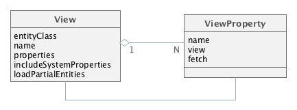
Figure 5. View Classes
A view is determined by an instance of the View class, where:
-
entityClass– the entity class, for which the view is defined. In other words, it is the "root" of the loaded entities tree. -
name– the name of the view. It should be eithernullor a unique name within all views for the entity. -
properties– collection ofViewPropertyinstances corresponding to the entity attributes that should be loaded. -
includeSystemProperties– if set, system attributes (defined by basic interfaces of persistent entities, such asBaseEntityandUpdatable) are automatically included in the view.
-
loadPartialEntities- specifies whether the view affects loading of local (in other words, immediate) attributes. If false, only reference attributes are affected, and local ones are loaded regardless of their presence in the view.This property is controlled to some extent by the platform data loading mechanisms, see the sections about loading partial entities in DataManager and EntityManager.
ViewProperty class has the following properties:
-
name– the name of the entity attribute. -
view– for reference attributes, specifies the view which will be used to load the related entity. -
fetch- for reference attributes, specifies how to fetch the related entity from the database. It corresponds to theFetchModeenum and can have one of the following values:-
AUTO- the platform will choose an optimal mode depending on the relation type. -
UNDEFINED- fetching will be performed according to JPA rules, which effectively means loading by a separate select. -
JOIN- fetching in the same select by joining with referenced table. -
BATCH- queries of related objects will be optimized in batches. See more here.
If the
fetchattribute is not specified, theAUTOmode is applied. If the reference represents a cacheable entity,UNDEFINEDwill be used regardless of the value specified in the view. -
3.2.3.1. Creating Views
You can create views as follows:
-
Programmatically – by creating a
Viewinstance. This way is appropriate for creating views that are used in the business logic.View instances, including nested ones, can be created by constructors:
View view = new View(Order.class) .addProperty("date") .addProperty("amount") .addProperty("customer", new View(Customer.class) .addProperty("name") );The same can be done using
ViewBuilder:View view = ViewBuilder.of(Order.class) .addAll("date", "amount", "customer.name") .build();ViewBuildercan also be used in DataManager's fluent interface:// explicit view builder dataManager.load(Order.class) .view(viewBuilder -> viewBuilder.addAll("date", "amount", "customer.name")) .list(); // implicit view builder dataManager.load(Order.class) .viewProperties("date", "amount", "customer.name") .list(); -
Declaratively in screens - by defining an inline view right in the screen’s XML, see an example in Declarative Creation of Data Components. This is the recommended way for loading data in Generic UI screens for projects based on CUBA 7.2+.
-
Declaratively in the shared repository – by defining a view in the views.xml file of the project. The
views.xmlfile is deployed on the application start, createdViewinstances are cached inViewRepository. Further on, the required view can be retrieved in any part of the application code by a call toViewRepositoryproviding the entity class and the view name.
Below is an example of the XML view declaration which provides loading of all local attributes of the Order entity, associated Customer and the Items collection:
<view class="com.sample.sales.entity.Order"
name="order-with-customer"
extends="_local">
<property name="customer" view="_minimal"/>
<property name="items" view="item-in-order"/>
</view>- Working with the shared views repository
-
ViewRepositoryis a Spring bean, accessible to all application blocks. The reference toViewRepositorycan be obtained using injection or through theAppBeansstatic methods. UseViewRepository.getView()methods to retrieve view instances from the repository.Three views named
_local,_minimaland_baseare available in the views repository for each entity by default:-
_localcontains all local entity attributes. -
_minimalcontains the attributes which are included to the name of the entity instance and specified in the @NamePattern annotation. If the@NamePatternannotation is not specified at the entity, this view does not contain any attributes. -
_baseincludes all local non-system attributes and attributes defined by@NamePattern(effectively_minimal+_local).
CUBA Studio automatically creates and maintains a single views.xml file in your project. However, you can create multiple view descriptor files as follows:
-
The
globalmodule must contain theviews.xmlfile with all view descriptors that should be globally accessible (i.e. on all application tiers) into it. This file should be registered in the cuba.viewsConfig application property of all blocks, i.e. inapp.propertiesof thecoremodule,web-app.propertiesof thewebmodule, etc. This is what Studio does for you by default. -
If you have a large number of shared views, you can put them in multiple files, e.g. into standard
views.xmland additionalfoo-views.xml,bar-views.xml. Register all your files in thecuba.viewsConfigapplication property:cuba.viewsConfig = +com/company/sales/views.xml com/company/sales/foo-views.xml com/company/sales/bar-views.xml
-
If there are views which are used only in one application block, they can be defined in the similar file of this block, for example,
web-views.xml, and registered incuba.viewsConfigproperty of this block only.
If the repository contains a view with certain name for some entity, an attempt to deploy another view with this name for the same entity will be ignored. If you need to replace the existing view in the repository with a new one and guarantee its deployment, specify
overwrite = "true"attribute for it.It is recommended to give descriptive names to the shared views. For example, not just "browse", but "customer-browse". It simplifies the search of views in XML descriptors.
-
3.2.4. Spring Beans
Spring Beans are classes that are instantiated and populated with dependencies by the Spring Framework container. Beans are designed for implementation of the application’s business logic.
|
Spring Bean is a singleton by default, i.e., only one instance of such class exists in each application block. If a singleton bean contains mutable data in its fields (in other words, has a state), it is necessary to synchronize access to these fields. |
3.2.4.1. Creating a Bean
|
See Create Business Logic in CUBA guide to learn how to put business logic as a Spring bean. |
To create a Spring bean, add the @org.springframework.stereotype.Component annotation to the Java class. For example:
package com.sample.sales.core;
import com.sample.sales.entity.Order;
import org.springframework.stereotype.Component;
@Component(OrderWorker.NAME)
public class OrderWorker {
public static final String NAME = "sales_OrderWorker";
public void calculateTotals(Order order) {
}
}It is recommended to assign a unique name to the bean in the {project_name}_{class_name} form and to define it in the NAME constant.
|
The |
The bean class should be placed inside the package tree with the root specified in the context:component-scan element of the spring.xml file. For the bean in the example above, the spring.xml file should contain the element:
<context:component-scan base-package="com.sample.sales"/>which means that the search for annotated beans for this application block will be performed starting with the com.sample.sales package.
Spring beans can be created on any application tier.
3.2.4.2. Using the Bean
A reference to the bean can be obtained through injection or through the AppBeans class. As an example of using the bean, let’s look at the implementation of the OrderService bean that delegates the execution to the OrderWorker bean:
package com.sample.sales.core;
import com.haulmont.cuba.core.Persistence;
import com.sample.sales.entity.Order;
import org.springframework.stereotype.Service;
import org.springframework.transaction.annotation.Transactional;
import javax.inject.Inject;
@Service(OrderService.NAME)
public class OrderServiceBean implements OrderService {
@Inject
protected Persistence persistence;
@Inject
protected OrderWorker orderWorker;
@Transactional
@Override
public BigDecimal calculateTotals(Order order) {
Order entity = persistence.getEntityManager().merge(order);
return orderWorker.calculateTotals(entity);
}
}In this example, the service starts a transaction, merges the detached entity obtained from the client level into the persistent context, and passes the control to the OrderWorker bean, which contains the main business logic.
3.2.5. JMX Beans
Sometimes, it is necessary to give system administrator an ability to view and change the state of some Spring bean at runtime. In such case, it is recommended to create a JMX bean – a program component having the JMX interface. JMX bean is usually a wrapper delegating calls to the managed bean which actually maintains state: cache, configuration data or statistics.
Figure 6. JMX Bean Class Diagram
As you can see from the diagram, the JMX bean consists of the interface and the implementation class. The class should be a Spring bean, i.e., should have the @Component annotation and unique name. The interface of the JMX bean is registered in spring.xml in a special way to create the JMX interface in the current JVM.
Calls to all JMX bean interface methods are intercepted using Spring AOP by the MBeanInterceptor interceptor class, which sets the correct ClassLoader in the current thread and enables logging of unhandled exceptions.
|
The JMX bean interface name must conform to the following format: |
JMX-interface can be utilized by external tools, such as jconsole or jvisualvm. In addition, the Web Client platform block includes the JMX console, which provides the basic tools to view the status and call the methods of the JMX beans.
3.2.5.1. Creating a JMX Bean
The following example shows how to create a JMX bean.
-
JMX bean interface:
package com.sample.sales.core; import org.springframework.jmx.export.annotation.*; import com.haulmont.cuba.core.sys.jmx.JmxBean; @JmxBean(module = "sales", alias = "OrdersMBean") @ManagedResource(description = "Performs operations on Orders") public interface OrdersMBean { @ManagedOperation(description = "Recalculates an order amount") @ManagedOperationParameters({@ManagedOperationParameter(name = "orderId", description = "")}) String calculateTotals(String orderId); }-
The interface and its methods may contain annotations to specify the description of the JMX bean and its operations. This description will be displayed in all tools that work with this JMX interface, thereby helping the system administrator.
-
Optional
@JmxBeanannotation is used for automatic registration of the class instances with a JMX server, according to themoduleandaliasattributes. You can register JMX bean using this annotation instead of registration in a spring.xml. -
Optional
@JmxRunAsyncannotation is designed to denote long operations. When such operation is launched using the built-in JMX console, the platform displays a dialog with an indefinite progress bar and the Cancel button. A user can abort the operation and continue to work with the application. The annotation can also contain thetimeoutparameter that sets a maximum execution time for the operation in milliseconds, for example:@JmxRunAsync(timeout = 30000) String calculateTotals();If the timeout is exceeded, the dialog closes with an error message.
Please note, that if an operation is cancelled or timed out on UI, it still continue to work in background, i.e. these actions do not abort the actual execution, they just return control back to the user.
-
Since the JMX tools support a limited set of data types, it is desirable to use
Stringas the type for the parameters and result of the method and perform the conversion inside the method, if necessary. Alongside withString, the following parameter types are supported:boolean,double,float,int,long,Boolean,Integer.
-
-
The JMX bean class:
package com.sample.sales.core; import com.haulmont.cuba.core.*; import com.haulmont.cuba.core.app.*; import com.sample.sales.entity.Order; import org.apache.commons.lang.exception.ExceptionUtils; import org.springframework.stereotype.Component; import javax.inject.Inject; import java.util.UUID; @Component("sales_OrdersMBean") public class Orders implements OrdersMBean { @Inject protected OrderWorker orderWorker; @Inject protected Persistence persistence; @Authenticated @Override public String calculateTotals(String orderId) { try { try (Transaction tx = persistence.createTransaction()) { Order entity = persistence.getEntityManager().find(Order.class, UUID.fromString(orderId)); orderWorker.calculateTotals(entity); tx.commit(); }; return "Done"; } catch (Throwable e) { return ExceptionUtils.getStackTrace(e); } } }The
@Componentannotation defines the class as a Spring bean with thesales_OrdersMBeanname. The name is specified directly in the annotation and not in the constant, since access to the JMX bean from Java code is not required.Lets overview the implementation of the
calculateTotals()method.-
The method has the
@Authenticatedannotation, i.e., system authentication is performed on method entry in the absence of the user session. -
The method’s body is wrapped in the try/catch block, so that, if successful, the method returns "Done", and in case of error – the stack trace of the exception as string.
In this case, all exceptions are handled and therefore do not get logged automatically, because they never fall through to
MBeanInterceptor. If logging of exceptions is required, the call of the logger should be added in thecatchsection. -
The method starts the transaction, loads the
Orderentity instance by identifier, and passes control to theOrderWorkerbean for processing.
-
-
If you did not set the
@JmxBeanannotation for the JMX bean interface, you should register the JMX bean in thespring.xml:<bean id="sales_MBeanExporter" lazy-init="false" class="com.haulmont.cuba.core.sys.jmx.MBeanExporter"> <property name="beans"> <map> <entry key="${cuba.webContextName}.sales:type=Orders" value-ref="sales_OrdersMBean"/> </map> </property> </bean>All JMX beans of a project are declared in one
MBeanExporterinstance in themap/entryelements of thebeansproperty. The key is JMX ObjectName, the value – the bean’s name specified in the@Componentannotation. ObjectName begins with the name of the web application, because several web applications, which export the same JMX interfaces, can be deployed into one application server instance (i.e., into one JVM).
3.2.5.2. The Platform JMX Beans
This section describes some of the JMX beans available in the platform.
3.2.5.2.1. CachingFacadeMBean
CachingFacadeMBean provides methods to clear various caches in the Middleware and Web Client blocks.
JMX ObjectName: app-core.cuba:type=CachingFacade and app.cuba:type=CachingFacade
3.2.5.2.2. ConfigStorageMBean
ConfigStorageMBean enables viewing and setting values of the application properties in the Middleware, Web Client and Web Portal blocks.
This interface has separate sets of operations for working with properties stored in files (*AppProperties) and stored in the database (*DbProperties). These operations show only the properties explicitly set in the storage. It means that if you have a configuration interface defining a property and its default value, but you did not set the value in the database (or a file), these methods will not show the property and its current value.
Please note that the changes to property values stored in files are not persistent, and are valid only until restart of the application block.
Unlike the operations described above, the getConfigValue() operation returns exactly the same value as the corresponding method of the configuration interface invoked in the application code.
JMX ObjectName:
-
app-core.cuba:type=ConfigStorage -
app.cuba:type=ConfigStorage -
app-portal.cuba:type=ConfigStorage
3.2.5.2.3. EmailerMBean
EmailerMBean enables viewing the current values of the email sending parameters, and sending test messages.
JMX ObjectName: app-core.cuba:type=Emailer
3.2.5.2.4. PersistenceManagerMBean
PersistenceManagerMBean provides the following abilities:
-
Managing entity statistics mechanism.
-
Viewing new DB update scripts using the
findUpdateDatabaseScripts()method. Triggering DB update with theupdateDatabase()method. -
Executing arbitrary JPQL queries in the Middleware context by using
jpqlLoadList(),jpqlExecuteUpdate()methods.
JMX ObjectName: app-core.cuba:type=PersistenceManager
3.2.5.2.5. ScriptingManagerMBean
ScriptingManagerMBean is the JMX facade for the Scripting infrastructure interface.
JMX ObjectName: app-core.cuba:type=ScriptingManager
JMX attributes:
-
RootPath– absolute path to the configuration directory of the Middleware block, in which this bean was started.
JMX operations:
-
runGroovyScript()– executes a Groovy script in the Middleware context and returns the result. The following variables are passed to the script:-
persistenceof the Persistence type. -
metadataof the Metadata type. -
configurationof the Configuration type. -
dataManagerof the DataManager type.The result type should be of the String type to be displayed in the JMX interface. Otherwise, the method is similar to the Scripting.runGroovyScript() method.
The example script for creating a set of test users is shown below:
import com.haulmont.cuba.core.* import com.haulmont.cuba.core.global.* import com.haulmont.cuba.security.entity.* PasswordEncryption passwordEncryption = AppBeans.get(PasswordEncryption.class) Transaction tx = persistence.createTransaction() try { EntityManager em = persistence.getEntityManager() Group group = em.getReference(Group.class, UUID.fromString('0fa2b1a5-1d68-4d69-9fbd-dff348347f93')) for (i in (1..250)) { User user = new User() user.setGroup(group) user.setLogin("user_${i.toString().padLeft(3, '0')}") user.setName(user.login) user.setPassword(passwordEncryption.getPasswordHash(user.id, '1')); em.persist(user) } tx.commit() } finally { tx.end() }
-
3.2.5.2.6. ServerInfoMBean
ServerInfoMBean provides the general information about this Middleware block: the build number, build date and the server id.
JMX ObjectName: app-core.cuba:type=ServerInfo
3.2.6. Infrastructure Interfaces
Infrastructure interfaces provide access to frequently used functionality of the platform. Most of them are located in the global module and can be used both on the middle and client tiers. However, some of them (Persistence, for example) are accessible only for Middleware code.
Infrastructure interfaces are implemented by Spring beans, so they can be injected into any other managed components (beans, Middleware services, generic user interface screen controllers).
Also, like any other beans, infrastructure interfaces can be obtained using static methods of AppBeans class, and can be used in non-managed components (POJO, helper classes etc.).
3.2.6.1. Configuration
The interface helps to obtain references to configuration interfaces.
Examples:
// field injection
@Inject
protected Configuration configuration;
...
String tempDir = configuration.getConfig(GlobalConfig.class).getTempDir();// setter injection
protected GlobalConfig globalConfig;
@Inject
public void setConfiguration(Configuration configuration) {
this.globalConfig = configuration.getConfig(GlobalConfig.class);
}// location
String tempDir = AppBeans.get(Configuration.class).getConfig(GlobalConfig.class).getTempDir();3.2.6.2. DataManager
DataManager interface provides CRUD functionality on both middle and client tiers. It is a universal tool for loading entity graphs from the database and saving changed detached entity instances.
|
See Introduction to Working with Data guide to learn different use cases regarding programmatic data access with the DataManager API. |
|
See DataManager vs. EntityManager for information on differences between DataManager and EntityManager. |
DataManager in fact just delegates to a DataStore implementation and handles cross-database references if needed. The most implementation details described below are in effect when you work with entities stored in a relational database through the standard RdbmsStore. For another type of data store, everything except the interface method signatures can be different. For simplicity, when we write DataManager without additional clarification, we mean DataManager via RdbmsStore.
DataManager methods are listed below:
-
load(Class)- loads entities of the specified class. This method is an entry point to the fluent API:@Inject private DataManager dataManager; private Book loadBookById(UUID bookId) { return dataManager.load(Book.class).id(bookId).view("book.edit").one(); } private List<BookPublication> loadBookPublications(UUID bookId) { return dataManager.load(BookPublication.class) .query("select p from library_BookPublication p where p.book.id = :bookId") .parameter("bookId", bookId) .view("bookPublication.full") .list(); } -
loadValues(String query)- loads key-value pairs by the query for scalar values. This method is an entry point to the fluent API:List<KeyValueEntity> list = dataManager.loadValues( "select o.customer, sum(o.amount) from demo_Order o " + "where o.date >= :date group by o.customer") .store("legacy_db") (1) .properties("customer", "sum") (2) .parameter("date", orderDate) .list();1 - specify data store where the entity is located. Omit this method if the entity is located in the main data store. 2 - specify names of the resulting KeyValueEntityattributes. The order of the properties must correspond to the columns in the query result set. -
loadValue(String query, Class valueType)- loads a single value by the query for scalar values. This method is an entry point to the fluent API:BigDecimal sum = dataManager.loadValue( "select sum(o.amount) from demo_Order o " + "where o.date >= :date group by o.customer", BigDecimal.class) .store("legacy_db") (1) .parameter("date", orderDate) .one();1 - specify data store where the entity is located. Omit this method if the entity is located in the main data store. -
load(LoadContext),loadList(LoadContext)– load entities according to the parameters of theLoadContextobject passed to it.LoadContextmust include either a JPQL query or an entity identifier. If both are defined, the query is used, and the identifier is ignored.For example:
@Inject private DataManager dataManager; private Book loadBookById(UUID bookId) { LoadContext<Book> loadContext = LoadContext.create(Book.class) .setId(bookId).setView("book.edit"); return dataManager.load(loadContext); } private List<BookPublication> loadBookPublications(UUID bookId) { LoadContext<BookPublication> loadContext = LoadContext.create(BookPublication.class) .setQuery(LoadContext.createQuery("select p from library_BookPublication p where p.book.id = :bookId") .setParameter("bookId", bookId)) .setView("bookPublication.full"); return dataManager.loadList(loadContext); } -
loadValues(ValueLoadContext)- loads a list of key-value pairs. The method acceptsValueLoadContextwhich defines a query for scalar values and a list of keys. The returned list contains instances ofKeyValueEntity. For example:ValueLoadContext context = ValueLoadContext.create() .setQuery(ValueLoadContext.createQuery( "select o.customer, sum(o.amount) from demo_Order o " + "where o.date >= :date group by o.customer") .setParameter("date", orderDate)) .addProperty("customer") .addProperty("sum"); List<KeyValueEntity> list = dataManager.loadValues(context); -
getCount(LoadContext)- returns a number of records for a query passed to the method. When possible, the standard implementation inRdbmsStoreexecutesselect count()query with the same conditions as in the original query for maximum performance. -
commit(CommitContext)– saves a set of entities passed inCommitContextto the database. Collections of entities for updating and deletion must be specified separately.The method returns the set of entity instances returned by EntityManager.merge(); essentially these are fresh instances just updated in DB. Further work should be performed with these returned instances to prevent data loss or optimistic locking. You can ensure that required attributes are present in the returned entities by setting a view for each saved instance using
CommitContext.getViews()map.DataManagercan perform bean validation of saved entities.Examples of saving a collection of entities:
@Inject private DataManager dataManager; private void saveBookInstances(List<BookInstance> toSave, List<BookInstance> toDelete) { CommitContext commitContext = new CommitContext(toSave, toDelete); dataManager.commit(commitContext); } private Set<Entity> saveAndReturnBookInstances(List<BookInstance> toSave, View view) { CommitContext commitContext = new CommitContext(); for (BookInstance bookInstance : toSave) { commitContext.addInstanceToCommit(bookInstance, view); } return dataManager.commit(commitContext); } -
reload(Entity, View)- convenience method to reload a specified instance from the database with the required view. It delegates to theload()method. -
remove(Entity)- removes a specified instance from the database. Delegates tocommit()method. -
create(Class)- creates an instance of the given entity in memory. This is a convenience method that just delegates toMetadata.create(). -
getReference(Class, Object)- returns an entity instance which can be used as a reference to an object which exists in the database.For example, if you are creating a
User, you have to set aGroupthe user belongs to. If you know the group id, you could load it from the database and set to the user. This method saves you from unneeded database round trip:user.setGroup(dataManager.getReference(Group.class, groupId)); dataManager.commit(user);A reference can also be used to delete an existing object by id:
dataManager.remove(dataManager.getReference(Customer.class, customerId));
- Query
-
When working with relational databases, use JPQL queries to load data. See the JPQL Functions, Case-Insensitive Substring Search and Macros in JPQL sections for information on how JPQL in CUBA differs from the JPA standard. Also note that
DataManagercan execute only "select" queries.The
query()method of the fluent interface accepts both full and abbreviated query string. The latter should be created in accordance with the following rules:-
You can always omit the
"select <alias>"clause. -
If the
"from"clause contains a single entity and you don’t need a specific alias for it, you can omit the"from <entity> <alias> where"clause. In this case, the framework assumes that the alias ise. -
You can use positional parameters and pass their values right to the
query()method as additional arguments.
For example:
// named parameter dataManager.load(Customer.class) .query("e.name like :name") .parameter("name", value) .list(); // positional parameter dataManager.load(Customer.class) .query("e.name like ?1", value) .list(); // case-insensitive positional parameter dataManager.load(Customer.class) .query("e.name like ?1 or e.email like ?1", "(?i)%joe%") .list(); // multiple positional parameters dataManager.load(Order.class) .query("e.date between ?1 and ?2", date1, date2) .list(); // omitting "select" and using a positional parameter dataManager.load(Order.class) .query("from sales_Order o, sales_OrderLine l " + "where l.order = o and l.product.name = ?1", productName) .list();Please note that positional parameters are supported only in the fluent interface.
LoadContext.Querysupports only named parameters. -
- Transactions
-
DataManager always starts a new transaction and commits it on operation completion, thus returning entities in the detached state. On the middle tier, you can use TransactionalDataManager if you need to implement complex transactional behavior.
- Partial entities
-
Partial entity is an entity instance that can have only a subset of local attributes loaded. By default, DataManager loads partial entities according to views (in fact,
RdbmsStorejust sets the loadPartialEntities property of the view to true and passes it down to EntityManager).There are some conditions, when DataManager loads all local attributes and uses views only for fetching references:
-
The loaded entity is cached.
-
In-memory "read" constraints are defined for the entity.
-
Dynamic attribute access control is set up for the entity.
-
The
loadPartialEntitiesattribute ofLoadContextis set to false.
-
3.2.6.2.1. DataManager vs. EntityManager
Both DataManager and EntityManager can be used for CRUD operations on entities. There are the following differences between these interfaces:
| DataManager | EntityManager |
|---|---|
DataManager is available on both middle and client tiers. |
EntityManager is available only on the middle tier. |
DataManager is a singleton bean. It can be injected or obtained via |
You should obtain a reference to EntityManager through the Persistence interface. |
DataManager defines a few high-level methods for working with detached entities: |
EntityManager mostly resembles the standard |
DataManager can perform bean validation when saving entities. |
EntityManager doesn’t perform bean validation. |
DataManager in fact delegates to DataStore implementations, so the DataManager features listed below apply only to the most common case when you work with entities located in a relational database:
| DataManager | EntityManager |
|---|---|
DataManager always starts new transactions internally. On the middle tier, you can use TransactionalDataManager if you need to implement complex transactional behavior. |
You have to open a transaction before working with EntityManager. |
DataManager loads partial entities according to views. There are a few exceptions, see details here. |
EntityManager loads all local attributes. If a view is specified, it affects only reference attributes. See details here. |
DataManager executes only JPQL queries. Besides, it has separate methods for loading entities: |
EntityManager can run any JPQL or native (SQL) queries. |
DataManager checks security restrictions when invoked on the client tier. |
EntityManager does not impose security restrictions. |
When you work with data on the client tier, you have only one option - DataManager. On the middleware, use TransactionalDataManager when you need to implement some atomic logic inside a transaction or EntityManager if it is better suited to the task. In general, on the middleware you can use any of these interfaces.
If you need to overcome restrictions of DataManager when working on the client tier, create your own service and use TransactionalDataManager or EntityManager to work with data. In the service, you can check permissions using the Security interface and return data to the client in the form of persistent or non-persistent entities or arbitrary values.
3.2.6.2.2. TransactionalDataManager
TransactionalDataManager is a bean of the middle tier which mimics the DataManager interface but can join an existing transaction. It has the following features:
-
If there is an active transaction, joins it, otherwise creates and commits a transaction same as
DataManager. -
It accepts and returns entities in detached state. The developer should load entities with appropriate views and explicitly use the
save()method to save modified instances to the database. -
It applies row-level security, works with dynamic attributes and cross-datastore references in the same way as
DataManager.
Below is a simple example of using TransactionalDataManager in a service method:
@Inject
private TransactionalDataManager txDataManager;
@Transactional
public void transfer(Id<Account, UUID> acc1Id, Id<Account, UUID> acc2Id, Long amount) {
Account acc1 = txDataManager.load(acc1Id).one();
Account acc2 = txDataManager.load(acc2Id).one();
acc1.setBalance(acc1.getBalance() - amount);
acc2.setBalance(acc2.getBalance() + amount);
txDataManager.save(acc1);
txDataManager.save(acc2);
}You can find more complex example in the framework test: DataManagerTransactionalUsageTest.java
|
|
3.2.6.2.3. Security in DataManager
The load(), loadList(), loadValues() and getCount() methods check user’s READ permission for entities being loaded. Additionally, loading entities from the database is subject for access group constraints.
The commit() method checks CREATE permissions for new entities, UPDATE for the updated entities and DELETE for the deleted ones.
By default, DataManager checks permissions on entity operations (READ/CREATE/UPDATE/DELETE) when invoked from a client, and ignores them when invoked from a middleware code. Attribute permissions are not enforced by default.
If you want to check entity operation permissions when using DataManager in your middleware code, obtain a wrapper via DataManager.secure() method and call its methods. Alternatively, you can set the cuba.dataManagerChecksSecurityOnMiddleware application property to turn on security check for the whole application.
Attribute permissions will be enforced on the middleware only if you additionally set the cuba.entityAttributePermissionChecking application property to true. It makes sense if Middleware serves remote clients that theoretically can be hacked, like a desktop client. In this case, set also the cuba.keyForSecurityTokenEncryption application property to a unique value. If your application uses only Web or Portal clients, you can safely keep default values of these properties.
Note that access group constraints (row-level security) are always applied regardless of the above conditions.
See also the Data Access Checks section for the whole picture of how security permissions and constraints are used by different mechanisms of the framework.
3.2.6.2.4. Queries with distinct
If a screen contains a table with paging, and JPQL that is used to load data can be modified at run time as a result of applying a generic filter or access group constraints, the following can happen when distinct operator is omitted in JPQL queries:
-
If a collection is joined at the database level, the loaded dataset will contain duplicate rows.
-
On client level, the duplicates disappear in the datasource as they are added to a map (
java.util.Map). -
In case of paged table, a page may show fewer lines than requested, while the total number of lines exceeds requested.
Thus, we recommend including distinct in JPQL queries, which ensures the absence of duplicates in the dataset returned from the database. However, certain DB servers (PostgreSQL in particular) have performance problems when executing SQL queries with distinct if the number of returned records is large (more than 10000).
To solve this, the platform contains a mechanism to operate correctly without distinct at SQL level. This mechanism is enabled by cuba.inMemoryDistinct application property. When activated, it does the following:
-
The JPQL query should still include
select distinct. -
DataManagercutsdistinctout of the JPQL query before sending it to ORM. -
After the data page is loaded by
DataManager, it deletes the duplicates and runs additional queries to DB in order to retrieve the necessary number of rows which are then returned to the client.
3.2.6.2.5. Sequential Queries
DataManager can select data from the results of previous requests. This capability is used by the generic filter for sequential application of filters.
The mechanism works as follows:
-
If a
LoadContextwith defined attributesprevQueriesandqueryKeyis provided,DataManagerexecutes the previous query and saves identifiers of retrieved entities in theSYS_QUERY_RESULTtable (corresponding tosys$QueryResultentity), separating the sets of records by user sessions and the query session keyqueryKey. -
The current query is modified to be combined with the results of the previous one, so that the resulting data complies with the conditions of both queries combined by AND.
-
The process may be further repeated. In this case the gradually reduced set of previous results is deleted from the
SYS_QUERY_RESULTtable and refilled again.
The SYS_QUERY_RESULT table is periodically cleaned of old query results left by terminated user sessions. This is done by the deleteForInactiveSessions() method of the QueryResultsManagerAPI bean which is invoked by a Spring scheduler defined in cuba-spring.xml. By default, it is done once in 10 minutes, but you can set a desired interval in milliseconds using the cuba.deleteOldQueryResultsInterval application property of the core module.
3.2.6.3. EntityStates
An interface for obtaining the information on persistent entities managed by ORM. Unlike the Persistence and PersistenceTools beans, this interface is available on all tiers.
The EntityStates interface has the following methods:
-
isNew()– determines if the passed instance is newly created, i.e., in the New state. Also returnstrueif this instance is actually in Managed state but newly-persisted in the current transaction, or if it is not a persistent entity. -
isManaged()- determines if the passed instance is Managed, i.e. attached to a persistence context. -
isDetached()– determines if the passed instance is in the Detached state. Also returnstrue, if this instance is not a persistent entity. -
isLoaded()- determines if an attribute is loaded from the database. The attribute is loaded if it is included into a view, or if it is a local attribute and a view was not provided to the loading mechanism (EntityManager or DataManager). Only immediate attributes of the entity can be checked by this method. -
checkLoaded()- the same asisLoaded()but throwsIllegalArgumentExceptionif at least one of the attributes passed to the method is not loaded. -
isLoadedWithView()- accepts an entity instance and a view and returns true if all attributes required by the view are actually loaded. -
checkLoadedWithView()- the same asisLoadedWithView()but throwsIllegalArgumentExceptioninstead of returning false. -
makeDetached()- accepts a newly created entity instance and turns it into the detached state. The detached object can be passed toDataManager.commit()orEntityManager.merge()to save its state in the database. See details in the API docs. -
makePatch()- accepts a newly created entity instance and makes it a patch object. The patch object can be passed toDataManager.commit()orEntityManager.merge()to save its state in the database. Unlike for a detached object, only non-null attributes will be saved. See details in the API docs.
3.2.6.3.1. PersistenceHelper
A helper class with static methods delegating to the EntityStates interface.
3.2.6.4. Events
|
See Decouple Business Logic with Application Events guide to learn different examples of application events. |
Events bean encapsulates the application-scope event publication functionality. Application events can be used to exchange information between loosely coupled components. Events bean is a simple facade for ApplicationEventPublisher of the Spring Framework.
public interface Events {
String NAME = "cuba_Events";
void publish(ApplicationEvent event);
}It has only one method publish() that receives an event object. Events.publish() notifies all matching listeners registered with this application of an application event. You can use PayloadApplicationEvent to publish any object as an event.
See also Spring Framework tutorial.
- Event handling in beans
-
First of all, we have to create a new event class. It should extend the
ApplicationEventclass. An event class can contain any additional data. For instance:package com.company.sales.core; import com.haulmont.cuba.security.entity.User; import org.springframework.context.ApplicationEvent; public class DemoEvent extends ApplicationEvent { private User user; public DemoEvent(Object source, User user) { super(source); this.user = user; } public User getUser() { return user; } }Beans can publish an event using the
Eventsbean:package com.company.sales.core; import com.haulmont.cuba.core.global.Events; import com.haulmont.cuba.core.global.UserSessionSource; import com.haulmont.cuba.security.global.UserSession; import org.springframework.stereotype.Component; import javax.inject.Inject; @Component public class DemoBean { @Inject private Events events; @Inject private UserSessionSource userSessionSource; public void demo() { UserSession userSession = userSessionSource.getUserSession(); events.publish(new DemoEvent(this, userSession.getUser())); } }By default, all events are handled synchronously.
There are two ways to handle events:
-
Implement the
ApplicationListenerinterface. -
Use the
@EventListenerannotation for a method.
In the first case, we have to create a bean that implements
ApplicationListenerwith the type of our event:@Component public class DemoEventListener implements ApplicationListener<DemoEvent> { @Inject private Logger log; @Override public void onApplicationEvent(DemoEvent event) { log.debug("Demo event is published"); } }The second way can be used to hide implementation details and listen for multiple events in a single bean:
@Component public class MultipleEventListener { @Order(10) @EventListener protected void handleDemoEvent(DemoEvent event) { // handle event } @Order(1010) @EventListener protected void handleUserLoginEvent(UserLoggedInEvent event) { // handle event } }By default, Spring events require
protected,packageorpublicaccess modifiers for@EventListenermethods. Pay attention thatprivatemodifier is not supported.Methods with
@EventListenerannotation do not work in services, JMX beans and other beans with interfaces. If you define@EventListeneron such bean you will get the following error on application start:BeanInitializationException: Failed to process @EventListener annotation on bean. Need to invoke method declared on target class, but not found in any interface(s) of the exposed proxy type. Either pull the method up to an interface or switch to CGLIB proxies by enforcing proxy-target-class mode in your configuration.
If you need to listen to an event in a bean with interface, implement the
ApplicationListenerinterface instead.You can use Spring Framework
Orderedinterface and@Orderannotation for event handlers ordering. All the platform beans and event handlers useordervalue between 100 and 1000, thus you can add your custom handling before or after the platform code. If you want to add your bean or event handler before platform beans - use a value lower than 100.See also Login Events.
-
- Event handling in UI screens
-
Usually,
Eventsdelegates event publishing to theApplicationContext. On the web tier, you can use a special interface for event classes -UiEvent. It is a marker interface for events that are sent to UIs screens in the current UI instance (the current web browser tab).Please note that
UiEventinstances are not sent to Spring beans.Sample event class:
package com.company.sales.web; import com.haulmont.cuba.gui.events.UiEvent; import com.haulmont.cuba.security.entity.User; import org.springframework.context.ApplicationEvent; public class UserRemovedEvent extends ApplicationEvent implements UiEvent { private User user; public UserRemovedEvent(Object source, User user) { super(source); this.user = user; } public User getUser() { return user; } }It can be fired using
Eventsbean from a window controller the same way as from a bean:@Inject Events events; // ... UserRemovedEvent event = new UserRemovedEvent(this, removedUser); events.publish(event);In order to handle an event you have to define methods in UI screens with a special annotation
@EventListener(ApplicationListenerinterface is not supported):@Order(15) @EventListener protected void onUserRemove(UserRemovedEvent event) { notifications.create() .withCaption("User is removed " + event.getUser()) .show(); }You can use
@Orderannotation for event listener ordering.If an event is
UiEventand fired using theEventsbean from UI thread then opened windows and/or frames with such methods will receive the event. Event handling is synchronous. Only UI screens of the current web browser tab opened by the user receive the event.
3.2.6.5. Messages
Messages interface provides methods to get localized message strings.
Let’s consider interface methods in detail.
-
getMessage()– returns the localized message by key, pack name and required locale. There are several modifications of this method with different sets of parameters. If locale is not specified in the method parameter, the current user locale is used.Examples:
@Inject protected Messages messages; ... String message1 = messages.getMessage(getClass(), "someMessage"); String message2 = messages.getMessage("com.abc.sales.web.customer", "someMessage"); String message3 = messages.getMessage(RoleType.STANDARD); -
formatMessage()– retrieves a localized message by key, pack name and required locale, then uses it to format the input parameters. The format is defined according toString.format()method rules. There are several modifications of this method with different sets of parameters. If locale is not specified in the method parameter, the current user locale is used.Example:
String formattedValue = messages.formatMessage(getClass(), "someFormat", someValue); -
getMainMessage()– returns the localized message from the main message pack of the application block.Example:
protected Messages messages = AppBeans.get(Messages.class); ... messages.getMainMessage("actions.Ok"); -
getMainMessagePack()– returns the name of the main message pack of the application block.Example:
String formattedValue = messages.formatMessage(messages.getMainMessagePack(), "someFormat", someValue); -
getTools()– returnsMessageToolsinterface instance (see below).
3.2.6.5.1. MessageTools
MessageTools interface is a Spring bean containing additional methods for working with localized messages. You can access MessageTools interface either using Messages.getTools() method, or as any other bean – by means of injection or through AppBeans class.
MessageTools methods:
-
loadString()– returns a localized message, specified by reference inmsg://{messagePack}/{key}formatReference components:
-
msg://– mandatory prefix. -
{messagePack}– optional name of the message pack. If it is not specified, it is assumed that the pack name is passed toloadString()as a separate parameter. -
{key}– message key in the pack.
Examples of the message references:
msg://someMessage msg://com.abc.sales.web.customer/someMessage -
-
getEntityCaption()– returns the localized entity name. -
getPropertyCaption()– returns the localized name of an entity attribute. -
hasPropertyCaption()– checks whether the entity attribute was given a localized name. -
getMessageRef()– forms a message reference for meta-property which can be used to retrieve the localized name of the entity attribute. -
getDefaultLocale()– returns default application locale, which is the first one listed in cuba.availableLocales application property. -
useLocaleLanguageOnly()– returnstrue, if for all locales supported by the application (defined incuba.availableLocalesproperty) only the language parameter is specified, without country and variant. This method is used by platform mechanisms which need to find the most appropriate supported locale when locale info is received from the external sources such as operation system or HTTP request. -
trimLocale()– deletes from the passed locale everything except language, ifuseLocaleLanguageOnly()method returnstrue.
You can override MessageTools to extend the set of its methods in your application. Below are the examples of working with the extended interface:
MyMessageTools tools = messages.getTools();
tools.foo();((MyMessageTools) messages.getTools()).foo();3.2.6.6. Metadata
Metadata interface provides access to metadata session and view repository.
Interface methods:
-
getSession()– returns the metadata session instance. -
getViewRepository()– returns the view repository instance. -
getExtendedEntities()– returnsExtendedEntitiesinstance, intended for working with the extended entities. See more in Extending an Entity. -
create()– creates an entity instance, taking into account potential extension.For persistent
BaseLongIdEntityandBaseIntegerIdEntitysubclasses, assigns identifiers right after creation. The new identifiers are fetched from automatically created database sequences. By default, the sequences are created in the main data store. However, if the cuba.useEntityDataStoreForIdSequence application property is set to true, sequences are created in the data store the entity belongs to. -
getTools()– returnsMetadataToolsinterface instance (see below).
3.2.6.6.1. MetadataTools
MetadataTools is a Spring bean, containing additional methods for working with metadata. You can access MetadataTools interface by either using Metadata.getTools() method, or as any other bean – by means of injection or through AppBeans class.
`MetadataTools `methods:
-
getAllPersistentMetaClasses()– returns the collection of persistent entities meta-classes. -
getAllEmbeddableMetaClasses()– returns the collection of embeddable entities meta-classes. -
getAllEnums()– returns the collection of enumeration classes used as entity attributes types. -
format()– formats the passed value according to data type of the given meta-property. -
isSystem()– checks if a meta-property is system, i.e. specified in one of the basic entity interfaces. -
isPersistent()– checks if a meta-property is persistent, i.e. stored in the database. -
isTransient()– checks if a meta-property or an arbitrary attribute is non-persistent. -
isEmbedded()– checks if a meta-property is an embedded object. -
isAnnotationPresent()– checks if an annotation is present on the class or on one of its ancestors. -
getNamePatternProperties()– returns collection of meta-properties of attributes included in the instance name, returned byInstance.getInstanceName()method. See @NamePattern.
You can override MetadataTools bean in your application to extend the set of its methods. The examples of working with the extended interface:
MyMetadataTools tools = metadata.getTools();
tools.foo();((MyMetadataTools) metadata.getTools()).foo();3.2.6.7. Resources
Resources interface maintains resources loading according to the following rules:
-
If the provided location is a URL, the resource is downloaded from this URL;
-
If the provided location begins with
classpath:prefix, the resource is downloaded from classpath; -
If the location is not a URL and it does not begin with
classpath:, then:-
The file is searched in the configuration folder of application using the provided location as relative pathname. If the file is found, the resource is downloaded from it;
-
If the resource is not found at the previous steps, it is downloaded from classpath.
-
In practice, explicit identification of URL or classpath: prefix is rarely used, so resources are usually downloaded either from the configuration folder or from classpath. The resource in the configuration folder overrides the classpath resource with the same name.
Resources methods:
-
getResourceAsStream()– returnsInputStreamfor the provided resource, ornull, if the resource is not found. The stream should be closed after it had been used, for example:@Inject protected Resources resources; ... InputStream stream = null; try { stream = resources.getResourceAsStream(resourceLocation); ... } finally { IOUtils.closeQuietly(stream); }You can also use "try with resources":
try (InputStream stream = resources.getResourceAsStream(resourceLocation)) { ... } -
getResourceAsString()– returns the indicated resource content as string, ornull, if the resource is not found.
3.2.6.8. Scripting
Scripting interface is used to compile and load Java and Groovy classes dynamically (i.e. at runtime) as well as to execute Groovy scripts and expressions.
Scripting methods:
-
evaluateGroovy()– executes the Groovy expression and returns its result.cuba.groovyEvaluatorImport application property is used to define the common set of the imported classes inserted into each executed expression. By default, all standard application blocks import PersistenceHelper class.
The compiled expressions are cached, and this considerably speeds up repeated execution.
Example:
@Inject protected Scripting scripting; ... Integer intResult = scripting.evaluateGroovy("2 + 2", new Binding()); Binding binding = new Binding(); binding.setVariable("instance", new User()); Boolean boolResult = scripting.evaluateGroovy("return PersistenceHelper.isNew(instance)", binding);
-
runGroovyScript()– executes Groovy script and returns its result.The script should be located either in application configuration folder or in classpath (the current
Scriptingimplementation supports classpath resources within JAR files only). A script in the configuration folder overrides the script in classpath with the same name.The path to the script is constructed using separators
/. The separator is not required in the beginning of the path.Example:
@Inject protected Scripting scripting; ... Binding binding = new Binding(); binding.setVariable("itemId", itemId); BigDecimal amount = scripting.runGroovyScript("com/abc/sales/CalculatePrice.groovy", binding); -
loadClass()– loads Java or Groovy class using the following steps:-
If the class is already loaded, it will be returned.
-
The Groovy source code (file
*.groovy) is searched in the configuration folder. If it is found, it will be compiled and the class will be returned. -
The Java source code (file
*.java) is searched in the configuration folder. If it is found, it will be compiled and the class will be returned. -
The compiled class is searched in classpath. If it is found, it will be loaded and returned.
-
If nothing is found,
nullwill be returned.
The files in configuration folder containing Java and Groovy source code can be modified at runtime. On the next
loadClass()call the corresponding class will be recompiled and the new one will be returned, with the following restrictions:-
The type of the source code must not be changed from Groovy to Java;
-
If Groovy source code was once compiled, the deletion of the source code file will not lead to loading of another class from classpath. Instead of this, the class compiled from the removed source code will still be returned.
Example:
@Inject protected Scripting scripting; ... Class calculatorClass = scripting.loadClass("com.abc.sales.PriceCalculator"); -
-
getClassLoader()– returnsClassLoader, which is able to work according to the rules forloadClass()method described above.
Cache of the compiled classes can be cleaned at runtime using CachingFacadeMBean JMX bean.
See also ScriptingManagerMBean.
3.2.6.9. Security
This interface provides authorization – checking user access rights to different objects in the system. Most of the interface methods delegate to the corresponding methods of current UserSession object, but before this they search for an original meta-class of the entity, which is important for projects with extensions. Besides methods duplicating UserSession functionality, this interface contains isEntityAttrReadPermitted() and isEntityAttrUpdatePermitted() methods that check attribute path availability with respect to availability of all attributes and entities included in the path.
The Security interface is recommended to use everywhere instead of direct calling of the UserSession.isXYXPermitted() methods.
See more in User Authentication.
3.2.6.10. TimeSource
TimeSource interface provides the current time. Using new Date() and similar methods in the application code is not recommended.
Examples:
@Inject
protected TimeSource timeSource;
...
Date date = timeSource.currentTimestamp();long startTime = AppBeans.get(TimeSource.class).currentTimeMillis();3.2.6.11. UserSessionSource
The interface is used to obtain current user session object. See more in User Authentication.
3.2.6.12. UuidSource
The interface is used to obtain UUID values, including those used for entity identifiers. Using UUID.randomUUID() in the application code is not recommended.
To call from a static context, you can use the UuidProvider class, which also has an additional fromString() method that works faster than the standard UUID.fromString() method.
3.2.7. AppContext
AppContext is a system class, which stores references to certain common components for each application block in its static fields:
-
ApplicationContextof Spring Framework. -
Set of application properties loaded from
app.propertiesfiles. -
ThreadLocalvariable, storing SecurityContext instances. -
Collection of application lifecycle listeners (
AppContext.Listener).
When the application is started, AppContext is initialized using loader classes, specific for each application block:
-
Middleware loader –
AppContextLoader -
Web Client loader –
WebAppContextLoader -
Web Portal loader –
PortalAppContextLoader
AppContext can be used in the application code for the following tasks:
-
Getting the application property values, stored in
app.propertiesfiles in case they are not available through configuration interfaces. -
Passing
SecurityContextto new execution threads, see User Authentication. -
Registering listeners, triggered after full initialization and before termination of the application, for example:
AppContext.addListener(new AppContext.Listener() { @Override public void applicationStarted() { System.out.println("Application is ready"); } @Override public void applicationStopped() { System.out.println("Application is closing"); } });Please note that the recommended way to run code on the application startup and shutdown is using Application Lifecycle Events.
3.2.8. Application Lifecycle Events
There are the following types of lifecycle events in a CUBA application:
- AppContextInitializedEvent
-
It is sent right after AppContext is initialized. At this moment:
-
All the beans are fully initialized and their
@PostConstructmethods are executed. -
Static
AppBeans.get()methods can be used for obtaining beans. -
The
AppContext.isStarted()method returnsfalse. -
The
AppContext.isReady()method returnsfalse.
-
- AppContextStartedEvent
-
It is sent after
AppContextInitializedEventand after running allAppContext.Listener.applicationStarted(). At this moment:-
The
AppContext.isStarted()method returnstrue. -
The
AppContext.isReady()method returnsfalse. -
On the middleware, if cuba.automaticDatabaseUpdate application property is enabled, all database update scripts are successfully executed.
-
- AppContextStoppedEvent
-
It is sent before the application shutdown and after running all
AppContext.Listener.applicationStopped(). At this moment:-
All the beans are operational and can be obtained via
AppBeans.get()methods. -
AppContext.isStarted()method returnsfalse. -
The
AppContext.isReady()method returnsfalse.
-
You can affect the order of listeners invocation by specifying the @Order annotation. The Events.HIGHEST_PLATFORM_PRECEDENCE and Events.LOWEST_PLATFORM_PRECEDENCE constants define the range which is used by listeners defined in the platform.
For example:
package com.company.demo.core;
import com.haulmont.cuba.core.global.Events;
import com.haulmont.cuba.core.sys.events.*;
import org.slf4j.Logger;
import org.springframework.context.event.EventListener;
import org.springframework.stereotype.Component;
import javax.inject.Inject;
@Component
public class MyAppLifecycleBean {
@Inject
private Logger log;
// event type is defined by annotation parameter
@EventListener(AppContextInitializedEvent.class)
// run after all platform listeners
@Order(Events.LOWEST_PLATFORM_PRECEDENCE + 100)
protected void appInitialized() {
log.info("Initialized");
}
// event type is defined by method parameter
@EventListener
protected void appStarted(AppContextStartedEvent event) {
log.info("Started");
}
@EventListener
protected void appStopped(AppContextStoppedEvent event) {
log.info("Stopped");
}
}- ServletContextInitializedEvent
-
It is published right after initialization of Servlet and Application contexts. At this moment:
-
Static
AppBeans.get()methods can be used for obtaining beans. -
This event contains application and servlet contexts, thus enabling to register custom Servlets, Filters and Listeners, see Registration of Servlets and Filters.
-
- ServletContextDestroyedEvent
-
It is published when Servlet and Application are about to be shut down and enables to free resources manually.
For example:
@Component public class MyInitializerBean { @Inject private Logger log; @EventListener public void foo(ServletContextInitializedEvent e) { log.info("Application and servlet context is initialized"); } @EventListener public void bar(ServletContextDestroyedEvent e) { log.info("Application is about to shut down, all contexts are now destroyed"); } }
3.2.9. Application Properties
Application properties represent named values of different types, which determine various aspects of application configuration and functionality. The platform uses application properties extensively, and you can also employ them to configure application-specific features.
Platform application properties can be classified by intended purpose as follows:
-
Configuration parameters – specify sets of configuration files and certain user interface parameters, i.e. determine the application functionality. Values of configuration parameters are usually defined for the application project at development time.
For example: cuba.springContextConfig.
-
Deployment parameters – describe various URLs to connect application blocks, DBMS type, security settings etc. Values of deployment parameters are usually depend on the environment where the application instance is installed.
For example: cuba.connectionUrlList, cuba.dbmsType, cuba.userSessionExpirationTimeoutSec.
-
Runtime parameters – audit settings, email sending parameters etc. Values of these properties can be changed when needed at the application run time even without restart.
For example: cuba.entityLog.enabled, cuba.email.smtpHost.
- Setting Application Properties
-
Values of application properties can be set in the database, in the property files, via Java system properties and OS environment variables. If a property with the same name is defined in different sources, its value is determined by the following priorities:
-
Java system property (highest priority)
-
OS environment variable
-
Properties file
-
Database (lowest priority)
For example, a value specified in a properties file overrides the value specified in the database.
For OS environment variables, the framework tries to find the exact match of property name, and if not found, it looks for a name converted to upper case and with dots replaced with underscores. For example,
MYAPP_SOMEPROPERTYenvironment variable can assign value tomyapp.somePropertyapplication property. If you want to disable this feature and keep only exact match, set thecuba.disableUppercaseEnvironmentPropertiesapplication property to true.Some properties do not support setting values in the database for the following reason: their values are needed when the database is not accessible to the application code yet. These are configuration and deployment parameters mentioned above. So you can only define them in property files or via Java system properties and OS environment variables. Runtime parameters can always be set in the database (and possibly be overridden by values in files or system properties).
Typically, an application property is used in one or several application blocks. For example, cuba.persistenceConfig is used only in Middleware, cuba.web.appWindowMode is used in Web Client, while cuba.springContextConfig is used in all blocks. It means that if you need to set some value to a property, you should do it in all blocks that use this property. Properties stored in the database are automatically available to all blocks, so you set them just in one place (in the database table) regardless of what blocks use them. Moreover, there is a standard UI screen to manage properties of this type: see Administration > Application Properties. Properties stored in files should be set separately in the respective files of the blocks.
When you need to set a value to a platform property, find this property in the documentation. If the documentation states that the property is stored in the database, use the Administration > Application Properties screen to set its value. Otherwise, find out what blocks use the property and define it in the
app.propertiesfiles of these blocks. For example, if the documentation states that the property is used in all blocks, and your application consists of Middleware and Web Client, you should define the property in theapp.propertiesfile of the core module and in theweb-app.propertiesfile of the web module. Deployment parameters can also be set in an externallocal.app.propertiesfile. See Storing Properties in Files for details. -
- Properties From Application Components
-
An application component can expose properties by defining them in its app-component.xml file. Then if an application which uses the component does not define its own value for the property, the value will be obtained from the component. If the application uses multiple components defining the same property, the actual value in the application will be obtained from the component which is the closest ancestor by the hierarchy of dependencies between components. If there are several components on the same level of the hierarchy, the value is unpredictable.
- Additive Properties
-
Sometimes it is needed to get a combined property value from all application components used in the project. This is especially true for configuration parameters that allow platform mechanisms to configure your application based on the parameters provided by components.
Such properties should be made additive by specifying the plus sign in the beginning of their values. This sign indicates that the property value will be assembled from application components at runtime. For example, cuba.persistenceConfig should be an additive property. In your project, it specifies a
persistence.xmlfile defining your project’s data model. But due to the fact that the real property value will include alsopersistence.xmlfiles of the application components, the whole data model of your application will include also entities defined in the components.If you omit
+for a property, its value will be obtained only from the current project. It can be useful if you don’t want to inherit some configuration from components, for example, when you define a menu structure.An additive property value obtained at runtime is formed by elements concatenated with a space symbol.
- Programmatic Access to Application Properties
-
You can access application properties in your code using the following mechanisms:
-
Configuration interfaces. If you define application properties as annotated methods of a configuration interface, the application code will have typed access to the properties. Configuration interfaces allow you to define and access properties of all types of storage: database, files and system properties.
-
The
getProperty()method of the AppContext class. If you set a property in a file or as a Java system property, you can read its value using this method. This approach has the following drawbacks:-
Properties stored in the database are not supported.
-
Unlike invoking an interface method, you have to provide the property name as String.
-
Unlike getting a result of a specific type, you can only get the property value as String.
-
-
3.2.9.1. Storing Properties in Files
Properties that determine configuration and deployment parameters are specified in special property files named according to the *app.properties pattern. Each application block contains a set of such files which is defined in the appPropertiesConfig parameter of web.xml.
For example, the set of property files of the Middleware block is specified in the web/WEB-INF/web.xml file of the core module and looks as follows:
<context-param>
<param-name>appPropertiesConfig</param-name>
<param-value>
classpath:com/company/sample/app.properties
/WEB-INF/local.app.properties
"file:${app.home}/local.app.properties"
</param-value>
</context-param>The classpath: prefix means that the corresponding file can be found in the Java classpath, while file: prefix means that it should be loaded from the file system. A path without such prefix means the path inside the web application relative to its root. Java system properties can be used: here app.home system property points to the application home directory.
An order in which files are declared is important because the values, specified in each subsequent file override the values of the properties with the same name, specified in the preceding files. If any of these files does not exist, it is silently ignored.
The last file in the above set is local.app.properties. It can be used to set or override application properties specific to a particular deployment environment.
|
Use the following rules when create
|
3.2.9.2. Storing Properties in the Database
Application properties that represent runtime parameters are stored in the SYS_CONFIG database table.
Such properties have the following distinctive features:
-
As the property value is stored in the database, it is defined in a single location, regardless of what application blocks use it.
-
The value can be changed and saved at runtime in the following ways:
-
Using the Administration > Application Properties screen.
-
Using the ConfigStorageMBean JMX bean.
-
If the configuration interface has a setter method, you can set the property value in the application code.
-
-
Property value can be overridden for a particular application block in its
*app.propertiesfile, via Java system property or OS environment variable.
It is important to mention, that access to properties stored in the database on the client side leads to Middleware requests. This is less efficient than retrieving properties from local *app.properties files. To reduce the number of requests, the client caches properties for the lifetime of configuration interface implementation instance. Thus, if you need to access the properties of a configuration interface from some UI screen for several times, it is recommended to get the reference to this interface upon screen initialization and save it to a screen controller field for further access.
3.2.9.3. Configuration Interfaces
The configuration interfaces mechanism enables working with application properties using Java interface methods, providing the following benefits:
-
Typed access – application code works with actual data types (String, Boolean, Integer etc.).
-
Instead of string property identifiers, the application code uses interface methods, which are checked by the compiler and you can use code completion when working in an IDE.
Example of reading the transaction timeout value in the Middleware block:
@Inject
private ServerConfig serverConfig;
public void doSomething() {
int timeout = serverConfig.getDefaultQueryTimeoutSec();
...
}If injection is impossible, the configuration interface reference can be obtained via the Configuration infrastructure interface:
int timeout = AppBeans.get(Configuration.class)
.getConfig(ServerConfig.class)
.getDefaultQueryTimeoutSec();|
Configuration interfaces are not regular Spring beans. They can only be obtained through explicit interface injection or via |
3.2.9.3.1. Using Configuration Interfaces
To create a configuration interface in your application, do the following:
-
Create an interface inherited from
com.haulmont.cuba.core.config.Config(not to be confused with the entity classcom.haulmont.cuba.core.entity.Config). -
Add
@Sourceannotation to specify where the property values should be stored:-
SourceType.SYSTEM– values will be taken from the system properties of the given JVM using theSystem.getProperty()method. -
SourceType.APP– values will be taken from*app.propertiesfiles. -
SourceType.DATABASE– values will be taken from the database.
-
-
Create property access methods (getters / setters). If you are not going to change the property value from the application code, do not create setter. A getter return type defines the property type. Possible property types are described below.
-
Add
@Propertyannotation defining the property name to the getter. -
You can optionally set
@Sourceannotation for a particular property if its source differs from the interface source. -
If the
@Sourcevalue isSourceType.DATABASE, the property can be edited on the Administration > Application Properties screen provided by the platform. You can use the@Secretannotation in order to mask the value on this screen (PasswordField will be used instead of the regular text field).
|
Config interfaces must be defined inside of the root package of the application (or in inner packages of the root package). |
Example:
@Source(type = SourceType.DATABASE)
public interface SalesConfig extends Config {
@Property("sales.companyName")
String getCompanyName();
@Property("sales.ftpPassword")
@Secret
String getFtpPassword();
}Do not create any implementation classes because the platform will create a required proxy automatically when you inject the configuration interface or obtain it through Configuration.
3.2.9.3.2. Property Types
The following property types are supported in the platform out-of-the-box:
-
String, primitive types and their object wrappers (boolean,Boolean,int,Integer, etc.) -
enum. The property value is stored in a file or in the database as the value name of the enumeration.If the enum implements the
EnumClassinterface and has the staticfromId()method for getting a value by an identifier, you can specify that the enum identifier should be stored instead of value with the@EnumStoreannotation. For example:@Property("myapp.defaultCustomerGrade") @DefaultInteger(10) @EnumStore(EnumStoreMode.ID) CustomerGrade getDefaultCustomerGrade(); @EnumStore(EnumStoreMode.ID) void setDefaultCustomerGrade(CustomerGrade grade); -
Persistent entity classes. When accessing a property of the entity type, the instance defined by the property value is loaded from the database.
To support arbitrary types, use TypeStringify and TypeFactory classes to convert the value to/from a string and specify these classes for the property with @Stringify and @Factory annotations.
Let us consider this process using the UUID type as an example.
-
Create class
com.haulmont.cuba.core.config.type.UuidTypeFactoryinherited fromcom.haulmont.cuba.core.config.type.TypeFactoryand implement the following method in it:public Object build(String string) { if (string == null) { return null; } return UUID.fromString(string); } -
There is no need to create
TypeStringifyastoString()method is sufficient in this case. -
Annotate the property in the configuration interface:
@Factory(factory = UuidTypeFactory.class) UUID getUuidProp(); void setUuidProp(UUID value);
The platform provides TypeFactory and Stringify implementations for the following types:
-
UUID–UuidTypeFactory, as described above.TypeStringifyis redundant here, you can easily usetoString()method forUUID. -
java.util.Date–DateFactoryandDateStringify. Date value must be specified inyyyy-MM-dd HH:mm:ss.SSSformat, for example:cuba.test.dateProp = 2013-12-12 00:00:00.000Example of describing a date property in the configuration interface:
@Property("cuba.test.dateProp") @Factory(factory = DateFactory.class) @Stringify(stringify = DateStringify.class) Date getDateProp(); void setDateProp(Date date); -
List<Integer>(the list of integers) –IntegerListTypeFactoryandIntegerListStringify. The property value must be specified in the form of numbers, separated by spaces, for example:cuba.test.integerListProp = 1 2 3Example of describing a
List<Integer>property in the configuration interface:@Property("cuba.test.integerListProp") @Factory(factory = IntegerListTypeFactory.class) @Stringify(stringify = IntegerListStringify.class) List<Integer> getIntegerListProp(); void setIntegerListProp(List<Integer> list); -
List<String>(the list of strings) –StringListTypeFactoryandStringListStringify. The property value must be specified as a list of strings separated by "|" sign, for example:cuba.test.stringListProp = aaa|bbb|cccExample of describing a
List<String>property in the configuration interface:@Property("cuba.test.stringListProp") @Factory(factory = StringListTypeFactory.class) @Stringify(stringify = StringListStringify.class) List<String> getStringListProp(); void setStringListProp(List<String> list);
3.2.9.3.3. Default Values
You can specify default values for properties defined by configuration interfaces. These values will be returned instead of null if the property is not set in the storage location – the database or *app.properties files.
A default value can be specified as a string using the @Default annotation, or as a specific type using other annotations from com.haulmont.cuba.core.config.defaults package:
@Property("cuba.email.adminAddress")
@Default("address@company.com")
String getAdminAddress();
@Property("cuba.email.delayCallCount")
@Default("2")
int getDelayCallCount();
@Property("cuba.email.defaultSendingAttemptsCount")
@DefaultInt(10)
int getDefaultSendingAttemptsCount();
@Property("cuba.test.dateProp")
@Default("2013-12-12 00:00:00.000")
@Factory(factory = DateFactory.class)
Date getDateProp();
@Property("cuba.test.integerList")
@Default("1 2 3")
@Factory(factory = IntegerListTypeFactory.class)
List<Integer> getIntegerList();
@Property("cuba.test.stringList")
@Default("aaa|bbb|ccc")
@Factory(factory = StringListTypeFactory.class)
List<String> getStringList();A default value for an entity is a string of the {entity_name}-{id}-{optional_view_name} format, for example:
@Default("sec$User-98e5e66c-3ac9-11e2-94c1-3860770d7eaf-browse")
User getAdminUser();
@Default("sec$Role-a294aef0-3ac9-11e2-9433-3860770d7eaf")
Role getAdminRole();3.2.10. Messages Localization
Applications based on CUBA platform support messages localization, which means that all user interface elements can be displayed in the language, selected by user.
|
See Localization in CUBA applications guide to learn how localized messages within the CUBA application can be defined and used. |
Language selection options are determined by the combination of cuba.localeSelectVisible and cuba.availableLocales application properties.
This section describes the localization mechanism and rules of localized messages creation.
3.2.10.1. Message Packs
A message pack is a set of property files with the names in messages{_XX}.properties format located in a single Java package. XX suffix indicates the language of the messages in this file and corresponds to the language code in Locale.getLanguage(). It is also possible to use other Locale attributes, for example, country. In this case the message pack file will look like messages{_XX_YY}.properties. One of the files in the pack can have no language suffix – it is the default file. The name of the message pack corresponds to the name of the Java package, which contains the pack files.
Let us consider the following example:
/com/abc/sales/gui/customer/messages.properties
/com/abc/sales/gui/customer/messages_fr.properties
/com/abc/sales/gui/customer/messages_ru.properties
/com/abc/sales/gui/customer/messages_en_US.propertiesThis pack consists of 4 files – one for Russian, one for French, one for American English (with US country code), and a default file. The name of the pack is com.abc.sales.gui.customer.
Message files contain key/value pairs, where the key is the message identifier referenced by the application code, and the value is the message itself in the language of the file. The rules for matching pairs are similar to those of java.util.Properties property files with the following specifics:
-
File encoding –
UTF-8only. -
Including other message packs is supported using
@includekey. Several packs can be included using comma-separated list. In this case, if some message key is found in both the current and the included pack, the message from the current pack will be used. Example of including packs:@include=com.haulmont.cuba.web, com.abc.sales.web someMessage=Some Message ...
Messages are retrieved from the packs using Messages interface methods according to the following rules:
-
At first step the search is performed in the application configuration directory.
-
messages_XX.propertiesfile is searched in the directory specified by the message pack name, whereXXis the code of the required language. -
If there is no such file, default
messages.propertiesfile is searched in the same directory. -
If either the required language file or the default file is found, it is loaded together with all
@includefiles, and the key message is searched in it. -
If the file is not found or it does not contain the proper key, the directory is changed to the parent one and the search procedure is repeated. The search continues until the root of the configuration directory is reached.
-
-
If the message is not found in the configuration directory, the search is performed in classpath according to the same algorithm.
-
If the message is found, it is cached and returned. If not, the fact that the message is not present is cached as well and the key which was passed for search is returned. Thus, the complex search procedure is only performed once and further on the result is loaded from the local cache of the application block.
|
It is recommended to organize message packs as follows:
|
3.2.10.2. Main Message Pack
Each standard application block should have its own main message pack. For the client tier blocks the main message pack contains main menu entries and common UI elements names (for example, names of OK and Cancel buttons). The main pack also determines Datatype transformation formats for all application blocks, including Middleware.
cuba.mainMessagePack application property is used to specify the main message pack. The property value can be either a single pack or list of packs separated by spaces. For example:
cuba.mainMessagePack=com.haulmont.cuba.web com.abc.sales.webIn this case the messages in the second pack of the list will override those from the first pack. Thus, the messages defined in the application components packs can be overridden in the application project.
Existing messages from CUBA base projects can be also overridden by specifying new messages in the project’s main message pack:
com.haulmont.cuba.gui.backgroundwork/backgroundWorkProgress.timeoutMessage = Overridden Error MessageMessages about database unique constraint violation should contain keys equal to constraint names and be in uppercase:
IDX_SEC_USER_UNIQ_LOGIN = A user with the same login already exists3.2.10.3. Entity and Attributes Names Localization
To display localized names of the entities and attributes in UI, create special message packs in the Java packages containing the entities. Use the following format in message files:
-
Key of the entity name – simple class name (without package).
-
Key of the attribute name – simple class name, then the name of the attribute separated by period.
The example of default English localization of com.abc.sales.entity.Customer entity – /com/abc/sales/entity/messages.properties file:
Customer=Customer
Customer.name=Name
Customer.email=Email
Order=Order
Order.customer=Customer
Order.date=Date
Order.amount=AmountSuch message packs are usually used implicitly by the framework, for example, by Table and FieldGroup visual components. Besides, you can obtain the names of the entities and attributes using the following methods:
-
Programmatically – by MessageTools
getEntityCaption(),getPropertyCaption()methods; -
In XML screen descriptor – by reference to the message according to MessageTools.loadString() rules:
msg://{entity_package}/{key}, for example:caption="msg://com.abc.sales.entity/Customer.name"
3.2.10.4. Enum Localization
To localize the enumeration names and values, add messages with the following keys to the message pack located in the Java package of the enumeration class:
-
Enumeration name key – simple class name (without package);
-
Value key – simple class name, then the value name separated by period.
For example, for enum
package com.abc.sales;
public enum CustomerGrade {
PREMIUM,
HIGH,
STANDARD
}default English localization file /com/abc/sales/messages.properties should contain the following lines:
CustomerGrade=Customer Grade
CustomerGrade.PREMIUM=Premium
CustomerGrade.HIGH=High
CustomerGrade.STANDARD=StandardLocalized enum values are automatically used by different visual components such as LookupField. You can obtain localized enum value programmatically: use getMessage() method of the Messages interface and simply pass the enum instance to it.
3.2.11. User Authentication
This section describes some access control aspects from the developer’s point of view. For complete information on configuring user data access restrictions, see Security Subsystem.
3.2.11.1. UserSession
User session is the main element of access control mechanism of CUBA applications. It is represented by the UserSession object, which is associated with the currently authenticated user and contains information about user rights. The UserSession object can be obtained in any application block using the UserSessionSource infrastructure interface.
The UserSession object is created on Middleware during AuthenticationManager.login() method execution after the user is authenticated using a name and a password. The object is then cached in the Middleware block and returned to the client tier. When running in cluster, the session object is replicated to all cluster members. The client tier also stores the session object after receiving it, associating it with the active user in one way or another (for example, storing it in HTTP session). Further on, all Middleware invocations on behalf of this user are accompanied by passing the session identifier (of UUID type). This process does not need any special support in the application code, as the session identifier is passed automatically, regardless of the signature of invoked methods. Processing of client invocations in the Middleware starts from retrieving session from the cache using the obtained identifier. Then the session is associated with the request execution thread. The session object is deleted from the cache when the AuthenticationManager.logout() method is called or when the timeout defined by cuba.userSessionExpirationTimeoutSec application property expires.
Thus the session identifier created when the user logs into the system is used for user authentication during each Middleware invocation.
The UserSession object also contains methods for current user authorization – validation of the rights to system objects: isScreenPermitted(), isEntityOpPermitted(), isEntityAttrPermitted(), isSpecificPermitted(). However, it is recommended to use the Security infrastructure interface for programmatic authorization.
The UserSession object can contain named attributes of arbitrary serializable type. The attributes are set by setAttribute() method and returned by getAttribute() method. The latter is also able to return the following session parameters, as if they were attributes:
-
userId– ID of the currently registered or substituted user; -
userLogin– login of the currently registered or substituted user in lowercase.
The session attributes are replicated in the Middleware cluster, same as the other user session data.
3.2.11.2. Login
CUBA Platform provides built-in extensible authentication mechanisms. They include different authentication schemes such as login/password, remember me, trusted and anonymous login.
|
See Anonymous Access & Social Login guide to learn how to set up public access to some screens of the application and implement custom login using a Google, Facebook, or GitHub account. |
This section primarily describes authentication mechanisms of the middle tier. For web client specifics, see Web Login.
The platform includes the following authentication mechanisms on middleware:
-
AuthenticationManagerimplemented byAuthenticationManagerBean -
AuthenticationProviderimplementations -
AuthenticationServiceimplemented byAuthenticationServiceBean -
UserSessionLog- see user session logging.
Figure 7. Authentication mechanisms of middleware
Also, it employs the following additional components:
-
TrustedClientServiceimplemented byTrustedClientServiceBean- provides anonymous/system sessions to trusted clients. -
AnonymousSessionHolder- creates and holds anonymous session instance for trusted clients. -
UserCredentialsChecker- checks if user credentials can be used, for instance, protect against brute-force attack. -
UserAccessChecker- checks if user can access system from the given context, for instance, from REST or using provided IP address.
The main interface for authentication is AuthenticationManager which contains four methods:
public interface AuthenticationManager {
AuthenticationDetails authenticate(Credentials credentials) throws LoginException;
AuthenticationDetails login(Credentials credentials) throws LoginException;
UserSession substituteUser(User substitutedUser);
void logout();
}There are two methods with similar responsibility: authenticate() and login(). Both methods check if provided credentials are valid and corresponds to a valid user, then return AuthenticationDetails object. The main difference between them is that login method additionally activates user session, thus it can be used for calling service methods later.
Credentials represent a set of credentials for authentication subsystem. The platform has several types of credentials that are supported by AuthenticationManager:
Available for all tiers:
-
LoginPasswordCredentials -
RememberMeCredentials -
TrustedClientCredentials
Available only on middle tier:
-
SystemUserCredentials -
AnonymousUserCredentials
AuthenticationManager login / authenticate methods return AuthenticationDetails instance which contains UserSession object. This object can be used to check additional permissions, read User properties and session attributes. There is only one built-in implementation of AuthenticationDetails interface - SimpleAuthenticationDetails that stores only user session object, but application can provide its own AuthenticationDetails implementation with additional information for clients.
AuthenticationManager can do one of three things in its authenticate() method:
-
return
AuthenticationDetailsif it can verify that the input represents a valid user. -
throw
LoginExceptionif it cannot authenticate user with the passed credentials object. -
throw
UnsupportedCredentialsExceptionif it does not support the passed credentials object.
The default implementation of AuthenticationManager is AuthenticationManagerBean, which delegates authentication to a chain of AuthenticationProvider instances. An AuthenticationProvider is an authentication module that can process a specific Credentials implementation, also it has a special method supports() to allow the caller to query if it supports a given Credentials type.

Figure 8. Standard user login process
Standard user login process:
-
The user enters their username and password.
-
Application client invokes
Connection.login()method passing the user login and password. -
ConnectioncreatesCredentialsobject and invokeslogin()method ofAuthenticationService. -
AuthenticationServicedelegates execution to theAuthenticationManagerbean, which uses chain ofAuthenticationProviderobjects. There isLoginPasswordAuthenticationProviderthat can work withLoginPasswordCredentialsobjects. It loadsUserobject by the entered login, hashes the obtained password hash again using user identifier as salt and compares the obtained hash to the password hash stored in the DB. In case of mismatch,LoginExceptionis thrown. -
If the authentication is successful, all the access parameters of the user (roles list, rights, restrictions and session attributes) are loaded to the created UserSession instance.
-
If the user session logging is enabled, the record with the user session information is saved to the database.
See also Web Login Procedure.
Password hashing algorithm is implemented by the EncryptionModule type bean and is specified in cuba.passwordEncryptionModule application property. BCrypt is used by default.
- Built-in authentication providers
-
The platform contains the following implementations of
AuthenticationProviderinterface:-
LoginPasswordAuthenticationProvider -
RememberMeAuthenticationProvider -
TrustedClientAuthenticationProvider -
SystemAuthenticationProvider -
AnonymousAuthenticationProvider
All the implementations load user from the database, verify the passed credentials object and create a non-active user session using
UserSessionManager. That session instance can become active later in case ofAuthenticationManager.login()is called.LoginPasswordAuthenticationProvider,RememberMeAuthenticationProviderandTrustedClientAuthenticationProvideruse additional pluggable checks: beans that implementUserAccessCheckerinterface. If at least one of theUserAccessCheckerinstances throwLoginExceptionthen authentication is considered failed andLoginExceptionis thrown.Besides,
LoginPasswordAuthenticationProviderandRememberMeAuthenticationProvidercheck credentials instance using UserCredentialsChecker beans. There is only one built-in implementation of UserCredentialsChecker interface - BruteForceUserCredentialsChecker that checks if a user uses brute-force attack to find out valid credentials. -
- Exceptions
-
AuthenticationManagerandAuthenticationProvidercan throw LoginException or one of its descendants fromauthenticate()andlogin()methods. Also, UnsupportedCredentialsException is thrown if passed credentials object cannot be processed by availableAuthenticationProviderbeans.See the following exception classes:
-
UnsupportedCredentialsException -
LoginException -
AccountLockedException -
UserIpRestrictedException -
RestApiAccessDeniedException
-
- Events
-
Standard implementation of
AuthenticationManager-AuthenticationManagerBeanfires the following application events during login / authentication procedure:-
BeforeAuthenticationEvent/AfterAuthenticationEvent -
BeforeLoginEvent/AfterLoginEvent -
AuthenticationSuccessEvent/AuthenticationFailureEvent -
UserLoggedInEvent/UserLoggedOutEvent -
UserSubstitutedEvent
Spring beans of the middle tier can handle these events using Spring
@EventListenersubscription:@Component public class LoginEventListener { @Inject private Logger log; @EventListener protected void onUserLoggedIn(UserLoggedInEvent event) { User user = event.getUserSession().getUser(); log.info("Logged in user {}", user.getLogin()); } }Event handlers of all events mentioned above (excluding
AfterLoginEvent,UserSubstitutedEventandUserLoggedInEvent) can throwLoginExceptionto interrupt authentication / login process.For instance, we can implement maintenance mode valve for our application that will block login attempts if maintenance mode is active.
@Component public class MaintenanceModeValve { private volatile boolean maintenance = true; public boolean isMaintenance() { return maintenance; } public void setMaintenance(boolean maintenance) { this.maintenance = maintenance; } @EventListener protected void onBeforeLogin(BeforeLoginEvent event) throws LoginException { if (maintenance && event.getCredentials() instanceof AbstractClientCredentials) { throw new LoginException("Sorry, system is unavailable"); } } } -
- Extension points
-
You can extend authentication mechanisms using the following types of extension points:
-
AuthenticationService- replace existingAuthenticationServiceBean. -
AuthenticationManager- replace existingAuthenticationManagerBean. -
AuthenticationProviderimplementations - implement additional or replace existingAuthenticationProvider. -
Events - implement event handler.
You can replace existing beans using Spring Framework mechanisms, for instance by registering a new bean in Spring XML config of the core module.
<bean id="cuba_LoginPasswordAuthenticationProvider" class="com.company.authext.core.CustomLoginPasswordAuthenticationProvider"/>public class CustomLoginPasswordAuthenticationProvider extends LoginPasswordAuthenticationProvider { @Inject public CustomLoginPasswordAuthenticationProvider(Persistence persistence, Messages messages) { super(persistence, messages); } @Override public AuthenticationDetails authenticate(Credentials credentials) throws LoginException { LoginPasswordCredentials loginPassword = (LoginPasswordCredentials) credentials; // for instance, add new check before login if ("demo".equals(loginPassword.getLogin())) { throw new LoginException("Demo account is disabled"); } return super.authenticate(credentials); } }Event handlers can be ordered using the
@Orderannotation. All the platform beans and event handlers useordervalue between 100 and 1000, thus you can add your custom handling before or after the platform code. If you want to add your bean or event handler before platform beans - use a value lower than 100.Ordering for an event handler:
@Component public class DemoEventListener { @Inject private Logger log; @Order(10) @EventListener protected void onUserLoggedIn(UserLoggedInEvent event) { log.info("Demo"); } }AuthenticationProviders can use Ordered interface and implement
getOrder()method.@Component public class DemoAuthenticationProvider extends AbstractAuthenticationProvider implements AuthenticationProvider, Ordered { @Inject private UserSessionManager userSessionManager; @Inject public DemoAuthenticationProvider(Persistence persistence, Messages messages) { super(persistence, messages); } @Nullable @Override public AuthenticationDetails authenticate(Credentials credentials) throws LoginException { // ... } @Override public boolean supports(Class<?> credentialsClass) { return LoginPasswordCredentials.class.isAssignableFrom(credentialsClass); } @Override public int getOrder() { return 10; } } -
- Additional Features
-
-
The platform has a mechanism for the protection against password brute force cracking. The protection is enabled by the cuba.bruteForceProtection.enabled application property on Middleware. If the protection is enabled then the combination of user login and IP address is blocked for a time interval in case of multiple unsuccessful login attempts. A maximum number of login attempts for the combination of user login and IP address is defined by the cuba.bruteForceProtection.maxLoginAttemptsNumber application property (default value is 5). Blocking interval in seconds is defined by the cuba.bruteForceProtection.blockIntervalSec application property (default value is 60).
-
It is possible that the user password (actually, password hash) is not stored in the database, but is verified by external means, for example, by means of integration with LDAP. In this case the authentication is in fact performed by the client block, while the Middleware "trusts" the client by creating the session based on user login only, without the password, using
AuthenticationService.login()method withTrustedClientCredentials. This method requires satisfying the following conditions:-
The client block has to pass the so-called trusted password, specified in the cuba.trustedClientPassword Middleware and client block application property.
-
IP address of the client block has to be in the list specified in the cuba.trustedClientPermittedIpList application property.
-
-
Login to the system is also required for scheduled automatic processes as well as for connecting to the Middleware beans using JMX interface. Formally, these actions are considered administrative and they do not require authentication as long as no entities are changed in the database. When an entity is persisted to the database, the process requires login of the user who is making the change so that the login of the user responsible for the changes is stored.
An additional benefit from login to the system for an automatic process or for JMX call is that the server log output is displayed with the current user login if the user session is set to the execution thread. This simplifies searching messages created by specific process during log parsing.
System access for the processes within Middleware is done using
AuthenticationManager.login()withSystemUserCredentialscontaining the login (without password) of the user on whose behalf the process will be executed. As result, UserSession object will be created and cached in the corresponding Middleware block but it will not be replicated in the cluster.
See more about processes authentication inside Middleware in System Authentication.
-
3.2.11.3. SecurityContext
SecurityContext class instance stores information about the user session for the current execution thread. It is created and passed to AppContext.setSecurityContext() method in the following moments:
-
For the Web Client and Web Portal blocks – at the beginning of processing of each HTTP request from the user browser.
-
For the Middleware block – at the beginning of processing of each request from the client tier and from CUBA Scheduled Tasks.
In the first two cases, SecurityContext is removed from the execution thread when the request execution is finished.
If you create a new execution thread from the application code, pass the current SecurityContext instance to it as in the example below:
final SecurityContext securityContext = AppContext.getSecurityContext();
executor.submit(new Runnable() {
public void run() {
AppContext.setSecurityContext(securityContext);
// business logic here
}
});The same can be done using SecurityContextAwareRunnable or SecurityContextAwareCallable wrappers, for example:
executor.submit(new SecurityContextAwareRunnable<>(() -> {
// business logic here
}));Future<String> future = executor.submit(new SecurityContextAwareCallable<>(() -> {
// business logic here
return some_string;
}));3.2.12. Exceptions Handling
This section describes various aspects of working with exceptions in CUBA applications.
3.2.12.1. Exception Classes
The following rules should be followed when creating your own exception classes:
-
If the exception is part of business logic and requires some non-trivial actions to handle it, the exception class should be made checked (inherited from
Exception). Such exceptions are handled by the invoking code. -
If the exception indicates an error and assumes interruption of execution and a simple action like displaying the error information to the user, its class should be unchecked (inherited from
RuntimeException). Such exceptions are processed by special handler classes registered in the client blocks of the application. -
If the exception is thrown and processed in the same block, its class should be declared in corresponding module. If the exception is thrown on Middleware and processed on the client tier, the exception class should be declared in the global module.
The platform contains a special unchecked exception class SilentException. It can be used to interrupt execution without showing any messages to the user or writing them to the log. SilentException is declared in the global module, and therefore is accessible both in Middleware and client blocks.
3.2.12.2. Passing Middleware Exceptions
If an exception is thrown on Middleware as a result of handling a client request, the execution terminates and the exception object is returned to the client. The object usually includes the chain of underlying exceptions. This chain can contain classes which are inaccessible for the client tier (for example, JDBC driver exceptions). For this reason, instead of sending this chain to the client we send its representation inside a specially created RemoteException object.
The information about the causing exceptions is stored as a list of RemoteException.Cause objects. Each Cause object always contains an exception class name and its message. Moreover, if the exception class is "supported by client", Cause stores the exception object as well. This enables passing information to the client in the exception fields.
Exception class should be annotated by @SupportedByClient if its objects should be passed to the client tier as Java objects. For example:
@SupportedByClient
public class WorkflowException extends RuntimeException {
...Thus, when an exception is thrown on Middleware and it is not annotated by @SupportedByClient the calling client code will receive RemoteException containing original exception information in a string form. If the source exception is annotated by @SupportedByClient, the caller will receive it directly. This enables handling the exceptions declared by Middleware services in the application code in the traditional way – using try/catch blocks.
Bear in mind that if you need the exception supported by client to be passed on the client as an object, it should not contain any unsupported exceptions in its getCause() chain. Therefore, if you create an exception instance on Middleware and want to pass it to the client, specify cause parameter only if you are sure that it contains the exceptions known to the client.
ServiceInterceptor class is a service interceptor which packs the exception objects before passing them to the client tier. Besides, it performs exceptions logging. All information about the exception including full stack trace is logged by default. If it is not desirable, add @Logging annotation to the exception class and specify the logging level:
-
FULL– full information, including stacktrace (default). -
BRIEF– exception class name and message only. -
NONE– no output.
For example:
@SupportedByClient
@Logging(Logging.Type.BRIEF)
public class FinancialTransactionException extends Exception {
...3.2.12.3. Client-Level Exception Handlers
Unhandled exceptions thrown on the client tier or passed from Middleware, are passed to the special handlers mechanism of the Web Client block.
A handler is a Spring bean implementing the UiExceptionHandler interface. Its handle() method should process the exception and return true, or immediately return false if this handler is not able to handle the passed exception. This behavior enables creating a "chain of responsibility" for handlers.
It is recommended to inherit your handlers from the AbstractUiExceptionHandler base class, which is able to disassemble the exceptions chain (including ones packed inside RemoteException) and handle specific exception types. Exception types supported by this handler are defined by passing a string array to the base constructor from the handler constructor. Each string of the array should contain one full class name of the handled exception.
Suppose you have the following exception class:
package com.company.demo.web;
public class ZeroBalanceException extends RuntimeException {
public ZeroBalanceException() {
super("Insufficient funds in your account");
}
}Then the handler for this exception must have the following constructor:
@Component("demo_ZeroBalanceExceptionHandler")
public class ZeroBalanceExceptionHandler extends AbstractUiExceptionHandler {
public ZeroBalanceExceptionHandler() {
super(ZeroBalanceException.class.getName());
}
...If the exception class is not accessible on the client side, specify its name with the string literal:
@Component("sample_ForeignKeyViolationExceptionHandler")
public class ForeignKeyViolationExceptionHandler extends AbstractUiExceptionHandler {
public ForeignKeyViolationExceptionHandler() {
super("java.sql.SQLIntegrityConstraintViolationException");
}
...In the case of using AbstractUiExceptionHandler as a base class, the processing logic is located in doHandle() method and looks as follows:
package com.company.demo.web;
import com.haulmont.cuba.gui.Notifications;
import com.haulmont.cuba.gui.exception.AbstractUiExceptionHandler;
import org.springframework.stereotype.Component;
import javax.annotation.Nullable;
@Component("demo_ZeroBalanceExceptionHandler")
public class ZeroBalanceExceptionHandler extends AbstractUiExceptionHandler {
public ZeroBalanceExceptionHandler() {
super(ZeroBalanceException.class.getName());
}
@Override
protected void doHandle(String className, String message, @Nullable Throwable throwable, UiContext context) {
context.getNotifications().create(Notifications.NotificationType.ERROR)
.withCaption("Error")
.withDescription(message)
.show();
}
}If the name of the exception class is insufficient to make a decision whether this handler can be applied to the exception, define the canHandle() method. This method accepts also the text of the exception. If the handler is applicable for this exception, the method must return true. For example:
package com.company.demo.web.exceptions;
import com.haulmont.cuba.gui.Notifications;
import com.haulmont.cuba.gui.exception.AbstractUiExceptionHandler;
import org.apache.commons.lang3.StringUtils;
import org.springframework.stereotype.Component;
import javax.annotation.Nullable;
@Component("demo_ZeroBalanceExceptionHandler")
public class ZeroBalanceExceptionHandler extends AbstractUiExceptionHandler {
public ZeroBalanceExceptionHandler() {
super(ZeroBalanceException.class.getName());
}
@Override
protected void doHandle(String className, String message, @Nullable Throwable throwable, UiContext context) {
context.getNotifications().create(Notifications.NotificationType.ERROR)
.withCaption("Error")
.withDescription(message)
.show();
}
@Override
protected boolean canHandle(String className, String message, @Nullable Throwable throwable) {
return StringUtils.containsIgnoreCase(message, "Insufficient funds in your account");
}
}The Dialogs interface available via the UiContext parameter of the doHandle() method provides a special dialog for displaying exceptions containing a collapsable area with the complete exception stack trace. This dialog is used in the default handler, but you can use it for your exceptions too, for example:
@Override
protected void doHandle(String className, String message, @Nullable Throwable throwable, UiContext context) {
if (throwable != null) {
context.getDialogs().createExceptionDialog()
.withThrowable(throwable)
.withCaption("Error")
.withMessage(message)
.show();
} else {
context.getNotifications().create(Notifications.NotificationType.ERROR)
.withCaption("Error")
.withDescription(message)
.show();
}
}3.2.12.3.1. Handling Unique Constraint Violation Exceptions
The framework allows you to customize the message displayed by an exception handler for a database constraint violation error.
A custom message should be specified in the main message pack of the web module with a key equal to the database unique index name in uppercase. For example:
IDX_SEC_USER_UNIQ_LOGIN = A user with the same login already existsSo, for example, if you got this notification:

then by adding
IDX_DEMO_PRODUCT_UNIQ_NAME = A product with this name already existsto the main message pack, you will get the following notification:

Detection of database constraint violation errors is done by the UniqueConstraintViolationHandler class which uses regular expressions depending on your database type. If the default expression doesn’t recognize errors from your database, try to adjust it using the cuba.uniqueConstraintViolationPattern application property.
You can also completely replace the standard handler by providing your own exception handler with a higher precedence, e.g. @Order(HIGHEST_PLATFORM_PRECEDENCE - 10).
3.2.13. Bean Validation
Bean validation is an optional mechanism that provides uniform validation of data on the middleware, in Generic UI and REST API. It is based on the JSR 380 - Bean Validation 2.0 and its reference implementation: Hibernate Validator.
3.2.13.1. Defining Constraints
You can define constraints using annotations of the javax.validation.constraints package or custom annotations. The annotations can be set on an entity or POJO class declaration, field or getter, and on a middleware service method.
Example of using standard validation annotations on entity fields:
@Table(name = "DEMO_CUSTOMER")
@Entity(name = "demo_Customer")
public class Customer extends StandardEntity {
@Size(min = 3) // length of value must be longer then 3 characters
@Column(name = "NAME", nullable = false)
protected String name;
@Min(1) // minimum value
@Max(5) // maximum value
@Column(name = "GRADE", nullable = false)
protected Integer grade;
@Pattern(regexp = "\\S+@\\S+") // value must conform to the pattern
@Column(name = "EMAIL")
protected String email;
//...
}Example of using a custom class-level annotation (see below):
@CheckTaskFeasibility(groups = {Default.class, UiCrossFieldChecks.class}) // custom validation annotation
@Table(name = "DEMO_TASK")
@Entity(name = "demo_Task")
public class Task extends StandardEntity {
//...
}Example of validation of a service method parameters and return value:
public interface TaskService {
String NAME = "demo_TaskService";
@Validated // indicates that the method should be validated
@NotNull
String completeTask(@Size(min = 5) String comment, @Valid @NotNull Task task);
}The @Valid annotation can be used if you need the cascaded validation of method parameters. In the example above, the constraints declared on the Task object will be validated as well.
- Constraint Groups
-
Constraint groups enable applying only a subset of all defined constraints depending on the application logic. For example, you may want to force a user to enter a value for an entity attribute, but at the same time to have an ability to set this attribute to null by some internal mechanism. In order to do it, you should specify the
groupsattribute on the constraint annotation. Then the constraint will take effect only when the same group is passed to the validation mechanism.The platform passes to the validation mechanism the following constraint groups:
-
RestApiChecks- when validating in REST API. -
ServiceParametersChecks- when validating service parameters. -
ServiceResultChecks- when validating service return values. -
UiComponentChecks- when validating individual UI fields. -
UiCrossFieldChecks- when validating class-level constraints on entity editor commit. -
javax.validation.groups.Default- this group is always passed except on the UI editor commit.
-
- Validation Messages
-
Constraints can have messages to be displayed to users.
Messages can be set directly in the validation annotations, for example:
@Pattern(regexp = "\\S+@\\S+", message = "Invalid format") @Column(name = "EMAIL") protected String email;You can also place the message in a localized messages pack and use the following format to specify the message in an annotation:
{msg://message_pack/message_key}or simply{msg://message_key}(for entities only). For example:@Pattern(regexp = "\\S+@\\S+", message = "{msg://com.company.demo.entity/Customer.email.validationMsg}") @Column(name = "EMAIL") protected String email;or, if the constraint is defined for an entity and the message is in the entity’s message pack:
@Pattern(regexp = "\\S+@\\S+", message = "{msg://Customer.email.validationMsg}") @Column(name = "EMAIL") protected String email;Messages can contain parameters and expressions. Parameters are enclosed in
{}and represent either localized messages or annotation parameters, e.g.{min},{max},{value}. Expressions are enclosed in${}and can include the validated value variablevalidatedValue, annotation parameters likevalueormin, and JSR-341 (EL 3.0) expressions. For example:@Pattern(regexp = "\\S+@\\S+", message = "Invalid email: ${validatedValue}, pattern: {regexp}") @Column(name = "EMAIL") protected String email;Localized message values can also contain parameters and expressions.
- Custom Constraints
-
You can create you own domain-specific constraints with programmatic or declarative validation.
In order to create a constraint with programmatic validation, do the following:
-
Create an annotation in the global module of your project and annotate it with
@Constraint. The annotation must containmessage,groupsandpayloadattributes:@Target({ ElementType.TYPE }) @Retention(RUNTIME) @Constraint(validatedBy = TaskFeasibilityValidator.class) public @interface CheckTaskFeasibility { String message() default "{msg://com.company.demo.entity/CheckTaskFeasibility.message}"; Class<?>[] groups() default {}; Class<? extends Payload>[] payload() default {}; } -
Create a validator class in the global module of your project:
public class TaskFeasibilityValidator implements ConstraintValidator<CheckTaskFeasibility, Task> { @Override public void initialize(CheckTaskFeasibility constraintAnnotation) { } @Override public boolean isValid(Task value, ConstraintValidatorContext context) { Date now = AppBeans.get(TimeSource.class).currentTimestamp(); return !(value.getDueDate().before(DateUtils.addDays(now, 3)) && value.getProgress() < 90); } } -
Use the annotation:
@CheckTaskFeasibility(groups = UiCrossFieldChecks.class) @Table(name = "DEMO_TASK") @Entity(name = "demo_Task") public class Task extends StandardEntity { @Future @Temporal(TemporalType.DATE) @Column(name = "DUE_DATE") protected Date dueDate; @Min(0) @Max(100) @Column(name = "PROGRESS", nullable = false) protected Integer progress; //... }
You can also create custom constraints using a composition of existing ones, for example:
@NotNull @Size(min = 2, max = 14) @Pattern(regexp = "\\d+") @Target({METHOD, FIELD, ANNOTATION_TYPE}) @Retention(RUNTIME) @Constraint(validatedBy = {}) public @interface ValidProductCode { String message() default "{msg://om.company.demo.entity/ValidProductCode.message}"; Class<?>[] groups() default {}; Class<? extends Payload>[] payload() default {}; }When using a composite constraint, the resulting set of constraint violations will contain separate entries for each enclosed constraint. If you want to return a single violation, annotate the annotation class with
@ReportAsSingleViolation. -
- Validation Annotations Defined by CUBA
-
Apart from the standard annotations from the
javax.validation.constraintspackage, you can use the following annotation defined in the CUBA platform:-
@RequiredView- can be added to service method definitions to ensure that entity instances are loaded with all the attributes specified in a view. If the annotation is assigned to a method, then the return value is checked. If the annotation is assigned to a parameter, then this parameter is checked. If the return value or the parameter is a collection, all elements of the collection are checked. For example:
public interface MyService { String NAME = "sample_MyService"; @Validated void processFoo(@RequiredView("foo-view") Foo foo); @Validated void processFooList(@RequiredView("foo-view") List<Foo> fooList); @Validated @RequiredView("bar-view") Bar loadBar(@RequiredView("foo-view") Foo foo); } -
3.2.13.2. Running Validation
- Validation in UI
-
Generic UI components connected to a datasource get an instance of
BeanValidatorto check the field value. The validator is invoked from theComponent.Validatable.validate()method implemented by the visual component and can throw theCompositeValidationExceptionexception that contains the set of violations.The standard validator can be removed or initialized with a different constraint group:
@UiController("sample_NewScreen") @UiDescriptor("new-screen.xml") public class NewScreen extends Screen { @Inject private TextField<String> field1; @Inject private TextField<String> field2; @Subscribe protected void onInit(InitEvent event) { field1.getValidators().stream() .filter(BeanPropertyValidator.class::isInstance) .forEach(field1::removeValidator); (1) field2.getValidators().stream() .filter(BeanPropertyValidator.class::isInstance) .forEach(validator -> { ((BeanPropertyValidator) validator).setValidationGroups(new Class[] {UiComponentChecks.class}); (2) }); } }1 Completely remove bean validation from the UI component. 2 Here validators will check only constraints with explicitly set UiComponentChecks group, because the Default group will not be passed. By default,
BeanValidatorhas bothDefaultandUiComponentChecksgroups.If an entity attribute is annotated with
@NotNullwithout constraint groups, it will be marked as mandatory in metadata and UI components working with this attribute through a datasource will haverequired = true.The DateField and DatePicker components automatically set their
rangeStartandrangeEndproperties by the@Past,@PastOrPresent,@Future,@FutureOrPresentannotations.Editor screens perform validation against class-level constraints on commit if the constraint includes the
UiCrossFieldChecksgroup and if all attribute-level checks are passed. You can turn off the validation of this kind using thesetCrossFieldValidate()method of the controller:public class EventEdit extends StandardEditor<Event> { @Subscribe public void onInit(InitEvent event) { setCrossFieldValidate(false); } }
- Validation in DataManager
-
DataManager can perform validation of saved entity instances. The following parameters affect the validation:
-
The cuba.dataManagerBeanValidation application property sets the global default for whether the validation is performed.
-
You can override the global default by providing a
CommitContext.ValidationModevalue toCommitContextwhen usingDataManager.commit()method or toDataContext.PreCommitEventwhen saving data in a UI screen. -
You can provide a list of validation groups to
CommitContextand toDataContext.PreCommitEventto apply only a subset of defined constraints.
-
- Validation in Middleware Services
-
Middleware services perform validation of parameters and results if a method has annotation
@Validatedin the service interface. For example:public interface TaskService { String NAME = "demo_TaskService"; @Validated @NotNull String completeTask(@Size(min = 5) String comment, @NotNull Task task); }The
@Validatedannotation can specify constraint groups to apply a certain set of constraints. If no groups are specified, the following are used by default:-
DefaultandServiceParametersChecks- for method parameters -
DefaultandServiceResultChecks- for method return value
The
MethodParametersValidationExceptionandMethodResultValidationExceptionexceptions are thrown on validation errors.If you perform some custom programmatic validation in a service, use
CustomValidationExceptionto inform clients about validation errors in the same format as the standard bean validation does. It can be particularly relevant for REST API clients. -
- Validation in REST API
-
Universal REST API automatically performs bean validation for create and update actions. Validation errors are returned to the client in the following way:
-
MethodResultValidationExceptionandValidationExceptioncause500 Server errorHTTP status -
MethodParametersValidationException,ConstraintViolationExceptionandCustomValidationExceptioncause400 Bad requestHTTP status -
Response body with
Content-Type: application/jsonwill contain a list of objects withmessage,messageTemplate,pathandinvalidValueproperties, for example:[ { "message": "Invalid email: aaa", "messageTemplate": "{msg://com.company.demo.entity/Customer.email.validationMsg}", "path": "email", "invalidValue": "aaa" } ]-
pathindicates a path to the invalid attribute in the validated object graph -
messageTemplatecontains a string which is defined in themessageannotation attribute -
messagecontains an actual value of the validation message -
invalidValueis returned only if its type is one of the following:String,Date,Number,Enum,UUID.
-
-
- Programmatic Validation
-
You can perform bean validation programmatically using the
BeanValidationinfrastructure interface, available on both middleware and client tier. It is used to obtain ajavax.validation.Validatorimplementation which runs validation. The result of validation is a set ofConstraintViolationobjects. For example:@Inject private BeanValidation beanValidation; public void save(Foo foo) { Validator validator = beanValidation.getValidator(); Set<ConstraintViolation<Foo>> violations = validator.validate(foo); // ... }
|
See the Validation in Java applications article in our blog for more details. The sample application described in this article is available on GitHub. |
3.2.14. Entity Attribute Access Control
The security subsystem allows you to set up access to entity attributes according to user permissions. That is the framework can automatically make an attribute read-only or hidden depending on a set of roles assigned to the current user. But sometimes you may want to change the access to attributes dynamically depending also on the current state of the entity or its linked entities.
The attribute access control mechanism allows you to create rules of what attributes should be hidden, read-only or required for a particular entity instance, and apply these rules automatically to Generic UI components and REST API.
The mechanism works as follows:
-
When DataManager loads an entity, it locates all Spring beans implementing the
SetupAttributeAccessHandlerinterface and invokes theirsetupAccess()method passing theSetupAttributeAccessEventobject. This object contains the loaded instance in the managed state, and three collections of attribute names: read-only, hidden and required (they are initially empty). -
The
SetupAttributeAccessHandlerimplementations analyze the state of the entity and fill collections of attribute names in the event appropriately. These classes are in fact containers for the rules that define the attribute access for a given instance. -
The mechanism saves the attribute names, defined by your rules, in the entity instance itself (in a linked
SecurityStateobject). -
On the client tier, Generic UI and REST API use the
SecurityStateobject to control the access to entity attributes.
In order to create a rule for particular entity type, do the following:
-
Create a Spring bean in the core module of your project and implement the
SetupAttributeAccessHandlerinterface. Parameterize the interface with the type of handled entity. The bean must have the default singleton scope. You have to implement the interface methods:-
supports(Class)returns true if the handler is designed to work with the given entity class. -
setupAccess(SetupAttributeAccessEvent)manipulates with the collections of attributes to set up the access. You should fill the collections of read-only, hidden and required attributes using theaddHidden(),addReadOnly()andaddRequired()methods of the event. The entity instance, which is available via thegetEntity()method, is in the managed state, so you can safely access its attributes and attributes of its linked entities.
-
For example, provided that Order entity has customer and amount attributes, you could create the following rule for restricting access to the amount attribute depending on the customer:
package com.company.sample.core;
import com.company.sample.entity.Order;
import com.haulmont.cuba.core.app.SetupAttributeAccessHandler;
import com.haulmont.cuba.core.app.events.SetupAttributeAccessEvent;
import org.springframework.context.event.EventListener;
import org.springframework.stereotype.Component;
@Component("sample_OrderAttributeAccessHandler")
public class OrderAttributeAccessHandler implements SetupAttributeAccessHandler<Order> {
@Override
public boolean supports(Class clazz) {
return Order.class.isAssignableFrom(clazz);
}
@Override
public void setupAccess(SetupAttributeAccessEvent<Order> event) {
Order order = event.getEntity();
if (order.getCustomer() != null) {
if ("PLATINUM".equals(order.getCustomer().getGrade().getCode())) {
event.addHidden("amount");
} else if ("GOLD".equals(order.getCustomer().getGrade().getCode())) {
event.addReadOnly("amount");
}
}
}
}- Attribute Access Control in Generic UI
-
The framework automatically applies attribute access restrictions to a screen at the moment between sending BeforeShowEvent and AfterShowEvent. If you don’t want to apply restrictions to a particular screen, add the
@DisableAttributeAccessControlannotation to the controller class.You may want to recompute and apply the restrictions while the screen is opened, in response of user actions. You can do it using the
AttributeAccessSupportbean, passing the current screen and the entity which state has changed. For example:@UiController("sales_Order.edit") @UiDescriptor("order-edit.xml") @EditedEntityContainer("orderDc") @LoadDataBeforeShow public class OrderEdit extends StandardEditor<Order> { @Inject private AttributeAccessSupport attributeAccessSupport; @Subscribe(id = "orderDc", target = Target.DATA_CONTAINER) protected void onOrderDcItemPropertyChange(InstanceContainer.ItemPropertyChangeEvent<Order> event) { if ("customer".equals(event.getProperty())) { attributeAccessSupport.applyAttributeAccess(this, true, getEditedEntity()); } } }The second parameter of the
applyAttributeAccess()method is a boolean value which specifies whether to reset components access to default before applying new restrictions. If it’s true, programmatic changes to the components state (if any) will be lost. When the method is invoked automatically on screen opening, the value of this parameter is false. But when invoking the method in response of UI events, set it to true, otherwise the restrictions on components will be summed and not replaced.Attribute access restrictions are applied only to the components bound to single entity attributes, like TextField or LookupField. Table and other components implementing the
ListComponentinterface are not affected. So if you write a rule that can hide an attribute for some entity instances, we recommend not showing this attribute in tables at all.
3.3. Databases
This section provides information on how to configure database connections and work with particular types of DBMS. It also describes a database migration mechanism, which enables creating a new database and keeping it up-to-date throughout the entire cycle of the development and operation of the application.
Database-related components belong to the Middleware block; other blocks of the application do not have direct access to the database.
3.3.1. Connecting to Databases
CUBA application obtains connections to a database through JDBC DataSource. A data source can be configured in the application or obtained from JNDI. The method of obtaining the data source is specified by the cuba.dataSourceProvider application property: it can be either application or jndi.
You can easily configure connections for the main and additional data stores using CUBA Studio, see its documentation. The information below can be helpful for troubleshooting and for defining parameters not available in Studio, e.g. connection pool settings.
- Configuring a Data Source in the Application
-
When the data source is configured in the application, the framework creates a connection pool using HikariCP. Both the connection parameters and the pool settings are configured using application properties located in the
app.propertiesfile of thecoremodule. This is the recommended way if you don’t need a specific connection pool provided by an application server.The following application properties define the database type and connection parameters:
-
cuba.dbmsType- defines the DBMS type. -
cuba.dataSourceProvider-applicationvalue indicates that the data source must be configured using application properties. -
cuba.dataSource.username- the database user name. -
cuba.dataSource.password- the database user password. -
cuba.dataSource.dbName- the database name. -
cuba.dataSource.host- the database host. -
cuba.dataSource.port- optional parameter, sets the database port if it is non-standard for the selected DBMS type. -
cuba.dataSource.jdbcUrl- optional parameter, sets the full JDBC URL if some additional connection parameters need to be passed. Note that all separate properties described above are still required for database migration tasks.
In order to configure connection pool settings, specify the HikariCP properties prefixed with
cuba.dataSource., for examplecuba.dataSource.maximumPoolSizeorcuba.dataSource.connectionTimeout. See the full list of supported parameters and their default values in the HikariCP documentation.If your application uses additional data stores, you should define the same set of parameters for each data store. The data store name is added to the second part of each property name:
For example:
# main data store connection parameters cuba.dbmsType = hsql cuba.dataSourceProvider = application cuba.dataSource.username = sa cuba.dataSource.password = cuba.dataSource.dbName = demo cuba.dataSource.host = localhost cuba.dataSource.port = 9111 cuba.dataSource.maximumPoolSize = 20 # names of additional data stores cuba.additionalStores = clients,orders # 'clients' data store connection parameters cuba.dbmsType_clients = postgres cuba.dataSourceProvider_clients = application cuba.dataSource_clients.username = postgres cuba.dataSource_clients.password = postgres cuba.dataSource_clients.dbName = clients_db cuba.dataSource_clients.host = localhost # 'orders' data store connection parameters cuba.dbmsType_orders = mssql cuba.dataSourceProvider_orders = application cuba.dataSource_orders.jdbcUrl = jdbc:sqlserver://localhost;databaseName=orders_db;currentSchema=my_schema cuba.dataSource_orders.username = sa cuba.dataSource_orders.password = myPass123 cuba.dataSource_orders.dbName = orders_db cuba.dataSource_orders.host = localhostBesides, for each additional data store, the
spring.xmlfile of thecoremodule must contain a definition of theCubaDataSourceFactoryBeanbean with the appropriatestoreNameparameter. For example:<bean id="cubaDataSource_clients" class="com.haulmont.cuba.core.sys.CubaDataSourceFactoryBean"> <property name="storeName" value="clients"/> </bean> <bean id="cubaDataSource_orders" class="com.haulmont.cuba.core.sys.CubaDataSourceFactoryBean"> <property name="storeName" value="orders"/> </bean>If you configure the data source in the application, the database migration Gradle tasks may have no parameters, as they will be obtained from the same set of application properties. This is an additional benefit of configuring data sources in the application. For example:
task createDb(dependsOn: assembleDbScripts, description: 'Creates local database', type: CubaDbCreation) { } task updateDb(dependsOn: assembleDbScripts, description: 'Updates local database', type: CubaDbUpdate) { } -
- Obtaining a Data Source from JNDI
-
If you want to use a data source provided by an application server via JNDI, define the following application properties in the
app.propertiesfile of thecoremodule:-
cuba.dbmsType- defines the DBMS type. -
cuba.dataSourceProvider-jndivalue indicates that the data source must be obtained from JNDI.
The JNDI name of the data source is specified in the cuba.dataSourceJndiName application property, which is
java:comp/env/jdbc/CubaDSby default. For additional data stores, specify the same properties adding the data store name.For example:
# main data store connection parameters cuba.dbmsType = hsql cuba.dataSourceProvider = jndi # names of additional data stores cuba.additionalStores = clients,orders # 'clients' data store connection parameters cuba.dbmsType_clients = postgres cuba.dataSourceProvider_clients = jndi cuba.dataSourceJndiName_clients = jdbc/ClientsDS # 'orders' data store connection parameters cuba.dbmsType_orders = mssql cuba.dataSourceProvider_orders = jndi cuba.dataSourceJndiName_orders = jdbc/OrdersDSBesides, for each additional data store, the
spring.xmlfile of thecoremodule must contain a definition of theCubaDataSourceFactoryBeanbean with the appropriatestoreNameandjndiNameAppPropertyparameters. For example:<bean id="cubaDataSource_clients" class="com.haulmont.cuba.core.sys.CubaDataSourceFactoryBean"> <property name="storeName" value="clients"/> <property name="jndiNameAppProperty" value="cuba.dataSourceJndiName_clients"/> </bean> <bean id="cubaDataSource_orders" class="com.haulmont.cuba.core.sys.CubaDataSourceFactoryBean"> <property name="storeName" value="orders"/> <property name="jndiNameAppProperty" value="cuba.dataSourceJndiName_orders"/> </bean>Data sources provided via JNDI are configured in a way specific to the application server. In Tomcat, it is done in the context.xml file. CUBA Studio writes connection parameters into
modules/core/web/META-INF/context.xmland use this file in the standard deployment process when developing the application.If the data source is configured in
context.xml, the database migration Gradle tasks must have own parameters defining the database connection, for example:task createDb(dependsOn: assembleDbScripts, description: 'Creates local database', type: CubaDbCreation) { dbms = 'hsql' host = 'localhost:9111' dbName = 'demo' dbUser = 'sa' dbPassword = '' } task updateDb(dependsOn: assembleDbScripts, description: 'Updates local database', type: CubaDbUpdate) { dbms = 'hsql' host = 'localhost:9111' dbName = 'demo' dbUser = 'sa' dbPassword = '' } -
3.3.1.1. Connecting to a Non-Default Database Schema
PostgreSQL and Microsoft SQL Server support connection to a specific database schema. By default, the schema is public on PostgreSQL and dbo on SQL Server.
- PostgreSQL
-
If you are using Studio, add the
currentSchemaconnection parameter to the Connection params field in the Data Store Properties window. Studio will automatically update project files according to your data source configuration method. Otherwise, specify the connection parameter manually as described below.If you configure the data source in the application, add the full URL property, for example:
cuba.dataSource.jdbcUrl = jdbc:postgresql://localhost/demo?currentSchema=my_schemaIf you obtain the data source from JNDI, add the
currentSchemaparameter to the connection URL in the data source definition (for Tomcat it is incontext.xml) and to theconnectionParamsproperty of the createDb and updateDb Gradle tasks, for example:task createDb(dependsOn: assembleDbScripts, type: CubaDbCreation) { dbms = 'postgres' host = 'localhost' dbName = 'demo' connectionParams = '?currentSchema=my_schema' dbUser = 'postgres' dbPassword = 'postgres' }Now you can update or re-create the database, and all tables will be created in the specified schema.
- Microsoft SQL Server
-
On Microsoft SQL Server, providing a connection property is not enough, you have to link the schema with the database user. Below is an example of creating a new database and using a non-default schema in it.
-
Create a login:
create login JohnDoe with password='saPass1' -
Create a new database:
create database my_db -
Connect to the new database as
sa, create a schema, then create a user and give him owner rights:create schema my_schema create user JohnDoe for login JohnDoe with default_schema = my_schema exec sp_addrolemember 'db_owner', 'JohnDoe'
If you are using Studio, add the
currentSchemaconnection parameter to the Connection params field in the Data Store Properties window. Studio will automatically update project files according to your data source configuration method. Otherwise, specify the connection parameter manually as described below.If you configure the data source in the application, add the full URL property, for example:
cuba.dataSource.jdbcUrl = jdbc:sqlserver://localhost;databaseName=demo;currentSchema=my_schemaIf you obtain the data source from JNDI, add the
currentSchemaparameter to the connection URL in the data source definition (for Tomcat it is incontext.xml) and to theconnectionParamsproperty of the createDb and updateDb Gradle tasks.task updateDb(dependsOn: assembleDbScripts, type: CubaDbUpdate) { dbms = 'mssql' dbmsVersion = '2012' host = 'localhost' dbName = 'demo' connectionParams = ';currentSchema=my_schema' dbUser = 'JohnDoe' dbPassword = 'saPass1' }Keep in mind, that you cannot re-create the SQL Server database from Studio or by executing
createDbin the command line, because non-default schema requires association with a user. But if you run Update Database in Studio orupdateDbin the command line, all required tables will be created in the existing database and specified schema. -
3.3.2. DBMS Types
The type of the DBMS used in the application is defined by the cuba.dbmsType and (optionally) cuba.dbmsVersion application properties. These properties affect various platform mechanisms depending on the database type.
The platform supports the following types of DBMS "out of the box":
| cuba.dbmsType | cuba.dbmsVersion | JDBC driver | |
|---|---|---|---|
HSQLDB |
hsql |
org.hsqldb.jdbc.JDBCDriver |
|
PostgreSQL 8.4+ |
postgres |
org.postgresql.Driver |
|
Microsoft SQL Server 2005 |
mssql |
2005 |
net.sourceforge.jtds.jdbc.Driver |
Microsoft SQL Server 2008 |
mssql |
com.microsoft.sqlserver.jdbc.SQLServerDriver |
|
Microsoft SQL Server 2012+ |
mssql |
2012 |
com.microsoft.sqlserver.jdbc.SQLServerDriver |
Oracle Database 11g+ |
oracle |
oracle.jdbc.OracleDriver |
|
MySQL 5.6+ |
mysql |
com.mysql.jdbc.Driver |
|
MariaDB 5.5+ |
mysql |
org.mariadb.jdbc.Driver |
The table below describes the recommended mapping of data types between entity attributes in Java and table columns in different DBMS. CUBA Studio automatically chooses these types when generates scripts to create and update the database. The operation of all platform mechanisms is guaranteed when you use these types.
| Java | HSQL | PostgreSQL | MS SQL Server | Oracle | MySQL | MariaDB |
|---|---|---|---|---|---|---|
UUID |
varchar(36) |
uuid |
uniqueidentifier |
varchar2(32) |
varchar(32) |
varchar(32) |
Date |
timestamp |
timestamp |
datetime |
timestamp |
datetime(3) |
datetime(3) |
java.sql.Date |
timestamp |
date |
datetime |
date |
date |
date |
java.sql.Time |
timestamp |
time |
datetime |
timestamp |
time(3) |
time(3) |
BigDecimal |
decimal(p, s) |
decimal(p, s) |
decimal(p, s) |
number(p, s) |
decimal(p, s) |
decimal(p, s) |
Double |
double precision |
double precision |
double precision |
float |
double precision |
double precision |
Long |
bigint |
bigint |
bigint |
number(19) |
bigint |
bigint |
Integer |
integer |
integer |
integer |
integer |
integer |
integer |
Boolean |
boolean |
boolean |
tinyint |
char(1) |
boolean |
boolean |
String (limited) |
varchar(n) |
varchar(n) |
varchar(n) |
varchar2(n) |
varchar(n) |
varchar(n) |
String (unlimited) |
longvarchar |
text |
varchar(max) |
clob |
longtext |
longtext |
byte[] |
longvarbinary |
bytea |
image |
blob |
longblob |
longblob |
Usually, all the work to convert the data between the database and the Java code is performed by the ORM layer in conjunction with the appropriate JDBC driver. It means that no manual conversion is required when working with the data using DataManager, EntityManager and JPQL queries; you should simply use Java types listed in the left column of the table.
When using native SQL through EntityManager.createNativeQuery() or through QueryRunner, some types in the Java code will be different from those mentioned above, depending on the DBMS in use. In particular, this applies to attributes of the UUID type – only the PostgreSQL driver returns values of corresponding columns using this type; other servers return String. To abstract application code from the database type, it is recommended to convert parameter types and query results using the DbTypeConverter interface.
3.3.2.1. Support for Other DBMSs
In the application project, you can use any DBMS supported by the ORM framework (EclipseLink). Follow the steps below:
-
Specify the type of database in the form of an arbitrary code in the cuba.dbmsType property. The code must be different from those used in the platform:
hsql,postgres,mssql,oracle. -
Implement the
DbmsFeatures,SequenceSupport,DbTypeConverterinterfaces by classes with the following names:TypeDbmsFeatures,TypeSequenceSupport, andTypeDbTypeConverter, respectively, whereTypeis the DBMS type code. The package of the implementation class must be the same as of the interface. -
If you configure the data source in the application, specify the full connection URL in the required format as described in the Connecting to Databases section.
-
Create database init and update scripts in the directories marked with the DBMS type code. Init scripts must create all database objects required by the platform entities (you can copy them from the existing
10-cuba, etc. directories and modify for your database). -
To create and update the database by Gradle tasks, you need to specify the additional parameters for these tasks in
build.gradle:task createDb(dependsOn: assemble, type: CubaDbCreation) { dbms = 'my' // DBMS code driver = 'net.my.jdbc.Driver' // JDBC driver class dbUrl = 'jdbc:my:myserver://192.168.47.45/mydb' // Database URL masterUrl = 'jdbc:my:myserver://192.168.47.45/master' // URL of a master DB to connect to for creating the application DB dropDbSql = 'drop database mydb;' // Drop database statement createDbSql = 'create database mydb;' // Create database statement timeStampType = 'datetime' // Date and time datatype - needed for SYS_DB_CHANGELOG table creation dbUser = 'sa' dbPassword = 'saPass1' } task updateDb(dependsOn: assemble, type: CubaDbUpdate) { dbms = 'my' // DBMS code driver = 'net.my.jdbc.Driver' // JDBC driver class dbUrl = 'jdbc:my:myserver://192.168.47.45/mydb' // Database URL dbUser = 'sa' dbPassword = 'saPass1' }
It is also possible to add support for the custom database into the CUBA Studio. When integration is implemented, Studio allows developer to use standard dialogs when changing data store settings. Also (the most important) Studio will be able to automatically generate database migration scripts for entities defined in the platform, add-ons and the project. Integration instructions are available in the corresponding section of the Studio User Guide.
A working example of integrating a custom database (Firebird) into the CUBA platform and CUBA Studio can be found here: https://github.com/cuba-labs/firebird-sample.
3.3.2.2. DBMS Version
In addition to cuba.dbmsType application property, there is an optional cuba.dbmsVersion property. It affects the choice of interface implementations for DbmsFeatures, SequenceSupport, DbTypeConverter, and the search for database init and update scripts.
The name of the implementation class of the integration interface is constructed as follows: TypeVersionName. Here, Type is the value of the cuba.dbmsType property (capitalized), Version is the value of cuba.dbmsVersion, and Name is the interface name. The package of the class must correspond to that of the interface. If a class with the same name is not available, an attempt is made to find a class with the name without version: TypeName. If such class does not exist either, an exception is thrown.
For example, the com.haulmont.cuba.core.sys.persistence.Mssql2012SequenceSupport class is defined in the platform. This class will take effect if the following properties are specified in the project:
cuba.dbmsType = mssql
cuba.dbmsVersion = 2012The search for database init and update scripts prioritizes the type-version directory over the type directory. This means that the scripts in the type-version directory replace the scripts with the same name in the type directory. The type-version directory can also contain some scripts with unique names; they will be added to the common set of scripts for execution, too. Script sorting is performed by path, starting with the first subdirectory of the type or type-version directory, i.e. regardless of the directory where the script is located (versioned or not).
For example, the init script for Microsoft SQL Server versions below and above 2012 should look as follows:
modules/core/db/init/
mssql/
10.create-db.sql
20.create-db.sql
30.create-db.sql
mssql-2012/
10.create-db.sql3.3.2.3. MS SQL Server Specifics
Microsoft SQL Server uses cluster indexes for tables.
By default, a clustered index is based on the table’s primary key, however, keys of the UUID type used by CUBA applications are poorly suited for clustered indexes. We recommend creating UUID primary keys with the nonclustered modificator:
create table SALES_CUSTOMER (
ID uniqueidentifier not null,
CREATE_TS datetime,
...
primary key nonclustered (ID)
)^3.3.2.4. MySQL Database Specifics
|
For the databases with the charset different from UTF-8, the framework scripts with constraints cannot be executed. In this case, modify the Charset and Collation name database properties by setting the following parameters in the Connection params field of the Data Store Properties window: |
MySQL does not support partial indexes, so the only way to implement a unique constraint for a soft deleted entity is to use the DELETE_TS column in the index. But there is another problem: MySQL allows multiple NULLs in a column with a unique constraint. Since the standard DELETE_TS column is nullable, it cannot be used in the unique index. We recommend the following workaround for creating unique constraints for soft deleted entities:
-
Create a
DELETE_TS_NNcolumn in the database table. This column is not null and is initialized by a default value:create table DEMO_CUSTOMER ( ... DELETE_TS_NN datetime(3) not null default '1000-01-01 00:00:00.000', ... ) -
Create a trigger that will change
DELETE_TS_NNvalue whenDELETE_TSvalue is changed:create trigger DEMO_CUSTOMER_DELETE_TS_NN_TRIGGER before update on DEMO_CUSTOMER for each row if not(NEW.DELETE_TS <=> OLD.DELETE_TS) then set NEW.DELETE_TS_NN = if (NEW.DELETE_TS is null, '1000-01-01 00:00:00.000', NEW.DELETE_TS); end if -
Create a unique index including unique columns and
DELETE_TS_NN:create unique index IDX_DEMO_CUSTOMER_UNIQ_NAME on DEMO_CUSTOMER (NAME, DELETE_TS_NN)
3.3.3. Database Migration Scripts
A CUBA-application project always contains two sets of scripts:
-
Scripts to create the database, intended for the creation of the database from scratch. They contain a set of the DDL and DML operators, which create an empty database schema that is fully consistent with the current state of the data model of the application. These scripts can also fill the database with the necessary initialization data.
-
Scripts to update the database, intended for bringing the database structure to the current state of the data model from any of the previous states.
|
CUBA Studio automatically creates database migration scripts for your changing data model, see its documentation. The information below can be helpful for better understanding of the process and for creating Groovy-based migration scripts not supported in Studio. |
When changing the data model, it is necessary to reproduce the corresponding change of the database schema in Create and Update scripts. For example, when adding the address attribute to the Customer entity, it is necessary to:
-
Change the table creation script:
create table SALES_CUSTOMER ( ID varchar(36) not null, CREATE_TS timestamp, CREATED_BY varchar(50), NAME varchar(100), ADDRESS varchar(200), -- added column primary key (ID) ) -
Add an update script, which modifies the same table:
alter table SALES_CUSTOMER add ADDRESS varchar(200)Please note that Studio update scripts generator does not track changes in Column definition entity attributes and
sqlTypeof custom datatypes. If you changed them, create appropriate update scripts manually.
The create scripts for the main data store are located in the /db/init directory of the core module. Create scripts for additional data stores (if any) must be located in /db/init_<datastore_name> directory. For each type of DBMS supported by the application, a separate set of scripts is created and located in the subdirectory specified in cuba.dbmsType application property, for example /db/init/postgres. Create scripts names should have the following format {optional_prefix}create-db.sql.
The update scripts for the main data store are located in the /db/update directory of the core module. Update scripts for additional data stores (if any) must be located in /db/update_<datastore_name> directory. For each type of DBMS supported by the application, a separate set of scripts is created and located in the subdirectory specified in cuba.dbmsType application property, for example, /db/update/postgres.
The update scripts can be of two types: with the *.sql or *.groovy extension. The primary way to update the database is with SQL scripts. Groovy scripts are only executed by the server mechanism to launch database scripts, therefore they are mainly used at the production stage, in cases when migration or import of the data that cannot be implemented in pure SQL. If you want to skip Groovy update scripts, you can run the following in command line:
delete from sys_db_changelog where script_name like '%groovy' and create_ts > (now() - interval '1 hour')The update scripts should have names, which form the correct sequence of their execution when sorted in the alphabetical order (usually, it is a chronological sequence of their creation). Therefore, when creating such scripts manually, it is recommended to specify the name of the update scripts in the following format: {yymmdd}-{description}.sql, where yy is a year, mm is a month, dd is a day, and description is a short description of the script. For example, 121003-addCodeToCategoryAttribute.sql. Studio also adheres to this format when generating scripts automatically.
In order to be executed by the updateDb task, the groovy scripts should have .upgrade.groovy extension and the same naming logic. Post update actions are not allowed in that scripts, while the same ds (access to datasource) and log (access to logging) variables are used for the data binding. The execution of groovy scripts can be disabled by setting executeGroovy = false in the updateDb task of build.gradle.
It is possible to group update scripts into subdirectories, however, the path to the script with the subdirectory should not break the chronological sequence. For example, subdirectories can be created by using year, or by year and month.
In a deployed application, the scripts to create and update the database are located in a special database script directory, that is set by the cuba.dbDir application property.
3.3.3.1. The Structure of SQL Scripts
Database migration SQL scripts are text files with a set of DDL and DML commands separated by the "^" character. The "^" character is used, so that the ";" separator can be applied as part of complex commands; for example, when creating functions or triggers. The script execution mechanism splits the input file into separate commands using the "^" separator and executes each command in a separate transaction. This means that, if necessary, it is possible to group several single statements (e.g., insert), separated by semicolons and ensure that they execute in a single transaction.
|
The "^" delimiter can be escaped by doubling it. For example, if you want to pass |
An example of the update SQL script:
create table LIBRARY_COUNTRY (
ID varchar(36) not null,
CREATE_TS time,
CREATED_BY varchar(50),
NAME varchar(100) not null,
primary key (ID)
)^
alter table LIBRARY_TOWN add column COUNTRY_ID varchar(36) ^
alter table LIBRARY_TOWN add constraint FK_LIBRARY_TOWN_COUNTRY_ID foreign key (COUNTRY_ID) references LIBRARY_COUNTRY(ID)^
create index IDX_LIBRARY_TOWN_COUNTRY on LIBRARY_TOWN (COUNTRY_ID)^3.3.3.2. The Structure of Groovy scripts
Groovy update scripts have the following structure:
-
The main part, which contains the code executed before the start of the application context. In this section, you can use any Java, Groovy and the Middleware application block classes. However, keep in mind that no beans, infrastructure interfaces and other application objects have been instantiated yet and it is impossible to use them.
The main part of the script is primarily designed to update the database schema, as usually done with ordinary SQL scripts.
-
The PostUpdate part – a set of closures, which will be executed after the start of the application context and once the update process is finished. Inside these closures, it is possible to use any Middleware objects.
In this part of the script, it is convenient to perform data import as it is possible to use the Persistence interface and data model objects.
The execution mechanism passes the following variables to the Groovy scripts:
-
ds– instance ofjavax.sql.DataSourcefor the application database; -
log– instance oforg.apache.commons.logging.Logto output messages in the server log; -
postUpdate– object that contains theadd(Closure closure)method to add PostUpdate closures described above.
|
Groovy scripts are executed only by the server mechanism to launch database scripts. |
An example of the Groovy update script:
import com.haulmont.cuba.core.Persistence
import com.haulmont.cuba.core.global.AppBeans
import com.haulmont.refapp.core.entity.Colour
import groovy.sql.Sql
log.info('Executing actions in update phase')
Sql sql = new Sql(ds)
sql.execute """ alter table MY_COLOR add DESCRIPTION varchar(100); """
// Add post update action
postUpdate.add({
log.info('Executing post update action using fully functioning server')
def p = AppBeans.get(Persistence.class)
def tr = p.createTransaction()
try {
def em = p.getEntityManager()
Colour c = new Colour()
c.name = 'yellow'
c.description = 'a description'
em.persist(c)
tr.commit()
} finally {
tr.end()
}
})3.3.3.3. Execution of Database Scripts by Gradle Tasks
This mechanism is generally used by application developers for updating their own database instance. The execution of scripts essentially comes down to running a special Gradle task defined in the build.gradle build script. It can be done from the command line or via the Studio interface.
To run scripts to create the database, use the createDb task. In Studio, it corresponds to the CUBA > Create Database command in the main menu. When this task is started, the following occurs:
-
Scripts of the application components and
db/**/*.sqlscripts of the core module of the current project are built in themodules/core/build/dbdirectory. Sets of scripts for application components are located in subdirectories with numeric prefixes. The prefixes are used to provide the alphabetical order of the execution of scripts according to the dependencies between components. -
If the database exists, it is completely erased. A new empty database is created.
-
All creation scripts from
modules/core/build/db/init/**/*create-db.sqlsubdirectory are executed sequentially in the alphabetical order, and their names along with the path relative to the db directory are registered in the SYS_DB_CHANGELOG table. -
Similarly, in the SYS_DB_CHANGELOG table, all currently available
modules/core/build/db/update/**/*.sqlupdate scripts are registered. This is required for applying the future incremental updates to the database.
To run scripts to update the database, use the updateDb task. In Studio, it corresponds to the CUBA > Update Database command in the main menu. When this task is started, the following occurs:
-
The scripts are built in the same way as for the
createDbcommand described above. -
The execution mechanism checks, whether all creation scripts of application components have been run (by checking the
SYS_DB_CHANGELOGtable). If not, the application component creation scripts are executed and registered in theSYS_DB_CHANGELOGtable. -
A search is performed in
modules/core/build/db/update/**directories, for update scripts which are not registered in theSYS_DB_CHANGELOGtable, i.e., not previously executed. -
All scripts found in the previous step are executed sequentially in the alphabetical order, and their names along with the path relative to the
dbdirectory are registered in theSYS_DB_CHANGELOGtable.
3.3.3.4. Execution of Database Scripts by Server
The mechanism of executing database scripts by the server is used for bringing the DB up to date at the start of the application server and is activated during the initialization of the Middleware block. Obviously, the application should have been built and deployed on the server – e.g. a production or developer’s Tomcat instance.
Depending on the conditions described below, this mechanism executes either create or update scripts, i.e., it can both initialize the database from scratch and update it. However, unlike the Gradle createDb task described in the previous section, the database must exist to be initialized – the server does not create the database automatically but only executes scripts on it.
The mechanism to execute scripts by the server works as follows:
-
The application reads scripts from the database scripts directory defined by the cuba.dbDir application property, which is set by default to
WEB-INF/db. -
If the database does not have the
SEC_USERtable, it is considered empty and the full initialization is performed using the create scripts. After executing the initialization scripts, their names are stored in theSYS_DB_CHANGELOGtable. The names of all available update scripts are stored in the same table, without their execution. -
If the database has the
SEC_USERtable but does not have theSYS_DB_CHANGELOGtable (this is the case when the described mechanism is launched for the first time on the existing production DB), no scripts are executed. Instead, theSYS_DB_CHANGELOGtable is created and the names of all currently available create and update scripts are stored. -
If the database has both the
SEC_USERandSYS_DB_CHANGELOGtables, the update scripts which names were not previously stored in theSYS_DB_CHANGELOGtable are executed and their names are stored in theSYS_DB_CHANGELOGtable. The sequence of scripts execution is determined by two factors: the priority of the application component (see database scripts directory:10-cuba,20-bpm, …) and the name of the script file (taking into account the subdirectories of theupdatedirectory) in the alphabetical order.Before the execution of update scripts, the check is performed, whether all creation scripts of application components have been run (by checking the
SYS_DB_CHANGELOGtable). If the database is not initialized for use of some application component, its creation scripts are executed.
The mechanism to execute the scripts on server startup is enabled by the cuba.automaticDatabaseUpdate application property.
In already running application, the script execution mechanism can be launched using the app-core.cuba:type=PersistenceManager JMX bean by calling its updateDatabase() method with the update parameter. Obviously, it is only possible to update an already existing database as it is impossible to log in to the system to run a method of the JMX bean with an empty DB. Please note, that an unrecoverable error will occur, if part of the data model no longer corresponding to the outdated DB schema is initialized during Middleware startup or user login. That is why the automatic update of the DB on the server startup before initializing the data model is usually required.
The JMX app-core.cuba:type=PersistenceManager bean has one more method related to the DB update mechanism: findUpdateDatabaseScripts(). It returns a list of new update scripts available in the directory and not registered in the DB (not yet executed).
Recommendations for usage of the server DB update mechanism can be found in Creating and Updating Database in Production.
3.4. Middleware Components
The following figure shows the main components of the CUBA application middle tier.
Figure 9. Components of the Middle Tier
Services are Spring beans that form the application boundary and provide the interface to the client tier. Services may contain the business logic themselves or delegate the execution to managed beans.
Managed beans are Spring beans that contain the business logic of the application. They are called by services, other beans or via the optional JMX interface.
Persistence is the infrastructure interface to access the data storage functionality: ORM and transactions management.
3.4.1. Services
Services form the layer that defines a set of Middleware operations available to the client tier. In other words, a service is an entry point to the Middleware business logic. In a service, you can manage transactions, check user permissions, work with the database or delegate execution to other Spring beans of the middle tier.
Below is a class diagram which shows the components of a service:
The service interface is located in the global module and is available for both middle and client tiers. At runtime, a proxy is created for the service interface on the client tier. The proxy provides invocation of service bean methods using Spring HTTP Invoker mechanism.
The service implementation bean is located in the core module and is available on the middle tier only.
ServiceInterceptor is called automatically for any service method using Spring AOP. It checks the availability of the user session for the current thread, and transforms and logs exceptions if the service is called from the client tier.
3.4.1.1. Creating a Service
|
See Create Business Logic in CUBA guide to learn how to put business logic as a middleware service. |
The name of service interface should end with Service, the names of implementation class – with ServiceBean.
CUBA Studio will help you to easily scaffold the service interface and class stubs. Studio will also register the new service in spring.xml automatically. To create a service, use the New > Service task in the Middleware node of CUBA project tree.
If you want to create a service manually, follow the steps below.
-
Create the service interface in the global module, as the service interface must be available at all tiers), and specify the service name in it. It is recommended to specify the name in the following format:
{project_name}_{interface_name}. For example:package com.sample.sales.core; import com.sample.sales.entity.Order; public interface OrderService { String NAME = "sales_OrderService"; void calculateTotals(Order order); } -
Create the service class in the core module and add the
@org.springframework.stereotype.Serviceannotation to it with the name specified in the interface:package com.sample.sales.core; import com.sample.sales.entity.Order; import org.springframework.stereotype.Service; @Service(OrderService.NAME) public class OrderServiceBean implements OrderService { @Override public void calculateTotals(Order order) { } }
The service class, being a Spring bean, should be placed inside the package tree with the root specified in the context:component-scan element of the spring.xml file. In this case, the spring.xml file contains the element:
<context:component-scan base-package="com.sample.sales"/>which means that the search for annotated beans for this application block will be performed starting with the com.sample.sales package.
If different services or other Middleware components require calling the same business logic, it should be extracted and encapsulated inside an appropriate Spring bean. For example:
// service interface
public interface SalesService {
String NAME = "sample_SalesService";
BigDecimal calculateSales(UUID customerId);
}// service implementation
@Service(SalesService.NAME)
public class SalesServiceBean implements SalesService {
@Inject
private SalesCalculator salesCalculator;
@Transactional
@Override
public BigDecimal calculateSales(UUID customerId) {
return salesCalculator.calculateSales(customerId);
}
}// managed bean encapsulating business logic
@Component
public class SalesCalculator {
@Inject
private Persistence persistence;
public BigDecimal calculateSales(UUID customerId) {
Query query = persistence.getEntityManager().createQuery(
"select sum(o.amount) from sample_Order o where o.customer.id = :customerId");
query.setParameter("customerId", customerId);
return (BigDecimal) query.getFirstResult();
}
}3.4.1.2. Using a Service
In order to call a service, the corresponding proxy object should be created in the client block of the application. There is a special factory that creates service proxies: for the Web Client block, it is WebRemoteProxyBeanCreator, for Web Portal – PortalRemoteProxyBeanCreator.
The proxy object factory is configured in spring.xml of the corresponding client block and contains service names and interfaces.
For example, to call the sales_OrderService service from the web client in the sales application, add the following code into the web-spring.xml file of the web module:
<bean id="sales_proxyCreator" class="com.haulmont.cuba.web.sys.remoting.WebRemoteProxyBeanCreator">
<property name="serverSelector" ref="cuba_ServerSelector"/>
<property name="remoteServices">
<map>
<entry key="sales_OrderService" value="com.sample.sales.core.OrderService"/>
</map>
</property>
</bean>All imported services should be declared in the single remoteServices property in the map/entry elements.
|
CUBA Studio automatically registers services in all client blocks of the project. |
From the application code perspective, the service’s proxy object at the client level is a standard Spring bean and can be obtained either by injection or through AppBeans class. For example:
@Inject
private OrderService orderService;
public void calculateTotals() {
orderService.calculateTotals(order);
}or
public void calculateTotals() {
AppBeans.get(OrderService.class).calculateTotals(order);
}3.4.1.3. DataService
DataService provides a facade for calling DataManager middleware implementation from the client tier. The usage of DataService interface in the application code is not recommended. Instead, use DataManager directly on both middle and client tiers.
3.4.2. Data Stores
A usual way of working with data in CUBA applications is manipulating entities - either declaratively through data-aware visual components, or programmatically via DataManager or EntityManager. The entities are mapped to data in a data store, which is usually a relational database. An application can connect to multiple data stores so its data model will contain entities mapped to data located in different databases.
An entity can belong only to a single data store. You can display entities from different data stores on a single UI screen, and DataManager will ensure they will be dispatched to appropriate data stores on save. Depending on the entity type, DataManager selects a registered data store represented by an implementation of the DataStore interface and delegates loading and saving entities to it. When you control transactions in your code and work with entities via EntityManager, you have to specify explicitly what data store to use. See the Persistence interface methods and @Transactional annotation parameters for details.
The platform contains a single implementation of the DataStore interface called RdbmsStore. It is designed to work with relational databases through the ORM layer. You can implement DataStore in your project to provide integration, for example, with a non-relational database or an external system having REST interface.
In any CUBA application, there is always the main data store which contains system and security entities and where the users log in. When we mention a database in this manual, we always mean the main data store if not explicitly stated otherwise. The main data store must be a relational database connected through a JDBC data source. An additional data store can be any implementation of the DataStore interface.
|
CUBA Studio allows you to set up additional data stores, see the documentation. It automatically creates all required application properties and JDBC data sources, as well as maintains additional |
The information below can help you in troubleshooting or if you don’t use Studio.
Additional data store names are specified in the cuba.additionalStores application property. If the additional store is RdbmsStore, the following properties should be defined for it:
-
cuba.dbmsType_<store_name>- type of the data store DBMS. -
cuba.persistenceConfig_<store_name>- location of the data storepersistence.xmlfile. -
cuba.dataSource…- connection parameters as described in Connecting to Databases.
If you implement the DataStore interface in your project, the name of the implementation bean must be specified in the cuba.storeImpl_<store_name> application property.
For example, if you work with two additional data stores: db1 (a PostgreSQL database) and mem1 (a custom in-memory storage implemented by some project bean), the following application properties must be specified in the app.properties file of your core module:
cuba.additionalStores = db1, mem1
# RdbmsStore for Postgres database with data source obtained from JNDI
cuba.dbmsType_db1 = postgres
cuba.persistenceConfig_db1 = com/company/sample/db1-persistence.xml
cuba.dataSourceJndiName_db1 = jdbc/db1
# Custom store
cuba.storeImpl_mem1 = sample_InMemoryStoreThe cuba.additionalStores and cuba.persistenceConfig_db1 properties should also be specified in the property files of all used application blocks (web-app.properties, portal-app.properties, etc.).
- References between entities from different data stores
-
DataManager can automatically maintain TO-ONE references between entities from different data stores, if they are properly defined. For example, consider the case when you have
Orderentity in the main data store andCustomerentity in an additional data store, and you want to have a reference fromOrdertoCustomer. Then do the following:-
In the
Orderentity, define an attribute with the type of theCustomeridentifier. The attribute should be annotated with@SystemLevelto exclude it from various lists available to users, like attributes in Filter:@SystemLevel @Column(name = "CUSTOMER_ID") private Long customerId; -
In the
Orderentity, define a non-persistent reference toCustomerand specify thecustomerIdattribute as "related":@Transient @MetaProperty(related = "customerId") private Customer customer; -
Include non-persistent
customerattribute to appropriate views.
After that, when you load
Orderwith a view includingcustomerattribute,DataManagerautomatically loads relatedCustomerfrom the additional data store. The loading of collections is optimized for performance: after loading a list of orders, the loading of references from the additional data store is done in batches. The size of the batch is defined by the cuba.crossDataStoreReferenceLoadingBatchSize application property.When you commit an entity graph which includes
OrderwithCustomer,DataManagersaves the instances via correspondingDataStoreimplementations, and then saves the identifier of the customer in the order’scustomerIdattribute.Cross-datastore references are also supported by the Filter component.
CUBA Studio automatically maintains the set of attributes for cross-datastore references when you select an entity from a different data store as an association.
-
3.4.3. The Persistence Interface
The Persistence interface is designed to be an entry point to the data storage functionality provided by the ORM layer.
The interface has the following methods:
-
createTransaction(),getTransaction()– obtain the interface for managing transactions. The methods can accept a data store name. If it is not provided, the main data store is assumed. -
callInTransaction(),runInTransaction()- execute an action in a new transaction with or without return value. The methods can accept a data store name. If it is not provided, the main data store is assumed. -
isInTransaction()– checks if there is an active transaction the moment. -
getEntityManager()– returns an EntityManager instance bound to the current transaction. The method can accept a data store name. If it is not provided, the main data store is assumed. -
isSoftDeletion()– allows you to determine if the soft deletion mode is active. -
setSoftDeletion()– enables or disables the soft deletion mode. Setting this property affects all newly createdEntityManagerinstances. Soft deletion is enabled by default. -
getDbTypeConverter()– returns the DbTypeConverter instance for the main database or for an additional data store. -
getDataSource()– returns thejavax.sql.DataSourceinstance for the main database or for an additional data store.For all
javax.sql.Connectionobjects obtained throughgetDataSource().getConnection()method theclose()method should be called in thefinallysection after using the connection. Otherwise, the connection will not be returned to the pool. Over time, the pool will overflow and the application will not be able to execute database queries. -
getTools()– returns an instance of thePersistenceToolsinterface (see below).
3.4.3.1. PersistenceTools
A Spring bean containing helper methods related to data storage functionality. It can be obtained either by calling the Persistence.getTools() method or like any other bean, through injection or the AppBeans class.
The PersistenceTools bean has the following methods:
-
getDirtyFields()– returns a collection of entity attribute names that have been changed since the last load of the instance from the DB. For new instances an empty collection is returned. -
isLoaded()– determines if the specified instance attribute was loaded from the DB. The attribute may not be loaded, if it was not present in the view specified when loading the instance.This method only works for instances in the Managed state.
-
getReferenceId()– returns an ID of the related entity without loading it from the DB.Let us suppose that an
Orderinstance was loaded in the persistent context and it is necessary to get the ID value of theCustomerinstance related to thisOrder. A call to theorder.getCustomer().getId()method will execute the DB query to load theCustomerinstance, which in this case is unnecessary, because the value of the Customer ID is also located in theOrdertable as a foreign key. Whereas the execution ofpersistence.getTools().getReferenceId(order, "customer")will not send any additional queries to the database.
This method works only for instances in the Managed state.
The PersistenceTools bean can be overridden in your application to extend the set of default helper methods. An example of working with the extended interface is shown below:
MyPersistenceTools tools = persistence.getTools();
tools.foo();((MyPersistenceTools) persistence.getTools()).foo();3.4.3.2. DbTypeConverter
The interface containing methods for conversion between data model attribute values and parameters/results of JDBC queries. An object of this interface can be obtained through the Persistence.getDbTypeConverter() method.
The DbTypeConverter interface has the following methods:
-
getJavaObject()– converts the result of the JDBC query into a type suitable for assigning to entity attribute. -
getSqlObject()– converts the value of the entity attribute into a type suitable for assigning to the JDBC query parameter. -
getSqlType()– returns ajava.sql.Typesconstant that corresponds to the passed entity attribute type.
3.4.4. ORM Layer
Object-Relational Mapping is a technology for linking relational database tables to programming language objects. CUBA uses the ORM implementation based on the EclipseLink framework.
ORM provides some obvious benefits:
-
Enables working with a relational DBMS by means of Java objects manipulation.
-
Simplifies programming by eliminating routine writing of SQL queries.
-
Simplifies programming by letting you load and save entire object graphs with one command.
-
Ensures easy porting of the application to different DBMS.
-
Enables use of a concise object query language – JPQL.
At the same time, there are some drawbacks too. First of all, a developer working with ORM directly should have a good understanding of how it works. Also, ORM makes direct optimization of SQL and usage of the DBMS specifics difficult.
|
If you have any performance issues with the database access, the first thing to check is what SQL statements are actually executed. Use |
3.4.4.1. EntityManager
EntityManager – main ORM interface for working with persistent entities.
|
See DataManager vs. EntityManager for information on differences between EntityManager and DataManager. |
Reference to EntityManager may be obtained via the Persistence interface by calling its getEntityManager() method. The retrieved instance of EntityManager is bound to the current transaction, i.e. all calls to getEntityManager() as part of one transaction return one and the same instance of EntityManager. After the end of the transaction using the corresponding EntityManager instance is impossible.
An instance of EntityManager contains a persistence context – a set of instances loaded from the database or newly created. The persistence context is a data cache within a transaction. EntityManager automatically flushes to the database all changes made in its persistence context on the transaction commit or when the EntityManager.flush() method is called.
The EntityManager interface used in CUBA applications mainly copies the standard javax.persistence.EntityManager interface. Let us have a look at its main methods:
-
persist()– adds a new instance of the entity to the persistence context. When the transaction is committed a corresponding record is created in DB using SQLINSERT. -
merge()– copies the state of detached instance to the persistence context the following way: an instance with the same identifier gets loaded from DB and the state of the passed Detached instance is copied into it and then the loaded Managed instance is returned. After that you should work with the returned Managed instance. The state of this entity will be stored in DB using SQLUPDATEon transaction commit. -
remove()– removes an object from the database, or, if soft deletion mode is turned on, setsdeleteTsanddeletedByattributes.If the passed instance is in Detached state,
merge()is performed first. -
find()– loads an entity instance by its identifier.When forming a request to the database the system considers the view which has been passed as a parameter to this method. As a result, the persistence context will contain a graph of objects with all view attributes loaded. If no view is passed, the
_localview is used by default. -
createQuery()– creates aQueryorTypedQueryobject for executing a JPQL query. -
createNativeQuery()– creates aQueryobject to execute an SQL query. -
reload()– reloads the entity instance with the provided view. -
isSoftDeletion()– checks if theEntityManageris in soft deletion mode. -
setSoftDeletion()– sets soft deletion mode for thisEntityManager. -
getConnection()– returns ajava.sql.Connection, which is used by this instance ofEntityManager, and hence by the current transaction. Such connection does not need to be closed, it will be closed automatically when the transaction is complete. -
getDelegate()– returnsjavax.persistence.EntityManagerprovided by the ORM implementation.
Example of using EntityManager in a service:
@Service(SalesService.NAME)
public class SalesServiceBean implements SalesService {
@Inject
private Persistence persistence;
@Override
public BigDecimal calculateSales(UUID customerId) {
BigDecimal result;
// start transaction
try (Transaction tx = persistence.createTransaction()) {
// get EntityManager for the current transaction
EntityManager em = persistence.getEntityManager();
// create and execute Query
Query query = em.createQuery(
"select sum(o.amount) from sample_Order o where o.customer.id = :customerId");
query.setParameter("customerId", customerId);
result = (BigDecimal) query.getFirstResult();
// commit transaction
tx.commit();
}
return result != null ? result : BigDecimal.ZERO;
}
}- Partial entities
-
By default, in EntityManager, a view affects only reference attributes, i.e. all local attributes are loaded.
You can force EntityManager to load partial entities if you set the loadPartialEntities attribute of the view to true (for example, DataManager does this). However, if the loaded entity is cached, this view attribute is ignored and the entity will still be loaded with all local attributes.
3.4.4.2. Entity States
- New
-
An instance which has just been created in memory:
Car car = new Car().A new instance may be passed to
EntityManager.persist()to be stored to the database, in which case it changes its state to Managed. - Managed
-
An instance loaded from the database, or a new one passed to
EntityManager.persist(). Belongs to aEntityManagerinstance, i.e. is contained in its persistence context.Any changes of the instance in Managed state will be saved to the database when the transaction that the
EntityManagerbelongs to is committed. - Detached
-
An instance loaded from the database and detached from its persistence context (as a result of the transaction end or serialization).
The changes applied to a Detached instance will be saved to the database only if this instance becomes Managed by being passed to
EntityManager.merge().
3.4.4.3. Lazy Loading
Lazy loading (loading on demand) enables delayed loading of linked entities, i.e. they get loaded when their properties are accessed for the first time.
Lazy loading generates more database queries than eager fetching, but it is stretched in time.
-
For example, in case of lazy loading of a list of N instances of entity A, each containing a link to an instance of entity B, will require N+1 requests to DB.
-
In most cases, minimizing the number of requests to the database results in less response time and database load. The platform uses the mechanism of views to achieve this. Using view allows ORM to create only one request to the database with table joining for the above mentioned case.
Lazy loading works only for instances in Managed state, i.e. within the transaction which loaded the instance.
3.4.4.4. Executing JPQL Queries
This section describes the Query interface which is designed to execute JPQL queries at the ORM level. The reference to it may be obtained from the current EntityManager instance by calling createQuery() method. If the query is supposed to be used to load entities, we recommend calling createQuery() with the result type as a parameter. This will create a TypedQuery instance.
The methods of Query mainly correspond to the methods of the standard JPA javax.persistence.Query interface. Let’s have a look at the differences.
-
setView(),addView()– define a view which is used to load data. -
getDelegate()– returns an instance ofjavax.persistence.Query, provided by the ORM implementation.
If a view is set for a query, then by default the query has FlushModeType.AUTO, which affects the case when the current persistence context contains changed entity instances: these instances will be saved to the database prior to the query execution. In other words, ORM first synchronizes the state of entities in the persistence context and in the database, and only after that runs the query. It guarantees that the query results contain all relevant instances, even if they have not been saved to the database explicitly yet. The downside of this is that you will have an implicit flush, i.e. execution of SQL update statements for all currently changed entity instances, which may affect performance.
If a query is executed without a view, then by default the query has FlushModeType.COMMIT, which means that the query will not cause a flush, and the query results will not respect the contents of the current persistence context.
In most cases ignoring the current persistence context is acceptable, and is a preferred behavior because it doesn’t lead to extra SQL updates. But there is the following issue when using views: if there is a changed entity instance in the persistence context, and you execute a query with a view and FlushModeType.COMMIT loading the same instance, the changes will be lost. That is why we use FlushModeType.AUTO by default when running queries with views.
You can also set flush mode explicitly using the setFlushMode() method of the Query interface. It will override the default settings described above.
- Using DELETE FROM with soft-deleted entities
-
The JPQL
DELETE FROMstatement throws an exception if launched for the soft-deleted entity and the Soft Delete mode is on. Such statement is actually transformed to SQL which deletes all instances not marked for deletion. This confusing behavior is disabled by default and can be enabled using the cuba.enableDeleteStatementInSoftDeleteMode application property.
- Query Hints
-
The
Query.setHint()method allows you to add some hints to the generated SQL statements. The hints are usually used to specify how the query should use indexes or other database specifics. The framework defines the following constants which can be passed to this method as hint names:-
QueryHints.SQL_HINT- the hint value is added after the generated SQL statement. Provide the full hint string here, including comment delimiters if any. -
QueryHints.MSSQL_RECOMPILE_HINT- addsOPTION(RECOMPILE)SQL hint for MS SQL Server database. The hint value is ignored.
When working with DataManager, query hints can be provided to the query using
LoadContext.setHint()method. -
3.4.4.4.1. JPQL Functions
The table below describes the JPQL functions supported and not supported by CUBA Platform.
| Function | Support | Query |
|---|---|---|
Aggregate Functions |
Supported |
|
Not supported: aggregate functions with scalar expression (EclipseLink feature) |
|
|
ALL, ANY, SOME |
Supported |
|
Arithmetic Functions (INDEX, SIZE, ABS, SQRT, MOD) |
Supported |
|
CASE Expressions |
Supported |
|
Not supported: CASE in UPDATE query |
|
|
Date Functions (CURRENT_DATE, CURRENT_TIME, CURRENT_TIMESTAMP) |
Supported |
|
EclipseLink Functions (CAST, REGEXP, EXTRACT) |
Supported |
|
Not supported: CAST in GROUP BY clause |
|
|
Entity Type Expression |
Supported: entity type passed as a parameter |
|
Not supported: direct link to an entity type |
|
|
Function Invocation |
Supported: function result in comparison clauses |
|
Not supported: function result as is |
|
|
IN |
Supported |
|
IS EMPTY collection |
Supported |
|
KEY/VALUE |
Not supported |
|
Literals |
Supported |
|
Not supported: date and time literals |
|
|
MEMBER OF |
Supported: fields or query results |
|
Not supported: literals |
|
|
NEW in SELECT |
Supported |
|
NULLIF/COALESCE |
Supported |
|
NULLS FIRST, NULLS LAST in order by |
Supported |
|
String Functions (CONCAT, SUBSTRING, TRIM, LOWER, UPPER, LENGTH, LOCATE) |
Supported |
|
Not supported: TRIM with trim char |
|
|
Subquery |
Supported |
|
Not supported: path expression instead of entity name in subquery’s FROM |
|
|
TREAT |
Supported |
|
Not supported: TREAT in WHERE clauses |
|
3.4.4.4.2. Case-Insensitive Substring Search
You can use the (?i) prefix in the value of the query parameters to conveniently specify conditions for case insensitive search by any part of the string. For example, look at the query:
select c from sales_Customer c where c.name like :nameIf you pass the string (?i)%doe% as a value of the name parameter, the search will return John Doe, if such record exists in the database, even though the case of symbols is different. This will happen because ORM will run the SQL query with the condition lower(C.NAME) like ?.
It should be kept in mind that such search will not use index on the name field, even if such exists in the database.
3.4.4.4.3. Macros in JPQL
JPQL query text can include macros, which are processed before the query is executed. They are converted into the executable JPQL and can additionally modify the set of query parameters.
The macros solve the following problems:
-
Provide a workaround for the limitation of JPQL which makes it impossible to express the condition of dependency of a given field on current time (i.e. expressions like "current_date -1" do not work).
-
Enable comparing
Timestamptype fields (the date/time fields) with a date.
Let us consider them in more detail:
- @between
-
Has the format
@between(field_name, moment1, moment2, time_unit)or@between(field_name, moment1, moment2, time_unit, user_timezone), where-
field_nameis the name of the compared attribute. -
moment1,moment2– start and end points of the time interval where the value offield_nameshould fall into. Each of the points should be defined by an expression containingnowvariable with an addition or subtraction of an integer number. -
time_unit– defines the unit for time interval added to or subtracted fromnowin the time point expressions and time points rounding precision. May be one of the following:year,month,day,hour,minute,second. -
user_timezone- an optional argument that defines the current user’s time zone to be considered in the query.
The macro gets converted to the following expression in JPQL:
field_name >= :moment1 and field_name < :moment2Example 1. Customer was created today:
select c from sales_Customer where @between(c.createTs, now, now+1, day)Example 2. Customer was created within the last 10 minutes:
select c from sales_Customer where @between(c.createTs, now-10, now, minute)Example 3. Documents dated within the last 5 days, considering current user time zone:
select d from sales_Doc where @between(d.createTs, now-5, now, day, user_timezone) -
- @today
-
Has the format
@today(field_name)or@today(field_name, user_timezone)and helps to define a condition checking that the attribute value falls into the current date. Essentially, this is a special case of the@betweenmacro.Example. Customer was created today:
select d from sales_Doc where @today(d.createTs) - @dateEquals
-
Has the format
@dateEquals(field_name, parameter)or@dateEquals(field_name, parameter, user_timezone)and allows you to define a condition checking thatfield_namevalue (inTimestampformat) falls into the date passed asparameter.Example:
select d from sales_Doc where @dateEquals(d.createTs, :param)You can pass the current date using the
nowattribute. To set the days offset, usenowwith+or-, for example:select d from sales_Doc where @dateEquals(d.createTs, now-1) - @dateBefore
-
Has the format
@dateBefore(field_name, parameter)or@dateBefore(field_name, parameter, user_timezone)and allows you to define a condition checking thatfield_namevalue (inTimestampformat) is smaller than the date passed asparameter.Example:
select d from sales_Doc where @dateBefore(d.createTs, :param, user_timezone)You can pass the current date using the
nowattribute. To set the days offset, usenowwith+or-, for example:select d from sales_Doc where @dateBefore(d.createTs, now+1) - @dateAfter
-
Has the format
@dateAfter(field_name, parameter)or@dateAfter(field_name, parameter, user_timezone)and allows you to define a condition that the date of thefield_namevalue (inTimestampformat) is more or equal to the date passed asparameter.Example:
select d from sales_Doc where @dateAfter(d.createTs, :param)You can pass the current date using the
nowattribute. To set the days offset, usenowwith+or-, for example:select d from sales_Doc where @dateAfter(d.createTs, now-1) - @enum
-
Allows you to use a fully qualified enum constant name instead of its database identifier. This simplifies searching for enum usages throughout the application code.
Example:
select r from sec$Role where r.type = @enum(com.haulmont.cuba.security.entity.RoleType.SUPER) order by r.name
3.4.4.5. Running SQL Queries
ORM enables execution of SQL queries returning either the lists of individual fields or entity instances. To do this, create a Query or TypedQuery object by calling one of the EntityManager.createNativeQuery() methods.
If individual columns are selected, the resulting list will include the rows as Object[]. For example:
Query query = persistence.getEntityManager().createNativeQuery(
"select ID, NAME from SALES_CUSTOMER where NAME like ?1");
query.setParameter(1, "%Company%");
List list = query.getResultList();
for (Iterator it = list.iterator(); it.hasNext(); ) {
Object[] row = (Object[]) it.next();
UUID id = (UUID) row[0];
String name = (String) row[1];
}If a single column or aggregate function is selected, the result list will contain these values directly:
Query query = persistence.getEntityManager().createNativeQuery(
"select count(*) from SEC_USER where login = #login");
query.setParameter("login", "admin");
long count = (long) query.getSingleResult();If the resulting entity class is passed to EntityManager.createNativeQuery() along with the query text, TypedQuery is returned, and ORM attempts to map the query results to entity attributes. For example:
TypedQuery<Customer> query = em.createNativeQuery(
"select * from SALES_CUSTOMER where NAME like ?1",
Customer.class);
query.setParameter(1, "%Company%");
List<Customer> list = query.getResultList();Keep in mind when using SQL, that the columns corresponding to entity attributes of UUID type are returned as UUID or as String depending on the DBMS in use:
-
HSQLDB –
String -
PostgreSQL –
UUID -
Microsoft SQL Server –
String -
Oracle –
String -
MySQL –
String
Parameters of this type should also be passed either as UUID or using their string representation, depending on the DBMS. To ensure that your code does not depend on the DBMS specifics, use DbTypeConverter. It provides methods to convert data between Java objects and JDBC parameters and results.
Native queries support positional and named parameters. Positional parameters are marked in the query text with ? followed by the parameter number starting from 1. Named parameters are marked with the number sign (#). See the examples above.
Behavior of SQL queries returning entities and modifying queries (update, delete) in relation to the current persistence context is similar to that of JPQL queries described above.
3.4.4.6. Entity Listeners
Entity Listeners are designed to react to the entity instances lifecycle events on the middle tier.
A listener is a class implementing one or several interfaces from the com.haulmont.cuba.core.listener package. The listener will react to events corresponding to the implemented interfaces.
- BeforeDetachEntityListener
-
onBeforeDetach()method is called before the object is detached from EntityManager on transaction commit.This listener can be used for populating non-persistent entity attributes before sending it to the client tier.
- BeforeAttachEntityListener
-
onBeforeAttach()method is called before the object is attached to the persistence context as a result ofEntityManager.merge()operation.This listener can be used, for example, to populate persistent entity attributes before saving it to the database.
- BeforeInsertEntityListener
-
onBeforeInsert()method is called before a record is inserted into the database. All kinds of operations can be performed with the currentEntityManageravailable within this method. - AfterInsertEntityListener
-
onAfterInsert()is called after a record is inserted into database, but before transaction commit. This method does not allow modifications of the current persistence context, however, database modifications can be done using QueryRunner. - BeforeUpdateEntityListener
-
onBeforeUpdate()method is called before a record is updated in the database. All kinds of operations can be performed with the currentEntityManageravailable within this method. - AfterUpdateEntityListener
-
onAfterUpdate()method is called after a record was updated in the database, but before transaction commit. This method does not allow modifications of the current persistence context, however, database modifications can be done usingQueryRunner. - BeforeDeleteEntityListener
-
onBeforeDelete()method is called before a record is deleted from the database (in the case of soft deletion – before updating a record). All kinds of operations can be performed with the currentEntityManageravailable within this method. - AfterDeleteEntityListener
-
onAfterDelete()method is called after a record is deleted from the database (in the case of soft deletion – after updating a record), but before transaction commit. This method does not allow modifications of the current persistence context, however, database modifications can be done usingQueryRunner.
An entity listener must be a Spring bean, so you can use injection in its fields and setters. Only one listener instance of a certain type is created for all instances of a particular entity class, therefore listener must not have a mutable state.
Be aware that for BeforeInsertEntityListener the framework guarantees managed state only for the root entity coming to the listener. Its references down to the object graph can be in the detached state. So you should use EntityManager.merge() method if you need to update these objects or EntityManager.find() to be able to access all their attributes. For example:
package com.company.sample.listener;
import com.company.sample.core.DiscountCalculator;
import com.company.sample.entity.*;
import com.haulmont.cuba.core.EntityManager;
import com.haulmont.cuba.core.listener.*;
import org.springframework.stereotype.Component;
import javax.inject.Inject;
import java.math.BigDecimal;
@Component("sample_OrderEntityListener")
public class OrderEntityListener implements
BeforeInsertEntityListener<Order>,
BeforeUpdateEntityListener<Order>,
BeforeDeleteEntityListener<Order> {
@Inject
private DiscountCalculator discountCalculator; // a managed bean of the middle tier
@Override
public void onBeforeInsert(Order entity, EntityManager entityManager) {
calculateDiscount(entity.getCustomer(), entityManager);
}
@Override
public void onBeforeUpdate(Order entity, EntityManager entityManager) {
calculateDiscount(entity.getCustomer(), entityManager);
}
@Override
public void onBeforeDelete(Order entity, EntityManager entityManager) {
calculateDiscount(entity.getCustomer(), entityManager);
}
private void calculateDiscount(Customer customer, EntityManager entityManager) {
if (customer == null)
return;
// Delegate calculation to a managed bean of the middle tier
BigDecimal discount = discountCalculator.calculateDiscount(customer.getId());
// Merge customer instance because it comes to onBeforeInsert as part of another
// entity's object graph and can be detached
Customer managedCustomer = entityManager.merge(customer);
// Set the discount for the customer. It will be saved on transaction commit.
managedCustomer.setDiscount(discount);
}
}All listeners except BeforeAttachEntityListener work within a transaction. It means that if an exception is thrown inside the listener, the current transaction is rolled back and all database changes are discarded.
If you need to perform some actions after successful transaction commit, use Spring’s TransactionSynchronization callback to defer execution to a desired transaction phase. For example:
package com.company.sales.service;
import com.company.sales.entity.Customer;
import com.haulmont.cuba.core.EntityManager;
import com.haulmont.cuba.core.listener.BeforeInsertEntityListener;
import com.haulmont.cuba.core.listener.BeforeUpdateEntityListener;
import org.springframework.stereotype.Component;
import org.springframework.transaction.support.TransactionSynchronizationAdapter;
import org.springframework.transaction.support.TransactionSynchronizationManager;
@Component("sales_CustomerEntityListener")
public class CustomerEntityListener implements BeforeInsertEntityListener<Customer>, BeforeUpdateEntityListener<Customer> {
@Override
public void onBeforeInsert(Customer entity, EntityManager entityManager) {
printCustomer(entity);
}
@Override
public void onBeforeUpdate(Customer entity, EntityManager entityManager) {
printCustomer(entity);
}
private void printCustomer(Customer customer) {
System.out.println("In transaction: " + customer);
TransactionSynchronizationManager.registerSynchronization(new TransactionSynchronizationAdapter() {
@Override
public void afterCommit() {
System.out.println("After transaction commit: " + customer);
}
});
}
}- Registration of entity listeners
-
An entity listener can be specified for an entity in two ways:
-
Statically – the bean names of listeners are listed in @Listeners annotation on the entity class.
@Entity(...) @Table(...) @Listeners("sample_MyEntityListener") public class MyEntity extends StandardEntity { ... } -
Dynamically – the bean name of the listener is passed to the
addListener()method of theEntityListenerManagerbean. This way you can add a listener to an entity located in an application component. In the example below, we add the entity listener implemented by thesample_UserEntityListenerbean to theUserentity defined in the framework:package com.company.sample.core; import com.haulmont.cuba.core.global.Events; import com.haulmont.cuba.core.sys.events.AppContextInitializedEvent; import com.haulmont.cuba.core.sys.listener.EntityListenerManager; import com.haulmont.cuba.security.entity.User; import org.springframework.context.event.EventListener; import org.springframework.core.annotation.Order; import org.springframework.stereotype.Component; import javax.inject.Inject; @Component("sample_AppLifecycle") public class AppLifecycle { @Inject private EntityListenerManager entityListenerManager; @EventListener(AppContextInitializedEvent.class) // notify after AppContext is initialized @Order(Events.LOWEST_PLATFORM_PRECEDENCE + 100) // run after all framework listeners public void initEntityListeners() { entityListenerManager.addListener(User.class, "sample_UserEntityListener"); } }
If several listeners of the same type (for example from annotations of entity class and its parents and also added dynamically) were declared for an entity, they will be invoked in the following order:
-
For each ancestor, starting from the most distant one, dynamically added listeners are invoked first, followed by statically assigned listeners.
-
Once parent classes are processed, dynamically added listeners for the given class are invoked first, followed by statically assigned.
-
3.4.5. Transaction Management
This section covers various aspects of transaction management in CUBA applications.
3.4.5.1. Programmatic Transaction Management
Programmatic transaction management is done using the com.haulmont.cuba.core.Transaction interface. A reference to it can be obtained via the createTransaction() or getTransaction() methods of the Persistence infrastructure interface.
The createTransaction() method creates a new transaction and returns the Transaction interface. Subsequent calls of commit(), commitRetaining(), end() methods of this interface control the created transaction. If at the moment of creation there was another transaction, it will be suspended and resumed after the completion of the newly created one.
The getTransaction() method either creates a new transaction or attaches to an existing one. If at the moment of the call there is an active transaction, then the method completes successfully, but subsequent calls of commit(), commitRetaining(), end() have no influence on the existing transaction. However calling end() without a prior call to commit() will mark current transaction as RollbackOnly.
Examples of programmatic transaction management:
@Inject
private Metadata metadata;
@Inject
private Persistence persistence;
...
// try-with-resources style
try (Transaction tx = persistence.createTransaction()) {
Customer customer = metadata.create(Customer.class);
customer.setName("John Smith");
persistence.getEntityManager().persist(customer);
tx.commit();
}
// plain style
Transaction tx = persistence.createTransaction();
try {
Customer customer = metadata.create(Customer.class);
customer.setName("John Smith");
persistence.getEntityManager().persist(customer);
tx.commit();
} finally {
tx.end();
}Transaction interface has also the execute() method accepting an action class or a lambda expression. The action will be performed in the transaction. This enables organizing transaction management in functional style, for example:
UUID customerId = persistence.createTransaction().execute((EntityManager em) -> {
Customer customer = metadata.create(Customer.class);
customer.setName("ABC");
em.persist(customer);
return customer.getId();
});
Customer customer = persistence.createTransaction().execute(em ->
em.find(Customer.class, customerId, "_local"));Keep in mind that execute() method of a given instance of Transaction may be called only once because the transaction ends after the action code is executed.
3.4.5.2. Declarative Transaction Management
Any method of the Middleware Spring bean may be annotated with @org.springframework.transaction.annotation.Transactional, which will automatically create a transaction when the method is called. Such method does not require invoking Persistence.createTransaction(), you can immediately get EntityManager and work with it.
@Transactional annotation supports a number of parameters, including:
-
propagation- transaction creation mode. TheREQUIREDvalue corresponds togetTransaction(), theREQUIRES_NEWvalue – tocreateTransaction(). The default value isREQUIRED.@Transactional(propagation = Propagation.REQUIRES_NEW) public void doSomething() { } -
value- data store name. If omitted, the main data store is assumed. For example:@Transactional("db1") public void doSomething() { }
Declarative transaction management allows you to reduce the amount of boilerplate code, but it has the following drawback: transactions are committed outside of the application code, which often complicates debugging because it conceals the moment when changes are sent to the database and the entities become Detached. Additionally, keep in mind that declarative markup will only work if the method is called by the container, i.e. calling a transaction method from another method of the same object will not start a transaction.
With this in mind, we recommend using declarative transaction management only for simple cases like a service method reading a certain object and returning it to the client.
3.4.5.3. Examples of Transactions Interaction
- Rollback of a Nested Transaction
-
If a nested transaction was created via
getTransaction()and rolled back, then commit of the enclosing transaction will be impossible. For example:void methodA() { Transaction tx = persistence.createTransaction(); try { methodB(); (1) tx.commit(); (4) } finally { tx.end(); } } void methodB() { Transaction tx = persistence.getTransaction(); try { tx.commit(); (2) } catch (Exception e) { return; (3) } finally { tx.end(); } }1 calling a method creating a nested transaction 2 let us assume the exception occurs here 3 handle it and exit 4 at this point an exception will be thrown, because transaction is marked as rollback only If the transaction in
methodB()is created withcreateTransaction()instead, then rolling it back will have no influence on the enclosing transaction inmethodA(). - Reading and Modifying Data in a Nested Transaction
-
Let us first have a look at a dependent nested transaction created using
getTransaction():void methodA() { Transaction tx = persistence.createTransaction(); try { EntityManager em = persistence.getEntityManager(); Employee employee = em.find(Employee.class, id); (1) assertEquals("old name", employee.getName()); employee.setName("name A"); (2) methodB(); (3) tx.commit(); (8) } finally { tx.end(); } } void methodB() { Transaction tx = persistence.getTransaction(); try { EntityManager em = persistence.getEntityManager(); (4) Employee employee = em.find(Employee.class, id); (5) assertEquals("name A", employee.getName()); (6) employee.setName("name B"); tx.commit(); (7) } finally { tx.end(); } }1 loading an entity with name == "old name" 2 setting new value to the field 3 calling a method creating a nested transaction 4 retrieving the same instance of EntityManager as methodA 5 loading an entity with the same identifier 6 the field value is the new one since we are working with the same persistent context, and there are no calls to DB at all 7 no actual commit is done at this point 8 the changes are committed to DB, and it will contain "name B" Now, let us have a look at the same example with an independent nested transaction created with
createTransaction():void methodA() { Transaction tx = persistence.createTransaction(); try { EntityManager em = persistence.getEntityManager(); Employee employee = em.find(Employee.class, id); (1) assertEquals("old name", employee.getName()); employee.setName("name A"); (2) methodB(); (3) tx.commit(); (8) } finally { tx.end(); } } void methodB() { Transaction tx = persistence.createTransaction(); try { EntityManager em = persistence.getEntityManager(); (4) Employee employee = em.find(Employee.class, id); (5) assertEquals("old name", employee.getName()); (6) employee.setName("name B"); (7) tx.commit(); } finally { tx.end(); } }1 loading an entity with name == "old name" 2 setting new value to the field 3 calling a method creating a nested transaction 4 creating a new instance of EntityManager, as this is a new transaction 5 loading an entity with the same identifier 6 the field value is old because an old instance of the entity has been loaded from DB 7 the changes are committed to DB, and the value of "name B" will now be in DB 8 an exception occurs due to optimistic locking and commit will fail In the last example, the exception at point (8) will only occur if the entity supports optimistic locking, i.e. if it implements
Versionedinterface.
3.4.5.4. Transaction Parameters
- Transaction Timeout
-
You can set a timeout in seconds for created transaction. When the timeout is exceeded, the transaction is interrupted and rolled back. Transaction timeout effectively limits the maximum duration of a database request.
When transactions are managed programmatically, the timeout is specified by passing
TransactionParamsobject to thePersistence.createTransaction()method. For example:Transaction tx = persistence.createTransaction(new TransactionParams().setTimeout(2));In case of declarative transactions management, use the
timeoutparameter of the@Transactionalannotation:@Transactional(timeout = 2) public void someServiceMethod() { ...The default timeout can be defined using the cuba.defaultQueryTimeoutSec application property.
- Read-only Transactions
-
A transaction can be marked as read-only if it is intended only for reading data from the database. For example, all
loadmethods of DataManager use read-only transactions by default. Read-only transactions yield better performance because the platform does not execute code that handles possible entity modifications.BeforeCommittransaction listeners are not invoked as well.If the persistence context of a read-only transaction contains modified entities,
IllegalStateExceptionwill be thrown on attempt to commit the transaction. It means that you should mark a transaction as read-only only when you are sure that it doesn’t modify any entity.When transactions are managed programmatically, the read-only sign is specified by passing
TransactionParamsobject to thePersistence.createTransaction()method. For example:Transaction tx = persistence.createTransaction(new TransactionParams().setReadOnly(true));In case of declarative transactions management, use the
readOnlyparameter of the@Transactionalannotation:@Transactional(readOnly = true) public void someServiceMethod() { ...
3.4.5.5. Transaction Listeners
Transaction listeners are designed to react on transaction lifecycle events. Unlike entity listeners, they are not tied to an entity type and invoked for each transaction.
A listener is a Spring bean implementing one or both BeforeCommitTransactionListener and AfterCompleteTransactionListener interfaces.
- BeforeCommitTransactionListener
-
beforeCommit()method is called before transaction commit after all entity listeners if the transaction is not read-only. The method accepts a current EntityManager and a collection of entities in the current persistence context.The listener can be used to enforce complex business rules involving multiple entities. In the following example, the
amountattribute of theOrderentity must be calculated based ondiscountvalue located in the order, andpriceandquantityofOrderLineentities constituted the order.@Component("demo_OrdersTransactionListener") public class OrdersTransactionListener implements BeforeCommitTransactionListener { @Inject private PersistenceTools persistenceTools; @Override public void beforeCommit(EntityManager entityManager, Collection<Entity> managedEntities) { // gather all orders affected by changes in the current transaction Set<Order> affectedOrders = new HashSet<>(); for (Entity entity : managedEntities) { // skip not modified entities if (!persistenceTools.isDirty(entity)) continue; if (entity instanceof Order) affectedOrders.add((Order) entity); else if (entity instanceof OrderLine) { Order order = ((OrderLine) entity).getOrder(); // a reference can be detached, so merge it into current persistence context affectedOrders.add(entityManager.merge(order)); } } // calculate amount for each affected order by its lines and discount for (Order order : affectedOrders) { BigDecimal amount = BigDecimal.ZERO; for (OrderLine orderLine : order.getOrderLines()) { if (!orderLine.isDeleted()) { amount = amount.add(orderLine.getPrice().multiply(orderLine.getQuantity())); } } BigDecimal discount = order.getDiscount().divide(BigDecimal.valueOf(100), 2, BigDecimal.ROUND_DOWN); order.setAmount(amount.subtract(amount.multiply(discount))); } } } - AfterCompleteTransactionListener
-
afterComplete()method is called after transaction is completed. The method accepts a parameter indicating whether the transaction was successfully committed and a collection of detached entities contained in the persistence context of the completed transaction.Usage example:
@Component("demo_OrdersTransactionListener") public class OrdersTransactionListener implements AfterCompleteTransactionListener { private Logger log = LoggerFactory.getLogger(OrdersTransactionListener.class); @Override public void afterComplete(boolean committed, Collection<Entity> detachedEntities) { if (!committed) return; for (Entity entity : detachedEntities) { if (entity instanceof Order) { log.info("Order: " + entity); } } } }
3.4.6. Entity and Query Cache
- Entity Cache
-
Entity cache is provided by EclipseLink ORM framework. It stores recently read or written entity instance in memory, which minimizes database access and improves the application performance.
Entity cache is used only when you retrieve entities by ID, so queries by other attributes still run on the database. However, these queries can be simpler and faster if related entities are in cache. For example, if you query for Orders together with related Customers and do not use cache, the SQL query will contain a JOIN for customers table. If Customer entities are cached, the SQL query will select only orders, and related customers will be retrieved from the cache.
In order to turn on entity cache, set the following properties in the app.properties file of your core module:
-
eclipselink.cache.shared.sales_Customer = true- turns on caching ofsales_Customerentity. -
eclipselink.cache.size.sales_Customer = 500- sets cache size forsales_Customerto 500 instances. Default size is 100.If the entity cache is enabled, it is always recommended to increase the value of cache size. Otherwise, if the number of records returned by the query exceeds 100, a lot of fetch operations will be performed for each record of the query result.
The fact of whether an entity is cached affects the fetch mode chosen by the platform for loading entity graphs. If a reference attribute is a cacheable entity, the fetch mode is always
UNDEFINED, which allows ORM to retrieve the reference from the cache instead of executing queries with JOINs or separate batch queries.The platform provides entity cache coordination in middleware cluster. When a cached entity is updated or deleted on one cluster node, the same cached instance on other nodes (if any) will be invalidated, so the next operation with this instance will read a fresh state from the database.
-
- Query Cache
-
Query cache stores identifiers of entity instances returned by JPQL queries, so it naturally complements the entity cache.
For example, if entity cache is enabled for an entity (say,
sales_Customer), and you execute the queryselect c from sales_Customer c where c.grade = :gradefor the first time, the following happens:-
ORM runs the query on the database.
-
Loaded
Customerinstances are placed to the entity cache. -
A mapping of the query text and parameters to the list of identifiers of the returned instances is placed to the query cache.
When you execute the same query with the same parameters the second time, the platform finds the query in the query cache and loads entity instances from the entity cache by identifiers. No database operations are needed.
Queries are not cached by default. You can specify that a query should be cached on different layers of the application:
-
Using
setCacheable()method of the Query interface when working with EntityManager. -
Using
setCacheable()method of theLoadContext.Queryinterface when working with DataManager. -
Using
setCacheable()method of theCollectionLoaderinterface orcacheableXML attribute when working with data loaders.
Use cacheable queries only if entity cache is enabled for the returned entity. Otherwise on every query entity instances will be fetched from the database by their identifiers one by one.
Query cache is invalidated automatically when ORM performs creation, update or deletion of instances of the corresponding entities. The invalidation works across the middleware cluster.
The
app-core.cuba:type=QueryCacheSupportJMX-bean can be used to monitor the cache state and to evict cached queries manually. For example, if you have modified an instance of thesales_Customerentity directly in the database, you should evict all cached queries for this entity using theevict()operation withsales_Customerargument.The following application properties affect the query cache:
-
3.4.7. EntityChangedEvent
|
See Decouple Business Logic with Application Events guide to learn how to use |
EntityChangedEvent is a Spring’s ApplicationEvent which is sent by the framework on the middle tier when an entity instance is saved to the database. The event can be handled both inside the transaction (using @EventListener) and after its completion (using @TransactionalEventListener).
|
The event is sent only for entities annotated with |
EntityChangedEvent does not contain the changed entity instance but only its id. Also, the getOldValue(attributeName) method returns ids of references instead of objects. So if needed, the developer should reload entities with a required view and other parameters.
Below is an example of handling the EntityChangedEvent for a Customer entity in the current transaction and after its completion:
package com.company.demo.core;
import com.company.demo.entity.Customer;
import com.haulmont.cuba.core.app.events.AttributeChanges;
import com.haulmont.cuba.core.app.events.EntityChangedEvent;
import com.haulmont.cuba.core.entity.contracts.Id;
import org.springframework.context.event.EventListener;
import org.springframework.stereotype.Component;
import org.springframework.transaction.event.TransactionalEventListener;
import java.util.UUID;
@Component("demo_CustomerChangedListener")
public class CustomerChangedListener {
@EventListener (1)
public void beforeCommit(EntityChangedEvent<Customer, UUID> event) {
Id<Customer, UUID> entityId = event.getEntityId(); (2)
EntityChangedEvent.Type changeType = event.getType(); (3)
AttributeChanges changes = event.getChanges();
if (changes.isChanged("name")) { (4)
String oldName = changes.getOldValue("name"); (5)
// ...
}
}
@TransactionalEventListener (6)
public void afterCommit(EntityChangedEvent<Customer, UUID> event) {
(7)
}
}| 1 | - this listener is invoked inside the current transaction. |
| 2 | - changed entity’s id. |
| 3 | - change type: CREATED, UPDATED or DELETED. |
| 4 | - you can check if a particular attribute has been changed. |
| 5 | - you can get the old value of a changed attribute. |
| 6 | - this listener is invoked after the transaction is committed. |
| 7 | - after transaction commit, the event contains the same information as before commit. |
If the listener is invoked inside the transaction, you can roll it back by throwing an exception. Nothing will be saved in the database then. If you don’t want any notifications to the user, use SilentException.
If an "after commit" listener throws an exception, it will be logged, but not propagated to the client (the user won’t see the error in UI).
|
When handling In "after commit" listeners ( |
Below is an example of using EntityChangedEvent to update related entities.
Suppose we have Order, OrderLine and Product entities as in the Sales Application, but Product additionally has special boolean attribute and Order has numberOfSpecialProducts integer attribute which should be recalculated each time an OrderLine is created or deleted from the Order.
Create the following class with the @EventListener method which will be invoked for changed OrderLine entities before transaction commit:
package com.company.sales.listener;
import com.company.sales.entity.Order;
import com.company.sales.entity.OrderLine;
import com.haulmont.cuba.core.TransactionalDataManager;
import com.haulmont.cuba.core.app.events.EntityChangedEvent;
import com.haulmont.cuba.core.entity.contracts.Id;
import org.springframework.context.event.EventListener;
import org.springframework.stereotype.Component;
import javax.inject.Inject;
import java.util.UUID;
@Component("sales_OrderLineChangedListener")
public class OrderLineChangedListener {
@Inject
private TransactionalDataManager txDm;
@EventListener
public void beforeCommit(EntityChangedEvent<OrderLine, UUID> event) {
Order order;
if (event.getType() != EntityChangedEvent.Type.DELETED) { (1)
order = txDm.load(event.getEntityId()) (2)
.view("orderLine-with-order") (3)
.one()
.getOrder(); (4)
} else {
Id<Order, UUID> orderId = event.getChanges().getOldReferenceId("order"); (5)
order = txDm.load(orderId).one();
}
long count = txDm.load(OrderLine.class) (6)
.query("select o from sales_OrderLine o where o.order = :order")
.parameter("order", order)
.view("orderLine-with-product")
.list().stream()
.filter(orderLine -> Boolean.TRUE.equals(orderLine.getProduct().getSpecial()))
.count();
order.setNumberOfSpecialProducts((int) count);
txDm.save(order); (7)
}
}| 1 | - if OrderLine is not deleted, we can load it from the database by id. |
| 2 | - event.getEntityId() method returns id of the changed OrderLine. |
| 3 | - use a view that contains OrderLine together with the Order it belongs to. The view must contain the Order.numberOfSpecialProducts attribute because we need to update it later. |
| 4 | - get Order from the loaded OrderLine. |
| 5 | - if OrderLine has just been deleted, it cannot be loaded from the database, but event.getChanges() method returns all attributes of the entity, including identifiers of related entities. So we can load related Order by its id. |
| 6 | - load all OrderLine instances for the given Order, filter them by Product.special and count them. The view must contain OrderLine together with the related Product. |
| 7 | - save Order after changing its attribute. |
3.4.8. EntityPersistingEvent
EntityPersistingEvent is a Spring’s ApplicationEvent which is sent by the framework on the middle tier before a new instance is saved to the database. At the moment of sending the event, an active transaction exists.
EntityPersistingEvent can be used to initialize entity attributes before creating it in the database:
package com.company.demo.core;
import com.company.demo.entity.Customer;
import com.haulmont.cuba.core.app.events.EntityPersistingEvent;
import org.springframework.context.event.EventListener;
import org.springframework.stereotype.Component;
@Component("demo_CustomerChangedListener")
public class CustomerChangedListener {
@EventListener
void beforePersist(EntityPersistingEvent<Customer> event) {
Customer customer = event.getEntity();
customer.setCode(obtainNewCustomerCode(customer));
}
// ...
}3.4.9. System Authentication
When executing user requests, the Middleware program code always has access to the information on the current user via the UserSessionSource interface. This is possible because the corresponding SecurityContext object is automatically set for the current thread when a request is received from the client tier.
However, there are situations when the current thread is not associated with any system user, for example, when calling a bean’s method from the scheduler, or via the JMX interface. In case the bean modifies entities in the database, it will require information on who is making changes, i.e., authentication.
This kind of authentication is called "system authentication" as it requires no user participation – the application middle layer simply creates or uses an existing user session and sets the corresponding SecurityContext object for the current thread.
The following methods can be used to provide the system authentication for a code block:
-
Make use of the
com.haulmont.cuba.security.app.Authenticationbean:@Inject protected Authentication authentication; ... authentication.begin(); try { // authenticated code } finally { authentication.end(); } -
Add the
@Authenticatedannotation to the bean method:@Authenticated public String foo(String value) { // authenticated code }
The second case uses the Authentication bean implicitly, via the AuthenticationInterceptor object, which intercepts calls of all bean methods with the @Authenticated annotation.
In the examples above, the user session will be created on behalf of the user, whose login is specified in the cuba.jmxUserLogin application property. If authentication on behalf of another user is required, pass the login of the desired user to the begin() method of the first variant.
|
If current thread has an active user session assigned at the time of For example, if a bean is in the same JVM as the Web Client block, to which the user is currently connected, the call of the JMX bean method from the Web Client built-in JMX console will be executed on behalf of the currently logged in user, regardless of the system authentication. |
3.5. Generic User Interface
The Generic User Interface (Generic UI, GUI) framework allows you to create UI screens using Java and XML. XML is optional but it provides a declarative approach to the screen layout and reduces the amount of code which is required for building the user interface.

Figure 10. The Structure of Generic User Interface
The application screens consist of the following parts:
-
Descriptors – XML files for declarative definition of the screen layout and data components.
-
Controllers – Java classes for handling events generated by the screen and its UI controls and for programmatic manipulation with the screen components.
The code of application screens interacts with visual component interfaces (VCL Interfaces). These interfaces are implemented using the Vaadin framework components.
Visual Components Library (VCL) contains a large set of ready-to-use components.
Data components provide a unified interface for binding visual components to entities and for working with entities in screen controllers.
Infrastructure includes the main application window and other common client mechanisms.
3.5.1. Screens and Fragments
A screen is a main unit of the generic UI. It contains visual components, data containers and non-visual components. A screen can be displayed inside the main application window either in the tab or as a modal dialog.
The main part of the screen is a Java or Groovy class called controller. Layout of the screen is usually defined in an XML file called descriptor.
In order to show a screen, the framework creates a new instance of the Window visual component, connects the window with the screen controller and loads the screen layout components as child components of the window. After that, the screen’s window is added to the main application window.
A fragment is another UI building block which can be used as part of screens and other fragments. It is very similar to screen internally, but has a specific lifecycle and the Fragment visual component instead of Window at the root of the components tree. Fragments also have controllers and XML descriptors.
3.5.1.1. Screen Controllers
A screen controller is a Java or Groovy class that contains the screen initialization and event handling logic. Normally, the controller is linked to an XML descriptor which defines the screen layout and data containers, but it can also create all visual and non-visual components programmatically.
All screen controllers implement the FrameOwner marker interface. The name of this interface means that it has a reference to a frame, which is a visual component representing the screen when it is shown in the main application window. There are two types of frames:
-
Window- a standalone window that can be displayed inside the main application window in a tab or as a modal dialog. -
Fragment- a lightweight component that can be added to windows or other fragments.
Controllers are also divided into two distinct categories according to the frames they use:
-
Screen- a base class of window controllers. -
ScreenFragment- a base class of fragment controllers.

Figure 11. Controllers and Frames
The Screen class provides the most basic functionality for all standalone screens. There are also more specific base classes to use for screens working with entities:
-
StandardEditor- a base class for entity editor screens. -
StandardLookup- a base class for entity browse and lookup screens. -
MasterDetailScreen- a combined screen displaying the list of entities on the left and details of the selected entity on the right.

Figure 12. Base Classes of Controllers
3.5.1.1.1. Screen Controller Annotations
Class-level annotations on controllers are used to provide information about the screens to the framework. Some of the annotations are applicable to any type of screen, some of them should be used only on entity edit or lookup screens.
The following example demonstrates usage of common screen annotations:
package com.company.demo.web.screens;
import com.haulmont.cuba.gui.screen.*;
@UiController("demo_FooScreen")
@UiDescriptor("foo-screen.xml")
@LoadDataBeforeShow
@MultipleOpen
@DialogMode(forceDialog = true)
public class FooScreen extends Screen {
}-
@UiControllerannotation indicates that the class is a screen controller. The value of the annotation is the id of the screen which can be used to refer to the screen from the main menu or when opening the screen programmatically.
-
@UiDescriptorannotation connects the screen controller to an XML descriptor. The value of the annotation specifies the path to the descriptor file. If the value contains a file name only, it is assumed that the file is located in the same package as the controller class.
-
@LoadDataBeforeShowannotation indicates that all data loaders should be triggered automatically before showing the screen. More precisely, the data is loaded after invoking all BeforeShowEvent listeners but before AfterShowEvent listeners. If you need to perform some actions when loading data before the screen is shown, remove this annotation or set its value tofalseand usegetScreenData().loadAll()method orload()methods of individual loaders in aBeforeShowEventlistener. Consider also using the DataLoadCoordinator facet for fine-grained data loading control.
-
@MultipleOpenannotation indicates that the screen can be opened from the main menu multiple times. By default, when a user clicks a main menu item, the framework checks if the screen of the same class and id is already opened on top of a main window tab. If such screen is found, it is closed and the new instance of the screen is opened in a new tab. When the@MultipleOpenannotation is present, no checks are performed and a new instance of the screen is simply opened in the new tab.You can provide your own way of checking if the screen instance is the same by overriding the
isSameScreen()method in the screen controller.
-
@DialogModeannotation allows you to specify geometry and behavior of the screen when it is opened in the dialog window. It corresponds to the<dialogMode>element of the screen descriptor and can be used instead. Settings in XML have priority over the annotation for all parameters exceptforceDialog. TheforceDialogparameter is joined: when it is set to true either in the annotation or in XML, the screen is always opened in a dialog.
Example of annotations specific to lookup screens:
package com.company.demo.web.screens;
import com.haulmont.cuba.gui.screen.*;
import com.company.demo.entity.Customer;
// common annotations
@UiController("demo_Customer.browse")
@UiDescriptor("customer-browse.xml")
@LoadDataBeforeShow
// lookup-specific annotations
@LookupComponent("customersTable")
@PrimaryLookupScreen(Customer.class)
public class CustomerBrowse extends StandardLookup<Customer> {
}-
@LookupComponentannotation specifies the id of a UI component to be used for getting a value returned from the lookup.Instead of using the annotation, you can specify the lookup component programmatically by overriding the
getLookupComponent()method in the screen controller.
-
@PrimaryLookupScreenannotation indicates that this screen is the default lookup screen for entities of the specified type. The annotation has greater priority than the{entity_name}.lookup / {entity_name}.browsename convention.
Example of annotations specific to editor screens:
package com.company.demo.web.data.sort;
import com.haulmont.cuba.gui.screen.*;
import com.company.demo.entity.Customer;
// common annotations
@UiController("demo_Customer.edit")
@UiDescriptor("customer-edit.xml")
@LoadDataBeforeShow
// editor-specific annotations
@EditedEntityContainer("customerDc")
@PrimaryEditorScreen(Customer.class)
public class CustomerEdit extends StandardEditor<Customer> {
}-
@EditedEntityContainerannotation specifies a data container that contains the edited entity.Instead of using the annotation, you can specify the container programmatically by overriding the
getEditedEntityContainer()method in the screen controller.
-
@PrimaryEditorScreenannotation indicates that this screen is the default edit screen for entities of the specified type. The annotation has greater priority than the{entity_name}.editname convention.
3.5.1.1.2. Screen Controller Methods
In this section, we describe some methods of screen controller base classes that can be invoked or overridden in the application code.
- Methods of all screens
-
-
show()- shows the screen. This method is usually used after creating the screen as described in the Opening Screens section. -
close()- closes the screen with the passedStandardOutcomeenum value or aCloseActionobject. For example:@Subscribe("closeBtn") public void onCloseBtnClick(Button.ClickEvent event) { close(StandardOutcome.CLOSE); }The parameter value is propagated to BeforeCloseEvent and AfterCloseEvent, so the information about the reason why the screen was closed can be obtained in the listeners. For more information on using these listeners see Executing code after close and returning values.
-
getScreenData()- returns theScreenDataobject that serves as a registry for all data components defined in the screen XML descriptor. You can use itsloadAll()method to trigger all data loaders of the screen:@Subscribe public void onBeforeShow(BeforeShowEvent event) { getScreenData().loadAll(); } -
getSettings()- returns theSettingsobject that can be used to read or write custom settings associated with the screen for the current user. -
saveSettings()- saves the screen settings represented by theSettingsobject. This method is called automatically if cuba.gui.manualScreenSettingsSaving application property is set to false (which is the default).
-
- Methods of StandardEditor
-
-
getEditedEntity()- when the screen is shown, returns an instance of the entity being edited. It’s the instance which is set in the data container specified in the @EditedEntityContainer annotation.In InitEvent and AfterInitEvent listeners, this method returns null. In BeforeShowEvent listener, this method returns the instance passed to the screen for editing (later in the screen opening process the entity is reloaded and a different instance is set to the data container).
The following methods can be used to close the edit screen:
-
closeWithCommit()- validates and saves data, then closes the screen withStandardOutcome.COMMIT. -
closeWithDiscard()- ignores any unsaved changes and closes the screen withStandardOutcome.DISCARD.
If the screen has unsaved changes in DataContext, a dialog with a corresponding message will be displayed before the screen is closed. You can adjust the notification type using the cuba.gui.useSaveConfirmation application property. If you use the
closeWithDiscard()orclose(StandardOutcome.DISCARD)methods, unsaved changes are ignored without any message.-
commitChanges()- saves changes without closing the screen. You can call this method from a custom event listener or override the defaultwindowCommitaction listener to perform some operations after the data has been saved, for example:@Override protected void commit(Action.ActionPerformedEvent event) { commitChanges().then(() -> { // this flag is used for returning correct outcome on subsequent screen closing commitActionPerformed = true; // perform actions after the data has been saved }); }The default implementation of the
commit()method shows a notification about successful commit. You can switch it off using thesetShowSaveNotification(false)method on screen initialization. -
validateAdditionalRules()method can be overridden for additional validation before saving changes. The method should store the information about validation errors in theValidationErrorsobject which is passed to it. Afterwards this information is displayed together with the errors of standard validation. For example:
private Pattern pattern = Pattern.compile("\\d"); @Override protected void validateAdditionalRules(ValidationErrors errors) { if (getEditedEntity().getAddress().getCity() != null) { if (pattern.matcher(getEditedEntity().getAddress().getCity()).find()) { errors.add("City name cannot contain digits"); } } super.validateAdditionalRules(errors); } -
- Methods of MasterDetailScreen
-
-
getEditedEntity()- when the screen is in edit mode, returns an instance of the entity being edited. It’s the instance which is set in the data container of theformcomponent. If the screen is not in edit mode, the method throwsIllegalStateException. -
validateAdditionalRules()method can be overridden for additional validation on saving changes as described above forStandardEditor.
-
3.5.1.1.3. Screen Events
This section describes the screen lifecycle events that can be handled in controllers.
|
See Decouple Business Logic with Application Events guide to learn how to use events on the UI layer. |
- InitEvent
-
InitEventis sent when the screen controller and all its declaratively defined components are created, and dependency injection is completed. Nested fragments are not initialized yet. Some visual components are not fully initialized, for example buttons are not linked with actions.@Subscribe protected void onInit(InitEvent event) { Label<String> label = uiComponents.create(Label.TYPE_STRING); label.setValue("Hello World"); getWindow().add(label); }
- AfterInitEvent
-
AfterInitEventis sent when the screen controller and all its declaratively defined components are created, dependency injection is completed, and all components have completed their internal initialization procedures. Nested screen fragments (if any) have sent theirInitEventandAfterInitEvent. In this event listener, you can create visual and data components and perform additional initialization if it depends on initialized nested fragments.
- InitEntityEvent
-
InitEntityEventis sent in screens inherited fromStandardEditorandMasterDetailScreenbefore the new entity instance is set to edited entity container.See also Initial Entity Values guide to learn how to use
InitEntityEventlisteners.Use this event listener to initialize default values in the new entity instance, for example:
@Subscribe protected void onInitEntity(InitEntityEvent<Foo> event) { event.getEntity().setStatus(Status.ACTIVE); }
- BeforeShowEvent
-
BeforeShowEventis sent right before the screen is shown, i.e. it is not added to the application UI yet. Security restrictions are applied to UI components. Saved component settings are not yet applied to UI components. Data is not loaded yet for screens annotated with@LoadDataBeforeShow. In this event listener, you can load data, check permissions and modify UI components. For example:@Subscribe protected void onBeforeShow(BeforeShowEvent event) { customersDl.load(); }
- AfterShowEvent
-
AfterShowEventis sent right after the screen is shown, i.e. when it is added to the application UI. Saved component settings are applied to UI components. In this event listener, you can show notifications, dialogs or other screens. For example:@Subscribe protected void onAfterShow(AfterShowEvent event) { notifications.create().withCaption("Just opened").show(); }
- BeforeCommitChangesEvent
-
BeforeCommitChangesEventis sent in screens inherited fromStandardEditorandMasterDetailScreenbefore saving of changed data by thecommitChanges()method. In this event listener, you can check any conditions, interact with the user and abort or resume the save operation using thepreventCommit()andresume()methods of the event object.Let’s consider some use cases.
-
Abort the save operation with a notification:
@Subscribe public void onBeforeCommitChanges(BeforeCommitChangesEvent event) { if (getEditedEntity().getStatus() == null) { notifications.create().withCaption("Enter status!").show(); event.preventCommit(); } } -
Abort saving, show a dialog and resume after confirmation by the user:
@Subscribe public void onBeforeCommitChanges(BeforeCommitChangesEvent event) { if (getEditedEntity().getStatus() == null) { dialogs.createOptionDialog() .withCaption("Confirmation") .withMessage("Status is empty. Do you really want to commit?") .withActions( new DialogAction(DialogAction.Type.OK).withHandler(e -> { // resume with default behavior event.resume(); }), new DialogAction(DialogAction.Type.CANCEL) ) .show(); // abort event.preventCommit(); } } -
Abort saving, show a dialog and retry
commitChanges()after confirmation by the user:@Subscribe public void onBeforeCommitChanges(BeforeCommitChangesEvent event) { if (getEditedEntity().getStatus() == null) { dialogs.createOptionDialog() .withCaption("Confirmation") .withMessage("Status is empty. Do you want to use default?") .withActions( new DialogAction(DialogAction.Type.OK).withHandler(e -> { getEditedEntity().setStatus(getDefaultStatus()); // retry commit and resume action event.resume(commitChanges()); }), new DialogAction(DialogAction.Type.CANCEL) ) .show(); // abort event.preventCommit(); } }
-
- AfterCommitChangesEvent
-
AfterCommitChangesEventis sent in screens inherited fromStandardEditorandMasterDetailScreenafter saving of changed data by thecommitChanges()method. Usage example:@Subscribe public void onAfterCommitChanges(AfterCommitChangesEvent event) { notifications.create() .withCaption("Saved!") .show(); }
- BeforeCloseEvent
-
BeforeCloseEventis sent right before the screen is closed by itsclose(CloseAction)method. The screen is still displayed and fully functional. Component settings are not saved yet. In this event listener, you can check any conditions and prevent screen closing using thepreventWindowClose()method of the event, for example:@Subscribe protected void onBeforeClose(BeforeCloseEvent event) { if (Strings.isNullOrEmpty(textField.getValue())) { notifications.create().withCaption("Input required").show(); event.preventWindowClose(); } }There is also an event with the same name but defined in the
Windowinterface. It is sent before the screen is closed by an external (relative to the controller) action, like clicking on the button in the window tab or by pressing the Esc key. The way the window is closed can be obtained using thegetCloseOrigin()method which returns a value implementing theCloseOrigininterface. Its default implementationCloseOriginTypehas three values:-
BREADCRUMBS- the screen is closed by clicking on the breadcrumbs link. -
CLOSE_BUTTON- the screen is closed by the close button in the window header or by the window tab close button or context menu actions: Close, Close All, Close Others. -
SHORTCUT- the screen is closed by the keyboard shortcut defined in the cuba.gui.closeShortcut application property.
You can subscribe to
Window.BeforeCloseEventby specifyingTarget.FRAMEin the@Subscribeannotation:@Subscribe(target = Target.FRAME) protected void onBeforeClose(Window.BeforeCloseEvent event) { if (event.getCloseOrigin() == CloseOriginType.BREADCRUMBS) { event.preventWindowClose(); } } -
- AfterCloseEvent
-
AfterCloseEventis sent after the screen is closed by itsclose(CloseAction)method and afterScreen.AfterDetachEvent. Component settings are saved. In this event listener, you can show notifications or dialogs after closing the screen, for example:@Subscribe protected void onAfterClose(AfterCloseEvent event) { notifications.create().withCaption("Just closed").show(); }
- AfterDetachEvent
-
AfterDetachEventis sent after the screen is removed from the application UI when it is closed by the user or when the user logs out. This event listener can be used for releasing resources acquired by the screen. Note that this event is not sent on HTTP session expiration.
- UrlParamsChangedEvent
-
UrlParamsChangedEventis sent when browser URL parameters corresponding to opened screen are changed. It is fired before the screen is shown, which enables to do some preparatory work. In this event listener, you can load some data or change screen controls state depending on new parameters:@Subscribe protected void onUrlParamsChanged(UrlParamsChangedEvent event) { Map<String, String> params = event.getParams(); // handle new params }
3.5.1.1.4. ScreenFragment Events
This section describes the lifecycle events that can be handled in fragment controllers.
-
InitEventis sent when the fragment controller and all its declaratively defined components are created, and dependency injection is completed. Nested fragments are not initialized yet. Some visual components are not fully initialized, for example buttons are not linked with actions. If the fragment is attached to the host screen declaratively in XML, this event is sent after InitEvent of the host controller. Otherwise it is sent when the fragment is added to the host’s component tree.
-
AfterInitEventis sent when the fragment controller and all its declaratively defined components are created, dependency injection is completed, and all components have completed their internal initialization procedures. Nested screen fragments (if any) have sent theirInitEventandAfterInitEvent. In this event listener, you can create visual and data components and perform additional initialization if it depends on initialized nested fragments.
-
AttachEventis sent when the fragment is added to the host’s component tree. At this moment, the fragment is fully initialized,InitEventandAfterInitEventhave been sent. In this event listener, you can access the host screen usinggetHostScreen()andgetHostController()methods.
-
DetachEventis sent when the fragment is programmatically removed from the host’s component tree. You cannot access the host screen in this event listener.
An example of listening to fragment events:
@UiController("demo_AddressFragment")
@UiDescriptor("address-fragment.xml")
public class AddressFragment extends ScreenFragment {
private static final Logger log = LoggerFactory.getLogger(AddressFragment.class);
@Subscribe
private void onAttach(AttachEvent event) {
Screen hostScreen = getHostScreen();
FrameOwner hostController = getHostController();
log.info("onAttach to screen {} with controller {}", hostScreen, hostController);
}
@Subscribe
private void onDetach(DetachEvent event) {
log.info("onDetach");
}
}In a fragment controller, you can also subscribe to events of the host screen by specifying the PARENT_CONTROLLER value in the target attribute of the annotation, for example:
@Subscribe(target = Target.PARENT_CONTROLLER)
private void onBeforeShowHost(Screen.BeforeShowEvent event) {
//
}Any event can be handled this way, including InitEntityEvent sent by entity editors.
3.5.1.2. Screen XML Descriptors
Screen descriptor is an XML file containing declarative definition of visual components, data components and some screen parameters.
For example:
<?xml version="1.0" encoding="UTF-8" standalone="no"?>
<window xmlns="http://schemas.haulmont.com/cuba/screen/window.xsd"
caption="Sample Screen"
messagesPack="com.company.sample.web.screens.monitor">
<layout>
</layout>
</window>XML schema is available at http://schemas.haulmont.com/cuba/7.2/screen/window.xsd.
A descriptor has the window the root element.
The root element attributes:
-
class− name of a controller class. -
messagesPack− a default message pack for the screen. It is used to obtain localized messages in the controller usinggetMessage()method and in the XML descriptor using message key without specifying the pack. -
caption− window caption, can contain a link to a message from the above mentioned pack, for example,caption="msg://credits" -
focusComponent− identifier of a component which should get input focus when the screen is displayed.
Elements of the descriptor:
-
data− defines data components of the screen. -
dialogMode- defines the settings of geometry and behavior of the screen when it is opened as a dialog.Attributes of
dialogMode:-
closeable- defines whether the dialog window has close button. Possible values:true,false. -
closeOnClickOutside- defines if the dialog window should be closed by click on outside the window area, when the window has a modal mode. Possible values:true,false. -
forceDialog- specifies that the screen should always be opened as a dialog regardless of whatWindowManager.OpenTypewas selected in the calling code. Possible values:true,false. -
height- sets the height of the dialog window. -
maximized- if thetruevalue is set, the dialog window will be maximized across the screen. Possible values:true,false. -
modal- specifies the modal mode for the dialog window. Possible values:true,false. -
positionX- sets thexposition of the top-left corner of the dialog window. -
positionY- sets theyposition of the top-left corner of the dialog window. -
resizable- defines whether the user can change the size of the dialog window. Possible values:true,false. -
width- sets the width of the dialog window.
For example:
<dialogMode height="600" width="800" positionX="200" positionY="200" forceDialog="true" closeOnClickOutside="false" resizable="true"/> -
-
actions– defines the list of actions for the screen. -
timers– defines the list of timers for the screen. -
layout− root element of the screen layout.
3.5.1.3. Opening Screens
A screen can be opened from the main menu, by navigating to a URL, by a standard action (when working with browse and edit entity screens), or programmatically from another screen. In this section, we explain how to open screens programmatically.
- Using the Screens interface
-
The
Screensinterface allows you to create and show screens of any type.Suppose we have a screen to show a message with some special formatting:
Screen controller@UiController("demo_FancyMessageScreen") @UiDescriptor("fancy-message-screen.xml") @DialogMode(forceDialog = true, width = "300px") public class FancyMessageScreen extends Screen { @Inject private Label<String> messageLabel; public void setFancyMessage(String message) { (1) messageLabel.setValue(message); } @Subscribe("closeBtn") protected void onCloseBtnClick(Button.ClickEvent event) { closeWithDefaultAction(); } }1 - a screen parameter Screen descriptor<?xml version="1.0" encoding="UTF-8" standalone="no"?> <window xmlns="http://schemas.haulmont.com/cuba/screen/window.xsd" caption="Fancy Message"> <layout> <label id="messageLabel" value="A message" stylename="h1"/> <button id="closeBtn" caption="Close"/> </layout> </window>Then we can create and open it from another screen as follows:
@Inject private Screens screens; private void showFancyMessage(String message) { FancyMessageScreen screen = screens.create(FancyMessageScreen.class); screen.setFancyMessage(message); screens.show(screen); }Notice how we create the screen instance, provide a parameter for it and then show the screen.
If the screen does not require any parameters from the caller code, you can create and open it in one line:
@Inject private Screens screens; private void showDefaultFancyMessage() { screens.create(FancyMessageScreen.class).show(); }Screensis not a Spring bean, so you can only inject it to screen controllers or obtain usingComponentsHelper.getScreenContext(component).getScreens()static method.
- Using the ScreenBuilders bean
-
The
ScreenBuildersbean allows you to open all kinds of screens with various parameters.See Initial Entity Values guide to learn how to use external initialization via
ScreenBuilders.Below is an example of using it for opening a screen and executing some code after the screen is closed (see more details here):
@Inject private ScreenBuilders screenBuilders; @Inject private Notifications notifications; private void openOtherScreen() { screenBuilders.screen(this) .withScreenClass(OtherScreen.class) .withAfterCloseListener(e -> { notifications.create().withCaption("Closed").show(); }) .build() .show(); }Next we’ll consider working with editor and lookup screens. Note that in most cases you open such screens using standard actions (such as CreateAction or LookupAction), so you don’t have to use the
ScreenBuildersAPI directly. However, the examples below can be useful if you don’t use standard actions but open a screen from a BaseAction or Button handler.Example of opening a default editor for the
Customerentity instance:@Inject private ScreenBuilders screenBuilders; private void editSelectedEntity(Customer entity) { screenBuilders.editor(Customer.class, this) .editEntity(entity) .build() .show(); }In this case, the editor will update the entity, but the caller screen will not receive the updated instance.
Often you need to edit an entity displayed by some
TableorDataGridcomponent. Then you should use the following form of invocation, which is more concise and automatically updates the table:@Inject private GroupTable<Customer> customersTable; @Inject private ScreenBuilders screenBuilders; private void editSelectedEntity() { screenBuilders.editor(customersTable).build().show(); }In order to create a new entity instance and open the editor screen for it, just call the
newEntity()method on the builder:@Inject private GroupTable<Customer> customersTable; @Inject private ScreenBuilders screenBuilders; private void createNewEntity() { screenBuilders.editor(customersTable) .newEntity() .build() .show(); }The default editor screen is determined by the following procedure:
-
If an editor screen annotated with @PrimaryEditorScreen exists, it is used.
-
Otherwise, an editor screen with
<entity_name>.editid is used (for example,sales_Customer.edit).
The builder provides a lot of methods to set optional parameters of the opened screen. For example, the following code creates an entity first initializing the new instance, in a particular editor opened as a dialog:
@Inject private GroupTable<Customer> customersTable; @Inject private ScreenBuilders screenBuilders; private void editSelectedEntity() { screenBuilders.editor(customersTable).build().show(); } private void createNewEntity() { screenBuilders.editor(customersTable) .newEntity() .withInitializer(customer -> { // lambda to initialize new instance customer.setName("New customer"); }) .withScreenClass(CustomerEdit.class) // specific editor screen .withLaunchMode(OpenMode.DIALOG) // open as modal dialog .build() .show(); }Entity lookup screens can also be opened with various parameters.
Below is an example of opening a default lookup screen of the
Userentity:@Inject private TextField<String> userField; @Inject private ScreenBuilders screenBuilders; private void lookupUser() { screenBuilders.lookup(User.class, this) .withSelectHandler(users -> { User user = users.iterator().next(); userField.setValue(user.getName()); }) .build() .show(); }If you need to set the looked up entity to a field, use the more concise form:
@Inject private PickerField<User> userPickerField; @Inject private ScreenBuilders screenBuilders; private void lookupUser() { screenBuilders.lookup(User.class, this) .withField(userPickerField) // set result to the field .build() .show(); }The default lookup screen is determined by the following procedure:
-
If a lookup screen annotated with @PrimaryLookupScreen exists, it is used.
-
Otherwise, if a screen with
<entity_name>.lookupid exists, it is used (for example,sales_Customer.lookup). -
Otherwise, a screen with
<entity_name>.browseid is used (for example,sales_Customer.browse).
As with edit screens, use the builder methods to set optional parameters of the opened screen. For example, the following code looks up the
Userentity using a particular lookup screen opened as a dialog:@Inject private TextField<String> userField; @Inject private ScreenBuilders screenBuilders; private void lookupUser() { screenBuilders.lookup(User.class, this) .withScreenId("sec$User.browse") // specific lookup screen .withLaunchMode(OpenMode.DIALOG) // open as modal dialog .withSelectHandler(users -> { User user = users.iterator().next(); userField.setValue(user.getName()); }) .build() .show(); } -
- Passing parameters to screens
-
The recommended way of passing parameters to an opened screen is to use public setters of the screen controller, as demonstrated in the example above.
With this approach, you can pass parameters to screens of any type, including entity edit and lookup screens opened using ScreenBuilders or from the main menu. The invocation of the same
FancyMessageScreenusingScreenBuilderswith passing the parameter looks as follows:@Inject private ScreenBuilders screenBuilders; private void showFancyMessage(String message) { FancyMessageScreen screen = screenBuilders.screen(this) .withScreenClass(FancyMessageScreen.class) .build(); screen.setFancyMessage(message); screen.show(); }If you are opening a screen using a standard action such as CreateAction, use its
screenConfigurerhandler to pass parameters via screen public setters.Another way is to define a special class for parameters and pass its instance to the standard
withOptions()method of the screen builder. The parameters class must implement theScreenOptionsmarker interface. For example:import com.haulmont.cuba.gui.screen.ScreenOptions; public class FancyMessageOptions implements ScreenOptions { private String message; public FancyMessageOptions(String message) { this.message = message; } public String getMessage() { return message; } }In the opened
FancyMessageScreenscreen, the options can be obtained in InitEvent and AfterInitEvent handlers:@Subscribe private void onInit(InitEvent event) { ScreenOptions options = event.getOptions(); if (options instanceof FancyMessageOptions) { String message = ((FancyMessageOptions) options).getMessage(); messageLabel.setValue(message); } }The invocation of the
FancyMessageScreenscreen usingScreenBuilderswith passingScreenOptionslooks as follows:@Inject private ScreenBuilders screenBuilders; private void showFancyMessage(String message) { screenBuilders.screen(this) .withScreenClass(FancyMessageScreen.class) .withOptions(new FancyMessageOptions(message)) .build() .show(); }As you can see, this approach requires type casting in the controller receiving the parameters, so use it wisely and prefer the type-safe setters approach explained above.
If you are opening a screen using a standard action such as CreateAction, use its
screenOptionsSupplierhandler to create and initialize the requiredScreenOptionsobject.Usage of the
ScreenOptionsobject is the only way to get parameters if the screen is opened from a screen based on the legacy API. In this case, the options object is of typeMapScreenOptionsand you can handle it in the opened screen as follows:@Subscribe private void onInit(InitEvent event) { ScreenOptions options = event.getOptions(); if (options instanceof MapScreenOptions) { String message = (String) ((MapScreenOptions) options).getParams().get("message"); messageLabel.setValue(message); } }
- Executing code after close and returning values
-
Each screen sends
AfterCloseEventwhen it closes. You can add a listener to a screen to be notified when the screen is closed, for example:@Inject private Screens screens; @Inject private Notifications notifications; private void openOtherScreen() { OtherScreen otherScreen = screens.create(OtherScreen.class); otherScreen.addAfterCloseListener(afterCloseEvent -> { notifications.create().withCaption("Closed " + afterCloseEvent.getScreen()).show(); }); otherScreen.show(); }When using
ScreenBuilders, the listener can be provided in thewithAfterCloseListener()method:@Inject private ScreenBuilders screenBuilders; @Inject private Notifications notifications; private void openOtherScreen() { screenBuilders.screen(this) .withScreenClass(OtherScreen.class) .withAfterCloseListener(afterCloseEvent -> { notifications.create().withCaption("Closed " + afterCloseEvent.getScreen()).show(); }) .build() .show(); }The event object provides an information about how the screen was closed. This information can be obtained in two ways: by testing whether the screen was closed with one of standard outcomes defined by the
StandardOutcomeenum, or by getting theCloseActionobject. The former approach is simpler while the latter is much more flexible.Let’s consider the first approach: to close a screen with a standard outcome and test for it in the calling code.
The following screen is to be invoked:
package com.company.demo.web.screens; import com.haulmont.cuba.gui.components.Button; import com.haulmont.cuba.gui.screen.*; @UiController("demo_OtherScreen") @UiDescriptor("other-screen.xml") public class OtherScreen extends Screen { private String result; public String getResult() { return result; } @Subscribe("okBtn") public void onOkBtnClick(Button.ClickEvent event) { result = "Done"; close(StandardOutcome.COMMIT); (1) } @Subscribe("cancelBtn") public void onCancelBtnClick(Button.ClickEvent event) { close(StandardOutcome.CLOSE); (2) } }1 - on "OK" button click, set some result state and close the screen with StandardOutcome.COMMITenum value.2 - on "Cancel" button click, close the with StandardOutcome.CLOSE.In the
AfterCloseEventlistener, you can check how the screen was closed using theclosedWith()method of the event, and read the result value if needed:@Inject private ScreenBuilders screenBuilders; @Inject private Notifications notifications; private void openOtherScreen() { screenBuilders.screen(this) .withScreenClass(OtherScreen.class) .withAfterCloseListener(afterCloseEvent -> { OtherScreen otherScreen = afterCloseEvent.getScreen(); if (afterCloseEvent.closedWith(StandardOutcome.COMMIT)) { String result = otherScreen.getResult(); notifications.create().withCaption("Result: " + result).show(); } }) .build() .show(); }Another way of returning values from screens is using custom
CloseActionimplementations. Let’s rewrite the above example to use the following action class:package com.company.demo.web.screens; import com.haulmont.cuba.gui.screen.StandardCloseAction; public class MyCloseAction extends StandardCloseAction { private String result; public MyCloseAction(String result) { super("myCloseAction"); this.result = result; } public String getResult() { return result; } }Then we can use this action when closing the screen:
package com.company.demo.web.screens; import com.haulmont.cuba.gui.components.Button; import com.haulmont.cuba.gui.screen.*; @UiController("demo_OtherScreen2") @UiDescriptor("other-screen.xml") public class OtherScreen2 extends Screen { @Subscribe("okBtn") public void onOkBtnClick(Button.ClickEvent event) { close(new MyCloseAction("Done")); (1) } @Subscribe("cancelBtn") public void onCancelBtnClick(Button.ClickEvent event) { closeWithDefaultAction(); (2) } }1 - on "OK" button click, create the custom close action and set the result value in it. 2 - on "Cancel" button click, close with a default action provided by the framework. In the
AfterCloseEventlistener, you can get theCloseActionfrom the event and read the result value:@Inject private Screens screens; @Inject private Notifications notifications; private void openOtherScreen() { Screen otherScreen = screens.create("demo_OtherScreen2", OpenMode.THIS_TAB); otherScreen.addAfterCloseListener(afterCloseEvent -> { CloseAction closeAction = afterCloseEvent.getCloseAction(); if (closeAction instanceof MyCloseAction) { String result = ((MyCloseAction) closeAction).getResult(); notifications.create().withCaption("Result: " + result).show(); } }); otherScreen.show(); }As you can see, when values are returned through a custom
CloseAction, the caller doesn’t have to know the opened screen class because it doesn’t invoke methods of the concrete screen controller. So the screen can be created by its string id.Of course, the same approach for returning values through close actions can be used when opening screens using
ScreenBuilders.
3.5.1.4. Using Screen Fragments
In this section, we explain how to define and use screen fragments. See also ScreenFragment Events for how to handle fragment lifecycle events.
- Declarative usage of a fragment
-
Suppose we have a fragment for entering an address:
AddressFragment.java@UiController("demo_AddressFragment") @UiDescriptor("address-fragment.xml") public class AddressFragment extends ScreenFragment { }address-fragment.xml<fragment xmlns="http://schemas.haulmont.com/cuba/screen/fragment.xsd"> <layout> <textField id="cityField" caption="City"/> <textField id="zipField" caption="Zip"/> </layout> </fragment>Then we can include it to another screen using the
fragmentelement with thescreenattribute pointing to the fragment id, specified in its@UiControllerannotation:host-screen.xml<window xmlns="http://schemas.haulmont.com/cuba/screen/window.xsd" caption="Some Screen"> <layout> <groupBox id="addressBox" caption="Address"> <fragment screen="demo_AddressFragment"/> </groupBox> </layout> </window>The
fragmentelement can be added to any UI-container of the screen, including the top-levellayoutelement.
- Programmatic usage of a fragment
-
The same fragment can be included in the screen programmatically in a InitEvent or AfterInitEvent handler as follows:
host-screen.xml<window xmlns="http://schemas.haulmont.com/cuba/screen/window.xsd" caption="Some Screen"> <layout> <groupBox id="addressBox" caption="Address"/> </layout> </window>HostScreen.java@UiController("demo_HostScreen") @UiDescriptor("host-screen.xml") public class HostScreen extends Screen { @Inject private Fragments fragments; (1) @Inject private GroupBoxLayout addressBox; @Subscribe private void onInit(InitEvent event) { AddressFragment addressFragment = fragments.create(this, AddressFragment.class); (2) addressBox.add(addressFragment.getFragment()); (3) } }1 - inject the Fragmentsbean which is designed to instantiate screen fragments2 - create the fragment’s controller by its class 3 - get the Fragmentvisual component from the controller and add it to a UI-containerIf the fragment has parameters, you can set them via public setters prior to adding the fragment to the screen. Then the parameters will be available in
InitEventandAfterInitEventhandlers of the fragment controller.
- Passing parameters to fragments
-
A fragment controller can have public setters to accept parameters as it is done when opening screens. If the fragment is opened programmatically, the setters can be invoked explicitly:
@UiController("demo_HostScreen") @UiDescriptor("host-screen.xml") public class HostScreen extends Screen { @Inject private Fragments fragments; @Inject private GroupBoxLayout addressBox; @Subscribe private void onInit(InitEvent event) { AddressFragment addressFragment = fragments.create(this, AddressFragment.class); addressFragment.setStrParam("some value"); (1) addressBox.add(addressFragment.getFragment()); } }1 - pass a parameter before adding the fragment to the screen. If the fragment is added to the screen declaratively in XML, use
propertieselement to pass the parameters, for example:<window xmlns="http://schemas.haulmont.com/cuba/screen/window.xsd" caption="Some Screen"> <data> <instance id="someDc" class="com.company.demo.entity.Demo"/> </data> <layout> <textField id="someField"/> <fragment screen="demo_AddressFragment"> <properties> <property name="strParam" value="some value"/> (1) <property name="dataContainerParam" ref="someDc"/> (2) <property name="componentParam" ref="someField"/> (3) </properties> </fragment> </layout> </window>1 - pass a string parameter to setStrParam()method.2 - pass a data container to setDataContainerParam()method.3 - pass the TextFieldcomponent tosetComponentParam()method.Use the
valueattribute to specify values and therefattribute to specify identifiers of the screen components. Setters must have parameters of appropriate types.
- Data components in screen fragments
-
A screen fragment can have its own data containers and loaders, defined in the
dataXML element. At the same time, the framework creates a single instance of DataContext for the screen and all its fragments. Therefore all loaded entities are merged to the same context and their changes are saved when the host screen is committed.In the following example, we consider usage of own data containers and loaders in a screen fragment.
Suppose we have a
Cityentity and in the fragment, instead of the text field, we want to show a drop-down list with available cities. We can define data components in the fragment descriptor as we would in a regular screen:address-fragment.xml<fragment xmlns="http://schemas.haulmont.com/cuba/screen/fragment.xsd"> <data> <collection id="citiesDc" class="com.company.demo.entity.City" view="_base"> <loader id="citiesLd"> <query><![CDATA[select e from demo_City e ]]></query> </loader> </collection> </data> <layout> <lookupField id="cityField" caption="City" optionsContainer="citiesDc"/> <textField id="zipField" caption="Zip"/> </layout> </fragment>In order to load data in the fragment when the host screen is opened, we need to subscribe to the screen’s event:
AddressFragment.java@UiController("demo_AddressFragment") @UiDescriptor("address-fragment.xml") public class AddressFragment extends ScreenFragment { @Inject private CollectionLoader<City> citiesLd; @Subscribe(target = Target.PARENT_CONTROLLER) (1) private void onBeforeShowHost(Screen.BeforeShowEvent event) { citiesLd.load(); } }1 - subscribing to BeforeShowEvent of the host screen The
@LoadDataBeforeShowannotation does not work for screen fragments.
- Provided data containers
-
The next example demonstrates how to use data containers of the host screen in the fragment.
host-screen.xml<window xmlns="http://schemas.haulmont.com/cuba/screen/window.xsd" caption="Some Screen"> <data> <instance id="addressDc" class="com.company.demo.entity.Address"/> (1) </data> <layout> <groupBox id="addressBox" caption="Address"> <fragment screen="demo_AddressFragment"/> </groupBox> </layout> </window>1 - data container which is used in the fragment below address-fragment.xml<fragment xmlns="http://schemas.haulmont.com/cuba/screen/fragment.xsd"> <data> <instance id="addressDc" class="com.company.demo.entity.Address" provided="true"/> (1) <collection id="citiesDc" class="com.company.demo.entity.City" view="_base"> <loader id="citiesLd"> <query><![CDATA[select e from demo_City e]]></query> </loader> </collection> </data> <layout> <lookupField id="cityField" caption="City" optionsContainer="citiesDc" dataContainer="addressDc" property="city"/> (2) <textField id="zipField" caption="Zip" dataContainer="addressDc" property="zip"/> </layout> </fragment>1 - provided="true"means that the container with the same id must exist in a host screen or enclosing fragment, i.e it must be provided from outside2 - UI-components are linked to the provided data container In the XML element having
provided="true", all attributes exceptidare ignored but can be present to provide information for design time tools.
3.5.1.5. Screen Mixins
Mixins enable creating features that can be reused in multiple UI screens without the need to inherit your screens from common base classes. Mixins are implemented using Java interfaces with default methods.
Mixins have the following characteristics:
-
A screen can have multiple mixins.
-
A mixin interface can subscribe to screen events.
-
A mixin can save some state in the screen if needed.
-
A mixin can obtain screen components and infrastructure beans like Dialogs, Notifications, etc.
-
In order to parameterize its behavior, a mixin can rely on screen annotations or introduce abstract methods to be implemented by the screen.
Usage of mixins is normally as simple as implementing specific interfaces in a screen controller. In the example below, the CustomerEditor screen acquires functionality of mixins implemented by the HasComments, HasHistory, HasAttachments interfaces:
public class CustomerEditor extends StandardEditor<Customer>
implements HasComments, HasHistory, HasAttachments {
// ...
}A mixin can use the following classes to work with screen and the infrastructure:
-
com.haulmont.cuba.gui.screen.Extensionsprovides static methods for saving and retrieving a state from the screen where the mixin is used, as well as access toBeanLocatorwhich in turn allows you to get any Spring bean. -
UiControllerUtilsprovides access to the screen’s UI and data components.
Below are examples that demonstrate how to create and use mixins.
- DeclarativeLoaderParameters mixin
-
The next mixin helps to establish master-detail relationships between data containers. Normally, you have to subscribe to
ItemChangeEventof the master container and set a parameter to the detail’s loader, as described in Dependencies Between Data Components. The mixin will do it automatically if the parameter has a special name pointing to the master container.The mixin will use a state object to pass information between event handlers. It’s done mostly for demonstration purposes because we could put all the logic in a single
BeforeShowEventhandler.First, let’s create a class for the shared state. It contains a single field for storing a set of loaders to be triggered in the
BeforeShowEventhandler:package com.company.demo.web.mixins; import com.haulmont.cuba.gui.model.DataLoader; import java.util.Set; public class DeclarativeLoaderParametersState { private Set<DataLoader> loadersToLoadBeforeShow; public DeclarativeLoaderParametersState(Set<DataLoader> loadersToLoadBeforeShow) { this.loadersToLoadBeforeShow = loadersToLoadBeforeShow; } public Set<DataLoader> getLoadersToLoadBeforeShow() { return loadersToLoadBeforeShow; } }Next, create the mixin interface:
package com.company.demo.web.mixins; import com.haulmont.cuba.gui.model.*; import com.haulmont.cuba.gui.screen.*; import java.util.HashSet; import java.util.Set; import java.util.regex.Matcher; import java.util.regex.Pattern; public interface DeclarativeLoaderParameters { Pattern CONTAINER_REF_PATTERN = Pattern.compile(":(container\\$(\\w+))"); @Subscribe default void onDeclarativeLoaderParametersInit(Screen.InitEvent event) { (1) Screen screen = event.getSource(); ScreenData screenData = UiControllerUtils.getScreenData(screen); (2) Set<DataLoader> loadersToLoadBeforeShow = new HashSet<>(); for (String loaderId : screenData.getLoaderIds()) { DataLoader loader = screenData.getLoader(loaderId); String query = loader.getQuery(); Matcher matcher = CONTAINER_REF_PATTERN.matcher(query); while (matcher.find()) { (3) String paramName = matcher.group(1); String containerId = matcher.group(2); InstanceContainer<?> container = screenData.getContainer(containerId); container.addItemChangeListener(itemChangeEvent -> { (4) loader.setParameter(paramName, itemChangeEvent.getItem()); (5) loader.load(); }); if (container instanceof HasLoader) { (6) loadersToLoadBeforeShow.add(((HasLoader) container).getLoader()); } } } DeclarativeLoaderParametersState state = new DeclarativeLoaderParametersState(loadersToLoadBeforeShow); (7) Extensions.register(screen, DeclarativeLoaderParametersState.class, state); } @Subscribe default void onDeclarativeLoaderParametersBeforeShow(Screen.BeforeShowEvent event) { (8) Screen screen = event.getSource(); DeclarativeLoaderParametersState state = Extensions.get(screen, DeclarativeLoaderParametersState.class); for (DataLoader loader : state.getLoadersToLoadBeforeShow()) { loader.load(); (9) } } }1 - subscribe to InitEvent. 2 - get the ScreenDataobject where all data containers and loaders defined in XML are registered.3 - check if a loader parameter matches the :container$masterContainerIdpattern.4 - extract the master container id from the parameter name and register a ItemChangeEventlistener for this container.5 - reload the detail loader for the new master item. 6 - add the master loader to set to trigger it later in the BeforeShowEventhandler.7 - create the shared state object and store it in the screen using Extensionsutility class.8 - subscribe to BeforeShowEvent. 9 - trigger all master loaders found in the InitEventhandler.In the screen XML descriptor, define master and detail containers and loaders. The detail’s loader should have a parameter with the name like
:container$masterContainerId:<collection id="countriesDc" class="com.company.demo.entity.Country" view="_local"> <loader id="countriesDl"> <query><![CDATA[select e from demo_Country e]]></query> </loader> </collection> <collection id="citiesDc" class="com.company.demo.entity.City" view="city-view"> <loader id="citiesDl"> <query><![CDATA[ select e from demo_City e where e.country = :container$countriesDc ]]></query> </loader> </collection>In the screen controller, just add the mixin interface, and it will trigger the loaders appropriately:
package com.company.demo.web.country; import com.company.demo.entity.Country; import com.company.demo.web.mixins.DeclarativeLoaderParameters; import com.haulmont.cuba.gui.screen.*; @UiController("demo_Country.browse") @UiDescriptor("country-browse.xml") @LookupComponent("countriesTable") public class CountryBrowse extends StandardLookup<Country> implements DeclarativeLoaderParameters { }
3.5.1.6. Root Screens
A root screen is a Generic UI screen which is displayed directly in the web browser tab. There are two types of such screens: login screen and main screen. Among other components, any root screen can contain the WorkArea component which enables opening other application screens in the inner tabs. If the root screen doesn’t contain WorkArea, application screens can be opened only in DIALOG mode.
- Login screen
-
Login screen is displayed before a user logs in. You can customize the login screen by extending the one provided by the framework or by creating completely new screen from scratch.
In order to extend the existing screen, use Login screen template in Studio screen creation wizard. As a result, Studio will create a screen extending the standard login screen. This screen will be used instead of the standard one because it will have the same
loginidentifier in the@UiControllerannotation.If you want to create a new login screen from scratch, use Blank screen template. The source code of a minimalistic login screen may look as follows:
my-login-screen.xml<window xmlns="http://schemas.haulmont.com/cuba/screen/window.xsd" caption="Login" messagesPack="com.company.sample.web"> <layout> <label value="Hello World"/> <button id="loginBtn" caption="Login"/> </layout> </window>MyLoginScreen.javapackage com.company.sample.web; import com.haulmont.cuba.gui.Route; import com.haulmont.cuba.gui.components.Button; import com.haulmont.cuba.gui.screen.*; import com.haulmont.cuba.security.auth.LoginPasswordCredentials; import com.haulmont.cuba.web.App; @UiController("myLogin") @UiDescriptor("my-login-screen.xml") @Route(path = "login", root = true) public class MyLoginScreen extends Screen { @Subscribe("loginBtn") private void onLoginBtnClick(Button.ClickEvent event) { App.getInstance().getConnection().login( new LoginPasswordCredentials("admin", "admin")); } }In order to use this login screen instead of the default one, set its id to the
cuba.web.loginScreenIdproperty inweb-app.propertiesfile:cuba.web.loginScreenId = myLoginYou could as well give your screen the default
loginid and don’t change this property.
- Main screen
-
Main screen is the root application screen displayed when the user is logged in. By default, the framework provides the main screen with a side menu.
Studio has a number of templates for creating a customized main screen. All of them use the same
MainScreenbase class for controllers.-
Main screen with side menu creates an extension of the standard main screen with the
mainid. The main screen with side menu, by default, allows you to expand and collapse the side menu using the Collapse button located in the lower-left corner.The behavior of the side menu can be customized using SCSS variables (you can change these variables in the visual editor after creating a theme extension or a custom theme):
-
$cuba-sidemenu-layout-collapse-enabledenables or disables the side menu collapse mode. The default value istrue. -
$cuba-sidemenu-layout-collapsed-widthspecifies the width of the collapsed side menu. -
$cuba-sidemenu-layout-expanded-widthspecifies the width of the expanded side menu. -
$cuba-sidemenu-layout-collapse-animation-timespecifies the time for the side menu to collapse and expand in seconds.When the
$cuba-sidemenu-layout-collapse-enabledvariable is set tofalse, the Collapse button is hidden, and the side menu is expanded.
-
-
Main screen with responsive side menu creates a similar screen, but the side menu is responsive and collapses on narrow displays. The screen will have an own generated id which must be registered in
web-app.properties:cuba.web.mainScreenId = respSideMenuMainScreen -
Main screen with top menu creates a screen with top menu bar and ability to show folders panel on the left. The screen will have an own generated id which must be registered in
web-app.properties:cuba.web.mainScreenId = topMenuMainScreen
The following special components may be used in the main screen in addition to the standard UI components:
-
SideMenu– application menu in the form of the vertical tree. -
AppMenu– application menu bar. -
AppWorkArea– work area, the required component for opening screens in theTHIS_TAB,NEW_TABandNEW_WINDOWmodes. -
FoldersPane– a panel for application and search folders. -
UserIndicator– the field which displays the name of the current user, as well as enables selecting substituted users, if any.The
setUserNameFormatter()method allows you to represent the user’s name in a format different from theUserinstance name:userIndicator.setUserNameFormatter(value -> value.getName() + " - [" + value.getEmail() + "]");
-
NewWindowButton– the button which opens a new main screen in a separate browser tab.
-
UserActionsButton– if the session is not authenticated, shows the link to the login screen. Otherwise, shows the menu with the link to the user settings screen and logout action.You can install
LoginHandlerorLogoutHandlerin the main screen controller to implement your custom logic:@Install(to = "userActionsButton", subject = "loginHandler") private void loginHandler(UserActionsButton.LoginHandlerContext ctx) { // do custom logic } @Install(to = "userActionsButton", subject = "logoutHandler") private void logoutHandler(UserActionsButton.LogoutHandlerContext ctx) { // do custom logic } -
LogoutButton– the application logout button. -
TimeZoneIndicator– the label displaying the current user’s time zone. -
FtsField– the full text search field.
The following application properties may affect the main screen:
-
cuba.web.appWindowMode – sets default mode for the main window: tabbed or single screen (
TABBEDorSINGLE). Users can change the mode using Settings screen available via the UserActionsButton. -
cuba.web.maxTabCount – when the main window is in the tabbed mode, this property sets the maximum number of tabs that a user can open. The default value is 20.
-
cuba.web.foldersPaneEnabled - enables display of folders pane for a screen created by the Main screen with top menu template.
-
cuba.web.defaultScreenId - specifies the default screen to be opened in the main screen automatically.
-
cuba.web.defaultScreenCanBeClosed - defines whether the user can close the default screen.
-
cuba.web.useDeviceWidthForViewport - handles the viewport width. Set
trueif device width should be used as viewport width. The cuba.web.pageInitialScale property can also be useful.
-
3.5.1.7. Screen Validation
The ScreenValidation bean can be used to run validation in screens. It has the following methods:
-
ValidationErrors validateUiComponents()is used by default when committing changes in theStandardEditor,InputDialog, andMasterDetailScreen. The method accepts a collection of components or a component container and returns validation errors in these components (ValidationErrorsobject). ThevalidateUiComponents()method also can be used in an arbitrary screen. For example:@UiController("demo_DemoScreen") @UiDescriptor("demo-screen.xml") public class DemoScreen extends Screen { @Inject private ScreenValidation screenValidation; @Inject private Form demoForm; @Subscribe("validateBtn") public void onValidateBtnClick(Button.ClickEvent event) { ValidationErrors errors = screenValidation.validateUiComponents(demoForm); if (!errors.isEmpty()) { screenValidation.showValidationErrors(this, errors); return; } } } -
showValidationErrors()- displays a notification with all errors and problematic components. The method accepts the screen andValidationErrorsobject. It is also used by default in theStandardEditor,InputDialog, andMasterDetailScreen. -
validateCrossFieldRules()- accepts a screen and an entity and returns theValidationErrorsobject. Performs cross-field validation rules. Editor screens validate class-level constraints on the commit if the constraints include theUiCrossFieldChecksgroup and all attribute-level constraint checks are successful (see more information in the Custom Constraints section). You can disable this type of validation using thesetCrossFieldValidate()method of the controller. By default, it is used in theStandardEditor,MasterDetailScreen, in the editor of theDataGrid. ThevalidateCrossFieldRules()method also can be used in an arbitrary screen.As an example, let’s look at the
Evententity for which we can define a class-level annotation@EventDateto check that the Start date must be lower than the End date.Event entity@Table(name = "DEMO_EVENT") @Entity(name = "demo_Event") @NamePattern("%s|name") @EventDate(groups = {Default.class, UiCrossFieldChecks.class}) public class Event extends StandardEntity { private static final long serialVersionUID = 1477125422077150455L; @Column(name = "NAME") private String name; @Temporal(TemporalType.TIMESTAMP) @Column(name = "START_DATE") private Date startDate; @Temporal(TemporalType.TIMESTAMP) @Column(name = "END_DATE") private Date endDate; ... }The annotation definition looks like this:
@Target(ElementType.TYPE) @Retention(RetentionPolicy.RUNTIME) @Constraint(validatedBy = EventDateValidator.class) public @interface EventDate { String message() default "The Start date must be earlier than the End date"; Class<?>[] groups() default {}; Class<? extends Payload>[] payload() default {}; }EventDateValidatorpublic class EventDateValidator implements ConstraintValidator<EventDate, Event> { @Override public boolean isValid(Event event, ConstraintValidatorContext context) { if (event == null) { return false; } if (event.getStartDate() == null || event.getEndDate() == null) { return false; } return event.getStartDate().before(event.getEndDate()); } }Then you can use the
validateCrossFieldRules()method in an arbitrary screen.@UiController("demo_DemoScreen") @UiDescriptor("demo-screen.xml") public class DemoScreen extends Screen { @Inject protected Metadata metadata; @Inject protected ScreenValidation screenValidation; @Inject protected TimeSource timeSource; @Subscribe("validateBtn") public void onValidateBtnClick(Button.ClickEvent event) { Event event = metadata.create(Event.class); event.setName("Demo event"); event.setStartDate(timeSource.currentTimestamp()); // We make the endDate earlier than the startDate event.setEndDate(DateUtils.addDays(event.getStartDate(), -1)); ValidationErrors errors = screenValidation.validateCrossFieldRules(this, event); if (!errors.isEmpty()) { screenValidation.showValidationErrors(this, errors); } } } -
showUnsavedChangesDialog()- shows the standard dialog for unsaved changes ("Do you want to discard unsaved changes?") with the Yes and No buttons. It is used in theStandardEditor. TheshowUnsavedChangesDialog()method has a handler that responds to user actions (the button that was clicked):screenValidation.showUnsavedChangesDialog(this, action) .onDiscard(() -> result.resume(closeWithDiscard())) .onCancel(result::fail); -
showSaveConfirmationDialog()- shows the standard dialog for confirming saving changed data ("Do you want to save changes before close?") with the Save, Do not save, Cancel buttons. It is used in theStandardEditor. TheshowSaveConfirmationDialog()method has a handler that responds to user actions (the button that was clicked):screenValidation.showSaveConfirmationDialog(this, action) .onCommit(() -> result.resume(closeWithCommit())) .onDiscard(() -> result.resume(closeWithDiscard())) .onCancel(result::fail);
You can adjust the dialog type using the cuba.gui.useSaveConfirmation application property.
3.5.2. Visual Components Library
3.5.2.1. Components
Menu |
|
|
|
|
|
Buttons |
|
|
|
|
|
|
|
Text |
|
|
|
Text inputs |
|
|
|
|
|
|
|
|
|
|
|
|
|
|
|
Date inputs |
|
|
|
|
|
|
|
Selects |
|
|
|
|
|
|
|
|
|
|
|
|
|
|
|
|
|
|
|
|
|
|
|
Uploads |
|
|
|
Tables and trees |
|
|
|
|
|
|
|
|
|
|
|
|
|
Others |
|
|
|
|
|
|
|
|
|
|
|
|
|
|
|
|
|
|
|
|
|
|
|
|


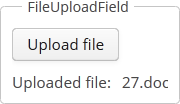

3.5.2.1.1. AppMenu
AppMenu component provides means of customizing the main menu in the main screen and managing menu items dynamically.
CUBA Studio has some templates for the main window based on the standard MainScreen provided by the platform. In the example below the template extends the MainScreen class and provides direct access to the AppMenu instance:
public class ExtMainScreen extends MainScreen implements Window.HasFoldersPane {
@Inject
private Notifications notifications;
@Inject
private AppMenu mainMenu;
@Subscribe
public void onInit(InitEvent event) {
AppMenu.MenuItem item = mainMenu.createMenuItem("shop", "Shop");
AppMenu.MenuItem subItem = mainMenu.createMenuItem("customer", "Customers", null, menuItem -> {
notifications.create()
.withCaption("Customers menu item clicked")
.withType(Notifications.NotificationType.HUMANIZED)
.show();
});
item.addChildItem(subItem);
mainMenu.addMenuItem(item, 0);
}
}Methods of the AppMenu interface:
-
addMenuItem()- adds menu item to the end of root items list or to specified position in the root items list.
-
createMenuItem()- the factory method that creates new menu item. Does not add item to the menu.idmust be unique for whole menu.
-
createSeparator()- creates menu separator. -
getMenuItem()/getMenuItemNN()- returns the item from the menu tree by itsid. -
getMenuItems()- returns the list of root menu items. -
hasMenuItems()- returnstrueif the menu has items.
Methods of the MenuItem interface:
-
addChildItem() / removeChildItem()- adds/removes the menu item to the end or to the specified position of children list. -
getCaption()- returns the String caption of the menu item. -
getChildren()- returns the list of child items.
-
setCommand()- sets item command, or the action to be performed on this menu item click. -
setDescription()- sets the String description of the menu item, displayed as a popup tip. -
setIconFromSet()- sets the item’s icon. -
getId()- returns the menu item id. -
getMenu()- returns the menu item owner. -
setStylename()- sets one or more user-defined style names of the component, replacing any previous user-defined styles. Multiple styles can be specified as a space-separated list of style names. The style names must be valid CSS class names. -
hasChildren()- returnstrueif the menu item has child items. -
isSeparator()- returnstrueif the item is a separator. -
setVisible()- manages visibility of the menu item.
The appearance of the AppMenu component can be customized using SCSS variables with $cuba-menubar-* and $cuba-app-menubar-* prefixes. You can change these variables in the visual editor after creating a theme extension or a custom theme.
- API
3.5.2.1.2. BrowserFrame
A BrowserFrame is designed to display embedded web pages. It is the equivalent of the HTML iframe element.

Component’s XML-name: browserFrame
An example of component definition in an XML-descriptor of a screen:
<browserFrame id="browserFrame"
height="280px"
width="600px"
align="MIDDLE_CENTER">
<url url="https://www.cuba-platform.com/blog/cuba-7-the-new-chapter"/>
</browserFrame>Similarly to the Image component, the BrowserFrame component can also display images from different resources. You can set the resource type declaratively using the browserFrame elements listed below:
-
classpath- a resource in the classpath.<browserFrame> <classpath path="com/company/sample/web/screens/myPic.jpg"/> </browserFrame>
-
file- a resource in the file system.<browserFrame> <file path="D:\sample\modules\web\web\VAADIN\images\myImage.jpg"/> </browserFrame>
-
relativePath- a resource in the application directory.<browserFrame> <relativePath path="VAADIN/images/myImage.jpg"/> </browserFrame>
-
theme- a theme resource, for example:<browserFrame> <theme path="../halo/com.company.demo/myPic.jpg"/> </browserFrame>
-
url- a resource which can be loaded from the given URL.<browserFrame> <url url="http://www.foobar2000.org/"/> </browserFrame>
browserFrame attributes:
-
The
allowattribute specifies Feature Policy for the component. The value of the attribute should be a space-separated list of allowed features:-
autoplay– controls whether the current document is allowed to autoplay media requested through the interface. -
camera– controls whether the current document is allowed to use video input devices. -
document-domain– controls whether the current document is allowed to setdocument.domain. -
encrypted-media– controls whether the current document is allowed to use the Encrypted Media Extensions API (EME). -
fullscreen– controls whether the current document is allowed to useElement.requestFullScreen(). -
geolocation– controls whether the current document is allowed to use the Geolocation Interface. -
microphone– controls whether the current document is allowed to use audio input devices. -
midi– controls whether the current document is allowed to use the Web MIDI API. -
payment– controls whether the current document is allowed to use the Payment Request API. -
vr– controls whether the current document is allowed to use the WebVR API.
-
-
alternateText- sets an alternate text for the frame in case the resource is not set or unavailable.
-
The
referrerpolicyattribute indicates which referrer to send when fetching the frame’s resource.ReferrerPolicy– enum of standard values of the attribute:-
no-referrer– the referer header will not be sent. -
no-referrer-when-downgrade– the referer header will not be sent to origins without TLS (HTTPS). -
origin– the sent referrer will be limited to the origin of the referring page: its scheme, host, and port. -
origin-when-cross-origin– the referrer sent to other origins will be limited to the scheme, the host, and the port. Navigation on the same origin will still include the path. -
same-origin– a referrer will be sent for the same origin, but cross-origin requests will contain no referrer information. -
strict-origin– only sends the origin of the document as the referrer when the protocol security level stays the same (HTTPS->HTTPS), but doesn’t send it to a less secure destination (HTTPS->HTTP). -
strict-origin-when-cross-origin– sends a full URL when performing a same-origin request, only sends the origin when the protocol security level stays the same (HTTPS->HTTPS), and sends no header to a less secure destination (HTTPS->HTTP). -
unsafe-url– the referrer will include the origin and the path. This value is unsafe because it leaks origins and paths from TLS-protected resources to insecure origins.
-
-
The
sandboxattribute applies extra restrictions to the content in the frame. The value of the attribute should be either empty to apply all restrictions or space-separated tokens to lift particular restrictions.Sandbox– enum of standard values of the attribute:-
allow-forms– allows the resource to submit forms. -
allow-modals– lets the resource open modal windows. -
allow-orientation-lock– lets the resource lock the screen orientation. -
allow-pointer-lock– lets the resource use the Pointer Lock API. -
allow-popups– allows popups (such aswindow.open(),target="_blank", orshowModalDialog()). -
allow-popups-to-escape-sandbox– lets the sandboxed document open new windows without those windows inheriting the sandboxing. -
allow-presentation– lets the resource start a presentation session. -
allow-same-origin– allows theiframecontent to be treated as being from the same origin. -
allow-scripts– lets the resource run scripts. -
allow-storage-access-by-user-activation– lets the resource request access to the parent’s storage capabilities with the Storage Access API. -
allow-top-navigation– lets the resource navigate the top-level browsing context (the one named_top). -
allow-top-navigation-by-user-activation– lets the resource navigate the top-level browsing context, but only if initiated by a user gesture. -
allow-downloads-without-user-activation– allows for downloads to occur without a gesture from the user. -
""– applies all restrictions.
-
-
The
srcdocattribute – inline HTML to embed, overriding thesrcattribute. The IE and Edge browsers don’t support this attribute. You can also specify a value for thesrcdocattribute using thesrcdocFileattribute in xml by passing the path to the file with HTML code.
-
The
srcdocFileattribute – the path to the file whose contents will be set to thesrcdocattribute. File content is obtained by using the classPath resource. You can set the attribute value only in the XML descriptor.
browserFrame resources settings:
-
bufferSize- the size of the download buffer in bytes used for this resource.<browserFrame> <file bufferSize="1024" path="C:/img.png"/> </browserFrame>
-
cacheTime- the length of cache expiration time in milliseconds.<browserFrame> <file cacheTime="2400" path="C:/img.png"/> </browserFrame>
-
mimeType- the MIME type of the resource.<browserFrame> <url url="https://avatars3.githubusercontent.com/u/17548514?v=4&s=200" mimeType="image/png"/> </browserFrame>
Methods of the BrowserFrame interface:
-
addSourceChangeListener()- adds a listener that will be notified when the content source is changed.@Inject private Notifications notifications; @Inject BrowserFrame browserFrame; @Subscribe protected void onInit(InitEvent event) { browserFrame.addSourceChangeListener(sourceChangeEvent -> notifications.create() .withCaption("Content updated") .show()); }
-
setSource()- sets the content source for the frame. The method accepts the resource type and returns the resource object that can be configured using the fluent interface. Each resource type has its own methods, for example,setPath()forThemeResourcetype orsetStreamSupplier()forStreamResourcetype:BrowserFrame frame = uiComponents.create(BrowserFrame.NAME); try { frame.setSource(UrlResource.class).setUrl(new URL("http://www.foobar2000.org/")); } catch (MalformedURLException e) { throw new RuntimeException(e); }You can use the same resource types as for the
Imagecomponent.
-
createResource()- creates the frame resource implementation by its type. The created object can be later passed to thesetSource()method.UrlResource resource = browserFrame.createResource(UrlResource.class) .setUrl(new URL(fromString)); browserFrame.setSource(resource);
- HTML markup in BrowserFrame:
-
BrowserFramecan be used to integrate HTML markup into your application. For example, you can dynamically generate HTML content at runtime from the user input.<textArea id="textArea" height="250px" width="400px"/> <browserFrame id="browserFrame" height="250px" width="500px"/>textArea.addTextChangeListener(event -> { byte[] bytes = event.getText().getBytes(StandardCharsets.UTF_8); browserFrame.setSource(StreamResource.class) .setStreamSupplier(() -> new ByteArrayInputStream(bytes)) .setMimeType("text/html"); });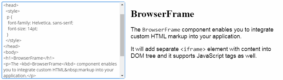
- PDF in BrowserFrame:
-
Besides HTML,
BrowserFramecan be also used for displaying PDF files content. Use the file as a resource and set the corresponding MIME type for it:@Inject private BrowserFrame browserFrame; @Inject private Resources resources; @Subscribe protected void onInit(InitEvent event) { browserFramePdf.setSource(StreamResource.class) .setStreamSupplier(() -> resources.getResourceAsStream("/com/company/demo/" + "web/screens/CUBA_Hands_on_Lab_6.8.pdf")) .setMimeType("application/pdf"); }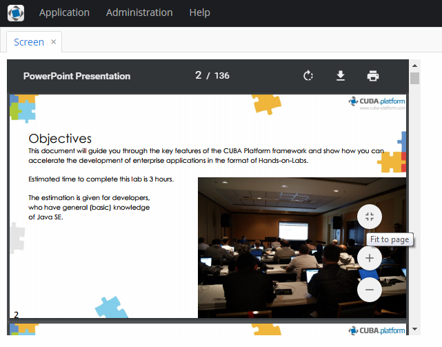
- Attributes of browserFrame
-
align - allow - alternateText - caption - captionAsHtml - contextHelpText - contextHelpTextHtmlEnabled - colspan - css - description - descriptionAsHtml - enable - box.expandRatio - height - htmlSanitizerEnabled - icon - id - referrerpolicy - responsive - rowspan - sandbox - srcdoc - srcdocFile - stylename - visible - width
- Attributes of browserFrame resources
- Elements of browserFrame
-
classpath - file - relativePath - theme - url
- API
3.5.2.1.3. Button
A button performs an action when a user clicks on it.

Component’s XML-name: button
Buttons can contain a caption, an icon, or both. The figure below shows different button types.
An example of a button with a tooltip and a caption retrieved from a localized message pack:
<button id="textButton" caption="msg://someAction" description="Press me"/>The button’s caption is set using the caption attribute, the tooltip – using the description attribute.
If the disableOnClick attribute is set to true the button will be automatically disabled when clicked, typically to prevent (accidental) extra clicks on a button. You can later return the button to the enabled state by invoking the setEnabled(true) method.
The icon attribute defines icon location in theme catalog or the icon name in the icon set. Detailed information on recommended icon placement is available in Icons.
Example of creating a button with an icon:
<button id="iconButton" caption="" icon="SAVE"/>The button’s main function is to perform an action on a click. Controller method that should be invoked after a click can be defined using invoke attribute. The attribute value should contain name of the controller method satisfying the following conditions:
-
The method should be
public. -
The method should return
void. -
The method should not have any arguments, or should have a single argument of
Componenttype. If the method has aComponentargument, then an instance of the invoking button will be passed in it.
Below is the example of a button invoking someMethod:
<button invoke="someMethod" caption="msg://someButton"/>A method named someMethod should be defined in the screen controller:
public void someMethod() {
//some actions
}The invoke attribute is ignored if action attribute is set. The action attribute contains the name of action corresponding to the button.
Example of a button with an action:
<actions>
<action id="someAction" caption="msg://someAction"/>
</actions>
<layout>
<button action="someAction"/>
</layout>Any action present in the component implementing Component.ActionsHolder interface can be assigned to a button. This applies to Table, GroupTable, TreeTable, Tree. The way of adding actions (declaratively in the XML descriptor or programmatically in the controller) is irrelevant. In any case, for using an action, the name of the component and the identifier of the required action must be specified in the action attribute, separated by dot. For instance, in the next example the create action of the coloursTable table is assigned to a button:
<button action="coloursTable.create"/>Button actions can also be created programmatically in the screen controller by deriving them from BaseAction class.
|
If an If |
The shortcut attribute is used to specify a key combination for a button. Possible modifiers: ALT, CTRL, SHIFT − are separated by the "-" character. For example:
<button id="button" caption="msg://shortcutButton" shortcut="ALT-C"/>- Button styles
-
The
primaryattribute is used to set the highlighting for the button. The highlighting is applied by default if the action invoked by this button is primary.<button primary="true" invoke="foo"/>The highlighting is available by default in the Hover theme; to enable this feature in a Halo-based theme, set
truefor the$cuba-highlight-primary-actionstyle variable.
Next, in Web Client with a Halo-based theme, you can set predefined styles to the Button component using the
stylenameattribute either in the XML descriptor or in the screen controller:<button id="button" caption="Friendly button" stylename="friendly"/>When setting a style programmatically, select one of the
HaloThemeclass constants with theBUTTON_prefix:button.setStyleName(HaloTheme.BUTTON_FRIENDLY);The appearance of the
Buttoncomponent can be customized using SCSS variables with$cuba-button-*prefix. You can change these variables in the visual editor after creating a theme extension or a custom theme.
- Attributes of button
-
action - align - caption - captionAsHtml - css - description - descriptionAsHtml - disableOnClick - enable - box.expandRatio - htmlSanitizerEnabled - icon - id - invoke - shortcut - stylename - tabIndex - visible - width
- Predefined styles of button
-
borderless - borderless-colored - danger - friendly - huge - icon-align-right - icon-align-top - icon-only - large - primary - quiet - small - tiny
3.5.2.1.4. BulkEditor
BulkEditor is a component that enables changing attribute values for several entity instances at once. The component is a button, usually added to a table or a tree, which opens the entity bulk editor on click.

XML-name of the component: bulkEditor
|
|
To enable the use of BulkEditor, the table or tree must have the multiselect attribute set to "true".
The entity editor is automatically generated based on the defined view (containing the fields of this entity, including references), the entity’s dynamic attributes (if any) and the user permissions. System attributes are not displayed in the editor either.
Entity attributes in the editor are sorted alphabetically. By default, the fields are empty. At screen commit, non-empty attribute values defined in the editor, are set for all the entity instances.
The editor also enables removing a specific field value for all the instances by setting it to null. In order to do this, click  button next to the field. After that, the field will become non-editable. The field can be unlocked by clicking the same button again.
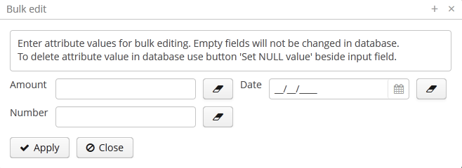
Example of bulkEditor use in a table:
<table id="invoiceTable"
multiselect="true"
width="100%">
<actions>
<!-- ... -->
</actions>
<buttonsPanel>
<!-- ... -->
<bulkEditor for="invoiceTable"
exclude="customer"/>
</buttonsPanel>-
bulkEditorattributes -
-
The
excludeattribute can contain a regular expression to exclude some fields explicitly from the list of attributes available for editing. For example:date|customer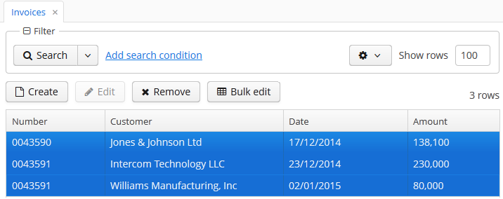
-
includeProperties- defines the entity attributes to be included to bulk editor window. If set, other attributes will be ignored.includePropertiesdoes not apply for dynamic attributes.When set declaratively, the list of properties should be comma-separated:
<bulkEditor for="ordersTable" includeProperties="name, description"/>The list of properties can also be set programmatically in the screen controller:
bulkEditor.setIncludeProperties(Arrays.asList("name", "description"));
-
loadDynamicAttributesdefines whether or not the dynamic attributes of the edited entity should be displayed on the entity’s bulk editor screen. The default value istrue.
-
useConfirmDialogdefines whether or not the confirmation dialog should be displayed to the user before saving the changes. The default value istrue.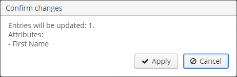
-
columnsMode− the number of columns in the bulk editor screen as a value of theColumnsModeenum.TWO_COLUMNSby default. For example:<groupTable id="customersTable" width="100%"> <actions>...</actions> <columns>...</columns> <buttonsPanel id="buttonsPanel" alwaysVisible="true"> ... <bulkEditor for="customersTable" columnsMode="ONE_COLUMN"/> </buttonsPanel> </groupTable>
The appearance of the bulk edit screen can be customized using SCSS variables with
$c-bulk-editor-*prefix. You can change these variables in the visual editor after creating a theme extension or a custom theme. -
- Attributes of bulkEditor
-
align - caption - captionAsHtml - columnsMode - css - description - descriptionAsHtml - enable - exclude - box.expandRatio - for - htmlSanitizerEnabled - icon - id - includeProperties - loadDynamicAttributes - openType - stylename - tabIndex - useConfirmDialog - visible - width
3.5.2.1.5. Calendar
The Calendar component is intended to organize and display calendar events.
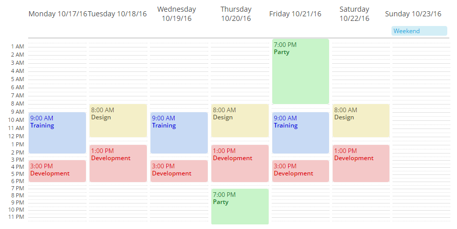
XML name of the component: calendar.
An example of a component definition in an XML descriptor of a screen:
<calendar id="calendar"
captionProperty="caption"
startDate="2016-10-01"
endDate="2016-10-31"
height="100%"
width="100%"/>The view mode is determined from the date range of the calendar, defined by the start date and the end date. The default view is the weekly view, it is used for ranges up to seven days a week. For a single-day view use the range within one date. Calendar will be shown in a monthly view when the date range is over than one week (seven days) long.
Navigation buttons to page the calendar one week forward or backward are hidden by default. To show them on a weekly view, use the navigationButtonsVisible attribute:
<calendar width="100%"
height="100%"
navigationButtonsVisible="true"/>
Attributes of calendar:
-
endDate- the end date for the calendar’s range. You can the date in the "yyyy-MM-dd" or "yyyy-MM-dd HH:mm" format.
-
endDateProperty- the name of an entity attribute that contains the end date.
-
datatype- the datatype of thestartDate,endDateand calendar events. You can set the following datatypes:-
date -
dateTime -
localDate -
localDateTime -
offsetDateTimedateTimedatatype is set by default. In casestartDatePropertyandendDatePropertyare set, then their datatype is applied to thecalendar.
-
-
descriptionProperty- the name of an entity attribute that contains the event description.
-
isAllDayProperty- the name of an entity attribute that determines if the event is all day long.
-
startDate- the start date for the calendar’s range. You can the date in the "yyyy-MM-dd" or "yyyy-MM-dd HH:mm" format.
-
startDateProperty- the name of an entity attribute that contains the start date.
-
stylenameProperty- the name of an entity attribute that contains the event style name.
-
timeFormat- time format: 12H or 24H.
- Working with Calendar events:
To display events in the calendar cells, you can add the events directly to the Calendar object using the addEvent() method or use the CalendarEventProvider interface. An example of direct event adding:
@Inject
private Calendar<Date> calendar;
public void generateEvent(String caption, String description, Date start, Date end, boolean isAllDay, String stylename) {
SimpleCalendarEvent<Date> calendarEvent = new SimpleCalendarEvent<>();
calendarEvent.setCaption(caption);
calendarEvent.setDescription(description);
calendarEvent.setStart(start);
calendarEvent.setEnd(end);
calendarEvent.setAllDay(isAllDay);
calendarEvent.setStyleName(stylename);
calendar.getEventProvider().addEvent(calendarEvent);
}The removeEvent() method of CalendarEventProvider is used to remove a particular event by its index:
CalendarEventProvider eventProvider = calendar.getEventProvider();
List<CalendarEvent> events = new ArrayList<>(eventProvider.getEvents());
eventProvider.removeEvent(events.get(events.size()-1));The removeAllEvents method, in turn, removes all available events:
CalendarEventProvider eventProvider = calendar.getEventProvider();
eventProvider.removeAllEvents();There are two data providers available: ListCalendarEventProvider (created by default) and ContainerCalendarEventProvider.
ListCalendarEventProvider is filled by addEvent() method that gets a CalendarEvent object as a parameter:
@Inject
private Calendar<LocalDateTime> calendar;
public void addEvents() {
ListCalendarEventProvider listCalendarEventProvider = new ListCalendarEventProvider();
calendar.setEventProvider(listCalendarEventProvider);
listCalendarEventProvider.addEvent(generateEvent("Training", "Student training",
LocalDateTime.of(2016, 10, 17, 9, 0), LocalDateTime.of(2016, 10, 17, 14, 0), false, "event-blue"));
listCalendarEventProvider.addEvent(generateEvent("Development", "Platform development",
LocalDateTime.of(2016, 10, 17, 15, 0), LocalDateTime.of(2016, 10, 17, 18, 0), false, "event-red"));
listCalendarEventProvider.addEvent(generateEvent("Party", "Party with friends",
LocalDateTime.of(2016, 10, 22, 13, 0), LocalDateTime.of(2016, 10, 22, 18, 0), false, "event-yellow"));
}
private SimpleCalendarEvent<LocalDateTime> generateEvent(String caption, String description, LocalDateTime start, LocalDateTime end, Boolean isAllDay, String stylename) {
SimpleCalendarEvent<LocalDateTime> calendarEvent = new SimpleCalendarEvent<>();
calendarEvent.setCaption(caption);
calendarEvent.setDescription(description);
calendarEvent.setStart(start);
calendarEvent.setEnd(end);
calendarEvent.setAllDay(isAllDay);
calendarEvent.setStyleName(stylename);
return calendarEvent;
}ContainerCalendarEventProvider is filled with data directly from an entity fields. To be used for the ContainerCalendarEventProvider, an entity should at least have attributes for the event start date, event end date with one of the datatypes and event caption with String type.
In the example below we assume that the CalendarEvent entity has all required attributes: eventCaption, eventDescription, eventStartDate, eventEndDate, eventStylename, and will set their names as values for calendar attributes:
<calendar id="calendar"
dataContainer="calendarEventsDc"
width="100%"
height="100%"
startDate="2016-10-01"
endDate="2016-10-31"
captionProperty="eventCaption"
descriptionProperty="eventDescription"
startDateProperty="eventStartDate"
endDateProperty="eventEndDate"
stylenameProperty="eventStylename"/>The Calendar component supports several event listeners for user interaction with its elements, such as date and week captions, date/time range selections, event dragging and event resizing. Navigation buttons used to scroll forward and backward in time are also listened by the server. Below is the list of default listeners:
-
addDateClickListener(CalendarDateClickListener listener)- adds listener for date clicks:calendar.addDateClickListener( calendarDateClickEvent -> notifications.create() .withCaption(String.format("Date clicked: %s", calendarDateClickEvent.getDate().toString())) .show());
-
addWeekClickListener()- adds listener for week number clicks.
-
addEventClickListener()- adds listener for calendar event clicks.
-
addEventResizeListener()- adds listener for event size changing.
-
addEventMoveListener()- adds listener for event drag and drop.
-
addForwardClickListener()- adds listener for calendar forward scrolling.
-
addBackwardClickListener()- adds listener for calendar backward scrolling.
-
addRangeSelectListener()- adds listener for calendar range selection.
Calendar events can be styled with CSS. To configure a style, create the style name and set the parameters in the .scss-file. For example, let’s configure the background color of an event:
.v-calendar-event.event-green {
background-color: #c8f4c9;
color: #00e026;
}Then use the setStyleName method of the event:
calendarEvent.setStyleName("event-green");As a result, the event’s background is green:
In order to change the names of days and months in the Calendar component, use the setDayNames() and setMonthNames() methods, passing a map with the new values to them:
Map<DayOfWeek, String> days = new HashMap<>(7);
days.put(DayOfWeek.MONDAY,"Heavens and earth");
days.put(DayOfWeek.TUESDAY,"Sky");
days.put(DayOfWeek.WEDNESDAY,"Dry land");
days.put(DayOfWeek.THURSDAY,"Stars");
days.put(DayOfWeek.FRIDAY,"Fish and birds");
days.put(DayOfWeek.SATURDAY,"Animals and man");
days.put(DayOfWeek.SUNDAY,"Rest");
calendar.setDayNames(days);- Attributes of calendar
-
caption - captionAsHtml - captionProperty - colspan - contextHelpText - contextHelpTextHtmlEnabled - css - dataContainer - datatype - description - descriptionAsHtml - descriptionProperty - endDateProperty - endDate - box.expandRatio - height - htmlSanitizerEnabled - icon - id - isAllDayProperty - rowspan - startDate - startDateProperty - stylename - stylenameProperty - timeFormat - visible - width
- API
-
addEvent - removeAllEvents - removeEvent - setEventProvider - setDayNames
- Listeners of calendar
-
CalendarBackwardClickListener - CalendarDateClickListener - CalendarEventClickListener - CalendarEventMoveListener - CalendarEventResizeListener - CalendarForwardClickListener - CalendarRangeSelectListener - CalendarWeekClickListener
3.5.2.1.6. CapsLockIndicator
This is a field that indicates if the Caps Lock is on when the user is typing a password in the PasswordField.
XML name of the component: capsLockIndicator.
The capsLockOnMessage and capsLockOffMessage attributes allow you to define the messages that will be shown by the component depending on the current Caps Lock state.
Examples:
<hbox spacing="true">
<passwordField id="passwordField"
capsLockIndicator="capsLockIndicator"/>
<capsLockIndicator id="capsLockIndicator"/>
</hbox>CapsLockIndicator capsLockIndicator = uiComponents.create(CapsLockIndicator.NAME);
capsLockIndicator.setId("capsLockIndicator");
passwordField.setCapsLockIndicator(capsLockIndicator);The CapsLockIndicator component is designed to be used together with the PasswordField and handles the Caps Lock state only when this field is focused. When the field loses its focus, the state is changed to inactive.
Changing visibility of the CapsLockIndicator component dynamically using the visible attribute when the screen is already opened may not work as expected.
The appearance of the CapsLockIndicator component can be customized using SCSS variables with $cuba-capslockindicator-* prefix. You can change these variables in the visual editor after creating a theme extension or a custom theme.
- Attributes of capsLockIndicator
-
align - capsLockOffMessage - capsLockOnMessage - colspan - css - box.expandRatio - height - id - rowspan - stylename - visible - width
3.5.2.1.7. CheckBox
CheckBox is a component with two states: selected or deselected.
Component’s XML-name: checkBox.
An example of a checkbox with a label retrieved from a localized messages pack:
<checkBox id="accessField" caption="msg://accessFieldCaption"/>Selecting / deselecting of the checkbox changes its value: Boolean.TRUE or Boolean.FALSE. The value can be retrieved using getValue() method and set using setValue(). Submitting null using setValue() will change the value to Boolean.FALSE and uncheck the checkbox.
Changes of the checkbox value, as well as of any other components implementing the Field interface, can be tracked using a ValueChangeListener. The origin of the ValueChangeEvent can be tracked using isUserOriginated() method. For example:
@Inject
private CheckBox accessField;
@Inject
private Notifications notifications;
@Subscribe
protected void onInit(InitEvent event) {
accessField.addValueChangeListener(valueChangeEvent -> {
if (Boolean.TRUE.equals(valueChangeEvent.getValue())) {
notifications.create()
.withCaption("set")
.show();
} else {
notifications.create()
.withCaption("not set")
.show();
}
});
}The dataContainer and property attributes should be used to create a checkbox associated with data.
<data>
<instance id="customerDc" class="com.company.sales.entity.Customer" view="_local">
<loader/>
</instance>
</data>
<layout>
<checkBox dataContainer="customerDc" property="active"/>
</layout>According to the example the screen includes the description of customerDc data container for a Customer entity with active attribute. The dataContainer attribute of the checkBox component should contain a reference to a data container; the property attribute should contain the name of an entity attribute which value should be displayed in the checkbox. The attribute should have Boolean type. If the attribute value is null the checkbox is deselected.
The appearance of the CheckBox component can be customized using SCSS variables with $cuba-checkbox-* prefix. You can change these variables in the visual editor after creating a theme extension or a custom theme.
- Attributes of checkBox
-
align - caption - captionAsHtml - contextHelpText - contextHelpTextHtmlEnabled - css - dataContainer - description - descriptionAsHtml - editable - enable - box.expandRatio - height - htmlSanitizerEnabled - icon - id - property - stylename - tabIndex - visible - width
- API
-
addValueChangeListener commit - discard - isModified - setContextHelpIconClickHandler
3.5.2.1.8. CheckBoxGroup
This is a component that allows a user to select multiple values from a list of options using checkboxes.
XML name of the component: checkBoxGroup.
The CheckBoxGroup component is implemented for Web Client.
The list of component options can be specified using the setOptions(), setOptionsList(), setOptionsMap() and setOptionsEnum() methods, or using an optionsContainer attribute.
-
The simplest case of using
CheckBoxGroupis to select an enumeration value for an entity attribute. For example, aRoleentity hastypeattribute of theRoleTypetype, which is an enumeration. Then you can useCheckBoxGroupto display this attribute as follows, using theoptionsEnumattribute:<checkBoxGroup optionsEnum="com.haulmont.cuba.security.entity.RoleType" property="type"/>The
setOptionsEnum()takes a class of enumeration as a parameter. The options list will consist of localized names of enum values, the value of the component will be an enum value.@Inject private CheckBoxGroup<RoleType> checkBoxGroup; @Subscribe protected void onInit(InitEvent event) { checkBoxGroup.setOptionsEnum(RoleType.class); }The same result will be achieved using the
setOptions()method which enables working with all types of options:@Inject private CheckBoxGroup<RoleType> checkBoxGroup; @Subscribe protected void onInit(InitEvent event) { checkBoxGroup.setOptions(new EnumOptions<>(RoleType.class)); }
-
setOptionsList()enables specifying programmatically a list of component options. To do this, declare a component in the XML descriptor:<checkBoxGroup id="checkBoxGroup"/>Then inject the component into the controller and specify a list of options for it:
@Inject private CheckBoxGroup<Integer> checkBoxGroup; @Subscribe protected void onInit(InitEvent event) { List<Integer> list = new ArrayList<>(); list.add(2); list.add(4); list.add(5); list.add(7); checkBoxGroup.setOptionsList(list); }The component will be as follows:
Depending on the selected option, the
getValue()method of the component will returnIntegervalues: 2, 4, 5, 7.
-
setOptionsMap()enables specifying string names and option values separately. For example, we can set the following options map for thecheckBoxGroupcomponent injected in the controller:@Inject private CheckBoxGroup<Integer> checkBoxGroup; @Subscribe protected void onInit(InitEvent event) { Map<String, Integer> map = new LinkedHashMap<>(); map.put("two", 2); map.put("four", 4); map.put("five", 5); map.put("seven", 7); checkBoxGroup.setOptionsMap(map); }The component will be as follows:
Depending on the selected option, the
getValue()method of the component will returnIntegervalues: 2, 4, 5, 7, and not the strings that are displayed on the screen.
-
The component can take a list of options from a data container. For this purpose, the
optionsContainerattribute is used. For example:<data> <collection id="employeesCt" class="com.company.demo.entity.Employee" view="_minimal"> <loader> <query><![CDATA[select e from demo_Employee e]]></query> </loader> </collection> </data> <layout> <checkBoxGroup optionsContainer="employeesCt"/> </layout>In this case, the
checkBoxGroupcomponent will display instance names of theEmployeeentity, located in theemployeesCtdata container, and itsgetValue()method will return the selected entity instance.
With the help of captionProperty attribute entity attribute to be used instead of an instance name for string option names can be defined.
Programmatically, you can define the options container using the
setOptions()method ofCheckBoxGroupinterface:@Inject private CheckBoxGroup<Employee> checkBoxGroup; @Inject private CollectionContainer<Employee> employeesCt; @Subscribe protected void onInit(InitEvent event) { checkBoxGroup.setOptions(new ContainerOptions<>(employeesCt)); }
You can use OptionDescriptionProvider to generate optional descriptions (tooltips) for the options. It can be used via the setOptionDescriptionProvider() method or the @Install annotation:
@Inject
private CheckBoxGroup<Product> checkBoxGroup;
@Subscribe
public void onInit(InitEvent event) {
checkBoxGroup.setOptionDescriptionProvider(product -> "Price: " + product.getPrice());
}@Install(to = "checkBoxGroup", subject = "optionDescriptionProvider")
private String checkBoxGroupOptionDescriptionProvider(Experience experience) {
switch (experience) {
case HIGH:
return "Senior";
case COMMON:
return "Middle";
default:
return "Junior";
}
}The orientation attribute defines the orientation of group elements. By default, elements are arranged vertically. The horizontal value sets the horizontal orientation.
- Attributes of CheckBoxGroup
-
align - box.expandRatio - caption - captionAsHtml - captionProperty - colspan - contextHelpText - contextHelpTextHtmlEnabled - css - dataContainer - description - descriptionAsHtml - editable - enable - height - htmlSanitizerEnabled - icon - id - optionsContainer - optionsEnum - orientation - property - required - requiredMessage - responsive - rowspan - stylename - tabIndex - visible - width
- API
-
addValueChangeListener - setContextHelpIconClickHandler - setOptions - setOptionCaptionProvider - setOptionDescriptionProvider - setOptionsEnum - setOptionsList - setOptionsMap
3.5.2.1.9. ColorPicker
ColorPicker is a field that allows a user to preview and select a color. Component returns a hexadecimal (HEX) value of the color as a string.
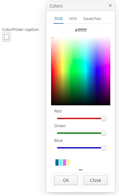
An example of a color picker with a caption retrieved from the localized messages pack:
<colorPicker id="colorPicker" caption="msg://colorPickerCaption"/>The figure below shows an example of the color picker with the popup closed.

To create a color picker connected to data, use dataContainer and property attributes.
<data>
<collection id="carsDc" class="com.company.sales.entity.Car" view="_local">
<loader>
<query>
<![CDATA[select e from sales_Car e]]>
</query>
</loader>
</collection>
</data>
<layout>
<colorPicker id="colorPicker" dataContainer="carsDc" property="color"/>
</layout>Attributes of сolorPicker:
-
defaultCaptionEnabled- if set totrueandbuttonCaptionis not set, displays HEX value as a button caption.
-
historyVisible- determines the visibility of history of recently picked colors in the popup window.
You can determine visibility of the popup tabs using the following attributes:
-
rgbVisible- determines the visibility of the RGB tab. -
hsvVisible- determines the visibility of the HSV tab. -
swatchesVisible- determines the visibility of the swatches tab.
By default, only the RGB tab is visible.
Also, if you want to redefine the labels in popup, you can use caption attributes:
-
popupCaption- caption of the popup window. -
confirmButtonCaption- caption of the confirm button. -
cancelButtonCaption- caption of the cancel button. -
swatchesTabCaption- swatches tab caption. -
lookupAllCaption- caption of lookup item for all colors. -
lookupRedCaption- caption of lookup item for red color. -
lookupGreenCaption- caption of lookup item for green color. -
lookupBlueCaption- caption of lookup item for blue color.
getValue() method of the component returns a string, containing a HEX code of the selected color.
- Attributes of colorPicker
-
align - buttonCaption - cancelButtonCaption - caption - captionAsHtml - confirmButtonCaption - contextHelpText - contextHelpTextHtmlEnabled - css - dataContainer - defaultCaptionEnabled - description - descriptionAsHtml - editable - box.expandRatio - height - historyVisible - hsvVisible - htmlSanitizerEnabled - icon - id - lookupAllCaption - lookupBlueCaption - lookupGreenCaption - lookupRedCaption - popupCaption - rgbVisible - required - stylename - swatchesTabCaption - swatchesVisible - tabIndex - visible - width
- API
3.5.2.1.10. CurrencyField
CurrencyField is a subtype of a text field designed for currency value input. CurrencyField is used by default in screens generated by Studio for the attributes annotated with @CurrencyValue annotation. It has a currency symbol inside the field and is aligned to the right by default.

XML-name of the component: currencyField.
CurrencyField is implemented for Web Client only.
Basically, CurrencyField repeats the functionality of TextField. You can manually set a datatype for the field, except that only numeric datatypes inheriting NumericDatatype class are supported. If the datatype is unparseable, an exception will be thrown.
CurrencyField can be bound to a data container using the dataContainer and property attributes:
<currencyField currency="$"
dataContainer="orderDc"
property="amount"/>currencyField attributes:
-
currency- a text that will be a content of the currency label.<currencyField currency="USD"/>
-
currencyLabelPosition- sets the position of currency label inside the field:-
LEFT- to the left from the text input component, -
RIGHT- to the right from the text input component (default value).
-
-
showCurrencyLabel- defines whether the currency label should be displayed.
- Attributes of currencyField
-
align - caption - captionAsHtml - colspan - contextHelpText - contextHelpTextHtmlEnabled - conversionErrorMessage - css - currency - currencyLabelPosition - dataContainer - datatype - description - descriptionAsHtml - editable - enable - box.expandRatio - height - htmlSanitizerEnabled - icon - id - property - required - requiredMessage - rowspan - showCurrencyLabel - stylename - visible - width
- Predefined styles of currencyField
- API
-
addValidator - addValueChangeListener - commit - discard - isModified - setContextHelpIconClickHandler - setCurrency - setCurrencyLabelPosition - setShowCurrencyLabel
3.5.2.1.11. DataGrid
In this section:
DataGrid, similarly to the Table component, is designed to display and sort tabular data, and provides means to manipulate rows and columns with greater performance due to lazy loading of data while scrolling.
XML name of the component: dataGrid.
An example of component definition in an XML-descriptor of a screen:
<data>
<collection id="ordersDc" class="com.company.sales.entity.Order" view="order-with-customer">
<loader id="ordersDl">
<query>
<![CDATA[select e from sales_Order e order by e.date]]>
</query>
</loader>
</collection>
</data>
<layout>
<dataGrid id="ordersDataGrid" dataContainer="ordersDc" height="100%" width="100%">
<columns>
<column id="date" property="date"/>
<column id="customer" property="customer.name"/>
<column id="amount" property="amount"/>
</columns>
</dataGrid>
</layout>In the example above the id attribute is a column identifier, and the property is the name of the entity attribute from the data container that populates the column with data.
If you need to define a data source programmatically in the screen controller, use the metaClass attribute in XML instead of declarative setting a dataContainer.
dataGrid elements
-
columns- an element that defines theDataGridcolumns set. If not specified, columns will be automatically determined from the attributes from the view that is defined in dataContainer. Elementcolumnshas the following attributes:-
includeAll– load all the attributes from the view that is defined in dataContainer.In the example below, we will show all the attributes from the view used in the
customersDc. If the view contains system properties, they will be shown too.<dataGrid id="dataGrid" width="100%" height="100%" dataContainer="customersDc"> <columns includeAll="true"/> </dataGrid>If the view of the entity contains a reference attribute, this attribute will be displayed according to its instance name. If you want to show a specific attribute, it must be defined in the view as well as in the
columnelement:<columns includeAll="true"> <column id="address.street"/> </columns>If no view is specified,
includeAllattribute will load all the attributes from a given entity and its ancestors.
-
exclude– comma-separated list of attributes that should not be loaded to theDataGrid.In the example below, we will show all the attributes excluding
nameandorder:<dataGrid id="dataGrid" width="100%" height="100%" dataContainer="customersDc"> <columns includeAll="true" exclude="name, order"/> </dataGrid>
Each column is described in the nested
columnelement with the following attributes:-
id- an optional attribute with the column identifier. If not set, the string with thepropertyvalue will be used as the column identifier. In this case setting thepropertyvalue is mandatory, otherwise theGuiDevelopmentExceptionexception will be thrown. Theidattribute is still mandatory for the columns created in the screen controller.
-
property- contains the entity attribute’s name. Can be either an attribute of the entity from the data source / data container or a linked entity – object graph traversal is indicated with a dot. For example:<columns> <column id="date" property="date"/> <column id="customer" property="customer"/> <column id="customerName" property="customer.name"/> <column id="customerCountry" property="customer.address.country"/> </columns> -
caption- an optional attribute containing the column caption. If not specified, a localized attribute name will be displayed.
-
expandRatio- sets the column width ratio. By default, all columns have equal width (i.e.expandRatio = 1). If another value is set for at least one column, all implicit values are ignored, and only set values are considered.
-
collapsible- defines whether a user can hide or show columns using the sidebar menu in the top right ofDataGrid. The default value istrue.
-
collapsed- an optional attribute; hides the column by default when set totrue. The default value isfalse.
-
collapsingToggleCaption- sets the column’s caption in the sidebar menu. By default, its value isnull, in this case the caption remains the same as the column’s caption.
-
resizable- defines whether a user can change the column’s size.
-
sortable- an optional attribute to disable sorting of the column. Takes effect if the wholeDataGridhassortableattribute set totrue(which is by default). -
width- an optional attribute controlling default column width. May contain only numeric values in pixels.
-
minimumWidth- sets the minimal column width in pixels.
-
maximumWidth- sets the maximal column width in pixels.
The
columnelement may contain a nested formatter element that allows you to represent the attribute value in a format different from the standard for this DataType:<column id="date" property="date"> <formatter class="com.haulmont.cuba.gui.components.formatters.DateFormatter" format="yyyy-MM-dd HH:mm:ss" useUserTimezone="true"/> </column> -
-
actions- optional element to define actions forDataGrid. Besides custom actions, the standard actions from theListActionTypeenumeration are also supported: create, edit, remove, refresh, add, exclude.
-
rowsCount- optional element that creates aRowsCountcomponent for theDataGrid.RowsCountenables pagination of data, the page size is set by limitation of records in the data loader with the help ofCollectionLoader.setMaxResults()method from the screen controller. Another way to do this is to use a universalFiltercomponent bound with the same data container as theDataGrid.The
RowsCountcomponent can also display the total number of records returned by current data request without loading these records. When a user clicks the "?" button, it calls thecom.haulmont.cuba.core.global.DataManager#getCountmethod that passes to the database a request with the same parameters as current but withCOUNT(*)aggregation function instead of getting results. The returned number is displayed in place of "?" symbol.The
autoLoadattribute of theRowsCountcomponent set totrueenables loading rows count automatically. It can be set in the XML descriptor:<rowsCount autoLoad="true"/>Also, this behavior can be enabled or disabled via
RowsCountAPI in the screen controller:boolean autoLoadEnabled = rowsCount.getAutoLoad(); rowsCount.setAutoLoad(false);
- dataGrid attributes
-
The
aggregatableattribute enables aggregation forDataGridrows. The following operations are supported:-
SUM− calculate the sum -
AVG− find the average value -
COUNT− calculate the total number -
MIN− find the minimum value -
MAX− find the maximum value
The
aggregationelement should be set for aggregatedDataGridcolumns with thetypeattribute, which sets the aggregation function. By default, only numeric data types are supported in aggregated columns, such asInteger,Double,Long, andBigDecimal. The aggregated values are shown in an additional row at the top of theDataGrid. The functionality of aggregation is the same as for Table component. It means that you can use strategyClass, valueDescription, and formatter for the aggregation.An example of an aggregated
DataGriddescription:<dataGrid id="ordersDataGrid" dataContainer="ordersDc" aggregationPosition="BOTTOM" aggregatable="true"> <columns> <column id="customerGrade" property="customer.grade"> <aggregation strategyClass="com.company.sample.CustomerGradeAggregation" valueDescription="msg://customerGradeAggregationDesc"/> </column> <column id="amount" property="amount"> <aggregation type="SUM"> <formatter class="com.company.sample.MyFormatter"/> </aggregation> </column> ... </columns> ... </dataGrid> -
-
The
aggregationPositionattribute allows you to specify the location of the aggregation row:TOPorBOTTOM.TOPis used by default.
-
columnResizeMode- sets the mode of columns resizing by user. Two modes are supported:-
ANIMATED- the columns size follows the mouse when dragging (default mode). -
SIMPLE- the columns size is changed after the dragging is finished.
The column size changes can be tracked with
ColumnResizeListener. The origin of the column size changes event can be tracked using isUserOriginated() method. -
-
columnsCollapsingAllowed- defines whether a user can hide columns in the sidebar menu. Displayed columns are checked in the menu. There are additional menu items:-
Select all− shows all columns; -
Deselect all− hides all columns.
When a column name is checked/unchecked, the value of
collapsedattribute of each column is updated. When set tofalse, thecollapsedattribute of any column cannot be set totrue.The column collapsing changes can be tracked with
ColumnCollapsingChangeListener. The origin of the column collapsing event can be tracked using isUserOriginated() method.
-
-
contextMenuEnabled- enables turning on and off the context menu. Default value istrue.The right mouse clicks on the
DataGridcan be tracked withContextClickListener.
-
editorBuffered- sets the buffered editor mode. The default mode is buffered (true).
-
editorCancelCaption- sets the caption on the cancel button in theDataGrideditor.
-
editorCrossFieldValidate- enables cross field validation in the inline editor. Default value istrue.
-
editorEnabled- enables the item inline editor UI. Default value isfalse. IfdataGridis bound to KeyValueCollectionContainer, it is supposed to be read-only, andeditorEnabledattribute becomes nonsense.
-
editorSaveCaption- sets the caption on the save button in theDataGridinline editor.
-
frozenColumnCount- sets the number of fixedDataGridcolumns. The0value means that no columns will be fixed except the predefined column with checkboxes for multiple choice if the multiselect mode is used. The-1value makes even multiselect column not fixed.
-
headerVisible- defines if theDataGridheader is visible. The default value istrue.
-
htmlSanitizerEnabled- enables or disables HTML sanitization. TheDataGridcomponent has some providers that can render HTML:-
HtmlRenderer -
RowDescriptionProvider with
ContentMode.HTML -
DescriptionProvider with
ContentMode.HTMLThe result of the execution of these providers is sanitized if
htmlSanitizerEnabledattribute is set totrueforDataGridcomponent.protected static final String UNSAFE_HTML = "<i>Jackdaws </i><u>love</u> <font size=\"javascript:alert(1)\" " + "color=\"moccasin\">my</font> " + "<font size=\"7\">big</font> <sup>sphinx</sup> " + "<font face=\"Verdana\">of</font> <span style=\"background-color: " + "red;\">quartz</span><svg/onload=alert(\"XSS\")>"; @Inject private DataGrid<Customer> customersDataGrid; @Inject private DataGrid<Customer> customersDataGrid2; @Inject private DataGrid<Customer> customersDataGrid3; @Subscribe public void onInit(InitEvent event) { customersDataGrid.setHtmlSanitizerEnabled(true); customersDataGrid.getColumn("name") .setRenderer(customersDataGrid.createRenderer(DataGrid.HtmlRenderer.class)); customersDataGrid2.setHtmlSanitizerEnabled(true); customersDataGrid2.setRowDescriptionProvider(customer -> UNSAFE_HTML, ContentMode.HTML); customersDataGrid3.setHtmlSanitizerEnabled(true); customersDataGrid3.getColumn("name").setDescriptionProvider(customer -> UNSAFE_HTML, ContentMode.HTML); }The
htmlSanitizerEnabledattribute overrides the value of global cuba.web.htmlSanitizerEnabled configuration property.If you want to use
HtmlRendererwith custompresentationProvider, then the presentation value will not be sanitized by default. If you want sanitize presentation value you have to do it yourself:protected static final String UNSAFE_HTML = "<i>Jackdaws </i><u>love</u> <font size=\"javascript:alert(1)\" " + "color=\"moccasin\">my</font> " + "<font size=\"7\">big</font> <sup>sphinx</sup> " + "<font face=\"Verdana\">of</font> <span style=\"background-color: " + "red;\">quartz</span><svg/onload=alert(\"XSS\")>"; @Inject private DataGrid<Customer> customersDataGrid; @Inject private HtmlSanitizer htmlSanitizer; @Subscribe public void onInit(InitEvent event) { customersDataGrid.getColumn("name") .setRenderer(customersDataGrid.createRenderer(DataGrid.HtmlRenderer.class), (Function<String, String>) nameValue -> htmlSanitizer.sanitize(UNSAFE_HTML)); }
-
-
reorderingAllowed- defines whether a user can change the columns order by dragging them with a mouse. The default value istrue.The column order changes can be tracked with
ColumnReorderListener. The origin of the order change event can be tracked using isUserOriginated() method.
-
selectionMode- sets the rows selection mode. There are 4 predefined selection modes:-
SINGLE- single record selection. -
MULTI- multiple selection as in any table. -
MULTI_CHECK- multiple selection using the embedded column with checkboxes. -
NONE- selection is disabled.Rows selection events can be tracked by
SelectionListener. The origin of the selection event can be tracked using isUserOriginated() method.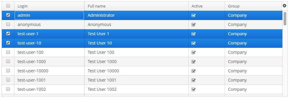
-
-
sortable- enables or disables theDataGridsorting. The default value istrue. When the sorting is enabled, the click on the column name will display the sorting icon to the right of the column caption. Sorting of any specific column can be disabled by this column’ssortableattribute.The
DataGridsorting events can be tracked bySortListener. The origin of the sorting event can be tracked using isUserOriginated() method.
-
textSelectionEnabled- enables or disables text selection in theDataGrid cells. The default value isfalse.
Methods of the DataGrid interface
-
getColumns()- returns the current set ofDataGridcolumns in their current display order. -
getSelected(),getSingleSelected()- return instances of the entities corresponding to the selected rows of the table. A collection can be obtained by invoking getSelected(). If nothing is selected, the application returns an empty set. IfSelectionMode.SINGLEis set, it is more convenient to use getSingleSelected() method returning one selected entity or null, if nothing is selected. -
getVisibleColumns()- returns the current set of visibleDataGridcolumns in their current display order.
-
scrollTo()- method allows you to scroll theDataGridto the specified row. It takes an entity instance identifying the row as a parameter. Besides the entity instance, an overloaded method can take aScrollDestinationparameter with the following possible values:-
ANY- scroll as little as possible to show the required record. -
START- scroll to place the required record in the beginning of theDataGridvisible area. -
MIDDLE- scroll to place the required record in the centre of theDataGridvisible area. -
END- scroll to place the required record in the end of theDataGridvisible area.
-
-
scrollToStart()andscrollToEnd()- scroll theDataGridto the top and to the end respectively.
-
addCellStyleProvider()- adds style provider for theDataGridcells.
-
addRowStyleProvider()- adds style provider for theDataGridrows.
-
setEnterPressAction()- method allows you to define an action executed when Enter is pressed. If such action is not defined, the table will attempt to find an appropriate one in the list of its actions in the following order:-
The action defined by the
setItemClickAction()method. -
The action assigned to the Enter key by the
shortcutproperty. -
The
editaction. -
The
viewaction.
If such action is found, and has
enabled = trueproperty, the action is executed. -
-
setItemClickAction()- method allows you to define an action that will be performed when a table row is double-clicked. If such action is not defined, the table will attempt to find an appropriate one in the list of its actions in the following order:-
The action assigned to the Enter key by the
shortcutproperty. -
The
editaction. -
The
viewaction.
If such action is found, and has
enabled = trueproperty, the action is executed.Item click events can be tracked with
ItemClickListener. -
-
sort()- sorts the data for the specified column in the sort direction chosen from 2 values of theSortDirectionenum:-
ASCENDING- ascending (e.g. A-Z, 1..9) sort order. -
DESCENDING- descending (e.g. Z-A, 9..1) sort order.
-
-
The
getAggregationResults()method returns a map with aggregation results, where map keys areDataGridcolumn identifiers, and values are aggregation values.
Usage of description providers
-
setDescriptionProvider()method is used to generate optional descriptions (tooltips) for the cells of individualDataGridcolumns. The description may contain HTML markup.@Inject private DataGrid<Customer> customersDataGrid; @Subscribe protected void onInit(InitEvent event) { customersDataGrid.getColumnNN("age").setDescriptionProvider(customer -> getPropertyCaption(customer, "age") + customer.getAge(), ContentMode.HTML); customersDataGrid.getColumnNN("active").setDescriptionProvider(customer -> getPropertyCaption(customer, "active") + getMessage(customer.getActive() ? "trueString" : "falseString"), ContentMode.HTML); customersDataGrid.getColumnNN("grade").setDescriptionProvider(customer -> getPropertyCaption(customer, "grade") + messages.getMessage(customer.getGrade()), ContentMode.HTML); }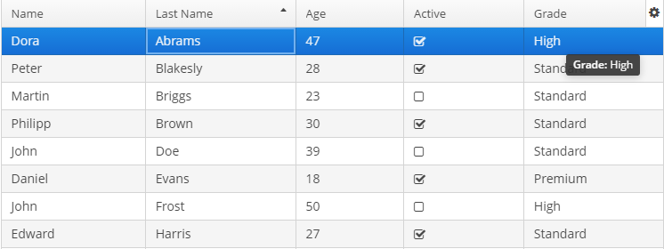
-
setRowDescriptionProvider()method is used to generate optional descriptions (tooltips) forDataGridrows. If a column description provider is also set, the row description generated by provider is used for cells for which the cell description provider returns null.customersDataGrid.setRowDescriptionProvider(Instance::getInstanceName);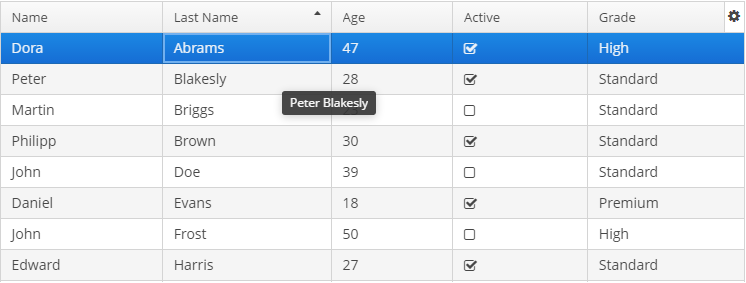
Usage of the DetailsGenerator interface
The DetailsGenerator interface allows you to create a custom component to display the details of a particular row using the setDetailsGenerator() method:
@Inject
private DataGrid<Order> ordersDataGrid;
@Inject
private UiComponents uiComponents;
@Install(to = "ordersDataGrid", subject = "detailsGenerator")
protected Component ordersDataGridDetailsGenerator(Order order) {
VBoxLayout mainLayout = uiComponents.create(VBoxLayout.NAME);
mainLayout.setWidth("100%");
mainLayout.setMargin(true);
HBoxLayout headerBox = uiComponents.create(HBoxLayout.NAME);
headerBox.setWidth("100%");
Label infoLabel = uiComponents.create(Label.NAME);
infoLabel.setHtmlEnabled(true);
infoLabel.setStyleName("h1");
infoLabel.setValue("Order info:");
Component closeButton = createCloseButton(order);
headerBox.add(infoLabel);
headerBox.add(closeButton);
headerBox.expand(infoLabel);
Component content = getContent(order);
mainLayout.add(headerBox);
mainLayout.add(content);
mainLayout.expand(content);
return mainLayout;
}
private Component createCloseButton(Order entity) {
Button closeButton = uiComponents.create(Button.class);
// ... (1)
return closeButton;
}
private Component getContent(Order entity) {
Label<String> content = uiComponents.create(Label.TYPE_STRING);
content.setHtmlEnabled(true);
StringBuilder sb = new StringBuilder();
// ... (2)
content.setValue(sb.toString());
return content;
}| 1 | – See the full code of the createCloseButton method in the DataGridDetailsGeneratorSample class. |
| 2 | – See the full code of the getContent method in the DataGridDetailsGeneratorSample class. |
Result:
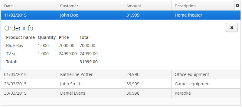
Usage of DataGrid inline editor
The DataGrid component has an API for inline editing of records in the cells. When an item is being edited, the inline edit UI with default save and cancel buttons is displayed.
Methods of inline editor API:
-
getEditedItem()- returns the item that is currently being edited. -
isEditorActive()- returns whether an item is currently being edited in the editor.
-
editItem(Object itemId)(Deprecated) - opens the editor interface for the provided itemid. Scrolls the Grid to bring the item to view if it is not already visible.
-
edit(Entity item)- opens the editor interface for the provided item. Scrolls the Grid to bring the item to view if it is not already visible.
DataGrid inline editor can take into account entity constraints (cross field validation). If there are validation errors, DataGrid will show an error message. To enable/disable validation or get current state use the following methods:
-
setEditorCrossFieldValidate(boolean validate)- enables or disables the cross field validation in the inline editor. The default value istrue. -
isEditorCrossFieldValidate()- returntrueif the inline editor validates cross field rules.
You can add and remove listeners to the editor using the following methods:
-
addEditorOpenListener(),removeEditorOpenListener()-DataGrideditor open listener.This listener is triggered by a double click on the
DataGridarea that instantiates the inline editor and enables to get the fields of the edited row. This enables to update some fields depending on other fields' values without closing the editor.For example:
customersTable.addEditorOpenListener(editorOpenEvent -> { Map<String, Field> fieldMap = editorOpenEvent.getFields(); Field active = fieldMap.get("active"); Field grade = fieldMap.get("grade"); ValueChangeListener listener = e -> active.setValue(true); grade.addValueChangeListener(listener); });
-
addEditorCloseListener(),removeEditorCloseListener()-DataGrideditor close listener.
-
addEditorPreCommitListener(),removeEditorPreCommitListener()-DataGrideditor pre commit listener.
-
addEditorPostCommitListener(),removeEditorPostCommitListener()-DataGrideditor post commit listener.
The changes are committed to the data source or data container only. The logic to save these changes in the database should be added separately.
The editor field can be customized with the help of EditorFieldGenerationContext class. Apply the setEditFieldGenerator() method to a column in order to set a custom component for editing this column:
@Inject
private DataGrid<Order> ordersDataGrid;
@Inject
private UiComponents uiComponents;
@Subscribe
protected void onInit(InitEvent event) {
ordersDataGrid.getColumnNN("amount").setEditFieldGenerator(orderEditorFieldGenerationContext -> {
LookupField<BigDecimal> lookupField = uiComponents.create(LookupField.NAME);
lookupField.setValueSource((ValueSource<BigDecimal>) orderEditorFieldGenerationContext
.getValueSourceProvider().getValueSource("amount"));
lookupField.setOptionsList(Arrays.asList(BigDecimal.ZERO, BigDecimal.ONE, BigDecimal.TEN));
return lookupField;
});
}The result:
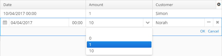
Usage of the ColumnGenerator interface
DataGrid enables adding generated columns. There are two ways to create a generated column:
-
Declaratively using the
@Installannotation in the screen controller:@Inject private UiComponents uiComponents; @Install(to = "dataGrid.fullName", subject = "columnGenerator") protected Component fullNameColumnGenerator(DataGrid.ColumnGeneratorEvent<Customer> e) { Label<String> label = uiComponents.create(Label.TYPE_STRING); label.setValue(e.getItem().getFirstName() + " " + e.getItem().getLastName()); return label; }ColumnGeneratorEventcontains information on the entity, displayed in the currentDataGridrow, and the column identifier. -
Programmatically with the help of the methods:
-
addGeneratedColumn(String columnId, ColumnGenerator generator) -
addGeneratedColumn(String columnId, ColumnGenerator generator, int index)
ColumnGeneratoris a special interface that defines the generated, or calculated, column:-
value of each column’s row,
-
the type of value - common for the whole column.
Below is an example of generating a column that displays users' login in the upper case:
@Subscribe protected void onInit(InitEvent event) { DataGrid.Column column = usersGrid.addGeneratedColumn("loginUpperCase", new DataGrid.ColumnGenerator<User, String>(){ @Override public String getValue(DataGrid.ColumnGeneratorEvent<User> event){ return event.getItem().getLogin().toUpperCase(); } @Override public Class<String> getType(){ return String.class; } }, 1); column.setCaption("Login Upper Case"); }The result:
By default, the generated column is added to the end of the table. There are two possible ways to manage the column’s position: either using an index in the code or adding a column in advance in the XML descriptor and pass its
idto theaddGeneratedColumnmethod. -
Usage of renderers
The way the data is displayed in columns can be customized using parameterized declarative renderers. Some DataGrid renderers are set by special XML elements with parameters defined in the corresponding attributes. Renderers can be declared for not generated columns.
The list of renderers supported by the platform:
-
ButtonRenderer– displays string values as a button caption.The
ButtonRenderercannot be declared in the XML descriptor because it is not possible to define a renderer click listener in the XML descriptor. Studio will generate theButtonRendererdeclaration code in theinit()screen controller method:@Inject private DataGrid<Customer> customersDataGrid; @Inject private Notifications notifications; @Subscribe public void onInit(InitEvent event) { DataGrid.ButtonRenderer<Customer> customersDataGridNameRenderer = customersDataGrid.createRenderer(DataGrid.ButtonRenderer.class); customersDataGridNameRenderer.setRendererClickListener(clickableButtonRendererClickEvent -> { notifications.create() .withType(Notifications.NotificationType.TRAY) .withCaption("ButtonRenderer") .withDescription("Column id: " + clickableButtonRendererClickEvent.getColumnId()) .show(); }); customersDataGrid.getColumn("name").setRenderer(customersDataGridNameRenderer); }
-
CheckBoxRenderer– displays boolean values as a checkbox icon.The
columnelement ofDataGridhas a childcheckBoxRendererelement:<column property="checkBoxRenderer" id="checkBoxRendererColumn"> <checkBoxRenderer/> </column>
-
ClickableTextRenderer– displays simple plain-text string values as a link with call back handler.The
ClickableTextRenderercannot be declared in the XML descriptor because it is not possible to define a renderer click listener in the XML descriptor. Studio will generate theClickableTextRendererdeclaration code in theinit()screen controller method:@Inject private DataGrid<Customer> customersDataGrid; @Inject private Notifications notifications; @Subscribe public void onInit(InitEvent event) { DataGrid.ClickableTextRenderer<Customer> customersDataGridNameRenderer = customersDataGrid.createRenderer(DataGrid.ClickableTextRenderer.class); customersDataGridNameRenderer.setRendererClickListener(clickableTextRendererClickEvent -> { notifications.create() .withType(Notifications.NotificationType.TRAY) .withCaption("ClickableTextRenderer") .withDescription("Column id: " + clickableTextRendererClickEvent.getColumnId()) .show(); }); customersDataGrid.getColumn("name").setRenderer(customersDataGridNameRenderer); }
-
ComponentRenderer– a renderer for UI components.The
columnelement ofDataGridhas a childcomponentRendererelement:<column property="componentRenderer" id="componentRendererColumn"> <componentRenderer/> </column>
-
DateRenderer– displays dates in the defined format.The
columnelement ofDataGridhas a childdateRendererelement with non-requirednullRepresentationattribute and requiredformatstring attribute:<column property="dateRenderer" id="dateRendererColumn"> <dateRenderer nullRepresentation="null" format="yyyy-MM-dd HH:mm:ss"/> </column>
-
IconRenderer– a renderer that representsCubaIcon.The
columnelement ofDataGridhas a childiconRendererelement.Below is an example of rendering an entity attribute with the
Stringtype asCubaIcon:<column id="iconOS" property="iconOS"> <iconRenderer/> </column>@Install(to = "devicesTable.iconOS", subject = "columnGenerator") private Icons.Icon devicesTableIconOSColumnGenerator(DataGrid.ColumnGeneratorEvent<Device> event) { return CubaIcon.valueOf(event.getItem().getIconOS()); }The result:
-
ImageRenderer– uses the path to an image to display the image.The
ImageRenderercannot be declared in the XML descriptor because it is not possible to define a renderer click listener in the XML descriptor. Studio will generate theImageRendererdeclaration code in theinit()screen controller method:@Inject private DataGrid<TestEntity> testEntitiesDataGrid; @Inject private Notifications notifications; @Subscribe public void onInit(InitEvent event) { DataGrid.ImageRenderer<TestEntity> imageRenderer = testEntitiesDataGrid.createRenderer(DataGrid.ImageRenderer.class); imageRenderer.setRendererClickListener(imageRendererClickEvent -> notifications.create() .withType(Notifications.NotificationType.TRAY) .withCaption("ImageRenderer") .withDescription("Column id: " + imageRendererClickEvent.getColumnId()) .show()); testEntitiesDataGrid.getColumn("imageRendererColumn").setRenderer(imageRenderer); }
-
HtmlRenderer– displays HTML layout.The
columnelement ofDataGridhas a childhtmlRendererelement with non-requirednullRepresentationattribute:<column property="htmlRenderer" id="htmlRendererColumn"> <htmlRenderer nullRepresentation="null"/> </column>
-
LocalDateRenderer– displays dates asLocalDatevalues.The
columnelement ofDataGridhas a childlocalDateRendererelement with non-requirednullRepresentationattribute and requiredformatstring attribute:<column property="localDateRenderer" id="localDateRendererColumn"> <localDateRenderer nullRepresentation="null" format="dd/MM/YYYY"/> </column>
-
LocalDateTimeRenderer– displays dates asLocalDateTimevalues.The
columnelement ofDataGridhas a childlocalDateTimeRendererelement with non-requirednullRepresentationattribute and requiredformatstring attribute:<column property="localDateTimeRenderer" id="localDateTimeRendererColumn"> <localDateTimeRenderer nullRepresentation="null" format="dd/MM/YYYY HH:mm:ss"/> </column>
-
NumberRenderer– displays numbers in the defined format.The
columnelement ofDataGridhas a childnumberRendererelement with non-requirednullRepresentationattribute and requiredformatstring attribute:<column property="numberRenderer" id="numberRendererColumn"> <numberRenderer nullRepresentation="null" format="%f"/> </column>
-
ProgressBarRenderer– displaysdoublevalues between 0 and 1 as aProgressBarcomponent.The
columnelement ofDataGridhas a childprogressBarRendererelement:<column property="progressBar" id="progressBarColumn"> <progressBarRenderer/> </column>
-
TextRenderer– displays plain text.The
columnelement ofDataGridhas a childtextRendererelement with non-requirednullRepresentationattribute:<column property="textRenderer" id="textRendererColumn"> <textRenderer nullRepresentation="null"/> </column>
The WebComponentRenderer interface allows you to display components of different web components types in the DataGrid cells. This interface is implemented only in the Web Module. Below is an example of creating a column with the LookupField component:
@Inject
private DataGrid<User> usersGrid;
@Inject
private UiComponents uiComponents;
@Inject
private Configuration configuration;
@Inject
private Messages messages;
@Subscribe
protected void onInit(InitEvent event) {
Map<String, Locale> locales = configuration.getConfig(GlobalConfig.class).getAvailableLocales();
Map<String, String> options = new TreeMap<>();
for (Map.Entry<String, Locale> entry : locales.entrySet()) {
options.put(entry.getKey(), messages.getTools().localeToString(entry.getValue()));
}
DataGrid.Column column = usersGrid.addGeneratedColumn("language",
new DataGrid.ColumnGenerator<User, Component>() {
@Override
public Component getValue(DataGrid.ColumnGeneratorEvent<User> event) {
LookupField<String> component = uiComponents.create(LookupField.NAME);
component.setOptionsMap(options);
component.setWidth("100%");
User user = event.getItem();
component.setValue(user.getLanguage());
component.addValueChangeListener(e -> user.setLanguage(e.getValue()));
return component;
}
@Override
public Class<Component> getType() {
return Component.class;
}
});
column.setRenderer(new WebComponentRenderer());
}The result:
When the field type does not match the data type that can be processed by a renderer, one can create a Function to match data types of the model and the view. For example, to display a boolean value as an icon, it would be handy to use the HtmlRenderer to display HTML layout and implement the logic to convert a boolean value to the layout for icons' display.
@Inject
private DataGrid<User> usersGrid;
@Subscribe
protected void onInit(InitEvent event) {
DataGrid.Column<User> hasEmail = usersGrid.addGeneratedColumn("hasEmail", new DataGrid.ColumnGenerator<User, Boolean>() {
@Override
public Boolean getValue(DataGrid.ColumnGeneratorEvent<User> event) {
return StringUtils.isNotEmpty(event.getItem().getEmail());
}
@Override
public Class<Boolean> getType() {
return Boolean.class;
}
});
hasEmail.setCaption("Has Email");
hasEmail.setRenderer(
usersGrid.createRenderer(DataGrid.HtmlRenderer.class),
(Function<Boolean, String>) hasEmailValue -> {
return BooleanUtils.isTrue(hasEmailValue)
? FontAwesome.PLUS_SQUARE.getHtml()
: FontAwesome.MINUS_SQUARE.getHtml();
});
}The result:
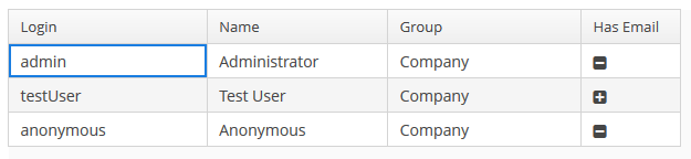
The renderers can be created in three ways:
-
declaratively using the special elements of the
columnelement ofDataGrid. -
passing a renderer interface to the fabric method of the
DataGridinterface. Suits for GUI and Web modules. -
directly creating a renderer implementation for the corresponding module:
dataGrid.createRenderer(DataGrid.ImageRenderer.class) → new WebImageRenderer()For the moment this way is suitable only for the Web module.
Header and Footer
HeaderRow and FooterRow interfaces are used to represent header and footer cells respectively. They can be a merged cell for multiple columns.
The following methods of DataGrid allow to create and manage the DataGrid header and footer:
-
appendHeaderRow(),appendFooterRow()- adds a new row at the bottom of the header/footer section. -
prependHeaderRow(),prependFooterRow()- adds a new row at the top of the header/footer section. -
addHeaderRowAt(),addFooterRowAt()- inserts a new row at the given position to the header/footer section. Shifts the row currently at that position and any subsequent rows down incrementing their indices. -
removeHeaderRow(),removeFooterRow()- removes the given row from the header/footer section. -
getHeaderRowCount(),getFooterRowCount()- gets the row count for the header/footer section. -
setDefaultHeaderRow()- sets the default row of the header. The default row is a special header row providing a user interface for sorting columns.
HeaderCell and FooterCell interfaces provide means of customization of static DataGrid cells:
-
setStyleName()- sets a custom style name for this cell. -
getCellType()- returns the type of content stored in this cell. There are 3 types ofDataGridStaticCellTypeenumeration available:-
TEXT -
HTML -
COMPONENT
-
-
getComponent(),getHtml(),getText()- returns the content displayed in this cell depending on its type.
Below is an example of DataGrid the header that contains merged cells, and the footer displaying calculated values.
<dataGrid id="dataGrid" dataContainer="countryGrowthDs" width="100%">
<columns>
<column property="country"/>
<column property="year2017"/>
<column property="year2018"/>
</columns>
</dataGrid>@Inject
private DataGrid<CountryGrowth> dataGrid;
@Inject
private UserSessionSource userSessionSource;
@Inject
private Messages messages;
@Inject
private CollectionContainer<CountryGrowth> countryGrowthsDc;
private DecimalFormat percentFormat;
@Subscribe
protected void onBeforeShow(BeforeShowEvent event) {
initPercentFormat();
initHeader();
initFooter();
initRenderers();
}
private DecimalFormat initPercentFormat() {
percentFormat = (DecimalFormat) NumberFormat.getPercentInstance(userSessionSource.getLocale());
percentFormat.setMultiplier(1);
percentFormat.setMaximumFractionDigits(2);
return percentFormat;
}
private void initRenderers() {
dataGrid.getColumnNN("year2017").setRenderer(new WebNumberRenderer(percentFormat));
dataGrid.getColumnNN("year2018").setRenderer(new WebNumberRenderer(percentFormat));
}
private void initHeader() {
DataGrid.HeaderRow headerRow = dataGrid.prependHeaderRow();
DataGrid.HeaderCell headerCell = headerRow.join("year2017", "year2018");
headerCell.setText("GDP growth");
headerCell.setStyleName("center-bold");
}
private void initFooter() {
DataGrid.FooterRow footerRow = dataGrid.appendFooterRow();
footerRow.getCell("country").setHtml("<strong>" + messages.getMainMessage("average") + "</strong>");
footerRow.getCell("year2017").setText(percentFormat.format(getAverage("year2017")));
footerRow.getCell("year2018").setText(percentFormat.format(getAverage("year2018")));
}
private double getAverage(String propertyId) {
double average = 0.0;
List<CountryGrowth> items = countryGrowthsDc.getItems();
for (CountryGrowth countryGrowth : items) {
Double value = countryGrowth.getValue(propertyId);
average += value != null ? value : 0.0;
}
return average / items.size();
}
DataGrid styles
Уou can set predefined styles to the DataGrid component using the stylename attribute in the XML descriptor.
<dataGrid id="dataGrid"
width="100%"
height="100%"
stylename="borderless"
dataContainer="customersDc">
</dataGrid>Or set a style programmatically in the screen controller.
dataGrid.setStyleName("borderless");Predefined styles:
-
borderless- removes the outer border of the DataGrid.
-
no-horizontal-lines- removes the horizontal divider lines between the DataGrid rows.
-
no-vertical-lines- removes the vertical divider lines between the DataGrid columns.
-
no-stripes- removes the alternating row colors.
The appearance of the DataGrid component can be customized using SCSS variables with $cuba-datagrid-* prefix. You can change these variables in the visual editor after creating a theme extension or a custom theme.
- Attributes of dataGrid
-
aggregatable - aggregationPosition - align - caption - captionAsHtml - colspan - columnResizeMode - columnsCollapsingAllowed - contextHelpText - contextHelpTextHtmlEnabled - contextMenuEnabled - css - dataContainer - description - descriptionAsHtml - editorBuffered - editorCancelCaption - editorCrossFieldValidate - editorEnabled - editorSaveCaption - emptyStateLinkMessage - emptyStateMessage - enable - box.expandRatio - frozenColumnCount - headerVisible - height - htmlSanitizerEnabled - icon - id - metaClass - reorderingAllowed - responsive - rowspan - selectionMode - settingsEnabled - sortable - stylename - tabIndex - textSelectionEnabled - visible - width
- Elements of dataGrid
-
actions - buttonsPanel - columns - rowsCount
- Attributes of columns
- Attributes of column
-
caption - collapsed - collapsible - collapsingToggleCaption - editable - expandRatio - id - maximumWidth - minimumWidth - property - resizable - sort - sortable - width
- Elements of column
-
aggregation - checkBoxRenderer - componentRenderer - dateRenderer - formatter - iconRenderer - htmlRenderer - localDateRenderer - localDateTimeRenderer - numberRenderer - progressBarRenderer - textRenderer
- Attributes of aggregation
- API
-
addGeneratedColumn - applySettings - createRenderer - edit - getAggregationResults - saveSettings - getColumns - setDescriptionProvider - addCellStyleProvider - setConverter - setDetailsGenerator - setEditorCrossFieldValidate - setEmptyStateLinkClickHandler - setEnterPressAction - setItemClickAction - setRenderer - setRowDescriptionProvider - addRowStyleProvider - sort
- Listeners of dataGrid
-
ColumnCollapsingChangeListener - ColumnReorderListener - ColumnResizeListener - ContextClickListener - EditorCloseListener - EditorOpenListener - EditorPostCommitListener - EditorPreCommitListener - ItemClickListener - SelectionListener - SortListener
- Predefined styles
-
borderless - no-horizontal-lines - no-vertical-lines - no-stripes
3.5.2.1.12. DateField
DateField is a field to display and enter date and time. It is an input field, inside which there is a button with a drop-down calendar. To the right, there is a time field.
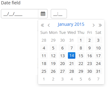
XML name of the component: dateField.
-
To create a date field associated with data, you should use the dataContainer and property attributes:
<data> <instance id="orderDc" class="com.company.sales.entity.Order" view="_local"> <loader/> </instance> </data> <layout> <dateField dataContainer="orderDc" property="date"/> </layout>In the example above, the screen has the
orderDcdata container for theOrderentity, which has thedateproperty. The reference to the data container is specified in the dataContainer attribute of thedateFieldcomponent; the name of the entity attribute which value should be displayed in the field is specified in the property attribute. -
If the field is associated with an entity attribute, it will automatically take the appropriate form:
-
If the attribute has the
java.sql.Datetype or the@Temporal(TemporalType.DATE)annotation is specified, the time field will not be displayed. The date format is defined by thedatedatatype and is specified in the main localized message pack in thedateFormatkey. -
Otherwise, the time field with hours and minutes will be displayed. The time format is defined by the
timedatatype and is specified in the main localized message pack in thetimeFormatkey.
-
-
If the field is not connected to an entity attribute (i.e. the data container and attribute name are not set), you can set the data type using the
datatypeattribute.DateFielduses the following data types:-
date -
dateTime -
localDate -
localDateTime -
offsetDateTime
-
-
You can change the date and time format using the
dateFormatattribute. An attribute value can be either a format string itself or a key in a message pack (if the value starts withmsg://).The format is defined by rules of the
SimpleDateFormatclass (http://docs.oracle.com/javase/8/docs/api/java/text/SimpleDateFormat.html). If there are noHorhcharacters in the format, the time field will not be displayed.<dateField dateFormat="MM/yy" caption="msg://monthOnlyDateField"/>
DateFieldis primarily intended for quick input by filling placeholders from keyboard. Therefore the component supports only formats with digits and separators. Complex formats with textual representation of weekdays or months will not work.
-
You can specify available dates by using
rangeStartandrangeEndattributes. If a range is set, all dates outside the range will be disabled. You can set range dates in the "yyyy-MM-dd" format in XML or programmatically by using corresponding setters.<dateField id="dateField" rangeStart="2016-08-15" rangeEnd="2016-08-19"/>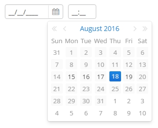
-
The
autofillattribute set totrueenables automatical filling the current month and year after entering a day. If the attribute is disabled, the DateField resets value when the date is not fully entered.In case the
autofillattribute is enabled andrangeStartorrangeEndare set, the values of these attributes are considered when filling the date. -
Changes of the
DateFieldvalue, as well as of any other components implementing theFieldinterface, can be tracked using aValueChangeListener. The origin of theValueChangeEventcan be tracked using isUserOriginated() method.
-
Date and time accuracy can be defined using a
resolutionattribute. An attribute value should match theDateField.Resolutionenumeration −SEC,MIN,HOUR,DAY,MONTH,YEAR. Default isMIN, i.e., to within a minute.If
resolution="DAY"anddateFormatis not specified, the format will be taken from one specified in the main message pack with thedateFormatkey.If
resolution="MIN"anddateFormatis not specified, the format will be taken from one specified in the main message pack with thedateTimeFormatkey. Below is a field definition for entering a date up to within a month.<dateField resolution="MONTH" caption="msg://monthOnlyDateField"/>

-
DateFieldcan perform timestamp value conversions between server and user time zones if the user’s time zone is set bysetTimeZone()method. The time zone is assigned automatically from the current user session when the component is bound to an entity attribute of the timestamp type. If the component is not bound to such attribute, you can callsetTimeZone()in the screen controller to make theDateFieldperform required conversions.. -
Today’s date in the calendar is determined against current timestamp in a user’s web browser, which depends on the OS time zone settings. User’s time zone doesn’t affect this behaviour.
-
In Web Client with a Halo-based theme, you can set predefined
borderlessstyle name to the DateField component to remove borders and background from the field. This can be done either in the XML descriptor or in the screen controller:<dateField id="dateField" stylename="borderless"/>When setting a style programmatically, select the
HaloThemeclass constant with theDATEFIELD_prefix:dateField.setStyleName(HaloTheme.DATEFIELD_BORDERLESS);
- Attributes of dateField
-
align - autofill - caption - captionAsHtml - contextHelpText - contextHelpTextHtmlEnabled - css - dataContainer - datatype - dateFormat - description - descriptionAsHtml - editable - enable - box.expandRatio - height - htmlSanitizerEnabled - icon - id - property - stylename - required - rangeEnd - rangeStart - requiredMessage - resolution - tabIndex - visible - width
- Elements of dateField
- Predefined styles of dateField
-
borderless - small - tiny
- API
-
addValueChangeListener - commit - discard - isModified - setContextHelpIconClickHandler
3.5.2.1.13. DatePicker
DatePicker is a field to display and choose a date. It has the same view as the drop-down calendar in DateField.

XML name of the component: datePicker.
The DatePicker component is implemented for Web Client.
-
To create a date picker associated with data, you should use the dataContainer and property attributes:
<data> <instance id="orderDc" class="com.company.sales.entity.Order" view="_local"> <loader/> </instance> </data> <layout> <datePicker id="datePicker" dataContainer="orderDc" property="date"/> </layout>In the example above, the screen has the
orderDcdata container for theOrderentity, which has thedateproperty. The reference to the data container is specified in the dataContainer attribute of thedatePickercomponent; the name of the entity attribute which value should be displayed in the field is specified in the property attribute.
-
You can specify available dates to select by using
rangeStartandrangeEndattributes. If you set them, all the dates that are outside the range will be disabled.<datePicker id="datePicker" rangeStart="2016-08-15" rangeEnd="2016-08-19"/>
-
Date accuracy can be defined using a
resolutionattribute. An attribute value should match theDatePicker.Resolutionenumeration −DAY,MONTH,YEAR. Default resolution isDAY.<datePicker id="datePicker" resolution="MONTH"/>
<datePicker id="datePicker" resolution="YEAR"/>
-
Today’s date in the calendar is determined against current timestamp in a user’s web browser, which depends on the OS time zone settings. User’s time zone doesn’t affect this behaviour.
- Attributes of datePicker
-
align - caption - captionAsHtml - contextHelpText - contextHelpTextHtmlEnabled - css - dataContainer - datatype - description - descriptionAsHtml - editable - enable - box.expandRatio - height - htmlSanitizerEnabled - id - property - rangeEnd - rangeStart - resolution - stylename - tabIndex - visible - width
- API
3.5.2.1.14. Embedded (Deprecated)
|
Starting from the version 6.8 of the Platform the |
Embedded component is intended for displaying images and embedding arbitrary web pages into the application screens.
XML name of the component: embedded
Below is an example of using the component to display an image from a file located in FileStorage.
-
Declare the component in an XML screen descriptor:
<groupBox caption="Embedded" spacing="true" height="250px" width="250px" expand="embedded"> <embedded id="embedded" width="100%" align="MIDDLE_CENTER"/> </groupBox> -
In a screen controller, inject the component itself and the
FileStorageServiceinterface. Ininit()method, get theFileDescriptorpassed from the calling code, load the corresponding file in a byte array, create aByteArrayInputStreamfor it, and pass the stream to thesetSource()method of the component:@Inject private Embedded embedded; @Inject private FileStorageService fileStorageService; @Override public void init(Map<String, Object> params) { FileDescriptor imageFile = (FileDescriptor) params.get("imageFile"); byte[] bytes = null; if (imageFile != null) { try { bytes = fileStorageService.loadFile(imageFile); } catch (FileStorageException e) { showNotification("Unable to load image file", NotificationType.HUMANIZED); } } if (bytes != null) { embedded.setSource(imageFile.getName(), new ByteArrayInputStream(bytes)); embedded.setType(Embedded.Type.IMAGE); } else { embedded.setVisible(false); } }
The Embedded component supports several different content types, which are rendered differently in HTML. You can set the content type with the setType() method. Supported types:
-
OBJECT- allows embedding certain file types inside HTML <object> and <embed> elements. -
IMAGE- embeds an image inside a HTML <img> element. -
BROWSER- embeds a browser frame inside a HTML <iframe> element.
In Web Client, the component enables displaying of files located inside VAADIN folder. You can set the resource path relative to the application root, for example:
<embedded id="embedded"
relativeSrc="VAADIN/themes/halo/my-logo.png"/>or
embedded.setRelativeSource("VAADIN/themes/halo/my-logo.png")You can also define a resource files directory in the cuba.web.resourcesRoot application property and specify the name of a file inside this directory with the prefix for the value: file:// , url:// , or theme://:
<embedded id="embedded"
src="file://my-logo.png"/>or
embedded.setSource("theme://branding/app-icon-menu.png");In order to display an external web page, pass its URL to the component:
try {
embedded.setSource(new URL("http://www.cuba-platform.com"));
} catch (MalformedURLException e) {
throw new RuntimeException(e);
}- Attributes of embedded
-
align - caption - captionAsHtml - contextHelpText - contextHelpTextHtmlEnabled - description - descriptionAsHtml - height - htmlSanitizerEnabled - id - relativeSrc - src - stylename - visible - width
3.5.2.1.15. FieldGroup
FieldGroup is intended for the joint display and editing of multiple entity attributes.
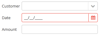
XML-name of the component: fieldGroup
|
|
Below is an example of defining a group of fields in an XML screen descriptor:
<dsContext>
<datasource id="orderDs"
class="com.sample.sales.entity.Order"
view="order-with-customer">
</datasource>
</dsContext>
<layout>
<fieldGroup id="orderFieldGroup" datasource="orderDs" width="250px">
<field property="date"/>
<field property="customer"/>
<field property="amount"/>
</fieldGroup>
</layout>In the example above, dsContext defines an orderDs data source, which contains a single instance of the Order entity. The data source is specified in the datasource attribute of the fieldGroup component. field elements refer to the entity attributes that need to be displayed in the component.
Elements of fieldGroup:
-
column– optional element that allows you to position fields in multiple columns. For this purpose,fieldelements should be placed not immediately withinfieldGroup, but within acolumn. For example:<fieldGroup id="orderFieldGroup" datasource="orderDs" width="100%"> <column width="250px"> <field property="num"/> <field property="date"/> <field property="amount"/> </column> <column width="400px"> <field property="customer"/> <field property="info"/> </column> </fieldGroup>In this case, fields will be arranged in two columns; the first column will contain all fields with the width of
250px, the second one with the width of400px.Attributes of
column:-
width– specifies the field width of a column. By default, fields have the width of200px. In this attribute, the width can be specified both in pixels and in percentage of the total horizontal width of the column.
-
flex– a number, which indicates the degree of horizontal change in the overall size of the column relative to other columns as a result of changing the entire width offieldGroup. For example, you can specifyflex=1for a column, andflex=3for another one.
-
id– an optional column identifier, which allows you to refer to it in case of screen extension.
-
-
field– the main component element. It defines one field of the component.Custom fields can be included in the
fieldelement as inline XML definition:<fieldGroup> <field id="demo"> <lookupField id="demoField" datasource="userDs" property="group"/> </field> </fieldGroup>Attributes of
field:-
id– required attribute, ifpropertyis not set; otherwise it takes the same value aspropertyby default. Theidattribute should contain an arbitrary unique identifier either of a field with thepropertyattribute set, or a programmatically defined field. In the latter case, thefieldshould have the attributecustom="true"as well (see below).
-
property- required attribute, ifidis not set; it should contain an entity attribute name, which is displayed in the field, for data binding.
-
caption− allows you to specify a field caption. If not specified, an entity attribute localized name will be displayed. -
inputPrompt- if the inputPrompt attribute is available for the component used for this field, you can set its value directly for the field.
-
visible− allows you to hide the field together with the caption.
-
datasource− allows you to specify a data source for the field, other than specified for the entirefieldGroupcomponent. Thus, attributes of different entities can be displayed in a field group. -
optionsDatasourcespecifies a name of a data source, used to create a list of options. You can specify this attribute for a field connected to a reference entity attribute. By default, the selection of a related entity is made through a lookup screen. IfoptionsDatasourceis specified, you can select the related entity from a drop-down list of options. Actually, specifyingoptionsDatasourcewill lead to the fact that LookupPickerField will be used in the field instead of PickerField.
-
width− allows you to specify the field width excluding caption. By default, the field width will be200px. The width can be specified both in pixels and in percentage of the total horizontal width of the column. To specify the width of all fields simultaneously, you can use thewidthattribute of thecolumnelement described above.
-
custom– if set totrue, it means that a field identifier does not refer to an entity attribute, and a component, which is in the field, will be set programmatically usingsetComponent()method ofFieldGroup(see below).
-
the
generatorattribute is used for declarative creation of custom fields: you can specify the name of the method that returns a custom component for this field:<fieldGroup datasource="productDs"> <column width="250px"> <field property="description" generator="generateDescriptionField"/> </column> </fieldGroup>public Component generateDescriptionField(Datasource datasource, String fieldId) { TextArea textArea = uiComponents.create(TextArea.NAME); textArea.setRows(5); textArea.setDatasource(datasource, fieldId); return textArea; }
-
link- if set totrue, enables displaying a link to an entity editor instead of an entity picker field (supported for Web Client only). Such behaviour may be required when the user should be able to view the related entity, but should not change the relationship.
-
linkScreen- contains the identifier of the screen that is opened by clicking the link, enabled in thelinkattribute.
-
linkScreenOpenType- sets the screen opening mode (THIS_TAB,NEW_TABorDIALOG).
-
linkInvoke- contains the controller method to be invoked instead of opening the screen.
The following attributes of
fieldcan be applied depending on the type of the entity attribute displayed in the field:-
If you specify a value of the
maskattribute for a text entity attribute, MaskedField with an appropriate mask will be used instead of TextField. In this case, you can also specify thevalueModeattribute.
-
If you specify a value of the
rowsattribute for a text entity attribute, TextArea with the appropriate number of rows will be used instead of TextField. In this case, you can also specify thecolsattribute. -
For a text entity attribute, you can specify the
maxLengthattribute similarly to one described for TextField. -
For an entity attribute of the
dateordateTimetype, you can specify thedateFormatandresolutionfor the parameterization of the DateField component used in the field. -
For an entity attribute of the
timetype, you can specify theshowSecondsattribute for the parameterization of the TimeField component used in the field.
-
Attributes of fieldGroup:
-
The
borderattribute can be set either tohiddenorvisible. Default ishidden. If set tovisible, thefieldGroupcomponent is highlighted with a border. In the web implementation of the component, displaying a border is done by adding thecuba-fieldgroup-borderCSS class.
-
captionAlignmentattribute defines the position of captions relative to the fields in within theFieldGroup. Two options are available:LEFTandTOP.
-
fieldFactoryBean: declarative fields defined in the XML-descriptor are created with theFieldGroupFieldFactoryinterface. In order to override this factory, use this attribute with the name of your customFieldGroupFieldFactoryimplementation.For the
FieldGroupcreated programmatically, use thesetFieldFactory()method.
Methods of the FieldGroup interface:
-
addFieldenables adding fields to the FieldGroup at runtime. As a parameter it takes aFieldConfiginstance, you can also define the position of the new field by addingcolIndexandrowIndexparameters.
-
bind()method applied to the field aftersetDatasource()triggers the creation of field components.
-
createField()is used to create a FieldGroup element implementingFieldConfiginterface:fieldGroup.addField(fieldGroup.createField("newField"));
-
getComponent()returns a visual component, which is located in a field with the specified identifier. This may be required for additional component parameterization, which is not available through XML attributes offielddescribed above.To obtain a reference to a field component in a screen controller, you can use injection instead of the explicit invocation of
getFieldNN("id").getComponentNN(). To do this, use the@Namedannotation and provide an identifier offieldGroupand a field identifier after a dot.For example, in a field selecting a related entity, you can add an action to open an instance and remove the field cleaning action as follows:
<fieldGroup id="orderFieldGroup" datasource="orderDs"> <field property="date"/> <field property="customer"/> <field property="amount"/> </fieldGroup>@Named("orderFieldGroup.customer") protected PickerField customerField; @Override public void init(Map<String, Object> params) { customerField.addOpenAction(); customerField.removeAction(customerField.getAction(PickerField.ClearAction.NAME)); }To use
getComponent()or to inject field components, you need to know which component type is located in the field. The table below shows the correspondence between entity attribute types and components created for them:Entity attribute type Additional conditions Field component type Related Entity
optionsDatasourceis specifiedEnumeration (
enum)stringmaskis specifiedrowsis specifiedbooleandate,dateTimetimeint,long,double,decimalmaskis specifiedUUIDMaskedField with hex mask
-
removeField()enables removing fields at runtime byid.
-
setComponent()method is used to set your own field view. Can be used together with thecustom="true"attribute of thefieldelement or with the field created programmatically by thecreateField()method (see above). When used withcustom="true", the datasource and the property should be set up manually.The
FieldConfiginstance can be obtained withgetField()orgetFieldNN()method, then thesetComponent()method is called:@Inject protected FieldGroup fieldGroup; @Inject protected UiComponents uiComponents; @Inject private Datasource<User> userDs; @Override public void init(Map<String, Object> params) { PasswordField passwordField = uiComponents.create(PasswordField.NAME); passwordField.setDatasource(userDs, "password"); fieldGroup.getFieldNN("password").setComponent(passwordField); }
- Attributes of fieldGroup
-
align - border - caption - captionAsHtml - captionAlignment - contextHelpText - contextHelpTextHtmlEnabled - css - datasource - description - descriptionAsHtml - editable - enable - box.expandRatio - fieldFactoryBean - htmlSanitizerEnabled - id - height - stylename - visible - width
- Attributes of column
- Attributes of field
-
caption - captionProperty - cols - custom - datasource - dateFormat - description - editable - enable - generator - id - link - linkInvoke - linkScreen - linkScreenOpenType - mask - maxLength - optionsDatasource - property - required - requiredMessage - resolution - rows - showSeconds - tabIndex - visible - width
- Elements of field
-
column - field - inputPrompt - validator
- API
-
addField - bind - createField - getComponent - removeField - setComponent - setFieldFactory
3.5.2.1.16. FileMultiUploadField
The FileMultiUploadField component allows a user to upload files to the server. The component is a button; when it is clicked, a standard OS file picker window is shown, where the user can select multiple files for upload.
XML name of the component: multiUpload.
Below is an example of using FileMultiUploadField.
-
Declare the component in an XML screen descriptor:
<multiUpload id="multiUploadField" caption="Upload Many"/> -
In the screen controller, inject the component itself, the FileUploadingAPI and DataManager interfaces.
@Inject private FileMultiUploadField multiUploadField; @Inject private FileUploadingAPI fileUploadingAPI; @Inject private Notifications notifications; @Inject private DataManager dataManager; @Subscribe protected void onInit(InitEvent event) { (1) multiUploadField.addQueueUploadCompleteListener(queueUploadCompleteEvent -> { (2) for (Map.Entry<UUID, String> entry : multiUploadField.getUploadsMap().entrySet()) { (3) UUID fileId = entry.getKey(); String fileName = entry.getValue(); FileDescriptor fd = fileUploadingAPI.getFileDescriptor(fileId, fileName); (4) try { fileUploadingAPI.putFileIntoStorage(fileId, fd); (5) } catch (FileStorageException e) { throw new RuntimeException("Error saving file to FileStorage", e); } dataManager.commit(fd); (6) } notifications.create() .withCaption("Uploaded files: " + multiUploadField.getUploadsMap().values()) .show(); multiUploadField.clearUploads(); (7) }); multiUploadField.addFileUploadErrorListener(queueFileUploadErrorEvent -> { notifications.create() .withCaption("File upload error") .show(); }); }1 In the onInit()method, add listeners which will react on successful uploads and errors.2 The component uploads all selected files to the temporary storage of the client tier and invokes the listener added by the addQueueUploadCompleteListener()method.3 In this listener, the FileMultiUploadField.getUploadsMap()method is invoked to obtain a map of temporary storage file identifiers to file names.4 Then, corresponding FileDescriptorobjects are created by callingFileUploadingAPI.getFileDescriptor()for each map entry.com.haulmont.cuba.core.entity.FileDescriptor(do not confuse withjava.io.FileDescriptor) is a persistent entity, which uniquely identifies an uploaded file and then is used to download the file from the system.5 FileUploadingAPI.putFileIntoStorage()method is used to move the uploaded file from the temporary client storage to FileStorage. Parameters of this method are temporary storage file identifier and theFileDescriptorobject.6 After uploading the file to FileStorage, theFileDescriptorinstance is saved in a database by invokingDataManager.commit(). The saved instance returned by this method can be set to an attribute of an entity related to this file. Here,FileDescriptoris simply stored in the database. The file will be available through the Administration > External Files screen.7 After processing, the list of files should be cleared by calling the clearUploads()method in order to prepare for further uploads.
Below is the list of listeners available to track the upload process:
-
FileUploadErrorListener,
-
FileUploadStartListener,
-
FileUploadFinishListener,
-
QueueUploadCompleteListener.
Maximum upload size is determined by the cuba.maxUploadSizeMb application property and is 20MB by default. If a user selects a file of a larger size, a corresponding message will be displayed, and the upload will be interrupted.
multiUpload attributes:
-
The
acceptXML attribute (and the correspondingsetAccept()method) can be used to set the file type mask in the file selection dialog. Users still be able to change the mask to "All files" and upload arbitrary files.The value of the attribute should be a comma-separated list of masks. For example:
*.jpg,*.png.
-
The
fileSizeLimitXML attribute (and the correspondingsetFileSizeLimit()method) can be used to set maximum allowed file size in bytes. This limit defines a maximum size for each file.<multiUpload id="multiUploadField" fileSizeLimit="200000"/>
-
The
permittedExtensionsXML attribute (and the correspondingsetPermittedExtensions()method) sets the white list of permitted file extensions.The value of the attribute should be a set of string values, where each string is a permitted extension with leading dot. For example:
uploadField.setPermittedExtensions(Sets.newHashSet(".png", ".jpg"));
-
The
dropZoneXML attribute allows you to specify a BoxLayout to be used as a target for drag-and-dropping files from outside of the browser. If the container style is not set, the selected container is highlighted when a user drags files over the container, otherwise the dropZone is not visible.
See Working with Images guide for more complex example of working with uploaded files.
- Attributes of multiUpload
-
accept - align - caption - captionAsHtml - css - description - descriptionAsHtml - dropZone - enable - box.expandRatio - fileSizeLimit - height - htmlSanitizerEnabled - icon - id - pasteZone - permittedExtensions - stylename - tabIndex - visible - width
- Listeners of multiUpload
-
FileUploadErrorListener - FileUploadFinishListener - FileUploadStartListener - QueueUploadCompleteListener
3.5.2.1.17. FileUploadField
The FileUploadField component allows a user to upload files to the server. The component can contain a caption, a link to uploaded file, and two buttons: for uploading and for clearing the selected file. When the upload button is clicked, a standard OS file picker window is shown, where the user can select a file. In order to upload multiple files, use FileMultiUploadField.
XML name of the component: upload.
For entity attributes of FileDescriptor type, the component can be used inside FieldGroup with datasource attribute, inside Form with dataContainer attribute, or independently. If the component is bound to any data component, the uploaded file is immediately stored in file storage and the corresponding FileDescriptor instance is saved to the database.
<upload fileStoragePutMode="IMMEDIATE"
dataContainer="personDc"
property="photo"/>You can also control the saving of file and FileDescriptor programmatically:
-
Declare the component in an XML screen descriptor:
<upload id="uploadField" fileStoragePutMode="MANUAL"/>
-
In the screen controller, inject the component itself, the FileUploadingAPI and DataManager interfaces. Then subscribe to the events of successful uploads or error:
@Inject private FileUploadField uploadField; @Inject private FileUploadingAPI fileUploadingAPI; @Inject private DataManager dataManager; @Inject private Notifications notifications; @Subscribe("uploadField") public void onUploadFieldFileUploadSucceed(FileUploadField.FileUploadSucceedEvent event) { File file = fileUploadingAPI.getFile(uploadField.getFileId()); (1) if (file != null) { notifications.create() .withCaption("File is uploaded to temporary storage at " + file.getAbsolutePath()) .show(); } FileDescriptor fd = uploadField.getFileDescriptor(); (2) try { fileUploadingAPI.putFileIntoStorage(uploadField.getFileId(), fd); (3) } catch (FileStorageException e) { throw new RuntimeException("Error saving file to FileStorage", e); } dataManager.commit(fd); (4) notifications.create() .withCaption("Uploaded file: " + uploadField.getFileName()) .show(); } @Subscribe("uploadField") public void onUploadFieldFileUploadError(UploadField.FileUploadErrorEvent event) { notifications.create() .withCaption("File upload error") .show(); }
| 1 | Here you can get the file uploaded to the temporary storage if you need it. |
| 2 | Normally, you would want to save the file to the file storage of the middle tier. |
| 3 | Save file to FileStorage. |
| 4 | Save file descriptor to database. |
The component will upload the file to the temporary storage of the client tier and invoke the FileUploadSucceedEvent listener. In this listener, a FileDescriptor object is requested from the component. com.haulmont.cuba.core.entity.FileDescriptor is a persistent entity, which uniquely identifies an uploaded file and is used to download the file from the system.
FileUploadingAPI.putFileIntoStorage() method is used to move the uploaded file from the temporary client storage to FileStorage. Parameters of this method are temporary storage file identifier and the FileDescriptor object. Both of these parameters are provided by FileUploadField.
After uploading the file to FileStorage, the FileDescriptor instance is saved in the database by invoking DataManager.commit(). The saved instance returned by this method can be set to an attribute of an entity related to this file. Here, FileDescriptor is simply stored in the database. The file will be available through the Administration > External Files screen.
The FileUploadErrorEvent listener will be invoked if an error occurs when uploading a file to the temporary storage of the client tier.
Below is the list of events available to subscribe to track the upload process:
-
AfterValueClearEvent,
-
BeforeValueClearEvent,
-
FileUploadErrorEvent,
-
FileUploadFinishEvent
-
FileUploadStartEvent, -
FileUploadSucceedEvent,
-
ValueChangeEvent.
fileUploadField attributes:
-
fileStoragePutMode- defines how the file and the correspondingFileDescriptorare stored.-
In the
IMMEDIATEmode it is done right after uploading file to the temporary storage of the client tier. -
In the
MANUALmode, you should do it programmatically in aFileUploadSucceedListener.
The
IMMEDIATEmode is selected by default whenFileUploadFieldis used insideFieldGroup. Otherwise, the default mode isMANUAL. -
-
uploadButtonCaption,uploadButtonIconanduploadButtonDescriptionXML attributes allow you to set the properties of the upload button.
-
showFileName- controls whether the name of uploaded file is displayed next to upload button. It isfalseby default.
-
showClearButton- controls whether the clear button is visible. It isfalseby default.
-
clearButtonCaption,clearButtonIconandclearButtonDescriptionXML attributes allow you to set the properties of the clear button if it is visible.
-
The
acceptXML attribute (and the correspondingsetAccept()method) can be used to set the file type mask in the file selection dialog. Users still be able to change the mask to "All files" and upload arbitrary files.The value of the attribute should be a comma-separated list of masks. For example:
*.jpg,*.png. -
Maximum upload size is determined by the cuba.maxUploadSizeMb application property and is 20MB by default. If a user selects a file of a larger size, a corresponding message will be displayed, and the upload will be interrupted.
-
The
fileSizeLimitXML attribute (and the correspondingsetFileSizeLimit()method) can be used to set maximum allowed file size specified in bytes.<upload id="uploadField" fileSizeLimit="2000"/>
-
The
permittedExtensionsXML attribute (and the correspondingsetPermittedExtensions()method) sets the white list of permitted file extensions.The value of the attribute should be a comma-separated list of extensions with leading dots. For example:
uploadField.setPermittedExtensions(Sets.newHashSet(".png", ".jpg"));
-
dropZone- allows you to specify a BoxLayout to be used as a target for drag-and-dropping files from outside of the browser. The dropZone can cover the whole layout of a dialog window. The selected container is highlighted when a user drags a file over the container, otherwise it is not visible.<layout spacing="true" width="100%"> <vbox id="dropZone" height="AUTO" spacing="true"> <textField id="textField" caption="Title" width="100%"/> <textArea id="textArea" caption="Description" width="100%" rows="5"/> <checkBox caption="Is reference document" width="100%"/> <upload id="upload" dropZone="dropZone" showClearButton="true" showFileName="true"/> </vbox> <hbox spacing="true"> <button caption="mainMsg://actions.Apply"/> <button caption="mainMsg://actions.Cancel"/> </hbox> </layout>
To make a dropZone static and display it permanently, assign the predefined
dropzone-containerstyle to its container. In this case the container should be empty with only thelabelcomponent inside:<layout spacing="true" width="100%"> <textField id="textField" caption="Title" width="100%"/> <checkBox caption="Is reference document" width="100%"/> <upload id="upload" dropZone="dropZone" showClearButton="true" showFileName="true"/> <vbox id="dropZone" height="150px" spacing="true" stylename="dropzone-container"> <label stylename="dropzone-description" value="Drop file here" align="MIDDLE_CENTER"/> </vbox> <hbox spacing="true"> <button caption="mainMsg://actions.Apply"/> <button caption="mainMsg://actions.Cancel"/> </hbox> </layout>
-
pasteZoneallows you to specify a container to be used for handling paste shortcuts when a text input field nested in this container is focused. This feature is supported by Chromium-based browsers.<upload id="uploadField" pasteZone="vboxId" showClearButton="true" showFileName="true"/>
See Working with Images guide for more complex example of working with uploaded files.
- Attributes of upload
-
accept - align - caption - captionAsHtml - clearButtonCaption - clearButtonDescription - clearButtonIcon - contextHelpText - contextHelpTextHtmlEnabled - css - dataContainer - description - descriptionAsHtml - dropZone - editable - enable - box.expandRatio - fileSizeLimit - fileStoragePutMode - height - htmlSanitizerEnabled - icon - id - pasteZone - permittedExtensions - property - showClearButton - showFileName - stylename - tabIndex - uploadButtonCaption - uploadButtonDescription - uploadButtonIcon - visible - width
- API
-
addValueChangeListener - commit - discard - isModified - setContextHelpIconClickHandler
- Events of upload
-
AfterValueClearEvent - BeforeValueClearEvent - FileUploadErrorEvent - FileUploadFinishEvent - FileUploadStartEvent - FileUploadSucceedEvent - ValueChangeEvent
3.5.2.1.18. Filter
In this section:
The Filter is a versatile tool for filtering lists of entities extracted from a database to display in tables. The component enables quick data filtering by arbitrary conditions, as well as creating filters for repeated use.
Filter should be connected to a data loader defined for a CollectionContainer or KeyValueCollectionContainer. The loader should contain a JPQL query. The filter operates by modifying the query in accordance with the criteria provided by the user. Thus, filtering is done at the database level when the SQL query is executed, and only selected data is loaded to the middleware and client tiers.
Using a Filter
A typical filter is shown below:
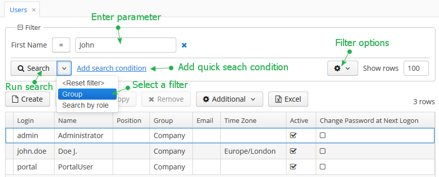
By default, the component is in quick filter mode. This means that a user can add a set of conditions for a one-off data search. After the screen is closed, the conditions will disappear.
To create a quick filter, click Add search condition link. The condition selection screen will be displayed:
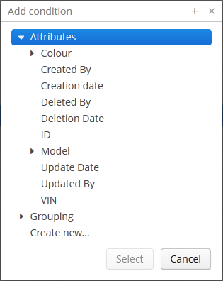
Possible condition types are described below:
-
Attributes – attributes of this entity and related entities. Only persistent attributes are displayed. They should also either be explicitly set in the
propertyelement of the filter XML descriptor, or comply with the rules specified in the properties element. -
Custom conditions – conditions specified by developer in the
customelements of the filter XML descriptor. -
Create new… – enables creating a new arbitrary JPQL condition. This option is only available to users having the specific
cuba.gui.filter.customConditionspermission.
Selected conditions are displayed at the top of the filter panel. The  icon will appear next to each condition field, allowing them to be removed from the set.
Quick filters can be saved for further re-use. In order to save a quick filter, click the filter settings icon, select Save/Save as and provide a new filter name in the popup dialog:
After that, the filter will be saved and will appear in the drop-down menu of the Search button.
The Reset filter menu lets you reset all currently applied search conditions.
The filter settings popup button provides the list of options for filter management:
-
Save – save changes to the current filter.
-
Save with values – save changes to the current filter using the values in parameter editors as filter default values.
-
Save as – save the filter under a new name.
-
Edit – open the filter editor (see below).
-
Make default – make the filter default for this screen. The filter will be automatically displayed on the filter panel when the screen is opened.
-
Remove – delete the current filter.
-
Pin applied – use the results of the last search for sequential data filtering (see Applying Filters Sequentially).
-
Save as search folder – create a search folder based on the current filter.
-
Save as application folder – create an application folder based on the current filter. This option is available to users having the specific
cuba.gui.appFolder.globalpermission only.
The Edit option opens the filter editor, allowing advanced configuration of the current filter:
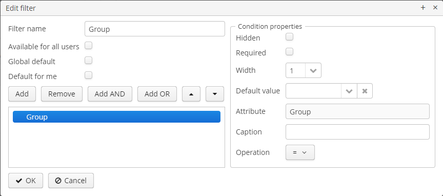
Filter name should be provided in the Name field. This name will be displayed in available filters list for the current screen.
Filter can be made global (i.e., available to all users) using the Available to all users checkbox and global default using the Global default checkbox. These operations require a specific permission called CUBA > Filter > Create/modify global filters. If the filter is marked as global default then it will be automatically selected when users open the screen. Users can set their own default filters using the Default for me checkbox. This setting overrides the global default one.
The filter conditions are contained in the tree. They can be added using the Add button, swapped using  /
/ or removed using the Remove button.
AND or OR grouping conditions can be added with the help of the corresponding buttons. All top level conditions (i.e., without explicit grouping) are joined with AND.
Selecting a condition in the tree opens the list of its properties in the right part of the editor.
The conditions can be made hidden or required by means of corresponding checkboxes. The hidden condition parameter is invisible to the user, so it should be provided when the filter is being edited.
Width property enables selecting the width of the parameter field on the filter panel for the current condition. By default, conditions on the filter panel are displayed in three columns. The field width equals to the number of columns it will occupy (1, 2 or 3).
Default parameter value for the current condition can be selected in the Default value field.
A custom caption for filter condition can be provided in the Caption field.
Operation field enables selecting the condition operator. The list of available operators depends on the attribute type.
If an entity has an attribute of the DateTime type with no @IgnoreUserTimeZone annotation, the the user’s time zone will be respected in filters for this attribute by default. As for the Date type, you can define whether the user’s time zone should be respected by using the special Use time zone flag in the custom condition editor.
Filter Component
XML name of the component: filter.
An example of component declaration in XML screen descriptor is shown below:
<data readOnly="true">
<collection id="carsDc" class="com.haulmont.sample.core.entity.Car" view="carBrowse">
<loader id="carsDl" maxResults="50">
<query>
<![CDATA[select e from sample_Car e order by e.createTs]]>
</query>
</loader>
</collection>
</data>
<layout expand="carsTable" spacing="true">
<filter id="filter" applyTo="carsTable" dataLoader="carsDl">
<properties include=".*"/>
</filter>
<table id="carsTable" width="100%" dataContainer="carsDc">
<columns>
<column id="vin"/>
<column id="colour"/>
<column id="model"/>
</columns>
<rowsCount/>
</table>
</layout>In the example above, the data container holds the collection of Car entity instances. The data loader loads the collection using a JPQL query. The loader’s query is modified by the filter component which is connected to the loader using the dataLoader attribute. Data is displayed using the Table component, which is connected to the data container.
filter may contain nested elements. They describe conditions available for user selection in Add Condition dialog:
-
properties– multiple entity attributes can be made available for selection. This element has the following attributes:-
include– required attribute. It contains a regular expression, which should match an entity attribute name.
-
exclude– contains a regular expression. If an attribute matches the expression, it will be excluded from previously included (usinginclude).
-
excludeProperties– contains a comma-separated list of property paths that should be excluded from filtering. As opposed toexclude, it supports traversing the entity graphs, for example:customer.name.
-
excludeRecursively- defines if an attribute fromexcludePropertiesshould be excluded recursively for the whole object graph. Iftrue, an attribute and all its nested attributes with the same name will be excluded.For example:
<filter id="filter" applyTo="ordersTable" dataLoader="ordersDl"> <properties include=".*" exclude="(amount)|(id)" excludeProperties="version,createTs,createdBy,updateTs,updatedBy,deleteTs,deletedBy" excludeRecursively="true"/> </filter>To exclude properties programmatically, use the
setPropertiesFilterPredicate()method of theFiltercomponent:filter.setPropertiesFilterPredicate(metaPropertyPath -> !metaPropertyPath.getMetaProperty().getName().equals("createTs"));
The following entity attributes are ignored when
propertieselement is used:-
Not accessible due to security permissions.
-
Collections (
@OneToMany,@ManyToMany). -
Non-persistent attributes.
-
Attributes that do not have localized names.
-
Attributes annotated with
@SystemLevel. -
Attributes of type
byte[]. -
The
versionattribute.
-
-
property– explicitly includes an entity attribute by name. This element has the following attributes:-
name– required attribute, containing the name of entity attribute to be included. It can be a path (using ".") in the entity graph. For example:<filter id="transactionsFilter" dataLoader="transactionsDl" applyTo="table"> <properties include=".*" exclude="(masterTransaction)|(authCode)"/> <property name="creditCard.maskedPan" caption="msg://EmbeddedCreditCard.maskedPan"/> <property name="creditCard.startDate" caption="msg://EmbeddedCreditCard.startDate"/> </filter>
-
caption– localized entity attribute name displayed in filter conditions. Generally it is a string with themsg://prefix in accordance with MessageTools.loadString() rules.If the
nameattribute is specified as an entity graph path (using ".") , thecaptionattribute is required.
-
paramWhere− specifies the JPQL expression which is used to select the list of condition parameter values if the parameter is a related entity. The{E}placeholder should be used in the expression instead of the alias of the entity being selected.For example, let’s assume that
Carhas a reference toModel. Then possible condition parameter values list can be limited toAudimodels only:<filter id="carsFilter" dataLoader="carsDl"> <property name="model" paramWhere="{E}.manufacturer = 'Audi'"/> </filter>Screen parameters, session attributes and screen components including those showing other parameters can be used in JPQL expression. Query parameters specification rules are described in Dependencies Between Data Components and CollectionDatasourceImpl Queries.
An example of session and screen parameters usage is shown below:
{E}.createdBy = :session$userLogin and {E}.name like :param$groupNameWith the
paramWhereclause, you can introduce dependencies between parameters. For example, let’s assume thatManufactureris a separate entity. That isCarhas a reference toModelwhich in turn has a reference toManufacturer. Then you may want to create two conditions for the Cars filter: first to select a Manufacturer and second to select a Model. To restrict the list of models by previously selected manufacturer, add a parameter to theparamWhereexpression:{E}.manufacturer.id = :component$filter.model_manufacturer90062The parameter references a component which displays Manufacturer parameter. You can see the name of the component showing condition parameter by opening context menu on a condition table row in the filter editor:
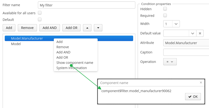
-
paramView− specifies a view, which will be used to load the list of condition parameter values if the parameter is a related entity. For example,_local. If view is not specified,_minimalview will be used.
-
-
customis an element defining an arbitrary condition. The element content should be a JPQL expression (JPQL Macros can be used), which will be added to the data container query’swhereclause. The{E}placeholder should be used in the expression instead of the alias of the entity being selected. The condition can only have one parameter denoted by "?" if used.A value of custom condition can contain special characters, for example "%" or "_" for "like" operator. If you want to escape these characters, add
escape '<char>'to your condition, for example:{E}.name like ? escape '\'Then if you use
foo\%as a value of the condition parameter, the search will interpret "%" as a character in your name and not as a special character.An example of a filter with arbitrary conditions is shown below:
<filter id="carsFilter" dataLoader="carsDl"> <properties include=".*"/> <custom name="vin" paramClass="java.lang.String" caption="msg://vin"> {E}.vin like ? </custom> <custom name="colour" paramClass="com.company.sample.entity.Colour" caption="msg://colour" inExpr="true"> ({E}.colour.id in (?)) </custom> <custom name="repair" paramClass="java.lang.String" caption="msg://repair" join="join {E}.repairs cr"> cr.description like ? </custom> <custom name="updateTs" caption="msg://updateTs"> @between({E}.updateTs, now-1, now+1, day) </custom> </filter>customconditions are displayed in the Custom conditions section of the Add condition dialog:
Attributes of
custom:-
name− required attribute, condition name.
-
caption− required attribute, localized condition name. Generally it is a string with themsg://prefix in accordance with MessageTools.loadString() rules.
-
paramClass− Java class of the condition parameter. If the parameter is not specified, this attribute is optional.
-
inExpr− should be set totrue, if the JPQL expression containsin (?)conditions. In this case user will be able to enter several condition parameter values.
-
join− optional attribute. It specifies a string, which will be added to the data container queryfromsection. This can be required to create a complex condition based on an attribute of a related collection.joinorleft joinstatements should be included into the attribute value.For example, let’s assume that the
Carentity has arepairsattribute, which is a related entityRepairinstances collection. Then the following condition can be created to filterCarbyRepairentity’sdescriptionattribute:<filter id="carsFilter" dataLoader="carsDl"> <custom name="repair" caption="msg://repair" paramClass="java.lang.String" join="join {E}.repairs cr"> cr.description like ? </custom> </filter>If the condition above is used, the original data container query
select c from sample_Car c order by c.createTswill be transformed into the following one:
select c from sample_Car c join c.repairs cr where (cr.description like ?) order by c.createTsAlso, you can create a custom condition with an unrelated entity and use this entity later in the
wheresection of the condition. In this case, you should use", "instead ofjoinorleft joinstatements in thejoinattribute value.Below is an example of a custom condition to find cars that were assigned to drivers after the specified date:
<filter id="carsFilter" dataLoader="carsLoader" applyTo="carsTable"> <custom name="carsFilter" caption="carsFilter" paramClass="java.util.Date" join=", ref$DriverAllocation da"> da.car = {E} and da.createTs >= ? </custom> </filter> -
paramWhere− specifies a JPQL expression used to select the list of condition parameter values if the parameter is a related entity. See the description of thepropertyelement’s attribute of the same name. -
paramView− specifies a view, which will be used when a list of condition parameter values are loaded if the parameter is a related entity. See the description of thepropertyelement’s attribute of the same name.
-
filter attributes:
-
editable– if the attribute value isfalse, the Edit option is disabled.
-
applyImmediately– specifies when the filter is applied. If the attribute value isfalse, the filter will be applied only after the Search button is clicked. If the attribute value istrue, filter is applied immediately after changing the filter conditions. General cases when a filter is applied immediately:-
After the parameter field’s value changing;
-
After changing condition operation;
-
After removing a condition from the filter;
-
After the Show rows field changing;
-
When you click on the OK button in the filter editor dialog;
-
After clearing all values.
In the immediate mode, the Refresh button is used instead of Search.
The
applyImmediatelyattribute takes precedence over the cuba.gui.genericFilterApplyImmediately application property. -
-
manualApplyRequired− defines when the filter will be applied. If the attribute value isfalse, the filter (default or empty) will be applied when the screen is opened. It means that the data container will be refreshed and linked components (e.g.Table) will display data. If the value istrue, the filter will be applied only after the Search button is clicked.This attribute takes precedence over the cuba.gui.genericFilterManualApplyRequired application property.
-
useMaxResults− limits the page size of entity instances loaded into the data container. It is set totrueby default.If the attribute value is
false, the filter will not show the Show rows field. The number of records in the data container (and displayed in the table accordingly) will be limited only by theMaxFetchUIparameter of the entity statistics, which is set to 10000 by default.If the attribute is not specified or is
true, the Show rows field will be displayed only if the user has specificcuba.gui.filter.maxResultspermission. If thecuba.gui.filter.maxResultspermission is not granted, the filter will force selecting only the first N rows without user to be able to disable it or specify another N. N is defined byFetchUI,DefaultFetchUIparameters. They are obtained from the entity statistics mechanism.A filter shown below has the following parameters:
useMaxResults="true", thecuba.gui.filter.maxResultspermission is denied, andcuba.gui.filter.maxResultsDefaultFetchUI = 2.
-
textMaxResults- enables using the text field instead of the drop-down list as the Show rows field.falseby default.
-
folderActionsEnabled− if it is set tofalse, the following filter actions will be hidden: Save as Search Folder, Save as Application Folder. By default, the attribute value istrue, and Save as Search Folder, Save as Application Folder are available.
-
applyTo− optional attribute, contains the identifier of a component associated with the filter. It is used when access to related component presentations is required. For example, when saving the filter as a search folder or as an application folder, the presentation that will be applied when browsing this folder can be specified.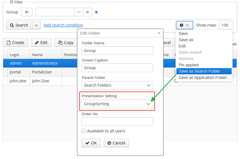
-
caption- enables setting a custom caption for the filter panel.
-
columnsCount- defines the number of columns for conditions on the filter panel. Default value is 3.
-
controlsLayoutTemplate- defines an internal layout of the filter controls. The layout template format can be found in the cuba.gui.genericFilterControlsLayout application property description.
-
defaultMode- defines the filter default mode. Possible values aregenericandfts. Whenftsvalue is set then the filter will be opened in the full text search mode (if the entity is indexed). The default value isgeneric.
-
modeSwitchVisible- defines the visibility of the checkbox that switches the filter to the full text search mode. If full text search is unavailable then the checkbox will be invisible despite of the defined value. Possible values aretrueandfalse(trueby default).
Methods of Filter interface:
-
setBorderVisible()- defines if the filter border should be displayed. The default value istrue.
Listeners of Filter:
-
ExpandedStateChangeListener- enables tracking the expanded state changes.
-
FilterEntityChangeListener- is triggered when a filter is selected for the first time on a component initialization or later from the list of saved filters.
The appearance of the Filter component can be customized using SCSS variables with $cuba-filter-* prefix. You can change these variables in the visual editor after creating a theme extension or a custom theme.
- Attributes of filter
-
applyImmediately - applyTo - caption - captionAsHtml - columnsCount - controlsLayoutTemplate - css - dataLoader - defaultMode - description - descriptionAsHtml - editable - enable - box.expandRatio - folderActionsEnabled - htmlSanitizerEnabled - id - manualApplyRequired - margin - modeSwitchVisible - settingsEnabled - stylename - textMaxResults - useMaxResults - visible - width
- Elements of filter
-
custom - properties - property
- Attributes of properties
- Attributes of property
-
caption - name - paramView - paramWhere
- Attributes of custom
-
caption - name - inExpr - join - paramClass - paramView - paramWhere
- API
-
addExpandedStateChangeListener - addFilterEntityChangeListener - applySettings - getMargin - saveSettings - setMargin
User Permissions
-
To create/change/delete global (available to all users) filters, user must have the
cuba.gui.filter.globalpermission. -
To create/change
customconditions user must have acuba.gui.filter.customConditionspermission. -
To change the maximum number of rows per table page using the Show rows field, user must have the
cuba.gui.filter.maxResultspermission. See also the useMaxResults filter attribute.
For specific permissions configuration information, see Security Subsystem.
External Filter Control Parameters
-
System-wide parameters
The following application properties affect filter behavior:
-
cuba.gui.genericFilterApplyImmediately allows controlling the default search mode for the filter. See also applyImmediately filter attribute.
-
cuba.gui.genericFilterManualApplyRequired − disables automatic applying of the filter (i.e., data loading) when the screen is opened. See also manualApplyRequired filter attribute.
-
cuba.gui.genericFilterChecking − enables the check that at least one condition is filled before applying the filter.
-
cuba.gui.genericFilterControlsLayout − defines an internal layout of the filter controls.
-
cuba.allowQueryFromSelected enables switching off sequential filters application mechanism.
-
cuba.gui.genericFilterColumnsCount - sets the default number of columns for placing conditions on the filter panel. See also columnsCount filter attribute.
-
cuba.gui.genericFilterConditionsLocation - defines the location of the conditions panel.
-
cuba.gui.genericFilterPopupListSize - defines the maximum number of items displayed in the popup list of the Search button.
-
cuba.gui.genericFilterPropertiesHierarchyDepth - defines the properties hierarchy depth in the "Add Condition" dialog window.
-
cuba.gui.genericFilterTrimParamValues - defines whether all generic text filters should trim input values.
-
-
Screen invocation parameters
It is possible to specify a filter and its parameters which should be applied when the screen is opened. For this purpose, the filter should be created in advance, stored in the database, and a corresponding record in the
SEC_FILTERtable should have a value in theCODEfield. Screen invocation parameters are set in theweb-menu.xmlconfiguration file.In order to store the filter in the database, the insert script for the filter should be added to the
30.create-db.sqlscript of the entity. To simplify the script creation, find the filter in the Entity Inspector section of the Administration menu, in the filter’s context menu choose System Information, click Script for insert button and copy the script.Then you can adjust the screen to use the filter by default. To specify a filter code, pass to the screen a parameter with the same name as filter component identifier in this screen. Parameter value should be the code of the filter.
To set filter parameter values, pass to the screen parameters with the names equal to parameter names and their values in string format.
An example of main menu item descriptor is shown below. It sets a filter with the
FilterByVINcode to thecarsFiltercomponent of thesample_Car.browsescreen which it opens. It also setsTMAvalue to thecomponent$carsFilter.vin79216condition:<item id="sample_Car.browse"> <param name="carsFilter" value="FilterByVIN"/> <param name="component$carsFilter.vin79216" value="TMA"/> </item>It should be noted that a filter with a defined
CODEfield has some specifics:-
It cannot be edited by users.
-
Name of this filter can be displayed in several languages. To achieve this, specify a string with key equal to the filter code in the application main message pack.
-
Applying Filters Sequentially
If the cuba.allowQueryFromSelected application property is enabled, the last applied filter and the current filtered results can be pinned via the component’s user interface. After that another filter or other parameters of the current filter can be selected and applied to the currently selected records.
This approach helps to achieve two aims:
-
Decompose complex filters, which may lead to better performance as well.
-
Apply filters to the records selected using application or search folders.
Take the following steps to use sequential filters. First, choose and apply one of the filters. Next click the filter settings button and select Pin applied. The filter will be pinned at the top of the filter panel. Then another filter can be applied to the selected records and so on. Any number of filters can be applied sequentially. Filters can also be removed using  button.
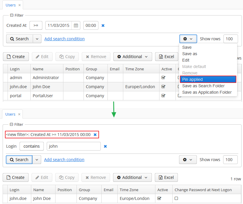
The sequential filters implementation is based on the ability of DataManager to run sequential queries.
API for Working with Filter Parameters
The Filter interface provides methods for reading and writing of filter parameter values in a screen controller:
-
setParamValue(String paramName, Object value) -
getParamValue(String paramName)
paramName - filter parameter name. Parameter name is a part of component name that displays a parameter value. The procedure of getting a component name was described above. Parameter name is placed after the last dot in a component name. For example, if the component name is component$filter.model_manufacturer90062, then the parameter name is model_manufacturer90062.
Note that you cannot use these methods in the InitEvent handler of the screen controller, because the filter is not initialized at that moment. A good place to work with filter parameters is the BeforeShowEvent handler.
Full-Text Search Mode in Filter
If a filter data container contains entities that are indexed by the full-text search subsystem (see CUBA Platform. Full Text Search), then a full-text search mode is available in the filter. Use the Full-Text Search checkbox to switch to this mode.
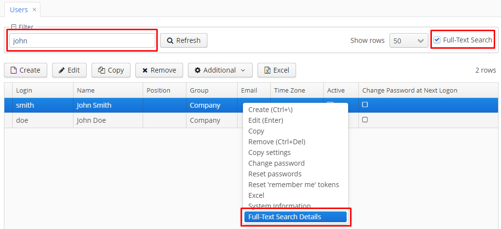
In the full-text search mode, the filter contains text fields for search criteria, and the search is performed in entity fields indexed by the FTS subsystem.
If a table is defined in the applyTo attribute, then it’s possible to display an information what entity attributes satisfy the search criteria. If the cuba.gui.genericFilterFtsDetailsActionEnabled application property is set to true, then the Full-Text Search Details action will be added to the table. Right click on the table row and select this menu item - a dialog window with the full-text search details will be opened.
If the cuba.gui.genericFilterFtsTableTooltipsEnabled application property is set to true then placing the mouse cursor on the table row will display a tooltip with the information what entity attributes satisfy the search criteria. Keep in mind that tooltip generation may take a lot of time, so it is disabled by default.
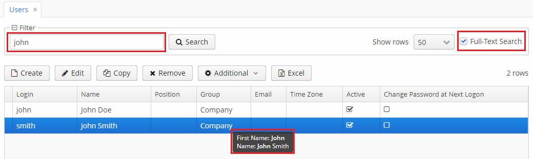
For hiding the filter mode checkbox, set false value to the modeSwitchVisible filter attribute.
If you want the filter to be opened in the full-text search mode by default, set fts value to the defaultMode filter attribute.
Full-text search can be used combined with any number of filter conditions:
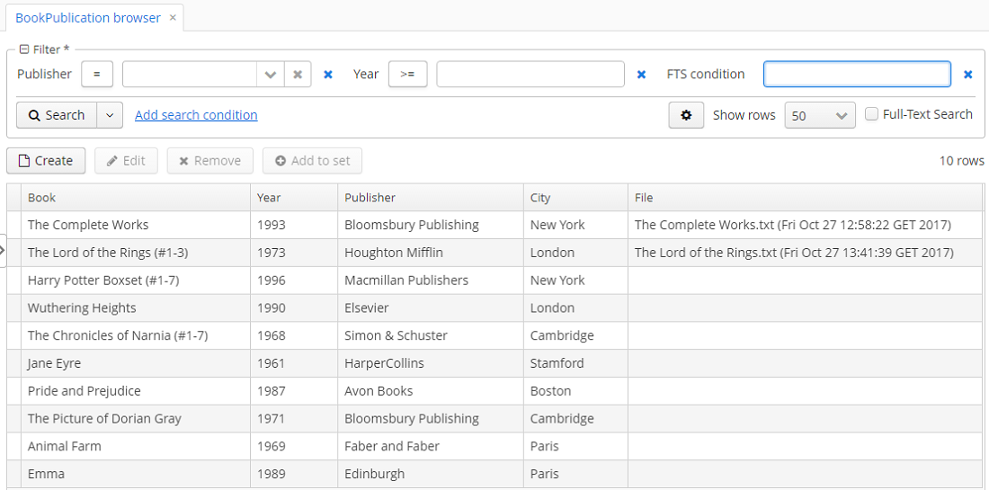
The FTS condition can be selected in the conditions selection window.
3.5.2.1.19. Form
The Form component is designed for the joint display and editing of multiple entity attributes. It is a simple container similar to GridLayout, it can have any number of nested columns, the type of nested fields is defined declaratively in XML, the fields' captions are located to the left of the fields. The main difference from GridLayout is that Form enables binding all nested fields to one data container.
Form is used instead of FieldGroup by default in generated editor screens since the framework version 7.0.
XML-name of the component: form
Below is an example of defining a group of fields in an XML screen descriptor:
<data>
<instance id="orderDc" class="com.company.sales.entity.Order" view="order-edit">
<loader/>
</instance>
</data>
<layout>
<form id="form" dataContainer="orderDc">
<dateField property="date"/>
<textField property="amount" description="Total amount"/>
<pickerField property="customer"/>
<field id="statusField" property="status"/>
</form>
</layout>In the example above, the form component shows attributes of the entity loaded into the orderDc data container. Nested form elements define visual components bound to entity attributes using the property XML attribute. Captions will be created automatically based on the localized names of entity attributes. The nested components can have any common or specific attributes like the description shown in the example.
Apart from concrete visual components, the form can also contain generic fields defined with the nested field element. The framework will choose an appropriate visual component on the basis of the corresponding entity attribute and existing component generation strategies. The field element can have a number of common attributes like description, contextHelpText, etc.
In order to inject a nested component to the screen controller, give it id attribute in XML. The component will be injected with its concrete type, e.g., TextField. If a generic field is injected into the screen controller, it has the Field type, which is a superclass of all visual components that can be displayed in the form.
The form component supports the colspan and rowspan attributes. These attributes set the number of columns and rows occupied by the corresponding nested component. An example below demonstrates how Field 1 can be extended to cover two columns:
<form>
<column width="250px">
<textField caption="Field 1" colspan="2" width="100%"/>
<textField caption="Field 2"/>
</column>
<column width="250px">
<textField caption="Field 3"/>
</column>
</form>As a result, the components will be placed in the following way:
Similarly, Field 1 can be extended to cover two rows:
<form>
<column width="250px">
<textField caption="Field 1" rowspan="2" height="100%"/>
</column>
<column width="250px">
<textField caption="Field 2"/>
<textField caption="Field 3"/>
</column>
</form>As a result, the components will be placed in the following way:
Attributes of form:
-
childrenCaptionWidth– specifies fixed captions width for all nested columns and their child elements. Set-1to use auto size.
-
childrenCaptionAlignment– defines the alignment of child component captions in all nested columns. Two options are available:LEFTandRIGHT. The default value isLEFT. Applicable only when the captionPosition attribute isLEFT.
-
captionPosition- defines the fields' caption position:TOPorLEFT.
-
dataContainer- sets the data container for nested fields.
Elements of form:
-
column– an optional element that allows you to position fields in multiple columns. For this purpose, nested fields should be placed not immediately within theform, but within acolumn. For example:<form id="form" dataContainer="orderDc"> <column width="250px"> <dateField property="date"/> <textField property="amount"/> </column> <column width="400px"> <pickerField property="customer"/> <textArea property="info"/> </column> </form>In this case, fields will be arranged in two columns; the first column will contain all fields with the width of
250px, the second one with the width of400px.Attributes of
column:-
id– an optional column identifier, which allows you to refer to it in case of screen extension.
-
width– specifies the field width of a column. By default, fields have the width of200px. In this attribute, the width can be specified both in pixels and in percentage of the total horizontal width of the column.
-
childrenCaptionWidth– specifies fixed captions width for nested fields. Set-1to use auto size.
-
childrenCaptionAlignment– defines the alignment of the nested fields captions. Two options are available:LEFTandRIGHT. The default value isLEFT. Applicable only when the captionPosition attribute isLEFT.
-
Methods of the Form interface:
-
add()- enables adding fields to theFormprogrammatically. It takes aComponentinstance as a parameter, and you can also define the position of the new field by addingcolumnandrowindexes. Besides, an overloaded method can take rowspan and colspan parameters.Data container is not assigned to the components added programmatically, so you have to use the component’s
setValueSource()method for data binding.For example, if you have declared a form with the
namefield:<data> <instance id="customerDc" class="com.company.demo.entity.Customer"> <loader/> </instance> </data> <layout> <form id="form" dataContainer="customerDc"> <column> <textField id="nameField" property="name"/> </column> </form> </layout>You can add an
emailfield to the form programmatically in the screen controller as follows:@Inject private UiComponents uiComponents; @Inject private InstanceContainer<Customer> customerDc; @Inject private Form form; @Subscribe private void onInit(InitEvent event) { TextField<String> emailField = uiComponents.create(TextField.TYPE_STRING); emailField.setCaption("Email"); emailField.setWidthFull(); emailField.setValueSource(new ContainerValueSource<>(customerDc, "email")); form.add(emailField); }
-
setChildrenCaptionAlignment(CaptionAlignment alignment)– sets alignment of child component captions in all columns. -
setChildrenCaptionAlignment(int column, CaptionAlignment alignment)– sets alignment of child component captions for a column with the given index.
- Attributes of form
-
align - box.expandRatio - caption - captionAsHtml - captionPosition - childrenCaptionAlignment - childrenCaptionWidth - colspan - contextHelpText - contextHelpTextHtmlEnabled - css - dataContainer - description - descriptionAsHtml - editable - enable - height - htmlSanitizerEnabled - icon - id - responsive - rowspan - stylename - visible - width
- Attributes of column
-
childrenCaptionAlignment - childrenCaptionWidth - id - width
- API
3.5.2.1.20. GroupTable
GroupTable component is a table with an ability to group information dynamically by any field. In order to group a table by a column the required column should be dragged to the left and dropped on the  element of the table header. Grouped values can be expanded and collapsed using
  /
/ buttons.
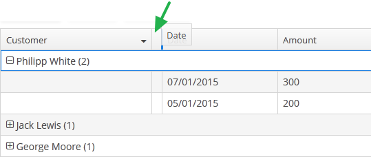
XML name of the component: groupTable.
A data container of CollectionContainer type must be specified for GroupTable, otherwise, grouping will not work. Example:
<data>
<collection id="ordersDc"
class="com.company.sales.entity.Order"
view="order-with-customer">
<loader id="ordersDl">
<query>
<![CDATA[select e from sales_Order e]]>
</query>
</loader>
</collection>
</data>
<layout>
<groupTable id="ordersTable"
width="100%"
dataContainer="ordersDc">
<columns>
<group>
<column id="date"/>
</group>
<column id="customer"/>
<column id="amount"/>
</columns>
<rowsCount/>
</groupTable>
</layout>group is an optional element that can be present in a single instance inside columns. It contains a set of column elements, by which grouping will be performed initially when opening a screen.
In the example below, we will use the includeAll attribute of the columns element along with the group element.
<groupTable id="groupTable"
width="100%"
height="100%"
dataContainer="customersDc">
<columns includeAll="true">
<group>
<column id="address"/>
</group>
<column id="name"
sortable="false"/>
</columns>
</groupTable>So a specific attribute is added to the name column, and a GroupTable is grouped by the address column.
Each column element can contain the groupAllowed attribute with boolean value. This attribute controls whether a user can group by this column.
If aggregatable attribute is true, the table shows aggregation results for each group and results for all rows in an additional row on the top. If showTotalAggregation attribute is false, results for all rows are not shown.
If multiselect attribute is true, the click to the group row holding down the Ctrl key will expand the group (if collapsed) and set the selection to all rows of this group. The converse is not true: if the whole group is selected, Ctrl+click will not deselect all the group. You still can deselect certain rows using the common Ctrl key behaviour.
-
Methods of the
GroupTableinterface: -
-
groupByColumns()- performs grouping by the given table columns.The example below will group the table first by the department name, and then by city:
groupTable.groupByColumns("department", "city");
-
ungroupByColumns()- resets grouping by the given columns.The following example will ungroup the table by department, while grouping by city from the previous snippet will be kept.
groupTable.ungroupByColumns("department");
-
ungroup()- resets grouping at all.
-
The
setAggregationDistributionProvider()method is similar to the same method for theTablecomponent with the only difference that when creating a provider, theGroupAggregationDistributionContext<V>object is used, which contains additional:-
GroupInfo groupInfo– an object with information about the grouping row: properties of the grouped columns and their values.
-
-
The
getAggregationResults()method returns a map with aggregation results for the specified GroupInfo object, where map keys are table column identifiers, and values are aggregation values.
-
The
setStyleProvider()method allows setting table cell display style. For theGroupTable, it will accept aGroupTable.GroupStyleProvider, which extendsTable.StyleProvider.GroupStyleProviderhas a specific method for styling grouping rows with the GroupInfo parameter. This method will be invoked for every grouping row in theGroupTable.Example of setting a style:
@Inject private GroupTable<Customer> customerTable; @Subscribe public void onInit(InitEvent event) { customerTable.setStyleProvider(new GroupTable.GroupStyleProvider<Customer>() { @SuppressWarnings("unchecked") @Override public String getStyleName(GroupInfo info) { CustomerGrade grade = (CustomerGrade) info.getPropertyValue(info.getProperty()); switch (grade) { case PREMIUM: return "premium-grade"; case HIGH: return "high-grade"; case STANDARD: return "standard-grade"; } return null; } @Override public String getStyleName(Customer customer, @Nullable String property) { if (Boolean.TRUE.equals(customer.getActive())) { return "active-customer"; } return null; } }); }Then the styles set in the application theme should be defined. Detailed information on creating a theme is available in Themes. For web client, new styles are defined in the
styles.scssfile. Style names defined in the controller, form CSS selectors. For example:.active-customer { font-weight: bold; } .premium-grade { background-color: red; color: white; } .high-grade { background-color: green; color: white; } .standard-grade { background-color: blue; color: white; }
-
The rest of the GroupTable functionality is similar to a simple Table.
- Attributes of groupTable
-
align - aggregatable - aggregationStyle - caption - captionAsHtml - columnControlVisible - contextHelpText - contextHelpTextHtmlEnabled - contextMenuEnabled - css - dataContainer - description - descriptionAsHtml - editable - emptyStateLinkMessage - emptyStateMessage - enable - box.expandRatio - height - htmlSanitizerEnabled - id - metaClass - multiLineCells - multiselect - presentations - reorderingAllowed - settingsEnabled - showTotalAggregation - sortable - stylename - tabIndex - textSelectionEnabled - visible - width
- Elements of groupTable
-
actions - buttonsPanel - columns - rows - rowsCount
- Attributes of columns
- Elements of columns
- Attributes of column
-
align - caption - captionProperty - collapsed - dateFormat - editable - expandRatio - groupAllowed - id - link - linkInvoke - linkScreen - linkScreenOpenType - maxTextLength - optionsContainer - resolution - sort - sortable - visible - width
- Elements of column
- Attributes of aggregation
- API
-
addColumnCollapseListener - addSelectionListener - getAggregationResults - groupByColumns - setAggregationDistributionProvider - setClickListener - setEmptyStateLinkClickHandler - setItemDescriptionProvider - setStyleProvider - ungroup - ungroupByColumns
3.5.2.1.21. Image
Image component is designed for displaying images from different sources. The component can be bound to a data container or configured programmatically.
|
See Working with Images in CUBA applications guide to learn how to upload and display images in the application. |
XML name of the component: image.
The Image component can display the value of an entity attribute of FileDescriptor or byte[] type. In the simplest case image can be declaratively associated with data using the dataContainer and property attributes:
<image id="image" dataContainer="employeeDс" property="avatar"/>In the example above, component displays the avatar attribute of the Employee entity located in the employeeDс data container.
Alternatively, the Image component can display images from different resources. You can set the resource type declaratively using the image elements listed below:
-
classpath- a resource in the classpath.<image> <classpath path="com/company/sample/web/screens/myPic.jpg"/> </image>
-
file- a resource in the file system.<image> <file path="D:\sample\modules\web\web\VAADIN\images\myImage.jpg"/> </image>
-
relativePath- resource in the application directory.<image> <relativePath path="VAADIN/images/myImage.jpg"/> </image>
-
theme- a theme resource, e.g.,VAADIN/themes/customTheme/some/path/image.png.<image> <theme path="com.company.sample/myPic.jpg"/> </image>
-
url- a resource which can be loaded from the given URL.<image> <url url="https://www.cuba-platform.com/sites/all/themes/cuba_adaptive/img/lori.png"/> </image>
image attributes:
-
scaleMode- applies the scale mode to the image. The following scale modes are available:-
FILL- the image will be stretched according to the size of the component. -
CONTAIN- the image will be compressed or stretched to the minimum dimension of the component while preserving the proportions. -
COVER- the image will be compressed or stretched to fill the entire area of the component while maintaining the component’s proportions. If the image proportions do not match the component’s proportions, then the image will be clipped to fit. -
SCALE_DOWN- the content changes size by comparing the difference betweenNONEandCONTAINin order to find the smallest concrete size of the object. -
NONE- the image will retain its real size.
-
-
alternateText- sets an alternate text for an image in case the resource is not set or unavailable.<image id="image" alternateText="logo"/>
image resources settings:
-
bufferSize- the size of the download buffer in bytes used for this resource.<image> <file bufferSize="1024" path="C:/img.png"/> </image>
-
cacheTime- the length of cache expiration time in milliseconds.<image> <file cacheTime="2400" path="C:/img.png"/> </image>
-
mimeType- the MIME type of the resource.<image> <url url="https://avatars3.githubusercontent.com/u/17548514?v=4&s=200" mimeType="image/png"/> </image>
To programmatically manage the Image component, use the following methods:
-
setValueSource()- sets the data container and the entity attribute name. OnlyFileDescriptorandbyte[]attributes are supported.The data container can be set programmatically, for example, to display images in table cells:
frameworksTable.addGeneratedColumn("image", entity -> { Image image = uiComponents.create(Image.NAME); image.setValueSource(new ContainerValueSource<>(frameworksTable.getInstanceContainer(entity), "image")); image.setHeight("100px"); return image; });
-
setSource()- sets the content source for the component. The method accepts the resource type and return the resource object that can be configured using the fluent interface. Each resource type has its own methods, for example,setPath()forThemeResourcetype orsetStreamSupplier()forStreamResourcetype:Image image = uiComponents.create(Image.NAME); image.setSource(ThemeResource.class) .setPath("images/image.png");or
image.setSource(StreamResource.class) .setStreamSupplier(() -> new FileDataProvider(fileDescriptor).provide()) .setBufferSize(1024);You can use one of the following resource types implementing the
Resourceinterface or extend it to create a custom resource:-
ClasspathResource- an image located in classpath. This resource can be also set declaratively using theclasspathelement of theimagecomponent. -
FileDescriptorResource- an image which can be obtained from theFileStorageusing the givenFileDescriptor. -
FileResource- an image stored in the file system. This resource can be also set declaratively using thefileelement of theimagecomponent. -
RelativePathResource- an image stored in a directory of the application. This resource can be also set declaratively using therelativePathelement of theimagecomponent. -
StreamResource- an image from a stream. -
ThemeResource- a theme image, for example,VAADIN/themes/yourtheme/some/path/image.png. This resource can be also set declaratively using thethemeelement of theimagecomponent. -
UrlResource- an image which can be loaded from the given URL. This resource can be also set declaratively using theurlelement of theimagecomponent.
-
-
createResource()- creates the image resource implementation by its type. The created object can be later passed to thesetSource()method.FileDescriptorResource resource = image.createResource(FileDescriptorResource.class) .setFileDescriptor(avatar); image.setSource(resource);
-
addClickListener()- adds a listener that will be notified when a user clicks on an image area.image.addClickListener(clickEvent -> { if (clickEvent.isDoubleClick()) notifications.create() .withCaption("Double clicked") .show(); });
-
addSourceChangeListener()- adds a listener that will be notified when a source of an image is changed.
- Attributes of image
-
align - alternateText - caption - captionAsHtml - colspan - contextHelpText - contextHelpTextHtmlEnabled - css - dataContainer - description - descriptionAsHtml - editable - enable - box.expandRatio - height - htmlSanitizerEnabled - icon - id - property - required - requiredMessage - responsive - rowspan - scaleMode - stylename - stylename - visible - width
- Attributes of image resources
- Elements of image
-
classpath - file - relativePath - theme - url
- API
-
addClickListener - addSourceChangeListener - createResource - setScaleMode - setSource - setValueSource
3.5.2.1.22. Label
Label is a text component that displays static text or value of an entity attribute.
XML name of the component: label
Below is an example of setting a label with text taken from the localized message pack:
<label value="msg://orders"/>The value attribute sets text for a label.
In a web client, the text contained in value will be split into multiple lines if its length exceeds the width value. Therefore, to display a multiline label, it is sufficient to specify an absolute value of width. If the label text is too long and the value of width is not specified, the text will be truncated.
<label value="Label, which should be split into multiple lines"
width="200px"/>You can set label parameters in the screen controller. To do this, you should specify a component identifier and get a reference to the component in the controller:
<label id="dynamicLabel"/>@Inject
private Label dynamicLabel;
@Subscribe
protected void onInit(InitEvent event) {
dynamicLabel.setValue("Some value");
}The Label component can display value of an entity attribute. For this purpose, dataContainer and property attributes are used. For example:
<data>
<instance id="customerDc" class="com.company.sales.entity.Customer" view="_local">
<loader/>
</instance>
</data>
<layout>
<label dataContainer="customerDc" property="name"/>
</layout>In the example above, component displays the name attribute of the Customer entity located in the customerDc data container.
htmlEnabled attribute indicates the way the value attribute will be interpreted: if htmlEnabled="true", the attribute will be treated as HTML code, otherwise as a plain string.
The htmlSanitizerEnabled attribute enables or disables HTML sanitization. If htmlEnabled and htmlSanitizerEnabled attributes are set to true, then the label value will be sanitized.
protected static final String UNSAFE_HTML = "<i>Jackdaws </i><u>love</u> <font size=\"javascript:alert(1)\" " +
"color=\"moccasin\">my</font> " +
"<font size=\"7\">big</font> <sup>sphinx</sup> " +
"<font face=\"Verdana\">of</font> <span style=\"background-color: " +
"red;\">quartz</span><svg/onload=alert(\"XSS\")>";
@Inject
private Label<String> label;
@Subscribe
public void onInit(InitEvent event) {
label.setHtmlEnabled(true);
label.setHtmlSanitizerEnabled(true);
label.setValue(UNSAFE_HTML);
}The htmlSanitizerEnabled attribute overrides the value of global cuba.web.htmlSanitizerEnabled configuration property.
- Label styles
-
In Web Client with a Halo-based theme, you can set predefined styles to the
Labelcomponent using thestylenameattribute either in the XML descriptor or in the screen controller:<label value="Label to be styled" stylename="colored"/>When setting a style programmatically, select one of the
HaloThemeclass constants with theLABEL_prefix:label.setStyleName(HaloTheme.LABEL_COLORED);-
bold- bolder font weight. Suitable for important/prominent UI text.
-
colored- colored text.
-
failure- failure badge style. Adds a border around the label and an icon next to the text. Suitable for UI notifications that need to be used in the direct context of some component.
-
h1- header style for main application headings.
-
h2- header style for different sections in the application.
-
h3- header style for different sub-sections in the application.
-
h4- header style for different sub-sections in the application.
-
light- lighter font weight. Suitable for additional/supplementary UI text.
-
no-margin- removes default margins from the header.
-
spinner- spinner style. Add this style name to an emptyLabelto create a spinner.
-
success- success badge style. Adds a border around the label and an icon next to the text. Suitable for UI notifications that need to be used in the direct context of some component.
-
- Attributes of label
-
align - css - dataContainer - description - descriptionAsHtml - enable - box.expandRatio - height - htmlEnabled - htmlSanitizerEnabled - icon - id - property - stylename - value - visible - width
- Elements of label
- Predefined styles of label
-
bold - colored - failure - h1 - h2 - h3 - h4 - huge - large - light - no-margin - small - spinner - success - tiny
- API
3.5.2.1.23. Link
Link is a hyperlink, which enables uniform opening of external web resources.
XML-name of the component: link
An example of XML-description for link:
<link caption="Link" url="https://www.cuba-platform.com" target="_blank" rel="noopener"/>link attributes:
-
url– the URL of the web resource.
-
target– sets the web page opening mode for the Web Client, the same as thetargetattribute of the<a>HTML element.
-
rel- an optional attribute that specifies the relationship between the current document and the linked document. It corresponds to therelHTML attribute which is placed within the<a>tag.Default value is
"noopener noreferrer".-
noopener- indicates that any browsing context created by following the link will not have an opener browsing context, which means that itswindow.openerproperty will benull. -
noreferrerindicates that no HTTP referer header is to be sent when following the link.
-
- Attributes of link
-
align - caption - captionAsHtml - css - description - descriptionAsHtml - enable - box.expandRatio - htmlSanitizerEnabled - icon - id - rel - stylename - url - target - visible - width
3.5.2.1.24. LinkButton
LinkButton is a button that looks like a hyperlink.
XML name of the component: linkButton
The link button can contain text or icon (or both). The figure below shows different types of buttons.
By default, the caption for LinkButton is split into multiple lines if its length exceeds the width value. Therefore, to display a multiline link button, it is sufficient to specify an absolute value of width. If the link button’s caption is too long and the value of width is not specified, the caption will be truncated.
The user can change the default behavior to display LinkButton caption in one row:
-
Create a theme extension or a custom theme.
-
Define the SCSS variable
$cuba-link-button-caption-wrap:$cuba-link-button-caption-wrap: false
The link button differs from regular Button only in its appearance. All properties and behavior are identical to those described for Button.
Below is an example of XML description of a link button that invokes the someMethod() method of a controller. The link button has a caption (the caption attribute), a tooltip (the description attribute) and an icon (the icon attribute):
<linkButton id="linkButton"
caption="msg://linkButton"
description="Press me"
icon="SAVE"
invoke="someMethod"/>- Attributes of linkButton
-
action - align - caption - captionAsHtml - css - description - descriptionAsHtml - enable - box.expandRatio - htmlSanitizerEnabled - icon - id - invoke - stylename - visible - width
3.5.2.1.25. LookupField
This is a component to select a value from drop-down list. Drop-down list provides the filtering of values as the user inputs some text, and the pagination of available values.
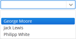
XML name of the component: lookupField.
-
The simplest case of using
LookupFieldis to select an enumeration value for an entity attribute. For example, aRoleentity has atypeattribute of theRoleTypetype, which is an enumeration. Then you can useLookupFieldto edit this attribute as follows:<data> <instance id="roleDc" class="com.haulmont.cuba.security.entity.Role" view="_local"> <loader/> </instance> </data> <layout expand="editActions" spacing="true"> <lookupField dataContainer="roleDc" property="type"/> </layout>In the example above, the screen defines
roleDcdata container for theRoleentity. In thelookupFieldcomponent, a link to a data container is specified in the dataContainer attribute, and a name of an entity attribute is specified in the property attribute. In this case, the entity attribute is an enumeration, and the drop-down list will display localized names of all enumeration values.
-
Similarly,
LookupFieldcan be used to select an instance of a related entity. optionsContainer attribute is used to create a list of options:<data> <instance id="carDc" class="com.haulmont.sample.core.entity.Car" view="carEdit"> <loader/> </instance> <collection id="colorsDc" class="com.haulmont.sample.core.entity.Color" view="_minimal"> <loader id="colorsDl"> <query> <![CDATA[select e from sample_Color e]]> </query> </loader> </collection> </data> <layout> <lookupField dataContainer="carDc" property="color" optionsContainer="colorsDc"/> </layout>In this case, the component will display instance names of the
Colorentity located in thecolorsDcdata container, and the selected value will be set into thecolorattribute of theCarentity, which is located in thecarDcdata container.captionProperty attribute defines which entity attribute can be used instead of an instance name for string option names.
-
The
setOptionCaptionProvider()method allows you to define captions for string option names displayed byLookupFieldcomponent:lookupField.setOptionCaptionProvider((item) -> item.getLocalizedName()); -
The list of component options can be specified arbitrarily using the
setOptionsList(),setOptionsMap()andsetOptionsEnum()methods, or using the XMLoptionsContainerattribute.-
setOptionsList()allows you to programmatically specify a list of component options. To do this, declare a component in the XML descriptor:<lookupField id="numberOfSeatsField" dataContainer="modelDc" property="numberOfSeats"/>Then inject the component into the controller and specify a list of options in the
onInit()method:@Inject protected LookupField<Integer> numberOfSeatsField; @Subscribe public void onInit(InitEvent event) { List<Integer> list = new ArrayList<>(); list.add(2); list.add(4); list.add(5); list.add(7); numberOfSeatsField.setOptionsList(list); }In the component’s drop-down list the values 2, 4, 5 and 7 will be displayed. Selected number will be put into the
numberOfSeatsattribute of an entity located in themodelDcdata container.
-
setOptionsMap()allows you to specify string names and option values separately. For example, in thenumberOfSeatsFieldcomponent in the XML descriptor, specify an option map inonInit():@Inject protected LookupField<Integer> numberOfSeatsField; @Subscribe public void onInit(InitEvent event) { Map<String, Integer> map = new LinkedHashMap<>(); map.put("two", 2); map.put("four", 4); map.put("five", 5); map.put("seven", 7); numberOfSeatsField.setOptionsMap(map); }In the component’s drop-down list,
two,four,five,sevenstrings will be displayed. However, the value of the component will be a number that corresponds to the selected option. It will be put into thenumberOfSeatsattribute of an entity located in themodelDcdata container.
-
setOptionsEnum()takes the class of an enumeration as a parameter. The drop-down list will show localized names of enum values, the value of the component will be an enum value.
-
-
setPopupWidth()allows you to set the drop-down list’s width, which is passed to the method as a string. By using relative units (e.g.,"50%") it’s possible to set the drop-down list’s width relative to theLookupFielditself. By default, this width is set tonullso that the drop-down list’s width can be greater than a component width to fit the content of all displayed items. By setting the value to"100%"the drop-down list’s width will be equal to the width of theLookupField.
-
setOptionStyleProvider()enables you to use separate style names for the the options displayed by the component:lookupField.setOptionStyleProvider(entity -> { User user = (User) entity; switch (user.getGroup().getName()) { case "Company": return "company"; case "Premium": return "premium"; default: return "company"; } });
-
Each drop-down list component can have an icon on the left. Use the
setOptionIconProvider()method in the screen controller:lookupField.setOptionIconProvider(entity -> { if (entity.getType() == LegalStatus.LEGAL) return "icons/icon-office.png"; return "icons/icon-user.png"; });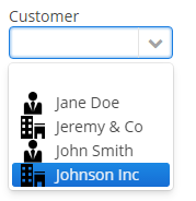
If you use SVG icons, set the icon size explicitly to avoid icons overlay.
<svg version="1.1" id="Capa_1" xmlns="http://www.w3.org/2000/svg" xmlns:xlink="http://www.w3.org/1999/xlink" xml:space="preserve" style="enable-background:new 0 0 55 55;" viewBox="0 0 55 55" height="25px" width="25px">
-
The
setOptionImageProvider()method allows you to define images for the options displayed by theLookupFieldcomponent. This method sets a function that accepts one of the resource types.@Inject private LookupField<Customer> lookupField; @Inject private Image imageResource; @Subscribe private void onInit(InitEvent event) { lookupField.setOptionImageProvider(e -> imageResource.createResource(ThemeResource.class).setPath("icons/radio.svg")); } -
If the
LookupFieldcomponent is not required and if the related entity attribute is not declared as required, the list of component options has an empty row. If this row is selected, the component returnsnull. The nullName attribute allows you to specify a row to be displayed in this case instead of an empty one. Below is an example:<lookupField dataContainer="carDc" property="colour" optionsContainer="colorsDs" nullName="(none)"/>In this case, instead of an empty row,
(none)will be displayed. If this row is selected,nullwill be set to a related entity attribute.If you specify a list of options programmatically using
setOptionsList(), you can pass one of the options intosetNullOption()method. Then, if the user selects it, the component value will benull.- LookupField filters:
-
-
Using the
filterModeattribute, option filtering type can be defined for the user input:-
NO− no filtering. -
STARTS_WITH− by the beginning of a phrase. -
CONTAINS− by any occurrence (is used by default).
-
-
The
setFilterPredicate()method enables to setup how items should be filtered. The predicate tests whether an item with the given caption matches to the given search string. For example:BiFunction<String, String, Boolean> predicate = String::contains; lookupField.setFilterPredicate((itemCaption, searchString) -> predicate.apply(itemCaption.toLowerCase(), searchString));The functional interface
FilterPredicatehas thetestmethod that enables implementing custom filtering logic, for example, to escape accents or special characters:lookupField.setFilterPredicate((itemCaption, searchString) -> StringUtils.replaceChars(itemCaption, "ÉÈËÏÎ", "EEEII") .toLowerCase() .contains(searchString));
-
-
The
LookupFieldcomponent is able to handle user input if there is no suitable option in the list. In this case,setNewOptionHandler()is used. For example:@Inject private Metadata metadata; @Inject private LookupField<Color> colorField; @Inject private CollectionContainer<Color> colorsDc; @Subscribe protected void onInit(InitEvent event) { colorField.setNewOptionHandler(caption -> { Color color = metadata.create(Color.class); color.setName(caption); colorsDc.getMutableItems() .add(color); colorField.setValue(color); }); }The new options handler is invoked if the user enters a value that does not coincide with any option and presses Enter. In this case, a new
Colorentity instance is created in the handler, itsnameattribute is set to the value entered by the user, this instance is added to the options data container and selected in the component.Instead of using
setNewOptionHandler()method for processing user input, the controller method name can be specified in thenewOptionHandlerXML attribute. This method should have two parameters, one ofLookupFieldtype, and the other ofStringtype. They will be set to the component instance and the value entered by the user, accordingly. ThenewOptionAllowedattribute is used to enable adding new options.
-
The
nullOptionVisibleXML attribute sets visibility for the null option in the drop-down list. It allows you to makeLookupFieldnot required but still without the null option.
-
The
textInputAllowedXML attribute can be used to disable filtering options from keyboard. It can be convenient for short lists. The default value istrue.
-
The
pageLengthXML attribute allows you to redefine the number of options on one page of the drop-down list, specified in the cuba.gui.lookupFieldPageLength application property. -
In Web Client with a Halo-based theme, you can set predefined styles to the
LookupFieldcomponent using thestylenameattribute either in the XML descriptor or in the screen controller:<lookupField id="lookupField" stylename="borderless"/>When setting a style programmatically, select one of the
HaloThemeclass constants with theLOOKUPFIELD_prefix:lookupField.setStyleName(HaloTheme.LOOKUPFIELD_BORDERLESS);LookupField styles:
-
align-center- align the text inside the field to center.
-
align-right- align the text inside the field to the right.
-
borderless- removes the border and background from the text field.
-
- Attributes of lookupField
-
align - caption - captionAsHtml - captionProperty - contextHelpText - contextHelpTextHtmlEnabled - css - dataContainer - description - descriptionAsHtml - editable - enable - box.expandRatio - filterMode - height - htmlSanitizerEnabled - icon - id - inputPrompt - newOptionAllowed - newOptionHandler - nullName - nullOptionVisible - optionsContainer - optionsEnum - pageLength - property - required - requiredMessage - stylename - tabIndex - textInputAllowed - visible - width
- Elements of lookupField
- Predefined styles of lookupField
-
align-right - align-center - borderless - huge - large - small - tiny
- API
-
addValueChangeListener - commit - discard - isModified - setContextHelpIconClickHandler - setFilterPredicate - setOptionCaptionProvider - setOptionImageProvider - setOptionsEnum - setOptionsList - setOptionsMap - setOptionsStyleProvider - setPopupWidth
3.5.2.1.26. LookupPickerField
The LookupPickerField component enables to display an entity instance in a text field, select an instance in a drop-down list and perform actions by pressing buttons on the right.
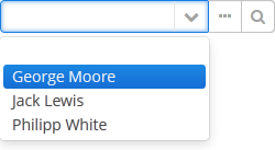
XML name of the component: lookupPickerField.
In fact, LookupPickerField is a hybrid of LookupField and PickerField. Thus it has the same features except the default list of actions added when determining the component in XML: for LookupPickerField these are lookup  and
and open  actions.
Below is an example of using LookupPickerField to select a value of the color reference attribute of the Car entity:
<data>
<instance id="carDc" class="com.haulmont.sample.core.entity.Car" view="carEdit">
<loader/>
</instance>
<collection id="colorsDc" class="com.haulmont.sample.core.entity.Color" view="_minimal">
<loader id="colorsDl">
<query>
<![CDATA[select e from sample_Color e]]>
</query>
</loader>
</collection>
</data>
<layout>
<lookupPickerField dataContainer="carDc" property="color" optionsContainer="colorsDc"/>
</layout>- Attributes of lookupPickerField
-
align - caption - captionAsHtml - captionProperty - contextHelpText - contextHelpTextHtmlEnabled - css - dataContainer - description - descriptionAsHtml - editable - enable - box.expandRatio - filterMode - height - htmlSanitizerEnabled - icon - id - inputPrompt - metaClass - newOptionAllowed - newOptionHandler - nullName - optionsContainer - pageLength - property - required - requiredMessage - stylename - tabIndex - visible - width
- Elements of lookupPickerField
- Predefined styles of lookupPickerField
- API
-
addValueChangeListener - commit - discard - isModified - setContextHelpIconClickHandler - setOptionCaptionProvider - setOptionImageProvider - setOptionsStyleProvider - setPopupWidth
3.5.2.1.27. MaskedField
This is a text field, in which data is entered in a predefined format. For example, it is convenient to use MaskedField to enter telephone numbers.
XML name of the component: maskedField.
The MaskedField component is implemented for Web Client only.
Basically, MaskedField repeats the functionality of TextField, except that you cannot set datatype for it. So, MaskedField is intended for work only with text and entity attributes of type String. MaskedField has the following specific attributes:
-
mask– sets a mask for the field. To set a mask, use the following characters:-
#– number -
U– uppercase letter -
L– lowercase letter -
?– letter -
А– letter or number -
*– any character -
H– uppercase hex character -
h– lowercase hex character -
~– " +" or "-" character
-
-
valueMode– defines a format of a returned value (with a mask or not) and can take eithermaskedorclear.
Example of a text field with a mask for entering telephone numbers is provided below:
<maskedField id="phoneNumberField" mask="(###)###-##-##" valueMode="masked"/>
<button id="showPhoneNumberBtn" caption="msg://showPhoneNumberBtn"/>@Inject
private MaskedField phoneNumberField;
@Inject
private Notifications notifications;
@Subscribe("showPhoneNumberBtn")
protected void onShowPhoneNumberBtnClick(Button.ClickEvent event) {
notifications.create()
.withCaption((String) phoneNumberField.getValue())
.withType(Notifications.NotificationType.HUMANIZED)
.show();
}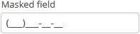
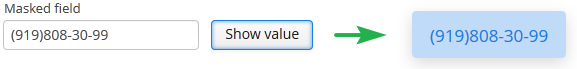
- Attributes of maskedField
-
align - caption - captionAsHtml - contextHelpText - contextHelpTextHtmlEnabled - css - dataContainer - description - descriptionAsHtml - editable - enable - box.expandRatio - height - htmlSanitizerEnabled - icon - id - mask - maxLength - property - required - requiredMessage - stylename - tabIndex - trim - valueMode - visible - width
- Elements of maskedField
- API
-
addEnterPressListener - addValueChangeListener - setContextHelpIconClickHandler
3.5.2.1.28. OptionsGroup
This is a component that allows a user to choose from a list of options. Radio buttons are used to select a single value; a group of checkboxes is used to select multiple values.
XML name of the component: optionsGroup.
-
The simplest case of using
OptionsGroupis to select an enumeration value for an entity attribute. For example, aCustomerentity has thegradeattribute of theCustomerGradetype, which is an enumeration. Then you can useOptionsGroupto edit this attribute as follows:<data> <instance id="customerDc" class="com.company.app.entity.Customer" view="_local"> <loader/> </instance> </data> <layout> <optionsGroup id="gradeField" property="grade" dataContainer="customerDc"/> </layout>In the example above, the
customerDcdata container is defined for theCustomerentity. In theoptionsGroupcomponent, the link to the data container is specified in the dataContainer attribute and the name of the entity attribute is set in the property attribute.As a result, the component will be as follows:
-
The list of component options can be specified arbitrarily using the
setOptionsList(),setOptionsMap()andsetOptionsEnum()methods, or using the XMLoptionsContaineroroptionsEnumattributes.
-
setOptionsList()allows you to specify programmatically a list of component options. To do this, declare a component in the XML descriptor:<optionsGroup id="optionsGroupWithList"/>Then inject the component into the controller and specify a list of options in the
onInit()method:@Inject private OptionsGroup<Integer, Integer> optionsGroupWithList; @Subscribe protected void onInit(InitEvent event) { List<Integer> list = new ArrayList<>(); list.add(2); list.add(4); list.add(5); list.add(7); optionsGroupWithList.setOptionsList(list); }The component will be as follows:

Depending on the selected option, the
getValue()method of the component will returnIntegervalues: 2, 4, 5, 7.
-
setOptionsMap()allows you to specify string names and option values separately. For example, we can set the following options map for theoptionsGroupWithMapcomponent, described the XML descriptor, in theonInit()method of the controller:@Inject private OptionsGroup<Integer, Integer> optionsGroupWithMap; @Subscribe protected void onInit(InitEvent event) { Map<String, Object> map = new LinkedHashMap<>(); map.put("two", 2); map.put("four", 4); map.put("five", 5); map.put("seven", 7); optionsGroupWithMap.setOptionsMap(map); }The component will be as follows:

Depending on the selected option, the
getValue()method of the component will returnIntegervalues: 2, 4, 5, 7, and not the strings that are displayed on the screen.
-
setOptionsEnum()takes a class of enumeration as a parameter. The options list will consist of localized names of enum values, the value of the component will be an enum value. -
The component can take a list of options from a data container. For this purpose, the optionsContainer attribute is used. For example:
<data> <collection id="coloursDc" class="com.haulmont.app.entity.Colour" view="_local"> <loader id="coloursLoader"> <query> <![CDATA[select c from app_Colour c]]> </query> </loader> </collection> </data> <layout> <optionsGroup id="coloursField" optionsContainer="coloursDc"/> </layout>In this case, the
coloursFieldcomponent will display instance names of theColourentity, located in thecoloursDcdata container, and itsgetValue()method will return the selected entity instance.With the help of the captionProperty attribute entity attribute to be used instead of an instance name for a string option names can be defined.
-
The
multiselectattribute is used to switchOptionsGroupto a multiple-choice mode. Ifmultiselectis turned on, the component is displayed as a group of independent checkboxes, and the component value is a list of selected options.For example, if we create the component in the XML screen descriptor:
<optionsGroup id="roleTypesField" multiselect="true"/>and set a list of options for it –
RoleTypeenumeration values:@Inject protected OptionsGroup roleTypesField; @Subscribe protected void onInit(InitEvent event) { roleTypesField.setOptionsList(Arrays.asList(RoleType.values())); }then the component will be as follows:

In this case, the
getValue()method of the component will return ajava.util.List, containingRoleType.READONLYandRoleType.DENYINGvalues.The example above also illustrates the ability of the
OptionsGroupcomponent to display localized values of enumerations included in the data model.You can also make some values selected programmatically by passing a
java.util.Listof values to thesetValue()method:optionsGroup.setValue(Arrays.asList(RoleType.STANDARD, RoleType.ADMIN));
-
The
orientationattribute defines the orientation of group elements. By default, elements are arranged vertically. Thehorizontalvalue sets the horizontal orientation.
The appearance of the OptionsGroup component can be customized using SCSS variables with $cuba-optiongroup-* prefix. You can change these variables in the visual editor after creating a theme extension or a custom theme.
- Attributes of optionsGroup
-
align - box.expandRatio - caption - captionAsHtml - captionProperty - colspan - contextHelpText - contextHelpTextHtmlEnabled - css - dataContainer - description - descriptionAsHtml - editable - enable - icon - id - multiselect - height - htmlSanitizerEnabled - optionsContainer - optionsEnum - orientation - property - required - requiredMessage - responsive - rowspan - stylename - tabIndex - visible - width
- Elements of optionsGroup
- API
-
addValueChangeListener - setContextHelpIconClickHandler - setOptionCaptionProvider - setOptionsEnum - setOptionsList - setOptionsMap
3.5.2.1.29. OptionsList
OptionsList is a variation of the OptionsGroup component which represents the list of options as a vertical scrollable list. If multi-select is enabled, multiple items can be selected by holding the Ctrl key while clicking, or as a range by holding the Shift key.
XML name of the component: optionsList.
The OptionsList component is implemented for Web Client.
By default the OptionsList component displays the first null element in suggestion popup, this can be disabled with the help of nullOptionVisible attribute set to false.
The addDoubleClickListener() method allows you to listen to DoubleClickEvent which is sent when a user double-clicks on the component options.
optionsList.addDoubleClickListener(doubleClickEvent ->
notifications.create()
.withCaption("Double clicked")
.show());For the same purpose, you can subscribe to the event in the screen controller, for example:
@Subscribe("optionsList")
private void onOptionsListDoubleClick(OptionsList.DoubleClickEvent event) {
notifications.create()
.withCaption("Double clicked")
.show();
}The only difference in API between OptionsList and OptionsGroup is that OptionsList has no orientation attribute.
- Attributes of optionsList
-
align - caption - captionAsHtml - captionProperty - contextHelpText - contextHelpTextHtmlEnabled - css - dataContainer - description - descriptionAsHtml - editable - enable - box.expandRatio - height - htmlSanitizerEnabled - icon - id - multiselect - nullOptionVisible - optionsContainer - optionsEnum - property - required - requiredMessage - stylename - tabIndex - visible - width
- Elements of optionsList
- API
-
addDoubleClickListener - addValueChangeListener - setContextHelpIconClickHandler - setOptionCaptionProvider
3.5.2.1.30. PasswordField
This is a text field that displays echo characters instead of those entered by a user.
XML name of the component: passwordField.
Basically, PasswordField is similar to TextField apart from the ability to set datatype. PasswordField is intended to work with text and entity attributes of type String only.
Example:
<passwordField id="passwordField" caption="msg://name"/>
<button id="showPasswordBtn" caption="msg://buttonsName"/>@Inject
private PasswordField passwordField;
@Inject
private Notifications notifications;
@Subscribe("showPasswordBtn")
protected void onShowPasswordBtnClick(Button.ClickEvent event) {
notifications.create()
.withCaption(passwordField.getValue())
.show();
}
The autocomplete attribute allows you to enable saving passwords in the web browser. It is disabled by default.
The capsLockIndicator attribute allows you to set the id of a CapsLockIndicator component that should indicate Caps Lock state for this passwordField. The Caps Lock state is handled only when the passwordField is focused. When the field loses its focus, the state changes to "Caps Lock off".
Example:
<passwordField id="passwordField"
capsLockIndicator="capsLockIndicator"/>
<capsLockIndicator id="capsLockIndicator"
align="MIDDLE_CENTER"
capsLockOffMessage="Caps Lock is OFF"
capsLockOnMessage="Caps Lock is ON"/>- Attributes of passwordField
-
align - autocomplete - capsLockIndicator - caption - captionAsHtml - contextHelpText - contextHelpTextHtmlEnabled - css - dataContainer - description - descriptionAsHtml - editable - enable - box.expandRatio - height - htmlSanitizerEnabled - icon - id - maxLength - property - required - requiredMessage - stylename - tabIndex - visible - width
- Elements of passwordField
- API
3.5.2.1.31. PickerField
PickerField displays an entity instance in a text field and performs actions when a user clicks buttons on the right.

XML name of the component: pickerField.
-
As a rule,
PickerFieldis used for working with reference entity attributes. It is sufficient to specify dataContainer and property attributes for the component:<data> <instance id="carDc" class="com.haulmont.sample.core.entity.Car" view="carEdit"> <loader/> </instance> </data> <layout> <pickerField dataContainer="carDc" property="color"/> </layout>In the example above, the screen defines
carDcdata container for aCarentity having thecolorattribute. In thepickerFieldelement, a link to a data container is specified in thedataContainerattribute, and a name of an entity attribute is set in thepropertyattribute. The entity attribute should refer to another entity, in the example above it isColor.
-
For
PickerField, you can define an arbitrary number of actions, displayed as buttons on the right.It can be done either in the XML descriptor using the
actionsnested element, or programmatically in the controller usingaddAction().-
The framework provides a set of standard PickerField actions:
picker_lookup,picker_clear,picker_open. They perform the selection of a related entity, clearing the field and opening the edit screen for a selected related entity, respectively. When declaring standard actions in XML, you should define the action identifier and its type using thetypeattribute.If no actions are defined in the
actionselement when declaring the component, the XML loader will definelookupandclearactions for it. To add a default action, for example,open, you need to define theactionselement as follows:<pickerField dataContainer="carDc" property="color"> <actions> <action id="lookup" type="picker_lookup"/> <action id="open" type="picker_open"/> <action id="clear" type="picker_clear"/> </actions> </pickerField>The
actionelement does not extend but overrides a set of standard actions. Identifiers of all required actions have to be defined explicitly. The component looks as follows:
Use
addAction()to set standard actions programmatically. If the component is defined in the XML descriptor withoutactionsnested element, it is sufficient to add missing actions:@Inject protected PickerField<Color> colorField; @Subscribe protected void onInit(InitEvent event) { colorField.addAction(actions.create(OpenAction.class)); }If the component is created in the controller, it will get no default actions and you need to explicitly add all necessary actions:
@Inject private InstanceContainer<Car> carDc; @Inject private UiComponents uiComponents; @Inject private Actions actions; @Subscribe protected void onInit(InitEvent event) { PickerField<Color> colorField = uiComponents.create(PickerField.NAME); colorField.setValueSource(new ContainerValueSource<>(carDc, "color")); colorField.addAction(actions.create(LookupAction.class)); colorField.addAction(actions.create(OpenAction.class)); colorField.addAction(actions.create(ClearAction.class)); getWindow().add(colorField); }You can customize the standard actions behavior by subscribing to the
ActionPerformedEventand providing your own implementation. For example, you can use a specific lookup screen as follows:@Inject private ScreenBuilders screenBuilders; @Inject private PickerField<Color> pickerField; @Subscribe("pickerField.lookup") protected void onPickerFieldLookupActionPerformed(Action.ActionPerformedEvent event) { screenBuilders.lookup(pickerField) .withScreenClass(CustomColorBrowser.class) .build() .show(); }For more information, see Opening Screens section.
-
Arbitrary actions in the XML descriptor can also be defined in the
actionsnested element, and the action logic should be implemented in this action’s event, for example:<pickerField dataContainer="orderDc" property="customer"> <actions> <action id="lookup"/> <action id="show" icon="PICKERFIELD_OPEN" caption="Show"/> </actions> </pickerField>@Inject private PickerField<Customer> pickerField; @Subscribe("pickerField.show") protected void onPickerFieldShowActionPerformed(Action.ActionPerformedEvent event) { CustomerEdit customerEdit = screenBuilders.editor(pickerField) .withScreenClass(CustomerEdit.class) .build(); customerEdit.setDiscount(true); customerEdit.show(); }The declarative and programmatic creation of actions is described in Actions section.
-
-
PickerFieldcan be used without binding to entities, i.e., without setting dataContainer and property. In this case,metaClassattribute should be used to specify an entity type forPickerField. For example:<pickerField id="colorField" metaClass="sample_Color"/>You can get an instance of a selected entity by injecting the component into a controller and invoking its
getValue()method.For proper operation of the
PickerFieldcomponent you need either set ametaClassattribute, or simultaneously set dataContainer and property attributes. -
You can use keyboard shortcuts in PickerField, see Keyboard Shortcuts for details.
-
PickerFieldcomponent can have an icon on the left. Below is an example of using a function in thesetOptionIconProvider()method in the screen controller. The"cancel"icon should be installed when a field value equalsnull; else the"chain"icon should be installed.@Inject private PickerField<Customer> pickerField; protected String generateIcon(Customer customer) { return (customer!= null) ? "icons/chain.png" : "icons/cancel.png"; } @Subscribe private void onInit(InitEvent event) { pickerField.setOptionIconProvider(this::generateIcon); }
- Attributes of pickerField
-
align - caption - captionAsHtml - captionProperty - contextHelpText - contextHelpTextHtmlEnabled - css - dataContainer - description - descriptionAsHtml - editable - enable - box.expandRatio - height - htmlSanitizerEnabled - icon - id - metaClass - property - required - requiredMessage - stylename - tabIndex - visible - width
- Elements of pickerField
- API
-
addAction - addValueChangeListener - commit - discard - isModified - setContextHelpIconClickHandler - setOptionCaptionProvider - setOptionIconProvider
3.5.2.1.32. PopupButton
This is a button with a popup. Popup may contain a drop-down list of actions or a custom content.

XML name of the component: popupButton.
PopupButton can contain text, which is specified using the caption attribute, or icon (or both). A tooltip can be defined in the description attribute. The figure below shows different types of buttons:
popupButton elements:
-
actions- specifies the drop-down actions list.Only the following action properties are displayed:
caption,enable,visible. Thedescriptionandshortcutproperties are ignored. Handling of theiconproperty depends on the cuba.gui.showIconsForPopupMenuActions application property and theshowActionIconsattribute of the component. The latter has priority.Below is an example of a button with a drop-down list containing two actions:
<popupButton id="popupButton" caption="msg://popupButton" description="Press me"> <actions> <action id="popupAction1" caption="msg://action1"/> <action id="popupAction2" caption="msg://action2"/> </actions> </popupButton>You can create the actions from scratch or use the actions already defined for any element in the current screen, for example:
<popupButton id="popupButton"> <actions> <action id="ordersTable.create"/> <action id="ordersTable.edit"/> <action id="ordersTable.remove"/> </actions> </popupButton>
-
popup- sets custom inner content for the popup. Actions are ignored if a custom popup content is set.Below is an example of a custom popup layout:
<popupButton id="popupButton" caption="Settings" align="MIDDLE_CENTER" icon="font-icon:GEARS" closePopupOnOutsideClick="true" popupOpenDirection="BOTTOM_CENTER"> <popup> <vbox width="250px" height="AUTO" spacing="true" margin="true"> <label value="Settings" align="MIDDLE_CENTER" stylename="h2"/> <progressBar caption="Progress" width="100%"/> <textField caption="New title" width="100%"/> <lookupField caption="Status" optionsEnum="com.haulmont.cuba.core.global.SendingStatus" width="100%"/> <hbox spacing="true"> <button caption="Save" icon="SAVE"/> <button caption="Reset" icon="REMOVE"/> </hbox> </vbox> </popup> </popupButton>
popupButton attributes:
-
autoClose- defines if the popup should be closed automatically after the action triggering.
-
closePopupOnOutsideClick- if set totrue, clicking on the outside the popup closes it. This does not affect clicking on the button itself.
-
popupOpenDirection- sets the opening direction for the popup. Possible values:-
BOTTOM_LEFT, -
BOTTOM_RIGHT, -
BOTTOM_CENTER.
-
-
showActionIcons- enables displaying icons for action buttons.
-
togglePopupVisibilityOnClick- defines whether sequential click on the popup should toggle popup visibility.
Methods of the PopupButton interface:
-
addPopupVisibilityListener()- adds a listener to intercept the events of the component’s visibility changes.popupButton.addPopupVisibilityListener(popupVisibilityEvent -> notifications.create() .withCaption("Popup visibility changed") .show());You can also track
PopupButtonvisibility changes by subscribing to the corresponding event:@Subscribe("popupButton") protected void onPopupButtonPopupVisibility(PopupButton.PopupVisibilityEvent event) { notifications.create() .withCaption("Popup visibility changed") .show(); }
The appearance of the PopupButton component can be customized using SCSS variables with $cuba-popupbutton-* prefix. You can change these variables in the visual editor after creating a theme extension or a custom theme.
- Attributes of popupButton
-
align - autoClose - caption - captionAsHtml - closePopupOnOutsideClick - css - description - descriptionAsHtml - enable - box.expandRatio - htmlSanitizerEnabled - icon - id - menuWidth - popupOpenDirection - showActionIcons - stylename - tabIndex - togglePopupVisibilityOnClick - visible - width
- Elements of popupButton
- API
3.5.2.1.33. PopupView
PopupView is a component that allows you to open a popup with a container. The popup can be opened by clicking on minimized value or programmatically. It can be closed by mouse out or by clicking on outside area.
A typical PopupView with hidden and visible popup is shown below:

Figure 13. Popup hidden

Figure 14. Popup visible
An example of a PopupView with minimized value retrieved from a localized message pack:
<popupView id="popupView"
minimizedValue="msg://minimizedValue"
caption="PopupView caption">
<vbox width="60px" height="40px">
<label value="Content" align="MIDDLE_CENTER"/>
</vbox>
</popupView>The inner content of the PopupView should be a container, for example BoxLayout.
PopupView methods:
-
setPopupVisible()allows you to open popup window programmatically.@Inject private PopupView popupView; @Subscribe protected void onInit(InitEvent event) { popupView.setMinimizedValue("Hello world!"); } -
setMinimizedValue()allows you to set a minimized value programmatically.@Inject private PopupView popupView; @Override public void init(Map<String, Object> params) { popupView.setMinimizedValue("Hello world!"); }
-
addPopupVisibilityListener(PopupVisibilityListener listener)allows you to listen to the popup window visibility changes.@Inject private PopupView popupView; @Inject private Notifications notifications; @Subscribe protected void onInit(InitEvent event) { popupView.addPopupVisibilityListener(popupVisibilityEvent -> notifications.create() .withCaption(popupVisibilityEvent.isPopupVisible() ? "The popup is visible" : "The popup is hidden") .withType(Notifications.NotificationType.HUMANIZED) .show() ); }
-
The
PopupViewcomponent has methods for setting the popup position. Thetopandleftvalues determine the position of the top-left corner of the popup. You can use standard values or set custom values of the position. The standard values are:-
TOP_RIGHT -
TOP_LEFT -
TOP_CENTER -
MIDDLE_RIGHT -
MIDDLE_LEFT -
MIDDLE_CENTER -
BOTTOM_RIGHT -
BOTTOM_LEFT -
BOTTOM_CENTERThe
DEFAULTvalue sets the popup in the middle of the minimized value.These are the methods for setting the popup position:
-
void setPopupPosition(int top, int left)- sets thetopandleftpopup position. -
void setPopupPositionTop(int top)- sets thetoppopup position. -
void setPopupPositionLeft(int left)- sets theleftpopup position. -
void setPopupPosition(PopupPosition position)- sets the popup position using standard values.@Inject private PopupView popupView; @Subscribe public void onInit(InitEvent event) { popupView.setPopupPosition(PopupView.PopupPosition.BOTTOM_CENTER); }If the popup position is set using standard values, the
leftandtopvalues will be reset and vice versa.
-
-
The popup set with one of the standard values will be displayed with a slight indentation. You can disable this indent by overriding
$popup-horizontal-marginand$popup-vertical-marginvariables in styles. -
To get the popup position use the following methods:
-
int getPopupPositionTop()- returns thetoppopup position. -
int getPopupPositionLeft()- returns theleftpopup position. -
PopupPosition getPopupPosition()- returns null in case the popup position is set without using standard values.
-
PopupView attributes:
-
minimizedValueattribute defines the text of popup button. This text may contain HTML tags.
-
If the
hideOnMouseOutattribute is set tofalse, popup container will close after click on outside area.
- Attributes of popupView
-
caption - captionAsHtml - contextHelpText - contextHelpTextHtmlEnabled - css - description - descriptionAsHtml - box.expandRatio - height - htmlSanitizerEnabled - hideOnMouseOut - icon - id - minimizedValue - stylename - visible - width
- API
3.5.2.1.34. ProgressBar
The ProgressBar component is designed to display the progress of a long process.

XML name of the component: progressBar
Below is an example of the component usage together with the background tasks mechanism:
<progressBar id="progressBar" width="100%"/>@Inject
private ProgressBar progressBar;
@Inject
private BackgroundWorker backgroundWorker;
private static final int ITERATIONS = 5;
@Subscribe
protected void onInit(InitEvent event){
BackgroundTask<Integer, Void> task = new BackgroundTask<Integer, Void>(300, getWindow()) {
@Override
public Void run(TaskLifeCycle<Integer> taskLifeCycle) throws Exception{
for(int i = 1; i <= ITERATIONS; i++) {
TimeUnit.SECONDS.sleep(2); (1)
taskLifeCycle.publish(i);
}
return null;
}
@Override
public void progress(List<Integer> changes){
double lastValue = changes.get(changes.size() - 1);
progressBar.setValue((lastValue / ITERATIONS));
}
};
BackgroundTaskHandler taskHandler = backgroundWorker.handle(task);
taskHandler.execute();
}| 1 | some time consuming task |
Here in the BackgroundTask.progress() method, which is executed in UI thread, the ProgressBar component is set to the current value. The component value should be a double number from 0.0 to 1.0.
The changes of the ProgressBar value can be tracked using the ValueChangeListener. The origin of the ValueChangeEvent can be tracked using isUserOriginated() method.
If a running process is unable to send information about the progress, an indeterminate state of the indicator can be displayed. Set the indeterminate to true to show an indeterminate state. Default is false. For example:
<progressBar id="progressBar" width="100%" indeterminate="true"/>By default indeterminate progress bar is displayed as horizontal bar. To make it a spinning wheel instead, set the attribute stylename="indeterminate-circle".
To make the progress bar indicator appear as a dot which progresses over the progress bar track (instead of a growing bar), use the point predefined style:
progressBar.setStyleName(HaloTheme.PROGRESSBAR_POINT);- Attributes of progressBar
-
align - caption - captionAsHtml - contextHelpText - contextHelpTextHtmlEnabled - css - description - descriptionAsHtml - enable - box.expandRatio - height - htmlSanitizerEnabled - id - indeterminate - stylename - visible - width
- Predefined styles of progressBar
- API
3.5.2.1.35. RadioButtonGroup
This is a component that allows a user to select a single value from a list of options using radio buttons.
XML name of the component: radioButtonGroup.
The RadioButtonGroup component is implemented for Web Client.
The list of component options can be specified using the setOptions(), setOptionsList(), setOptionsMap() and setOptionsEnum() methods, or using an optionsContainer attribute.
-
The simplest case of using
RadioButtonGroupis to select an enumeration value for an entity attribute. For example, aRoleentity hastypeattribute of theRoleTypetype, which is an enumeration. Then you can useRadioButtonGroupto display this attribute as follows, using theoptionsEnumattribute:<radioButtonGroup optionsEnum="com.haulmont.cuba.security.entity.RoleType" property="type"/>The
setOptionsEnum()takes a class of enumeration as a parameter. The options list will consist of localized names of enum values, the value of the component will be an enum value.radioButtonGroup.setOptionsEnum(RoleType.class);The same result will be achieved using the
setOptions()method which enables working with all types of options:radioButtonGroup.setOptions(new EnumOptions<>(RoleType.class));
-
setOptionsList()enables specifying programmatically a list of component options. To do this, declare a component in the XML descriptor:<radioButtonGroup id="radioButtonGroup"/>Then inject the component into the controller and specify a list of options for it:
@Inject private RadioButtonGroup<Integer> radioButtonGroup; @Subscribe protected void onInit(InitEvent event) { List<Integer> list = new ArrayList<>(); list.add(2); list.add(4); list.add(5); list.add(7); radioButtonGroup.setOptionsList(list); }The component will be as follows:
Depending on the selected option, the
getValue()method of the component will returnIntegervalues: 2, 4, 5, 7.
-
setOptionsMap()enables specifying string names and option values separately. For example, we can set the following options map for theradioButtonGroupcomponent injected in the controller:@Inject private RadioButtonGroup<Integer> radioButtonGroup; @Subscribe protected void onInit(InitEvent event) { Map<String, Integer> map = new LinkedHashMap<>(); map.put("two", 2); map.put("four", 4); map.put("five", 5); map.put("seven", 7); radioButtonGroup.setOptionsMap(map); }The component will be as follows:
Depending on the selected option, the
getValue()method of the component will returnIntegervalues: 2, 4, 5, 7, and not the strings that are displayed on the screen.
-
The component can take a list of options from a data container. For this purpose, the
optionsContainerattribute is used. For example:<data> <collection id="employeesCt" class="com.company.demo.entity.Employee" view="_minimal"> <loader> <query><![CDATA[select e from demo_Employee e]]></query> </loader> </collection> </data> <layout> <radioButtonGroup optionsContainer="employeesCt"/> </layout>In this case, the
radioButtonGroupcomponent will display instance names of theEmployeeentity, located in theemployeesCtdata container, and itsgetValue()method will return the selected entity instance.
With the help of captionProperty attribute entity attribute to be used instead of an instance name for string option names can be defined.
Programmatically, you can define the options container using the
setOptions()method ofRadioButtonGroupinterface:@Inject private RadioButtonGroup<Employee> radioButtonGroup; @Inject private CollectionContainer<Employee> employeesCt; @Subscribe protected void onInit(InitEvent event) { radioButtonGroup.setOptions(new ContainerOptions<>(employeesCt)); }
You can use OptionDescriptionProvider to generate optional descriptions (tooltips) for the options. It can be used via the setOptionDescriptionProvider() method or the @Install annotation:
@Inject
private RadioButtonGroup<Product> radioButtonGroup;
@Subscribe
public void onInit(InitEvent event) {
radioButtonGroup.setOptionDescriptionProvider(product -> "Price: " + product.getPrice());
}@Install(to = "radioButtonGroup", subject = "optionDescriptionProvider")
private String radioButtonGroupOptionDescriptionProvider(Experience experience) {
switch (experience) {
case HIGH:
return "Senior";
case COMMON:
return "Middle";
default:
return "Junior";
}
}The orientation attribute defines the orientation of group elements. By default, elements are arranged vertically. The horizontal value sets the horizontal orientation.
- Attributes of RadioButtonGroup
-
align - box.expandRatio - caption - captionAsHtml - captionProperty - colspan - contextHelpText - contextHelpTextHtmlEnabled - css - dataContainer - description - descriptionAsHtml - editable - enable - height - htmlSanitizerEnabled - icon - id - optionsContainer - optionsEnum - orientation - property - required - requiredMessage - responsive - rowspan - stylename - tabIndex - visible - width
- API
-
addValueChangeListener - setContextHelpIconClickHandler - setOptionCaptionProvider - setOptionDescriptionProvider - setOptions - setOptionsEnum - setOptionsList - setOptionsMap
3.5.2.1.36. RelatedEntities
RelatedEntities component is a popup button with a drop-down list of classes related to the entity displayed in a table. Once the user selects the required entity class, a new browser screen is opened, containing the instances of this entity class, related to the entity instances selected in the initial table.
The XML-name of the component: relatedEntities
Related entities are selected considering the user permissions for entities, entity attributes and screens.
By default, the browser screen for the class selected in the drop-down is defined by convention ({entity_name}.browse,{entity_name}.lookup). Optionally, you can define the screen explicitly in the component.
A filter selecting records related to the selected entities is dynamically created in the browser window.
Example of using the component in screen XML-descriptor:
<table id="invoiceTable"
multiselect="true"
width="100%">
<actions>
<action id="create"/>
<action id="edit"/>
<action id="remove"/>
</actions>
<buttonsPanel id="buttonsPanel">
<button id="createBtn"
action="invoiceTable.create"/>
<button id="editBtn"
action="invoiceTable.edit"/>
<button id="removeBtn"
action="invoiceTable.remove"/>
<relatedEntities for="invoiceTable"
openType="NEW_TAB">
<property name="invoiceItems"
screen="sales_InvoiceItem.lookup"
filterCaption="msg://invoiceItems"/>
</relatedEntities>
</buttonsPanel>
. . .
</table>The for attribute is required. It contains the table identifier.
The openType="NEW_TAB" attribute sets the opening mode of the lookup windows to new tab. The entity browser is opened in the current tab by default.
The property element enables explicitly defining the related entity displayed in the drop-down.
property attributes:
-
name– the current entity attribute name, referencing the related entity.
-
screen– the identifier of the browser screen that should be opened.
-
filterCaption– the name of the dynamically generated filter.
The exclude attribute enables excluding some of the related entities from the drop-down list. The value of the property is a regular expression matching reference attributes to exclude.
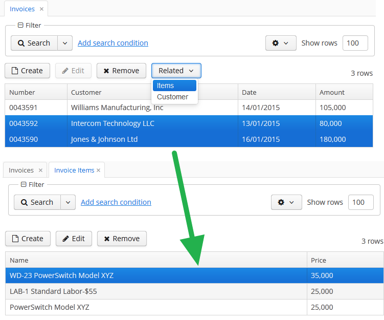
The platform provides an API for opening related entities screens without the RelatedEntities component: the RelatedEntitiesAPI interface and its implementation RelatedEntitiesBean. The logic is defined with the openRelatedScreen() method which takes the collection of entities from one side of relation, MetaClass of single entity from this collection, and a chosen field to find related entities.
<button id="related"
caption="Related customer"/>@UiController("sales_Order.browse")
@UiDescriptor("order-browse.xml")
@LookupComponent("ordersTable")
@LoadDataBeforeShow
public class OrderBrowse extends StandardLookup<Order> {
@Inject
private RelatedEntitiesAPI relatedEntitiesAPI;
@Inject
private GroupTable<Order> ordersTable;
@Subscribe("related")
protected void onRelatedClick(Button.ClickEvent event) {
relatedEntitiesAPI.openRelatedScreen(ordersTable.getSelected(), Order.class, "customer");
}
}By default, the standard entity browser screen is opened. Optionally you can add a RelatedScreenDescriptor parameter to make the method open another screen or open it with parameters. The RelatedScreenDescriptor is a POJO which can store the screen identifier (String), open type (WindowManager.OpenType), filter caption (String), and screen params (Map<String, Object>).
relatedEntitiesAPI.openRelatedScreen(ordersTable.getSelected(),
Order.class, "customer",
new RelatedEntitiesAPI.RelatedScreenDescriptor("sales_Customer.lookup", WindowManager.OpenType.DIALOG));- Attributes of relatedEntities
-
align - caption - captionAsHtml - css - description - descriptionAsHtml - enable - exclude - box.expandRatio - for - htmlSanitizerEnabled - icon - id - openType - stylename - tabIndex - visible - width
- Attributes of property
-
caption - filterCaption - name - screen
3.5.2.1.37. ResizableTextArea
ResizableTextArea is a multi-line text editor field with the ability to change the size.
XML-name of the component: resizableTextArea.
ResizableTextArea mostly replicates the functionality of the TextArea component and has the following specific attributes:
-
resizableDirection– defines the way a user can change the size of the component unless the percentage size is set for the component.<resizableTextArea id="textArea" resizableDirection="BOTH"/>
There are four resize modes available:
-
BOTH– the component is resizable in both directions.BOTHis the default value. The component is not resizable if the percentage size is set for the component. -
NONE– the component can not be resized. -
VERTICAL– the component is resizable only vertically. The component can not be resized vertically if the percentage size is set for the component. -
HORIZONTAL– the component is resizable only horizontally. The component can not be resized horizontally if the percentage width is set for the component.
The area size change events can be tracked using the
ResizeListenerinterface. For example:resizableTextArea.addResizeListener(resizeEvent -> notifications.create() .withCaption("Resized") .show()); -
- Attributes of resizableTextArea
-
align - caption - captionAsHtml - caseConversion - cols - contextHelpText - contextHelpTextHtmlEnabled - css - dataContainer - datatype - description - descriptionAsHtml - editable - enable - box.expandRatio - height - htmlSanitizerEnabled - icon - id - inputPrompt - maxLength - property - required - requiredMessage - responsive - rows - settingsEnabled - stylename - tabIndex - textChangeEventMode - textChangeTimeout - trim - visible - width - wordWrap
- Predefined styles of resizableTextArea
-
align-center - align-right - borderless - huge - large - small - tiny
- API
-
addResizeListener - addTextChangeListener - addValueChangeListener - addValidator - applySettings - commit - discard - isModified - saveSettings - setContextHelpIconClickHandler
3.5.2.1.38. RichTextArea
This is a text area to display and enter formatted text.
XML name of the component: richTextArea
RichTextArea is implemented only for Web Client.
Basically, RichTextArea mirrors the functionality of TextField, except that you cannot set datatype for it. So, RichTextArea is intended for work only with text and entity attributes of type String.
RichTextArea is also used to input and output HTML string. If the htmlSanitizerEnabled attribute is set to true, then the RichTextArea value will be sanitized.
protected static final String UNSAFE_HTML = "<i>Jackdaws </i><u>love</u> <font size=\"javascript:alert(1)\" " +
"color=\"moccasin\">my</font> " +
"<font size=\"7\">big</font> <sup>sphinx</sup> " +
"<font face=\"Verdana\">of</font> <span style=\"background-color: " +
"red;\">quartz</span><svg/onload=alert(\"XSS\")>";
@Inject
private RichTextArea richTextArea;
@Subscribe
public void onInit(InitEvent event) {
richTextAreasetHtmlSanitizerEnabled(true);
richTextArea.setValue(UNSAFE_HTML);
}The htmlSanitizerEnabled attribute overrides the value of global cuba.web.htmlSanitizerEnabled configuration property.
- Attributes of richTextArea
-
align - caption - captionAsHtml - contextHelpText - contextHelpTextHtmlEnabled - css - dataContainer - description - descriptionAsHtml - editable - enable - box.expandRatio - height - htmlSanitizerEnabled - icon - id - property - required - requiredMessage - stylename - tabIndex - visible - width
- API
3.5.2.1.39. SearchPickerField
The SearchPickerField component is used to search for entity instances according to the entered string. A user should enter a few characters and press Enter. If several matches have been found, all of them will be displayed in a drop-down list. If only one instance matches the search query, it immediately becomes a component value. SearchPickerField also enables performing actions by clicking on buttons on the right.
|
|
XML name of the component: searchPickerField.
-
To use
SearchPickerFieldcomponent, you need to create collectionDatasource and specify a query, which contains corresponding search conditions. Condition must contain a parameter namedcustom$searchString. This parameter will be populated with a substring entered by the user. A data source with a search condition should be defined in the optionsDatasource attribute of the component. For example:<dsContext> <datasource id="carDs" class="com.company.sample.entity.Car" view="_local"/> <collectionDatasource id="colorsDs" class="com.company.sample.entity.Color" view="_local"> <query> select c from sample_Color c where c.name like :(?i)custom$searchString </query> </collectionDatasource> </dsContext> <layout> <searchPickerField datasource="carDs" property="color" optionsDatasource="colorsDs"/> </layout>In this case, the component will look for instances of
Colourentity according to the occurrence of the substring in itsnameattribute. The(?i)prefix is used for case-insensitive search (see Case-Insensitive Search for a Substring). The selected value will be set in thecolourattribute of theCarentity located in thecarDsdatasource.The
escapeValueForLikeattribute set totrueenables searching for the values that contain special symbols%,\, and_using like-clauses. In order to useescapeValueForLike = true, modify the query of the collection data source adding the escape value to it:select c from ref_Colour c where c.name like :(?i)custom$searchString or c.description like :(?i)custom$searchString escape '\'The
escapeValueForLikeattribute works for all databases except HSQLDB.
-
Using the
minSearchStringLengthattribute the minimum number of characters, which the user should enter to search for values, can be defined. -
In the screen controller, two component methods can be implemented that will be invoked:
-
If the number of entered characters is less than the value of
minSearchStringLengthattribute. -
If the search of characters entered by the user has returned no results.
Below is an example of implementing methods to display messages to the user:
@Inject private Notifications notifications; @Inject private SearchPickerField colorField; @Subscribe protected void onInit(InitEvent event) { colorField.setSearchNotifications(new SearchField.SearchNotifications() { @Override public void notFoundSuggestions(String filterString) { notifications.create() .withCaption("No colors found for search string: " + filterString) .withType(Notifications.NotificationType.TRAY) .show(); } @Override public void needMinSearchStringLength(String filterString, int minSearchStringLength) { notifications.create() .withCaption("Minimum length of search string is " + minSearchStringLength) .withType(Notifications.NotificationType.TRAY) .show(); } }); } -
-
SearchPickerFieldimplements LookupField and PickerField interfaces. Thus, it inherits the same functionality except the default list of actions added when defining the component in XML: forSearchPickerFieldthese arelookup and open actions.
- Attributes of searchPickerField
-
align - caption - captionAsHtml - captionProperty - contextHelpText - contextHelpTextHtmlEnabled - css - datasource - description - descriptionAsHtml - editable - enable - escapeValueForLike - box.expandRatio - filterMode - height - htmlSanitizerEnabled - icon - id - inputPrompt - metaClass - minSearchStringLength - newOptionAllowed - newOptionHandler - nullName - optionsDatasource - property - required - requiredMessage - stylename - tabIndex - visible - width
- Elements of searchPickerField
- Predefined styles of searchPickerField
- API
-
addValueChangeListener - setContextHelpIconClickHandler - setOptionCaptionProvider - setOptionImageProvider - setPopupWidth
3.5.2.1.40. SideMenu
SideMenu component provides means of customizing the main window layout, managing menu items, adding icons and badges and applying custom styles.
It can also be used in any screen as any other visual component.
XML name of the component: sideMenu.
An example of component definition in an XML-descriptor of a screen:
<sideMenu id="sideMenu"
width="100%"
selectOnClick="true"/>CUBA Studio provides the screen template for main window with the sideMenu component and predefined styles within the side panel:
<layout>
<hbox id="horizontalWrap"
expand="workArea"
height="100%"
stylename="c-sidemenu-layout"
width="100%">
<vbox id="sideMenuPanel"
expand="sideMenu"
height="100%"
margin="false,false,true,false"
spacing="true"
stylename="c-sidemenu-panel"
width="250px">
<hbox id="appTitleBox"
spacing="true"
stylename="c-sidemenu-title"
width="100%">
<label id="appTitleLabel"
align="MIDDLE_CENTER"
value="mainMsg://application.logoLabel"/>
</hbox>
<embedded id="logoImage"
align="MIDDLE_CENTER"
stylename="c-app-icon"
type="IMAGE"/>
<hbox id="userInfoBox"
align="MIDDLE_CENTER"
expand="userIndicator"
margin="true"
spacing="true"
width="100%">
<userIndicator id="userIndicator"
align="MIDDLE_CENTER"/>
<newWindowButton id="newWindowButton"
description="mainMsg://newWindowBtnDescription"
icon="app/images/new-window.png"/>
<logoutButton id="logoutButton"
description="mainMsg://logoutBtnDescription"
icon="app/images/exit.png"/>
</hbox>
<sideMenu id="sideMenu"
width="100%"/>
<ftsField id="ftsField"
width="100%"/>
</vbox>
<workArea id="workArea"
height="100%">
<initialLayout margin="true"
spacing="true">
<label id="welcomeLabel"
align="MIDDLE_CENTER"
stylename="c-welcome-text"
value="mainMsg://application.welcomeText"/>
</initialLayout>
</workArea>
</hbox>
</layout>sideMenu attributes:
-
The
selectOnClickattribute, when set totrue, highlights the selected menu item on mouse click. The default value isfalse.
Methods of the SideMenu interface:
-
createMenuItem- creates new menu item, but does not add this item to menu.Idmust be unique for whole menu.
-
addMenuItem- adds menu item to the menu.
-
removeMenuItem- removes menu item from the items list. -
getMenuItem- returns menu item from the menu tree by itsid. -
hasMenuItems- returnstrueif the menu has items.
SideMenu component is used to display menu items. The MenuItem API enables creating menu items in the screen controller. The methods below can be used for dynamic update of menu items depending on the application business logic. The example of adding a menu item programmatically:
SideMenu.MenuItem item = sideMenu.createMenuItem("special");
item.setCaption("Daily offer");
item.setBadgeText("New");
item.setIconFromSet(CubaIcon.GIFT);
sideMenu.addMenuItem(item,0);
Methods of the MenuItem interface:
-
setCaption- sets item caption.
-
setCaptionAsHtml- enables or disables HTML mode for caption.
-
setBadgeText- sets badge text for the item. Badges are shown as small widget on the right side of menu items, for example:int count = 5; SideMenu.MenuItem item = sideMenu.createMenuItem("count"); item.setCaption("Messages"); item.setBadgeText(count + " new"); item.setIconFromSet(CubaIcon.ENVELOPE); sideMenu.addMenuItem(item,0);
The badge text can be dynamically updated with the help of the Timer component:
public void updateCounters(Timer source) { sideMenu.getMenuItemNN("sales") .setBadgeText(String.valueOf(LocalTime.MIDNIGHT.minusSeconds(timerCounter-source.getDelay()))); timerCounter++; }
-
setIcon- sets menu icon.
-
setCommand- sets item command, or the action to be performed on this menu item click.
-
addChildItem/removeChildItem- adds/removes menu item to the children list.
-
setExpanded- expands or collapses sub-menu with children by default.
-
setStyleName- sets one or more user-defined style names of the component, replacing any previous user-defined styles. Multiple styles can be specified as a space-separated list of style names. The style names must be valid CSS class names.The standard
sideMenutemplate includes several predefined styles:c-sidemenu-layout,c-sidemenu-panelandc-sidemenu-title. The defaultc-sidemenustyle is supported in theHaloandHoverthemes and their extensions.
-
setTestId- setscuba-idvalue for UI testing.
The appearance of the SideMenu component can be customized using SCSS variables with $cuba-sidemenu-* and $cuba-responsive-sidemenu-* prefixes. You can change these variables in the visual editor after creating a theme extension or a custom theme.
- Attributes of sideMenu
-
align - caption - css - description - enable - height - icon - id - selectOnClick - stylename - tabIndex - visible - width
- Attributes of ftsfield
-
align - caption - description - enable - height - icon - id - stylename - visible - width
- API of sideMenu
- API of menuItem
-
addChildItem - removeChildItem - setBadgeText - setCaption - setCaptionAsHtml - setCommand - setExpanded - setIcon - setStyleName - setTestId
3.5.2.1.41. Slider
Slider is a vertical or horizontal bar. It allows setting a numeric value within a defined range by dragging a bar handle with the mouse. The value is shown when dragging the handle.

XML name of the component: slider.
The default data type of the slider is double.You can set the numeric data type for the component such as int, long, double, and decimal using the datatype attribute. It can be declared in the XML descriptor or using the API.
To create a slider connected to data use the dataContainer and property attributes. In this case, the data type will be determined from the entity attribute contained in the property.
In the example, the data type of the slider will be set as the data type of the amount attribute of the Order entity.
<data>
<instance id="orderDc" class="com.company.sales.entity.Order" view="_local">
<loader/>
</instance>
</data>
<layout>
<slider dataContainer="orderDc" property="amount"/>
</layout>The slider component has the following specific attributes:
-
max- the maximum value of the slider range. The default is 100.
-
min- the minimum value of the slider range. The default is 0.
-
resolution- a number of digits after the decimal point. The default is 0.
-
orientation- horizontal or vertical placement of the slider. The default is horizontal.
-
updateValueOnClick- if set totrue, the value of the slider can be updated by clicking on the bar. The default isfalse.
Here is an example of a slider that is placed vertically with the integer data type and the range of values from 2 to 20.
<slider id="slider"
orientation="vertical"
datatype="int"
min="2"
max="20"/>The value can be retrieved using getValue() method and set using setValue().
To track changes of the slider value, as well as of any other components implementing the Field interface, use the ValueChangeListener and subscribe to the corresponding event. In the example below the value of the Slider is written into TextField if the value is changed.
@Inject
private TextField<Integer> textField;
@Subscribe("slider")
private void onSliderValueChange(HasValue.ValueChangeEvent<Integer> event) {
textField.setValue(event.getValue());
}- Attributes of slider
-
align - caption - captionAsHtml - colspan - contextHelpText - contextHelpTextHtmlEnabled - css - dataContainer - datatype - description - descriptionAsHtml - enable - box.expandRatio - height - htmlSanitizerEnabled - icon - id - max - min - orientation - property - requiredMessage - resolution - responsive - required - rowspan - stylename - updateValueOnClick - visible - width
- API
3.5.2.1.42. SourceCodeEditor
SourceCodeEditor is designed to display and enter source code. It is a multi-line text area featured with code highlighting and optional print margin and gutter with line numbers.
XML-name of the component: sourceCodeEditor.
SourceCodeEditor is implemented for Web Client.
Basically, SourceCodeEditor mostly replicates the functionality of the TextField component and has the following specific attributes:
-
if
handleTabKeyistrue, the Tab button on the keyboard is handled to indent lines, whenfalse, it is used to advance the cursor or focus to the next tab stop. This attribute should be set when the screen is initialized and will not work if changed at a runtime.
All following properties can be easily changed at a runtime:
-
highlightActiveLineis used to highlight the line the caret is on.
-
modeprovides the list of languages supported for the syntax highlight. This list is defined in theModeenumeration of theSourceCodeEditorinterface and includes the following languages: Java, HTML, XML, Groovy, SQL, JavaScript, Properties, and Text with no highlight.
-
printMarginattribute sets if the printing edge line should be displayed or hidden.
-
showGutteris used to hide or show the left gutter with line numbers.
Below is an example of SourceCodeEditor component adjustable at a runtime.
XML-descriptor:
<hbox spacing="true">
<checkBox id="highlightActiveLineCheck" align="BOTTOM_LEFT" caption="Highlight Active Line"/>
<checkBox id="printMarginCheck" align="BOTTOM_LEFT" caption="Print Margin"/>
<checkBox id="showGutterCheck" align="BOTTOM_LEFT" caption="Show Gutter"/>
<lookupField id="modeField" align="BOTTOM_LEFT" caption="Mode" required="true"/>
</hbox>
<sourceCodeEditor id="simpleCodeEditor" width="100%"/>The controller:
@Inject
private CheckBox highlightActiveLineCheck;
@Inject
private LookupField<HighlightMode> modeField;
@Inject
private CheckBox printMarginCheck;
@Inject
private CheckBox showGutterCheck;
@Inject
private SourceCodeEditor simpleCodeEditor;
@Subscribe
protected void onInit(InitEvent event) {
highlightActiveLineCheck.setValue(simpleCodeEditor.isHighlightActiveLine());
highlightActiveLineCheck.addValueChangeListener(e ->
simpleCodeEditor.setHighlightActiveLine(Boolean.TRUE.equals(e.getValue())));
printMarginCheck.setValue(simpleCodeEditor.isShowPrintMargin());
printMarginCheck.addValueChangeListener(e ->
simpleCodeEditor.setShowPrintMargin(Boolean.TRUE.equals(e.getValue())));
showGutterCheck.setValue(simpleCodeEditor.isShowGutter());
showGutterCheck.addValueChangeListener(e ->
simpleCodeEditor.setShowGutter(Boolean.TRUE.equals(e.getValue())));
Map<String, HighlightMode> modes = new HashMap<>();
for (HighlightMode mode : SourceCodeEditor.Mode.values()) {
modes.put(mode.toString(), mode);
}
modeField.setOptionsMap(modes);
modeField.setValue(HighlightMode.TEXT);
modeField.addValueChangeListener(e ->
simpleCodeEditor.setMode(e.getValue()));
}The result will be:
SourceCodeEditor can also support code autocomplete provided by the Suggester class. To activate word completion, the setSuggester method should be invoked, for example:
@Inject
protected DataGrid<User> usersGrid;
@Inject
private SourceCodeEditor suggesterCodeEditor;
@Inject
private CollectionContainer<User> usersDc;
@Inject
private CollectionLoader<User> usersDl;
@Subscribe
protected void onInit(InitEvent event) {
suggesterCodeEditor.setSuggester((source, text, cursorPosition) -> {
List<Suggestion> suggestions = new ArrayList<>();
usersDl.load();
for (User user : usersDc.getItems()) {
suggestions.add(new Suggestion(source, user.getLogin(), user.getName(), null, -1, -1));
}
return suggestions;
});
}The result:
Ctrl+Space or pressed dot invokes suggestions. To disable code autocomplete after pressing a dot, set the suggestOnDot attribute in false. The default value of this option is true.
<sourceCodeEditor id="simpleCodeEditor" width="100%" suggestOnDot="false"/>The appearance of the SourceCodeEditor component can be customized using SCSS variables with $cuba-sourcecodeeditor-* prefix. You can change these variables in the visual editor after creating a theme extension or a custom theme.
- Attributes of sourceCodeEditor
-
align - caption - captionAsHtml - colspan - contextHelpText - contextHelpTextHtmlEnabled - css - dataContainer - description - descriptionAsHtml - editable - enable - box.expandRatio - handleTabKey - height - htmlSanitizerEnabled - highlightActiveLine - icon - id - mode - printMargin - property - required - requiredMessage - rowspan - suggestOnDot - showGutter - stylename - tabIndex - visible - width
- API
3.5.2.1.43. SuggestionField
The SuggestionField component is designed to search for certain values according to a string entered by a user. It differs from SuggestionPickerField in that it can use any types of options: for instance, entities, strings, or enum values, and does not have action buttons. The list of options is loaded in background according to the logic defined by the application developer on the server side.
XML name of the component: suggestionField.
suggestionField attributes:
-
asyncSearchDelayMs- sets the delay between the last key press action and asynchronous search.
-
minSearchStringLength- sets the minimal string length which is required to perform suggestions search.
-
popupWidth- sets the width of the suggestion popup.Possible options:
-
auto- the popup width will be equal to the maximum width of suggestions, -
parent- the popup width will be equal to the width of main component, -
absolute (e.g.
"170px") or relative (e.g."50%") value.
-
-
suggestionsLimit- sets the limit of suggestions to be displayed.
suggestionField elements:
-
query- an optional element which enables defining a query for selecting suggested values. Thequeryelement, in turn, has the following attributes:-
entityClass(required) - full qualified name of entity class.
-
view- optional attribute that specifies the view to be used for loading the queried entity.
-
escapeValueForLike- enables searching for the values that contain special symbols:%,\, etc. Default value isfalse.
-
searchStringFormat- a Groovy string, thus you can use any valid Groovy-string expressions.
<suggestionField id="suggestionField" captionProperty="login"> <query entityClass="com.haulmont.cuba.security.entity.User" escapeValueForLike="true" view="user.edit" searchStringFormat="%$searchString%"> select e from sec$User e where e.login like :searchString escape '\' </query> </suggestionField>If the query is not defined, the list of options must be provided by
SearchExecutor, assigned programmatically (see below). -
In the most common case, it is sufficient to set SearchExecutor to the component. SearchExecutor is a functional interface that contains a single method: List<E> search(String searchString, Map<String, Object> searchParams):
suggestionField.setSearchExecutor((searchString, searchParams) -> {
return Arrays.asList(entity1, entity2, ...);
});SearchExecutor can return any types of options, for example, entities, strings, or enum values.
-
Entities:
customersDs.refresh();
List<Customer> customers = new ArrayList<>(customersDs.getItems());
suggestionField.setSearchExecutor((searchString, searchParams) ->
customers.stream()
.filter(customer -> StringUtils.containsIgnoreCase(customer.getName(), searchString))
.collect(Collectors.toList()));-
Strings:
List<String> strings = Arrays.asList("Red", "Green", "Blue", "Cyan", "Magenta", "Yellow");
stringSuggestionField.setSearchExecutor((searchString, searchParams) ->
strings.stream()
.filter(str -> StringUtils.containsIgnoreCase(str, searchString))
.collect(Collectors.toList()));-
Enum:
List<SendingStatus> enums = Arrays.asList(SendingStatus.values());
enumSuggestionField.setSearchExecutor((searchString, searchParams) ->
enums.stream()
.map(sendingStatus -> messages.getMessage(sendingStatus))
.filter(str -> StringUtils.containsIgnoreCase(str, searchString))
.collect(Collectors.toList()));-
OptionWrapperclass is used when you need to separate a value of any type and its string representation:
List<OptionWrapper> wrappers = Arrays.asList(
new OptionWrapper("One", 1),
new OptionWrapper("Two", 2),
new OptionWrapper("Three", 3);
suggestionField.setSearchExecutor((searchString, searchParams) ->
wrappers.stream()
.filter(optionWrapper -> StringUtils.containsIgnoreCase(optionWrapper.getCaption(), searchString))
.collect(Collectors.toList()));|
The |
The searchString parameter can be used to filter candidates using the string entered by the user. You can use the escapeForLike() method to search for the values that contain special symbols:
suggestionField.setSearchExecutor((searchString, searchParams) -> {
searchString = QueryUtils.escapeForLike(searchString);
return dataManager.loadList(LoadContext.create(Customer.class).setQuery(
LoadContext.createQuery("select c from sample_Customer c where c.name like :name order by c.name escape '\\'")
.setParameter("name", "%" + searchString + "%")));
});-
OptionsStyleProviderenables you to use separate style names for the suggested options displayed bysuggestionField:suggestionField.setOptionsStyleProvider((field, item) -> { User user = (User) item; switch (user.getGroup().getName()) { case "Company": return "company"; case "Premium": return "premium"; default: return "company"; } });
The appearance of the SuggestionField component can be customized using SCSS variables with $cuba-suggestionfield-* prefix. You can change these variables in the visual editor after creating a theme extension or a custom theme.
- Attributes of suggestionField
-
align - asyncSearchDelayMs - caption - captionAsHtml - captionProperty - colspan - contextHelpText - contextHelpTextHtmlEnabled - css - dataContainer - description - descriptionAsHtml - editable - enable - box.expandRatio - height - htmlSanitizerEnabled - icon - id - inputPrompt - minSearchStringLength - popupWidth - property - required - requiredMessage - responsive - rowspan - stylename - suggestionsLimit - tabIndex - visible - width
- Elements of suggestionField
- Attributes of query
-
entityClass - escapeValueForLike - searchStringFormat - view
- Predefined styles of suggestionField
- API
-
addValueChangeListener - setContextHelpIconClickHandler - setOptionCaptionProvider - setOptionsStyleProvider
3.5.2.1.44. SuggestionPickerField
The SuggestionPickerField component is designed to search for entity instances according to a string entered by a user. It differs from SearchPickerField in that it refreshes the list of options on each entered symbol without the need to press Enter. The list of options is loaded in background according to the logic defined by the application developer on the server side.
SuggestionPickerField is also a PickerField and can contain actions represented by buttons on the right.
XML name of the component: suggestionPickerField.
SuggestionPickerField is used to select reference entity attributes, so you usually set its dataContainer and property attributes:
<data>
<instance id="orderDc"
class="com.company.sales.entity.Order"
view="order-with-customer">
<loader id="orderDl"/>
</instance>
</data>
<layout>
<suggestionPickerField id="suggestionPickerField"
captionProperty="name"
dataContainer="orderDc"
property="customer"/>
</layout>suggestionPickerField attributes:
-
asyncSearchDelayMs- sets the delay between the last key press action and asynchronous search.
-
metaClass- sets the link to the component’sMetaClassif the component is used without binding to a data component, i.e., without setting dataContainer and property.
-
minSearchStringLength- sets the minimal string length which is required to perform suggestions search.
-
popupWidth- sets the width of the suggestion popup.Possible options:
-
auto- the popup width will be equal to the maximum width of suggestions, -
parent- the popup width will be equal to the width of main component, -
absolute (e.g.
"170px") or relative (e.g."50%") value.
-
-
suggestionsLimit- sets the limit of suggestions to be displayed.
|
The appearance of |
suggestionPickerField elements:
-
actions- an optional element describing the actions related to the component. In addition to custom arbitrary actions,suggestionPickerFieldsupports the following standard PickerField actions:picker_lookup,picker_clear,picker_open.
- Base SuggestionPickerField usage
-
In the most common case, it is sufficient to set
SearchExecutorto the component.SearchExecutoris a functional interface that contains a single method:List<E extends Entity> search(String searchString, Map<String, Object> searchParams):suggestionPickerField.setSearchExecutor((searchString, searchParams) -> { return Arrays.asList(entity1, entity2, ...); });The
search()method is executed in a background thread so it cannot access visual or data components. Call DataManager or a middleware service directly; or process and return data loaded to the screen beforehand.The
searchStringparameter can be used to filter candidates using the string entered by the user. You can use theescapeForLike()method to search for the values that contain special symbols:suggestionPickerField.setSearchExecutor((searchString, searchParams) -> { searchString = QueryUtils.escapeForLike(searchString); return dataManager.load(Customer.class) .query("e.name like ?1 order by e.name escape '\\'", "%" + searchString + "%") .list(); });
- ParametrizedSearchExecutor usage
-
In the previous examples,
searchParamsis an empty map. To define params, you should useParametrizedSearchExecutor:suggestionPickerField.setSearchExecutor(new SuggestionField.ParametrizedSearchExecutor<Customer>(){ @Override public Map<String, Object> getParams() { return ParamsMap.of(...); } @Override public List<Customer> search(String searchString, Map<String, Object> searchParams) { return executeSearch(searchString, searchParams); } });
- EnterActionHandler and ArrowDownActionHandler usage
-
Another way to use the component is to set
EnterActionHandlerorArrowDownActionHandler. These listeners are fired when a user presses Enter or Arrow Down keys when the popup with suggestions is hidden. They are also functional interfaces with single method and single parameter -currentSearchString. You can set up your own action handlers and useSuggestionField.showSuggestions()method which accepts the list of entities to show suggestions.suggestionPickerField.setArrowDownActionHandler(currentSearchString -> { List<Customer> suggestions = findSuggestions(); suggestionPickerField.showSuggestions(suggestions); }); suggestionPickerField.setEnterActionHandler(currentSearchString -> { List<Customer> suggestions = getDefaultSuggestions(); suggestionPickerField.showSuggestions(suggestions); });
- Attributes of suggestionPickerField
-
align - asyncSearchDelayMs - caption - captionAsHtml - captionProperty - colspan - contextHelpText - contextHelpTextHtmlEnabled - css - dataContainer - description - descriptionAsHtml - editable - enable - box.expandRatio - height - htmlSanitizerEnabled - icon - id - inputPrompt - metaClass - minSearchStringLength - popupWidth - property - required - requiredMessage - responsive - rowspan - stylename - suggestionsLimit - tabIndex - visible - width
- Elements of suggestionPickerField
- Predefined styles of suggestionPickerField
- API
-
addValueChangeListener - setContextHelpIconClickHandler - setOptionCaptionProvider - setOptionIconProvider - setOptionsStyleProvider
3.5.2.1.45. Table
In this section:
The Table component presents information in a table view, sorts data, manages table columns and headers and invokes actions for selected rows.
XML-name of the component: table
An example of component definition in an XML-descriptor of a screen:
<data readOnly="true">
<collection id="ordersDc" class="com.company.sales.entity.Order" view="order-with-customer">
<loader id="ordersDl">
<query>
<![CDATA[select e from sales_Order e]]>
</query>
</loader>
</collection>
</data>
<layout>
<table id="ordersTable" dataContainer="ordersDc" width="100%">
<columns>
<column id="date"/>
<column id="amount"/>
<column id="customer"/>
</columns>
<rowsCount/>
</table>
</layout>In the example, the data element defines the collection container, which selects Order entities using JPQL query. The table element defines the data container, while columns element defines which entity attributes are used as table columns.
If you need to define a data source programmatically in the screen controller, use the metaClass attribute in XML instead of declarative setting a dataContainer.
table elements
-
rows– a required element if the datasource attribute is used for data binding.Each row can have an icon in an additional column on the left. Create an implementation of the
ListComponent.IconProviderinterface in the screen controller and set it for the table:@Inject private Table<Customer> table; @Subscribe protected void onInit(InitEvent event) { table.setIconProvider(new ListComponent.IconProvider<Customer>() { @Nullable @Override public String getItemIcon(Customer entity) { CustomerGrade grade = entity.getGrade(); switch (grade) { case PREMIUM: return "icons/premium_grade.png"; case HIGH: return "icons/high_grade.png"; case MEDIUM: return "icons/medium_grade.png"; default: return null; } } }); }
-
columns– an element defining the set of columns for a table. If not specified, columns will be automatically determined from the attributes from the view that is defined in dataContainer. Elementcolumnshas the following attributes:-
includeAll– load all the attributes from the view that is defined in dataContainer.In the example below, we will show all the attributes from the view used in the
customersDc. If the view contains system properties, they will be shown too.<table id="table" width="100%" height="100%" dataContainer="customersDc"> <columns includeAll="true"/> </table>If the view of the entity contains a reference attribute, this attribute will be displayed according to its instance name. If you want to show a specific attribute, it must be defined in the view as well as in the
columnelement:<columns includeAll="true"> <column id="address.street"/> </columns>If no view is specified,
includeAllattribute will load all the attributes from a given entity and its ancestors.
-
exclude– comma-separated list of attributes that should not be loaded to the table.In the example below, we will show all the attributes excluding
nameandorder:<table id="table" width="100%" height="100%" dataContainer="customersDc"> <columns includeAll="true" exclude="name, order"/> </table>
Each column is described in a nested
columnelement with the following attributes:-
id− a mandatory attribute, contains the name of an entity attribute displayed in the column. Can be either an attribute of the entity from the data container or a linked entity – object graph traversal is indicated with a dot. For example:<columns> <column id="date"/> <column id="customer"/> <column id="customer.name"/> <column id="customer.address.country"/> </columns>
-
caption− an optional attribute containing the column caption. If not specified, a localized attribute name will be displayed.
-
captionAsHtml− an optional attribute defining whether HTML tags can be used in the column caption. Default value isfalse.<column id="name" caption="msg://role.name" captionAsHtml="true"/>role.name=<em>Name</em>
-
collapsed− an optional attribute; hides the column by default when set totrue. Users can control column’s visibility using the menu available via a button in the top right part of the table when the table’s
 columnControlVisibleattribute is notfalse. By default,collapsedisfalse.
-
expandRatio− an optional attribute that specifies the expand ratio for each column. The ratio must be greater than or equal to 0. If some value is set for at least one column, all implicit values are ignored, and only explicitly assigned values are considered. If you set width andexpandRatioattributes simultaneously, it will cause an error in the application.
-
width− an optional attribute controlling default column width. May contain only numeric values in pixels.
-
align− an optional attribute that sets text alignment of column cells. Possible values:LEFT,RIGHT,CENTER. Default isLEFT.
-
editable− an optional attribute allowing editing of the corresponding column in the table. In order for a column to be editable, the editable attribute of the entire table should be set totrueas well. Changing this property at runtime is not supported.
-
sortable− an optional attribute to disable sorting of the column. Takes effect if the whole table has sortable attribute set totrue(which is by default).
-
sort− an optional attribute allowing to set the initial sorting of the table by the specified column according to the sort direction. Possible values:-
ASCENDING– ascending (e.g., A-Z, 1..9) sort order. -
DESCENDING– descending (e.g., Z-A, 9..1) sort order.
<columns> <column property="name" sort="DESCENDING"/> </columns> -
Pay attention: if the settingsEnabled attribute is
true, the table can be sorted according to the user settings.Only one column can be sorted at the same time. So, the example below:
<columns> <column property="name" sort="DESCENDING"/> <column property="parent" sort="ASCENDING"/> </columns>raises an exception.
Also, if you set
sortandsortable="false"attributes simultaneously for the column, it will cause an error in the application.-
maxTextLength– an optional attribute allowing to limit the number of characters in a cell. If the difference between the actual and the maximum allowed number of characters does not exceed the 10 character threshold, the "extra" characters remain unhidden. To see the entire record, users need to click on its visible part. An example of a column with a 10 character limitation:
-
link- if set totrue, enables displaying a link to an entity editor in a table column (supported for Web Client only). Thelinkattribute may be set to true for primitive type columns, too; in this case, the main entity editor will be opened. This approach may be used to simplify navigation: the users will be able to open entity editors simply by clicking on some key attributes.
-
linkScreen- contains the identifier of the screen that is opened by clicking the link enabled in thelinkattribute.
-
linkScreenOpenType- sets the screen opening mode (THIS_TAB,NEW_TABorDIALOG).
-
linkInvoke- invokes the controller method instead of opening the screen.@Inject private Notifications notifications; public void linkedMethod(Entity item, String columnId) { Customer customer = (Customer) item; notifications.create() .withCaption(customer.getName()) .show(); }
-
captionProperty- the name of an entity attribute which should be shown in the column instead of specified by id. For example, if you have a reference to thePriorityentity with thenameandorderNoattributes, you can define the following column:<column id="priority.orderNo" captionProperty="priority.name" caption="msg://priority" />In this case, the column will display the priority name, but the sorting of the column will be done by the priority order.
-
an optional
generatorattribute contains the link to a method in the screen controller that creates a visual component to be shown in table cells:<columns> <column id="name"/> <column id="imageFile" generator="generateImageFileCell"/> </columns>public Component generateImageFileCell(Employee entity){ Image image = uiComponents.create(Image.NAME); image.setSource(FileDescriptorResource.class).setFileDescriptor(entity.getImageFile()); return image; }It can be used instead of providing an implementation of
Table.ColumnGeneratorto the addGeneratedColumn() method. -
columnelement may contain a nested formatter element that allows you to represent the attribute value in a format different from the standard for this Datatype:<column id="date"> <formatter class="com.haulmont.cuba.gui.components.formatters.DateFormatter" format="yyyy-MM-dd HH:mm:ss" useUserTimezone="true"/> </column>
-
-
rowsCount− an optional element adding theRowsCountcomponent for the table; this component enables loading the table data in pages. Page size can be defined by limiting the number of records in the data container using the loader’ssetMaxResults()method. Typically, this is performed by a Filter component linked to the table’s data loader. However, if there is no generic filter, this method can be called directly from the screen controller.RowsCountcomponent can also show the total number of records returned by the current query from the container without extracting the records themselves. It invokescom.haulmont.cuba.core.global.DataManager#getCountwhen user clicks the ? icon, which results in performing a database query with the same conditions as the current query, but using aCOUNT(*)aggregate function instead. The number retrieved is displayed instead of the ? icon.The
autoLoadattribute of theRowsCountcomponent set totrueenables loading rows count automatically. It can be set in the XML descriptor:<rowsCount autoLoad="true"/>Also, this behavior can be enabled or disabled via
RowsCountAPI in the screen controller:boolean autoLoadEnabled = rowsCount.getAutoLoad(); rowsCount.setAutoLoad(false);
-
actions− an optional element describing the actions, related to the table. In addition to custom arbitrary actions, the element supports the following standard actions, defined in thecom.haulmont.cuba.gui.actions.listpackage:create,edit,remove,refresh,add,exclude,excel.
table attributes
-
emptyStateMessageattribute enables to set the message when no data is loaded, null items are set, or empty container is used. This attribute is often used together with the emptyStateLinkMessage attribute. The message should contain information about why the table is empty. For example:<table id="table" emptyStateMessage="No data added to the table" ... width="100%">emptyStateMessageattribute supports loading message from the message pack. If you don’t want to show a message, just do not specify this attribute.
-
emptyStateLinkMessageattribute enables to set the link message when no data is loaded, null items are set, or empty container is used. This attribute is often used together with the emptyStateMessage attribute. The message should describe the action that needs to be performed to fill the table. For example:<table id="table" emptyStateMessage="No data added to the table" emptyStateLinkMessage="Add data (Ctrl+\)" ... width="100%">
emptyStateLinkMessageattribute supports loading message from the message pack. If you don’t want to show a message, just do not specify this attribute.In order to handle click on the link message you can use the setEmptyStateLinkClickHandler or subscribe to the corresponding event:
@Install(to = "customersTable", subject = "emptyStateLinkClickHandler") private void customersTableEmptyStateLinkClickHandler(Table.EmptyStateClickEvent<Customer> emptyStateClickEvent) { screenBuilders.editor(emptyStateClickEvent.getSource()) .newEntity() .show(); }
-
multiselectattribute enables setting multiple selection mode for table rows. Ifmultiselectistrue, users can select multiple rows in the table using keyboard or mouse holding Ctrl or Shift keys. By default, multiple selection mode is switched off.
-
sortableattribute enables sorting data in the table. By default, it is set totrue. If sorting is allowed, clicking a column header will show a /
/ icon to the right of the column name. You can disable sorting for a particular column by using its sortable attribute.
Table sorting can be performed differently depending on whether all the records can be placed on one page or not. If they can, sorting is performed in memory without database queries. If there is more than one page, sorting is performed in the database by sending a new query with the corresponding
ORDER BYcondition.A table column may refer to a local attribute or a linked entity. For example:
<table id="ordersTable" dataContainer="ordersDc"> <columns> <column id="customer.name"/> <!-- the 'name' attribute of the 'Customer' entity --> <column id="contract"/> <!-- the 'Contract' entity --> </columns> </table>In the latter case, the database sorting will be performed by attributes defined in the
@NamePatternannotation of the related entity. If the entity has no such annotation, the sorting will be performed in memory only within the current page.If the column refers to a non-persistent entity attribute, the database sorting will be performed by attributes defined in the
related()parameter of the@MetaPropertyannotation. If no related attributes are specified, the sorting will be performed in memory only within the current page.If the table is connected to a nested property container that contains a collection of related entities, the collection attribute must be of ordered type (
ListorLinkedHashSet) for table to be sortable. If the attribute is of typeSet, thesortableattribute has no effect and the table cannot be sorted by users.You can provide your own implementation of sorting if needed.
-
presentationsattribute controls the mechanism of presentations. By default, the value isfalse. If the attribute value istrue, a corresponding icon is added to the top right corner of the table . The mechanism of presentations is implemented for the Web Client only.
-
If the
columnControlVisibleattribute is set tofalse, users cannot hide columns using the drop-down menu of the button in the right part of the table header. Currently displayed columns are marked with checkmarks in the menu. There are additional menu items:-
Select all− shows all table columns; -
Deselect all− hides all columns that are possible except the first one. The first column is not hidden to display the table correctly.
-
-
If the
reorderingAllowedattribute is set tofalse, users cannot change columns order by dragging them with a mouse.
-
If the
columnHeaderVisibleattribute is set tofalse, the table has no header.
-
If the
showSelectionattribute is set tofalse, a current row is not highlighted.
-
contextMenuEnabledattribute enables the context menu. By default this attribute is set totrue. The context menu shows table actions (if any) and the System Information item containing information on the selected entity (if the user hascuba.gui.showInfopermission).
-
Setting
multiLineCellstotrueenables multi-line display for cells containing several lines of text. In this mode, the web browser will load all the rows of the current table page at once, instead of lazy-loading the visible part of the table. It is required for proper scrolling in the Web Client. The default value isfalse.
-
aggregatableattribute enables aggregation for table rows. The following operations are supported:-
SUM– calculate the sum -
AVG– find the average value -
COUNT– calculate the total number -
MIN– find the minimum value -
MAX– find the maximum value
The
aggregationelement should be set for aggregated table columns with thetypeattribute, which sets the aggregation function. By default, only numeric data types are supported in aggregated columns, such asInteger,Double,Long, andBigDecimal. The aggregated table values are shown in an additional row at the top of the table. An example of an aggregated table description:<table id="itemsTable" aggregatable="true" dataContainer="itemsDc"> <columns> <column id="product"/> <column id="quantity"/> <column id="amount"> <aggregation type="SUM"/> </column> </columns> </table>The
aggregationelement can contain theeditableattribute. Setting the attribute totruein conjunction with using the setAggregationDistributionProvider() method allows developers to implement algorithms for the distribution of data between the rows of the table.The
aggregationelement can also contain thestrategyClassattribute specifying a class implementing theAggregationStrategyinterface (see below the example of setting an aggregation strategy programmatically).The
valueDescriptionattribute defines a hint which is displayed in a popup when a user hovers the mouse cursor on the aggregated value. For the operations listed above (SUM,AVG,COUNT,MIN,MAX), popup hints are already available by default.A Formatter can be specified to display the aggregated value in the format other than the standard for this Datatype:
<column id="amount"> <aggregation type="SUM"> <formatter class="com.company.sample.MyFormatter"/> </aggregation> </column>The
aggregationStyleattribute allows you to specify the location of the aggregation row:TOPorBOTTOM.TOPis used by default.In addition to the operations listed above, you can define a custom aggregation strategy by implementing the
AggregationStrategyinterface and passing it to thesetAggregation()method of theTable.Columnclass inside theAggregationInfoinstance. For example:public class TimeEntryAggregation implements AggregationStrategy<List<TimeEntry>, String> { @Override public String aggregate(Collection<List<TimeEntry>> propertyValues) { HoursAndMinutes total = new HoursAndMinutes(); for (List<TimeEntry> list : propertyValues) { for (TimeEntry timeEntry : list) { total.add(HoursAndMinutes.fromTimeEntry(timeEntry)); } } return StringFormatHelper.getTotalDayAggregationString(total); } @Override public Class<String> getResultClass() { return String.class; } }AggregationInfo info = new AggregationInfo(); info.setPropertyPath(metaPropertyPath); info.setStrategy(new TimeEntryAggregation()); Table.Column column = weeklyReportsTable.getColumn(columnId); column.setAggregation(info); -
-
editableattribute enables switching the table to in-place editing mode. In this mode, the columns witheditable = trueattribute show components to edit the attributes of the corresponding entity.The component type for each editable column is selected automatically based on the type of the corresponding entity attribute. For example, for string and numeric attributes, the application will use TextField, for
Date– DateField, for lists – LookupField, for links to other entities – PickerField.For a
Datetype editable column, you can additionally definedateFormatorresolutionattributes similar to the ones described for the DateField.optionsContainer and captionProperty attributes can be additionally defined for an editable column showing a linked entity. If
optionsContaineris set, the application will use LookupField instead of PickerField.Custom configuration (including editing) of a cell can be performed using
Table.addGeneratedColumn()method – see below.
-
In Web Client with a Halo-based theme,
stylenameattribute enables setting predefined styles to theTablecomponent either in the XML descriptor or in the screen controller:<table id="table" dataContainer="itemsDc" stylename="no-stripes"> <columns> <column id="product"/> <column id="quantity"/> </columns> </table>When setting a style programmatically, select one of the
HaloThemeclass constants with theTABLE_prefix:table.setStyleName(HaloTheme.TABLE_NO_STRIPES);- Table styles
-
borderless- removes the outer border of the table.
-
compact- reduces the white space inside the table cells.
-
no-header- hides the table column headers.
-
no-horizontal-lines- removes the horizontal divider lines between the table rows.
-
no-stripes- removes the alternating row colors.
-
no-vertical-lines- removes the vertical divider lines between the table columns.
-
small- small font size and reduced the white space inside the table cells.
Methods of the Table interface
-
addColumnCollapsedListener() method is useful for tracking the columns visibility with the help of theColumnCollapsedListenerinterface implementation.
-
getSelected(),getSingleSelected()return instances of the entities corresponding to the selected rows of the table. A collection can be obtained by invokinggetSelected(). If nothing is selected, the application returns an empty set. Ifmultiselectis disabled, it is more convenient to usegetSingleSelected()method returning one selected entity ornull, if nothing is selected.
-
addSelectionListener()enables tracking the table rows selection. For example:customersTable.addSelectionListener(customerSelectionEvent -> notifications.create() .withCaption("You selected " + customerSelectionEvent.getSelected().size() + " customers") .show());You can also implement selection tracking by subscription to the corresponding event:
@Subscribe("customersTable") protected void onCustomersTableSelection(Table.SelectionEvent<Customer> event) { notifications.create() .withCaption("You selected " + customerSelectionEvent.getSelected().size() + " customers") .show(); }The origin of the
SelectionEventcan be tracked using isUserOriginated() method.
-
addGeneratedColumn()method allows you to define custom representation of data in a column. It takes two parameters: identifier of the column and an implementation of theTable.ColumnGeneratorinterface. Identifier can match one of the identifiers set for table columns in XML-descriptor – in this case the new column is inserted instead of the one defined in XML. If the identifier does not match any of the columns, a new column is added to the right.generateCell()method of theTable.ColumnGeneratorinterface is invoked for each row of the table. The method receives an instance of the entity displayed in the corresponding row.generateCell()method should return a visual component which will be displayed in the cell.Example of using the component:
@Inject private GroupTable<Car> carsTable; @Inject private CollectionContainer<Car> carsDc; @Inject private CollectionContainer<Color> colorsDc; @Inject private UiComponents uiComponents; @Inject private Actions actions; @Subscribe protected void onInit(InitEvent event) { carsTable.addGeneratedColumn("color", entity -> { LookupPickerField<Color> field = uiComponents.create(LookupPickerField.NAME); field.setValueSource(new ContainerValueSource<>(carsTable.getInstanceContainer(entity), "color")); field.setOptions(new ContainerOptions<>(colorsDc)); field.addAction(actions.create(LookupAction.class)); field.addAction(actions.create(OpenAction.class)); return field; }); }In the example above, all cells within the
colorcolumn in the table show the LookupPickerField component. The component will save its value into thecolorattribute of the entity instance which is displayed in the corresponding row.The
getInstanceContainer()method returning container with the current entity should be used only for data binding of components created when generating table cells.If you want to display just dynamic text, use special class
Table.PlainTextCellinstead of the Label component. It will simplify rendering and make the table faster.If
addGeneratedColumn()method receives the identifier of a column which is not declared in XML-descriptor, the header for the new column to be set as follows:carsTable.getColumn("colour").setCaption("Colour");Consider also using a more declarative approach with the generator XML attribute.
-
requestFocus()method allows you to set focus on the concrete editable field of a certain row. It takes two parameters: an entity instance which identifies the row and the column identifier. Example of requesting a focus:table.requestFocus(item, "count");
-
scrollTo()method allows you to scroll table to the concrete row. It takes one parameter: an entity instance identifying the row.Example of scrolling:
table.scrollTo(item);
-
setCellClickListener()method can save you from adding generated columns with components when you need to draw something in cells and receive notifications when a user clicks inside these cells. TheCellClickListenerimplementation passed to this method receives the selected entity and the column identifier. The cells content will be wrapped in span element withcuba-table-clickable-cellstyle which can be used to specify the cell representation.Example of using
CellClickListener:@Inject private Table<Customer> customersTable; @Inject private Notifications notifications; @Subscribe protected void onInit(InitEvent event) { customersTable.setCellClickListener("name", customerCellClickEvent -> notifications.create() .withCaption(customerCellClickEvent.getItem().getName()) .show()); }
-
You can use the
setAggregationDistributionProvider()method to specify theAggregationDistributionProviderthat defines the rules for distributing the aggregated value between rows in a table. If the user enters a value in an aggregated cell, it is distributed to the constituent cells according to a custom algorithm. Supported only for theTOPaggregation style. To make aggregated cells editable, use the editable attribute of theaggregationelement.When creating a provider, you should use the
AggregationDistributionContext<E>object, which contains the data needed to distribute the aggregated value:-
Column columnwhere total or group aggregation was changed; -
Object value− the new aggregation value; -
Collection<E> scope− a collection of entities that will be affected by changed aggregation; -
boolean isTotalAggregationshows total aggregation changed, or it was group aggregation.As an example, consider a table that represents a budget. The user creates budget categories and sets for each of them the percentages according to which the amount of income should be distributed. Next, the user sets the total amount of income in the aggregated cell; after that, it distributes by category.
An example of table configuration in an XML-descriptor of a screen:
<table id="budgetItemsTable" width="100%" dataContainer="budgetItemsDc" aggregatable="true" editable="true" showTotalAggregation="true"> ... <columns> <column id="category"/> <column id="percent"/> <column id="sum"> <aggregation editable="true" type="SUM"/> </column> </columns> ... </table>An example in a screen controller:
budgetItemsTable.setAggregationDistributionProvider(context -> { Collection<BudgetItem> scope = context.getScope(); if (scope.isEmpty()) { return; } double value = context.getValue() != null ? ((double) context.getValue()) : 0; for (BudgetItem budgetItem : scope) { budgetItem.setSum(value / 100 * budgetItem.getPercent()); } });
-
-
The
getAggregationResults()method returns a map with aggregation results, where map keys are table column identifiers, and values are aggregation values.
-
The
setStyleProvider()method enables setting table cell display style. The method accepts an implementation ofTable.StyleProviderinterface as a parameter.getStyleName()method of this interface is invoked by the table for each row and each cell separately. If the method is invoked for a row, the first parameter contains the entity instance displayed by the row, the second parameter isnull. If the method is called for a cell, the second parameter contains the name of the attribute displayed by the cell.Example of setting a style:
@Inject protected Table customersTable; @Subscribe protected void onInit(InitEvent event) { customersTable.setStyleProvider((customer, property) -> { if (property == null) { // style for row if (hasComplaints(customer)) { return "unsatisfied-customer"; } } else if (property.equals("grade")) { // style for column "grade" switch (customer.getGrade()) { case PREMIUM: return "premium-grade"; case HIGH: return "high-grade"; case MEDIUM: return "medium-grade"; default: return null; } } return null; }); }Then the cell and row styles set in the application theme should be defined. Detailed information on creating a theme is available in Themes. For web client, new styles are defined in the
styles.scssfile. Style names defined in the controller, together with prefixes identifying table row and column form CSS selectors. For example:.v-table-row.unsatisfied-customer { font-weight: bold; } .v-table-cell-content.premium-grade { background-color: red; } .v-table-cell-content.high-grade { background-color: green; } .v-table-cell-content.medium-grade { background-color: blue; }
-
addPrintable()method enables setting a custom presentation of the data within a column when exporting to an XLS file via theexcelstandard action or directly using theExcelExporterclass. The method accepts the column identifier and an implementation of theTable.Printableinterface for the column. For example:ordersTable.addPrintable("customer", new Table.Printable<Customer, String>() { @Override public String getValue(Customer customer) { return "Name: " + customer.getName; } });getValue()method of theTable.Printableinterface should return data to be displayed in the table cell. This is not necessarily a string – the method may return values of other types, for example, numeric data or dates, which will be represented in the XLS file accordingly.If formatted output to XLS is required for a generated column, an implementation of the
Table.PrintableColumnGeneratorinterface passed to theaddGeneratedColumn()method should be used. The value for a cell in an XLS document is defined in thegetValue()method of this interface:ordersTable.addGeneratedColumn("product", new Table.PrintableColumnGenerator<Order, String>() { @Override public Component generateCell(Order entity) { Label label = uiComponents.create(Label.NAME); Product product = order.getProduct(); label.setValue(product.getName() + ", " + product.getCost()); return label; } @Override public String getValue(Order entity) { Product product = order.getProduct(); return product.getName() + ", " + product.getCost(); } });If
Printablepresentation is not defined for a generated column in one way or another, then the column will either show the value of corresponding entity attribute or nothing if there is no associated entity attribute.
-
The
setItemClickAction()method allows you to define an action that will be performed when a table row is double-clicked. If such action is not defined, the table will attempt to find an appropriate one in the list of its actions in the following order:-
The action assigned to the Enter key by the
shortcutproperty -
The
editaction -
The
viewactionIf such action is found, and has
enabled = trueproperty, the action is executed.
-
-
The
setEnterPressAction()allows you to define an action executed when Enter is pressed. If such action is not defined, the table will attempt to find an appropriate one in the list of its actions in the following order:-
The action defined by the
setItemClickAction()method -
The action assigned to the Enter key by the
shortcutproperty -
The
editaction -
The
viewaction
If such action is found, and has
enabled = trueproperty, the action is executed. -
-
setEmptyStateLinkClickHandlerallows you to provide a handler which will be invoked after clicking on the empty state link message:@Subscribe public void onInit(InitEvent event) { customersTable.setEmptyStateLinkClickHandler(emptyStateClickEvent -> screenBuilders.editor(emptyStateClickEvent.getSource()) .newEntity() .show()); }
-
The
setItemDescriptionProvidermethod sets the item description provider that is used for generating optional tooltip descriptions for items.In the example below, we will show a
setItemDescriptionProviderusage for thedepartmentsTable. TheDepartmententity has three attributes:name,active,parentDept.@Inject private Table<Department> departmentsTable; @Subscribe public void onInit(InitEvent event) { departmentsTable.setItemDescriptionProvider(((department, property) -> { if (property == null) { (1) if (department.getParentDept() == null) { return "Parent Department"; } } else if (property.equals("active")) { (2) return department.getActive() ? "Active department" : "Inactive department"; } return null; })); }1 – description for row. 2 – description for the "active" column.
The appearance of the Table component can be customized using SCSS variables with $cuba-table-* prefix. You can change these variables in the visual editor after creating a theme extension or a custom theme.
- Attributes of table
-
align - aggregatable - aggregationStyle - caption - captionAsHtml - columnControlVisible - columnHeaderVisible - contextHelpText - contextHelpTextHtmlEnabled - contextMenuEnabled - css - dataContainer - description - descriptionAsHtml - editable - emptyStateLinkMessage - emptyStateMessage - enable - box.expandRatio - height - htmlSanitizerEnabled - id - metaClass - multiLineCells - multiselect - presentations - reorderingAllowed - settingsEnabled - showSelection - sortable - stylename - tabIndex - textSelectionEnabled - visible - width
- Elements of table
-
actions - buttonsPanel - columns - rows - rowsCount
- Attributes of columns
- Attributes of column
-
align - caption - captionAsHtml - captionProperty - collapsed - dateFormat - editable - expandRatio - generator - id - link - linkInvoke - linkScreen - linkScreenOpenType - maxTextLength - optionsContainer - resolution - sort - sortable - visible - width
- Elements of column
- Attributes of aggregation
- Predefined styles of table
-
borderless - compact - no-header - no-horizontal-lines - no-stripes - no-vertical-lines - small
- API
-
addGeneratedColumn - addPrintable - addColumnCollapseListener - addSelectionListener - applySettings - generateCell - getAggregationResults - getSelected - requestFocus - saveSettings - scrollTo - setAggregationDistributionProvider - setClickListener - setEmptyStateLinkClickHandler - setEnterPressAction - setItemClickAction - setItemDescriptionProvider - setStyleProvider
3.5.2.1.46. TextArea
TextArea is a multi-line text editor field.
XML-name of the component: textArea.
TextArea mostly replicates the functionality of the TextField component and has the following specific attributes:
-
colsandrowsset the number of columns and rows of text:<textArea id="textArea" cols="20" rows="5" caption="msg://name"/>The values of
widthandheighthave priority over the values ofcolsandrows.
-
wordWrap- set this attribute tofalseto turn off word wrapping.TextAreasupportsTextChangeListenerdefined in its parentTextInputFieldinterface. Text change events are processed asynchronously after typing in order not to block the typing.textArea.addTextChangeListener(event -> { int length = event.getText().length(); textAreaLabel.setValue(length + " of " + textArea.getMaxLength()); });
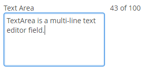
-
textChangeEventModedefines the way the changes are transmitted to the server to cause a server-side event. There are 3 predefined event modes:-
LAZY(default) - an event is triggered when there is a pause in editing the text. The length of the pause can be modified withsetTextChangeTimeout()or using the textChangeTimeout attribute. A text change event is forced before a possibleValueChangeEvent, even if the user did not keep a pause while entering the text. -
TIMEOUT- an event is triggered after a timeout period. If more changes are made during this period, the event sent to the server-side includes the changes made up to the last change. The length of the timeout can be set withsetTextChangeTimeout()or using the textChangeTimeout attribute.If a
ValueChangeEventwould occur before the timeout period, aTextChangeEventis triggered before it, on the condition that the text content has changed since the previousTextChangeEvent. -
EAGER- an event is triggered immediately for every change in the text content, typically caused by a key press. The requests are separate and are processed sequentially one after another. Change events are nevertheless communicated asynchronously to the server, so further input can be typed while event requests are being processed.
-
-
textChangeTimeoutdefines the time of the pause in editing the text or a timeout period, when the textChangeEventMode isLAZYorTIMEOUT.- TextArea styles
-
In Web Client with a Halo-based theme, you can set predefined styles to the
TextAreacomponent using thestylenameattribute either in the XML descriptor or in the screen controller:<textArea id="textArea" stylename="borderless"/>When setting a style programmatically, select one of the
HaloThemeclass constants with theTEXTAREA_prefix:textArea.setStyleName(HaloTheme.TEXTAREA_BORDERLESS);-
align-center- align the text inside the area to center.
-
align-right- align the text inside the area to the right.
-
borderless- removes the border and background from the text area.
-
- Attributes of textArea
-
align - caption - captionAsHtml - caseConversion - cols - contextHelpText - contextHelpTextHtmlEnabled - conversionErrorMessage - css - dataContainer - datatype - description - descriptionAsHtml - editable - enable - box.expandRatio - height - htmlSanitizerEnabled - icon - id - inputPrompt - maxLength - property - required - requiredMessage - responsive - rows - settingsEnabled - stylename - tabIndex - textChangeEventMode - textChangeTimeout - trim - visible - width - wordWrap
- Predefined styles of textArea
-
align-center - align-right - borderless - huge - large - small - tiny
- API
-
addTextChangeListener - addValueChangeListener - addValidator - commit - discard - isModified - setContextHelpIconClickHandler
3.5.2.1.47. TextField
TextField is a component for text editing. It can be used both for working with entity attributes and entering/displaying arbitrary textual information.
XML-name of the component: textField
-
An example of a text field with a caption retrieved from the localized messages pack:
<textField id="nameField" caption="msg://name"/>The figure below shows an example of a simple text field.
-
In Web Client with a Halo-based theme, you can set predefined styles to the TextField component using the
stylenameattribute either in the XML descriptor or in the screen controller:<textField id="textField" stylename="borderless"/>When setting a style programmatically, select one of the
HaloThemeclass constants with theTEXTFIELD_prefix:textField.setStyleName(HaloTheme.TEXTFIELD_INLINE_ICON);TextField styles:
-
align-center- align the text inside the field to center.
-
align-right- align the text inside the field to the right.
-
borderless- removes the border and background from the text field.
-
inline-icon- moves the default caption icon inside the text field.
TextField supports automatic case conversion. The
caseConvertionattribute can have one of the following values:-
UPPER- the upper case, -
LOWER- the lower case, -
NONE- without conversion (the default value). Use this option to support key-sequence input using IME (for example, for Japanese, Korean or Chinese language).
-
-
To create a text field connected to data, use dataContainer and property attributes.
<data> <instance id="customerDc" class="com.company.sales.entity.Customer" view="_local"> <loader/> </instance> </data> <layout> <textField dataContainer="customerDc" property="name" caption="msg://name"/> </layout>As you can see in the example, the screen describes the
customerDcdata container forCustomerentity, which hasnameattribute. The text field component has a link to the container specified in the dataContainer attribute; property attribute contains the name of the entity attribute that is displayed in the text field.
-
If the field is not connected to an entity attribute (i.e., the data container and attribute name are not set), you can set the data type using the
datatypeattribute. It is used to format field values. The attribute value accepts any data type registered in the application metadata – see Datatype. Typically,TextFielduses the following data types:-
decimal -
double -
int -
long
If the
datatypeattribute is specified for the field and the user enters an incorrect value, the default conversion error message appears.As an example, let’s look at a text field with an
Integerdata type.<textField id="integerField" datatype="int" caption="msg://integerFieldName"/>If a user enters a value that cannot be interpreted as an integer number, then when the field loses focus, the application will show a default error message.
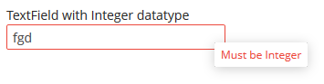
Default error messages are specified in the main localized message pack and have the following template:
databinding.conversion.error.<type>, e.g.:databinding.conversion.error.int = Must be Integer -
-
You can specify a custom conversion error message declaratively in the screen XML descriptor using the
conversionErrorMessageattribute:<textField conversionErrorMessage="This field can work only with Integers" datatype="int"/>or programmatically in the screen controller:
textField.setConversionErrorMessage("This field can work only with Integers"); -
Text field can be assigned a validator – a class implementing
Field.Validatorinterface. The validator limits user input in addition to what is already done by thedatatype. For example, to create an input field for positive integer numbers, you need to create a validator class:public class PositiveIntegerValidator implements Field.Validator { @Override public void validate(Object value) throws ValidationException { Integer i = (Integer) value; if (i <= 0) throw new ValidationException("Value must be positive"); } }and assign it as a validator to the text field with
intdatatype:<textField id="integerField" datatype="int"> <validator class="com.sample.sales.gui.PositiveIntegerValidator"/> </textField>Unlike input check against the data type, validation is performed not when the field looses focus, but after invocation of the field’s
validate()method. It means that the field (and the linked entity attribute) may temporarily contain a value that does not satisfy validation conditions (a non-positive number in the example above). This should not be an issue, because validated fields are typically used in editor screens, which automatically invoke validation for all their fields before commit. If the field is located not in an editing screen, the field’svalidate()method should be invoked explicitly in the controller.
-
TextFieldsupportsTextChangeListenerdefined in its parentTextInputFieldinterface. Text change events are processed asynchronously after typing in order not to block the typing.textField.addTextChangeListener(event -> { int length = event.getText().length(); textFieldLabel.setValue(length + " of " + textField.getMaxLength()); }); textField.setTextChangeEventMode(TextInputField.TextChangeEventMode.LAZY);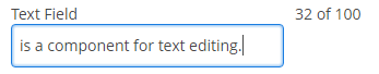
-
The
TextChangeEventModedefines the way the changes are transmitted to the server to cause a server-side event. There are 3 predefined event modes:-
LAZY(default) - an event is triggered when there is a pause in editing the text. The length of the pause can be modified withsetInputEventTimeout(). A text change event is forced before a possibleValueChangeEvent, even if the user did not keep a pause while entering the text. -
TIMEOUT- an event is triggered after a timeout period. If more changes are made during this period, the event sent to the server-side includes the changes made up to the last change. The length of the timeout can be set withsetInputEventTimeout().If a
ValueChangeEventwould occur before the timeout period, aTextChangeEventis triggered before it, on the condition that the text content has changed since the previousTextChangeEvent. -
EAGER- an event is triggered immediately for every change in the text content, typically caused by a key press. The requests are separate and are processed sequentially one after another. Change events are nevertheless communicated asynchronously to the server, so further input can be typed while event requests are being processed. -
BLUR- an event is triggered when the text field loses focus.
-
-
EnterPressListenerallows you to define an action executed when Enter is pressed:textField.addEnterPressListener(enterPressEvent -> notifications.create() .withCaption("Enter pressed") .show());
-
ValueChangeListeneris triggered on the value changes when the user finished the text input, i.e. after the Enter press or when the component loses focus. An event object of theValueChangeEventtype is passed to the listener. It has the following methods:-
getPrevValue()returns the value of the component before the change. -
getValue()method return the current value of the component.textField.addValueChangeListener(stringValueChangeEvent -> notifications.create() .withCaption("Before: " + stringValueChangeEvent.getPrevValue() + ". After: " + stringValueChangeEvent.getValue()) .show());The origin of the
ValueChangeEventcan be tracked using isUserOriginated() method.
-
-
If a text field is linked to an entity attribute (via
dataContainerandproperty), and if the entity attribute has alengthparameter defined in the@ColumnJPA-annotation, then theTextFieldwill limit the maximum length of entered text accordingly.If a text field is not linked to an attribute, or if the attribute does not have
lengthvalue defined, or this value needs to be overridden, then the maximum length of the entered text can be limited usingmaxLengthattribute. The value of "-1" means there are no limitations. For example:<textField id="shortTextField" maxLength="10"/>
-
By default, text field trims spaces at the beginning and at the end of the entered string. I.e. if user enters " aaa bbb ", the value of the field returned by the
getValue()method and saved to the linked entity attribute will be "aaa bbb". You can disable trimming of spaces by setting thetrimattribute tofalse.It should be noted that trimming only works when users enter a new value. If the value of the linked attribute already has spaces in it, the spaces will be displayed until user edits the value.
-
Text field always returns
nullinstead of an entered empty string. Therefore, with thetrimattribute enabled, any string containing spaces only will be converted tonull. -
The
setCursorPosition()method can be used to focus the field and set the cursor position to the specified 0-based index.
- Attributes of textField
-
align - caption - captionAsHtml - caseConversion - contextHelpText - contextHelpTextHtmlEnabled - conversionErrorMessage - css - dataContainer - datatype - description - descriptionAsHtml - editable - enable - box.expandRatio - height - htmlSanitizerEnabled - icon - id - inputPrompt - maxLength - property - required - requiredMessage - stylename - tabIndex - trim - visible - width
- Elements of textField
- Predefined styles of textField
-
align-center - align-right - borderless - huge - inline-icon - large - small - tiny
- API
-
addEnterPressListener - addTextChangeListener - addValueChangeListener - commit - discard - isModified - setContextHelpIconClickHandler
3.5.2.1.48. TimeField
TimeField is a field for displaying and entering time.

XML-name of the component: timeField.
-
To create a time field associated with data, dataContainer and property attributes should be used:
<data> <instance id="orderDc" class="com.company.sales.entity.Order" view="_local"> <loader/> </instance> </data> <layout> <timeField dataContainer="orderDc" property="deliveryTime"/> </layout>As you can see in the example above, the screen defines the
orderDcdata container forOrderentity, which hasdeliveryTimeattribute. ThedataContainerattribute of the time input component contains a link to the container, and thepropertyattribute – the name of the entity attribute displayed in the field.Related entity attribute should have
java.util.Dateorjava.sql.Timetype.
-
If the field is not connected to an entity attribute (i.e. the data container and attribute name are not set), you can set the data type using the
datatypeattribute.TimeFielduses the following data types:-
localTime -
offsetTime -
time
-
-
The time format is defined by the
timedatatype and is specified in the main localized messages pack in thetimeFormatkey. -
The time format can also be specified in the
timeFormatattribute. It can be either a format string, or a key in a message pack (with themsg://prefix).
-
Regardless of the mentioned above format display of seconds can be controlled using
showSecondsattribute. By default, seconds are displayed if the format containsss.<timeField dataContainer="orderDc" property="createTs" showSeconds="true"/>
- Attributes of timeField
-
align - caption - captionAsHtml - contextHelpText - contextHelpTextHtmlEnabled - css - dataContainer - datatype - description - descriptionAsHtml - editable - enable - box.expandRatio - height - htmlSanitizerEnabled - icon - id - property - required - requiredMessage - showSeconds - stylename - tabIndex - timeFormat - visible - width
- Elements of timeField
- API
-
addValueChangeListener - commit - discard - isModified - setContextHelpIconClickHandler
3.5.2.1.49. TokenList
TokenList component offers a simplified way of working with lists: instance names are listed vertically or horizontally, adding is done using drop-down list, removal – using the buttons located near each instance.
XML-name of the component: tokenList
Below is an example description of TokenList in an XML-descriptor of a screen:
<data>
<instance id="orderDc" class="com.company.sales.entity.Order" view="order-edit">
<loader/>
<collection id="productsDc" property="products"/>
</instance>
<collection id="allProductsDc" class="com.company.sales.entity.Product" view="_minimal">
<loader id="allProductsDl">
<query><![CDATA[select e from sales_Product e order by e.name]]></query>
</loader>
</collection>
</data>
<layout>
<tokenList id="productsList" dataContainer="orderDc" property="products" inline="true" width="500px">
<lookup optionsContainer="allProductsDc"/>
</tokenList>
</layout>In the example above, the nested productsDc data container which includes a collection of products within an order is defined, as well as allProductsDs data container containing a collection of all products available in the database. The TokenList component with productsList identifier displays the content of the productsDc container and enables changing the collection by adding instances from allProductsDc.
tokenList attributes:
-
position– sets the position for the drop-down list. The attribute can take two values:TOP,BOTTOM. Default isTOP.
-
inlineattribute defines how the list with selected items will be displayed: vertically or horizontally.truecorresponds to horizontal alignment,false– to vertical. An example of a component with horizontal alignment:

-
simple– when set totrue, the items selection component will be hidden with only the Add button left. Clicking the Add button opens the screen with the list of entity instances which type is defined by the data container. Selection screen identifier is selected according to the rules for thePickerFieldstandard lookup action. Clicking the Clear button will remove all elements from theTokenListcomponent’s container.
-
clearEnabled- when set tofalse, the Clear button is hidden.
tokenList elements:
-
lookup− values selection component descriptor.Attributes of the
lookupelement:-
lookupattribute makes it possible to select items using an entity lookup screen: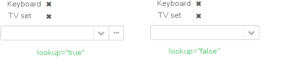
-
inputPrompt- a textual prompt that is displayed in the lookup field to prompt the user for input. If not set, the lookup is empty.<tokenList id="linesList" dataContainer="orderItemsDс" property="items" width="320px"> <lookup optionsContainer="allItemsDс" inputPrompt="Choose an item"/> </tokenList>
-
lookupScreenattribute sets the identifier of the screen used for items selection inlookup="true"mode. If this attribute is not set, screen identifier is selected according to the rules for thecom.haulmont.cuba.gui.actions.picker.LookupActionstandard action. -
openTypeattribute defines how the lookup screen will be opened, similar to what is described for thecom.haulmont.cuba.gui.actions.picker.LookupActionstandard action. Default value –THIS_TAB.
-
multiselect- if this attribute’s value is set totrue, then the entity lookup screen will be set into multiple selection mode. Every screen that is intended to change a lookup component selection mode must implementcom.haulmont.cuba.gui.screen.MultiSelectLookupScreeninterface. TheStandardLookupprovides the default implementation of this interface. In case you need to provide the custom implementation, override thesetLookupComponentMultiSelectmethod, for example:public class ProductsList extends StandardLookup { @Inject private GroupTable<Product> productsTable; @Override public void setLookupComponentMultiSelect(boolean multiSelect) { productsTable.setMultiSelect(multiSelect); } }
-
The component can take a list of options from a data container: for this purpose, the optionsContainer attribute is used. Arbitrarily, the list of component options can be specified using the setOptions(), setOptionsList() and setOptionsMap() methods. In this case, the <lookup> attribute value in the XML descriptor can be empty.
-
setOptionsList()enables specifying programmatically a list of entities to be used as component options. To do this, declare a component in the XML descriptor:<tokenList id="tokenList" dataContainer="orderDc" property="items" width="320px"> <lookup/> </tokenList>Then inject the component into the controller and specify a list of options for it:
@Inject private TokenList<OrderItem> tokenList; @Inject private CollectionContainer<OrderItem> allItemsDc; @Subscribe public void onAfterShow(AfterShowEvent event) { tokenList.setOptionsList(allItemsDc.getItems()); }The same result will be achieved using the
setOptions()method which enables working with all types of options:@Inject private TokenList<OrderItem> tokenList; @Inject private CollectionContainer<OrderItem> allItemsDc; @Subscribe public void onAfterShow(AfterShowEvent event) { tokenList.setOptions(new ContainerOptions<>(allItemsDc)); }
The TokenList component is able to handle user input if there is no suitable option in the list. The new options handler is invoked if the user enters a value that does not coincide with any option and presses Enter.
There are two ways to use newOptionHandler:
-
Declaratively using the
@Installannotation in the screen controller:@Inject private CollectionContainer<Tag> tagsDc; @Inject private Metadata metadata; @Install(to = "tokenList", subject = "newOptionHandler") private void tokenListNewOptionHandler(String string) { Tag newTag = metadata.create(Tag.class); newTag.setName(string); tagsDc.getMutableItems().add(newTag); } -
Programmatically with the help of the
setNewOptionHandler()method:@Inject private CollectionContainer<Tag> tagsDc; @Inject private Metadata metadata; @Inject private TokenList<Tag> tokenList; @Subscribe public void onInit(InitEvent event) { tokenList.setNewOptionHandler(string -> { Tag newTag = metadata.create(Tag.class); newTag.setName(string); tagsDc.getMutableItems().add(newTag); }); }
tokenList listeners:
-
ItemClickListenerallows you to track the click ontokenListitems. -
ValueChangeListenerenables tracking the changes of thetokenListvalue, as well as of any other components implementing theFieldinterface. The origin of theValueChangeEventcan be tracked using isUserOriginated() method.
- Attributes of tokenList
-
align - caption - captionAsHtml - captionProperty - clearEnabled - contextHelpText - contextHelpTextHtmlEnabled - css - dataContainer - description - descriptionAsHtml - editable - enable - box.expandRatio - height - htmlSanitizerEnabled - icon - id - inline - position - simple - stylename - tabIndex - visible - width
- Elements of tokenList
- Attributes of lookup
-
captionProperty - filterMode - inputPrompt - lookup - lookupScreen - multiselect - openType - optionsContainer
- Attributes of button
- API
-
addValueChangeListener - setContextHelpIconClickHandler - setItemClickListener - setNewOptionHandler - setOptionCaptionProvider
3.5.2.1.50. Tree
The Tree component is intended to display hierarchical structures represented by entities referencing themselves.
XML-name of the component: tree
Below is an example of the Tree component description in a screen XML-descriptor:
<data readOnly="true">
<collection id="departmentsDc" class="com.company.sales.entity.Department" view="department-view">
<loader id="departmentsDl">
<query>
<![CDATA[select e from sales_Department e]]>
</query>
</loader>
</collection>
</data>
<layout>
<tree id="departmentsTree" dataContainer="departmentsDc" hierarchyProperty="parentDept"/>
</layout>Here, the dataContainer attribute contains a reference to a collection container, and the hierarchyProperty attribute defines the name of the entity attribute which is a reference to same entity.
The name of the entity attribute to be displayed in the tree can be set using the captionProperty attribute. If this attribute is not defined, the screen will show the entity instance name.
The contentMode attribute defines how the tree element captions should be displayed. There are three predefined content modes:
-
TEXT- textual values are displayed as plain text. -
PREFORMATTED- textual values are displayed as preformatted text. In this mode, newlines are preserved when rendered on the screen. -
HTML- textual values are interpreted and displayed as HTML. Care should be taken when using this mode to avoid XSS issues.
The setItemCaptionProvider() method sets a function for placing the name of the entity attribute as a caption for each item of the tree.
Selection in Tree:
-
multiselectattribute enables setting multiple selection mode for tree items. Ifmultiselectistrue, users can select multiple items using keyboard or mouse holding Ctrl or Shift keys. By default, multiple selection mode is switched off.
-
selectionMode- sets the rows selection mode. There are 3 predefined selection modes:-
SINGLE- single record selection. -
MULTI- multiple selection as in any table. -
NONE- selection is disabled.
Rows selection events can be tracked by
SelectionListener. The origin of the selection event can be tracked using isUserOriginated() method.The
selectionModeattribute has priority over the deprecatedmultiselectattribute. -
The setItemClickAction() method may be used to define an action that will be performed when a tree node is double-clicked.
Each tree item can have an icon on the left. Create an implementation of the Function interface in the setIconProvider() method in the screen controller:
@Inject
private Tree<Department> tree;
@Subscribe
protected void onInit(InitEvent event) {
tree.setIconProvider(department -> {
if (department.getParentDept() == null) {
return "icons/root.png";
}
return "icons/leaf.png";
});
}You can react to expanding and collapsing tree items as follows:
@Subscribe("tree")
public void onTreeExpand(Tree.ExpandEvent<Task> event) {
notifications.create()
.withCaption("Expanded: " + event.getExpandedItem().getName())
.show();
}
@Subscribe("tree")
public void onTreeCollapse(Tree.CollapseEvent<Task> event) {
notifications.create()
.withCaption("Collapsed: " + event.getCollapsedItem().getName())
.show();
}The Tree component has a DescriptionProvider, that can render HTML if the contentMode is set to ContentMode.HTML. The result of the execution of this provider is sanitized if htmlSanitizerEnabled attribute is set to true.
The htmlSanitizerEnabled attribute overrides the value of global cuba.web.htmlSanitizerEnabled configuration property.
For old screens, the Tree component can be bound to a datasource instead of data container. In this case, the nested treechildren element should be defined and contain a reference to a hierarchicalDatasource in the datasource attribute. Declaration of a hierarchicalDatasource should contain a hierarchyProperty attribute – the name of the entity attribute which is a reference to same entity.
- Attributes of tree
-
caption - captionAsHtml - captionProperty - contentMode - contextHelpText - contextHelpTextHtmlEnabled - css - dataContainer - description - descriptionAsHtml - enable - box.expandRatio - height - htmlSanitizerEnabled - id - multiselect - showOrphans - stylename - tabIndex - visible - width
- Elements of tree
- Attributes of treechildren
- API
-
addCollapseListener - addExpandListener - setDescriptionProvider - setDetailsGenerator - setItemCaptionProvider
3.5.2.1.51. TreeDataGrid
TreeDataGrid, similarly to the DataGrid component, is designed to display and sort tabular data, and provides means to display hierarchical data and manipulate rows and columns with greater performance due to lazy loading of data while scrolling.
The component is used for entities that have references to themselves. For example, it can be a file system or a company organization chart.
XML name of the component: treeDataGrid.
For TreeDataGrid, two attributes should be set: dataContainer which binds treeDataGrid to a data container, and hierarchyProperty which is the name of the entity attribute which references the same entity.
An example of component definition in an XML-descriptor of a screen:
<data readOnly="true">
<collection id="departmentsDc" class="com.company.sales.entity.Department" view="department-view">
<loader id="departmentsDl">
<query>
<![CDATA[select e from sales_Department e]]>
</query>
</loader>
</collection>
</data>
<layout>
<treeDataGrid id="treeDataGrid" dataContainer="departmentsDc" hierarchyProperty="parentDept">
<columns>
<column id="name" property="name"/>
<column id="parentDept" property="parentDept"/>
</columns>
</treeDataGrid>
</layout>The functionality of TreeDataGrid is similar to a simple DataGrid.
- Attributes of treeDataGrid
-
aggregatable - aggregationPosition - align - caption - captionAsHtml - colspan - columnResizeMode - columnsCollapsingAllowed - contextMenuEnabled - css - dataContainer - description - descriptionAsHtml - editorBuffered - editorCancelCaption - editorEnabled - editorSaveCaption - emptyStateLinkMessage - emptyStateMessage - enable - box.expandRatio - frozenColumnCount - headerVisible - height - hierarchyProperty - htmlSanitizerEnabled - icon - id - metaClass - reorderingAllowed - responsive - rowspan - selectionMode - settingsEnabled - showOrphans - sortable - stylename - tabIndex - textSelectionEnabled - visible - width
- Elements of treeDataGrid
-
actions - buttonsPanel - columns - rowsCount
- Attributes of columns
- Attributes of column
-
caption - collapsed - collapsible - collapsingToggleCaption - editable - expandRatio - id - maximumWidth - minimumWidth - property - resizable - sort - sortable - width
- Elements of column
-
aggregation - checkBoxRenderer - componentRenderer - dateRenderer - formatter - iconRenderer - htmlRenderer - localDateRenderer - localDateTimeRenderer - numberRenderer - progressBarRenderer - textRenderer
- Attributes of aggregation
- API
-
addGeneratedColumn - applySettings - createRenderer - edit - getAggregationResults - saveSettings - getColumns - setDescriptionProvider - addCellStyleProvider - setConverter - setDetailsGenerator - setEmptyStateLinkClickHandler - setEnterPressAction - setItemClickAction - setRenderer - setRowDescriptionProvider - addRowStyleProvider - sort
- Listeners of treeDataGrid
-
ColumnCollapsingChangeListener - ColumnReorderListener - ColumnResizeListener - ContextClickListener - EditorCloseListener - EditorOpenListener - EditorPostCommitListener - EditorPreCommitListener - ItemClickListener - SelectionListener - SortListener
- Predefined styles
-
borderless - no-horizontal-lines - no-vertical-lines - no-stripes
3.5.2.1.52. TreeTable
TreeTable component is a hierarchical table displaying a tree-like structure in the leftmost column. The component is used for entities that have references to themselves. For example, it can be a file system or a company organization chart.
XML-name of the component: treeTable
The dataContainer attribute of the treeTable component should contain a reference to a collection container, and the hierarchyProperty attribute defines the name of the entity attribute which is a reference to same entity.
Below is an example of component description in a screen XML descriptor:
<data readOnly="true">
<collection id="departmentsDc" class="com.company.sales.entity.Department" view="_local">
<loader id="departmentsDl">
<query>
<![CDATA[select e from sales_Department e]]>
</query>
</loader>
</collection>
</data>
<layout>
<treeTable id="departmentsTable" dataContainer="departmentsDc" hierarchyProperty="parentDept" width="100%">
<columns>
<column id="name"/>
<column id="active"/>
</columns>
</treeTable>
</layout>The functionality of TreeTable is similar to a simple Table.
- Attributes of treeTable
-
align - aggregatable - aggregationStyle - caption - captionAsHtml - columnControlVisible - contextHelpText - contextHelpTextHtmlEnabled - contextMenuEnabled - css - dataContainer - description - descriptionAsHtml - editable - emptyStateLinkMessage - emptyStateMessage - enable - box.expandRatio - height - htmlSanitizerEnabled - id - metaClass - multiLineCells - multiselect - presentations - reorderingAllowed - settingsEnabled - showOrphans - sortable - stylename - tabIndex - textSelectionEnabled - visible - width
- Elements of treeTable
-
actions - buttonsPanel - columns - rows - rowsCount
- Attributes of columns
- Attributes of column
-
align - caption - captionProperty - collapsed - dateFormat - editable - expandRatio - id - link - linkInvoke - linkScreen - linkScreenOpenType - maxTextLength - optionsContainer - resolution - sort - sortable - visible - width
- Elements of column
- Attributes of aggregation
- API
-
addColumnCollapseListener - addSelectionListener - getAggregationResults - setAggregationDistributionProvider - setClickListener - setEmptyStateLinkClickHandler - setItemDescriptionProvider
3.5.2.1.53. TwinColumn
TwinColumn is a twin list component for multiple items selection. The left part of the list contains available unselected values, the right part – selected values. Users select the values by transferring them from the left to the right and backward using double click or dedicated buttons. A unique representation style and an icon can be defined for each value.
XML name of the component: twinColumn
Below is an example of a twinColumn component usage to select entity instances:
<data>
<instance id="orderDc" class="com.company.sales.entity.Order" view="order-edit">
<loader id="orderDl"/>
</instance>
<collection id="allProductsDc" class="com.company.sales.entity.Product" view="_minimal">
<loader>
<query>
<![CDATA[select e from sales_Product e]]>
</query>
</loader>
</collection>
</data>
<layout>
<twinColumn id="twinColumn"
dataContainer="orderDc"
property="products"
optionsContainer="allProductsDc"/>
</layout>In this example, the twinColumn component will display instance names of Product entity instances located in the allProductsDc data container, and its getValue() method will return a collection of selected instances.
addAllBtnEnabled attribute shows the buttons moving all items between the lists.
columns attribute is used to set the number of characters in a row, and the rows attribute – to set the number of rows in each list.
The reorderable attribute specifies whether the items should be reordered after selection. Reordering is enabled by default. In this case, the items will be reordered after selection to match the order of the elements in the data source. If the attribute value is false, the items will be added in the order in which they are selected.
leftColumnCaption and rightColumnCaption attributes can be used to set captions for the columns.
The presentation of the items can be defined by implementing the TwinColumn.StyleProvider interface and returning a style name and icon path for each entity instance displayed in the component.
The list of component options can be specified arbitrarily using the setOptionsList(), setOptionsMap() and setOptionsEnum() methods as described for the CheckBoxGroup component.
- Attributes of twinColumn
-
align - addAllBtnEnabled - caption - captionAsHtml - captionProperty - columns - contextHelpText - contextHelpTextHtmlEnabled - css - dataContainer - description - descriptionAsHtml - editable - enable - box.expandRatio - height - htmlSanitizerEnabled - icon - id - leftColumnCaption - optionsContainer - property - reorderable - required - requiredMessage - rightColumnCaption - rows - stylename - tabIndex - visible - width
- Elements of twinColumn
- API
-
addValueChangeListener - setContextHelpIconClickHandler - setOptionCaptionProvider
3.5.2.2. Containers
3.5.2.2.1. Accordion
Accordion is a container for collapsible content that allows you to toggle between hiding and showing large amount of content. The Accordion container is implemented for Web Client.
XML-name of the component: accordion. An example description of an accordion in a screen XML-descriptor:
<accordion id="accordion" height="100%">
<tab id="tabStamford" caption="msg://tabStamford" margin="true" spacing="true">
<label value="msg://sampleStamford"/>
</tab>
<tab id="tabBoston" caption="msg://tabBoston" margin="true" spacing="true">
<label value="msg://sampleBoston"/>
</tab>
<tab id="tabLondon" caption="msg://tabLondon" margin="true" spacing="true">
<label value="msg://sampleLondon"/>
</tab>
</accordion>The accordion component should contain nested tab elements describing tabs. Each tab is a container with a vertical components layout similar to vbox. Accordion container can be used if the application page is limited in space or the tab title is too long to be displayed in the TabSheet. Accordion is featured with a smooth transition animation.
tab element attributes:
-
id– tab identifier. Please note that tabs are not components and their IDs are used only within theAccordionin order to work with tabs from the controller. -
caption – tab caption.
-
icon - defines icon location in theme catalog or the icon name in the icon set. Detailed information on recommended icon placement is available in Icons.
-
lazy– sets lazy loading for tab content.Lazy tabs do not load their content when the screen is opened, which reduces the number of components in memory. Components within a tab are loaded only when a user selects the tab. Additionally, if a lazy-tab includes visual components linked to a data container with a loader, the loader will not be triggered. As a result, screen opens faster, and data is loaded only when the user requests it by selecting this tab.
Please note that the components located on a lazy tab do not exist when the screen is opened. Therefore they cannot be injected into a controller and cannot be obtained by invoking
getComponent()in the controller’sinit()method. The lazy tab components can be accessed only after the user opens the tab. This moment may be intercepted usingAccordion.SelectedTabChangeListener, for example:@Inject private Accordion accordion; private boolean tabInitialized; @Subscribe protected void onInit(InitEvent event) { accordion.addSelectedTabChangeListener(selectedTabChangeEvent -> { if ("tabCambridge".equals(selectedTabChangeEvent.getSelectedTab().getName())) { initCambridgeTab(); } }); } private void initCambridgeTab() { if (tabInitialized) { return; } tabInitialized = true; (1) }1 Write the initialization code here. Use getComponentNN("comp_id")here to get lazy tab’s components.By default, tabs are not
lazy, which means that all their content is loaded when a screen is opened. -
In Web Client with a Halo-based theme, the
stylenameattribute allows you to set the predefinedborderlessstyle to theaccordioncomponent to remove borders and background:accordion.setStyleName(HaloTheme.ACCORDION_BORDERLESS);
An accordion tab can contain any other visual container, such as table, grid etc:
<accordion id="accordion" height="100%" width="100%" enable="true">
<tab id="tabNY" caption="msg://tabNY" margin="true" spacing="true">
<table id="nYTable" width="100%">
<columns>
<column id="borough"/>
<column id="county"/>
<column id="population"/>
<column id="square"/>
</columns>
<rows datasource="newYorkDs"/>
</table>
</tab>
</accordion>
- Attributes of accordion
-
caption - captionAsHtml - colspan - contextHelpText - contextHelpTextHtmlEnabled - css - description - descriptionAsHtml - enable - box.expandRatio - height - htmlSanitizerEnabled - id - rowspan - stylename - tabCaptionsAsHtml - tabIndex - visible - width
- Attributes of tab
-
caption - description - enable - expand - icon - id - lazy - margin - spacing - stylename - visible
- API
-
add - addSelectedTabChangeListener - getComponent - getComponentNN - getComponents - getOwnComponent - getOwnComponents - remove - removeAll
3.5.2.2.2. BoxLayout
BoxLayout is a container with sequential placement of components.
There are three types of BoxLayout, identified by the XML-elements:
-
hbox− components are placed horizontally.
<hbox spacing="true" margin="true"> <dateField dataContainer="orderDc" property="date"/> <lookupField dataContainer="orderDc" property="customer" optionsContainer="customersDc"/> <textField dataContainer="orderDc" property="amount"/> </hbox>
-
vbox− components are placed vertically.vboxhas 100% width by default.
<vbox spacing="true" margin="true"> <dateField dataContainer="orderDc" property="date"/> <lookupField dataContainer="orderDc" property="customer" optionsContainer="customersDc"/> <textField dataContainer="orderDc" property="amount"/> </vbox>
-
flowBox− components are placed horizontally with line wrapping. If there is not enough space in a line, the components that do not fit will be displayed in the next line (the behavior is similar to SwingFlowLayout).
<flowBox spacing="true" margin="true"> <dateField dataContainer="orderDc" property="date"/> <lookupField dataContainer="orderDc" property="customer" optionsContainer="customersDc"/> <textField dataContainer="orderDc" property="amount"/> </flowBox>
In Web Client with a Halo-based theme, BoxLayout may be used to create enhanced composite layouts. The stylename attribute with card or well value along with stylename="v-panel-caption" for an enclosed container will make a component look like Vaadin Panel.
-
cardstyle name makes a layout look like a card. -
wellstyle makes the card look "sunken" with shaded background.
<vbox stylename="well"
height="200px"
width="300px"
expand="message"
spacing="true">
<hbox stylename="v-panel-caption"
width="100%">
<label value="Widget caption"/>
<button align="MIDDLE_RIGHT"
icon="font-icon:EXPAND"
stylename="borderless-colored"/>
</hbox>
<textArea id="message"
inputPrompt="Enter your message here..."
width="280"
align="MIDDLE_CENTER"/>
<button caption="Send message"
width="100%"/>
</vbox>The getComponent() method allows you to obtain a child component of BoxLayout by its index:
Button button = (Button) hbox.getComponent(0);You can use keyboard shortcuts in BoxLayout. Set the shortcut and the action to be performed using the addShortcutAction() method:
flowBox.addShortcutAction(new ShortcutAction("SHIFT-A", shortcutTriggeredEvent ->
notifications.create()
.withCaption("SHIFT-A action")
.show()
));- Attributes of hbox, vbox, flowBox
-
align - caption - captionAsHtml - contextHelpText - contextHelpTextHtmlEnabled - css - description - descriptionAsHtml - enable - expand - box.expandRatio - height - htmlSanitizerEnabled - id - margin - spacing - stylename - visible - width
- API
-
add - addLayoutClickListener - addShortcutAction - getComponent - getComponentNN - getComponents - getMargin - getOwnComponent - getOwnComponents - indexOf - remove - removeAll - setMargin - setSpacing
3.5.2.2.3. ButtonsPanel
ButtonsPanel is a container that streamlines the use and placement of the components (usually, buttons) for data management in a table.

XML-name of the component: buttonsPanel.
A sample definition of ButtonsPanel in screen XML-descriptor:
<table id="customersTable" dataContainer="customersDc" width="100%">
<actions>
<action id="create" type="create"/>
<action id="edit" type="edit"/>
<action id="remove" type="remove"/>
<action id="excel" type="excel"/>
</actions>
<columns>
<column id="name"/>
<column id="email"/>
</columns>
<rowsCount/>
<buttonsPanel id="buttonsPanel" alwaysVisible="true">
<button id="createBtn" action="customersTable.create"/>
<button id="editBtn" action="customersTable.edit"/>
<button id="removeBtn" action="customersTable.remove"/>
<button id="excelBtn" action="customersTable.excel"/>
</buttonsPanel>
</table>buttonsPanel element can be located either inside a table, or in any other place of a screen.
If the buttonsPanel is located in a table, it is combined with the table’s rowsCount component thus using vertical space more effectively. Additionally, if a lookup screen is opened using Frame.openLookup() (for example, from the PickerField component) the buttons panel becomes hidden.
|
The caption of |
alwaysVisible attribute disables panel hiding in a lookup screen when it is opened by Frame.openLookup(). If the attribute value is true, the buttons panel is not hidden. By default, the attribute value is false.
By default, buttons in the buttonsPanel are placed horizontally with line wrapping. If there is not enough space in a line, the buttons that do not fit will be displayed in the next line.
You can change the default behavior to display buttonsPanel in one row:
-
Create a theme extension or a custom theme.
-
Define the SCSS variable
$cuba-buttonspanel-flow:$cuba-buttonspanel-flow: false
Clicks on the buttonsPanel area can be intercepted with the help of the LayoutClickListener interface.
You can use keyboard shortcuts in ButtonsPanel. Set the shortcut and the action to be performed using the addShortcutAction() method:
buttonsPanel.addShortcutAction(new ShortcutAction("SHIFT-A", shortcutTriggeredEvent ->
notifications.create()
.withCaption("SHIFT-A action")
.show()
));- Attributes of buttonsPanel
-
align - alwaysVisible - caption - captionAsHtml - contextHelpText - contextHelpTextHtmlEnabled - css - description - descriptionAsHtml - enable - box.expandRatio - height - htmlSanitizerEnabled - id - stylename - visible - width
- API
3.5.2.2.4. CssLayout
CssLayout is a container that enables full control over placement and styling of enclosed components using CSS.
XML-name of the component: cssLayout.
Below is an example of using cssLayout for simple responsive screen.
Displaying components on a wide screen:
Displaying components on a narrow screen:
Screen’s XML-descriptor:
<cssLayout responsive="true" stylename="responsive-container" width="100%">
<vbox margin="true" spacing="true" stylename="group-panel">
<textField caption="Field One" width="100%"/>
<textField caption="Field Two" width="100%"/>
<button caption="Button"/>
</vbox>
<vbox margin="true" spacing="true" stylename="group-panel">
<textField caption="Field Three" width="100%"/>
<textField caption="Field Four" width="100%"/>
<button caption="Button"/>
</vbox>
</cssLayout>Content of modules/web/themes/halo/halo-ext.scss file (see Extending an Existing Theme for how to create this file):
/* Define your theme modifications inside next mixin */
@mixin halo-ext {
@include halo;
.responsive-container {
&[width-range~="0-900px"] {
.group-panel {
width: 100% !important;
}
}
&[width-range~="901px-"] {
.group-panel {
width: 50% !important;
}
}
}
}-
stylenameattribute enables setting predefined styles to theCssLayoutcomponent either in the XML descriptor or in the screen controller.-
v-component-groupstyle is used to create a grouped set of components, i.e. a row of components which are joined seamlessly together:<cssLayout stylename="v-component-group"> <textField inputPrompt="Search..."/> <button caption="OK"/> </cssLayout>
-
wellstyle makes container look "sunken" with shaded background. -
cardstyle name makes a layout look like a card. Combined with an additionalv-panel-captionstyle name for any enclosed layout, it provides a possibility to create enhanced composite layouts, for example:<cssLayout height="300px" stylename="card" width="300px"> <hbox stylename="v-panel-caption" width="100%"> <label value="Widget caption"/> <button align="MIDDLE_RIGHT" icon="font-icon:EXPAND" stylename="borderless-colored"/> </hbox> <vbox height="100%"> <label value="Panel content"/> </vbox> </cssLayout>and result will be the following:
-
- Attributes of cssLayout
-
caption - captionAsHtml - contextHelpText - contextHelpTextHtmlEnabled - css - description - descriptionAsHtml - enable - box.expandRatio - height - htmlSanitizerEnabled - id - responsive - stylename - visible - width
- API
-
add - addShortcutAction - addLayoutClickListener - getComponent - getComponentNN - getComponents - getOwnComponent - getOwnComponents - indexOf - remove - removeAll
3.5.2.2.5. Frame
frame element is designed to include frames into a screen.
Attributes:
-
src− path to the frame XML-descriptor.
-
screen– frame identifier in screens.xml (if the frame is registered).
One of these attributes should be defined. If both attributes are defined, frame will be loaded from the file explicitly set in src.
- Attributes of frame
-
align - caption - captionAsHtml - css - description - descriptionAsHtml - height - box.expandRatio - htmlSanitizerEnabled - id - screen - src - stylename - visible - width
- API
-
add - getComponent - getComponentNN - getComponents - getMargin - getOwnComponent - getOwnComponents - indexOf - remove - removeAll - setMargin - setSpacing
3.5.2.2.6. GridLayout
GridLayout container places components on a grid.
XML-name of the component: grid.
Example container usage:
<grid spacing="true">
<columns count="4"/>
<rows>
<row>
<label value="Date" align="MIDDLE_LEFT"/>
<dateField dataContainer="orderDc" property="date"/>
<label value="Customer" align="MIDDLE_LEFT"/>
<lookupField dataContainer="orderDc" property="customer" optionsContainer="customersDc"/>
</row>
<row>
<label value="Amount" align="MIDDLE_LEFT"/>
<textField dataContainer="orderDc" property="amount"/>
</row>
</rows>
</grid>grid elements:
-
columns– a required element, describes grid columns. It should have either acountattribute, or a nestedcolumnelement for each column.In the simplest case, it is enough to set the number of columns in the
countattribute. Then, if the container width is explicitly defined in pixels or percents, free space will be divided between the columns equally.In order to divide screen space non-equally, a
columnelement with aflexattribute should be defined for each column.An example of a grid where the second and the fourth columns take all extra horizontal space and the fourth column takes three times more space:
<grid spacing="true" width="100%"> <columns> <column/> <column flex="1"/> <column/> <column flex="3"/> </columns> <rows> <row> <label value="Date"/> <dateField dataContainer="orderDc" property="date" width="100%"/> <label value="Customer"/> <lookupField dataContainer="orderDc" property="customer" optionsContainer="customersDc" width="100%"/> </row> <row> <label value="Amount"/> <textField dataContainer="orderDc" property="amount" width="100%"/> </row> </rows> </grid>If
flexis not defined, or is set to 0, the width of the column will be set according to its contents given that at least one other column has a non-zeroflex. In the example above, the first and the third columns will get the width according to the maximum text length.In order for the free space to appear, the entire container width should be set in either pixels or percents. Otherwise, column width will be calculated according to content length, and
flexattribute will have no effect.
-
rows− a required element, contains a set of rows. Each line is defined in its ownrowelement.rowelement can have aflexattribute similar to the one defined forcolumn, but affecting the distribution of free vertical space with a given total grid height.rowelement should contain elements of the components displayed in the grid’s current row cells. The number of components in a row should not exceed the defined number of columns, but it can be less.
Any component located in a grid container can have colspan and rowspan attributes. These attributes set the number of columns and rows occupied by the corresponding component. For example, this is how Field3 field can be extended to cover three columns:
<grid spacing="true">
<columns count="4"/>
<rows>
<row>
<label value="Name 1"/>
<textField/>
<label value="Name 2"/>
<textField/>
</row>
<row>
<label value="Name 3"/>
<textField colspan="3" width="100%"/>
</row>
</rows>
</grid>As a result, the components will be placed in the following way:
Clicks on the GridLayout area can be intercepted with the help of the LayoutClickListener interface.
The getComponent() method allows you to obtain a child component of GridLayout by its column and row index:
Button button = (Button) gridLayout.getComponent(0,1);You can use keyboard shortcuts in GridLayout. Set the shortcut and the action to be performed using the addShortcutAction() method:
grid.addShortcutAction(new ShortcutAction("SHIFT-A", shortcutTriggeredEvent ->
notifications.create()
.withCaption("SHIFT-A action")
.show()
));- Attributes of grid
-
align - caption - captionAsHtml - contextHelpText - contextHelpTextHtmlEnabled - css - description - descriptionAsHtml - enable - box.expandRatio - height - htmlSanitizerEnabled - id - margin - spacing - stylename - visible - width
- Elements of grid
- Attributes of columns
- Attributes of column
- Attributes of row
- API
-
add - addShortcutAction - addLayoutClickListener - getComponent - getComponentNN - getComponents - getMargin - getOwnComponent - getOwnComponents - remove - removeAll - setMargin - setSpacing
3.5.2.2.7. GroupBoxLayout
GroupBoxLayout is a container that enables framing the embedded components and setting a universal header for them. Additionally, it can collapse content.
Component XML-name: groupBox.
An example container description in a screen XML-descriptor:
<groupBox caption="Order">
<dateField dataContainer="orderDc" property="date" caption="Date"/>
<lookupField dataContainer="orderDc" property="customer" optionsContainer="customersDc" caption="Customer"/>
<textField dataContainer="orderDc" property="amount" caption="Amount"/>
</groupBox>groupBox attributes:
-
caption– group header.
-
orientation– defines components placement direction − horizontal or vertical. The default value isvertical.
-
collapsable– if the value is set totrue, the component’s content can be hidden using/ buttons.
-
collapsed– if set totrue, component’s content will be collapsed initially. It is used withcollapsable="true".An example of a collapsed
GroupBox:
The expanded state change events of the
groupBoxcomponent can be intercepted with the help of theExpandedStateChangeListenerinterface.
-
outerMargin- sets the outer margins outside the border ofgroupBox. If set totrue, the outer margins will be added on all sides of the component. To set the outer margins for all sides individually, settrueorfalsefor each side ofgroupBox:<groupBox outerMargin="true, false, true, false">If the
showAsPanelattribute is set to true,outerMarginis ignored.
-
showAsPanel– if set totrue, the component will look like Vaadin Panel. The default value isfalse.
By default, the groupBox container is 100% wide, similar to vbox.
In Web Client, you can set predefined styles to the groupBox component using the stylename attribute either in the XML descriptor or in the screen controller. When setting a style programmatically, select one of the HaloTheme class constants with the LAYOUT_ or GROUPBOX_ prefix. The following styles should be used combined with showAsPanel attribute set to true:
-
borderlessstyle removes borders and the background color of thegroupBox:groupBox.setShowAsPanel(true); groupBox.setStyleName(HaloTheme.GROUPBOX_PANEL_BORDERLESS);
-
wellstyle makes container look "sunken" with shaded background:<groupBox caption="Well-styled groupBox" showAsPanel="true" stylename="well" width="300px" height="200px"/>
There is an additional predefined style for the groupBox container - light. A Groupbox with the light style has only the top border, as shown in the picture below.
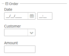
You can use keyboard shortcuts in Groupbox. Set the shortcut and the action to be performed using the addShortcutAction() method:
groupBox.addShortcutAction(new ShortcutAction("SHIFT-A", shortcutTriggeredEvent ->
notifications.create()
.withCaption("SHIFT-A action")
.show()
));- Attributes of groupBox
-
align - caption - captionAsHtml - collapsable - collapsed - contextHelpText - contextHelpTextHtmlEnabled - css - description - descriptionAsHtml - expand - box.expandRatio - height - htmlSanitizerEnabled - id - orientation - outerMargin - settingsEnabled - showAsPanel - spacing - stylename - width
- Predefined styles of groupBox
-
borderless - light - well
- API
-
add - addExpandedStateChangeListener - addShortcutAction - applySettings - getComponent - getComponentNN - getComponents - getOwnComponent - getOwnComponents - indexOf - remove - removeAll - saveSettings - setOuterMargin - setSpacing
3.5.2.2.8. HtmlBoxLayout
HtmlBoxLayout is a container that enables you to define locations of components in an HTML template. The layout template is included in a theme.
|
Do not use |
XML-name of the component: htmlBox.
Below is an example of using htmlBox for a simple screen.
Screen’s XML-descriptor:
<htmlBox align="TOP_CENTER"
template="sample"
width="500px">
<label id="logo"
value="Subscribe"
stylename="logo"/>
<textField id="email"
width="100%"
inputPrompt="email@test.test"/>
<button id="submit"
width="100%"
invoke="showMessage"
caption="Subscribe"/>
</htmlBox>htmlBox attributes:
-
templateattribute defines the name of an HTML file located in thelayoutssubdirectory of your theme. You should create a theme extension or a custom theme before creating a template.For example, if your theme is Halo and the attribute contains
my_template, the template file should bemodules/web/themes/halo/layouts/my_template.html.Content of the HTML template located in the
modules/web/themes/halo/layouts/sample.htmlfile:<div location="logo" class="logo"></div> <table class="component-container"> <tr> <td> <div location="email" class="email"></div> </td> <td> <div location="submit" class="submit"></div> </td> </tr> </table>A template should contain
<div>elements withlocationattributes. This elements will display CUBA components defined in the XML descriptor with corresponding identifiers.Content of
modules/web/themes/halo/com.company.application/halo-ext.scssfile (see Extending an Existing Theme for how to create this file):@mixin com_company_application-halo-ext { .email { width: 390px; } .submit { width: 100px; } .logo { font-size: 96px; text-transform: uppercase; margin-top: 50px; } .component-container { display: inline-block; vertical-align: top; width: 100%; } }
-
templateContentsattribute sets the contents of the template and is used to draw the custom layout directly.For example:
<htmlBox height="256px" width="400px"> <templateContents> <![CDATA[ <table align="center" cellspacing="10" style="width: 100%; height: 100%; color: #fff; padding: 20px; background: #31629E repeat-x"> <tr> <td colspan="2"><h1 style="margin-top: 0;">Login</h1> <td> </tr> <tr> <td align="right">User name:</td> <td> <div location="username"></div> </td> </tr> <tr> <td align="right">Password:</td> <td> <div location="password"></div> </td> </tr> <tr> <td align="right" colspan="2"> <div location="okbutton" style="padding: 10px;"></div> </td> </tr> <tr> <td colspan="2" style="padding: 7px; background-color: #4172AE"><span style="font-family: FontAwesome; margin-right: 5px;"></span> This information is in the layout. <td> </tr> </table> ]]> </templateContents> <textField id="username" width="100%"/> <textField id="password" width="100%"/> <button id="okbutton" caption="Login"/> </htmlBox>
-
The
htmlSanitizerEnabledattribute enables or disables HTML sanitization. IfhtmlSanitizerEnabledattribute is set totrue, then theHtmlBoxLayoutcontent will be sanitized.For example:
protected static final String UNSAFE_HTML = "<i>Jackdaws </i><u>love</u> <font size=\"javascript:alert(1)\" " + "color=\"moccasin\">my</font> " + "<font size=\"7\">big</font> <sup>sphinx</sup> " + "<font face=\"Verdana\">of</font> <span style=\"background-color: " + "red;\">quartz</span><svg/onload=alert(\"XSS\")>"; @Inject private HtmlBoxLayout htmlBox; @Subscribe public void onInit(InitEvent event) { htmlBox.setHtmlSanitizerEnabled(true); htmlBox.setTemplateContents(UNSAFE_HTML); }The
htmlSanitizerEnabledattribute overrides the value of global cuba.web.htmlSanitizerEnabled configuration property.
- Attributes of htmlBox
-
align - caption - captionAsHtml - contextHelpText - contextHelpTextHtmlEnabled - css - description - descriptionAsHtml - enable - box.expandRatio - height - htmlSanitizerEnabled - id - stylename - template - templateContents - visible - width
- API
-
add - getComponent - getComponentNN - getComponents - getOwnComponent - getOwnComponents - remove - removeAll
3.5.2.2.9. Layout
layout is the root element of the screen layout. It is a container with a vertical layout of components, similar to vbox.
Attributes of layout:
-
spacing - sets spacing between components within the layout.
-
margin - defines indentation between the outer borders and the layout content.
-
expand - defines a component within the layout that should be expanded to use all available space in the direction of component placement.
-
responsive - indicates that the container should react on change in the available space.
-
stylename - defines a style name for the layout.
-
height - sets the layout’s height.
-
width - sets the layout’s width.
-
maxHeight- sets maximum CSS height for window layout. For example,"640px","100%".
-
minHeight- sets minimum CSS height for window layout. For example,"640px","auto".
-
maxWidth- sets maximum CSS width for window layout. For example,"640px","100%".
-
minWidth- sets minimum CSS width for window layout. For example,"640px","auto".
For example:
<layout minWidth="600px"
minHeight="200px">
<textArea width="800px"/>
</layout>
Figure 15. Full-size textArea inside a layout
Figure 16. Scroll bars appear when the window size is less than the layout’s minimal dimensions
These attributes work in the dialog mode as well:
<dialogMode forceDialog="true"
width="500"
height="250"/>
<layout minWidth="600px"
minHeight="200px">
<textArea width="250px"/>
</layout>
Figure 17. Scroll bars appear when the dialog size is less than the layout’s minimal dimensions
3.5.2.2.10. ScrollBoxLayout
ScrollBoxLayout − a container that supports content scrolling.
Component XML-name: scrollBox
An example container description in a screen XML-descriptor:
<groupBox caption="Order" width="300" height="170">
<scrollBox width="100%" height="100%" spacing="true" margin="true">
<dateField dataContainer="orderDc" property="date" caption="Date"/>
<lookupField dataContainer="orderDc" property="customer" optionsContainer="customersDc" caption="Customer"/>
<textField dataContainer="orderDc" property="amount" caption="Amount"/>
</scrollBox>
</groupBox>-
The components placement direction can be defined by
orientationattribute −horizontalorvertical. Default isvertical.
-
scrollBarsattribute enables configuring scroll bars. It can behorizontal,vertical– for horizontal and vertical scrolling respectively,both– for scrolling in both directions. Setting the value tononeforbids scrolling in any direction.
-
contentHeight- sets content height.
-
contentWidth- sets content width.
-
contentMaxHeight- sets maximum CSS height for content, for example,"640px","100%".
-
contentMinHeight- sets minimum CSS height for content, for example,"640px","auto".
-
contentMaxWidth- sets maximum CSS width for content, for example,"640px","100%".
-
contentMinWidth- sets minimum CSS width for content, for example,"640px","auto".
<layout>
<scrollBox contentMinWidth="600px"
contentMinHeight="200px"
height="100%"
width="100%">
<textArea height="150px"
width="800px"/>
</scrollBox>
</layout>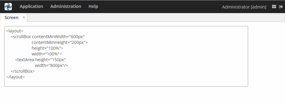
Figure 18. Full-size scrollBox with textArea inside
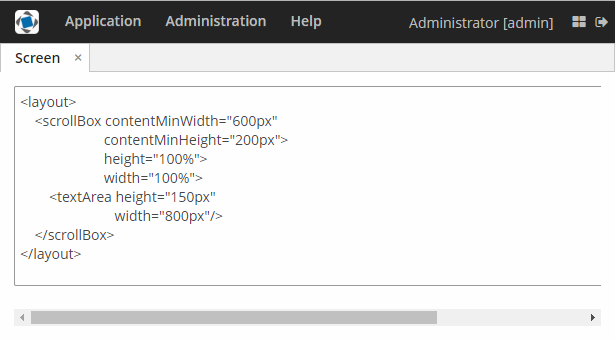
Figure 19. Scroll bar appears to maintain the content width when the window is resized
|
It is recommended to set the content width and height. Otherwise, the components placed in the Do not set the size of nested components to |
You can use keyboard shortcuts in ScrollBox. Set the shortcut and the action to be performed using the addShortcutAction() method:
scrollBox.addShortcutAction(new ShortcutAction("SHIFT-A", shortcutTriggeredEvent ->
notifications.create()
.withCaption("SHIFT-A action")
.show()
));- Attributes of scrollBox
-
align - caption - captionAsHtml - contextHelpText - contextHelpTextHtmlEnabled - css - description - descriptionAsHtml - box.expandRatio - height - htmlSanitizerEnabled - id - margin - orientation - scrollBars - spacing - stylename - width
- API
-
add - addShortcutAction - getComponent - getComponentNN - getComponents - getMargin - getOwnComponent - getOwnComponents - indexOf - remove - removeAll - setMargin - setSpacing
3.5.2.2.11. SplitPanel
SplitPanel − a container divided into two areas by a movable separator.
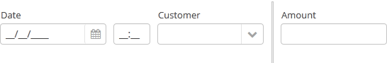
Component XML-name: split.
An example description of a split panel in a screen XML-descriptor:
<split orientation="horizontal" pos="30" width="100%" height="100%">
<vbox margin="true" spacing="true">
<dateField dataContainer="orderDc" property="date" caption="Date"/>
<lookupField dataContainer="orderDc" property="customer" optionsContainer="customersDc" caption="Customer"/>
</vbox>
<vbox margin="true" spacing="true">
<textField dataContainer="orderDc" property="amount" caption="Amount"/>
</vbox>
</split>split container must contain two nested containers or components. They will be displayed on both sides of the separator.
split attributes:
-
dockable- enables or disables theSplitPaneldock button, the default value isfalse.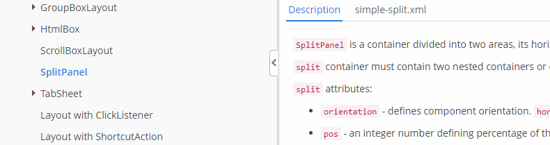
Docking is available only for horizontally-oriented
SplitPanel.
-
dockMode- defines the docking direction. Possible values:LEFTorRIGHT.<split orientation="horizontal" dockable="true" dockMode="RIGHT"> ... </split>
-
minSplitPosition,maxSplitPosition- defines a range of the available position of the split which can be set in pixels or percents.For example, you can restrict moving the splitter between 100 and 300 pixels from the left side of the component as follows:
<split id="splitPanel" maxSplitPosition="300px" minSplitPosition="100px" width="100%" height="100%"> <vbox margin="true" spacing="true"> <button caption="Button 1"/> <button caption="Button 2"/> </vbox> <vbox margin="true" spacing="true"> <button caption="Button 4"/> <button caption="Button 5"/> </vbox> </split>If you want to set the range programmatically, specify a unit of value with
Component.UNITS_PIXELSorComponent.UNITS_PERCENTAGE:splitPanel.setMinSplitPosition(100, Component.UNITS_PIXELS); splitPanel.setMaxSplitPosition(300, Component.UNITS_PIXELS);
-
orientation– defines component orientation.horizontal– nested components are placed horizontally,vertical– they are placed vertically.
-
pos– an integer number defining percentage of the first component area compared to the second one. For example,pos="30"means that the areas ration is 30/70. By default the areas are divided 50/50.
-
reversePosition- indicates that theposattribute specifies a position of the splitter from the opposite side of the component.
-
If the
lockedattribute is set totrue, users are unable to change the separator position.
-
The
stylenameattribute with thelargevalue makes the split handle wider.split.setStyleName(HaloTheme.SPLITPANEL_LARGE);
SplitPanel methods:
-
You can get a position of the splitter using the
getSplitPosition()method.
-
The events of moving the splitter can be intercepted with the help of
PositionUpdateListener. The origin of theSplitPositionChangeEventcan be tracked using isUserOriginated() method. -
If you need to get a unit of splitter position, use
getSplitPositionUnit()method. It will returnComponent.UNITS_PIXELSorComponent.UNITS_PERCENTAGE. -
isSplitPositionReversed()returnstrueif position is set from the opposite side of the component.
The appearance of the SplitPanel component can be customized using SCSS variables with $cuba-splitpanel-* prefix. You can change these variables in the visual editor after creating a theme extension or a custom theme.
- Attributes of split
-
align - caption - captionAsHtml - contextHelpText - contextHelpTextHtmlEnabled - css - description - descriptionAsHtml - dockable - dockMode - box.expandRatio - height - htmlSanitizerEnabled - id - locked - minSplitPosition - maxSplitPosition - orientation - pos - reversePosition - settingsEnabled - stylename - width
- API
-
add - addPositionUpdateListener - applySettings - getComponent - getComponentNN - getComponents - getMaxSplitPosition - getMaxSplitPositionSizeUnit - getMinSplitPosition - getMinSplitPositionSizeUnit - getOwnComponent - getOwnComponents - remove - removeAll - saveSettings
3.5.2.2.12. TabSheet
TabSheet container is a tabbed panel. The panel shows content of one tab at a time.
XML-name of the component: tabSheet.
An example description of a tabbed panel in a screen XML-descriptor:
<tabSheet>
<tab id="mainTab" caption="Tab1" margin="true" spacing="true">
<dateField dataContainer="orderDc" property="date" caption="Date"/>
<lookupField dataContainer="orderDc" property="customer" optionsContainer="customersDc" caption="Customer"/>
</tab>
<tab id="additionalTab" caption="Tab2" margin="true" spacing="true">
<textField dataContainer="orderDc" property="amount" caption="Amount"/>
</tab>
</tabSheet>The description attribute of tabSheet defines a hint which is displayed in a popup when a user hovers the mouse cursor over or clicks on the tabs area.
The tabSheet component should contain nested tab elements describing tabs. Each tab is a container with a vertical components layout similar to vbox.
tab element attributes:
-
id– tab identifier. Please note that tabs are not components and their IDs are used only within aTabSheetin order to work with tabs from the controller. -
caption – tab caption.
-
description - the text of a hint which is displayed in a popup when a user hovers the mouse cursor over or clicks on the concrete tab.
-
lazy– sets lazy loading for tab content.Lazy tabs do not load their content when the screen is opened, which reduces the number of components in memory. Components within a tab are loaded only when a user selects the tab. Additionally, if a lazy-tab includes visual components linked to a data container with a loader, the loader will not be triggered. As a result, screen opens faster, and data is loaded only when the user requests it by selecting this tab.
Please note that the components located on a lazy tab do not exist when the screen is opened. Therefore they cannot be injected into a controller and cannot be obtained by invoking
getComponent()in the controller’sinit()method. The lazy tab components can be accessed only after the user opens the tab. This moment may be intercepted usingTabSheet.SelectedTabChangeListener, for example:@Inject private TabSheet tabSheet; private boolean detailsInitialized, historyInitialized; @Subscribe protected void onInit(InitEvent event) { tabSheet.addSelectedTabChangeListener(selectedTabChangeEvent -> { if ("detailsTab".equals(selectedTabChangeEvent.getSelectedTab().getName())) { initDetails(); } else if ("historyTab".equals(selectedTabChangeEvent.getSelectedTab().getName())) { initHistory(); } }); } private void initDetails() { if (detailsInitialized) { return; } detailsInitialized = true; (1) } private void initHistory() { if (historyInitialized) { return; } historyInitialized = true; (2) }1 use getComponentNN("comp_id")here to get tab’s components2 use getComponentNN("comp_id")here to get tab’s componentsBy default, tabs are not
lazy, which means that all their content is loaded when a screen is opened.The origin of the
SelectedTabChangeEventcan be tracked using isUserOriginated() method.- TabSheet styles
-
In Web Client with a Halo-based theme, you can set predefined styles to the
TabSheetcontainer using thestylenameattribute either in the XML descriptor or in the screen controller:<tabSheet stylename="framed"> <tab id="mainTab" caption="Framed tab"/> </tabSheet>When setting a style programmatically, select one of the
HaloThemeclass constants with theTABSHEET_prefix:tabSheet.setStyleName(HaloTheme.TABSHEET_COMPACT_TABBAR);-
centered-tabs- centers the tabs inside the tab bar. Works best if all the tabs fit completely in the tab bar (i.e. no tab bar scrolling).
-
compact-tabbar- reduces the whitespace around the tabs in the tab bar.
-
equal-width-tabs- gives equal amount of space to all tabs in the tab bar (i.e. expand ratio == 1 for all tabs). The tab captions will be truncated if they do not fit into the tab. Tab scrolling will be disabled when this style is applied (all tabs will be visible at the same time).
-
framed- adds a border around the whole component as well as around individual tabs in the tab bar.
-
icons-on-top- displays tab icons on top of the tab captions (by default the icons are place on the left side of the caption).
-
only-selected-closeable- only the selected tab has the close button visible. Does not prevent closing the tab programmatically, it only hides the button from the end user.
-
padded-tabbar- adds a small amount of padding around the tabs in the tab bar, so that they don’t touch the outer edges of the component.
-
The appearance of the TabSheet component can be customized using SCSS variables with $cuba-tabsheet-* prefix. You can change these variables in the visual editor after creating a theme extension or a custom theme.
- Attributes of tabSheet
-
caption - captionAsHtml - contextHelpText - contextHelpTextHtmlEnabled - css - box.expandRatio - height - id - description - descriptionAsHtml - htmlSanitizerEnabled - stylename - tabCaptionsAsHtml - tabIndex - tabsVisible - visible - width
- Attributes of tab
-
caption - closable - description - enable - expand - margin - icon - id - lazy - spacing - stylename - visible
- Predefined styles of tabSheet
-
centered-tabs - compact-tabbar - equal-width-tabs - framed - icons-on-top - only-selected-closeable - padded-tabbar
- API
-
add - addSelectedTabChangeListener - getComponent - getComponentNN - getComponents - getOwnComponent - getOwnComponents - remove - removeAll
3.5.2.3. Screen Layout Rules
Below we explain how to properly place visual components and containers on your screens.
3.5.2.3.1. Positioning of Components
- Size types
- Content-dependent size
-
The component will take enough space to fit its content.
Examples:
-
For Label, the size is defined by text length.
-
For containers, the size is defined by the sum of all component sizes inside a container.
XML<label width=”AUTO”/>Javalabel.setWidth(Component.AUTO_SIZE);Components with content-dependent size will adjust their dimensions during screen layout initialization or when the content size is changed.
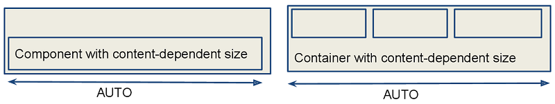
-
- Fixed size
-
Fixed size implies that the component dimensions will not change at runtime.
XML<vbox width=”320px” height=”240px”/>Javavbox.setWidth(”320px”);
- Relative size
-
Relative size indicates the percentage of available space that will be occupied by the component.
XML<label width=”100%”/>Javalabel.setWidth(”50%”);Components with relative size will react to changes in the amount of the available space and adjust their actual size on the screen.
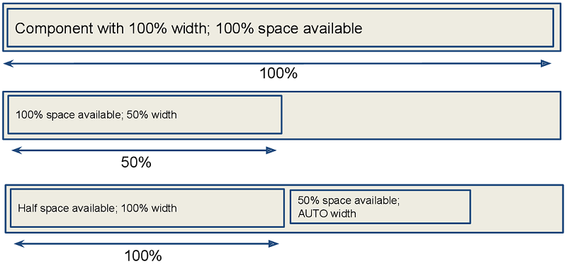
- Container specifics
-
By default, containers without the expand attribute provide equal space for all nested components. Exceptions: flowBox and htmlBox.
For example:
<layout> <button caption="Button"/> <button caption="Button"/> </layout>
Components and containers width and height are content-dependent by default. Some containers have different default dimensions:
Container Width Height 100%
AUTO
100%
AUTO
100%
AUTO
The root layout element is a vertical container (
VBox), which has 100% width and height. The height can beAUTOin dialog mode.Tabs within a TabSheet are VBox containers.
GroupBoxcomponent contains aVBoxor anHBox, depending on the orientation property value.Example of a container with content-based size:
<layout> <vbox> <button caption="Button"/> <button caption="Button"/> </vbox> </layout>
Example of a container with relative size:
<layout spacing="true"> <groupBox caption="GroupBox" height="100%"/> <button caption="Button"/> </layout>
Here,
layout, as well asvboxorhbox, provides equal space to all nested components, andgroupBoxhas 100% height. In addition to that,groupBoxhas 100% width by default and takes all the available space.
- Component specifics
-
It is recommended to set the absolute or relative height for Table and Tree. Otherwise, a table/tree can take unlimited size, if there are too many rows or nodes.
ScrollBox must have fixed or relative (but not AUTO) width and height. Components inside
ScrollBox, positioned in the scrolling direction, may not have relative dimensions.The following examples show the correct use of horizontal and vertical
ScrollBoxcontainers. If scrolling is required in both directions, bothheightandwidthmust be set for the components (AUTO or absolute).
- The expand option
-
The container’s expand attribute allows specifying the component that will be given maximum available space.
The component specified in
expandwill have 100% size in the direction of the component expansion (vertically - forVBox, horizontally - forHBox). When container size is changed, the component will change its size accordingly.<vbox expand="bigBox"> <vbox id="bigBox"/> <label value="Label"/> </vbox>
expandworks relatively to component expansion, for example:<layout spacing="true" expand="groupBox"> <groupBox id="groupBox" caption="GroupBox" width="200px"/> <button caption="Button"/> </layout>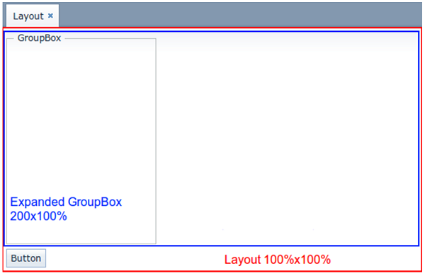
In the following example, the auxiliary Label element (spacer) is used. Due to applied
expand, it takes all the space left in the container.<layout expand="spacer"> <textField caption="Number"/> <dateField caption="Date"/> <label id="spacer"/> <hbox spacing="true"> <button caption="OK"/> <button caption="Cancel"/> </hbox> </layout>
3.5.2.3.2. Margins and Spacing
- Margin for screen borders
-
The margin attribute enables setting margins between container borders and nested components.
If
marginis set totrue, the margin is applied to all sides of the container.<layout> <vbox margin="true" height="100%"> <groupBox caption="Group" height="100%"/> </vbox> <groupBox caption="Group" height="100%"/> </layout>
Margins can be also set for each individual side (Top, Right, Bottom, Left). The example of top and bottom margins:
<vbox margin="true,false,true,false">
- Spacing between components
-
The spacing attribute indicates whether the space should be added between nested components in the direction of the container expansion.
Spacing will work correctly in case some of the nested components become invisible, so you should not use
marginto emulate spacing.<layout spacing="true"> <button caption="Button"/> <button caption="Button"/> <button caption="Button"/> <button caption="Button"/> </layout>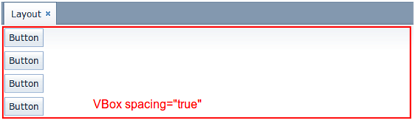
3.5.2.3.3. Alignment
- Aligning components inside a container
-
Use the align attribute to align components within a container.
For example, here the label is located in the centre of the container:
<vbox height="100%"> <label align="MIDDLE_CENTER" value="Label"/> </vbox>
Component with specified alignment should not have 100% size in alignment direction. The container should provide more space than required by the component. The component will be aligned within this space.
The example of alignment within available space:
<layout> <groupBox height="100%" caption="Group"/> <label align="MIDDLE_CENTER" value="Label"/> </layout>
3.5.2.3.4. Common Layout Mistakes
- Common mistake 1. Setting relative size for a component within a container with content-based size
-
Example of incorrect layout with relative size:
In this example, a
labelhas 100% height, while the default height forVBoxis AUTO, i.e. content-based.Example of incorrect layout with expand:
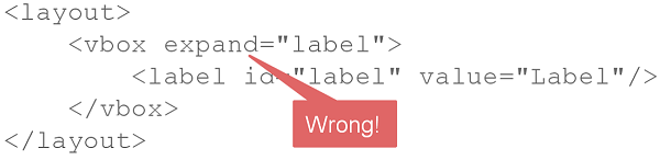
Expand implicitly sets relative 100% height for the label, which is not correct, just like in the example above. In such cases, the screen may not look as expected. Some components may disappear or have zero size. If you encounter any layout problems, check that relative sizes are specified correctly first of all.
- Common mistake 2. Components inside a ScrollBox have 100% dimensions
-
Example of incorrect layout:
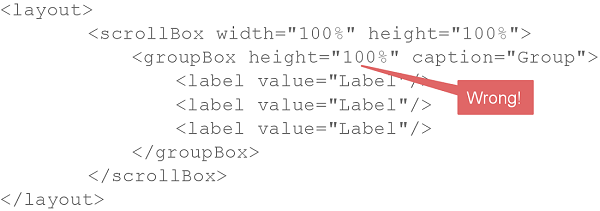
As a result of such mistake, scroll bars in
ScrollBoxwill not appear even if the size of nested components exceeds the scrolling area.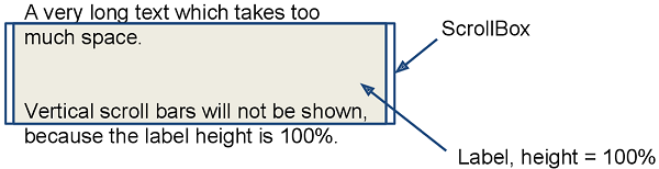
- Common mistake 3. Aligning components with insufficient space
-
Example of incorrect layout:
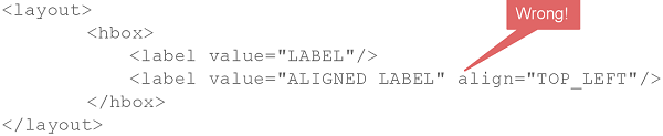
In this example,
HBoxhas content-dependent size, therefore the label alignment has no effect.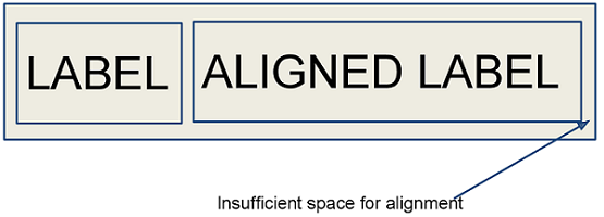
3.5.2.4. Miscellaneous
This section describes different elements of the generic user interface that are related to visual components.
3.5.2.4.1. UiComponents
UiComponents is a factory which allows you to create UI components by name, class or type token.
If you create a component working with data, use a type token to get the component parameterized by the specific value type. For Label, TextField or DateField component, use type token constants like TextField.TYPE_INTEGER. When creating a component working with entities, like PickerField, LookupField or Table, use the static of() method to get the appropriate type token. For other components and containers, use the component class as the argument.
For example:
@Inject
private UiComponents uiComponents;
@Subscribe
protected void onInit(InitEvent event) {
// components working with simple data types
Label<String> label = uiComponents.create(Label.TYPE_STRING);
TextField<Integer> amountField = uiComponents.create(TextField.TYPE_INTEGER);
LookupField<String> stringLookupField = uiComponents.create(LookupField.TYPE_STRING);
// components working with entities
LookupField<Customer> customerLookupField = uiComponents.create(LookupField.of(Customer.class));
PickerField<Customer> pickerField = uiComponents.create(PickerField.of(Customer.class));
Table<OrderLine> table = uiComponents.create(Table.of(OrderLine.class));
// other components and containers
Button okButton = uiComponents.create(Button.class);
VBoxLayout vBox = uiComponents.create(VBoxLayout.class);
// ...
}3.5.2.4.2. Formatter
In an XML-descriptor of a screen, a component’s formatter can be defined in a nested formatter element. The element has a single attribute:
-
class− the name of a class implementing acom.haulmont.cuba.gui.components.Formatter
If formatter’s constructor class has a org.dom4j.Element, parameter, then it will receive an XML element, describing this formatter. This can be used to parameterize a formatter instance. For example, using a formatted string. Particularly, DateFormatter and NumberFormatter classes in the platform can take the format string from the format attribute. Example of using the component:
<column id="date">
<formatter class="com.haulmont.cuba.gui.components.formatters.DateFormatter" format="yyyy-MM-dd HH:mm:ss"/>
</column>Additionally, DateFormatter class also recognizes a type attribute, which can have a DATE or DATETIME value. In this case, formatting is done using the Datatype mechanism using a dateFormat or a dateTimeFormat string respectively. For example:
<column id="endDate">
<formatter class="com.haulmont.cuba.gui.components.formatters.DateFormatter" type="DATE"/>
</column>By default, DateFormatter displays the date and time in the server timezone. To show the current user’s timezone, set true for the useUserTimezone attribute of the formatter.
|
If a formatter is implemented as an internal class, it should be declared with a
|
Formatter can be assigned to a component not only using a screen XML-descriptor , but also programmatically – by submitting a formatter instance into a setFormatter() component.
An example of declaring a custom formatter and using it to format values in a table column:
public class CurrencyFormatter implements Function<BigDecimal, String> {
@Override
public String apply(BigDecimal bigDecimal) {
return NumberFormat.getCurrencyInstance(Locale.getDefault()).format(bigDecimal);
}
}@Inject
private GroupTable<Order> ordersTable;
@Subscribe
public void onInit(InitEvent event) {
Function currencyFormatter = new CurrencyFormatter();
ordersTable.getColumn("totalPrice").setFormatter(currencyFormatter);
}3.5.2.4.3. Presentations
The mechanism of presentations allows users to manage table settings.
Users can:
-
Save presentations with unique names. Table settings are automatically saved in an active presentation.
-
Edit and remove presentations.
-
Switch between presentations.
-
Set up a default presentation, which will be applied on the screen opening.
-
Create global presentations, available to all users. In order to create, change or remove global presentations, a user should have
cuba.gui.presentations.globalsecurity permission.
Presentations are available to components implementing the com.haulmont.cuba.gui.components.Component.HasPresentations interface. These components are:
3.5.2.4.4. Validator
Validator is designed to check values entered into visual components.
|
Validation and input type checking should be differentiated. If a given component (e.g., TextField) data type is set to anything different than string (this can happen when binding to an entity attribute or setting On the other hand, validation does not act immediately on data entry or focus loss, but rather when the component’s |
The framework contains the set of implementations for the most frequently used validators, which can be used in your project:
In a screen XML-descriptor, such component validators can be defined in a nested validators element. Validator can be added using CUBA Studio interface. Below is an example of adding a validator to the TextField component:
Each validator is a Prototype Bean, and if you want to use validators from Java code, you need to get them using BeanLocator.
Some of the validators use Groovy string in error message. It means that it is possible to pass parameters to the error message (e.g., $value). These parameters take account of user’s locale.
You can use a custom Java class as a validator. It should implement the Consumer interface.
In a screen XML-descriptor, a custom validator can be defined in a nested validator element.
|
If the validator is implemented as an internal class, it should be declared with a
|
A validator class can be assigned to a component not only using a screen XML-descriptor but also programmatically – by submitting a validator instance into the component’s addValidator() method.
Example of creating a validator class for zip codes:
public class ZipValidator implements Consumer<String> {
@Override
public void accept(String s) throws ValidationException {
if (s != null && s.length() != 6)
throw new ValidationException("Zip must be of 6 characters length");
}
}Example of using a zip code validator for the TextField component:
<textField id="zipField" property="zip">
<validator class="com.company.sample.web.ZipValidator"/>
</textField>Example of setting a validator programmatically in a screen controller:
zipField.addValidator(value -> {
if (value != null && value.length() != 6)
throw new ValidationException("Zip must be of 6 characters length");
});Below we consider predefined validators.
- DecimalMaxValidator
-
It checks that value is less than or equal to the specified maximum. Supported types:
BigDecimal,BigInteger,Long,Integer, andStringthat representsBigDecimalvalue with the current locale.It has the following attributes:
-
value− maximum value (required); -
inclusive− when set totrue, the value should be less than or equal to the specified maximum value. The default value istrue; -
message− a custom message displayed to a user when validation fails. This message can contain$valueand$maxkeys for formatted output.
Default message keys:
-
validation.constraints.decimalMaxInclusive -
validation.constraints.decimalMax
Layout descriptor usage:
<textField id="numberField" property="numberProperty"> <validators> <decimalMax value="1000" inclusive="false" message="Value '$value' cannot be greater than `$max`"/> </validators> </textField>Java code usage:
DecimalMaxValidator maxValidator = beanLocator.getPrototype(DecimalMaxValidator.NAME, new BigDecimal(1000)); numberField.addValidator(maxValidator); -
- DecimalMinValidator
-
It checks that value is greater than or equal to the specified minimum. Supported types:
BigDecimal,BigInteger,Long,Integer, andStringthat representsBigDecimalvalue with the current locale.It has the following attributes:
-
value− minimum value (required); -
inclusive− when set totrue, the value should be greater than or equal to the specified minimum value. The default value istrue; -
message− a custom message displayed to a user when validation fails. This message can contain$valueand$minkeys for formatted output.
Default message keys:
-
validation.constraints.decimalMinInclusive -
validation.constraints.decimalMin
Layout descriptor usage:
<textField id="numberField" property="numberProperty"> <validators> <decimalMin value="100" inclusive="false" message="Value '$value' cannot be less than `$min`"/> </validators> </textField>Java code usage:
DecimalMinValidator minValidator = beanLocator.getPrototype(DecimalMinValidator.NAME, new BigDecimal(100)); numberField.addValidator(minValidator); -
- DigitsValidator
-
It checks that value is a number within the accepted range. Supported types:
BigDecimal,BigInteger,Long,Integer, andStringthat representsBigDecimalvalue with the current locale.It has the following attributes:
-
integer− count of numbers in the integer part (required); -
fraction− count of numbers in the fraction part (required); -
message− a custom message displayed to a user when validation fails. This message can contain$value,$integer, and$fractionkeys for formatted output.
Default message keys:
-
validation.constraints.digits
Layout descriptor usage:
<textField id="numberField" property="numberProperty"> <validators> <digits integer="3" fraction="2" message="Value '$value' is out of bounds ($integer digits are expected in integer part and $fraction in fractional part)"/> </validators> </textField>Java code usage:
DigitsValidator digitsValidator = beanLocator.getPrototype(DigitsValidator.NAME, 3, 2); numberField.addValidator(digitsValidator); -
- DoubleMaxValidator
-
It checks that value is less than or equal to the specified maximum. Supported types:
Double, andStringthat representsDoublevalue with the current locale.It has the following attributes:
-
value− maximum value (required); -
inclusive− when set totrue, the value should be less than or equal to the specified maximum value. The default value istrue; -
message− a custom message displayed to a user when validation fails. This message can contain$valueand$maxkeys for formatted output.
Default message keys:
-
validation.constraints.decimalMaxInclusive -
validation.constraints.decimalMax
Layout descriptor usage:
<textField id="numberField" property="numberProperty"> <validators> <doubleMax value="1000" inclusive="false" message="Value '$value' cannot be greater than `$max`"/> </validators> </textField>Java code usage:
DoubleMaxValidator maxValidator = beanLocator.getPrototype(DoubleMaxValidator.NAME, new Double(1000)); numberField.addValidator(maxValidator); -
- DoubleMinValidator
-
It checks that value is greater than or equal to the specified minimum. Supported types:
Double, andStringthat representsDoublevalue with the current locale.It has the following attributes:
-
value− minimum value (required); -
inclusive− when set totrue, the value should be greater than or equal to the specified minimum value. The default value istrue; -
message− a custom message displayed to a user when validation fails. This message can contain$valueand$minkeys for formatted output.
Default message keys:
-
validation.constraints.decimalMinInclusive -
validation.constraints.decimalMin
Layout descriptor usage:
<textField id="numberField" property="numberProperty"> <validators> <doubleMin value="100" inclusive="false" message="Value '$value' cannot be less than `$min`"/> </validators> </textField>Java code usage:
DoubleMinValidator minValidator = beanLocator.getPrototype(DoubleMinValidator.NAME, new Double(100)); numberField.addValidator(minValidator); -
- FutureOrPresentValidator
-
It validates that date or time is in the future or present. It doesn’t use Groovy string, so there are no parameters you can pass to the error message. Supported types:
java.util.Date,LocalDate,LocalDateTime,LocalTime,OffsetDateTime,OffsetTime.It has the following attributes:
-
checkSeconds− when set totrue, the validator should compare date or time with seconds and nanos. The default value isfalse; -
message− a custom message displayed to a user when validation fails.
Default message keys:
-
validation.constraints.futureOrPresent
Layout descriptor usage:
<dateField id="dateTimePropertyField" property="dateTimeProperty"> <validators> <futureOrPresent checkSeconds="true"/> </validators> </dateField>Java code usage:
FutureOrPresentValidator futureOrPresentValidator = beanLocator.getPrototype(FutureOrPresentValidator.NAME); dateField.addValidator(futureOrPresentValidator); -
- FutureValidator
-
It validates that date or time is in the future. It doesn’t use Groovy string, so there are no parameters you can pass to the error message. Supported types:
java.util.Date,LocalDate,LocalDateTime,LocalTime,OffsetDateTime,OffsetTime.It has the following attributes:
-
checkSeconds− when set totrue, the validator should compare date or time with seconds and nanos. The default value isfalse; -
message− a custom message displayed to a user when validation fails.
Default message keys:
-
validation.constraints.future
Layout descriptor usage:
<timeField id="localTimeField" property="localTimeProperty" showSeconds="true"> <validators> <future checkSeconds="true"/> </validators> </timeField>Java code usage:
FutureValidator futureValidator = beanLocator.getPrototype(FutureValidator.NAME); timeField.addValidator(futureValidator); -
- MaxValidator
-
It checks that value is less than or equal to the specified maximum. Supported types:
BigDecimal,BigInteger,Long,Integer.It has the following attributes:
-
value− maximum value (required); -
message− a custom message displayed to a user when validation fails. This message can contain$valueand$maxkeys for formatted output.
Default message keys:
-
validation.constraints.max
Layout descriptor usage:
<textField id="numberField" property="numberProperty"> <validators> <max value="20500" message="Value '$value' must be less than or equal to '$max'"/> </validators> </textField>Java code usage:
MaxValidator maxValidator = beanLocator.getPrototype(MaxValidator.NAME, 20500); numberField.addValidator(maxValidator); -
- MinValidator
-
It checks that value is greater than or equal to the specified minimum. Supported types:
BigDecimal,BigInteger,Long,Integer.It has the following attributes:
-
value− minimum value (required); -
message− a custom message displayed to a user when validation fails. This message can contain$value, and$minkeys for formatted output.
Default message keys:
-
validation.constraints.min
Layout descriptor usage:
<textField id="numberField" property="numberProperty"> <validators> <min value="30" message="Value '$value' must be greater than or equal to '$min'"/> </validators> </textField>Java code usage:
MinValidator minValidator = beanLocator.getPrototype(MinValidator.NAME, 30); numberField.addValidator(minValidator); -
- NegativeOrZeroValidator
-
It checks that value is less than or equal 0. Supported types:
BigDecimal,BigInteger,Long,Integer,Double,Float.It has the following attributes:
-
message− a custom message displayed to a user when validation fails. This message can contain$valuekey for formatted output. Note, thatFloatdoesn’t have its own datatype and won’t be formatted with the user’s locale.
Default message keys:
-
validation.constraints.negativeOrZero
Layout descriptor usage:
<textField id="numberField" property="numberProperty"> <validators> <negativeOrZero message="Value '$value' must be less than or equal to 0"/> </validators> </textField>Java code usage:
NegativeOrZeroValidator negativeOrZeroValidator = beanLocator.getPrototype(NegativeOrZeroValidator.NAME); numberField.addValidator(negativeOrZeroValidator); -
- NegativeValidator
-
It checks that value is strictly less than 0. Supported types:
BigDecimal,BigInteger,Long,Integer,Double,Float.It has the following attributes:
-
message− a custom message displayed to a user when validation fails. This message can contain$valuekey for formatted output. Note, thatFloatdoesn’t have its own datatype and won’t be formatted with the user’s locale.
Default message keys:
-
validation.constraints.negative
Layout descriptor usage:
<textField id="numberField" property="numberProperty"> <validators> <negative message="Value '$value' should be less than 0"/> </validators> </textField>Java code usage:
NegativeValidator negativeValidator = beanLocator.getPrototype(NegativeValidator.NAME); numberField.addValidator(negativeValidator); -
- NotBlankValidator
-
It checks that value contains at least one non-whitespace character. It doesn’t use Groovy string, so there are no parameters you can pass to the error message. Supported type:
String.It has the following attributes:
-
message− a custom message displayed to a user when validation fails.
Default message keys:
-
validation.constraints.notBlank
Layout descriptor usage:
<textField id="textField" property="textProperty"> <validators> <notBlank message="Value must contain at least one non-whitespace character"/> </validators> </textField>Java code usage:
NotBlankValidator notBlankValidator = beanLocator.getPrototype(NotBlankValidator.NAME); textField.addValidator(notBlankValidator); -
- NotEmptyValidator
-
It checks that value is not
nulland not empty. Supported types:CollectionandString.It has the following attributes:
-
message− a custom message displayed to a user when validation fails. This message can contain$valuekey for formatted output, only forStringtype.
Default message keys:
-
validation.constraints.notEmpty
Layout descriptor usage:
<textField id="textField" property="textProperty"> <validators> <notEmpty/> </validators> </textField>Java code usage:
NotEmptyValidator notEmptyValidator = beanLocator.getPrototype(NotEmptyValidator.NAME); textField.addValidator(notEmptyValidator); -
- NotNullValidator
-
It checks that value is not
null. It doesn’t use Groovy string, so there are no parameters you can pass to the error message.It has the following attributes:
-
message− a custom message displayed to a user when validation fails.
Default message keys:
-
validation.constraints.notNull
Layout descriptor usage:
<textField id="numberField" property="numberProperty"> <validators> <notNull/> </validators> </textField>Java code usage:
NotNullValidator notNullValidator = beanLocator.getPrototype(NotNullValidator.NAME); numberField.addValidator(notNullValidator); -
- PastOrPresentValidator
-
It validates that date or time is in the past or present. It doesn’t use Groovy string, so there are no parameters you can pass to the error message. Supported types:
java.util.Date,LocalDate,LocalDateTime,LocalTime,OffsetDateTime,OffsetTime.It has the following attributes:
-
checkSeconds− when setting totrue, the validator should compare date or time with seconds and nanos. The default value isfalse; -
message− a custom message displayed to a user when validation fails.
Default message keys:
-
validation.constraints.pastOrPresent
Layout descriptor usage:
<dateField id="dateTimeField" property="dateTimeProperty"> <validators> <pastOrPresent/> </validators> </dateField>Java code usage:
PastOrPresentValidator pastOrPresentValidator = beanLocator.getPrototype(PastOrPresentValidator.NAME); numberField.addValidator(pastOrPresentValidator); -
- PastValidator
-
It validates that date or time is in the past. It doesn’t use Groovy string, so there are no parameters you can pass to the error message. Supported types:
java.util.Date,LocalDate,LocalDateTime,LocalTime,OffsetDateTime,OffsetTime.It has the following attributes:
-
checkSeconds− when setting totrue, the validator should compare date or time with seconds and nanos. The default value isfalse; -
message− a custom message displayed to a user when validation fails.
Default message keys:
-
validation.constraints.past
Layout descriptor usage:
<dateField id="dateTimeField" property="dateTimeProperty"> <validators> <pastOrPresent/> </validators> </dateField>Java code usage:
PastOrPresentValidator pastOrPresentValidator = beanLocator.getPrototype(PastOrPresentValidator.NAME); numberField.addValidator(pastOrPresentValidator); -
- PositiveOrZeroValidator
-
It checks that value is greater than or equal to 0. Supported types:
BigDecimal,BigInteger,Long,Integer,Double,Float.It has the following attributes:
-
message− a custom message displayed to a user when validation fails. This message can contain$valuekey for formatted output. Note, thatFloatdoesn’t have its own datatype and won’t be formatted with the user’s locale.
Default message keys:
-
validation.constraints.positiveOrZero
Layout descriptor usage:
<textField id="numberField" property="numberProperty"> <validators> <positiveOrZero message="Value '$value' should be greater than or equal to '0'"/> </validators> </textField>Java code usage:
PositiveOrZeroValidator positiveOrZeroValidator = beanLocator.getPrototype(PositiveOrZeroValidator.NAME); numberField.addValidator(positiveOrZeroValidator); -
- PositiveValidator
-
It checks that value is strictly greater than 0. Supported types:
BigDecimal,BigInteger,Long,Integer,Double,Float.It has the following attributes:
-
message− a custom message displayed to a user when validation fails. This message can contain$valuekey for formatted output. Note, thatFloatdoesn’t have its own datatype and won’t be formatted with the user’s locale.
Default message keys:
-
validation.constraints.positive
Layout descriptor usage:
<textField id="numberField" property="numberProperty"> <validators> <positive message="Value '$value' should be greater than '0'"/> </validators> </textField>Java code usage:
PositiveValidator positiveValidator = beanLocator.getPrototype(PositiveValidator.NAME); numberField.addValidator(positiveValidator); -
- RegexpValidator
-
It checks that
Stringvalue is matched with specified regular expression. Supported type:String.It has the following attributes:
-
regexp− a regular expression to match (required); -
message− a custom message displayed to a user when validation fails. This message can contain$valuekey for formatted output.
Default message keys:
-
validation.constraints.regexp
Layout descriptor usage:
<textField id="textField" property="textProperty"> <validators> <regexp regexp="[a-z]*"/> </validators> </textField>Java code usage:
RegexpValidator regexpValidator = beanLocator.getPrototype(RegexpValidator.NAME, "[a-z]*"); textField.addValidator(regexpValidator); -
- SizeValidator
-
It checks that value is in a specific range. Supported types:
CollectionandString.It has the following attributes:
-
min− a minimum value (with inclusive), cannot be less than 0. The default value is 0; -
max− a maximum value (with inclusive), cannot be less than 0. The default value isInteger.MAX_VALUE; -
message− a custom message displayed to a user when validation fails. This message can contain$value(only forStringtype),$min,$maxkeys for formatted output.
Default message keys:
-
validation.constraints.collectionSizeRange -
validation.constraints.sizeRange
Layout descriptor usage:
<textField id="textField" property="textProperty"> <validators> <size min="2" max="10" message="Value '$value' should be between '$min' and '$max'"/> </validators> </textField> <twinColumn id="twinColumn"> <validators> <size min="2" max="4" message="Collection size must be between $min and $max"/> </validators> </twinColumn>Java code usage:
SizeValidator sizeValidator = beanLocator.getPrototype(SizeValidator.NAME); textField.addValidator(sizeValidator); -
3.5.2.5. API of Components
- Common
-
-
unwrap()- returns client-specific component instance (Vaadin or Swing component). Can be used in client module to simplify invocation of underlying API, see Working with Vaadin Components section.com.vaadin.ui.TextField vTextField = textField.unwrap(com.vaadin.ui.TextField.class); -
unwrapComposition()- returns the outmost external container of client-specific component instance. Can be used in client module to simplify invocation of underlying API.
Available for all components.
-
- Buffered
-
-
commit()- updates all changes made since the previous commit to the data source.
-
discard()- discards all changes since last commit. The object updates its value from the data source.
-
isModified()- returnstrueif the object value has been modified since it was last updated from the data source.
if (textArea.isModified()) { textArea.commit(); }Available for components:
-
- Collapsable
-
-
addExpandedStateChangeListener()- adds the listener implementing theExpandedStateChangeListenerinterface to intercept the component’s expanded state change events.@Subscribe("groupBox") protected void onGroupBoxExpandedStateChange(Collapsable.ExpandedStateChangeEvent event) { notifications.create() .withCaption("Expanded: " + groupBox.isExpanded()) .show(); }Available for components:
-
- ComponentContainer
-
-
add()- adds child component to the container.
-
remove()- removes the child component from the container.
-
removeAll()- removes all children components from te container.
-
getOwnComponent()- returns the component directly owned by this container.
-
getComponent()- returns the component belonging to the whole components tree below this container.
-
getComponentNN()- returns the component belonging to the whole components tree below this container. Throws an exception if not found.
-
getOwnComponents()- returns all components directly owned by this container.
-
getComponents()- returns all components belonging to the whole components tree below this container.
Available for components:
Accordion - BoxLayout - CssLayout - FieldGroup - Form - Frame - GridLayout - GroupBoxLayout - HtmlBoxLayout - ScrollBoxLayout - SplitPanel - TabSheet
-
- OrderedContainer
-
-
indexOf()- returns the index of a given component in an ordered container.
Available for components:
BoxLayout - CssLayout - Frame - GroupBoxLayout - ScrollBoxLayout -
-
- HasContextHelp
-
-
setContextHelpText()- sets context help text. If set, then a special icon will be added for a field, see contextHelpText. -
setContextHelpTextHtmlEnabled()- defines if context help text should be rendered as HTML, see contextHelpTextHtmlEnabled. -
setContextHelpIconClickHandler()- sets a context help icon click handler. Click handler has priority over context help text, i.e. no tooltip with context help text will be shown if the click handler is set.
textArea.setContextHelpIconClickHandler(contextHelpIconClickEvent -> dialogs.createMessageDialog() .withCaption("Title") .withMessage("Message body") .withType(Dialogs.MessageType.CONFIRMATION) .show() );Available for almost all components:
Accordion - BoxLayout - BrowserFrame - ButtonsPanel - Calendar - CheckBox - CheckBoxGroup - ColorPicker - CssLayout - CurrencyField - DataGrid - DateField - DatePicker - Embedded - FieldGroup - FileUploadField - Filter - Form - GridLayout - GroupBoxLayout - GroupTable - HtmlBoxLayout - Image - JavaScriptComponent - Label - LookupField - LookupPickerField - MaskedField - OptionsGroup - OptionsList - PasswordField - PickerField - PopupView - ProgressBar - RadioButtonGroup - RichTextArea - ScrollBoxLayout - SearchPickerField - Slider - SourceCodeEditor - SplitPanel - SuggestionField - SuggestionPickerField - Table - TabSheet - TextArea - TextField - TimeField - TokenList - Tree - TreeDataGrid - TreeTable - TwinColumn
-
- HasSettings
-
-
applySettings()- restores the last user settings for this component. -
saveSettings()- saves current user settings for this component.
Available for components:
DataGrid - Filter - GroupBoxLayout - SplitPanel - Table - TextArea
-
- HasUserOriginated
-
-
isUserOriginated()- provides information of the event origin. Returnstrueif this event was triggered by user interaction, on the client side, orfalseif it was triggered programmatically, on the server side.Usage example:
@Subscribe("customersTable") protected void onCustomersTableSelection(Table.SelectionEvent<Customer> event) { if (event.isUserOriginated()) notifications.create() .withCaption("You selected " + event.getSelected().size() + " customers") .show(); }
The
isUserOriginated()method is available for the following events:-
CollapseEventin TreeDataGrid and Tree, -
ColumnCollapsingChangeEventin DataGrid, -
ColumnReorderEventin DataGrid, -
ColumnResizeEventin DataGrid, -
ExpandedStateChangeEventin Filter and GroupBoxLayout (see Collapsable), -
ExpandEventin TreeDataGrid and Tree, -
SelectedTabChangeEventin TabSheet, -
SelectionEventin DataGrid, -
SelectionEventin Table, -
SortEventin DataGrid, -
SplitPositionChangeEventin SplitPanel, -
ValueChangeEventof the components implementingHasValueinterface (see ValueChangeListener).
-
- HasValue
-
-
addValueChangeListener()- adds the listener implementing theValueChangeListenerinterface to intercept the component’s value changes.@Inject private TextField<String> textField; @Inject private Notifications notifications; @Subscribe protected void onInit(InitEvent event) { textField.addValueChangeListener(stringValueChangeEvent -> notifications.create() .withCaption("Before: " + stringValueChangeEvent.getPrevValue() + ". After: " + stringValueChangeEvent.getValue()) .show()); }For the same purpose, you can subscribe to a dedicated event of a component, for example:
@Subscribe("textField") protected void onTextFieldValueChange(HasValue.ValueChangeEvent<String> event) { notifications.create() .withCaption("Before: " + event.getPrevValue() + ". After: " + event.getValue()) .show(); }
See also UserOriginated.
Available for components:
CheckBox - CheckBoxGroup - ColorPicker - CurrencyField - DateField - DatePicker - FileUploadField - Label - LookupField - LookupPickerField - MaskedField - OptionsGroup - OptionsList - PasswordField - PickerField - ProgressBar - RadioButtonGroup - RichTextArea - SearchPickerField - Slider - SourceCodeEditor - SuggestionField - SuggestionPickerField - TextArea - TextField - TimeField - TokenList - TwinColumn
-
- LayoutClickNotifier
-
-
addLayoutClickListener()- adds the listener implementing theLayoutClickListenerinterface to intercept the clicks on the component area.vbox.addLayoutClickListener(layoutClickEvent -> notifications.create() .withCaption("Clicked") .show());For the same purpose, you can subscribe to a dedicated event of a component, for example:
@Subscribe("vbox") protected void onVboxLayoutClick(LayoutClickNotifier.LayoutClickEvent event) { notifications.create() .withCaption("Clicked") .show(); }
Available for components:
-
- HasMargin
-
-
setMargin()- sets the margins for the component.-
Sets margins on all sides of the component:
vbox.setMargin(true); -
Sets margins only on the top and the bottom of the component:
vbox.setMargin(true, false, true, false); -
Creates new instance of
MarginInfoconfiguration class:vbox.setMargin(new MarginInfo(true, false, false, true));
-
-
getMargin()- returns margin configuration as an instance ofMarginInfoclass.
-
- HasOuterMargin
-
-
setOuterMargin()- sets the outer margins outside the border of the component.-
Sets outer margins on all sides of the component:
groupBox.setOuterMargin(true); -
Sets outer margins only on the top and the bottom of the component:
groupBox.setOuterMargin(true, false, true, false); -
Creates new instance of
MarginInfoconfiguration class:groupBox.setOuterMargin(new MarginInfo(true, false, false, true));
-
-
getOuterMargin()- returns outer margin configuration as an instance ofMarginInfoclass.
Available for component:
-
- HasSpacing
-
-
setSpacing()- adds space between the component and its child components.vbox.setSpacing(true);
Available for components:
-
- ShortcutNotifier
-
-
addShortcutAction()- adds an action which is triggered when the user presses a given key combination.cssLayout.addShortcutAction(new ShortcutAction("SHIFT-A", shortcutTriggeredEvent -> notifications.create() .withCaption("SHIFT-A action") .show()));
Available for components:
-
3.5.2.6. XML-Attributes of Components
- align
-
Defines the component position relative to the parent container. Possible values are:
-
TOP_RIGHT -
TOP_LEFT -
TOP_CENTER -
MIDDLE_RIGHT -
MIDDLE_LEFT -
MIDDLE_CENTER -
BOTTOM_RIGHT -
BOTTOM_LEFT -
BOTTOM_CENTER
-
- box.expandRatio
-
In vbox and hbox containers, components are placed in slots. The
box.expandRatioattribute specifies the expand ratio for each slot. The ratio must be greater than or equal to 0.<hbox width="500px" expand="button1" spacing="true"> <button id="button1" box.expandRatio="1"/> <button id="button2" width="100%" box.expandRatio="3"/> <button id="button3" width="100%" box.expandRatio="2"/> </hbox>If we specify
box.expandRatio=1to one component and its height or width is 100% (depends on layout), this component will be expanded to use all available space in the direction of component placement.By default, all slots for components have equal width or height (i.e.
box.expandRatio = 1). If another value is set for at least one component, all implicit values are ignored, and only explicitly assigned values are considered.See also the expand attribute.
- caption
-
Sets the component’s caption.
The attribute value can either be a message or a key in a message pack. In case of a key, the value should begin with the
msg://prefix.There are two ways of setting a key:
-
A short key – in this case the message will be searched in the package of the current screen:
caption="msg://infoFieldCaption" -
Full key including package name:
caption="msg://com.company.sample.gui.screen/infoFieldCaption"
-
- captionAsHtml
-
Defines whether HTML is enabled in the component’s caption. If set to
true, the captions are rendered in the browser as HTML, and the developer is responsible for ensuring no harmful HTML is used. If set tofalse, the content is rendered in the browser as plain text.Possible values −
true,false. Default isfalse.
- captionProperty
-
Defines the name of an entity attribute which is displayed by a component.
captionPropertycan only be used for entities contained in a datasource (for example, defined by the optionsDatasource property of the LookupField component).If
captionPropertyis not defined, instance name is shown.
- colspan
-
Sets the number of grid columns that the component should occupy (default is 1).
This attribute can be defined for any component located immediately within a GridLayout container.
- contextHelpText
-
Sets the context help text. If set, then a special ? icon will be added for a field. If the field has an external caption, i.e. either caption or icon attribute is set, then the context help icon will be displayed next to the caption text, otherwise next to the field itself:
In the web client, the context help tooltip appears when the users hovers over the ? icon.
<textField id="textField" contextHelpText="msg://contextHelp"/>
- contextHelpTextHtmlEnabled
-
Defines if context help text can be presented as HTML.
<textField id="textField" description="Description" contextHelpText="<p><h1>Lorem ipsum dolor</h1> sit amet, <b>consectetur</b> adipiscing elit.</p><p>Donec a lobortis nisl.</p>" contextHelpTextHtmlEnabled="true"/>
Possible values −
true,false.
- css
-
Provides a declarative way to set CSS properties for UI components. This attribute can be used together with the stylename attribute, see an example below.
XML definition:<cssLayout css="display: grid; grid-gap: 10px; grid-template-columns: 33% 33% 33%" stylename="demo" width="100%" height="100%"> <label value="A" css="grid-column: 1 / 3; grid-row: 1"/> <label value="B" css="grid-column: 3; grid-row: 1 / 3;"/> <label value="C" css="grid-column: 1; grid-row: 2;"/> <label value="D" css="grid-column: 2; grid-row: 2;"/> </cssLayout>Additional CSS:.demo > .v-label { display: block; background-color: #444; color: #fff; border-radius: 5px; padding: 20px; font-size: 150%; }
- dataContainer
-
Sets a data container defined in the
datasection of the screen XML descriptor.When setting the
dataContainerattribute for a component, the property attribute should also be set.
- dataLoader
-
Sets a data loader defined for a data container in the
datasection of the screen XML descriptor.
- datasource
-
Sets a data source defined in the
dsContextsection of the screen XML descriptor.When setting the
datasourceattribute for a component implementing theDatasourceComponentinterface, the property attribute should also be set.
- datatype
-
Sets a data type if the field is not connected to an entity attribute (i.e. the data container and attribute name are not set). The attribute value accepts a data type registered in the application metadata − see Datatype.
The attribute is used for TextField, DateField, DatePicker, TimeField, Slider components.
- description
-
Defines a hint which is displayed in a popup when a user hovers the mouse cursor over or clicks on the component area.
- descriptionAsHtml
-
Defines whether HTML is allowed in the component’s description. If set to
true, the captions are rendered in the browser as HTML, and the developer is responsible for ensuring no harmful HTML is used. If set tofalse, the content is rendered in the browser as plain text.Possible values −
true,false. Default isfalse.
- editable
-
Indicates that the component’s content can be edited (do not confuse with enable).
Possible values −
true,false. Default value istrue.Ability to edit content of a component bound to data (inheritor of
DatasourceComponentorListComponent) is also influenced by the security subsystem. If the security subsystem information indicates that the component should not be editable, the value of itseditableattribute is ignored.
- enable
-
Defines the component’s enabled/disabled state.
If a component is disabled, it does not accept input focus. Disabling a container disables all of its components as well. Possible values are
true,false. By default all components are enabled.
- expand
-
Defines a component within the container that should be expanded to use all available space in the direction of component placement.
For a container with vertical placement, this attribute sets 100% height to a component; for the containers with horizontal placement - 100% width. Additionally, resizing a container will resize the expanded component.
See also box.expandRatio.
- height
-
Sets the component’s height. Can be set in pixels or in percents of the parent container height. For example:
100px,100%,50. If it is specified without units, pixels are assumed.Setting a value in
%means that the component will occupy the corresponding height within an area provided by the parent container.When set to
AUTOor-1px, a default value will be used for the component height. For a container, default height is defined by the content: it is the sum of the heights of all nested components.
- htmlSanitizerEnabled
-
Defines whether HTML sanitization is enabled for the component’s content (caption, description, contextHelpText attributes). If the
htmlSanitizerEnabledis set totrueand appropriate attributes (captionAsHtml, descriptionAsHtml, contextHelpTextHtmlEnabled) are set totrue, then the value ofcaption,description, andcontextHelpTextattributes will be sanitized.protected static final String UNSAFE_HTML = "<i>Jackdaws </i><u>love</u> <font size=\"javascript:alert(1)\" " + "color=\"moccasin\">my</font> " + "<font size=\"7\">big</font> <sup>sphinx</sup> " + "<font face=\"Verdana\">of</font> <span style=\"background-color: " + "red;\">quartz</span><svg/onload=alert(\"XSS\")>"; @Inject private TextField<String> textFieldOn; @Inject private TextField<String> textFieldOff; @Subscribe public void onInit(InitEvent event) { textFieldOn.setCaption(UNSAFE_HTML); textFieldOn.setCaptionAsHtml(true); textFieldOn.setHtmlSanitizerEnabled(true); (1) textFieldOff.setCaption(UNSAFE_HTML); textFieldOff.setCaptionAsHtml(true); textFieldOff.setHtmlSanitizerEnabled(false); (2) }1 – TextFieldhas a safe HTML as its caption.2 – TextFieldhas an unsafe HTML as its caption.htmlSanitizerEnabledattribute overrides the value of global cuba.web.htmlSanitizerEnabled configuration property.
- icon
-
Sets a component icon.
The attribute value should contain a path to an icon file relative to the themes folder:
icon="icons/create.png"or the icon name in an icon set:
icon="CREATE_ACTION"If different icons should be displayed depending on the user’s language, you can set paths to the icons in the message pack and specify a message key in the
iconattribute, for example:icon="msg://addIcon"Font elements of Font Awesome can be used instead of files in web client with Halo theme (or derived from it). For this, specify the name of the required constant of the
com.vaadin.server.FontAwesomeclass in the icon property with thefont-icon:prefix, for example:icon="font-icon:BOOK"For more details on the usage of icons see the Icons section.
- id
-
Sets an identifier of the component.
It is recommended to create identifiers according to the rules for Java-identifiers and use camelСase, for example:
userGrid,filterPanel. Theidattribute can be specified for any component and should be unique within a screen.
- inputPrompt
-
Defines a string which is displayed in the field when its value is
null.<suggestionField inputPrompt="Let's search something!"/>The attribute is used for TextField, LookupField, LookupPickerField, SearchPickerField, SuggestionPickerField components in web client only.
- margin
-
Defines indentation between the outer borders and the container content.
It can take value of two types:
-
margin="true"− enables margins for all sides. -
margin="true,false,true,false"− enables only the top and the bottom margin (the value format is "top,right,bottom,left").
By default margins are disabled.
-
- metaClass
-
Defines the columns type of table component if neither dataContainer nor datasource attributes are defined declaratively. Defining the
metaClassattribute in XML is equivalent to setting empty items for DataGrid, GroupTable, Table, TreeDataGrid, or TreeTable, thus you can set the items programmatically in a screen controller.<table id="table" metaClass="sec$User"> <actions> <action id="refresh" type="refresh"/> </actions> </table>
- nullName
-
Selection of the option defined in the
nullNameattribute is equal to setting thenullvalue to the component.The attribute is used for LookupField, LookupPickerField, and SearchPickerField components.
Example of setting an attribute value in an XML-descriptor:
<lookupField datasource="orderDs" property="customer" nullName="(none)" optionsDatasource="customersDs" width="200px"/>Example of setting an attribute value in a controller:
<lookupField id="customerLookupField" optionsDatasource="customersDs" width="200px" datasource="orderDs" property="customer"/>customerLookupField.setNullOption("<null>");
- openType
-
Defines how a related screen will be opened. Corresponds to the
WindowManager.OpenTypeenumeration with the valuesNEW_TAB,THIS_TAB,NEW_WINDOW,DIALOG. Default value isTHIS_TAB.
- optionsContainer
-
Sets the name of a data container which contains a list of options.
captionProperty attribute can be used together with
optionsContainer.
- optionsDatasource
-
Sets the name of a data source which contains a list of options.
captionProperty attribute can be used together with
optionsDatasource.
- optionsEnum
-
Sets the enumeration class name which contains a list of options.
- property
-
Sets the name of an entity attribute which value will be displayed and edited by this visual component.
propertyis always used together with the datasource attribute.
- required
-
Indicates that this field requires a value.
Possible values −
true,false. Default isfalse.The requiredMessage attribute can be used together with
required.
- requiredMessage
-
Used together with the required attribute. It sets a message that will be displayed to a user when the component has no value.
The attribute can contain a message or a key from a message pack, for example:
requiredMessage="msg://infoTextField.requiredMessage"
- responsive
-
Indicates that the component should react on change in the available space. Reaction can be customized with the help of styles.
Possible values −
true,false. Default isfalse.
- rowspan
-
Sets the number of grid lines that the component should occupy (default is 1).
This attribute can be set for any component located immediately within a GridLayout container.
- settingsEnabled
-
Defines if user settings for the component should be saved/restored. Settings are saved only if the component’s id is set.
Possible values −
true,false. Default istrue.
- showOrphans
-
The
showOrphansattribute is used to control the visibility of orphan records of tree-like components, i.e., records whose parents are not available in the current data set. If theshowOrphansattribute is set tofalse, the component doesn’t show orphans records. If theshowOrphansis set totrue, the component behaves as before, i.e., orphan records are displayed on the top level as roots.The default value is
true.Not showing orphans looks like a natural choice when using filters. However, it doesn’t help with paging (some pages will be empty or half-populated), so paging should be turned off using tree-like components:
-
Set the value of filter’s useMaxResults attribute to
false; -
Remove the rowsCount element from tables.
The attribute is used for Tree, TreeDataGrid, TreeTable components.
-
- spacing
-
Sets spacing between components within a container.
Possible values −
true,false.By default spacing is disabled.
- stylename
-
Defines a style name for a component. See Themes for details.
There are several predefined styles in
halotheme available for the components:-
huge- sets the field size to 160% of its default size.
-
large- sets the field size to 120% of its default size.
-
small- sets the field size to 85% of its default size.
-
tiny- sets the field size to 75% of its default size.
-
- tabCaptionsAsHtml
-
Defines whether HTML is allowed in the tab captions. If set to
true, the captions are rendered in the browser as HTML, and the developer is responsible for ensuring no harmful HTML is used. If set tofalse, the content is rendered in the browser as plain text.Possible values −
true,false. Default isfalse.
- tabIndex
-
Specifies whether the component is focusable and sets the relative order of the component in the sequence of focusable components on the screen.
It can can take integer values of positive or negative range:
-
negative valuemeans that the component should be focusable, but should not be reachable via sequential keyboard navigation; -
0means that the component should be focusable and reachable via sequential keyboard navigation, but its relative order follows its relative position on the screen; -
positive valuemeans the component should be focusable and reachable via sequential keyboard navigation; its relative order is defined by the value of the attribute: the sequential follows the increasing number of thetabIndex. If several components share the sametabIndexvalue, their relative order follows their relative position on the screen.
-
- tabsVisible
-
Sets whether the tab selection part should be shown in the UI.
Possible values −
true,false. Default istrue.
- textSelectionEnabled
-
Defines if text selection is enabled in table cells.
Possible values −
true,false. Default isfalse.
- visible
-
Sets visibility of the component. Possible values −
true,false.If a container is invisible all its components are invisible. By default all components are visible.
- width
-
Defines component’s width.
The value can be set in pixels or in percents of the width of the parent container. For example:
100px,100%,50. If specified without units, pixels are assumed. Setting a value in%means that the component will occupy the corresponding width within an area provided by the parent container.When set to
AUTOor-1px, a default value will be used for a component width. For a container, the default width is defined by the content: it is the sum of the widths of all nested components.
3.5.3. Data Components
Data components are non-visual elements of screens that provide loading of data from the middle tier, binding it to data-aware visual components and saving changed data back to the middle tier. There are the following categories of data components:
-
Containers provide the thin layer between entities and data-aware visual components. Different types of containers hold either single instances or collections of entities.
-
Loaders load data from the middle tier to containers.
-
DataContext tracks changes in entities and saves changed instances back to the middle tier upon request.
Usually, data components are defined in the screen XML descriptor in the <data> element. They can be injected into the controller in the same way as visual components:
@Inject
private CollectionLoader<Customer> customersDl;
private String customerName;
@Subscribe
protected void onBeforeShow(BeforeShowEvent event) {
customersDl.setParameter("name", customerName)
customersDl.load();
}Data components of a particular screen are registered in the ScreenData object which is associated with the screen controller and available through its getScreenData() method. This object is useful when you need to load all data for the screen, for example:
@Subscribe
protected void onBeforeShow(BeforeShowEvent event) {
getScreenData().loadAll();
}|
Please note that screens load data automatically when the |
3.5.3.1. Data Containers
Data containers form a thin layer between visual components and the data model. They are designed to hold entity instances and collections, provide information about entity meta-class, view and a selected instance for collections, register listeners to various events.

Figure 20. Interfaces of Data Containers
3.5.3.1.1. InstanceContainer
The InstanceContainer interface is a root of data containers hierarchy. It is designed to hold a single entity instance and has the following methods:
-
setItem()- sets an entity instance to the container. -
getItem()- returns the instance stored in the container. If the container is empty, the method throws an exception. Use this method when you are sure that an entity has been set in the container, then you don’t have to check the returned value for null. -
getItemOrNull()- returns the instance stored in the container. If the container is empty, this method returns null. Always check the returned value for null before using it. -
getEntityMetaClass()- returns the meta-class of the entity that can be stored in this container. -
setView()- sets a view that must be used when loading entities for this container. Keep in mind that containers themselves do not load data, so this attribute just indicates the desired view for a loader connected to this container. -
getView()- returns a view that must be used when loading entities for this container.
- InstanceContainer events
-
The
InstanceContainerinterface allows you to register listeners to the following events.-
ItemPropertyChangeEventis sent when the value of an attribute of the instance stored in the container is changed. Example of subscribing to the event for a container defined in the screen XML withcustomerDcid:@Subscribe(id = "customerDc", target = Target.DATA_CONTAINER) private void onCustomerDcItemPropertyChange( InstanceContainer.ItemPropertyChangeEvent<Customer> event) { Customer customer = event.getItem(); String changedProperty = event.getProperty(); Object currentValue = event.getValue(); Object previousValue = event.getPrevValue(); // ... } -
ItemChangeEventis sent when another instance (or null) is set in the container. Example of subscribing to the event for a container defined in the screen XML withcustomerDcid:@Subscribe(id = "customerDc", target = Target.DATA_CONTAINER) private void onCustomerDcItemChange(InstanceContainer.ItemChangeEvent<Customer> event) { Customer customer = event.getItem(); Customer previouslySelectedCustomer = event.getPrevItem(); // ... }
-
3.5.3.1.2. CollectionContainer
The CollectionContainer interface is designed to hold a collection of entities of the same type. It is a descendant of InstanceContainer and defines the following specific methods:
-
setItems()- sets a collection of entities to the container. -
getItems()- returns an immutable list of entities stored in the container. Use this method to iterate over the collection, to get a stream or to get an instance by its position in the list. If you need to get an entity instance by its id, usegetItem(entityId). For example:@Inject private CollectionContainer<Customer> customersDc; private Optional<Customer> findByName(String name) { return customersDc.getItems().stream() .filter(customer -> Objects.equals(customer.getName(), name)) .findFirst(); } -
getMutableItems()- returns a mutable list of entities stored in the container. All list changes caused by theadd(),addAll(),remove(),removeAll(),set(),clear()methods produceCollectionChangeEvent, so subscribed visual components will update accordingly. For example:@Inject private CollectionContainer<Customer> customersDc; private void createCustomer() { Customer customer = metadata.create(Customer.class); customer.setName("Homer Simpson"); customersDc.getMutableItems().add(customer); }Use
getMutableItems()only when you want to change the collection, otherwise prefergetItems(). -
setItem()- sets the current item for this container. If the provided item is not null, it must exist in the collection. The method sendsItemChangeEvent.Please note that visual components like Table do not listen to
ItemChangeEventsent by the container. So if you want to select a row in a table, use thesetSelected()method of the table instead ofsetItem()method of the collection container. The current item of the container will also be changed, because the container listens to the component. For example:@Inject private CollectionContainer<Customer> customersDc; @Inject private GroupTable<Customer> customersTable; private void selectFirstRow() { customersTable.setSelected(customersDc.getItems().get(0)); } -
getItem()- overrides the method ofInstanceContainerand returns the current item. If the current item is not set, the method throws an exception. Use this method when you are sure that the current item has been set for the container, then you don’t have to check the returned value for null. -
getItemOrNull()- overrides the method ofInstanceContainerand returns the current item. If the current item is not set, this method returns null. Always check the returned value for null before using it. -
getItemIndex(entityId)- returns the position of an instance with the given id in the list returned by thegetItems()andgetMutableItems()methods. This method acceptsObjectand you can pass either id or the entity instance itself. The container implementation maintains a map of ids to indexes, so the method works fast even on large lists. -
getItem(entityId)- returns an instance from the collection by its id. It’s a shortcut method which first obtains the instance position usinggetItemIndex(entityId)and then returns the instance from the list usinggetItems().get(index). The method throws an exception if the instance with the specified id doesn’t exist in the collection. -
getItemOrNull(entityId)- same asgetItem(entityId)but returns null if the instance with the specified id doesn’t exist in the collection. Always check the returned value for null before using it. -
containsItem(entityId)- returns true if an instance with the specified id exists in the collection. It’s a shortcut method which usesgetItemIndex(entityId)under the hood. -
replaceItem(entity)- if the item with the same id exists in the container, it is replaced with the given instance. If not, the given instance is added to the items list. The method sendsCollectionChangeEventof theSET_ITEMorADD_ITEMStype depending on what has been done. -
setSorter()- sets the given sorter for this container. Standard implementation of theSorterinterface isCollectionContainerSorter. It is set by the framework automatically when the container is associated with a loader. You can provide your own implementation if needed. -
getSorter()- returns the sorter currently set for this container.
- CollectionContainer events
-
In addition to events of InstanceContainer, the
CollectionContainerinterface allows you to register listeners to theCollectionChangeEventevent which is sent when the container items collection is changed, i.e. on adding, removing and replacing elements. Example of subscribing to the event for a container defined in the screen XML withcustomersDcid:@Subscribe(id = "customersDc", target = Target.DATA_CONTAINER) private void onCustomersDcCollectionChange( CollectionContainer.CollectionChangeEvent<Customer> event) { CollectionChangeType changeType = event.getChangeType(); (1) Collection<? extends Customer> changes = event.getChanges(); (2) // ... }1 - type of changes: REFRESH, ADD_ITEMS, REMOVE_ITEMS, SET_ITEM. 2 - collection of entities that were added or removed from the container. If the change type is REFRESH, the framework cannot determine what exactly items were added or removed, so this collection is empty.
3.5.3.1.3. Property Containers
InstancePropertyContainer and CollectionPropertyContainer are designed to work with entity instances and collections that are attributes of other entities. For example, if the Order entity that has the orderLines attribute which is a collection of the OrderLine entity, you can use CollectionPropertyContainer to bind orderLines to a table component.
Property containers implement the Nested interface which defines methods to get the master container and the name of its attribute to bind the property container to. In the example with Order and OrderLine entities, the master container is the one storing the Order instance.
InstancePropertyContainer works directly with the attribute of the master entity. It means that if you invoke its setItem() method, the value will be set to the corresponding master entity attribute and its ItemPropertyChangeEvent listener will be invoked.
CollectionPropertyContainer contains a copy of the master collection and its methods behave as follows:
-
getMutableItems()returns the mutable list of entities and changes in the list are reflected in the underlying property. That is if you remove an item from this list, the master attribute will be changed andItemPropertyChangeEventlistener will be invoked on the master container. -
getDisconnectedItems()returns the mutable list of entities, but changes in the list are not reflected in the underlying property. That is if you remove an item from this list, the master attribute will stay the same. -
setItems()sets a collection of entities to the container and to the underlying property.ItemPropertyChangeEventlistener is invoked on the master container. -
setDisconnectedItems()sets a collection of entities to the container, but the underlying master attribute will stay the same.
The getDisconnectedItems() and setDisconnectedItems() methods can be used to temporarily change the representation of the collection in UI, for example to filter a table:
@Inject
private CollectionPropertyContainer<OrderLine> orderLinesDc;
private void filterByProduct(String product) {
List<OrderLine> filtered = getEditedEntity().getOrderLines().stream()
.filter(orderLine -> orderLine.getProduct().equals(product))
.collect(Collectors.toList());
orderLinesDc.setDisconnectedItems(filtered);
}
private void resetFilter() {
orderLinesDc.setDisconnectedItems(getEditedEntity().getOrderLines());
}3.5.3.1.4. KeyValue Containers
KeyValueContainer and KeyValueCollectionContainer are designed to work with KeyValueEntity. This entity can contain an arbitrary number of attributes which are defined at runtime.
The KeyValue containers define the following specific methods:
-
addProperty()- as the container can store entities with any number of attributes, you have to specify what attributes are expected by using this method. It accepts a name of the attribute and its type in the form of Datatype or a Java class. In the latter case, the class should be either an entity class or a class supported by one of the datatypes. -
setIdName()is an optional method which allows you to define one of the attributes as an identifier attribute of the entity. It means thatKeyValueEntityinstances stored in this container will have identifiers obtained from the given attribute. Otherwise,KeyValueEntityinstances get randomly generated UUIDs. -
getEntityMetaClass()returns a dynamic implementation of theMetaClassinterface that represents the current schema ofKeyValueEntityinstances. It is defined by previous calls toaddProperty().
KeyValueContainer and KeyValueCollectionContainer can be defined in a screen XML descriptor using keyValueInstance and keyValueCollection elements.
XML definition of a KeyValue container must include the properties element that defines the KeyValueEntity attributes. The order of nested property elements should conform to the order of result set columns returned by the query. For example, in the following definition the customer attribute will get its value from o.customer column and the sum attribute from sum(o.amount) column:
<data readOnly="true">
<keyValueCollection id="salesDc">
<loader id="salesDl">
<query>
<![CDATA[select o.customer, sum(o.amount) from sales_Order o group by o.customer]]>
</query>
</loader>
<properties>
<property name="customer" class="com.company.sales.entity.Customer"/>
<property name="sum" datatype="decimal"/>
</properties>
</keyValueCollection>
</data>KeyValue containers are designed only for reading data because KeyValueEntity is not persistent and cannot be saved by the standard persistence mechanisms.
3.5.3.2. Data Loaders
Loaders are designed to load data from the middle tier to containers.
There are slightly different interfaces of loaders depending on containers they work with:
-
InstanceLoaderloads a single instance toInstanceContainerby entity id or JPQL query. -
CollectionLoaderloads a collection of entities toCollectionContainerby a JPQL query. You can specify paging, sorting and other optional parameters. -
KeyValueCollectionLoaderloads a collection ofKeyValueEntityinstances toKeyValueCollectionContainer. In addition toCollectionLoaderparameters, you can specify a data store name.
In screen XML descriptors, all loaders are defined by the same <loader> element and the type of a loader is determined by what container it is enclosed in.
Loaders are optional because you can just load data using DataManager or your custom service and set directly to containers, but they simplify this process in declaratively defined screens, especially with the Filter component. Usually, a collection loader obtains a JPQL query from the screen XML descriptor and query parameters from the filter component, creates LoadContext and invokes DataManager to load entities. So the typical XML descriptor looks like this:
<data>
<collection id="customersDc" class="com.company.sample.entity.Customer" view="_local">
<loader id="customersDl">
<query>
select e from sample_Customer e
</query>
</loader>
</collection>
</data>
<layout>
<filter id="filter" applyTo="customersTable" dataLoader="customersDl">
<properties include=".*"/>
</filter>
<!-- ... -->
</layout>Attributes of the loader XML element allow you to define optional parameters like cacheable, softDeletion, etc.
In an entity editor screen, the loader XML element is usually empty, because the instance loader requires an entity identifier which is specified programmatically by the StandardEditor base class:
<data>
<instance id="customerDc" class="com.company.sample.entity.Customer" view="_local">
<loader/>
</instance>
</data>Loaders can delegate actual loading to a function which can be provided using the setLoadDelegate() method or declaratively using the @Install annotation in the screen controller, for example:
@Inject
private DataManager dataManager;
@Install(to = "customersDl", target = Target.DATA_LOADER)
protected List<Customer> customersDlLoadDelegate(LoadContext<Customer> loadContext) {
return dataManager.loadList(loadContext);
}In the example above, the customersDlLoadDelegate() method will be used by the customersDl loader to load the list of Customer entities. The method accepts LoadContext which will be created by the loader based on its parameters: query, filter (if any), etc. In the example, the loading is done via DataManager which is effectively the same as the standard loader implementation, but you can use a custom service or perform any post-processing of the loaded entities.
You can listen to PreLoadEvent and PostLoadEvent to add some logic before or after loading:
@Subscribe(id = "customersDl", target = Target.DATA_LOADER)
private void onCustomersDlPreLoad(CollectionLoader.PreLoadEvent<Customer> event) {
// do something before loading
}
@Subscribe(id = "customersDl", target = Target.DATA_LOADER)
private void onCustomersDlPostLoad(CollectionLoader.PostLoadEvent<Customer> event) {
// do something after loading
}A loader can also be created and configured programmatically, for example:
@Inject
private DataComponents dataComponents;
private void createCustomerLoader(CollectionContainer<Customer> container) {
CollectionLoader<Customer> loader = dataComponents.createCollectionLoader();
loader.setQuery("select e from sample_Customer e");
loader.setContainer(container);
loader.setDataContext(getScreenData().getDataContext());
}When DataContext is set for a loader (which is always the case when the loader is defined in XML descriptor), all loaded entities are automatically merged into the data context.
- Query conditions
-
Sometimes you need to modify a data loader query at runtime to filter the loaded data at the database level. The simplest way to provide filtering based on parameters entered by users is to connect the Filter visual component to the data loader.
Instead of the universal filter or in addition to it, you can create a set of conditions for the loader query. A condition is a set of query fragments with parameters. These fragments are added to the resulting query text only when all parameters used in the fragments are set for the query. Conditions are processed on the data store level, so they can contain fragments of different query languages supported by data stores. The framework provides conditions for JPQL.
Let’s consider creating a set of conditions for filtering a
Customerentity by two of its attributes: stringnameand booleanstatus.Loader query conditions can be defined either declaratively in the
<condition>XML element, or programmatically using thesetCondition()method. Below is an example of configuring the conditions in XML:<window xmlns="http://schemas.haulmont.com/cuba/screen/window.xsd" xmlns:c="http://schemas.haulmont.com/cuba/screen/jpql_condition.xsd" (1) caption="Customers browser" focusComponent="customersTable"> <data> <collection id="customersDc" class="com.company.demo.entity.Customer" view="_local"> <loader id="customersDl"> <query><![CDATA[select e from demo_Customer e]]> <condition> (2) <and> (3) <c:jpql> (4) <c:where>e.name like :name</c:where> </c:jpql> <c:jpql> <c:where>e.status = :status</c:where> </c:jpql> </and> </condition> </query> </loader> </collection> </data>1 - add the JPQL conditions namespace 2 - define the conditionelement insidequery3 - if you have more than one condition, add andororelement4 - define a JPQL condition with optional joinelement and mandatorywhereelementSuppose that the screen has two UI components for entering the condition parameters:
nameFilterFieldtext field andstatusFilterFieldcheck box. In order to refresh the data when a user changes their values, add the following event listeners to the screen controller:@Inject private CollectionLoader<Customer> customersDl; @Subscribe("nameFilterField") private void onNameFilterFieldValueChange(HasValue.ValueChangeEvent<String> event) { if (event.getValue() != null) { customersDl.setParameter("name", "(?i)%" + event.getValue() + "%"); (1) } else { customersDl.removeParameter("name"); } customersDl.load(); } @Subscribe("statusFilterField") private void onStatusFilterFieldValueChange(HasValue.ValueChangeEvent<Boolean> event) { if (event.getValue()) { customersDl.setParameter("status", true); } else { customersDl.removeParameter("status"); } customersDl.load(); }1 - notice how we use Case-Insensitive Substring Search provided by ORM As mentioned above, a condition is included in the query only when its parameters are set. So the resulting query executed on the database will depend on what is entered in the UI components:
Only nameFilterField has a valueselect e from demo_Customer e where e.name like :nameOnly statusFilterField has a valueselect e from demo_Customer e where e.status = :statusBoth nameFilterField and statusFilterField have valuesselect e from demo_Customer e where (e.name like :name) and (e.status = :status)
3.5.3.3. DataContext
DataContext is an interface for tracking changes in entities loaded to the client tier. Tracked entities are marked as "dirty" on any modification of their attributes, and DataContext saves dirty entities to the middle tier when its commit() method is invoked.
Within DataContext, an entity with the given identifier is represented by a single object instance, no matter where and how many times it is used in object graphs.
In order to be tracked, an entity must be put into DataContext using its merge() method. If the context does not contain the entity with the same id, the context creates a new instance, copies the state of the passed instance to the new one and returns it. If the context already contains an instance with the same id, it copies the state of the passed instance to the existing one and returns it. This mechanism allows the context to always have only one instance of an entity with a particular identifier.
When you merge an entity, the whole object graph with the root in this entity will be merged. I.e. all referenced entities (including collections) will become tracked.
|
The main rule of using the |
Example of merging an entity into DataContext:
@Inject
private DataContext dataContext;
private void loadCustomer(Id<Customer, UUID> customerId) {
Customer customer = dataManager.load(customerId).one();
Customer trackedCustomer = dataContext.merge(customer);
customersDc.getMutableItems().add(trackedCustomer);
}A single instance of DataContext exists for a given screen and all its nested fragments. It is created if the <data> element exists in the screen XML descriptor.
The <data> element can have readOnly="true" attribute, in that case a special "no-op" implementation is used which actually doesn’t track entities and hence doesn’t affect performance. By default, entity browsers scaffolded by Studio have the read-only data context, so if you need to track changes and commit dirty entities in a browser, remove the readOnly="true" XML attribute.
- Obtaining DataContext
-
DataContextof a screen can be obtained in its controller using injection:@Inject private DataContext dataContext;If you have a reference to a screen, you can get its
DataContextusing theUiControllerUtilsclass:DataContext dataContext = UiControllerUtils.getScreenData(screenOrFrame).getDataContext();A UI component can obtain
DataContextof the current screen as follows:DataContext dataContext = UiControllerUtils.getScreenData(getFrame().getFrameOwner()).getDataContext();
- Parent DataContext
-
DataContextinstances can form parent-child relationships. If aDataContextinstance has parent context, it commits changed entities to the parent instead of saving them to the middle tier. This feature enables editing compositions, when detail entities are saved only together with the master entity. If an entity attribute is annotated with @Composition, the framework automatically sets parent context in the attribute editor screen, so the changed attribute entity will be saved to the data context of the master entity.You can easily provide the same behavior for any entities and screens.
If you open an edit screen which should commit data to the current screen’s data context, use
withParentDataContext()method of the builder:@Inject private ScreenBuilders screenBuilders; @Inject private DataContext dataContext; private void editFooWithCurrentDataContextAsParent() { FooEdit fooEdit = screenBuilders.editor(Foo.class, this) .withScreenClass(FooEdit.class) .withParentDataContext(dataContext) .build(); fooEdit.show(); }If you open a simple screen using the
Screensbean, provide a setter method accepting the parent data context:public class FooScreen extends Screen { @Inject private DataContext dataContext; public void setParentDataContext(DataContext parentDataContext) { dataContext.setParent(parentDataContext); } }And use it after creating the screen:
@Inject private Screens screens; @Inject private DataContext dataContext; private void openFooScreenWithCurrentDataContextAsParent() { FooScreen fooScreen = screens.create(FooScreen.class); fooScreen.setParentDataContext(dataContext); fooScreen.show(); }Make sure the parent data context is not defined with
readOnly="true"attribute. Otherwise you will get an exception when try to use it as a parent for another context.
3.5.3.4. Using Data Components
In this section, we provide practical examples of working with data components.
3.5.3.4.1. Declarative Creation of Data Components
The simplest way to create data components for a screen is to define them in the screen XML descriptor in the <data> element.
Let’s consider the data model consisting of Customer, Order and OrderLine entities. The edit screen for the Order entity can have the following XML definition:
<data> (1)
<instance id="orderDc" class="com.company.sales.entity.Order"> (2)
<view extends="_local"> (3)
<property name="lines" view="_minimal">
<property name="product" view="_local"/>
<property name="quantity"/>
</property>
<property name="customer" view="_minimal"/>
</view>
<loader/> (4)
<collection id="linesDc" property="lines"/> (5)
</instance>
<collection id="customersDc" class="com.company.sales.entity.Customer" view="_minimal"> (6)
<loader> (7)
<query><![CDATA[select e from sales_Customer e]]></query>
</loader>
</collection>
</data>In this case, the following data components are created:
| 1 | - DataContext instance. |
| 2 | - InstanceContainer the Order entity. |
| 3 | - Inline view of the entity instance located in the container. Inline views can extend shared (defined in views.xml) ones. |
| 4 | - InstanceLoader which loads the Order instance. |
| 5 | - CollectionPropertyContainer for the nested OrderLines entity. It is bound to the Order.lines collection attribute. |
| 6 | - CollectionContainer for the Customer entity. The view attribute can point to a shared view. |
| 7 | - CollectionLoader which loads Customer entity instances using the specified query. |
The data containers can be used in visual components as follows:
<layout>
<dateField dataContainer="orderDc" property="date"/> (1)
<form id="form" dataContainer="orderDc"> (2)
<column>
<textField property="amount"/>
<lookupPickerField id="customerField" property="customer"
optionsContainer="customersDc"/> (3)
</column>
</form>
<table dataContainer="linesDc"> (4)
<columns>
<column id="product"/>
<column id="quantity"/>
</columns>
</table>| 1 | Standalone fields have dataContainer and property attributes. |
| 2 | form propagates dataContainer to its fields so they need only property attribute. |
| 3 | Lookup fields have optionsContainer attribute. |
| 4 | Tables have only dataContainer attribute. |
3.5.3.4.2. Programmatic Creation of Data Components
Data components can be created and used in visual components programmatically.
In the example below, we create an editor screen with the same data and visual components as defined in the previous section using only Java code without any XML descriptor.
package com.company.sales.web.order;
import com.company.sales.entity.Customer;
import com.company.sales.entity.Order;
import com.company.sales.entity.OrderLine;
import com.haulmont.cuba.core.global.View;
import com.haulmont.cuba.gui.UiComponents;
import com.haulmont.cuba.gui.components.*;
import com.haulmont.cuba.gui.components.data.options.ContainerOptions;
import com.haulmont.cuba.gui.components.data.table.ContainerTableItems;
import com.haulmont.cuba.gui.components.data.value.ContainerValueSource;
import com.haulmont.cuba.gui.model.*;
import com.haulmont.cuba.gui.screen.PrimaryEditorScreen;
import com.haulmont.cuba.gui.screen.StandardEditor;
import com.haulmont.cuba.gui.screen.Subscribe;
import com.haulmont.cuba.gui.screen.UiController;
import javax.inject.Inject;
import java.sql.Date;
@UiController("sales_Order.edit")
public class OrderEdit extends StandardEditor<Order> {
@Inject
private DataComponents dataComponents; (1)
@Inject
private UiComponents uiComponents;
private InstanceContainer<Order> orderDc;
private CollectionPropertyContainer<OrderLine> linesDc;
private CollectionContainer<Customer> customersDc;
private InstanceLoader<Order> orderDl;
private CollectionLoader<Customer> customersDl;
@Subscribe
protected void onInit(InitEvent event) {
createDataComponents();
createUiComponents();
}
private void createDataComponents() {
DataContext dataContext = dataComponents.createDataContext();
getScreenData().setDataContext(dataContext); (2)
orderDc = dataComponents.createInstanceContainer(Order.class);
orderDl = dataComponents.createInstanceLoader();
orderDl.setContainer(orderDc); (3)
orderDl.setDataContext(dataContext); (4)
orderDl.setView("order-edit");
linesDc = dataComponents.createCollectionContainer(
OrderLine.class, orderDc, "lines"); (5)
customersDc = dataComponents.createCollectionContainer(Customer.class);
customersDl = dataComponents.createCollectionLoader();
customersDl.setContainer(customersDc);
customersDl.setDataContext(dataContext);
customersDl.setQuery("select e from sales_Customer e"); (6)
customersDl.setView(View.MINIMAL);
}
private void createUiComponents() {
DateField<Date> dateField = uiComponents.create(DateField.TYPE_DATE);
getWindow().add(dateField);
dateField.setValueSource(new ContainerValueSource<>(orderDc, "date")); (7)
Form form = uiComponents.create(Form.class);
getWindow().add(form);
LookupPickerField<Customer> customerField = uiComponents.create(LookupField.of(Customer.class));
form.add(customerField);
customerField.setValueSource(new ContainerValueSource<>(orderDc, "customer"));
customerField.setOptions(new ContainerOptions<>(customersDc)); (8)
TextField<Integer> amountField = uiComponents.create(TextField.TYPE_INTEGER);
amountField.setValueSource(new ContainerValueSource<>(orderDc, "amount"));
Table<OrderLine> table = uiComponents.create(Table.of(OrderLine.class));
getWindow().add(table);
getWindow().expand(table);
table.setItems(new ContainerTableItems<>(linesDc)); (9)
Button okButton = uiComponents.create(Button.class);
okButton.setAction(getWindow().getActionNN(WINDOW_COMMIT_AND_CLOSE));
getWindow().add(okButton);
Button cancelButton = uiComponents.create(Button.class);
cancelButton.setAction(getWindow().getActionNN(WINDOW_CLOSE));
getWindow().add(cancelButton);
}
@Override
protected InstanceContainer<Order> getEditedEntityContainer() { (10)
return orderDc;
}
@Subscribe
protected void onBeforeShow(BeforeShowEvent event) { (11)
orderDl.load();
customersDl.load();
}
}| 1 | DataComponents is a factory to create data components. |
| 2 | DataContext instance is registered in the screen for standard commit action to work properly. |
| 3 | orderDl loader will load data to orderDc container. |
| 4 | orderDl loader will merge loaded entities into data context for change tracking. |
| 5 | linesDc is created as a property container. |
| 6 | A query is specified for the customersDl loader. |
| 7 | ContainerValueSource is used to bind single fields to containers. |
| 8 | ContainerOptions is used to provide options to lookup fields. |
| 9 | ContainerTableItems is used to bind tables to containers. |
| 10 | getEditedEntityContainer() is overridden to specify the container instead of @EditedEntityContainer annotation. |
| 11 | Load data before showing the screen. The edited entity id will be set to orderDl by the framework automatically. |
3.5.3.4.3. Dependencies Between Data Components
Sometimes you need to load and display data which depends on other data in the same screen. For example, on the screenshot below the left table displays the list of orders and the right one displays the list of lines of the selected order. The right list is refreshed each time the selected item in the left list changes.
Figure 21. Dependent Tables
In this example, the Order entity contains the orderLines attribute which is a one-to-many collection. So the simplest way to implement the screen is to load the list of orders with a view containing the orderLines attribute and use a property container to hold the list of dependent lines. Then bind the left table to the master container and the right table to the property container.
But this approach has the following performance implication: you will load lines for all orders from the left table, even though you display the order lines only for a single order at a time. And the longer the list of orders is, the more unneeded data is loaded, because there is a little chance that the user will go through all orders to see their lines. This is why we recommend using property containers and wide views only when loading a single master item, for example in an order editor screen.
Also, the master entity may have no direct property pointing to the dependent entity. In this case, the above approach with property container would not work at all.
The common approach to organize relations between data in a screen is to use queries with parameters. The dependent loader contains a query with a parameter which links data to the master, and when the current item in the master container changes, you set the parameter and trigger the dependent loader.
Below is an example of the screen which has two dependent container/loader pairs and the tables bound to them.
<window xmlns="http://schemas.haulmont.com/cuba/screen/window.xsd">
<data>
<collection id="ordersDc" (1)
class="com.company.sales.entity.Order" view="order-with-customer">
<loader id="ordersDl">
<query>select e from sales_Order e></query>
</loader>
</collection>
<collection id="orderLinesDc" (2)
class="com.company.sales.entity.OrderLine" view="_local">
<loader id="orderLinesDl">
<query>select e from sales_OrderLine e where e.order = :order</query>
</loader>
</collection>
</data>
<layout>
<hbox id="mainBox" width="100%" height="100%" spacing="true">
<table id="ordersTable" width="100%" height="100%"
dataContainer="ordersDc"> (3)
<columns>
<column id="customer"/>
<column id="date"/>
<column id="amount"/>
</columns>
<rows/>
</table>
<table id="orderLinesTable" width="100%" height="100%"
dataContainer="orderLinesDc"> (4)
<columns>
<column id="product"/>
<column id="quantity"/>
</columns>
<rows/>
</table>
</hbox>
</layout>
</window>| 1 | Master container and loader. |
| 2 | Dependent container and loader. |
| 3 | Master table. |
| 4 | Dependent table. |
package com.company.sales.web.order;
import com.company.sales.entity.Order;
import com.company.sales.entity.OrderLine;
import com.haulmont.cuba.gui.model.CollectionLoader;
import com.haulmont.cuba.gui.model.InstanceContainer;
import com.haulmont.cuba.gui.screen.*;
import javax.inject.Inject;
@UiController("order-list")
@UiDescriptor("order-list.xml")
@LookupComponent("ordersTable")
public class OrderList extends StandardLookup<Order> { (1)
@Inject
private CollectionLoader<Order> ordersDl;
@Inject
private CollectionLoader<OrderLine> orderLinesDl;
@Subscribe
protected void onBeforeShow(BeforeShowEvent event) {
ordersDl.load(); (2)
}
@Subscribe(id = "ordersDc", target = Target.DATA_CONTAINER)
protected void onOrdersDcItemChange(InstanceContainer.ItemChangeEvent<Order> event) {
orderLinesDl.setParameter("order", event.getItem()); (3)
orderLinesDl.load();
}
}| 1 | The screen controller class has no @LoadDataBeforeShow annotation, so the loaders will not be triggered automatically. |
| 2 | The master loader is triggered in the BeforeShowEvent handler. |
| 3 | In the ItemChangeEvent handler of the master container, a parameter is set to the dependent loader and it is triggered. |
|
The DataLoadCoordinator facet allows you to link data components declaratively without writing any Java code. |
3.5.3.4.4. Using Screen Parameters in Loaders
It is often required to load data in a screen depending on parameters passed to that screen. Below is an example of a browse screen which accepts a parameter and uses it to filter the loaded data.
Suppose we have two entities: Country and City. The City entity has country attribute which is a reference to Country. The cities browser accepts a country instance and shows cities only of this country.
First, consider the cities screen XML descriptor. It’s loader contains a query with a parameter:
<collection id="citiesDc"
class="com.company.demo.entity.City"
view="_local">
<loader id="citiesDl">
<query>
<![CDATA[select e from demo_City e where e.country = :country]]>
</query>
</loader>
</collection>The cities screen controller contains a public setter for the parameter and uses the parameter in BeforeShowEvent handler. Notice that the screen has no @LoadDataBeforeShow annotation, because loading is triggered explicitly:
@UiController("demo_City.browse")
@UiDescriptor("city-browse.xml")
@LookupComponent("citiesTable")
public class CityBrowse extends StandardLookup<City> {
@Inject
private CollectionLoader<City> citiesDl;
private Country country;
public void setCountry(Country country) {
this.country = country;
}
@Subscribe
private void onBeforeShow(BeforeShowEvent event) {
if (country == null)
throw new IllegalStateException("country parameter is null");
citiesDl.setParameter("country", country);
citiesDl.load();
}
}The cities screen can be opened from another screen passing a country as follows:
@Inject
private ScreenBuilders screenBuilders;
private void showCitiesOfCountry(Country country) {
CityBrowse cityBrowse = screenBuilders.screen(this)
.withScreenClass(CityBrowse.class)
.build();
cityBrowse.setCountry(country);
cityBrowse.show();
}3.5.3.4.5. Custom Sorting
Sorting of UI tables by entity attributes is performed by CollectionContainerSorter which is set for a CollectionContainer. The standard implementation sorts data in memory if it fits in one page of loaded data, otherwise it sends a new request to the database with the appropriate "order by" clause. The "order by" clause is created by the JpqlSortExpressionProvider bean on the middle tier.
Some entity attributes may require a special implementation of sorting. Below we explain how to customize sorting on a simple example: suppose there is a Foo entity with a number attribute of type String, but we know that the attribute actually stores only numeric values. So we want the sort order to be 1, 2, 3, 10, 11. With the default behavior, the order would be 1, 10, 11, 2, 3.
First, create a subclass of the CollectionContainerSorter class in the web module for sorting in memory:
package com.company.demo.web;
import com.company.demo.entity.Foo;
import com.haulmont.chile.core.model.MetaClass;
import com.haulmont.chile.core.model.MetaPropertyPath;
import com.haulmont.cuba.core.entity.Entity;
import com.haulmont.cuba.core.global.Sort;
import com.haulmont.cuba.gui.model.BaseCollectionLoader;
import com.haulmont.cuba.gui.model.CollectionContainer;
import com.haulmont.cuba.gui.model.impl.CollectionContainerSorter;
import com.haulmont.cuba.gui.model.impl.EntityValuesComparator;
import javax.annotation.Nullable;
import java.util.Comparator;
import java.util.Objects;
public class CustomCollectionContainerSorter extends CollectionContainerSorter {
public CustomCollectionContainerSorter(CollectionContainer container,
@Nullable BaseCollectionLoader loader) {
super(container, loader);
}
@Override
protected Comparator<? extends Entity> createComparator(Sort sort, MetaClass metaClass) {
MetaPropertyPath metaPropertyPath = Objects.requireNonNull(
metaClass.getPropertyPath(sort.getOrders().get(0).getProperty()));
if (metaPropertyPath.getMetaClass().getJavaClass().equals(Foo.class)
&& "number".equals(metaPropertyPath.toPathString())) {
boolean isAsc = sort.getOrders().get(0).getDirection() == Sort.Direction.ASC;
return Comparator.comparing(
(Foo e) -> e.getNumber() == null ? null : Integer.valueOf(e.getNumber()),
EntityValuesComparator.asc(isAsc));
}
return super.createComparator(sort, metaClass);
}
}If you need the customized sorting just in a few screens, you can instantiate CustomCollectionContainerSorter right in the screen:
public class FooBrowse extends StandardLookup<Foo> {
@Inject
private CollectionContainer<Foo> fooDc;
@Inject
private CollectionLoader<Foo> fooDl;
@Subscribe
private void onInit(InitEvent event) {
CustomCollectionContainerSorter sorter = new CustomCollectionContainerSorter(fooDc, fooDl);
fooDc.setSorter(sorter);
}
}If your sorter defines some global behavior, create your own factory which instantiates sorters system-wide:
package com.company.demo.web;
import com.haulmont.cuba.gui.model.*;
import javax.annotation.Nullable;
public class CustomSorterFactory extends SorterFactory {
@Override
public Sorter createCollectionContainerSorter(CollectionContainer container,
@Nullable BaseCollectionLoader loader) {
return new CustomCollectionContainerSorter(container, loader);
}
}Register the factory in web-spring.xml to override the default factory:
<bean id="cuba_SorterFactory" class="com.company.demo.web.CustomSorterFactory"/>Now create own implementation of JpqlSortExpressionProvider in the core module for sorting at the database level:
package com.company.demo.core;
import com.company.demo.entity.Foo;
import com.haulmont.chile.core.model.MetaPropertyPath;
import com.haulmont.cuba.core.app.DefaultJpqlSortExpressionProvider;
public class CustomSortExpressionProvider extends DefaultJpqlSortExpressionProvider {
@Override
public String getDatatypeSortExpression(MetaPropertyPath metaPropertyPath, boolean sortDirectionAsc) {
if (metaPropertyPath.getMetaClass().getJavaClass().equals(Foo.class)
&& "number".equals(metaPropertyPath.toPathString())) {
return String.format("CAST({E}.%s BIGINT)", metaPropertyPath.toString());
}
return String.format("{E}.%s", metaPropertyPath.toString());
}
}Register the expression provider in spring.xml to override the default one:
<bean id="cuba_JpqlSortExpressionProvider" class="com.company.demo.core.CustomSortExpressionProvider"/>3.5.4. Facets
Facets are screen elements that are not added to the screen layout, unlike visual components. Instead, they add supplementary behavior to the screen or one of its components.
Facets defined in the facets element of the XML descriptor. The framework provides the following facets:
The application or an add-on can provide its own facets. In order to create a custom facet, follow the steps below:
-
Create an interface extending
com.haulmont.cuba.gui.components.Facet. -
Create implementation class based on
com.haulmont.cuba.web.gui.WebAbstractFacet. -
Create a Spring bean implementing the
com.haulmont.cuba.gui.xml.FacetProviderinterface parameterized by the type of your facet. -
Create an XSD to be used in screens XML.
-
Optionally, mark facet interface and its methods with metadata annotations to add support for the facet in the Screen Designer of the CUBA Studio.
Classes ClipboardTrigger, WebClipboardTrigger and ClipboardTriggerFacetProvider of the framework can be a good example of creating a facet.
3.5.4.1. Timer
Timer is a facet designed to run some screen controller code at specified time intervals. The timer works in a thread that handles user interface events, therefore it can update screen components. Timer stops working when a screen it was created for is closed.
The main approach for creating timers is by declaring them in the facets element of the screen XML descriptor.
Timers are described using the timer element.
-
delayis a required attribute; it defines timer interval in milliseconds. -
autostart– an optional attribute; when it is set totrue, timer starts immediately after the screen is opened. By default, the value isfalse, which means that the timer will start only when itsstart()method is invoked. -
repeating– an optional attribute, turns on repeated executions of the timer. If the attribute is set totrue, the timer runs in cycles at equal intervals defined in thedelayattribute. Otherwise, the timer runs only once –delaymilliseconds after the timer start.
To execute some code on timer, subscribe to its TimerActionEvent in the screen controller.
An example of defining a timer and subscribing to it in the controller:
<window xmlns="http://schemas.haulmont.com/cuba/screen/window.xsd" ...>
<facets>
<timer id="myTimer" delay="3000" autostart="true" repeating="true"/>
</facets>@Inject
private Notifications notifications;
@Subscribe("myTimer")
private void onTimer(Timer.TimerActionEvent event) {
notifications.create(Notifications.NotificationType.TRAY)
.withCaption("on timer")
.show();
}A timer can be injected into a controller field, or acquired using the getWindow().getFacet() method. Timer execution can be controlled using the timer’s start() and stop() methods. For an already active timer, start() invocation will be ignored. After stopping the timer using stop() method, it can be started again with start().
Example of defining a timer in an XML descriptor and using timer listeners in a controller:
<window xmlns="http://schemas.haulmont.com/cuba/screen/window.xsd" ...>
<facets>
<timer id="helloTimer" delay="5000"/>
<facets>@Inject
private Timer helloTimer;
@Inject
private Notifications notifications;
@Subscribe("helloTimer")
protected void onHelloTimerTimerAction(Timer.TimerActionEvent event) { (1)
notifications.create()
.withCaption("Hello")
.show();
}
@Subscribe("helloTimer")
protected void onHelloTimerTimerStop(Timer.TimerStopEvent event) { (2)
notifications.create()
.withCaption("Timer is stopped")
.show();
}
@Subscribe
protected void onInit(InitEvent event) { (3)
helloTimer.start();
}| 1 | timer execution handler |
| 2 | timer stop event |
| 3 | start the timer |
A timer can be created in a controller, in this case it should be added to the screen implicitly using the addFacet() method, for example:
@Inject
private Notifications notifications;
@Inject
private Facets facets;
@Subscribe
protected void onInit(InitEvent event) {
Timer helloTimer = facets.create(Timer.class);
getWindow().addFacet(helloTimer); (1)
helloTimer.setId("helloTimer"); (2)
helloTimer.setDelay(5000);
helloTimer.setRepeating(true);
helloTimer.addTimerActionListener(e -> { (3)
notifications.create()
.withCaption("Hello")
.show();
});
helloTimer.addTimerStopListener(e -> { (4)
notifications.create()
.withCaption("Timer is stopped")
.show();
});
helloTimer.start(); (5)
}| 1 | add timer to the screen |
| 2 | set timer parameters |
| 3 | add execution handler |
| 4 | add stop listener |
| 5 | start the timer |
3.5.4.2. ClipboardTrigger
ClipboardTrigger is a facet which allows a user to copy text from a field to the clipboard. It is defined in the facets element of the screen XML descriptor and has the following attributes:
-
input- identifier of a text field, must be a subclass ofTextInputFieldlikeTextField,TextAreaand so on. -
button- identifier of aButtonwhich triggers the copying.
For example:
<window xmlns="http://schemas.haulmont.com/cuba/screen/window.xsd" ...>
<facets>
<clipboardTrigger id="clipper" button="clipBtn" input="textArea"/>
</facets>
<layout expand="textArea" spacing="true">
<textArea id="textArea" width="100%"/>
<button id="clipBtn" caption="Clip text"/>
</layout>
</window>@Inject
private Notifications notifications;
@Subscribe("clipBtn")
private void onClipBtnClick(Button.ClickEvent event) {
notifications.create().withCaption("Copied to clipboard").show();
}3.5.4.3. DataLoadCoordinator
DataLoadCoordinator facet is designed for declarative linking of data loaders to data containers, visual components and screen events. It can work in two modes:
-
In automatic mode, it relies on parameter names with special prefixes. The prefix denotes a component which produces the parameter value and change events. If the loader has no parameters in its query text (although it can have parameters in query conditions), it is refreshed on BeforeShowEvent in
Screenor on AttachEvent inScreenFragment.By default, the parameter prefix is
container_for data containers andcomponent_for visual components. -
In manual mode, the links are specified in the facet markup or via its API.
Semi-automatic mode is also possible, when some links are specified explicitly and the rest is configured automatically.
When using DataLoadCoordinator in a screen, the @LoadDataBeforeShow annotation on the screen controller has no effect: the loading of data is controlled by the facet and by custom event handlers, if any.
See usage examples below.
-
Automatic configuration. The
autoattribute is set totrue.<window xmlns="http://schemas.haulmont.com/cuba/screen/window.xsd" xmlns:c="http://schemas.haulmont.com/cuba/screen/jpql_condition.xsd" ...> <data readOnly="true"> <collection id="ownersDc" class="com.company.demo.entity.Owner" view="owner-view"> <loader id="ownersDl"> <query> <![CDATA[select e from demo_Owner e]]> (1) <condition> <and> <c:jpql> <c:where>e.category = :component_categoryFilterField</c:where> (2) </c:jpql> <c:jpql> <c:where>e.name like :component_nameFilterField</c:where> (3) </c:jpql> </and> </condition> </query> </loader> </collection> <collection id="petsDc" class="com.company.demo.entity.Pet"> <loader id="petsDl"> <query><![CDATA[select e from demo_Pet e where e.owner = :container_ownersDc]]></query> (4) </loader> </collection> </data> <facets> <dataLoadCoordinator auto="true"/> </facets> <layout> <pickerField id="categoryFilterField" metaClass="demo_OwnerCategory"/> <textField id="nameFilterField"/>1 - there are no parameters in the query, so the ownersDlloader will be triggered onBeforeShowEvent.2 - the ownersDlloader will also be triggered oncategoryFilterFieldcomponent value change.3 - the ownersDlloader will also be triggered onnameFilterFieldcomponent value change. As the condition uses thelikeclause, the value will be automatically wrapped in '(?i)% %' to provide the case-insensitive search.4 - the petsDlis triggered on theownersDcdata container item change. -
Manual configuration. The
autoattribute is absent (or set tofalse), the nested entries define when the data loaders must be triggered.<window xmlns="http://schemas.haulmont.com/cuba/screen/window.xsd" xmlns:c="http://schemas.haulmont.com/cuba/screen/jpql_condition.xsd" ...> <data readOnly="true"> <collection id="ownersDc" class="com.company.demo.entity.Owner" view="owner-view"> <loader id="ownersDl"> <query> <![CDATA[select e from demo_Owner e]]> <condition> <and> <c:jpql> <c:where>e.category = :category</c:where> </c:jpql> <c:jpql> <c:where>e.name like :name</c:where> </c:jpql> </and> </condition> </query> </loader> </collection> <collection id="petsDc" class="com.company.demo.entity.Pet"> <loader id="petsDl"> <query><![CDATA[select e from demo_Pet e where e.owner = :owner]]></query> </loader> </collection> </data> <facets> <dataLoadCoordinator> <refresh loader="ownersDl" onScreenEvent="Init"/> (1) <refresh loader="ownersDl" param="category" onComponentValueChanged="categoryFilterField"/> (2) <refresh loader="ownersDl" param="name" onComponentValueChanged="nameFilterField" likeClause="CASE_INSENSITIVE"/> (3) <refresh loader="petsDl" param="owner" onContainerItemChanged="ownersDc"/> (4) </dataLoadCoordinator> </facets> <layout> <pickerField id="categoryFilterField" metaClass="demo_OwnerCategory"/> <textField id="nameFilterField"/>1 - the ownersDlloader will be triggered onInitEvent.2 - the ownersDlloader will also be triggered oncategoryFilterFieldcomponent value change.3 - the ownersDlloader will also be triggered onnameFilterFieldcomponent value change. ThelikeClauseattribute causes the value to be wrapped in '(?i)% %' to provide the case-insensitive search.4 - the petsDlis triggered on theownersDcdata container item change. -
Semi-automatic configuration. When the
autoattribute is set totrueand there are some manually configured triggers, the facet will configure automatically all loaders that have no manual configuration.<window xmlns="http://schemas.haulmont.com/cuba/screen/window.xsd" ...> <data readOnly="true"> <collection id="ownersDc" class="com.company.demo.entity.Owner" view="owner-view"> <loader id="ownersDl"> <query> <![CDATA[select e from demo_Owner e]]> </query> </loader> </collection> <collection id="petsDc" class="com.company.demo.entity.Pet"> <loader id="petsDl"> <query><![CDATA[select e from demo_Pet e where e.owner = :container_ownersDc]]></query> (1) </loader> </collection> </data> <facets> <dataLoadCoordinator auto="true"> <refresh loader="ownersDl" onScreenEvent="Init"/> (2) </dataLoadCoordinator> </facets>1 - the petsDlis configured automatically and triggered on theownersDcdata container item change.2 - the ownersDlloader is configured manually and will be triggered onInitEvent.
3.5.4.4. NotificationFacet
NotificationFacet is a facet that provides an ability to pre-configure a notification. Declarative definition of the replaces existing Notifications.create() method. NotificationFacet is defined in the facets element of the screen XML descriptor.
Component’s XML-name: notification.
Usage example:
<facets>
<notification id="notification"
caption="msg://notificationFacet"
description="msg://notificationDescription"
type="TRAY"/>
</facets>The screen configured with NotificationFacet can be shown explicitly using the show() method:
@Inject
protected NotificationFacet notification;
public void showNotification() {
notification.show();
}notification has the following attributes:
-
onActionattribute contains the action identifier. After this action is performed, the notification should be shown.<actions> <action id="notificationAction"/> </actions> <facets> <notification id="notification" caption="msg://notificationFacet" onAction="notificationAction" type="TRAY"/> </facets>
-
onButtonattribute contains the button identifier. After this button is clicked, the notification should be shown.<facets> <notification id="notification" caption="msg://notificationFacet" onButton="notificationBtn" type="TRAY"/> </facets> <layout> <button id="notificationBtn" caption="Show notification"/> </layout>
-
If the contentMode attribute is set to
ContentMode.HTML, you can enable HTML sanitization for the notification content using thehtmlSanitizerEnabledattribute.<facets> <notification id="notificationFacetOn" caption="NotificationFacet with Sanitizer" contentMode="HTML" htmlSanitizerEnabled="true" onButton="showNotificationFacetOnBtn" type="TRAY"/> <notification id="notificationFacetOff" caption="NotificationFacet without Sanitizer" contentMode="HTML" htmlSanitizerEnabled="false" onButton="showNotificationFacetOffBtn" type="TRAY"/> </facets>The
htmlSanitizerEnabledattribute overrides the value of global cuba.web.htmlSanitizerEnabled configuration property.
- Attributes of notification
-
caption - contentMode - delay - description - htmlSanitizerEnabled - id - onAction - onButton - position - stylename - type
3.5.4.5. MessageDialogFacet
MessageDialogFacet is a facet that provides an ability to pre-configure a message dialog. Declarative definition of the message dialog replaces existing Dialogs.createMessageDialog() method. MessageDialogFacet is defined in the facets element of the screen XML descriptor.
Component’s XML-name: messageDialog.
Usage example:
<facets>
<messageDialog id="messageDialog"
caption="msg://msgDialogFacet"
message="msg://msgDialogDemo"
modal="true"
closeOnClickOutside="true"/>
</facets>The screen configured with MessageDialogFacet can be shown explicitly using the show() method:
@Inject
protected MessageDialogFacet messageDialog;
@Subscribe("showDialog")
public void onShowDialogClick(Button.ClickEvent event) {
messageDialog.show();
}Alternatively, the facet can be subscribed to any action (see onAction attribute) or button (see onButton attribute) by id.
<actions>
<action id="dialogAction"/>
</actions>
<facets>
<messageDialog id="messageDialog"
caption="msg://msgDialogFacet"
message="msg://msgDialogDemo"
onAction="dialogAction"/>
</facets>- Attributes of messageDialog
-
caption - closeOnClickOutside - contentMode - height - htmlSanitizerEnabled - id - maximized - message - modal - onAction - onButton - stylename - width
3.5.4.6. OptionDialogFacet
OptionDialogFacet is a facet that provides an ability to pre-configure an option dialog. Declarative definition of the option dialog replaces existing Dialogs.createOptionDialog() method. OptionDialogFacet is defined in the facets element of the screen XML descriptor.
Component’s XML-name: optionDialog.
Usage example:
<facets>
<optionDialog id="optionDialog"
caption="msg://optionDialogCaption"
message="msg://optionDialogMsg"
onAction="dialogAction">
<actions>
<action id="ok"
caption="msg://optDialogOk"
icon="CHECK"
primary="true"/>
<action id="cancel"
caption="msg://optDialogCancel"
icon="BAN"/>
</actions>
</optionDialog>
</facets>The screen configured with OptionDialogFacet can be shown explicitly using the show():
@Inject
protected OptionDialogFacet optionDialog;
@Subscribe("showDialog")
public void onShowDialogClick(Button.ClickEvent event) {
optionDialog.show();
}Alternatively, the facet can be subscribed to any action (see onAction attribute) or button (see onButton attribute) by id.
optionDialog has the actions element, which represents a list of dialog actions.
To implement custom logic for a dialog action, you should create an appropriate handler method in the controller:
@Inject
protected OptionDialogFacet optionDialog;
@Inject
protected Notifications notifications;
@Install(to = "optionDialog.ok", subject = "actionHandler") (1)
protected void onDialogOkAction(DialogActionPerformedEvent<OptionDialogFacet> event) {
String actionId = event.getDialogAction().getId();
notifications.create(Notifications.NotificationType.TRAY)
.withCaption("Dialog action performed: " + actionId)
.show();
}
@Install(to = "optionDialog.cancel", subject = "actionHandler") (2)
protected void onDialogCancelAction(DialogActionPerformedEvent<OptionDialogFacet> event) {
String actionId = event.getDialogAction().getId();
notifications.create(Notifications.NotificationType.TRAY)
.withCaption("Dialog action performed: " + actionId)
.show();
}| 1 | - a handler that is invoked when the user clicks the OK button in the option dialog. |
| 2 | - a handler that is invoked when the user clicks the Cancel button in the option dialog. |
3.5.4.7. InputDialogFacet
InputDialogFacet is a facet that provides an ability to pre-configure an input dialog. Declarative definition of the input dialog replaces existing Dialogs.createInputDialog() method. InputDialogFacet is defined in the facets element of the screen XML descriptor.
Component’s XML-name: inputDialog.
Usage example:
<facets>
<inputDialog id="inputDialogFacet"
caption="msg://inputDialog"
onAction="dialogAction">
<parameters>
<booleanParameter id="boolParam"
caption="msg://boolParam"
defaultValue="true"
required="true"/>
<intParameter id="intParam"
caption="msg://intParam"
required="true"/>
<entityParameter id="userParam"
caption="msg://userParam"
entityClass="com.haulmont.cuba.security.entity.User"
required="true"/>
</parameters>
</inputDialog>
</facets>The screen configured with InputDialogFacet can be shown explicitly using the show() method:
@Inject
protected InputDialogFacet inputDialog;
@Subscribe("showDialog")
public void onShowDialogClick(Button.ClickEvent event) {
inputDialog.show();
}Alternatively, the facet can be subscribed to any action (see onAction attribute) or button (see onButton attribute) by id.
In addition to attributes described for the OptionDialogFacet, inputDialog has the defaultActions attribute that defines a set of predefined actions to use in a dialog. The standard values are:
-
OK -
OK_CANCEL -
YES_NO -
YES_NO_CANCEL
The default value is OK_CANCEL.
inputDialog elements:
-
actionselement represents a list of dialog actions.
-
parameterselement may contain the following parameters:-
stringParameter -
booleanParameter -
intParameter -
doubleParameter -
longParameter -
bigDecimalParameter -
dateParameter -
timeParameter -
dateTimeParameter -
entityParameter -
enumParameter
-
To implement custom logic for a dialog action, you should create an appropriate handler method in the controller.
To handle input dialog results, you can install the corresponding delegate:
@Install(to = "inputDialogFacet", subject = "dialogResultHandler")
public void handleDialogResults(InputDialog.InputDialogResult dialogResult) {
String closeActionType = dialogResult.getCloseActionType().name();
String values = dialogResult.getValues().entrySet()
.stream()
.map(entry -> String.format("%s = %s", entry.getKey(), entry.getValue()))
.collect(Collectors.joining(", "));
notifications.create(Notifications.NotificationType.HUMANIZED)
.withCaption("InputDialog Result Handler")
.withDescription("Close Action: " + closeActionType +
". Values: " + values)
.show();
}3.5.4.8. ScreenFacet
ScreenFacet is a facet that provides an ability to pre-configure screen opening and passing properties. Declarative definition of the screen replaces existing ScreenBuilders.screen() method. ScreenFacet is defined in the facets element of the screen XML descriptor.
Component’s XML-name: screen.
Usage example:
<facets>
<screen id="testScreen"
screenId="sample_TestScreen"
onButton="openTestScreen">
<properties>
<property name="num" value="42"/>
</properties>
</screen>
</facets>The screen configured with ScreenFacet can be shown explicitly using the show() method:
@Inject
protected ScreenFacet testScreen;
@Subscribe("showDialog")
public void onShowDialogClick(Button.ClickEvent event) {
testScreen.show();
}Alternatively, the facet can be subscribed to any action (see onAction attribute) or button (see onButton attribute) by id.
ScreenFacet has the following attributes:
-
screenId– specifies the id of the screen to open.
-
screenClass– Java class of the screen controller to open.
-
openMode– screen open mode, corresponds to theOpenModeenum:NEW_TAB,DIALOG,NEW_WINDOW,ROOT,THIS_TAB. The default value isNEW_TAB.
ScreenFacet has the properties element, which represents a list of properties, that will be injected into the opened screen via public setters. See Passing parameters to screens.
3.5.4.9. EditorScreenFacet
EditorScreenFacet is a facet that provides an ability to pre-configure an editor screen. Declarative definition of the editor screen replaces existing ScreenBuilders.editor() method. EditorScreenFacet is defined in the facets element of the screen XML descriptor.
Component’s XML-name: editorScreen.
Usage example:
<facets>
<editorScreen id="userEditor"
openMode="DIALOG"
editMode="CREATE"
entityClass="com.haulmont.cuba.security.entity.User"
onAction="action"/>
</facets>The screen configured with EditorScreenFacet can be shown explicitly using the show() method:
@Inject
protected EditorScreenFacet userEditor;
@Subscribe("showDialog")
public void onShowDialogClick(Button.ClickEvent event) {
userEditor.show();
}Alternatively, the facet can be subscribed to any action (see onAction attribute) or button (see onButton attribute) by id.
EditorScreenFacet has the following attributes:
-
addFirst– defines whether a new item will be added to the beginning or to the end of the collection. Affects only standalone containers; for nested containers new items are always added to the end.
-
container– sets a CollectionContainer. The container is updated after the screen is committed. If the container is nested, the framework automatically initializes the reference to the parent entity and sets up data context for editing compositions.
-
editMode– sets the screen edit mode, corresponds to theEditModeenum:CREATE(to create a new entity instance), orEDIT(to edit an existing one).
-
entityClass– the full qualified name of an entity class.
-
field– sets the PickerField component id. If the field is set, the framework sets the committed entity to the field after a successful editor commit.
- Attributes of editorScreen
-
addFirst - container - editMode - entityClass - field - id - listComponent onAction - onButton - openMode - screenClass - screenId
- Element of editorScreen
3.5.4.10. LookupScreenFacet
LookupScreenFacet is a facet that provides an ability to pre-configure a lookup screen. Declarative definition of the lookup screen replaces existing ScreenBuilders.lookup() method. LookupScreenFacet is defined in the facets element of the screen XML descriptor.
Component’s XML-name: lookupScreen.
Usage example:
<lookupScreen id="userLookup"
openMode="DIALOG"
entityClass="com.haulmont.cuba.security.entity.User"
listComponent="usersTable"
field="pickerField"
container="userDc"
onAction="lookupAction"/>The screen configured with LookupScreenFacet can be shown explicitly using the show() method:
@Inject
protected LookupScreenFacet userLookup;
@Subscribe("showDialog")
public void onShowDialogClick(Button.ClickEvent event) {
userLookup.show();
}Alternatively, the facet can be subscribed to any action (see onAction attribute) or button (see onButton attribute) by id.
- Attributes of lookupScreen
-
container - entityClass - field - id - listComponent - onAction - onButton - openMode - screenClass - screenId
- Element of lookupScreen
3.5.5. Actions
Action is an interface that abstracts an action (in other words, some function) from a visual component. It is particularly useful when the same action can be invoked from different visual components (for example, from button and table context menu). Action also defines some common properties, such as caption, keyboard shortcut, flags of accessibility and visibility, etc.
You can create actions declaratively or by creating classes inherited from the BaseAction. Also, there is a set of provided by the framework standard actions for tables and picker components.
Visual components associated with an action can be of two types:
-
Visual components with a single action implement the
Component.ActionOwnerinterface. These are Button and LinkButton.An action is linked to the component by invoking the
ActionOwner.setAction()method of the component. At this point, the component replaces its properties with corresponding properties of the action (see components overview for details). -
Visual components containing several actions implement the
Component.ActionsHolderinterface. These areWindow,Fragment, DataGrid, Table and its inheritors, Tree, PopupButton, PickerField, LookupPickerField.The
ActionsHolder.addAction()method is used to add actions to the component. Implementation of this method in the component checks whether it already contains an action with the same identifier. If yes, then the existing action will be replaced with the new one. Therefore, it is possible, for example, to declare a standard action in a screen descriptor and then create a new one in the controller with different properties and add it to the component.
3.5.5.1. Declarative Actions
You can specify a set of actions in an XML screen descriptor for any component that implements the Component.ActionsHolder interface, including the entire window or fragment. This is done in the actions element, which contains nested action elements.
The action element can have the following attributes:
-
id− identifier, which should be unique within theActionsHoldercomponent. -
type- defines a specific action type. If this attribute is set, the framework finds the class having@ActionTypeannotation with the specified value, and uses it to instantiate the action. If the type is not defined, the framework creates an instance of BaseAction class. See Standard Actions for how to use action types provided by the framework and Custom Action Types for how to create your own types. -
caption– action name. -
description– action description. -
enable– accessibility flag (true/false). -
icon– action icon.
-
primary- attribute that indicates if a button representing this action should be highlighted with a special visual style (true/false).The highlighting is available by default in the
hovertheme; to enable this feature in thehalotheme, settruefor the$cuba-highlight-primary-actionstyle variable.The
createstandard list action and thelookupSelectActionin the lookup screen are primary by default.
-
shortcut- a keyboard shortcut.Shortcut values can be hard-coded in the XML descriptor. Possible modifiers,
ALT,CTRL,SHIFT, are separated by the "-" character. For example:<action id="create" shortcut="ALT-N"/>To avoid the hard-coded values, you can use the predefined shortcut aliases from the list below, for example:
<action id="edit" shortcut="${TABLE_EDIT_SHORTCUT}"/>-
TABLE_EDIT_SHORTCUT -
COMMIT_SHORTCUT -
CLOSE_SHORTCUT -
FILTER_APPLY_SHORTCUT -
FILTER_SELECT_SHORTCUT -
NEXT_TAB_SHORTCUT -
PREVIOUS_TAB_SHORTCUT -
PICKER_LOOKUP_SHORTCUT -
PICKER_OPEN_SHORTCUT -
PICKER_CLEAR_SHORTCUT
Another option is to use the fully qualified name of the
Configinterface and method which returns shortcut:<action id="remove" shortcut="${com.haulmont.cuba.client.ClientConfig#getTableRemoveShortcut}"/> -
-
visible– visibility flag (true/false).
The examples of action declaration and handling are provided below.
-
Declaring actions for the whole screen:
<window> <actions> <action id="sayHello" caption="msg://sayHello" shortcut="ALT-T"/> </actions> <layout> <button action="sayHello"/> </layout> </window>// controller @Inject private Notifications notifications; @Subscribe("sayHello") protected void onSayHelloActionPerformed(Action.ActionPerformedEvent event) { notifications.create() .withCaption("Hello") .withType(Notifications.NotificationType.HUMANIZED) .show(); }In the example above, an action with
sayHelloidentifier and a caption from the screen’s message pack is declared. This action is bound to a button, which caption will be set to the action’s name. The screen controller subscribes to the action’sActionPerformedEvent, so theonSayHelloActionPerformed()method will be invoked when the user clicks the button or presses the ALT-T keyboard shortcut.
|
Note that actions declared for the whole screen do not refresh their state. It means that if an action has specific |
-
Declaring actions for PopupButton:
<popupButton id="sayBtn" caption="Say"> <actions> <action id="hello" caption="Say Hello"/> <action id="goodbye" caption="Say Goodbye"/> </actions> </popupButton>// controller @Inject private Notifications notifications; private void showNotification(String message) { notifications.create() .withCaption(message) .withType(NotificationType.HUMANIZED) .show(); } @Subscribe("sayBtn.hello") private void onSayBtnHelloActionPerformed(Action.ActionPerformedEvent event) { notifications.create() .withCaption("Hello") .show(); } @Subscribe("sayBtn.goodbye") private void onSayBtnGoodbyeActionPerformed(Action.ActionPerformedEvent event) { notifications.create() .withCaption("Hello") .show(); } -
Declaring actions for Table:
<groupTable id="customersTable" width="100%" dataContainer="customersDc"> <actions> <action id="create" type="create"/> <action id="edit" type="edit"/> <action id="remove" type="remove"/> <action id="copy" caption="Copy" icon="COPY" trackSelection="true"/> </actions> <columns> <!-- --> </columns> <rowsCount/> <buttonsPanel alwaysVisible="true"> <!-- --> <button action="customersTable.copy"/> </buttonsPanel> </groupTable>// controller @Subscribe("customersTable.copy") protected void onCustomersTableCopyActionPerformed(Action.ActionPerformedEvent event) { // ... }In this example, the
copyaction is declared in addition tocreate,editandremovestandard actions of the table. ThetrackSelection="true"attribute means that the action and corresponding button become disabled if no row is selected in the table. It is useful if the action is intended to be executed for a currently selected table row. -
Declaring PickerField actions:
<pickerField id="userPickerField" dataContainer="customerDc" property="user"> <actions> <action id="lookup" type="picker_lookup"/> <action id="show" description="Show user" icon="USER"/> </actions> </pickerField>// controller @Subscribe("userPickerField.show") protected void onUserPickerFieldShowActionPerformed(Action.ActionPerformedEvent event) { // }In the example above, the standard
picker_lookupaction and an additionalshowaction are declared for thePickerFieldcomponent. SincePickerFieldbuttons that display actions use icons instead of captions, the caption attribute is not set. Thedescriptionattribute allows you to display a tooltip when hovering over the action button.
You can obtain a reference to any declared action in the screen controller either directly by injection, or from a component that implements the Component.ActionsHolder interface. It can be useful to set action properties programmatically. For example:
@Named("customersTable.copy")
private Action customersTableCopy;
@Inject
private PickerField<User> userPickerField;
@Subscribe
protected void onBeforeShow(BeforeShowEvent event) {
customersTableCopy.setEnabled(false);
userPickerField.getActionNN("show").setEnabled(false);
}3.5.5.2. Standard Actions
Standard actions are provided by the framework to solve common tasks, such as invocation of an edit screen for an entity selected in a table. A standard action should be declared in the screen XML descriptor by specifying its type in the type attribute.
There are two categories of standard actions:
-
List actions work with collections of entities that are displayed in tables or trees. These are CreateAction, EditAction, ViewAction, RemoveAction, AddAction, ExcludeAction, RefreshAction, ExcelAction, BulkEditAction.
When a list action is added to a table, tree or data grid, it can be invoked from the component’s context menu item and by its predefined keyboard shortcut. Usually, the action is also invoked by a button added to the buttons panel.
<groupTable id="customersTable"> <actions> <action id="create" type="create"/> ... <buttonsPanel> <button id="createBtn" action="customersTable.create"/> ...
-
Picker field actions work with the content of the field. These are LookupAction, OpenAction, OpenCompositionAction, ClearAction.
When a picker action is added to the picker field component, it is automatically represented by a button inside the field.
<pickerField id="customerField"> <actions> <action id="lookup" type="picker_lookup"/> ...
Each standard action is implemented by a class annotated with @ActionType("<some_type>"). The class defines the action’s default properties and behavior.
You can specify any basic action XML attributes to override common action properties: caption, icon, shortcut, etc. For example:
<action id="create" type="create" caption="Create customer" icon="USER_PLUS"/>Since CUBA 7.2, standard actions have additional properties that can be set in XML or using setters in Java. In XML, additional properties are configured using the nested <properties> element, where each <property> element corresponds to a setter existing in this action class:
<action id="create" type="create">
<properties>
<property name="openMode" value="DIALOG"/>
<property name="screenClass" value="com.company.demo.web.CustomerEdit"/>
</properties>
</action>The same can be done in Java controller:
@Named("customersTable.create")
private CreateAction createAction;
@Subscribe
public void onInit(InitEvent event) {
createAction.setOpenMode(OpenMode.DIALOG);
createAction.setScreenClass(CustomerEdit.class);
}If a setter accepts a functional interface, you can install a handler method in the screen controller. For example, CreateAction has setAfterCommitHandler(Consumer) method which is used to set a handler to be invoked after the created entity is committed. Then you can provide the handler as follows:
@Install(to = "customersTable.create", subject = "afterCommitHandler")
protected void customersTableCreateAfterCommitHandler(Customer entity) {
System.out.println("Created " + entity);
}There is a common enabledRule handler available to all actions, which allows you to set the action "enabled" state depending on the situation. In the example below, it disables RemoveAction for some entities:
@Inject
private GroupTable<Customer> customersTable;
@Install(to = "customersTable.remove", subject = "enabledRule")
private boolean customersTableRemoveEnabledRule() {
Set<Customer> customers = customersTable.getSelected();
return canBeRemoved(customers);
}See the next sections for detailed description of the actions provided by the framework and the Custom Action Types section for how to create your own action types or override the existing ones.
3.5.5.2.1. AddAction
AddAction is a list action designed to add existing entity instances to a data container by selecting them in a lookup screen. For example, it can be used to fill a many-to-many collection.
The action is implemented by com.haulmont.cuba.gui.actions.list.AddAction class and should be defined in XML using type="add" action’s attribute. You can configure common action parameters using XML attributes of the action element, see Declarative Actions for details. Below we describe parameters specific to the AddAction class.
The following parameters can be set both in XML and in Java:
-
openMode- the lookup screen opening mode as a value of theOpenModeenum:NEW_TAB,DIALOG, etc. By default, AddAction opens the lookup screen inTHIS_TABmode. -
screenId- string id of the lookup screen to use. By default, AddAction uses either a screen, annotated with@PrimaryLookupScreen, or having identifier in the format of<entity_name>.lookupor<entity_name>.browse, e.g.demo_Customer.browse. -
screenClass- Java class of the lookup screen controller to use. It has higher priority thanscreenId.
For example, if you want to open a specific lookup screen as a dialog, you can configure the action in XML:
<action id="add" type="add">
<properties>
<property name="openMode" value="DIALOG"/>
<property name="screenClass" value="com.company.sales.web.customer.CustomerBrowse"/>
</properties>
</action>Alternatively, you can inject the action into the screen controller and configure it using setters:
@Named("customersTable.add")
private AddAction customersTableAdd;
@Subscribe
public void onInit(InitEvent event) {
customersTableAdd.setOpenMode(OpenMode.DIALOG);
customersTableAdd.setScreenClass(CustomerBrowse.class);
}Now let’s consider parameters that can be configured only in Java code. In order to generate correctly annotated method stubs for these parameters, use Handlers tab of the Component Inspector tool window in Studio.
-
screenOptionsSupplier- a handler that returnsScreenOptionsobject to be passed to the opened lookup screen. For example:@Install(to = "customersTable.add", subject = "screenOptionsSupplier") private ScreenOptions customersTableAddScreenOptionsSupplier() { return new MapScreenOptions(ParamsMap.of("someParameter", 10)); }The returned
ScreenOptionsobject will be available in theInitEventof the opened screen. -
screenConfigurer- a handler that accepts the lookup screen and can initialize it before opening. For example:@Install(to = "customersTable.add", subject = "screenConfigurer") private void customersTableAddScreenConfigurer(Screen screen) { ((CustomerBrowse) screen).setSomeParameter(10); }Note that screen configurer comes into play when the screen is already initialized but not yet shown, i.e. after its
InitEventandAfterInitEventand beforeBeforeShowEventare sent. -
selectValidator- a handler that is invoked when the user clicks Select in the lookup screen. It accepts the object that contains the selected entities. You can use this handler to check if the selection matches some criteria. The handler must returntrueto proceed and close the lookup screen. For example:@Install(to = "customersTable.add", subject = "selectValidator") private boolean customersTableAddSelectValidator(LookupScreen.ValidationContext<Customer> validationContext) { boolean valid = checkCustomers(validationContext.getSelectedItems()); if (!valid) { notifications.create().withCaption("Selection is not valid").show(); } return valid; } -
transformation- a handler that is invoked after entities are selected and validated in the lookup screen. It accepts the collection of selected entities. You can use this handler to transform the selection before adding entities to the receiving data container. For example:@Install(to = "customersTable.add", subject = "transformation") private Collection<Customer> customersTableAddTransformation(Collection<Customer> collection) { return reloadCustomers(collection); } -
afterCloseHandler- a handler that is invoked after the lookup screen is closed.AfterCloseEventis passed to the handler. For example:@Install(to = "customersTable.add", subject = "afterCloseHandler") private void customersTableAddAfterCloseHandler(AfterCloseEvent event) { if (event.closedWith(StandardOutcome.SELECT)) { System.out.println("Selected"); } }
If you want to perform some checks or interact with the user before the action is executed, subscribe to the action’s ActionPerformedEvent and invoke execute() method of the action when needed. The action will be invoked with all parameters that you defined for it. In the example below, we show a confirmation dialog before executing the action:
@Named("customersTable.add")
private AddAction customersTableAdd;
@Subscribe("customersTable.add")
public void onCustomersTableAdd(Action.ActionPerformedEvent event) {
dialogs.createOptionDialog()
.withCaption("Please confirm")
.withMessage("Do you really want to add a customer?")
.withActions(
new DialogAction(DialogAction.Type.YES)
.withHandler(e -> customersTableAdd.execute()), // execute action
new DialogAction(DialogAction.Type.NO)
)
.show();
}You can also subscribe to ActionPerformedEvent and instead of invoking the action’s execute() method, use ScreenBuilders API directly to open the lookup screen. In this case, you are ignoring all specific action parameters and behavior and using only its common parameters like caption, icon, etc. For example:
@Inject
private ScreenBuilders screenBuilders;
@Inject
private Table<Customer> customersTable;
@Subscribe("customersTable.add")
public void onCustomersTableAdd(Action.ActionPerformedEvent event) {
screenBuilders.lookup(customersTable)
.withOpenMode(OpenMode.DIALOG)
.withScreenClass(CustomerBrowse.class)
.withSelectValidator(customerValidationContext -> {
boolean valid = checkCustomers(customerValidationContext.getSelectedItems());
if (!valid) {
notifications.create().withCaption("Selection is not valid").show();
}
return valid;
})
.build()
.show();
}3.5.5.2.2. BulkEditAction
BulkEditAction is a list action designed to change attribute values for multiple entity instances at once. It opens a special screen where the user can enter desired attribute values. After that, the action updates the selected entities in the database and in the data container of the UI component.
The action is implemented by com.haulmont.cuba.gui.actions.list.BulkEditAction class and should be defined in XML using type="bulkEdit" action’s attribute. You can configure common action parameters using XML attributes of the action element, see Declarative Actions for details. Below we describe parameters specific to the BulkEditAction class.
-
openMode- the bulk edit screen opening mode as a value of theOpenModeenum:NEW_TAB,DIALOG, etc. By default, the screen is opened inDIALOGmode. -
columnsMode- the number of columns in the bulk edit screen as a value of theColumnsModeenum.TWO_COLUMNSby default. -
exclude- a regular expression to exclude entity attributes from displaying in the editor. -
includeProperties- a list of entity attributes to be shown in the editor. This list has higher priority thanexcludeexpression. -
loadDynamicAttributes- whether to display dynamic attributes in the editor screen. True by default. -
useConfirmDialog- whether to show a confirmation dialog before saving the changes. True by default.
For example:
<action id="bulkEdit" type="bulkEdit">
<properties>
<property name="openMode" value="THIS_TAB"/>
<property name="includeProperties" value="name,email"/>
<property name="columnsMode" value="ONE_COLUMN"/>
</properties>
</action>Alternatively, you can inject the action into the screen controller and configure it using setters:
@Named("customersTable.bulkEdit")
private BulkEditAction customersTableBulkEdit;
@Subscribe
public void onInit(InitEvent event) {
customersTableBulkEdit.setOpenMode(OpenMode.THIS_TAB);
customersTableBulkEdit.setIncludeProperties(Arrays.asList("name", "email"));
customersTableBulkEdit.setColumnsMode(ColumnsMode.ONE_COLUMN);
}The parameter below can be configured only in Java code. In order to generate correctly annotated method stub for it, use Handlers tab of the Component Inspector tool window in Studio.
-
fieldSorter- a handler that accepts the list ofMetaPropertyobject denoting entity attributes and returns a map of this objects to desired index in the edit screen. For example:@Install(to = "customersTable.bulkEdit", subject = "fieldSorter") private Map<MetaProperty, Integer> customersTableBulkEditFieldSorter(List<MetaProperty> properties) { Map<MetaProperty, Integer> result = new HashMap<>(); for (MetaProperty property : properties) { switch (property.getName()) { case "name": result.put(property, 0); break; case "email": result.put(property, 1); break; default: } } return result; }
If you want to perform some checks or interact with the user before the action is executed, subscribe to the action’s ActionPerformedEvent and invoke execute() method of the action when needed. In the example below, we show a custom confirmation dialog before executing the action:
@Named("customersTable.bulkEdit")
private BulkEditAction customersTableBulkEdit;
@Subscribe("customersTable.bulkEdit")
public void onCustomersTableBulkEdit(Action.ActionPerformedEvent event) {
dialogs.createOptionDialog()
.withCaption("Please confirm")
.withMessage("Are you sure you want to edit the selected entities?")
.withActions(
new DialogAction(DialogAction.Type.YES)
.withHandler(e -> customersTableBulkEdit.execute()), // execute action
new DialogAction(DialogAction.Type.NO)
)
.show();
}You can also subscribe to ActionPerformedEvent and instead of invoking the action’s execute() method, use BulkEditors API directly. In this case, you are ignoring all specific action parameters and behavior and using only its common parameters like caption, icon, etc. For example:
@Inject
private BulkEditors bulkEditors;
@Inject
private GroupTable<Customer> customersTable;
@Subscribe("customersTable.bulkEdit")
public void onCustomersTableBulkEdit(Action.ActionPerformedEvent event) {
bulkEditors.builder(metadata.getClassNN(Customer.class), customersTable.getSelected(), this)
.withListComponent(customersTable)
.withColumnsMode(ColumnsMode.ONE_COLUMN)
.withIncludeProperties(Arrays.asList("name", "email"))
.create()
.show();
}The appearance of the bulk edit screen can be customized using SCSS variables with $c-bulk-editor-* prefix. You can change these variables in the visual editor after creating a theme extension or a custom theme.
3.5.5.2.3. ClearAction
ClearAction is a picker field action designed to clear the picker field. If the field displays a one-to-one composition entity, the entity instance will also be removed on DataContext commit (if the screen is an entity editor, it happens when the user clicks OK).
The action is implemented by com.haulmont.cuba.gui.actions.picker.ClearAction class and should be defined in XML using type="picker_clear" action’s attribute. You can configure common action parameters using XML attributes of the action element, see Declarative Actions for details.
If you want to perform some checks or interact with the user before the action is executed, subscribe to the action’s ActionPerformedEvent and invoke execute() method of the action when needed. In the example below, we show a confirmation dialog before executing the action:
@Named("customerField.clear")
private ClearAction customerFieldClear;
@Subscribe("customerField.clear")
public void onCustomerFieldClear(Action.ActionPerformedEvent event) {
dialogs.createOptionDialog()
.withCaption("Please confirm")
.withMessage("Do you really want to clear the field?")
.withActions(
new DialogAction(DialogAction.Type.YES)
.withHandler(e -> customerFieldClear.execute()), // execute action
new DialogAction(DialogAction.Type.NO)
)
.show();
}3.5.5.2.4. CreateAction
CreateAction is a list action designed to create new entity instances. It creates a new instance and opens the entity edit screen with the created instance. After the instance is saved to the database by the edit screen, the action adds it to the data container of the UI component.
The action is implemented by com.haulmont.cuba.gui.actions.list.CreateAction class and should be defined in XML using type="create" action’s attribute. You can configure common action parameters using XML attributes of the action element, see Declarative Actions for details. Below we describe parameters specific to the CreateAction class.
The following parameters can be set both in XML and in Java:
-
openMode- the editor screen opening mode as a value of theOpenModeenum:NEW_TAB,DIALOG, etc. By default, CreateAction opens the editor inTHIS_TABmode. -
screenId- string id of the editor screen to use. By default, CreateAction uses either a screen, annotated with@PrimaryEditorScreen, or having identifier in the format of<entity_name>.edit, e.g.demo_Customer.edit. -
screenClass- Java class of the editor screen controller to use. It has higher priority thanscreenId.
For example, if you want to open a specific editor screen as a dialog, you can configure the action in XML:
<action id="create" type="create">
<properties>
<property name="openMode" value="DIALOG"/>
<property name="screenClass" value="com.company.sales.web.customer.CustomerEdit"/>
</properties>
</action>Alternatively, you can inject the action into the screen controller and configure it using setters:
@Named("customersTable.create")
private CreateAction customersTableCreate;
@Subscribe
public void onInit(InitEvent event) {
customersTableCreate.setOpenMode(OpenMode.DIALOG);
customersTableCreate.setScreenClass(CustomerEdit.class);
}Now let’s consider parameters that can be configured only in Java code. In order to generate correctly annotated method stubs for these parameters, use Handlers tab of the Component Inspector tool window in Studio.
-
screenOptionsSupplier- a handler that returnsScreenOptionsobject to be passed to the opened editor screen. For example:@Install(to = "customersTable.create", subject = "screenOptionsSupplier") protected ScreenOptions customersTableCreateScreenOptionsSupplier() { return new MapScreenOptions(ParamsMap.of("someParameter", 10)); }The returned
ScreenOptionsobject will be available in theInitEventof the opened screen. -
screenConfigurer- a handler that accepts the editor screen and can initialize it before opening. For example:@Install(to = "customersTable.create", subject = "screenConfigurer") protected void customersTableCreateScreenConfigurer(Screen editorScreen) { ((CustomerEdit) editorScreen).setSomeParameter(10); }Note that screen configurer comes into play when the screen is already initialized but not yet shown, i.e. after its
InitEventandAfterInitEventand beforeBeforeShowEventare sent. -
newEntitySupplier- a handler that returns a new entity instance to be shown in the editor screen. For example:@Install(to = "customersTable.create", subject = "newEntitySupplier") protected Customer customersTableCreateNewEntitySupplier() { Customer customer = metadata.create(Customer.class); customer.setName("a customer"); return customer; } -
initializer- a handler that accepts the new entity instance and can initialize it before show in the editor screen. For example:@Install(to = "customersTable.create", subject = "initializer") protected void customersTableCreateInitializer(Customer entity) { entity.setName("a customer"); } -
afterCommitHandler- a handler that is invoked after the created entity instance is committed in the editor screen. It accepts the created entity. For example:@Install(to = "customersTable.create", subject = "afterCommitHandler") protected void customersTableCreateAfterCommitHandler(Customer entity) { System.out.println("Created " + entity); } -
afterCloseHandler- a handler that is invoked after the editor screen is closed.AfterCloseEventis passed to the handler. For example:@Install(to = "customersTable.create", subject = "afterCloseHandler") protected void customersTableCreateAfterCloseHandler(AfterCloseEvent event) { if (event.closedWith(StandardOutcome.COMMIT)) { System.out.println("Committed"); } }
If you want to perform some checks or interact with the user before the action is executed, subscribe to the action’s ActionPerformedEvent and invoke execute() method of the action when needed. The action will be invoked with all parameters that you defined for it. In the example below, we show a confirmation dialog before executing the action:
@Named("customersTable.create")
private CreateAction customersTableCreate;
@Subscribe("customersTable.create")
public void onCustomersTableCreate(Action.ActionPerformedEvent event) {
dialogs.createOptionDialog()
.withCaption("Please confirm")
.withMessage("Do you really want to create new customer?")
.withActions(
new DialogAction(DialogAction.Type.YES)
.withHandler(e -> customersTableCreate.execute()), // execute action
new DialogAction(DialogAction.Type.NO)
)
.show();
}You can also subscribe to ActionPerformedEvent and instead of invoking the action’s execute() method, use ScreenBuilders API directly to open the edit screen. In this case, you are ignoring all specific action parameters and behavior and using only its common parameters like caption, icon, etc. For example:
@Inject
private ScreenBuilders screenBuilders;
@Subscribe("customersTable.create")
public void onCustomersTableCreate(Action.ActionPerformedEvent event) {
screenBuilders.editor(customersTable)
.newEntity()
.withOpenMode(OpenMode.DIALOG)
.withScreenClass(CustomerEdit.class)
.withAfterCloseListener(afterScreenCloseEvent -> {
if (afterScreenCloseEvent.closedWith(StandardOutcome.COMMIT)) {
Customer committedCustomer = (afterScreenCloseEvent.getScreen()).getEditedEntity();
System.out.println("Created " + committedCustomer);
}
})
.build()
.show();
}3.5.5.2.5. EditAction
EditAction is a list action designed to edit entity instances. It opens the entity edit screen with the entity instance selected in the UI component. After the instance is saved to the database by the edit screen, the action updates it in the data container of the UI component.
The action is implemented by com.haulmont.cuba.gui.actions.list.EditAction class and should be defined in XML using type="edit" action’s attribute. You can configure common action parameters using XML attributes of the action element, see Declarative Actions for details. Below we describe parameters specific to the EditAction class.
The following parameters can be set both in XML and in Java:
-
openMode- the editor screen opening mode as a value of theOpenModeenum:NEW_TAB,DIALOG, etc. By default, EditAction opens the editor inTHIS_TABmode. -
screenId- string id of the editor screen to use. By default, EditAction uses either a screen, annotated with@PrimaryEditorScreen, or having identifier in the format of<entity_name>.edit, e.g.demo_Customer.edit. -
screenClass- Java class of the editor screen controller to use. It has higher priority thanscreenId.
For example, if you want to open a specific editor screen as a dialog, you can configure the action in XML:
<action id="edit" type="edit">
<properties>
<property name="openMode" value="DIALOG"/>
<property name="screenClass" value="com.company.sales.web.customer.CustomerEdit"/>
</properties>
</action>Alternatively, you can inject the action into the screen controller and configure it using setters:
@Named("customersTable.edit")
private EditAction customersTableEdit;
@Subscribe
public void onInit(InitEvent event) {
customersTableEdit.setOpenMode(OpenMode.DIALOG);
customersTableEdit.setScreenClass(CustomerEdit.class);
}Now let’s consider parameters that can be configured only in Java code. In order to generate correctly annotated method stubs for these parameters, use Handlers tab of the Component Inspector tool window in Studio.
-
screenOptionsSupplier- a handler that returnsScreenOptionsobject to be passed to the opened editor screen. For example:@Install(to = "customersTable.edit", subject = "screenOptionsSupplier") protected ScreenOptions customersTableEditScreenOptionsSupplier() { return new MapScreenOptions(ParamsMap.of("someParameter", 10)); }The returned
ScreenOptionsobject will be available in theInitEventof the opened screen. -
screenConfigurer- a handler that accepts the editor screen and can initialize it before opening. For example:@Install(to = "customersTable.edit", subject = "screenConfigurer") protected void customersTableEditScreenConfigurer(Screen editorScreen) { ((CustomerEdit) editorScreen).setSomeParameter(10); }Note that screen configurer comes into play when the screen is already initialized but not yet shown, i.e. after its
InitEventandAfterInitEventand beforeBeforeShowEventare sent. -
afterCommitHandler- a handler that is invoked after the edited entity instance is committed in the editor screen. It accepts the updated entity. For example:@Install(to = "customersTable.edit", subject = "afterCommitHandler") protected void customersTableEditAfterCommitHandler(Customer entity) { System.out.println("Updated " + entity); } -
afterCloseHandler- a handler that is invoked after the editor screen is closed.AfterCloseEventis passed to the handler. For example:@Install(to = "customersTable.edit", subject = "afterCloseHandler") protected void customersTableEditAfterCloseHandler(AfterCloseEvent event) { if (event.closedWith(StandardOutcome.COMMIT)) { System.out.println("Committed"); } }
If you want to perform some checks or interact with the user before the action is executed, subscribe to the action’s ActionPerformedEvent and invoke execute() method of the action when needed. The action will be invoked with all parameters that you defined for it. In the example below, we show a confirmation dialog before executing the action:
@Named("customersTable.edit")
private EditAction customersTableEdit;
@Subscribe("customersTable.edit")
public void onCustomersTableEdit(Action.ActionPerformedEvent event) {
dialogs.createOptionDialog()
.withCaption("Please confirm")
.withMessage("Do you really want to edit the customer?")
.withActions(
new DialogAction(DialogAction.Type.YES)
.withHandler(e -> customersTableEdit.execute()), // execute action
new DialogAction(DialogAction.Type.NO)
)
.show();
}You can also subscribe to ActionPerformedEvent and instead of invoking the action’s execute() method, use ScreenBuilders API directly to open the edit screen. In this case, you are ignoring all specific action parameters and behavior and using only its common parameters like caption, icon, etc. For example:
@Inject
private ScreenBuilders screenBuilders;
@Subscribe("customersTable.edit")
public void onCustomersTableEdit(Action.ActionPerformedEvent event) {
screenBuilders.editor(customersTable)
.withOpenMode(OpenMode.DIALOG)
.withScreenClass(CustomerEdit.class)
.withAfterCloseListener(afterScreenCloseEvent -> {
if (afterScreenCloseEvent.closedWith(StandardOutcome.COMMIT)) {
Customer committedCustomer = (afterScreenCloseEvent.getScreen()).getEditedEntity();
System.out.println("Updated " + committedCustomer);
}
})
.build()
.show();
}3.5.5.2.6. ExcelAction
ExcelAction is a list action designed to export the table content to an XLS file.
If the user has selected some rows in the table, the action will ask whether they want to export the selected or all rows. You can override the title and message of the dialog by adding messages with actions.exportSelectedTitle and actions.exportSelectedCaption keys to your main message pack.
The action is implemented by com.haulmont.cuba.gui.actions.list.ExcelAction class and should be defined in XML using type="excel" action’s attribute. You can configure common action parameters using XML attributes of the action element, see Declarative Actions for details. Below we describe parameters specific to the ExcelAction class.
-
fileName- the export file name. If not specified, it is generated automatically based on the entity name. -
exportAggregation- whether to export aggregation rows if they exist in the table. True by default.
For example:
<action id="excel" type="excel">
<properties>
<property name="fileName" value="customers"/>
<property name="exportAggregation" value="false"/>
</properties>
</action>Alternatively, you can inject the action into the screen controller and configure it using setters:
@Named("customersTable.excel")
private ExcelAction customersTableExcel;
@Subscribe
public void onInit(InitEvent event) {
customersTableExcel.setFileName("customers");
customersTableExcel.setExportAggregation(false);
}If you want to perform some checks or interact with the user before the action is executed, subscribe to the action’s ActionPerformedEvent and invoke execute() method of the action when needed. In the example below, we show a custom confirmation dialog before executing the action:
@Named("customersTable.excel")
private ExcelAction customersTableExcel;
@Subscribe("customersTable.excel")
public void onCustomersTableExcel(Action.ActionPerformedEvent event) {
dialogs.createOptionDialog()
.withCaption("Please confirm")
.withMessage("Are you sure you want to print the content to XLS?")
.withActions(
new DialogAction(DialogAction.Type.YES)
.withHandler(e -> customersTableExcel.execute()), // execute action
new DialogAction(DialogAction.Type.NO)
)
.show();
}You can also subscribe to ActionPerformedEvent and instead of invoking the action’s execute() method, use ExcelExporter class directly.
3.5.5.2.7. ExcludeAction
ExcludeAction is a list action designed to remove entity instances from a data container in UI. Unlike RemoveAction, ExcludeAction does not remove the selected instance from the database. It is required, for example, when working with a many-to-many collection.
The action is implemented by com.haulmont.cuba.gui.actions.list.ExcludeAction class and should be defined in XML using type="exclude" action’s attribute. You can configure common action parameters using XML attributes of the action element, see Declarative Actions for details. Below we describe parameters specific to the ExcludeAction class.
The following parameters can be set both in XML and in Java:
-
confirmation- boolean value specifying whether to show confirmation dialog before removing the selected entities. True by default. -
confirmationMessage- confirmation dialog message. By default, it is taken from the main message pack using thedialogs.Confirmation.Removekey. -
confirmationTitle- confirmation dialog title. By default, it is taken from the main message pack using thedialogs.Confirmationkey.
For example, if you want to show a specific confirmation message, you can configure the action in XML:
<action id="exclude" type="exclude">
<properties>
<property name="confirmation" value="true"/>
<property name="confirmationTitle" value="Removing customer..."/>
<property name="confirmationMessage" value="Do you really want to remove the customer from the list?"/>
</properties>
</action>Alternatively, you can inject the action into the screen controller and configure it using setters:
@Named("customersTable.exclude")
private ExcludeAction customersTableExclude;
@Subscribe
public void onInit(InitEvent event) {
customersTableExclude.setConfirmation(true);
customersTableExclude.setConfirmationTitle("Removing customer...");
customersTableExclude.setConfirmationMessage("Do you really want to remove the customer from the list?");
}Now let’s consider parameters that can be configured only in Java code. In order to generate correctly annotated method stubs for these parameters, use Handlers tab of the Component Inspector tool window in Studio.
-
afterActionPerformedHandler- a handler that is invoked after selected entities are removed. It accepts the event object that can be used to get the entities selected for removal. For example:@Install(to = "customersTable.exclude", subject = "afterActionPerformedHandler") private void customersTableExcludeAfterActionPerformedHandler(RemoveOperation.AfterActionPerformedEvent<Customer> event) { System.out.println("Removed " + event.getItems()); } -
actionCancelledHandler- a handler that is invoked when the remove operation is cancelled by user in the confirmation dialog. It accepts the event object that can be used to get the entities selected for removal. For example:@Install(to = "customersTable.exclude", subject = "actionCancelledHandler") private void customersTableExcludeActionCancelledHandler(RemoveOperation.ActionCancelledEvent<Customer> event) { System.out.println("Cancelled"); }
If you want to perform some checks or interact with the user before the action is executed, subscribe to the action’s ActionPerformedEvent and invoke execute() method of the action when needed. The action will be invoked with all parameters that you defined for it. In the example below, we show a custom confirmation dialog before executing the action:
@Named("customersTable.exclude")
private ExcludeAction customersTableExclude;
@Subscribe("customersTable.exclude")
public void onCustomersTableExclude(Action.ActionPerformedEvent event) {
customersTableExclude.setConfirmation(false);
dialogs.createOptionDialog()
.withCaption("My fancy confirm dialog")
.withMessage("Do you really want to remove the customer from the list?")
.withActions(
new DialogAction(DialogAction.Type.YES)
.withHandler(e -> customersTableExclude.execute()), // execute action
new DialogAction(DialogAction.Type.NO)
)
.show();
}You can also subscribe to ActionPerformedEvent and instead of invoking the action’s execute() method, use RemoveOperation API directly to remove the selected entities. In this case, you are ignoring all specific action parameters and behavior and using only its common parameters like caption, icon, etc. For example:
@Inject
private RemoveOperation removeOperation;
@Subscribe("customersTable.exclude")
public void onCustomersTableExclude(Action.ActionPerformedEvent event) {
removeOperation.builder(customersTable)
.withConfirmationMessage("Do you really want to remove the customer from the list?")
.withConfirmationTitle("Removing customer...")
.exclude();
}3.5.5.2.8. LookupAction
LookupAction is a picker field action designed to select an entity instance from a lookup screen and set it to the picker field.
The action is implemented by com.haulmont.cuba.gui.actions.picker.LookupAction class and should be defined in XML using type="picker_lookup" action’s attribute. You can configure common action parameters using XML attributes of the action element, see Declarative Actions for details. Below we describe parameters specific to the LookupAction class.
The following parameters can be set both in XML and in Java:
-
openMode- the lookup screen opening mode as a value of theOpenModeenum:NEW_TAB,DIALOG, etc. By default, LookupAction opens the screen inTHIS_TABmode. -
screenId- string id of the lookup screen to use. By default, LookupAction uses either a screen, annotated with@PrimaryLookupScreen, or having identifier in the format of<entity_name>.lookupor<entity_name>.browse, e.g.demo_Customer.browse. -
screenClass- Java class of the lookup screen controller to use. It has higher priority thanscreenId.
For example, if you want to open a specific lookup screen as a dialog, you can configure the action in XML:
<action id="lookup" type="picker_lookup">
<properties>
<property name="openMode" value="DIALOG"/>
<property name="screenClass" value="com.company.sales.web.customer.CustomerBrowse"/>
</properties>
</action>Alternatively, you can inject the action into the screen controller and configure it using setters:
@Named("customerField.lookup")
private LookupAction customerFieldLookup;
@Subscribe
public void onInit(InitEvent event) {
customerFieldLookup.setOpenMode(OpenMode.DIALOG);
customerFieldLookup.setScreenClass(CustomerBrowse.class);
}Now let’s consider parameters that can be configured only in Java code. In order to generate correctly annotated method stubs for these parameters, use Handlers tab of the Component Inspector tool window in Studio.
-
screenOptionsSupplier- a handler that returnsScreenOptionsobject to be passed to the opened lookup screen. For example:@Install(to = "customerField.lookup", subject = "screenOptionsSupplier") private ScreenOptions customerFieldLookupScreenOptionsSupplier() { return new MapScreenOptions(ParamsMap.of("someParameter", 10)); }The returned
ScreenOptionsobject will be available in theInitEventof the opened screen. -
screenConfigurer- a handler that accepts the lookup screen and can initialize it before opening. For example:@Install(to = "customerField.lookup", subject = "screenConfigurer") private void customerFieldLookupScreenConfigurer(Screen screen) { ((CustomerBrowse) screen).setSomeParameter(10); }Note that screen configurer comes into play when the screen is already initialized but not yet shown, i.e. after its
InitEventandAfterInitEventand beforeBeforeShowEventare sent. -
selectValidator- a handler that is invoked when the user clicks Select in the lookup screen. It accepts the object that contains the collection of selected entities. The first item of the collection is set to the field. You can use this handler to check if the selection matches some criteria. The handler must returntrueto proceed and close the lookup screen. For example:@Install(to = "customerField.lookup", subject = "selectValidator") private boolean customerFieldLookupSelectValidator(LookupScreen.ValidationContext<Customer> validationContext) { boolean valid = validationContext.getSelectedItems().size() == 1; if (!valid) { notifications.create().withCaption("Select a single customer").show(); } return valid; } -
transformation- a handler that is invoked after entities are selected and validated in the lookup screen. It accepts the collection of selected entities. The first item of the collection is set to the field. You can use this handler to transform the selection before setting the entity to the field. For example:@Install(to = "customerField.lookup", subject = "transformation") private Collection<Customer> customerFieldLookupTransformation(Collection<Customer> collection) { return reloadCustomers(collection); } -
afterCloseHandler- a handler that is invoked after the lookup screen is closed.AfterCloseEventis passed to the handler. For example:@Install(to = "customerField.lookup", subject = "afterCloseHandler") private void customerFieldLookupAfterCloseHandler(AfterCloseEvent event) { if (event.closedWith(StandardOutcome.SELECT)) { System.out.println("Selected"); } }
If you want to perform some checks or interact with the user before the action is executed, subscribe to the action’s ActionPerformedEvent and invoke execute() method of the action when needed. The action will be invoked with all parameters that you defined for it. In the example below, we show a confirmation dialog before executing the action:
@Named("customerField.lookup")
private LookupAction customerFieldLookup;
@Subscribe("customerField.lookup")
public void onCustomerFieldLookup(Action.ActionPerformedEvent event) {
dialogs.createOptionDialog()
.withCaption("Please confirm")
.withMessage("Do you really want to select a customer?")
.withActions(
new DialogAction(DialogAction.Type.YES)
.withHandler(e -> customerFieldLookup.execute()), // execute action
new DialogAction(DialogAction.Type.NO)
)
.show();
}You can also subscribe to ActionPerformedEvent and instead of invoking the action’s execute() method, use ScreenBuilders API directly to open the lookup screen. In this case, you are ignoring all specific action parameters and behavior and using only its common parameters like caption, icon, etc. For example:
@Inject
private ScreenBuilders screenBuilders;
@Inject
private LookupPickerField<Customer> customerField;
@Subscribe("customerField.lookup")
public void onCustomerFieldLookup(Action.ActionPerformedEvent event) {
screenBuilders.lookup(customerField)
.withOpenMode(OpenMode.DIALOG)
.withScreenClass(CustomerBrowse.class)
.withSelectValidator(customerValidationContext -> {
boolean valid = customerValidationContext.getSelectedItems().size() == 1;
if (!valid) {
notifications.create().withCaption("Select a single customer").show();
}
return valid;
})
.build()
.show();
}3.5.5.2.9. OpenAction
OpenAction is a picker field action designed to open an editor screen for the entity currently selected in the picker field.
The action is implemented by com.haulmont.cuba.gui.actions.picker.OpenAction class and should be defined in XML using type="picker_open" action’s attribute. You can configure common action parameters using XML attributes of the action element, see Declarative Actions for details. Below we describe parameters specific to the OpenAction class.
The following parameters can be set both in XML and in Java:
-
openMode- the editor screen opening mode as a value of theOpenModeenum:NEW_TAB,DIALOG, etc. By default, OpenAction opens the editor inTHIS_TABmode. -
screenId- string id of the editor screen to use. By default, OpenAction uses either a screen, annotated with@PrimaryEditorScreen, or having identifier in the format of<entity_name>.edit, e.g.demo_Customer.edit. -
screenClass- Java class of the editor screen controller to use. It has higher priority thanscreenId.
For example, if you want to open a specific editor screen as a dialog, you can configure the action in XML:
<action id="open" type="picker_open">
<properties>
<property name="openMode" value="DIALOG"/>
<property name="screenClass" value="com.company.sales.web.customer.CustomerEdit"/>
</properties>
</action>Alternatively, you can inject the action into the screen controller and configure it using setters:
@Named("customerField.open")
private OpenAction customerFieldOpen;
@Subscribe
public void onInit(InitEvent event) {
customerFieldOpen.setOpenMode(OpenMode.DIALOG);
customerFieldOpen.setScreenClass(CustomerEdit.class);
}Now let’s consider parameters that can be configured only in Java code. In order to generate correctly annotated method stubs for these parameters, use Handlers tab of the Component Inspector tool window in Studio.
-
screenOptionsSupplier- a handler that returnsScreenOptionsobject to be passed to the opened editor screen. For example:@Install(to = "customerField.open", subject = "screenOptionsSupplier") private ScreenOptions customerFieldOpenScreenOptionsSupplier() { return new MapScreenOptions(ParamsMap.of("someParameter", 10)); }The returned
ScreenOptionsobject will be available in theInitEventof the opened screen. -
screenConfigurer- a handler that accepts the editor screen and can initialize it before opening. For example:@Install(to = "customerField.open", subject = "screenConfigurer") private void customerFieldOpenScreenConfigurer(Screen screen) { ((CustomerEdit) screen).setSomeParameter(10); }Note that screen configurer comes into play when the screen is already initialized but not yet shown, i.e. after its
InitEventandAfterInitEventand beforeBeforeShowEventare sent. -
afterCloseHandler- a handler that is invoked after the editor screen is closed.AfterCloseEventis passed to the handler. For example:@Install(to = "customerField.open", subject = "afterCloseHandler") private void customerFieldOpenAfterCloseHandler(AfterCloseEvent event) { System.out.println("Closed with " + event.getCloseAction()); }
If you want to perform some checks or interact with the user before the action is executed, subscribe to the action’s ActionPerformedEvent and invoke execute() method of the action when needed. The action will be invoked with all parameters that you defined for it. In the example below, we show a confirmation dialog before executing the action:
@Named("customerField.open")
private OpenAction customerFieldOpen;
@Subscribe("customerField.open")
public void onCustomerFieldOpen(Action.ActionPerformedEvent event) {
dialogs.createOptionDialog()
.withCaption("Please confirm")
.withMessage("Do you really want to open the customer?")
.withActions(
new DialogAction(DialogAction.Type.YES)
.withHandler(e -> customerFieldOpen.execute()), // execute action
new DialogAction(DialogAction.Type.NO)
)
.show();
}You can also subscribe to ActionPerformedEvent and instead of invoking the action’s execute() method, use ScreenBuilders API directly to open the edit screen. In this case, you are ignoring all specific action parameters and behavior and using only its common parameters like caption, icon, etc. For example:
@Inject
private ScreenBuilders screenBuilders;
@Inject
private LookupPickerField<Customer> customerField;
@Subscribe("customerField.open")
public void onCustomerFieldOpen(Action.ActionPerformedEvent event) {
screenBuilders.editor(customerField)
.withOpenMode(OpenMode.DIALOG)
.withScreenClass(CustomerEdit.class)
.build()
.show();
}3.5.5.2.10. OpenCompositionAction
OpenCompositionAction is a picker field action designed to open an editor screen for the one-to-one composition entity selected in the picker field. If there is no linked entity at the moment (i.e. the field is empty), a new instance is created and saved by the edit screen afterwards.
The action is implemented by com.haulmont.cuba.gui.actions.picker.OpenCompositionAction class and should be defined in XML using type="picker_open_composition" action’s attribute. The action parameters are the same as for OpenAction.
3.5.5.2.11. RefreshAction
RefreshAction is a list action designed to reload the data container which is used by the table or tree component.
The action is implemented by com.haulmont.cuba.gui.actions.list.RefreshAction class and should be defined in XML using type="refresh" action’s attribute. You can configure common action parameters using XML attributes of the action element, see Declarative Actions for details.
If you want to perform some checks or interact with the user before the action is executed, subscribe to the action’s ActionPerformedEvent and invoke execute() method of the action when needed. In the example below, we show a custom confirmation dialog before executing the action:
@Named("customersTable.refresh")
private RefreshAction customersTableRefresh;
@Subscribe("customersTable.refresh")
public void onCustomersTableRefresh(Action.ActionPerformedEvent event) {
dialogs.createOptionDialog()
.withCaption("Please confirm")
.withMessage("Are you sure you want to refresh the list?")
.withActions(
new DialogAction(DialogAction.Type.YES)
.withHandler(e -> customersTableRefresh.execute()), // execute action
new DialogAction(DialogAction.Type.NO)
)
.show();
}You can also subscribe to ActionPerformedEvent and instead of invoking the action’s execute() method, trigger the data loader directly. For example:
@Inject
private CollectionLoader<Customer> customersDl;
@Subscribe("customersTable.refresh")
public void onCustomersTableRefresh(Action.ActionPerformedEvent event) {
customersDl.load();
}3.5.5.2.12. RemoveAction
RemoveAction is a list action designed to remove entity instances from a data container in UI and from the database.
The action is implemented by com.haulmont.cuba.gui.actions.list.RemoveAction class and should be defined in XML using type="remove" action’s attribute. You can configure common action parameters using XML attributes of the action element, see Declarative Actions for details. Below we describe parameters specific to the RemoveAction class.
The following parameters can be set both in XML and in Java:
-
confirmation- boolean value specifying whether to show confirmation dialog before removing the selected entities. True by default. -
confirmationMessage- confirmation dialog message. By default, it is taken from the main message pack using thedialogs.Confirmation.Removekey. -
confirmationTitle- confirmation dialog title. By default, it is taken from the main message pack using thedialogs.Confirmationkey.
For example, if you want to show a specific confirmation message, you can configure the action in XML:
<action id="remove" type="remove">
<properties>
<property name="confirmation" value="true"/>
<property name="confirmationTitle" value="Removing customer..."/>
<property name="confirmationMessage" value="Do you really want to remove the customer?"/>
</properties>
</action>Alternatively, you can inject the action into the screen controller and configure it using setters:
@Named("customersTable.remove")
private RemoveAction customersTableRemove;
@Subscribe
public void onInit(InitEvent event) {
customersTableRemove.setConfirmation(true);
customersTableRemove.setConfirmationTitle("Removing customer...");
customersTableRemove.setConfirmationMessage("Do you really want to remove the customer?");
}Now let’s consider parameters that can be configured only in Java code. In order to generate correctly annotated method stubs for these parameters, use Handlers tab of the Component Inspector tool window in Studio.
-
afterActionPerformedHandler- a handler that is invoked after selected entities are removed. It accepts the event object that can be used to get the entities selected for removal. For example:@Install(to = "customersTable.remove", subject = "afterActionPerformedHandler") protected void customersTableRemoveAfterActionPerformedHandler(RemoveOperation.AfterActionPerformedEvent<Customer> event) { System.out.println("Removed " + event.getItems()); } -
actionCancelledHandler- a handler that is invoked when the remove operation is cancelled by user in the confirmation dialog. It accepts the event object that can be used to get the entities selected for removal. For example:@Install(to = "customersTable.remove", subject = "actionCancelledHandler") protected void customersTableRemoveActionCancelledHandler(RemoveOperation.ActionCancelledEvent<Customer> event) { System.out.println("Cancelled"); }
If you want to perform some checks or interact with the user in a special way before the action is executed, subscribe to the action’s ActionPerformedEvent and invoke execute() method of the action when needed. The action will be invoked with all parameters that you defined for it. In the example below, we show a custom confirmation dialog before executing the action:
@Named("customersTable.remove")
private RemoveAction customersTableRemove;
@Subscribe("customersTable.remove")
public void onCustomersTableRemove(Action.ActionPerformedEvent event) {
customersTableRemove.setConfirmation(false);
dialogs.createOptionDialog()
.withCaption("My fancy confirm dialog")
.withMessage("Do you really want to remove the customer?")
.withActions(
new DialogAction(DialogAction.Type.YES)
.withHandler(e -> customersTableRemove.execute()), // execute action
new DialogAction(DialogAction.Type.NO)
)
.show();
}You can also subscribe to ActionPerformedEvent and instead of invoking the action’s execute() method, use RemoveOperation API directly to remove the selected entities. In this case, you are ignoring all specific action parameters and behavior and using only its common parameters like caption, icon, etc. For example:
@Inject
private RemoveOperation removeOperation;
@Subscribe("customersTable.remove")
public void onCustomersTableRemove(Action.ActionPerformedEvent event) {
removeOperation.builder(customersTable)
.withConfirmationTitle("Removing customer...")
.withConfirmationMessage("Do you really want to remove the customer?")
.remove();
}3.5.5.2.13. ViewAction
ViewAction is a list action designed to view and edit entity instances. It opens the edit screen in the same way as EditAction, but it makes all fields non-editable and disables actions implementing interface Action.DisabledWhenScreenReadOnly. If you want to allow users to switch the screen to the editable mode, add a button and link it with the predefined enableEditing action:
<hbox id="editActions" spacing="true">
<button action="windowCommitAndClose"/>
<button action="windowClose"/>
<button action="enableEditing"/> <!-- this button is shown only when the screen is in read-only mode -->
</hbox>You can redefine the enableEditing action caption in main message pack using the actions.EnableEditing key, or right in the screen by specifying the caption attribute to the corresponding button.
ViewAction is implemented by com.haulmont.cuba.gui.actions.list.ViewAction class and should be defined in XML using type="view" action’s attribute. You can configure common action parameters using XML attributes of the action element, see Declarative Actions for details. Below we describe parameters specific to the ViewAction class.
The following parameters can be set both in XML and in Java:
-
openMode- the editor screen opening mode as a value of theOpenModeenum:NEW_TAB,DIALOG, etc. By default, ViewAction opens the editor inTHIS_TABmode. -
screenId- string id of the editor screen to use. By default, ViewAction uses either a screen, annotated with@PrimaryEditorScreen, or having identifier in the format of<entity_name>.edit, e.g.demo_Customer.edit. -
screenClass- Java class of the editor screen controller to use. It has higher priority thanscreenId.
For example, if you want to open a specific editor screen as a dialog, you can configure the action in XML:
<action id="view" type="view">
<properties>
<property name="openMode" value="DIALOG"/>
<property name="screenClass" value="com.company.sales.web.customer.CustomerEdit"/>
</properties>
</action>Alternatively, you can inject the action into the screen controller and configure it using setters:
@Named("customersTable.view")
private ViewAction customersTableView;
@Subscribe
public void onInit(InitEvent event) {
customersTableView.setOpenMode(OpenMode.DIALOG);
customersTableView.setScreenClass(CustomerEdit.class);
}Now let’s consider parameters that can be configured only in Java code. In order to generate correctly annotated method stubs for these parameters, use Handlers tab of the Component Inspector tool window in Studio.
-
screenOptionsSupplier- a handler that returnsScreenOptionsobject to be passed to the opened editor screen. For example:@Install(to = "customersTable.view", subject = "screenOptionsSupplier") protected ScreenOptions customersTableViewScreenOptionsSupplier() { return new MapScreenOptions(ParamsMap.of("someParameter", 10)); }The returned
ScreenOptionsobject will be available in theInitEventof the opened screen. -
screenConfigurer- a handler that accepts the editor screen and can initialize it before opening. For example:@Install(to = "customersTable.view", subject = "screenConfigurer") protected void customersTableViewScreenConfigurer(Screen editorScreen) { ((CustomerEdit) editorScreen).setSomeParameter(10); }Note that screen configurer comes into play when the screen is already initialized but not yet shown, i.e. after its
InitEventandAfterInitEventand beforeBeforeShowEventare sent. -
afterCommitHandler- a handler that is invoked after the edited entity instance is committed in the editor screen, if the user switched the screen to editable mode usingenableEditingaction mentioned above. The handler method accepts the updated entity. For example:@Install(to = "customersTable.view", subject = "afterCommitHandler") protected void customersTableViewAfterCommitHandler(Customer entity) { System.out.println("Updated " + entity); } -
afterCloseHandler- a handler that is invoked after the editor screen is closed.AfterCloseEventis passed to the handler. For example:@Install(to = "customersTable.view", subject = "afterCloseHandler") protected void customersTableViewAfterCloseHandler(AfterCloseEvent event) { if (event.closedWith(StandardOutcome.COMMIT)) { System.out.println("Enabled editing and then committed"); } }
If you want to perform some checks or interact with the user before the action is executed, subscribe to the action’s ActionPerformedEvent and invoke execute() method of the action when needed. The action will be invoked with all parameters that you defined for it. In the example below, we show a confirmation dialog before executing the action:
@Named("customersTable.view")
private ViewAction customersTableView;
@Subscribe("customersTable.view")
public void onCustomersTableView(Action.ActionPerformedEvent event) {
dialogs.createOptionDialog()
.withCaption("Please confirm")
.withMessage("Do you really want to view the customer?")
.withActions(
new DialogAction(DialogAction.Type.YES)
.withHandler(e -> customersTableView.execute()), // execute action
new DialogAction(DialogAction.Type.NO)
)
.show();
}You can also subscribe to ActionPerformedEvent and instead of invoking the action’s execute() method, use ScreenBuilders API directly to open the edit screen. In this case, you are ignoring all specific action parameters and behavior and using only its common parameters like caption, icon, etc. For example:
@Inject
private ScreenBuilders screenBuilders;
@Subscribe("customersTable.view")
public void onCustomersTableView(Action.ActionPerformedEvent event) {
CustomerEdit customerEdit = screenBuilders.editor(customersTable)
.withOpenMode(OpenMode.DIALOG)
.withScreenClass(CustomerEdit.class)
.withAfterCloseListener(afterScreenCloseEvent -> {
if (afterScreenCloseEvent.closedWith(StandardOutcome.COMMIT)) {
Customer committedCustomer = (afterScreenCloseEvent.getScreen()).getEditedEntity();
System.out.println("Updated " + committedCustomer);
}
})
.build();
customerEdit.setReadOnly(true);
customerEdit.show();
}3.5.5.3. Custom Action Types
You can create your own action types or override existing standard types in your project.
For example, imagine that you need an action that would show the instance name of the currently selected entity in a table, and you would like to use this action in multiple screens by specifying its type only. Below are the steps to create such action.
-
Create an action class and add the
@ActionTypeannotation with the desired type name:package com.company.sample.web.actions; import com.haulmont.cuba.core.entity.Entity; import com.haulmont.cuba.core.global.MetadataTools; import com.haulmont.cuba.gui.ComponentsHelper; import com.haulmont.cuba.gui.Notifications; import com.haulmont.cuba.gui.components.ActionType; import com.haulmont.cuba.gui.components.Component; import com.haulmont.cuba.gui.components.actions.ItemTrackingAction; import javax.inject.Inject; @ActionType("showSelected") public class ShowSelectedAction extends ItemTrackingAction { @Inject private MetadataTools metadataTools; public ShowSelectedAction(String id) { super(id); setCaption("Show Selected"); } @Override public void actionPerform(Component component) { Entity selected = getTarget().getSingleSelected(); if (selected != null) { Notifications notifications = ComponentsHelper.getScreenContext(target).getNotifications(); notifications.create() .withType(Notifications.NotificationType.TRAY) .withCaption(metadataTools.getInstanceName(selected)) .show(); } } } -
In the
web-spring.xmlfile, add<gui:actions>element with thebase-packagesattribute pointing to a package where to find your annotated actions:<beans ... xmlns:gui="http://schemas.haulmont.com/cuba/spring/cuba-gui.xsd"> <!-- ... --> <gui:actions base-packages="com.company.sample.web.actions"/> </beans> -
Now you can use the action in screen descriptors by specifying its type:
<groupTable id="customersTable"> <actions> <action id="show" type="showSelected"/> </actions> <columns> <!-- ... --> </columns> <buttonsPanel> <button action="customersTable.show"/> </buttonsPanel> </groupTable>
|
If you want to override an existing type, just register your new action type with the same name. |
- CUBA Studio support and configurable properties for custom actions
Custom action types implemented in your project can be integrated into user interface of the CUBA Studio’s Screen Designer. Screen Designer provides the following support for custom action types:
-
Ability to select action type in the list of standard actions when adding new action to the screen from the palette or by invoking the +Add → Action in the table.
-
Quick navigation from action usage site to the action class by pressing Ctrl + B or Ctrl-clicking the mouse when the cursor is placed on the action type in the screen descriptor (e.g. on the
showSelectedattribute value in the XML fragment<action id="sel" type="showSelected">). -
Editing of the user-defined action properties in the Component Inspector panel.
-
Generating event handlers and method delegates provided by the action to customize its logic.
-
Support for generic type parameterization. The generic type is determined as the entity class used by the table (action’s owner component).
The @com.haulmont.cuba.gui.meta.StudioAction annotation is used to mark custom action class as containing custom properties. Custom actions should be marked with this annotation, however at the moment Studio doesn’t use any of the @StudioAction annotation attributes.
The @com.haulmont.cuba.gui.meta.StudioPropertiesItem annotation is used to mark setter of the action property as editable action property. Such properties will be displayed and editable in the Component Inspector panel of the Screen Designer. Annotation has the following attributes:
-
name- name of the attribute written to the XML. If not set, it is derived from the setter method name. -
type- type of the property. This attribute is used by the Inspector panel to create appropriate input component providing suggestions and basic validation. Description for all property types is available here. -
caption- caption of the property to be displayed in the Inspector panel. -
description- additional description for the property that will be displayed in the Inspector panel as a mouse-over tooltip. -
category- category of the property in the Inspector panel (not used by the Screen Designer yet). -
required- the property is required, in this case Inspector panel will not allow to input an empty value for this property. -
defaultValue- specifies the value of the property that is implicitly used by the action when the corresponding XML attribute is omitted. The default value will be omitted from XML code. -
options- list of options for the action property, e.g. forENUMERATIONproperty type.
Note that only limited list of Java types is supported for action properties:
-
Primitive types:
String,Boolean,Byte,Short,Integer,Long,Float,Double. -
Enumerations.
-
java.lang.Class. -
java.util.Listof types mentioned above. Studio’s Inspector panel doesn’t have specific input component for this Java class, so it should be input as plain String and marked asPropertyType.STRING.
Examples:
private String contentType = "PLAIN";
private Class<? extends Screen> dialogClass;
private List<Integer> columnNumbers = new ArrayList<>();
@StudioPropertiesItem(name = "ctype", type = PropertyType.ENUMERATION, description = "Email content type", (1)
defaultValue = "PLAIN", options = {"PLAIN", "HTML"}
)
public void setContentType(String contentType) {
this.contentType = contentType;
}
@StudioPropertiesItem(type = PropertyType.SCREEN_CLASS_NAME, required = true) (2)
public void setDialogClass(Class<? extends Screen> dialogClass) {
this.dialogClass = dialogClass;
}
@StudioPropertiesItem(type = PropertyType.STRING) (3)
public void setColumnNumbers(List<Integer> columnNumbers) {
this.columnNumbers = columnNumbers;
}| 1 | - String property with limited number of options and with default value. |
| 2 | - required property with options limited by classes of screens defined in the project. |
| 3 | - list of integer numbers. The property type is set to STRING as Inspector panel doesn’t have suitable input component. |
Studio also provides support for events and delegate methods in custom actions. Support is the same as for built-in UI components. No annotations are required for declaring an event listener or delegate method in the action class. Declaration example is presented below.
- Example of the customizable action: SendByEmailAction
This example demonstrates:
-
declaration and annotating the custom action class.
-
annotating action’s editable properties.
-
declaration of the custom event produced by the action and its event handler.
-
declaration of the action’s delegate methods.
The SendByEmailAction represents an action that sends email about the entity currently selected in the table owning the action. This action is highly configurable as most of its internal logic can be modified with properties, delegate methods and events.
Action source code:
@StudioAction(category = "List Actions", description = "Sends selected entity by email") (1)
@ActionType("sendByEmail") (2)
public class SendByEmailAction<E extends Entity> extends ItemTrackingAction { (3)
private final MetadataTools metadataTools;
private final EmailService emailService;
private String recipientAddress = "admin@example.com";
private Function<E, String> bodyGenerator;
private Function<E, List<EmailAttachment>> attachmentProvider;
public SendByEmailAction(String id) {
super(id);
setCaption("Send by email");
emailService = AppBeans.get(EmailService.NAME);
metadataTools = AppBeans.get(MetadataTools.NAME);
}
@StudioPropertiesItem(required = true, defaultValue = "admin@example.com") (4)
public void setRecipientAddress(String recipientAddress) {
this.recipientAddress = recipientAddress;
}
public Subscription addEmailSentListener(Consumer<EmailSentEvent> listener) { (5)
return getEventHub().subscribe(EmailSentEvent.class, listener);
}
public void setBodyGenerator(Function<E, String> bodyGenerator) { (6)
this.bodyGenerator = bodyGenerator;
}
public void setAttachmentProvider(Function<E, List<EmailAttachment>> attachmentProvider) { (7)
this.attachmentProvider = attachmentProvider;
}
@Override
public void actionPerform(Component component) {
if (recipientAddress == null || bodyGenerator == null) {
throw new IllegalStateException("Required parameters are not set");
}
E selected = (E) getTarget().getSingleSelected();
if (selected == null) {
return;
}
String caption = "Entity " + metadataTools.getInstanceName(selected) + " info";
String body = bodyGenerator.apply(selected); (8)
List<EmailAttachment> attachments = attachmentProvider != null ? attachmentProvider.apply(selected) (9)
: new ArrayList<>();
EmailInfo info = EmailInfoBuilder.create()
.setAddresses(recipientAddress)
.setCaption(caption)
.setBody(body)
.setBodyContentType(EmailInfo.TEXT_CONTENT_TYPE)
.setAttachments(attachments.toArray(new EmailAttachment[0]))
.build();
emailService.sendEmailAsync(info); (10)
EmailSentEvent event = new EmailSentEvent(this, info);
eventHub.publish(EmailSentEvent.class, event); (11)
}
public static class EmailSentEvent extends EventObject { (12)
private final EmailInfo emailInfo;
public EmailSentEvent(SendByEmailAction origin, EmailInfo emailInfo) {
super(origin);
this.emailInfo = emailInfo;
}
public EmailInfo getEmailInfo() {
return emailInfo;
}
}
}| 1 | - action class is marked with the @StudioAction annotation. |
| 2 | - action id is set with the help of @ActionType annotation. |
| 3 | - action class has the E type parameter - type of the entity stored in the owning table. |
| 4 | - email recipient address is exposed as action property. |
| 5 | - method that adds the listener for the EmailSentEvent event. This method is detected by the Studio as the declaration of the action’s event handler. |
| 6 | - method that sets the Function object used to delegate (to the screen controller) the logic of generating email body. This method is detected by the Studio as the declaration of the action’s delegate method. |
| 7 | - declaration of another delegate method - in this case it’s used to delegate the logic of creating email attachments. Note that both delegate methods use the E generic type parameter. |
| 8 | - the required delegate method (implemented in the screen controller) is called to generate email body. |
| 9 | - if it is set, the optional delegate method is called to create email attachments. |
| 10 | - this is the actual call to send the email. |
| 11 | - the EmailSentEvent is published after successful sending of the email. If screen controller was subscribed for this event, the corresponding event handler method will be called. |
| 12 | - declaration of the event class, note that it’s possible to add some fields to the event object and thus pass useful data to the event handling logic. |
When the code is implemented like presented above, the Studio begins to display new custom action along with standard actions in the action creation dialog:
After the action is added to the screen descriptor, you can select it and edit its properties in the Component Inspector panel:
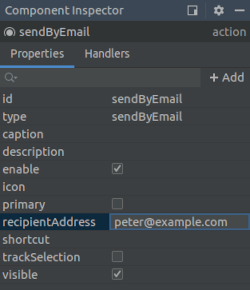
When the custom action’s property is changed in the Inspector, it is written to screen descriptor in the following format:
<action id="sendByEmail" type="sendByEmail">
<properties>
<property name="recipientAddress" value="peter@example.com"/>
</properties>
</action>Action’s event handlers and delegate methods are also displayed and available for generation in the Component Inspector panel:
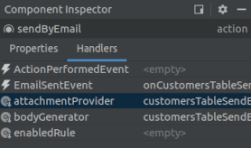
The example of the generated logic with delegate methods and event handlers implemented in the screen controller looks like this:
@UiController("sales_Customer.browse")
@UiDescriptor("customer-browse.xml")
@LookupComponent("customersTable")
@LoadDataBeforeShow
public class CustomerBrowse extends StandardLookup<Customer> {
@Inject
private Notifications notifications;
@Named("customersTable.sendByEmail")
private SendByEmailAction<Customer> customersTableSendByEmail; (1)
@Subscribe("customersTable.sendByEmail")
public void onCustomersTableSendByEmailEmailSent(SendByEmailAction.EmailSentEvent event) { (2)
notifications.create(Notifications.NotificationType.HUMANIZED)
.withCaption("Email sent")
.show();
}
@Install(to = "customersTable.sendByEmail", subject = "bodyGenerator")
private String customersTableSendByEmailBodyGenerator(Customer customer) { (3)
return "Hello, " + customer.getName();
}
@Install(to = "customersTable.sendByEmail", subject = "attachmentProvider")
private List<EmailAttachment> customersTableSendByEmailAttachmentProvider(Customer customer) { (4)
return Collections.emptyList();
}
}| 1 | - the correct type parameter is used for the action’s injection point. |
| 2 | - implementation of the event handler. |
| 3 | - implementation of the bodyGenerator delegate method. The Customer type parameter is inserted in the method signature. |
| 4 | - implementation of the attachmentProvider delegate method. |
3.5.5.4. BaseAction
BaseAction is a base class for actions implementation. It is recommended to derive custom actions from it when declarative actions creation functionality is insufficient.
When creating a custom action class, you should implement actionPerform() method and pass action identifier to the BaseAction constructor. You can override any property getters: getCaption(), getDescription(), getIcon(), getShortcut(), isEnabled(), isVisible(), isPrimary(). Standard implementations of these methods return values set by setter methods, except the getCaption() method. If the action name is not explicitly set by setCaption() method, it retrieves message using action identifier as key from the the localized message pack corresponding to the action class package. If there is no message with such key, then the key itself, i.e. the action identifier, is returned.
Alternatively, you can use the fluent API for setting properties and providing a lambda expression for handling the action: see withXYZ() methods.
BaseAction can change its enabled and visible properties depending on user permissions and current context.
BaseAction is visible if the following conditions are met:
-
setVisible(false)method was not called; -
there is no
hideUI permission for this action.
The action is enabled if the following conditions are met:
-
setEnabled(false)method was not called; -
there are no
hideor read-only UI permissions for this action; -
isPermitted()method returns true; -
isApplicable()method returns true.
Usage examples:
-
Button action:
@Inject private Notifications notifications; @Inject private Button helloBtn; @Subscribe protected void onInit(InitEvent event) { helloBtn.setAction(new BaseAction("hello") { @Override public boolean isPrimary() { return true; } @Override public void actionPerform(Component component) { notifications.create() .withCaption("Hello!") .withType(Notifications.NotificationType.TRAY) .show(); } }); // OR helloBtn.setAction(new BaseAction("hello") .withPrimary(true) .withHandler(e -> notifications.create() .withCaption("Hello!") .withType(Notifications.NotificationType.TRAY) .show())); }In this example, the
helloBtnbutton caption will be set to the string located in the message pack with thehellokey. You can override thegetCaption()action method to initialize button name in a different way. -
Action of a programmatically created PickerField:
@Inject private UiComponents uiComponents; @Inject private Notifications notifications; @Inject private MessageBundle messageBundle; @Inject private HBoxLayout box; @Subscribe protected void onInit(InitEvent event) { PickerField pickerField = uiComponents.create(PickerField.NAME); pickerField.addAction(new BaseAction("hello") { @Override public String getCaption() { return null; } @Override public String getDescription() { return messageBundle.getMessage("helloDescription"); } @Override public String getIcon() { return "icons/hello.png"; } @Override public void actionPerform(Component component) { notifications.create() .withCaption("Hello!") .withType(Notifications.NotificationType.TRAY) .show(); } }); // OR pickerField.addAction(new BaseAction("hello") .withCaption(null) .withDescription(messageBundle.getMessage("helloDescription")) .withIcon("icons/ok.png") .withHandler(e -> notifications.create() .withCaption("Hello!") .withType(Notifications.NotificationType.TRAY) .show())); box.add(pickerField); }In this example an anonymous
BaseActionderived class is used to set the action of the picker field button. The button caption is not displayed, as an icon with a description, which pops up when hovering mouse cursor, is used instead. -
Table action:
@Inject private Notifications notifications; @Inject private Table<Customer> table; @Inject private Security security; @Subscribe protected void onInit(InitEvent event) { table.addAction(new HelloAction()); } private class HelloAction extends BaseAction { public HelloAction() { super("hello"); } @Override public void actionPerform(Component component) { notifications.create() .withCaption("Hello " + table.getSingleSelected()) .withType(Notifications.NotificationType.TRAY) .show(); } @Override protected boolean isPermitted() { return security.isSpecificPermitted("myapp.allow-greeting"); } @Override public boolean isApplicable() { return table != null && table.getSelected().size() == 1; } }In this example, the
HelloActionclass is declared, and its instance is added to the table’s actions list. The action is enabled for users who havemyapp.allow-greetingsecurity permission and only when a single table row is selected. The latter is possible because BaseAction’stargetproperty is automatically assigned to the action when it is added to aListComponentdescendant (TableorTree). -
If you need an action, which becomes enabled when one or more table rows are selected, use BaseAction’s descendant -
ItemTrackingAction, which adds default implementation ofisApplicable()method:@Inject private Table table; @Inject private Notifications notifications; @Subscribe protected void onInit(InitEvent event) { table.addAction(new ItemTrackingAction("hello") { @Override public void actionPerform(Component component) { notifications.create() .withCaption("Hello " + table.getSelected().iterator().next()) .withType(Notifications.NotificationType.TRAY) .show(); } }); }
3.5.6. Dialogs
The Dialogs interface is designed to display standard dialogs windows. Its createMessageDialog(), createOptionDialog() and createInputDialog() methods are the entry points to the fluent API that allows you to construct and show dialogs.
Appearance of the dialogs can be customized using SCSS variables with $cuba-window-modal-* prefix. You can change these variables in the visual editor after creating a theme extension or a custom theme.
- Message Dialog
-
In the following example, a message dialog is shown when the user clicks a button:
@Inject private Dialogs dialogs; @Subscribe("showDialogBtn") protected void onShowDialogBtnClick(Button.ClickEvent event) { dialogs.createMessageDialog().withCaption("Information").withMessage("Message").show(); }Use the
withMessage()method to pass the message text.You can use
\ncharacters for line breaks in messages. In order to show HTML, use thewithContentMode()method withContentMode.HTMLparameter. When using HTML, don’t forget to escape data to prevent code injection.You can pass
trueto thewithHtmlSanitizer()method to enable HTML sanitization for the dialog content. In this case,ContentMode.HTMLparameter must be passed to thewithContentMode()method.protected static final String UNSAFE_HTML = "<i>Jackdaws </i><u>love</u> <font size=\"javascript:alert(1)\" " + "color=\"moccasin\">my</font> " + "<font size=\"7\">big</font> <sup>sphinx</sup> " + "<font face=\"Verdana\">of</font> <span style=\"background-color: " + "red;\">quartz</span><svg/onload=alert(\"XSS\")>"; @Inject private Dialogs dialogs; @Subscribe("showMessageDialogOnBtn") public void onShowMessageDialogOnBtnClick(Button.ClickEvent event) { dialogs.createMessageDialog() .withCaption("MessageDialog with Sanitizer") .withMessage(UNSAFE_HTML) .withContentMode(ContentMode.HTML) .withHtmlSanitizer(true) .show(); } @Subscribe("showMessageDialogOffBtn") public void onShowMessageDialogOffBtnClick(Button.ClickEvent event) { dialogs.createMessageDialog() .withCaption("MessageDialog without Sanitizer") .withMessage(UNSAFE_HTML) .withContentMode(ContentMode.HTML) .withHtmlSanitizer(false) .show(); }The value passed to the
withHtmlSanitizer()method overrides the value of global cuba.web.htmlSanitizerEnabled configuration property.The following methods allow you to customize the look and behavior of the message dialog:
-
withModal()– iffalseis passed, the dialog is shown as non-modal, which allows a user to interact with the other parts of the application.
-
withCloseOnClickOutside()– whentrueis passed and the dialog is modal, allows a user to close the dialog by clicking on the application window outside of the dialog.
-
withMaximized()– whentrueis passed, the dialog should be maximized.
-
withWidth(),withHeight()allow you to specify the desired dialog geometry.
For example:
@Inject private Dialogs dialogs; @Subscribe("showDialogBtn") protected void onShowDialogBtnClick(Button.ClickEvent event) { dialogs.createMessageDialog() .withCaption("Information") .withMessage("<i>Message<i/>") .withContentMode(ContentMode.HTML) .withCloseOnClickOutside(true) .withWidth("100px") .withHeight("300px") .show(); } -
- Option Dialog
-
The option dialog displays a message and a set of buttons for user reaction. Use
withActions()method to provide actions, each of which is represented by a button in the dialog. For example:@Inject private Dialogs dialogs; @Subscribe("showDialogBtn") protected void onShowDialogBtnClick(Button.ClickEvent event) { dialogs.createOptionDialog() .withCaption("Confirm") .withMessage("Are you sure?") .withActions( new DialogAction(DialogAction.Type.YES, Action.Status.PRIMARY).withHandler(e -> { doSomething(); }), new DialogAction(DialogAction.Type.NO) ) .show(); }When a button is clicked, the dialog closes and invokes
actionPerform()method of the corresponding action.The
DialogActionbase class is designed to create actions with standard names and icons. Five types of actions defined by theDialogAction.Typeenum are supported:OK,CANCEL,YES,NO,CLOSE. Names of corresponding buttons are extracted from the main message pack.The second parameter of the
DialogActionconstructor is used to assign a special visual style for a button representing the action.Status.PRIMARYhighlights the corresponding button and makes it selected, which is provided by thec-primary-actionstyle. If multiple actions withStatus.PRIMARYare defined for the dialog, only the first action’s button will get the style and focus.
- Input Dialog
-
Input dialog is a versatile tool which allows you to construct input forms using API and can often save you from creating screens for trivial data input. It enables entering values of different types, validates the input and provides different actions to be selected by the user.
Let’s consider some examples.
-
Input dialog with parameters of standard types and standard OK/Cancel actions:
@Inject private Dialogs dialogs; @Subscribe("showDialogBtn") private void onShowDialogBtnClick(Button.ClickEvent event) { dialogs.createInputDialog(this) .withCaption("Enter some values") .withParameters( InputParameter.stringParameter("name") .withCaption("Name").withRequired(true), (1) InputParameter.doubleParameter("quantity") .withCaption("Quantity").withDefaultValue(1.0), (2) InputParameter.entityParameter("customer", Customer.class) .withCaption("Customer"), (3) InputParameter.enumParameter("status", Status.class) .withCaption("Status") (4) ) .withActions(DialogActions.OK_CANCEL) (5) .withCloseListener(closeEvent -> { if (closeEvent.closedWith(DialogOutcome.OK)) { (6) String name = closeEvent.getValue("name"); (7) Double quantity = closeEvent.getValue("quantity"); Optional<Customer> customer = closeEvent.getOptional("customer"); (8) Status status = closeEvent.getValue("status"); // process entered values... } }) .show(); }1 - specifies a mandatory string parameter. 2 - specifies a double parameter with default value. 3 - specifies an entity parameter. 4 - specifies an enumeration parameter. 5 - specifies a set of actions represented by buttons at the bottom of the dialog. 6 - in the close listener, we can check what action was used by the user. 7 - the close event contains entered values that can be obtained using parameter identifiers. 8 - you can get a value wrapped in Optional. -
Input dialog with a custom parameter:
@Inject private Dialogs dialogs; @Inject private UiComponents uiComponents; @Subscribe("showDialogBtn") private void onShowDialogBtnClick(Button.ClickEvent event) { dialogs.createInputDialog(this) .withCaption("Enter some values") .withParameters( InputParameter.stringParameter("name").withCaption("Name"), InputParameter.parameter("customer") (1) .withField(() -> { LookupField<Customer> field = uiComponents.create( LookupField.of(Customer.class)); field.setOptionsList(dataManager.load(Customer.class).list()); field.setCaption("Customer"); (2) field.setWidthFull(); return field; }) ) .withActions(DialogActions.OK_CANCEL) .withCloseListener(closeEvent -> { if (closeEvent.closedWith(DialogOutcome.OK)) { String name = closeEvent.getValue("name"); Customer customer = closeEvent.getValue("customer"); (3) // process entered values... } }) .show(); }1 - specifies a custom parameter. 2 - a caption for the custom parameter is specified in the created component. 3 - value of the custom parameter is obtained in the same way as for standard parameters. -
Input dialog with custom actions:
@Inject private Dialogs dialogs; @Subscribe("showDialogBtn") private void onShowDialogBtnClick(Button.ClickEvent event) { dialogs.createInputDialog(this) .withCaption("Enter some values") .withParameters( InputParameter.stringParameter("name").withCaption("Name") ) .withActions( (1) InputDialogAction.action("confirm") .withCaption("Confirm") .withPrimary(true) .withHandler(actionEvent -> { InputDialog dialog = actionEvent.getInputDialog(); String name = dialog.getValue("name"); (2) dialog.closeWithDefaultAction(); (3) // process entered values... }), InputDialogAction.action("refuse") .withCaption("Refuse") .withValidationRequired(false) .withHandler(actionEvent -> actionEvent.getInputDialog().closeWithDefaultAction()) ) .show(); }1 - withActions()method can accept an array of custom actions.2 - in the action handler, you can get a parameter value from the dialog. 3 - custom action does not close the dialog itself, so you should do it at some moment. -
Input dialog with custom validator:
@Inject private Dialogs dialogs; @Subscribe("showDialogBtn") private void onShowDialogBtnClick(Button.ClickEvent event) { dialogs.createInputDialog(this) .withCaption("Enter some values") .withParameters( InputParameter.stringParameter("name").withCaption("Name"), InputParameter.entityParameter("customer", Customer.class).withCaption("Customer") ) .withValidator(context -> { (1) String name = context.getValue("name"); (2) Customer customer = context.getValue("customer"); if (Strings.isNullOrEmpty(name) && customer == null) { return ValidationErrors.of("Enter name or select a customer"); } return ValidationErrors.none(); }) .withActions(DialogActions.OK_CANCEL) .withCloseListener(closeEvent -> { if (closeEvent.closedWith(DialogOutcome.OK)) { String name = closeEvent.getValue("name"); Customer customer = closeEvent.getValue("customer"); // process entered values... } }) .show(); }1 - the custom validator is needed to ensure at least one parameter is entered. 2 - in the validator, parameter values can be obtained from the context object. -
Input dialog with a
FileDescriptorparameter:@Inject private Dialogs dialogs; @Subscribe("showDialogBtn") public void onShowDialogBtnClick(Button.ClickEvent event) { dialogs.createInputDialog(this) .withCaption("Select the file") .withParameters( InputParameter.fileParameter("fileField") (1) .withCaption("File")) .withCloseListener(closeEvent -> { if (closeEvent.closedWith(DialogOutcome.OK)) { FileDescriptor fileDescriptor = closeEvent.getValue("fileField"); (2) } }) .show(); }1 - specifies a FileDescriptorparameter.2 - the close event contains entered value that can be obtained using a parameter identifier.
-
3.5.7. Notifications
Notifications are pop-ups displayed in the center or in the corner of the main application window. They can disappear automatically or when the user clicks on the screen or presses Esc.
In order to show a notification, inject the Notifications interface into the screen controller and use its fluent API. In the following example, a notification is shown on the button click:
@Inject
private Notifications notifications;
@Subscribe("sayHelloBtn")
protected void onSayHelloBtnClick(Button.ClickEvent event) {
notifications.create().withCaption("Hello!").show();
}Notification can have a description which is displayed under the caption in a lighter font:
@Inject
private Notifications notifications;
@Subscribe("sayHelloBtn")
protected void onSayHelloBtnClick(Button.ClickEvent event) {
notifications.create().withCaption("Greeting").withDescription("Hello World!").show();
}Notifications can be of the following types:
-
TRAY– a notification is displayed in the bottom right corner of the application and disappears automatically. -
HUMANIZED– a standard notification displayed in the center of the screen, disappears automatically. -
WARNING– a warning. Disappears when the user clicks on the screen. -
ERROR– a notification about an error. Disappears when the user clicks on the screen.
The default type is HUMANIZED. You can provide another type in the create() method:
@Inject
private Notifications notifications;
@Subscribe("sayHelloBtn")
protected void onSayHelloBtnClick(Button.ClickEvent event) {
notifications.create(Notifications.NotificationType.TRAY).withCaption("Hello World!").show();
}You can use \n characters for line breaks in messages. In order to show HTML, use the withContentMode() method:
@Inject
private Notifications notifications;
@Subscribe("sayHelloBtn")
protected void onSayHelloBtnClick(Button.ClickEvent event) {
notifications.create()
.withContentMode(ContentMode.HTML)
.withCaption("<i>Hello World!</i>")
.show();
}When using HTML, don’t forget to escape data to prevent code injection.
You can pass true to the withHtmlSanitizer() method to enable HTML sanitization for the notification content. In this case, ContentMode.HTML parameter must be passed to the withContentMode() method.
protected static final String UNSAFE_HTML = "<i>Jackdaws </i><u>love</u> <font size=\"javascript:alert(1)\" " +
"color=\"moccasin\">my</font> " +
"<font size=\"7\">big</font> <sup>sphinx</sup> " +
"<font face=\"Verdana\">of</font> <span style=\"background-color: " +
"red;\">quartz</span><svg/onload=alert(\"XSS\")>";
@Inject
private Notifications notifications;
@Subscribe("showNotificationOnBtn")
public void onShowNotificationOnBtnClick(Button.ClickEvent event) {
notifications.create()
.withCaption("Notification with Sanitizer")
.withDescription(UNSAFE_HTML)
.withContentMode(ContentMode.HTML)
.withHtmlSanitizer(true)
.show();
}
@Subscribe("showNotificationOffBtn")
public void onShowNotificationOffBtnClick(Button.ClickEvent event) {
notifications.create()
.withCaption("Notification without Sanitizer")
.withDescription(UNSAFE_HTML)
.withContentMode(ContentMode.HTML)
.withHtmlSanitizer(false)
.show();
}The value passed to the withHtmlSanitizer() method overrides the value of global cuba.web.htmlSanitizerEnabled configuration property.
You can set the position of the notification using the withPosition() method. The standard values are:
-
TOP_RIGHT -
TOP_LEFT -
TOP_CENTER -
MIDDLE_RIGHT -
MIDDLE_LEFT -
MIDDLE_CENTER -
BOTTOM_RIGHT -
BOTTOM_LEFT -
BOTTOM_CENTER
You can also set the delay in milliseconds before the notification disappears, using the withHideDelayMs() method. The -1 value is used to require the user to click the message.
3.5.8. Background Tasks
Background tasks mechanism is designed for performing tasks at the client tier asynchronously without blocking the user interface.
In order to use background tasks, do the following:
-
Define a task as an inheritor of the
BackgroundTaskabstract class. Pass a link to a screen controller which will be associated with the task and the task timeout to the task constructor.Closing the screen will interrupt the tasks associated with it. Additionally, the task will be interrupted automatically after the specified timeout.
Actual actions performed by the task are implemented in the run() method.
-
Create an object of
BackgroundTaskHandlerclass controlling the task by passing the task instance to thehandle()method of theBackgroundWorkerbean. A link toBackgroundWorkercan be obtained by an injection in a screen controller, or through theAppBeansclass. -
Run the task by invoking the
execute()method ofBackgroundTaskHandler.
|
UI components' state and data containers must not be read/updated from |
Example:
@Inject
protected BackgroundWorker backgroundWorker;
@Override
public void init(Map<String, Object> params) {
// Create task with 10 sec timeout and this screen as owner
BackgroundTask<Integer, Void> task = new BackgroundTask<Integer, Void>(10, this) {
@Override
public Void run(TaskLifeCycle<Integer> taskLifeCycle) throws Exception {
// Do something in background thread
for (int i = 0; i < 5; i++) {
TimeUnit.SECONDS.sleep(1); // time consuming computations
taskLifeCycle.publish(i); // publish current progress to show it in progress() method
}
return null;
}
@Override
public void canceled() {
// Do something in UI thread if the task is canceled
}
@Override
public void done(Void result) {
// Do something in UI thread when the task is done
}
@Override
public void progress(List<Integer> changes) {
// Show current progress in UI thread
}
};
// Get task handler object and run the task
BackgroundTaskHandler taskHandler = backgroundWorker.handle(task);
taskHandler.execute();
}Detailed information about methods is provided in JavaDocs for BackgroundTask, TaskLifeCycle, BackgroundTaskHandler classes.
Please note the following:
-
BackgroundTask<T, V>is a parameterized class:-
T− the type of objects displaying task progress. Objects of this type are passed to the task’sprogress()method during an invocation ofTaskLifeCycle.publish()in the working thread. -
V− task result type passed to thedone()method. It can also be obtained by invokingBackgroundTaskHandler.getResult()method, which will wait for a task to complete.
-
-
canceled()method is invoked only during a controlled cancellation of a task, i.e. whencancel()is invoked in theTaskHandler. -
handleTimeoutException()is invoked when the task timeout expires. If the window where the task is running closes, the task is stopped without a notification.
-
run()method of a task should support external interruptions. To ensure this, we recommend checking theTaskLifeCycle.isInterrupted()flag periodically during long processes and stopping execution when needed. Additionally, you should not silently discardInterruptedException(or any other exception) - instead you should either exit the method correctly or not handle the exception at all.-
isCancelled()method returnstrueif a task was interrupted by calling thecancel()method.public String run(TaskLifeCycle<Integer> taskLifeCycle) { for (int i = 0; i < 9_000_000; i++) { if (taskLifeCycle.isCancelled()) { log.info(" >>> Task was cancelled"); break; } else { log.info(" >>> Task is working: iteration #" + i); } } return "Done"; }
-
-
BackgroundTaskobjects are stateless. If you did not create fields for temporary data when implementing task class, you can start several parallel processes using a single task instance. -
BackgroundHandlerobject (itsexecute()method) can only be started once. If you need to restart a task frequently, useBackgroundTaskWrapperclass. -
Use
BackgroundWorkWindoworBackgroundWorkProgressWindowclasses with a set of static methods to show a modal window with progress indicator and Cancel button. You can define progress indication type and allow or prohibit cancellation of the background task for the window. -
If you need to use certain values of visual components in the task thread, you should implement their acquisition in
getParams()method, which runs in the UI thread once, when a task starts. In the run() method, these parameters will be accessible via thegetParams()method of theTaskLifeCycleobject. -
If any exception occurs, the framework invokes
BackgroundTask.handleException()method in the UI thread, which can be used to display the error. -
Background tasks are affected by cuba.backgroundWorker.maxActiveTasksCount and cuba.backgroundWorker.timeoutCheckInterval application properties.
|
In Web Client, background tasks are implemented using HTTP push provided by the Vaadin framework. See https://vaadin.com/wiki/-/wiki/Main/Working+around+push+issues for information on how to set up your web servers for this technology. |
|
If you don’t use background tasks, but want to update UI state from a non-UI thread, use methods of the |
3.5.8.1. Background Task Usage Examples
- Display and control background task operation with BackgroundWorkProgressWindow
-
Often when launching a background task one needs to display a simple UI:
-
to show to the user that requested action is in the process of execution,
-
to allow user to abort requested long operation,
-
to show operation progress if progress percent can be determined.
Platform satisfies these needs with
BackgroundWorkWindowandBackgroundWorkProgressWindowutility classes. These classes have static methods allowing to associate background task with a modal window that has a title, description, progress bar and optionalCancelbutton. The difference between two classes is thatBackgroundWorkProgressWindowuses determinate progress bar, and it should be used in case if you can estimate progress of the task. Conversely,BackgroundWorkWindowshould be used for tasks of indeterminate duration.Consider the following development task as an example:
-
A given screen contains a table displaying a list of students, with multi-selection enabled.
-
When the user presses a button, the system should send reminder emails to selected students, without blocking UI and with an ability to cancel the operation.
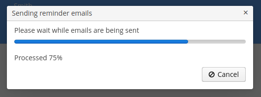
Sample implementation:
import com.haulmont.cuba.gui.backgroundwork.BackgroundWorkProgressWindow; public class StudentBrowse extends StandardLookup<Student> { @Inject private Table<Student> studentsTable; @Inject private EmailService emailService; @Subscribe("studentsTable.sendEmail") public void onStudentsTableSendEmail(Action.ActionPerformedEvent event) { Set<Student> selected = studentsTable.getSelected(); if (selected.isEmpty()) { return; } BackgroundTask<Integer, Void> task = new EmailTask(selected); BackgroundWorkProgressWindow.show(task, (1) "Sending reminder emails", "Please wait while emails are being sent", selected.size(), true, true (2) ); } private class EmailTask extends BackgroundTask<Integer, Void> { (3) private Set<Student> students; (4) public EmailTask(Set<Student> students) { super(10, TimeUnit.MINUTES, StudentBrowse.this); (5) this.students = students; } @Override public Void run(TaskLifeCycle<Integer> taskLifeCycle) throws Exception { int i = 0; for (Student student : students) { if (taskLifeCycle.isCancelled()) { (6) break; } emailService.sendEmail(student.getEmail(), "Reminder", "Don't forget, the exam is tomorrow", EmailInfo.TEXT_CONTENT_TYPE); i++; taskLifeCycle.publish(i); (7) } return null; } } }1 - launch the task and show modal progress window 2 - set dialog options: total number of elements for progress bar, user can cancel a task, show progress percent 3 - task progress unit is Integer(number of processed table items), and result type isVoidbecause this task doesn’t produce result4 - selected table items are saved into a variable which is initialized in the task constructor. This is necessary because run()method is executed in a background thread and cannot access UI components.5 - set timeout to 10 minutes 6 - periodically check isCancelled()so that the task can stop immediately after the user pressedCanceldialog button7 - update progress bar position after every email sent -
- Periodically refresh screen data in the background using Timer and BackgroundTaskWrapper
-
BackgroundTaskWrapperis a tiny utility wrapper aroundBackgroundWorker. It provides simple API for cases when background tasks of the same type get started, restarted and cancelled repetitively.As a usage example, consider the following development task:
-
A rank monitoring screen needs to display and automatically update some data.
-
Data is loaded slowly and therefore it should be loaded in the background.
-
Show time of the latest data update on the screen.
-
Data is filtered with simple filter (checkbox).
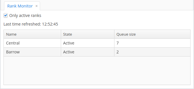
-
If data refresh fails for some reason, the screen should indicate this fact to the user:
Sample implementation:
@UiController("playground_RankMonitor") @UiDescriptor("rank-monitor.xml") public class RankMonitor extends Screen { @Inject private Notifications notifications; @Inject private Label<String> refreshTimeLabel; @Inject private CollectionContainer<Rank> ranksDc; @Inject private RankService rankService; @Inject private CheckBox onlyActiveBox; @Inject private Logger log; @Inject private TimeSource timeSource; @Inject private Timer refreshTimer; private BackgroundTaskWrapper<Void, List<Rank>> refreshTaskWrapper = new BackgroundTaskWrapper<>(); (1) @Subscribe public void onBeforeShow(BeforeShowEvent event) { refreshTimer.setDelay(5000); refreshTimer.setRepeating(true); refreshTimer.start(); } @Subscribe("onlyActiveBox") public void onOnlyActiveBoxValueChange(HasValue.ValueChangeEvent<Boolean> event) { refreshTaskWrapper.restart(new RefreshScreenTask()); (2) } @Subscribe("refreshTimer") public void onRefreshTimerTimerAction(Timer.TimerActionEvent event) { refreshTaskWrapper.restart(new RefreshScreenTask()); (3) } public class RefreshScreenTask extends BackgroundTask<Void, List<Rank>> { (4) private boolean onlyActive; (5) protected RefreshScreenTask() { super(30, TimeUnit.SECONDS, RankMonitor.this); onlyActive = onlyActiveBox.getValue(); } @Override public List<Rank> run(TaskLifeCycle<Void> taskLifeCycle) throws Exception { List<Rank> data = rankService.loadActiveRanks(onlyActive); (6) return data; } @Override public void done(List<Rank> result) { (7) List<Rank> mutableItems = ranksDc.getMutableItems(); mutableItems.clear(); mutableItems.addAll(result); String hhmmss = new SimpleDateFormat("HH:mm:ss").format(timeSource.currentTimestamp()); refreshTimeLabel.setValue("Last time refreshed: " + hhmmss); } @Override public boolean handleTimeoutException() { (8) displayRefreshProblem(); return true; } @Override public boolean handleException(Exception ex) { (9) log.debug("Auto-refresh error", ex); displayRefreshProblem(); return true; } private void displayRefreshProblem() { if (!refreshTimeLabel.getValue().endsWith("(outdated)")) { refreshTimeLabel.setValue(refreshTimeLabel.getValue() + " (outdated)"); } notifications.create(Notifications.NotificationType.TRAY) .withCaption("Problem refreshing data") .withHideDelayMs(10_000) .show(); } } }1 - initialize BackgroundTaskWrapperinstance with no-arg constructor; for every iteration a new task instance will be supplied2 - immediately trigger a background data refresh after checkbox value has changed 3 - every timer tick triggers a data refresh in the background 4 - task publishes no progress so progress unit is Void; task produces result of typeList<Rank>5 - checkbox state is saved into a variable which is initialized in the task constructor. This is necessary because run()method is executed in a background thread and cannot access UI components.6 - call custom service to load data (this is the long operation to be executed in the background) 7 - apply successfully obtained result to screen’s components 8 - update UI in the special case if data loading timed out: show notification in the screen corner 9 - inform user that data loading has failed with exception by showing notification -
3.5.9. Themes
Themes are used to manage the visual presentation of the application.
A web theme consists of SCSS files and other resources like images.
The platform provides several themes that can be used in the project out-of-the-box. A theme extension allows you to modify an existing theme on the project level. You can also create your own custom themes in addition to the standard ones.
If you want to use a theme in multiple projects, you can include it in an application component or create a reusable theme JAR.
3.5.9.1. Using Existing Themes
The platform includes three ready-to-use themes: Hover, Halo and Havana. By default, the application will use the one specified in the cuba.web.theme application property.
The user may select the other theme in the standard Help > Settings screen. If you want to disable the option of selecting themes, register the settings screen in the web-screens.xml file of your project and set the changeThemeEnabled = false parameter for it:
<screen id="settings" template="/com/haulmont/cuba/web/app/ui/core/settings/settings-window.xml">
<param name="changeThemeEnabled" value="false"/>
</screen>3.5.9.2. Extending an Existing Theme
A platform theme can be modified in the project. In the modified theme, you can:
-
Change branding images.
-
Add icons to use them in visual components. See the Icons section below.
-
Create new styles for visual components and use them in the stylename attribute. This requires some expertise in CSS.
-
Modify existing styles of the visual components.
-
Modify common parameters, such as background color, margins, spacing, etc.
- File structure and build scripts
-
Themes are defined in SCSS files. To modify (extend) a theme in the project, you should create a specific file structure in the web module.
A convenient way to do this is to use CUBA Studio: in the main menu, click CUBA > Advanced > Manage themes > Create theme extension. Select the theme you want to extend in the popup window. Another way is to use the
themecommand in CUBA CLI.As a result, the following directory structure will be created in the
modules/webdirectory (for Halo theme extension):themes/ halo/ branding/ app-icon-login.png app-icon-menu.png com.company.application/ app-component.scss halo-ext.scss halo-ext-defaults.scss favicon.ico styles.scssApart from that, the build.gradle script will be complemented with the
buildScssThemestask, which is executed automatically each time the web module is built. The optional deployThemes task can be used to quickly apply changes in themes to the running application.If your project contains an application component with extended theme, and you want this extension to be used for the whole project, then you should create theme extension for the project too. For more details on how to inherit the component’s theme, see the Using Themes from Application Components section.
- Changing branding
-
You can configure some branding properties, such as icons, login and main application window captions, and the website icon (
favicon.ico).To use custom images, replace default ones in the
modules/web/themes/halo/brandingdirectory.To set window captions and the login window welcome text, set window captions and the login window welcome text in main message pack of the web module (i.e the
modules/web/<root_package>/web/messages.propertiesfile and its variants for different locales). Message packs allow you to use different image files for different user locales. The samplemessages.propertiesfile:application.caption = MyApp application.logoImage = branding/myapp-menu.png loginWindow.caption = MyApp Login loginWindow.welcomeLabel = Welcome to MyApp! loginWindow.logoImage = branding/myapp-login.pngThe path to
favicon.icois not specified since it must be located in the root directory of the theme.
- Adding fonts
-
You can add custom fonts to your web theme. To add a font family, import it in the first line of the
styles.scssfile, for example:@import url(http://fonts.googleapis.com/css?family=Roboto);
- Creating new styles
-
Consider the example of setting the yellow background color to the field displaying the customer’s name.
Define the form component in the XML descriptor:
<form id="form" dataContainer="customerDc"> <column width="250px"> <textField id="nameField" property="name" stylename="name-field"/> <textField id="address" property="address"/> </column> </form>In the stylename attribute, specify the name of the style.
In the
halo-ext.scssfile, add the new style definition to thehalo-extmixin:@mixin com_company_application-halo-ext { .name-field { background-color: lightyellow; } }After rebuilding the project, the fields will look as follows:
- Modifying existing styles of the visual components
-
To modify style parameters of existing components, add the corresponding CSS code to the
halo-extmixin of thehalo-ext.scssfile. Use developer tools of your web browser to find out CSS classes assigned to the elements of visual components. For example, to display the application menu items in bold, the contents of thehalo-ext.scssfile should be as follows:@mixin com_company_application-halo-ext { .v-menubar-menuitem-caption { font-weight: bold; } }
- Modifying common parameters
-
Themes contain a number of SCSS variables that control application background colour, component size, margins and other parameters.
Below is the example of a Halo theme extension, since it is based on Valo theme from Vaadin, and provides the widest range of options for customization.
The
themes/halo/halo-ext-defaults.scssfile is intended for overriding theme variables. Most of the Halo variables correspond to those described in the Valo documentation. Below are the most common variables:$v-background-color: #fafafa; /* component background colour */ $v-app-background-color: #e7ebf2; /* application background colour */ $v-panel-background-color: #fff; /* panel background colour */ $v-focus-color: #3b5998; /* focused element colour */ $v-error-indicator-color: #ed473b; /* empty required fields colour */ $v-line-height: 1.35; /* line height */ $v-font-size: 14px; /* font size */ $v-font-weight: 400; /* font weight */ $v-unit-size: 30px; /* base theme size, defines the height for buttons, fields and other elements */ $v-font-size--h1: 24px; /* h1-style Label size */ $v-font-size--h2: 20px; /* h2-style Label size */ $v-font-size--h3: 16px; /* h3-style Label size */ /* margins for containers */ $v-layout-margin-top: 10px; $v-layout-margin-left: 10px; $v-layout-margin-right: 10px; $v-layout-margin-bottom: 10px; /* spacing between components in a container (if enabled) */ $v-layout-spacing-vertical: 10px; $v-layout-spacing-horizontal: 10px; /* whether filter search button should have "friendly" style*/ $cuba-filter-friendly-search-button: true; /* whether button that has primary action or marked as primary itself should be highlighted*/ $cuba-highlight-primary-action: false; /* basic table and datagrid settings */ $v-table-row-height: 30px; $v-table-header-font-size: 13px; $v-table-cell-padding-horizontal: 7px; $v-grid-row-height $v-grid-row-selected-background-color $v-grid-cell-padding-horizontal /* input field focus style */ $v-focus-style: inset 0px 0px 5px 1px rgba($v-focus-color, 0.5); /* required fields focus style */ $v-error-focus-style: inset 0px 0px 5px 1px rgba($v-error-indicator-color, 0.5); /* animation for elements is enabled by default */ $v-animations-enabled: true; /* popup window animation is disabled by default */ $v-window-animations-enabled: false; /* inverse header is controlled by cuba.web.useInverseHeader property */ $v-support-inverse-menu: true; /* show "required" indicators for components */ $v-show-required-indicators: false !default;The sample
halo-ext-defaults.scssfor a theme with a dark background and slightly minimized margins is provided below:$v-background-color: #444D50; $v-font-size--h1: 22px; $v-font-size--h2: 18px; $v-font-size--h3: 16px; $v-layout-margin-top: 8px; $v-layout-margin-left: 8px; $v-layout-margin-right: 8px; $v-layout-margin-bottom: 8px; $v-layout-spacing-vertical: 8px; $v-layout-spacing-horizontal: 8px; $v-table-row-height: 25px; $v-table-header-font-size: 13px; $v-table-cell-padding-horizontal: 5px; $v-support-inverse-menu: false;Another example is a set of variables that makes Halo theme look like the old Havana theme removed from the framework version 7:
$cuba-menubar-background-color: #315379; $cuba-menubar-border-color: #315379; $v-table-row-height: 25px; $v-selection-color: rgb(77, 122, 178); $v-table-header-font-size: 12px; $v-textfield-border: 1px solid #A5C4E0; $v-selection-item-selection-color: #4D7AB2; $v-app-background-color: #E3EAF1; $v-font-size: 12px; $v-font-weight: 400; $v-unit-size: 25px; $v-border-radius: 0px; $v-border: 1px solid #9BB3D3 !default; $v-font-family: Verdana,tahoma,arial,geneva,helvetica,sans-serif,"Trebuchet MS"; $v-panel-background-color: #ffffff; $v-background-color: #ffffff; $cuba-menubar-menuitem-text-color: #ffffff; $cuba-app-menubar-padding-top: 8px; $cuba-app-menubar-padding-bottom: 8px; $cuba-menubar-text-color: #ffffff; $cuba-menubar-submenu-padding: 1px;
- Changing the application header
-
Halo theme supports the cuba.web.useInverseHeader property, which controls the colour of the application header. By default, this property is set to
true, which sets a dark (inverse) header.You can make a light header without any changes to the theme, simply by setting this property tofalse.
3.5.9.3. Creating a Custom Theme
You can create one or several application themes in the project and give the users an opportunity to select the most appropriate one. Creating new themes also allows you to override the variables in the *-theme.properties files, which define a few server-side parameters:
-
Default dialog window size.
-
Default input field width.
-
Dimensions of some components (Filter, FileMultiUploadField).
-
Correspondence between icon names and constants of the
com.vaadin.server.FontAwesomeenumeration for using Font Awesome in standard actions and screens of the platform, if cuba.web.useFontIcons is enabled.
New themes can be easily created in CUBA Studio, in CUBA CLI or manually. Let’s consider all the three ways taking Hover Dark custom theme as an example.
- In CUBA Studio:
-
-
In the main menu, click CUBA > Advanced > Manage themes > Create custom theme. Enter the name of the new theme: hover-dark. Select the hover theme in the Base theme dropdown.
The required file structure will be created in the web module. The
webThemesModulemodule and its configuration will be automatically added to thesettings.gradleand build.gradle files. Also, the generateddeployThemesgradle task allows you to see the changes without server restart.
-
- Manually:
-
-
Create the following file structure in the web module of your project:
web/ src/ themes/ hover-dark/ branding/ app-icon-login.png app-icon-menu.png com.haulmont.cuba/ app-component.scss favicon.ico hover-dark.scss hover-dark-defaults.scss styles.scss -
The
app-component.scssfile:@import "../hover-dark"; @mixin com_haulmont_cuba { @include hover-dark; } -
The
hover-dark.scssfile:@import "../hover/hover"; @mixin hover-dark { @include hover; } -
The
styles.scssfile:@import "hover-dark-defaults"; @import "hover-dark"; .hover-dark { @include hover-dark; } -
Create the
hover-dark-theme.propertiesfile in the web subdirectory of your web module:@include=com/haulmont/cuba/hover-theme.properties -
Add the
webThemesModulemodule to thesettings.gradlefile:include(":${modulePrefix}-global", ":${modulePrefix}-core", ":${modulePrefix}-web", ":${modulePrefix}-web-themes") //... project(":${modulePrefix}-web-themes").projectDir = new File(settingsDir, 'modules/web/themes') -
Add the
webThemesModulemodule configuration to the build.gradle file:def webThemesModule = project(":${modulePrefix}-web-themes") configure(webThemesModule) { apply(plugin: 'java') apply(plugin: 'maven') apply(plugin: 'cuba') appModuleType = 'web-themes' buildDir = file('../build/scss-themes') sourceSets { main { java { srcDir '.' } resources { srcDir '.' } } } } -
Finally, create the
deployThemesgradle task inbuild.gradleto see the changes without server restart:configure(webModule) { // . . . task buildScssThemes(type: CubaWebScssThemeCreation) task deployThemes(type: CubaDeployThemeTask, dependsOn: buildScssThemes) assemble.dependsOn buildScssThemes }
-
- In CUBA CLI:
-
-
Run the
themecommand, then select the hover theme.The specific file structure will be created in the web module of the project.
-
Modify the generated file structure and the files' contents so that they correspond to the files from above.
-
Create the
hover-dark-theme.propertiesfile in the source directory of your web module:@include=com/haulmont/cuba/hover-theme.properties
The
build.gradleandsettings.gradlefiles will be updated automatically by CLI. -
See also the example in Creating Facebook Theme section.
- Modifying server-side theme parameters
-
In Halo theme, Font Awesome icons are used for standard actions and platform screens by default (if cuba.web.useFontIcons is enabled). In this case, you can replace a standard icon by setting the required mapping between the icon and the font element name in
<your_theme>-theme.propertiesfile. For example, to use "plus" icon for thecreateaction in the new Facebook theme, thefacebook-theme.propertiesfile should contain the following:@include=com/haulmont/cuba/halo-theme.properties cuba.web.icons.create.png = font-icon:PLUSThe fragment of the standard users browser screen in the Facebook theme with the modified
createaction:
3.5.9.3.1. Creating Hover Dark Theme
Here you can find the steps to create a Hover Dark theme, which will be a dark variation of the default Hover theme. The sample application with this theme is available on GitHub.
-
Create the new hover-dark theme in your project following the instructions in Creating a Custom Theme section.
The required file structure will be created in the web module. The
webThemesModulemodule and its configuration will be automatically added to thesettings.gradleand build.gradle files. -
Override the default style variables in the
hover-dark-defaults.scssfile, i.e. replace the variables in it by the following ones:@import "../hover/hover-defaults"; $v-app-background-color: #262626; $v-background-color: lighten($v-app-background-color, 12%); $v-border: 1px solid (v-tint 0.8); $font-color: valo-font-color($v-background-color, 0.85); $v-button-font-color: $font-color; $v-font-color: $font-color; $v-link-font-color: lighten($v-focus-color, 15%); $v-link-text-decoration: none; $v-textfield-background-color: $v-background-color; $cuba-hover-color: #75a4c1; $cuba-maintabsheet-tabcontainer-background-color: $v-app-background-color; $cuba-menubar-background-color: lighten($v-app-background-color, 4%); $cuba-tabsheet-tab-caption-selected-color: $v-font-color; $cuba-window-modal-header-background: $v-background-color; $cuba-menubar-menuitem-border-radius: 0; -
Using the cuba.themeConfig application property define the themes you want to make available in the application:
cuba.themeConfig = com/haulmont/cuba/hover-theme.properties /com/company/demo/web/hover-dark-theme.properties
As the result, both themes will be available in the application: the default Hover theme and its dark variation.
3.5.9.3.2. Creating Facebook Theme
Below is the example of creating a Halo-based Facebook theme, which resembles the interface of a popular social network.
-
In CUBA Studio, click CUBA > Advanced > Manage themes > Create custom theme. Set the theme name -
facebook, selecthaloas the base theme and click Create. The new theme directory will be created in the project:themes/ facebook/ branding/ app-icon-login.png app-icon-menu.png com.haulmont.cuba/ app-component.scss // cuba app-component include facebook.scss // main theme file facebook-defaults.scss // main theme variables favicon.ico styles.scss // entry point of SCSS build procedureThe
styles.scssfile contains the list of your themes:@import "facebook-defaults"; @import "facebook"; .facebook { @include facebook; }The
facebook.scssfile:@import "../halo/halo"; @mixin facebook { @include halo; }The
app-component.scssfile insidecom.haulmont.cuba:@import "../facebook"; @mixin com_haulmont_cuba { @include facebook; } -
Modify the theme variables in
facebook-defaults.scss. You can do it in Studio by clicking Manage themes > Edit Facebook theme variables or in IDE:@import "../halo/halo-defaults"; $v-background-color: #fafafa; $v-app-background-color: #e7ebf2; $v-panel-background-color: #fff; $v-focus-color: #3b5998; $v-border-radius: 0; $v-textfield-border-radius: 0; $v-font-family: Helvetica, Arial, 'lucida grande', tahoma, verdana, arial, sans-serif; $v-font-size: 14px; $v-font-color: #37404E; $v-font-weight: 400; $v-link-text-decoration: none; $v-shadow: 0 1px 0 (v-shade 0.2); $v-bevel: inset 0 1px 0 v-tint; $v-unit-size: 30px; $v-gradient: v-linear 12%; $v-overlay-shadow: 0 3px 8px v-shade, 0 0 0 1px (v-shade 0.7); $v-shadow-opacity: 20%; $v-selection-overlay-padding-horizontal: 0; $v-selection-overlay-padding-vertical: 6px; $v-selection-item-border-radius: 0; $v-line-height: 1.35; $v-font-size: 14px; $v-font-weight: 400; $v-unit-size: 25px; $v-font-size--h1: 22px; $v-font-size--h2: 18px; $v-font-size--h3: 16px; $v-layout-margin-top: 8px; $v-layout-margin-left: 8px; $v-layout-margin-right: 8px; $v-layout-margin-bottom: 8px; $v-layout-spacing-vertical: 8px; $v-layout-spacing-horizontal: 8px; $v-table-row-height: 25px; $v-table-header-font-size: 13px; $v-table-cell-padding-horizontal: 5px; $v-focus-style: inset 0px 0px 1px 1px rgba($v-focus-color, 0.5); $v-error-focus-style: inset 0px 0px 1px 1px rgba($v-error-indicator-color, 0.5); -
The
facebook-theme.propertiesfile in thesrcdirectory of the web module can be used to override the server-side theme variables from thehalo-theme.propertiesfile of the platform. -
The new theme has been automatically added to the
web-app.propertiesfile:cuba.web.theme = facebook cuba.themeConfig = com/haulmont/cuba/halo-theme.properties /com/company/application/web/facebook-theme.propertiesThe cuba.themeConfig property defines which themes will be available for the user in the Settings menu of an application.
-
Rebuild the application and start the server. Now the user will see the application in Facebook theme on first login, and will be able to choose between Facebook, Halo and Havana in the Help > Settings menu.
3.5.9.4. Using Themes from Application Components
If your project contains an application component with a custom theme, you can use this theme for the whole project.
To inherit the theme as is, simply add it to the cuba.themeConfig application property:
cuba.web.theme = {theme-name}
cuba.themeConfig = com/haulmont/cuba/hover-theme.properties /com/company/{app-component-name}/web/{theme-name}-theme.propertiesIn case you want to override some variables from the parent theme, you need to create a theme extension in your project first.
In the following example we will use the facebook theme from the Creating a Custom Theme section.
-
Follow the steps to create the
facebooktheme for your app component. -
Install the app component using Studio menu as described in the Example of Application Component section.
-
Extend the
halotheme in the project that uses your application component. -
By means of your IDE, rename all
halooccurrences inthemesdirectory, including file names, tofacebookin order to get the following structure:themes/ facebook/ branding/ app-icon-login.png app-icon-menu.png com.company.application/ app-component.scss facebook-ext.scss facebook-ext-defaults.scss favicon.ico styles.scss -
The
app-component.scssfile aggregates theme modifications of the application component. During the SCSS build process, the Gradle plugin automatically finds the app components and imports them in the generatedmodules/web/build/themes-tmp/VAADIN/themes/{theme-name}/app-components.scssfile.By default
app-component.scssdoes not include variables modifications from{theme-name}-ext-defaults. To include variables modifications to app component bundle, you should import it manually inapp-component.scss:@import "facebook-ext"; @import "facebook-ext-defaults"; @mixin com_company_application { @include com_company_application-facebook-ext; }At this stage the
facebooktheme is already imported from the app component to the project. -
Now you can use
facebook-ext.scssandfacebook-ext-defaults.scssfiles inside thecom.company.applicationpackage to override variables from app component’s theme and customize it for the concrete project. -
Add the following properties to the
web-app.propertiesfile to make thefacebooktheme available in the Settings menu of the application. Use the relative path to referencefacebook-theme.propertiesfrom the app component.cuba.web.theme = facebook cuba.themeConfig = com/haulmont/cuba/hover-theme.properties /com/company/{app-component-name}/web/facebook-theme.properties
|
In case of any trouble with themes building check |
3.5.9.5. Creating a Reusable Theme
Any theme can be packed and reused without an application component. To create a theme package, you need to create a Java project from scratch and bundle it in a single JAR file. Follow the steps below to create a distribution of facebook theme from the previous examples.
-
Create a new project with the following structure in IDE. It will be a simple Java project that consists of SCSS files and theme properties:
halo-facebook/ src/ //sources root halo-facebook/ com.haulmont.cuba/ app-component.scss halo-facebook.scss halo-facebook-defaults.scss halo-facebook-theme.properties styles.scssThis sample theme project can be downloaded from GitHub.
-
build.gradlescript:allprojects { group = 'com.haulmont.theme' version = '0.1' } apply(plugin: 'java') apply(plugin: 'maven') sourceSets { main { java { srcDir 'src' } resources { srcDir 'src' } } } -
settings.gradlefile:rootProject.name = 'halo-facebook' -
app-component.scssfile:@import "../halo-facebook"; @mixin com_haulmont_cuba { @include halo-facebook; } -
halo-facebook.scssfile:@import "../@import "../"; @mixin halo-facebook { @include halo; } -
halo-facebook-defaults.scssfile:@import "../halo/halo-defaults"; $v-background-color: #fafafa; $v-app-background-color: #e7ebf2; $v-panel-background-color: #fff; $v-focus-color: #3b5998; $v-border-radius: 0; $v-textfield-border-radius: 0; $v-font-family: Helvetica, Arial, 'lucida grande', tahoma, verdana, arial, sans-serif; $v-font-size: 14px; $v-font-color: #37404E; $v-font-weight: 400; $v-link-text-decoration: none; $v-shadow: 0 1px 0 (v-shade 0.2); $v-bevel: inset 0 1px 0 v-tint; $v-unit-size: 30px; $v-gradient: v-linear 12%; $v-overlay-shadow: 0 3px 8px v-shade, 0 0 0 1px (v-shade 0.7); $v-shadow-opacity: 20%; $v-selection-overlay-padding-horizontal: 0; $v-selection-overlay-padding-vertical: 6px; $v-selection-item-border-radius: 0; $v-line-height: 1.35; $v-font-size: 14px; $v-font-weight: 400; $v-unit-size: 25px; $v-font-size--h1: 22px; $v-font-size--h2: 18px; $v-font-size--h3: 16px; $v-layout-margin-top: 8px; $v-layout-margin-left: 8px; $v-layout-margin-right: 8px; $v-layout-margin-bottom: 8px; $v-layout-spacing-vertical: 8px; $v-layout-spacing-horizontal: 8px; $v-table-row-height: 25px; $v-table-header-font-size: 13px; $v-table-cell-padding-horizontal: 5px; $v-focus-style: inset 0px 0px 1px 1px rgba($v-focus-color, 0.5); $v-error-focus-style: inset 0px 0px 1px 1px rgba($v-error-indicator-color, 0.5); $v-show-required-indicators: true; -
halo-facebook-theme.propertiesfile:@include=com/haulmont/cuba/halo-theme.properties
-
-
Build and install the project with the Gradle task:
gradle assemble install -
Add the theme to your CUBA-based project as a Maven dependency in two configurations: themes and compile, by modifying you
build.gradlefile:configure(webModule) { //... dependencies { provided(servletApi) compile(guiModule) compile('com.haulmont.theme:halo-facebook:0.1') themes('com.haulmont.theme:halo-facebook:0.1') } //... }If you install the theme locally, don’t forget to add
mavenLocal()to the list of repositories: open the Project Properties section in Studio and add the local Maven repository coordinates to the repositories list. -
To inherit this theme and modify it in your project, you have to extend this theme. Extend the
halotheme and renamethemes/halofolder tothemes/halo-facebook:themes/ halo-facebook/ branding/ app-icon-login.png app-icon-menu.png com.company.application/ app-component.scss halo-ext.scss halo-ext-defaults.scss favicon.ico styles.scss -
Modify
styles.scssfile:@import "halo-facebook-defaults"; @import "com.company.application/halo-ext-defaults"; @import "app-components"; @import "com.company.application/halo-ext"; .halo-facebook { // include auto-generated app components SCSS @include app_components; @include com_company_application-halo-ext; } -
The last step is to define
halo-facebook-theme.propertiesfile inweb-app.propertiesfile:cuba.themeConfig = com/haulmont/cuba/hover-theme.properties /halo-facebook/halo-facebook-theme.properties
Now, you can choose halo-facebook theme from Help > Settings menu or set the default theme using cuba.web.theme application property.
3.5.10. Icons
Image files used in the icon properties for actions and visual components, e.g. Button, can be added to your theme extension.
For example, to add an icon to the Halo theme extension, you have to add the image file to the modules/web/themes/halo directory described in the Extending an Existing Theme section (it is recommended to create a subfolder):
themes/
halo/
icons/
cool-icon.pngIn the following sections, we consider using the icons in visual components and adding icons from arbitrary font libraries.
3.5.10.1. Icon Sets
Icon sets allow you to decouple usage of icons in visual components from real paths to images in theme or font element constants. They also simplify overriding of icons used in the UI inherited from application components.
Icon sets are enumerations with items corresponding to icons. An icon set must implement the Icons.Icon interface which has one parameter: a string which denotes the source of an icon, for example, font-icon:CHECK or icons/myawesomeicon.png. To obtain the source, use the Icons bean provided by the platform.
Icon sets can be created in the web or gui module. All names of icon set items should match the regexp: [A-Z]_, i.e. they should contain only upper-case letters and underscores.
For example:
public enum MyIcon implements Icons.Icon {
COOL_ICON("icons/cool-icon.png"), (1)
OK("icons/my-ok.png"); (2)
protected String source;
MyIcon(String source) {
this.source = source;
}
@Override
public String source() {
return source;
}
@Override
public String iconName() {
return name();
}
}| 1 | - adding new icon, |
| 2 | - overriding a CUBA default icon. |
Icon sets should be registered in cuba.iconsConfig application property, e.g:
web-app.properties
cuba.iconsConfig = +com.company.demo.gui.icons.MyIcon|
To make the icon set from an application component accessible in the target project, this property should be added to the component descriptor. |
Now you can use the icons from this icon set simply by its name declaratively in screen XML descriptor:
<button icon="COOL_ICON"/>or programmatically in the screen controller:
button.setIconFromSet(MyIcon.COOL_ICON);The following prefixes allow you to use icons from different sources in declarative way:
-
theme- the icon will be served from the current theme directory, for example,web/themes/halo/awesomeFolder/superIcon.png:<button icon="theme:awesomeFolder/superIcon.png"/> -
file- the icon will be served from file system:<button icon="file:D:/superIcon.png"/> -
classpath- icon will be served from classpath, for example,com/company/demo/web/superIcon.png<button icon="classpath:/com/company/demo/web/superIcon.png"/>
There is one predefined icon set provided by the platform - CubaIcon. It includes almost full FontAwesome icon set and CUBA-specific icons. These icons can be selected in Studio icon editor:
3.5.10.2. Using Icons from Other Font Libraries
To enhance the theme extension, you may need to create icons and embed them into fonts, as well as use any external icons library.
-
In the web module create the
enumclass implementingcom.vaadin.server.FontIconinterface for the new icons:import com.vaadin.server.FontIcon; import com.vaadin.server.GenericFontIcon; public enum IcoMoon implements FontIcon { HEADPHONES(0XE900), SPINNER(0XE905); public static final String FONT_FAMILY = "IcoMoon"; private int codepoint; IcoMoon(int codepoint) { this.codepoint = codepoint; } @Override public String getFontFamily() { return FONT_FAMILY; } @Override public int getCodepoint() { return codepoint; } @Override public String getHtml() { return GenericFontIcon.getHtml(FONT_FAMILY, codepoint); } @Override public String getMIMEType() { throw new UnsupportedOperationException(FontIcon.class.getSimpleName() + " should not be used where a MIME type is needed."); } public static IcoMoon fromCodepoint(final int codepoint) { for (IcoMoon f : values()) { if (f.getCodepoint() == codepoint) { return f; } } throw new IllegalArgumentException("Codepoint " + codepoint + " not found in IcoMoon"); } } -
Add new styles to the theme extension. We recommend creating a special subfolder
fontsin the main folder of theme extension, for example,modules/web/themes/halo/com.company.demo/fonts. Put the styles and font files in their own subfolders, for example,fonts/icomoon.Files of fonts are represented by the following extensions:
-
.eot, -
.svg, -
.ttf, -
.woff.The set of fonts
icomoonfrom an open library, used in this example, consists of 4 joint used files:icomoon.eot,icomoon.svg,icomoon.ttf,icomoon.woff.
-
-
Create a file with styles that includes
@font-faceand a CSS class with the icon style. Below is an example of theicomoon.scssfile, whereIcoMoonclass name corresponds to the value returned byFontIcon#getFontFamilymethod:@mixin icomoon-style { /* use !important to prevent issues with browser extensions that change fonts */ font-family: 'icomoon' !important; speak: none; font-style: normal; font-weight: normal; font-variant: normal; text-transform: none; line-height: 1; /* Better Font Rendering =========== */ -webkit-font-smoothing: antialiased; -moz-osx-font-smoothing: grayscale; } @font-face { font-family: 'icomoon'; src:url('icomoon.eot?hwgbks'); src:url('icomoon.eot?hwgbks#iefix') format('embedded-opentype'), url('icomoon.ttf?hwgbks') format('truetype'), url('icomoon.woff?hwgbks') format('woff'), url('icomoon.svg?hwgbks#icomoon') format('svg'); font-weight: normal; font-style: normal; } .IcoMoon { @include icomoon-style; } -
Create a reference to the file with font styles in
halo-ext.scssor other file of theme extension:@import "fonts/icomoon/icomoon"; -
Then create new icon set which is an enumeration implementing the
Icons.Iconinterface:import com.haulmont.cuba.gui.icons.Icons; public enum IcoMoonIcon implements Icons.Icon { HEADPHONES("ico-moon:HEADPHONES"), SPINNER("ico-moon:SPINNER"); protected String source; IcoMoonIcon(String source) { this.source = source; } @Override public String source() { return source; } @Override public String iconName() { return name(); } } -
Create new
IconProvider.For managing custom icon sets CUBA platform provides the mechanism that consists of
IconProviderandIconResolver.IconProvideris a marker interface that exists only in the web module and can provide resources (com.vaadin.server.Resource) by the icon path.The
IconResolverbean obtains all beans that implementIconProviderinterface and iterates over them to find the one that can provide a resource for the icon.In order to use this mechanism, you should create your implementation of
IconProvider:import com.haulmont.cuba.web.gui.icons.IconProvider; import com.vaadin.server.Resource; import org.slf4j.Logger; import org.slf4j.LoggerFactory; import org.springframework.stereotype.Component; @Order(10) @Component public class IcoMoonIconProvider implements IconProvider { private final Logger log = LoggerFactory.getLogger(IcoMoonIconProvider.class); @Override public Resource getIconResource(String iconPath) { Resource resource = null; iconPath = iconPath.split(":")[1]; try { resource = ((Resource) IcoMoon.class .getDeclaredField(iconPath) .get(null)); } catch (IllegalAccessException | NoSuchFieldException e) { log.warn("There is no icon with name {} in the FontAwesome icon set", iconPath); } return resource; } @Override public boolean canProvide(String iconPath) { return iconPath.startsWith("ico-moon:"); } }Here we explicitly assign order for this bean with
@Order annotation. -
Register your icon set in the application properties file:
cuba.iconsConfig = +com.company.demo.gui.icons.IcoMoonIcon
Now you can use new icons by direct reference to their class and enum element in XML-descriptor of the screen:
<button caption="Headphones" icon="ico-moon:HEADPHONES"/>or in the Java controller:
spinnerBtn.setIconFromSet(IcoMoonIcon.SPINNER);As a result, new icons are added to the buttons:
- Overriding icons with icon sets
-
The mechanism of icon sets enables you to override icons from other sets. In order to do this, you should create and register a new icon set (enumeration) with the same icons (options) but with different icon paths (
source). In the following example the newMyIconenum is created to override the standard icons fromCubaIconset.-
The default icon set:
public enum CubaIcon implements Icons.Icon { OK("font-icon:CHECK"), CANCEL("font-icon:BAN"), ... } -
The new icon set:
public enum MyIcon implements Icons.Icon { OK("icons/my-custom-ok.png"), ... } -
Register the new icon set in
web-app.properties:cuba.iconsConfig = +com.company.demo.gui.icons.MyIcon
Now, the new OK icon will be used instead of the standard one:
Icons icons = AppBeans.get(Icons.NAME); button.setIcon(icons.getIcon(CubaIcon.OK))In case you need to ignore redefinitions, you still can use the standard icons by using the path to an icon instead of the option name:
<button caption="Created" icon="icons/create.png"/>or
button.setIcon(CubaIcon.CREATE_ACTION.source()); -
3.5.11. DOM and CSS Attributes
The framework provides the ad-hoc HTML attributes API for setting DOM and CSS attributes to visual components.
The HtmlAttributes bean allows setting DOM/CSS attributes programmatically using the following methods:
-
setDomAttribute(Component component, String attributeName, String value)– sets DOM attribute on the top-most element of the UI component. -
setCssProperty(Component component, String propertyName, String value)– sets CSS property value on the top-most element of UI component. -
setDomAttribute(Component component, String querySelector, String attributeName, String value)– sets DOM attribute for all nested elements of UI component corresponding to the given query selector. -
getDomAttribute(Component component, String querySelector, String attributeName)– gets DOM attribute value assigned earlier usingHtmlAttributes. Does not reflect a real value from DOM. -
removeDomAttribute(Component component, String querySelector, String attributeName)– removes DOM attribute for all nested elements of UI component corresponding to the given query selector. -
setCssProperty(Component component, String querySelector, String propertyName, String value)– sets CSS property value for all nested elements of UI component corresponding to the given query selector. -
getCssProperty(Component component, String querySelector, String propertyName)– gets CSS property value assigned earlier usingHtmlAttributes. Does not reflect a real value from DOM. -
removeCssProperty(Component component, String querySelector, String propertyName)– clears CSS property value for all nested elements of UI component corresponding to the given query selector. -
applyCss(Component component, String querySelector, String css)– applies CSS properties from the CSS string.
The methods described above accept the following parameters:
-
component– the component’s identifier. -
querySelector– a string containing one or more selectors to match. This string must be a valid CSS selector string. -
attributeName– DOM attribute name (e.g.title). -
propertyName– CSS property name (e.g.border-color). -
value– the attribute value.
The most common DOM attribute names and CSS property names are available in the HtmlAttributes bean class as constants, but you can use any custom attributes as well.
|
The functioning of a particular attribute may vary depending on the component this attribute is applied to. Some visual components may implicitly use the same attributes for their own purposes, so the methods above may not work in some cases. |
The HtmlAttributes bean should be injected in the screen controller and used as follows:
XML descriptor
<?xml version="1.0" encoding="UTF-8" standalone="no"?>
<window xmlns="http://schemas.haulmont.com/cuba/screen/window.xsd"
caption="Demo"
messagesPack="com.company.demo.web">
<layout>
<button id="demoButton"
caption="msg://demoButton"
width="33%"/>
</layout>
</window>
Screen controller
import com.haulmont.cuba.gui.components.Button;
import com.haulmont.cuba.gui.components.HtmlAttributes;
import com.haulmont.cuba.gui.screen.Screen;
import com.haulmont.cuba.gui.screen.Subscribe;
import com.haulmont.cuba.gui.screen.UiController;
import com.haulmont.cuba.gui.screen.UiDescriptor;
import javax.inject.Inject;
@UiController("demo_DemoScreen")
@UiDescriptor("demo-screen.xml")
public class DemoScreen extends Screen {
@Inject
private Button demoButton;
@Inject
protected HtmlAttributes html;
@Subscribe
private void onBeforeShow(BeforeShowEvent event) {
html.setDomAttribute(demoButton, HtmlAttributes.DOM.TITLE, "Hello!");
html.setCssProperty(demoButton, HtmlAttributes.CSS.BACKGROUND_COLOR, "red");
html.setCssProperty(demoButton, HtmlAttributes.CSS.BACKGROUND_IMAGE, "none");
html.setCssProperty(demoButton, HtmlAttributes.CSS.BOX_SHADOW, "none");
html.setCssProperty(demoButton, HtmlAttributes.CSS.BORDER_COLOR, "red");
html.setCssProperty(demoButton, "color", "white");
html.setCssProperty(demoButton, HtmlAttributes.CSS.MAX_WIDTH, "400px");
}
}3.5.12. Keyboard Shortcuts
This section provides a list of keyboard shortcuts used in the generic user interface of the application. All the application properties listed below belong to the ClientConfig interface and can be used in Web Client block.
-
Main application window.
-
CTRL-SHIFT-PAGE_DOWN – switch to the next tab. Defined by the
cuba.gui.nextTabShortcutproperty. -
CTRL-SHIFT-PAGE_UP – switch to the previous tab. Defined by the
cuba.gui.previousTabShortcutproperty.
-
-
Folders panel. To use keyboard shortcuts in folders, you should set the cuba.web.foldersPaneEnabled property to
true.-
ENTER – open the selected folder.
-
SPACE - select/deselect the focused folder.
-
ARROW UP, ARROW DOWN - switch between folders.
-
ARROW LEFT, ARROW RIGHT - collapse/expand a folder with subfolders or jump to the owning folder.
-
-
Screens.
-
Standard actions for list components (Table, GroupTable, TreeTable, Tree). In addition to these application properties, a shortcut for a particular action can be set by calling it’s
setShortcut()method.-
CTRL-\ – call the CreateAction. Defined by the
cuba.gui.tableShortcut.insertproperty. -
CTRL-ALT-\ – call the AddAction. Defined by the
cuba.gui.tableShortcut.addproperty. -
ENTER – call the EditAction. Defined by the
cuba.gui.tableShortcut.editproperty. -
CTRL-DELETE – call the RemoveAction and ExcludeAction. Defined by the
cuba.gui.tableShortcut.removeproperty.
-
-
Drop-down lists (LookupField, LookupPickerField).
-
SHIFT-DELETE – clear the value.
-
-
Standard actions for lookup fields (PickerField, LookupPickerField, SearchPickerField). In addition to these application properties, a shortcut for a particular action can be set by calling its
setShortcut()method.-
CTRL-ALT-L – call the LookupAction. Defined by the
cuba.gui.pickerShortcut.lookup. -
CTRL-ALT-O – call the OpenAction. Defined by the
cuba.gui.pickerShortcut.openproperty. -
CTRL-ALT-C – call the ClearAction. Defined by the
cuba.gui.pickerShortcut.clearproperty.
In addition to these shortcuts, lookup fields support action calls with CTRL-ALT-1, CTRL-ALT-2 and so on, depending on the number of actions. If you click CTRL-ALT-1 the first action in the list will be called; clicking CTRL-ALT-2 calls the second action, etc. The CTRL-ALT combination can be replaced with any other combination specified in
cuba.gui.pickerShortcut.modifiersproperty. -
-
Filter component.
-
SHIFT-BACKSPACE – open the filter selection popup. Defined by the
cuba.gui.filterSelectShortcutproperty. -
SHIFT-ENTER – apply the selected filter. Defined by the
cuba.gui.filterApplyShortcutproperty.
-
3.5.13. URL History and Navigation
CUBA URL History and Navigation feature provides browser history and navigation functionality which is essential for many web applications. This functionality consists of the following parts:
-
History – support for the browser Back button. The Forward button is not supported due to impossibility to reproduce all conditions of opening a screen.
-
Routes and Navigation – registration and handling of routes to the application screens.
-
Routing API – a set of methods that enables reflecting a current state of the screen in the URL.
A fragment is the last part of the URL after the "#" symbol. It is used as a route value.
For example, consider the following URL:
host:port/app/#main/42/orders/edit?id=17
In this URL, the fragment is main/42/orders/edit?id=17 and it consists of the following parts:
-
main– the route to the root screen (Main Window); -
42– a state mark which is used by internals of the navigation mechanism; -
orders/edit– the nested screen’s route; -
?id=17– the parameters part.
All opened screens map their routes to the current URL. For example, when the user browser screen is open and currently active, the application URL looks as follows:
http://localhost:8080/app/#main/0/usersIf a screen doesn’t have registered route, only a state mark is appended to the URL fragment. For example:
http://localhost:8080/app/#main/42For editor screens, the edited entity id is added to address as a parameter if the screen has a registered route. For example:
http://localhost:8080/app/#main/1/users/edit?id=27zy3tj6f47p2e3m4w58vdca9yIdentifiers of the UUID type are encoded as Base32 Crockford Encoding, all other types are used as is.
When the user is not logged in but some screen route is requested, the redirect parameter is used. Suppose the app/#main/orders route is entered in the address. When the application is loaded and login screen is shown, the address will be changed to: app/#login?redirectTo=orders. After logging in, the screen corresponding to the orders route will be opened.
If the requested route does non exist, the application shows an empty screen with the "Not Found" caption.
The URL History and Navigation feature is enabled by default. The cuba.web.urlHandlingMode application property allows you to disable it using the NONE value, or to revert to the old mechanism of handling the browser Back button using the BACK_ONLY value.
3.5.13.1. Handling URL Changes
The framework automatically reacts to the changes in the application URL: it tries to resolve the requested route and performs history navigation or opens a screen registered for this route.
When a screen is opened by a route with parameters, the framework sends a UrlParamsChangedEvent to the screen controller before the screen is shown. The same is happened when the URL parameters are changed while the screen is open. You can subscribe to this event to handle the initial parameters and their changes. For example, you can load data or hide/show screen UI components depending on the URL parameters.
An example of subscribing to the event in a screen controller:
@Subscribe
protected void onUrlParamsChanged(UrlParamsChangedEvent event) {
// handle
}See a complete example of using UrlParamsChangedEvent below.
3.5.13.2. Routing API
This section describes the key concepts of the routing API.
- Route Registration
-
In order to register a route for a screen, add the
@Routeannotation to the screen controller, for example:@Route("my-screen") public class MyScreen extends Screen { }The annotation has three parameters:
-
path(orvalue) is the route itself; -
parentPrefixis used for routes squashing (see below). -
rootis the boolean property which enables to specify whether a route is registered for the root screen (like Login screen or Main screen). The default value isfalse.If you create a root screen with the path other than the default
loginand make it available by a link without login, you should enable it for the anonymous user. Otherwise, when users enter the URL like/app/#your_root_screenthey will be re-directed to the/app/#loginlink instead of opening your root screen.-
Set
cuba.web.allowAnonymousAccess = truein theweb-app.propertiesfile. -
Enable the created screen for anonymous users: start the application, go to Administration > Roles, and create a new role with access to your screen. Then assign the created role to the anonymous user.
-
If you need to define a route for a legacy screen add the
route(and optionallyrouteParentPrefixequivalent to theparentPrefixparameter,rootRouteequivalent to therootparameter) attribute to the screen’s element in the screens.xml file, for example:<screen id="myScreen" template="..." route="my-screen" /> -
- Route Squashing
-
This feature is designed to keep the URL clean and readable when opening multiple screens with routes having the same parts.
Suppose that we have browser and editor screens for the
Orderentity:@Route("orders") public class OrderBrowser extends StandardLookup<Order> { } @Route("orders/edit") public class OrderEditor extends StandardEditor<Order> { }URL squashing is used to avoid repeating of the
ordersroute in the URL when the editor screen is opened right after browser. Just specify the repeated part in theparentPrefixparameter of the@Routeannotation on the editor screen:@Route("orders") public class OrderBrowser extends StandardLookup<Order> { } @Route(value = "orders/edit", parentPrefix = "orders") public class OrderEditor extends StandardEditor<Order> { }Now when the editor is opened in the same tab as the browser, the resulting address will be like
app/#main/0/orders/edit?id=…
- Mapping of UI State to URL
-
The
UrlRoutingbean allows you to change the current application URL according to the current screen and some parameters. It has the following methods:-
pushState()– changes the address and pushes new browser history entry; -
replaceState()– replaces the address without adding new browser history entry; -
getState()– returns a current state asNavigationStateobject.
The
pushState()/replaceState()methods accept the current screen controller and optional map of parameters.See an example of using
UrlRoutingin the section below. -
3.5.13.3. Using URL History and Navigation API
This section contains examples of using the URL History and Navigation API.
Suppose we have a Task entity and TaskInfo screen with an information about a selected task.
The TaskInfo screen controller contains the @Route annotation to specify the route to the screen:
package com.company.demo.web.navigation;
import com.haulmont.cuba.gui.Route;
import com.haulmont.cuba.gui.screen.Screen;
import com.haulmont.cuba.gui.screen.UiController;
import com.haulmont.cuba.gui.screen.UiDescriptor;
@Route("task-info")
@UiController("demo_TaskInfoScreen")
@UiDescriptor("task-info.xml")
public class TaskInfoScreen extends Screen {
}As a result, a user can open the screen by entering http://localhost:8080/app/#main/task-info in the address bar:
When the screen is open, the address contains also a state mark.
- Mapping State to URL
-
Suppose that the
TaskInfoscreen shows information about a single task at a time, and it has controls to switch the selected tasks. You may want to reflect the currently viewed task in the URL to be able to copy the URL and later open the screen for this particular task just by pasting the URL to the address bar.The following code implements mapping of the selected task to the URL:
package com.company.demo.web.navigation; import com.company.demo.entity.Task; import com.google.common.collect.ImmutableMap; import com.haulmont.cuba.gui.Route; import com.haulmont.cuba.gui.UrlRouting; import com.haulmont.cuba.gui.components.Button; import com.haulmont.cuba.gui.components.LookupField; import com.haulmont.cuba.gui.screen.*; import com.haulmont.cuba.web.sys.navigation.UrlIdSerializer; import javax.inject.Inject; @Route("task-info") @UiController("demo_TaskInfoScreen") @UiDescriptor("task-info.xml") @LoadDataBeforeShow public class TaskInfoScreen extends Screen { @Inject private LookupField<Task> taskField; @Inject private UrlRouting urlRouting; @Subscribe("selectBtn") protected void onSelectBtnClick(Button.ClickEvent event) { Task task = taskField.getValue(); (1) if (task == null) { urlRouting.replaceState(this); (2) return; } String serializedTaskId = UrlIdSerializer.serializeId(task.getId()); (3) urlRouting.replaceState(this, ImmutableMap.of("task_id", serializedTaskId)); (4) } }1 - get the current task from LookupField2 - remove URL parameters if no task is selected 3 - serialize task’s id with the UrlIdSerializerhelper4 - replace the current URL state with the new one containing serialized task id as a parameter. As a result, the application URL is changed when the user selects a task and clicks the Select Task button:
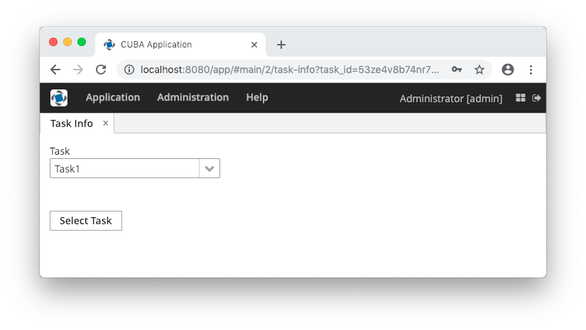
- UrlParamsChangedEvent
-
Now let’s implement the last requirement: when a user enters the URL with the route and the
task_idparameter, the application must show the screen with the corresponding task selected. Below is the complete screen controller code.package com.company.demo.web.navigation; import com.company.demo.entity.Task; import com.google.common.collect.ImmutableMap; import com.haulmont.cuba.core.global.DataManager; import com.haulmont.cuba.gui.Route; import com.haulmont.cuba.gui.UrlRouting; import com.haulmont.cuba.gui.components.Button; import com.haulmont.cuba.gui.components.LookupField; import com.haulmont.cuba.gui.navigation.UrlParamsChangedEvent; import com.haulmont.cuba.gui.screen.*; import com.haulmont.cuba.web.sys.navigation.UrlIdSerializer; import javax.inject.Inject; import java.util.UUID; @Route("task-info") @UiController("demo_TaskInfoScreen") @UiDescriptor("task-info.xml") @LoadDataBeforeShow public class TaskInfoScreen extends Screen { @Inject private LookupField<Task> taskField; @Inject private UrlRouting urlRouting; @Inject private DataManager dataManager; @Subscribe protected void onUrlParamsChanged(UrlParamsChangedEvent event) { String serializedTaskId = event.getParams().get("task_id"); (1) UUID taskId = (UUID) UrlIdSerializer.deserializeId(UUID.class, serializedTaskId); (2) taskField.setValue(dataManager.load(Task.class).id(taskId).one()); (3) } @Subscribe("selectBtn") protected void onSelectBtnClick(Button.ClickEvent event) { Task task = taskField.getValue(); if (task == null) { urlRouting.replaceState(this); return; } String serializedTaskId = UrlIdSerializer.serializeId(task.getId()); urlRouting.replaceState(this, ImmutableMap.of("task_id", serializedTaskId)); } }1 - get the parameter value from UrlParamsChangedEvent2 - deserialize the task id 3 - load the task instance and set it to the field
3.5.13.4. URL Routes Generator
Sometimes, it is necessary to get a proper URL of some application screen that can be sent via email or shown to the user. The simplest way to generate it is by using URL Routes Generator.
URL Routes Generator provides API for generating links to an entity editor screen or a screen defined by its id or class. The link can also contain URL parameters that enable to reflect inner screen state to URL to use it later.
The getRouteGenerator() method of UrlRouting bean allows you to get an instance of RouteGenerator. RouteGenerator has the following methods:
-
getRoute(String screenId)– returns a route for a screen with givenscreenId, for example:String route = urlRouting.getRouteGenerator().getRoute("demo_Customer.browse");The resulting URL will be
route = "http://host:port/context/#main/customers" -
getRoute(Class<? extends Screen> screenClass)– generates a route for screen with the givenscreenClass, for example:String route = urlRouting.getRouteGenerator().getRoute(CustomerBrowse.class);The resulting URL will be
route = "http://host:port/context/#main/customers" -
getEditorRoute(Entity entity)– generates a route to a default editor screen of the givenentity, for example:Customer сustomer = customersTable.getSingleSelected(); String route = urlRouting.getRouteGenerator().getEditorRoute(сustomer);The resulting URL will be
route = "http://localhost:8080/app/#main/customers/edit?id=5jqtc3pwzx6g6mq1vv5gkyjn0s" -
getEditorRoute(Entity entity, Class<? extends Screen> screenClass)– generates a route for editor with the givenscreenClassandentity. -
getRoute(Class<? extends Screen> screenClass, Map<String, String> urlParams)– generates a route for screen with the givenscreenClassandurlParams.
- URL Routes Generator Example
-
Suppose that we have a
Customerentity with standard screens that have registered routes. Let’s add a button to the browser screen that generates a link to the editor of the selected entity:
@Inject
private UrlRouting urlRouting;
@Inject
private GroupTable<Customer> customersTable;
@Inject
private Dialogs dialogs;
@Subscribe("getLinkButton")
public void onGetLinkButtonClick(Button.ClickEvent event) {
Customer selectedCustomer = customersTable.getSingleSelected();
if (selectedCustomer != null) {
String routeToSelectedRole = urlRouting.getRouteGenerator()
.getEditorRoute(selectedCustomer);
dialogs.createMessageDialog()
.withCaption("Generated route")
.withMessage(routeToSelectedRole)
.withWidth("710")
.show();
}
}The resulting route looks like this:
3.5.14. Composite Components
A composite component is a component consisting of other components. Like screen fragments, composite components allow you to reuse some presentation layout and logic. We recommend using composite components in the following cases:
-
The component functionality can be implemented as a combination of existing Generic UI components. If you need some non-standard features, create a custom component by wrapping a Vaadin component or JavaScript library, or use Generic JavaScriptComponent.
-
The component is relatively simple and does not load or save data itself. Otherwise, consider creating a screen fragment.
The class of a composite component must extend the CompositeComponent base class. A composite component must have a single component at the root of the inner components tree. The root component can be obtained using the CompositeComponent.getComposition() method.
Inner components are usually created declaratively in an XML descriptor. In this case, the component class should have the @CompositeDescriptor annotation which specifies the path to the descriptor file. If the annotation value does not start with /, the file is loaded from the component’s class package.
|
Pay attention that IDs of inner components must be unique in the screen to avoid collisions in listeners and injections. Use identifiers with some prefixes like |
Alternatively, the inner components tree can be created programmatically in a CreateEvent listener.
CreateEvent is sent by the framework when it finishes the initialization of the component. At this moment, if an XML descriptor is used by the component, it is loaded, and getComposition() method returns the root component. This event can be used for any additional initialization of the component or for creating the inner components without XML.
Below we demonstrate the creation of Stepper component which is designed to edit integer values in the input field and by clicking on up/down buttons located next to the field.
Let’s assume the project has com/company/demo base package.
- Component layout descriptor
-
Create an XML descriptor with the component layout in the
com/company/demo/web/components/stepper/stepper-component.xmlfile of thewebmodule:<composite xmlns="http://schemas.haulmont.com/cuba/screen/composite.xsd"> (1) <hbox id="rootBox" width="100%" expand="valueField"> (2) <textField id="valueField"/> (3) <button id="upBtn" icon="font-icon:CHEVRON_UP"/> <button id="downBtn" icon="font-icon:CHEVRON_DOWN"/> </hbox> </composite>1 - XSD defines the content of the component descriptor 2 - a single root component 3 - any number of nested components
- Component implementation class
-
Create the component implementation class in the same package:
package com.company.demo.web.components.stepper; import com.haulmont.bali.events.Subscription; import com.haulmont.cuba.gui.components.*; import com.haulmont.cuba.gui.components.data.ValueSource; import com.haulmont.cuba.web.gui.components.*; import java.util.Collection; import java.util.function.Consumer; @CompositeDescriptor("stepper-component.xml") (1) public class StepperField extends CompositeComponent<HBoxLayout> (2) implements Field<Integer>, (3) CompositeWithCaption, (4) CompositeWithHtmlCaption, CompositeWithHtmlDescription, CompositeWithIcon, CompositeWithContextHelp { public static final String NAME = "stepperField"; (5) private TextField<Integer> valueField; (6) private Button upBtn; private Button downBtn; private int step = 1; (7) public StepperField() { addCreateListener(this::onCreate); (8) } private void onCreate(CreateEvent createEvent) { valueField = getInnerComponent("valueField"); upBtn = getInnerComponent("upBtn"); downBtn = getInnerComponent("downBtn"); upBtn.addClickListener(clickEvent -> updateValue(step)); downBtn.addClickListener(clickEvent -> updateValue(-step)); } private void updateValue(int delta) { Integer value = getValue(); setValue(value != null ? value + delta : delta); } public int getStep() { return step; } public void setStep(int step) { this.step = step; } @Override public boolean isRequired() { (9) return valueField.isRequired(); } @Override public void setRequired(boolean required) { valueField.setRequired(required); getComposition().setRequiredIndicatorVisible(required); } @Override public String getRequiredMessage() { return valueField.getRequiredMessage(); } @Override public void setRequiredMessage(String msg) { valueField.setRequiredMessage(msg); } @Override public void addValidator(Consumer<? super Integer> validator) { valueField.addValidator(validator); } @Override public void removeValidator(Consumer<Integer> validator) { valueField.removeValidator(validator); } @Override public Collection<Consumer<Integer>> getValidators() { return valueField.getValidators(); } @Override public boolean isEditable() { return valueField.isEditable(); } @Override public void setEditable(boolean editable) { valueField.setEditable(editable); upBtn.setEnabled(editable); downBtn.setEnabled(editable); } @Override public Integer getValue() { return valueField.getValue(); } @Override public void setValue(Integer value) { valueField.setValue(value); } @Override public Subscription addValueChangeListener(Consumer<ValueChangeEvent<Integer>> listener) { return valueField.addValueChangeListener(listener); } @Override public void removeValueChangeListener(Consumer<ValueChangeEvent<Integer>> listener) { valueField.removeValueChangeListener(listener); } @Override public boolean isValid() { return valueField.isValid(); } @Override public void validate() throws ValidationException { valueField.validate(); } @Override public void setValueSource(ValueSource<Integer> valueSource) { valueField.setValueSource(valueSource); getComposition().setRequiredIndicatorVisible(valueField.isRequired()); } @Override public ValueSource<Integer> getValueSource() { return valueField.getValueSource(); } }1 - the @CompositeDescriptorannotation specifies the path to the component layout descriptor which is located in the class package.2 - the component class extends CompositeComponentparameterized by the type of the root component.3 - our component implements the Field<Integer>interface because it is designed to display and edit an integer value.4 - a set of interfaces with default methods to implement standard Generic UI component functionality. 5 - name of the component which is used to register the component in ui-component.xmlfile to be recognized by the framework.6 - fields containing references to inner components. 7 - component’s property which defines the value of a single click to up/down buttons. It has public getter/setter methods and can be assigned in screen XML. 8 - component initialization is done in the CreateEventlistener.
- Component loader
-
Create the component loader which is needed to initialize the component when it is used in screen XML descriptors:
package com.company.demo.web.components.stepper; import com.google.common.base.Strings; import com.haulmont.cuba.gui.xml.layout.loaders.AbstractFieldLoader; public class StepperFieldLoader extends AbstractFieldLoader<StepperField> { (1) @Override public void createComponent() { resultComponent = factory.create(StepperField.NAME); (2) loadId(resultComponent, element); } @Override public void loadComponent() { super.loadComponent(); String incrementStr = element.attributeValue("step"); (3) if (!Strings.isNullOrEmpty(incrementStr)) { resultComponent.setStep(Integer.parseInt(incrementStr)); } } }1 - loader class must extend AbstractComponentLoaderparameterized by the class of the component. As our component implementsField, use more specificAbstractFieldLoaderbase class.2 - create the component by its name. 3 - load the stepproperty value from XML if it is specified.
- Registration of the component
-
In order to register the component and its loader with the framework, create the
com/company/demo/ui-component.xmlfile of thewebmodule:<?xml version="1.0" encoding="UTF-8" standalone="no"?> <components xmlns="http://schemas.haulmont.com/cuba/components.xsd"> <component> <name>stepperField</name> <componentLoader>com.company.demo.web.components.stepper.StepperFieldLoader</componentLoader> <class>com.company.demo.web.components.stepper.StepperField</class> </component> </components>Add the following property to
com/company/demo/web-app.properties:cuba.web.componentsConfig = +com/company/demo/ui-component.xmlNow the framework will recognize the new component in XML descriptors of application screens.
If an application that has a composite component is registered as a application component, you must recreate its descriptor.
- Component XSD
-
XSD is required to use the component in screen XML descriptors. Define it in the
com/company/demo/ui-component.xsdfile of thewebmodule:<?xml version="1.0" encoding="UTF-8" standalone="no"?> <xs:schema xmlns="http://schemas.company.com/demo/0.1/ui-component.xsd" attributeFormDefault="unqualified" elementFormDefault="qualified" targetNamespace="http://schemas.company.com/demo/0.1/ui-component.xsd" xmlns:xs="http://www.w3.org/2001/XMLSchema" xmlns:layout="http://schemas.haulmont.com/cuba/screen/layout.xsd"> <xs:element name="stepperField"> <xs:complexType> <xs:complexContent> <xs:extension base="layout:baseFieldComponent"> (1) <xs:attribute name="step" type="xs:integer"/> (2) </xs:extension> </xs:complexContent> </xs:complexType> </xs:element> </xs:schema>1 - inherit all base field properties. 2 - define an attribute for the stepproperty.
- Usage of the component
-
The following example shows how the component can be used in a screen:
<?xml version="1.0" encoding="UTF-8" standalone="no"?>
<window xmlns="http://schemas.haulmont.com/cuba/screen/window.xsd"
xmlns:app="http://schemas.company.com/demo/0.1/ui-component.xsd" (1)
caption="msg://caption"
messagesPack="com.company.demo.web.components.sample">
<data>
<instance id="fooDc" class="com.company.demo.entity.Foo" view="_local">
<loader/>
</instance>
</data>
<layout>
<form id="form" dataContainer="fooDc">
<column width="250px">
<textField id="nameField" property="name"/>
<app:stepperField id="ageField" property="limit" step="10"/> (2)
</column>
</form>
</layout>
</window>| 1 | - the namespace referencing the component’s XSD. |
| 2 | - the composite component connected to the limit attribute of an entity. |
- Custom styling
-
Now let’s apply some custom styles to improve the component look.
First, change the root component to CssLayout and assign style names to the inner components. Besides custom styles defined in the project (see below), the following predefined styles are used: v-component-group, icon-only.
<composite xmlns="http://schemas.haulmont.com/cuba/screen/composite.xsd"> <cssLayout id="rootBox" width="100%" stylename="v-component-group stepper-field"> <textField id="valueField"/> <button id="upBtn" icon="font-icon:CHEVRON_UP" stylename="stepper-btn icon-only"/> <button id="downBtn" icon="font-icon:CHEVRON_DOWN" stylename="stepper-btn icon-only"/> </cssLayout> </composite>Change the component class accordingly:
@CompositeDescriptor("stepper-component.xml") public class StepperField extends CompositeComponent<CssLayout> implements ...Generate theme extension (see here how to do it in Studio) and add the following code to the
modules/web/themes/hover/com.company.demo/hover-ext.scssfile:@mixin com_company_demo-hover-ext { .stepper-field { display: flex; .stepper-btn { width: $v-unit-size; min-width: $v-unit-size; } } }Restart the application server and open the screen. The form with our composite Stepper component should look as follows:
3.5.15. Pluggable Component Factories
The pluggable component factories mechanism extends the standard component creation procedure and allows you to create different edit fields in Form, Table and DataGrid. It means that application components or your project itself can provide custom strategies that will create non-standard components and/or support custom data types.
An entry point to the mechanism is the UiComponentsGenerator.generate(ComponentGenerationContext) method. It works as follows:
-
Tries to find
ComponentGenerationStrategyimplementations. If at least one strategy exists, then:-
Iterates over strategies according to the
org.springframework.core.Orderedinterface. -
Returns the first created not
nullcomponent.
-
ComponentGenerationStrategy implementations are used to create UI components. A project can contain any number of such strategies.
ComponentGenerationContext is a class which stores the following information that can be used when creating a component:
-
metaClass- defines the entity for which the component is created. -
property- defines the entity attribute for which the component is created. -
datasource- a datasource. -
optionsDatasource- a datasource that can be used to show options. -
valueSource- a value source that can be used to create the component. -
options- an options object that can be used to show options. -
xmlDescriptor- an XML descriptor which contains additional information, in case the component is declared in an XML descriptor. -
componentClass- a component class for which a component is created, e.g.Form,Table,DataGrid.
There are two built-in component strategies:
-
DefaultComponentGenerationStrategy- used to create a component according to the givenComponentGenerationContextobject. Has the order valueComponentGenerationStrategy.LOWEST_PLATFORM_PRECEDENCE(1000). -
DataGridEditorComponentGenerationStrategy- used to create a component according to the givenComponentGenerationContextobject for a DataGrid Editor. Has the order valueComponentGenerationStrategy.HIGHEST_PLATFORM_PRECEDENCE + 30(130).
The sample below shows how to replace the default Form field generation for a certain attribute of a specific entity.
import com.company.sales.entity.Order;
import com.haulmont.chile.core.model.MetaClass;
import com.haulmont.cuba.core.global.Metadata;
import com.haulmont.cuba.gui.UiComponents;
import com.haulmont.cuba.gui.components.*;
import com.haulmont.cuba.gui.components.data.ValueSource;
import org.springframework.core.Ordered;
import javax.annotation.Nullable;
import javax.inject.Inject;
import java.sql.Date;
@org.springframework.stereotype.Component(SalesComponentGenerationStrategy.NAME)
public class SalesComponentGenerationStrategy implements ComponentGenerationStrategy, Ordered {
public static final String NAME = "sales_SalesComponentGenerationStrategy";
@Inject
private UiComponents uiComponents;
@Inject
private Metadata metadata;
@Nullable
@Override
public Component createComponent(ComponentGenerationContext context) {
String property = context.getProperty();
MetaClass orderMetaClass = metadata.getClassNN(Order.class);
// Check the specific field of the Order entity
// and that the component is created for the Form component
if (orderMetaClass.equals(context.getMetaClass())
&& "date".equals(property)
&& context.getComponentClass() != null
&& Form.class.isAssignableFrom(context.getComponentClass())) {
DatePicker<Date> datePicker = uiComponents.create(DatePicker.TYPE_DATE);
ValueSource valueSource = context.getValueSource();
if (valueSource != null) {
//noinspection unchecked
datePicker.setValueSource(valueSource);
}
return datePicker;
}
return null;
}
@Override
public int getOrder() {
return 50;
}
}The sample below shows how to define a ComponentGenerationStrategy for a specific datatype.
import com.company.colordatatype.datatypes.ColorDatatype;
import com.haulmont.chile.core.datatypes.Datatype;
import com.haulmont.chile.core.model.MetaClass;
import com.haulmont.chile.core.model.MetaPropertyPath;
import com.haulmont.chile.core.model.Range;
import com.haulmont.cuba.core.app.dynamicattributes.DynamicAttributesUtils;
import com.haulmont.cuba.gui.UiComponents;
import com.haulmont.cuba.gui.components.ColorPicker;
import com.haulmont.cuba.gui.components.Component;
import com.haulmont.cuba.gui.components.ComponentGenerationContext;
import com.haulmont.cuba.gui.components.ComponentGenerationStrategy;
import com.haulmont.cuba.gui.components.data.ValueSource;
import org.springframework.core.annotation.Order;
import javax.annotation.Nullable;
import javax.inject.Inject;
@Order(100)
@org.springframework.stereotype.Component(ColorComponentGenerationStrategy.NAME)
public class ColorComponentGenerationStrategy implements ComponentGenerationStrategy {
public static final String NAME = "colordatatype_ColorComponentGenerationStrategy";
@Inject
private UiComponents uiComponents;
@Nullable
@Override
public Component createComponent(ComponentGenerationContext context) {
String property = context.getProperty();
MetaPropertyPath mpp = resolveMetaPropertyPath(context.getMetaClass(), property);
if (mpp != null) {
Range mppRange = mpp.getRange();
if (mppRange.isDatatype()
&& ((Datatype) mppRange.asDatatype()) instanceof ColorDatatype) {
ColorPicker colorPicker = uiComponents.create(ColorPicker.class);
colorPicker.setDefaultCaptionEnabled(true);
ValueSource valueSource = context.getValueSource();
if (valueSource != null) {
//noinspection unchecked
colorPicker.setValueSource(valueSource);
}
return colorPicker;
}
}
return null;
}
protected MetaPropertyPath resolveMetaPropertyPath(MetaClass metaClass, String property) {
MetaPropertyPath mpp = metaClass.getPropertyPath(property);
if (mpp == null && DynamicAttributesUtils.isDynamicAttribute(property)) {
mpp = DynamicAttributesUtils.getMetaPropertyPath(metaClass, property);
}
return mpp;
}
}3.5.16. Working with Vaadin Components
In order to work directly with Vaadin components that implement interfaces of the visual components library in Web Client, use the following methods of the Component interface:
-
unwrap()– retrieves an underlying Vaadin component for a given CUBA component. -
unwrapComposition()- retrieves a Vaadin component that is the outmost external container in the implementation of a given CUBA component. For simple components, such as Button, this method returns the same object asunwrap()-com.vaadin.ui.Button. For complex components, such as Table,unwrap()will return the corresponding object -com.vaadin.ui.Table, whileunwrapComposition()will returncom.vaadin.ui.VerticalLayout, which contains the table together with ButtonsPanel andRowsCountdefined with it.
The methods accept a class of the underlying component to be returned, for example:
com.vaadin.ui.TextField vTextField = textField.unwrap(com.vaadin.ui.TextField.class);You can also use the unwrap() and getComposition() static methods of the WebComponentsHelper class, passing a CUBA component into them.
Please note that if a screen is located in the project’s gui module, you can only work with generalized interfaces of CUBA components. In order to use unwrap() you should either put the entire screen into the web module, or use the controller companions mechanism.
3.5.17. Custom Visual Components
This section contains an overview of different ways of creating custom web UI components in CUBA applications. The practical tutorial of using these approaches is located in the Creating Custom Visual Components section.
|
Before creating a component using a low-level technology, consider composite components based on existing Generic UI components. |
A new component can be created with the following technologies:
-
On the basis of a Vaadin add-on.
This is the simplest method. The following steps are required to use an add-on in your application:
-
Add a dependency to the add-on artifact to build.gradle.
-
Create the web-toolkit module in your project. This module contains a GWT widgetset file and allows you to create client-side parts of visual components.
-
Include the add-on widgetset to the widgetset of your project.
-
If the component’s look does not fit the application theme, create a theme extension and define some CSS for the new component.
See an example in the Using a Third-party Vaadin Component section.
-
-
As a wrapper of a JavaScript library.
This method is recommended if you already have a pure JavaScript component that does what you need. To use it in your application, you need to do the following:
-
Create a server-side Vaadin component in the web module. A server component defines an API for server code, access methods, event listeners, etc. The server component must extend the
AbstractJavaScriptComponentclass. Note that the web-toolkit module with a widgetset is not required when integrating a JavaScript component. -
Create a JavaScript connector. A connector is a function that initializes the JavaScript component and is responsible for interaction between JavaScript and the server-side code.
-
Create a state class. Its public fields define what data are sent from the server to the client. The class must extend
JavaScriptComponentState.
See an example in the Using a JavaScript library section.
-
-
As a resource from WebJar. See the section below for details.
-
As a new GWT component.
This is the recommended method of creating completely new visual components. The following steps are required to create and use a GWT component in your application:
-
Create the web-toolkit module.
-
Create a client-side GWT widget class.
-
Create a server-side Vaadin component.
-
Create a component state class that defines what data are sent between the client and the server.
-
Create a connector class that links the client code with the server component.
-
Create an RPC interface that defines a server API that is invoked from the client.
See an example in the Creating a GWT component section.
-
There are three levels of integration of a new component into the platform.
-
On the first level, the new component becomes available as a native Vaadin component. An application developer can use this component in screen controllers directly: create a new instance and add it to an unwrapped container. All methods of creating new components described above give you a component on this level of integration.
-
On the second level, the new component is integrated into CUBA Generic UI. In this case, from an application developer perspective, it looks the same as a standard component from the visual components library. The developer can define the component in a screen XML descriptor or create it through
UiComponentsin a controller. See an example in the Integrating a Vaadin Component into the Generic UI section. -
On the third level, the new component is available on the Studio components palette and can be used in the WYSIWYG layout editor. See an example in the Support for Custom Visual Components and Facets in CUBA Studio section.
3.5.17.1. Using WebJars
This method allows you to use various JS libraries packaged into JAR files and deployed on Maven Central. The following steps are required to use a component from a WebJar in your application:
-
Add dependency to the
compilemethod of web module:compile 'org.webjars.bower:jrcarousel:1.0.0' -
Create the web-toolkit module.
-
Create a client-side GWT widget class and implement the
nativeJSNI method for creating the component. -
Create a server-side component class with
@WebJarResourceannotation.This annotation should be used only with
ClientConnectorinheritors (which are classes of UI components from the web-toolkit module usually).The value of the
@WebJarResourceannotation, or the resource definition, should follow one of the two possible templates:-
<webjar_name>:<sub_path>, for example:@WebJarResource("pivottable:plugins/c3/c3.min.css") -
<webjar_name>/<resource_version>/<webjar_resource>, for example:@WebJarResource("jquery-ui/1.12.1/jquery-ui.min.js")
The annotation value can have one or more (String array) WebJar resource String definitions:
@WebJarResource({ "jquery-ui:jquery-ui.min.js", "jquery-fileupload:jquery-fileupload.min.js", "jquery-fileupload:jquery-fileupload.min.js" }) public class CubaFileUpload extends CubaAbstractUploadComponent { ... }Specifying the WebJar version is not required, as due to Maven version resolution strategy the WebJar with the higher version will be used automatically.
Optionally, you can specify a directory inside
VAADIN/webjars/from which the static resources will be served. Thus you can override WebJar resources by placing new versions of resources in this directory. To set the path, use theoverridePathproperty of the@WebJarResourceannotation, for example:@WebJarResource(value = "pivottable:plugins/c3/c3.min.css", overridePath = "pivottable") -
-
Add new component to the screen.
3.5.17.2. Generic JavaScriptComponent
JavaScriptComponent is a simple UI component that can work with any JavaScript wrapper without Vaadin component implementation. Thus, you can easily integrate any pure JavaScript component in your CUBA-based application.
The component can be defined declaratively in an XML descriptor of the screen, so that you can configure dynamic properties and JavaScript dependencies in XML.
XML-name of the component: jsComponent.
- Defining dependencies
-
You can define a list of dependencies (JavaScript, CSS) for the component. A dependency can be obtained from the following sources:
-
WebJar resource - starts with
webjar:// -
File placed within VAADIN directory - starts with
vaadin:// -
Web resource - starts with
http://orhttps://
If the type of dependency cannot be inferred from the extension, specify the type explicitly in the
typeXML attribute or by passingDependencyTypeenum value to theaddDependency()method.Example of defining dependencies in XML:
<jsComponent ...> <dependencies> <dependency path="webjar://leaflet.js"/> <dependency path="http://code.jquery.com/jquery-3.4.1.min.js"/> <dependency path="http://api.map.baidu.com/getscript?v=2.0" type="JAVASCRIPT"/> </dependencies> </jsComponent>Example of adding dependencies programmatically:
jsComponent.addDependencies( "webjar://leaflet.js", "http://code.jquery.com/jquery-3.4.1.min.js" ); jsComponent.addDependency( "http://api.map.baidu.com/getscript?v=2.0", DependencyType.JAVASCRIPT ); -
- Defining initialization function
-
The component requires an initialization function. This function’s name that will be used to find an entry point for the JavaScript component connector (see below).
The initialization function name must be unique within a window.
The function name can be passed to the component using the
setInitFunctionName()method:jsComponent.setInitFunctionName("com_company_demo_web_screens_Sandbox"); - Defining JavaScript connector
-
To use
JavaScriptComponentwrapper for a library, you should define a JavaScript connector - a function that initializes the JavaScript component and handles communication between the server-side and the JavaScript code.The following methods are available from the connector function:
-
this.getElement()returns the HTML DOM element of the component. -
this.getState()returns a shared state object with the current state as synchronized from the server-side.
-
- Component features
-
The
JavaScriptComponentcomponent has the following features that let you:-
Set a state object that can be used in the client-side JavaScript connector and is accessible from the
datafield of the component’s state, for example:MyState state = new MyState(); state.minValue = 0; state.maxValue = 100; jsComponent.setState(state); -
Register a function that can be called from the JavaScript using the provided name, for example:
jsComponent.addFunction("valueChanged", callbackEvent -> { JsonArray arguments = callbackEvent.getArguments(); notifications.create() .withCaption(StringUtils.join(arguments, ", ")) .show(); });this.valueChanged(values); -
Invoke a named function that the connector JavaScript has added to the JavaScript connector wrapper object.
jsComponent.callFunction("showNotification ");this.showNotification = function () { alert("TEST"); };
-
- JavaScriptComponent usage example
-
This section describes how to integrate a third-party JavaScript library to a CUBA-based application taking Quill Rich Text Editor from https://quilljs.com/ as an example. To use Quill in your project, you should follow the steps below.
-
Add the following dependency to the web module:
compile('org.webjars.npm:quill:1.3.6') -
Create a
quill-connector.jsfile in theweb/VAADIN/quilldirectory on the web module. -
In this file, add the connector implementation:
com_company_demo_web_screens_Sandbox = function () { var connector = this; var element = connector.getElement(); element.innerHTML = "<div id=\"editor\">" + "<p>Hello World!</p>" + "<p>Some initial <strong>bold</strong> text</p>" + "<p><br></p>" + "</div>"; connector.onStateChange = function () { var state = connector.getState(); var data = state.data; var quill = new Quill('#editor', data.options); // Subscribe on textChange event quill.on('text-change', function (delta, oldDelta, source) { if (source === 'user') { connector.valueChanged(quill.getText(), quill.getContents()); } }); } }; -
Create a screen with the following
jsComponentdefinition:<jsComponent id="quill" initFunctionName="com_company_demo_web_screens_Sandbox" height="200px" width="400"> <dependencies> <dependency path="webjar://quill:dist/quill.js"/> <dependency path="webjar://quill:dist/quill.snow.css"/> <dependency path="vaadin://quill/quill-connector.js"/> </dependencies> </jsComponent> -
Add the following screen controller implementation:
@UiController("demo_Sandbox") @UiDescriptor("sandbox.xml") public class Sandbox extends Screen { @Inject private JavaScriptComponent quill; @Inject private Notifications notifications; @Subscribe protected void onInit(InitEvent event) { QuillState state = new QuillState(); state.options = ParamsMap.of("theme", "snow", "placeholder", "Compose an epic..."); quill.setState(state); quill.addFunction("valueChanged", javaScriptCallbackEvent -> { String value = javaScriptCallbackEvent.getArguments().getString(0); notifications.create() .withCaption(value) .withPosition(Notifications.Position.BOTTOM_RIGHT) .show(); }); } class QuillState { public Map<String, Object> options; } }
As a result, the Quill Rich Text Editor is available on the screen:
Another example of custom JavaScript component integration see at Using a JavaScript library.
-
3.5.17.3. ScreenDependencyUtils
The simple way to add dependencies such as CSS, JavaScript or HTML to the current page for screens and fragments is to use the ScreenDependencyUtils helper class. You can obtain dependencies from the following sources:
-
WebJar resource - starts with
webjar:// -
File placed within VAADIN directory - starts with
vaadin:// -
Web resource - starts with
http://orhttps://
This helper class has the following methods for adding and getting dependencies:
-
setScreenDependencies- sets a list of dependencies. -
addScreenDependencies- adds dependencies paths. -
addScreenDependency- adds a dependency path. -
List<ClientDependency> getScreenDependencies- returns a list of previously added dependencies.
In the example a CSS file is added to the login screen:
protected void loadStyles() {
ScreenDependencyUtils.addScreenDependency(this,
"vaadin://brand-login-screen/login.css", Dependency.Type.STYLESHEET);
}As the result the following import will be added to the page header:
<link rel="stylesheet" type="text/css" href="http://localhost:8080/app/VAADIN/brand-login-screen/login.css">Added CSS file is being applied only to the login screen:

3.5.17.4. Creating Custom Visual Components
As explained in the Custom Visual Components section, the standard set of visual components can be extended in your project. You have the following options:
-
Integrate a Vaadin add-on. Many third-party Vaadin components are distributed as add-ons and available at
https://vaadin.com/directory. -
Integrate a JavaScript component. You can create a Vaadin component using a JavaScript library.
-
Create a new Vaadin component with the client part written on GWT.
Futher on, you can integrate the resulting Vaadin component into CUBA Generic UI to be able to use it declaratively in screen XML descriptors and bind to data containers.
And the final step of integration is the support of the new component in the Studio WYSIWYG layout editor.
This section gives you examples of creating new visual components with all the methods described above. Integration to the Generic UI and support in Studio are the same for all methods, so these topics are described only for a new component created on the basis of a Vaadin add-on.
3.5.17.4.1. Using a Third-party Vaadin Component
This is an example of using the Stepper component available at http://vaadin.com/addon/stepper, in an application project. The component enables changing text field value in steps using the keyboard, mouse scroll or built-in up/down buttons.
Create a new project in CUBA Studio and name it addon-demo.
A Vaadin add-on may be integrated if the application project has a web-toolkit module. A convenient way to create it is to use CUBA Studio: in the main menu, click CUBA > Advanced > Manage modules > Create 'web-toolkit' Module.
Then add add-on dependencies:
-
In build.gradle, for the web module add a dependency on the add-on that contains the component:
configure(webModule) { ... dependencies { ... compile("org.vaadin.addons:stepper:2.4.0") } -
In
AppWidgetSet.gwt.xmlfile of the web-toolkit module, indicate that the project’s widgetset inherits from the add-on widgetset:<module> <inherits name="com.haulmont.cuba.web.widgets.WidgetSet" /> <inherits name="org.vaadin.risto.stepper.StepperWidgetset" /> <set-property name="user.agent" value="safari" /> </module>You can speed up the widgetset compilation by defining the
user.agentproperty. In this example, widgetset will be compiled only for browsers based on WebKit: Chrome, Safari, etc.
Now the component from the Vaadin add-on is included to the project. Let’s see how to use it in the project screens.
-
Create a new entity
Customerwith two fields:-
nameof type String -
scoreof type Integer
-
-
Generate standard screens for the new entity. Ensure that the Module field is set to
Module: 'app-web_main'(this field is shown only if the gui module is added to the project). Screens that use Vaadin components directly must be placed in the web module.Actually, screens can be placed in the gui module as well, but then the code that uses the Vaadin component should be moved to a separate companion.
-
Next, we will add the
steppercomponent to the screen.Replace the
scorefield of theformcomponent of thecustomer-edit.xmlscreen with ahBoxthat will be used as a container for a Vaadin component.<?xml version="1.0" encoding="UTF-8" standalone="no"?> <window xmlns="http://schemas.haulmont.com/cuba/screen/window.xsd" caption="msg://editorCaption" focusComponent="form" messagesPack="com.company.demo.web.customer"> <data> <instance id="customerDc" class="com.company.demo.entity.Customer" view="_local"> <loader/> </instance> </data> <dialogMode height="600" width="800"/> <layout expand="editActions" spacing="true"> <form id="form" dataContainer="customerDc"> <column width="250px"> <textField id="nameField" property="name"/> <!-- A box that will be used as a container for a Vaadin component --> <hbox id="scoreBox" caption="msg://com.company.demo.entity/Customer.score" height="100%" width="100%"/> </column> </form> <hbox id="editActions" spacing="true"> <button action="windowCommitAndClose"/> <button action="windowClose"/> </hbox> </layout> </window>Add the following code to the
CustomerEdit.javacontroller:package com.company.demo.web.customer; import com.company.demo.entity.Customer; import com.haulmont.cuba.gui.components.HBoxLayout; import com.haulmont.cuba.gui.screen.*; import com.vaadin.ui.Layout; import org.vaadin.risto.stepper.IntStepper; import javax.inject.Inject; @UiController("demo_Customer.edit") @UiDescriptor("customer-edit.xml") @EditedEntityContainer("customerDc") @LoadDataBeforeShow public class CustomerEdit extends StandardEditor<Customer> { @Inject private HBoxLayout scoreBox; private IntStepper stepper = new IntStepper(); @Subscribe protected void onInit(InitEvent event) { scoreBox.unwrap(Layout.class) .addComponent(stepper); stepper.setSizeFull(); stepper.addValueChangeListener(valueChangeEvent -> getEditedEntity().setScore(valueChangeEvent.getValue())); } @Subscribe protected void onInitEntity(InitEntityEvent<Customer> event) { event.getEntity().setScore(0); } @Subscribe protected void onBeforeShow(BeforeShowEvent event) { stepper.setValue(getEditedEntity().getScore()); } }The
onInit()method initializes a stepper component instance, retrieves a link to the Vaadin container using theunwrapmethod, and adds the new component to it.Data binding is implemented programmatically by setting a current value to the
steppercomponent from the editedCustomerinstance in theonBeforeShow()method. Additionally, the corresponding entity attribute is updated through the value change listener, when the user changes the value. -
To adapt the component style, create a theme extension in the project. A convenient way to do this is to use CUBA Studio: in the main menu, click CUBA > Advanced > Manage themes > Create theme extension. Select the
hovertheme in the popup window. Another way is to use theextend-themecommand in CUBA CLI. After that, open thethemes/hover/com.company.demo/hover-ext.scssfile located in the web module and add the following code:/* Define your theme modifications inside next mixin */ @mixin com_company_demo-hover-ext { /* Basic styles for stepper inner text box */ .stepper input[type="text"] { @include box-defaults; @include valo-textfield-style; &:focus { @include valo-textfield-focus-style; } } } -
Start the application server. The resulting editor screen will look as follows:
3.5.17.4.2. Integrating a Vaadin Component into the Generic UI
In the previous section, we have included the third-party Stepper component in the project. In this section, we will integrate it into CUBA Generic UI. This will allow developers to use the component declaratively in the screen XML and bind it to the data model entities through Data Components.
In order to integrate Stepper into CUBA Generic UI, we need to create the following files:
-
Stepper- an interface of the component in the gui subfolder of the web module. -
WebStepper- a component implementation in the gui subfolder of the web module. -
StepperLoader- a component XML-loader in the gui subfolder of the web module. -
ui-component.xsd- a new component XML schema definition. If the file already exists, add the information about the new component to the existing file. -
cuba-ui-component.xml- the file that registers a new component loader in web module. If the file already exists add the information about the new component to the existing file.
Open the project in the IDE.
Let’s create required files and make necessary changes.
-
Create the
Stepperinterface in the gui subfolder of the web module. Replace its content with the following code:package com.company.demo.web.gui.components; import com.haulmont.cuba.gui.components.Field; // note that Stepper should extend Field public interface Stepper extends Field<Integer> { String NAME = "stepper"; boolean isManualInputAllowed(); void setManualInputAllowed(boolean value); boolean isMouseWheelEnabled(); void setMouseWheelEnabled(boolean value); int getStepAmount(); void setStepAmount(int amount); int getMaxValue(); void setMaxValue(int maxValue); int getMinValue(); void setMinValue(int minValue); }The base interface for the component is
Field, which is designed to display and edit an entity attribute. -
Create the
WebStepperclass - a component implementation in the gui subfolder of the web module. Replace its content with the following code:package com.company.demo.web.gui.components; import com.haulmont.cuba.web.gui.components.WebV8AbstractField; import org.vaadin.risto.stepper.IntStepper; // note that WebStepper should extend WebV8AbstractField public class WebStepper extends WebV8AbstractField<IntStepper, Integer, Integer> implements Stepper { public WebStepper() { this.component = createComponent(); attachValueChangeListener(component); } private IntStepper createComponent() { return new IntStepper(); } @Override public boolean isManualInputAllowed() { return component.isManualInputAllowed(); } @Override public void setManualInputAllowed(boolean value) { component.setManualInputAllowed(value); } @Override public boolean isMouseWheelEnabled() { return component.isMouseWheelEnabled(); } @Override public void setMouseWheelEnabled(boolean value) { component.setMouseWheelEnabled(value); } @Override public int getStepAmount() { return component.getStepAmount(); } @Override public void setStepAmount(int amount) { component.setStepAmount(amount); } @Override public int getMaxValue() { return component.getMaxValue(); } @Override public void setMaxValue(int maxValue) { component.setMaxValue(maxValue); } @Override public int getMinValue() { return component.getMinValue(); } @Override public void setMinValue(int minValue) { component.setMinValue(minValue); } }The chosen base class is
WebV8AbstractField, which implements the methods of theFieldinterface. -
The
StepperLoaderclass in the gui subfolder of the web module loads the component from its representation in XML.package com.company.demo.web.gui.xml.layout.loaders; import com.company.demo.web.gui.components.Stepper; import com.haulmont.cuba.gui.xml.layout.loaders.AbstractFieldLoader; public class StepperLoader extends AbstractFieldLoader<Stepper> { @Override public void createComponent() { resultComponent = factory.create(Stepper.class); loadId(resultComponent, element); } @Override public void loadComponent() { super.loadComponent(); String manualInput = element.attributeValue("manualInput"); if (manualInput != null) { resultComponent.setManualInputAllowed(Boolean.parseBoolean(manualInput)); } String mouseWheel = element.attributeValue("mouseWheel"); if (mouseWheel != null) { resultComponent.setMouseWheelEnabled(Boolean.parseBoolean(mouseWheel)); } String stepAmount = element.attributeValue("stepAmount"); if (stepAmount != null) { resultComponent.setStepAmount(Integer.parseInt(stepAmount)); } String maxValue = element.attributeValue("maxValue"); if (maxValue != null) { resultComponent.setMaxValue(Integer.parseInt(maxValue)); } String minValue = element.attributeValue("minValue"); if (minValue != null) { resultComponent.setMinValue(Integer.parseInt(minValue)); } } }The
AbstractFieldLoaderclass contains code for loading basic properties of theFieldcomponent. SoStepperLoaderloads only the specific properties of theSteppercomponent. -
The
cuba-ui-component.xmlfile in the web module registers the new component and its loader. Replace its content with the following code:<?xml version="1.0" encoding="UTF-8" standalone="no"?> <components xmlns="http://schemas.haulmont.com/cuba/components.xsd"> <component> <name>stepper</name> <componentLoader>com.company.demo.web.gui.xml.layout.loaders.StepperLoader</componentLoader> <class>com.company.demo.web.gui.components.WebStepper</class> </component> </components> -
The
ui-component.xsdfile in web module contains XML schema definitions of custom visual components. Add thestepperelement and its attributes definition.<?xml version="1.0" encoding="UTF-8" standalone="no"?> <xs:schema xmlns="http://schemas.company.com/agd/0.1/ui-component.xsd" elementFormDefault="qualified" targetNamespace="http://schemas.company.com/agd/0.1/ui-component.xsd" xmlns:xs="http://www.w3.org/2001/XMLSchema"> <xs:element name="stepper"> <xs:complexType> <xs:attribute name="id" type="xs:string"/> <xs:attribute name="caption" type="xs:string"/> <xs:attribute name="height" type="xs:string"/> <xs:attribute name="width" type="xs:string"/> <xs:attribute name="dataContainer" type="xs:string"/> <xs:attribute name="property" type="xs:string"/> <xs:attribute name="manualInput" type="xs:boolean"/> <xs:attribute name="mouseWheel" type="xs:boolean"/> <xs:attribute name="stepAmount" type="xs:int"/> <xs:attribute name="maxValue" type="xs:int"/> <xs:attribute name="minValue" type="xs:int"/> </xs:complexType> </xs:element> </xs:schema>
Let’s see how to add the new component to a screen.
-
Either remove the changes made in the previous section or generate editor screen for the entity.
-
Add the
steppercomponent to the editor screen. You can add it either declaratively or programmatically. We’ll examine both methods.-
Using the component declaratively in an XML descriptor.
-
Open the
customer-edit.xmlfile. -
Define the new namespace
xmlns:app="http://schemas.company.com/agd/0.1/ui-component.xsd". -
Remove the
scorefield fromform. -
Add
steppercomponent to the screen.
As a result, the XML descriptor should look like this:
<?xml version="1.0" encoding="UTF-8" standalone="no"?> <window xmlns="http://schemas.haulmont.com/cuba/screen/window.xsd" xmlns:app="http://schemas.company.com/agd/0.1/ui-component.xsd" caption="msg://editorCaption" focusComponent="form" messagesPack="com.company.demo.web.customer"> <data> <instance id="customerDc" class="com.company.demo.entity.Customer" view="_local"> <loader/> </instance> </data> <dialogMode height="600" width="800"/> <layout expand="editActions" spacing="true"> <form id="form" dataContainer="customerDc"> <column width="250px"> <textField id="nameField" property="name"/> <app:stepper id="stepper" dataContainer="customerDc" property="score" minValue="0" maxValue="20"/> </column> </form> <hbox id="editActions" spacing="true"> <button action="windowCommitAndClose"/> <button action="windowClose"/> </hbox> </layout> </window>In the example above, the
steppercomponent is associated with thescoreattribute of theCustomerentity. An instance of this entity is managed by thecustomerDcinstance container. -
-
Programmatic creation of the component in a Java controller.
<?xml version="1.0" encoding="UTF-8" standalone="no"?> <window xmlns="http://schemas.haulmont.com/cuba/screen/window.xsd" caption="msg://editorCaption" focusComponent="form" messagesPack="com.company.demo.web.customer"> <data> <instance id="customerDc" class="com.company.demo.entity.Customer" view="_local"> <loader/> </instance> </data> <dialogMode height="600" width="800"/> <layout expand="editActions" spacing="true"> <form id="form" dataContainer="customerDc"> <column width="250px"> <textField id="nameField" property="name"/> </column> </form> <hbox id="editActions" spacing="true"> <button action="windowCommitAndClose"/> <button action="windowClose"/> </hbox> </layout> </window>package com.company.demo.web.customer; import com.company.demo.entity.Customer; import com.company.demo.web.gui.components.Stepper; import com.haulmont.cuba.gui.UiComponents; import com.haulmont.cuba.gui.components.Form; import com.haulmont.cuba.gui.components.data.value.ContainerValueSource; import com.haulmont.cuba.gui.model.InstanceContainer; import com.haulmont.cuba.gui.screen.*; import javax.inject.Inject; @UiController("demo_Customer.edit") @UiDescriptor("customer-edit.xml") @EditedEntityContainer("customerDc") @LoadDataBeforeShow public class CustomerEdit extends StandardEditor<Customer> { @Inject private Form form; @Inject private InstanceContainer<Customer> customerDc; @Inject private UiComponents uiComponents; @Subscribe protected void onInit(InitEvent event) { Stepper stepper = uiComponents.create(Stepper.NAME); stepper.setValueSource(new ContainerValueSource<>(customerDc, "score")); stepper.setCaption("Score"); stepper.setWidthFull(); stepper.setMinValue(0); stepper.setMaxValue(20); form.add(stepper); } @Subscribe protected void onInitEntity(InitEntityEvent<Customer> event) { event.getEntity().setScore(0); } }
-
-
Start the application server. The resulting editor screen will look as follows:
3.5.17.4.3. Using a JavaScript library
The CUBA platform has a Slider component that allows setting a numeric value within a defined range. For your tasks, you may need a similar component with two drag handlers that define a values range. So in this example, we will use the Slider component from the jQuery UI library.
Create a new project in CUBA Studio and name it jscomponent.
In order to use the Slider component, we need to create the following files:
-
SliderServerComponent- a Vaadin component integrated with JavaScript. -
SliderState- a state class of the Vaadin component. -
slider-connector.js- a JavaScript connector for the Vaadin component.
The process of integration into the Generic UI is the same as described at Integrating a Vaadin Component into the Generic UI, so we won’t repeat it here.
Let’s create required files in the toolkit/ui/slider subfolder of the web module and make necessary changes.
-
SlideStatestate class defines what data is transferred between the server and the client. In our case it is a minimal possible value, maximum possible value and selected values.package com.company.jscomponent.web.toolkit.ui.slider; import com.vaadin.shared.ui.JavaScriptComponentState; public class SliderState extends JavaScriptComponentState { public double[] values; public double minValue; public double maxValue; } -
Vaadin server-side component
SliderServerComponent.package com.company.jscomponent.web.toolkit.ui.slider; import com.haulmont.cuba.web.widgets.WebJarResource; import com.vaadin.annotations.JavaScript; import com.vaadin.ui.AbstractJavaScriptComponent; import elemental.json.JsonArray; @WebJarResource({"jquery:jquery.min.js", "jquery-ui:jquery-ui.min.js", "jquery-ui:jquery-ui.css"}) @JavaScript({"slider-connector.js"}) public class SliderServerComponent extends AbstractJavaScriptComponent { public interface ValueChangeListener { void valueChanged(double[] newValue); } private ValueChangeListener listener; public SliderServerComponent() { addFunction("valueChanged", arguments -> { JsonArray array = arguments.getArray(0); double[] values = new double[2]; values[0] = array.getNumber(0); values[1] = array.getNumber(1); getState(false).values = values; listener.valueChanged(values); }); } public void setValue(double[] value) { getState().values = value; } public double[] getValue() { return getState().values; } public double getMinValue() { return getState().minValue; } public void setMinValue(double minValue) { getState().minValue = minValue; } public double getMaxValue() { return getState().maxValue; } public void setMaxValue(double maxValue) { getState().maxValue = maxValue; } @Override protected SliderState getState() { return (SliderState) super.getState(); } @Override public SliderState getState(boolean markAsDirty) { return (SliderState) super.getState(markAsDirty); } public ValueChangeListener getListener() { return listener; } public void setListener(ValueChangeListener listener) { this.listener = listener; } }The server component defines getters and setters to work with the slider state and an interface of value change listeners. The class extends
AbstractJavaScriptComponent.The
addFunction()method invocation in the class constructor defines a handler for an RPC-call of thevalueChanged()function from the client.The
@JavaScriptand@WebJarResourceannotations point to files that must be loaded on the web page. In our example, these are JavaScript files of the jquery-ui library and the stylesheet for jquery-ui located in the WebJar resource, and the connector that is located in the Java package of the Vaadin server component. -
JavaScript connector
slider-connector.js.com_company_jscomponent_web_toolkit_ui_slider_SliderServerComponent = function() { var connector = this; var element = connector.getElement(); $(element).html("<div/>"); $(element).css("padding", "5px 0px"); var slider = $("div", element).slider({ range: true, slide: function(event, ui) { connector.valueChanged(ui.values); } }); connector.onStateChange = function() { var state = connector.getState(); slider.slider("values", state.values); slider.slider("option", "min", state.minValue); slider.slider("option", "max", state.maxValue); $(element).width(state.width); } }Connector is a function that initializes a JavaScript component when the web page is loaded. The function name must correspond to the server component class name where dots in package name are replaced with underscore characters.
Vaadin adds several useful methods to the connector function.
this.getElement()returns an HTML DOM element of the component,this.getState()returns a state object.Our connector does the following:
-
Initializes the
slidercomponent of the jQuery UI library. Theslide()function is invoked when the position of any drag handler changes. This function in turn invokes thevalueChanged()connector method.valuedChanged()is the method that we defined on the server side in theSliderServerComponentclass. -
Defines the
onStateChange()function. It is called when the state object is changed on the server side.
-
To demonstrate how the component works, let’s create the Product entity with three attributes:
-
nameof type String -
minDiscountof type Double -
maxDiscountof type Double
Generate standard screens for the entity. Ensure that the Module field is set to Module: 'app-web_main' (this field is shown only if the gui module is added to the project).
The slider component will set minimal and maximum discount values of a product.
Open the product-edit.xml file. Make minDiscount and maxDiscount fields not editable by adding the editable="false" attribute to the corresponding elements. Then add a box that will be used as a container for a Vaadin component.
As a result, the XML descriptor of the editor screen should look as follows:
<?xml version="1.0" encoding="UTF-8" standalone="no"?>
<window xmlns="http://schemas.haulmont.com/cuba/screen/window.xsd"
caption="msg://editorCaption"
focusComponent="form"
messagesPack="com.company.jscomponent.web.product">
<data>
<instance id="productDc"
class="com.company.jscomponent.entity.Product"
view="_local">
<loader/>
</instance>
</data>
<dialogMode height="600"
width="800"/>
<layout expand="editActions" spacing="true">
<form id="form" dataContainer="productDc">
<column width="250px">
<textField id="nameField" property="name"/>
<textField id="minDiscountField" property="minDiscount" editable="false"/>
<textField id="maxDiscountField" property="maxDiscount" editable="false"/>
<hbox id="sliderBox" width="100%"/>
</column>
</form>
<hbox id="editActions" spacing="true">
<button action="windowCommitAndClose"/>
<button action="windowClose"/>
</hbox>
</layout>
</window>Open the ProductEdit.java file. Replace its content with the following code:
package com.company.jscomponent.web.product;
import com.company.jscomponent.entity.Product;
import com.company.jscomponent.web.toolkit.ui.slider.SliderServerComponent;
import com.haulmont.cuba.gui.components.HBoxLayout;
import com.haulmont.cuba.gui.screen.*;
import com.vaadin.ui.Layout;
import javax.inject.Inject;
@UiController("jscomponent_Product.edit")
@UiDescriptor("product-edit.xml")
@EditedEntityContainer("productDc")
@LoadDataBeforeShow
public class ProductEdit extends StandardEditor<Product> {
@Inject
private HBoxLayout sliderBox;
@Subscribe
protected void onInitEntity(InitEntityEvent<Product> event) {
event.getEntity().setMinDiscount(15.0);
event.getEntity().setMaxDiscount(70.0);
}
@Subscribe
protected void onBeforeShow(BeforeShowEvent event) {
SliderServerComponent slider = new SliderServerComponent();
slider.setValue(new double[]{
getEditedEntity().getMinDiscount(),
getEditedEntity().getMaxDiscount()
});
slider.setMinValue(0);
slider.setMaxValue(100);
slider.setWidth("250px");
slider.setListener(newValue -> {
getEditedEntity().setMinDiscount(newValue[0]);
getEditedEntity().setMaxDiscount(newValue[1]);
});
sliderBox.unwrap(Layout.class).addComponent(slider);
}
}The onInitEntity() method sets initial values for discounts of a new product.
Method onBeforeShow() initializes the slider component. It sets current, minimal and maximum values of the slider and defines the value change listener. When the drag handler moves, a new value will be set to the corresponding field of the editable entity.
Start the application server and open the product editor screen. Changing the drop handler position must change the value of the text fields.
3.5.17.4.4. Creating a GWT component
In this section, we will cover the creation of a simple GWT component (a rating field consisting of 5 stars) and its usage in application screens.

Create a new project in CUBA Studio and name it ratingsample.
Create the web-toolkit module. A convenient way to do this is to use CUBA Studio: in the main menu, click CUBA > Advanced > Manage modules > Create 'web-toolkit' Module.
In order to create a GTW component, we need to create the following files:
-
RatingFieldWidget.java- a GWT widget in the web-toolkit module. -
RatingFieldServerComponent.java- a Vaadin component class. -
RatingFieldState.java- a component state class. -
RatingFieldConnector.java- a connector that links the client code with the server component. -
RatingFieldServerRpc.java- a class that defines a server API for the client.
Let’s create required files and make necessary changes in them.
-
Create the
RatingFieldWidgetclass in the web-toolkit module. Replace its content with the following code:package com.company.ratingsample.web.toolkit.ui.client.ratingfield; import com.google.gwt.dom.client.DivElement; import com.google.gwt.dom.client.SpanElement; import com.google.gwt.dom.client.Style.Display; import com.google.gwt.user.client.DOM; import com.google.gwt.user.client.Event; import com.google.gwt.user.client.ui.FocusWidget; import java.util.ArrayList; import java.util.List; public class RatingFieldWidget extends FocusWidget { private static final String CLASSNAME = "ratingfield"; // API for handle clicks public interface StarClickListener { void starClicked(int value); } protected List<SpanElement> stars = new ArrayList<>(5); protected StarClickListener listener; protected int value = 0; public RatingFieldWidget() { DivElement container = DOM.createDiv().cast(); container.getStyle().setDisplay(Display.INLINE_BLOCK); for (int i = 0; i < 5; i++) { SpanElement star = DOM.createSpan().cast(); // add star element to the container DOM.insertChild(container, star, i); // subscribe on ONCLICK event DOM.sinkEvents(star, Event.ONCLICK); stars.add(star); } setElement(container); setStylePrimaryName(CLASSNAME); } // main method for handling events in GWT widgets @Override public void onBrowserEvent(Event event) { super.onBrowserEvent(event); switch (event.getTypeInt()) { // react on ONCLICK event case Event.ONCLICK: SpanElement element = event.getEventTarget().cast(); // if click was on the star int index = stars.indexOf(element); if (index >= 0) { int value = index + 1; // set internal value setValue(value); // notify listeners if (listener != null) { listener.starClicked(value); } } break; } } @Override public void setStylePrimaryName(String style) { super.setStylePrimaryName(style); for (SpanElement star : stars) { star.setClassName(style + "-star"); } updateStarsStyle(this.value); } // let application code change the state public void setValue(int value) { this.value = value; updateStarsStyle(value); } // refresh visual representation private void updateStarsStyle(int value) { for (SpanElement star : stars) { star.removeClassName(getStylePrimaryName() + "-star-selected"); } for (int i = 0; i < value; i++) { stars.get(i).addClassName(getStylePrimaryName() + "-star-selected"); } } }A widget is a client-side class responsible for displaying the component in the web browser and handling events. It defines interfaces for working with the server side. In our case these are the
setValue()method and theStarClickListenerinterface. -
RatingFieldServerComponentis a Vaadin component class. It defines an API for the server code, accessor methods, event listeners and data sources connection. Developers use the methods of this class in the application code.package com.company.ratingsample.web.toolkit.ui; import com.company.ratingsample.web.toolkit.ui.client.ratingfield.RatingFieldServerRpc; import com.company.ratingsample.web.toolkit.ui.client.ratingfield.RatingFieldState; import com.vaadin.ui.AbstractField; // the field will have a value with integer type public class RatingFieldServerComponent extends AbstractField<Integer> { public RatingFieldServerComponent() { // register an interface implementation that will be invoked on a request from the client registerRpc((RatingFieldServerRpc) value -> setValue(value, true)); } @Override protected void doSetValue(Integer value) { if (value == null) { value = 0; } getState().value = value; } @Override public Integer getValue() { return getState().value; } // define own state class @Override protected RatingFieldState getState() { return (RatingFieldState) super.getState(); } @Override protected RatingFieldState getState(boolean markAsDirty) { return (RatingFieldState) super.getState(markAsDirty); } } -
The
RatingFieldStatestate class defines what data are sent between the client and the server. It contains public fields that are automatically serialized on server side and deserialized on the client.package com.company.ratingsample.web.toolkit.ui.client.ratingfield; import com.vaadin.shared.AbstractFieldState; public class RatingFieldState extends AbstractFieldState { { // change the main style name of the component primaryStyleName = "ratingfield"; } // define a field for the value public int value = 0; } -
The
RatingFieldServerRpcinterface defines a server API that is used from the client-side. Its methods may be invoked by the RPC mechanism built into Vaadin. We will implement this interface in the component.package com.company.ratingsample.web.toolkit.ui.client.ratingfield; import com.vaadin.shared.communication.ServerRpc; public interface RatingFieldServerRpc extends ServerRpc { //method will be invoked in the client code void starClicked(int value); } -
Create the
RatingFieldConnectorclass in the web-toolkit module. Connector links client code with the server.package com.company.ratingsample.web.toolkit.ui.client.ratingfield; import com.company.ratingsample.web.toolkit.ui.RatingFieldServerComponent; import com.vaadin.client.communication.StateChangeEvent; import com.vaadin.client.ui.AbstractFieldConnector; import com.vaadin.shared.ui.Connect; // link the connector with the server implementation of RatingField // extend AbstractField connector @Connect(RatingFieldServerComponent.class) public class RatingFieldConnector extends AbstractFieldConnector { // we will use a RatingFieldWidget widget @Override public RatingFieldWidget getWidget() { RatingFieldWidget widget = (RatingFieldWidget) super.getWidget(); if (widget.listener == null) { widget.listener = value -> getRpcProxy(RatingFieldServerRpc.class).starClicked(value); } return widget; } // our state class is RatingFieldState @Override public RatingFieldState getState() { return (RatingFieldState) super.getState(); } // react on server state change @Override public void onStateChanged(StateChangeEvent stateChangeEvent) { super.onStateChanged(stateChangeEvent); // refresh the widget if the value on server has changed if (stateChangeEvent.hasPropertyChanged("value")) { getWidget().setValue(getState().value); } } }
The RatingFieldWidget class does not define the component appearance, it only assigns style names to key elements. To define an appearance of the component, we’ll create stylesheet files. A convenient way to do this is to use CUBA Studio: in the main menu, click CUBA > Advanced > Manage themes > Create theme extension. Select the hover theme in the popup window. Another way is to use the extend-theme command in CUBA CLI. The hover theme uses FontAwesome font glyphs instead of icons. We’ll use this fact.
It is recommended to put component styles into a separate file componentname.scss in the components/componentname directory in the form of SCSS mixture. Create the components/ratingfield directories structure in the themes/hover/com.company.ratingsample directory of the web module. Then create the ratingfield.scss file inside the ratingfield directory:
@mixin ratingfield($primary-stylename: ratingfield) {
.#{$primary-stylename}-star {
font-family: FontAwesome;
font-size: $v-font-size--h2;
padding-right: round($v-unit-size/4);
cursor: pointer;
&:after {
content: '\f006'; // 'fa-star-o'
}
}
.#{$primary-stylename}-star-selected {
&:after {
content: '\f005'; // 'fa-star'
}
}
.#{$primary-stylename} .#{$primary-stylename}-star:last-child {
padding-right: 0;
}
.#{$primary-stylename}.v-disabled .#{$primary-stylename}-star {
cursor: default;
}
}Include this file in the hover-ext.scss main theme file:
@import "components/ratingfield/ratingfield";
@mixin com_company_ratingsample-hover-ext {
@include ratingfield;
}To demonstrate how the component works let’s create a new screen in the web module.
Name the screen rating-screen.
Open the rating-screen.xml file in the IDE. We need a container for our component. Declare it in the screen XML:
<?xml version="1.0" encoding="UTF-8" standalone="no"?>
<window xmlns="http://schemas.haulmont.com/cuba/screen/window.xsd"
caption="msg://caption"
messagesPack="com.company.ratingsample.web.screens.rating">
<layout expand="container">
<vbox id="container">
<!-- we'll add vaadin component here-->
</vbox>
</layout>
</window>Open the RatingScreen.java screen controller and add the code that puts the component to the screen.
package com.company.ratingsample.web.screens.rating;
import com.company.ratingsample.web.toolkit.ui.RatingFieldServerComponent;
import com.haulmont.cuba.gui.components.VBoxLayout;
import com.haulmont.cuba.gui.screen.Screen;
import com.haulmont.cuba.gui.screen.Subscribe;
import com.haulmont.cuba.gui.screen.UiController;
import com.haulmont.cuba.gui.screen.UiDescriptor;
import com.vaadin.ui.Layout;
import javax.inject.Inject;
@UiController("ratingsample_RatingScreen")
@UiDescriptor("rating-screen.xml")
public class RatingScreen extends Screen {
@Inject
private VBoxLayout container;
@Subscribe
protected void onInit(InitEvent event) {
RatingFieldServerComponent field = new RatingFieldServerComponent();
field.setCaption("Rate this!");
container.unwrap(Layout.class).addComponent(field);
}
}The picture below shows the completed project structure:
Start the application server and see the result.
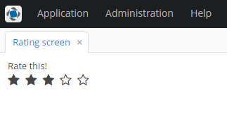
3.5.17.4.5. Support for Custom Visual Components and Facets in CUBA Studio
Screen Designer of the CUBA Studio allows developers to integrate a custom UI component (or facet) implemented in an add-on or project by adding special metadata annotations to the component’s definition.
|
Custom UI components and facets are supported in the CUBA Studio starting from Studio version |
Support for the UI component in the Screen Designer includes the following features:
-
Displaying component item in the Palette panel.
-
Scaffolding XML code for the component when it is added from the Palette. Automatically adding XSD namespace import if it is configured in the component metadata.
-
Displaying icon corresponding to the added component in the Hierarchy panel.
-
Displaying and editing component properties in the Inspector panel. Scaffolding XML tag attributes when component properties are modified.
-
Providing suggestions for property values.
-
Validating property values.
-
Injecting component to the screen controller.
-
Generating event handlers and delegate methods declared by the component.
-
Displaying component stub in the Layout Preview panel.
-
Re-directing to the web documentation if the link is provided by the developer.
- Prerequisites
Note that the result of the Screen Designer’s work is the scaffolded XML code in the screen descriptor. However, for the custom component or custom facet to be successfully loaded from the XML to the screen in the running application, the following additional code should be implemented in your project:
-
Component or Facet interface is created.
-
For components - the component loader is implemented. For facets, the facet provider is created - a Spring bean implementing the
com.haulmont.cuba.gui.xml.FacetProviderinterface parameterized by the facet class. -
Component and its loader are registered in the
cuba-ui-component.xmlfile. -
Optional: defined the XML schema describing the structure and restrictions on component (facet) definition in the screen descriptor.
These steps are described in the Integrating a Vaadin Component into the Generic UI section.
- Stepper sample project
Fully implemented example of custom UI component with metadata annotations can be found in the Stepper Vaadin addon integration sample. Its source code can be found here: https://github.com/cuba-labs/vaadin-stepper-addon-integration.
The files you should pay attention to:
-
Metadata annotations have been added to the component interface:
com.company.demo.web.gui.components.Stepper. -
Component palette icons (
stepper.svgandstepper_dark.svg) are placed to themodules/web/src/com/company/demo/web/gui/components/iconsfolder. -
The
customer-edit.xmlscreen descriptor usessteppercomponent in the layout.
import com.haulmont.cuba.gui.meta.*;
@StudioComponent(category = "Samples",
unsupportedProperties = {"description", "icon", "responsive"},
xmlns = "http://schemas.company.com/demo/0.1/ui-component.xsd",
xmlnsAlias = "app",
icon = "com/company/demo/web/gui/components/icons/stepper.svg",
canvasBehaviour = CanvasBehaviour.INPUT_FIELD)
@StudioProperties(properties = {
@StudioProperty(name = "dataContainer", type = PropertyType.DATACONTAINER_REF),
@StudioProperty(name = "property", type = PropertyType.PROPERTY_PATH_REF, options = "int"),
}, groups = @PropertiesGroup(
properties = {"dataContainer", "property"}, constraint = PropertiesConstraint.ALL_OR_NOTHING
))
public interface Stepper extends Field<Integer> {
@StudioProperty(name = "manualInput", type = PropertyType.BOOLEAN, defaultValue = "true")
void setManualInputAllowed(boolean value);
boolean isManualInputAllowed();
// ...
}If you open the customer-edit.xml screen in the Screen Designer, you will see how the component has been integrated into designer’s panels.
The Component Palette panel contains Stepper component:
The Component Hierarchy panel displays component along with other components in the tree:
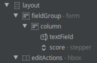
The Component Inspector panel displays and provides editing for the component properties:
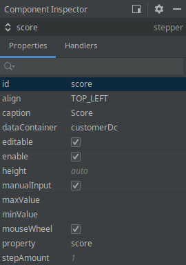
Finally, the layout preview panel displays component in the shape of text field:
Now let’s take a look at annotations and attributes that should be added to the component interface in order to achieve such integration.
- Metadata annotation list
All UI metadata annotations and related classes are located in the com.haulmont.cuba.gui.meta package. UI metadata annotations are supported for the following types of UI elements:
-
Visual Components - marked with
@StudioComponent. -
Facets - marked with
@StudioFacet. -
Actions - marked with
@StudioAction. Action annotations are described in the Custom Action Types section.
Full list of annotations is the following:
-
@StudioComponent- indicates that the annotated UI component interface should be available in the Screen Designer. Provides necessary attributes for panels of the Screen Designer. The annotated interface must be a direct or indirect subclass of thecom.haulmont.cuba.gui.components.Component. -
@StudioFacet- indicates that the annotated interface should be available in the Screen Designer as a facet. Provides necessary attributes for panels of the Screen Designer. The annotated interface must be a direct or indirect sub-interface of thecom.haulmont.cuba.gui.components.Facet. The facet should have an associatedFacetProviderbean defined in the project. -
@StudioProperty- indicates that the annotated setter method should be shown in the Inspector panel as the property of the UI component or Facet. -
@StudioProperties- declares additional properties and property groups of the UI component or Facet. Can be used to declare additional properties not related to component property setter methods, to override inherited properties and to validate semantically related pairs of properties. -
@PropertiesGroup- declares a property group: list of dependent properties that must be used only together or mutually exclusive. -
@StudioElementsGroup- indicates that the annotated setter method should be shown in the Screen Designer as a nested group of elements of the UI component or Facet, e.g. columns, actions or property map. -
@StudioElement- indicates that the annotated class or interface should be available in the Screen Designer as a part of the UI Component or Facet, e.g. column, action or property map. -
@StudioEmbedded- used for cases when a set of component parameters is extracted into a separate POJO. -
@StudioCollection- declares metadata for nested group of sub-elements that should be supported in the Screen Designer, e.g. columns, actions, fields.
- UI component definition
Declaring that UI component should become available in the Screen Designer is performed by marking the component interface with the com.haulmont.cuba.gui.meta.StudioComponent annotation.
@StudioComponent(caption = "GridLayout", xmlElement = "bgrid", category = "Containers")
private interface BGridLayout extends BLayout {
// ...
}The @StudioComponent annotation has the following attributes:
-
caption- component caption displayed in the Palette panel. -
description- description of the component displayed as a mouse-over tooltip in the Palette panel. -
category- category in the Palette panel (Containers, Components etc) where the component will be placed to. -
icon- path to the component icon used in the Palette and Hierarchy panels, SVG or PNG format, relative to the component module root. Note that component icon may have two variants: for light and dark IDE themes. File name of the dark icon variant is determined by adding the_darkpostfix to the icon file name, for example:stepper.svgandstepper_dark.svg. -
xmlElement- name of the XML tag that will be added to the screen descriptor XML when the component is added to the screen. -
xmlns- XML namespace required for the component. When the component is added to the screen, Studio automatically adds namespace import to the root element of the screen descriptor. -
xmlnsAlias- XML namespace alias required for the component. E.g. if the namespace alias istrackand the XML tag name isgoogleTrackerthen the component will be added to the screen as<track:googleTracker/>tag. -
defaultProperty- name of the default component property, it will be automatically selected in the Inspector panel when the component is selected in the layout. -
unsupportedProperties- the list of properties that are inherited from the component parent interfaces but are not actually supported by the component. These properties will be hidden from the Inspector panel. -
canvasBehavior- defines behaviour how the UI component will look like on the layout preview panel. Possible options are:-
COMPONENT- the component is displayed in the preview as a simple box with an icon. -
INPUT_FIELD- the component is displayed in the preview as a text field. -
CONTAINER- the component is displayed in the preview as a component container.
-
-
canvasIcon- path to the icon displayed in the preview as a placeholder if thecanvasBehaviourattribute hasCOMPONENTvalue. Icon file should be in SVG or PNG format. Theiconproperty is used if this value is not specified. -
canvasIconSize- size of the icon displayed in the preview as a placeholder. Possible values are:-
SMALL- small icon. -
LARGE- the icon is large, and the componentidis displayed under the icon.
-
-
containerType- type of the container layout (vertical, horizontal or flow) if thecanvasBehaviourattribute hasCONTAINERvalue. -
documentationURL- URL pointing to the documentation page for the UI component. Used by the CUBA Documentation action in the Screen Designer. If the path to the documentation is version dependent, use the%VERSION%as a placeholder. It will be replaced with the minor version (e.g.1.2) of the library containing the UI component.
- Facet definition
Declaring that custom facet should become available in the Screen Designer is performed by marking the facet interface with the com.haulmont.cuba.gui.meta.StudioFacet annotation.
|
For support of the custom facet in the Screen Designer, an associated FacetProvider implementation should be created in the project. |
FacetProvider is a Spring bean implementing the com.haulmont.cuba.gui.xml.FacetProvider interface parameterized by the facet class. See the com.haulmont.cuba.web.gui.facets.ClipboardTriggerFacetProvider platform class as an example.
The attributes of the @StudioFacet annotation are similar to the attributes of the @StudioComponent annotation described in the previous section.
Example:
@StudioFacet(
xmlElement = "clipboardTrigger",
category = "Facets",
icon = "icon/clipboardTrigger.svg",
documentationURL = "https://doc.cuba-platform.com/manual-%VERSION%/gui_ClipboardTrigger.html"
)
public interface ClipboardTrigger extends Facet {
@StudioProperty(type = PropertyType.COMPONENT_REF, options = "com.haulmont.cuba.gui.components.TextInputField")
void setInput(TextInputField<?> input);
@StudioProperty(type = PropertyType.COMPONENT_REF, options = "com.haulmont.cuba.gui.components.Button")
void setButton(Button button);
// ...
}- Standard component properties
Component properties are declared by using two annotations:
-
@StudioProperty- indicates that the annotated method (setter, setXxx) should be shown in the Inspector panel as a component property. -
@StudioProperties- declares on an interface definition additional properties and property groups of a component not related to setter methods.
Example:
@StudioComponent(caption = "RichTextArea")
@StudioProperties(properties = {
@StudioProperty(name = "css", type = PropertyType.CSS_BLOCK)
})
interface RichTextArea extends Component {
@StudioProperty(type = PropertyType.CSS_CLASSNAME_LIST)
void setStylename(String stylename);
@StudioProperty(type = PropertyType.SIZE, defaultValue = "auto")
void setWidth(String width);
@StudioProperty(type = PropertyType.SIZE, defaultValue = "auto")
void setHeight(String height);
@StudioProperty(type = PropertyType.LOCALIZED_STRING)
void setContextHelpText(String contextHelpText);
@StudioProperty(type = PropertyType.LOCALIZED_STRING)
void setDescription(String description);
@StudioProperty
@Min(-1)
void setTabIndex(int tabIndex);
}The setter method can be annotated with @StudioProperty without any additional data. In this case:
-
the name and the caption of the property will be inferred from setter name.
-
the type of the property will be inferred from setter parameter.
The @StudioProperty annotation has the following attributes:
-
name- name of the property. -
type- defines which content is stored in the property, e.g. it can be a string, an entity name or a reference to other component in the same screen. Supported property types are listed below. -
caption- caption of the property to be displayed in the Inspector panel. -
description- additional description for the property that will be displayed in the Inspector panel as a mouse-over tooltip. -
category- category of the property in the Inspector panel. (Not implemented in the Screen Designer yet as of Studio 14.0.) -
required- the property is required, in this case Screen Designer will not allow component declaration with an empty value. -
defaultValue- specifies the value of the property that is implicitly used by the component when the corresponding XML attribute is omitted. The default value will be omitted from XML code. -
options- context dependent list of options for the component property:-
For
ENUMERATIONproperty type - enumeration options. -
For
BEAN_REFproperty type - list of allowed base classes for the Spring bean. -
For
COMPONENT_REFproperty type - list of allowed base component classes. -
For
PROPERTY_PATH_REFproperty type - list of allowed entity attribute types. Use registered Datatype names for the datatype properties orto_oneandto_manyfor the association properties.
-
-
xmlAttribute- target XML attribute name, if not set then equal to the property name. -
xmlElement- target XML element name. By using this attribute you can declare component property mapped to a sub-tag of the main component XML tag, see below. -
typeParameter- specifies the name of the generic type parameter provided by this property for the component. See description below.
- Component property types
The following property types (com.haulmont.cuba.gui.meta.PropertyType) are supported:
-
INTEGER,LONG,FLOAT,DOUBLE,STRING,BOOLEAN,CHARACTER- primitive types. -
DATE- date in theYYYY-MM-DDformat. -
DATE_TIME- date with time in theYYYY-MM-DD hh:mm:ssformat. -
TIME- time in thehh:mm:ssformat. -
ENUMERATION- enumerated value. List of enumeration options is provided by theoptionsannotation attribute. -
COMPONENT_ID- identifier of a component, sub-component or action. Must be a valid Java identifier. -
ICON_ID- icon path or ID of icon predefined in CUBA or defined in the project. -
SIZE- size value, e.g. width or height. -
LOCALIZED_STRING- localized message represented by String value or by message key withmsg://ormainMsg://prefix. -
JPA_QUERY- JPA QL string. -
ENTITY_NAME- name of the entity (specified by thejavax.persistence.Entity#nameannotation attribute) defined in the project. -
ENTITY_CLASS- fully-qualified class name of the entity defined in the project. -
JAVA_CLASS_NAME- fully-qualified class name of any Java class. -
CSS_CLASSNAME_LIST- list of CSS classes separated with space symbol. -
CSS_BLOCK- inline CSS properties. -
BEAN_REF- ID of a Spring bean defined in this project. The list of allowed base Spring bean classes is provided by theoptionsannotation attribute. -
COMPONENT_REF- ID of a component defined in this screen. The list of allowed base component classes is provided by theoptionsannotation attribute. -
DATASOURCE_REF- ID of a datasource defined in the screen (legacy API). -
COLLECTION_DATASOURCE_REF- ID of a collection datasource defined in the screen (legacy API). -
DATALOADER_REF- ID of a data loader defined in the screen. -
DATACONTAINER_REF- ID of a data container defined in the screen. -
COLLECTION_DATACONTAINER_REF- ID of a collection data container defined in the screen. -
PROPERTY_REF- name of an entity attribute. The list of allowed entity attribute types is provided by theoptionsannotation attribute. In order to display suggestions for this attribute, this component property should be associated with another component property defining a data container or datasource with the help of properties group. -
PROPERTY_PATH_REF- name of an entity attribute or list of nested attributes separated with dot symbol, e.g.user.group.name. The list of allowed entity attribute types is provided by theoptionsannotation attribute. In order to display suggestions for this component property in the Inspector panel, this component property should be associated with another component property defining a data container or datasource with the help of properties group. -
DATATYPE_ID- ID of a Datatype, e.g.stringordecimal. -
SHORTCUT- keyboard shortcut, e.g.CTRL-SHIFT-U. -
SCREEN_CLASS- fully-qualified name of a screen controller class defined in this project. -
SCREEN_ID- ID of a screen defined in this project. -
SCREEN_OPEN_MODE- screen open mode.
- Component property validation
Inspector panel supports validation of the component properties with limited set of BeanValidation annotations:
-
@Min,@Max,@DecimalMin,@DecimalMax. -
@Negative,@Positive,@PosizitiveOrZero,@NegativeOrZero. -
@NotBlank,@NotEmpty. -
@Digits. -
@Pattern. -
@Size,@Length. -
@URL.
Example:
@StudioProperty(type = PropertyType.INTEGER)
@Positive
void setStepAmount(int amount);
int getStepAmount();If user tries to input invalid property value, the following error message is displayed:
- @StudioProperties and property groups
The metadata defined with the @StudioProperty can be overridden with the @StudioProperties annotation on the component interface.
The @StudioProperties annotation can have zero or more declarations in the groups attribute with the @PropertiesGroup type. Each group defines a property group whose type is determined by the @PropertiesGroup#constraint attribute:
-
ONE_OF- group specifies properties that are mutually exclusive. -
ALL_OR_NOTHING- a list of dependent properties that must be used together.
One specific important application of the property group is the specification of the dataContainer and property attribute pair for the components that can be bound to the data container. These properties must be included into the ALL_OR_NOTHING group. See example of the component with such property group:
@StudioComponent(
caption = "RichTextField",
category = "Fields",
canvasBehaviour = CanvasBehaviour.INPUT_FIELD)
@StudioProperties(properties = {
@StudioProperty(name = "dataContainer", type = PropertyType.DATACONTAINER_REF),
@StudioProperty(name = "property", type = PropertyType.PROPERTY_PATH_REF, options = "string")
}, groups = @PropertiesGroup(
properties = {"dataContainer", "property"}, constraint = PropertiesConstraint.ALL_OR_NOTHING
))
interface RichTextField extends Component {
// ...
}- Declaring sub-element metadata with @StudioCollection
Compound components such as table, pickerField or charts are defined in the screen descriptor by several nested XML tags. Sub-tags represent parts of the component and are loaded to the screen by the parent component’s ComponentLoader. You have two options how to declare metadata for sub-elements:
-
With
@StudioCollection- sub-element metadata is specified right in the component interface. -
With
@StudioElementGroupand@StudioElement- sub-element metadata is specified on separate classes that represent XML sub-tags.
The com.haulmont.cuba.gui.meta.StudioCollection annotation has the following attributes:
-
xmlElement- XML tag name of the collection. -
itemXmlElement- XML tag name of the elements (collection items). -
documentationURL- URL pointing to the documentation page for the sub-element. Used by the CUBA Documentation action in the Screen Designer. If the path to the documentation is version dependent, use the%VERSION%as a placeholder. It will be replaced with the minor version (e.g.1.2) of the library containing the UI component. -
itemProperties- collection of@StudioPropertyannotations defining item properties.
See the example below.
This is the desired XML structure in the screen descriptor:
<layout>
<langPicker>
<options>
<option caption="msg://lang.english" code="en" flagIcon="icons/english.png"/>
<option caption="msg://lang.french" code="fr" flagIcon="icons/french.png"/>
</options>
</langPicker>
</layout>Component class with @StudioCollection declaration:
@StudioComponent(xmlElement = "langPicker", category = "Samples")
public interface LanguagePicker extends Field<Locale> {
@StudioCollection(xmlElement = "options", itemXmlElement = "option",
itemProperties = {
@StudioProperty(name = "caption", type = PropertyType.LOCALIZED_STRING, required = true),
@StudioProperty(name = "code", type = PropertyType.STRING),
@StudioProperty(name = "flagIcon", type = PropertyType.ICON_ID)
})
void setOptions(List<LanguageOption> options);
List<LanguageOption> getOptions();
}The Inspector panel for the main component’s element additionally displays the Add → {element caption} button that adds additional sub-element to the XML:
If the sub-element is selected in the layout, the Inspector panel contains its properties specified in the StudioCollection annotation:
- Declaring sub-element metadata with @StudioElementGroup and @StudioElement
The @StudioElementGroup is used to mark setter method in the component interface. It gives a hint to the Studio that it should search for sub-element metadata in the referenced class.
@StudioElementsGroup(xmlElement = "subElementGroupTagName")
void setSubElements(List<ComponentSubElement> subElements);The @StudioElementGroup annotation has the following attributes:
-
xmlElement- XML tag name of the sub-element group. -
icon- path to the icon used in the Palette and Hierarchy panels for the sub-element group, SVG or PNG format, relative to the component module root. -
documentationURL- URL pointing to the documentation page for the sub-element group. Used by the CUBA Documentation action in the Screen Designer. If the path to the documentation is version dependent, use the%VERSION%as a placeholder. It will be replaced with the minor version (e.g.1.2) of the library containing the UI component.
The @StudioElement is used to mark the class that represents component’s sub-element. Available attributes of the XML tag represented by this element are declared by using the @StudioProperty and @StudioProperties annotations.
@StudioElement(xmlElement = "subElement", caption = "Sub Element")
public interface SubElement {
@StudioProperty
void setElementProperty(String elementProperty);
// ...
}Attributes of the @StudioElement annotation are similar to ones of the @StudioComponent:
-
xmlElement- XML tag name of the sub-element. -
caption- caption of the element to be displayed in the Inspector panel. -
description- additional description for the element that will be displayed in the Inspector panel as a mouse-over tooltip. -
icon- path to the sub-element icon used in the Palette and Hierarchy panels, SVG or PNG format, relative to the component module root. -
xmlns- XML namespace required for the element. When the element is added to the screen, Studio automatically adds namespace import to the root element of the screen descriptor. -
xmlnsAlias- XML namespace alias required for the element. E.g. if the namespace alias ismapand the XML tag name islayerthen the element will be added to the screen as<map:layer/>tag. -
defaultProperty- name of the default element property, it will be automatically selected in the Inspector panel when the element is selected in the layout. -
unsupportedProperties- the list of properties that are inherited from the element’s parent interfaces but are not actually supported by the element. These properties will be hidden from the Inspector panel. -
documentationURL- URL pointing to the documentation page for the UI component. Used by the CUBA Documentation action in the Screen Designer. If the path to the documentation is version dependent, use the%VERSION%as a placeholder. It will be replaced with the minor version (e.g.1.2) of the library containing the UI component.
See the example below.
This is the desired XML structure in the screen descriptor:
<layout>
<serialChart backgroundColor="#ffffff" caption="Weekly Stats">
<graphs>
<graph colorProperty="color" valueProperty="price"/>
<graph colorProperty="costColor" valueProperty="cost"/>
</graphs>
</serialChart>
</layout>Component class with @StudioElementsGroup declaration:
@StudioComponent(xmlElement = "serialChart", category = "Samples")
public interface SerialChart extends Component {
@StudioProperty
void setCaption(String caption);
String getCaption();
@StudioProperty(type = PropertyType.STRING)
void setBackgroundColor(Color backgroundColor);
Color getBackgroundColor();
@StudioElementsGroup(xmlElement = "graphs")
void setGraphs(List<ChartGraph> graphs);
List<ChartGraph> getGraphs();
}Sub-element declaration annotated with @StudioElement:
@StudioElement(xmlElement = "graph", caption = "Graph")
public interface ChartGraph {
@StudioProperty(type = PropertyType.PROPERTY_PATH_REF)
void setValueProperty(String valueProperty);
String getValueProperty();
@StudioProperty(type = PropertyType.PROPERTY_PATH_REF)
void setColorProperty(String colorProperty);
String getColorProperty();
}The Inspector panel for the main component’s element additionally displays the Add → {element caption} button that adds additional sub-element to the XML:
If the sub-element is selected in the layout, the Inspector panel displays its properties specified in the element declaration:
- Declaring sub-tag attributes
It is possible to declare some of component attributes not in the main tag, but in a single sub-tag of the main component XML tag in the screen descriptor. As an example, consider the following XML layout of the component:
<myChart>
<scrollBar color="white" position="TOP"/>
</myChart>Here the scrollBar is a part of the main myChart component and not an independent component, and we want to declare attributes metadata in the main component interface.
Metadata annotations defining attributes of the sub-tag can be declared right in the component interface using the xmlElement attribute of the @StudioProperty annotation. This attribute defines the name of the sub-tag. The annotated component definition looks as follows:
@StudioComponent(xmlElement = "myChart", category = "Samples")
public interface MyChart extends Component {
@StudioProperty(name = "position", caption = "scrollbar position",
xmlElement = "scrollBar", xmlAttribute = "position",
type = PropertyType.ENUMERATION, options = {"TOP", "BOTTOM"})
void setScrollBarPosition(String scrollBarPosition);
String getScrollBarPosition();
@StudioProperty(name = "color", caption = "scrollbar color",
xmlElement = "scrollBar", xmlAttribute = "color")
void setScrollBarColor(String scrollBarColor);
String getScrollBarColor();
}- Declaring tag attributes extracted into a POJO with @StudioEmbedded
There are some cases when you might want to extract a set of component properties into a separate POJO (plain old Java object). At the same time in the xml schema extracted properties are still specified as attributes of the main XML tag. In this case the @StudioEmbedded annotation can help. You should mark the setter method that accepts the POJO object with @StudioEmbedded to declare that this POJO contains additional component properties.
The com.haulmont.cuba.gui.meta.StudioEmbedded annotation has no attributes.
Usage example is presented below.
The desired XML structure, note that all attributes are specified for the main component tag:
<layout>
<richTextField textColor="blue" editable="false" id="rtf"/>
</layout>POJO class with annotated properties:
public class FormattingOptions {
private String textColor = "black";
private boolean foldComments = true;
@StudioProperty(defaultValue = "black", description = "Main text color")
public void setTextColor(String textColor) {
this.textColor = textColor;
}
@StudioProperty(defaultValue = "true")
public void setFoldComments(boolean foldComments) {
this.foldComments = foldComments;
}
}Component interface:
@StudioComponent(category = "Samples",
unsupportedProperties = {"icon", "responsive"},
description = "Text field with html support")
public interface RichTextField extends Field<String> {
@StudioEmbedded
void setFormattingOptions(FormattingOptions formattingOptions);
FormattingOptions getFormattingOptions(FormattingOptions formattingOptions);
}The Component Inspector panel shows embedded properties along with others:
- Support for events and delegate methods
Studio provides the same support for events and delegate methods in custom UI components (or facets) as for built-in UI components. No annotations are required for declaring an event listener or delegate method in a component interface.
Example of the component declaring an event handler with its own event class:
@StudioComponent(category = "Samples")
public interface LazyTreeTable extends Component {
// ...
Subscription addNodeExpandListener(Consumer<NodeExpandEvent> listener);
class NodeExpandEvent extends EventObject {
private final Object nodeId;
public NodeExpandEvent(LazyTreeTable source, Object nodeId) {
super(source);
this.nodeId = nodeId;
}
public Object getNodeId() {
return nodeId;
}
}
}Declared event handler becomes available in the Inspector panel:
Event handler implementation method’s stub generated by the Studio will be the following:
@UiController("demo_Dashboard")
@UiDescriptor("dashboard.xml")
public class Dashboard extends Screen {
// ...
@Subscribe("regionTable")
public void onRegionTableNodeExpand(LazyTreeTable.NodeExpandEvent event) {
}
}The next example demonstrates how to declare delegate methods in the facet with generic type parameter:
@StudioFacet
public interface LookupScreenFacet<E extends Entity> extends Facet {
// ...
void setSelectHandler(Consumer<Collection<E>> selectHandler);
void setOptionsProvider(Supplier<ScreenOptions> optionsProvider);
void setTransformation(Function<Collection<E>, Collection<E>> transformation);
@StudioProperty(type = PropertyType.COMPONENT_REF, typeParameter = "E",
options = "com.haulmont.cuba.gui.components.ListComponent")
void setListComponent(ListComponent<E> listComponent);
}- Support for generic type parameters
Studio supports parameterizing component interface with generic type parameter. The parameter can be the entity class, screen class or any other Java class. Type parameter is used when the component is injected to the screen controller and when delegate method stubs are generated.
Studio infers generic type used by particular component by looking at its properties assigned in the XML. Component property can specify generic type directly or indirectly. E.g. the table component displays list of entities and is parameterized by the entity class. To determine actual entity type used, Studio looks at the dataContainer attribute, and then at the collection container definition. If all attributes are assigned then entity class used by the collection container is determined to be table’s generic parameter.
The typeParameter parameter of the @StudioProperty annotation specifies the name of the type parameter for the generic UI component or facet that is provided by the property. The actual class for the type parameter can be resolved for the following property types:
-
PropertyType.JAVA_CLASS_NAME- the specified class is used. -
PropertyType.ENTITY_CLASS- the specified entity class is used. -
PropertyType.SCREEN_CLASS_NAME- the specified screen class is used. -
PropertyType.DATACONTAINER_REF,PropertyType.COLLECTION_DATACONTAINER_REF- the entity class of the specified data container is used. -
PropertyType.DATASOURCE_REF,PropertyType.COLLECTION_DATASOURCE_REF- the entity class of the specified datasource is used. -
PropertyType.COMPONENT_REF- the class of the entity that the given field is bound to is used (entity class is determined via the bound data container or datasource).
Usage example is presented below.
Component interface for the UI component that displays collection of entities provided by the collection container:
@StudioComponent(category = "Samples")
public interface MyTable<E extends Entity> extends Component { (1)
@StudioProperty(type = PropertyType.COLLECTION_DATACONTAINER_REF,
typeParameter = "E") (2)
void setContainer(CollectionContainer<E> container);
void setStyleProvider(@Nullable Function<? super E, String> styleProvider); (3)
}| 1 | - component interface is parameterized with the E parameter which represents the entity class of items displayed in the table. |
| 2 | - by specifying the typeParameter annotation attribute on the property of the COLLECTION_DATACONTAINER_REF type you can direct Studio to infer actual entity type by looking at the associated collection container. |
| 3 | - generic type parameter is also used by the component’s delegate method. |
To allow Studio automatically infer component’s type parameter, this component should be associated with the collection container in the screen descriptor:
<?xml version="1.0" encoding="UTF-8" standalone="no"?>
<window xmlns="http://schemas.haulmont.com/cuba/screen/window.xsd"
caption="msg://dashboard.caption"
messagesPack="com.company.demo.web.screens">
<data>
<collection id="regionsDc" class="com.company.demo.entity.Region">
<!-- ... -->
</collection>
</data>
<layout>
<myTable id="regionTable" container="regionsDc"/>
</layout>
</window>The following code will be generated by the Studio in the screen controller:
@UiController("demo_Dashboard")
@UiDescriptor("dashboard.xml")
public class Dashboard extends Screen {
@Inject
private MyTable<Region> regionTable; (1)
@Install(to = "regionTable", subject = "styleProvider")
private String regionTableStyleProvider(Region region) { (2)
return "bold-text";
}
}| 1 | - component is injected to the controller with the correct type parameter. |
| 2 | - correct type parameter is used for the delegate method’s signature. |
3.5.18. Generic UI Infrastructure
This section describes Generic UI infrastructure classes that can be extended in an application.

Figure 22. Generic UI Infrastructure Classes
-
AppUIis a class inherited fromcom.vaadin.ui.UI. There is one instance of this class for each open web browser tab. It refers aRootWindowwhich contains either a login screen or main screen, depending on the connection state. You can get a reference to theAppUIfor the current browser tab by using theAppUI.getCurrent()static method.If you want to customize functionality of
AppUIin your project, create a class extendingAppUIin the web module and register it in web-spring.xml withcuba_AppUIid andprototypescope, for example:<bean id="cuba_AppUI" class="com.company.sample.web.MyAppUI" scope="prototype"/> -
Connectionis an interface providing functionality of connecting to middleware and holding a user session.ConnectionImplis a standard implementation of this interface.If you want to customize functionality of
Connectionin your project, create a class extendingConnectionImplin the web module and register it in web-spring.xml withcuba_Connectionid andvaadinscope, for example:<bean id="cuba_Connection" class="com.company.sample.web.MyConnection" scope="vaadin"/> -
ExceptionHandlersclass contains a collection of client-level exception handlers. -
Appcontains links toConnection,ExceptionHandlersand other infrastructure objects. A single instance of this class is created for an HTTP session and stored in its attribute. You can get a reference to theAppinstance by using theApp.getInstance()static method.If you want to customize functionality of
Appin your project, create a class extendingDefaultAppin the web module and register it in web-spring.xml withcuba_Appid andvaadinscope, for example:<bean name="cuba_App" class="com.company.sample.web.MyApp" scope="vaadin"/>
3.5.19. Web Login
This section describes how the web client authentication works and how to extend it in your project. For information about authentication on the middle tier, see Login.
|
See Anonymous Access & Social Login guide to learn how to set up public access to some screens of the application and implement custom login using a Google, Facebook, or GitHub account. |
Implementation of the login procedure of the Web Client block has the following mechanisms:
-
Connectionimplemented byConnectionImpl. -
LoginProviderimplementations. -
HttpRequestFilterimplementations.
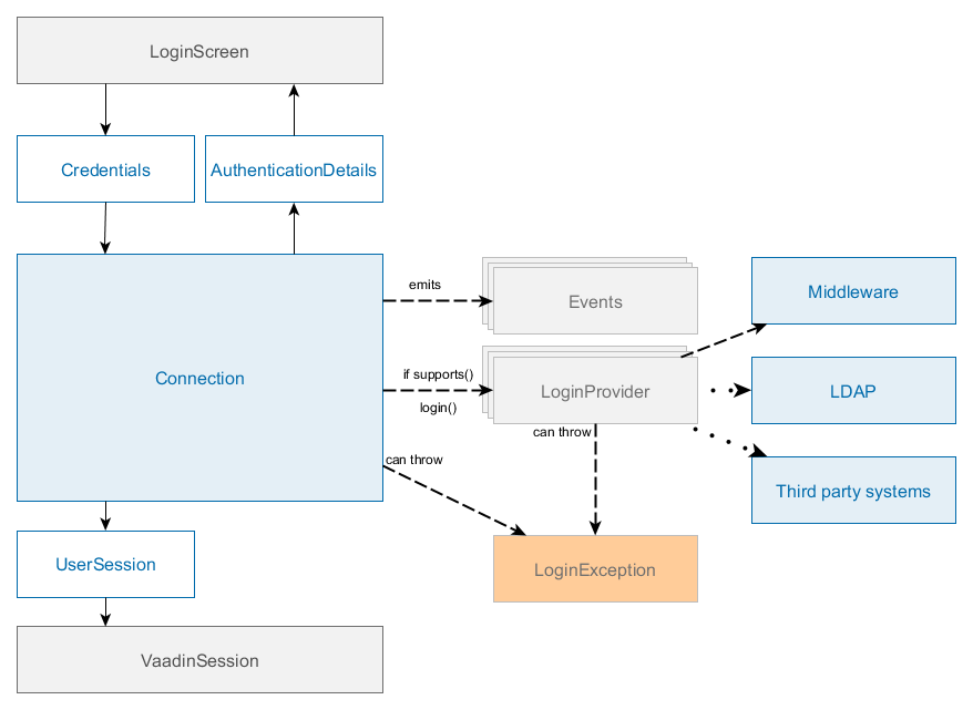
Figure 23. Login mechanisms of the Web Client
The main interface of Web login subsystem is Connection which contains the following key methods:
-
login() - authenticates a user, starts a session and changes the state of the connection.
-
logout() - log out of the system.
-
substituteUser() - substitute a user in the current session with another user. This method creates a new UserSession instance, but with the same session ID.
-
getSession() - get the current user session.
After successful login, Connection sets UserSession object to the attribute of VaadinSession and sets SecurityContext. The Connection object is bound to VaadinSession thus it cannot be used from non-UI threads, it throws IllegalConcurrentAccessException in case of login/logout call from a non UI thread.
Usually, login is performed from the LoginScreen screen that supports login with login/password and "remember me" credentials.
The default implementation of Connection is ConnectionImpl, which delegates login to a chain of LoginProvider instances. A LoginProvider is a login module that can process a specific Credentials implementation, also it has a special supports() method to allow the caller to query if it supports a given Credentials type.

Figure 24. Standard user login process
Standard user login process:
-
Users enter their username and password.
-
Web client block creates a
LoginPasswordCredentialsobject passing the login and password to its constructor and invokesConnection.login()method with this credentials. -
Connectionuses chain ofLoginProviderobjects. There isLoginPasswordLoginProviderthat works withLoginPasswordCredentialsinstances. Depending on the cuba.checkPasswordOnClient it either invokesAuthenticationService.login(Credentials)passing user’s login and password; or loads theUserentity by login, checks the password against the loaded password hash and logs in as a trusted client withTrustedClientCredentialsand cuba.trustedClientPassword. -
If the authentication is successful, the created
AuthenticationDetailsinstance with the active UserSession is passed back toConnection. -
Connectioncreates aClientUserSessionwrapper and sets it toVaadinSession. -
Connectioncreates aSecurityContextinstance and sets it toAppContext. -
ConnectionfiresStateChangeEventthat triggers UI update and leads to theMainScreeninitialization.
All LoginProvider implementations must:
-
Authenticate user using
Credentialsobject. -
Start a new user session with
AuthenticationServiceor return another active session (for instance, anonymous). -
Return authentication details or null if it cannot login user with this
Credentialsobject, for instance, if the login provider is disabled or is not properly configured. -
Throw
LoginExceptionin case of incorrectCredentialsor passLoginExceptionfrom the middleware to the caller.
HttpRequestFilter - marker interface for beans that will be automatically added to the application filter chain as HTTP filter: https://docs.oracle.com/javaee/6/api/javax/servlet/Filter.html. You can use it to implement additional authentication, pre- and post-processing of request and response.
You can expose additional Filter if you create Spring Framework component and implement HttpRequestFilter interface:
@Component
public class CustomHttpFilter implements HttpRequestFilter {
@Override
public void init(FilterConfig filterConfig) throws ServletException {
}
@Override
public void doFilter(ServletRequest request, ServletResponse response,
FilterChain chain)
throws IOException, ServletException {
// delegate to the next filter/servlet
chain.doFilter(request, response);
}
@Override
public void destroy() {
}
}Please note that the minimal implementation has to delegate execution to FilterChain otherwise your application will not work. By default, filters added as HttpRequestFilter beans will not receive requests to VAADIN directory and other paths specified in cuba.web.cubaHttpFilterBypassUrls app property.
- Built-in login providers
-
The platform contains the following implementations of
LoginProviderinterface:-
AnonymousLoginProvider- provides anonymous login for non-logged-in users. -
LoginPasswordLoginProvider- delegates login toAuthenticationServicewithLoginPasswordCredentials. -
RememberMeLoginProvider- delegates login toAuthenticationServicewithRememberMeCredentials. -
LdapLoginProvider- acceptsLoginPasswordCredentials, performs authentication using LDAP and delegates login toAuthenticationServicewithTrustedClientCredentials. -
ExternalUserLoginProvider- acceptsExternalUserCredentialsand delegates login toAuthenticationServicewithTrustedClientCredentials. It can be used to perform login as a provided user name.
All the implementations create an active user session using
AuthenticationService.login().You can override any of them using Spring Framework mechanisms.
-
- Events
-
Standard implementation of
Connection-ConnectionImplfires the following application events during login procedure:-
BeforeLoginEvent/AfterLoginEvent -
LoginFailureEvent -
UserConnectedEvent/UserDisconnectedEvent -
UserSessionStartedEvent/UserSessionFinishedEvent -
UserSessionSubstitutedEvent
Event handlers of
BeforeLoginEventandLoginFailureEventmay throwLoginExceptionto cancel login process or override the original login failure exception.For instance, you can permit login to Web Client only for users with login that includes a company domain using
BeforeLoginEvent.@Component public class BeforeLoginEventListener { @Order(10) @EventListener protected void onBeforeLogin(BeforeLoginEvent event) throws LoginException { if (event.getCredentials() instanceof LoginPasswordCredentials) { LoginPasswordCredentials loginPassword = (LoginPasswordCredentials) event.getCredentials(); if (loginPassword.getLogin() != null && !loginPassword.getLogin().contains("@company")) { throw new LoginException( "Only users from @company are allowed to login"); } } } }Additionally, the standard application class -
DefaultAppfires the following events:-
AppInitializedEvent- fired afterAppinitialization, performed once per HTTP session. -
AppStartedEvent- fired on the first request processing of anAppright before login as anonymous user. Event handlers may login the user using theConnectionobject bound toApp. -
AppLoggedInEvent- fired after UI initialization ofAppwhen a user is logged in. -
AppLoggedOutEvent- fired after UI initialization ofAppwhen a user is logged out. -
SessionHeartbeatEvent- fired on heartbeat requests from a client web browser.
AppStartedEventcan be used to implement SSO login with third-party authentication system, for instance Jasig CAS. Usually, it is used together with a customHttpRequestFilterbean that should collect and provide additional authentication data.Let’s assume that we will automatically log in users if they have a special cookie value -
PROMO_USER.@Order(10) @Component public class AppStartedEventListener implements ApplicationListener<AppStartedEvent> { private static final String PROMO_USER_COOKIE = "PROMO_USER"; @Inject private Logger log; @Override public void onApplicationEvent(AppStartedEvent event) { String promoUserLogin = event.getApp().getCookieValue(PROMO_USER_COOKIE); if (promoUserLogin != null) { Connection connection = event.getApp().getConnection(); if (!connection.isAuthenticated()) { try { connection.login(new ExternalUserCredentials(promoUserLogin)); } catch (LoginException e) { log.warn("Unable to login promo user {}: {}", promoUserLogin, e.getMessage()); } finally { event.getApp().removeCookie(PROMO_USER_COOKIE); } } } } }Thus if users have "PROMO_USER" cookie and open the application, they will be automatically logged in as
promoUserLogin.If you want to perform additional actions after login and UI initialization you could use
AppLoggedInEvent. Keep in mind that you have to check if a user is authenticated or not in event handlers, all the events are fired foranonymoususer as well. -
- Web Session Lifecycle Events
-
The framework sends two events related to the HTTP session lifecycle:
-
WebSessionInitializedEventis sent when HTTP session is initialized. -
WebSessionDestroyedEventis sent when HTTP session is destroyed.
These events can be used to perform some system-level actions. Note that there is no
SecurityContextavailable in the thread. -
- Extension points
-
You can extend login mechanisms using the following types of extension points:
-
Connection- replace existingConnectionImpl. -
HttpRequestFilter- implement additionalHttpRequestFilter. -
LoginProviderimplementations - implement additional or replace existingLoginProvider. -
Events - implement event handler for one of the available events.
You can replace existing beans using Spring Framework mechanisms, for instance by registering a new bean in Spring XML config of the web module.
<bean id="cuba_LoginPasswordLoginProvider" class="com.company.demo.web.CustomLoginProvider"/> -
3.5.20. Anonymous Access to Screens
By default, only the login screen is available to the anonymous (not authenticated) session. By extending the login screen, you can add any information on it, or even add the WorkArea component and be able to open inside of it other screens available to the anonymous user. But as soon as the user logs in, all screens opened in the anonymous mode will be closed.
You may want to have some application screens to be always accessible regardless of whether the user is authenticated or not. Consider the following requirements:
-
When users open the application, they see a Welcome screen.
-
There is an Info screen with some publicly available information. The Info screen must be shown in a top level window, i.e. without main menu and other standard main window controls.
-
Users can open the Info screen both from the Welcome screen and by entering an URL in web browser.
-
Also from the Welcome screen, the user can go to login screen and continue working with the rest of the system as authenticated user.
Implementation steps are described below.
-
Create the Info screen and annotate its controller with
@Routeto be able to open it using a link:<?xml version="1.0" encoding="UTF-8" standalone="no"?> <window xmlns="http://schemas.haulmont.com/cuba/screen/window.xsd" caption="msg://caption" messagesPack="com.company.demo.web.info"> <layout margin="true"> <label value="Info" stylename="h1"/> </layout> </window>package com.company.demo.web.info; import com.haulmont.cuba.gui.Route; import com.haulmont.cuba.gui.screen.*; @UiController("demo_InfoScreen") @UiDescriptor("info-screen.xml") @Route(path = "info") (1) public class InfoScreen extends Screen { }1 - specifies the screen’s address. When the screen is opened in the top-level window (as root), its address will be like http://localhost:8080/app/#info. -
Extend the default main screen in the project to implement the required Welcome screen. Use one of the Main screen … templates in the screen creation wizard in Studio, then add some components to the
initialLayoutelement, for example:<?xml version="1.0" encoding="UTF-8" standalone="no"?> <window xmlns="http://schemas.haulmont.com/cuba/screen/window.xsd" xmlns:ext="http://schemas.haulmont.com/cuba/window-ext.xsd" extends="/com/haulmont/cuba/web/app/main/main-screen.xml"> <layout> <hbox id="horizontalWrap"> <workArea id="workArea"> <initialLayout> <label id="welcomeLab" stylename="h1" value="Welcome!"/> <button id="openInfoBtn" caption="Go to Info screen"/> </initialLayout> </workArea> </hbox> </layout> </window>package com.company.demo.web.main; import com.company.demo.web.info.InfoScreen; import com.haulmont.cuba.gui.Screens; import com.haulmont.cuba.gui.components.Button; import com.haulmont.cuba.gui.screen.*; import com.haulmont.cuba.web.app.main.MainScreen; import javax.inject.Inject; @UiController("main") @UiDescriptor("ext-main-screen.xml") public class ExtMainScreen extends MainScreen { @Inject private Screens screens; @Subscribe("openInfoBtn") private void onOpenInfoBtnClick(Button.ClickEvent event) { screens.create(InfoScreen.class, OpenMode.ROOT).show(); (1) } }1 - create InfoScreenand open it in the root window when the user clicks the button. -
In order to open our Welcome screen instead of login screen when the user enters the application, add the following properties to the
web-app.propertiesfile:cuba.web.initialScreenId = main cuba.web.allowAnonymousAccess = true -
Enable Info screen for anonymous users: start the application, go to Administration > Roles, create the Anonymous role in the role editor screen, and enable access to the Info screen for the Anonymous role. Assign the newly created role to the anonymous user.
As a result, when users open the application, they see the Welcome screen:
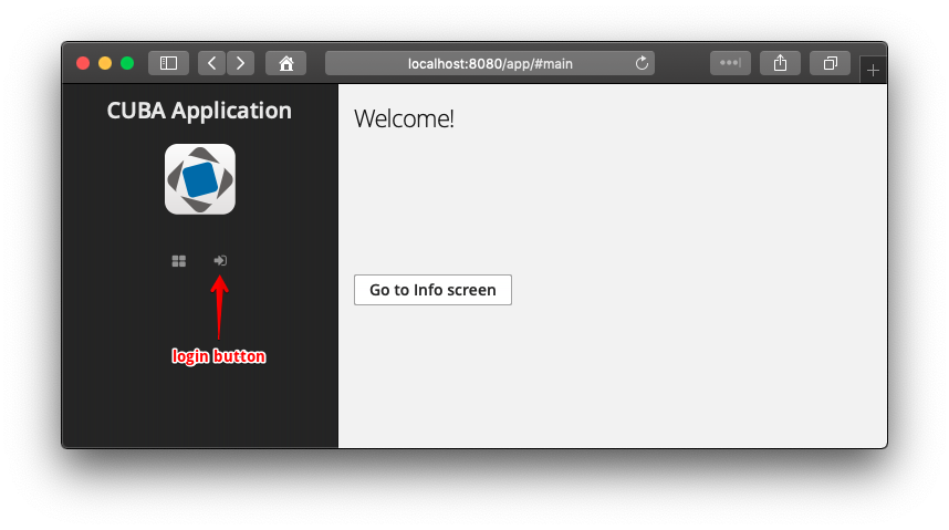
Users can open Info screen without authentication or click the login button to enter the secured part of the application.
3.5.21. Unsupported Browser Page
If the browser’s version isn’t supported by the application, the user will see a standard page with a notification, a suggestion to update the browser and a list of recommended browsers.
Users will not be able to work with the application until they update the browser.
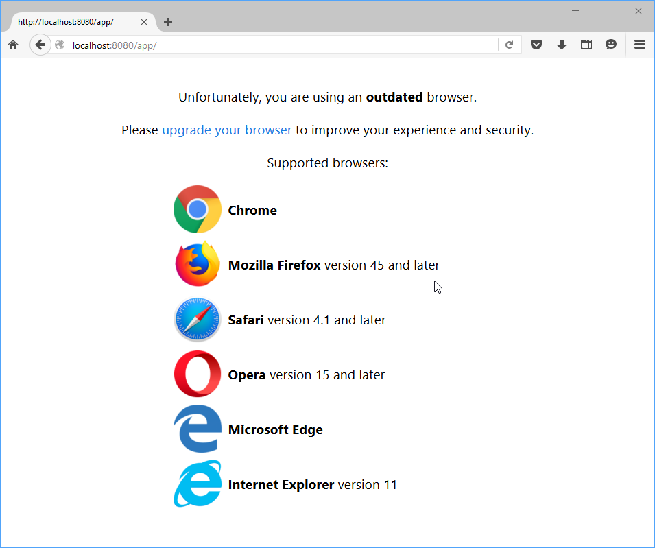
Figure 25. Unsupported browser page
You can change or localize the content of a default page. In order to do this, use the following keys in the main message pack of the web module:
-
unsupportedPage.captionMessage– notification caption; -
unsupportedPage.descriptionMessage– notification description; -
unsupportedPage.browserListCaption– caption of the browser’s list; -
unsupportedPage.chromeMessage– message for Chrome browser; -
unsupportedPage.firefoxMessage– message for Firefox browser; -
unsupportedPage.safariMessage– message for Safari browser; -
unsupportedPage.operaMessage– message for Opera browser; -
unsupportedPage.edgeMessage– message for Edge browser; -
unsupportedPage.explorerMessage– message for Explorer browser.
You can use a custom template for the unsupported browser page:
-
Create a new
*.htmlfile template. -
Set the path to the new template in the
cuba.web.unsupportedPagePathproperty of theweb-app.propertiesfile:cuba.web.unsupportedPagePath = /com/company/sample/web/sys/unsupported-page-template.html
3.5.22. Opening External URLs
WebBrowserTools is a utility bean for opening external URLs. While the BrowserFrame component displays embedded web pages within the application, WebBrowserTools enables accessing external URLs in a user’s web browser tab.
WebBrowserTools is a functional interface that contains a single method: void showWebPage(String url, @Nullable Map<String, Object> params).
@Inject
private WebBrowserTools webBrowserTools;
@Subscribe("button")
public void onButtonClick(Button.ClickEvent event) {
webBrowserTools.showWebPage("https://cuba-platform.com", ParamsMap.of("_target", "blank"));
}The showWebPage() method may take optional parameters:
-
target- String value used as the target name in awindow.opencall in the client. This means that only the values"_blank","_self","_top", and"_parent"will be considered. If not specified,"_blank"is used. -
width- Integer value specifying the width of the browser window in pixels. -
height- Integer value specifying the height of the browser window in pixels. -
border- String value specifying the border style of the window of the browser window. Possible values are"DEFAULT","MINIMAL","NONE".
|
For example, to open a URL directly from a menu item you should create a class implementing See more on |
3.5.23. Opening Static Resources in Browser
Static resources can be loaded and read in the web browser using a simple URL without authentication, REST or FileDescriptor. Place static files within the local directory of the project: /modules/web/web/VAADIN/. Then resources will be accessible by URL http://localhost:8080/app/VAADIN/{fileName}, for instance:
http://localhost:8080/app/VAADIN/customers_list.txt3.5.24. Web Page Refresh Event
UIRefreshEvent is an application event sent on each web page refresh. It’s a UiEvent, so it can be handled only by event listener methods of screen controllers.
@UiController("extMainScreen")
@UiDescriptor("ext-main-screen.xml")
public class ExtMainScreen extends MainScreen {
@Inject
private Notifications notifications;
@EventListener
protected void onPageRefresh(UIRefreshEvent event) {
notifications.create()
.withCaption("Page is refreshed " + event.getTimestamp())
.show();
}
}3.6. GUI Legacy API
3.6.1. Screens (Legacy)
|
This is a legacy API. For new data API available since release 7.0, see Screens and Fragments. |
A generic UI screen is defined by an XML-descriptor and a controller class. The descriptor has a link to the controller class.
In order to be able to invoke the screen from the main menu or from Java code (e.g. from controller of a different screen) the XML-descriptor should be registered in the project’s screens.xml file. The default screen that should be opened after login can be set using the cuba.web.defaultScreenId application property.
The main menu of an application is generated on the basis of menu.xml files.
3.6.1.1. Screen Types
|
This is a legacy API. For new data API available since release 7.0, see Screen Controllers. |
This section describes the following basic types of screens:
3.6.1.1.1. Frame
|
This is a legacy API. For new data API available since release 7.0, see Screen Controllers. |
Frames are reusable parts of screens. Frames are included in screens using the frame XML element.
A frame controller must extend the AbstractFrame class.
|
You can create a frame in Studio using the Blank frame template. |
Below are the rules of interaction between a frame and its enclosing screen:
-
Frame components can be referenced from a screen using dot:
frame_id.component_id -
List of screen components can be obtained from a frame controller by invoking
getComponent(component_id)method, but only if there is no component with the same name in the frame itself. I.e. frame components mask screen components. -
Screen datasource can be obtained from a frame by invoking
getDsContext().get(ds_id)method or injection, or usingds$ds_idin query, but only if the datasource with the same name is not declared in the frame itself (same as for components). -
From a screen, frame datasource can be obtained only by iterating the
getDsContext().getChildren()collection.
The screen commit causes commit of modified datasources of all frames included in the screen.
3.6.1.1.2. Simple Screen
|
This is a legacy API. For new data API available since release 7.0, see Screen Controllers. |
Simple screens enable displaying and editing of arbitrary information including individual instances and lists of entities. Screens of this type have only the core functionality for opening in the application’s main window and working with datasources.
The controller of a simple screen must be inherited from the AbstractWindow class.
|
You can create a simple screen in Studio using the Blank screen template. |
3.6.1.1.3. Lookup Screen
|
This is a legacy API. For new data API available since release 7.0, see Screen Controllers. |
Lookup screens are designed to select and return instances or lists of entities. The standard LookupAction in visual components like PickerField and LookupPickerField invokes lookup screens to select related entities.
When a lookup screen is invoked by the openLookup() method, it contains a panel with the buttons for selection. When a user selects an instance or multiple instances, the lookup screen invokes the handler which was passed to it, thus returning results to the calling code. When being invoked by openWindow() method or, for example, from the main menu, the selection panel is not displayed, effectively transforming the lookup screen into a simple screen.
The controller of a lookup screen should be inherited from the AbstractLookup class. The lookupComponent attribute of the screen’s XML must point to a component (for example Table), from which the selected entity instance should be taken as a result of the lookup.
|
You can create a lookup screen for an entity in Studio using the Entity browser or Entity combined screen templates. |
By default, the LookupAction uses a lookup screen registered in screens.xml with the {entity_name}.lookup or {entity_name}.browse identifier, for example, sales$Customer.lookup. So make sure you have one when using components mentioned above. Studio registers browse screens with {entity_name}.browse identifiers, so they are automatically used as lookup screens.
- Customization of the lookup screen look and behavior
-
-
To change the lookup panel (Select and Cancel buttons) for all lookup screens in the project, create a frame and register it with the
lookupWindowActionsidentifier. The default frame is in/com/haulmont/cuba/gui/lookup-window.actions.xml. Your frame must contain a button linked to thelookupSelectActionaction (which is added automatically to the screen when it is opened as a lookup). -
To replace the lookup panel in a certain screen, just create a button linked to the
lookupSelectActionaction in the screen. Then the default frame will not be added. For example:<layout expand="table"> <hbox> <button id="selectBtn" caption="Select item" action="lookupSelectAction"/> </hbox> <!-- ... --> </layout> -
To replace the default select action with a custom one, just add your action in the controller:
@Override public void init(Map<String, Object> params) { addAction(new SelectAction(this) { @Override protected Collection getSelectedItems(LookupComponent lookupComponent) { Set<MyEntity> selected = new HashSet<>(); // ... return selected; } }); }Use
com.haulmont.cuba.gui.components.SelectActionas a base class for your action and override its methods when needed.
-
3.6.1.1.4. Edit Screen
|
This is a legacy API. For new data API available since release 7.0, see Screen Controllers. |
Edit screen is designed to display and edit entity instances. It initializes the instance being edited and contains actions for committing changes to the database. Edit screen should be opened by the openEditor() method accepting an entity instance as an argument.
By default, the standard CreateAction and EditAction open a screen, registered in screens.xml with the {entity_name}.edit identifier, for example, sales$Customer.edit.
Edit screen controller must be inherited from the AbstractEditor class.
|
You can create an edit screen for an entity in Studio using the Entity editor template. |
The datasource attribute of a screen’s XML should refer to a datasource containing the edited entity instance. The following standard button frames in the XML can be used to display actions that commit or cancel changes:
-
editWindowActions(filecom/haulmont/cuba/gui/edit-window.actions.xml) – contains OK and Cancel buttons -
extendedEditWindowActions(filecom/haulmont/cuba/gui/extended-edit-window.actions.xml) – contains OK & Close, OK and Cancel
The following actions are implicitly initialized in the edit screen:
-
windowCommitAndClose(corresponds to theWindow.Editor.WINDOW_COMMIT_AND_CLOSEconstant) – an action committing changes to the database and closing the screen. The action is initialized if the screen has a visual component withwindowCommitAndCloseidentifier. The action is displayed as an OK & Close button when the mentioned above standardextendedEditWindowActionsframe is used. -
windowCommit(corresponds to theWindow.Editor.WINDOW_COMMITconstant) – an action which commits changes to the database. In absence ofwindowCommitAndCloseaction, closes the screen after committing. The action is always displayed as an OK button if the screen has the abovementioned standard frames. -
windowClose(corresponds to theWindow.Editor.WINDOW_CLOSEconstant) – which closes the screen without committing any changes. The action is always initialized. If the screen has the abovementioned standard frames, it is displayed as Cancel button.
Thus, if the screen contains an editWindowActions frame, the OK button commits the changes and closes the screen, and the Cancel button – closes the screen without committing the changes. If the screen contains an extendedEditWindowActions frame, the OK button only commits the changes, OK & Close button commits the changes and closes the screen, and the Cancel button closes the screen without committing the changes.
Instead of standard frames, the actions can be visualized using arbitrary components, for example, LinkButton.
3.6.1.1.5. Combined Screen
|
This is a legacy API. For new data API available since release 7.0, see Screen Controllers. |
The combined screen allows you to display a list of entities on the left and an edit form for a selected entity on the right. So it is a combination of lookup and edit screens.
The controller of a combined screen should be inherited from the EntityCombinedScreen class.
|
You can create a combined screen for an entity in Studio using the Entity combined screen template. |
3.6.1.2. XML-Descriptor
|
This is a legacy API. For the new API available since v.7.0, see Screen XML Descriptors. |
XML-descriptor is a file in XML format describing datasources and screen layout.
XML schema is available at http://schemas.haulmont.com/cuba/7.2/window.xsd.
Descriptor has the following structure:
window − root element.
window attributes:
-
class− name of a controller class. -
messagesPack− a default message pack for the screen. It is used to obtain localized messages in the controller usinggetMessage()method and in the XML descriptor using message key without specifying the pack. -
caption− window caption, can contain a link to a message from the above mentioned pack, for example,caption="msg://credits" -
focusComponent− identifier of a component which should get input focus when the screen is displayed. -
lookupComponent– mandatory attribute for a lookup screen; defines the identifier of a visual component that the entity instance should be selected from. Supports the following types of components (and their subclasses):-
Table -
Tree -
LookupField -
PickerField -
OptionsGroup
-
-
datasource– mandatory attribute for an edit screen which defines the identifier of the datasource containing the edited entity instance.
window elements:
-
metadataContext− the element initializing the views required for the screen. It is recommended to define all views in a single views.xml file, because all view descriptors are deployed into a common repository, so it is difficult to ensure unique names if the descriptors are scattered across multiple files. -
dsContext− defines datasource for the screen. -
dialogMode- defines the settings of geometry and behaviour of the screen when it is opened as a dialog.Attributes of
dialogMode:-
closeable- defines whether the dialog window has close button. Possible values:true,false. -
closeOnClickOutside- defines if the dialog window should be closed by click on outside the window area, when the window has a modal mode. Possible values:true,false. -
forceDialog- specifies that the screen should always be opened as a dialog regardless of whatWindowManager.OpenTypewas selected in the calling code. Possible values:true,false. -
height- sets the height of the dialog window. -
maximized- if thetruevalue is set, the dialog window will be maximized across the screen. Possible values:true,false. -
modal- specifies the modal mode for the dialog window. Possible values:true,false. -
positionX- sets thexposition of the top-left corner of the dialog window. -
positionY- sets theyposition of the top-left corner of the dialog window. -
resizable- defines whether the user can change the size of the dialog window. Possible values:true,false. -
width- sets the width of the dialog window.
For example:
<dialogMode height="600" width="800" positionX="200" positionY="200" forceDialog="true" closeOnClickOutside="false" resizable="true"/> -
-
actions– defines the list of actions for the screen. -
timers– defines the list of timers for the screen. -
companions– defines the list of companion classes for the screen controller.Elements of
companions:-
web– defines a companion implemented in the web module. -
desktop– defines a companion implemented in the desktop module.
Each of these elements contains
classattribute defining the companion class. -
-
layout − root element of the screen layout, a container with a vertical layout of components.
3.6.1.3. Screen Controller
|
This is a legacy API. For the new API available since v.7.0, see Screen Controllers. |
Screen controller is a Java or Groovy class, linked to an XML-descriptor and containing screen initialization and event handling logic.
Controller should be inherited from one of the following base classes:
-
AbstractFrame − for implementation of frames.
-
AbstractWindow − for implementation of simple screens.
-
AbstractLookup − for implementation of lookup screens.
-
AbstractEditor − for implementation of edit screens.
|
If a screen does not need additional logic, it can use the base class itself as a controller – |
Controller class should be registered in class attribute of the root element window in a screen’s XML descriptor.
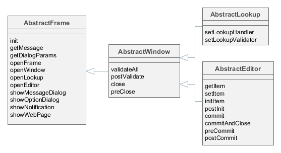
Figure 26. Controller Base Classes
3.6.1.3.1. AbstractFrame
|
This is a legacy API. For the new API available since v.7.0, see Screen Controllers. |
AbstractFrame is the root of the controller classes hierarchy. Below is the description of its main methods:
-
init()is called by the framework after creating components tree described by an XML-descriptor, but before a screen is displayed.init()method accepts a map of parameters that can be used in controller. These parameters can be passed both from the controller of the calling screen (usingopenWindow(),openLookup()oropenEditor()methods) or defined in the screen registration file screens.xml.init()method should be implemented if it is necessary to initialize screen components, for example:@Inject private Table someTable; @Override public void init(Map<String, Object> params) { someTable.addGeneratedColumn("someColumn", new Table.ColumnGenerator<Colour>() { @Override public Component generateCell(Colour entity) { ... } }); }
-
openFrame()– loads a frame according to an identifier registered in screens.xml file. If the method receives a container component from the invoking code, the frame is shown within the container. The method returns frame controller. For example:@Inject private BoxLayout container; @Override public void init(Map<String, Object> params) { SomeFrame frame = openFrame(container, "someFrame"); frame.setHeight("100%"); frame.someInitMethod(); }It is not required to pass the container immediately via
openFrame()method, instead it is possible to load the frame first and then add it to the necessary container:@Inject private BoxLayout container; @Override public void init(Map<String, Object> params) { SomeFrame frame = openFrame(null, "someFrame"); frame.setHeight("100%"); frame.someInitMethod(); container.add(frame); }
-
openWindow(),openLookup(),openEditor()– open a simple screen, a lookup screen, or an edit screen respectively. Methods return a controller of the created screen.For the dialog mode, the method
openWindow()can be called with parameters, for example:@Override public void actionPerform(Component component) { openWindow("sec$User.browse", WindowManager.OpenType.DIALOG.width(800).height(300).closeable(true).resizable(true).modal(false)); }These parameters will be considered if they don’t conflict with the higher-priority parameters of the window being opened. The latter can be set either in the getDialogOptions() method of screen controller or in XML descriptor of the screen:
<dialogMode forceDialog="true" width="300" height="200" closeable="true" modal="true" closeOnClickOutside="true"/>CloseListenercan be added in order to perform actions after the invoked screen closes, for example:CustomerEdit editor = openEditor("sales$Customer.edit", customer, WindowManager.OpenType.THIS_TAB); editor.addCloseListener((String actionId) -> { // do something });Use
CloseWithCommitListenerto be notified only when the invoked screen closes by an action with theWindow.COMMIT_ACTION_IDname (i.e. OK button), for example:CustomerEdit editor = openEditor("sales$Customer.edit", customer, WindowManager.OpenType.THIS_TAB); editor.addCloseWithCommitListener(() -> { // do something });
-
showMessageDialog()– shows a dialog box with a message.
-
showOptionDialog()– shows a dialog box with a message and an option for user to invoke certain actions. Actions are defined by an array of Action type items displayed as buttons in the dialog.It is recommended to use
DialogActionobjects for display of standard buttons such as OK, Cancel and other, for example:showOptionDialog("PLease confirm", "Are you sure?", MessageType.CONFIRMATION, new Action[] { new DialogAction(DialogAction.Type.YES) { @Override public void actionPerform(Component component) { // do something } }, new DialogAction(DialogAction.Type.NO) });
-
showNotification()– shows a pop up notification.
-
showWebPage()– opens specified web page in a browser.
3.6.1.3.2. AbstractWindow
|
This is a legacy API. For the new API available since v.7.0, see Screen Controllers. |
AbstractWindow is a subclass of AbstractFrame and defines the following methods:
-
getDialogOptions()– returns aDialogOptionsobject to control geometry and behaviour of the screen when it is opened as a dialog (WindowManager.OpenType.DIALOG). These options can be set when the screen is initialized as well as can be changed at a runtime. See the examples below.Setting the width and height:
@Override public void init(Map<String, Object> params) { getDialogOptions().setWidth("480px").setHeight("320px"); }Setting the dialog position on the screen:
getDialogOptions() .setPositionX(100) .setPositionY(100);Making the dialog closeable by click on outside area:
getDialogOptions().setModal(true).setCloseOnClickOutside(true);Making the dialog non-modal and resizable:
@Override public void init(Map<String, Object> params) { getDialogOptions().setModal(false).setResizable(true); }Defining whether the dialog should be maximized across the screen:
getDialogOptions().setMaximized(true);Specifying that the screen should always be opened as a dialog regardless of what
WindowManager.OpenTypewas selected in the calling code:@Override public void init(Map<String, Object> params) { getDialogOptions().setForceDialog(true); }
-
setContentSwitchMode()- defines how the managed main TabSheet should switch a tab with the given window: hide it or unload its content.Three options are available:
-
DEFAULT- the switch mode is determined by the managed main TabSheet mode, defined in the cuba.web.managedMainTabSheetMode application property. -
HIDE- the tab content should be hidden not considering the TabSheet mode. -
UNLOAD- tab content should be unloaded not considering the TabSheet mode.
-
-
saveSettings()- saves the screen settings of the current user to the database when the screen is closed.For example, the screen contains a checkBox showPanel that manages some panel’s visibility. In the following method we create an XML element for the checkBox, then add an attribute
showPanelcontaining the checkBox value to this element, and finally we save thesettingselement to the XML descriptor for the current user in the database:@Inject private CheckBox showPanel; @Override public void saveSettings() { boolean showPanelValue = showPanel.getValue(); Element xmlDescriptor = getSettings().get(showPanel.getId()); xmlDescriptor.addAttribute("showPanel", String.valueOf(showPanelValue)); super.saveSettings(); }
-
applySettings()- restores settings saved in the database for the current user when the screen is opened.This method can be overridden to restore custom settings. For example, in the method below we get the XML element of the checkBox from the previous example, then we make sure the required attribute is not null, and if it isn’t, we set the restored value to the checkBox:
@Override public void applySettings(Settings settings) { super.applySettings(settings); Element xmlDescriptor = settings.get(showPanel.getId()); if (xmlDescriptor.attribute("showPanel") != null) { showPanel.setValue(Boolean.parseBoolean(xmlDescriptor.attributeValue("showPanel"))); } }Another example of managing settings is the standard Server Log screen from the Administration menu of CUBA application that automatically saves and restores recently opened log files.
-
ready()- a template method that can be implemented in controller to intercept the moment of screen opening. It is invoked when the screen is fully initialized and opened.
-
validateAll()– validates a screen. The default implementation callsvalidate()for all screen components implementing theComponent.Validatableinterface, collects information about exceptions and displays corresponding message. Method returnsfalse, if any exceptions were found; andtrueotherwise.This method should be overridden only if it is required to override screen validation procedure completely. It is sufficient to implement a special template method –
postValidate(), if validation should be just supplemented.
-
postValidate()– a template method that can be implemented in controller for additional screen validation. The method stores validation errors information inValidationErrorsobject which is passed to it. Afterwards this information is displayed together with the errors of standard validation. For example:private Pattern pattern = Pattern.compile("\\d"); @Override protected void postValidate(ValidationErrors errors) { if (getItem().getAddress().getCity() != null) { if (pattern.matcher(getItem().getAddress().getCity()).find()) { errors.add("City name can't contain digits"); } } }
-
showValidationErrors()- shows validation errors alert. It can be overridden to change the default alert behavior. The notification type can be defined by the cuba.gui.validationNotificationType application property.@Override public void showValidationErrors(ValidationErrors errors) { super.showValidationErrors(errors); }
-
close()– closes this screen.The method accepts string value, which is then passed to
preClose()template method and toCloseListenerlisteners. Thus, the information about the reason why the window was closed can be obtained from the code that initiated the closing event. It is recommended to use the following constants for closing edit screens:Window.COMMIT_ACTION_IDafter committing changes,Window.CLOSE_ACTION_ID– without committing changes.If any of the datasources contains unsaved changes, a dialog with a corresponding message will be displayed before the screen is closed. Notification type may be adjusted using the cuba.gui.useSaveConfirmation application property.
A variant of
close()method withforce = trueparameter closes the screen without callingpreClose()and without a notification regardless of any unsaved changes.close()method returnstrue, if the screen is closed successfully, andfalse– if closing procedure was interrupted.
-
preClose()is a template method which can be implemented in a controller to intercept the moment when the window closes. The method receives a string value provided by the closing initiator when invokingclose()method.If the
preClose()method returnsfalse, the window closing process is interrupted.
-
addBeforeCloseWithCloseButtonListener()- adds a listener to be notified when a screen is closed with one of the following approaches: the screen’s close button, bread crumbs, orTabSheettabs' close actions (Close, Close All, Close Others). To prevent a user from closing a window accidentally, invoke thepreventWindowClose()method ofBeforeCloseEvent:addBeforeCloseWithCloseButtonListener(BeforeCloseEvent::preventWindowClose);
-
addBeforeCloseWithShortcutListener- adds a listener to be notified when a screen is closed with a close shortcut (for example,Escbutton). To prevent a user from closing a window accidentally, invoke thepreventWindowClose()method ofBeforeCloseEvent:addBeforeCloseWithShortcutListener(BeforeCloseEvent::preventWindowClose);
3.6.1.3.3. AbstractLookup
|
This is a legacy API. For the new API available since v.7.0, see Screen Controllers. |
AbstractLookup is the base class for lookup screen controllers. It is a subclass of AbstractWindow and defines the following own methods:
-
setLookupComponent()– sets the component, which will be used to select entity instances.As a rule, component for selection is defined in screen XML-descriptor and there is no need to call this method in the application code.
-
setLookupValidator()– setsWindow.Lookup.Validatorobject to the screen, whichvalidate()method is invoked by the framework before returning selected entity instances. Ifvalidate()method returnsfalse, the lookup and window closing process is interrupted.By default, the validator is not set.
3.6.1.3.4. AbstractEditor
|
This is a legacy API. For the new API available since v.7.0, see Screen Controllers. |
AbstractEditor is the base class for edit screen controller. It is a subclass of AbstractWindow.
When creating a controller class, it is recommended to parameterize AbstractEditor with the edited entity class. This enables getItem() and initNewItem() methods work with the specified entity type and application code does not need to do additional type conversion. For example:
public class CustomerEdit extends AbstractEditor<Customer> {
@Override
protected void initNewItem(Customer item) {
...AbstractEditor defines the following own methods:
-
getItem()– returns an instance of the entity being edited, which is set in the main datasource of the screen (i.e. specified in thedatasourceattribute of the root element of the XML-descriptor).If the instance being edited is not a new one, screen opening procedure will reload the instance from the database with the required view as set for the main datasource.
Changes made to the instance returned by
getItem(), are reflected in the state of the datasource and will be sent to the Middleware at commit.It should be considered that
getItem()returns a value only after screen is initialized withsetItem()method. Until this moment, this method returnsnull, for instance when calling from insideinit()orinitNewItem().However, in the
init()method, an instance of an entity passed toopenEditor()can be retrieved from parameters using the following approach:@Override public void init(Map<String, Object> params) { Customer item = WindowParams.ITEM.getEntity(params); // do something }The
initNewItem()method receives an instance as a parameter of the appropriate type.In both cases the obtained entity instance will be reloaded afterwards unless it is a new one. Therefore you should not change it or save it in a field for future use.
-
setItem()– invoked by the framework when a window is opened usingopenEditor()to set the instance being edited to the main datasource. By the moment of invocation all screen components and datasources will have been created and the controller’sinit()method will have been executed.It is recommended to use template methods
initNewItem()andpostInit(), instead of overridingsetItem()in order to initialize a screen.
-
initNewItem()– a template method invoked by the framework before setting the edited entity instance into the main datasource.The
initNewItem()method is called for newly created entity instances only. The method is not called for detached instances. This method can be implemented in the controller, if new entity instances must be initialized before setting them in the datasource. For example:@Inject private UserSession userSession; @Override protected void initNewItem(Complaint item) { item.setOpenedBy(userSession.getUser()); item.setStatus(ComplaintStatus.OPENED); }A more complex example of using the
initNewItem()method can be found in the cookbook.
-
postInit()– a template method invoked by the framework immediately after the edited entity instance is set to the main datasource. In this method,getItem()can be called to return a new entity instance or an instance re-loaded during screen initialization.This method can be implemented in controller for final screen initialization, for example:
@Inject private EntityStates entityStates; @Inject protected EntityDiffViewer diffFrame; @Override protected void postInit() { if (!entityStates.isNew(getItem())) { diffFrame.loadVersions(getItem()); } }
-
commit()– validates the screen and submits changes to the Middleware via DataSupplier.If a method is used with
validate = false, commit does not perform a validation.It is recommended to use specialized template methods –
postValidate(),preCommit()andpostCommit()instead of overriding this method.
-
commitAndClose()– validates the screen, submits changes to the Middleware and closes the screen. The value of theWindow.COMMIT_ACTION_IDwill be passed to thepreClose()method and registeredCloseListenerlisteners.It is recommended to use specialized template methods –
postValidate(),preCommit()andpostCommit()instead of overriding this method.
-
preCommit()– a template method invoked by the framework during the commit process, after a successful validation, but before the data is submitted to the Middleware.This method can be implemented in controller. If the method returns
false, commit process gets interrupted, as well as window closing process (ifcommitAndClose()was invoked). For example:@Override protected boolean preCommit() { if (somethingWentWrong) { notifications.create() .withCaption("Something went wrong") .withType(Notifications.NotificationType.WARNING) .show(); return false; } return true; }
-
postCommit()– a template method invoked by the framework at the final stage of committing changes. Method parameters are:-
committed– set totrue, if the screen had changes and they have been submitted to Middleware. -
close– set totrue, if the screen should be closed after the changes are committed.If the screen does not close the default implementation of this method displays a message about successful commit and invokes
postInit().This method can be overridden in controller in order to perform additional actions after successful commit, for example:
@Inject private Datasource<Driver> driverDs; @Inject private EntitySnapshotService entitySnapshotService; @Override protected boolean postCommit(boolean committed, boolean close) { if (committed) { entitySnapshotService.createSnapshot(driverDs.getItem(), driverDs.getView()); } return super.postCommit(committed, close); }
-
The diagrams below show initialization sequence and different ways to commit changes for an edit screen.

Figure 27. Edit Screen Initialization

Figure 28. Committing And Closing a Window With an editWindowActions Frame

Figure 29. Committing a Screen With an extendedEditWindowActions Frame

Figure 30. Committing a Screen With an extendedEditWindowActions Frame
- API
-
commit() - commitAndClose() - getItem() - initNewItem() - postCommit() - postInit() - preCommit() - setItem()
3.6.1.3.5. EntityCombinedScreen
|
This is a legacy API. For the new API available since v.7.0, see Screen Controllers. |
EntityCombinedScreen is the base class for combined screen controllers. It is a subclass of AbstractLookup.
The EntityCombinedScreen class looks up key components such as table, field group and others by hardcoded identifiers. If you name your components differently, override protected methods of the class and return your identifiers to let the controller find your components. See the class JavaDocs for details.
3.6.1.3.6. Controller Dependency Injection
|
This is a legacy API. For the new API available since v.7.0, see Screen Controllers. |
Dependency Injection in controllers can be used to acquire references to utilized objects. For this purpose it is required to declare either a field of the corresponding type or a write access method (setter) with an appropriate parameter type and with one of the following annotations:
-
@Inject– the simplest option, where an object for injection will be found according to the field/method type and the name of the field or attribute corresponding to the method according to JavaBeans rules. -
@Named("someName")– explicitly defines the name of the target object.
The following objects can be injected into controllers:
-
This screen’s visual components defined in the XML-descriptor. If the attribute type is derived from
Component, the system will search for a component with the corresponding name within the current screen. -
Actions defined in the XML-descriptor – see Actions.
-
Datasources defined in the XML-descriptor. If the attribute type is derived from
Datasource, the system will search for a datasource with the corresponding name in the current screen. -
UserSession. If the attribute type is UserSession, the system will inject an object of the current user session. -
DsContext. If the attribute type isDsContext, the system will inject theDsContextof the current screen. -
WindowContext. If the attribute type isWindowContext, the system will inject theWindowContextof the current screen. -
DataSupplier. If the attribute type is DataSupplier, the corresponding instance will be injected. -
Any bean defined in the context of a given client block, including:
-
Middleware services imported by Client
-
WindowConfig -
ExportDisplay
-
-
If nothing of the mentioned above is appropriate and the controller has companions, a companion for the current client type will be injected, if the types match.
It is possible to inject parameters passed in a map to the init() method into the controller using @WindowParam annotation. The annotation has the name attribute which contains the parameter name (a key in the map) and an optional required attribute. If required = true and the map does not contain the corresponding parameter a WARNING message is added to the log.
An example of the injection of a Job entity passed to the controller’s init() method:
@WindowParam(name = "job", required = true)
protected Job job;3.6.1.3.7. Controller Companions
|
This section is not relevant since version 7.0 as the desktop client is not supported anymore. Instead of creating companions, just place your screen in the web module. |
3.6.2. Datasources (Legacy)
|
This is a legacy API. For new data API available since release 7.0, see Data Components. |
Datasources provide data to data-aware components.
Visual components themselves do not access Middleware: they get entity instances from linked datasources. Furthermore, one datasource can work with multiple visual components if they need the same instance or set of instances.
-
When a user changes a value in the component, the new value is set for the entity attribute in the datasource.
-
When the entity attribute is modified in the code, the new value is set and displayed in the visual component.
-
User input can be monitored both by datasource listeners and value listeners on the component – they are notified sequentially.
-
To read or write the value of an attribute in the application code, it is recommended to use the datasource, rather than the component. Below is an example of reading the attribute:
@Inject private FieldGroup fieldGroup; @Inject private Datasource<Order> orderDs; @Named("fieldGroup.customer") private PickerField customerField; public void init(Map<String, Object> params){ Customer customer; // Get customer from component: not for common use Component component = fieldGroup.getFieldNN("customer").getComponentNN(); customer = ((HasValue)component).getValue(); // Get customer from component customer = customerField.getValue(); // Get customer from datasource: recommended customer = orderDs.getItem().getCustomer(); }As you can see, working with entity attribute values through a component is not very straightforward. In the first example, it requires type casting and specifying FieldGroup field
idas a string. The second example is more safe and direct, but requires you to know exactly the type of the field to be injected. At the same time, if the instance is obtained from the datasource via thegetItem()method, the values of attributes can be read and modified directly.
Datasources also track changes in entities contained therein and can send modified instances back to the middleware for storing in the database.
|
Typically, a visual component is bound to an attribute that directly belongs to the entity in the datasource. In the example above, the component is bound to the A component can also be associated with an attribute of a related entity, for example, |
The basic interfaces of datasources are described below.
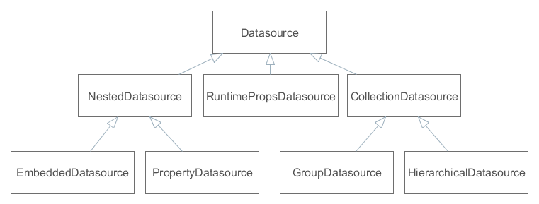
Figure 31. Datasource interfaces
-
Datasource is a simple datasource designed to work with one entity instance. The instance is set by the
setItem()method and is accessed viagetItem().DatasourceImplclass is the standard implementation of such datasource, which is used, for instance, as a main datasource on entity edit screens. -
CollectionDatasource is a datasource designed to work with a collection of entity instances. The collection is loaded with the invocation of the
refresh()method, instance keys are accessible through thegetItemIds()method. ThesetItem()method sets the "current" instance of the collection andgetItem()returns it (for example, the one that corresponds to the currently selected table row).The way of loading collections is determined by implementation. The most typical one is loading from Middleware via DataManager; in this case,
setQuery(),setQueryFilter()are used to form a JPQL query.CollectionDatasourceImplclass is the standard implementation of such datasources, which is used on screens with entity lists.-
GroupDatasource is a subtype of
CollectionDatasource, designed to work with the GroupTable component.Standard implementation is the
GroupDatasourceImplclass. -
HierarchicalDatasource is a subtype of
CollectionDatasource, designed to work with the Tree and TreeTable components.Standard implementation is the
HierarchicalDatasourceImplclass.
-
-
NestedDatasource is a datasource designed to work with instances that are loaded in an attribute of another entity. In this case, a datasource that contains a parent entity is accessible via
getMaster(), and meta property that corresponds to the parent attribute containing instances of this datasource is accessible viagetProperty().For example an
Orderinstance which contains a reference to theCustomerinstance is set in thedsOrderdatasource. Then, to link theCustomerinstance with visual components, it is enough to createNestedDatasourcewithdsOrderas parent and meta property to point to theOrder.customerattribute.-
PropertyDatasource is a subtype of
NestedDatasource, designed to work with one instance or collection of related entities that are not embedded.Standard implementations: for working with one instance –
PropertyDatasourceImpl, with a collection –CollectionPropertyDatasourceImpl,GroupPropertyDatasourceImpl,HierarchicalPropertyDatasourceImpl. The latter also implements theCollectionDatasourceinterface, however some of its irrelevant methods likesetQuery()throwUnsupportedOperationException. -
EmbeddedDatasource is a subtype of
NestedDatasource, which contains an instance of an embedded entity.Standard implementation is the
EmbeddedDatasourceImplclass.
-
-
RuntimePropsDatasource is a specific datasource, designed to work with dynamic attributes of entities.
Typically, datasources are declared in the dsContext section of a screen descriptor.
- Automatic CollectionDatasource refresh
-
When the screen opens, its visual components connected to collection datasources cause the datasources to load data. As a result, tables show data right after opening the screen, without any explicit user action. If you want to prevent automatic loading of collection datasources, set the
DISABLE_AUTO_REFRESHscreen parameter totruein the screen’sinit()method or pass it from the calling code. This parameter is defined in theWindowParamsenumeration, so it can be set as shown below:@Override public void init(Map<String, Object> params) { WindowParams.DISABLE_AUTO_REFRESH.set(params, true); }In this case, the screen collection datasources will be loaded only when their
refresh()method will be called. It can be done by the application code or when the user clicks Search in the Filter component.
3.6.2.1. Creating Datasources
|
This is a legacy API. For new data API available since release 7.0, see Data Components. |
Datasource objects can be created both declaratively, using an XML screen descriptor, and programmatically in a controller. Typically, standard implementation of datasources is used, however, you can create your own class that is inherited from a standard one, if necessary.
3.6.2.1.1. Declarative Creation
|
This is a legacy API. For new data API available since release 7.0, see Data Components. |
Typically, datasources are declared in the dsContext element of a screen descriptor. Depending on the relative position of declaration elements, datasources of two varieties are created:
-
if an element is located directly in
dsContext, a normalDatasourceorCollectionDatasource, which contains an independently loaded entity or collection, is created; -
if an element is located inside an element of another datasource,
NestedDatasourceis created and the external datasource becomes its parent.
Below is an example of declaring a datasource:
<dsContext>
<datasource id="carDs" class="com.haulmont.sample.entity.Car" view="carEdit">
<collectionDatasource id="allocationsDs" property="driverAllocations"/>
<collectionDatasource id="repairsDs" property="repairs"/>
</datasource>
<collectionDatasource id="colorsDs" class="com.haulmont.sample.entity.Color" view="_local">
<query>
<![CDATA[select c from sample$Color c order by c.name]]>
</query>
</collectionDatasource>
</dsContext>In the example above, carDs contains one entity instance, Car, and nested allocationsDs and repairsDs contain collections of related entities from the Car.driverAllocations and Car.repairs attributes, respectively. The Car instance together with related entities is set into the datasource from the outside. If this screen is an edit screen, it happens automatically when opening the screen. The colorsDs datasource contains a collection of instances of the Color entity, which is loaded by the datasource itself using the specified JPQL query with the _local view.
Below is the XML scheme.
dsContext – root element.
dsContext elements:
-
datasource– defines a datasource that contains a single entity instance.Attributes:
-
id– datasource identifier, must be unique for thisDsContext. -
class– Java class of an entity that will be contained in this datasource. -
view– name of entity view. If the datasource itself loads instances, then this view will be used during loading. Otherwise, this view makes signals to external mechanisms on how to load an entity for this datasource. -
allowCommit– if set tofalse, theisModified()method of this datasource always returnsfalseand thecommit()method does nothing. Thus, changes in entities that are contained in the datasource are ignored. By default, it is set totrue, i.e., changes are tracked and can be saved. -
datasourceClassis a custom implementation class, if necessary.
-
-
collectionDatasource– defines a datasource that contains a collection of instances.collectionDatasourceattributes:-
refreshMode– a datasource update mode, default isALWAYS. In theNEVERmode, whenrefresh()method is invoked, the datasource does not load data and only changes its state toDatasource.State.VALID, notifies listeners and sorts available instances. TheNEVERmode is useful if you need to programmatically fillCollectionDatasourcewith preloaded or created entities. For example:@Override public void init(Map<String, Object> params) { Set<Customer> entities = (Set<Customer>) params.get("customers"); for (Customer entity : entities) { customersDs.includeItem(entity); } customersDs.refresh(); } -
softDeletion– the false value disables the soft deletion mode when loading entities, i.e., deleted instances will also be loaded. Default value istrue.
collectionDatasourceelements:-
query– query to load entities
-
-
groupDatasource– completely similar tocollectionDatasource, but creates datasource implementation that is suitable to use in conjunction with the GroupTable component. -
hierarchicalDatasource– similar tocollectionDatasource, and creates datasource implementation that is suitable to use in conjunction with the Tree and TreeTable components.hierarchyPropertyis a specific attribute. It specifies an attribute name, upon which a hierarchy is built.
A datasource implementation class is selected implicitly based on the name of the XML element and, as mentioned above, the mutual arrangement of elements. However, if you need to apply a custom datasource, you can explicitly specify its class in the datasourceClass attribute.
3.6.2.1.2. Programmatic Creation
|
This is a legacy API. For new data API available since release 7.0, see Data Components. |
If you need to create a datasource in the Java code, it is recommended to use a special class, DsBuilder.
The DsBuilder instance is parameterized by an invocation chain of its methods in the fluent interface style. If the master and property parameters are set, then NestedDatasource will be created, otherwise – Datasource or CollectionDatasource.
Example:
CollectionDatasource ds = new DsBuilder(getDsContext())
.setJavaClass(Order.class)
.setViewName(View.LOCAL)
.setId("ordersDs")
.buildCollectionDatasource();3.6.2.1.3. Custom Implementation Classes
|
This is a legacy API. For new data API available since release 7.0, see Data Components. |
If you need to implement a custom mechanism of loading entities, create a custom datasource class inherited from CustomCollectionDatasource, CustomGroupDatasource, or CustomHierarchicalDatasource, and implement the getEntities() method.
For example:
public class MyDatasource extends CustomCollectionDatasource<SomeEntity, UUID> {
private SomeService someService = AppBeans.get(SomeService.NAME);
@Override
protected Collection<SomeEntity> getEntities(Map<String, Object> params) {
return someService.getEntities();
}
}To create a custom datasource instance declaratively, specify the custom class name in the datasourceClass attribute of the datasource XML element. In case of programmatic creation via DsBuilder, specify the class by invoking setDsClass() or as a parameter of one of the build*() methods.
3.6.2.2. CollectionDatasourceImpl Queries
|
This is a legacy API. For new data API available since release 7.0, see Data Components. |
The CollectionDatasourceImpl class and its subclasses, GroupDatasourceImpl and HierarchicalDatasourceImpl, are standard implementations of datasources that work with collections of entity instances. These datasources load data via DataManager by sending a JPQL queries to the middleware. The format of these queries is described below.
3.6.2.2.1. Returned values
|
This is a legacy API. For new data API available since release 7.0, see Data Components. |
A query should return entities of the type which is specified at the moment of creating a datasource. In case of declarative creation, the entity type is specified in the class attribute of an XML element, if DsBuilder is used – in the setJavaClass() or setMetaClass() method.
For example, a query of the datasource of the Customer entity may look as follows:
select c from sales$Customer cor
select o.customer from sales$Order oA query cannot return single attributes or aggregates, for example:
select c.id, c.name from sales$Customer c /* invalid – returns single fields, not the whole Customer object */If you need to execute a query which returns scalar values or aggregates and to display the results in visual components using standard data binding, use Value Datasources.
3.6.2.2.2. Query Parameters
|
This is a legacy API. For new data API available since release 7.0, see Data Components. |
A JPQL query in a datasource may contain parameters of several types. A parameter type is determined by a prefix of a parameter name. A prefix is a part of the name before the $ character. The interpretation of the name after $ is described below.
-
The
dsprefixThe parameter value is data from another datasource that is registered in the same
DsContext. For example:<collectionDatasource id="customersDs" class="com.sample.sales.entity.Customer" view="_local"> <query> <![CDATA[select c from sales$Customer c]]> </query> </collectionDatasource> <collectionDatasource id="ordersDs" class="com.sample.sales.entity.Order" view="_local"> <query> <![CDATA[select o from sales$Order o where o.customer.id = :ds$customersDs]]> </query> </collectionDatasource>In the example above, a query parameter of the
ordersDsdatasource will be a current entity instance located in thecustomersDsdatasource.If parameters with the
dsprefix are used, dependencies between datasources are created automatically. They lead to updating the datasource if its parameter are changed. In the example above, if the selected Customer is changed, the list of its Orders is changed automatically.Please note that in the example of the parameterized query, the left part of the comparison operator is the value of the
o.customer.ididentifier, and the right part – theCustomerinstance that is contained in thecustomersDsdatasource. This comparison is valid since when running a query at Middleware, the implementation of the Query interface, by assigning values to query parameters, automatically adds entity ID instead of a passed entity instance.A path through the entity graph to an attribute (from which the value should be used) can be specified in the parameter name after the prefix and name of a datasource, for example:
<query> <![CDATA[select o from sales$Order o where o.customer.id = :ds$customersDs.id]]> </query>or
<query> <![CDATA[select o from sales$Order o where o.tagName = :ds$customersDs.group.tagName]]> </query>
-
The
customprefix.A parameter value will be taken from the
Map<String, Object>object that is passed into therefresh()method of a datasource. For example:<collectionDatasource id="ordersDs" class="com.sample.sales.entity.Order" view="_local"> <query> <![CDATA[select o from sales$Order o where o.number = :custom$number]]> </query> </collectionDatasource>ordersDs.refresh(ParamsMap.of("number", "1"));Casting an instance to its identifier, if necessary, is performed similarly to parameters with the
dsprefix. The path through the entity graph in the parameter name is not supported in this case.
-
The
paramprefix.A parameter value is taken from the
Map<String, Object>object that is passed into theinit()method of a controller. For example:<query> <![CDATA[select e from sales$Order e where e.customer = :param$customer]]> </query>openWindow("sales$Order.lookup", WindowManager.OpenType.DIALOG, ParamsMap.of("customer", customersTable.getSingleSelected()));Casting an instance to its identifier, if necessary, is performed similarly to parameters with the
dsprefix. The path through the entity graph in the parameter name is supported.
-
The
componentprefix.A parameter value will be a current value of a visual component, which path is specified in the parameter name. For example:
<query> <![CDATA[select o from sales$Order o where o.number = :component$filter.orderNumberField]]> </query>The path to a component should include all nested frames.
Casting an instance to its identifier, if necessary, is similar to
dsparameters. The path through the entity graph in the parameter name is supported as the continuation of the path to a component in this case.The datasource will not be refreshed automatically if the component value is changed.
-
The
sessionprefix.A parameter value will be a value of the user session attribute specified in the parameter name.
The value is extracted by the
UserSession.getAttribute()method, so predefined names of session attributes are also supported.-
userId– ID of the currently registered or substituted user; -
userLogin– login of the currently registered or substituted user in lowercase.
Example:
<query> <![CDATA[select o from sales$Order o where o.createdBy = :session$userLogin]]> </query>Casting an instance to its identifier, if necessary, is similar to
dsparameters. In this case, the path through the entity graph in the parameter name is not supported. -
3.6.2.2.3. Query Filter
|
This is a legacy API. For new data API available since release 7.0, see Data Components. |
A datasource query can be modified at runtime depending on conditions entered by the user. This allows you to efficiently filter data at the database level.
The easiest way to provide such ability is to connect the datasource to a special visual component: Filter.
If the universal filter is not suitable for some reason, a special XML markup can be embedded into the query text. This allows you to create a resulting query based on values entered by the user into any visual components of the screen.
The following elements can be used in this filter:
-
filter– a root element of the filter. It can directly contain only one condition.-
and,or– logical conditions, may contain any number of other conditions and statements. -
c– JPQL condition, which is added to thewheresection of the query. If the query does not containwhereclause, it will be added before the first condition. An optionaljoinattribute can be used to specify joined entities. The value of thejoinattribute is added after the root entity declaration as is, so it must containjoinkeyword or comma.
-
Conditions and statements are added to the resulting query only if corresponding parameters have values, i.e. when they are not null.
Example:
<query>
<![CDATA[select distinct d from app$GeneralDoc d]]>
<filter>
<or>
<and>
<c join=", app$DocRole dr">dr.doc.id = d.id and d.processState = :custom$state</c>
<c>d.barCode like :component$barCodeFilterField</c>
</and>
<c join=", app$DocRole dr">dr.doc.id = d.id and dr.user.id = :custom$initiator</c>
</or>
</filter>
</query>In this case, if state and initiator parameters are passed to the refresh() method of the datasource, and the barCodeFilterField visual component has some value, then the resulting query will be as follows:
select distinct d from app$GeneralDoc d, app$DocRole dr
where
(
(dr.doc.id = d.id and d.processState = :custom$state)
and
(d.barCode like :component$barCodeFilterField)
)
or
(dr.doc.id = d.id and dr.user.id = :custom$initiator)If, for example, the barCodeFilterField component is empty and only initiator parameter is passed to the refresh() method, the query will be as follows:
select distinct d from app$GeneralDoc d, app$DocRole dr
where
(dr.doc.id = d.id and dr.user.id = :custom$initiator)3.6.2.2.4. Case-Insensitive Search for a Substring
|
This is a legacy API. For new data API available since release 7.0, see Data Components. |
It is possible to use a special feature of JPQL queries execution in datasources, described for the Query interface of the Middleware level: for easy creation of case-insensitive search condition of any substring, (?i) prefix can be used. However, due to the fact that the query value is usually passed implicitly, the following differences take place:
-
The
(?i)prefix should be specified before a parameter name and not inside the value. -
The parameter value will be automatically converted to lowercase.
-
If the parameter value does not have
%characters, they will be added to the beginning and the end.
Below is an example of how to process the following query:
select c from sales$Customer c where c.name like :(?i)component$customerNameFieldIn this case, the parameter value taken from the customerNameField component will be converted to lowercase and will be framed with % characters, and then an SQL query with a lower(C.NAME) like ? condition will be executed in the database.
Please note that with this search, an index created in the DB by the NAME field, will not be used.
3.6.2.3. Value Datasources
|
This is a legacy API. For new data API available since release 7.0, see Data Components. |
Value datasources enable execution of queries that return scalar values and aggregates. For example, you can load some aggregated statistics for customers:
select o.customer, sum(o.amount) from demo$Order o group by o.customerValue datasources work with entities of a special type named KeyValueEntity. This entity can contain an arbitrary number of attributes which are defined at runtime. So in the example above, the KeyValueEntity instances will contain two attributes: the first of type Customer and the second of type BigDecimal.
Value datasource implementations extend other widely used collection datasource classes and implement a specific interface: ValueDatasource. Below is a diagram showing the value datasource implementations and their base classes:
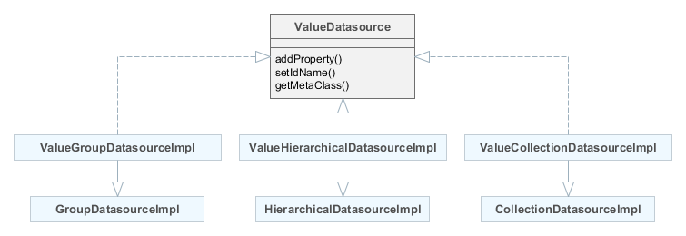
The ValueDatasource interface declares the following methods:
-
addProperty()- as the datasource can return entities with any number of attributes, you have to specify what attributes are expected by using this method. It accepts a name of the attribute and its type in the form of Datatype or a Java class. In the latter case, the class should be either an entity class or a class supported by one the datatypes. -
setIdName()is an optional method which allows you to define one of the attributes as an identifier attribute of the entity. It means thatKeyValueEntityinstances contained in this datasource will have identifiers obtained from the given attribute. Otherwise,KeyValueEntityinstances get randomly generated UUIDs. -
getMetaClass()returns a dynamic implementation of theMetaClassinterface that represents the current schema ofKeyValueEntityinstances. It is defined by previous calls toaddProperty().
Value datasources can be used declaratively in a screen XML descriptor. There are three XML elements corresponding to the implementation classes:
-
valueCollectionDatasource -
valueGroupDatasource -
valueHierarchicalDatasource
XML definition of a value datasource must contain the properties element that defines the attributes of KeyValueEntity instances that will be contained in the datasource (see the addProperty() method description above). The order of property elements should conform to the order of result set columns returned by the query. For example, in the following definition the customer attribute will get its value from o.customer column and the sum attribute from sum(o.amount) column:
<dsContext>
<valueCollectionDatasource id="salesDs">
<query>
<![CDATA[select o.customer, sum(o.amount) from demo$Order o group by o.customer]]>
</query>
<properties>
<property class="com.company.demo.entity.Customer" name="customer"/>
<property datatype="decimal" name="sum"/>
</properties>
</valueCollectionDatasource>
</dsContext>Value datasources are designed only for reading data, because KeyValueEntity is not persistent and cannot be saved by standard persistence mechanisms.
You can create value datasources either manually or in Studio in the Datasources tab of the Screen designer page.
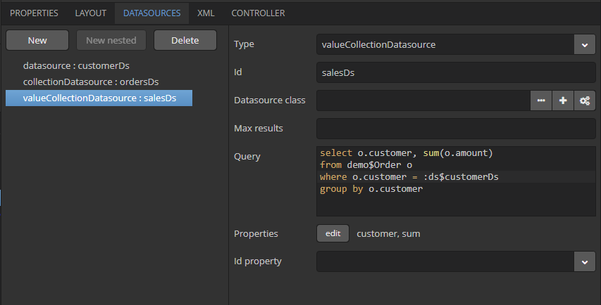
The Properties editor allows you to create the datasource attributes of a certain datatype and/or a Java class.
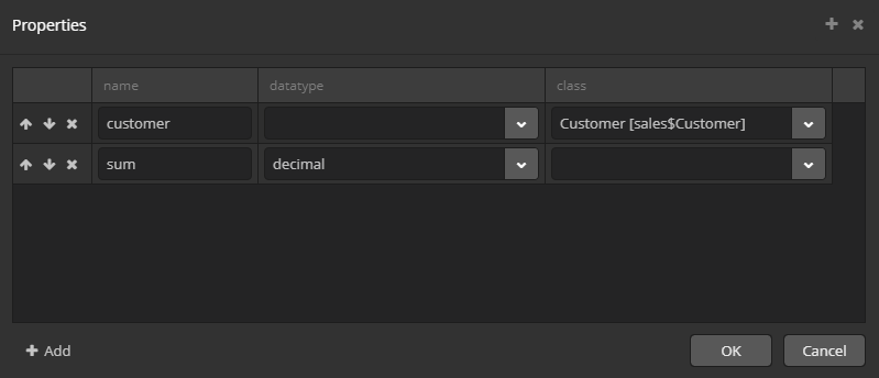
3.6.2.4. Datasource Listeners
|
This is a legacy API. For new data API available since release 7.0, see Data Components. |
Datasource listeners receive notifications of changes in the state of datasources and entities contained in them.
There are four types of listeners. Three of them: ItemPropertyChangeListener, ItemChangeListener and StateChangeListener are defined in the Datasource interface and can be used in any datasource. CollectionChangeListener is defined in CollectionDatasource and can be used only in datasources working with collections of entities.
Compared to ValueChangeListener, datasource listeners give finer control over the screen lifecycle and are recommended to be used with visual components bound to datasources.
Example of using datasource listeners:
public class EmployeeBrowse extends AbstractLookup {
private Logger log = LoggerFactory.getLogger(EmployeeBrowse.class);
@Inject
private CollectionDatasource<Employee, UUID> employeesDs;
@Override
public void init(Map<String, Object> params) {
employeesDs.addItemPropertyChangeListener(event -> {
log.info("Property {} of {} has been changed from {} to {}",
event.getProperty(), event.getItem(), event.getPrevValue(), event.getValue());
});
employeesDs.addStateChangeListener(event -> {
log.info("State of {} has been changed from {} to {}",
event.getDs(), event.getPrevState(), event.getState());
});
employeesDs.addItemChangeListener(event -> {
log.info("Datasource {} item has been changed from {} to {}",
event.getDs(), event.getPrevItem(), event.getItem());
});
employeesDs.addCollectionChangeListener(event -> {
log.info("Datasource {} content has been changed due to {}",
event.getDs(), event.getOperation());
});
}
}The listener interfaces are described below.
-
ItemPropertyChangeListeneris added by theDatasource.addItemPropertyChangeListener()method. The listener is invoked when an attribute of an entity contained in the datasource is changed. The modified entity instance itself, the name of changed attribute, old and new values can be obtained from the event object passed to the listener.The
ItemPropertyChangeListenercan be used to react to changes made in an entity instance by UI components, i.e. when a user edits input fields. -
ItemChangeListeneris added by theDatasource.addItemChangeListener()method. The listener is invoked when a selected entity instance returned by theDatasource.getItem()method is changed.For
Datasource, it happens when another instance (ornull) is set to the datasource withsetItem()method.For
CollectionDatasource, this listener is invoked when a selected element is changed in a linked visual component. For example, it may be a selected table row, tree element or item in a drop-down list. -
StateChangeListeneris added by theDatasource.addStateChangeListener()method. The listener is invoked when a state of the datasource is changed. The datasource can be in one of three states corresponding to theDatasource.Stateenumeration:-
NOT_INITIALIZED– datasource has just been created. -
INVALID– the whole DsContext, which this datasource is related to, is created. -
VALID– datasource is ready:Datasourcecontains an entity instance or null,CollectionDatasource– collection of instances or an empty collection.
Receiving a notification about changes in datasource state may be important for complex editors, which consist of several frames where it is difficult to trace the moment of setting an edited entity into the datasource. In this case,
StateChangeListenercan be used for the delayed initialization of certain screen elements:employeesDs.addStateChangeListener(event -> { if (event.getState() == Datasource.State.VALID) initDataTypeColumn(); }); -
-
CollectionChangeListeneris added by theCollectionDatasource.addCollectionChangeListener()method. The listener is invoked when a entity collection, which is stored in the datasource, is changed. The event object provides thegetOperation()method returning value of typeCollectionDatasource.Operation:REFRESH,CLEAR,ADD,REMOVE,UPDATE. It indicates the operation that caused the collection changes.
3.6.2.5. DsContext
|
This is a legacy API. For new data API available since release 7.0, see Data Components. |
All datasources that are created declaratively are registered in the DsContext object which belongs to a screen. A reference to DsContext can be obtained using the getDsContext() method of a screen controller or via Controller Dependency Injection.
DsContext is designed for the following tasks:
-
Organizes dependencies between datasources when navigation through a record set in one datasource (i.e. changing a "current" instance with the
setItem()method) causes a related datasource to be updated. These dependencies allow you to organize master-detail relationships between visual components on screens.Dependencies between datasources are organized using query parameters with the
ds$prefix. -
Collects all changed entity instances and sends them to Middleware in a single invocation of
DataManager.commit(), i.e. to save them into the database in a single transaction.As an example, let’s assume that some screen allows a user to edit an instance of the
Orderentity and a collection ofOrderLineinstances belonging to it. TheOrderinstance is located inDatasource; theOrderLinecollection – in nestedCollectionDatasource, which is created using theOrder.linesattribute.If a user changes some attribute of
Orderand creates a new instance,OrderLine, then, when a screen is committed to DataManager, two instances – changedOrderand newOrderLine– will be sent simultaneously. After that, they will together be merged into one persistent context and saved into the database on the transaction commit. It allows you to not specify cascade parameters on the ORM level and avoid the problems mentioned in the @OneToMany annotation description.As a result of committing the transaction,
DsContextreceives a set of saved instances from Middleware (in the case of optimistic locking they, at least, have an increased value of theversionattribute), and sets these instances in datasources replacing old ones. It allows you to work with the latest instances immediately after committing without an extra datasource refresh that produces queries to Middleware and the database. -
Declares two listeners:
BeforeCommitListenerandAfterCommitListener. They receive notifications before and after committing modified instances.BeforeCommitListenerenables to supplement a collection of entities sent to DataManager to save arbitrary entities in the same transaction. A collection of saved instances that are returned fromDataManagercan be obtained after commit in theAfterCommitListenerlistener.This mechanism is required if some entities, with which a screen works, are not under control of datasources, but are created and changed directly in the controller code. For example, a visual component, FileUploadField, after uploading a file, creates a new entity instance,
FileDescriptor, which can be saved together with other screen entities by adding toCommitContextinBeforeCommitListener.In the following example, a new instance of
Customerwill be sent to Middleware and saved to the database together with other modified screen entities when the screen is committed:protected Customer customer; protected void createNewCustomer() { customer = metadata.create(Customer.class); customer.setName("John Doe"); } @Override public void init(Map<String, Object> params) { getDsContext().addBeforeCommitListener(context -> { if (customer != null) context.getCommitInstances().add(customer); } }
3.6.2.6. DataSupplier
|
This is a legacy API. For new data API available since release 7.0, see Data Components. |
DataSupplier – interface, through which the datasources refer to Middleware for loading and saving entities. The standard implementation simply delegates to DataManager. A screen can define its implementation of the DataSupplier in dataSupplier attribute of the window element.
A reference to DataSupplier can be obtained either by injection into a screen controller or through the DsContext or Datasource instances. In both cases, an own implementation is returned if defined for the screen.
3.6.3. Dialogs and Notifications (Legacy)
|
This is a legacy API. For new data API available since release 7.0, see Dialogs and Notifications sections. |
Dialogs and notifications can be used to display messages to users.
Dialogs have a title with a closing button and are always displayed in the center of the application main window. Notifications can be displayed both in the center and in the corner of the window, and can automatically disappear.
3.6.3.1. Dialogs
|
This is a legacy API. For new data API available since release 7.0, see Dialogs section. |
- General-purpose dialogs
-
General-purpose dialogs are invoked by
showMessageDialog()andshowOptionDialog()methods of theFrameinterface. This interface is implemented by screen controller, so these methods can be invoked directly in the controller code.-
showMessageDialog()is intended to display a message. The method has the following parameters:-
title– dialog title. -
message- message. For HTML type (see below), you can use HTML tags for formatting the message. When using HTML, make sure you escape data loaded from the database to avoid code injection in web client. You can use\ncharacters for line breaks in non-HTML messages. -
messageType– message type. Possible types:-
CONFIRMATION,CONFIRMATION_HTML– confirmation dialog. -
WARNING,WARNING_HTML– warning dialog.The difference in message types is reflected in desktop user interface only.
Message type can be set with parameters:
-
width- the dialog width, -
modal- if the dialog is modal, -
maximized- if the dialog should be maximized across the screen, -
closeOnClickOutside- if the dialog can be closed by clicking on area outside the dialog.An example of showing a dialog:
showMessageDialog("Warning", "Something is wrong", MessageType.WARNING.modal(true).closeOnClickOutside(true));
-
-
-
-
showOptionDialog()is intended to display a message and buttons for user actions. In addition to parameters described forshowMessageDialog(), the method takes an array or a list of actions. A button is created for each dialog action. After a button is clicked, the dialog closes invokingactionPerform()method of the corresponding action.It is convenient to use anonymous classes derived from
DialogActionfor buttons with standard names and icons. Five types of actions defined by theDialogAction.Typeenum are supported:OK,CANCEL,YES,NO,CLOSE. Names of corresponding buttons are extracted from the main message pack.Below is an example of a dialog invocation with
YesandNobuttons and with a caption and messages taken from the message pack of the current screen:showOptionDialog( getMessage("confirmCopy.title"), getMessage("confirmCopy.msg"), MessageType.CONFIRMATION, new Action[] { new DialogAction(DialogAction.Type.YES, Status.PRIMARY).withHandler(e -> copySettings()), new DialogAction(DialogAction.Type.NO, Status.NORMAL) } );The
Statusparameter ofDialogActionis used to assign a special visual style for a button representing the action.Status.PRIMARYhighlights the corresponding button and makes it selected. TheStatusparameter can be omitted, in this case default highlighting is applied. If multiple actions withStatus.PRIMARYare passed to theshowOptionDialog, only the first action’s button will get thecuba-primary-actionstyle and focus.
-
- File upload dialog
-
The
FileUploadDialogwindow provides the base functionality for loading files into the temporary storage. It contains the drop zone for drag-and-dropping files from outside of the browser and the upload button.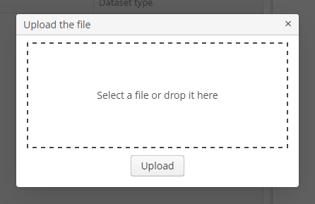
The dialog is opened with the
openWindow()method, in case of successful upload it is closed withCOMMIT_ACTION_ID. You can track the close action of the dialog withCloseListenerorCloseWithCommitListenerand use thegetFileId()andgetFileName()methods to get the UUID and the name of uploaded file. Then you can create aFileDescriptorfor referencing the file from the data model objects or implement any other logic.FileUploadDialog dialog = (FileUploadDialog) openWindow("fileUploadDialog", OpenType.DIALOG); dialog.addCloseWithCommitListener(() -> { UUID fileId = dialog.getFileId(); String fileName = dialog.getFileName(); FileDescriptor fileDescriptor = fileUploadingAPI.getFileDescriptor(fileId, fileName); // your logic here });
The appearance of the Dialogs can be customized using SCSS variables with $cuba-window-modal-* prefix. You can change these variables in the visual editor after creating a theme extension or a custom theme.
3.6.3.2. Notifications
|
This is a legacy API. For new data API available since release 7.0, see Notifications section. |
Notifications can be invoked using showNotification() method of the Frame interface. This interface is implemented by screen controller, so this method can be invoked directly from the controller code.
showNotification() method takes the following parameters:
-
caption- notification text. In case of HTML type (see below), you can format message text using HTML tags. When using HTML, don’t forget to escape data to prevent code injection in the web-client. You can use\ncharacters for line breaks in non-HTML messages. -
description– an optional description displayed under the caption. You can also use\ncharacter or HTML formatting. -
type– notification type. Possible values:-
TRAY,TRAY_HTML- a notification is displayed in the bottom right corner of the application and disappears automatically. -
HUMANIZED,HUMANIZED_HTML– a standard notification displayed in the center of the screen, disappears automatically. -
WARNING,WARNING_HTML– a warning. Disappears when clicked. -
ERROR,ERROR_HTML– a notification about an error. Disappears when clicked.
-
Examples of invoking a notification:
showNotification(getMessage("selectBook.text"), NotificationType.HUMANIZED);
showNotification("Validation error", "<b>Date</b> is incorrect", NotificationType.TRAY_HTML);3.6.4. Actions over Collection (Legacy)
|
This is a legacy API. For new data API available since release 7.0, see List Component Actions. |
For inheritors of ListComponent (Table, GroupTable, TreeTable and Tree) the set of standard actions is defined in ListActionType enumeration; their implementation classes are located in com.haulmont.cuba.gui.components.actions package.
The example of using standard actions in a table:
<table id="usersTable" width="100%">
<actions>
<action id="create"/>
<action id="edit"/>
<action id="remove"/>
<action id="refresh"/>
</actions>
<buttonsPanel>
<button action="usersTable.create"/>
<button action="usersTable.edit"/>
<button action="usersTable.remove"/>
<button action="usersTable.refresh"/>
</buttonsPanel>
<rowsCount/>
<columns>
<column id="login"/>
...
</columns>
<rows datasource="usersDs"/>
</table>These actions are described in details below.
CreateAction
CreateAction – action with create identifier. It is intended to create new entity instance and open its edit screen. If the edit screen successfully commits a new instance to the database, CreateAction adds this new instance to the table data source and makes it selected.
The following specific methods are defined in the CreateAction class:
-
setOpenType()allows you to specify new entity edit screen open mode.THIS_TABby default.Since it is quite often required to open edit screens in another mode (typically,
DIALOG), you can specify anopenTypeattribute with desired value in theactionelement when using declarative creation of thecreateaction. This eliminates the need to obtain action reference in the controller and set this property programmatically. For example:<table id="usersTable"> <actions> <action id="create" openType="DIALOG"/> -
setWindowId()allows you to specify the identifier of the entity edit screen. By default,{entity_name}.editis used, for examplesales$Customer.edit. -
setWindowParams()allows you to set edit screen parameters passed into itsinit()method. The parameters can be further used directly in the datasource query via theparam$prefix or injected into the screen controller using the@WindowParamannotation. -
setWindowParamsSupplier()is different fromsetWindowParams()in that it allows you to get parameter values right before the action is invoked. Supplied parameters are merged with ones set by thesetWindowParams()method and can override them. For example:createAction.setWindowParamsSupplier(() -> { Customer customer = metadata.create(Customer.class); customer.setCategory(/* some value dependent on the current state of the screen */); return ParamsMap.of("customer", customer); }); -
setInitialValues()allows you to set initial values of attributes of the entity being created. It takes aMapobject, where keys are attribute names, and values are attribute values. For example:Map<String, Object> values = new HashMap<>(); values.put("type", CarType.PASSENGER); carCreateAction.setInitialValues(values);An example of
setInitialValues()usage is also provided in the section of development recipes. -
setInitialValuesSupplier()is different fromsetInitialValues()in that it allows you to get values right before the action is invoked. Supplied values are merged with ones set by thesetInitialValues()method and can override them. For example:carCreateAction.setInitialValuesSupplier(() -> ParamsMap.of("type", /* value depends on the current state of the screen */)); -
setBeforeActionPerformedHandler()allows you to provide a handler which will be invoked by the action before its execution. The method should returntrueto proceed with the execution andfalseto abort. For example:customersTableCreate.setBeforeActionPerformedHandler(() -> { showNotification("The new customer instance will be created"); return isValid(); }); -
afterCommit()is invoked by the action after the new entity has been successfully committed and the edit screen has been closed. This method does not have implementation and can be overridden in inheritors to handle this event. -
setAfterCommitHandler()allows you to provide a handler which will be called after the new entity has been successfully committed and the edit screen has been closed. This handler can be used instead of overridingafterCommit()to avoid creating the action subclass. For example:@Named("customersTable.create") private CreateAction customersTableCreate; @Override public void init(Map<String, Object> params) { customersTableCreate.setAfterCommitHandler(new CreateAction.AfterCommitHandler() { @Override public void handle(Entity entity) { showNotification("Committed", NotificationType.HUMANIZED); } }); } -
afterWindowClosed()is the last method invoked by the action after closing the edit screen regardless of whether the new entity has been committed or not. This method does not have implementation and can be overridden in inheritors to handle this event. -
setAfterWindowClosedHandler()allows you to provide a handler which will be called after closing the edit screen regardless of whether the new entity has been committed or not. This handler can be used instead of overridingafterWindowClosed()to avoid creating the action subclass.
EditAction
EditAction is an action with edit identifier, intended to open an edit screen for a selected entity instance. If the edit screen successfully commits the instance to the database, then EditAction updates this instance in the table datasource.
The following specific methods are defined in the EditAction class:
-
setOpenType()allows you to specify entity edit screen open mode.THIS_TABby default.Since it is quite often required to open edit screens in another mode (typically
DIALOG), you can specifyopenTypeattribute with desired value in theactionelement when creating the action declaratively. This eliminates the need to obtain action reference in the controller and set this property programmatically. For example:<table id="usersTable"> <actions> <action id="edit" openType="DIALOG"/> -
setWindowId()allows you to specify entity edit screen identifier.{entity_name}.editis used by default, for example,sales$Customer.edit. -
setWindowParams()allows you to set edit screen parameters, passed to itsinit()method. The parameters can be further used directly in the datasource query via theparam$prefix or injected into the screen controller using the@WindowParamannotation. -
setWindowParamsSupplier()is different fromsetWindowParams()in that it allows you to get parameter values right before the action is invoked. Supplied parameters are merged with ones set by thesetWindowParams()method and can override them. For example:customersTableEdit.setWindowParamsSupplier(() -> ParamsMap.of("category", /* some value dependent on the current state of the screen */)); -
setBeforeActionPerformedHandler()allows you to provide a handler which will be invoked by the action before its execution. The method should returntrueto proceed with the execution andfalseto abort. For example:customersTableEdit.setBeforeActionPerformedHandler(() -> { showNotification("The customer instance will be edited"); return isValid(); }); -
afterCommit()is invoked by the action after the entity has been successfully committed and the edit screen has been closed. This method does not have implementation and can be overridden in inheritors to handle this event. -
setAfterCommitHandler()allows you to provide a handler which will be called after the new entity has been successfully committed and the edit screen has been closed. This handler can be used instead of overridingafterCommit()to avoid creating the action subclass. For example:@Named("customersTable.edit") private EditAction customersTableEdit; @Override public void init(Map<String, Object> params) { customersTableEdit.setAfterCommitHandler(new EditAction.AfterCommitHandler() { @Override public void handle(Entity entity) { showNotification("Committed", NotificationType.HUMANIZED); } }); } -
afterWindowClosed()is the last method invoked by the action after closing the edit screen regardless of whether the edited entity has been committed or not. This method does not have implementation and can be overridden in inheritors to handle this event. -
setAfterWindowClosedHandler()allows you to provide a handler which will be called after closing the edit screen regardless of whether the new entity has been committed or not. This handler can be used instead of overridingafterWindowClosed()to avoid creating the action subclass. -
getBulkEditorIntegration()provides a possibility of bulk editing for the table records. The table should have themultiselectattribute enabled. The BulkEditor component will be opened, if multiple table lines are selected when theEditActionis called.The returned
BulkEditorIntegrationinstance can be further modified by the following methods:-
setOpenType(), -
setExcludePropertiesRegex(), -
setFieldValidators(), -
setModelValidators(), -
setAfterEditCloseHandler().
@Named("clientsTable.edit") private EditAction clientsTableEdit; @Override public void init(Map<String, Object> params) { super.init(params); clientsTableEdit.getBulkEditorIntegration() .setEnabled(true) .setOpenType(WindowManager.OpenType.DIALOG); } -
RemoveAction
RemoveAction - action with remove identifier, intended to remove a selected entity instance.
The following specific methods are defined in the RemoveAction class:
-
setAutocommit()allows you to control the moment of entity removal from the database. By defaultcommit()method is invoked after triggering the action and removing the entity from the datasource. As result, the entity is removed from the database. You can setautocommitproperty into false usingsetAutocommit()method or corresponding parameter of the constructor. In this case you will need to explicitly invoke the datasourcecommit()method to confirm the removal after removing the entity from the datasource.The value of
autocommitdoes not affect datasources in theDatasource.CommitMode.PARENTmode, i.e. the datasources that provide composite entities editing. -
setConfirmationMessage()allows you to set message text for the removal confirmation dialog. -
setConfirmationTitle()allows you to set removal confirmation dialog title. -
setBeforeActionPerformedHandler()allows you to provide a handler which will be invoked by the action before its execution. The method should returntrueto proceed with the execution andfalseto abort. For example:customersTableRemove.setBeforeActionPerformedHandler(() -> { showNotification("The customer instance will be removed"); return isValid(); }); -
afterRemove()is invoked by the action after the entity has been successfully removed. This method does not have implementation and can be overridden. -
setAfterRemoveHandler()allows you to provide a handler which will be called after the new entity has been successfully removed. This handler can be used instead of overridingafterRemove()to avoid creating the action subclass. For example:@Named("customersTable.remove") private RemoveAction customersTableRemove; @Override public void init(Map<String, Object> params) { customersTableRemove.setAfterRemoveHandler(new RemoveAction.AfterRemoveHandler() { @Override public void handle(Set removedItems) { showNotification("Removed", NotificationType.HUMANIZED); } }); }
RefreshAction
RefreshAction - an action with refresh identifier. It is intended to update (reload) entities collection. When triggered, it invokes refresh() method of a datasource associated with the corresponding component.
The following specific methods are defined in the RefreshAction class:
-
setRefreshParams()allows you to set parameters passed into theCollectionDatasource.refresh()method to be used in the query. By default, no parameters are passed. -
setRefreshParamsSupplier()is different fromsetRefreshParams()in that it allows you to get parameter values right before the action is invoked. Supplied parameters are merged with ones set by thesetRefreshParams()method and can override them. For example:customersTableRefresh.setRefreshParamsSupplier(() -> ParamsMap.of("number", /* some value dependent on the current state of the screen */));
AddAction
AddAction – action with add identifier, intended for selecting an existing entity instance and adding it to the collection. When triggered, opens entities lookup screen.
The following specific methods are defined in the AddAction class:
-
setOpenType()allows you to specify entity selection screen open mode.THIS_TABby default.Since it is often required to open the lookup screens in a different mode (usually
DIALOG), theopenTypeattribute can be specified in the action element, when creating theaddaction declaratively. This eliminates the need to get a reference to the action in the controller and set this property programmatically. For example:<table id="usersTable"> <actions> <action id="add" openType="DIALOG"/> -
setWindowId()allows you to specify entity selection screen identifier.{entity_name}.lookupby default, for example,sales$Customer.lookup. If such screen does not exist, attempts to open{entity_name}.browsescreen, for example,sales$Customer.browse. -
setWindowParams()allows you to set selection screen parameters, passed into itsinit()method. The parameters can be further used directly in the datasource query via theparam$prefix or injected into the screen controller using the@WindowParamannotation. -
setWindowParamsSupplier()is different fromsetWindowParams()in that it allows you to get parameter values right before the action is invoked. Supplied parameters are merged with ones set by thesetWindowParams()method and can override them. For example:tableAdd.setWindowParamsSupplier(() -> ParamsMap.of("customer", getItem())); -
setHandler()allows you to set an object implementingWindow.Lookup.Handlerinterface which will be passed to the selection screen. By default,AddAction.DefaultHandlerobject is used. -
setBeforeActionPerformedHandler()allows you to provide a handler which will be invoked by the action before its execution. The method should returntrueto proceed with the execution andfalseto abort. For example:customersTableAdd.setBeforeActionPerformedHandler(() -> { notifications.create() .withCaption("The new customer will be added") .show(); return isValid(); });
ExcludeAction
ExcludeAction - an action with exclude identifier. It allows a user to exclude entity instances from a collection without removing them from the database. The class of this action is an inheritor of RemoveAction, however, when triggered it invokes excludeItem() of CollectionDatasource instead of removeItem(). In addition, for an entity in a nested datasource, the ExcludeAction disconnects the link with the parent entity. Therefore this action can be used for editing one-to-many associations.
The following specific methods are defined in the ExcludeAction class in addition to RemoveAction:
-
setConfirm()– flag to show the removal confirmation dialog. You can also set this property via the action constructor. By default it is set tofalse. -
setBeforeActionPerformedHandler()allows you to provide a handler which will be invoked by the action before its execution. The method should returntrueto proceed with the execution andfalseto abort. For example:customersTableExclude.setBeforeActionPerformedHandler(() -> { showNotification("The selected customer will be excluded"); return isValid(); });
ExcelAction
ExcelAction - an action with excel identifier, intended to export table data into XLS and download the resulting file. You can add this action only to Table, GroupTable and TreeTable components.
When creating the action programmatically, you can set the display parameter with an ExportDisplay interface implementation for file download. Standard implementation is used by default.
The following specific methods are defined in the ExcelAction class:
-
setFileName()- sets the Excel file name without extension. -
getFileName()- returns the Excel file name without extension. -
setBeforeActionPerformedHandler()allows you to provide a handler which will be invoked by the action before its execution. The method should returntrueto proceed with the execution andfalseto abort. For example:customersTableExcel.setBeforeActionPerformedHandler(() -> { showNotification("The selected data will ve downloaded as an XLS file"); return isValid(); });
3.6.5. Actions of the Picker Field (Legacy)
|
This is a legacy API. For new data API available since release 7.0, see Picker Field Actions. |
For PickerField, LookupPickerField and SearchPickerField components, a set of standard actions is defined in the PickerField.ActionType enumeration. Implementations are inner classes of the PickerField interface, which are described in details below.
The example of standard actions usage in a picker component:
<searchPickerField optionsDatasource="coloursDs"
datasource="carDs" property="colour">
<actions>
<action id="clear"/>
<action id="lookup"/>
<action id="open"/>
</actions>
</searchPickerField>LookupAction
LookupAction – action with lookup identifier, intended for selecting an entity instance and setting it as the component’s value. When triggered, it opens an entities lookup screen.
The following specific methods are defined in the LookupAction class:
-
setLookupScreenOpenType()allows you to specify entity selection screen open mode.THIS_TABby default. -
setLookupScreen()allows you to specify entity selection screen identifier.{entity_name}.lookupby default, for example,sales$Customer.lookup. If such screen does not exist, attempts to open{entity_name}.browsescreen, for example,sales$Customer.browse. -
setLookupScreenParams()allows you to set selection screen parameters, passed into itsinit()method. -
afterSelect()is invoked by the action after the selected instance is set as the component’s value. This method does not have implementation and can be overridden. -
afterCloseLookup()is the last method invoked by the action after closing the lookup screen regardless of whether an instance has been selected or not. This method does not have implementation and can be overridden.
ClearAction
ClearAction - an action with clear identifier, intended for clearing (i.e. for setting to null) the value of the component.
OpenAction
OpenAction - action with open identifier, intended for opening an edit screen for the entity instance which is the current value of the component.
The following specific methods are defined in the OpenAction class:
-
setEditScreenOpenType()allows you to specify entity selection screen open mode.THIS_TABby default. -
setEditScreen()allows you to specify entity edit screen identifier.{entity_name}.editscreen is used by default, for example,sales$Customer.edit. -
setEditScreenParams()allows you to set edit screen parameters, passed to its `init()`method. -
afterWindowClosed()is invoked by the action after closing the edit screen. This method does not have implementation and can be overridden in inheritors to handle this event.
3.6.6. screens.xml (Legacy)
|
Screens written with the new API available since v.7.0 do not need registration. They are discovered by the |
Files of this type are used in the generic user interface of the Web Client for registration of screen XML-descriptors.
XML schema is available at http://schemas.haulmont.com/cuba/7.2/screens.xsd.
The file location is specified in the cuba.windowConfig application property. When you create a new project in Studio, it creates the web-screens.xml file in the root package of the web module, for example modules/web/src/com/company/sample/web-screens.xml.
The file has the following structure:
screen-config – the root element. It contains the following elements:
-
screen– screen descriptor.screenattributes:-
id– screen identifier used to reference this screen from the application code (e.g. in theFrame.openWindow()and other methods) and in the menu.xml. -
template– path to screen’s XML-descriptor. Resources interface rules apply to loading the descriptor. -
class– if thetemplateattribute is not set, this attribute should contain the name of the class implementing eitherCallableorRunnable.In case of
Callable, thecall()method should return an instance ofWindow, which will be returned to the invoking code as the result of callingWindowManager.openWindow(). The class may contain a constructor with string parameters, defined by the nestedparamelement (see below). -
agent- if multiple templates are registered with the sameid, this attribute is used to choose a template to open. There are three standard agent types:DESKTOP,TABLET,PHONE. They enable selection of a screen template depending on the current device and display parameters. See Screen Agent for details. -
multipleOpen– optional attribute, allowing a screen to be opened multiple times. If set tofalseor not defined and the screen with this identifier has already been opened in the main window, the system will show the existing screen instead of opening a new one. If set totrue, any number of screen instances can be opened.
screenelements:-
param– defines a screen parameter submitted as a map to the controller'sinit()method. Parameters, passed to theopenWindow()methods by the invoking code, override the matching parameters set inscreens.xml.paramattributes:-
name– parameter name. -
value– parameter value. Stringstrueandfalseare converted into the correspondingBooleanvalues.
-
-
-
include– includes a different file, e.g.screens.xml.includeattributes:-
file– path to a file according to the rules of the Resources interface.
-
Example of a screens.xml file:
<screen-config xmlns="http://schemas.haulmont.com/cuba/screens.xsd">
<screen id="sales$Customer.lookup" template="/com/sample/sales/gui/customer/customer-browse.xml"/>
<screen id="sales$Customer.edit" template="/com/sample/sales/gui/customer/customer-edit.xml"/>
<screen id="sales$Order.lookup" template="/com/sample/sales/gui/order/order-browse.xml"/>
<screen id="sales$Order.edit" template="/com/sample/sales/gui/order/order-edit.xml"/>
</screen-config>3.7. Frontend User Interface
The Frontend UI is a CUBA Platform block serving as an alternative to the Generic UI. Whereas Generic UI is designed primarily for internal (back-office) users, Frontend UI is targeted for external users and is more flexible in terms of layout customization. It also uses different technologies which are more familiar to frontend developers, and allows easy integration of UI libraries and components from vast JavaScript ecosystem. However, it requires better knowledge of modern frontend stack.
Frontend UI can be powered by one of the following technologies:
-
React
-
React Native
-
Polymer (deprecated)
-
Your favorite framework (such as Angular or Vue): you can use a framework-agnostic TypeScript SDK for that
We provide several tools and libraries that you can use in order to build your Frontend UI application (or frontend client as we call it):
- Frontend Generator
-
The Frontend Generator is a scaffolding tool that can be used to speed up the process of developing a frontend client. It can be used from CUBA Studio or as a standalone CLI tool. It can generate a starter app and add the pieces you need such as entity browser and editor screens. It can also generate a TypeScript SDK.
- Component and utility libraries for React and React Native
-
There are two libraries for React and React Native powered frontend clients that are both used in the code generated by the Frontend Generator and can be utilized on its own. One is CUBA React Core which is responsible for core functionalities such as working with CUBA entities. It is used by both React and React Native clients. The other is CUBA React UI which contains the UI components. It uses Ant Design UI kit and is used by the React client.
- CUBA REST JS library
-
CUBA REST JS is a library that handles the interactions with Generic REST API. Frontend clients use Generic REST API to communicate with the Middleware. However, you don’t have to manually send the requests from your code. If your frontend client is based on React or React Native then CUBA React Core components will often handle this communication for you utilizing CUBA REST JS under the hood. If you are using a different framework or need more flexibility, you can use CUBA REST JS directly.
- TypeScript SDK
-
TypeScript SDK is generated by the Frontend Generator and is a TypeScript representation of project’s entities, views and facades to access REST services. The SDK can be used to develop a frontend client using your favorite framework (if it happens not to be one of the frameworks supported out of the box) as well as for Node.js-based BFF (Backend for Frontend) development.
To learn more about these tools and developing a frontend client see the Frontend UI manual.
3.7.1. Adding Frontend UI using Studio
See Frontend UI section of the CUBA Studio User Guide.
3.7.2. React-based User Interface
See Frontend UI manual.
3.7.3. Polymer-based User Interface (Deprecated)
|
Starting from the version 7.2 of the Platform the Polymer UI is deprecated. Use React UI. |
See Frontend UI manual.
3.8. Portal Components
In this manual, a portal is a client block, which is designed to:
-
provide an alternative web-interface, which is usually intended for users outside of the organization;
-
provide an interface for integration with mobile applications and third-party systems.
A specific application may contain several portal modules intended for different purposes; for example, in an application, which automates business tasks, it can be a public web site for customers, an integration module for a mobile application for ordering a taxi, an integration module for a mobile application for drivers, etc.
The cuba application component includes the portal module, which is a template to create portals in projects. It provides basic functionality of the client block to work with Middleware. Besides, the universal REST API, included to the portal module as a dependency, is turned on by default.
Below is an overview of the main components provided by the platform in the portal module.
-
PortalAppContextLoader– the AppContext loader; must be registered in thelistenerelement of theweb.xmlfile. -
PortalDispatcherServlet– the central servlet that distributes requests to Spring MVC controllers, for both the web interface and REST API. The set of Spring context configuration files is defined by the cuba.dispatcherSpringContextConfig application property. This servlet must be registered inweb.xmland mapped to the root URL of the web application. -
App– the object that contains information on the current HTTP request and the reference toConnectionobject. TheAppinstance can be obtained in the application code by calling theApp.getInstance()static method. -
Connection– allows a user to log in/out of the Middleware. -
PortalSession– the object of a user session that is specific for the portal. It is returned by the UserSessionSource infrastructure interface and by thePortalSessionProvider.getUserSession()static method.It has an additional
isAuthenticated()method, which returnstrueif this session belongs to a non-anonymous user, i.e. a user explicitly registered with the login and password.When a user first accesses the portal, the
SecurityContextHandlerInterceptorcreates an anonymous session for him (or ties to an already existing one) by registering at Middleware with a user name specified in the cuba.portal.anonymousUserLogin application property. The registration is made by loginTrusted() method, so it is necessary to set the cuba.trustedClientPassword property in the portal block as well. Thus, any anonymous user of the portal can work with Middleware withcuba.portal.anonymousUserLoginuser rights.If the portal contains user registration page with name and password
SecurityContextHandlerInterceptorassigns the session of the explicitly registered user to the execution thread afterConnection.login()is executed, and the work with Middleware is performed on this user’s behalf. -
PortalLogoutHandler– handles the navigation to the logout page. It must be registered in theportal-security-spring.xmlproject file.
3.9. Platform Features
This section provides overview on various optional features provided by the platform.
3.9.1. Dynamic Attributes
Dynamic attributes are additional entity attributes, that can be added without changing the database schema and restarting the application. Dynamic attributes are usually used to define new entity properties at deployment or production stage.
CUBA dynamic attributes implement the Entity-Attribute-Value model.
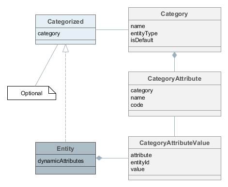
Figure 32. Dynamic Attributes Classes Diagram
-
Category- defines a category of objects and the corresponding set of dynamic attributes. The category must be assigned to some entity type.For example, there is an entity of the Car type. We can define two categories for it: Truck and Passenger. The Truck category will contain Load Capacity and Body Type attributes, and the Passenger category – Number of Seats and Child Seat.
-
CategoryAttribute- defines a dynamic attribute related to some category. Each attribute describes a single field of a definite type. The requiredCodefield contains the system name of the attribute. TheNamefield contains the human-readable attribute name. -
CategoryAttributeValue- dynamic attribute value for a particular entity instance. Dynamic attribute values are physically stored in the dedicatedSYS_ATTR_VALUEtable. Each table record has a reference to some entity (ENTITY_IDcolumn).
An entity instance can have dynamic attributes of all categories related to the entity type. So if you create two categories of the Car entity mentioned above, you will be able to specify any dynamic attribute from both categories for a Car instance. If you want to be able to classify an entity instance as belonging to a single category (a car can be either truck or passenger), the entity must implement Categorized interface. In this case an entity instance will have the reference to a category, and dynamic attributes from this category only.
Loading and saving of dynamic attribute values is handled by DataManager. The setLoadDynamicAttributes() method of LoadContext and the dynamicAttributes() method of the fluent API are used to indicate that dynamic attributes should be loaded for entity instances. By default, dynamic attributes are not loaded. At the same time, DataManager always saves dynamic attributes contained in entity instances passed to commit().
Dynamic attribute values are available through getValue() / setValue() methods for any persistent entity inherited from BaseGenericIdEntity. An attribute code with the + prefix should be passed to these methods, for example:
Car entity = dataManager.load(Car.class).id(carId).dynamicAttributes(true).one;
Double capacity = entity.getValue("+loadCapacity");
entity.setValue("+loadCapacity", capacity + 10);
dataManager.commit(entity);In fact, the direct access to attribute values in the application code is rarely needed. Any dynamic attribute can be automatically displayed in any Table or Form component bound to a data container with the entity for which the dynamic attribute was created. The attribute editor described in the next section allows you to specify screens and components that should show the attribute.
User permissions to access dynamic attributes can be set in the security role editor in the same way as for regular attributes. Dynamic attributes are displayed with the + prefix.
3.9.1.1. Managing Dynamic Attributes
You can manage dynamic attributes in the Administration > Dynamic Attributes screen. The screen has a list of categories on the left and attributes belonging to the selected category on the right.
In order to create a dynamic attribute for an entity, first create a category for it. The Default checkbox in the category editor indicates that this category will be automatically selected for a new instance if the entity implements the Categorized interface. If the entity does not implement Categorized, the checkbox value is not used and you can create either a single category for the entity, or multiple categories - all their attributes will be displayed according to the visibility settings.
After making changes in the dynamic attributes configuration, click Apply settings button in the categories browser. Changes can also be applied via Administration > JMX Console by calling the clearDynamicAttributesCache() method of the app-core.cuba:type=CachingFacade JMX bean.
Below is an example of the category editor screen:
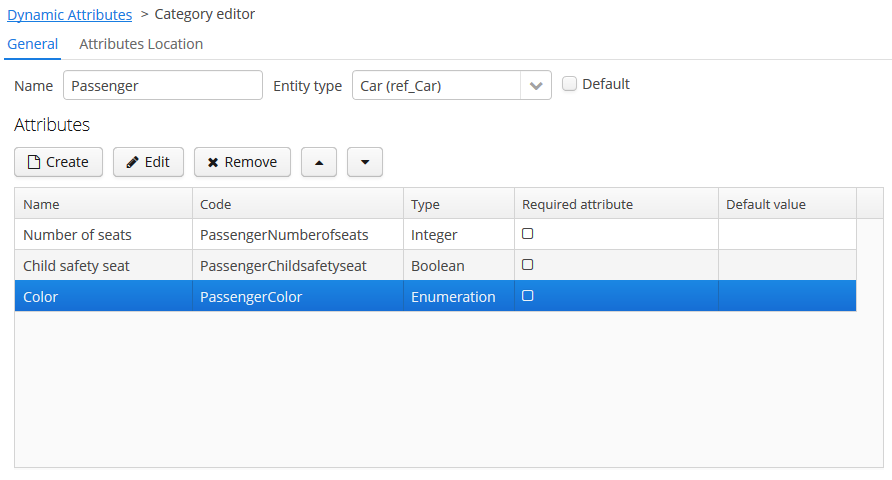
Figure 33. Category Editor
The Name localization groupbox is shown on the category editor screen if the application supports more than one language. It enables setting the localized values of category names for each available locale.
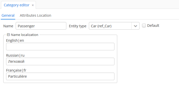
Figure 34. Category name localization
On the Attributes Location tab, you can set the location of each dynamic attribute inside the DynamicAttributesPanel.
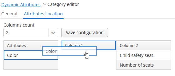
Figure 35. Setting the location of attributes
Specify the number of columns in the Columns count drop-down list. To change the position of an attribute, drag it from the attribute list to the desired column and the desired line. You can add empty cells or change the order of the attributes. After making the changes, click on the Save configuration button.
Location of the attributes in the DynamicAttributesPanel of the entity editor:
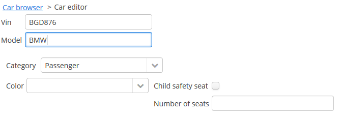
Dynamic attribute editor enables setting the name, system code, description, value type, the default value of the attribute and the validation script.
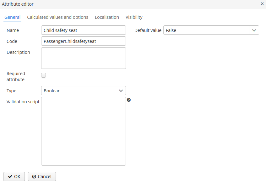
Figure 36. Dynamic Attribute Editor
For all value types, except Boolean, there is a Width field available to set up the field width in Form in pixels or as a percentage. If the Width field is empty, its assumed value is 100%.
For all value types, except Boolean, there is also an Is collection checkbox available. It allows you to create multi-valued dynamic attributes of a selected type.
For all numeric value types: Double, Fixed-point number, Integer – the following fields are available:
-
Minimum value – when you enter an attribute value, it checks that the value must be greater than or equal to the specified minimum value.
-
Maximum value – when you enter an attribute value, it checks that the value must be less than or equal to the specified maximum value.
For the Fixed-point number value type, the Number format pattern field is available in which you can specify a format pattern. The pattern is set according to the rules described in DecimalFormat.
For all value types, you can specify a script in the Validation script field to validate the value entered by the user. The validation logic is set in the Groovy script. If Groovy validation fails, the script should return an error message. Otherwise, the script should return nothing or may return null. The checked value is available in the script in the value variable. The error message uses a Groovy string; the $value key can be used in the message to generate the result.
For example:
if (!value.startsWith("correctValue")) return "the value '\$value' is incorrect"For the Enumeration value type, the set of named values is defined in the Enumeration field via the list editor.
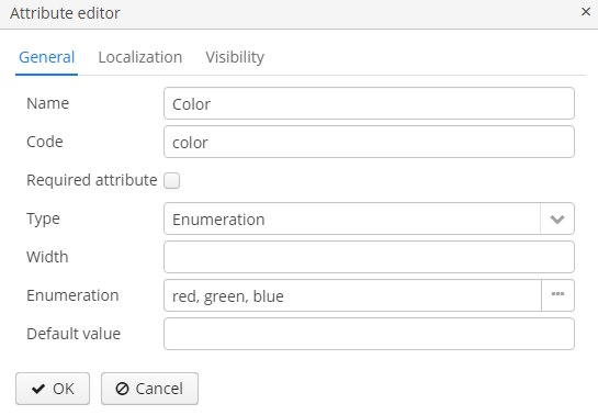
Figure 37. Dynamic Attribute Editor for Enumeration type
Each enumeration value can be localized to the languages, available for the application.
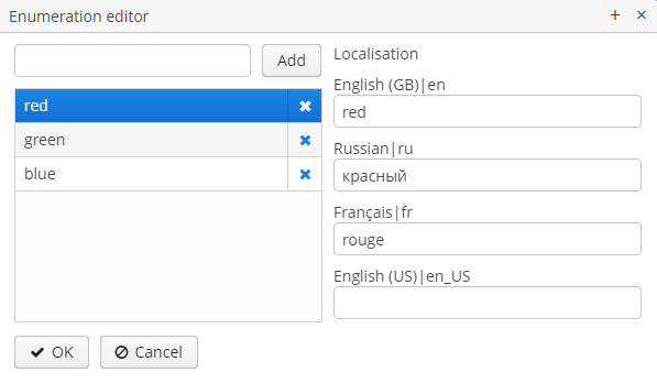
Figure 38. Dynamic Attribute Localization for Enumeration type
For String, Double, Entity, Fixed-point number and Integer data types the checkbox Lookup field is available. If this checkbox is set, the user can select the attribute value from the drop-down list. The list of valid values can be configured on the Calculated values and options tab. For the Entity data type Where and Join clauses are configured.
Consider the Calculated values and options tab. In the Attribute depends on field, you can specify which attributes the current attribute depends on. When changing the value of one of these attributes, either the script for calculating the attribute value or the script for calculating the list of possible values will be recalculated.
The Groovy script for calculating the attribute value is specified in the Recalculation value script field. The script must return a new parameter value. The following variables are passed to the script:
-
entity– the edited entity; -
dynamicAttributes– a map where thekey– the attribute code,value– the value of the dynamic attribute.
Figure 39. Recalculation value script
Example of a recalculation script using the dynamicAttributes map:
if (dynamicAttributes['PassengerNumberofseats'] > 9) return 'Bus' else return 'Passenger car'The script will be evaluated each time the value of one of the attributes which the attribute depends on is changed.
If the script is defined, the attribute input field will be non-editable.
Recalculation works only with the following UI components: Form, DynamicAttributesPanel.
The Options type field determines the type of the options loader and is required if the Lookup field checkbox has been set on the General tab. If the checkbox is not set, the Options type field is unavailable.
Available option loader types: Groovy, SQL, JPQL (only for Entity data type).
-
The Groovy options loader loads a list of values using the Groovy script. The
entityvariable is passed to the script where you can access the attributes of the entity (including dynamic attributes). An example script for an attribute of typeString: Figure 40. The script for the Groovy options loader
 -
The SQL options loader loads a list of values using a SQL script. You can access the entity id using the
${entity}variable. To access entity parameters, use the${entity.<field>}construction, wherefieldis the name of the entity parameter. The+prefix is used to access the dynamic attributes of an entity, such as${entity.+<field>}. Script sample (here we access to the entity and dynamic attributeCategorytype):select name from DYNAMICATTRIBUTESLOADER_TAG where CUSTOMER_ID = ${entity} and NAME = ${entity.+Categorytype} -
The JPQL option loader applies only to a dynamic attribute of the
Entitytype. JPQL conditions are specified in the JoinClause and Where Clause fields. Also, you can use the Constraint Wizard, which enables the visual creation of the JPQL conditions. You can use{entity}and{entity.<field>}variables in JPQL parameters.
Localization is supported for all types of dynamic attributes:
Figure 41. Dynamic Attribute Localization
- Visibility of attributes
-
A dynamic attribute also has visibility settings which define the screens where it should be displayed. By default, the attribute is not shown.
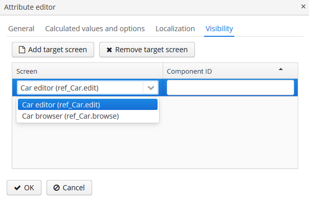 Figure 42. Dynamic Attribute Visibility Settings
In addition to the screen, you can also specify a component in which the attribute should appear (for example, for screens where several Form components show the fields of the same entity).
If the attribute is marked as visible on a screen, it will automatically appear in all forms and tables displaying entities of the corresponding type on the screen.
Access to dynamic attributes can also be restricted by user role settings. Security settings for dynamic attributes are similar to those for regular attributes.
Dynamic attributes can be added to a screen manually. In order to do this, add
dynamicAttributes="true"attribute to the data loader and use attribute’s code with+prefix when binding UI components to it:<data> <instance id="carDc" class="com.company.app.entity.Car" view="_local"> <loader id="carDl" dynamicAttributes="true"/> </instance> </data> <layout> <form id="form" dataContainer="carDc"> <!--...--> <textField property="+PassengerNumberofseats"/> </form>
3.9.1.2. DynamicAttributesPanel
If an entity implements com.haulmont.cuba.core.entity.Categorized interface, you can use DynamicAttributesPanel component for displaying dynamic attributes of this entity. This component allows a user to select a category for the particular entity instance and specify values of dynamic attributes of this category.
In order to use the DynamicAttributesPanel component in an edit screen, do the following:
-
Include the
categoryattribute to the view of your categorized entity:<view entity="ref_Car" name="car-view" extends="_local"> <property name="category" view="_minimal"/> </view> -
Declare an InstanceContainer in the
datasection:<data> <instance id="carDc" class="com.company.ref.entity.Car" view="car-view"> <loader dynamicAttributes="true"/> </instance> </data>Set the
dynamicAttributesparameter of the loader totrueto load the entity’s dynamic attributes. Dynamic attributes are not loaded by default. -
Now, the
dynamicAttributesPanelvisual component may be included in the XML-descriptor of the screen:<dynamicAttributesPanel dataContainer="carDc" cols="2" rows="2" width="AUTO"/>You can specify the number of columns to display dynamic attributes using the
colsparameter. Or you can use therowsparameter to specify the number of rows (in this case, the number of columns will be calculated automatically). By default, all attributes will be displayed in one column.On the Attributes Location tab of the category editor, you can more flexibly customize the position of the dynamic attributes. In this case, the values of the
colsandrowsparameters will be ignored.
3.9.2. Email Sending
The platform provides email sending facilities with the following features:
-
Synchronous or asynchronous sending. In case of synchronous sending, the calling code waits till the message is sent to the SMTP server. In case of asynchronous sending, the message is persisted to the database and the control is returned immediately to the calling code. The actual sending is done later by a scheduled task.
-
Reliable tracking of message sending timestamp or errors in the database for both synchronous and asynchronous modes.
-
User interface to search and view information about sent messages, including all message attributes and content, sending status and the number of attempts.
3.9.2.1. Sending Methods
To send an email, the EmailerAPI bean should be used at the Middleware, and the EmailService service – at the client tier.
The basic methods of these components are described below:
-
sendEmail()– synchronous message sending. The calling code is blocked while sending the message to the SMTP server.The message can be transmitted in the form of a set of parameters (the comma-separated list of recipients, subject, content, array of attachments), and in the form of a special
EmailInfoobject, which encapsulates all this information and allows you to explicitly set the sender’s address and to form the message body using a FreeMarker template.EmailExceptionmay be thrown during synchronous sending, containing the information on the recipient addresses, where delivery has failed, and the corresponding error messages.During the execution of the method, a
SendingMessageinstance is created in the database for each recipient. It has the initialSendingStatus.SENDINGstatus, andSendingStatus.SENTafter successful sending. In case of a message sending error, the message status changes toSendingStatus.NOTSENT. -
sendEmailAsync()– asynchronous message sending. This method returns the list (by the number of recipients) ofSendingMessageinstances inSendingStatus.QUEUEstatus, which were created in the database. The actual sending is performed with the subsequent call of theEmailerAPI.processQueuedEmails()method, which should be invoked from a scheduled task with the desired frequency.
3.9.2.2. Email Attachments
The EmailAttachment object is a wrapper that holds the attachment as a byte array (the data field), the file name (the name field), and, if necessary, the attachment identifier which is unique for this message (the optional but useful contentId field).
The attachment identifier may be used to insert images in the message body. For this, a unique contentId (for example, myPic) is specified when creating EmailAttachment. Expression like cid:myPic can be used as a path to insert the attachment in the message body. So, to insert an image you can specify the following HTML element:
<img src="cid:myPic"/>3.9.2.3. Configuring Email Sending Parameters
Email sending parameters can be configured using the application properties listed below. All of them are runtime parameters and are stored in the database, but can be overridden for a specific Middleware block in its app.properties file.
All email sending parameters are available via the EmailerConfig configuration interface.
-
cuba.email.fromAddress– the default sender’s address. It is used if theEmailInfo.fromattribute is not specified.Default value:
DoNotReply@localhost
-
cuba.email.smtpHost– the address of the SMTP server.Default value:
test.host
-
cuba.email.smtpPort– the port of the SMTP server.Default value:
25
-
cuba.email.smtpAuthRequiredflags whether the SMTP server requires authentication. It corresponds to themail.smtp.authparameter, which is passed at the creation of thejavax.mail.Sessionobject.Default value:
false
-
cuba.email.smtpSslEnabledflags whetherSSLprotocol is enabled. It corresponds to themail.transport.protocolparameter with thesmtpsvalue, which is passed at the creation of thejavax.mail.Sessionobject.Default value:
false
-
cuba.email.smtpStarttlsEnable– flags the use of theSTARTTLScommand when authenticating on the SMTP server. It corresponds to themail.smtp.starttls.enableparameter, which is passed at the creation of thejavax.mail.Sessionobject.Default value:
false
-
cuba.email.smtpUser– the user name for SMTP server authentication.
-
cuba.email.smtpPassword– the user password for SMTP server authentication.
-
cuba.email.delayCallCount– is used in asynchronous sending of emails to skip first few calls ofEmailManager.queueEmailsToSend()after server startup to reduce the load during application initialization. Email sending will start with the next call.Default value:
2
-
cuba.email.messageQueueCapacity– for asynchronous sending, the maximum number of messages read from the queue and sent in one call ofEmailManager.queueEmailsToSend().Default value:
100
-
cuba.email.defaultSendingAttemptsCountfor asynchronous sending, the default number of attempts to send an email. It is used if theattemptsCountparameter is not specified when callingEmailer.sendEmailAsync().Default value:
10
-
cuba.email.maxSendingTimeSec– the maximum expected time in seconds, which is required to send an email to the SMTP server. It is used for asynchronous sending to optimize the selection ofSendingMessageobjects from the DB queue.Default value: 120
-
cuba.email.sendAllToAdmin– indicates that all messages should be sent to the cuba.email.adminAddress address, regardless of the specified recipient’s address. It is recommended to use this parameter during system development and debugging.Default value:
false
-
cuba.email.adminAddress– the address, to which all messages are sent if thecuba.email.sendAllToAdminproperty is switched on.Default value:
admin@localhost
-
cuba.emailerUserLogin– the login of system user, used by asynchronous email sending code to be able to persist the information to the database. It is recommended to create a separate user (for example,emailer) without a password, so that it will be impossible to log in under their name via user interface. This is also convenient to search for messages related to email sending in the server log.Default value:
admin
-
cuba.email.exceptionReportEmailTemplateBody- path to the exception report email body*.gsp-template location.The templates are based on Groovy
SimpleTemplateEnginesyntax, thus you can use Groovy blocks inside of the template content:-
toHtml()method converts the string to HTML string by escaping and replacing special symbols, -
timestamp- last attempt date to send the email, -
errorMessage- the message of error, -
stacktrace- stack trace of the error, -
user- a reference to theUserobject.
Example of a template file:
<html> <body> <p>${timestamp}</p> <p>${toHtml(errorMessage)}</p> <p>${toHtml(stacktrace)}</p> <p>User login: ${user.getLogin()}</p> </body> </html> -
-
cuba.email.allowutf8- if set totrue, allow UTF-8 encoding in message headers, e.g., in addresses. This property should only be set if the mail server also supports UTF-8. It corresponds to themail.mime.allowutf8parameter, which is passed at the creation of thejavax.mail.Sessionobject.Default value:
false
-
cuba.email.exceptionReportEmailTemplateSubject- path to the exception report email subject*.gsptemplate location.Example of a template file:
[${systemId}] [${userLogin}] Exception Report
You can also use properties from JavaMail API, adding them to the app.properties file of the core module. The mail.* properties are passed at the creation of the javax.mail.Session object.
You can view the current parameter values and send a test message using the app-core.cuba:type=Emailer JMX bean.
3.9.2.4. Email Sending Guide
This section contains a practical guide on sending emails using the CUBA email sending mechanism.
Let’s consider the following task:
-
There are the
NewsItementity and theNewsItemEditscreen. -
The
NewsItementity contains the following attributes:date,caption,content. -
We want to send emails to some addresses every time a new instance of
NewsItemis created through theNewsItemEditscreen. An email should containNewsItem.captionas a subject and the message body should be created from a template includingNewsItem.content.
-
Add the following code to
NewsItemEdit.java:@UiController("sample_NewsItem.edit") @UiDescriptor("news-item-edit.xml") @EditedEntityContainer("newsItemDc") @LoadDataBeforeShow public class NewsItemEdit extends StandardEditor<NewsItem> { private boolean justCreated; (1) @Inject protected EmailService emailService; @Inject protected Dialogs dialogs; @Subscribe public void onInitEntity(InitEntityEvent<NewsItem> event) { (2) justCreated = true; } @Subscribe(target = Target.DATA_CONTEXT) public void onPostCommit(DataContext.PostCommitEvent event) { (3) if (justCreated) { dialogs.createOptionDialog() (4) .withCaption("Email") .withMessage("Send the news item by email?") .withType(Dialogs.MessageType.CONFIRMATION) .withActions( new DialogAction(DialogAction.Type.YES) { @Override public void actionPerform(Component component) { sendByEmail(); } }, new DialogAction(DialogAction.Type.NO) ) .show(); } } private void sendByEmail() { (5) NewsItem newsItem = getEditedEntity(); EmailInfo emailInfo = EmailInfoBuilder.create() .setAddresses("john.doe@company.com,jane.roe@company.com") (6) .setCaption(newsItem.getCaption()) (7) .setFrom(null) (8) .setTemplatePath("com/company/demo/templates/news_item.txt") (9) .setTemplateParameters(Collections.singletonMap("newsItem", newsItem)) (10) .build(); emailService.sendEmailAsync(emailInfo); } }1 - indicates that a new item was created in this editor 2 - this method is invoked when a new item is initialized 3 - this method is invoked after commit of data context 4 - if a new entity was saved to the database, ask a user about sending an email 5 - queues an email for sending asynchronously 6 - recipients 7 - subject 8 - the fromaddress will be taken from the cuba.email.fromAddress application property9 - body template path 10 - template parameters As you can see, the
sendByEmail()method invokes theEmailServiceand passes theEmailInfoinstance describing the the messages. The body of the messages will be created on the basis of thenews_item.txttemplate. -
Create the body template file
news_item.txtin thecom.company.demo.templatespackage of the core module:The company news: ${newsItem.content}This is a Freemarker template which will use parameters passed in the
EmailInfoinstance (newsItemin this case). -
Launch the application, open the
NewsItementity browser and click Create. The editor screen will be opened. Fill in the fields and press OK. The confirmation dialog with the question about sending emails will be shown. Click Yes. -
Go to the Administration > Email History screen of your application. You will see two records (by the number of recipients) with the
Queuestatus. It means that the emails are in the queue and not yet sent. -
To process the queue, set up a scheduled task. Go to the Administration > Scheduled Tasks screen of your application. Create a new task and set the following parameters:
-
Bean Name -
cuba_Emailer -
Method Name -
processQueuedEmails() -
Singleton - yes (this is important only for a cluster of middleware servers)
-
Period, sec - 10
Save the task and click Activate on it.
If you did not set up the scheduled tasks execution for this project before, nothing will happen on this stage - the task will not be executed until you start the whole scheduling mechanism.
-
-
Open the
modules/core/src/app.propertiesfile and add the following property:cuba.schedulingActive = trueRestart the application server. The scheduling mechanism is now active and invokes the email queue processing.
-
Go to the Administration > Email History screen. The status of the emails will be
Sentif they were successfully sent, or, most probably,SendingorQueueotherwise. In the latter case, you can open the application log inbuild/tomcat/logs/app.logand find out the reason. The email sending mechanism will take several (10 by default) attempts to send the messages and if they fail, set the status toNot sent. -
The most obvious reason that emails cannot be sent is that you have not set up the SMTP server parameters. You can set the parameters in the database through the
app-core.cuba:type=EmailerJMX bean or in the application properties file of your middleware. Let us consider the latter. Open themodules/core/src/app.propertiesfile and add the required parameters:cuba.email.fromAddress = do-not-reply@company.com cuba.email.smtpHost = mail.company.comRestart the application server. Go to Administration > JMX Console, find the
EmailerJMX bean and try to send a test email to yourself using thesendTestEmail()operation. -
Now your sending mechanism is set up correctly, but it will not send the messages in the
Not sentstate. So you have to create anotherNewsItemin the editor screen. Do it and then watch how the status of new messages in the Email History screen will change toSent.
3.9.3. Entity Inspector
The entity inspector enables working with any application objects without having to create dedicated screens. The inspector dynamically generates the screens to browse and edit the instances of the selected entity.
This gives the system administrator an opportunity to review and edit the data that is not accessible from standard screens due to their design, and to create the data model and main menu sections linked to the entity inspector only, at prototyping stage.
The entry point for the inspector is the com/haulmont/cuba/gui/app/core/entityinspector/entity-inspector-browse.xml screen.
If a String-type parameter named entity with an entity name has been passed to the screen, the inspector will show a list of entities with the abilities for filtering, selection and editing. The parameter can be specified when registering the screen in screens.xml, for example:
screens.xml
<screen id="sales$Product.lookup"
template="/com/haulmont/cuba/gui/app/core/entityinspector/entity-inspector-browse.xml">
<param name="entity"
value="sales$Product"/>
</screen>menu.xml
<item id="sales$Product.lookup"/>Screen identifier defined as {entity_name}.lookup allows PickerField and LookupPickerField components to use this screen within the PickerField.LookupAction standard action.
Generally, the screen may be called without any parameters. In this case, the top part will contain an entity selection field. In the cuba application component, the inspector screen is registered with the entityInspector.browse identifier, so it can be simply referenced in a menu item:
<item id="entityInspector.browse"/>- Export and Import Using the Entity Inspector
-
Using the Entity Inspector, you can export and import any of the simple entities, including the system entities(for example, scheduled tasks, locks).
After selecting the entity type, the Entity Inspector screen displays actions for exporting the selected entity instances as ZIP or JSON and importing them to the system (using the Export/Import buttons).
Keep in mind that when an entity is exported using the Entity Inspector, reference attributes with the one-to-many or many-to-many relationship type cannot be exported. Import and export using the Entity Inspector work for simple cases, but if you need to export complex object graphs, you’ll have to do in your application using the EntityImportExportService.
3.9.4. Entity Log
This mechanism tracks entity persistence at the entity listeners level, i.e. it is guaranteed to track all changes passing through persistent context of the EntityManager. Direct changes to entities in the database using SQL, including the ones performed using NativeQuery or QueryRunner, are not tracked.
Modified entity instances are passed to registerCreate(), registerModify() and registerDelete() methods of the EntityLogAPI bean before they are saved to the database. Each method has auto parameter, allowing separation of automatic logs added by entity listeners from manual logs added by calling these methods from the application code. When these methods are called from entity listeners the value of auto parameter is true.
The logs contain information about the time of modification, the user who has modified the entity, and the new values of the changed attributes. Log entries are stored in the SEC_ENTITY_LOG table corresponding to the EntityLogItem entity. Changed attribute values are stored in the CHANGES column and are converted to instances of EntityLogAttr entity when they are loaded by the Middleware.
3.9.4.1. Setting Up Entity Log
The simplest way to set up the entity log is using the Administration > Entity Log > Setup application screen.
You can also set up Entity Log by entering some records in the database, if you want to include the configuration to the database initialization scripts.
Logging is configured using the LoggedEntity and LoggedAttribute entities corresponding to SEC_LOGGED_ENTITY and SEC_LOGGED_ATTR tables.
LoggedEntity defines the types of entities that should be logged. LoggedEntity has the following attributes:
-
name(NAME column) – the name of the entity meta-class, for example,sales_Customer. -
auto(AUTO column) – defines if the system should log the changes when EntityLogAPI is called withauto = trueparameter (i.e. called by entity listeners). -
manual(MANUAL column) – defines if the system should log the changes whenEntityLogAPIis called withauto = falseparameter.
LoggedAttribute defines the entity attribute to be logged and contains a link to the LoggedEntity and the attribute name.
To set up logging for a certain entity, the corresponding entries should be added into the SEC_LOGGED_ENTITY and SEC_LOGGED_ATTR tables. For example, logging the changes to name and grade attributes of the Customer entity can be enabled using:
insert into SEC_LOGGED_ENTITY (ID, CREATE_TS, CREATED_BY, NAME, AUTO, MANUAL)
values ('25eeb644-e609-11e1-9ada-3860770d7eaf', now(), 'admin', 'sales_Customer', true, true);
insert into SEC_LOGGED_ATTR (ID, CREATE_TS, CREATED_BY, ENTITY_ID, NAME)
values (newid(), now(), 'admin', '25eeb644-e609-11e1-9ada-3860770d7eaf', 'name');
insert into SEC_LOGGED_ATTR (ID, CREATE_TS, CREATED_BY, ENTITY_ID, NAME)
values (newid(), now(), 'admin', '25eeb644-e609-11e1-9ada-3860770d7eaf', 'grade');The logging mechanism is activated by default. If you want to stop it, set the Enabled attribute of the app-core.cuba:type=EntityLog JMX bean false and then invoke the its invalidateCache() operation. Alternatively, set the cuba.entityLog.enabled application property to false and restart the server.
3.9.4.2. Viewing the Entity Log
The entity log content can be viewed on a dedicated screen available at Administration > Entity Log.
The change log for a certain entity can also be accessed from any application screen by loading a collection of EntityLogItem and the associated EntityLogAttr instances into the data containers and creating the visual components connected to these containers.
The example below shows the fragment of the screen XML descriptor of a Customer entity which has a tab with the entity log content.
The fragment of the customer-edit.xml
<data>
<instance id="customerDc"
class="com.company.sample.entity.Customer"
view="customer-view">
<loader id="customerDl"/>
</instance>
<collection id="entitylogsDc"
class="com.haulmont.cuba.security.entity.EntityLogItem"
view="logView" >
<loader id="entityLogItemsDl">
<query><![CDATA[select i from sec$EntityLog i where i.entityRef.entityId = :customer
order by i.eventTs]]>
</query>
</loader>
<collection id="logAttrDc"
property="attributes"/>
</collection>
</data>
<layout>
<tabSheet id="tabSheet">
<tab id="propertyTab">
<!--...-->
</tab>
<tab id="logTab">
<table id="logTable"
dataContainer="entitylogsDc"
width="100%"
height="100%">
<columns>
<column id="eventTs"/>
<column id="user.login"/>
<column id="type"/>
</columns>
</table>
<table id="attrTable"
height="100%"
width="100%"
dataContainer="logAttrDc">
<columns>
<column id="name"/>
<column id="oldValue"/>
<column id="value"/>
</columns>
</table>
</tab>
</tabSheet>
</layout>Let us have a look on the Customer screen controller:
The fragment of the Customer screen controller
@UiController("sample_Customer.edit")
@UiDescriptor("customer-edit.xml")
@EditedEntityContainer("customerDc")
public class CustomerEdit extends StandardEditor<Customer> {
@Inject
private InstanceLoader<Customer> customerDl;
@Inject
private CollectionLoader<EntityLogItem> entityLogItemsDl;
@Subscribe
private void onBeforeShow(BeforeShowEvent event) { (1)
customerDl.load();
}
@Subscribe(id = "customerDc", target = Target.DATA_CONTAINER)
private void onCustomerDcItemChange(InstanceContainer.ItemChangeEvent<Customer> event) { (2)
entityLogItemsDl.setParameter("customer", event.getItem().getId());
entityLogItemsDl.load();
}
}Notice that the screen has no @LoadDataBeforeShow annotation, because loading is triggered explicitly.
| 1 | − the onBeforeShow method loads data before showing the screen. |
| 2 | − in the ItemChangeEvent handler of the customerDc container, a parameter is set to the dependent loader and it is triggered. |
3.9.5. Entity Snapshots
The entity saving mechanism, much like the entity log, is intended to track data changes at runtime. It has the following distinct features:
-
The whole state (or snapshot) of a graph of entities defined by a specified view is saved.
-
Snapshot saving mechanism is explicitly called from the application code.
-
The platform allows the snapshots to be viewed and compared.
3.9.5.1. Saving Snapshots
In order to save a snapshot of a given graph of entities, you need to call the EntitySnapshotService.createSnapshot() method passing the entity which is an entry point to the graph and the view describing the graph. The snapshot will be created using the loaded entities without any calls to the database. As a result, the snapshot will not contain the fields that are not included in the view used to load the entity.
The graph of Java objects is converted into XML and saved in the SYS_ENTITY_SNAPSHOT table (corresponding to the EntitySnapshot enitity) together with the link to the primary entity.
Usually, snapshots need to be saved after editor screen commit. This may be achieved by creating the listener the onAfterCommitChanges of the screen controller, for example:
public class OrderEdit extends StandardEditor<Order> {
@Inject
InstanceContainer <Order> orderDc;
@Inject
protected EntitySnapshotService entitySnapshotService;
...
@Subscribe
public void onAfterCommitChanges(AfterCommitChangesEvent event) {
entitySnapshotService.createSnapshot(orderDc.getItem(), orderDc.getView());
}
}3.9.5.2. Viewing Snapshots
Viewing snapshots for arbitrary entities is possible using the com/haulmont/cuba/gui/app/core/entitydiff/diff-view.xml frame. For example:
<frame id="diffFrame"
src="/com/haulmont/cuba/gui/app/core/entitydiff/diff-view.xml"
width="100%"
height="100%"/>The snapshots should be loaded into the frame from the edit screen controller:
public class CustomerEditor extends AbstractEditor<Customer> {
@Inject
private EntityStates entityStates;
@Inject
protected EntityDiffViewer diffFrame;
...
@Override
protected void postInit() {
if (!entityStates.isNew(getItem())) {
diffFrame.loadVersions(getItem());
}
}
}The diff-view.xml frame shows the list of snapshots for the given entity, with an ability to compare them. The view for each snapshot includes the user, date and time. When a snapshot is selected from the list, the changes will be displayed compared to the previous snapshot. All attributes are marked as changed for the first snapshot. Selecting two snapshots shows the results of the comparison in a table.
The comparison table shows attribute names and their new values. When a row is selected, the detailed information on attribute changes across two snapshots is shown. Reference fields are displayed according to their instance name. When comparing collections, the new and removed elements are highlighted with green and red color respectively. Collection elements with changed attributes are displayed without highlighting. Changes to element positions are not recorded.
3.9.6. Entity Statistics
The entity statistics mechanism provides the information on the current number of entity instances in the database. This data is used to automatically select the best lookup strategy for linked entities and to limit the size of search results displayed in UI screens.
Statistics is stored in the SYS_ENTITY_STATISTICS table which is mapped to the EntityStatistics entity. It can be updated automatically using the refreshStatistics() method of the PersistenceManagerMBean JMX bean. If you pass an entity name as a parameter, the statistics will be collected for the given entity, otherwise - for all entities. If you want to update the statistics regularly, create a scheduled task invoking this method. Keep it mind that the collection process will execute select count(*) for each entity and can put significant load on the database.
Programmatic access to entity statistics is available via PersistenceManagerAPI interface on the middle tier and PersistenceManagerService on the the client tier. Statistics is cached in memory, so any direct changes to statistics in the database will be applied only after the server restart or after calling the PersistenceManagerMBean.flushStatisticsCache() method.
The EntityStatistics attributes are described below.
-
name(NAMEcolumn) – the name of the entity meta-class, for example,sales_Customer. -
instanceCount(INSTANCE_COUNTcolumn) – the approximate number of entity instances. -
fetchUI(FETCH_UIcolumn) – the size of the data displayed on a page when extracting entity lists.For example, the Filter component uses this number in the Show N rows field.
-
maxFetchUI(MAX_FETCH_UIcolumn) – the maximum number of entity instances that can be extracted and passed to the client tier.This limit is applied when showing entity lists in such components as LookupField or LookupPickerField, as well as tables without a filter, when no limitations are applied to the connected data loader via
CollectionLoader.setMaxResults(). In this case the data loader itself limits the number of extracted instances tomaxFetchUI. -
lookupScreenThreshold(LOOKUP_SCREEN_THRESHOLDcolumn) – the threshold, measured in number of entities, which determines when lookup screens should be used instead of dropdowns for entity lookup.The Filter component takes this parameter into account when choosing filter parameters. Until the threshold is reached, the system uses the LookupField component, and once the threshold is exceeded, the PickerField component is used. Hence, if lookup screens should be used for a specific entity in a filter parameter, it is possible to set the value of
lookupScreenThresholdto a value lower thaninstanceCount.
PersistenceManagerMBean JMX bean enables setting default values for all of the parameters mentioned above via DefaultFetchUI, DefaultMaxFetchUI, DefaultLookupScreenThreshold attributes. The system will use the corresponding default values when an entity has no statistics, which is a common case.
Besides, PersistenceManagerMBean.enterStatistics() method allows a user to enter statistics data for an entity. For example, the following parameters should be passed to the method to set a default page size to 1,000 and maximum number of loaded into LookupField instances to 30,000:
entityName: sales_Customer
fetchUI: 1000
maxFetchUI: 30000Another example: suppose that you have a filter condition by the Customer entity, and you want to use a lookup screen instead of dropdown list when selecting Customer in the condition parameter. Then invoke the enterStatistics() method with the following parameters:
entityName: sales_Customer
instanceCount: 2
lookupScreenThreshold: 1Here we ignore the actual number of Customer records in the database and manually specify that the threshold is always exceeded.
3.9.7. Export and Import Entities in JSON
The platform provides an API for exporting and importing graphs of entities in JSON format. It is available on Middleware via the EntityImportExportAPI interface and on the client tier via EntityImportExportService. These interfaces have an identical set of methods which are described below. The export/import implementation delegates to the EntitySerializationAPI interface which can also be used directly.
-
exportEntitiesToJSON()- serializes a collection of entities to JSON.@Inject private EntityImportExportService entityImportExportService; @Inject private GroupDatasource<Customer, UUID> customersDs; ... String jsonFromDs = entityImportExportService.exportEntitiesToJSON(customersDs.getItems()); -
exportEntitiesToZIP()- serializes a collection of entities to JSON and packs the JSON file into ZIP archive. In the following example, the ZIP archive is saved to the file storage using the FileLoader interface:@Inject private EntityImportExportService entityImportExportService; @Inject private GroupDatasource<Customer, UUID> customersDs; @Inject private Metadata metadata; @Inject private DataManager dataManager; ... byte[] array = entityImportExportService.exportEntitiesToZIP(customersDs.getItems()); FileDescriptor descriptor = metadata.create(FileDescriptor.class); descriptor.setName("customersDs.zip"); descriptor.setExtension("zip"); descriptor.setSize((long) array.length); descriptor.setCreateDate(new Date()); try { fileLoader.saveStream(descriptor, () -> new ByteArrayInputStream(array)); } catch (FileStorageException e) { throw new RuntimeException(e); } dataManager.commit(descriptor); -
importEntitiesFromJSON()- deserializes the JSON and persists deserialized entities according to the rules, described by theentityImportViewparameter (see JavaDocs on theEntityImportViewclass). If an entity is not present in the database, it will be created. Otherwise the fields of the existing entity that are specified in theentityImportViewwill be updated. -
importEntitiesFromZIP()- reads a ZIP archive that contains a JSON file, deserializes the JSON and persists deserialized entities like theimportEntitiesFromJSON()method.@Inject private EntityImportExportService entityImportExportService; @Inject private FileLoader fileLoader; private FileDescriptor descriptor; ... EntityImportView view = new EntityImportView(Customer.class); view.addLocalProperties(); try { byte[] array = IOUtils.toByteArray(fileLoader.openStream(descriptor)); Collection<Entity> collection = entityImportExportService.importEntitiesFromZIP(array, view); } catch (FileStorageException e) { throw new RuntimeException(e); }
3.9.8. File Storage
File storage enables uploading, storing and downloading arbitrary files associated with the entities. In the standard implementation, the files are stored outside of the main database using a specialized structure within the file system.
File storage mechanism includes the following parts:
-
FileDescriptorentity – the descriptor of the uploaded file (not to be confused withjava.io.FileDescriptor) enables referencing the file from the data model objects. -
FileStorageAPIinterface – provides access to the file storage at the middle tier. Its main methods are:-
saveStream()– saves the contents of the file passed as theInputStreamaccording to the specifiedFileDescriptor. -
openStream()– returns the contents of the file defined by theFileDescriptorin the form of an openedInputStream.
-
-
FileUploadControllerclass – a Spring MVC controller, which enables sending files from the Client to the Middleware with HTTP POST requests. -
FileDownloadControllerclass – Spring MVC controller which enables retrieving files from the Middleware to the Client with HTTP GET requests. -
FileUpload and FileMultiUpload visual components – enable uploading files from the user’s computer to the client tier of the application and then transferring them to the Middleware.
-
FileUploadingAPIinterface – temporary storage for files uploaded to the client tier. It is used for uploading files to the client tier by the visual components mentioned above. The application code can useputFileIntoStorage()method for moving a file into the persistent storage of the Middleware. -
FileLoader - an interface for working with the file storage using the same set of methods on both middle and client tiers.
-
ExportDisplay– client tier interface allowing downloading various application resources to the user’s computer. Files can be retrieved from persistent storage using theshow()method, which requires aFileDescriptor. An instance ofExportDisplaymay be obtained either by calling theAppConfig.createExportDisplay()static method, or through injection into the controller class.
|
File transfer between the user’s computer and the storage in both directions is always performed by copying data between input and output streams. Files are never fully loaded into memory at any application level, which enables transferring files of almost any size. |
3.9.8.1. Uploading Files
Files from the user’s computer can be uploaded into the storage using the FileUpload and FileMultiUpload components. Usage examples are provided in this manual in the appropriate component descriptions.
|
See Working with Images in CUBA applications guide to learn how to upload and display images in the application. |
FileUpload component is also available within the ready-to-use FileUploadDialog window designed to load files in the temporary storage.
The FileUploadDialog window provides the base functionality for loading files into the temporary storage. It contains the drop zone for drag-and-dropping files from outside of the browser and the upload button.
The dialog is implemented with the legacy screen API and can be used as follows:
@Inject
private Screens screens;
@Inject
private FileUploadingAPI fileUploadingAPI;
@Inject
private DataManager dataManager;
@Subscribe("showUploadDialogBtn")
protected void onShowUploadDialogBtnClick(Button.ClickEvent event) {
FileUploadDialog dialog = (FileUploadDialog) screens.create("fileUploadDialog", OpenMode.DIALOG);
dialog.addCloseWithCommitListener(() -> {
UUID fileId = dialog.getFileId();
String fileName = dialog.getFileName();
File file = fileUploadingAPI.getFile(fileId); (1)
FileDescriptor fileDescriptor = fileUploadingAPI.getFileDescriptor(fileId, fileName); (2)
try {
fileUploadingAPI.putFileIntoStorage(fileId, fileDescriptor); (3)
dataManager.commit(fileDescriptor); (4)
} catch (FileStorageException e) {
throw new RuntimeException(e);
}
});
screens.show(dialog);
}| 1 | - obtaining the java.io.File object which points to the file in the file system of the Web Client block. You may need it if you want to process the file somehow instead of just putting it into the file storage. |
| 2 | - creating a FileDescriptor entity. |
| 3 | - uploading file to the file storage of the middle tier. |
| 4 | - saving the FileDescriptor entity. |
After a successful upload, the dialog is closed with COMMIT_ACTION_ID. In a CloseWithCommitListener, use the getFileId() and getFileName() methods to get the UUID and the name of uploaded file. Then you can get the file itself or create a FileDescriptor and upload the file to the file storage, or implement any other logic.
The temporary client-level storage (FileUploadingAPI) stores temporary files in the folder defined by cuba.tempDir application property. Temporary files are deleted automatically in the following cases:
-
If
FileUploadFieldis used inIMMEDIATEmode. -
If you use the
FileUploadingAPI.putFileIntoStorage(UUID, FileDescriptor)method.
Otherwise, you should delete the temporary files using the FileUploadingAPI.deleteFile(UUID) method.
Temporary files can remain in the folder in case of any failures. The clearTempDirectory() method of the cuba_FileUploading bean is invoked periodically by the scheduler defined in the cuba-web-spring.xml file. By default it runs on Tuesday, Thursday, Saturday midnight and deletes all files older than 2 days.
3.9.8.2. Downloading Files
Files can be downloaded from the file storage to the user’s computer by using the ExportDisplay interface. It can be obtained by calling the AppConfig.createExportDisplay() static method or via injection in the controller class. For example:
AppConfig.createExportDisplay(this).show(fileDescriptor);The show() method accepts an optional ExportFormat type parameter, which defines the type of the content and the file extension. If the format has not been provided, the extension is retrieved from the FileDescriptor, and the content type is set to application/octet-stream.
The file extension defines whether the file is downloaded via the browser’s standard open/save dialog (Content-Disposition = attachment), or if the browser will attempt to show the file in the browser window (Content-Disposition = inline). The list of extensions for files that should be shown in the browser window is defined by the cuba.web.viewFileExtensions application property.
ExportDisplay also enables downloading of arbitrary data if ByteArrayDataProvider is used as a parameter of the show() method. For example:
public class SampleScreen extends AbstractWindow {
@Inject
private ExportDisplay exportDisplay;
public void onDownloadBtnClick(Component source) {
String html = "<html><head title='Test'></head><body><h1>Test</h1></body></html>";
byte[] bytes;
try {
bytes = html.getBytes("UTF-8");
} catch (UnsupportedEncodingException e) {
throw new RuntimeException(e);
}
exportDisplay.show(new ByteArrayDataProvider(bytes), "test.html", ExportFormat.HTML);
}
}3.9.8.3. FileLoader Interface
The FileLoader interface allows you to work with file storage using the same set of methods on both middle and client tiers. Uploading and downloading of files is performed using streams:
-
saveStream()– saves anInputStreamcontents into file storage. -
openStream()– returns an input stream to load a file contents from file storage.
|
Both client-side and server-side implementations of |
As an example of using FileLoader let’s consider a simple task of saving a user input into the text file and displaying the file content in another field on the same screen.
The screen contains two textArea fields. Suppose the user inputs text in the first textArea, clicks the buttonIn below, and the text is saved to the FileStorage. The second textArea will display the content of the saved file on buttonOut click.
Below is the fragment of the screen XML descriptor:
<hbox margin="true"
spacing="true">
<vbox spacing="true">
<textArea id="textAreaIn"/>
<button id="buttonIn"
caption="Save text in file"
invoke="onButtonInClick"/>
</vbox>
<vbox spacing="true">
<textArea id="textAreaOut"
editable="false"/>
<button id="buttonOut"
caption="Show the saved text"
invoke="onButtonOutClick"/>
</vbox>
</hbox>The screen controller contains two methods invoked on buttons click:
-
In the
onButtonInClick()method we create a byte array from the firsttextAreainput. Then we create aFileDescriptorobject and define the new file name, extension, size, and creation date with its attributes.Then we save the new file with the
saveStream()method ofFileLoader, passing theFileDescriptorto it and providing the file content with anInputStreamsupplier. We also commit theFileDescriptorto the data store using theDataManagerinterface. -
In the
onButtonOutClick()method we extract the content of the saved file using theopenStream()method of theFileLoader. Then we display the content of the file in the secondtextArea.
import com.haulmont.cuba.core.entity.FileDescriptor;
import com.haulmont.cuba.core.global.DataManager;
import com.haulmont.cuba.core.global.FileLoader;
import com.haulmont.cuba.core.global.FileStorageException;
import com.haulmont.cuba.core.global.Metadata;
import com.haulmont.cuba.gui.components.AbstractWindow;
import com.haulmont.cuba.gui.components.TextArea;
import com.haulmont.cuba.gui.upload.FileUploadingAPI;
import org.apache.commons.io.IOUtils;
import javax.inject.Inject;
import java.io.ByteArrayInputStream;
import java.io.IOException;
import java.io.InputStream;
import java.util.Date;
public class FileLoaderScreen extends AbstractWindow {
@Inject
private Metadata metadata;
@Inject
private FileLoader fileLoader;
@Inject
private DataManager dataManager;
@Inject
private TextArea textAreaIn;
@Inject
private TextArea textAreaOut;
private FileDescriptor fileDescriptor;
public void onButtonInClick() {
byte[] bytes = textAreaIn.getRawValue().getBytes();
fileDescriptor = metadata.create(FileDescriptor.class);
fileDescriptor.setName("Input.txt");
fileDescriptor.setExtension("txt");
fileDescriptor.setSize((long) bytes.length);
fileDescriptor.setCreateDate(new Date());
try {
fileLoader.saveStream(fileDescriptor, () -> new ByteArrayInputStream(bytes));
} catch (FileStorageException e) {
throw new RuntimeException(e);
}
dataManager.commit(fileDescriptor);
}
public void onButtonOutClick() {
try {
InputStream inputStream = fileLoader.openStream(fileDescriptor);
textAreaOut.setValue(IOUtils.toString(inputStream, StandardCharsets.UTF_8));
} catch (FileStorageException | IOException e) {
throw new RuntimeException(e);
}
}
}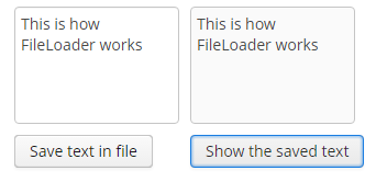
3.9.8.4. Standard File Storage Implementation
The standard implementation stores files in a dedicated folder structure within one or several file locations.
The roots of the structure can be defined in the cuba.fileStorageDir application property in the format of comma-separated paths list. For example:
cuba.fileStorageDir=/work/sales/filestorage,/mnt/backup/filestorageIf the property is not defined, the storage will be located in the filestorage sub-folder of the Middleware’s work directory. This folder is tomcat/work/app-core/filestorage in standard Tomcat deployment.
With several locations defined, the storage behaves as follows:
-
First folder in the list is considered as primary, others – as backup.
-
Stored files are first placed in the primary folder, and then copied to all of the backup directories.
The system checks that each folder is accessible before storing a file. If the primary directory is not accessible, the system throws an exception without storing the file. If any of the backup directories are not accessible, the file gets stored in available ones and the corresponding error is logged.
-
The files are read from the primary directory.
If the primary directory is not accessible, the system reads files from the first available backup directory containing the required files. A corresponding error is logged.
The storage folder structure is organized in the following way:
-
There are three levels of subdirectories representing the files upload date – year, month, and day.
-
The actual files are saved in the
daydirectory. The file names match the identifiers of the correspondingFileDescriptorobjects. The file extension matches that of the source file. -
The root folder of the structure contains a
storage.logfile with the information on each stored file, including the user and upload time. This log is not required for operation of the storage mechanism, but it could be useful for troubleshooting.
The app-core.cuba:type=FileStorage JMX bean displays the current set of storage roots and offers the following methods for troubleshooting:
-
findOrphanDescriptors()– finds all instances ofFileDescriptorin the database that do not have a matching file in the storage. -
findOrphanFiles()– finds all files in the storage that do not have a correspondingFileDescriptorinstance in the database.
3.9.8.5. Amazon S3 File Storage Implementation
The standard file storage implementation can be replaced by a cloud storage service. We recommend to use separate cloud file storage services for cloud deployments which, commonly, don’t guarantee the persistence of external files on their hard drives.
The AWS Filestorage add-on provides support of Amazon S3 file storage service out-of-the-box. To support other services, you need to implement your custom logic.
To use Amazon S3 support in your application follow installation and configuration instructions in README.
The storage folder structure is organized similarly to the standard implementation.
3.9.9. Folders Panel
The folders panel provides quick access to frequently used information. It is a panel on the left side of the main application window containing a hierarchical structure of folders. Clicking on folders shows the corresponding system screens with certain parameters.
At the moment of writing, the panel is available for the Web Client only.
The platform supports three types of folders: application folders, search folders, and record sets.
-
Application folders:
-
Open screens with or without a filter.
-
The set of folders depends on the current user session. Folder visibility is defined by a Groovy script.
-
Application folders can be created and changed only by users with special permissions.
-
Folder headers may show the record count calculated by a Groovy script.
-
Folder headers are updated on timer events, which means that record count and display style for each folder can be updated.
-
-
Search folders:
-
Open screens with a filter.
-
Search folders can be local or global, accessible only by the user who created them or by all users, respectively.
-
Local folders can be created by any user, while global are created only by users with special permissions.
-
-
Record sets:
Application folders are displayed at the top of the panel as a separate folder tree. Search folders and record sets are displayed at the bottom of the panel in a combined tree. To enable the display of folders pane, you should:
-
Set the cuba.web.foldersPaneEnabled property to
true. -
Extend the main screen using the Main screen with top menu template in Studio screen creation wizard. This template includes a special
FoldersPanecomponent.
Each folder in the folders panel can have an icon on the left. Set the cuba.web.showFolderIcons property to true to enable this feature. In this case, the standard icons will be used.
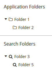
Figure 43. Application and search folders with standard icons
To set other icons, use the setFolderIconProvider() method of the FoldersPane component. Below is an example of using a function in the setOptionIconProvider() method in the custom main screen. The "category" icon should be for application folders; else, the "tag" icon should be installed.
foldersPane.setFolderIconProvider(e -> {
if (e instanceof AppFolder) {
return "icons/category.png";
}
return "icons/tag.png";
});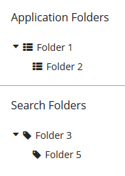
Figure 44. Application and search folders with custom icons
To restore the standard icons, pass a null value to the setFolderIconProvider() method.
The following application properties can influence the functionality of the folder panel:
3.9.9.1. Application Folders
Creating application folders requires special permissions Create/modify application folders (cuba.gui.appFolder.global). Such permission is set in the role edit screen on the Specific tab.
A simple application folder can be created via the folder panel context menu. Such folder will not be connected to the system screens and can be only used to group other folders within a folder tree.
A folder that opens a screen with a filter can be created as follows:
-
Open a screen and filter the records as necessary.
-
Select Save as application folder option in the Filter… button menu.
-
Fill in the folder attributes in the Add dialog:
-
Folder name.
-
Screen Caption – a string to be added to the window title when opening it from the folder.
-
Parent folder – determines the location of the new folder in the folder tree.
-
Visibility script – a Groovy script defining folder visibility, executed at the start of user session.
The script should return a
Boolean. The folder is visible, if the script is not defined or returnstrueornull. Example of a Groovy script:userSession.currentOrSubstitutedUser.login == 'admin' -
Quantity script – a Groovy script defining the record count and display style for a folder. Executed at the start of the user session and on timer.
The script should return a numeric value, the integer part of which will be used as the record count value. If the script is not defined or returns
null, the counter will not be displayed. In addition to the returned value, the script can also set thestylevariable, which will be used as folder display style. Example of a Groovy script:def em = persistence.getEntityManager() def q = em.createQuery('select count(o) from sales_Order o') def count = q.getSingleResult() style = count > 0 ? 'emphasized' : null return countIn order for the style to be displayed, the application theme should contain this style for the
v-tree-nodeelement incuba-folders-pane, for example:.c-folders-pane .v-tree-node.emphasized { font-weight: bold; } -
Order No – the folder’s order number in the folder tree.
-
Scripts can use the following variables defined in the groovy.lang.Binding context:
-
folder– an instance ofAppFolderentity for which the script is executed. -
userSession– instance of UserSession for current user session. -
persistence– implementation of the Persistence interface. -
metadata– implementation of the Metadata interface.
The platform uses the same instance of groovy.lang.Binding for all scripts when the folders are being updated. So it is possible to pass variables between them in order to eliminate duplicate requests and increase performance.
Script sources can be stored within the attributes of the AppFolder entity or in separate files. In the latter case, the attribute should include a file path with a mandatory ".groovy" extension, as required by the Resources interface. If an attribute contains a string ending with ".groovy", the script will be loaded from the corresponding file; otherwise, the attribute content itself will be used as a script.
Application folders are instances of the AppFolder entity and are stored in the related SYS_FOLDER and SYS_APP_FOLDER tables.
3.9.9.2. Search Folders
Search folders can be created by the users similar to application folders. Group folders are created directly via the context menu of the folder panel. The folders connected to screens are created from the Filter… button menu, using the Save as search folder option.
Creating global search folders, requires the user to have Create/modify global search folders permission (cuba.gui.searchFolder.global). Such permission is set in the role edit screen on the Specific tab.
Search folder’s filter can be edited once the folder is created by opening the folder and changing the Folder:{folder name} filter. Saving the filter will change the folder filter as well.
Search folders are instances of the SearchFolder entity stored in the related SYS_FOLDER and SEC_SEARCH_FOLDER tables.
3.9.9.3. Record Sets
In order to use record sets with a screen, follow the steps below.
For example:
<layout>
<filter id="customerFilter" dataLoader="customersDl"
applyTo="customersTable"/>
<groupTable id="customersTable" dataContainer="customersDc">
<actions>
<action id="addToSet" type="addToSet"/>
...
</actions>
<buttonsPanel>
<button action="customersTable.addToSet"/>
...
</buttonsPanel>When the screen displays some set, i.e. it is opened by clicking on a set in the folders panel, the table automatically shows Add to current set / Remove from current set actions in the context menu. If the table includes buttonsPanel (as in the example above), the corresponding table buttons are also shown.
Record sets are the instances of the SearchFolder entity stored in the related SYS_FOLDER and SEC_SEARCH_FOLDER tables.
3.9.10. Information about Software Components
The platform provides an ability to register the information about third party software components used in the application (credits) and to display this information in the UI. The information includes a software component name, a website link and the license text.
Application components of the platform contain their own files with descriptions, like com/haulmont/cuba/credits.xml, com/haulmont/reports/credits.xml and so on. The cuba.creditsConfig application property can be used to specify a description file of the application.
The structure of the credits.xml file is as follows:
-
The
itemselement lists the used libraries with license texts included either as an embeddedlicenseelement, or as alicenseattribute with a link to the text in thelicensessection.It is possible to reference licenses declared in the current file as well as any other file declared in
cuba.creditsConfigvariable prior to the current one. -
The
licenseselement lists the texts of general licenses used (e.g. LGPL).
The entire list of third-party software components can be displayed using the com/haulmont/cuba/gui/app/core/credits/credits-frame.xml frame, which loads the information from the files defined in the cuba.creditsConfig property. An example of the frame within a screen:
<dialogMode width="500" height="400"/>
<layout expand="creditsBox">
<groupBox id="creditsBox"
caption="msg://credits"
width="100%">
<frame id="credits"
src="/com/haulmont/cuba/gui/app/core/credits/credits-frame.xml"
width="100%"
height="100%"/>
</groupBox>
</layout>If the dialog mode (WindowManager.OpenType.DIALOG) is used when opening the screen that contains the frame, the height must be specified; otherwise, the scrolling may work not correctly. See the dialogMode element in the example above.
3.9.11. Integration with MyBatis
MyBatis framework offers wider capabilities for running SQL and mapping query results to objects than ORM native query or QueryRunner.
Follow the steps below to set up integration with MyBatis in a CUBA project.
-
Create UUID type handler class in the root package of the core module.
import com.haulmont.cuba.core.global.UuidProvider; import org.apache.ibatis.type.JdbcType; import org.apache.ibatis.type.TypeHandler; import java.sql.*; public class UUIDTypeHandler implements TypeHandler { @Override public void setParameter(PreparedStatement ps, int i, Object parameter, JdbcType jdbcType) throws SQLException { ps.setObject(i, parameter, Types.OTHER); } @Override public Object getResult(ResultSet rs, String columnName) throws SQLException { String val = rs.getString(columnName); if (val != null) { return UuidProvider.fromString(val); } else { return null; } } @Override public Object getResult(ResultSet rs, int columnIndex) throws SQLException { String val = rs.getString(columnIndex); if (val != null) { return UuidProvider.fromString(val); } else { return null; } } @Override public Object getResult(CallableStatement cs, int columnIndex) throws SQLException { String val = cs.getString(columnIndex); if (val != null) { return UuidProvider.fromString(val); } else { return null; } } } -
Create
mybatis.xmlconfiguration file in the core module next to spring.xml with a correct reference toUUIDTypeHandler:<!DOCTYPE configuration PUBLIC "-//mybatis.org//DTD Config 3.0//EN" "http://mybatis.org/dtd/mybatis-3-config.dtd"> <configuration> <settings> <setting name="lazyLoadingEnabled" value="false"/> </settings> <typeHandlers> <typeHandler javaType="java.util.UUID" handler="com.company.demo.core.UUIDTypeHandler"/> </typeHandlers> </configuration> -
Add the following beans into
spring.xmlfile to use MyBatis in the project:<bean id="sqlSessionFactory" class="org.mybatis.spring.SqlSessionFactoryBean"> <property name="dataSource" ref="cubaDataSource"/> <property name="configLocation" value="com/company/demo/mybatis.xml"/> <property name="mapperLocations" value="com/company/demo/core/sqlmap/*.xml"/> </bean> <bean class="org.mybatis.spring.mapper.MapperScannerConfigurer"> <property name="basePackage" value="com/company/demo.core.dao"/> <property name="sqlSessionFactory" ref="sqlSessionFactory"/> </bean> <bean id="sqlSession" class="org.mybatis.spring.SqlSessionTemplate"> <constructor-arg index="0" ref="sqlSessionFactory" /> </bean>The
sqlSessionFactorybean provides the reference to the createdmybatis.xml.The
MapperLocationsparameter defines a path tomapperLocationsmapping files (according to the rules ofResourceLoaderSpring interface). -
Finally, add MyBatis dependencies to the
coremodule in build.gradle:compile('org.mybatis:mybatis:3.2.8') compile('org.mybatis:mybatis-spring:1.2.5')
Below is an example of a mapping file for loading an instance of Order together with a related Customer and a collection of Order items:
<?xml version="1.0" encoding="UTF-8" ?>
<!DOCTYPE mapper PUBLIC "-//mybatis.org//DTD Mapper 3.0//EN" "http://mybatis.org/dtd/mybatis-3-mapper.dtd">
<mapper namespace="com.sample.sales">
<select id="selectOrder" resultMap="orderResultMap">
select
o.ID as order_id,
o.DATE as order_date,
o.AMOUNT as order_amount,
c.ID as customer_id,
c.NAME as customer_name,
c.EMAIL as customer_email,
i.ID as item_id,
i.QUANTITY as item_quantity,
p.ID as product_id,
p.NAME as product_name
from
SALES_ORDER o
left join SALES_CUSTOMER c on c.ID = o.CUSTOMER_ID
left join SALES_ITEM i on i.ORDER_ID = o.id and i.DELETE_TS is null
left join SALES_PRODUCT p on p.ID = i.PRODUCT_ID
where
c.id = #{id}
</select>
<resultMap id="orderResultMap" type="com.sample.sales.entity.Order">
<id property="id" column="order_id"/>
<result property="date" column="order_date"/>
<result property="amount" column="order_amount"/>
<association property="customer" column="customer_id" javaType="com.sample.sales.entity.Customer">
<id property="id" column="customer_id"/>
<result property="name" column="customer_name"/>
<result property="email" column="customer_email"/>
</association>
<collection property="items" ofType="com.sample.sales.entity.Item">
<id property="id" column="item_id"/>
<result property="quantity" column="item_quantity"/>
<association property="product" column="product_id" javaType="com.sample.sales.entity.Product">
<id property="id" column="product_id"/>
<result property="name" column="product_name"/>
</association>
</collection>
</resultMap>
</mapper>The following code can be used to retrieve query results from the example above:
try (Transaction tx = persistence.createTransaction()) {
SqlSession sqlSession = AppBeans.get("sqlSession");
Order order = (Order) sqlSession.selectOne("com.sample.sales.selectOrder", orderId);
tx.commit();
}3.9.12. Pessimistic Locking
Pessimistic locking should be used when there is a high probability of simultaneous editing of a single entity instance. In such cases the standard optimistic locking, based on entity versioning, usually creates too many collisions.
Pessimistic locking explicitly locks an entity instance when it is opened in the editor. As a result, only one user can edit this particular entity instance in a given moment of time.
Pessimistic locking mechanism can also be used to manage simultaneous execution of arbitrary processes. The key benefit is that the locks are distributed, since they are replicated in the Middleware cluster. More information is available in JavaDocs for the LockManagerAPI and LockService interfaces.
Pessimistic locking can be enabled for any entity class on application development or production stage using Administration > Locks > Setup screen, or as follows:
-
Insert a new record with the following field values into the SYS_LOCK_CONFIG table with the following field values:
-
ID – an arbitrary UUID-type identifier.
-
NAME – the name of the object to be locked. For an entity, it should be the name of its meta class.
-
TIMEOUT_SEC – lock expiration timeout in seconds.
Example:
insert into sys_lock_config (id, create_ts, name, timeout_sec) values (newid(), current_timestamp, 'sales_Order', 300) -
-
Restart the server or call
reloadConfiguration()method of theapp-core.cuba:type=LockManagerJMX bean.
Current state of locks can be tracked via the app-core.cuba:type=LockManager JMX bean or through the Administration > Locks screen. This screen also enables unlocking of any object.
3.9.13. Running SQL Using QueryRunner
QueryRunner is a class designed to run SQL. It should be used instead of JDBC in all cases where using plain SQL is necessary and working with the ORM tools of the same purpose is not desired.
The platform’s QueryRunner is a variant of Apache DbUtils QueryRunner with the added ability to use Java Generics.
Usage example:
QueryRunner runner = new QueryRunner(persistence.getDataSource());
try {
Set<String> scripts = runner.query("select SCRIPT_NAME from SYS_DB_CHANGELOG",
new ResultSetHandler<Set<String>>() {
public Set<String> handle(ResultSet rs) throws SQLException {
Set<String> rows = new HashSet<String>();
while (rs.next()) {
rows.add(rs.getString(1));
}
return rows;
}
});
return scripts;
} catch (SQLException e) {
throw new RuntimeException(e);
}There are two ways of using QueryRunner: current transaction or separate transaction in autocommit mode.
-
To run a query in current transaction
QueryRunnermust be instantiated using a parameterless constructor. Then,query()orupdate()methods should be called with aConnectionparameter retrieved viaEntityManager.getConnection(). There is no need to close theConnectionafter the query, as it will be closed when the transaction is committed. -
To run a query in a separate transaction,
QueryRunnerinstance must be created using a constructor with theDataSourceparameter retrieved usingPersistence.getDataSource(). Then,query()orupdate()methods should be called without theConnectionparameter. Connection will be created from the specifiedDataSourceand immediately closed afterwards.
3.9.14. Scheduled Tasks Execution
The platform offers two ways to run scheduled tasks:
-
By using the standard
TaskSchedulermechanism of the Spring Framework. -
By using platform’s own mechanism of scheduled tasks execution.
3.9.14.1. Spring TaskScheduler
This mechanism is described in details in the Task Execution and Scheduling section of the Spring Framework manual.
TaskScheduler can be used to run methods of arbitrary Spring beans in any application block both at the middleware and client tiers.
Example of configuration in spring.xml:
<?xml version="1.0" encoding="UTF-8"?>
<beans xmlns="http://www.springframework.org/schema/beans"
xmlns:xsi="http://www.w3.org/2001/XMLSchema-instance"
xmlns:context="http://www.springframework.org/schema/context"
xmlns:task="http://www.springframework.org/schema/task"
xsi:schemaLocation="http://www.springframework.org/schema/beans http://www.springframework.org/schema/beans/spring-beans-4.3.xsd http://www.springframework.org/schema/context http://www.springframework.org/schema/context/spring-context-4.3.xsd http://www.springframework.org/schema/task http://www.springframework.org/schema/task/spring-task-4.3.xsd">
<!--...-->
<task:scheduled-tasks scheduler="scheduler">
<task:scheduled ref="sales_Processor" method="someMethod" fixed-rate="60000"/>
<task:scheduled ref="sales_Processor" method="someOtherMethod" cron="0 0 1 * * MON-FRI"/>
</task:scheduled-tasks>
</beans>In the example above, two tasks are declared, which invoke someMethod() and someOtherMethod() of the sales_Processor bean. someMethod() will be invoked at fixed time intervals (60 seconds) from the moment of application startup. someOtherMethod() is invoked according to the schedule specified by Cron expression (for the description of the format of such expressions, see https://docs.spring.io/spring/docs/current/javadoc-api/org/springframework/scheduling/support/CronSequenceGenerator.html).
The actual launch of tasks is performed by the bean specified in the scheduler attribute of the scheduled-tasks element. It is the bean of the CubaThreadPoolTaskScheduler class which is configured in the core and web modules of the cuba application component (see cuba-spring.xml, cuba-web-spring.xml). This class provides some CUBA-specific housekeeping functionality.
In order to provide SecurityContext to the code executed by Spring scheduled tasks on the middle tier, use System Authentication.
3.9.14.2. CUBA Scheduled Tasks
CUBA scheduled tasks mechanism is intended to perform scheduled execution of arbitrary Spring beans methods on Middleware. The purposes of this mechanism and its distinction from the above mentioned standard Spring Framework schedulers are:
-
The ability to configure tasks while running an application without restarting the server.
-
The coordination of singleton tasks in the Middleware cluster, including:
-
Reliable protection from simultaneous execution.
-
Binding tasks to servers by priorities.
-
A singleton task is a task which must be executed only on one server at a certain moment of time. For example, reading from a queue and sending emails.
3.9.14.2.1. Task Registration
Tasks are registered in the SYS_SCHEDULED_TASK database table, which corresponds to the ScheduledTask entity. There are browser and editor screens for working with tasks, which are available through the Administration → Scheduled Tasks menu.
Task attributes are described below:
-
Defined by – describes which software object implements the task. Possible values are:
-
Bean – the task is implemented by a method of a Spring bean. Additional attributes:
-
Bean name – the name of the Spring bean.
The bean is listed and available for selection only if it is defined in the core module and has an interface, which contains methods appropriate for invocation from the task. Beans without an interface are not supported.
-
Method name – the bean interface method that is executed. The method must either have no parameters, or all parameters must be of
Stringtype. The return type of the method can either bevoidorString. In the latter case the returning value will be stored in the executions table (see Log finish below). -
Method parameters – the parameters of the chosen method. Only
Stringtype parameters are supported.
-
-
Class – the task is a class that implements the
java.util.concurrent.Callableinterface. The class must have a public constructor without parameters. Additional attributes:-
Class name – the name of the class.
-
-
Script – the task is a Groovy script. The script is executed by Scripting.runGroovyScript(). Additional attributes:
-
Script name – the name of the script.
-
-
-
User name – the name of a user on whose behalf the task will be executed. If not specified, the task will be executed on behalf of the user specified in the cuba.jmxUserLogin application property.
-
Singleton – indicates that the task is a singleton, i.e. should be run only on one application server.
-
Scheduling type – the means of task scheduling:
-
Cron – Cron expression is a sequence of six fields, separated by spaces: second, minute, hour, day, month, day of a week. The month and the day of a week can be represented by the first three letters of their English names. Examples:
-
0 0 * * * * – the beginning of every hour of every day
-
*/10 * * * * * – every 10 seconds
-
0 0 8-10 * * * – every day at 8, 9 and 10 o’clock
-
0 0/30 8-10 * * * – every day at 8:00, 8:30, 9:00, 9:30 and 10 o’clock
-
0 0 9-17 * * MON-FRI – every hour from 9 to 17 on working days
-
0 0 0 25 DEC ? – every Christmas at midnight.
-
-
Period – task execution interval in seconds.
-
Fixed Delay – task will be executed with the specified in Period delay after completion of the preceding execution.
-
-
Period – task execution interval or delay in seconds if Scheduling type is Period or Fixed Delay.
-
Start date – the date/time of the first launch. If not specified, the task is launched immediately on server startup. If specified, the task is launched at
startDate + period * N, where N is an integer.It is reasonable to specify
Start dateonly for "infrequent" tasks, i.e. running once an hour, once a day, etc. -
Timeout – time in seconds, upon the expiration of which it is considered that the execution of the task is completed, regardless of whether there is information about task completion or not. If the timeout is not set explicitly, it is assumed to be 3 hours.
It is recommended to always set the timeout to a realistic value for singleton tasks working in a clustered deployment. With the standard value, if a cluster node executing a task goes down, other nodes will wait for 3 hours before starting a new execution.
-
Time frame – if
Start dateis specified,Time framedefines the time window in seconds, during which the task will be launched afterstartDate + period * Ntime expires. IfTime frameis not specified explicitly, it is equal toperiod / 2.If
Start dateis not specified,Time frameis ignored, i.e. the task will be launched at any time afterPeriodsince the previous execution of the task expires. -
Start delay - delay of execution in seconds after the server is started and scheduling is activated. Set this parameter for a heavy task if you think that it slows down the server startup process.
-
Permitted servers – the list of comma-separated identifiers of servers that have the permission to run this task. If the list is not specified, the task may be executed on any server.
For singleton tasks, the order of the servers in the list defines the execution priority: the first server has a higher priority than the last. The server with a higher priority will intercept the execution of the singleton as follows: if the server with a higher priority detects that the task has been previously executed by a server with lower priority, it launches the task regardless of whether the
Periodhas elapsed or not.Server priority works only if Scheduling type is
Periodand the Start date attribute is not specified. Otherwise, start occurs at the same time and the interception is impossible. -
Log start – flags if the task launch should be registered in the
SYS_SCHEDULED_EXECUTIONtable, which corresponds to theScheduledExecutionentity.In the current implementation, if the task is a singleton, the launch is registered regardless of this flag.
-
Log finish – flags if the task completion should be registered in the
SYS_SCHEDULED_EXECUTIONtable, which corresponds to theScheduledExecutionentity.In the current implementation, if the task is a singleton, completion is registered regardless of this flag.
-
Description – an arbitrary text description of the task.
The task also has activity flag, which can be set in the tasks list screen. Inactive tasks are ignored.
3.9.14.2.2. Tasks Handling Control
-
cuba.schedulingActive application property should be set to
trueto enable tasks processing. You can do it either in the Administration > Application Properties screen, or through theapp-core.cuba:type=SchedulingJMX bean (see itsActiveattribute). -
All changes to tasks made via system screens take effect immediately for all servers in the cluster.
-
The
removeExecutionHistory()method of theapp-core.cuba:type=SchedulingJMX bean can be used to remove old execution history. The method has two parameters:-
age– the time (in hours) elapsed after the task execution. -
maxPeriod– the maximumPeriod(in hours) for tasks that should have their execution history removed. This enables removing the history for frequently run tasks only, while keeping the history for tasks executed once a day.The method can be invoked automatically. Create a new task with the following parameters:
-
Bean name –
cuba_SchedulingMBean -
Method name –
removeExecutionHistory(String age, String maxPeriod) -
Method parameters – for example,
age= 72,maxPeriod= 12.
-
-
3.9.14.2.3. Scheduling Implementation Details
-
Tasks processing invocation (the
SchedulingAPI.processScheduledTasks()method) interval is specified incuba-spring.xmland is equal to 1 second by default. It sets the minimal interval between task launches, which should be twice higher, i.e. 2 seconds. Reducing these values is not recommended. -
The current implementation of the scheduler is based on the synchronization using row locks in the database table. This means that under significant load the database may not respond to the scheduler in time and it might be necessary to increase the launch interval (>1 second), thus the minimum period of launching tasks will be increased accordingly.
-
If the
Permitted serversattribute is not specified, singleton tasks are performed only on the master node of the cluster (in case other conditions are met). It should be kept in mind that a standalone server outside the cluster is also considered a master. -
The task will not be launched if its previous execution has not yet finished and the specified
Timeouthas not expired. For singleton tasks in the current implementation, this is achieved using the information in the database; for non-singletons, the execution status table is maintained in the server memory. -
The execution mechanism creates and caches user sessions for users, specified in the User name attribute of the tasks or in the cuba.jmxUserLogin application property. The session is available in the execution thread of a launched task through the standard UserSessionSource interface.
|
Precise time synchronization of Middleware servers is required for correct execution of singleton tasks! |
3.9.15. Screen Links
|
See URL History and Navigation section which describes more advanced feature of mapping URL to application screens. |
The Web Client block enables opening application screens by commands provided in the URL. If the browser does not have an active session with a logged in user, the application will show the login screen first, and then, after successful authentication, proceed to the main application window with the requested screen.
The list of supported commands is defined by the cuba.web.linkHandlerActions application property. By default, these are open and o. When the HTTP request is being processed, the last part of the URL is analyzed, and if it matches a registered command, control is passed to an appropriate processor, which is a bean implementing the LinkHandlerProcessor interface.
The platform provides a processor that accepts the following request parameters:
-
screen– name of the screen defined in screens.xml, for example:http://localhost:8080/app/open?screen=sec$User.browse -
item– an entity instance to be passed to the edit screen, encoded according to conventions of theEntityLoadInfoclass, i.e.entityName-instanceIdorentityName-instanceId-viewName. Examples:http://localhost:8080/app/open?screen=sec$User.edit&item=sec$User-60885987-1b61-4247-94c7-dff348347f93 http://localhost:8080/app/open?screen=sec$User.edit&item=sec$User-60885987-1b61-4247-94c7-dff348347f93-user.editIn order to create a new entity instance directly in the opened editor screen, add the
NEW-prefix before the entity class name, for example:http://localhost:8080/app/open?screen=sec$User.edit&item=NEW-sec$User -
params– parameters passed to the screen controller’sinit()method. Parameters are encoded asname1:value1,name2:value2. Parameter values may include entity instances encoded according to the conventions of theEntityLoadInfoclass. Examples:http://localhost:8080/app/open?screen=sales$Customer.lookup¶ms=p1:v1,p2:v2 http://localhost:8080/app/open?screen=sales$Customer.lookup¶ms=p1:sales$Customer-01e37691-1a9b-11de-b900-da881aea47a6
If you want to provide additional URL commands, do the following:
-
Create a bean implementing the
LinkHandlerProcessorinterface in the web module of your project. -
The
canHandle()method of your bean must return true if the current URL, which parameters are passed in theExternalLinkContextobject, should be processed by your bean. -
In the
handle()method, perform required actions.
Your bean can optionally implement Spring’s Ordered interface or contain the Order annotation. Then you can specify the order of your bean in the chain of processors. Use the HIGHEST_PLATFORM_PRECEDENCE and LOWEST_PLATFORM_PRECEDENCE constants of the LinkHandlerProcessor interface to put your bean before or after processors defined in the platform. So if you specify the order lesser than HIGHEST_PLATFORM_PRECEDENCE, your bean will be requested earlier and you can override actions defined by a platform processor if needed.
3.9.16. Sequence Generation
This mechanism enables generating unique numerical sequences via a single API, independent of the DBMS type.
The main part of this mechanism is the UniqueNumbers bean with the UniqueNumbersAPI interface. The bean is available in the Middleware block. The interface has the following methods:
-
getNextNumber()– get the next value in a sequence. The mechanism enables simultaneous management of several sequences, identified by arbitrary strings. The name of the sequence from which you want to retrieve the value is passed in thedomainparameter.Sequences do not require initialization. When
getNextNumber()is called for the first time, the corresponding sequence will be created and 1 will be returned. -
getCurrentNumber()– obtain the current, i.e. the last generated value of the sequence. Thedomainparameter sets the sequence name. -
setCurrentNumber()– set the current value of the sequence. This value incremented by 1 will be returned by the next call togetNextNumber().
Below is an example of getting the next value in a sequence in a Middleware bean:
@Inject
private UniqueNumbersAPI uniqueNumbers;
private long getNextValue() {
return uniqueNumbers.getNextNumber("mySequence");
}The getNextNumber() method of the UniqueNumbersService service is used to get sequence values in client blocks.
The app-core.cuba:type=UniqueNumbers JMX bean with methods duplicating the methods of the UniqueNumbersAPI is used for sequence management.
The implementation of the sequence generation mechanism depends on the DBMS type. Sequence parameters can also be managed directly in the database, but in different ways.
-
For HSQL, Microsoft SQL Server 2012+, PostgreSQL and Oracle each
UniqueNumbersAPIsequence corresponds to aSEC_UN_{domain}sequence in the database. -
For Microsoft SQL Server before 2012 each sequence corresponds to a
SEC_UN_{domain}table with a primary key of IDENTITY type. -
For MySQL sequences correspond to records in the
SYS_SEQUENCEtable.
3.9.17. User Session Log
This mechanism is designed for retrieving historical data on the users' login and logout by the system administrators. The logging mechanism is based on tracking user sessions. Each time the UserSession object is created, the log record is saved to the database containing the following fields:
-
user session ID.
-
user ID.
-
substituted user ID.
-
user’s last action (login / logout / expiration / termination).
-
remote IP address where login request came from.
-
user session client type (web, portal).
-
server ID (for example,
localhost:8080/app-core). -
event start date.
-
event end date.
-
client information (session environment: OS, web browser etc).
By default, the user session logging mechanism is not activated. The simplest way to activate logging is using the Enable Logging button on the Administration > User Session Log application screen. Alternatively, you can use cuba.UserSessionLogEnabled application property.
If needed, you can create a report for the sec$SessionLogEntry entity.
3.10. Functionality Extension
The platform enables extending and overriding the following aspects of its functionality in applications:
-
Extending entity attributes set.
-
Extending screens functionality.
-
Extending and overriding business logic contained in Spring beans.
Below is an example of the first two operations, illustrated by adding the "Address" field to the User entity of the platform security subsystem.
3.10.1. Extending an Entity
In the application project, derive an entity class from com.haulmont.cuba.security.entity.User and add the required attribute with the corresponding access methods:
@Entity(name = "sales_ExtUser")
@Extends(User.class)
public class ExtUser extends User {
@Column(name = "ADDRESS", length = 100)
private String address;
public String getAddress() {
return address;
}
public void setAddress(String address) {
this.address = address;
}
}The new name of the entity should be specified in the @Entity annotation. Since the parent entity does not declare the inheritance strategy, it is assumed to be SINGLE_TABLE by default. It means that the child entity will be stored in the same table as the parent one, and the @Table annotation is not required. Other parent entity annotations ( @NamePattern, @Listeners, etc.) are automatically applied to the child entity, but can be overridden in its class.
An important element of the new entity class is the @Extends annotation, which takes the parent class as a parameter. It enables creating a registry of child entities and forces the platform mechanisms to use them everywhere instead of the parent ones. The registry is implemented by the ExtendedEntities class, which is a Spring bean named cuba_ExtendedEntities, and is also accessible via the Metadata interface.
Add a localized name of the new attribute to the com.sample.sales.entity package:
messages.properties
ExtUser.address=Addressmessages_ru.properties
ExtUser.address=АдресRegister the new entity in the persistence.xml file of the project:
<class>com.sample.sales.entity.ExtUser</class>Add the update script for the corresponding table to the database create and update scripts:
-- add column for "address" attribute
alter table SEC_USER add column ADDRESS varchar(100)
^
-- add discriminator column required for entity inheritance
alter table SEC_USER add column DTYPE varchar(100)
^
-- set discriminator value for existing records
update SEC_USER set DTYPE = 'sales_ExtUser' where DTYPE is null
^In order to use new entity attributes in screens, create views for the new entity with the same names as the views of the base entity. A new view should extend the base view and define new attributes, for example:
<view class="com.sample.sales.entity.ExtUser"
name="user.browse"
extends="user.browse">
<property name="address"/>
</view>The extended view will include all attributes from its parent view. An extended view is not required if the base one extends _local and you add only local attributes, so in the described case this step can be omitted.
3.10.2. Extending Screens
The platform supports creating new XML descriptors by inheriting them from the existing ones.
XML inheritance is implemented by specifying the parent descriptor path in the extends attribute of the root window element.
XML screen elements overriding rules:
-
If the extending descriptor has a certain element, the corresponding element will be searched for in the parent descriptor using the following algorithm:
-
If the overriding element has the
idattribute, the corresponding element with the sameidwill be searched for. -
If the search is successful, the found element is overridden.
-
Otherwise, the platform determines how many elements with the provided path and name are contained in the parent descriptor. If there is only one element, it is overridden.
-
If the search yields no result and there is either zero or more than one element with the given path and name in the parent descriptor, a new element is added.
-
-
The text for the overridden or added element is copied from the extending element.
-
All attributes from the extending element are copied to the overridden or added element. If attribute names match, the value is taken from the extending element.
-
By default, the new element is added to the end of the list of adjacent elements. In order to add a new element to the beginning or with an arbitrary index, you can do the following:
-
Define an additional namespace in the extending descriptor:
xmlns:ext="http://schemas.haulmont.com/cuba/window-ext.xsd". -
Add the
ext:indexattribute with a desired index, for example:ext:index="0"to the extending element.
-
In order to debug the descriptor conversion, you can output the resulting XML to the server log by specifying the TRACE level for the com.haulmont.cuba.gui.xml.XmlInheritanceProcessor logger in the Logback configuration file.
- Extending Legacy Screens
-
The framework contains a number of screens implemented with legacy API for backward compatibility. Below are examples of extending screens of the
Userentity from the security subsystem.First, consider a browser screen of the
ExtUserentity:ext-user-browse.xml<?xml version="1.0" encoding="UTF-8" standalone="no"?> <window xmlns="http://schemas.haulmont.com/cuba/window.xsd" xmlns:ext="http://schemas.haulmont.com/cuba/window-ext.xsd" extends="/com/haulmont/cuba/gui/app/security/user/browse/user-browse.xml"> <layout> <groupTable id="usersTable"> <columns> <column ext:index="2" id="address"/> </columns> </groupTable> </layout> </window>In this example, the descriptor is inherited from the standard
Userentities browser of the framework. Theaddresscolumn is added to the table with index2, so it is displayed afterloginandname.If you register a new screen in screens.xml with the same identifiers that were used for the parent screen, the new screen will be invoked everywhere instead of the old one.
<screen id="sec$User.browse" template="com/sample/sales/gui/extuser/extuser-browse.xml"/> <screen id="sec$User.lookup" template="com/sample/sales/gui/extuser/extuser-browse.xml"/>Similarly, let’s create an edit screen:
ext-user-edit.xml<?xml version="1.0" encoding="UTF-8" standalone="no"?> <window xmlns="http://schemas.haulmont.com/cuba/window.xsd" xmlns:ext="http://schemas.haulmont.com/cuba/window-ext.xsd" extends="/com/haulmont/cuba/gui/app/security/user/edit/user-edit.xml"> <layout> <groupBox id="propertiesBox"> <grid id="propertiesGrid"> <rows> <row id="propertiesRow"> <fieldGroup id="fieldGroupLeft"> <column> <field ext:index="3" id="address" property="address"/> </column> </fieldGroup> </row> </rows> </grid> </groupBox> </layout> </window>Register it in
screens.xmlwith the identifier of the parent screen:<screen id="sec$User.edit" template="com/sample/sales/gui/extuser/extuser-edit.xml"/>Once all the above-mentioned actions are completed, the application will use
ExtUserwith the corresponding screens instead of the standardUserentity of the platform.Screen controller can be extended by creating a new class that is inherited from the base screen controller. The class name is specified in the
classattribute of the root element of the extending XML descriptor; the usual rules of inheriting XML described above will apply. - Extending screens using CUBA Studio
-
In this example, we will add an
Excelbutton to the customer browser table by extending the screen for theCustomerentity from the Customer Management component described in Example of Application Component.-
Create a new project in Studio and add the Customer Management component.
-
Select Generic UI in the project tree and click New > Screen in the context menu. Then select the Extend an existing screen on the Screen Templates tab. In the Extend Screen list, select
customer-browse.xml. The newext-customer-browse.xmlandExtCustomerBrowse.javafiles will be created in the web module. -
Open the
ext-customer-browse.xmland switch to the Designer tab. The components of the parent screen are displayed in the designer workspace. -
Select the
customersTableand add a newexcelaction. -
Add a button to the
buttonsPanellinked to thecustomersTable.excelaction.
As a result, the
ext-customer-browse.xmlcode on the Text tab will look as follows:ext-customer-browse.xml<?xml version="1.0" encoding="UTF-8" standalone="no"?> <window xmlns="http://schemas.haulmont.com/cuba/screen/window.xsd" messagesPack="com.company.sales2.web" extends="com/company/customers/web/customer/customer-browse.xml"> <layout> <groupTable id="customersTable"> <actions> <action id="excel" type="excel"/> </actions> <buttonsPanel id="buttonsPanel"> <button id="excelButton" action="customersTable.excel"/> </buttonsPanel> </groupTable> </layout> </window>Consider the
ExtCustomerBrowsescreen controller.ExtCustomerBrowse.java@UiController("customers_Customer.browse") @UiDescriptor("ext-customer-browse.xml") public class ExtCustomerBrowse extends CustomerBrowse { }As the screen identifier
customers_Customer.browsematches the identifier of a base screen, the new screen will be invoked everywhere instead of the old. -
3.10.3. Extending Business Logic
The main part of platform business logic is contained in Spring beans. This enables to easily extend or override it in the application.
To substitute a bean implementation, you should create your own class that implements the interface or extends the base platform class and register it in spring.xml of the application. You cannot apply the @Component annotation to the extending class; overriding beans is possible only in the XML configuration.
Below is an example of adding a method to the PersistenceTools bean.
First, create a class with the necessary method:
public class ExtPersistenceTools extends PersistenceTools {
public Entity reloadInSeparateTransaction(final Entity entity, final String... viewNames) {
Entity result = persistence.createTransaction().execute(new Transaction.Callable<Entity>() {
@Override
public Entity call(EntityManager em) {
return em.reload(entity, viewNames);
}
});
return result;
}
}Register the class in spring.xml of the project core module with the same identifier as the platform bean:
<bean id="cuba_PersistenceTools" class="com.sample.sales.core.ExtPersistenceTools"/>After that, the Spring context will always return ExtPersistenceTools instead of the base PersistenceTools instance. A checking code example:
Persistence persistence;
PersistenceTools tools;
persistence = AppBeans.get(Persistence.class);
tools = persistence.getTools();
assertTrue(tools instanceof ExtPersistenceTools);
tools = AppBeans.get(PersistenceTools.class);
assertTrue(tools instanceof ExtPersistenceTools);
tools = AppBeans.get(PersistenceTools.NAME);
assertTrue(tools instanceof ExtPersistenceTools);The same logic can be used for overriding services, for example, from application components: to substitute a bean implementation, you should create a class that extends the base service functionality. In the example below the NewOrderServiceBean class is created to override the method from the base OrderServiceBean:
public class NewOrderServiceBean extends OrderServiceBean {
@Override
public BigDecimal calculateOrderAmount(Order order) {
BigDecimal total = super.calculateOrderAmount(order);
BigDecimal vatPercent = new BigDecimal(0.18);
return total.multiply(BigDecimal.ONE.add(vatPercent));
}
}Then, if you register the new class in spring.xml, the new implementation will be used instead of the one from OrderServiceBean. Note that the base service id from the application component is used with the fully qualified name of the new class:
<bean id="workshop_OrderService" class="com.company.retail.service.NewOrderServiceBean"/>3.10.4. Registration of Servlets and Filters
Servlets and filters defined in an application component have to be registered programmatically. Usually, servlets and filters are registered in the web.xml configuration file, however, the component’s web.xml has no effect in the target application.
The ServletRegistrationManager bean is designed for registering servlets and filters dynamically with the correct ClassLoader and enables using such static classes as AppContext. It also guarantees the correct work for all deployment options.
ServletRegistrationManager has two methods:
-
createServlet()- creates a servlet of the given servlet class. It loads the servlet class with the correctClassLoaderthat is obtained from the application context object. It means that a new servlet will be able to use static classes, for example,AppContextor Messages bean. -
createFilter()- creates filters in the same way.
In order to use this bean, we recommend creating an initializer bean in the application component. This bean should contain event listeners that are subscribed to ServletContextInitializedEvent and ServletContextDestroyedEvent.
For example:
@Component
public class WebInitializer {
@Inject
private ServletRegistrationManager servletRegistrationManager;
@EventListener
public void initializeHttpServlet(ServletContextInitializedEvent e) {
Servlet myServlet = servletRegistrationManager.createServlet(
e.getApplicationContext(), "com.demo.comp.MyHttpServlet");
e.getSource().addServlet("my_servlet", myServlet)
.addMapping("/myservlet/*");
}
}Here, the WebInitializer class has only one event listener which is used to register an HTTP servlet from an application component in the target application.
The createServlet() method takes the application context obtained from ServletContextInitializedEvent and the HTTP servlet FQN. Then we register the servlet by its name (my_servlet) and define HTTP-mapping (/myservlet/). Now, if you add this app component to you application, MyHttpServlet will be registered right after the initialization of the servlet and application contexts.
The servlet is registered with mapping myservlet and will be available at /app/myservlet/ or /app-core/myservlet/ depending on the application context.
For more complex example, see the Registering DispatcherServlet from Application Component section.
3.10.5. Registration of Main Servlets and Filters Programmatically
Usually, the main servlets (CubaApplicationServlet, CubaDispatcherServlet) and filters (CubaHttpFilter) are registered in the Web Client block’s web.xml configuration file:
<servlet>
<servlet-name>app_servlet</servlet-name>
<servlet-class>com.haulmont.cuba.web.sys.CubaApplicationServlet</servlet-class>
<async-supported>true</async-supported>
</servlet>
<servlet>
<servlet-name>dispatcher</servlet-name>
<servlet-class>com.haulmont.cuba.web.sys.CubaDispatcherServlet</servlet-class>
<load-on-startup>1</load-on-startup>
</servlet>
<servlet-mapping>
<servlet-name>dispatcher</servlet-name>
<url-pattern>/dispatch/*</url-pattern>
</servlet-mapping>
<servlet-mapping>
<servlet-name>app_servlet</servlet-name>
<url-pattern>/*</url-pattern>
</servlet-mapping>
<filter>
<filter-name>cuba_filter</filter-name>
<filter-class>com.haulmont.cuba.web.sys.CubaHttpFilter</filter-class>
<async-supported>true</async-supported>
</filter>
<filter-mapping>
<filter-name>cuba_filter</filter-name>
<url-pattern>/*</url-pattern>
</filter-mapping>However, sometimes the main servlets and filters have to be registered programmatically.
Here is an example of a bean that initializes the main servlets and filters:
@Component(MainServletsInitializer.NAME)
public class MainServletsInitializer {
public static final String NAME = "demo_MainServletsInitializer";
@Inject
protected ServletRegistrationManager servletRegistrationManager;
@EventListener
public void initServlets(ServletContextInitializedEvent event){
initAppServlet(event); (1)
initDispatcherServlet(event); (2)
initCubaFilter(event); (3)
}
protected void initAppServlet(ServletContextInitializedEvent event) {
CubaApplicationServlet cubaServlet = (CubaApplicationServlet) servletRegistrationManager.createServlet(
event.getApplicationContext(),
"com.haulmont.cuba.web.sys.CubaApplicationServlet");
cubaServlet.setClassLoader(Thread.currentThread().getContextClassLoader());
ServletRegistration.Dynamic registration = event.getSource()
.addServlet("app_servlet", cubaServlet); (4)
registration.setLoadOnStartup(0);
registration.setAsyncSupported(true);
registration.addMapping("/*");
JSR356WebsocketInitializer.initAtmosphereForVaadinServlet(registration, event.getSource()); (5)
try {
cubaServlet.init(new AbstractWebAppContextLoader.CubaServletConfig("app_servlet", event.getSource())); (6)
} catch (ServletException e) {
throw new RuntimeException("An error occurred while initializing app_servlet servlet", e);
}
}
protected void initDispatcherServlet(ServletContextInitializedEvent event) {
CubaDispatcherServlet cubaDispatcherServlet = (CubaDispatcherServlet) servletRegistrationManager.createServlet(
event.getApplicationContext(),
"com.haulmont.cuba.web.sys.CubaDispatcherServlet");
try {
cubaDispatcherServlet.init(
new AbstractWebAppContextLoader.CubaServletConfig("dispatcher", event.getSource()));
} catch (ServletException e) {
throw new RuntimeException("An error occurred while initializing dispatcher servlet", e);
}
ServletRegistration.Dynamic cubaDispatcherServletReg = event.getSource()
.addServlet("dispatcher", cubaDispatcherServlet);
cubaDispatcherServletReg.setLoadOnStartup(1);
cubaDispatcherServletReg.addMapping("/dispatch/*");
}
protected void initCubaFilter(ServletContextInitializedEvent event) {
CubaHttpFilter cubaHttpFilter = (CubaHttpFilter) servletRegistrationManager.createFilter(
event.getApplicationContext(),
"com.haulmont.cuba.web.sys.CubaHttpFilter");
FilterRegistration.Dynamic registration = event.getSource()
.addFilter("cuba_filter", cubaHttpFilter);
registration.setAsyncSupported(true);
registration.addMappingForUrlPatterns(EnumSet.of(DispatcherType.REQUEST), true, "/*");
}
}| 1 | - registration and initializing of the CubaApplicationServlet. |
| 2 | - registration and initializing of the CubaDispatcherServlet. |
| 3 | - registration and initializing of the CubaHttpFilter. |
| 4 | - we need to register servlet first in order to initialize Atmosphere Framework. |
| 5 | - initialize the JSR 356 explicitly. |
| 6 | - initialize the servlet. |
See SingleAppWebContextLoader for more details.
4. Application Development
This chapter contains practical information on how to create platform-based applications.
4.1. Recommended Code Style
Code Formatting
-
For Java and Groovy code, it is recommended to follow the standard style described in Java Code Conventions. When programming in IntelliJ IDEA, you can just use the default style and Ctrl-Alt-L shortcut for formatting.
The maximum line length is 120 characters. The indentation is 4 characters; using spaces instead of tabs is enabled.
-
XML code: indentation is 4 characters; using spaces instead of tabs is enabled.
Naming Conventions
| Identifier | Naming Rule | Example |
|---|---|---|
Java and Groovy classes |
||
Screen controller class |
UpperCamelCase Browse screen controller Edit screen controller |
|
XML screen descriptors |
||
Component identifier, parameter names in queries |
lowerCamelCase, only letters and numbers. |
|
Datasource identifier |
lowerCamelCase, only letters and numbers ending with |
|
SQL scripts |
||
Reserved words |
lowercase |
|
Tables |
UPPER_CASE. The name is preceded by the project name to form a namespace. It is recommended to use singular form in table names. |
|
Columns |
UPPER_CASE |
|
Foreign key columns |
UPPER_CASE. Consists of the table referred by the column (without the project prefix) and the _ID suffix. |
|
Indexes |
UPPER_CASE. Consists of the IDX_ prefix, name of the table that the index is created for (with the project prefix) and names of the fields included in the index. |
|
4.2. Project File Structure
Below is the project file structure of a simple application, Sales, consisting of the Middleware and Web Client blocks.
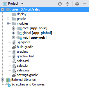
Figure 45. Project File Structure
The project root contains build scripts: build.gradle and settings.gradle.
The modules directory includes the subdirectories of the project default modules − global, core, web.
The global module contains the source code directory, src, with configuration files – metadata.xml, persistence.xml and views.xml. The com.sample.sales.service package contains interfaces of the Middleware services; the com.sample.sales.entity package contains entity classes and localization files for them.
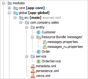
Figure 46. The global Module Structure
The core module contains the following directories:
-
db– directory with the database migration scripts. -
src– source code directory; its root contains the application properties file of the Middleware block and the spring.xml configuration file. Thecom.samples.sales.corepackage contains the Middleware classes: implementations of services, Spring beans and JMX beans. -
test- middleware integration test sources root. -
web– directory with the configuration files of the web application built from the Middleware block: context.xml and web.xml.
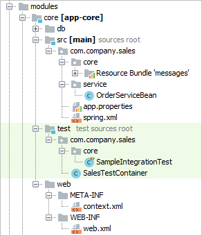
Figure 47. The core Module Structure
The web module contains the following directories:
-
src– source code directory with the application properties file of the Web Client block and configuration files – web-menu.xml, web-permissions.xml, web-screens.xml and web-spring.xml. Thecom.samples.sales.webpackage contains the main class of the Web Client block (inheritor ofDefaultApp) and the main localized messages pack. -
web– directory with configuration files of the web application built from the Web Client: context.xml and web.xml.
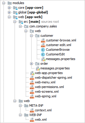
Figure 48. The web Module Structure
4.3. Build Scripts
Platform based projects are built using Gradle build system. Build scripts are two files in the project root directory:
-
settings.gradle– defines the project name and the set of modules. -
build.gradle– defines the build configuration.
This section describes the structure of the scripts and the purpose and parameters of Gradle tasks.
4.3.1. Structure of build.gradle
This section describes the structure and main elements of the build.gradle script.
- buildscript
-
The
buildscriptsection of the script defines the following:-
A version of the platform.
-
A set of repositories for loading project dependencies. See how to configure access to the repositories below.
-
Dependencies used by the build system, including the CUBA Gradle plugin.
Below the
buildscriptsection, a few variables are defined. They are used in the script later. -
- cuba
-
The CUBA-specific build logic is encapsulated in the
cubaGradle plugin. It is included in the root of the script and in theconfiguresection of all modules by the following statement:apply(plugin: 'cuba')The settings of the cuba plugin are defined in
cubasection:cuba { artifact { group = 'com.company.sales' version = '0.1' isSnapshot = true } tomcat { dir = "$project.rootDir/build/tomcat" } ide { copyright = '...' classComment = '...' vcs = 'Git' } }Let us consider the available options:
-
artifact- this section defines the group and version of the project artifacts being built. Artifact names are based on module names specified insettings.gradle.-
group- artifact group. -
version- artifact version. -
isSnapshot- iftrue, artifact names will have theSNAPSHOTsuffix.You can override the artifact version from the command line, for example:
gradle assemble -Pcuba.artifact.version=1.1.1
-
-
tomcat- this section defines the settings of the Tomcat server which is used for fast deployment.-
dir- location of the Tomcat installation directory. -
port- listening port; 8080 by default. -
debugPort- Java debug listening port; 8787 by default. -
shutdownPort- port listening to theSHUTDOWNcommand; 8005 by default. -
ajpPort- AJP connector port; 8009 by default.
-
-
ide- this section contains instructions for Studio and IDE.-
vcs- a version control system for the project. OnlyGitandsvnare currently supported. -
copyright- copyright text to be inserted into beginning of each source file. -
classComment- comment text to be placed above class declarations in Java source files.
-
-
uploadRepository- this section defines the settings of the repository where assembled project artifacts will be uploaded to upon completion of theuploadArchivestask.-
url- the repository URL. If not specified, Haulmont’s repository is used. -
user- the repository user. -
password- the repository password.You can pass the upload repository parameters from the command line with the following arguments:
gradlew uploadArchives -PuploadUrl=http://myrepo.com/content/repositories/snapshots -PuploadUser=me -PuploadPassword=mypassword
-
-
- dependencies
-
This section contains a set of application components used by the project. There are two types of dependencies:
appComponent- for CUBA application components dependencies anduberJar- for the libraries that should be loaded before the application starts. CUBA Components are specified by their global module artifact. In the following example, three components are used:com.haulmont.cuba(cuba component of the platform),com.haulmont.reports(reports premium add-on) andcom.company.base(a custom component):dependencies { appComponent("com.haulmont.cuba:cuba-global:$cubaVersion") appComponent("com.haulmont.reports:reports-global:$cubaVersion") appComponent("com.company.base:base-global:0.1-SNAPSHOT") } - configure
-
The
configuresections contain configuration of modules. The most important part of the configuration is the declaration of dependencies. For example:configure(coreModule) { dependencies { // standard dependencies using variables defined in the script above compile(globalModule) provided(servletApi) jdbc(hsql) testRuntime(hsql) // add a custom repository-based dependency compile('com.company.foo:foo:1.0.0') // add a custom file-based dependency compile(files("${rootProject.projectDir}/lib/my-library-0.1.jar")) // add all JAR files in the directory to dependencies compile(fileTree(dir: 'libs', include: ['*.jar'])) }You can add dependencies via the
serverconfiguration for core, web, and portal modules (modules that have a task with theCubaDeploymenttype). It makes sense in some cases. For example, for the UberJar deployment, the dependency is accessed before the application starts, and the dependency is needed for all deployment options in a specific module. Then declaring separately in the module (which is necessary, for example, for the WAR deployment) and via theuberjarconfiguration at the project level will cause unnecessary dependency duplication for UberJar. These dependencies will be placed in the server libs bydeploy,buildWar, andbuildUberJartasks.The
entitiesEnhancingconfiguration block is used to configure the bytecode enhancement (weaving) of entity classes. It should be included at least in the global module, but can also be declared in each module separately.Here,
mainandtestare the sources sets for the projects and tests, and the optionalpersistenceConfigparameter enables specifying the set of persistence.xml files explicitly. If not set, the task will enhance all persistent entities listed in the*persistence.xmlfiles located in the CLASSPATH.configure(coreModule) { ... entitiesEnhancing { main { enabled = true persistenceConfig = 'custom-persistence.xml' } test { enabled = true persistenceConfig = 'test-persistence.xml' } } }Non-standard module dependencies can be specified in Studio in the Project properties section of CUBA project view.
|
In case of transitive dependencies and version conflicts, the Maven strategy of dependencies resolution will be used. According to it, the release versions have priority over the snapshot ones, and the more precise numeric qualifier is the newest. Other things being equal, the string qualifiers are prioritized in alphabetical order. For example: Sometimes, it is necessary to use a specific version of some library, but another version of the same library gets into the project transitively from the dependency tree. For example, you may want to use the To use a desired version, configure the Gradle’s resolution strategy in your In this code block, we add a rule according to which version |
4.3.2. Configuring Access to Repository
- Main Repository
-
When you create a new project, you have to select a main repository containing CUBA artifacts. By default, there are two options (and you can have more if you set up a private repository):
-
https://repo.cuba-platform.com/content/groups/work- a repository located at Haulmont’s server. It requires common credentials which are specified right in the build script (cuba/cuba123). -
https://dl.bintray.com/cuba-platform/main- a repository hosted at JFrog Bintray. It has anonymous access.
Both repositories have identical contents for the latest platform versions, but Bintray does not contain snapshots. We assume that Bintray is more reliable for worldwide access.
In case of Bintray, the build script of the new project is also configured to use Maven Central, JCenter and Vaadin Add-ons repositories separately.
Bintray artifact repository, available by the
https://dl.bintray.com/cuba-platformURL, will soon be shut down by its maintainer (JFrog). Please avoid using the Bintray repository in your projects. The preliminary shutdown schedule is the following:-
After 31 March 2021:
-
New releases of the platform and add-ons will no longer be uploaded to the Bintray repository.
-
New commercial add-on subscriptions will no longer be given access to the old releases of add-ons located in the Bintray repository.
-
-
After 1 February 2022:
-
Bintray repository will no longer be available. Existing CUBA projects using this repository will not be able to resolve, build and run.
-
You should use the second
https://repo.cuba-platform.comrepository in all projects instead.The official announcement: https://jfrog.com/blog/into-the-sunset-bintray-jcenter-gocenter-and-chartcenter/
-
- Custom Repositories
-
Your project can use any number of custom repositories containing application components. They should be specified in
build.gradlemanually after the main repository, for example:repositories { // main repository containing CUBA artifacts maven { url 'https://repo.cuba-platform.com/content/groups/work' credentials { // ... } } // custom repository maven { url 'http://localhost:8081/repository/maven-snapshots' } }
4.3.3. Configuring Support for Kotlin
If you create a new project in Studio, it allows you to select the preferred language (Java, Kotlin, Java+Groovy) on the first page of the project creation wizard, so the build scripts will be configured accordingly.
If you want to add support for Kotlin to an existing project, make the following changes in the build.gradle file:
buildscript {
ext.cubaVersion = '7.2.0'
ext.kotlinVersion = '1.3.61' // add this line
// ...
dependencies {
classpath "com.haulmont.gradle:cuba-plugin:$cubaVersion"
classpath "org.jetbrains.kotlin:kotlin-gradle-plugin:$kotlinVersion" // add this line
classpath "org.jetbrains.kotlin:kotlin-stdlib-jdk8:$kotlinVersion" // add this line
}
}
// ...
apply(plugin: 'cuba')
apply(plugin: 'org.jetbrains.kotlin.jvm') // add this line
// ...
configure([globalModule, coreModule, webModule]) {
// ...
apply(plugin: 'cuba')
apply(plugin: 'org.jetbrains.kotlin.jvm') // add this line
dependencies {
compile("org.jetbrains.kotlin:kotlin-stdlib:$kotlinVersion") // add this line
compile("org.jetbrains.kotlin:kotlin-reflect:$kotlinVersion") // add this line
// ...If the project has Kotlin or Groovy support configured, you can choose in what language Studio will generate code. See Settings/Preferences > Languages & Frameworks > CUBA > Project settings > Scaffolding language.
4.3.4. Build Tasks
Tasks are executable units in Gradle. They are defined both in the plugins and in the build script itself. Below are CUBA-specific tasks; their parameters can be configured in build.gradle.
4.3.4.1. buildInfo
The buildInfo task is automatically added to your global module configuration by the CUBA Gradle plugin. It writes the build-info.properties file with the information about your application into the global artifact (e.g. app-global-1.0.0.jar). This information is read by the BuildInfo bean at runtime and is displayed on the Help > About window. This bean can also be invoked by different mechanisms to get the information about the application name, version, etc.
You can optionally change the following task parameters:
-
appName- application name. By default, the project name set insettings.gradleis used. -
artifactGroup- artifact group, which is by convention equal to the root package of the project. -
version- application version. By default, the version set in thecuba.artifact.versionproperty is used. -
properties- a map of arbitrary properties, empty by default.
Example of specifying custom properties of the buildInfo task:
configure(globalModule) {
buildInfo {
appName = 'MyApp'
properties = ['prop1': 'val1', 'prop2': 'val2']
}
// ...4.3.4.2. buildUberJar
buildUberJar – the task of the CubaUberJarBuilding type that creates JAR files containing the application code and all its dependencies together with embedded Jetty HTTP server. You can create either a single all-in-one JAR file or separate JARs for each application block, e.g. app-core.jar for the middleware and app.jar for the web client.
The task must be declared in the root of build.gradle. The resulting JAR files are located in the build/distributions project subdirectory. See the UberJAR Deployment section for how to run the generated JAR files.
|
The task can be configured using the Deployment > UberJAR settings page in Studio. |
Task parameters:
-
appProperties- a map defining application properties. These properties will be added to theWEB-INF/local.app.propertiesfiles inside generated JARs.task buildUberJar(type: CubaUberJarBuilding) { appProperties = ['cuba.automaticDatabaseUpdate' : true] // ... } -
singleJar- if set totrue, a single JAR containing all modules (core, web, portal) will be created.falseby default.task buildUberJar(type: CubaUberJarBuilding) { singleJar = true // ... } -
webPort- port for single (ifsingleJar=true) or web JAR embedded HTTP server,8080if not defined. Can also be set at run time using the-portcommand line argument. -
corePort- port for core JAR embedded HTTP server,8079if not defined. Can also be set at run time using the-portcommand line argument for the respective JAR. -
portalPort- port for portal JAR embedded HTTP server,8081if not defined. Can also be set at run time using the-portcommand line argument for the respective JAR. -
appName- name of the application, which isappby default. You can change it for the whole project if you set Module prefix field in the Project Properties window in Studio, or you can set it only for thebuildUberJartask using this parameter. For example:task buildUberJar(type: CubaUberJarBuilding) { appName = 'sales' // ... }After changing the application name to
salesthe task will generatesales-core.jarandsales.jarfiles and the web client will be available athttp://localhost:8080/sales. You can also change web contexts at run time without changing the application name using the-contextNamecommand line argument or just by renaming the JAR file itself. -
logbackConfigurationFile- defines a relative path to a file to be used for logging configuration.For example:
logbackConfigurationFile = "/modules/global/src/logback.xml" -
useDefaultLogbackConfiguration- whiletrue(default value), the task will copy its own standardlogback.xmlconfiguration file. -
coreJettyEnvPath- defines a relative (from the project root) path to a file which contains JNDI resource definitions for Jetty HTTP server.task buildUberJar(type: CubaUberJarBuilding) { coreJettyEnvPath = 'modules/core/web/META-INF/jetty-env.xml' // ... } -
webJettyConfPath- a relative path to a file to be used for Jetty server configuration for the single (ifsingleJar=true) or web JAR (ifsingleJar=false). See https://www.eclipse.org/jetty/documentation/9.4.x/jetty-xml-config.html. -
coreJettyConfPath(do not confuse withcoreJettyEnvPathdescribed above) - a relative path to a file to be used for Jetty server configuration for the core JAR (ifsingleJar=false). -
portalJettyConfPath- a relative path to a file to be used for Jetty server configuration for the portal JAR (ifsingleJar=false). -
coreWebXmlPath- a relative path to a file to be used as aweb.xmlfor the core module web application. -
webWebXmlPath- a relative path to a file to be used as aweb.xmlfor the web module web application. -
portalWebXmlPath- a relative path to a file to be used as aweb.xmlfor the portal module web application. -
excludeResources- a file pattern of resources to not include in JARs. -
mergeResources- a file pattern of resources to be merged in JARs. -
webContentExclude- a file pattern of web content to not include in web JAR. -
coreProject- a Gradle project representing the core module (Middleware). If not defined, the standard core module is used. -
webProject- a Gradle project representing the web module (Web Client). If not defined, the standard web module is used. -
portalProject- a Gradle project representing the portal module (Web Portal). If not defined, the standard portal module is used. -
frontProject- a Gradle project representing the Frontend User Interface module. If not defined, the standard front module is used.
4.3.4.2.1. Adding Dependencies
If you need some dependencies to be loaded before application starts, you should add them to the build file on the top level using uberJar configuration. Additional logback appender may be a good example. Build file will look like this:
buildscript {
//build script definitions
}
dependencies {
//app components definitions
uberJar ('net.logstash.logback:logstash-logback-encoder:6.3')
}
//modules and task definitions, etc.When declared like this, the library logstash-logback-encoder will be unpacked and its packages and classes will be placed to the root of the uberJar artifact.
4.3.4.3. buildWar
buildWar – the task of the CubaWarBuilding type, which builds a WAR file from the application code and its dependencies. It should be declared in the root of build.gradle. The resulting WAR file(s) are located in the build/distributions project subdirectory.
|
The task can be configured using the Deployment > WAR Settings page in Studio. |
Any CUBA application consists of at least two blocks: Middleware and Web Client. So the most natural way to deploy an application is to create two separate WAR files: one for Middleware and one for Web Client. This also allows you to scale your application when the number of users grows. However, separate WAR files contain some duplicated dependencies that increase overall size. Besides, extended deployment options are often not needed and rather complicate the process. The CubaWarBuilding task can create both types of WAR files: one per block or single WAR containing both blocks. In the latter case, the application blocks are loaded into separate class loaders inside one web application.
- Creating separate WAR files for Middleware and Web Client
-
To create separate WAR files for Middleware and Web Client, use the following task configuration:
task buildWar(type: CubaWarBuilding) { appProperties = ['cuba.automaticDatabaseUpdate': 'true'] singleWar = false }Task parameters:
-
appName- the name of the web application. By default, it corresponds to the Modules prefix, e.g.app. -
appProperties- an optional map defining application properties. These properties will be added to the/WEB-INF/local.app.propertiesfiles inside generated WAR.appProperties = ['cuba.automaticDatabaseUpdate': 'true']will create the database at the first launch, if there wasn’t any. -
singleWar- should be set tofalsefor building separate WAR files. -
includeJdbcDriver- include JDBC driver which is currently used in the project.falseby default. -
includeContextXml- include Tomcatcontext.xmlfile which is currently used in the project.falseby default. -
coreContextXmlPath- the relative path to a file which should be used instead of project’scontext.xmlifincludeContextXmlis set totrue. -
hsqlInProcess- if set totrue, the database URL incontext.xmlwill be modified for HSQL in-process mode. -
coreProject- the Gradle project representing the core module (Middleware). If not defined, the standard core module is used. -
webProject- the Gradle project representing the web module (Web Client). If not defined, the standard web module is used. -
portalProject- the Gradle project representing the portal module (Web Portal). Set this property if the application project contains the portal module. For example,portalProject = project(':app-portal'). -
coreWebXmlPath,webWebXmlPath,portalWebXmlPath- a relative path to a file to be used as aweb.xmlof the corresponding application block.Example of using custom
web.xmlfiles:task buildWar(type: CubaWarBuilding) { singleWar = false // ... coreWebXmlPath = 'modules/core/web/WEB-INF/production-web.xml' webWebXmlPath = 'modules/web/web/WEB-INF/production-web.xml' } -
logbackConfigurationFile- defines a relative path to a file to be used for logging configuration.For example:
task buildWar(type: CubaWarBuilding) { // ... logbackConfigurationFile = 'etc/war-logback.xml' } -
useDefaultLogbackConfiguration- whiletrue(default value), the task will copy its own standardlogback.xmlconfiguration file. -
frontBuildDir- the name of the directory where the Front UI is built. It isbuildby default. Set this parameter if you have custom build directory.
-
- Creating a single WAR file
-
To create a single WAR file that comprises both Middleware and Web Client blocks, use the following task configuration:
task buildWar(type: CubaWarBuilding) { webXmlPath = 'modules/web/web/WEB-INF/single-war-web.xml' }The following parameters should be specified in addition to the ones described above:
-
singleWar- should be omitted or set totrue. -
webXmlPath- the relative path to a file to be used as aweb.xmlof the single WAR. This file defines two servlet context listeners that load the application blocks:SingleAppCoreServletListenerandSingleAppWebServletListener. All initialization parameters are passed to them through context parameters.Example of
single-war-web.xml:<?xml version="1.0" encoding="UTF-8"?> <web-app xmlns="http://java.sun.com/xml/ns/javaee" xmlns:xsi="http://www.w3.org/2001/XMLSchema-instance" xsi:schemaLocation="http://java.sun.com/xml/ns/javaee http://java.sun.com/xml/ns/javaee/web-app_3_0.xsd" version="3.0"> <!--Application components--> <context-param> <param-name>appComponents</param-name> <param-value>com.haulmont.cuba</param-value> </context-param> <!-- Web Client parameters --> <context-param> <description>List of app properties files for Web Client</description> <param-name>appPropertiesConfigWeb</param-name> <param-value> classpath:com/company/sample/web-app.properties /WEB-INF/local.app.properties file:${app.home}/local.app.properties </param-value> </context-param> <context-param> <description>Web resources version for correct caching in browser</description> <param-name>webResourcesTs</param-name> <param-value>${webResourcesTs}</param-value> </context-param> <!-- Middleware parameters --> <context-param> <description>List of app properties files for Middleware</description> <param-name>appPropertiesConfigCore</param-name> <param-value> classpath:com/company/sample/app.properties /WEB-INF/local.app.properties file:${app.home}/local.app.properties </param-value> </context-param> <!-- Servlet context listeners that load the application blocks --> <listener> <listener-class> com.vaadin.server.communication.JSR356WebsocketInitializer </listener-class> </listener> <listener> <listener-class> com.haulmont.cuba.core.sys.singleapp.SingleAppCoreServletListener </listener-class> </listener> <listener> <listener-class> com.haulmont.cuba.web.sys.singleapp.SingleAppWebServletListener </listener-class> </listener> </web-app>
All filters and servlets for single WAR deployment should be registered programmatically, see Registration of Servlets and Filters.
Single WAR contains only core and web modules (Middleware and Web Client). To deploy the portal module, use separate WAR files.
If the application project contains the front module, it becomes accessible at
/<appName>/frontpath. In order for the frontend interface to work correctly in the single WAR, you should change the environment variablePUBLIC_URL= /app/front/during build (for example, in the.env.production.local(see README)). -
See also WAR deployment to Jetty section for step-by-step instructions on some variants of WAR deployment.
4.3.4.4. buildWidgetSet
buildWidgetSet - the task of the CubaWidgetSetBuilding which builds a custom GWT widgetset if the web-toolkit module exists in the project. This module enables development of custom visual components.
Available parameters:
-
style- the script output style:OBF,PRETTYorDETAILED.OBFby default. -
logLevel- the logging level:ERROR,WARN,INFO,TRACE,DEBUG,SPAM, orALL.INFOby default. -
draft- compile quickly with minimal optimizations.falseby default.
Example usage:
task buildWidgetSet(type: CubaWidgetSetBuilding) {
widgetSetClass = 'com.company.sample.web.toolkit.ui.AppWidgetSet'
style = 'PRETTY'
}4.3.4.5. createDb
createDb – the task of the CubaDbCreation type which creates application database by executing the corresponding scripts. It is declared in the core module.
If you configure the data source using application properties, the parameters described below are obtained automatically from the properties, so the task definition can be empty:
task createDb(dependsOn: assemble, description: 'Creates local database', type: CubaDbCreation) {
}You can also set the following parameters explicitly:
-
storeName- an additional data store name. If not set, the task executes scripts for the main data store. -
dbms– the DBMS type, specified as the stringhsql,postgres,mssql, ororacle. -
dbName– the database name. -
dbUser– the DBMS username. -
dbPassword– the DBMS user password. -
host– the DBMS host and port (optional) in thehost[:port]format. If not specified,localhostis used. -
connectionParams- an optional connection parameters string which will be appended to the end of the connection URL. -
masterUrl– the URL used to connect when creating the database. If not specified, the default value that depends on the DBMS type and thehostparameter is used. -
dropDbSql– the SQL command to delete the database. If not specified, the default value that depends on the DBMS type is used. -
createDbSql– the SQL command to create a database. If not specified, the default value that depends on the DBMS type is used. -
driverClasspath– the list of JAR files containing the JDBC driver. The items in the list are separated by ":" on Linux and by ";" on Windows. If not specified, the system uses the dependencies that are part of the current module’sjdbcconfiguration. Explicit definition ofdriverClasspathis necessary when using Oracle, because its JDBC driver is not available in the dependencies. -
oracleSystemPassword– the SYSTEM user password for Oracle.
Example for PostgreSQL:
task createDb(dependsOn: assemble, description: 'Creates local database', type: CubaDbCreation) {
dbms = 'postgres'
dbName = 'sales'
dbUser = 'cuba'
dbPassword = 'cuba'
}Example for MS SQL Server:
task createDb(dependsOn: assemble, description: 'Creates local database', type: CubaDbCreation) {
dbms = 'mssql'
dbName = 'sales'
dbUser = 'sa'
dbPassword = 'saPass1'
connectionParams = ';instance=myinstance'
}Example for Oracle:
task createDb(dependsOn: assemble, description: 'Creates database', type: CubaDbCreation) {
dbms = 'oracle'
host = '192.168.1.10'
dbName = 'orcl'
dbUser = 'sales'
dbPassword = 'sales'
oracleSystemPassword = 'manager'
driverClasspath = "$tomcatDir/lib/ojdbc6.jar"
}4.3.4.6. debugWidgetSet
debugWidgetSet - the task of the CubaWidgetSetDebug type which launches GWT Code Server for debugging widgets in the browser.
Example usage:
task debugWidgetSet(type: CubaWidgetSetDebug) {
widgetSetClass = 'com.company.sample.web.toolkit.ui.AppWidgetSet'
}Ensure that the web-toolkit module has a dependency on Servlet API library in the runtime configuration:
configure(webToolkitModule) {
dependencies {
runtime(servletApi)
}
...See Debugging Web Widgets for information on how to debug code in the browser.
4.3.4.7. deploy
deploy – the task of the CubaDeployment type which performs fast deployment of a module to Tomcat. It is declared in the core, web and portal modules. Parameters:
-
appName– name of the web application that will be created from the module. In fact, it is the name of a subdirectory insidetomcat/webapps. -
jarNames– the list of JAR file names (without versions) produced as a result of building a module and intended to be placed into theWEB-INF/libcatalog of the web application. All other module artifacts and dependencies will be copied totomcat/shared/lib.
For example:
task deploy(dependsOn: assemble, type: CubaDeployment) {
appName = 'app-core'
jarNames = ['cuba-global', 'cuba-core', 'app-global', 'app-core']
}4.3.4.8. deployThemes
deployThemes - the task of the CubaDeployThemeTask type which builds and deploys themes defined in the project to the running web application deployed by the deploy task. Changes in the themes are applied without the server restart.
For example:
task deployThemes(type: CubaDeployThemeTask, dependsOn: buildScssThemes) {
}4.3.4.9. deployWar
deployWar - the task of the CubaJelasticDeploy type which deploys the WAR file to Jelastic server.
For example:
task deployWar(type: CubaJelasticDeploy, dependsOn: buildWar) {
email = '<your@email.address>'
password = '<your password>'
context = '<app contex>'
environment = '<environment name or ID>'
hostUrl = '<Host API url>'
}Task parameters:
-
appName- the name of the web application. By default, it corresponds to the Modules prefix, e.g.,app. -
email- Jelastic server account login. -
password- Jelastic account password. -
context- the application context. Default value:ROOT. -
environment- the environment where the application WAR will be deployed. You can set either the environment name or its ID. -
hostUrl- URL of the API host. Typically it isapp.jelastic.<host name>. -
srcDir- the directory where the WAR is located. By default it is"${project.buildDir}/distributions/war".
4.3.4.10. restart
restart – the task that stops the local Tomcat server, runs fast deployment, and starts the server once again.
4.3.4.11. setupTomcat
setupTomcat – the task of the CubaSetupTomcat type which performs installation and initialization of the local Tomcat server for subsequent fast deployment of the application. This task is automatically added to the project when you apply the cuba Gradle plugin, so you don’t need to declare it in build.gradle. Tomcat installation directory is specified by the tomcat.dir property of the cuba section. By default, it is the project’s build/tomcat subdirectory.
4.3.4.12. start
start – the task of the CubaStartTomcat type which starts the local Tomcat server installed by the setupTomcat task. This task is automatically added to the project when you add the cuba plugin, so you don’t need to declare it in build.gradle.
4.3.4.13. startDb
startDb – the task of the CubaHsqlStart type which starts the local HSQLDB server. Parameters:
-
dbName– database name, default iscubadb. -
dbDataDir– database directory, default is thedeploy/hsqldbsubfolder of the project. -
dbPort– server port, default is 9001.
For example:
task startDb(type: CubaHsqlStart) {
dbName = 'sales'
}4.3.4.14. stop
stop – the task of CubaStopTomcat type which stops the local Tomcat server installed by the setupTomcat task. This task is automatically added to the project when you include the cuba plugin, so you don’t need to declare it in build.gradle.
4.3.4.15. stopDb
stopDb – the task of the CubaHsqlStop type which stops the local HSQLDB server. The parameters are similar to startDb.
4.3.4.16. tomcat
tomcat – the task of the Exec type which starts the local Tomcat server in the opened terminal window and keeps it open even if the start failed. This task may be useful for troubleshooting, e.g., to detect problems caused by Java version mismatch etc, on the server start.
4.3.4.17. updateDb
updateDb – the task of the CubaDbUpdate type which updates the database by executing the corresponding scripts. It is similar to the createDb task, except that the dropDbSql and createDbSql parameters are omitted.
If you configure the data source using application properties, the task obtains parameters from the properties, so the task definition can be empty:
task updateDb(dependsOn: assembleDbScripts, description: 'Updates local database', type: CubaDbUpdate) {
}You can also set the parameters described in createDb (except dropDbSql and createDbSql) explicitly.
4.3.4.18. zipProject
zipProject is the task of the CubaZipProject type which creates a ZIP archive of your project. The archive will not contain IDE project files, build results and Tomcat server. But HSQL database is included to the archive if present in the build directory.
This task is automatically added to the project when you apply the cuba Gradle plugin, so you don’t need to declare it in build.gradle.
4.3.5. Starting Build Tasks
Gradle tasks described in build scripts can be launched in the following ways:
-
If you are working with the project in CUBA Studio, many commands that you run from the CUBA main menu actually delegate to Gradle tasks: all commands of the Build Tasks item, as well as Start/Stop/Restart Application Server and Create/Update Database commands.
-
Alternatively, you can use the executable
gradlewscript (Gradle wrapper) included in the project. -
One more way is to use the manually installed Gradle version 5.6.4. In this case, run the
gradleexecutable located in thebinsubdirectory of the Gradle installation.
For example, in order to compile the Java files and build the JAR files for project artifacts, you need to run the following command:
Windows:
gradlew assemble
Linux & macOS:
./gradlew assemble|
If your project uses Premium Add-ons and you are starting build tasks outside Studio, you should pass the Premium Add-ons repository credentials to Gradle. See the section above for details. |
Typical build tasks in their normal usage sequence are provided below.
-
assemble– compile Java files and build JARs for project artifacts in thebuildsubdirectories of the modules. -
clean– removebuildsubdirectories of all project modules. -
setupTomcat – setup the Tomcat server to the path that is specified by the
cuba.tomcat.dirproperty of thebuild.gradlescript. -
deploy – deploy the application to the Tomcat server that has been pre-installed by the
setupTomcattask. -
createDb – create an application database and run the corresponding scripts.
-
updateDb – update the existing application database by running the corresponding scripts.
-
start – start the Tomcat server.
-
stop – stop the running Tomcat server.
-
restart – sequentially run the
stop,deploy,starttasks.
4.3.6. Setting Up a Private Artifact Repository
This section describes how to set up a private Maven repository and use it instead of the CUBA public repository for storing the platform artifacts and other dependencies. It is recommended in the following cases:
-
You have an unstable or slow connection to the internet. In spite of the fact that Gradle caches downloaded artifacts on the developer’s machine, you may need to connect to the artifact repository from time to time, for example when you run build for the first time or switch to a newer version of the platform.
-
You cannot have direct access to the internet due to a security policy of your organization.
-
You are not going to prolong your subscription to CUBA Premium Add-ons, but you need to be able to build your application in the future using the downloaded version of the artifacts.
The process of setting up a private repository consists of the following steps:
-
Install the repository manager software in a network connected to the internet.
-
Configure the private repository as a proxy for the CUBA public repository.
-
Make your project build script use the private repository. It can be done in Studio or right in
build.gradle. -
Perform full build of your project to cache all required artifacts in the private repository.
4.3.6.1. Install the Repository Manager
For the purpose of this example, we will use Sonatype Nexus OSS repository manager.
- On Microsoft Windows operating system
-
-
Download Sonatype Nexus OSS version 2.x (2.14.3 has been tested)
-
Unpack zip file to the directory
c:\nexus-2.14.3-02 -
Modify settings located in file
c:\nexus-2.14.3-02\conf\nexus.properties:-
You may configure server port; default is 8081
-
Configure repository data folder:
replace
nexus-work=${bundleBasedir}/../sonatype-work/nexuswith any convenient path to cached data, for example
nexus-work=${bundleBasedir}/nexus/sonatype-work/content
-
-
Navigate to the folder
c:\nexus-2.14.3-02\bin -
To start and stop Nexus as a service, install the wrapper (run command as Administrator):
nexus.bat install -
Launch nexus service.
-
Open
http://localhost:8081/nexusin the web browser and log in with the default credentials: loginadminand passwordadmin123.
-
- With Docker
-
Alternatively, we can use Docker to simplify the setup for local use. Instructions are also available at the Docker Hub.
-
Run
docker pull sonatype/nexus:ossto download the latest stable OSS image -
Then build the container with
docker run -d -p 8081:8081 --name nexus sonatype/nexus:oss -
The docker container will have nexus running in a few minutes. Test by either way:
-
curl http://localhost:8081/nexus/service/local/status -
Navigate to
http://localhost:8081/nexusin the web browser.
-
-
Credentials are the same: login
adminand passwordadmin123.
-
4.3.6.2. Configure the Proxy Repository
Click to the Repositories link on the left panel.
On the opened Repositories page click the Add button, then choose Proxy Repository. A new repository will be added. Fill in required fields at Configuration tab:
-
Repository ID:
cuba-work -
Repository Name:
cuba-work -
Provider:
Maven2 -
Remote Storage Location:
https://repo.cuba-platform.com/content/groups/work -
Auto Blocking Enabled:
false -
Enable Authentication, set Username:
cuba, Password:cuba123 -
Click Save button.
Create a Repository Group, in Nexus click Add button, then choose Repository Group and do the following on Configuration tab:
-
Enter the Group ID:
cuba-group -
Enter the Group Name:
cuba-group -
Provider:
Maven2 -
Add the repository cuba-work from Available Repositories to Ordered Group Repositories
-
Click Save button.
If you have a subscription to the Premium Add-ons, add one more repository with the following settings:
-
Repository ID:
cuba-premium -
Repository Name:
cuba-premium -
Provider:
Maven2 -
Remote Storage Location:
https://repo.cuba-platform.com/content/groups/premium -
Auto Blocking Enabled:
false -
Enable Authentication, set the first part of your license key (before dash) in the Username field and the second part of your license key (after dash) in the Password field.
-
Click Save button.
-
Click Refresh button.
-
Select the cuba-group group.
-
On the Configuration tab, add cuba-premium repository to the group below cuba-work.
-
Click Save button.
4.3.6.3. Using the Private Repository
Now your private repository is ready to use. Find the cuba-group URL at the top of the screen, for example:
http://localhost:8081/nexus/content/groups/cuba-group
-
Find the list of registered repositories in Studio. If you are creating a new project, it is in the New Project window. For an existing project, open CUBA > Project Properties window.
-
In the new repository dialog, enter the repository URL and credentials:
admin / admin123. -
After saving the repository information, use it in the project by selecting its checkbox in the list.
-
Save the project properties or continue with the project creation wizard.
During the first build your new repository downloads necessary artifacts and keeps them in the cache for the next usage. You may find them in c:\nexus-2.14.3-02\sonatype-work folder.
4.3.6.4. Repository in an Isolated Network
If you need to develop on CUBA in a network without connection to the internet, do the following:
-
Install a copy of the repository manager in the target network.
-
Copy the cached content of the repository from the open network to the isolated one. If you followed the instructions above, the content is stored in
c:\nexus-2.14.3-02\sonatype-work
-
Restart the nexus service.
If you need to add artifacts of a new platform version to the isolated repository, go to the environment connected to the internet, make a build through its repository and then copy the contents to the isolated environment again.
4.4. Creating a Project
The recommended way to create a new project is to use CUBA Studio. An example can be found in the Quick Start.
Another option is to use CUBA CLI:
-
Open a terminal and start CUBA CLI.
-
Input the command
create-app. You can use tab auto-completion. -
CLI will ask you for the project configuration. Click ENTER to accept the defaults or select another options:
-
Project name – the project name. For sample projects CLI generates random names that can be selected by default.
-
Project namespace – the namespace which will be used as a prefix for entity names and database tables. The namespace can consist of Latin letters only and should be as short as possible.
-
Platform version – the platform version used in the project. The platform artifacts will be automatically downloaded from the repository on project build.
-
Root package – the root package of Java classes.
-
Database – the SQL database to use.
-
After that, the empty project will be created in a new folder in the current directory. You can keep developing it in Studio or using CLI and any IDE.
4.5. Working with Application Components
Any CUBA application can be used as a component of another application. An application component is a full-stack library providing functionality on all layers - from database schema to business logic and UI.
Application components published on CUBA Marketplace are called add-ons, because they extend functionality of the framework and can be used in any CUBA-based application.
4.5.1. Using Public Add-ons
An add-on published on Marketplace can be added to your project in one of the ways described below. The first and the second approaches assume that you use one of the standard CUBA repositories. The last approach is applicable for open-source add-ons and doesn’t involve any remote repositories.
- By Studio
-
If you are using CUBA Studio 11+, manage add-ons via CUBA Add-Ons window as described in the Studio documentation.
For the previous CUBA Studio versions, follow the steps below:
-
Edit Project properties and on the App components panel click the plus button next to Custom components.
-
Copy add-on coordinates from the marketplace page or from the add-on’s documentation and paste them in the coordinates field, for example:
com.haulmont.addon.cubajm:cuba-jm-global:0.3.1 -
Click OK in the dialog. Studio will try to find the add-on binaries in the repository currently selected for the project. If it is found, the dialog will close and the add-on will appear in the list of custom components.
-
Save the project properties by clicking OK.
-
- By manual editing
-
-
Edit
build.gradleand specify the add-on coordinates in the rootdependenciessection:dependencies { appComponent("com.haulmont.cuba:cuba-global:$cubaVersion") // your add-ons go here appComponent("com.haulmont.addon.cubajm:cuba-jm-global:0.3.1") } -
Refresh Gradle project in your IDE, e.g., by clicking CUBA → Re-Import Gradle Project in the Studio main menu, to include add-on in your project’s development environment.
-
Edit
web.xmlfiles of thecoreandwebmodules and add the add-on identifier (which is equal to Maven groupId) to the space-separated list of application components in theappComponentscontext parameter:<context-param> <param-name>appComponents</param-name> <param-value>com.haulmont.cuba com.haulmont.addon.cubajm</param-value> </context-param>
-
- By building from sources
-
-
Clone the add-on’s repository to a local directory and import the project into Studio.
-
Execute CUBA > Advanced > Install app component main menu command to install the add-on to the local Maven repository (by default it is
~/.m2directory). -
Open your project in Studio and add the local Maven repository to the repositories list in Project > Properties.
-
Install the add-on into the project using the CUBA Add-ons dialog in Studio. For details, see Installing add-on by coordinates in the Managing Add-ons section of the Studio User Guide.
-
Click OK in the dialog and save the project properties.
-
|
If a project uses more than one add-ons having a web-toolkit module, then the project must have web-toolkit module too. If not, then only one widgetset from one add-on is loaded in the application. So the web-toolkit module is needed to integrate all widgetsets from used add-ons. |
4.5.2. Creating Application Components
This section contains some recommendations useful if you are developing a reusable application component.
- Naming rules
-
-
Choose the root package using the standard reverse-DNS notation, e.g.
com.jupiter.amazingsearch.Root package should not begin with a root package of any other component or application. For example, if you have an application with
com.jupiter.ticketsroot package, you cannot usecom.jupiter.tickets.amazingsearchpackage for a component. The reason is that Spring scans the classpath for the beans starting from the specified root package, and this scanning space must be unique for each component. -
Namespace is used as a prefix for the database tables, so for a public component it should be composite, like
jptams, not justsearch. It will minimize the risk of name collisions in the target application. You cannot use underscores and dashes in namespace, only letters and digits. -
Module prefix should repeat namespace, but can contain dashes, like
jpt-amsearch. -
Use namespace as a prefix for bean names and application properties, for example:
@Component("jptams_Finder") @Property("jptams.ignoreCase")
-
- Installing into the local Maven repository
-
In order to make the component available to the projects located on your computer, install it into the local Maven repository by executing the CUBA > Advanced > Install app component menu command. This command just runs the
installGradle task after stopping Gradle daemons.
- Uploading to a remote Maven repository
-
-
Set up a repository as explained in Setting Up a Private Artifact Repository.
-
Specify your repository and credentials for the project instead of the standard CUBA repository.
-
Open
build.gradleof the component project in a text editor and adduploadRepositoryto thecubasection:cuba { //... // repository for uploading your artifacts uploadRepository { url = 'http://repo.company.com/nexus/content/repositories/snapshots' user = 'admin' password = 'admin123' } } -
Open the component project in Studio.
-
Run the
uploadArchivesGradle task from the command line. The component’s artifacts will be uploaded to your repository. -
Remove the component artifacts from your local Maven repository to ensure that they will be downloaded from the remote repository during the next assembling of the application project: just delete the
.m2/repository/com/companyfolder located in your user home directory. -
Now, when you assemble and run the application that uses this component, it will be downloaded from the remote repository.
-
4.5.3. Example of Application Component
In this section, we’ll consider a complete example of creating an application component and using it in a project. The component will provide a "Customer Management" functionality and include the Customer entity and corresponding UI screens. The application will use the Customer entity from the component as a reference in its Order entity.
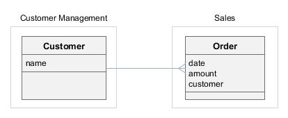
- Creating the Customer Management component
-
-
Create a new project in Studio and specify the following properties on the New project screen:
-
Project name –
customers -
Project namespace –
cust -
Root package –
com.company.customers
-
-
Open the Project Properties window and set the Module prefix to
cust. -
Create the
Customerentity with at least thenameattribute.If your component contains
@MappedSuperclasspersistent classes, make sure they have descendants which are entities (i.e., annotated with@Entity) in the same project. Otherwise, such base classes will not be properly enhanced and you will not be able to use them in applications. -
Generate DB scripts and create standard screens for the
Customerentity:cust_Customer.browseandcust_Customer.edit. -
Go to the menu designer and rename the
application-custmenu item tocustomerManagement. Then, open themessages.propertiesfile in the Main Message Pack section and specify the new caption for thecustomerManagementmenu item. -
Generate app-component.xml descriptor by clicking the CUBA > Advanced > App Component Descriptor item in the main menu.
-
Test the Customer Management functionality:
-
Select CUBA > Create Database in the main menu.
-
Run the application: click the debug button next to the selected
CUBA Applicationconfiguration in the main toolbar. -
Open
http://localhost:8080/custin your web browser.
-
-
Install the application component into the local Maven repository by selecting the CUBA > Advanced > Install App Component menu item.
-
- Creating the Sales application
-
-
Create a new project in Studio and specify the following properties on the New project screen:
-
Project name –
sales -
Project namespace –
sales -
Root package –
com.company.sales
-
-
Open the Project Properties window and select Use local Maven repository checkbox.
-
Include application component in the project as described in the Installing add-on by coordinates section of the Studio User Guide. Use Maven coordinates of the Customer Management component, e.g.
com.company.customers:cust-global:0.1-SNAPSHOT. -
Create the
Orderentity and add thedateandamountattributes. Then add thecustomerattribute as a many-to-one association with theCustomerentity – it should be available in the Type drop-down list. -
Generate DB scripts and create standard screens for the
Orderentity. When creating standard screens, create anorder-with-customerview that includes thecustomerattribute and use it for the screens. -
Test the application functionality:
-
Select CUBA > Create Database in the main menu.
-
Run the application: click the debug button next to the selected
CUBA Applicationconfiguration in the main toolbar. -
Open
http://localhost:8080/appin your web browser. The application will contain two top-level menu items: Customer Management and Application with the corresponding functionality.
-
-
- Modifying the Customer Management component
-
Suppose we have to change the component functionality (add an attribute to
Customer) and then reassemble the application to incorporate the changes.-
Open the
customersproject in Studio. -
Edit the
Customerentity and add theaddressattribute. Include this attribute to both browser and editor screens. -
Generate DB scripts – a script for altering table will be created. Save the scripts.
-
Test the changes in the component:
-
Select CUBA > Update Database in the main menu.
-
Run the application: click the debug button next to the selected
CUBA Applicationconfiguration in the main toolbar. -
Open
http://localhost:8080/custin your web browser.
-
-
Re-install the application component into the local Maven repository by selecting the CUBA > Advanced > Install App Component menu item.
-
Switch to the
salesproject in Studio. -
Select CUBA > Build Tasks > Clean.
-
Select CUBA > Update Database in the main menu – the update script from the Customer Management component will be executed.
-
Run the application: click the debug button next to the selected
CUBA Applicationconfiguration in the main toolbar. -
Open
http://localhost:8080/appin your web browser – the application will contain theCustomerentity and screens with the newaddressattribute.
-
4.5.4. Additional Data Stores in Application Component
If an application component uses an additional data store, the application must define a data store with the same name and of the same type. For example, if the component uses db1 data store connected to a PostgreSQL database, the application must have the db1 data store of PostgreSQL type too.
If you are using Studio, just create the additional data store as described in the Studio documentation. Otherwise, use the instructions from the Data Stores section.
4.5.5. Registering DispatcherServlet from Application Component
In this section you will learn how to propagate the servlets and filters configuration from an application component to the owning application. To avoid the duplication of code in the web.xml file, you need to register your servlets and filters in the component using the special ServletRegistrationManager bean.
The most common case of servlets registration is described through the example of HTTP servlet registration. Let’s consider a more complex example: an application component with a custom implementation of DispatcherServlet for processing web requests.
This servlet loads its config from the demo-dispatcher-spring.xml file, so to see it working you should create an empty file with such name in the root source directory (e.g. web/src).
public class WebDispatcherServlet extends DispatcherServlet {
private volatile boolean initialized = false;
@Override
public String getContextConfigLocation() {
String configFile = "demo-dispatcher-spring.xml";
File baseDir = new File(AppContext.getProperty("cuba.confDir"));
String[] tokenArray = new StrTokenizer(configFile).getTokenArray();
StringBuilder locations = new StringBuilder();
for (String token : tokenArray) {
String location;
if (ResourceUtils.isUrl(token)) {
location = token;
} else {
if (token.startsWith("/"))
token = token.substring(1);
File file = new File(baseDir, token);
if (file.exists()) {
location = file.toURI().toString();
} else {
location = "classpath:" + token;
}
}
locations.append(location).append(" ");
}
return locations.toString();
}
@Override
protected WebApplicationContext initWebApplicationContext() {
WebApplicationContext wac = findWebApplicationContext();
if (wac == null) {
ApplicationContext parent = AppContext.getApplicationContext();
wac = createWebApplicationContext(parent);
}
onRefresh(wac);
String attrName = getServletContextAttributeName();
getServletContext().setAttribute(attrName, wac);
if (this.logger.isDebugEnabled()) {
this.logger.debug("Published WebApplicationContext of servlet '" + getServletName() +
"' as ServletContext attribute with name [" + attrName + "]");
}
return wac;
}
@Override
public void init(ServletConfig config) throws ServletException {
if (!initialized) {
super.init(config);
initialized = true;
}
}
@Override
protected void service(HttpServletRequest request, HttpServletResponse response) throws ServletException, IOException {
_service(response);
}
@Override
public void service(ServletRequest req, ServletResponse res) throws ServletException, IOException {
_service(res);
}
private void _service(ServletResponse res) throws IOException {
String testMessage = AppContext.getApplicationContext().getBean(Messages.class).getMainMessage("testMessage");
res.getWriter()
.write("WebDispatcherServlet test message: " + testMessage);
}
}To register DispatcherServlet, you have to load the class manually, instantiate it and initialize, otherwise different ClassLoaders may cause an issue in case of SingleWAR/SingleUberJAR deployment. Moreover, the custom DispatcherServlet should be ready to double initialization - first time we initialize it manually, second time it is initialized by a servlet container.
Here is an example of a component that initializes WebDispatcherServlet:
@Component
public class WebInitializer {
private static final String WEB_DISPATCHER_CLASS = "com.demo.comp.web.WebDispatcherServlet";
private static final String WEB_DISPATCHER_NAME = "web_dispatcher_servlet";
private final Logger log = LoggerFactory.getLogger(WebInitializer.class);
@Inject
private ServletRegistrationManager servletRegistrationManager;
@EventListener
public void initialize(ServletContextInitializedEvent e) {
Servlet webDispatcherServlet = servletRegistrationManager.createServlet(e.getApplicationContext(), WEB_DISPATCHER_CLASS);
ServletContext servletContext = e.getSource();
try {
webDispatcherServlet.init(new AbstractWebAppContextLoader.CubaServletConfig(WEB_DISPATCHER_NAME, servletContext));
} catch (ServletException ex) {
throw new RuntimeException("Failed to init WebDispatcherServlet");
}
servletContext.addServlet(WEB_DISPATCHER_NAME, webDispatcherServlet)
.addMapping("/webd/*");
}
}The createServlet() method of the injected ServletRegistrationManager bean takes the application context from ServletContextInitializedEvent and the fully-qualified name of the WebDispatcherServlet class. In order to initialize the servlet, we pass the instance of ServletContext obtained from ServletContextInitializedEvent and the servlet name.
The servlet is registered with mapping webd and will be available at /app/webd/ or /app-core/webd/ depending on the application context.
4.6. Using Spring Profiles
Spring profiles allow you to customize the application for working in different environments. Depending on an active profile, you can instantiate different implementations of the same bean and assign different values of application properties.
If a Spring bean has @Profile annotation, it will be instantiated only when the annotation value matches some active profile. In the following example, SomeDevServiceBean will be used when dev profile is active, and SomeProdServiceBean will be used when the prod profile is active:
public interface SomeService {
String NAME = "demo_SomeService";
String hello(String input);
}
@Service(SomeService.NAME)
@Profile("dev")
public class SomeDevServiceBean implements SomeService {
@Override
public String hello(String input) {
return "Service stub: hello " + input;
}
}
@Service(SomeService.NAME)
@Profile("prod")
public class SomeProdServiceBean implements SomeService {
@Override
public String hello(String input) {
return "Real service: hello " + input;
}
}In order to define some profile-specific application properties, create a <profile>-app.properties (or <profile>-web-app.properties for web module) file in the same package as the base app.properties file.
For example, for core module:
com/company/demo/app.properties
com/company/demo/prod-app.propertiesFor web module:
com/company/demo/web-app.properties
com/company/demo/prod-web-app.propertiesThe profile-specific file will be loaded right after the base file, so the profile-specific properties will override the properties defined in the base file. In the following example, we define connection to a specific database for the prod profile:
prod-app.properties
cuba.dbmsType = postgres
cuba.dataSourceProvider = application
cuba.dataSource.dbName = my-prod-db
cuba.dataSource.host = my-prod-host
cuba.dataSource.username = cuba
cuba.dataSource.password = cubaThe list of active profiles can be set for the application in either of two ways:
-
In
spring.profiles.activeservlet context parameter in theweb.xmlfile, for example:<web-app ...> <context-param> <param-name>spring.profiles.active</param-name> <param-value>prod</param-value> </context-param> -
In
spring.profiles.activeJava system property. For example, when running Uber JAR:java -Dspring.profiles.active=prod -jar app.jar
4.7. Logging
The platform uses Logback framework for logging.
|
See Logging in CUBA Applications guide to learn how logging can be integrated, configured and viewed as part of the application itself or with the help of external tools. |
To output to the log, use SLF4J API: get a logger for the current class and invoke one of its methods, for example:
import org.slf4j.Logger;
import org.slf4j.LoggerFactory;
public class Foo {
// create logger
private static Logger log = LoggerFactory.getLogger(Foo.class);
private void someMethod() {
// output message with DEBUG level
log.debug("invoked someMethod");
}
}- Logging configuration
-
Logging configuration is defined in the
logback.xmlfile.-
At development stage, you can find this file in the
deploy/app_homedirectory of your project after performing Fast Deployment. Log files are created in thedeploy/app_home/logsdirectory.Note that the
deploydirectory is excluded from version control and can be removed and recreated at any time, so your changes in thedeploy/app_home/logback.xmlfile can be easily lost.If you want to make persistent changes in your development logging configuration, create
etc/logback.xml(you can copy the content from originaldeploy/app_home/logback.xmland change it appropriately). This file will be copied todeploy/app_homeeach time you run the application in Studio or executedeployGradle task:my_project/ deploy/ app_home/ logback.xml ... etc/ logback.xml - if exists, will be automatically copied to deploy/app_home -
When creating WAR or UberJAR archives, you can provide
logback.xmlby specifying the relative path to it in thelogbackConfigurationFileparameter of the buildWar and buildUberJar tasks. If you don’t specify this parameter, a default configuration with output to the console will be embedded into WAR/UberJar.Note that
etc/logback.xmlcreated for development environment will not be used by default for WAR/UberJar, you have to specify a file explicitly, for example:my_project/ etc/ logback.xml war-logback.xmlbuild.gradletask buildWar(type: CubaWarBuilding) { // ... logbackConfigurationFile = 'etc/war-logback.xml' } -
In a production environment, you can override the logging configuration embedded into WAR or UberJAR simply by providing a
logback.xmlfile in the application home directory.The
logback.xmlfile in the application home will be recognized only if you provide theapp.homeJava system property in the command line. It won’t work if the application home is set automatically totomcat/work/app_homeor~/.app_home.
-
- logback.xml structure
-
The
logback.xmlfile has the following structure:-
appenderelements define the "output device" for the log. The main appenders areFILEandCONSOLE. Thelevelparameter ofThresholdFilterdefines the message threshold. By default, it isDEBUGfor a file andINFOfor console. It means thatERROR,WARN,INFOandDEBUGmessages are written to a file, whileERROR,WARNandINFOare written to console.The path to the log file for the file appender is defined in the nested
fileelement. -
loggerelements define the logger parameters that are used to print messages from the program code. Logger names are hierarchical, i.e. the settings of thecom.company.samplelogger have effect on thecom.company.sample.core.CustomerServiceBeanandcom.company.sample.web.CustomerBrowseloggers, if the loggers do not explicitly override the settings with their own values.Minimum logging level is defined by the
levelattribute. For example, if the level isINFO, thenDEBUGandTRACEmessages will not be logged. Note that message logging is also affected by the level threshold set in the appender.
You can quickly change logger levels and appender thresholds for a running server using the Administration > Server Log screen available in the web client. Any changes to the logging settings are effective only during the server runtime and are not saved to a file. The screen also enables viewing and loading log files from the server logs folder.
-
- Log message format
-
The platform automatically adds the following information to the messages written to the file-based log:
-
application – the name of the web application that has logged the message. This information enables identifying messages from different application blocks (Middleware, Web Client), since they are written into the same file.
-
user – the login name of the user who invoked the code logging the message. This helps to track activity of a certain user in the log. If the code that logged a message was not invoked within a specific user session, the user information is not added.
For example, the following message has been written to the log by the code of the Middleware block (
app-core), running under theadminuser:16:12:20.498 DEBUG [http-nio-8080-exec-7/app-core/admin] com.haulmont.cuba.core.app.DataManagerBean - loadList: ... -
4.7.1. Useful Loggers
Below is a list of framework loggers that can be useful for application troubleshooting.
- eclipselink.sql
-
If set to
DEBUG, the EclipseLink ORM framework logs all its SQL statements together with their execution time. The logger is already defined in the standardlogback.xml, so you have to only change its level. For example:<configuration> ... <logger name="eclipselink.sql" level="DEBUG"/>Example of a log output:
2018-09-21 12:48:18.583 DEBUG [http-nio-8080-exec-5/app-core/admin] com.haulmont.cuba.core.app.RdbmsStore - loadList: metaClass=sec$User, view=com.haulmont.cuba.security.entity.User/user.browse, query=select u from sec$User u, max=50 2018-09-21 12:48:18.586 DEBUG [http-nio-8080-exec-5/app-core/admin] eclipselink.sql - <t 891235430, conn 1084868057> SELECT t1.ID AS a1, t1.ACTIVE AS a2, t1.CHANGE_PASSWORD_AT_LOGON AS a3, t1.CREATE_TS AS a4, t1.CREATED_BY AS a5, t1.DELETE_TS AS a6, t1.DELETED_BY AS a7, t1.EMAIL AS a8, t1.FIRST_NAME AS a9, t1.IP_MASK AS a10, t1.LANGUAGE_ AS a11, t1.LAST_NAME AS a12, t1.LOGIN AS a13, t1.LOGIN_LC AS a14, t1.MIDDLE_NAME AS a15, t1.NAME AS a16, t1.PASSWORD AS a17, t1.POSITION_ AS a18, t1.TIME_ZONE AS a19, t1.TIME_ZONE_AUTO AS a20, t1.UPDATE_TS AS a21, t1.UPDATED_BY AS a22, t1.VERSION AS a23, t1.GROUP_ID AS a24, t0.ID AS a25, t0.DELETE_TS AS a26, t0.DELETED_BY AS a27, t0.NAME AS a28, t0.VERSION AS a29 FROM SEC_USER t1 LEFT OUTER JOIN SEC_GROUP t0 ON (t0.ID = t1.GROUP_ID) WHERE (t1.DELETE_TS IS NULL) LIMIT ? OFFSET ? bind => [50, 0] 2018-09-21 12:48:18.587 DEBUG [http-nio-8080-exec-5/app-core/admin] eclipselink.sql - <t 891235430, conn 1084868057> [1 ms] spent - com.haulmont.cuba.core.sys.AbstractWebAppContextLoader
-
If set to
TRACE, the framework logs application properties defined in files and coming from application components when the server starts, which can help in case of startup problems.Note that you should also set an appropriate appender to
TRACE, because usually appenders are set to a higher threshold. For example:<configuration> ... <appender name="File" class="ch.qos.logback.core.rolling.RollingFileAppender"> <filter class="ch.qos.logback.classic.filter.ThresholdFilter"> <level>TRACE</level> </filter> ... <logger name="com.haulmont.cuba.core.sys.AbstractWebAppContextLoader" level="TRACE"/>Example of a log output:
2018-09-21 12:38:59.525 TRACE [localhost-startStop-1] com.haulmont.cuba.core.sys.AbstractWebAppContextLoader - AppProperties of the 'core' block: cuba.automaticDatabaseUpdate=true ...
4.7.2. Logging Configuration Internals
This section explains internal working of the Logback configuration, which can be useful for troubleshooting.
The platform provides the LogbackConfigurator class that hooks into standard Logback initialization procedure as an implementation of Configurator. This configurator performs the following steps to find a source of the configuration:
-
Looks for
logback.xmlin the application home (i.e. a directory specified by theapp.homesystem property). -
If not found, looks for
app-logback.xmlon classpath root. -
If nothing found, performs the basic configuration: output to console with WARN threshold.
Keep in mind, that this procedure comes into play only if there is no logback.xml on the classpath root.
The setupTomcat Gradle task creates logback.xml in deploy/app_home directory, so the initialization procedure explained above takes it on the first step. As a result, any development environment gets a default logback config writing logs to deploy/app_home/logs directory.
The deploy Gradle task copies etc/logback.xml project file (if it exists) to deploy/app_home, so developers can create and customize the logback config in the project and it will be used automatically in development Tomcat.
The buildWar and buildUberJar tasks can create app-logback.xml in classpath root (which is /WEB-INF/classes for WAR and / for UberJAR) from one of the following source files:
-
From
logbackConfigurationFiletask parameter if it is specified. -
From
logback.xmlincuba-gradle-pluginifuseDefaultLogbackConfigurationtask parameter is set to true (which is default).
If logbackConfigurationFile is not specified and useDefaultLogbackConfiguration is set to false, no any logback config is created in the archive.
Due to LogbackConfigurator initialization procedure and provided that there is no logback.xml in the classpath root, the configuration embedded into WAR/UberJAR can be overridden by logback.xml file in the application home directory. It enables customization of logging in production environment without rebuilding WAR/UberJAR.
4.8. Debugging
This section explains how to use step-by-step debugging in CUBA applications.
4.8.1. Connecting a Debugger
You can start Tomcat server in debug mode by either running the Gradle task
gradlew start
or by running the bin/debug.* command file of the installed Tomcat.
After this, the server will accept debugger connections over port 8787. Port number can be changed in the bin/setenv.* file, in the JPDA_OPTS variable.
For debugging in Intellij IDEA you need to create a new Remote type Run/Debug Configuration element in the application project and set its Port property to 8787.
4.8.2. Debug Version of Widgetset
The easiest way to debug the application on the client side without GWT Super Dev Mode is to use the debug configuration inside the web module configuration.
-
Add the new debug configuration inside
webModule:configure(webModule) { configurations { webcontent debug // a new configuration } '''''' } -
Add the debug dependency inside the
dependenciesblock ofwebModule:dependencies { provided(servletApi) compile(guiModule) debug("com.haulmont.cuba:cuba-web-toolkit:$cubaVersion:debug@zip") }If the charts add-on is added, then
debug("com.haulmont.charts:charts-web-toolkit:$cubaVersion:debug@zip")must be used. -
Add
deploy.doLasttask to thewebModuleconfigure block:task deploy.doLast { project.delete "$cuba.tomcat.dir/webapps/app/VAADIN/widgetsets" project.copy { from zipTree(configurations.debug.singleFile) into "$cuba.tomcat.dir/webapps/app" } }
The debug scenarios will be deployed in the $cuba.tomcat.dir/webapps/app/VAADIN/widgetsets/com.haulmont.cuba.web.toolkit.ui.WidgetSet directory of the project.
4.8.3. Debugging Web Widgets
You can use GWT Super Dev Mode to debug web widgets on the browser side.
-
Setup the debugWidgetSet task in
build.gradle. -
Deploy the application and start Tomcat.
-
Run the
debugWidgetSettask:gradlew debugWidgetSetThe running GWT Code Server will recompile your widgetset on modification.
-
Open
http://localhost:8080/app?debug&superdevmodein Chrome web browser and wait for the widgetset is built for the first time. -
Open the debug console in Chrome:
-
After changing the Java code in the
web-toolkitmodule, refresh the web page in the browser. The widgetset will be rebuilt incrementally in approximately 8-10 seconds.
4.9. Testing
CUBA applications can be tested using well-known approaches: unit, integration and UI testing.
Unit tests are well suited for testing business logic encapsulated in specific classes and loosely coupled with the application infrastructure. You can just create the test directory in the global, core or web module of your project and start writing JUnit tests. If you need mocks, add a dependency on your favorite mocking framework or JMockit which is already used by CUBA. The mocking framework dependency must be added to the build.gradle file before JUnit:
configure([globalModule, coreModule, webModule]) {
// ...
dependencies {
testCompile('org.jmockit:jmockit:1.48') (1)
testCompile('org.junit.jupiter:junit-jupiter-api:5.5.2')
testCompile('org.junit.jupiter:junit-jupiter-engine:5.5.2')
testCompile('org.junit.vintage:junit-vintage-engine:5.5.2')
}
// ...
test {
useJUnitPlatform()
jvmArgumentProviders.add(new JmockitAgent(classpath)) (2)
}
}
class JmockitAgent implements CommandLineArgumentProvider { (3)
FileCollection classpath
JmockitAgent(FileCollection classpath) {
this.classpath = classpath
}
Iterable<String> asArguments() {
def path = classpath.find { it.name.contains("jmockit") }.absolutePath
["-javaagent:${path}"]
}
}| 1 | - add your mocking framework here |
| 2 | - in case of JMockit, you should specify -javaagent argument when running tests |
| 3 | - a class that finds JMockit JAR on classpath and constructs the required -javaagent value |
|
See also Unit Testing in CUBA Applications guide. |
Integration tests run in the Spring container, so they are able to test most aspects of your application, including interaction with the database and UI screens. This section describes how to create integration tests on the middleware and web tiers.
For UI tests, we recommend using the Masquerade library which provides a set of useful abstractions for testing CUBA applications. See README and Wiki sections on GitHub.
4.9.1. Middleware Integration Tests
Middleware integration tests run in a fully functional Spring container connected to the database. In such tests, you can run code on all layers of the middleware, from services down to ORM.
|
See also Middleware Integration Testing in CUBA Applications guide. |
Right after creating a new project in Studio, you can find two classes in the base package of the core module: a test container class and a sample test. The test container class launches the middleware Spring container which is set up for tests. The sample test makes use of it and demonstrates how to test some operations with an entity.
Let’s consider the generated test container class and how it should be adapted to your needs.
The class must extend TestContainer provided by CUBA. In the constructor, you should do the following:
-
Add application components (add-ons) used in your project to the
appComponentslist. -
If needed, specify additional application properties files in the
appPropertiesFileslist. -
Invoke the
autoConfigureDataSource()method to initialize the test data source using the information from application properties or context.xml.
The generated test container provides connection to the same database as used by the application, so your tests will work against your main data store even if you change its type or how the JDBC DataSource is defined.
There is a disadvantage of using the same database for tests and for the application: the data entered manually may interfere with test data and break test execution. To avoid this, you can set up a separate database and use it only for tests. We recommend using a test database of the same type as your main database in order to use the same set of database migration scripts. Below is an example of setting up a test database on local PostgreSQL.
First, add the test database creation task to build.gradle:
configure(coreModule) {
// ...
task createTestDb(dependsOn: assembleDbScripts, type: CubaDbCreation) {
dbms = 'postgres'
host = 'localhost'
dbName = 'demo_test'
dbUser = 'cuba'
dbPassword = 'cuba'
}Then create the test-app.properties file in the base package of the test sources root (e.g. modules/core/test/com/company/demo/test-app.properties) and specify the test database connection properties:
cuba.dataSource.host = localhost
cuba.dataSource.dbName = demo_test
cuba.dataSource.username = cuba
cuba.dataSource.password = cubaAdd this file to the appPropertiesFiles list of the test container:
public class DemoTestContainer extends TestContainer {
public DemoTestContainer() {
super();
appComponents = Arrays.asList(
"com.haulmont.cuba"
);
appPropertiesFiles = Arrays.asList(
"com/company/demo/app.properties",
"com/haulmont/cuba/testsupport/test-app.properties",
"com/company/demo/test-app.properties" // your test properties
);
autoConfigureDataSource();
}Before running tests, create the test database by executing the task:
./gradlew createTestDbThe test container should be used in test classes as a JUnit 5 extension specified by the @RegisterExtension annotation:
package com.company.demo.core;
import com.company.demo.DemoTestContainer;
import com.company.demo.entity.Customer;
import com.haulmont.cuba.core.entity.contracts.Id;
import com.haulmont.cuba.core.global.AppBeans;
import com.haulmont.cuba.core.global.DataManager;
import org.junit.jupiter.api.BeforeAll;
import org.junit.jupiter.api.Test;
import org.junit.jupiter.api.extension.RegisterExtension;
import static org.junit.jupiter.api.Assertions.assertEquals;
public class CustomerTest {
// Using the common singleton instance of the test container which is initialized once for all tests
@RegisterExtension
static DemoTestContainer cont = DemoTestContainer.Common.INSTANCE;
static DataManager dataManager;
@BeforeAll
static void beforeAll() {
// Get a bean from the container
dataManager = AppBeans.get(DataManager.class);
}
@Test
void testCreateLoadRemove() {
Customer customer = cont.metadata().create(Customer.class);
customer.setName("c1");
Customer committedCustomer = dataManager.commit(customer);
assertEquals(customer, committedCustomer);
Customer loadedCustomer = dataManager.load(Id.of(customer)).one();
assertEquals(customer, loadedCustomer);
dataManager.remove(loadedCustomer);
}
}- Useful container methods
-
The
TestContainerclass has the following methods that can be used in the test code (see theCustomerTestexample above):-
persistence()– returns the reference to the Persistence interface. -
metadata()– returns the reference to the Metadata interface. -
deleteRecord()– this set of overloaded methods is aimed to be used in@Aftermethods to clean up the database after tests.
Besides, you can obtain any bean using the
AppBeans.get()static method as shown in the example above. -
- Logging
-
The test container sets up logging according to the
test-logback.xmlfile provided by the platform.If you want to configure logging levels for your tests, do the following:
-
Create
my-test-logback.xmlfile in thetestfolder of your project’scoremodule. -
Configure appenders and loggers in
my-test-logback.xml. You can take the default content from thetest-logback.xmlfile located inside thecuba-core-testsartifact. -
Add a static initializer to your test container to specify the location of your logback configuration file in the
logback.configurationFilesystem property:public class DemoTestContainer extends TestContainer { static { System.setProperty("logback.configurationFile", "com/company/demo/my-test-logback.xml"); }
-
- Additional Data Stores
-
If your project uses additional data stores and the additional database type is different from the main one, you should add its driver as the
testRuntimedependency to thecoremodule inbuild.gradle, for example:configure(coreModule) { // ... dependencies { // ... testRuntime(hsql) jdbc('org.postgresql:postgresql:9.4.1212') testRuntime('org.postgresql:postgresql:9.4.1212') // add this }
4.9.2. Web Integration Tests
Web integration tests run in the Spring container of the Web Client block. This test container works independently from the middleware because the framework automatically creates stubs for all middleware services. The testing infrastructure consists of the following classes located in the com.haulmont.cuba.web.testsupport package and nested packages:
-
TestContainer- a wrapper of the Spring container to be used as a base class for project-specific containers. -
TestServiceProxy- provides default stubs for middleware services. This class can be used to register service mocks specific to a test, see itsmock()static method. -
DataServiceProxy- default stub forDataManager. It contains an implementation forcommit()method which mimics the behavior of the real data store: makes new entities detached, increments versions, etc. The loading methods return null and empty collections. -
TestUiEnvironment- provides a set of methods to configure and obtainTestContainer. Instance of this class should be used in tests as a JUnit 5 extension. -
TestEntityFactory- convenient factory for creating entity instances for tests. The factory can be obtained fromTestContainer.
Although the framework provides default stubs for services, you may want to create your own service mocks in tests. To create mocks, you can use any mocking framework by adding it as a dependency as explained in the section above. Service mocks are registered using the TestServiceProxy.mock() method.
- Example of web integration test container
-
Create
testdirectory in thewebmodule. Then create project’s test container class in an appropriate package of thetestdirectory:package com.company.demo; import com.haulmont.cuba.web.testsupport.TestContainer; import java.util.Arrays; public class DemoWebTestContainer extends TestContainer { public DemoWebTestContainer() { appComponents = Arrays.asList( "com.haulmont.cuba" // add CUBA add-ons and custom app components here ); appPropertiesFiles = Arrays.asList( // List the files defined in your web.xml // in appPropertiesConfig context parameter of the web module "com/company/demo/web-app.properties", // Add this file which is located in CUBA and defines some properties // specifically for test environment. You can replace it with your own // or add another one in the end. "com/haulmont/cuba/web/testsupport/test-web-app.properties" ); } public static class Common extends DemoWebTestContainer { // A common singleton instance of the test container which is initialized once for all tests public static final DemoWebTestContainer.Common INSTANCE = new DemoWebTestContainer.Common(); private static volatile boolean initialized; private Common() { } @Override public void before() throws Throwable { if (!initialized) { super.before(); initialized = true; } setupContext(); } @Override public void after() { cleanupContext(); // never stops - do not call super } } }
- Example of UI screen test
-
Below is an example of web integration test that checks the state of the edited entity after some user action.
package com.company.demo.customer; import com.company.demo.DemoWebTestContainer; import com.company.demo.entity.Customer; import com.company.demo.web.screens.customer.CustomerEdit; import com.haulmont.cuba.gui.Screens; import com.haulmont.cuba.gui.components.Button; import com.haulmont.cuba.gui.screen.OpenMode; import com.haulmont.cuba.web.app.main.MainScreen; import com.haulmont.cuba.web.testsupport.TestEntityFactory; import com.haulmont.cuba.web.testsupport.TestEntityState; import com.haulmont.cuba.web.testsupport.TestUiEnvironment; import org.junit.jupiter.api.BeforeEach; import org.junit.jupiter.api.Test; import org.junit.jupiter.api.extension.RegisterExtension; import java.util.Collections; import static org.junit.jupiter.api.Assertions.assertEquals; import static org.junit.jupiter.api.Assertions.assertNull; public class CustomerEditInteractionTest { @RegisterExtension TestUiEnvironment environment = new TestUiEnvironment(DemoWebTestContainer.Common.INSTANCE).withUserLogin("admin"); (1) private Customer customer; @BeforeEach public void setUp() throws Exception { TestEntityFactory<Customer> customersFactory = environment.getContainer().getEntityFactory(Customer.class, TestEntityState.NEW); customer = customersFactory.create(Collections.emptyMap()); (2) } @Test public void testGenerateName() { Screens screens = environment.getScreens(); (3) screens.create(MainScreen.class, OpenMode.ROOT).show(); (4) CustomerEdit customerEdit = screens.create(CustomerEdit.class); (5) customerEdit.setEntityToEdit(customer); customerEdit.show(); assertNull(customerEdit.getEditedEntity().getName()); Button generateBtn = (Button) customerEdit.getWindow().getComponent("generateBtn"); (6) customerEdit.onGenerateBtnClick(new Button.ClickEvent(generateBtn)); (7) assertEquals("Generated name", customerEdit.getEditedEntity().getName()); } }1 - define test environment with the shared container and adminuser in the user session stub.2 - create entity instance in the newstate.3 - get Screensinfrastructure object from the environment.4 - open main screen, which is required for opening application screens. 5 - create, initialize and open an entity editor screen. 6 - get Buttoncomponent.7 - create a click event and invoke the controller’s method that reacts on the click.
- Example of test for loading data in a screen
-
Below is an example of web integration test that checks the correctness of loaded data.
package com.company.demo.customer; import com.company.demo.DemoWebTestContainer; import com.company.demo.entity.Customer; import com.company.demo.web.screens.customer.CustomerEdit; import com.haulmont.cuba.core.app.DataService; import com.haulmont.cuba.core.entity.Entity; import com.haulmont.cuba.core.global.LoadContext; import com.haulmont.cuba.gui.Screens; import com.haulmont.cuba.gui.model.InstanceContainer; import com.haulmont.cuba.gui.screen.OpenMode; import com.haulmont.cuba.gui.screen.UiControllerUtils; import com.haulmont.cuba.web.app.main.MainScreen; import com.haulmont.cuba.web.testsupport.TestEntityFactory; import com.haulmont.cuba.web.testsupport.TestEntityState; import com.haulmont.cuba.web.testsupport.TestUiEnvironment; import com.haulmont.cuba.web.testsupport.proxy.TestServiceProxy; import mockit.Delegate; import mockit.Expectations; import mockit.Mocked; import org.junit.jupiter.api.AfterEach; import org.junit.jupiter.api.BeforeEach; import org.junit.jupiter.api.Test; import org.junit.jupiter.api.extension.RegisterExtension; import static org.junit.jupiter.api.Assertions.assertEquals; public class CustomerEditLoadDataTest { @RegisterExtension TestUiEnvironment environment = new TestUiEnvironment(DemoWebTestContainer.Common.INSTANCE).withUserLogin("admin"); (1) @Mocked private DataService dataService; (1) private Customer customer; @BeforeEach public void setUp() throws Exception { new Expectations() {{ (2) dataService.load((LoadContext<? extends Entity>) any); result = new Delegate() { Entity load(LoadContext lc) { if ("demo_Customer".equals(lc.getEntityMetaClass())) { return customer; } else return null; } }; }}; TestServiceProxy.mock(DataService.class, dataService); (3) TestEntityFactory<Customer> customersFactory = environment.getContainer().getEntityFactory(Customer.class, TestEntityState.DETACHED); customer = customersFactory.create( "name", "Homer", "email", "homer@simpson.com"); (4) } @AfterEach public void tearDown() throws Exception { TestServiceProxy.clear(); (5) } @Test public void testLoadData() { Screens screens = environment.getScreens(); screens.create(MainScreen.class, OpenMode.ROOT).show(); CustomerEdit customerEdit = screens.create(CustomerEdit.class); customerEdit.setEntityToEdit(customer); customerEdit.show(); InstanceContainer customerDc = UiControllerUtils.getScreenData(customerEdit).getContainer("customerDc"); (6) assertEquals(customer, customerDc.getItem()); } }1 - define data service mock using JMockit framework. 2 - define the mock behavior. 3 - register the mock. 4 - create entity instance in the detachedstate.5 - remove the mock after the test completes. 6 - get data container.
4.10. Hot Deploy
CUBA Platform supports Hot Deploy technology which helps to apply project changes to the running application immediately without the need to restart the application server. In essence, hot deployment is performed by copying updated resources and Java source files of the project to the configuration directory of the application, and then the running application compiles the source code and loads new classes and resources.
- How it works
-
When you make some changes in the source code, Studio copies the changed files to the configuration directory of the web application (
tomcat/conf/apportomcat/conf/app-core). The resources in the configuration directory have priority over the resources in the JAR files of the application, so the running application will load these resources next time it needs them. If it encounters Java source files, it compiles them on the fly and loads the resulting classes.Studio also sends signals to the application to clear appropriate caches in order to make it load the changed resources. These are messages cache and the configurations of views, registered screens and menu.
When the application server is restarted, all files in the configuration directory are removed, and the JAR files contain the latest versions of your code.
- What can be hot deployed
-
-
Screen descriptors and controllers (including static methods), located in the web and gui modules.
-
Middleware service implementations located in the core module.
-
Portal templates.
Other UI and middleware classes and beans, including their static methods, are hot deployed only if some screen file or a middleware service implementation that uses them has also been changed.
The reason for this is that class reloading is started by a signal: for screen controllers it is the screen reopening by a user, for services - Studio generates a special trigger file that is recognized by the server and is used to reload the particular service class and all its dependencies.
-
- What cannot be hot deployed
-
-
Any classes of the global module, including middleware service interfaces, entities, entity listeners etc.
-
- Usage of hot deploy in Studio
-
Hot deploy settings can be configured in Studio: click CUBA > Settings in the main menu and select CUBA > Project settings element.
-
Click Hot Deploy Settings link to configure mappings between source paths and Tomcat directories.
-
The Instant hot deploy checkbox allows you to turn off automatic hot deploy for the current project.
When the instant hot deploy is disabled, you can manually trigger it by clicking CUBA > Build Tasks > Hot Deploy To Configuration Directory in the main menu.
-
4.11. Troubleshooting
This section presents solutions to various problems occurring during CUBA application development.
4.11.1. Building widgetset on Windows
When building projects with the web-toolkit module and custom widgetset on Windows, sometimes you can encounter the following error message in the Run console window:
Execution failed for task ':app-web-toolkit:buildWidgetSet'. > A problem occurred starting process 'command 'C:\Program Files\AdoptOpenJDK\jdk-8.0.242.08-hotspot\bin\java.exe'' * Try: Run with --stacktrace option to get the stack trace. Run with --info or --debug option to get more log output. Run with --scan to get full insights.
This message doesn’t show exact reason of the problem. Open the terminal (e.g. Terminal tool window in the IntelliJ IDEA or CUBA Studio) and run command with --stacktrace option in the project folder (adjust module name if your project’s module prefix differs from the default app):
gradlew :app-web-toolkit:buildWidgetSet --stacktrace
You will get the error output ending like below:
...
Caused by: java.io.IOException: Cannot run program "C:\Program Files\AdoptOpenJDK\jdk-8.0.242.08-hotspot\bin\java.exe" (in directory "C:\projects\proj\modules\web-toolkit"): CreateProcess error=206, The filename or extension is too long
at net.rubygrapefruit.platform.internal.DefaultProcessLauncher.start(DefaultProcessLauncher.java:25)
... 8 more
Caused by: java.io.IOException: CreateProcess error=206, The filename or extension is too long
... 9 more
If the error message contains "CreateProcess error=206" - it means that you meet the infamous Windows limitation - inability to create process with command line of more than 32K characters.
Unfortunately, there is no possible automatic way to avoid this problem. Possible solutions for the "The filename or extension is too long" error are:
-
Switch to other operating system for development (MacOS or Linux).
-
Upgrade project to use Gradle 6 or later by altering the
distributionUrlproperty in thegradle\wrapper\gradle.propertiesfile in the project. Gradle 6 avoids mentioned error by changing the way how command line parameters are passed to the external commands. Note that CUBA uses by default and was tested with Gradle 5.6.4, so changing Gradle version may require you to adjust your build scripts. -
Shorten command line of the buildWidgetSet Gradle task to reduce its length below 32K limit.
- Shortening buildWidgetSet command line
Take the following measures to shorten buildWidgetSet command line:
-
Move your project to the folder with short path from the disk root, e.g.
C:\proj\. -
Move and rename Gradle user home directory to the shortest possible name. See below.
-
Exclude transitive dependencies of the
app-web-toolkitmodule that aren’t necessary for widgetset building. See below.
- Determine buildWidgetSet command line length
To determine actual command line length of the Java process that builds widgetset, run the following command in terminal:
gradlew -i :app-web-toolkit:buildWidgetSet --stacktrace > build.log
Then open created build.log file in the text editor and search for the following snippet in the end:
GWT Compiler args: [...] JVM Args: [...] Starting process 'command 'C:\...\bin\java.exe''. Working directory: ... Command: C:\...\java.exe <THOUSANDS OF CHARACTERS> com.company.project.web.toolkit.ui.AppWidgetSet
The "Starting process …" line contains all command line with arguments, so its length is near to the actual command line length that we need to shorten.
- Change path to the Gradle user home directory
Read more about Gradle user home directory in the Gradle manual.
-
Choose new name of the user home directory. One-letter folder name located in the disk root is recommended, e.g.
C:\g\. -
Open standard Environment Variables operating system dialog and add new environment variable with name
GRADLE_USER_HOMEand value equal to the new folder name:C:\g -
Open your user’s home directory in the Explorer:
C:\users\%myusername%. -
Select
.gradlefolder. Move it to the new location and rename to the new name:C:\users\%myusername%\.gradlebecomesC:\g -
Reopen IntelliJ IDEA or CUBA Studio IDE to apply environment variable changes.
- Exclude transitive dependencies of the app-web-toolkit module
First you need to discover transitive dependencies of the app-web-toolkit module. Run the following command in terminal:
gradlew :app-web-toolkit:dependencies > deps.log
Then open created deps.log file in the text editor. You need to look for the compile group of listed dependencies.
Then open the build.gradle project file and modify the configure(webToolkitModule) { section. Add dependency exclusions like presented in the example below:
configure(webToolkitModule) {
configurations.compile {
// library dependencies that aren't necessary for widgetset compilation
exclude group: 'org.springframework'
exclude group: 'org.springframework.security.oauth'
exclude group: 'org.eclipse.persistence'
exclude group: 'org.codehaus.groovy'
exclude group: 'org.apache.ant'
exclude group: 'org.eclipse.jetty'
exclude group: 'com.esotericsoftware'
exclude group: 'com.googlecode.owasp-java-html-sanitizer'
exclude group: 'net.sourceforge.htmlunit'
// add-on dependencies that don't contain web components or widgetset
// and therefore aren't necessary for widgetset compilation
exclude group: 'com.haulmont.addon.restapi'
exclude group: 'com.haulmont.reports'
exclude group: 'com.haulmont.addon.admintools'
exclude group: 'com.haulmont.addon.search'
exclude group: 'com.haulmont.addon.emailtemplates'
exclude group: 'de.diedavids.cuba.metadataextensions'
exclude group: 'de.diedavids.cuba.instantlauncher'
}
// ...
}
The example presented above is just for reference. In your particular project you might need to exclude more libraries or add-ons.
Repeat excluding more libraries until buildWidgetSet command-line length (which can be determined by looking at debug logs as shown above) becomes less than 32000 characters.
5. Application Deployment
This chapter describes different aspects of CUBA applications deployment and operation.
Below is a diagram showing a possible deployment structure. It eliminates a single point of failure, provides load balancing and connection of different clients.
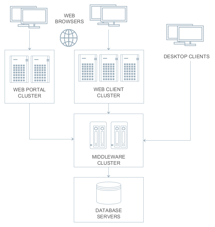
In the simplest case, however, an application can be installed on a single computer that contains also the database. Various deployment options depending on load and fault tolerance requirements are described in detail in Application Scaling.
5.1. Application Home
Application home is a file system directory where the CUBA application stores temporary files and where you can place local.app.properties and logback.xml configuration files. Most of the application directories described below are located in the application home. File storage also uses a subdirectory in the application home by default.
As CUBA application creates various files (temporary files, log files etc) in the application home, this directory should be write-accessible for the user running the application.
The framework gets the application home path from the app.home Java system property.
|
It is recommended that you set this property explicitly using the |
- Specifying application home explicitly
When running UberJAR, specify -D command line argument, for example:
java -Dapp.home=/opt/app_home -jar app.jar
When using WAR deployment, set app.home using -D command line argument in an appropriate startup script or by another recommended for the application server way. For example, in Tomcat, create bin/setenv.sh script with the following content:
CATALINA_OPTS="-Dapp.home=\"$CATALINA_BASE/work/app_home\" -Xmx512m -Dfile.encoding=UTF-8"
If you are using deployment to Tomcat Windows Service, place each property on a separate line in the Java Options field of the Tomcat service settings window.
- Automatic application home detection
If the app.home system property is not provided from the command line, it is set automatically according to the following rules:
-
If the application is started as UberJAR, the current working directory becomes application home.
-
If
catalina.basesystem property is set (i.e. the application is working under Tomcat), the application home is set to${catalina.base}/work/app_home. -
Otherwise, app home is set to the
.app_homesubdirectory of the user home directory.
|
Options 2 and 3 have the following drawback: the Logback initialization procedure comes into play before the |
When using Fast Deployment at development stage, the application home is set to the deploy/app_home directory of your project since CUBA 7.2. If your project is based on an older version of the platform, the application directories are located inside Tomcat’s conf and work subdirectories.
5.2. Application Directories
This section describes file system directories used by various application blocks at runtime.
5.2.1. Configuration Directory
The configuration directory can contain resources that complement and override configuration, user interface, and business logic after the application is deployed. Overriding is provided by the loading mechanism of the Resources infrastructure interface. Firstly it performs the search in the configuration directory and then in the classpath, so that resources from the configuration directory take precedence over identically named resources located in JAR files and class directories.
The configuration directory may contain resources of the following types:
-
metadata.xml, persistence.xml, views.xml, remoting-spring.xml configuration files.
-
XML-descriptors of UI screens.
-
Controllers of UI screens in the form of Java or Groovy source code.
-
Groovy scripts or classes, and Java source code that is used by the application via the Scripting interface.
The location of the configuration directory is determined by the cuba.confDir application property. By default, the configuration directory is located inside the application home.
5.2.2. Work Directory
The application uses the work directory to store some persistent data and configuration.
For example, the file storage mechanism by default uses the filestorage subdirectory of the work directory. Besides, the Middleware block writes generated persistence.xml and orm.xml files into the work directory on startup.
Work directory location is determined by the cuba.dataDir application property. By default, the work directory is located inside the application home.
5.2.3. Log Directory
Log directory is a directory where the application creates log files. The location and content of log files is defined by the configuration of the Logback framework provided in the logback.xml file. See Logging for more details.
Location of log files is usually specified relative to application home directory, for example:
<configuration debug="false">
<property name="logDir" value="${app.home}/logs"/>
<!-- ... -->You should also specify the same directory as defined by logback.xml in the cuba.logDir application property. It will allow system administrators to view and load log files in the Administration > Server Log screen.
5.2.4. Temporary Directory
This directory can be used by the application for creating arbitrary temporary files at runtime. The path to the temporary directory is determined by the cuba.tempDir application property. By default, the temporary directory is located inside the application home.
5.2.5. Database Scripts Directory
This directory contains the set of SQL scripts to create and update the database. It is specific to the Middleware block.
The script directory structure reproduces the one described in Database Migration Scripts, but it also has an additional top level that separates application components and the application scripts. The numbering of top-level directories is performed by project build tasks.
The DB scripts directory location is determined by cuba.dbDir application property. For fast deployment in Tomcat, it is the WEB-INF/db subdirectory of the middleware web application directory: tomcat/webapps/app-core/WEB-INF/db. For other deployment scenarios, the database scripts are located in the /WEB-INF/db directory inside WAR or UberJAR files.
5.3. Deployment Options
This section describes different ways to deploy CUBA applications.
5.3.1. Fast Deployment
Fast deployment is used by default when developing an application, as it provides minimum time for building, installation and starting the application. This option can also be used in production.
Fast deployment is performed when you run/debug your application in Studio or click CUBA > Build Tasks > Deploy. Under the hood, Studio executes the deploy task that is declared for core and web modules in the build.gradle file. Before the first execution of deploy, it also runs the setupTomcat task to install and initialize the local Tomcat server. You can run these tasks outside Studio as well.
|
Please make sure your environment does not contain |
Fast deployment creates the following structure in the deploy directory (only important directories and files are shown below):
deploy/
app_home/
app/
conf/
temp/
work/
app-core/
conf/
temp/
work/
logs/
app.log
local.app.properties
logback.xml
tomcat/
bin/
setenv.bat, setenv.sh
startup.bat, startup.sh
debug.bat, debug.sh
shutdown.bat, shutdown.sh
conf/
catalina.properties
server.xml
logging.properties
Catalina/
localhost/
lib/
hsqldb-2.4.1.jar
logs/
shared/
lib/
webapps/
app/
app-core/-
deploy/app_home- application home directory.-
app/conf,app-core/conf- web client and the middleware applications configuration directories. -
app/temp,app-core/temp– web client and the middleware applications temporary directories. -
app/work,app-core/work– web client and the middleware applications work directories. -
logs- the logs directory. The main log file of the application isapp.logby default. -
local.app.properties- a file where you can set application properties for this particular deployment. -
logback.xml- logging configuration.
-
-
deploy/tomcat- local Tomcat directory.-
bin– the directory that contains scripts to start and stop the Tomcat server:-
setenv.bat,setenv.sh– the scripts that set environment variables. These scripts should be used for setting JVM memory parameters, configuring access to JMX, parameters to connect the debugger.If you experience slow startup of Tomcat on Linux installed in a virtual machine (VPS), try to configure a non-blocking entropy source for JVM in
setenv.sh:CATALINA_OPTS="$CATALINA_OPTS -Djava.security.egd=file:/dev/./urandom" -
startup.bat,startup.sh– the scripts that start Tomcat. The server starts in a separate console window on Windows and in the background on Unix-like operating systems.To start the server in the current console window, use the following commands instead of
startup.*:> catalina.bat run$ ./catalina.sh run -
debug.bat,debug.sh– the scripts that are similar tostartup.*, but start Tomcat with an ability to connect the debugger. These scripts are launched when running the start the task of the build script. -
shutdown.bat,shutdown.sh– the scripts that stop Tomcat.
-
-
conf– the directory that contains Tomcat configuration files.-
catalina.properties– the Tomcat properties. To load shared libraries from theshared/libdirectory (see below), this file should contain the following line:shared.loader=${catalina.home}/shared/lib/*.jar -
server.xml– Tomcat configuration. -
logging.properties– Tomcat logging configuration. -
Catalina/localhost– in this directory, context.xml application deployment descriptors can be placed. Descriptors located in this directory take precedence over the descriptors in theMETA-INFdirectories of the application. This approach is often convenient for the production environment. For example, with this descriptor, it is possible to specify the database connection parameters that are different from those specified in the application itself.Server-specific deployment descriptor should have the application name and the
.xmlextension. So, to create this descriptor, for example, for theapp-coreapplication, copy the contents of thewebapps/app-core/META-INF/context.xmlfile to theconf/Catalina/localhost/app-core.xmlfile.
-
-
lib– directory of the libraries that are loaded by the server’s common classloader. These libraries are available for both the server and all web applications deployed in it. In particular, this directory should have JDBC drivers of the utilized databases (hsqldb-XYZ.jar,postgresql-XYZ.jar, etc.) -
logs– Tomcat logs directory. -
shared/lib– directory of libraries that are available to all deployed applications. Classes of these libraries are loaded by the server’s special shared classloader. Its usage is configured in theconf/catalina.propertiesfile as described above.The deploy task of the build script copies all libraries not listed in the
jarNamesparameter, i.e. not specific for the given application, into this directory. -
webapps– web application directories. Each application is located in its own subdirectory in the exploded WAR format.The deploy task of the build script create application subdirectories with the names specified in the
appNameparameters and, among other things, copy the libraries listed in thejarNamesparameter to theWEB-INF/libsubdirectory for each application.
-
The paths to Tomcat and application home can be specified in cuba.tomcat.dir and cuba.appHome properties of build.gradle, for example:
cuba {
// ...
tomcat {
dir = "$project.rootDir/some_path/tomcat"
}
appHome = "$project.rootDir/some_path/app_home"
}5.3.1.1. Using Tomcat in Production
By default, the fast deployment procedure creates the app and app-core web applications running on port 8080 of the local Tomcat instance. It means that the web client is available at http://localhost:8080/app.
You can use this Tomcat instance in production just by copying the tomcat and app_home directories to the server. The user who runs Tomcat must have read-write permissions to both directories.
After that, set up the server host name in app_home/local.app.properties:
cuba.webHostName = myserver
cuba.webAppUrl = http://myserver:8080/appBesides, set up the connection to your production database. You can do it in the context.xml file of your web application (tomcat/webapps/app-core/META-INF/context.xml), or copy this file to tomcat/conf/Catalina/localhost/app-core.xml as described in the previous section to separate development and production settings.
You can create the production database from a development database backup, or set up the automatic creation and further updating of the database. See Creating and Updating Database in Production.
5.3.2. WAR deployment to Jetty
Below is an example of deployment of the WAR files to the Jetty web server.
We are going to use the following directory structure:
-
C:\work\jetty-home\- Jetty distribution folder; -
C:\work\jetty-base\- Jetty configuration directory, used to store Jetty configuration files, additional libraries and web applications. -
C:\work\app_home\- CUBA application home directory.-
Use the CUBA project tree > Project > Deployment > WAR Settings dialog in Studio or just manually add the buildWar task to the end of build.gradle:
task buildWar(type: CubaWarBuilding) { appProperties = ['cuba.automaticDatabaseUpdate': 'true'] singleWar = false }Please note that we are building two separate WAR files for Middleware and Web Client blocks here.
-
Start build process by running
buildWarfrom the command line (provided that you have created the Gradle wrapper beforehand):gradlew buildWarAs a result, the
app-core.warandapp.warfiles will be created in thebuild\distributions\warproject subdirectory. -
Create an application home directory, for example,
c:\work\app_home. -
Copy the
logback.xmlfile from the development Tomcat (deploy/tomcat/confproject sub-folder) to the application home and edit thelogDirproperty in this file:<property name="logDir" value="${app.home}/logs"/> -
Download and install Jetty to a local directory, for example,
c:\work\jetty-home. This example has been tested onjetty-distribution-9.4.22.v20191022.zip. -
Create the
c:\work\jetty-basedirectory, open the command prompt in it and execute:java -jar c:\work\jetty-home\start.jar --add-to-start=http,jndi,deploy,plus,ext,resources -
Create the
c:\work\jetty-base\app-jetty.xmlfile defining the database connection pool. Contents of the file for a PostgreSQL database should be based on the following template:<?xml version="1.0"?> <!DOCTYPE Configure PUBLIC "-" "http://www.eclipse.org/jetty/configure_9_0.dtd"> <Configure id="wac" class="org.eclipse.jetty.webapp.WebAppContext"> <New id="CubaDS" class="org.eclipse.jetty.plus.jndi.Resource"> <Arg/> <Arg>jdbc/CubaDS</Arg> <Arg> <New class="org.apache.commons.dbcp2.BasicDataSource"> <Set name="driverClassName">org.postgresql.Driver</Set> <Set name="url">jdbc:postgresql://localhost/db_name</Set> <Set name="username">username</Set> <Set name="password">password</Set> <Set name="maxIdle">2</Set> <Set name="maxTotal">20</Set> <Set name="maxWaitMillis">5000</Set> </New> </Arg> </New> </Configure>The
app-jetty.xmlfile for MS SQL databases should correspond to the following template:<?xml version="1.0"?> <!DOCTYPE Configure PUBLIC "-" "http://www.eclipse.org/jetty/configure_9_0.dtd"> <Configure id="wac" class="org.eclipse.jetty.webapp.WebAppContext"> <New id="CubaDS" class="org.eclipse.jetty.plus.jndi.Resource"> <Arg/> <Arg>jdbc/CubaDS</Arg> <Arg> <New class="org.apache.commons.dbcp2.BasicDataSource"> <Set name="driverClassName">com.microsoft.sqlserver.jdbc.SQLServerDriver</Set> <Set name="url">jdbc:sqlserver://server_name;databaseName=db_name</Set> <Set name="username">username</Set> <Set name="password">password</Set> <Set name="maxIdle">2</Set> <Set name="maxTotal">20</Set> <Set name="maxWaitMillis">5000</Set> </New> </Arg> </New> </Configure> -
Download the following JARs required for the DB connection pool and put them to the
c:\work\jetty-base\lib\extfolder. Two of these files can be found in thedeploy\tomcat\shared\libproject sub-folder:commons-pool2-2.6.2.jar commons-dbcp2-2.7.0.jar commons-logging-1.2.jar -
Copy the
start.inifile from the Jetty distribution to thec:\work\jetty-basefolder. Add the following text to the beginning of thec:\work\jetty-base\start.inifile:--exec -Xdebug -agentlib:jdwp=transport=dt_socket,address=8787,server=y,suspend=n -Dapp.home=c:\work\app_home -Dlogback.configurationFile=c:\work\app_home\logback.xml app-jetty.xml -
Copy the JDBC driver for your database to the
c:\work\jetty-base\lib\extdirectory. You can take the driver file from thedeploy\tomcat\libproject directory. In case of PostgreSQL database, it ispostgresql-42.2.5.jar. -
Copy WAR files to the
c:\work\jetty-base\webappsdirectory. -
Open the command prompt in the
c:\work\jetty-basedirectory and run:java -jar c:\work\jetty-home\start.jar -
Open
http://localhost:8080/appin your web browser.
-
5.3.3. WAR deployment to WildFly
The WAR files with CUBA application can be deployed to the WildFly application server. An example below demonstrates how to deploy a CUBA application using PostgreSQL to the WildFly 18.0.1 server on Windows.
-
Edit
build.gradleand specify dependency in the global moduledependenciessection:runtime 'org.reactivestreams:reactive-streams:1.0.1' -
Assemble and deploy the project to the default Tomcat server in order to get all necessary dependencies locally.
-
Configure the application home directory for the application:
-
Create a folder that will be fully available for WildFly server’s process. For example:
C:\Users\UserName\app_home. -
Copy the
logback.xmlfile fromtomcat/confto this folder and edit thelogDirproperty:
<property name="logDir" value="${app.home}/logs"/> -
-
Configure the WildFly server
-
Install WildFly to a local folder, for example, to
C:\wildfly. -
Edit the
C:\wildfly\bin\standalone.conf.batfile and add the following line to the end of the file:
set "JAVA_OPTS=%JAVA_OPTS% -Dapp.home=%USERPROFILE%/app_home -Dlogback.configurationFile=%USERPROFILE%/app_home/logback.xml"Here we define the
app.homesystem property with the application home directory and configure the logging by setting the path to thelogback.xmlfile. You can also use an absolute path instead of%USERPROFILE%variable.-
Compare the Hibernate Validator versions in WildFly and CUBA application. If the platform uses a newer version, replace the
C:\wildfly\modules\system\layers\base\org\hibernate\validator\main\hibernate-validator-x.y.z-sometext.jarwith the newer file fromtomcat\shared\lib, for example,hibernate-validator-6.1.1.Final.jar. -
Update the JAR file version number in the
\wildfly\modules\system\layers\base\org\hibernate\validator\main\module.xmlfile. -
To register PostgreSQL driver in WildFly, copy the
postgresql-42.2.5.jarfromtomcat\libtoC:\wildfly\standalone\deployments. -
Setup WildFly logger: open the
\wildfly\standalone\configuration\standalone.xmlfile and add two lines to the<subsystem xmlns="urn:jboss:domain:logging:{version}"block:<subsystem xmlns="urn:jboss:domain:logging:8.0"> <add-logging-api-dependencies value="false"/> <use-deployment-logging-config value="false"/> . . . </subsystem>
-
-
Create JDBC Datasource
-
Start WildFly by running
standalone.bat -
Open the administration console on
http://localhost:9990. The first time you log in, you will be asked to create a user and a password. -
Open the Configuration - Subsystems - Datasources and Drivers - Datasources tab and create a new datasource for your application:
Name: Cuba JNDI Name: java:/jdbc/CubaDS JDBC Driver: postgresql-42.2.5.jar Driver Module Name: org.postgresql Driver Class Name: org.postgresql.Driver Connection URL: your database URL Username: your database username Password: your database passwordThe JDBC driver will be available on the list of detected drivers if you have copied
postgresql-x.y.z.jaras described above.Check the connection by clicking the Test connection button.
-
Activate the datasource.
-
Alternatively, you can create JDBC Datasource by using the
bin/jboss-cli.batcommand line utility:[disconnected /] connect [standalone@localhost:9990 /] data-source add --name=Cuba --jndi-name="java:/jdbc/CubaDS" --driver-name=postgresql-42.2.5.jar --user-name=dblogin --password=dbpassword --connection-url="jdbc:postgresql://dbhost/dbname" [standalone@localhost:9990 /] quit
-
-
Build the application
-
Open CUBA project tree > Project > Deployment > WAR Settings dialog in Studio.
-
Check Build WAR checkbox.
-
Save the settings.
-
Open build.gradle in IDE and add the
doAfterproperty to the buildWar task. This property will copy the WildFly deployment descriptor:task buildWar(type: CubaWarBuilding) { appProperties = ['cuba.automaticDatabaseUpdate' : true] singleWar = false doAfter = { copy { from 'jboss-deployment-structure.xml' into "${project.buildDir}/tmp/buildWar/core/war/META-INF/" } copy { from 'jboss-deployment-structure.xml' into "${project.buildDir}/tmp/buildWar/web/war/META-INF/" } } }For a singleWAR configuration the task will be different:
task buildWar(type: CubaWarBuilding) { webXmlPath = 'modules/web/web/WEB-INF/single-war-web.xml' appProperties = ['cuba.automaticDatabaseUpdate' : true] doAfter = { copy { from 'jboss-deployment-structure.xml' into "${project.buildDir}/tmp/buildWar/META-INF/" } } }If your project also contains a Polymer module, add the following configuration to your
single-war-web.xmlfile:<servlet> <servlet-name>default</servlet-name> <init-param> <param-name>resolve-against-context-root</param-name> <param-value>true</param-value> </init-param> </servlet> -
In the project root folder, create the
jboss-deployment-structure.xmlfile and add the WildFly deployment descriptor to it:
<?xml version="1.0" encoding="UTF-8"?> <jboss-deployment-structure xmlns="urn:jboss:deployment-structure:1.0"> <deployment> <exclusions> <module name="org.apache.commons.logging" /> <module name="org.apache.log4j" /> <module name="org.jboss.logging" /> <module name="org.jboss.logging.jul-to-slf4j-stub" /> <module name="org.jboss.logmanager" /> <module name="org.jboss.logmanager.log4j" /> <module name="org.slf4j" /> <module name="org.slf4j.impl" /> <module name="org.slf4j.jcl-over-slf4j" /> </exclusions> </deployment> </jboss-deployment-structure>-
Run the
buildWartask to create WAR files.
-
-
Copy the files
app-core.warandapp.warfrombuild\distributions\warto WildFly directory\wildfly\standalone\deployments. -
Restart the WildFly server.
-
Your application will become available on
http://localhost:8080/app. The log files will be saved in the application home:C:\Users\UserName\app_home\logs.
5.3.4. WAR deployment to Tomcat Windows Service
-
Use the CUBA project tree > Project > Deployment > WAR Settings dialog in Studio or just manually add the buildWar task to the end of build.gradle:
task buildWar(type: CubaWarBuilding) { singleWar = true includeContextXml = true includeJdbcDriver = true appProperties = ['cuba.automaticDatabaseUpdate': true] }If the target server parameters differ from what you have on the local Tomcat used for fast deployment, provide appropriate application properties. For example, if the target server runs on port 9999 and you build separate WARs, the task definition should be as follows:
task buildWar(type: CubaWarBuilding) { singleWar = false includeContextXml = true includeJdbcDriver = true appProperties = [ 'cuba.automaticDatabaseUpdate': true, 'cuba.webPort': 9999, 'cuba.connectionUrlList': 'http://localhost:9999/app-core' ] }You can also specify a separate
context.xmlfile to setup the connection to the production database or provide that file later on the server:task buildWar(type: CubaWarBuilding) { singleWar = true includeContextXml = true includeJdbcDriver = true appProperties = ['cuba.automaticDatabaseUpdate': true] coreContextXmlPath = 'modules/core/web/META-INF/war-context.xml' } -
Run the
buildWarGradle task. As a result,app.warfile (or several files if you build separate WARs) will be generated in thebuild/distributionsdirectory of your project.gradlew buildWar -
Create the application home directory, e.g.
C:\app_home. -
Download and install the Tomcat 9 Windows Service Installer from the Apache Tomcat official site.
-
Go to the
bindirectory of the installed server and runtomcat9w.exewith the administrative rights in order to set Tomcat service settings:-
Set Maximum memory pool to 1024MB on the Java tab.
-
Instruct Tomcat to use UTF-8 encoding by adding
-Dfile.encoding=UTF-8to the Java Options field. -
Specify application home folder by adding the
-Dapp.home=c:/app_hometo the Java Options field.
-
-
If you want to provide production database connection properties with a local file on the server, you can create a file in the
conf\Catalina\localhostsubfolder of the Tomcat server. The name of the file depends on the WAR file name, e.g.app.xmlfor single WAR andapp-core.xmlif separate WAR files are deployed. Copy contents of thecontext.xmlto this file. -
With the default configuration all application log messages are appended to the
logs/tomcat9-stdout.logfile. You have two options how to customize logging configuration of the application:-
Create the logback configuration file in the project. Specify path to this file for the
logbackConfigurationFileparameter of the buildWar task (manually or with the help of Studio WAR Settings dialog). -
Create the logging configuration file on the production server.
Copy the
logback.xmlfile from the development Tomcat (deploy/tomcat/confproject sub-folder) to the application home directory and edit thelogDirproperty in this file:<property name="logDir" value="${app.home}/logs"/>Add the following line to the Java Options field in the Tomcat 9 Windows Service settings window to specify path to the logging configuration file:
-Dlogback.configurationFile=C:/app_home/logback.xml
-
-
Copy the generated WAR file(s) to the
webappsdirectory of the Tomcat server. -
Restart the Tomcat service.
-
Open
http://localhost:8080/appin your web browser.
5.3.5. WAR deployment to Tomcat Linux Service
The example below has been developed for and tested on Ubuntu 18.04, with tomcat9 and tomcat8 packages.
-
Use the CUBA project tree > Project > Deployment > WAR Settings dialog in Studio or just manually add the buildWar task to the end of build.gradle. You can specify a separate
war-context.xmlproject file to specify connection settings to the production database or provide that file later on the server:task buildWar(type: CubaWarBuilding) { singleWar = true includeContextXml = true includeJdbcDriver = true appProperties = ['cuba.automaticDatabaseUpdate': true] webXmlPath = 'modules/web/web/WEB-INF/single-war-web.xml' coreContextXmlPath = 'modules/core/web/META-INF/war-context.xml' }If the target server parameters differ from what you have on the local Tomcat used for fast deployment, provide appropriate application properties. For example, if the target server runs on port 9999 and you build separate WARs, the task definition should be as follows:
task buildWar(type: CubaWarBuilding) { singleWar = false includeContextXml = true includeJdbcDriver = true appProperties = [ 'cuba.automaticDatabaseUpdate': true, 'cuba.webPort': 9999, 'cuba.connectionUrlList': 'http://localhost:9999/app-core' ] } -
Run the
buildWargradle task. As a result,app.warfile (or several files if you build separate WARs) will be generated in thebuild/distributionsdirectory of your project.gradlew buildWar -
Install Tomcat 9 package:
sudo apt install tomcat9 -
Copy the generated
app.warfile to the/var/lib/tomcat9/webappsdirectory of the server. You can also remove the/var/lib/tomcat9/webapps/ROOTsample webapp folder if it exists.Tomcat 9 service runs from
tomcatuser by default. The owner ofwebappsfolder istomcatas well. -
Create the application home directory, e.g.
/opt/app_homeand make the Tomcat server user (tomcat) to be the owner of this folder:sudo mkdir /opt/app_home sudo chown tomcat:tomcat /opt/app_home -
Tomcat 9 service (unlike earlier versions of the Tomcat Debian package) is sandboxed by systemd and has limited write access to the file system. You can read more about this in the
/usr/share/doc/tomcat9/README.Debianfile. It is necessary to modify systemd configuration to allow Tomcat service write access to the application home folder:-
Create the
override.conffile in the/etc/systemd/system/tomcat9.service.d/directory:sudo mkdir /etc/systemd/system/tomcat9.service.d/ sudo nano /etc/systemd/system/tomcat9.service.d/override.conf -
The contents of the
override.conffile are the following:[Service] ReadWritePaths=/opt/app_home/ -
Reload systemd configuration by invoking:
sudo systemctl daemon-reload
-
-
Create configuration file
/usr/share/tomcat9/bin/setenv.shwith the following text:CATALINA_OPTS="$CATALINA_OPTS -Xmx1024m" CATALINA_OPTS="$CATALINA_OPTS -Dapp.home=/opt/app_home"If you experience slow startup of Tomcat installed in a virtual machine (VPS), add an additional line to the
setenv.shfile:CATALINA_OPTS="$CATALINA_OPTS -Djava.security.egd=file:/dev/./urandom" -
If you want to provide production database connection properties with a local file on the server, you can create a file in the
/var/lib/tomcat9/conf/Catalina/localhost/folder. The name of the file depends on the WAR file name, e.g.app.xmlfor single WAR andapp-core.xmlif separate WAR files are deployed. Copy contents of thecontext.xmlto this file. -
With the default configuration all application log messages are appended to the
/var/log/syslogsystem journal. You have two options how to customize logging configuration of the application:-
Create the logback configuration file in the project. Specify path to this file for the
logbackConfigurationFileparameter of the buildWar task (manually or with the help of Studio WAR Settings dialog). -
Create the logging configuration file on the production server.
Copy the
logback.xmlfile from the development Tomcat (deploy/tomcat/confproject sub-folder) to the application home directory and edit thelogDirproperty in this file:<property name="logDir" value="${app.home}/logs"/>Add the following line to the
setenv.shscript to specify path to the logging configuration file:CATALINA_OPTS="$CATALINA_OPTS -Dlogback.configurationFile=/opt/app_home/logback.xml"
-
-
Restart the Tomcat service:
sudo systemctl restart tomcat9 -
Open
http://localhost:8080/appin your web browser.
- Differences when using tomcat8 package
-
CUBA supports deployment to both Tomcat 9 and Tomcat 8.5 versions. Please note the following differences when deploying to Tomcat 8.5:
-
Tomcat 8.5 is provided by the
tomcat8package -
User name is
tomcat8 -
Tomcat base directory is
/var/lib/tomcat8 -
Tomcat home directory is
/usr/share/tomcat8 -
Tomcat service does not use systemd sandboxing, so no need to change systemd settings.
-
Standard output and stderr messages are appended to the
/var/lib/tomcat8/logs/catalina.outfile.
-
- Troubleshooting LibreOffice reporting integration when using tomcat9 package
-
You may experience problems when deploying to the tomcat9 package and using LibreOffice integration with the Reporting add-on. Error may be diagnosed with this message:
2019-12-04 09:52:37.015 DEBUG [OOServer: ERR] com.haulmont.yarg.formatters.impl.doc.connector.OOServer - ERR: (process:10403): dconf-CRITICAL **: 09:52:37.014: unable to create directory '/.cache/dconf': Read-only file system. dconf will not work properly.This error is caused by the home directory of the
tomcatuser pointing to a non-writable location. It can be fixed by changingtomcatuser home directory to the/var/lib/tomcat9/workvalue:# bad value echo ~tomcat / # fix sudo systemctl stop tomcat9 sudo usermod -d /var/lib/tomcat9/work tomcat sudo systemctl start tomcat9
5.3.6. UberJAR Deployment
This is the simplest way to run your CUBA application in a production environment. You need to build an all-in-one JAR file using the buildUberJar Gradle task (see also the Deployment > UberJAR settings page in Studio) and then you can run the application from the command line using the java executable:
java -jar app.jarAll parameters of the application are defined at the build time, but can be overridden when running (see below). The default port of the web application is 8080 and it is available at http://host:8080/app. If your project has Polymer UI, by default it will be available at http://host:8080/app-front.
If you build separate JAR files for Middleware and Web Client, you can run them in the same way:
java -jar app-core.jar
java -jar app.jarThe default port of the web client is 8080 and it will try to connect to the middleware running on localhost:8079. So after running the above commands in two separate terminal windows, you will be able to connect to the web client at http://localhost:8080/app.
You can change the parameters defined at the build time by providing application properties via Java system properties. Besides, ports, context names and paths to Jetty configuration files can be provided as command line arguments.
- Command line arguments
-
-
port- defines the port on which the embedded HTTP server will run. For example:java -jar app.jar -port 9090Please note that if you build separate JARs and specify a port for the core block, you need to provide the cuba.connectionUrlList application property with the corresponding address to the client blocks, for example:
java -jar app-core.jar -port 7070 java -Dcuba.connectionUrlList=http://localhost:7070/app-core -jar app.jar -
contextName- a web context name for this application block. For example, in order to access your web client athttp://localhost:8080/sales, run the following command:java -jar app.jar -contextName salesIn order to connect to the web client at
http://localhost:8080, run the command:java -jar app.jar -contextName / -
frontContextName- a web context name for the Polymer UI (makes sense for single, web or portal JARs).
UberJAR doesn’t work correctly with the
frontContextName,contextNamearguments for React frontend clients.-
portalContextName- a web context name for the portal module running in the single JAR. -
jettyEnvPath- a path to the Jetty environment file which will override build time settings specified in thecoreJettyEnvPathparameter. It can be an absolute path or a path relative to the working directory. -
jettyConfPath- a path to the Jetty server configuration file which will override build time settings specified in thewebJettyConfPath/coreJettyConfPath/portalJettyConfPathparameter. It can be an absolute path or a path relative to the working directory.
-
- Application Home
-
By default, the application home is the working directory. It means that application directories will be created in the folder where you have run the application. It can be redefined by the
app.homeJava system property. So for example, in order to have the home in/opt/app_home, specify the following on the command line:java -Dapp.home=/opt/app_home -jar app.jar - Logging
-
If you want to modify built-in logging settings, provide the
logback.configurationFileJava system property with an URL to load your configuration file, for example:java -Dlogback.configurationFile=file:./logback.xml -jar app.jarHere it is assumed that the
logback.xmlfile is located in the folder where you start the application from.In order to set the log output directory correctly, make sure the
logDirproperty in thelogback.xmlpoints to thelogssubdirectory of the application home:<configuration debug="false"> <property name="logDir" value="${app.home}/logs"/> <!-- ... --> - Specifying deployment-time application properties
-
It is possible to set application properties in the deployment environment, specifying values which are not available at the time when the application is built (e.g. for security reasons).
You can do it using
local.app.propertiesfile, OS environment variables or Java system properties provided in the command line.The
local.app.propertiesfile must be located at application home. It is the current working directory if you haven’t specified the-Dapp.home=some_pathcommand line argument. For example:local.app.propertiescuba.web.loginDialogDefaultUser = <disabled> cuba.web.loginDialogDefaultPassword = <disabled>For OS environment variables, you can use uppercase variant of the application property name with dots replaced with underscores:
export CUBA_WEB_LOGINDIALOGDEFAULTUSER="<disabled>" export CUBA_WEB_LOGINDIALOGDEFAULTPASSWORD="<disabled>"Java system properties should be specified in the command line (keep in mind that they will be shown by task managers and
pscommand):java -Dcuba.web.loginDialogDefaultUser=<disabled> -Dcuba.web.loginDialogDefaultPassword=<disabled> -jar app.jarOS environment variables override values from
app.propertiesfiles, Java system variables override both OS environment variables and property files. - Stopping an application
-
You can gracefully stop the application in the following ways:
-
Pressing Ctrl+C in the terminal window where the application is running.
-
Executing
kill <PID>on Unix-like systems. -
Sending a stop key (i.e. a character sequence) on a port specified in the command line of the running application. There are the following command line arguments:
-
stopPort- a port to listen for a stop key or to send the key to. -
stopKey- a stop key. If not specified,SHUTDOWNis used. -
stop- to stop another process by sending the key.
-
For example:
# Start application 1 and listen to SHUTDOWN key on port 9090 java -jar app.jar -stopPort 9090 # Start application 2 and listen to MYKEY key on port 9090 java -jar app.jar -stopPort 9090 -stopKey MYKEY # Shutdown application 1 java -jar app.jar -stop -stopPort 9090 # Shutdown application 2 java -jar app.jar -stop -stopPort 9090 -stopKey MYKEY -
5.3.6.1. Configuring HTTPS for UberJAR
Below is an example of configuring HTTPS with a self-signed certificate for UberJAR deployment.
-
Generate keys and certificates with in-built JDK tool
Java Keytool:keytool -keystore keystore.jks -alias jetty -genkey -keyalg RSA -
Create the
jetty.xmlfile with SSL configuration in the project root folder:<Configure id="Server" class="org.eclipse.jetty.server.Server"> <Call name="addConnector"> <Arg> <New class="org.eclipse.jetty.server.ServerConnector"> <Arg name="server"> <Ref refid="Server"/> </Arg> <Set name="port">8090</Set> </New> </Arg> </Call> <Call name="addConnector"> <Arg> <New class="org.eclipse.jetty.server.ServerConnector"> <Arg name="server"> <Ref refid="Server"/> </Arg> <Arg> <New class="org.eclipse.jetty.util.ssl.SslContextFactory"> <Set name="keyStorePath">keystore.jks</Set> <Set name="keyStorePassword">password</Set> <Set name="keyManagerPassword">password</Set> <Set name="trustStorePath">keystore.jks</Set> <Set name="trustStorePassword">password</Set> </New> </Arg> <Set name="port">8443</Set> </New> </Arg> </Call> </Configure>The
keyStorePassword,keyManagerPassword, andtrustStorePasswordshould correspond to those set byKeytool. -
Add
jetty.xmlto the build task configuration:task buildUberJar(type: CubaUberJarBuilding) { singleJar = true coreJettyEnvPath = 'modules/core/web/META-INF/jetty-env.xml' appProperties = ['cuba.automaticDatabaseUpdate' : true] webJettyConfPath = 'jetty.xml' } -
Build Uber JAR as described in the UberJAR Deployment section.
-
Put the
keystore.jksin the same folder with JAR distribution of your project and start Uber JAR.The application will be available at
https://localhost:8443/app.
5.3.7. Deployment with Docker
This section covers deployment of CUBA applications in Docker containers.
We will take Sales Application, migrate it to PostgreSQL database and build UberJAR to run in a container. In fact, an application built as a WAR file would also work with a containerized Tomcat, but it would require a bit more configuration, so for the demo purposes we will stick with UberJAR.
- Configure and build UberJAR
-
Clone the sample project from https://github.com/cuba-platform/sample-sales-cuba7 and open it in CUBA Studio.
First, change your database type to PostgreSQL:
-
Click CUBA > Main Data Store Settings… in the main menu.
-
Select PostgreSQL in the Database type field and click OK.
-
Click CUBA > Generate Database Scripts in the main menu. Studio opens the Database Scripts dialog with generated scripts. Click Save and close in the dialog.
-
Click CUBA > Create Database in the main menu. Studio creates the
salesdatabase on the local PostgreSQL server.
Next, configure a Gradle task for building UberJAR.
-
Click CUBA > Deployment > Edit UberJAR Settings main menu item.
-
Select Build Uber JAR and Single Uber JAR checkboxes.
-
Click Generate button next to the Logback configuration file field.
-
Click Configure button next to the Custom data store configuration checkbox.
-
Make sure that URL in the Database Properties group starts with the
jdbc:postgresql://prefix. Enterpostgreshost name instead of thelocalhostin the first URL text field. It is necessary for connecting to the containerized database described below. -
Click OK. Studio adds the buildUberJar task to the
build.gradlefile. -
Open the generated
etc/uber-jar-logback.xmlfile or another file used as Logback configuration and ensure that thelogDirproperty has the following value:<property name="logDir" value="${app.home}/logs"/>Also, make sure the Logback configuration file limits the level of the
org.eclipse.jettylogger at least toINFO. If there is no such logger in the file, add it:<logger name="org.eclipse.jetty" level="INFO"/>
Run the task to create the JAR file by using main menu: CUBA → Deployment → Build UberJAR or by running the following command in the terminal:
./gradlew buildUberJar -
- Create Docker image
-
Now let’s create
Dockerfileand build a docker image with our application.-
Create the
docker-imagefolder in the project. -
Copy the JAR file from
build/distributions/uberJarinto this folder. -
Create a
Dockerfilewith the following instructions:FROM openjdk:8 COPY . /opt/sales CMD java -Dapp.home=/opt/sales-home -jar /opt/sales/app.jar
The
app.homeJava system property defines a directory for the application home where all logs and other files created by the application will be stored. When running the container, we will be able to map this directory to a host computer directory for easy access to logs and other data including files uploaded to FileStorage.Now build the image:
-
Open the terminal in the project root folder.
-
Run the build command passing the image name in the
-toption and the directory whereDockerfileis located:docker build -t sales docker-image
Check that the
salesimage is shown when you execute thedocker imagescommand. -
- Run application and database containers
-
The application is now ready to run in the container, but we also need a containerized PostgreSQL database. In order to manage two containers - one with the application and another with the database, we will use Docker Compose.
Create
docker-compose.ymlfile in the project root with the following content:version: '2' services: postgres: image: postgres:12 environment: - POSTGRES_DB=sales - POSTGRES_USER=cuba - POSTGRES_PASSWORD=cuba ports: - "5433:5432" web: depends_on: - postgres image: sales volumes: - /Users/me/sales-home:/opt/sales-home ports: - "8080:8080"Pay attention to the following parts of the file:
-
The
volumessection maps the container’s/opt/sales-homepath which is the application home directory to the host’s/Users/me/sales-homepath. It means that the application logs will be available in the/Users/me/sales-home/logsdirectory of the host computer. -
The PostgreSQL internal port 5432 is mapped to the host’s port 5433 to avoid possible conflicts with a PostgreSQL instance running on the host computer. Using this port, you can access the database from outside of the container, for example to backup it:
pg_dump -Fc -h localhost -p 5433 -d sales -U cuba > /Users/me/sales.backup
-
The application container exposes port 8080, so the application UI will be available at
http://localhost:8080/appon the host computer.
To start the application and the database, open the terminal in the directory of the
docker-compose.ymlfile and run:docker-compose up -
5.3.8. Deployment to Jelastic Cloud
Below is an example of building and deployment application to the Jelastic cloud.
|
Please note that only projects using PostgreSQL or HSQL databases are currently supported. |
-
First, create a free test account in the Jelastic cloud using a web browser.
-
Create a new environment where the application WAR will be deployed:
-
Click New Environment.
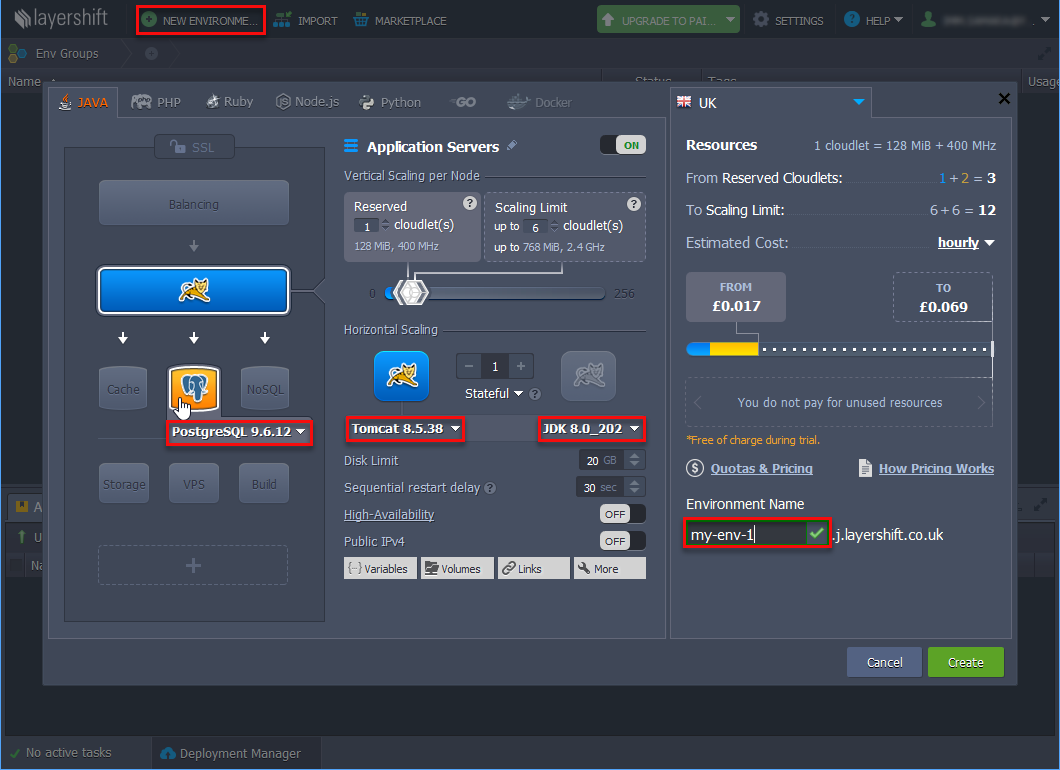
-
Specify the settings in the window that appears: a compatible environment should have Java 8, Tomcat 8 and PostgreSQL 9.1+ (if the project uses PostgreSQL database). In the Environment Name field, specify a unique environment name and click Create.
-
If the created environment uses PostgreSQL, you will receive an email with the database connection details. Go to the database administration web interface using the link in the email received after the creation of the environment and create an empty database. The database name should be specified later in the custom
context.xml.
-
-
Build Single WAR file using CUBA Studio:
-
Select CUBA > Deployment > WAR Settings in the main menu.
-
Select Build WAR checkbox.
-
Enter
..in the Application home directory field. -
Select Include JDBC driver and Include Tomcat’s context.xml checkboxes.
-
If your project uses PostgreSQL, press Generate button next to the Custom context.xml path field. Specify the database user, password, host, and name of the database that you created earlier in the Jelastic web interface.
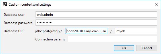
-
Select Single WAR for Middleware and Web Client checkbox.
-
Press Generate button next to the Custom web.xml path field. Studio will generate a special
web.xmlof the single WAR comprising the Middleware and Web Client application blocks.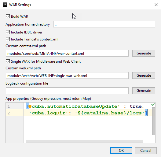
-
Add
cuba.logDirproperty in the App properties field:appProperties = ['cuba.automaticDatabaseUpdate': true, 'cuba.logDir': '${catalina.base}/logs'] -
Click the OK button. Studio adds the buildWar task to the
build.gradlefile.task buildWar(type: CubaWarBuilding) { includeJdbcDriver = true includeContextXml = true appProperties = ['cuba.automaticDatabaseUpdate': true, 'cuba.logDir' : '${catalina.base}/logs'] webXmlPath = 'modules/web/web/WEB-INF/single-war-web.xml' coreContextXmlPath = 'modules/core/web/META-INF/war-context.xml' } -
If your project uses HSQLDB, open the
buildWartask in thebuild.gradleand add thehsqlInProcess = trueproperty in order to run the embedded HSQL server while deploying the WAR file. Make sure that thecoreContextXmlPathproperty is not set.task buildWar(type: CubaWarBuilding) { appProperties = ['cuba.automaticDatabaseUpdate': true, 'cuba.logDir': '${catalina.base}/logs'] includeContextXml = true webXmlPath = 'modules/web/web/WEB-INF/single-war-web.xml' includeJdbcDriver = true hsqlInProcess = true } -
Start build process by running
buildWarfrom the command line:gradlew buildWarAs a result, the
app.warfile will be created in thebuild\distributions\warproject subdirectory.
-
-
Use deployWar Gradle task to deploy your WAR file to Jelastic.
task deployWar(type: CubaJelasticDeploy, dependsOn: buildWar){ email = **** password = **** hostUrl = 'app.j.layershift.co.uk' environment = 'my-env-1' } -
After the deployment process is completed, your application will be available in the Jelastic cloud. To open it, use a URL like
<environment>.<hostUrl>in the browser.For example:
http://my-env-1.j.layershift.co.ukYou can also open the application using the Open in Browser button located on the environments panel in Jelastic.
5.3.9. Deployment to Bluemix Cloud
CUBA Studio provides support of IBM® Bluemix® cloud deployment in a few easy steps.
|
Bluemix cloud deployment is currently applicable only to projects using PostgreSQL database. HSQLDB is available with in-process option only, that means the database will be recreated on every application restart, and the user data will be lost. |
-
Create an account on the Bluemix. Download and install:
-
Bluemix CLI: http://clis.ng.bluemix.net/ui/home.html
-
Cloud Foundry CLI: https://github.com/cloudfoundry/cli/releases
-
Make sure the commands
bluemixandcfwork in the command line. If not, add your\IBM\Bluemix\binpath to thePATHenvironment variable.
-
-
Create a Space in the Bluemix with any space name. You can group several applications within one space if needed.
-
In the Space create an application server: Create App → CloudFoundry Apps → Tomcat.
-
Specify the name of the application. The name should be unique as it will be used as part of the URL of your application.
-
To create a Database service, click Create service in the Space dashboard and choose ElephantSQL.
-
Open the application manager and connect the created DB Service to the application. Click Connect Existing. For the changes to take effect, the system requires restaging (updating) the application. In our case, it is not necessary, as the application will be redeployed.
-
After the DB Service is connected, DB credentials become available with the View Credentials button. The DB properties are also stored in the
VCAP_SERVICESenvironment variable of the application runtime and could be viewed by calling thecf envcommand. The created database is also accessible from outside of the Space, so you can work with it from your development environment. -
Setup your CUBA project to run with the PostgreSQL (the DBMS similar to the one you have in the Bluemix).
-
Generate DB scripts and start the local Tomcat server. Make sure the application works.
-
Generate WAR-file to deploy the application to Tomcat.
-
Click Deployment > WAR Settings in the Project section of CUBA project view.
-
Enable all the options using checkboxes, as for correct deployment it should be the Single WAR with JDBC driver and
context.xmlinside.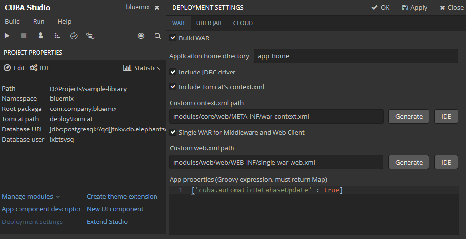
-
Click Generate button near the Custom context.XML field. In the opened dialog fill the credentials of the Database you have created in Bluemix.
Use the credentials from
uriof your DB service following the example below:{ "elephantsql": [ { "credentials": { "uri": "postgres://ixbtsvsq:F_KyeQjpEdpQfd4n0KpEFCYyzKAbN1W9@qdjjtnkv.db.elephantsql.com:5432/ixbtsvsq", "max_conns": "5" } } ] }Database user:
ixbtsvsqDatabase password:
F_KyeQjpEdpQfd4n0KpEFCYyzKAbN1W9Database URL:
qdjjtnkv.db.elephantsql.com:5432Database name:
ixbtsvsq -
Click Generate button to generate the custom
web.xmlfile required for the single WAR. -
Save the settings. Generate the WAR-file using the
buildWarGradle task in Studio or command line.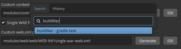
As a result, the
app.warappears in thebuild/distributions/war/sub-directory of the project.
-
-
In the root directory of the project create manually the
manifest.ymlfile. The contents of the file should be as follows:applications: - path: build/distributions/war/app.war memory: 1G instances: 1 domain: eu-gb.mybluemix.net name: myluckycuba host: myluckycuba disk_quota: 1024M buildpack: java_buildpack env: JBP_CONFIG_TOMCAT: '{tomcat: { version: 8.0.+ }}' JBP_CONFIG_OPEN_JDK_JRE: '{jre: { version: 1.8.0_+ }}'where
-
pathis the relative path to WAR-file. -
memory: the default memory limit is 1G. You may want to allocate less or more memory to your application, this can also be done via Bluemix WEB interface. Note that the allocated memory affects the Runtime Cost. -
nameis the name of the Tomcat application you have created in the Cloud above (depends on your application location, see yourApp URL, for example,https://myluckycuba.eu-gb.mybluemix.net/). -
host: the same as name. -
env: the environment variables used to set the Tomcat and Java versions.
-
-
In the command line switch to the root directory of your CUBA project.
cd your_project_directory -
Connect to Bluemix (double check the domain name).
cf api https://api.eu-gb.bluemix.net -
Log in to your Bluemix account.
cf login -u your_bluemix_id -o your_bluemix_ORG -
Deploy your WAR to your Tomcat.
cf pushThe
pushcommand gets all the required parameters from themanifest.ymlfile. -
You can find Tomcat server logs via Bluemix WEB-interface in the Logs tab on the application dashboard, as well as in command line using the command
cf logs cuba-app --recent -
After the deployment process is completed, your application will become accessible in browser using the URL
host.domain. This URL will be displayed in the ROUTE field in the table of your Cloud Foundry Apps.
5.3.10. Deployment to Heroku Cloud
The section describes how to deploy CUBA applications to the Heroku® cloud platform.
|
This tutorial covers deployment of a project using PostgreSQL database. |
5.3.10.1. WAR Deployment to Heroku
- Heroku account
-
First, create an account on Heroku using the web browser, free account
hobby-devis enough. Then login to the account and create new application using New button at the top of the page.Select unique name (or left the field blank to assign automatically) and choose a server location. Now you have an application, for example,
morning-beach-4895, this is the Heroku application name.At the first time, you will be redirected to the Deploy tab. Use Heroku Git deployment method.
- Heroku CLI
-
-
Install Heroku CLI on your computer.
-
Navigate to the folder containing your CUBA project. Further on we will use
$PROJECT_FOLDERfor it. -
Open command prompt in
$PROJECT_FOLDERand type:heroku login -
Enter your credentials when prompted. From now on you don’t need to enter credentials for this project anymore.
-
Install Heroku CLI deployment plugin:
heroku plugins:install heroku-cli-deploy
-
- PostgreSQL database
-
Using the web browser go to Heroku data page
You can choose existent Postgres database or create one. Next steps describe how to create a new database.
-
Find Heroku Postgres block and click Create one
-
On the next screen click Install Heroku Postgr…
-
Connect the database to Heroku application selected from a dropdown list
-
Select your Plan (for example:
hobby-dev)
Alternatively, you can install PostgreSQL using Heroku CLI:
heroku addons:create heroku-postgresql:hobby-dev --app morning-beach-4895Here
morning-beach-4895is your Heroku application name.Now you can find the new database on the Resources tab. The database is connected to the Heroku application. To obtain database credentials go to the Datasource page of your Heroku database, scroll down to Administration section and click View credentials button.
Host compute.amazonaws.com Database d2tk User nmmd Port 5432 Password 9c05 URI postgres://nmmd:9c05@compute.amazonaws.com:5432/d2tk -
- Project deployment settings
-
-
We assume that you use PostgreSQL with your CUBA project.
-
Open your CUBA project in Studio, navigate to CUBA Project Tree → Deployment, open WAR Settings dialog and then configure options as described below.
-
Select Build WAR
-
Set application home directory to '.' (dot)
-
Select Include JDBC driver
-
Select Include Tomcat’s context.xml
-
Click Generate button next to the Custom context.xml path field. Fill your database connection details in modal window.
-
Open the file generated
modules/core/web/META-INF/war-context.xmland check connection params and credentials:<Context> <!-- Database connection --> <Resource name="jdbc/CubaDS" type="javax.sql.DataSource" maxTotal="20" maxIdle="2" maxWaitMillis="5000" driverClassName="org.postgresql.Driver" url="jdbc:postgresql://compute.amazonaws.com/d2tk" username="nmmd" password="9c05"/> <!-- ... --> </Context> -
Select Single WAR for Middleware and Web Client
-
Click Generate button next to the Custom web.xml path field
-
Copy the code shown below and paste it into the App properties field:
[ 'cuba.automaticDatabaseUpdate' : true ] -
Save deployment settings and wait until Gradle project is refreshed.
-
-
- Build WAR file
-
Build WAR file by double-clicking the new Build WAR project tree item or by executing the
buildWarGradle task:gradlew buildWar - Application setup
-
-
Download Tomcat Webapp Runner from https://mvnrepository.com/artifact/com.github.jsimone/webapp-runner. The version of Webapp Runner must conform to the Tomcat version in use. For example, version 8.5.11.3 of Webapp Runner is suitable for Tomcat version 8.5.11. Rename JAR to
webapp-runner.jarand place it into$PROJECT_FOLDER. -
Download Tomcat DBCP from https://mvnrepository.com/artifact/org.apache.tomcat/tomcat-dbcp. Use the version corresponding to your Tomcat version, for example, 8.5.11. Create
$PROJECT_FOLDER/libs, rename JAR totomcat-dbcp.jarand place it into the$PROJECT_FOLDER/libsfolder. -
Create a file named
Procfilein$PROJECT_FOLDER. The file should contain the following text:web: java $JAVA_OPTS -cp webapp-runner.jar:libs/* webapp.runner.launch.Main --enable-naming --port $PORT build/distributions/war/app.war
-
- Git setup
-
Open the command prompt in
$PROJECT_FOLDERand run the commands listed below:git init heroku git:remote -a morning-beach-4895 git add . git commit -am "Initial commit" - Application deployment
-
Open the command prompt and run the following command:
On *nix:
heroku jar:deploy webapp-runner.jar --includes libs/tomcat-dbcp.jar:build/distributions/war/app.war --app morning-beach-4895On Windows:
heroku jar:deploy webapp-runner.jar --includes libs\tomcat-dbcp.jar;build\distributions\war\app.war --app morning-beach-4895Open the Resources tab in Heroku dashboard. A new Dyno should appear with a command from your
Procfile:
The application is deploying now. You can monitor logs to track the process.
- Logs monitoring
-
Wait for a message
https://morning-beach-4895.herokuapp.com/ deployed to Herokuin command window.In order to track application logs, run the following command on the command line:
heroku logs --tail --app morning-beach-4895
After the deployment process is completed your application will be accessible in web browser by an URL like https://morning-beach-4895.herokuapp.com.
You can also open the application from the Heroku dashboard using the Open app button.
5.3.10.2. Deployment from GitHub to Heroku
This guide is intended for developers who have a CUBA project located on GitHub.
- Heroku account
-
Create an account on Heroku using the web browser, free account
hobby-devis enough. Then login to the account and create new application using New button at the top of the page.Select unique name (or left the field blank to assign automatically) and choose a server location. Now you have an application, for example,
space-sheep-02453, this is a Heroku application name.At the first time, you will be redirected to Deploy tab. Use GitHub deployment method. Follow the screen instructions how to authorize your GitHub account. Click Search button to list all available Git repositories then connect to desired repo. When your Heroku application is connected to GitHub you are able to activate Automatic Deploys. This allows you to redeploy Heroku application automatically on each Git push event. In this tutorial, the option is enabled.
- Heroku CLI
-
-
Install Heroku CLI
-
Open command prompt in any folder of your computer and type:
heroku login -
Enter your credentials when prompted. From now on you don’t need to enter credentials for this project.
-
- PostgreSQL database
-
-
Return to web browser with Heroku dashboard
-
Go to Resources tab
-
Click Find more add-ons button to find the database add-on
-
Find Heroku Postgres block and click it. Follow the instruction on the screen, click Login to install / Install Heroku Postgres.
Alternatively, you can install PostgreSQL using Heroku CLI:
heroku addons:create heroku-postgresql:hobby-dev --app space-sheep-02453where
space-sheep-02453is your Heroku application name.Now you can find the new database on the Resources tab. The database is connected to the Heroku application. To obtain database credentials go to the Datasource page of your Heroku database, scroll down to Administration section and click View credentials button.
Host compute.amazonaws.com Database zodt User artd Port 5432 Password 367f URI postgres://artd:367f@compute.amazonaws.com:5432/zodt -
- Project deployment settings
-
-
Navigate to your local CUBA project folder (
$PROJECT_FOLDER) -
Copy the content of
modules/core/web/META-INF/context.xmltomodules/core/web/META-INF/heroku-context.xml -
Fill
heroku-context.xmlwith your actual database connection details (see example below):<Context> <Resource driverClassName="org.postgresql.Driver" maxIdle="2" maxTotal="20" maxWaitMillis="5000" name="jdbc/CubaDS" password="367f" type="javax.sql.DataSource" url="jdbc:postgresql://compute.amazonaws.com/zodt" username="artd"/> <Manager pathname=""/> </Context>
-
- Build configuration
-
Add the following Gradle task to your
$PROJECT_FOLDER/build.gradletask stage(dependsOn: ['setupTomcat', ':app-core:deploy', ':app-web:deploy']) { doLast { // replace context.xml with heroku-context.xml def src = new File('modules/core/web/META-INF/heroku-context.xml') def dst = new File('deploy/tomcat/webapps/app-core/META-INF/context.xml') dst.delete() dst << src.text // change port from 8080 to heroku $PORT def file = new File('deploy/tomcat/conf/server.xml') file.text = file.text.replace('8080', '${port.http}') // add local.app.properties for core application def coreConfDir = new File('deploy/tomcat/conf/app-core/') coreConfDir.mkdirs() def coreProperties = new File(coreConfDir, 'local.app.properties') coreProperties.text = ''' cuba.automaticDatabaseUpdate = true ''' // rename deploy/tomcat/webapps/app to deploy/tomcat/webapps/ROOT def rootFolder = new File('deploy/tomcat/webapps/ROOT') if (rootFolder.exists()) { rootFolder.deleteDir() } def webAppDir = new File('deploy/tomcat/webapps/app') webAppDir.renameTo( new File(rootFolder.path) ) // add local.app.properties for web application def webConfDir = new File('deploy/tomcat/conf/ROOT/') webConfDir.mkdirs() def webProperties = new File(webConfDir, 'local.app.properties') webProperties.text = ''' cuba.webContextName = / ''' } } - Procfile
-
A command that launches the application on Heroku side is passed by special file
Procfile. Create a file namedProcfilein$PROJECT_FOLDERwith following text:web: cd ./deploy/tomcat/bin && export 'JAVA_OPTS=-Dport.http=$PORT' && ./catalina.sh runThis provides JAVA_OPTS environment setting to Tomcat which starts with the Catalina script.
- Premium addons
-
If your project uses CUBA Premium Add-ons, set additional variables for the Heroku application.
-
Open the Heroku dashboard.
-
Go to the Settings tab.
-
Expand the Config Variables section clicking the Reveal Config Vars button.
-
Add new Config Vars using your license key parts (separated by dash) as username and password:
CUBA_PREMIUIM_USER | username CUBA_PREMIUM_PASSWORD | password -
- Gradle wrapper
-
Your project requires Gradle wrapper. You can use CUBA Studio to add it: see the Build > Create or update Gradle wrapper main menu command.
-
Create the
system.propertiesfile in$PROJECT_FOLDERwith the following content (example corresponds to local JDK 1.8.0_121 installed):java.runtime.version=1.8.0_121 -
Check that files
Procfile,system.properties,gradlew,gradlew.batandgradleare not in.gitignore -
Add these files to repository and commit it
git add gradlew gradlew.bat gradle/* system.properties Procfile git commit -am "Added Gradle wrapper and Procfile" -
- Application deployment
-
Once you commit and push all changes to GitHub, Heroku starts redeploying the application.
git pushThe building process is available on the dashboard on the Activity tab. Click View build log link to track the build log.
After building process is completed, your application will become accessible in browser using the
https://space-sheep-02453.herokuapp.com/. You can open the application from Heroku dashboard using the Open app button. - Logs monitoring
-
Heroku application log is shown by console command:
heroku logs --tail --app space-sheep-02453Tomcat logs are also available in web application: Menu > Administration > Server Log
5.3.10.3. Container Deployment to Heroku
Set up UberJAR building as it is described in the Deployment with Docker section. Create a Heroku account and install Heroku CLI. For this purpose, please refer to the WAR Deployment to Heroku section.
Create the app and connect it to the database with the following command
heroku create cuba-sales-docker --addons heroku-postgresql:hobby-devAfter the task is completed you have to configure the database credentials in the jetty-env.xml file for the connection to the database created by Heroku.
-
Go to the https://dashboard.heroku.com.
-
Select your project, open the Resources tab and select the database.
-
In the newly opened window open the Settings tab and click the View Credentials button.
Switch to the IDE and open the jetty-env.xml file. You have to change the URL (host and database name), user name and password. Copy credentials from the site and paste them into the file.
<?xml version="1.0"?>
<!DOCTYPE Configure PUBLIC "-" "http://www.eclipse.org/jetty/configure_9_0.dtd">
<Configure id='wac' class="org.eclipse.jetty.webapp.WebAppContext">
<New id="CubaDS" class="org.eclipse.jetty.plus.jndi.Resource">
<Arg/>
<Arg>jdbc/CubaDS</Arg>
<Arg>
<New class="org.apache.commons.dbcp2.BasicDataSource">
<Set name="driverClassName">org.postgresql.Driver</Set>
<Set name="url">jdbc:postgresql://<Host>/<Database></Set>
<Set name="username"><User></Set>
<Set name="password"><Password></Set>
<Set name="maxIdle">2</Set>
<Set name="maxTotal">20</Set>
<Set name="maxWaitMillis">5000</Set>
</New>
</Arg>
</New>
</Configure>Build the single Uber JAR file using the Gradle task:
gradle buldUberJarAlso, you have to add some changes to the Dockerfile. First of all, if you use the free account, you have to restrict the amount of memory consumed by the application. Then you need to obtain the port of the app from the Heroku and add it to the image.
The Dockerfile should look like the following:
### Dockerfile
FROM openjdk:8
COPY . /usr/src/cuba-sales
CMD java -Xmx512m -Dapp.home=/usr/src/cuba-sales/home -jar /usr/src/cuba-sales/app.jar -port $PORTSet up Git with the following commands:
git init
heroku git:remote -a cuba-sales-docker
git add .
git commit -am "Initial commit"Then log in to the container registry. It’s the Heroku location for storing images.
heroku container:loginNext, build the image and push it to Container Registry
heroku container:push webHere web is the process type of the application. When you run this command, by default Heroku is going to build the image using the Dockerfile in the current directory, and then push it to Heroku.
After the deployment process is completed, your application will be accessible in web browser by an URL like https://cuba-sales-docker.herokuapp.com/app
You can also open the application from the Heroku dashboard using the Open app button.
The third way to open a running application is to use the following command (remember to add the app context to the link, e.g. https://cuba-sales-docker.herokuapp.com/app):
heroku open5.4. Proxy Configuration for Tomcat
For integration tasks you may need a proxy server. This part describes the configuration of Nginx HTTP-server as a proxy for CUBA application.
|
If you set up a proxy, do not forget to set cuba.webAppUrl value. |
- Tomcat Setup
-
If Tomcat is used behind a proxy server - it should be configured as well, so that Tomcat can properly dispatch proxy server’s headers.
First, add
Valveto Tomcat configurationconf/server.xml, copy and paste the following code:<Valve className="org.apache.catalina.valves.RemoteIpValve" remoteIpHeader="X-Forwarded-For" requestAttributesEnabled="true" internalProxies="127\.0\.0\.1"/>There is another setting you should consider to change in the
conf/server.xmlfile -AccessLogValvepattern attribute. Add%{x-forwarded-for}ito the pattern, so that Tomcat access log records both original source IP address and IP address(-es) of proxy server(s):<Valve className="org.apache.catalina.valves.AccessLogValve" ... pattern="%h %{x-forwarded-for}i %l %u %t "%r" %s %b" />Then restart Tomcat:
sudo service tomcat8 restart- NGINX
-
For Nginx there are 2 configurations described below. All examples were tested on Ubuntu 18.04.
For example, your web application works on
http://localhost:8080/app.Run command to install Nginx:
sudo apt-get install nginxNavigate to
http://localhostand ensure that Nginx works, you will see Nginx welcome page.Now you may delete the symlink to default Nginx site:
rm /etc/nginx/sites-enabled/default
Next, configure your proxy one of the options selected below.
- Direct Proxy
-
In this case the requests are handled by proxy, transparently passing to the application.
Create Nginx site configuration file
/etc/nginx/sites-enabled/direct_proxy:server { listen 80; server_name localhost; location /app/ { proxy_set_header Host $host; proxy_set_header X-Forwarded-Server $host; proxy_set_header X-Forwarded-Proto $scheme; # Required to send real client IP to application server proxy_set_header X-Forwarded-For $proxy_add_x_forwarded_for; proxy_set_header X-Real-IP $remote_addr; # Optional timeouts proxy_read_timeout 3600; proxy_connect_timeout 240; proxy_http_version 1.1; # Required for WebSocket: proxy_set_header Upgrade $http_upgrade; proxy_set_header Connection "upgrade"; proxy_pass http://127.0.0.1:8080/app/; } }and restart Nginx
sudo service nginx restartNow you can access your site via
http://localhost/app.
- Redirect to Path
-
This example describes how to change the application’s URL path from /app to /, as if the application were deployed in the root context (similar to /ROOT). This will allow you to access the application at
http://localhost.Create Nginx site configuration file
/etc/nginx/sites-enabled/root_proxy:server { listen 80; server_name localhost; location / { proxy_set_header Host $host; proxy_set_header X-Forwarded-Server $host; proxy_set_header X-Forwarded-Proto $scheme; # Required to send real client IP to application server proxy_set_header X-Forwarded-For $proxy_add_x_forwarded_for; proxy_set_header X-Real-IP $remote_addr; # Optional timeouts proxy_read_timeout 3600; proxy_connect_timeout 240; proxy_http_version 1.1; # Required for WebSocket: proxy_set_header Upgrade $http_upgrade; proxy_set_header Connection "upgrade"; proxy_pass http://127.0.0.1:8080/app/; # Required for folder redirect proxy_cookie_path /app /; proxy_set_header Cookie $http_cookie; proxy_redirect http://localhost/app/ http://localhost/; } }and restart Nginx
sudo service nginx restartNow you can access your site via
http://localhost.
|
Please note that similar deployment instructions are valid for Jetty, |
5.5. Proxy Configuration for Uber JAR
This part describes the configuration of Nginx HTTP-server as a proxy for CUBA Uber JAR application.
- NGINX
For Nginx there are 2 configurations described below. All examples were tested on Ubuntu 16.04.
-
Direct Proxy
-
Redirect to Path
For example, your web application works on http://localhost:8080/app.
|
Uber JAR application uses Jetty 9.2 server. It is required to preconfigure Jetty in JAR to dispatch Nginx headers by Jetty. |
- Jetty Setup
-
-
Using Internal jetty.xml
First, create Jetty configuration file
jetty.xmlin the root of your project, copy and paste the following code:<?xml version="1.0" encoding="utf-8"?> <!DOCTYPE Configure PUBLIC "-//Jetty//Configure//EN" "http://www.eclipse.org/jetty/configure_9_0.dtd"> <Configure id="Server" class="org.eclipse.jetty.server.Server"> <New id="httpConfig" class="org.eclipse.jetty.server.HttpConfiguration"> <Set name="outputBufferSize">32768</Set> <Set name="requestHeaderSize">8192</Set> <Set name="responseHeaderSize">8192</Set> <Call name="addCustomizer"> <Arg> <New class="org.eclipse.jetty.server.ForwardedRequestCustomizer"/> </Arg> </Call> </New> <Call name="addConnector"> <Arg> <New class="org.eclipse.jetty.server.ServerConnector"> <Arg name="server"> <Ref refid="Server"/> </Arg> <Arg name="factories"> <Array type="org.eclipse.jetty.server.ConnectionFactory"> <Item> <New class="org.eclipse.jetty.server.HttpConnectionFactory"> <Arg name="config"> <Ref refid="httpConfig"/> </Arg> </New> </Item> </Array> </Arg> <Set name="port">8080</Set> </New> </Arg> </Call> </Configure>Add
webJettyConfPathproperty to the taskbuildUberJarin yourbuild.gradle:task buildUberJar(type: CubaUberJarBuilding) { singleJar = true coreJettyEnvPath = 'modules/core/web/META-INF/jetty-env.xml' appProperties = ['cuba.automaticDatabaseUpdate' : true] webJettyConfPath = 'jetty.xml' }You may use Studio to generate
jetty-env.xmlby following Deployment > UberJAR Settings tab, or use an example below:<?xml version="1.0"?> <!DOCTYPE Configure PUBLIC "-" "http://www.eclipse.org/jetty/configure_9_0.dtd"> <Configure id='wac' class="org.eclipse.jetty.webapp.WebAppContext"> <New id="CubaDS" class="org.eclipse.jetty.plus.jndi.Resource"> <Arg/> <Arg>jdbc/CubaDS</Arg> <Arg> <New class="org.apache.commons.dbcp2.BasicDataSource"> <Set name="driverClassName">org.postgresql.Driver</Set> <Set name="url">jdbc:postgresql://<Host>/<Database></Set> <Set name="username"><User></Set> <Set name="password"><Password></Set> <Set name="maxIdle">2</Set> <Set name="maxTotal">20</Set> <Set name="maxWaitMillis">5000</Set> </New> </Arg> </New> </Configure>Build Uber JAR using the following command:
gradlew buildUberJarYour application will be located in
build/distributions/uberJar, the default name isapp.jar.Run your application:
java -jar app.jarThen install and configure Nginx as described in Tomcat section.
Depending on your schema, you can access your site via
http://localhost/apporhttp://localhostURL. -
Using External jetty.xml
Use the same configuration file
jetty.xmlfrom the project root, as described above. Place it in your home folder and do not modifybuildUberJartask inbuild.gradle.Build Uber JAR using the following command:
gradlew buildUberJarYour application will be located in
build/distributions/uberJarfolder, default name isapp.jar.First, run the application with a parameter
-jettyConfPath:java -jar app.jar -jettyConfPath jetty.xmlThen install and configure Nginx as described in Tomcat section.
Depending on your schema and setings in
jetty.xmlfile, you can access your site viahttp://localhost/apporhttp://localhostURL.
-
5.6. Application Scaling
This section describes ways to scale a CUBA application that consists of the Middleware and the Web Client for increased load and stronger fault tolerance requirements.
|
Stage 1. Both blocks are deployed on the same application server. This is the simplest option implemented by the standard fast deployment procedure. In this case, maximum data transfer performance between the Web Client and the Middleware is provided, because when the cuba.useLocalServiceInvocation application property is enabled, the Middleware services are invoked bypassing the network stack. |
|
|
Stage 2. The Middleware and the Web Client blocks are deployed on separate application servers. This option allows you to distribute load between two application servers and use server resources better. Furthermore, in this case, the load coming from web users has smaller effect on the other processes execution. Here, the other processes mean handling other client types, running scheduled tasks and, potentially, integration tasks which are performed by the middle layer. Requirements for server resources:
In this case and when more complex deployment options are used, the Web Client’s cuba.useLocalServiceInvocation application property should be set to |
|
Stage 3. A cluster of Web Client servers works with one Middleware server. This option is used when memory requirements for the Web Client exceed the capabilities of a single JVM due to a large number of concurrent users. In this case, a cluster of Web Client servers (two or more) is started and user connection is performed through a Load Balancer. All Web Client servers work with one Middleware server. Duplication of Web Client servers automatically provides fault tolerance at this level. However, the replication of HTTP sessions is not supported, in case of unscheduled outage of one of the Web Client servers, all users connected to it will have to login into the application again. The load balancer must maintain sticky sessions to ensure that all requests from the user during the session are sent to the same Web Client node. Configuration of this option is described in Setting up a Web Client Cluster. |
|
Stage 4. A cluster of Web Client servers working with a cluster of Middleware servers. This is the most powerful deployment option providing fault tolerance and load balancing for the Middleware and the Web Client. Connection of users to the Web Client servers is performed through a load balancer which maintains sticky sessions (as in stage 3). The Web Client servers work with a cluster of Middleware servers. They do not need an additional load balancer – it is sufficient to determine the list of URLs for the Middleware servers in the cuba.connectionUrlList application property. Another option is to use Apache ZooKeeper Integration Add-on for dynamic discovery of middleware servers. Middleware servers exchange the information about user sessions, locks, etc. In this case, full fault tolerance of the Middleware is provided – in case of an outage of one of the servers, execution of requests from client blocks will continue on an available server without affecting users. Configuration of this option is described in Setting up a Middleware Cluster. |
|
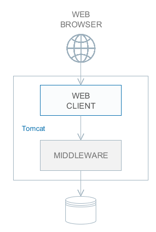
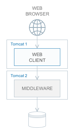
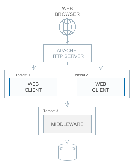
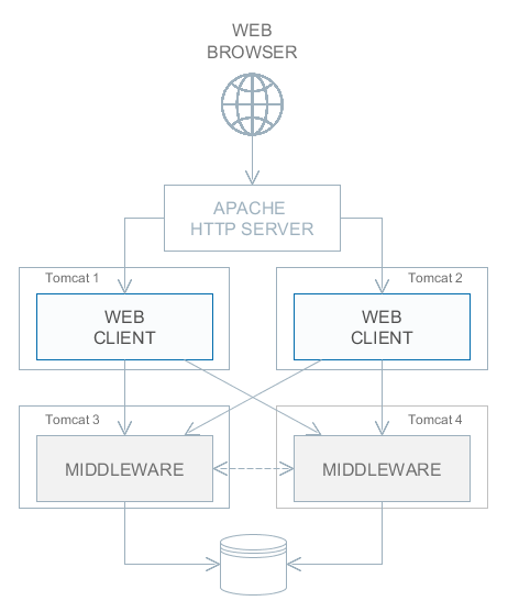
5.6.1. Setting up a Web Client Cluster
This section describes the following deployment configuration:
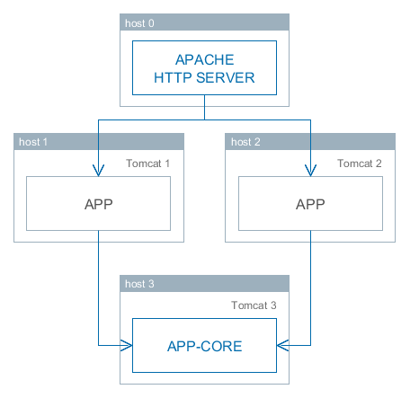
Servers host1 and host2 host Tomcat instances with the app web-app implementing the Web Client block. Users access the load balancer at http://host0/app, which redirects their requests to the servers. Server host3 hosts a Tomcat instance with the app-core web-app that implements the Middleware block.
|
The user’s Generic UI state and UserSession are located on the single Web Client node which performed the user’s login. Therefore the load balancer must maintain sticky sessions (AKA session affinity) to ensure that all requests from the user during the session are sent to the same Web Client node. |
5.6.1.1. Installing and Setting up a Load Balancer
Let us consider the installation of a load balancer based on Apache HTTP Server for Ubuntu 14.04.
-
Install Apache HTTP Server and its mod_jk module:
$ sudo apt-get install apache2 libapache2-mod-jk -
Replace the contents of the
/etc/libapache2-mod-jk/workers.propertiesfile with the following:workers.tomcat_home= workers.java_home= ps=/ worker.list=tomcat1,tomcat2,loadbalancer,jkstatus worker.tomcat1.port=8009 worker.tomcat1.host=host1 worker.tomcat1.type=ajp13 worker.tomcat1.connection_pool_timeout=600 worker.tomcat1.lbfactor=1 worker.tomcat2.port=8009 worker.tomcat2.host=host2 worker.tomcat2.type=ajp13 worker.tomcat2.connection_pool_timeout=600 worker.tomcat2.lbfactor=1 worker.loadbalancer.type=lb worker.loadbalancer.balance_workers=tomcat1,tomcat2 worker.jkstatus.type=status -
Add the lines listed below to
/etc/apache2/sites-available/000-default.conf:<VirtualHost *:80> ... <Location /jkmanager> JkMount jkstatus Order deny,allow Allow from all </Location> JkMount /jkmanager/* jkstatus JkMount /app loadbalancer JkMount /app/* loadbalancer </VirtualHost> -
Restart the Apache HTTP service:
$ sudo service apache2 restart
5.6.1.2. Setting up Web Client Servers
|
In the examples below, we provide paths to configuration files as if Fast Deployment is used. |
On the Tomcat 1 and Tomcat 2 servers, the following settings should be applied:
-
In
tomcat/conf/server.xml, add thejvmRouteparameter equivalent to the name of the worker specified in the load balancer settings fortomcat1andtomcat2:<Server port="8005" shutdown="SHUTDOWN"> ... <Service name="Catalina"> ... <Engine name="Catalina" defaultHost="localhost" jvmRoute="tomcat1"> ... </Engine> </Service> </Server> -
Set the following application properties in
app_home/local.app.properties:cuba.useLocalServiceInvocation = false cuba.connectionUrlList = http://host3:8080/app-core cuba.webHostName = host1 cuba.webPort = 8080cuba.webHostName and cuba.webPort parameters are not mandatory for WebClient cluster, but they allow easier identification of a server in other platform mechanisms, such as the JMX console. Additionally, Client Info attribute of the User Sessions screen shows an identifier of the Web Client that the current user is working with.
5.6.2. Setting up a Middleware Cluster
This section describes the following deployment configuration:
Servers host1 and host2 host Tomcat instances with the app web application implementing the Web Client block. Cluster configuration for these servers is described in the previous section. Servers host3 and host4 host Tomcat instances with the app-core web application implementing the Middleware block. They are configured to interact and share information about user sessions, locks, cache flushes, etc.
|
In the examples below, we provide paths to configuration files as if Fast Deployment is used. |
5.6.2.1. Setting up Connection to the Middleware Cluster
In order for the client blocks to be able to work with multiple Middleware servers, the list of server URLs should be specified in the cuba.connectionUrlList application property. This can be done in app_home/local.app.properties:
cuba.useLocalServiceInvocation = false
cuba.connectionUrlList = http://host3:8080/app-core,http://host4:8080/app-core
cuba.webHostName = host1
cuba.webPort = 8080A middleware server is randomly determined on the first remote connection for a user session, and it is fixed for the whole session lifetime ("sticky session"). Requests from anonymous session and without session do not stick to a server and go to random servers.
The algorithm of selecting a middleware server is provided by the cuba_ServerSorter bean which is by default implemented by the RandomServerSorter class. You can provide your own implementation in your project.
5.6.2.2. Configuring Interaction between Middleware Servers
Middleware servers can maintain shared lists of user sessions and other objects and coordinate invalidation of caches. The cuba.cluster.enabled property should be enabled on each server to achieve this. An example of the app_home/local.app.properties file is shown below:
cuba.cluster.enabled = true
cuba.webHostName = host3
cuba.webPort = 8080For the Middleware servers, correct values of the cuba.webHostName and cuba.webPort properties should be specified to form a unique Server ID.
Interaction mechanism is based on JGroups. The platform provides two configuration files for JGroups:
-
jgroups.xml- a UDP-based stack of protocols which is suitable for local network with enabled broadcast communication. This configuration is used by default when the cluster is turned on. -
jgroups_tcp.xml- TCP-based stack of protocols which is suitable for any network. It requires explicit setting of cluster members addresses inTCP.bind_addrandTCPPING.initial_hostsparameters. In order to use this configuration, set cuba.cluster.jgroupsConfig application property.If there is a firewall between your middleware servers, don’t forget to open firewall ports according to your
JGroupsconfiguration.
In order to set up JGroups parameters for your environment, copy the appropriate jgroups.xml file from the root of cuba-core-<version>.jar to the source root of your project’s core module (the src folder) or to tomcat/conf/app-core and modify it.
ClusterManagerAPI bean provides the program interface for interaction between servers in the Middleware cluster. It can be used in the application – see JavaDocs and usages in the platform code.
- Synchronous replication of user sessions
By default all JGroups messages are sent to the cluster asynchronously. It means that middleware code returns response to the client layer before the moment when the cluster message is received by other cluster members.
Such behavior improves response time of the system, however it can cause problems with load balancers that route requests between client layers and middleware and use round-robin strategy (such as NGINX or Kubernetes). That is: login request from web client returns earlier than new user session is fully replicated to other cluster members. Subsequent middleware call from web client layer can be directed by the round-robin strategy to the other middleware node where it will fail with NoUserSessionException because the user session hasn’t been received by this cluster member yet.
To avoid NoUserSessionException errors when using round-robin balancer with middleware cluster, new user sessions created on login should be replicated synchronously. Set these properties in the app.properties (or app_home/local.app.properties on the target server) file:
cuba.syncNewUserSessionReplication = true
# also if you use REST API add-on
cuba.rest.syncTokenReplication = true5.6.2.3. Using ZooKeeper for Cluster Coordination
There is an application component that enables dynamic discovery of middleware servers for communication between middleware blocks and for requesting middleware from client blocks. It is based on integration with Apache ZooKeeper - a centralized service for maintaining configuration information. When this component is included in your project, you need to specify only one static address when running your application blocks - the address of ZooKeeper. Middleware servers will advertise themselves by publishing their addresses on the ZooKeeper directory and discovery mechanisms will request ZooKeeper for addresses of available servers. If a middleware server goes down, it will be automatically removed from the directory immediately or after a timeout.
5.6.3. Server ID
Server ID is used for reliable identification of servers in a Middleware cluster. The identifier is formatted as host:port/context:
tezis.haulmont.com:80/app-core192.168.44.55:8080/app-coreThe identifier is formed based on the configuration parameters cuba.webHostName, cuba.webPort, cuba.webContextName, therefore it is very important to specify these parameters for the Middleware blocks working within the cluster.
Server ID can be obtained using the ServerInfoAPI bean or via the ServerInfoMBean JMX interface.
5.7. Using JMX Tools
This section describes various aspects of using Java Management Extensions in CUBA-based applications.
5.7.1. Built-In JMX Console
The Web Client module of the cuba application component contains JMX objects viewing and editing tool. The entry point for this tool is com/haulmont/cuba/web/app/ui/jmxcontrol/browse/display-mbeans.xml screen registered under the jmxConsole identifier and accessible via Administration > JMX Console in the standard application menu.
Without extra configuration, the console shows all JMX objects registered in the JVM where the Web Client block of the current user is running. Therefore, in the simplest case, when all application blocks are deployed to one web container instance, the console has access to the JMX beans of all tiers as well as the JMX objects of the JVM itself and the web container.
Names of the application beans have a prefix corresponding to the name of the web-app that contains them. For example, the app-core.cuba:type=CachingFacade bean has been loaded by the app-core web-app implementing the Middleware block, while the app.cuba:type=CachingFacade bean has been loaded by the app web-app implementing the Web Client block.
Figure 49. JMX Console
JMX console can also work with the JMX objects of a remote JVM. This is useful when application blocks are deployed over several instances of a web container, for example, separate Web Client and Middleware.
To connect to a remote JVM, a previously created connection should be selected in the JMX Connection field of the console, or a new connection can be created:
Figure 50. Editing a JMX Connection
To get a connection, JMX host, port, login, and password should be specified. There is also the Host name field, which is populated automatically if any CUBA-application block is detected at the specified address. In this case, the value of this field is defined as the combination of cuba.webHostName and cuba.webPort properties of this block, which enables identifying the server that contains it. If the connection is done to a 3rd party JMX interface, then the Host name field will have the "Unknown JMX interface" value. However, it can be changed arbitrarily.
In order to allow a remote JVM connection, the JVM should be configured properly (see below).
5.7.2. Setting up a Remote JMX Connection
This section describes Tomcat startup configuration required for a remote connection of JMX tools.
5.7.2.1. Tomcat JMX for Windows
-
Edit
bin/setenv.batin the following way:set CATALINA_OPTS=%CATALINA_OPTS% ^ -Dcom.sun.management.jmxremote ^ -Djava.rmi.server.hostname=192.168.10.10 ^ -Dcom.sun.management.jmxremote.ssl=false ^ -Dcom.sun.management.jmxremote.port=7777 ^ -Dcom.sun.management.jmxremote.authenticate=true ^ -Dcom.sun.management.jmxremote.password.file=../conf/jmxremote.password ^ -Dcom.sun.management.jmxremote.access.file=../conf/jmxremote.accessHere, the
java.rmi.server.hostnameparameter should contain the actual IP address or the DNS name of the computer where the server is running;com.sun.management.jmxremote.portsets the port for JMX tools connection. -
Edit the
conf/jmxremote.accessfile. It should contain user names that will be connecting to the JMX and their access level. For example:admin readwrite -
Edit the
conf/jmxremote.passwordfile. It should contain passwords for the JMX users, for example:admin admin -
The password file should have reading permissions only for the user running the Tomcat. server. You can configure permissions the following way:
-
Open the command line and go to the conf folder
-
Run the command:
cacls jmxremote.password /P "domain_name\user_name":Rwhere
domain_name\user_nameis the user’s domain and name -
After this command is executed, the file will be displayed as locked (with a lock icon) in Explorer.
-
-
If Tomcat is installed as a Windows service, then the service should be started on behalf of the user who has access permissions for jmxremote.password. It should be kept in mind that in this case the
bin/setenv.batfile is ignored and the corresponding JVM startup properties should be specified in the application that configures the service.
5.7.2.2. Tomcat JMX for Linux
-
Edit
bin/setenv.shthe following way:CATALINA_OPTS="$CATALINA_OPTS -Dcom.sun.management.jmxremote \ -Djava.rmi.server.hostname=192.168.10.10 \ -Dcom.sun.management.jmxremote.port=7777 \ -Dcom.sun.management.jmxremote.ssl=false \ -Dcom.sun.management.jmxremote.authenticate=true" CATALINA_OPTS="$CATALINA_OPTS -Dcom.sun.management.jmxremote.password.file=../conf/jmxremote.password -Dcom.sun.management.jmxremote.access.file=../conf/jmxremote.access"Here, the
java.rmi.server.hostnameparameter should contain the real IP address or the DNS name of the computer where the server is running;com.sun.management.jmxremote.portsets the port for JMX tools connection -
Edit
conf/jmxremote.accessfile. It should contain user names that will be connecting to the JMX and their access level. For example:admin readwrite -
Edit the
conf/jmxremote.passwordfile. It should contain passwords for the JMX users, for example:admin admin -
The password file should have reading permissions only for the user running the Tomcat server. Permissions for the current user can be configured the following way:
-
Open the command line and go to the conf folder.
-
Run the command:
chmod go-rwx jmxremote.password
-
5.8. Server Push Settings
CUBA applications use server push technology in the Background Tasks mechanism. It may require an additional setup of the application and proxy server (if any).
By default, server push uses the WebSocket protocol. The following application properties affect the platform server push functionality:
The information below is obtained from the Vaadin website - Configuring push for your environment.
- Chrome says ERR_INCOMPLETE_CHUNKED_ENCODING
-
This is completely normal and means that the (long-polling) push connection was aborted by a third party. This typically happens when there is a proxy between the browser and the server and the proxy has a configured timeout and cuts the connection when the timeout is reached. The browser should reconnect to the server normally after this happens.
- Tomcat 8 + Websockets
-
java.lang.ClassNotFoundException: org.eclipse.jetty.websocket.WebSocketFactory$AcceptorThis implies you have Jetty deployed on the classpath somewhere. Atmosphere gets confused and tries to use its Websocket implementation instead of Tomcat’s. One common reason for this is that you have accidentally deployed
vaadin-client-compiler, which has Jetty as a dependency (needed by SuperDevMode for instance).
- Glassfish 4 + Streaming
-
Glassfish 4 requires the comet option to be enabled for streaming to work.
Set
(Configurations → server-config → Network Config → Protocols → http-listener-1 → HTTP → Comet Support)or use
asadmin set server-config.network-config.protocols.protocol.http-listener-1.http.comet-support-enabled="true"
- Glassfish 4 + Websockets
-
If you are using Glassfish 4.0, upgrade to Glassfish 4.1 to avoid problems.
- Weblogic 12 + Websockets
-
Use WebLogic 12.1.3 or newer. WebLogic 12 specifies a timeout of 30 sec by default for websocket connections. To avoid constant reconnects, you can set the
weblogic.websocket.tyrus.session-max-idle-timeoutinit parameter to either-1(no timeout in use) or a higher value than30000(value is in ms).
- JBoss EAP 6.4 + Websockets
-
JBoss EAP 6.4 includes support for websockets but they are disabled by default. To make websockets work you need to change JBoss to use the NIO connector by running:
$ bin/jboss-cli.sh --connectand the following commands:
batch /subsystem=web/connector=http/:write-attribute(name=protocol,value=org.apache.coyote.http11.Http11NioProtocol) run-batch :reloadThen add a WEB-INF/jboss-web.xml to you war file with the following contents to enable websockets:
<jboss-web version="7.2" xmlns="http://www.jboss.com/xml/ns/javaee" xmlns:xsi="http://www.w3.org/2001/XMLSchema-instance" xsi:schemaLocation="http://www.jboss.com/xml/ns/javaee schema/jboss-web_7_2.xsd"> <enable-websockets>true</enable-websockets> </jboss-web>
- Duplicate resource
-
If server logs contain
Duplicate resource xyz-abc-def-ghi-jkl. Could be caused by a dead connection not detected by your server. Replacing the old one with the fresh oneThis indicates that first, the browser connected to the server and used the given identifier for the push connection. Everything went as expected. Later on, a browser (probably the same one) connected again using the same identifier but according to the server, the old browser connection should still be active. The server closes the old connection and logs the warning.
This happens because typically there was a proxy between the browser and the server, and the proxy was configured to kill open connections after a certain inactivity timeout on the connection (no data is sent before the server issues a push command). Because of how TCP/IP works, the server has no idea that the connection has been killed and continues to think that the old client is connected and all is well.
You have a couple of options to avoid this problem:
-
If you are in control of the proxy, configure it not to timeout/kill push connections (connections to the
/PUSHurl). -
If you know what the proxy timeout is, configure a slightly shorter timeout for push in the application so that the server terminates the idle connection and is aware of the termination before the proxy can kill the connection.
-
Set the
cuba.web.pushLongPollingparameter totrueto enable long polling transport instead of websocket. -
Use the
cuba.web.pushLongPollingSuspendTimeoutMsparameter to set push timeout in milliseconds.
-
If you do not configure the proxy so that the server knows when the connection is killed, you also have a small chance of losing pushed data. If it so happens that the server does a push right after the connection was killed, it will not realize that it pushed data into a closed connection (because of how sockets work and especially how they work in Java). Disabling the timeout or setting the timeout on the server also resolves this potential issue.
-
- Using Proxy
-
If users connect to the application server via a proxy that does not support WebSocket, set
cuba.web.pushLongPollingtotrueand increase proxy request timeout to 10 minutes or more.Below is an example of the Nginx web server settings for using WebSocket:
location / { proxy_set_header X-Forwarded-Host $host; proxy_set_header X-Forwarded-Server $host; proxy_set_header X-Forwarded-For $proxy_add_x_forwarded_for; proxy_read_timeout 3600; proxy_connect_timeout 240; proxy_set_header Host $host; proxy_set_header X-RealIP $remote_addr; proxy_pass http://127.0.0.1:8080/; proxy_set_header X-Forwarded-Proto $scheme; proxy_set_header Upgrade $http_upgrade; proxy_set_header Connection "upgrade"; }
5.9. Health Check URL
Every application block deployed as a web application provides a health check URL. An HTTP GET request for this URL returns ok if the block is ready to work.
The URL paths for different blocks are listed below:
-
Middleware:
/remoting/health -
Web Client:
/dispatch/health -
Web Portal:
/rest/health(requires REST API add-on)
So for an application named app and deployed at localhost:8080 the URLs will be:
-
http://localhost:8080/app-core/remoting/health -
http://localhost:8080/app/dispatch/health -
http://localhost:8080/app-portal/rest/health
You can replace ok in response with any text using the cuba.healthCheckResponse application property.
The health check controllers also send an application event of type HealthCheckEvent. Therefore you can add your own logic of checking the application health. In the example on GitHub, a bean of the web tier listens to the health check events and invokes a middleware service, which in turn executes an operation on the database.
5.10. Creating and Updating Database in Production
This section describes different ways of creating and updating a database during application deployment and operation. To learn more about the structure of database scripts, see Database Migration Scripts.
5.10.1. Execution of Database Scripts by Server
The execution of DB scripts by server mechanism can be used for both database initialization and its further update during the application development and data schema modification.
The following actions should be completed to initialize a new database:
-
Enable the cuba.automaticDatabaseUpdate application property by adding the following line to the
local.app.propertiesfile located in application home (if it is not set in project’sapp.properties):cuba.automaticDatabaseUpdate = true -
Create an empty database corresponding to the defined data source.
-
Start the application server containing the Middleware block. At application start, the database will be initialized and ready for work.
After that, each time when the application server starts, a scripts execution mechanism will compare the set of scripts located in the database scripts directory with the list of already executed scripts registered in the database. If new scripts are found, they will be executed and registered as well. Typically, it is enough to include the update scripts in each new application version, and the database will be actualized each time when the application server is restarted.
When using the database scripts execution mechanism at server start, the following should be considered:
-
If any error occurs when running a script, the Middleware block stops initialization and becomes inoperable. The client blocks generate messages about inability to connect to the Middleware.
Check the
app.logfile located in the server’s log folder for a message about SQL execution from thecom.haulmont.cuba.core.sys.DbUpdaterEnginelogger and, possibly, further error messages to identify the error reasons. -
The update scripts, as well as the DDL and the SQL commands within the scripts separated with
"^", are executed in separate transactions. That is why when an update fails there is still a big chance that a part of the scripts or even individual commands of the last script will have been executed and committed to the database.With this in mind, creating a backup copy of the database immediately before starting the server is highly recommended. Then, when the error reason is fixed, the database can be restored and the automatic process restarted.
If the backup is missing, you should identify which part of the script was executed and committed after the error is fixed. If the entire script failed to execute, the automatic process can be simply restarted. If some of the commands before the erroneous one were separated with the
"^"character, executed in a separate transaction and committed, then the remaining part of the commands should be run and this script should be registered inSYS_DB_CHANGELOGmanually. After that, the server can be started and the automatic update mechanism will start processing the next unexecuted script.CUBA Studio generates update scripts with ";" delimiter for all database types except Oracle. If update script commands are separated by semicolons, the script is executed in one transaction and entirely rolled back in case of failure. This behavior ensures consistency between the database schema and the list of executed update scripts.
5.10.2. Initializing and Updating Database from Command Line
Database create and update scripts can be run from the command line using the com.haulmont.cuba.core.sys.utils.DbUpdaterUtil class included in the platform’s Middleware block. At startup, the following arguments should be specified:
-
dbType– DBMS type, possible values: postgres, mssql, oracle, mysql. -
dbVersion– DBMS version (optional argument). -
dbDriver- JDBC driver class name (optional argument). If not provided, the driver class name will be derived fromdbType. -
dbUser– database user name. -
dbPassword– database user password. -
dbUrl– database connection URL. For primary initialization, the specified database should be empty; the database is not cleared automatically in advance. -
scriptsDir– absolute path to the folder containing scripts in the standard structure. Typically, this is the database scripts directory supplied with the application. -
one of the possible commands:
-
create– initialize the database. -
check– show all unexecuted update scripts. -
update– update the database.
-
An example of a script for Linux running DbUpdaterUtil:
#!/bin/sh
DB_URL="jdbc:postgresql://localhost/mydb"
APP_CORE_DIR="./../webapps/app-core"
WEBLIB="$APP_CORE_DIR/WEB-INF/lib"
SCRIPTS="$APP_CORE_DIR/WEB-INF/db"
TOMCAT="./../lib"
SHARED="./../shared/lib"
CLASSPATH=""
for jar in `ls "$TOMCAT/"`
do
CLASSPATH="$TOMCAT/$jar:$CLASSPATH"
done
for jar in `ls "$WEBLIB/"`
do
CLASSPATH="$WEBLIB/$jar:$CLASSPATH"
done
for jar in `ls "$SHARED/"`
do
CLASSPATH="$SHARED/$jar:$CLASSPATH"
done
java -cp $CLASSPATH com.haulmont.cuba.core.sys.utils.DbUpdaterUtil \
-dbType postgres -dbUrl $DB_URL \
-dbUser $1 -dbPassword $2 \
-scriptsDir $SCRIPTS \
-$3This script is designed to work with the database named mydb running on the local PostgreSQL server. The script should be located in the bin folder of the Tomcat server and should be started with {username}, {password} and {command}, for example:
./dbupdate.sh cuba cuba123 updateScript execution progress is displayed in the console. If any error occurs, same actions as described in the previous section for the automatic update mechanism should be performed.
|
When updating the database from the command line, the existing Groovy scripts are started, but only their main part gets executed. Due to the lack of the server context, the script’s |
6. Security Subsystem
CUBA includes a sophisticated security subsystem that solves common problems of enterprise applications:
-
Authentication using built-in users repository, LDAP, SSO or social networks.
-
The role-based access control for the data model (entity operations and attributes), UI screens and arbitrary named permissions. For example, John Doe can view documents, but cannot create, update or delete them. He also can view all document attributes except
amount. -
Row-level data access control - ability to specify rights to particular entity instances. For example, John Doe can view documents that have been created in his department only.
6.1. Web Security
Are CUBA applications secure?
CUBA as a framework follows good security practices and provides you with automatic protection against some of the most common vulnerabilities in web applications. Its architecture promotes a secure programming model, allowing you to concentrate on your business and application logic.
- 1. UI State and Validation
-
Web Client is a server-side application, where all of your application state, business and UI logic resides on the server. Unlike client driven frameworks, Web Client never exposes its internals to the browser, where vulnerabilities can be leveraged by an attacker. The data validation is always done on the server and therefore cannot be by-passed with client-side attacks, the same applies to REST API validation.
- 2. Cross-Site Scripting (XSS)
-
Web Client has built-in protection against cross-site scripting (XSS) attacks. It converts all data to use HTML entities before the data is rendered in the user’s browser.
- 3. Cross-Site Request Forgery (CSRF)
-
All requests between the client and the server are included with a user session specific CSRF token. All communication between the server and the client is handled by Vaadin Framework, so you do not need to remember to include the CSRF tokens manually.
- 4. Web Services
-
All communication in Web Client goes through one web service used for RPC requests. You never open up your business logic as web services and thus there are less attack entry points to your application.
Generic REST API automatically applies roles, permissions and all security constraints for both logged in and anonymous users.
- 5. SQL Injection
-
The platform uses ORM layer based on EclipseLink that is protected against SQL injections. Parameters of SQL queries are always passed to JDBC as parameters array and not interpolated into SQL queries as raw strings.
6.2. Security Components
The main CUBA security subsystem components are shown in the diagram below.
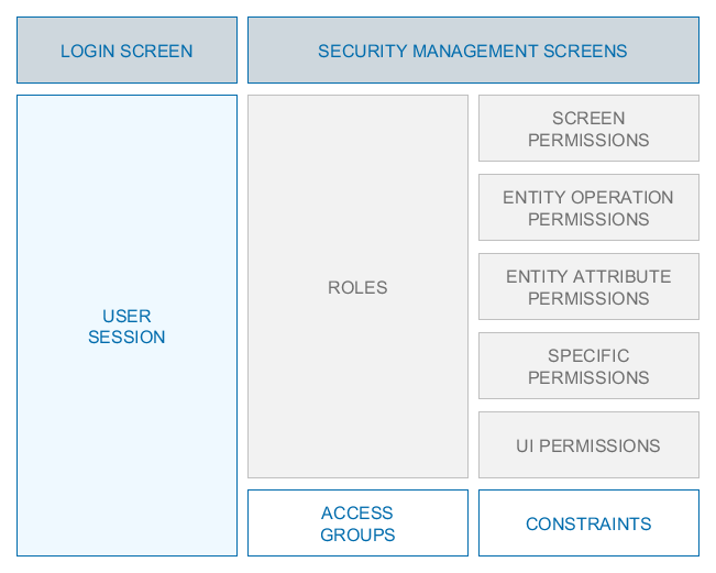
Figure 51. Security Subsystem Components Diagram
Below is an overview of these components.
Security management screens – screens available to system administrator for configuring user access rights.
Login screen − system login window. This window provides user authentication by username and password. The database stores password hashes for security.
The UserSession object is created upon login. This is the central security element associated with the currently authenticated user and containing information on data access rights.
The user login process is described in the Login section.
Roles − user roles. A role is an object which defines a set of permission. A user can have multiple roles.
Access Groups − user access groups. The groups have a hierarchical structure, with each element defining a set of constraints, allowing to control access to individual entity instances (at table row level).
6.2.1. Login Screen
The login screen provides the ability to register within the system with a login name and password. The login name is case-insensitive.
The Web Client’s Remember Me checkbox can be configured by using the cuba.web.rememberMeEnabled application property. The drop-down list of supported languages on the standard login screen can be configured with the cuba.localeSelectVisible and cuba.availableLocales application properties.
See also the cuba.web.loginDialogDefaultUser, cuba.web.loginDialogDefaultPassword and cuba.web.loginDialogPoweredByLinkVisible application properties.
In Web Client, the standard login window can be customized or completely replaced in the project using CUBA Studio. Select Generic UI in the project tree and click New > Screen in the context menu. Then select the Login screen or Login screen with branding image template on the Screen Templates tab. The new screen descriptor and controller files will be created in the Web module. The identifier of the new login screen will be automatically set as the value for the cuba.web.loginScreenId application property. See also Root Screens.
The platform has a mechanism for the protection against password brute force cracking: see the cuba.bruteForceProtection.enabled application property.
The appearance of the Login Screen can be customized using SCSS variables with $cuba-login-* prefix. You can change these variables in the visual editor after creating a theme extension or a custom theme.
6.2.2. Users
Each system user has a corresponding instance of sec$User entity, containing unique login, password hash, reference to access group and list of roles, and other attributes. User management is carried out using the Administration > Users screen:
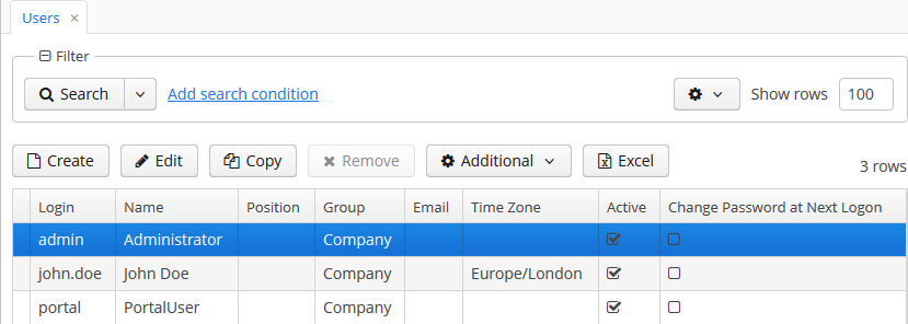
In addition to the standard actions to create, update and delete records, the following actions are available:
-
Copy – quickly creates a new user based on the selected one. The new user will have the same access group and role set. Both can be changed in the new user edit screen.
-
Copy settings – enables copying user interface settings from one user to several others. The settings include the table presentations, the SplitPanel separator position, filters and search folders.
-
Change password – allowing changing password for a selected user.
-
Reset passwords – enables performing the following actions on selected users:
-
If Generate new passwords flag is not selected in the Reset passwords for selected users dialog, the Change password at next logon flag will be assigned to selected users. These users will be asked to change the password on the next successful login.
In order to be able to change their passwords, the users must have permission to the
sec$User.changePasswordscreen. Keep it in mind when configuring roles, especially if you assign a Denying role to all users. The screen can be found under the Other screens entry in the role editor. -
If Generate new passwords flag is selected, new random passwords will be generated for selected users and displayed to the system administrator. The list of passwords can be exported to XLS and sent to related users. Additionally, the Change password at next logon flag will be set for each user, ensuring that users change the password on next login.
-
If Send emails with generated passwords flag is selected in addition to Generate new passwords, the automatically generated one-time passwords will be sent to corresponding users directly, and not shown to system administrator. The sending is done asynchronously so it requires a special scheduled task mentioned in section Sending Methods.
The template of password reset emails can be modified. Create custom templates in the core module, taking reset-password-subject.gsp and reset-password-body.gsp as an example. In order to localize templates, if needed, create files with locale suffixes, as it is done in the platform.
The templates are based on Groovy
SimpleTemplateEnginesyntax, thus you can use Groovy blocks inside of the template content. For instance:Hello <% print (user.active ? user.login : 'user') %> <% if (user.email.endsWith('@company.com')) { %> The password for your account has been reset. Please login with the following temporary password: ${password} and immediately create a new one for the further work. Thank you <% } else {%> Please contact your system administrator for a new password. <%}%>Data binding for these templates contains
user,password, andpersistencevariables. You can also use any Spring beans of the middleware if you importAppBeansclass and get them usingAppBeans.get()method.Having overridden the templates, in the
app.propertiesof the core module specify the following properties:cuba.security.resetPasswordTemplateBody = <relative path to your file> cuba.security.resetPasswordTemplateSubject = <relative path to your file>In a production environment, the templates can also be placed in the configuration directory and the properties can be added to the
local.app.propertiesfile.
-
The user edit screen is described below:
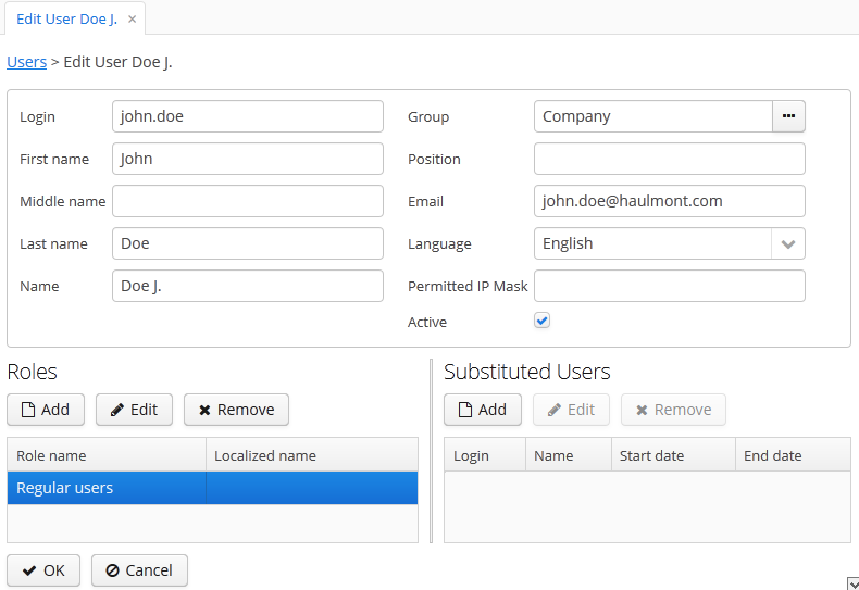
-
Login – unique login name (required).
-
Group – access group.
-
Last name, First name, Middle name – parts of user’s full name.
-
Name – automatically generated user’s full name. Based on full name parts above and a rule defined in the cuba.user.fullNamePattern application property. The name can also be changed manually.
-
Position – job position.
-
Language – the user interface language that will be set for the user, if the ability to choose a language on login is turned off using the cuba.localeSelectVisible application property.
-
Time Zone – the time zone that will be used for displaying and entering timestamp values.
-
Email – email address.
-
Active – if not set, the user is unable to login to the system.
-
Permitted IP Mask – IP address mask, defining addresses from which the user is allowed to login.
The mask is a list of IP addresses, separated by commas. Both the IPv4 and IPv6 address formats are supported. IPv4 address should consist of four numbers separated with periods. IPv6 address represents eight groups of four hexadecimal characters separated with colons. The "*" symbol can be used in place of an address part, to match any value. Only one type of address format (IPv4 or IPv6) can be used in the mask at the same time.
Example:
192.168.*.* -
Roles – user roles list.
-
Substituted Users – substituted users list.
6.2.2.1. User Substitution
The system administrator can give a user an ability to substitute another user. The substituting user will have the same session, but a different set of roles, constraints and attributes, assigned from the substituted user.
|
It is recommended to use the |
If the user has substituted users, a drop-down list will be shown in the application upper right corner instead of the plain text with the current user name:
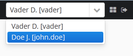
If another user is selected in this list, all opened screens will be closed and the substitution will be made active. The UserSession.getUser() method will still return the user that has logged in, however, the UserSession.getSubstitutedUser() method will return the substituted user. If there is no substitution, the UserSession.getSubstitutedUser() method will return null.
Substituted users can be managed through the Substituted Users table in the user edit screen. The user substitution screen is described below:
-
User – the edited user. This user will substitute another user.
-
Substituted user – the substituted user.
-
Start date, End date – optional substitution period. User substitution will be unavailable outside of this period. If no period is specified, substitution will be available until this table entry is removed.
6.2.2.2. Time Zone
By default, all temporal values are displayed in the server’s time zone. The server’s time zone is the one returned by TimeZone.getDefault() method of an application block. This default time zone is typically obtained from the operating system but can be set explicitly by user.timezone Java system property. For example, to set the time zone to GMT for web client and middleware running on Tomcat under Unix, add the following line to tomcat/bin/setenv.sh file:
CATALINA_OPTS="$CATALINA_OPTS -Duser.timezone=GMT"A user can view and edit timestamp values in a time zone different from the server’s time zone. There are two ways to manage user’s time zone:
-
An administrator can do it in the User editor screen.
-
The user can change their time zone in the Help > Settings window.
In both cases, the time zone settings consist of two fields:
-
Time zone name dropdown allows a user to select the time zone explicitly.
-
Auto checkbox indicates that the time zone will be obtained from the current environment (web browser for the web client).
If both fields are empty, no time zone conversions are performed for the user. Otherwise, the platform saves time zone in the UserSession object when the user logs in and uses it for displaying and entering timestamp values. The application code can also use the value returned by UserSession.getTimeZone() for custom functionality.
If a time zone is in use for the current session, its short name and offset from GMT are displayed in the application main window next to the current user’s name.
|
Time zone conversions are performed only for DateTimeDatatype entity attributes, i.e., timestamps. Attributes storing date ( |
6.2.3. Permissions
Permissions determine the user’s right to application objects and functions, such as UI screens or entity operations. With regards to permissions, these objects are called targets.
Permissions are granted to users by assigning roles to them.
|
Users have no rights to a target, unless an appropriate permission is given to them by a role. So users without roles have no any rights and cannot access the system through the Generic UI and REST API. |
There are the following types of permissions differentiated by targets:
- Screen permissions
-
A screen can be either allowed or denied.
The screen permissions are checked by the framework when building the main menu and creating screens using the
create()method of theScreensinterface. To check screen permissions in the application code, use theisScreenPermitted()method of the Security interface. - Entity operation permissions
-
For each entity, the following permissions can be allowed: Create, Read, Update, Delete.
See the Data Access Checks section for how entity operation permissions are used by different mechanisms of the framework. To check entity operation permissions in the application code, use the
isEntityOpPermitted()method of the Security interface. - Entity attribute permissions
-
Each attribute of each entity can be allowed for viewing or for modification.
See the Data Access Checks section for how entity attribute permissions are used by different mechanisms of the framework. To check entity attribute permissions in the application code, use the
isEntityAttrPermitted()method of the Security interface. - Specific permissions
-
These are permissions on arbitrary named functionality. Specific permissions for the project are set in the permissions.xml configuration file.
An example of checking a specific permission :
@Inject private Security security; public void calculateBalance() { if (!security.isSpecificPermitted("myapp.calculateBalance")) return; // ... } - Screen component permissions
-
Screen component permissions allow you to hide or make read-only particular UI components of a screen, regardless of whether they are bound to entities or not. Screen component permissions are applied by the framework after sending AfterInitEvent and before BeforeShowEvent.
The screen component permissions differ from other permission types in that they actually only restrict rights to their targets. Until you define a target component and a hidden/read-only permission for it, the component is fully available to the user.
The target component is specified by its path in the screen according to the following rules:
-
If the component belongs to the screen, simply specify the component identifier.
-
If the component belongs to the fragment that is embedded within the screen, specify the fragment identifier, and then the component identifier separated by period.
-
If configuring permission for the TabSheet tab or the Form field, specify the component identifier, and then the tab or field identifier in square brackets.
-
To configure permission for an action, specify the component, holding the action, and then the action identifier in angle brackets. For example:
customersTable<changeGrade>.
-
6.2.4. Roles
A role combines a set of permissions that can be granted to users.
The user may have multiple roles, in which case a logical sum (OR) is computed from all of the assigned roles. For example, if a user has roles A and B where role A does not grant a permission to X and role B allows X, then X will be allowed.
A role can grant permissions to individual targets, as well as to the whole categories of targets: screens, entity operations, entity attributes, specific permissions. For example, you can easily give the Read permission to all entities and the View permission to all their attributes.
The screen component permissions are a notable exception to the above rules: they can be defined only for a concrete component, and if no role defines a permission to a component, it is fully available to the user.
A role can be "default" with regards to users, which means that it is assigned to new users automatically. It allows you to grant a certain set of permissions to each new user by default.
- Defining roles at design time
-
The recommended way to define a role is to create a class extending
AnnotatedRoleDefinition, override the methods returning permissions for different target types, and add annotations that specify what permissions this role contains. The class must be located in thecoremodule. For example, a role granting permissions to work with theCustomerentity and its browse and edit screens may look as follows:@Role(name = "Customers Full Access") public class CustomersFullAccessRole extends AnnotatedRoleDefinition { @EntityAccess(entityClass = Customer.class, operations = {EntityOp.CREATE, EntityOp.READ, EntityOp.UPDATE, EntityOp.DELETE}) @Override public EntityPermissionsContainer entityPermissions() { return super.entityPermissions(); } @EntityAttributeAccess(entityClass = Customer.class, modify = "*") @Override public EntityAttributePermissionsContainer entityAttributePermissions() { return super.entityAttributePermissions(); } @ScreenAccess(screenIds = {"application-demo", "demo_Customer.browse", "demo_Customer.edit"}) @Override public ScreenPermissionsContainer screenPermissions() { return super.screenPermissions(); } }The annotations can be specified multiple times. For example, the following role gives read-only access to all entities and their attributes, allows to modify customer’s
gradeandcommentsattributes, allows to create/update order entity and all its attributes:@Role(name = "Order Management") public class OrderManagementRole extends AnnotatedRoleDefinition { @EntityAccess(entityName = "*", operations = {EntityOp.READ}) @EntityAccess(entityClass = Order.class, operations = {EntityOp.CREATE, EntityOp.UPDATE}) @Override public EntityPermissionsContainer entityPermissions() { return super.entityPermissions(); } @EntityAttributeAccess(entityName = "*", view = "*") @EntityAttributeAccess(entityClass = Customer.class, modify = {"grade", "comments"}) @EntityAttributeAccess(entityClass = Order.class, modify = "*") @Override public EntityAttributePermissionsContainer entityAttributePermissions() { return super.entityAttributePermissions(); } }You can create roles at design time only if the cuba.security.rolesPolicyVersion application property is set to 2, which is the default for new projects created with CUBA 7.2 or newer. If you are migrating from an earlier version, see Legacy Roles and Permissions.
- Defining roles at run time
-
The framework contains UI that allows you to define roles in the running application, see Administration > Roles. Roles created at run time can be modified or removed. Roles defined at design time are read-only.
On the upper part of the role editor screen you can define common role parameters. The bottom part of the screen contains tabs for defining permissions.
-
The Screens tab configures screen permissions. The tree reflects the structure of the application’s main menu. In order to set permissions for a screen not accessible through the main menu (for example, an entity edit screen), find it in the Other screens which is the last tree element.
Allow all screens checkbox enables all screens at once. It is an equivalent of
@ScreenAccess(screenIds = "*"). -
The Entities tab configures entity operation permissions. The Assigned only checkbox is selected by default, so that the table contains only the entities that have explicit permissions in this role. Therefore, the table for a new role will be empty. In order to add permissions, uncheck Assigned only and click Apply. The entity list can be filtered by entering a part of an entity name in the Entity field and clicking Apply. The System level checkbox enables viewing and selecting system entities marked with the
@SystemLevelannotation, which are not shown by default.Use Allow all entities panel to enable operations for all entities. It is an equivalent of
@EntityAccess(entityName = "*", …). -
The Attributes tab configures entity attribute permissions. The Permissions column in the entity table shows the list of the attributes that have explicit permissions. Entity list can be managed similarly to the list in the Entities tab.
Use Allow all attributes panel to enable viewing or modification of all attributes for all entities. If you want to enable all attributes for a specific entity, select the "*" checkbox at the bottom of the Permissions panel for this entity. The same can be achieved using the "*" wildcard in the
entityNameandview/modifyattributes of the@EntityAttributeAccessannotation. -
The Specific tab configures specific permissions. The permissions.xml configuration file defines the names of specific permissions used in the project.
Allow all specific permissions checkbox is an equivalent of
@SpecificAccess(permissions = "*"). -
The UI tab configures UI screen component permissions. In order to create a permission, select the desired screen in the Screen drop-down list, specify the component path in the Component field, and click Add. Follow the rules described in the Permissions sections when specifying the target component. You can use the Components tree button to see the screen components structure: select a component in the tree and click Copy id to path in the context menu.
-
- Security scopes
-
Security scopes allow users to have different sets of roles (and hence different permissions) depending on what client technology they are using to access the application. The security scope is specified using the
securityScopeattribute of the@Roleannotation or using the Security scope field of the role editor screen if the role is defined at run time.The core framework has a single client - Generic UI, so all roles have the
GENERIC_UIscope by default. All users logging in to the generic UI of your application will get the set of roles marked with this scope.The REST API add-on defines its own
RESTscope, so if you add it to the project, you should configure a separate set of roles for users logging in to the system through the REST API. If you don’t do it, the users will not be able to login via REST because they won’t have any permissions including thecuba.restApi.enabledspecific permission.
- System roles
-
The framework provides two predefined roles for the
GENERIC_UIscope:-
system-minimalrole contains the minimal set of permissions to allow users to work with Generic UI. It is defined by theMinimalRoleDefinitionclass. The role grants thecuba.gui.loginToClientspecific permission, as well as permissions to some system-level entities and screens. Thesystem-minimalrole has thedefaultattribute set, so it is automatically assigned to all new users. -
system-full-accessrole gives all permissions and can be used for creating administrators having all rights to the application. The built-inadminuser has this role by default.
-
6.2.5. Access Groups
With access groups, users can be organized into a hierarchical structure and assigned constraints and arbitrary session attributes.
A user can be added to a single group only, however they inherit the list of constraints and session attributes from all the groups up the hierarchy.
User access groups can be defined in the application code or at run time using the Administration > Access Groups screen. In the former case, create classes extending AnnotatedAccessGroupDefinition and add @AccessGroup annotations using the parent attribute to configure the hierarchy of groups. The classes must be located in the core module. For example:
@AccessGroup(name = "Root")
public class RootGroup extends AnnotatedAccessGroupDefinition {
// definitions of constraints and session attributes
}@AccessGroup(name = "Sales", parent = RootGroup.class)
public class Sales extends AnnotatedAccessGroupDefinition {
// definitions of constraints and session attributes
}6.2.5.1. Constraints
Constraints allow you to configure row-level access control, i.e. to manage access to particular rows of data. Unlike permissions which affect the whole types of entities, constraints affect particular entity instances. Constraints can be set for reading, creating, updating and deletion, so the framework will filter out some entities when loading or disable entity operations for an instance if it matches a constraint. Besides, one can add custom constraints not related to CRUD actions.
|
A user gets the set of constraints from all groups starting with their own one, and up the hierarchy. Therefore, the lower the users are in the groups hierarchy, the more constraints they have. |
Note that constraints are checked for all operations performed from the client tier through the standard DataManager. If an entity does not match the constraints conditions during creation, modification or deletion, the RowLevelSecurityException is thrown. See also the Data Access Checks section for how security constraints are used by different mechanisms of the framework.
There are two types of constraints: checked in database and checked in memory.
-
For the constraints checked in database, conditions are specified using JPQL expression fragments. These fragments are appended to all entity selection queries, so the entities not matching the conditions are filtered on the database level. Constraints checked in database can be used only for the read operation and affect only root entities of the loaded object graphs.
-
For the constraints checked in memory, the conditions are specified using Java code (if the constraint is defined at design time) or Groovy expressions (if the constraint is defined at run time). The expressions are executed for every entity in the checked graph of objects, and if the entity does not match the conditions, it is filtered out from the graph.
- Defining constraints at design time
-
Constraints can be defined in a class extending
AnnotatedAccessGroupDefinitionthat is used to define the access group. The class must be located in thecoremodule. Below is an example of an access group that defines a few constraints for theCustomerandOrderentities:@AccessGroup(name = "Sales", parent = RootGroup.class) public class SalesGroup extends AnnotatedAccessGroupDefinition { @JpqlConstraint(target = Customer.class, where = "{E}.grade = 'B'") (1) @JpqlConstraint(target = Order.class, where = "{E}.customer.grade = 'B'") (2) @Override public ConstraintsContainer accessConstraints() { return super.accessConstraints(); } @Constraint(operations = {EntityOp.CREATE, EntityOp.READ, EntityOp.UPDATE, EntityOp.DELETE}) (3) public boolean customerConstraints(Customer customer) { return Grade.BRONZE.equals(customer.getGrade()); } @Constraint(operations = {EntityOp.CREATE, EntityOp.READ, EntityOp.UPDATE, EntityOp.DELETE}) (4) public boolean orderConstraints(Order order) { return order.getCustomer() != null && Grade.BRONZE.equals(order.getCustomer().getGrade()); } @Constraint(operations = {EntityOp.UPDATE, EntityOp.DELETE}) (5) public boolean orderUpdateConstraints(Order order) { return order.getAmount().compareTo(new BigDecimal(100)) < 1; } }1 - load only customers with gradeattribute equalsB(corresponds to theGrade.BRONZEenum value).2 - load only orders for customers with gradeattribute equalsB.3 - in-memory constraint that filters out customers with gradeother thanGrade.BRONZEfrom loaded object graphs.4 - in-memory constraint that allows to work with orders for customers only with grade == Grade.BRONZE.5 - in-memory constraint that allows to modify or delete only orders with amount < 100.Consider the following rules when writing JPQL constraints:
-
The
{E}string should be used as an alias of the entity being loaded. On execution of the query, it will be replaced with a real alias specified in the query. -
The following predefined constants can be used in JPQL parameters:
-
session$userLogin– login name of the current user (in case of substitution – the login name of the substituted user). -
session$userId– ID of the current user (in case of substitution – ID of the substituted user). -
session$userGroupId– group ID of the current user (in case of substitution − group ID of the substituted user). -
session$XYZ– arbitrary attribute of the current user session, where XYZ is the attribute name.
-
-
The
whereattribute value is added to thewherequery clause usingandcondition. Addingwhereword is not needed, as it will be added automatically. -
The
joinattribute value is added to thefromquery clause. It should begin with a comma,joinorleft join.
-
- Defining constraints at run time
-
In order to create a constraint, open the Access Groups screen, select a group to create the constraint for, and go to the Constraints tab. The constraint edit screen contains the Constraint Wizard which helps to construct simple JPQL and Groovy expressions with entity attributes. When you select Custom as an operation type, the required Code field appears and you should set a code which will be used to identify the constraint.
The JPQL editor in the Join Clause and Where Clause fields supports auto-completion for entity names and their attributes. In order to invoke auto-completion, press Ctrl+Space. If the invocation is made after the period symbol, an entity attributes list matching the context will be shown, otherwise – a list of all data model entities.
In in-memory Groovy constraints, use
{E}placeholder as a variable containing the checked entity instance. Besides, theuserSessionvariable of theUserSessiontype is passed to the script. The following example shows a constraint checking that the entity is created by the current user:{E}.createdBy == userSession.user.loginWhen a constraint is violated, a notification is shown to the user. Notification caption and message for each constraint can be localized: see Localization button on the Constraints tab of the Access Groups screen.
- Checking constraints in application code
-
A developer can check the constraints conditions for the particular entity using the following methods of the
Securityinterface:-
isPermitted(Entity, ConstraintOperationType)- to check constraints by the operation type. -
isPermitted(Entity, String)- to check custom constraints by the constraint code.
Also, it is possible to link any any action based on the
ItemTrackingActionclass with a certain constraint. TheconstraintOperationTypeattribute should be set for theactionXML element or using thesetConstraintOperationType()method. Be aware that the constraint code will be executed on the client tier, so it must not use middleware classes.Example:
<table> ... <actions> <action id="create"/> <action id="edit" constraintOperationType="update"/> <action id="remove" constraintOperationType="delete"/> </actions> </table> -
6.2.5.2. Session Attributes
An access group can define session attributes for the users belonging to this group. These attributes can be used in the application code and in constraints.
When a user logs in, all the attributes set for the user’s group and for all the groups up the hierarchy will be placed into the user session. If an attribute is found in several levels of the hierarchy, the uppermost group value will be used. Hence, overriding the attribute values at the lower levels of the hierarchy is impossible. The framework prints a warning message to the server log if it encounters an attempt to override an attribute value.
Session attributes can be defined together with constraints in a class that is used to define the access group. The class must be located in the core module. Below is an example of an access group that defines the accessLevel session attribute with value 1:
@AccessGroup(name = "Level 1", parent = RootGroup.class)
public class FirstLevelGroup extends AnnotatedAccessGroupDefinition {
@SessionAttribute(name = "accessLevel", value = "1", javaClass = Integer.class)
@Override
public Map<String, Serializable> sessionAttributes() {
return super.sessionAttributes();
}
}Session attributes can also be defined at run time in the Access Groups screen: select the group to create the attribute for and go to the Session Attributes tab.
Session attributes can be accessed in the application code through the UserSession object:
@Inject
private UserSessionSource userSessionSource;
...
Integer accessLevel = userSessionSource.getUserSession().getAttribute("accessLevel");Session attributes can be used in the constraints as JPQL parameters with the session$ prefix:
{E}.accessLevel = :session$accessLevel6.2.6. Export and Import Roles and Access Groups
The Roles and Access Groups screens have actions for exporting the selected roles/access groups as ZIP or JSON and importing roles/access groups to the system (using the Export/Import buttons).
|
Export and import is only possible for roles and access groups defined at run time. |
6.2.7. Legacy Roles and Permissions
Before CUBA 7.2, the method of calculating effective permissions was different:
-
There were two types of permissions: "allow" and "deny".
-
If no role assigned a denying permission to a target, it was allowed.
-
A permission could be granted either explicitly by specifying "allow/deny" for a target, or by a role of a certain type, e.g. "Denying" role gave "deny" permissions to all targets except entity attributes. If a target took no explicit permission or permission by a role type, it was fully available to the user. As a result, a user without roles at all had all rights to the system.
It was recommended to give regular users first a "Denying" role, and then a set of roles with explicit allowing permissions. Now the denying role is not needed because users have no rights to a target, unless an appropriate permission is given to them by a role.
Also, in the previous versions, there were no security scopes, so all roles affected both Generic UI and REST API clients.
The security behavior is controlled by a few application properties with default values corresponding to the new behavior. If you are migrating to CUBA 7.2 from a previous version, Studio adds the properties shown below to switch to the legacy behavior and keep your existing security configuration. If you want to take advantage of the new features (e.g. design-time roles) and reconfigure your security, remove these properties.
In the core module, the properties for legacy security policy, using default-permission-values.xml configuration file and ignoring the new system-minimal role are set:
app.properties
cuba.security.rolesPolicyVersion = 1
cuba.security.defaultPermissionValuesConfigEnabled = true
cuba.security.minimalRoleIsDefault = falseIf your project uses the REST API add-on, the following property is set in the web and portal modules to set REST security scope to the same value as used by the Generic UI:
web-app.properties
cuba.rest.securityScope = GENERIC_UI
portal-app.properties
cuba.rest.securityScope = GENERIC_UI6.3. Data Access Checks
The following table explains how data access permissions and constraints are used by different mechanisms of the framework.
Entity Operations |
Entity Attributes |
Read Constraint |
Read Constraint |
Create/Update/Delete |
|
EntityManager |
No |
No |
No |
No |
No |
DataManager on middle tier |
No |
Yes |
No |
No |
|
DataManager.secure on middle tier DataManager on client tier |
Yes (3) |
No |
Yes |
Yes |
Yes |
Generic UI data-aware components |
Yes |
Yes |
- (6) |
- (6) |
- (6) |
REST API |
Yes |
Yes |
Yes |
Yes |
Yes |
REST API |
Yes |
Yes |
Yes |
Yes |
- (7) |
REST API |
Yes |
Yes |
- (8) |
- (8) |
- (8) |
Notes:
1) Read constraint checked in database affects only the root entity.
// order is loaded only if it satisfies constraints on the Order entity
Order order = dataManager.load(Order.class).viewProperties("date", "amount", "customer.name").one();
// related customer is loaded regardless of database-checked constraints on Customer entity
assert order.getCustomer() != null;2) Read constraint checked in memory affects the root entity and all linked entities in the loaded graph.
// order is loaded only if it satisfies constraints on the Order entity
Order order = dataManager.load(Order.class).viewProperties("date", "amount", "customer.name").one();
// related customer is not null only if it satisfies in-memory-checked constraints on Customer entity
if (order.getCustomer() != null) ...3) Entity operation check in DataManager is performed for the root entity only.
// loading Order
Order order = dataManager.load(Order.class).viewProperties("date", "amount", "customer.name").one();
// related customer is loaded even if the user has no permission to read the Customer entity
assert order.getCustomer() != null;4) DataManager checks entity operation permissions and in-memory constraints on middle tier only if you set cuba.dataManagerChecksSecurityOnMiddleware property to true.
5) DataManager checks entity attribute permissions only if you set cuba.entityAttributePermissionChecking to true.
6) UI components do not check constraints themselves, but when data is loaded through standard mechanisms, the constraints are applied by DataManager. As a result, if an entity instance is filtered out by constraints, the corresponding UI component is shown but it is empty. Also, it is possible to link any action based on the ItemTrackingAction class with a certain constraint, so the action is enabled only if the constraint check for the selected entity instance is successful.
7) REST queries are read-only.
8) REST service method parameters and results are not checked for compliance to access group constraints. The service behavior with respect to constraints is defined by how it loads and saves data, for example whether it uses DataManager or DataManager.secure().
6.4. Access Control Examples
This section provides some practical recommendations on how to configure data access for users.
6.4.1. Configuring Roles
Below is a quick reference of permissions that should be allowed to provide access to the Administration functionality. For example, if you want to allow nothing but Entity log functionality, set the permissions mentioned in the corresponding section.
It is recommended to provide at least a read-only permissions for the sys$FileDescriptor entity as it is widely used by the platform: emailing, attachments, logging etc.
- Users
-
The User entity may be used as a reference attribute in your data model. To make it visible in lookup fields and drop-down lists, it will be enough to set the permission for the
sec$Userentity.In case you want to create and edit the
Userentity, the following set of permissions is required:-
Entities:
sec$User,sec$Group; (optionally)sec$Role,sec$UserRole,sec$UserSubstitution.
Permission to read the
sec$UserSubstitutionentity is essential for functioning of the user substitution mechanism.-
Screens: Users menu item,
sec$User.edit,sec$Group.lookup; (optionally)sec$Group.edit,sec$Role.edit,sec$Role.lookup,sec$User.changePassword,sec$User.copySettings,sec$User.newPasswords,sec$User.resetPasswords,sec$UserSubstitution.edit.
-
- Access Groups
-
Creating and managing the user access groups and security constraints.
-
Entities:
sec$Group,sec$Constraint,sec$SessionAttribute,sec$LocalizedConstraintMessage. -
Screens: Access Groups menu item,
sec$Group.lookup,sec$Group.edit,sec$Constraint.edit,sec$SessionAttribute.edit,sec$LocalizedConstraintMessage.edit.
-
- Dynamic Attributes
-
Access to additional non-persistent entity attributes.
-
Entities:
sys$Category,sys$CategoryAttribute, and the required entities of your data model. -
Screens: Dynamic Attributes menu item,
sys$Category.edit,sys$CategoryAttribute.edit,dynamicAttributesConditionEditor,dynamicAttributesConditionFrame.
-
- User Sessions
-
Viewing the user sessions data.
-
Entities:
sec$User,sec$UserSessionEntity. -
Screens: User Sessions menu item,
sessionMessageWindow.
-
- Locks
-
Setting up Pessimistic locking for the entities.
-
Entities:
sys$LockInfo,sys$LockDescriptor, and the required entities of your data model. -
Screens: Locks menu item,
sys$LockDescriptor.edit.
-
- External Files
-
Access to the application File storage.
-
Entities:
sys$FileDescriptor. -
Screens: External Files menu item; (optionally)
sys$FileDescriptor.edit.
-
- Scheduled Tasks
-
Creating and managing scheduled tasks.
-
Entities:
sys$ScheduledTask,sys$ScheduledExecution. -
Screens: Scheduled Tasks menu item,
sys$ScheduledExecution.browse,sys$ScheduledTask.edit.
-
- Entity Inspector
-
Working with any application objects from the screens dynamically generated by the entity inspector.
-
Entities: the required entities of your data model.
-
Screens: Entity Inspector menu item,
entityInspector.edit, and the required entities of your data model.
-
- Entity Log
-
Tracking changes in the entity instances.
-
Entities:
sec$EntityLog,sec$User,sec$EntityLogAttr,sec$LoggedAttribute,sec$LoggedEntity, and the required entities of your data model. -
Screens: Entity Log menu item.
-
- User Session Log
-
Viewing the historical data on the users' login and logout, or user sessions.
-
Entities:
sec$SessionLogEntry. -
Screens: User Session Log menu item.
-
- Email History
-
Viewing the emails sent from the application.
-
Entities:
sys$SendingMessage,sys$SendingAttachment,sys$FileDescriptor(for attachments). -
Screens: Email History menu item,
sys$SendingMessage.attachments.
-
- Server Log
-
Viewing and downloading the application log files.
-
Entities:
sys$FileDescriptor. -
Screens: Server Log menu item,
serverLogDownloadOptionsDialog. -
Specific:
Download log files.
-
- Reports
-
Running reports, see Report Generator add-on.
-
Entities:
report$Report,report$ReportInputParameter,report$ReportGroup. -
Screens:
report$inputParameters,commonLookup,report$Report.run,report$showChart(if contains chart templates).
-
6.4.2. Creating Local Administrators
The hierarchical structure of access groups combined with the constraints inheritance enables creating local administrators, by delegating creation and configuration of users and their rights to organization departments.
The local administrators have access to the security subsystem screens; however, they only see the users and groups in their access group and below. Local administrators can create subgroups and users and assign roles available in the system, however, they will have at least the same constraints as the administrator who created them.
The global administrator in the root access group should create the roles that will be available to the local administrators for assigning to the users. The local administrators should not be able to create and update the roles.
An example access group structure is presented below:
Problem:
-
The users under the
Departmentsgroup should only see the users of their own group and the groups below. -
Each subgroup –
Dept 1,Dept 2, etc. should have its own administrator, who can create users and assign them the available roles.
Solution:
-
Add the following constraints for the
Departmentsgroup:-
For the
sec$Groupentity:{E}.id in ( select h.group.id from sec$GroupHierarchy h where h.group.id = :session$userGroupId or h.parent.id = :session$userGroupId )With this constraint, the users will not be able to see the groups higher than their own.
-
For the
sec$Userentity:{E}.group.id in ( select h.group.id from sec$GroupHierarchy h where h.group.id = :session$userGroupId or h.parent.id = :session$userGroupId )With this constraint, the users will not be able to see the users in groups higher than their own.
-
For the
sec$Roleentity (a Groovy constraint checked in memory):!['system-full-access', 'Some Role to Hide 1', 'Some Role to Hide 2'].contains({E}.name)With this constraint, the users will not be able to view and assign unwanted roles.
-
-
Create the
Department Administratorrole for local administrators:-
On the Screens tab, allow the following screens:
Administration,Users,Access Groups,Roles,sec$Group.edit,sec$Group.lookup,sec$Role.lookup,sec$User.changePassword,sec$User.copySettings,sec$User.edit,sec$User.lookup,sec$User.newPasswords,sec$User.resetPasswords,sec$UserSubstitution.edit. -
On the Entities tab, allow all operations for
sec$Group,sec$User,sec$UserRoleentities and allow the Read operation for thesec$Roleentity (to add permissions for thesec$UserRoleobject, select the System level checkbox). -
On the Attributes tab, select "*" for
sec$Group,sec$Userandsec$Roleentities.
-
-
Create local administrators in their departments as shown on the screenshot above and assign the
Department Administratorrole to them.
As a result, when local administrators log in to the system, they see only their department group and nested groups:
The local administrator can create new users and assign to them existing roles except listed in the constraint.
6.5. Integration with LDAP
CUBA applications can be integrated with LDAP to provide the following benefits:
-
Storing user passwords centrally in the LDAP database.
-
For Windows domain users, ability to log in using Single Sign-On without having to specify the username and password.
If the LDAP integration is enabled, a user still needs an account in the application. All the user permissions and properties (except password) are stored in the application database, LDAP is used only for authentication. It is recommended to leave the application password empty for most users except the ones that require the standard authentication (see below). The password field in the user editor screen is not required if the cuba.web.requirePasswordForNewUsers property is set to false.
If the user login is listed in the cuba.web.standardAuthenticationUsers application property, the application tries to authenticate the user only by the password hash stored in the database. As a result, a user from this list can log in to the system with this password if he is not registered in LDAP.
A CUBA-based application interacts with LDAP via the LdapLoginProvider bean.
You can use the Jespa library with the corresponding LoginProvider described in the Active Directory Integration Using Jespa section in order to enable advanced integration with Active Directory, including Single Sign-On for Windows domain users.
You can implement your own login mechanism using custom LoginProvider, HttpRequestFilter or events described in Web Login Specifics.
Also, you can enable LDAP authentication for REST API clients: REST API Authentication with LDAP.
6.5.1. Basic LDAP Integration
If the cuba.web.ldap.enabled property is set to true, the LdapLoginProvider is enabled. In this case, the Spring LDAP library is used for user authentication.
The following Web Client application properties are used to set up LDAP integration:
Example of local.app.properties file:
cuba.web.ldap.enabled = true
cuba.web.ldap.urls = ldap://192.168.1.1:389
cuba.web.ldap.base = ou=Employees,dc=mycompany,dc=com
cuba.web.ldap.user = cn=System User,ou=Employees,dc=mycompany,dc=com
cuba.web.ldap.password = system_user_passwordSee also cuba.web.requirePasswordForNewUsers.
In case of the integration with Active Directory, when creating users in the application, specify their sAMAccountName without domain as a login.
6.5.2. Active Directory Integration Using Jespa
Jespa is a Java library that enables integration of Active Directory service and Java applications using NTLMv2. For details, see http://www.ioplex.com.
6.5.2.1. Including the Library
Download the library at http://www.ioplex.com and place the JAR in a repository registered in your build.gradle script. This can be mavenLocal() or an in-house repository.
Add the following dependencies to the web module configuration section in build.gradle:
configure(webModule) {
...
dependencies {
compile('com.company.thirdparty:jespa:1.1.17') // from a custom repository
compile('jcifs:jcifs:1.3.17') // from Maven Central
...Create a LoginProvider implementation class in the web module:
package com.company.jespatest.web;
import com.google.common.collect.ImmutableMap;
import com.haulmont.cuba.core.global.ClientType;
import com.haulmont.cuba.core.global.GlobalConfig;
import com.haulmont.cuba.core.sys.AppContext;
import com.haulmont.cuba.core.sys.ConditionalOnAppProperty;
import com.haulmont.cuba.security.auth.*;
import com.haulmont.cuba.security.global.LoginException;
import com.haulmont.cuba.web.App;
import com.haulmont.cuba.web.Connection;
import com.haulmont.cuba.web.auth.WebAuthConfig;
import com.haulmont.cuba.web.security.ExternalUserCredentials;
import com.haulmont.cuba.web.security.LoginProvider;
import com.haulmont.cuba.web.security.events.AppStartedEvent;
import com.haulmont.cuba.web.sys.RequestContext;
import jespa.http.HttpSecurityService;
import jespa.ntlm.NtlmSecurityProvider;
import jespa.security.PasswordCredential;
import jespa.security.SecurityProviderException;
import org.apache.commons.lang3.StringUtils;
import org.slf4j.Logger;
import org.slf4j.LoggerFactory;
import org.springframework.context.event.EventListener;
import org.springframework.core.Ordered;
import org.springframework.stereotype.Component;
import javax.annotation.Nullable;
import javax.annotation.PostConstruct;
import javax.inject.Inject;
import javax.servlet.*;
import javax.servlet.http.HttpServletRequest;
import java.io.IOException;
import java.io.Serializable;
import java.security.Principal;
import java.util.HashMap;
import java.util.Map;
import static com.haulmont.cuba.web.security.ExternalUserCredentials.EXTERNAL_AUTH_USER_SESSION_ATTRIBUTE;
@ConditionalOnAppProperty(property = "activeDirectory.integrationEnabled", value = "true")
@Component("sample_JespaAuthProvider")
public class JespaAuthProvider extends HttpSecurityService implements LoginProvider, Ordered, Filter {
private static final Logger log = LoggerFactory.getLogger(JespaAuthProvider.class);
@Inject
private GlobalConfig globalConfig;
@Inject
private WebAuthConfig webAuthConfig;
@Inject
private DomainAliasesResolver domainAliasesResolver;
@Inject
private AuthenticationService authenticationService;
private static Map<String, DomainInfo> domains = new HashMap<>();
private static String defaultDomain;
@PostConstruct
public void init() throws ServletException {
initDomains();
Map<String, String> properties = new HashMap<>();
properties.put("jespa.bindstr", getBindStr());
properties.put("jespa.service.acctname", getAcctName());
properties.put("jespa.service.password", getAcctPassword());
properties.put("jespa.account.canonicalForm", "3");
properties.put("jespa.log.path", globalConfig.getLogDir() + "/jespa.log");
properties.put("http.parameter.anonymous.name", "anon");
fillFromSystemProperties(properties);
try {
super.init(JespaAuthProvider.class.getName(), null, properties);
} catch (SecurityProviderException e) {
throw new ServletException(e);
}
}
@Nullable
@Override
public AuthenticationDetails login(Credentials credentials) throws LoginException {
LoginPasswordCredentials lpCredentials = (LoginPasswordCredentials) credentials;
String login = lpCredentials.getLogin();
// parse domain by login
String domain;
int atSignPos = login.indexOf("@");
if (atSignPos >= 0) {
String domainAlias = login.substring(atSignPos + 1);
domain = domainAliasesResolver.getDomainName(domainAlias).toUpperCase();
} else {
int slashPos = login.indexOf('\\');
if (slashPos <= 0) {
throw new LoginException("Invalid name: %s", login);
}
String domainAlias = login.substring(0, slashPos);
domain = domainAliasesResolver.getDomainName(domainAlias).toUpperCase();
}
DomainInfo domainInfo = domains.get(domain);
if (domainInfo == null) {
throw new LoginException("Unknown domain: %s", domain);
}
Map<String, String> securityProviderProps = new HashMap<>();
securityProviderProps.put("bindstr", domainInfo.getBindStr());
securityProviderProps.put("service.acctname", domainInfo.getAcctName());
securityProviderProps.put("service.password", domainInfo.getAcctPassword());
securityProviderProps.put("account.canonicalForm", "3");
fillFromSystemProperties(securityProviderProps);
NtlmSecurityProvider provider = new NtlmSecurityProvider(securityProviderProps);
try {
PasswordCredential credential = new PasswordCredential(login, lpCredentials.getPassword().toCharArray());
provider.authenticate(credential);
} catch (SecurityProviderException e) {
throw new LoginException("Authentication error: %s", e.getMessage());
}
TrustedClientCredentials trustedCredentials = new TrustedClientCredentials(
lpCredentials.getLogin(),
webAuthConfig.getTrustedClientPassword(),
lpCredentials.getLocale(),
lpCredentials.getParams());
trustedCredentials.setClientInfo(lpCredentials.getClientInfo());
trustedCredentials.setClientType(ClientType.WEB);
trustedCredentials.setIpAddress(lpCredentials.getIpAddress());
trustedCredentials.setOverrideLocale(lpCredentials.isOverrideLocale());
trustedCredentials.setSyncNewUserSessionReplication(lpCredentials.isSyncNewUserSessionReplication());
Map<String, Serializable> targetSessionAttributes;
Map<String, Serializable> sessionAttributes = lpCredentials.getSessionAttributes();
if (sessionAttributes != null
&& !sessionAttributes.isEmpty()) {
targetSessionAttributes = new HashMap<>(sessionAttributes);
targetSessionAttributes.put(EXTERNAL_AUTH_USER_SESSION_ATTRIBUTE, true);
} else {
targetSessionAttributes = ImmutableMap.of(EXTERNAL_AUTH_USER_SESSION_ATTRIBUTE, true);
}
trustedCredentials.setSessionAttributes(targetSessionAttributes);
return authenticationService.login(trustedCredentials);
}
@Override
public boolean supports(Class<?> credentialsClass) {
return LoginPasswordCredentials.class.isAssignableFrom(credentialsClass);
}
@Override
public int getOrder() {
return HIGHEST_PLATFORM_PRECEDENCE + 50;
}
@Override
public void destroy() {
}
@Override
public void init(FilterConfig filterConfig) throws ServletException {
}
@EventListener
public void loginOnAppStart(AppStartedEvent appStartedEvent) {
App app = appStartedEvent.getApp();
Connection connection = app.getConnection();
Principal userPrincipal = RequestContext.get().getRequest().getUserPrincipal();
if (userPrincipal != null) {
String login = userPrincipal.getName();
log.debug("Trying to login using jespa principal " + login);
try {
connection.login(new ExternalUserCredentials(login, App.getInstance().getLocale()));
} catch (LoginException e) {
log.trace("Unable to login on start", e);
}
}
}
@Override
public void doFilter(ServletRequest request, ServletResponse response, FilterChain chain)
throws IOException, ServletException {
HttpServletRequest httpServletRequest = (HttpServletRequest) request;
if (httpServletRequest.getHeader("User-Agent") != null) {
String ua = httpServletRequest.getHeader("User-Agent")
.toLowerCase();
boolean windows = ua.contains("windows");
boolean gecko = ua.contains("gecko") && !ua.contains("webkit");
if (!windows && gecko) {
chain.doFilter(request, response);
return;
}
}
super.doFilter(request, response, chain);
}
private void initDomains() {
String domainsStr = AppContext.getProperty("activeDirectory.domains");
if (StringUtils.isEmpty(domainsStr)) {
return;
}
String[] strings = domainsStr.split(";");
for (int i = 0; i < strings.length; i++) {
String domain = strings[i];
domain = domain.trim();
if (StringUtils.isEmpty(domain)) {
continue;
}
String[] parts = domain.split("\\|");
if (parts.length != 4) {
log.error("Invalid ActiveDirectory domain definition: " + domain);
break;
} else {
domains.put(parts[0], new DomainInfo(parts[1], parts[2], parts[3]));
if (i == 0) {
defaultDomain = parts[0];
}
}
}
}
public String getDefaultDomain() {
return defaultDomain != null ? defaultDomain : "";
}
public String getBindStr() {
return getBindStr(getDefaultDomain());
}
public String getBindStr(String domain) {
initDomains();
DomainInfo domainInfo = domains.get(domain);
return domainInfo != null ? domainInfo.getBindStr() : "";
}
public String getAcctName() {
return getAcctName(getDefaultDomain());
}
public String getAcctName(String domain) {
initDomains();
DomainInfo domainInfo = domains.get(domain);
return domainInfo != null ? domainInfo.getAcctName() : "";
}
public String getAcctPassword() {
return getAcctPassword(getDefaultDomain());
}
public String getAcctPassword(String domain) {
initDomains();
DomainInfo domainInfo = domains.get(domain);
return domainInfo != null ? domainInfo.getAcctPassword() : "";
}
public void fillFromSystemProperties(Map<String, String> params) {
for (String name : AppContext.getPropertyNames()) {
if (name.startsWith("jespa.")) {
params.put(name, AppContext.getProperty(name));
}
}
}
public static class DomainInfo {
private final String bindStr;
private final String acctName;
private final String acctPassword;
DomainInfo(String bindStr, String acctName, String acctPassword) {
this.acctName = acctName;
this.acctPassword = acctPassword;
this.bindStr = bindStr;
}
public String getBindStr() {
return bindStr;
}
public String getAcctName() {
return acctName;
}
public String getAcctPassword() {
return acctPassword;
}
}
}Register LoginProvider as filter in modules/web/WEB-INF/web.xml:
<filter>
<filter-name>jespa_Filter</filter-name>
<filter-class>org.springframework.web.filter.DelegatingFilterProxy</filter-class>
<init-param>
<param-name>targetBeanName</param-name>
<param-value>sample_JespaAuthProvider</param-value>
</init-param>
</filter>
<filter-mapping>
<filter-name>jespa_Filter</filter-name>
<url-pattern>/*</url-pattern>
</filter-mapping>
Create a bean intended for resolving domains by their aliases in the web module:
package com.company.sample.web;
import com.haulmont.cuba.core.sys.AppContext;
import org.apache.commons.lang3.StringUtils;
import org.slf4j.Logger;
import org.slf4j.LoggerFactory;
import org.springframework.stereotype.Component;
import java.util.Arrays;
import java.util.HashMap;
import java.util.List;
import java.util.Map;
import java.util.stream.Collectors;
@Component(DomainAliasesResolver.NAME)
public class DomainAliasesResolver {
public static final String NAME = "sample_DomainAliasesResolver";
private static final Logger log = LoggerFactory.getLogger(DomainAliasesResolver.class);
private Map<String, String> aliases = new HashMap<>();
public DomainAliasesResolver() {
String domainAliases = AppContext.getProperty("activeDirectory.aliases");
if (StringUtils.isEmpty(domainAliases)) {
return;
}
List<String> aliasesPairs = Arrays.stream(StringUtils.split(domainAliases, ';'))
.filter(StringUtils::isNotEmpty)
.collect(Collectors.toList());
for (String aliasDefinition : aliasesPairs) {
String[] aliasParts = StringUtils.split(aliasDefinition, '|');
if (aliasParts == null
|| aliasParts.length != 2
|| StringUtils.isBlank(aliasParts[0])
|| StringUtils.isBlank(aliasParts[1])) {
log.warn("Incorrect domain alias definition: '{}'", aliasDefinition);
} else {
aliases.put(aliasParts[0].toLowerCase(), aliasParts[1]);
}
}
}
public String getDomainName(String alias) {
String alias_lc = alias.toLowerCase();
String domain = aliases.get(alias_lc);
if (domain == null) {
return alias;
}
log.debug("Resolved domain '{}' from alias '{}'", domain, alias);
return domain;
}
}6.5.2.2. Setting Up Configuration
-
Follow the steps described in Installation → Step 1: Create the Computer Account for NETLOGON Communication of the Jespa Operator’s Manual, which is available at http://www.ioplex.com/support.html.
-
Set domain parameters in the
activeDirectory.domainsproperty in the local.app.properties file. Each domain descriptor should have the following format:domain_name|full_domain_name|service_account_name|service_account_password. Domain descriptors are separated by semicolons.Example:
activeDirectory.domains = MYCOMPANY|mycompany.com|JESPA$@MYCOMPANY.COM|password1;TEST|test.com|JESPA$@TEST.COM|password2 -
Enable the Active Directory integration by setting the
activeDirectory.integrationEnabledproperty in thelocal.app.propertiesfile:activeDirectory.integrationEnabled = true -
Configure additional Jespa properties in the
local.app.propertiesfile (see Jespa Operator’s Manual). For example:jespa.log.level=3If the application is deployed to Tomcat, Jespa log file can be found in
tomcat/logs. -
Add the server address to the local intranet in the browser settings:
-
For Internet Explorer and Chrome: Settings > Security > Local intranet > Sites > Advanced
-
For Firefox:
about:config>network.automatic-ntlm-auth.trusted-uris=http://myapp.mycompany.com.
-
-
Create a user with a domain account in the application.
6.6. Single-Sign-On for CUBA Applications
Single-sign-on (SSO) for CUBA applications allows a user to log in to the multiple running applications by entering a single login name and password once in a browser session.
The IDP addon is designed to simplify setting up SSO in CUBA applications. See the addon documentation for more details.
6.7. Social Login
A social login is a form of single sign-on that allows you to use credentials from a social networking site such as Facebook, Twitter or Google+, to sign in to a CUBA application instead of creating a new login account explicitly for the application.
|
See Anonymous Access & Social Login guide to learn how to set up public access to some application screens and implement a custom login using a Google, Facebook, or GitHub account. |
In the following example, we will consider the social login using Facebook. Facebook uses the OAuth2 authorization mechanism; for more details, consult the documentation on Facebook API and Facebook Login Flow: https://developers.facebook.com/docs/facebook-login/manually-build-a-login-flow.
The source code of this sample project is available on GitHub. Below are the key points of social login implementation.
-
To connect your application to Facebook, you will need to create the App ID (unique application identifier) and App Secret (a kind of password that authenticates requests from your application to Facebook servers). Follow the instruction and register the generated values in the
app.propertiesfile of the core module as thefacebook.appIdandfacebook.appSecretapplication properties, respectively, for example:facebook.appId = 123456789101112 facebook.appSecret = 123456789101112abcde131415fghi16Grant email permission that allows your app to view the user’s primary email address.
Then, register the URL that you used for the Facebook app registration in the cuba.webAppUrl property in the core and web application properties files, for example:
cuba.webAppUrl = http://cuba-fb.test:8080/app -
Extend the login screen and add the button for the social login. Subscribe to the button click event: it will be the entry point to the social login flow.
<linkButton id="facebookBtn" align="MIDDLE_CENTER" caption="Facebook" icon="font-icon:FACEBOOK_SQUARE"/> -
We need to add one extra field to the standard CUBA user account to use Facebook user accounts. Extend the
Userentity and add thefacebookIdattribute of String type to it:@Column(name = "FACEBOOK_ID") protected String facebookId; -
Create a
FacebookAccessRolerole that allows the user to view the Help, Settings, and About screens:@Role(name = "facebook-access") public class FacebookAccessRole extends AnnotatedRoleDefinition { @ScreenAccess(screenIds = { "help", "aboutWindow", "settings", }) @Override public ScreenPermissionsContainer screenPermissions() { return super.screenPermissions(); } } -
Create a service that will look for a user with a given
facebookIdin the application database and either return the existent user or create a new one:public interface SocialRegistrationService { String NAME = "demo_SocialRegistrationService"; User findOrRegisterUser(String facebookId, String email, String name); }@Service(SocialRegistrationService.NAME) public class SocialRegistrationServiceBean implements SocialRegistrationService { @Inject private DataManager dataManager; @Inject private Configuration configuration; @Override public User findOrRegisterUser(String facebookId, String email, String name) { User existingUser = dataManager.load(User.class) .query("select u from sec$User u where u.facebookId = :facebookId") .parameter("facebookId", facebookId) .optional() .orElse(null); if (existingUser != null) { return existingUser; } SocialUser user = dataManager.create(SocialUser.class); user.setLogin(email); user.setName(name); user.setGroup(getDefaultGroup()); user.setActive(true); user.setEmail(email); user.setFacebookId(facebookId); UserRole fbUserRole = dataManager.create(UserRole.class); fbUserRole.setRoleName("facebook-access"); fbUserRole.setUser(user); EntitySet eSet = dataManager.commit(user, fbUserRole); return eSet.get(user); } private Group getDefaultGroup() { SocialRegistrationConfig config = configuration.getConfig(SocialRegistrationConfig.class); return dataManager.load(Group.class) .query("select g from sec$Group g where g.id = :defaultGroupId") .parameter("defaultGroupId", config.getDefaultGroupId()) .one(); } } -
Create a service to manage the login process. In this example it is FacebookService that contains two methods:
getLoginUrl()andgetUserData().-
getLoginUrl()will generate the login URL based on the application URL and OAuth2 response type (code, access token, or both; see more on response types in Facebook API documentation). The complete implementation of this method you can find in the FacebookServiceBean.java file. -
getUserData()will look for the Facebook user by the given application URL and code and either return the personal data of the existent user or create a new one. In this example, we want to get the user’sid,name, andemail; theidwill correspond thefacebookIdattribute created above.
-
-
Define the
facebook.fieldsapplication property in theapp.propertiesfile of the core module:facebook.fields = id,name,email -
Go back to the Facebook login button click event in the controller of the extended login screen. The full code of the controller you can find in the ExtLoginScreen.java file.
In this event, we add the request handler to the current session, save the current URL, and invoke the redirect to the Facebook authentication form in the browser:
private RequestHandler facebookCallBackRequestHandler = this::handleFacebookCallBackRequest; private URI redirectUri; @Inject private FacebookService facebookService; @Inject private GlobalConfig globalConfig; @Subscribe("facebookBtn") public void onFacebookBtnClick(Button.ClickEvent event) { VaadinSession.getCurrent() .addRequestHandler(facebookCallBackRequestHandler); this.redirectUri = Page.getCurrent().getLocation(); String loginUrl = facebookService.getLoginUrl(globalConfig.getWebAppUrl(), FacebookService.OAuth2ResponseType.CODE); Page.getCurrent() .setLocation(loginUrl); }The
handleFacebookCallBackRequest()method will handle the callback after the Facebook authentication form. Firstly, we use theUIAccessorinstance to lock the UI until the login request is proceeded.Then,
FacebookServicewill get the Facebook user accountemailandid. After that, the corresponding CUBA user will be found byfacebookIdor registered on the fly in the system.Next, the authentication is triggered, the user session on behalf of this user is loaded, and the UI is updated. After that, we remove the Facebook callback handler, as far as we no longer expect authentication.
public boolean handleFacebookCallBackRequest(VaadinSession session, VaadinRequest request, VaadinResponse response) throws IOException { if (request.getParameter("code") != null) { uiAccessor.accessSynchronously(() -> { try { String code = request.getParameter("code"); FacebookService.FacebookUserData userData = facebookService.getUserData(globalConfig.getWebAppUrl(), code); User user = socialRegistrationService.findOrRegisterUser( userData.getId(), userData.getEmail(), userData.getName()); Connection connection = app.getConnection(); Locale defaultLocale = messages.getTools().getDefaultLocale(); connection.login(new ExternalUserCredentials(user.getLogin(), defaultLocale)); } catch (Exception e) { log.error("Unable to login using Facebook", e); } finally { session.removeRequestHandler(facebookCallBackRequestHandler); } }); ((VaadinServletResponse) response).getHttpServletResponse(). sendRedirect(ControllerUtils.getLocationWithoutParams(redirectUri)); return true; } return false; }
Now, when a user clicks the Facebook button on the login screen, the application will ask them for permission to use their Facebook profile and email, and if this permission is granted, the logged-in user will be redirected to the main application page.
You can implement your own login mechanism using custom LoginProvider, HttpRequestFilter, or events described in the Web Login section.
Appendix A: Configuration Files
This appendix describes the main configuration files included in CUBA-applications.
A.1. app-component.xml
app-component.xml file is required for using the current application as a component of another application. The file defines the dependencies on other components, describes the existing application modules, generated artifacts and exposed application properties.
The app-component.xml file should be located in a package, specified in the App-Component-Id entry of the global module JAR manifest. This manifest entry allows the build system to find components for a project in the build class path. As a result, in order to use some component in your project, just define the component’s global artifact coordinates in the dependencies/appComponent items of your build.gradle.
By convention, the app-component.xml is located in the root package of the project (defined in metadata.xml) which is also equal to the projects’s artifact group (defined in build.gradle):
App-Component-Id == root-package == cuba.artifact.group == e.g. 'com.company.sample'Use CUBA Studio to generate the app-component.xml descriptor and the manifest entries for the current project automatically.
- Using 3rd party dependencies as appJars:
-
If you want the component’s 3rd party dependencies to be deployed with your application module’s artifacts (e.g.
app-comp-coreorapp-comp-web) into thetomcat/webapps/app[-core]/WEB-INF/lib/folder, you should add these dependencies as appJar libraries:<module blocks="core" dependsOn="global,jm" name="core"> <artifact appJar="true" name="cuba-jm-core"/> <artifact classifier="db" configuration="dbscripts" ext="zip" name="cuba-jm-core"/> <!-- Specify only the artifact name for your appJar 3rd party library --> <artifact name="javamelody-core" appJar="true" library="true"/> </module>If you don’t want to use a project as an app component, you should add such dependencies as appJars to the deploy task of your
build.gradle:configure(coreModule) { //... task deploy(dependsOn: assemble, type: CubaDeployment) { appName = 'app-core' appJars('app-global', 'app-core', 'javamelody-core') } //... }
A.2. context.xml
context.xml file is the application deployment descriptor for the Apache Tomcat server. In a deployed application, this file is located in the META-INF folder of the web application directory or the WAR file, for example, tomcat/webapps/app-core/META-INF/context.xml. In an application project, this file can be found in the /web/META-INF folders of the core, web and portal modules.
The main purpose of this file in the Middleware block is to define a JDBC data source with the JNDI name, specified in the cuba.dataSourceJndiName application property.
|
Since CUBA 7.2, you can use a simplified way of defining data sources in application properties, see Configuring a Data Source in the Application. |
An example of a data source declaration for PostgreSQL:
<Resource
name="jdbc/CubaDS"
type="javax.sql.DataSource"
maxIdle="2"
maxTotal="20"
maxWaitMillis="5000"
driverClassName="org.postgresql.Driver"
username="cuba"
password="cuba"
url="jdbc:postgresql://localhost/sales"/>An example of a data source declaration for Microsoft SQL Server 2005:
<Resource
name="jdbc/CubaDS"
type="javax.sql.DataSource"
maxIdle="2"
maxTotal="20"
maxWaitMillis="5000"
driverClassName="net.sourceforge.jtds.jdbc.Driver"
username="sa"
password="saPass1"
url="jdbc:jtds:sqlserver://localhost/sales"/>An example of a data source declaration for Microsoft SQL Server 2008+:
<Resource
name="jdbc/CubaDS"
type="javax.sql.DataSource"
maxIdle="2"
maxTotal="20"
maxWaitMillis="5000"
driverClassName="com.microsoft.sqlserver.jdbc.SQLServerDriver"
username="sa"
password="saPass1"
url="jdbc:sqlserver://localhost;databaseName=sales"/>An example of a data source declaration for Oracle:
<Resource
name="jdbc/CubaDS"
type="javax.sql.DataSource"
maxIdle="2"
maxTotal="20"
maxWaitMillis="5000"
driverClassName="oracle.jdbc.OracleDriver"
username="sales"
password="sales"
url="jdbc:oracle:thin:@//localhost:1521/orcl"/>An example of a data source declaration for MySQL:
<Resource
type="javax.sql.DataSource"
name="jdbc/CubaDS"
maxIdle="2"
maxTotal="20"
maxWaitMillis="5000"
driverClassName="com.mysql.jdbc.Driver"
password="cuba"
username="cuba"
url="jdbc:mysql://localhost/sales?useSSL=false&allowMultiQueries=true"/>The following line disables the serialization of HTTP sessions:
<Manager pathname=""/>A.3. default-permission-values.xml
|
Files of this type are used in CUBA before version 7.2, or in migrated projects that kept the legacy method of calculating effective permissions as described in the Legacy Roles and Permissions section. |
Default permission values are used when no role defines an explicit value for permission target. It is necessary mostly for denying roles: without this file the user with a denying role by default doesn’t have access to mainWindow screen and to filter screens.
The file should be created in the core module.
The file location is specified in the cuba.defaultPermissionValuesConfig application property. If this property is not defined in the application, the default cuba-default-permission-values.xml file will be used.
XML schema is available at http://schemas.haulmont.com/cuba/default-permission-values.xsd.
The file has the following structure:
default-permission-values - the root element, which has only one nested element - permission.
permission - the permission itself: it determines the object type and the permission imposed on it.
permission has three attributes:
-
target- permission object: determines the specific object the permission is imposed on. The format of the attribute depends on the permission type: for screens - theidof the screen, for entity operations - the entityidwith the operation type, for example,target="sec$Filter:read", and so on. -
value- permission value. Can be0or1(denied or allowed, respectively). -
type- the type of permission object:-
10- screen, -
20- entity operation, -
30- entity attribute, -
40- application-specific permission, -
50- UI component.
-
For example:
<?xml version="1.0" encoding="UTF-8"?>
<default-permission-values xmlns="http://schemas.haulmont.com/cuba/default-permission-values.xsd">
<permission target="dynamicAttributesConditionEditor" value="0" type="10"/>
<permission target="dynamicAttributesConditionFrame" value="0" type="10"/>
<permission target="sec$Filter:read" value="1" type="20"/>
<permission target="cuba.gui.loginToClient" value="1" type="40"/>
</default-permission-values>A.4. dispatcher-spring.xml
The files of this type define configuration of an additional Spring Framework container for client blocks containing Spring MVC controllers.
The additional container for controllers is created with the main container (configured by spring.xml files) as its parent. Therefore, the beans of the controllers container can use the beans of the main container, while the beans of the main container cannot "see" the beans of the controllers container.
The dispatcher-spring.xml file of the project is specified in the cuba.dispatcherSpringContextConfig application property.
The platform web and portal modules already contain such configuration files: cuba-dispatcher-spring.xml and cuba-portal-dispatcher-spring.xml respectively.
If you have created Spring MVC controllers in your project (for example, in the web module), add the following configuration:
-
Assuming that your controllers are located inside the
com.company.sample.web.controllerpackage, create themodules/web/src/com/company/sample/web/dispatcher-config.xmlfile with the following content:<?xml version="1.0" encoding="UTF-8"?> <beans xmlns="http://www.springframework.org/schema/beans" xmlns:xsi="http://www.w3.org/2001/XMLSchema-instance" xmlns:context="http://www.springframework.org/schema/context" xsi:schemaLocation=" http://www.springframework.org/schema/beans http://www.springframework.org/schema/beans/spring-beans-4.2.xsd http://www.springframework.org/schema/context http://www.springframework.org/schema/context/spring-context-4.2.xsd"> <context:annotation-config/> <context:component-scan base-package="com.company.sample.web.controller"/> </beans> -
Include the file into the cuba.dispatcherSpringContextConfig application property in the
web-app.propertiesfile:cuba.dispatcherSpringContextConfig = +com/company/sample/web/dispatcher-config.xml
Controllers defined in the web module will be available on addresses starting with the URL of the dispatcher servlet, which is /dispatch by default. For example:
http://localhost:8080/app/dispatch/my-controller-endpoint
Controllers defined in the portal module will be available in the root context of the web application. For example:
http://localhost:8080/app-portal/my-controller-endpoint
A.5. menu.xml
Files of this type are used in the Web Client to define the structure of the application main menu.
XML schema is available at http://schemas.haulmont.com/cuba/7.2/menu.xsd
The file location is specified in the cuba.menuConfig application property. When you create a new project in Studio, it creates the web-menu.xml file in the root package of the web module, for example modules/web/src/com/company/sample/web-menu.xml.
menu-config is the root XML element. Elements of menu-config form a tree structure where menu elements are branches and item and separator elements are leaves.
-
menuelement attributes:-
id– unique identifier of the element. -
caption- caption of the menu element. If not set, the caption will be determined by the rule explained below. -
description- a text shown as a tooltip on mouse hover. You can use localized messages from the main message pack. -
icon- icon of the menu element. See icon for details. -
insertBefore,insertAfter– determines whether the item should be inserted before or after a particular element or a menu item with the specified identifier. This attribute is used to insert an element to an appropriate place in the menu defined in the files of application components. Before and after elements cannot be used at the same time. -
stylename- defines a style name for the menu item. See Themes for details.
-
-
itemelement attributes:-
id– unique identifier of the element. If noscreen,bean,classattributes are defined, the id is used to point to a screen with the same id. When the user clicks on the menu item, the corresponding screen will be opened in the main application window.<item id="sample_Foo.browse"/> -
caption- caption of the menu element. If not set, the caption will be determined by the rule explained below.<item id="sample_Foo.browse" caption="mainMsg://fooBrowseCaption"/> -
screen- a screen identifier. It can be used to include one screen into the menu multiple times. When the user clicks on the menu item, the corresponding screen will be opened in the main application window.<item id="foo1" screen="sample_Foo.browse"/> <item id="foo2" screen="sample_Foo.browse"/> -
bean- a bean name. Must be used together withbeanMethod. When the user clicks on the menu item, the method of the bean is invoked.<item bean="sample_FooProcessor" beanMethod="processFoo"/> -
class- fully qualified name of a class which implementsRunnable,Consumer<Map<String, Object>>orMenuItemRunnableinterface. When the user clicks on the menu item, an instance of the specified class is created and its method is invoked.<item class="com.company.sample.web.FooProcessor"/> -
description- a text which is shown as a tooltip on mouse hover. You can also use localized messages from the main message pack.<item id="sample_Foo.browse" description="mainMsg://fooBrowseDescription"/> -
shortcut– a keyboard shortcut for this menu item. Possible modifiers –ALT,CTRL,SHIFT– are separated with “-”. For example:shortcut="ALT-C" shortcut="ALT-CTRL-C" shortcut="ALT-CTRL-SHIFT-C"Shortcuts can also be configured in application properties and then used in
menu.xmlfile in the following way:shortcut="${sales.menu.customer}" -
openType– screen open mode, corresponds to theOpenModeenum:NEW_TAB,THIS_TAB,DIALOG. Default value isNEW_TAB. -
icon- icon of the menu element. See icon for details. -
insertBefore,insertAfter– determines whether the item should be inserted before or after a particular element or a menu item with the specified identifier. -
resizable– only relevant to theDIALOGscreen open mode. Controls window resizing ability. Possible values −true,false. By default, the main menu does not affect the ability to resize dialog windows. -
stylename- defines a style name for the menu item. See Themes for details.
-
-
itemsub-elements:
Example of a menu file:
<menu-config xmlns="http://schemas.haulmont.com/cuba/menu.xsd">
<menu id="sales" insertBefore="administration">
<item id="sales_Order.lookup"/>
<separator/>
<item id="sales_Customer.lookup" openType="DIALOG"/> (1)
<item screen="sales_CustomerInfo">
<properties>
<property name="stringParam" value="some string"/> (2)
<property name="customerParam" (3)
entityClass="com.company.demo.entity.Customer"
entityId="0118cfbe-b520-797e-98d6-7d54146fd586"/>
</properties>
</item>
<item screen="sales_Customer.edit">
<properties>
<property name="entityToEdit" (4)
entityClass="com.company.demo.entity.Customer"
entityId="0118cfbe-b520-797e-98d6-7d54146fd586"
entityView="_local"/>
</properties>
</item>
</menu>
</menu-config>| 1 | - open the screen in dialog window. |
| 2 | - invoke setStringParam() method passing some string to it. |
| 3 | - invoke setCustomerParam() method passing an entity instance loaded by the given id. |
| 4 | - invoke setEntityToEdit() method of StandardEditor passing an entity instance loaded by the given id and view. |
menu-config.sales=Sales
menu-config.sales_Customer.lookup=CustomersIf the id is not set, the name of the menu element will be generated from the class name (if the class attribute is set) or the bean name and the bean method name (if the bean attribute is set), therefore setting the id attribute is recommended.
A.6. metadata.xml
Files of this type are used for registering custom datatypes and non-persistent entities and assigning meta annotations.
XML schema is available at http://schemas.haulmont.com/cuba/7.2/metadata.xsd.
The metadata.xml file of the project is specified in the cuba.metadataConfig application property.
The file has the following structure:
metadata – root element.
metadata elements:
-
datatypes- an optional descriptor of custom datatypes.datatypeselements:-
datatype- the datatype descriptor. It has the following attributes:-
id- identifier, which should be used to refer to this datatype from @MetaProperty annotation. -
class- defines the implementation class. -
sqlType- optional attribute which specifies an SQL type of your database suitable for storing values of this data type. The SQL type will be used by CUBA Studio when it generates database scripts. See Example of a Custom Datatype for details.
The
datatypeelement can also contain other attributes that depend on the implementation of the datatype. -
-
-
metadata-model– the project’s meta model descriptor.metadata-modelattribute:-
root-package– the project’s root package.metadata-modelelements: -
class– a non-persistent entity class.
-
-
annotations– contains assignments of entity meta-annotations.The
annotationselement containsentityelements which define entities to assign meta-annotation to. Eachentityelement must contain theclassattribute which specifies an entity class, and a list ofannotationelements.The
annotationelement defines a meta-annotation. It has thenameattribute which corresponds to the meta-annotation name. The map of meta-annotation attributes is defined using the list of nestedattributeelements.
Example:
<metadata xmlns="http://schemas.haulmont.com/cuba/metadata.xsd">
<metadata-model root-package="com.sample.sales">
<class>com.sample.sales.entity.SomeNonPersistentEntity</class>
<class>com.sample.sales.entity.OtherNonPersistentEntity</class>
</metadata-model>
<annotations>
<entity class="com.haulmont.cuba.security.entity.User">
<annotation name="com.haulmont.cuba.core.entity.annotation.TrackEditScreenHistory">
<attribute name="value" value="true" datatype="boolean"/>
</annotation>
<annotation name="com.haulmont.cuba.core.entity.annotation.EnableRestore">
<attribute name="value" value="true" datatype="boolean"/>
</annotation>
</entity>
<entity class="com.haulmont.cuba.core.entity.Category">
<annotation name="com.haulmont.cuba.core.entity.annotation.SystemLevel">
<attribute name="value" value="false" datatype="boolean"/>
</annotation>
</entity>
</annotations>
</metadata>A.7. permissions.xml
Files of this type are used in the Web Client block for registration of specific user permissions.
The file location is defined in the cuba.permissionConfig application property. When you create a new project in Studio, it creates the web-permissions.xml file in the root package of the web module, for example modules/web/src/com/company/sample/web-permissions.xml.
XML schema is available at http://schemas.haulmont.com/cuba/7.2/permissions.xsd.
The file has the following structure:
permission-config - root element.
permission-config elements:
-
specific- specific permissions descriptor.specificelements:-
category- permissions category which is used for grouping permissions in the role edit screen.idattribute is used as a key for retrieving a localized category name from the main message pack. -
permission- named permission.idattribute is used to obtain the permission value by theSecurity.isSpecificPermitted()method, and as a key for retrieving a localized permission name form the main message pack to display the permission in the role edit screen.
-
For example:
<permission-config xmlns="http://schemas.haulmont.com/cuba/permissions.xsd">
<specific>
<category id="app">
<permission id="app.payments.exportTransactionsToPdf"/>
<permission id="app.orders.modifyInvoicedOrders"/>
</category>
</specific>
</permission-config>To localize the names of categories and specific permissions, set the keys in the main message pack:
permission-config.app = Demo application permissions
permission-config.app.payments.exportTransactionsToPdf = Export transactions to pdf
permission-config.app.orders.modifyInvoicedOrders = Modify invoiced ordersA.8. persistence.xml
Files of this type are standard for JPA, and are used for registration of persistent entities and configuration of ORM framework parameters.
The persistence.xml file of the project is defined in the cuba.persistenceConfig application property.
When the Middleware block starts, the specified files are combined into a single persistence.xml, stored in the application work folder. File order is important, because each subsequent file in the list can override previously defined ORM parameters.
Example of a file:
<persistence xmlns="http://java.sun.com/xml/ns/persistence" version="1.0">
<persistence-unit name="sales" transaction-type="RESOURCE_LOCAL">
<class>com.sample.sales.entity.Customer</class>
<class>com.sample.sales.entity.Order</class>
</persistence-unit>
</persistence>A.9. remoting-spring.xml
Files of this type configure an additional Spring Framework container for the Middleware block, used for exporting services and other middleware components accessed by the client tier (hereafter remote access container).
The remoting-spring.xml file of the project is specified in the cuba.remotingSpringContextConfig application property.
Remote access container is created with the main container (configured by spring.xml files) as its parent. Therefore, the beans of the remote access container can use the beans of the main container, while the beans of the main container cannot "see" the beans of the remote access container.
The primary goal of remote access is to make Middleware services accessible to the client level using the Spring HttpInvoker mechanism. The cuba-remoting-spring.xml file in the cuba application component defines the servicesExporter bean of RemoteServicesBeanCreator type, which receives all service classes from the main container and exports them. In addition to regular annotated services, remote access container exports a number of specific beans, such as AuthenticationService.
Furthermore, the cuba-remoting-spring.xml file defines a base package that serves as a starting point for lookup of annotated Spring MVC controller classes used for file uploading and downloading.
The remoting-spring.xml file in the application project should only be created when specific Spring MVC controllers are used. Application project services will be imported by the standard servicesExporter bean defined in the cuba application component.
A.10. spring.xml
The files of this type configure the main Spring Framework container for each application block.
The spring.xml file of the project is specified in the cuba.springContextConfig application property.
Most of the configuration of the main container is performed using bean annotations (e.g. @Component, @Service, @Inject and others), therefore the only mandatory part of spring.xml in an application project is the context:component-scan element, which specifies the base Java package for lookup of annotated classes. For example:
<context:component-scan base-package="com.sample.sales"/>The remaining configuration depends on the block that a container is being configured for, e.g. the registration of JMX-beans for the Middleware block, or services import for client blocks.
A.11. views.xml
Files of this type are used to describe shared views, see Creating Views.
XML schema is available at http://schemas.haulmont.com/cuba/7.2/view.xsd.
views – root element.
views elements:
-
view–viewdescriptor.viewattributes:-
class– entity class. -
entity– the name of the entity, for examplesales_Order. This attribute can be used instead of theclassattribute. -
name– name of view in the repository, unique within the entity. -
systemProperties– enables inclusion of system attributes defined in base interfaces for persistent entitiesBaseEntityandUpdatable. Optional attribute,trueby default. -
overwrite– enables overriding a view with the same class and name already deployed in the repository. Optional attribute,falseby default. -
extends– specifies an entity view, from which the attributes should be inherited. For example, declaringextends="_local", will add all local attributes of an entity to the current view. Optional attribute.
viewelements:-
property–ViewPropertydescriptor.
propertyattributes:-
name– entity attribute name. -
view– for reference type attributes, specifies a view name the associated entity should be loaded with. -
fetch- for reference attributes, specifies how to fetch the related entity from the database. See Views for details.
propertyelements:-
property– associated entity attribute descriptor. This enables defining an unnamed inline view for an associated entity in the current descriptor.
-
-
include– include anotherviews.xmlfile.includeattributes:-
file– file path according to the Resources interface rules.
-
Example:
<views xmlns="http://schemas.haulmont.com/cuba/view.xsd">
<view class="com.sample.sales.entity.Order"
name="order-with-customer"
extends="_local">
<property name="customer" view="_minimal"/>
</view>
<view class="com.sample.sales.entity.Item"
name="itemsInOrder">
<property name="quantity"/>
<property name="product" view="_minimal"/>
</view>
<view class="com.sample.sales.entity.Order"
name="order-with-customer-defined-inline"
extends="_local">
<property name="customer">
<property name="name"/>
<property name="email"/>
</property>
</view>
</views>See also the cuba.viewsConfig application property.
A.12. web.xml
The web.xml file is a standard descriptor of a Java web application and should be created for the Middleware, Web Client and Web Portal blocks.
In an application project, web.xml files are located in the web/WEB-INF folders of the corresponding modules.
-
web.xmlfor the Middleware block (core project module) has the following content:<?xml version="1.0" encoding="UTF-8" standalone="no"?> <web-app xmlns="http://java.sun.com/xml/ns/javaee" xmlns:xsi="http://www.w3.org/2001/XMLSchema-instance" xsi:schemaLocation="http://java.sun.com/xml/ns/javaee http://java.sun.com/xml/ns/javaee/web-app_3_0.xsd" version="3.0"> <!-- Application properties config files --> <context-param> <param-name>appPropertiesConfig</param-name> <param-value> classpath:com/company/sample/app.properties /WEB-INF/local.app.properties "file:${app.home}/local.app.properties" </param-value> </context-param> <!--Application components--> <context-param> <param-name>appComponents</param-name> <param-value>com.haulmont.cuba com.haulmont.reports</param-value> </context-param> <listener> <listener-class>com.haulmont.cuba.core.sys.AppContextLoader</listener-class> </listener> <servlet> <servlet-name>remoting</servlet-name> <servlet-class>com.haulmont.cuba.core.sys.remoting.RemotingServlet</servlet-class> <load-on-startup>1</load-on-startup> </servlet> <servlet-mapping> <servlet-name>remoting</servlet-name> <url-pattern>/remoting/*</url-pattern> </servlet-mapping> </web-app>The
context-paramelements define initializing parameters for theServletContextobject of the current web application. The list of application components is defined in theappComponentsparameter, the list of application property files is defined in theappPropertiesConfigparameter.The
listenerelement defines a listener class implementing theServletContextListenerinterface. The Middleware block uses theAppContextLoaderclass as a listener. This class initializes the AppContext.Servlet descriptions follow, including the
RemotingServletclass, mandatory for the Middleware block. This servlet is accessible via the/remoting/*URL, and is related to the remote access container (see remoting-spring.xml). -
web.xmlfor the Web Client block (web project module) has the following content:<?xml version="1.0" encoding="UTF-8"?> <web-app xmlns="http://java.sun.com/xml/ns/javaee" xmlns:xsi="http://www.w3.org/2001/XMLSchema-instance" xsi:schemaLocation="http://java.sun.com/xml/ns/javaee http://java.sun.com/xml/ns/javaee/web-app_3_0.xsd" version="3.0"> <!-- Application properties config files --> <context-param> <param-name>appPropertiesConfig</param-name> <param-value> classpath:com/company/demo/web-app.properties /WEB-INF/local.app.properties "file:${app.home}/local.app.properties" </param-value> </context-param> <!--Application components--> <context-param> <param-name>appComponents</param-name> <param-value>com.haulmont.cuba com.haulmont.reports</param-value> </context-param> <listener> <listener-class>com.vaadin.server.communication.JSR356WebsocketInitializer</listener-class> </listener> <listener> <listener-class>com.haulmont.cuba.web.sys.WebAppContextLoader</listener-class> </listener> <servlet> <servlet-name>app_servlet</servlet-name> <servlet-class>com.haulmont.cuba.web.sys.CubaApplicationServlet</servlet-class> <async-supported>true</async-supported> </servlet> <servlet> <servlet-name>dispatcher</servlet-name> <servlet-class>com.haulmont.cuba.web.sys.CubaDispatcherServlet</servlet-class> <load-on-startup>1</load-on-startup> </servlet> <servlet-mapping> <servlet-name>dispatcher</servlet-name> <url-pattern>/dispatch/*</url-pattern> </servlet-mapping> <servlet-mapping> <servlet-name>app_servlet</servlet-name> <url-pattern>/*</url-pattern> </servlet-mapping> <filter> <filter-name>cuba_filter</filter-name> <filter-class>com.haulmont.cuba.web.sys.CubaHttpFilter</filter-class> <async-supported>true</async-supported> </filter> <filter-mapping> <filter-name>cuba_filter</filter-name> <url-pattern>/*</url-pattern> </filter-mapping> </web-app>In the
context-paramelements, the lists of application components and application property files are defined.The Web Client block uses the
WebAppContextLoaderclass as aServletContextListener.The
JSR356WebsocketInitializerlistener is required for WebSockets protocol support.CubaApplicationServletprovides the generic user interface implementation based on the Vaadin framework.CubaDispatcherServletinitializes an additional Spring context for Spring MVC controllers. This context is configured in the dispatcher-spring.xml file.
Appendix B: Application Properties
This appendix describes all available application properties in alphabetical order.
- cuba.additionalStores
-
Defines the names of additional data stores used in the application.
Used in all standard blocks.
Example:
cuba.additionalStores = db1, mem1
- cuba.allowQueryFromSelected
-
Allows the generic filter to use sequential filtering mode. See also Sequential Queries.
Default value:
trueStored in the database.
Interface:
GlobalConfigUsed in the Web Client and the Middleware blocks.
- cuba.anonymousLogin
-
Login name of the user on behalf of which the anonymous session is created.
Default value:
anonymousStored in the database.
Interface:
ServerConfigUsed in the Middleware block.
- cuba.automaticDatabaseUpdate
-
Determines whether the server should run the database update scripts at the application start.
Since CUBA 7.2, you can control the execution of database update scripts separately for the main and additional data stores: for the main data store use the
cuba.automaticDatabaseUpdate_MAINproperty, for additional data stores use properties in the form ofcuba.automaticDatabaseUpdate_<store_name>. The concrete properties have priority over the common one.Default value:
falseInterface:
ServerConfigUsed in the Middleware block.
- cuba.availableLocales
-
List of supported user interface languages.
Property format:
{language_name1}|{language_code_1};{language_name2}|{language_code_2};…Example:
cuba.availableLocales=French|fr;English|en{language_name}– name displayed in the list of available languages. For example, such lists can be found on the login screen and on the user edit screen.{language_code}– corresponds to language code returned by theLocale.getLanguage()method. Used as a suffix for message pack file names. For example,messages_fr.properties.The first language listed in the
cuba.availableLocalesproperty will be selected in the list of available languages by default if the list does not contain the user’s operating system language. Otherwise, user’s operating system language will be selected by default.Default value:
English|en;Russian|ru;French|frInterface:
GlobalConfigUsed in all standard blocks.
- cuba.backgroundWorker.maxActiveTasksCount
-
The maximum number of active background tasks.
Default value:
100Interface:
WebConfigUsed in the Web Client block.
- cuba.backgroundWorker.timeoutCheckInterval
-
Defines an interval in milliseconds for checking timeouts of background tasks.
Default value:
5000Interface:
ClientConfigUsed in Web Client.
- cuba.bruteForceProtection.enabled
-
Enables a mechanism for the protection against password brute force cracking.
Default value:
falseStored in the database.
Interface:
ServerConfigUsed in the Middleware block.
- cuba.bruteForceProtection.blockIntervalSec
-
Blocking interval in seconds after exceeding a maximum number of failed login attempts, if the cuba.bruteForceProtection.enabled property is on.
Default value: 60
Stored in the database.
Interface:
ServerConfigUsed in the Middleware block.
- cuba.bruteForceProtection.maxLoginAttemptsNumber
-
A maximum number of failed login attempts for the combination of user login and IP address, if the cuba.bruteForceProtection.enabled property is on.
Default value: 5
Stored in the database.
Interface:
ServerConfigUsed in the Middleware block.
- cuba.checkConnectionToAdditionalDataStoresOnStartup
-
If set to true, the framework checks connections to all additional data stores on the application startup. If the connection fails, a message is written in the log. Keep in mind that such checks can slow down the startup process.
Default value:
falseUsed in the Middleware block.
- cuba.checkPasswordOnClient
-
When set to false (which is the default),
LoginPasswordLoginProviderof the client block sends user’s password as is to the middlewareAuthenticationService.login()method. This is appropriate if the client and middleware blocks are co-located in the same JVM. For a distributed deployment when the client block is located on a different computer on the network, the connection between the client and middleware in this case should be encrypted using SSL.If set to true,
LoginPasswordLoginProviderloads theUserentity by the entered login and checks the password itself. If the password matches the loaded password hash, the provider performs login as a trusted client using the password specified in the cuba.trustedClientPassword property. This mode saves you from setting up SSL connections between clients and middleware in trusted networks, and at the same time does not exposes user passwords to the network: only hashes are transmitted. However notice that trusted client password is still transmitted over the network, so the SSL-protected connection is still more secure.Default value:
falseInterface:
WebAuthConfig,PortalConfigUsed in the Web and Portal blocks.
- cuba.cluster.enabled
-
Enables interaction between Middleware servers in a cluster. See Configuring Interaction between Middleware Servers for details.
Default value:
falseUsed in the Middleware block.
- cuba.cluster.jgroupsConfig
-
Path to JGroups configuration file. The file is loaded using the Resources interface, so it can be located in classpath or in the configuration directory.
For example:
cuba.cluster.jgroupsConfig = my_jgroups_tcp.xmlDefault value:
jgroups.xmlUsed in the Middleware block.
- cuba.cluster.messageSendingQueueCapacity
-
Limits the queue of middleware cluster messages. When the queue exceeds its maximum size, new messages are rejected.
Default value:
Integer.MAX_VALUEUsed in the Middleware block.
- cuba.cluster.stateTransferTimeout
-
Sets the timeout in milliseconds for receiving state from cluster on node start.
Default value:
10000Used in the Middleware block.
- cuba.confDir
-
Defines location of the configuration folder for an application block.
Default value:
${app.home}/${cuba.webContextName}/conf, which points to a subdirectory of the application home.Interface:
GlobalConfigUsed in all standard blocks.
- cuba.connectionReadTimeout
-
Sets Middleware connection timeout for client blocks. Non-negative value is passed to the
setReadTimeout()method ofURLConnection.See also cuba.connectionTimeout.
Default value:
-1Used in the Web Client and Web Portal blocks.
- cuba.connectionTimeout
-
Sets Middleware connection timeout for client blocks. Non-negative value is passed to the
setConnectTimeout()method ofURLConnection.See also cuba.connectionReadTimeout.
Default value:
-1Used in the Web Client and Web Portal blocks.
- cuba.connectionUrlList
-
Sets Middleware server connection URL for client blocks.
Property value should contain one or more comma separated URLs
http[s]://host[:port]/app-core, wherehostis the server hostname,portis the server port, andapp-coreis the name of the the Middleware block web application. For example:cuba.connectionUrlList = http://localhost:8080/app-coreWhen using a cluster of Middleware servers, their addresses should be listed separated with commas:
cuba.connectionUrlList = http://server1:8080/app-core,http://server2:8080/app-coreSee details in Setting up Connection to the Middleware Cluster.
See also cuba.useLocalServiceInvocation.
Interface:
ClientConfigUsed in the Web Client and Web Portal blocks.
- cuba.creditsConfig
-
Additive property defining a
credits.xmlfile containing information about the software components used by the application.The file is loaded using the Resources interface, so it can be located in classpath or in the configuration directory.
Used in the Web Client block.
Example:
cuba.creditsConfig = +com/company/base/credits.xml
- cuba.crossDataStoreReferenceLoadingBatchSize
-
Batch size for loading related entities from different data stores by DataManager.
Default value:
50Stored in the database.
Interface:
ServerConfigUsed in the Middleware block.
- cuba.dataManagerBeanValidation
-
Indicates that DataManager should perform bean validation when saving entities.
Default value:
falseStored in the database.
Interface:
ServerConfigUsed in the Middleware block.
- cuba.dataManagerChecksSecurityOnMiddleware
-
Indicates that DataManager should check entity operation permissions and in-memory constraints on the middle tier.
Default value:
falseStored in the database.
Interface:
ServerConfigUsed in the Middleware block.
- cuba.dataSourceJndiName
-
Defines JNDI name of the
javax.sql.DataSourceobject used for connection to the application database.Default value:
java:comp/env/jdbc/CubaDSUsed in the Middleware block.
- cuba.dataDir
-
Defines the location of the work folder for an application block.
Default value:
${app.home}/${cuba.webContextName}/work, which points to a subdirectory of the application home.Interface:
GlobalConfigUsed in all standard blocks.
- cuba.dbDir
-
Defines the location of the database scripts directory.
Default value for Fast Deployment:
${catalina.home}/webapps/${cuba.webContextName}/WEB-INF/db, which points to theWEB-INF/dbsubdirectory of the web application in Tomcat.Default value for WAR and UberJAR deployment:
web-inf:db, which points to theWEB-INF/dbsubdirectory inside the WAR or UberJAR.Interface:
ServerConfigUsed in the Middleware block.
- cuba.dbmsType
-
Defines the DBMS type. Affects the choice of DBMS integration interface implementations and the search for database init and update scripts together with cuba.dbmsVersion.
See DBMS Types for details.
Default value:
hsqlUsed in the Middleware block.
- cuba.dbmsVersion
-
An optional property that sets the database version. Affects the choice of DBMS integration interface implementations and the search for database init and update scripts together with cuba.dbmsType.
See DBMS Types for details.
Default value:
noneUsed in the Middleware block.
- cuba.defaultPermissionValuesConfig
-
When using Legacy Roles and Permissions, defines the set of files with the user’s default permissions. Default permission values are used when no role defines an explicit value for permission target. Used mostly for denying roles, see more in the default-permission-values.xml section.
Default value:
cuba-default-permission-values.xmlUsed in the Middleware block.
Example:
cuba.defaultPermissionValuesConfig = +my-default-permission-values.xml
- cuba.defaultQueryTimeoutSec
-
Defines default transaction timeout.
Default value:
0(no timeout).Stored in the database.
Interface:
ServerConfigUsed in the Middleware block.
- cuba.disableEntityEnhancementCheck
-
Disables the startup check which ensures all entities are properly enhanced.
Default value:
trueInterface:
ServerConfigUsed in the Middleware block.
- cuba.disableEscapingLikeForDataStores
-
Contains a list of data stores for which the platform should disable ESCAPE in JPQL queries with LIKE operator in filters.
Stored in the database.
Interface:
GlobalConfigUsed in all standard blocks.
- cuba.disableOrmXmlGeneration
-
Disables automatic generation of the
orm.xmlfile for extended entities.Default value:
false(orm.xmlwill be created automatically if any extended entity exists).Used in the Middleware block.
- cuba.dispatcherSpringContextConfig
-
Additive property defining a dispatcher-spring.xml file of a client block.
The file is loaded using the Resources interface, so it can be located in classpath or in the configuration directory.
Used in the Web Client and Web Portal blocks.
Example:
cuba.dispatcherSpringContextConfig = +com/company/sample/portal-dispatcher-spring.xml
- cuba.download.directories
-
Defines a list of folders from which the Middleware files can be downloaded from via
com.haulmont.cuba.core.controllers.FileDownloadController. For example, file downloading is utilized by the server log display mechanism found in the Administration > Server Log web client screen.The folder list should be separated with a semicolon.
Default value:
${cuba.tempDir};${cuba.logDir}(files can be downloaded from the temporary folder and the logs folder).Used in the Middleware block.
- cuba.email.*
-
Email sending parameters described in Configuring Email Sending Parameters.
- cuba.fileStorageDir
-
Defines file storage folder structure roots. For more information, see Standard File Storage Implementation.
Default value:
nullInterface:
ServerConfigUsed in the Middleware block.
- cuba.enableDeleteStatementInSoftDeleteMode
-
Backward compatibility toggle. If set to
true, enables running JPQLdelete fromstatement for soft-deleted entities when soft deletion mode is on. Such statement is transformed to SQL which deletes all instances not marked for deletion. This is counter-intuitive and disabled by default.Default value:
falseUsed in the Middleware block.
- cuba.enableSessionParamsInQueryFilter
-
Backward compatibility toggle. If set to
false, the filter conditions in datasource query filters and Filter component will be applied once at least one parameter value is supplied; the session parameters will not work.Default value:
trueUsed in the Web Client block.
- cuba.entityAttributePermissionChecking
-
If set to
true, DataManager checks entity attribute permissions. Whenfalse, attribute permissions are checked only in Generic UI data-aware components and REST API endpoints.Default value:
falseStored in the database.
Used in the Middleware block.
- cuba.entityLog.enabled
-
Activates the entity log mechanism.
Default value:
trueStored in the database.
Interface:
EntityLogConfigUsed in the Middleware block.
- cuba.groovyEvaluationPoolMaxIdle
-
Sets the maximum number of unused compiled Groovy expressions in the pool during
Scripting.evaluateGroovy()method execution. It is recommended to increment this parameter when intensive execution of Groovy expressions is required, for example, for a large number of application folders.Default value: 8
Used in all standard blocks.
- cuba.groovyEvaluatorImport
-
Defines a list of classes imported by all Groovy expressions executed through Scripting.
Class names in the list should be separated with commas or semicolons.
Default value:
com.haulmont.cuba.core.global.PersistenceHelperUsed in all standard blocks.
Example:
cuba.groovyEvaluatorImport = com.haulmont.cuba.core.global.PersistenceHelper,com.abc.sales.CommonUtils
- cuba.gui.genericFilterApplyImmediately
-
When set to
true, the generic filter works in the immediate mode when every change of filter parameters automatically reloads data. When set tofalse, the filter will be applied only after the Search button is clicked. See also applyImmediately filter attribute.Default value:
trueStored in the database.
Interface:
ClientConfigUsed in the Web Client block.
- cuba.gui.genericFilterChecking
-
Influences the behavior of the Filter component.
When set to
true, does not allow to apply a filter without specifying parameters.Default value:
falseStored in the database.
Interface:
ClientConfigUsed in the Web Client block.
- cuba.gui.genericFilterColumnsCount
-
Defines the number of columns with conditions for the Filter component.
Default value:
3Stored in the database.
Interface:
ClientConfigUsed in the Web Client block.
- cuba.gui.genericFilterConditionsLocation
-
Defines the location of the conditions panel in the Filter component. Two locations are available:
top(above the filter control elements) andbottom(below the filter control elements).Default value:
topStored in the database.
Interface:
ClientConfigUsed in the Web Client block.
- cuba.gui.genericFilterControlsLayout
-
Sets a template for Filter controls layout. Each control has the following format:
[component_name | options-comma-separated], e.g.[pin | no-caption, no-icon].Available controls:
-
filters_popup- popup button for selecting a filter, combined with the Search button. -
filters_lookup- lookup field for selecting a filter. The Search button should be added as a separate control. -
search- Search button. Do not add if usefilters_popup. -
add_condition- link button for adding new conditions. -
spacer- an empty space between controls. -
settings- Settings button. Specify action names that should be displayed in Settings popup as options (see below). -
max_results- group of controls for setting the maximum number of records to be selected. -
fts_switch- checkbox for switching to the Full-Text Search mode.
The following actions can be used as options of the
settingscontrol:save,save_as,edit,remove,pin,make_default,save_search_folder,save_app_folder,clear_values.The actions can also be used as independent controls outside of the Settings popup. In this case, they can have the following options:
-
no-icon- if an action button should be displayed without an icon. For example:[save | no-icon]. -
no-caption- if an action button should be displayed without a caption. For example:[pin | no-caption].
Default value:
[filters_popup] [add_condition] [spacer] \ [settings | save, save_as, edit, remove, make_default, pin, save_search_folder, save_app_folder, clear_values] \ [max_results] [fts_switch]Stored in the database.
Interface:
ClientConfigUsed in the Web Client block.
-
- cuba.gui.genericFilterManualApplyRequired
-
Influences the behavior of the Filter component.
When set to
true, screens containing filters will not trigger corresponding data loaders automatically on opening, until the user clicks the filter’s Apply button.The value of
cuba.gui.genericFilterManualApplyRequiredis ignored, when opening browser screens using an application or search folders, i.e. the filter is applied. The filter will not be applied, if theapplyDefaultvalue for a folder is explicitly set tofalse.Default value:
falseStored in the database.
Interface:
ClientConfigUsed in the Web Client block.
- cuba.gui.genericFilterMaxResultsOptions
-
Defines the options for the Show rows drop-down list of the Filter component.
NULL option indicates that the list should contain an empty value.
Default value:
NULL, 20, 50, 100, 500, 1000, 5000Stored in the database.
Interface:
ClientConfigUsed in the Web Client block.
- cuba.gui.genericFilterPopupListSize
-
Defines the number of items displayed in the popup list of the Search button. If the number of filters exceeds this value, Show more… action is added to the popup list. The action opens a new dialog window with a list of all possible filters.
Default value:
10Stored in the database.
Interface:
ClientConfigUsed in the Web Client block.
- cuba.gui.genericFilterPropertiesHierarchyDepth
-
Defines the properties hierarchy depth in the "Add Condition" dialog window. For example, if the depth value is 2, then you can select an entity attribute
contractor.city.country, if the value is 3, thencontractor.city.country.name, etc.Default value:
2Stored in the database.
Interface:
ClientConfigUsed in the Web Client block.
- cuba.gui.genericFilterTrimParamValues
-
Defines whether all generic filters should trim input values. When set to
false, the text filter will not trim values.Default value:
trueStored in the database.
Interface:
ClientConfigUsed in the Web Client block.
- cuba.gui.layoutAnalyzerEnabled
-
Allows you to disable the screen analyzer available in the context menu of the main window tabs and the modal window captions.
Default value:
trueStored in the database.
Interface:
ClientConfigUsed in the Web Client block.
- cuba.gui.lookupFieldPageLength
-
Defines the default number of options on one page of the drop-down list in the LookupField and LookupPickerField components. It can be overridden for a concrete instance of the component using the pageLength XML attribute.
Default value: 10
Stored in the database.
Interface:
ClientConfigUsed in the Web Client.
- cuba.gui.manualScreenSettingsSaving
-
If the property is set to
true, screens will not save their settings automatically on close. In this mode, a user can save or reset settings using the context menu which appears on clicking a screen tab or a dialog window caption.Default value:
falseInterface:
ClientConfigStored in the database.
Used in the Web Client block.
- cuba.gui.showIconsForPopupMenuActions
-
Enables displaying action icons in Table context menu and PopupButton items.
Default value:
falseStored in the database.
Interface:
ClientConfigUsed in the Web Client block.
- cuba.gui.systemInfoScriptsEnabled
-
Enables the display of SQL-scripts for creating / updating / retrieving an entity instance in the System Information window.
Such scripts actually show the contents of the database rows that store the selected entity instance, regardless of security settings that may deny viewing of some attributes. That is why it is reasonable to revoke the CUBA / Generic UI / System Information specific permission for all user roles except the administrators, or set the
cuba.gui.systemInfoScriptsEnabledtofalsefor the whole application.Default value:
trueStored in the database.
Interface:
ClientConfigUsed in the Web Client block.
- cuba.gui.useSaveConfirmation
-
Defines the layout of the dialog displayed when a user attempts to close a screen with unsaved changes in DataContext.
Value of
truecorresponds to a layout with three possible actions: "Save changes", "Don’t save", "Don’t close the screen".The value of
falsecorresponds to a form with two options: "Close the screen without saving changes", "Don’t close the screen".Default value:
trueStored in the database.
Interface:
ClientConfigUsed in the Web Client block.
- cuba.gui.validationNotificationType
-
Defines the standard window validation error validation error notification type.
Possible values are the elements of
com.haulmont.cuba.gui.components.Frame.NotificationTypeenumeration:-
TRAY- tray popup with plain text message, -
TRAY_HTML- tray popup with HTML message, -
HUMANIZED- standard popup with plain text message, -
HUMANIZED_HTML- standard popup with HTML message, -
WARNING- warning popup with plain text message, -
WARNING_HTML- warning popup with HTML message, -
ERROR- error popup with plain text message, -
ERROR_HTML- error popup with HTML message.
Default value:
TRAY.Interface:
ClientConfigUsed in the Web Client block.
-
- cuba.hasMultipleTableConstraintDependency
-
Enables using
JOINEDinheritance strategy for composite entities. If set totrue, provides the correct order of inserting new entities in the database.Default value:
false
- cuba.healthCheckResponse
-
Defines the text returned from a request to the health check URL.
Default value:
okInterface:
GlobalConfigUsed in all standard blocks.
- cuba.httpSessionExpirationTimeoutSec
-
Defines HTTP-session inactivity timeout in seconds.
Default value:
1800Interface:
WebConfigUsed in the Web Client block.
It is recommended to use the same values for cuba.userSessionExpirationTimeoutSec and
cuba.httpSessionExpirationTimeoutSecproperties.Do not try to set HTTP session timeout in
web.xml- it will be ignored.
- cuba.iconsConfig
- cuba.inMemoryDistinct
-
Enables in-memory filtering of duplicate records instead of using
select distinctat the database level. Used by the DataManager.Default value:
falseStored in the database.
Interface:
ServerConfigUsed in the Middleware block.
- cuba.jmxUserLogin
-
Defines a user login that should be used for system authentication.
Default value:
adminUsed in the Middleware block.
- cuba.keyForSecurityTokenEncryption
-
Used as a key for AES encryption of the entity security token. The token is sent inside an entity instance when it is loaded from the middleware in the following cases:
-
cuba.entityAttributePermissionChecking application property is set to true which means that attribute permissions are enforced on the middleware (see more details Security in DataManager).
-
Row-level security constraints are filtered out some elements of a collection attribute. In this case, the security token is also included to JSON returned by REST API, see REST API documentation.
-
Dynamic attribute access control is set up for the entity.
Although the security token does not contain any attribute values (only attribute names and filtered entity identifiers), it is highly recommended to change the default value of the encryption key in the production environment.
Default value:
CUBA.PlatformInterface:
ServerConfigUsed in the Middleware block.
-
- cuba.numberIdCacheSize
-
When an instance of entity inherited from
BaseLongIdEntityorBaseIntegerIdEntityis created in memory viaMetadata.create()method, an identifier value is assigned to the entity right away. This value is obtained from the mechanism that fetches the next id from a database sequence. In order to reduce the number of middleware and database calls, the sequence’s increment is set by default to 100, which means that the framework obtains the range of ids on each invocation. So it "caches" this range and yields the ids without going for the next value to the database until the whole range is used.The property defines the sequence’s increment and the corresponding size of the cached range in memory.
If you change the value of this property when there are already some entities in the database, recreate also all existing sequences with the new increment (which must be equal to
cuba.numberIdCacheSize) and the starting values corresponding to the maximum values of existing ids.Do not forget to set the property on all blocks used in the application. For example, if you have Web Client, Portal Client and Middleware, you should set the same value in
web-app.properties,portal-app.propertiesandapp.properties.Default value: 100
Interface:
GlobalConfigUsed in all standard blocks.
- cuba.legacyPasswordEncryptionModule
-
Same as cuba.passwordEncryptionModule but defines the name of the bean used for user password hashing for users created before migration to the framework version 7 and having the
SEC_USER.PASSWORD_ENCRYPTIONfield empty.Default value:
cuba_Sha1EncryptionModuleUsed in all standard blocks.
- cuba.localeSelectVisible
-
Disables the user interface language selection when logging in.
If
cuba.localeSelectVisibleis set to false, the locale for a user session is selected in the following way:-
If the
Userentity instance has alanguageattribute defined, the system will use this language. -
If the user’s operating system language is included in the list of available locales (set by the cuba.availableLocales property), the system will use this language.
-
Otherwise, the system will use the first language defined in the cuba.availableLocales property.
Default value:
trueInterface:
GlobalConfigUsed in all standard blocks.
-
- cuba.logDir
-
Specifies the location of the log folder for an application block.
Default value:
${app.home}/logs, which points to thelogssubdirectory of the application home.Interface:
GlobalConfigUsed in all standard blocks.
- cuba.mainMessagePack
-
Additive property defining a main message pack for an application block.
The value may include a single pack or a list of packs separated with spaces.
Used in all standard blocks.
Example:
cuba.mainMessagePack = +com.company.sample.gui com.company.sample.web
- cuba.maxUploadSizeMb
-
Maximum file size (in megabytes) that can be uploaded using the FileUploadField and FileMultiUploadField components.
Default value:
20Stored in the database.
Interface:
ClientConfigUsed in the Web Client block.
- cuba.metadataConfig
-
Additive property defining a metadata.xml file.
The file is loaded using the Resources interface, so it can be located in classpath or in the configuration directory.
Used in all standard blocks.
Example:
cuba.metadataConfig = +com/company/sample/metadata.xml
- cuba.passwordEncryptionModule
-
Defines the name of the bean used for user password hashing. When creating new user or updating user’s password, the value of this property is stored for the user in the
SEC_USER.PASSWORD_ENCRYPTIONdatabase field.See also cuba.legacyPasswordEncryptionModule.
Default value:
cuba_BCryptEncryptionModuleUsed in all standard blocks.
- cuba.passwordPolicyEnabled
-
Enables password policy enforcement. If the property is set to
true, all new user passwords will be checked according to the cuba.passwordPolicyRegExp property.Default value:
falseStored in the database.
Interface:
ClientConfigUsed in the client blocks: Web Client, Web Portal.
- cuba.passwordPolicyRegExp
-
Defines a regular expression used by the password checking policy.
Default value:
((?=.*\\d)(?=.*\\p{javaLowerCase}) (?=.*\\p{javaUpperCase}).{6,20})The expression above ensures that password contains from 6 to 20 characters, uses numbers and Latin letters, contains at least one number, one lower case, and one upper case letter. More information on regular expression syntax is available at https://en.wikipedia.org/wiki/Regular_expression and http://docs.oracle.com/javase/6/docs/api/java/util/regex/Pattern.html.
Stored in the database.
Interface:
ClientConfigUsed in the client level blocks: Web Client, Web Portal.
- cuba.performanceLogDisabled
-
Must be set to
truein case you need to disablePerformanceLogInterceptor.PerformanceLogInterceptoris triggered by the@PerformanceLogannotation of a class or a method, which provides logging of each method invocation and its execution time in theperfstat.logfile. If you don’t need such logging, we recommend you to disablePerformanceLogInterceptorfor performance reasons. To enable it again, delete this property or set the value tofalse.Default value:
falseUsed in the Middleware block.
- cuba.performanceTestMode
-
Must be set to true when the application is running performance tests.
Interface:
GlobalConfigDefault value:
falseUsed in Web Client and Middleware blocks.
- cuba.permissionConfig
-
Additive property defining a permissions.xml file.
Used in the Web Client block.
Example:
cuba.permissionConfig = +com/company/sample/web-permissions.xml
- cuba.persistenceConfig
-
Additive property defining a persistence.xml file.
The file is loaded using the Resources interface, so it can be located in classpath or in the configuration directory.
Used in all standard blocks.
Example:
cuba.persistenceConfig = +com/company/sample/persistence.xml
- cuba.portal.anonymousUserLogin
-
Defines a user login that should be used for anonymous session in the Web Portal block.
The user with the specified login should exist in the security subsystem and should have the required permissions. User password is not required, because anonymous portal sessions are created via the loginTrusted() method with the password defined in the cuba.trustedClientPassword property.
Interface:
PortalConfigUsed in the Web Portal block.
- cuba.queryCache.enabled
-
If set to
false, the query cache functionality is disabled.Default value:
trueInterface:
QueryCacheConfigUsed in the Middleware block.
- cuba.queryCache.maxSize
-
Maximum number of query cache entries. A cache entry is defined by the query text, query parameters, paging parameters and soft deletion.
As the cache size grows close to the maximum, the cache evicts entries that are less likely to be used again.
Default value: 100
Interface:
QueryCacheConfigUsed in the Middleware block.
- cuba.rememberMeExpirationTimeoutSec
-
Defines expiration timeout for "remember me" cookies and
RememberMeTokenentity instances.Default value:
30 * 24 * 60 * 60(30 days)Interface:
GlobalConfigUsed in the Web Client and Middleware blocks.
- cuba.remotingSpringContextConfig
-
Additive property defining a remoting-spring.xml file of the Middleware block.
The file is loaded using the Resources interface, so it can be located in classpath or in the configuration directory.
Used in the Middleware block.
Example:
cuba.remotingSpringContextConfig = +com/company/sample/remoting-spring.xml
- cuba.schedulingActive
-
Enables the CUBA scheduled tasks mechanism.
Default value:
falseStored in the database.
Interface:
ServerConfigUsed in the Middleware block.
- cuba.security.defaultPermissionValuesConfigEnabled
-
For backward compatibility, enables using default-permission-values.xml configuration file. See Legacy Roles and Permissions for details.
Default value:
falseInterface:
ServerConfigUsed in the Middleware block.
- cuba.security.rolesPolicyVersion
-
For backward compatibility, determines the security roles behavior. See Legacy Roles and Permissions for details.
Available values:
-
1 - before CUBA 7.2: if a permission is not defined, the target is allowed; roles types are used.
-
2 - CUBA 7.2 and later: if a permission is not defined, the target is denied; the only possible permission is "allow"; design-time roles can be used.
Default value: 2
Interface:
ServerConfigUsed in the Middleware block.
-
- cuba.serialization.impl
-
Specifies an implementation of the
Serializationinterface which is used for serialization of objects transferred between the application blocks. The platform contains two implementations:-
com.haulmont.cuba.core.sys.serialization.StandardSerialization- standard Java serialization. -
com.haulmont.cuba.core.sys.serialization.KryoSerialization- serialization based on the Kryo framework.
Default value:
com.haulmont.cuba.core.sys.serialization.StandardSerializationUsed in all standard blocks.
-
- cuba.springContextConfig
-
Additive property defining a spring.xml file in all standard application blocks.
The file is loaded using the Resources interface, so it can be located in classpath or in the configuration directory.
Used in all standard blocks.
Example:
cuba.springContextConfig = +com/company/sample/spring.xml
- cuba.supportEmail
-
Specifies an email address to which exception reports from the default exception handler screen, as well as user messages from the Help > Feedback screen, will be sent.
Report button in the exception handler screen will be hidden if this property is set to an empty string.
In order to successfully send emails, the parameters described in Configuring Email Sending Parameters must also be configured.
Default value: empty string.
Stored in the database.
Interface:
WebConfigUsed in the Web Client block.
- cuba.syncNewUserSessionReplication
-
Enables synchronous sending of new user sessions created on login to the cluster. See Synchronous replication of user sessions for details.
Default value:
falseInterface:
ServerConfigUsed in the Middleware block.
- cuba.tempDir
-
Defines the location of the temporary directory for an application block.
Default value:
${app.home}/${cuba.webContextName}/temp, which points to a subdirectory of the application home.Interface:
GlobalConfigUsed in all standard blocks.
- cuba.testMode
-
Must be set to true when the application is running automatic UI tests.
Interface:
GlobalConfigDefault value:
falseUsed in Web Client and Middleware blocks.
- cuba.themeConfig
-
Defines a set of
*-theme.propertiesfiles that store theme variables, such as default popup window dimensions and input field width.The property takes a list of files separated with spaces. The files are loaded as defined by the Resources interface.
Default value for Web Client:
com/haulmont/cuba/havana-theme.properties com/haulmont/cuba/halo-theme.properties com/haulmont/cuba/hover-theme.propertiesUsed in the Web Client block.
- cuba.triggerFilesCheck
-
Enables the processing of bean invocation trigger files.
The trigger file is a file that is placed in the
triggerssubdirectory of the application block’s temporary directory. The trigger file name consists of two parts separated with a period. The first part is the bean name, the second part is the method name of the bean to invoke. For example:cuba_Messages.clearCache. The trigger files handler monitors the folder for new trigger files, invokes the appropriate methods and then removes the files.By default, the trigger files processing is configured in the
cuba-web-spring.xmlfile and performed for the Web Client block only. At the project level, the processing for other modules can be performed by periodically invoking theprocess()method of thecuba_TriggerFilesProcessorbean.Default value:
trueUsed in blocks with the configured processing, the default is Web Client.
- cuba.triggerFilesCheckInterval
-
Defines the period in milliseconds of trigger files processing if the cuba.triggerFilesCheck is set to
true.Default value:
5000Used in blocks with the configured processing, the default is Web Client.
- cuba.trustedClientPassword
-
Defines password used to create
TrustedClientCredentials. The Middleware layer can authenticate users who connect via the trusted client block without checking the user password.This property is used when user passwords are not stored in the database, while the client block performs the actual authentication itself. For example, by integrating with Active Directory.
Interfaces:
ServerConfig,WebAuthConfig,PortalConfigUsed in blocks: Middleware, Web Client, Web Portal.
- cuba.trustedClientPermittedIpList
-
Defines the list of IP addresses, which is used with
TrustedClientCredentialsandTrustedClientService. For example:cuba.trustedClientPermittedIpList = 127.0.0.1, 10.17.*.*Default value:
127.0.0.1Interfaces:
ServerConfigUsed in the Middleware block.
- cuba.uniqueConstraintViolationPattern
-
A regular expression which is used by UniqueConstraintViolationHandler to find out that the exception is caused by a database unique constraint violation. The constraint name will be obtained from the first non-empty group of the expression. For example:
ERROR: duplicate key value violates unique constraint "(.+)"This property allows you to define a reaction to unique constraint violations depending on DBMS locale and version.
Default value is returned by the
PersistenceManagerService.getUniqueConstraintViolationPattern()method for the current DBMS.Can be defined in the database.
Used in all client blocks.
- cuba.useCurrentTxForConfigEntityLoad
-
Enables using current transaction, if there is one at the moment, for loading entity instances via the configuration interfaces. This could have a positive impact on performance. Otherwise, a new transaction is always created and committed, and the detached instances are returned.
Default value:
falseUsed in the Middleware block.
- cuba.useEntityDataStoreForIdSequence
-
If the property is set to true, sequences for generating identifiers for
BaseLongIdEntityandBaseIntegerIdEntitysubclasses are created in the data store the entity belongs to. Otherwise, they are created in the main data store.Default value:
falseInterface:
ServerConfigUsed in the Middleware block.
- cuba.useInnerJoinOnClause
-
Indicates that EclipseLink ORM will use
JOIN ONclause for inner joins instead of conditions inWHEREclause.Default value: false
Used in the Middleware block.
- cuba.useLocalServiceInvocation
-
When
true, the Web Client and Web Portal blocks invoke the Middleware services locally bypassing the network stack, which has a positive impact on system performance. It is possible in the case of fast deployment, single WAR and single Uber JAR. This property should be set to false for all other deployment options.Default value:
trueUsed in the Web Client and Web Portal blocks.
- cuba.useReadOnlyTransactionForLoad
-
Indicates that all
loadmethods of DataManager use read-only transactions.Default value:
trueStored in the database.
Interface:
ServerConfigUsed in the Middleware block.
- cuba.user.fullNamePattern
-
Defines the full name pattern for user.
Default value:
{FF| }{LL}The full name pattern can be formed from the user’s first, last and middle names. The following rules apply to the pattern:
-
The pattern parts are separated with
{} -
The pattern inside
{}must contain one of the following characters followed by the|character without any spaces:LL– long form of user’s last name (Smith)L– short form of user’s last name (S)FF– long form of user’s first name (John)F– short form of user’s first name (J)MM– long form of user’s middle name (Paul)M– short form of user’s middle name (P) -
The
|character can be followed by any symbols including spaces.
Used in the Web Client block.
-
- cuba.user.namePattern
-
Defines the display name pattern for the
Userentity. The display name is used in different places, including the upper right corner of the system’s main window.Default value:
{1} [{0}]{0}is substituted with theloginattribute,{1}– with thenameattribute.Used in the Middleware and Web Client blocks.
- cuba.userSessionExpirationTimeoutSec
-
Defines the user session expiration timeout in seconds.
Default value:
1800Interface:
ServerConfigUsed in the Middleware block.
It is recommended to use the same values for
cuba.userSessionExpirationTimeoutSecand cuba.httpSessionExpirationTimeoutSec.
- cuba.userSessionLogEnabled
-
Activates the user session log mechanism.
Default value:
falseStored in the database.
Interface:
GlobalConfig.Used in all standard blocks.
- cuba.userSessionProviderUrl
-
Defines the Middleware block URL used for logging users in.
This parameter should be set in additional middleware blocks that execute client requests but do not share the user session cache. If there is no required session in the local cache at the start of the request, this block invokes the
TrustedClientService.findSession()method at the specified URL, and caches the retrieved session.Interface:
ServerConfigUsed in the Middleware block.
- cuba.viewsConfig
- cuba.webAppUrl
-
Defines URL of the Web Client application.
In particular, used to generate external application screen links, as well as by the
ScreenHistorySupportclass.Default value:
http://localhost:8080/appStored in the database.
Interface:
GlobalConfigCan be used in all standard blocks.
- cuba.windowConfig
-
Additive property defining a screens.xml file.
The file is loaded using the Resources interface, so it can be located in classpath or in the configuration directory.
Used in the Web Client block.
Example:
cuba.windowConfig = +com/company/sample/web-screens.xml
- cuba.web.allowAnonymousAccess
-
Enables access to the application screens for non-authenticated users.
Default value:
falseInterface:
WebConfigUsed in the Web Client block.
- cuba.web.allowHandleBrowserHistoryBack
-
Enables handling of browser Back button in the application if the login and/or main window implements the
CubaHistoryControl.HistoryBackHandlerinterface. If the property is true, the standard browser behavior is replaced with this method invocation.Default value:
trueInterface:
WebConfigUsed in the Web Client block.
- cuba.web.appFoldersRefreshPeriodSec
-
Defines application folders refresh period in seconds.
Default value:
180Interface:
WebConfigUsed in the Web Client block.
- cuba.web.appWindowMode
-
Determines the initial mode for the main application window – "tabbed" or "single screen" (
TABBEDorSINGLErespectively). In the "single screen" mode, when a screen opens with theNEW_TABparameter, it completely replaces the current screen instead of opening a new tab.The user is able to change the mode later using the Help > Settings screen.
Default value:
TABBEDInterface:
WebConfigUsed in the Web Client block.
- cuba.web.closeIdleHttpSessions
-
Defines whether the Web Client can close the UIs and the session when the session timeout is expired after the last non-heartbeat request.
Default value:
falseInterface:
WebConfigUsed in the Web Client block.
- cuba.web.componentsConfig
-
Additive property defining a configuration file containing information about the application components supplied in separate jars or defined in
cuba-ui-component.xmldescriptor of web module.For example:
cuba.web.componentsConfig =+demo-web-components.xml
- cuba.web.customDeviceWidthForViewport
-
Defines custom viewport width for HTML page. Affects "viewport" meta tag of Vaadin HTML pages.
Default value:
-1Interface:
WebConfigUsed in blocks: Web Client.
- cuba.web.defaultScreenCanBeClosed
-
Defines whether the default screen can be closed by close button, ESC button or TabSheet context menu when
TABBEDwork area mode is used.Default value: true
Interface:
WebConfigUsed in the Web Client block.
- cuba.web.defaultScreenId
-
Defines the screen to be opened after login. This setting will be applied to all users.
For example:
cuba.web.defaultScreenId = sys$SendingMessage.browseInterface:
WebConfigUsed in the Web Client block.
- cuba.web.foldersPaneDefaultWidth
-
Defines default width (in pixels) for the folders panel.
Default value:
200Interface:
WebConfigUsed in the Web Client block.
- cuba.web.foldersPaneEnabled
-
Enables the folders panel functionality and using keyboard shortcuts in the folders.
Default value:
falseInterface:
WebConfigUsed in the Web Client block.
- cuba.web.foldersPaneVisibleByDefault
-
Determines whether the folders panel should be expanded by default.
Default value:
falseInterface:
WebConfigUsed in the Web Client block.
- cuba.web.htmlSanitizerEnabled
-
Determines whether the
HtmlSanitizerbean should be used by the UI components implementing theHasHtmlSanitizerinterface to to prevent cross-site scripting (XSS) in HTML content. The sanitization can also be enabled or disabled by individual components using htmlSanitizerEnabled attribute.Default value:
trueInterface:
WebConfigUsed in the Web Client block.
- cuba.web.initialScreenId
-
Defines what screen will be open for non-authenticated users when they first open the application URL. Requires the cuba.web.allowAnonymousAccess to be set to
true.Interface:
WebConfigUsed in the Web Client block.
- cuba.web.ldap.enabled
-
Enables/disables LDAP login mechanism of the Web Client.
For example:
cuba.web.ldap.enabled = trueInterface:
WebLdapConfigUsed in the Web Client block.
- cuba.web.ldap.urls
-
Specifies LDAP server URLs.
For example:
cuba.web.ldap.urls = ldap://192.168.1.1:389Interface:
WebLdapConfigUsed in the Web Client block.
- cuba.web.ldap.base
-
Specifies base DN for user search in LDAP.
For example:
cuba.web.ldap.base = ou=Employees,dc=mycompany,dc=comInterface:
WebLdapConfigUsed in the Web Client block.
- cuba.web.ldap.user
-
The distinguished name of a system user which has the right to read the information from the directory.
For example:
cuba.web.ldap.user = cn=System User,ou=Employees,dc=mycompany,dc=comInterface:
WebLdapConfigUsed in the Web Client block.
- cuba.web.ldap.password
-
The password for the system user defined in the cuba.web.ldap.user property.
For example:
cuba.web.ldap.password = system_user_passwordInterface:
WebLdapConfigUsed in the Web Client block.
- cuba.web.ldap.userLoginField
-
The name of an LDAP user attribute that is used for matching the login name.
sAMAccountNameby default (suitable for Active Directory).For example:
cuba.web.ldap.userLoginField = usernameInterface:
WebLdapConfigUsed in the Web Client block.
- cuba.web.linkHandlerActions
-
Defines a list of URL commands handled by the
LinkHandlerbean. See Screen Links for more information.The elements should be separated with the
|character.Default value:
open|oInterface:
WebConfigUsed in the Web Client block.
- cuba.web.loginDialogDefaultUser
-
Defines default user name, which will be automatically populated in the login screen. This is very convenient during development. This property should be set to
<disabled>value in production environment.Default value:
adminInterface:
WebConfigUsed in the Web Client block.
- cuba.web.loginDialogDefaultPassword
-
Defines default user password, which will be automatically populated in the login screen. This is very convenient during development. This property should be set to
<disabled>value in production environment.Default value:
adminInterface:
WebConfigUsed in the Web Client block.
- cuba.web.loginDialogPoweredByLinkVisible
-
Set to
falseto hide the "powered by CUBA Platform" link on the login dialog.Default value:
trueInterface:
WebConfigUsed in the Web Client block.
- cuba.web.loginScreenId
-
Identifier of a screen to be used as login screen of the application.
Default value:
loginInterface:
WebConfigUsed in the Web Client block.
- cuba.web.mainScreenId
-
Identifier of a screen to be used as main screen of the application.
Default value:
mainInterface:
WebConfigUsed in the Web Client block.
- cuba.web.mainTabSheetMode
-
Defines which component will be used for TABBED mode of main window. May have one of two possible string values from the
MainTabSheetModeenumeration:-
DEFAULT:CubaTabSheetcomponent is used. It loads and unloads components each time the user switches tabs. -
MANAGED:CubaManagedTabSheetis used. It doesn’t unload components from the tab when the user selects another tab.
Default value:
DEFAULT.Interface:
WebConfig.Used in the Web Client block.
-
- cuba.web.managedMainTabSheetMode
-
If the cuba.web.mainTabSheetMode property is set to
MANAGED, defines the way the managed main TabSheet switches its tabs: hides or unloads them.Default value:
HIDE_TABSInterface:
WebConfigUsed in the Web Client block.
- cuba.web.maxTabCount
-
Defines the maximum number of tabs that can be opened in the main application window. The value of
0disables this limitation.Default value:
20Interface:
WebConfigUsed in the Web Client block.
- cuba.web.pageInitialScale
-
Defines the initial scale of HTML page if cuba.web.customDeviceWidthForViewport is set or cuba.web.useDeviceWidthForViewport is
true. Affects "viewport" meta tag of Vaadin HTML pages.Default value:
0.8Interface:
WebConfigUsed in blocks: Web Client.
- cuba.web.productionMode
-
Allows you to completely disable opening the Vaadin developer console in browser by adding
?debugto the application URL, and, therefore, disabling the JavaScript debug mode and reducing the amount of server information available from the browser.Default value:
falseInterface:
WebConfigUsed in the Web Client block.
- cuba.web.pushEnabled
-
Allows you to completely disable server push. The Background Tasks mechanism will not work in this case.
Default value:
trueInterface:
WebConfigUsed in Web Client.
- cuba.web.pushLongPolling
-
Enables switching to long polling instead of WebSocket for server push implementation.
Default value:
falseInterface:
WebConfigUsed in Web Client.
- cuba.web.pushLongPollingSuspendTimeoutMs
-
Defines push timeout in milliseconds, which is used in case of setting long polling instead of WebSocket for server push implementation, i.e.
cuba.web.pushLongPolling="true".Default value:
-1Interface:
WebConfigUsed in Web Client.
- cuba.web.rememberMeEnabled
-
Enables displaying Remember Me checkbox in the standard login screen of the web client.
Default value:
trueInterface:
WebConfigUsed in Web Client.
- cuba.web.resourcesCacheTime
-
Enables configuring whether web resources should be cached or not. Value is set in seconds. Zero cache time disables caching at all. For example:
cuba.web.resourcesCacheTime = 136Default value: 60 * 60 (1 hour).
Interface:
WebConfigUsed in Web Client.
- cuba.web.webJarResourcesCacheTime
-
Enables configuring whether WebJar resources should be cached or not. Value is set in seconds. Zero cache time disables caching at all. For example:
cuba.web.webJarResourcesCacheTime = 631Default value: 60 * 60 * 24 * 365 (1 year).
Interface:
WebConfigUsed in Web Client.
- cuba.web.resourcesRoot
-
Sets a directory for loading files to display by Embedded component. For example:
cuba.web.resourcesRoot = ${cuba.confDir}/resourcesDefault value:
nullInterface:
WebConfigUsed in Web Client.
- cuba.web.requirePasswordForNewUsers
-
If set to
truethen password is required on user creation from the Web Client. It is recommended to set value tofalseif you use LDAP authentication.Default value:
trueInterface:
WebAuthConfigUsed in the Web Client block.
- cuba.web.showBreadCrumbs
-
Enables hiding of the breadcrumbs panel which normally appears on top of the main window working area.
Default value:
trueInterface:
WebConfigUsed in the Web Client block.
- cuba.web.showFolderIcons
-
Enables the folders panel icons. When enabled, the following application theme files are used:
-
icons/app-folder-small.png– for application folders. -
icons/search-folder-small.png– for search folders. -
icons/set-small.png– for record sets.
Default value:
falseInterface:
WebConfigUsed in the Web Client block.
-
- cuba.web.standardAuthenticationUsers
-
A comma-separated list of users that are not allowed to use external authentication (such as LDAP or IDP SSO) and should log in to the system using standard authentication only.
An empty list means that everyone is allowed to login using external authentication.
Default value:
<empty list>Interface:
WebAuthConfigUsed in the Web Client block.
- cuba.web.table.cacheRate
-
Adjusts Table caching in the web browser. The amount of cached rows will be
cacheRatemultiplied with pageLength both below and above visible area.Default value:
2Interface:
WebConfigUsed in the Web Client block.
- cuba.web.table.pageLength
-
Sets the number of rows to be fetched from the server into the web browser when Table is rendered first time on refresh. See also cuba.web.table.cacheRate.
Default value:
15Interface:
WebConfigUsed in the Web Client block.
- cuba.web.theme
-
Defines the name of the theme used as default for the web client. See also cuba.themeConfig.
Default value:
haloInterface:
WebConfigUsed in the Web Client block.
- cuba.web.uiHeartbeatIntervalSec
-
Defines the interval of the heartbeat requests for Web Client UI. If not set, the calculated value cuba.httpSessionExpirationTimeoutSec / 3 is used.
Default value: HTTP-session inactivity timeout, sec / 3
Interface:
WebConfigUsed in the Web Client block.
- cuba.web.unsupportedPagePath
-
Defines the path to the HTML page that is shown when an application doesn’t support the current browser version.
cuba.web.unsupportedPagePath = /com/company/sales/web/sys/unsupported-browser-page.htmlDefault value:
/com/haulmont/cuba/web/sys/unsupported-page-template.html.Interface:
WebConfig.Used in the Web Client block.
- cuba.web.urlHandlingMode
-
Defines how URL changes should be handled.
Possible values are the elements of
UrlHandlingModeenumeration:-
NONE– URL changes are not handled at all; -
BACK_ONLY–CubaHistoryControlis used to handle changes. This value replaces the old cuba.web.allowHandleBrowserHistoryBack property; -
URL_ROUTES– changes are handled by the URL History and Navigation feature.
Default value:
URL_ROUTES.Interface:
WebConfig. -
- cuba.web.useFontIcons
-
If this property is enabled for Halo theme, Font Awesome glyphs will be used for standard actions and platform screens instead of images.
The correspondence between the name in the icon attribute of a visual component or action and font element is defined in the
halo-theme.propertiesfile of the platform. Keys withcuba.web.iconsprefixes correspond to icon names, and their values - tocom.vaadin.server.FontAwesomeenumeration constants. For example, a font element for the standardcreateaction is defined as follows:cuba.web.icons.create.png = font-icon:FILE_ODefault value:
trueInterface:
WebConfigUsed in the Web Client block.
- cuba.web.useInverseHeader
-
Controls the web client application header for Halo theme and its inheritors. If
true, the header will be dark (inverse), iffalse- the header takes the colour of the main application background.This property is ignored in case
$v-support-inverse-menu: false;property is set in the application theme. This makes sense for a dark theme, if the user has the option to choose between a light and a dark theme. In this case, the header will be inverse for the light theme, and the same as the main background in the dark theme.
Default value:
trueInterface:
WebConfigUsed in the Web Client block.
- cuba.web.userCanChooseDefaultScreen
-
Defines whether a user is able to choose the default screen. If the
falsevalue is set, the Default screen field in the Settings screen is read-only.Default value: true
Interface:
WebConfigUsed in the Web Client block.
- cuba.web.useDeviceWidthForViewport
-
Handles the viewport width. Set
trueif device width should be used as viewport width. This property affects viewport meta tag of Vaadin HTML pages.Default value:
falseInterface:
WebConfigUsed in blocks: Web Client.
- cuba.web.viewFileExtensions
-
Defines a list of file extensions displayed in the browser when downloading the file using
ExportDisplay.show(). The|character should be used to separate the list items.Default value:
htm|html|jpg|png|jpeg|pdfInterface:
WebConfigUsed in the Web Client block.
- cuba.webContextName
-
Defines the web application context name. It is usually equivalent to the name of the directory or WAR-file containing this application block.
Interface:
GlobalConfigUsed in blocks: Middleware, Web Client, Web Portal.
For example, for the Middleware block, located in
tomcat/webapps/app-coreand available athttp://somehost:8080/app-core, the property should be set to the following value:cuba.webContextName = app-core
- cuba.webHostName
-
Defines the host name of the machine, on which this application block is running.
Default value:
localhostInterface:
GlobalConfigUsed in blocks: Middleware, Web Client, Web Portal.
For example, for the Middleware block, available at
http://somehost:8080/app-core, the property should be set to the following value:cuba.webHostName = somehost
- cuba.webPort
-
Defines the port, on which this application block is running.
Default value:
8080Interface:
GlobalConfigUsed in blocks: Middleware, Web Client, Web Portal.
For example, for the Middleware block, available at
http://somehost:8080/app-core, this property should be set to the following value:cuba.webPort = 8080
Appendix C: System Properties
System properties can be specified at JVM startup, using the command line argument -D. Additionally, system properties can be read or set using the getProperty() and setProperty() methods of the System class.
You can use system properties to set or override values of application properties. For example, the following command line argument will override the value of the cuba.connectionUrlList property which is normally set in the web-app.properties file:
-Dcuba.connectionUrlList=http://somehost:8080/app-core|
Keep in mind, that system properties affect the whole JVM, i.e all application blocks running on the JVM will get the same value of a property. |
|
System properties are cached by the framework at server startup, so your application should not rely on ability to override an application property by changing a system property at runtime. If you absolutely need it, reset the cache after changing a system property using the |
Below are the system properties that are used by the platform but are not application properties.
- logback.configurationFile
-
Defines the location of the Logback framework configuration file.
For application blocks running on the Tomcat web server, this system property is configured in the
tomcat/bin/setenv.batandtomcat/bin/setenv.shfiles. By default, it points to thetomcat/conf/logback.xmlconfiguration file.
- cuba.unitTestMode
-
This system property is set to
truewhen theCubaTestCasebase class is running integration tests.Example:
if (!Boolean.valueOf(System.getProperty("cuba.unitTestMode"))) return "Not in test mode";
Appendix D: Removed Sections
D.1. Organizing Business Logic
See Create business logic in CUBA guide.
D.2. Business Logic in Controllers
See Create business logic in CUBA guide.
D.3. Using Client Tier Beans
See Create business logic in CUBA guide.
D.4. Using Middleware Services
See Create business logic in CUBA guide.
D.5. Using Entity Listeners
See examples in the Entity Listeners section.
D.6. Using JMX Beans
See examples in the Creating a JMX Bean section.
D.7. Running Code on Startup
See the example in the Registration of entity listeners section.
D.9. Themes in Web Applications
See Themes.
D.10. Migration from Havana to Feature-rich Halo Theme
See the example in Modifying common theme parameters section.
D.11. Passing Parameters to a Screen
See Opening Screens.
D.12. Returning Values from an Invoked Screen
See Opening Screens.
D.14. Setting up Logging in The Desktop Client
Not relevant since version 7.0 as the desktop client is not supported anymore.
D.16. Many-to-Many Associations
See Data Modelling: Many-to-Many Association guide.
D.17. Direct Many-to-Many Association
See Direct Many-to-Many Association guide.
D.19. Entity Inheritance
See Data Modeling: Entity Inheritance guide.
D.20. Composite Structures
See Data Modelling: Composition guide.
D.21. One-to-Many: One Level of Nesting
See Data Modelling: Composition guide.
D.22. One-to-Many: Two Levels of Nesting
See Data Modelling: Composition guide.
D.23. One-to-Many: Three Levels of Nesting
See Data Modelling: Composition guide.
D.24. One-to-One Composition
See Data Modelling: Composition guide.
D.25. One-to-One Composition with a Single Editor
See Data Modelling: Composition guide.
D.26. Assigning Initial Values
See Initial Values for Entity Instances guide.
D.27. Entity Fields Initialization
See Initial Values for Entity Instances guide.
D.28. Initialization Using CreateAction
See Initial Values for Entity Instances guide.
D.29. Using initNewItem Method
See Initial Values for Entity Instances guide.
D.30. Getting Localized Messages
See Localization in CUBA applications guide.
D.31. Main Window Layout
See Root Screens.
D.32. REST API
REST API has been moved to add-on, see its documentation.
D.33. Working with Databases
See Databases.
D.34. Creating the Database Schema
See Studio User Guide.
D.35. Displaying Images in a Table Column
See Working with Images guide.
D.36. Loading and Displaying Images
See Working with Images guide.
D.37. Cookbook
See Guides.
D.38. Setting up Logging in Tomcat
See Logging.
D.39. List Component Actions
See Standard Actions.
D.40. Picker Field Actions
See Standard Actions.
7. Glossary
- Application Tiers
- Application Properties
-
Application properties are named data values of various types that define different aspects of application configuration or functions. See Application Properties.
- Application Blocks
- Artifact
-
In the context of this manual, an artifact is a file (usually a JAR or ZIP file) that contains executable code or other code obtained as a result of building a project. An artifact has a name and a version number defined according to specific rules and can be stored in the artifact repository.
- Artifact Repository
-
A server that stores artifacts in a specific structure. The artifacts that the project depends on are loaded from the repository when that project is built.
- Base Projects
-
The same as application components. This term was used in the previous versions of the platform and documentation.
- Container
-
Containers control lifecycle and configuration of application objects. This is a base component of the dependency injection mechanism also known as Inversion of Control.
CUBA platform uses the Spring Framework container.
- DB
-
A relational database.
- Dependency Injection
-
Also known as Inversion of Control (IoC) principle. A mechanism for retrieving links to the objects being used, which assumes that an object should only declare which objects it depends on, while the container creates all the necessary objects and injects them in the dependent object.
- Eager Fetching
-
Loading data from subclasses and related objects together with the requested entity.
- Entity
-
Main element of the data model, see Data Model.
- Entity Browser
-
A screen containing a table with a list of entities and buttons to create, edit and delete entities.
- EntityManager
-
A middle tier component for working with persistent entities.
See EntityManager.
- Interceptor
-
An element of aspect-oriented programming that enables changing or extending object method invocations.
- JMX
-
Java Management Extensions − a technology that provides tools to manage applications, system objects and devices. Defines the standard for JMX-components.
Additional details are available at: http://www.oracle.com/technetwork/java/javase/tech/javamanagement-140525.html.
See also Using JMX Tools.
- JPA
-
Java Persistence API – a standard specification of the object-relational mapping technology (ORM). CUBA platform uses EclipseLink framework that implements this specification.
- JPQL
-
Database-independent object-oriented query language, defined as a part of the JPA specification. See https://en.wikibooks.org/wiki/Java_Persistence/JPQL.
- Lazy loading
-
See Lazy Loading.
- Local attribute
-
An entity attribute that is not a reference or a collection of references to other entities. Values of all local entity attributes are typically stored in one table (with the exception of certain entity inheritance strategies).
- Localized message pack
-
See Message Packs.
- Managed Beans
-
Components that are managed by the container and contain application business logic.
See Spring Beans.
- Main Message Pack
-
See Main Message Pack.
- MBeans
-
Spring Beans that have a JMX-interface. Typically, such beans have an internal state (e.g. cache, configuration data or statistics) that needs to be accessible through JMX.
- Middleware
-
Middle tier – the application tier that contains the business logic, works with the database and provides a common interface for higher client tier of an application.
- Optimistic locking
-
Optimistic locking – an approach to managing access to shared data by different users that assumes a very low probability of simultaneous access to the same entity instance. With this approach, locking itself is not applied, instead the system checks if a newer version of the data is available in the database at the moment when the changes are being saved. If so, an exception is thrown and the user must reload the entity instance.
- ORM
-
Object-Relational Mapping – a technology that links tables in a relational database to objects of a programming language.
See ORM Layer.
- Persistent context
-
A set of entity instances loaded from the database or just created. Persistent context serves as data cache within the current transaction. When transaction is committed, all persistent context entity changes are saved to a database.
See EntityManager.
- Screen Controller
-
A Java class containing screen initialization and event handling logic. Works in conjunction with screen’s XML-descriptor.
See Screen Controller.
- Services
-
Middleware services provide the business interface for client calls and form the Middleware boundary. Services can encapsulate the business logic or delegate the execution to other Spring beans.
See Services.
- Soft deletion
-
See Soft Deletion.
- UI
-
User Interface.
- View
-
See Views
- XML-descriptor
-
An XML file containing layout of visual and data components of a screen.
See XML-Descriptor.