 Edit on GitHub
5.5.7.1.2. Extending an Existing Theme
A platform theme can be modified in the project. In the modified theme, you can:
-
Change branding images.
-
Add icons to use them in visual components. See the Icons section below.
-
Create new styles for visual components and use them in the stylename attribute. This requires some expertise in CSS.
-
Modify existing styles of the visual components.
-
Modify common parameters, such as background color, margins, spacing, etc.
Themes are defined in SCSS files. To modify (extend) a theme in the project, you should create a specific file structure in the web module. A convenient way to do this is to use CUBA Studio: open the Project properties section and click Create theme extension. Select the theme you want to extend in the popup window. As a result, the following directory structure will be created in the modules/web directory (for Halo theme extension):
themes/
  halo/
    branding/
        app-icon-login.png
        app-icon-menu.png
    com.company.application/
        app-component.scss
        halo-ext.scss
        halo-ext-defaults.scss
    favicon.ico
    styles.scss
Apart from that, the build.gradle script will be complemented with the buildScssThemes task, which is executed automatically each time the web module is built. The optional deployThemes task can be used to quickly apply changes in themes to the running application.
|
Tip
|
If your project contains an application component with extended theme, and you want this extension to be used for the whole project, then you should create theme extension for the project too. For more details on how to inherit the component’s theme, see the Using Themes from Application Components section. |
- Changing branding
-
You can configure some branding properties, such as icons, login and main application window captions, and the website icon (
favicon.ico).To use custom images, replace default ones in the
modules/web/themes/halo/brandingdirectory.To set window captions and the login window welcome text, edit Project properties in CUBA Studio and click Branding at the bottom of the page. Set window captions and the login window welcome text using the appropriate links.
These parameters are saved in the main message pack of the web module (i.e the
modules/web/<root_package>/web/messages.propertiesfile and its variants for different locales). Message packs allow you to use different image files for different user locales. The samplemessages.propertiesfile:application.caption = MyApp application.logoImage = branding/myapp-menu.png loginWindow.caption = MyApp Login loginWindow.welcomeLabel = Welcome to MyApp! loginWindow.logoImage = branding/myapp-login.pngThe path to
favicon.icois not specified since it must be located in the root directory of the theme.
- Adding fonts
-
You can add custom fonts to your web theme. To add a font family, import it in the first line of the
styles.scssfile, for example:@import url(http://fonts.googleapis.com/css?family=Roboto);
- Creating new styles
-
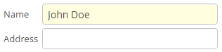
Consider the example of setting the yellow background color to the field displaying the customer’s name.
In an XML descriptor, the FieldGroup component is defined:
<fieldGroup id="fieldGroup" datasource="customerDs">
    <field property="name"/>
    <field property="address"/>
</fieldGroup>
The
fieldelements ofFieldGroupdo not have the stylename attribute, therefore we have to set the field’s style name in the controller:@Named("fieldGroup.name") private TextField nameField; @Override public void init(Map<String, Object> params) { nameField.setStyleName("name-field"); }In the
halo-ext.scssfile, add the new style definition to thehalo-extmixin:@mixin com_company_application-halo-ext { .name-field { background-color: lightyellow; } }After rebuilding the project, the fields will look as follows:
- Modifying existing styles of the visual components
-
To modify style parameters of existing components, add the corresponding CSS code to the
halo-extmixin of thehalo-ext.scssfile. Use developer tools of your web browser to find out CSS classes assigned to the elements of visual components. For example, to display the application menu items in bold, the contents of thehalo-ext.scssfile should be as follows:@mixin com_company_application-halo-ext { .v-menubar-menuitem-caption { font-weight: bold; } }
- Modifying common parameters
-
Themes contain a number of SCSS variables that control application background colour, component size, margins and other parameters.
Below is the example of a Halo theme extension, since it is based on Valo theme from Vaadin, and provides the widest range of options for customization.
The
themes/halo/halo-ext-defaults.scssfile is intended for overriding theme variables. Most of the Halo variables correspond to those described in the Valo documentation. Below are the most common variables:$v-background-color: #fafafa; /* component background colour */ $v-app-background-color: #e7ebf2; /* application background colour */ $v-panel-background-color: #fff; /* panel background colour */ $v-focus-color: #3b5998; /* focused element colour */ $v-error-indicator-color: #ed473b; /* empty required fields colour */ $v-line-height: 1.35; /* line height */ $v-font-size: 14px; /* font size */ $v-font-weight: 400; /* font weight */ $v-unit-size: 30px; /* base theme size, defines the height for buttons, fields and other elements */ $v-font-size--h1: 24px; /* h1-style Label size */ $v-font-size--h2: 20px; /* h2-style Label size */ $v-font-size--h3: 16px; /* h3-style Label size */ /* margins for containers */ $v-layout-margin-top: 10px; $v-layout-margin-left: 10px; $v-layout-margin-right: 10px; $v-layout-margin-bottom: 10px; /* spacing between components in a container (if enabled) */ $v-layout-spacing-vertical: 10px; $v-layout-spacing-horizontal: 10px; /* basic table dimensions */ $v-table-row-height: 30px; $v-table-header-font-size: 13px; $v-table-cell-padding-horizontal: 7px; /* input field focus style */ $v-focus-style: inset 0px 0px 5px 1px rgba($v-focus-color, 0.5); /* required fields focus style */ $v-error-focus-style: inset 0px 0px 5px 1px rgba($v-error-indicator-color, 0.5); /* animation for elements is enabled by default */ $v-animations-enabled: true; /* popup window animation is disabled by default */ $v-window-animations-enabled: false; /* inverse header is controlled by cuba.web.useInverseHeader property */ $v-support-inverse-menu: true; /* show "required" indicators for components */ $v-show-required-indicators: false !default;The sample
halo-ext-defaults.scssfor a theme with a dark background and slightly minimized margins is provided below:$v-background-color: #444D50; $v-font-size--h1: 22px; $v-font-size--h2: 18px; $v-font-size--h3: 16px; $v-layout-margin-top: 8px; $v-layout-margin-left: 8px; $v-layout-margin-right: 8px; $v-layout-margin-bottom: 8px; $v-layout-spacing-vertical: 8px; $v-layout-spacing-horizontal: 8px; $v-table-row-height: 25px; $v-table-header-font-size: 13px; $v-table-cell-padding-horizontal: 5px; $v-support-inverse-menu: false;
- Migration from Havana to feature-rich Halo theme
-
Halo theme is more extensible and supports some new visual components, such as DataGrid or SideMenu. If you want to use these components and keep your components library up-to-date, it is recommended to use the Halo theme. At the same time, if you want to keep the old Havana enterprise look, you can use the following variables in
halo-ext-defaults.scss:$cuba-menubar-background-color: #315379; $cuba-menubar-border-color: #315379; $v-table-row-height: 25px; $v-selection-color: rgb(77, 122, 178); $v-table-header-font-size: 12px; $v-textfield-border: 1px solid #A5C4E0; $v-selection-item-selection-color: #4D7AB2; $v-app-background-color: #E3EAF1; $v-font-size: 12px; $v-font-weight: 400; $v-unit-size: 25px; $v-border-radius: 0px; $v-border: 1px solid #9BB3D3 !default; $v-font-family: Verdana,tahoma,arial,geneva,helvetica,sans-serif,"Trebuchet MS"; $v-panel-background-color: #ffffff; $v-background-color: #ffffff; $cuba-menubar-menuitem-text-color: #ffffff; $cuba-app-menubar-padding-top: 8px; $cuba-app-menubar-padding-bottom: 8px; $cuba-menubar-text-color: #ffffff; $cuba-menubar-submenu-padding: 1px; - Changing the application header
-
Halo theme supports the cuba.web.useInverseHeader property, which controls the colour of the application header. By default, this property is set to
true, which sets a dark (inverse) header.You can make a light header without any changes to the theme, simply by setting this property tofalse.