 Edit on GitHub
5.5.2.2.10. SplitPanel
SplitPanel − a container divided into two areas by a movable separator.
Component XML-name: split.
An example description of a split panel in a screen XML-descriptor:
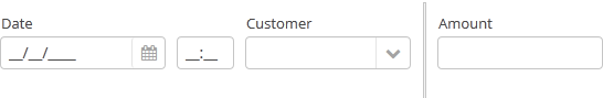
<split orientation="horizontal" pos="30" width="100%" height="100%">
    <vbox margin="true" spacing="true">
        <dateField datasource="orderDs" property="date" caption="Date"/>
        <lookupField datasource="orderDs" property="customer" optionsDatasource="customersDs" caption="Customer"/>
    </vbox>
    <vbox margin="true" spacing="true">
        <textField datasource="orderDs" property="amount" caption="Amount"/>
    </vbox>
</split>
split container must contain two nested containers or components. They will be displayed on both sides of the separator.
split attributes:
-
dockable- enables or disables theSplitPaneldock button, the default value isfalse. Warning
Docking is available only for horizontally-oriented
SplitPanel.
-
dockMode- defines the docking direction. Possible values:LEFTorRIGHT.<split orientation="horizontal" dockable="true" dockMode="RIGHT"> ... </split>
-
minSplitPosition,maxSplitPosition- defines a range of the available position of the split which can be set in pixels or percents.For example, you can restrict moving the splitter between 100 and 300 pixels from the left side of the component as follows:
<split id="splitPanel" maxSplitPosition="300px" minSplitPosition="100px" width="100%" height="100%">
    <vbox margin="true" spacing="true">
        <button caption="Button 1"/>
        <button caption="Button 2"/>
    </vbox>
    <vbox margin="true" spacing="true">
        <button caption="Button 4"/>
        <button caption="Button 5"/>
    </vbox>
</split>
If you want to set the range programmatically, specify a unit of value with
Component.UNITS_PIXELSorComponent.UNITS_PERCENTAGE:splitPanel.setMinSplitPosition(100, Component.UNITS_PIXELS); splitPanel.setMaxSplitPosition(300, Component.UNITS_PIXELS);
-
orientation– defines component orientation.horizontal– nested components are placed horizontally,vertical– they are placed vertically.
-
pos– an integer number defining percentage of the first component area compared to the second one. For example,pos="30"means that the areas ration is 30/70. By default the areas are divided 50/50.
-
reversePosition- indicates that theposattribute specifies a position of the splitter from the opposite side of the component.
-
If the
lockedattribute is set totrue, users are unable to change the separator position.
-
The
stylenameattribute with thelargevalue makes the split handle wider.split.setStyleName(HaloTheme.SPLITPANEL_LARGE);
SplitPanel methods:
-
You can get a position of the splitter using the
getSplitPosition()method.
-
The events of moving the splitter can be intercepted with the help of
PositionUpdateListener. -
If you need to get a unit of splitter position, use
getSplitPositionUnit()method. It will returnComponent.UNITS_PIXELSorComponent.UNITS_PERCENTAGE. -
isSplitPositionReversed()returnstrueif position is set from the opposite side of the component.
- Attributes of split
-
align - dockable - dockMode - height - id - locked - minSplitPosition - maxSplitPosition - orientation - pos - reversePosition - settingsEnabled - stylename - width
- API
-
add - addPositionUpdateListener - applySettings - getComponent - getComponentNN - getComponents - getOwnComponent - getOwnComponents - remove - removeAll - saveSettings