5.8.8.5. Support for Custom Visual Components in CUBA Studio
This section describes how to integrate a new custom visual component into CUBA Studio. As a result of the integration, the component will be available on the component palette of the WYSIWYG screen layout designer. Developers will be able to drag and drop the component to the canvas and edit its properties in the properties panel.
Let’s walk through the process of integrating the stepper component into Studio. Creation of this component was described in Integrating a Vaadin Component into the Generic UI.
Open the project containing the stepper component.
|
Tip
|
If you didn’t create this project, you can still reproduce the steps listed below in a new project. In this case, you will see how Studio supports the component, but you won’t be able to run the application. |
Click the Extend Studio link on the Project properties navigator section.
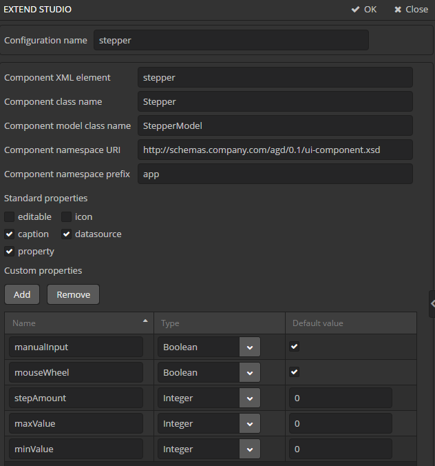
In the Extend Studio screen, fill in the following fields:
-
Configuration name - a configuration identifier. Enter
stepper. -
Component XML element - a component element name to use in screen XML descriptors. It is
stepperin our case.The Component class name and Component model class name fields are filled automatically based on the value of the Component XML element. Leave the values as is.
-
Component namespace URI - a namespace from the XSD that describes the Generic UI component. If you’ve generated the new component with Studio, then you can take the value of this field from the
ui-component.xsdfile located in the gui module. -
Component namespace prefix - a prefix for the component XML element.
-
Standard properties - standard properties that should be available for editing in the component properties panel of the Studio screen layout designer.
Select
caption,datasourceandpropertycheckboxes.Tipid,align,height,width,enable,stylenameandvisibleproperties are available to any component by default. -
Custom properties - this table is used for declaring component specific properties that should be edited in the component properties panel.
Add the following properties:
-
manualInput of type
Boolean, the default value istrue -
mouseWheel of type
Boolean, the default value istrue -
stepAmount, of type
Integer, the default value is0 -
maxValue, of type
Integer, the default value is0 -
minValue, of type
Integer, the default value is0
-
Press the OK button.
The custom visual components support is initialized when the Studio server start. Go to the Studio server window, stop the server, exit Studio, then reopen and start it again.
Re-create standard screens for the Customer entity to erase the results of our previous experiments.
Then go to the GENERIC UI navigator section and open the customer-edit.xml screen.
Remove the score field from fieldGroup because we will use a separate component for editing the score.
Find the new Stepper component on the components palette, then drag it to the screen below fieldGroup.
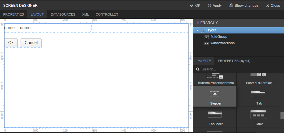
Select the stepper component and go to the component Properties tab.
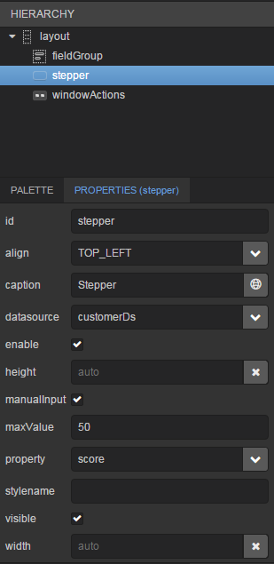
Fill in the fields:
-
id -
stepper -
caption -
Stepper -
datasource -
customerDs -
property -
score -
maxValue -
50
Go to the XML tab to see the result.
<?xml version="1.0" encoding="UTF-8" standalone="no"?>
<window xmlns="http://schemas.haulmont.com/cuba/window.xsd"
        caption="msg://editCaption"
        class="com.company.addonguidemo.gui.customer.CustomerEdit"
        datasource="customerDs"
        focusComponent="fieldGroup"
        messagesPack="com.company.addonguidemo.gui.customer"
        xmlns:app="http://schemas.company.com/agd/0.1/ui-component.xsd">
    <dsContext>
        <datasource id="customerDs"
                    class="com.company.addonguidemo.entity.Customer"
                    view="_local"/>
    </dsContext>
    <layout expand="windowActions"
            spacing="true">
        <fieldGroup id="fieldGroup"
                    datasource="customerDs">
            <column width="250px">
                <field property="name"/>
            </column>
        </fieldGroup>
        <app:stepper id="stepper"
                     caption="Stepper"
                     datasource="customerDs"
                     maxValue="50"
                     property="score"/>
        <frame id="windowActions"
               screen="editWindowActions"/>
    </layout>
</window>
There is a new namespace with the app prefix in the screen XML, the stepper component is added to the screen, and its properties are set correctly.