 Edit on GitHub
4. Displaying PivotTable
PivotTable is a table component with drag-and-drop functionality that enables turning a data set into a summary table and manipulate it using 2D drag-and-drop UI. It is fully available via the CUBA Studio components library.
PivotTable is based on the external JavaScript library - https://github.com/nicolaskruchten/pivottable. You can find more examples of PivotTable on its author’s website: http://nicolas.kruchten.com/pivottable/examples/.
XML-name of the component: pivotTable
The component is implemented for the Web Client only.
An example of component definition in an XML-descriptor of a screen:
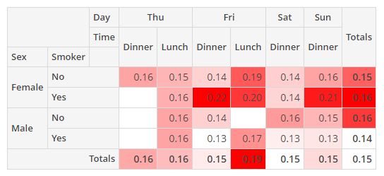
<chart:pivotTable id="tipsPivotTable"
                  dataContainer="tipsDc"
                  renderer="HEATMAP">
    <chart:properties>
        <chart:property name="row"/>
        <chart:property name="totalBill"/>
        <chart:property name="tip"/>
        <chart:property name="sex"/>
        <chart:property name="smoker"/>
        <chart:property name="day"/>
        <chart:property name="time"/>
        <chart:property name="size"/>
    </chart:properties>
    <chart:aggregation mode="SUM_OVER_SUM">
        <chart:property name="tip"/>
        <chart:property name="totalBill"/>
    </chart:aggregation>
    <chart:rows>
        <chart:row value="sex"/>
        <chart:row value="smoker"/>
    </chart:rows>
    <chart:columns>
        <chart:column value="day"/>
        <chart:column value="time"/>
    </chart:columns>
    <chart:sortersFunction>
        function(attr){
            if(attr=="Day"){
                return $.pivotUtilities.sortAs(["Mon","Tue","Wed","Thu","Fri","Sat","Sun"]);
            }
        }
    </chart:sortersFunction>
</chart:pivotTable>- pivotTable elements
-
properties- a key-value map with the set of properties to be used in thepivotTable, where the key is the name of an attribute from the data container, and the value is its localized caption.
-
derivedProperties- can be used to add new attributes to the original data container, derived from the existing ones. This element is a key-value map, where the key is the name of a generated attribute, and the value is a JavaScript function that generates this attribute.-
the enclosed
derivedPropertyelements should have thecaptionattribute defined, as the caption’s value will be used as the key. -
the
functionelement is used as the value for thederivedProperty.
-
-
columns- the list of attributes to be used as table columns. Its value can be either apropertieskey or a generated attribute’s name.
-
columnOrder- the order in which column data is provided to the renderer.
-
rows- the list of attributes to be used as table rows. Its value can be either apropertieskey or a generated attribute’s name.
-
rowOrder- the order in which row data is provided to the renderer.
-
exclusions- a key-value map where the key is the names of attributes (either apropertieskey or a generated attribute’s name), and the value is the list of these attributes' values to be excluded from rendering. Only for editablepivotTable.
-
inclusions- a key-value map where the key is the names of attributes (either apropertieskey or a generated attribute’s name), and the value is the list of these attributes' values to be rendered. Only for editablepivotTable.
-
filterFunction- JavaScript function that will be used for filtration.
-
renderers- defines the collection of rendering functions that should be displayed in the list of available renderers in the UI.-
defaultattribute enables setting one of the predefined renderers. The selected renderer will be used as a default when the component is loaded. -
enclosed
rendererelement enables setting one of the predefined renderers using itstypeattribute:AREA_CHART,BAR_CHART,COL_HEATMAP,HEATMAP,HORIZONTAL_BAR_CHART,HORIZONTAL_STACKED_BAR_CHART,LINE_CHART,ROW_HEATMAP,SCATTER_CHART,STACKED_BAR_CHART,TABLE_BAR_CHART,TABLE,TREEMAP,TSV_EXPORT.Only for editable
pivotTable.
-
-
rendererOptions- defines the renderers' options. Actually, only two renderer types can be customized:-
all kinds of
heatmap. The cell colours can be set by the Javascript code. -
all kinds of charts. Options can be used to set the chart’s size.
-
-
sortersFunction- JavaScript function that will be used for rows and columns captions sorting.
- Aggregation elements of pivotTable
-
aggregation- sets up a function which will aggregate results per cell.aggregationattributes:-
modeattribute enables setting one of the predefined aggregation functions. -
captionis a localized value to be displayed in the UI. -
custom- iftrue, themodevalue is ignored in favor of the javaScript code from the enclosedfunctionelement.aggregationelements: -
function- contains JavaScript code of an aggregation function. -
property- the list of attributes to be used as input parameters of the aggregation function. Its value can be either apropertieskey or a generated attribute’s name. Only for non-editablepivotTable.For example:
<chart:aggregation mode="SUM_OVER_SUM" custom="true">
    <chart:property name="tip"/>
    <chart:property name="Total Bill"/>
</chart:aggregation>
-
-
aggregationProperties- defines the list of attributes that should be displayed in the dropdown lists of aggregators. Its value can be either apropertieskey or a generated attribute’s name. Only for editablepivotTable.<chart:aggregationProperties> <chart:property name="tip"/> <chart:property name="totalBill"/> </chart:aggregationProperties>
-
aggregations- defines the collection of aggregators that should be displayed in the dropdown list of available aggregators in the UI.aggregationsattributes:-
defaultattribute enables setting one of predefined aggregation functions. The selected function will be used as default when the component is loaded. -
enclosed
aggregationelement is used in the same way as aggregation except for the enclosedpropertyelement. Only for editablepivotTable.For example:
<chart:aggregations default="COUNT">
    <chart:aggregation caption="Count"/>
    <chart:aggregation mode="SUM_OVER_SUM"/>
</chart:aggregations>
-
- pivotTable attributes
-
dataContainer- sets a data container defined in thedatasection of the screen XML descriptor. TheCollectionContainertype is required.
-
editable- iftrue, the elements for manipulation with data will be displayed in the UI, otherwise only the data will be displayed.
-
renderer- enables setting one of the predefined data renderers. Only for non-editablepivotTable.
-
showColTotals- defines whether the column totals should be displayed. The default value istrue. Works only for table renderers.
-
showRowTotals- defines whether the row totals should be displayed. The default value istrue. Works only for table renderers.
-
showUI- hides or shows the UI elements in the editable pivot table. The default value istrue.
-
autoSortUnusedProperties- defines if unused attributes should be sorted in the UI. Only for editablepivotTable.
-
unusedPropertiesVertical- defines if unused attributes should be displayed vertically (iftrue) or horizontally (iffalse, or by default). If set to a number, then if the attributes names' combined length in characters exceeds this number, the attributes will be shown vertically.
- Listeners of pivotTable
-
addCellClickListener- adds a listener to thePivotTablecell click events. TheCellClickEventis fired only for table renderers (TABLE,HEATMAP,TABLE_BAR_CHART,COL_HEATMAP,ROW_HEATMAP).tipsPivotTableUI.addCellClickListener(event -> { showNotification("Value: " + event.getValue() + ",\n" + "Filters applied: " + event.getFilters()); });
-
addRefreshListener- adds a listener to thePivotTablerefresh events. TheRefreshEventis fired only for editablePivotTable.tipsPivotTableUI.addRefreshListener(event -> { showNotification("Row order :" + event.getRowOrder() + ",\n" + "Inclusions: " + event.getInclusions()); });The following values are available from the
RefreshEvent: aggregation, aggregationProperties, columns, columnOrder, exclusions, inclusions, renderer, rowOrder, rows.
- Attributes of pivotTable
-
autoSortUnusedProperties - dataContainer - editable - height - menuLimit - renderer - unusedPropertiesVertical - width
- Elements of pivotTable
-
aggregation - aggregationProperties - aggregations - columnOrder - columns - derivedProperties - exclusions - filterFunction - hiddenFromAggregations - hiddenFromDragDrop - hiddenProperties - inclusions - properties - rendererOptions - renderers - rowOrder - rows - sortersFunction
- API