 Edit on GitHub
1.2. Configuring Charts
Charts are displayed using the Chart component acting as a universal canvas. Chart type is defined by the subtype interface that inherits the Chart interface.
Charts can be described both in a screen XML-descriptor or in a screen controller. To do this, you should connect the corresponding namespace to the descriptor:
<window xmlns="http://schemas.haulmont.com/cuba/window.xsd"
        xmlns:chart="http://schemas.haulmont.com/charts/charts.xsd"
        ...>
XML elements corresponding to different chart types:
-
chart:xyChart- XYChart -
chart:serialChart- SerialChart -
chart:pieChart- PieChart -
chart:funnelChart- FunnelChart -
chart:gaugeChart- AngularGaugeChart -
chart:radarChart- RadarChart -
chart:ganttChart- GanttChart -
chart:stockChart- StockChart
Each chart type has its own set of attributes and methods, which replicate the functionality of the corresponding charts from AmCharts library. Documentation on the properties and methods of the charts is available at docs.amcharts.com/3/javascriptcharts.
The following elements can be used for declarative configuration of all types of charts:
-
chart:allLabels- contains thelabelelements with label text and its properties. Labels can be placed on a certain position on the chart, for example: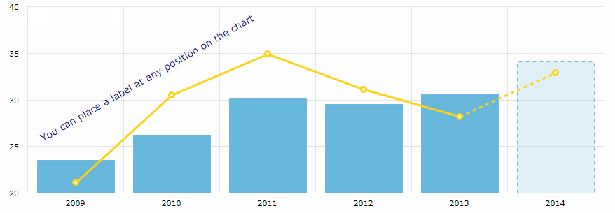
<chart:allLabels>
    <chart:label x="200"
                 y="700"
                 text="You can place a label at any position on the chart"
                 color="DARKBLUE"
                 align="CENTER"
                 rotation="-30"/>
</chart:allLabels>
-
chart:balloon- sets the configurations of balloons (tooltips) of the chart that follow the mouse cursor when you roll-over the data items. For example: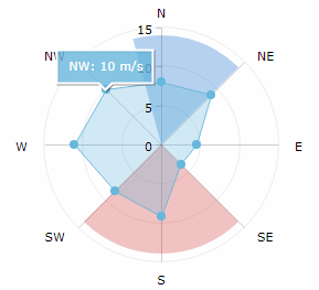
<chart:graphs>
    <chart:graph balloonText="[[category]]: [[value]] m/s"
                 bullet="ROUND"
                 fillAlphas="0.3"
                 valueField="value"/>
</chart:graphs>
<chart:balloon adjustBorderColor="false"
               color="WHITE"
               horizontalPadding="10"
               verticalPadding="8"/>
The balloon text is defined by the
balloonTextattribute of each chart graph.-
additionalFieldsattributeInterpolation of chart data is available for all fields used in the chart, such as
titleField,valueField,category,value,description,percents,openetc, as well as HTML tags.You can also fetch more entity attributes from the data provider using the
additionalFieldsattribute. This attribute allows you to add the passed entity attributes to the chart query and send the extracted data to the UI, so that you can use the entity attribute names directly in the chart configuration.In the example below
titleis the graph title,categoryis the value on the category axis,valueis the value on the value axis, andoptionalis theIncomeExpensesentity attribute fetched to be interpolated in theballoonText:<chart:serialChart additionalFields="optional" addClassNames="true" categoryField="year" datasource="incomeExpensesDs" startDuration="1"> <chart:graphs> <chart:graph alphaField="alpha" balloonText="<span style='font-size:12px;'>[[title]] in [[category]]:<br> <span style='font-size:20px;'>[[value]]</span> [[optional]]</span>" dashLengthField="dashLengthColumn" title="Income" type="COLUMN" valueField="income"/> <...> </chart:graphs> </chart:serialChart>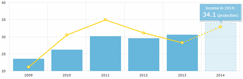
The list of fields can be added declaratively as a comma-separated string:
additionalFields="income,expense,vat"or programmatically in the screen controller:
List<String> fields = Arrays.asList("income", "expense", "vat");
ganttChart.setAdditionalFields(fields);
-
-
chart:chartScrollbar(for SerialChart and XYChart) - the chart’s scrollbar.-
You can set the concrete graph to zoom by the scrollbar, for example:
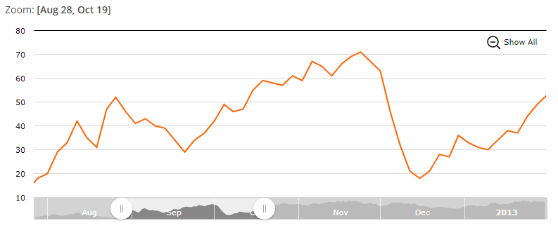
<chart:chartScrollbar graph="g1" autoGridCount="true" scrollbarHeight="30"/> -
The
chart:chartScrollbarSettingselement enables you to customize the scrollbar’s properties.<chart:chartScrollbarSettings graph="stockGraph" usePeriod="10mm" position="TOP"/> -
In addition, the GanttChart may have a
chart:valueScrollbarelement for scrolling the value axis, whilechart:chartScrollbarwill be used for zooming the category axis.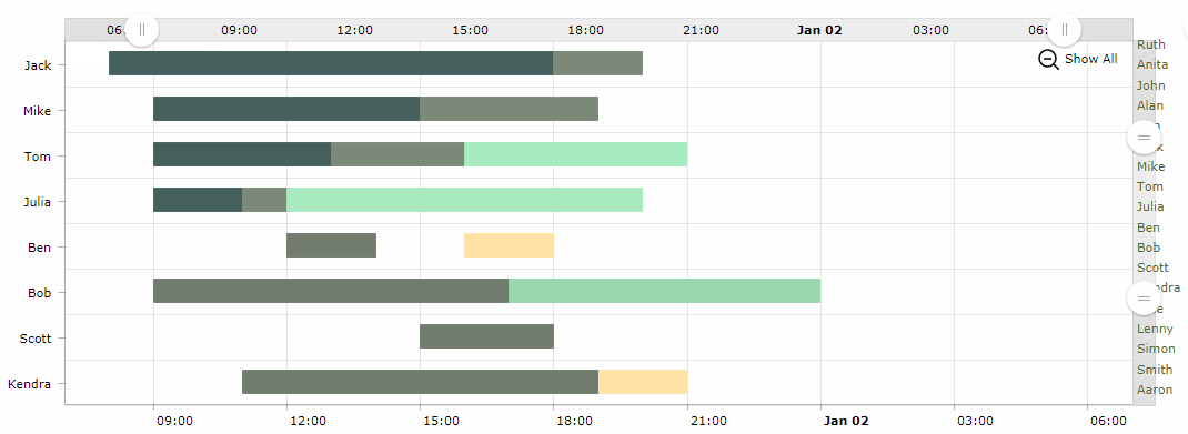
<chart:valueScrollbar autoGridCount="true"
                      color="BLACK"/>
<chart:chartScrollbar autoGridCount="true"
                      color="DARKOLIVEGREEN"/>
-
-
chart:cursor- an optional element adding a cursor to the chart; the cursor follows the mouse pointer and shows a tooltip with the value of the corresponding point on a chart.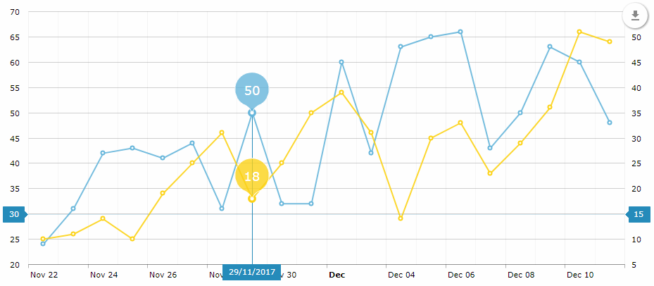
<chart:chartCursor cursorAlpha="1" cursorColor="#258cbb" cursorPosition="MOUSE" limitToGraph="g1" pan="true" valueLineAlpha="0.2" valueLineBalloonEnabled="true" valueLineEnabled="true" valueZoomable="true"/> -
chart:data- an optional element for data binding used mostly for prototyping. -
chart:export- an optional element that enables chart export. The default export implementation adds a floating download button on the chart:
-
chart:guides- horizontal/vertical guidelines.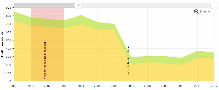
<chart:guides>
    <chart:guide category="2001"
                 dashLength="2"
                 fillAlpha="0.2"
                 fillColor="#CC0000"
                 inside="true"
                 label="fines for speeding increased"
                 labelRotation="90"
                 toCategory="2003"/>
    <chart:guide category="2007"
                 dashLength="2"
                 inside="true"
                 label="motorcycle fee introduced"
                 labelRotation="90"
                 lineAlpha="1"
                 lineColor="#CC0000"/>
</chart:guides>
-
chart:legend- an element that defines the chart legend, for example: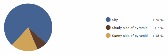
<chart:legend autoMargins="false" marginRight="20" markerType="CIRCLE" position="RIGHT" valueText="[[category]]: [[value]] %"/> -
chart:nativeJson- JSON configuration of the chart.
-
chart:titles- axis titles, for example: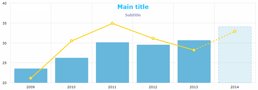
<chart:titles>
    <chart:title alpha="1"
                 bold="true"
                 color="DARKSLATEGREY"
                 size="20"
                 tabIndex="0"
                 text="Main title"/>
    <chart:title alpha="0.5"
                 color="BISQUE"
                 size="12"
                 text="Subtitle"/>
</chart:titles>
-
chart:responsive- the chart plugin that makes the chart responsive.It enables scaling-down and -up chart visual features automatically in order to adjust the chart to the screen resolution changes. You can find more information on the
responsiveplugin on the AmCharts website.The
responsiveelement should contain the enclosedruleselement where the rules of accommodation are defined. You can make the chart hide or show the legend, axis titles, guides, chart titles, zoom controls, move labels inside plot area and so on:<chart:responsive enabled="true"> <chart:rules> <chart:rule maxWidth="400"> <![CDATA[ { "precision": 2, "legend": { "enabled": false }, "valueAxes": { "inside": true } } ]]> </chart:rule> </chart:rules> </chart:responsive>
Any configuration attribute can be set to null; in this case the system will use the default value (except the cases specified in the AmCharts documentation).
Configuring charts in a screen controller is performed following the same logic. You can configure a simple property, as well as a composite object set:
pieChart.setWidth("700px");
pieChart.setTitleField("description")
        .setValueField("value")
        .setStartAngle(312)
        .setLegend(new Legend()
                .setMarkerType(MarkerType.CIRCLE)
                .setPosition(LegendPosition.RIGHT)
                .setMarginRight(80))
        .addLabels(
                new Label()
                    .setText("Sample Chart")
                    .setSize(26)
                    .setBold(true)
                    .setAlign(Align.CENTER),
                new Label()
                    .setText("extra information")
                    .setAlign(Align.RIGHT))
        .setLabelTickColor(Color.GOLDENROD)
        .setColors(Arrays.asList(
                    Color.valueOf("#446493"),
                    Color.valueOf("#5E3D2C"),
                    Color.valueOf("#D0A557")))
        .setDatasource(valueDescriptionsDs);
Messages used for displaying charts can be overridden or localized in the main message pack of the web module. Some localizations are available on CUBA GitHub.