Preface
This document describes two functional modules of the CUBA platform, which display charts and geographic maps respectively. These subsystems are implemented in the same add-on – charts – and thus can only be included in an application project together.
Charts and map display functionality is currently available only for the web client.
Target Audience
This manual is intended for developers building applications using CUBA platform. It is assumed that the reader is familiar with the Developer’s Manual.
Additional Materials
This guide, as well as any other CUBA platform documentation, is available at https://www.cuba-platform.com/documentation.
CUBA charts display subsystem implementation is based on AmCharts library, therefore familiarity with this library may be beneficial. See http://www.amcharts.com.
Feedback
If you have any suggestions for improving this manual, feel free to report issues in the source repository on GitHub. If you see a spelling or wording mistake, a bug or inconsistency, don’t hesitate to fork the repo and fix it. Thank you!
1. Installation
To install the add-on in your project follow the instruction below.
-
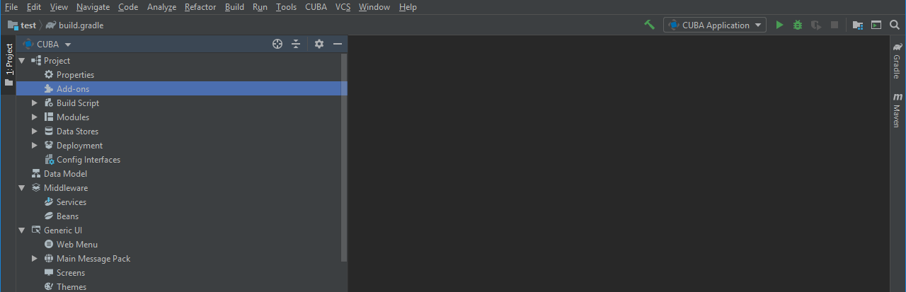
Double-click Add-ons in the CUBA project tree.
-
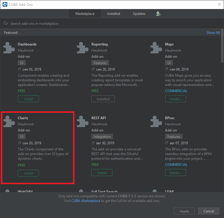
Select Marketplace tab and find Charts add-on.
-
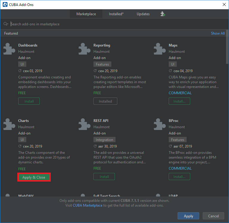
Click Install button and then Apply & Close.
-
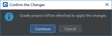
Click Continue in the dialog.
The add-on corresponding to the used platform version will be installed.
2. Displaying Charts
CUBA platform charts display add-on supports various chart types: pie charts, line plots, bubble charts, radar charts, funnel charts, stock charts and more. It is also possible to export charts. Most chart types support zoom and scrolling. The charts are supported in web client only.
AmCharts library which is the basis of the chart display add-on is distributed under a license, which allows its free use if you keep the link to the library website. Alternatively, you can purchase an AmCharts license for your project and remove the link.
First, add the Charts add-on to your project via CUBA Add-Ons window as described in the Installation section.
2.1. Configuring Charts
Charts are displayed using the Chart component acting as a universal canvas. Chart type is defined by the subtype interface that inherits the Chart interface.
Charts can be described both in a screen XML-descriptor or in a screen controller. To do this, you should connect the corresponding namespace to the descriptor:
<window xmlns="http://schemas.haulmont.com/cuba/window.xsd"
        xmlns:chart="http://schemas.haulmont.com/charts/charts.xsd"
        ...>
XML elements corresponding to different chart types:
-
chart:xyChart– XYChart -
chart:serialChart– SerialChart -
chart:pieChart– PieChart -
chart:funnelChart– FunnelChart -
chart:gaugeChart– AngularGaugeChart -
chart:radarChart– RadarChart -
chart:ganttChart– GanttChart -
chart:stockChart– StockChart
Each chart type has its own set of attributes and methods, which replicate the functionality of the corresponding charts from AmCharts library. Documentation on the properties and methods of the charts is available at http://docs.amcharts.com/3/javascriptcharts.
The following elements can be used for declarative configuration of all types of charts:
-
chart:allLabels– contains thelabelelements with label text and its properties. Labels can be placed on a certain position on the chart, for example: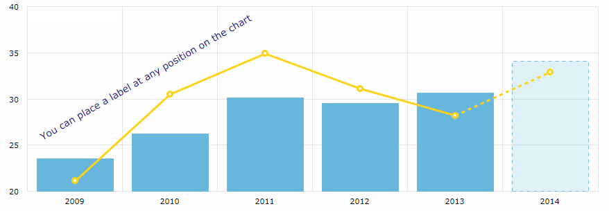 Figure 1. chart:allLabels
<chart:allLabels>
    <chart:label x="200"
                 y="700"
                 text="You can place a label at any position on the chart"
                 color="DARKBLUE"
                 align="CENTER"
                 rotation="-30"/>
</chart:allLabels>
-
chart:balloon– sets the configurations of balloons (tooltips) of the chart that follow the mouse cursor when you roll-over the data items. For example: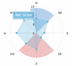 Figure 2. chart:balloon
<chart:graphs>
    <chart:graph balloonText="[[category]]: [[value]] m/s"
                 bullet="ROUND"
                 fillAlphas="0.3"
                 valueField="value"/>
</chart:graphs>
<chart:balloon adjustBorderColor="false"
               color="WHITE"
               horizontalPadding="10"
               verticalPadding="8"/>
The balloon text is defined by the
balloonTextattribute of each chart graph.-
additionalFieldsattributeInterpolation of chart data is available for all fields used in the chart, such as
titleField,valueField,category,value,description,percents,openetc, as well as HTML tags.You can also fetch more entity attributes from the data provider using the
additionalFieldsattribute. This attribute allows you to add the passed entity attributes to the chart query and send the extracted data to the UI, so that you can use the entity attribute names directly in the chart configuration.In the example below
titleis the graph title,categoryis the value on the category axis,valueis the value on the value axis, andoptionalis theIncomeExpensesentity attribute fetched to be interpolated in theballoonText:<chart:serialChart additionalFields="optional" addClassNames="true" categoryField="year" dataContainer="incomeExpensesDc" startDuration="1"> <chart:graphs> <chart:graph alphaField="alpha" balloonText="<span style='font-size:12px;'>[[title]] in [[category]]:<br> <span style='font-size:20px;'>[[value]]</span> [[optional]]</span>" dashLengthField="dashLengthColumn" title="Income" type="COLUMN" valueField="income"/> <...> </chart:graphs> </chart:serialChart>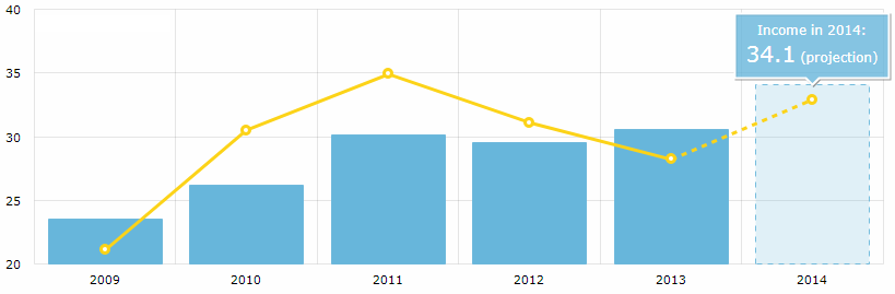 Figure 3. additionalFields
The list of fields can be added declaratively as a comma-separated string:
additionalFields="income,expense,vat"or programmatically in the screen controller:
List<String> fields = Arrays.asList("income", "expense", "vat");
ganttChart.setAdditionalFields(fields);
-
-
chart:chartScrollbar(for SerialChart and XYChart) – the chart’s scrollbar.-
You can set the concrete graph to zoom by the scrollbar, for example:
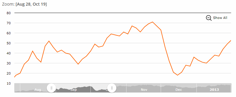 Figure 4. chart:chartScrollbar
<chart:chartScrollbar graph="g1" autoGridCount="true" scrollbarHeight="30"/> -
The
chart:chartScrollbarSettingselement enables you to customize the scrollbar’s properties.<chart:chartScrollbarSettings graph="stockGraph" usePeriod="10mm" position="TOP"/> -
In addition, the GanttChart may have a
chart:valueScrollbarelement for scrolling the value axis, whilechart:chartScrollbarwill be used for zooming the category axis.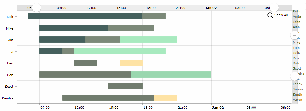 Figure 5. chart:valueScrollbar
<chart:valueScrollbar autoGridCount="true"
                      color="BLACK"/>
<chart:chartScrollbar autoGridCount="true"
                      color="DARKOLIVEGREEN"/>
-
-
chart:cursor– an optional element adding a cursor to the chart; the cursor follows the mouse pointer and shows a tooltip with the value of the corresponding point on a chart.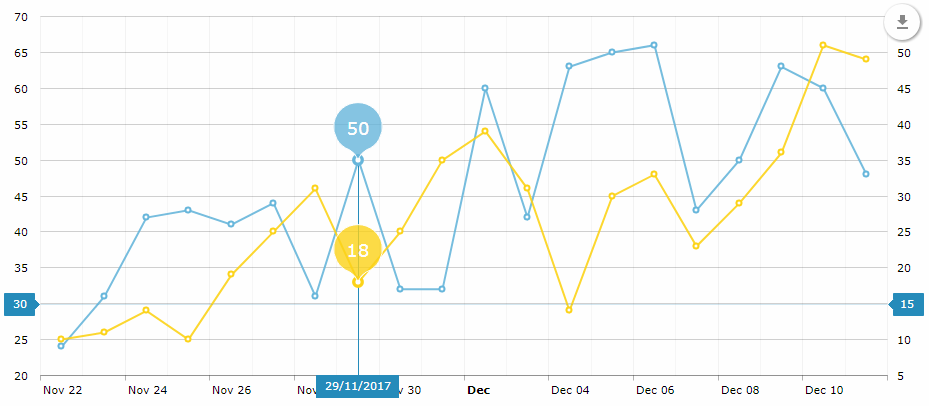 Figure 6. chart:cursor
<chart:chartCursor cursorAlpha="1" cursorColor="#258cbb" cursorPosition="MOUSE" limitToGraph="g1" pan="true" valueLineAlpha="0.2" valueLineBalloonEnabled="true" valueLineEnabled="true" valueZoomable="true"/> -
chart:data– an optional element for data binding used mostly for prototyping. -
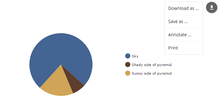
chart:export– an optional element that enables chart export. The default export implementation adds a floating download button on the chart: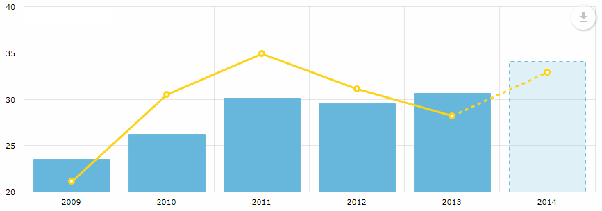 Figure 7. chart:export
-
chart:guides– horizontal/vertical guidelines.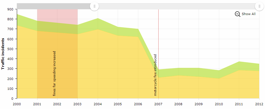 Figure 8. chart:guides
<chart:guides>
    <chart:guide category="2001"
                 dashLength="2"
                 fillAlpha="0.2"
                 fillColor="#CC0000"
                 inside="true"
                 label="fines for speeding increased"
                 labelRotation="90"
                 toCategory="2003"/>
    <chart:guide category="2007"
                 dashLength="2"
                 inside="true"
                 label="motorcycle fee introduced"
                 labelRotation="90"
                 lineAlpha="1"
                 lineColor="#CC0000"/>
</chart:guides>
-
chart:legend– an element that defines the chart legend, for example: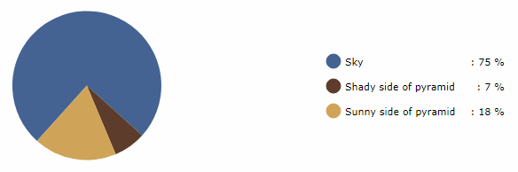 Figure 9. chart:legend
<chart:legend autoMargins="false" marginRight="20" markerType="CIRCLE" position="RIGHT" valueText="[[category]]: [[value]] %"/> -
chart:nativeJson– JSON configuration of the chart.
-
chart:titles– axis titles, for example: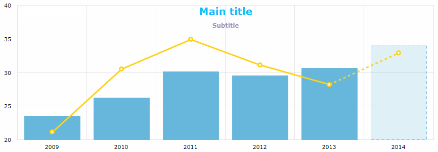 Figure 10. chart:titles
<chart:titles>
    <chart:title alpha="1"
                 bold="true"
                 color="DARKSLATEGREY"
                 size="20"
                 tabIndex="0"
                 text="Main title"/>
    <chart:title alpha="0.5"
                 color="BISQUE"
                 size="12"
                 text="Subtitle"/>
</chart:titles>
-
chart:responsive– the chart plugin that makes the chart responsive.It enables scaling-down and -up chart visual features automatically in order to adjust the chart to the screen resolution changes. You can find more information on the
responsiveplugin on the AmCharts website.The
responsiveelement should contain the enclosedruleselement where the rules of accommodation are defined. You can make the chart hide or show the legend, axis titles, guides, chart titles, zoom controls, move labels inside plot area and so on:<chart:responsive enabled="true"> <chart:rules> <chart:rule maxWidth="400"> <![CDATA[ { "precision": 2, "legend": { "enabled": false }, "valueAxes": { "inside": true } } ]]> </chart:rule> </chart:rules> </chart:responsive>
Any configuration attribute can be set to null; in this case, the system will use the default value (except the cases specified in the AmCharts documentation).
Configuring charts in a screen controller is performed following the same logic. You can configure a simple property, as well as a composite object set:
pieChart.setWidth("700px");
pieChart.setTitleField("description")
        .setValueField("value")
        .setStartAngle(312)
        .setLegend(new Legend()
                .setMarkerType(MarkerType.CIRCLE)
                .setPosition(LegendPosition.RIGHT)
                .setMarginRight(80))
        .addLabels(
                new Label()
                    .setText("Sample Chart")
                    .setSize(26)
                    .setBold(true)
                    .setAlign(Align.CENTER),
                new Label()
                    .setText("extra information")
                    .setAlign(Align.RIGHT))
        .setLabelTickColor(Color.GOLDENROD)
        .setColors(Arrays.asList(
                    Color.valueOf("#446493"),
                    Color.valueOf("#5E3D2C"),
                    Color.valueOf("#D0A557")))
        .setDataProvider(dataProvider);
Messages used for displaying charts can be overridden or localized in the main message pack of the web module. Some localizations are available on CUBA GitHub.
2.2. Charts Export
All charts can be exported from the running application as a picture or a source data. The chart:export element is used to create default export menu that enables the following options:
-
Download as… with available formats: PNG, JPG, SVG, PDF
-
Save as… with available formats: CSV, XLSX, JSON
-
Annotate… which is used to add personal notes and vector shapes to the chart. You can find information on the annotation plugin here.
-
Print that opens the standard print settings window.
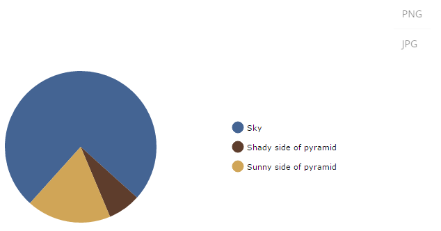
The export menu can be customized to limit user access to the chart data, for example:
<chart:export fileName="my-chart" position="TOP_RIGHT">
    <chart:menu>
        <chart:item label="PNG" title="Save as PNG" format="PNG"/>
        <chart:item label="JPG" title="Save as JPG" format="JPG"/>
    </chart:menu>
</chart:export>
In this case, only direct download buttons for chosen formats will be available:
You can define the following export settings:
-
backgroundColor– code of the color for the background of the exported image. The default value is#FFFFFF. -
dataDateFormat– the format to convert date strings to date objects in data export only. -
dateFormat– formats the category field in the given date format (data export only). -
enabled– enables or disables the export functionality. -
exportSelection– exports the current data selection only. The default value isfalse. -
exportTitles– exchanges the data field names with its dedicated title. The default value isfalse. -
fileListener– iftrue, it observes the drag and drop feature and loads the dropped image file into the annotation. The default value isfalse. -
fileName– a file name to use for generated export files (an extension will be appended to it based on the export format). -
keyListener– iftrue, observes the pressed keys to undo/redo the annotations. -
position– position of the export icon. Possible values:TOP_LEFT,TOP_RIGHT(Default value),BOTTOM_LEFT,BOTTOM_RIGHT. -
removeImages– iftrue, export checks for and removes unnecessary images that are loaded from different domains.
The following properties enable you to customize each export option:
- JPG
-
-
quality– a quality of the resulting image. Possible values0–1. The default value is1.
-
- PNG, JPG, SVG, PDF
-
-
multiplier– scale factor for the generated image.
-
- CSV
-
-
quotes– sets whether to enclose strings in double quotes. The default value istrue. -
delimiter– a string to use as a column delimiter. The default value is "," (comma). -
escape– defines whether to escape strings. The default value is true. -
withHeader– adds header row with column names. The default value istrue.
-
- XLSX
-
-
dateFormat– the XLSX date format mask. Do not forget to setparseDatestotruein CategoryAxis. -
stringify– converts all cell content to strings. The default value isfalse. -
withHeader– adds header row with column names. The default value istrue.
-
-
-
pageOrientation– the page orientation. The default value isPORTRAIT. -
pageOrigin– shows/hides the origin of the generated PDF. The default value istrue. -
pageSize– the format of PDF list. The default value isA4.
Additionally, you can override the string for
label.saved.frommessage in the main message pack. -
-
-
delay– delay before triggering print in seconds. -
lossless– enables or disables image optimization when printing. The default value isfalse.
-
2.3. Connecting Data
There are two ways how you can pass data to a chart: through the DataProvider interface or using the simplified data binding API, which allows adding the data directly using the addData() method and convenient MapDataItem constructors for those charts that are not bound to a data container. Example of Working with Charts illustrates all approaches to providing chart data.
- DataProvider:
-
The
DataProviderinterface has two standard implementations:ListDataProviderclass andContainerDataProviderclass.-
ListDataProvidercontains a list ofDataIteminstances from which the data for the chart will be taken. There are several standard implementations ofDataIteminterface:-
EntityDataItemtakes an instance of any entity from which the data for the chart will be taken:@Inject private PieChart chart; @Inject private Metadata metadata; @Subscribe protected void onInit(InitEvent event) { ListDataProvider dataProvider = new ListDataProvider(); dataProvider.addItem(new EntityDataItem(valueDescription(75, "Sky"))); dataProvider.addItem(new EntityDataItem(valueDescription(7, "Shady side of pyramid"))); dataProvider.addItem(new EntityDataItem(valueDescription(18, "Sunny side of pyramid"))); chart.setDataProvider(dataProvider); } private ValueDescription valueDescription(Integer value, String description) { ValueDescription entity = metadata.create(ValueDescription.class); entity.setValue(value); entity.setDescription(description); return entity; } -
MapDataItemis a set of key-value pairs from which the data for the chart will be taken:@Inject private PieChart chart; @Subscribe protected void onInit(InitEvent event) { ListDataProvider dataProvider = new ListDataProvider(); dataProvider.addItem(new MapDataItem( ImmutableMap.of("value", 75, "description", "Sky"))); dataProvider.addItem(new MapDataItem( ImmutableMap.of("value", 7, "description", "Shady side of pyramid"))); dataProvider.addItem(new MapDataItem( ImmutableMap.of("value", 18, "description", "Sunny side of pyramid"))); chart.setDataProvider(dataProvider); } -
SimpleDataItemtakes an instance of anypublicclass from which the data for the chart will be taken:@Inject private PieChart chart; @Subscribe protected void onInit(InitEvent event) { ListDataProvider dataProvider = new ListDataProvider(); dataProvider.addItem(new SimpleDataItem(new ValueDescription(75, "Sky"))); dataProvider.addItem(new SimpleDataItem(new ValueDescription(7, "Shady side of pyramid"))); dataProvider.addItem(new SimpleDataItem(new ValueDescription(18, "Sunny side of pyramid"))); chart.setDataProvider(dataProvider); } public class ValueDescription { private Integer value; private String description; public ValueDescription(Integer value, String description) { this.value = value; this.description = description; } public Integer getValue() { return value; } public String getDescription() { return description; } }
-
-
ContainerDataProvideris used to assign a CollectionContainer to aChartcomponent.Suppose we have a data container with a loader which will load the
TransportCountinstances. Below is the fragment of the screen XML descriptor:<data> <collection id="transportCountsDc" class="com.company.sampler.entity.TransportCount" view="_local"> <loader id="transportCountsDl"> <query><![CDATA[select e from sampler_TransportCount e order by e.year]]></query> </loader> </collection> </data> <layout> <chart:serialChart id="stackedArea" marginLeft="0" marginTop="10" plotAreaBorderAlpha="0" height="100%" width="100%"> <!--...--> </chart:serialChart> </layout>The screen controller defines the
onInit()method that sets the data provider for thestackedAreachart. Data provider is based on thetransportCountsDcdata container.@UiController("sampler_StackedareaChartSample") @UiDescriptor("stackedarea-chart-sample.xml") @LoadDataBeforeShow public class StackedareaChartSample extends Screen { @Inject private CollectionContainer<TransportCount> transportCountsDc; @Inject private SerialChart stackedArea; @Subscribe private void onInit(InitEvent event) { stackedArea.setDataProvider(new ContainerDataProvider(transportCountsDc)); stackedArea.setCategoryField("year"); } }This approach requires an entity that will represent chart data. It may be convenient when such an entity already exists in the application data model and also when chart data should be displayed as a table.
An instance of
DataProvideris passed to thesetDataProvider()method of chart configuration. This approach to providing chart data is the most universal, but it requires creating instances ofDataProviderorDataItemin a screen controller.Entity properties or the values contained in an instance of
DataProviderwhich are used for display purposes are defined in the chart attributes. The set of chart attributes may differ for different chart types. For example, for thechart:pieChartcomponent, you should define thevalueFieldandtitleFieldattributes. The following types are allowed for attribute values:Integer,Long,Double,String,Boolean,Date.Dynamic addition of data to an existing chart is supported for the data provider mechanisms.
-
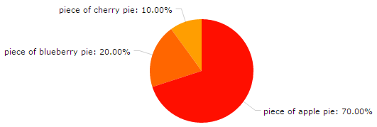
- chart:data element:
-
This option is useful for quick prototyping of charts. The
chart:dataelement and its nesteditemelements enable you to set key-value pairs of data directly in the XML descriptor of the chart, for example:<chart:pieChart id="pieChart" titleField="key" valueField="value"> <chart:data> <chart:item> <chart:property name="key" value="piece of apple pie"/> <chart:property name="value" value="70" type="int"/> </chart:item> <chart:item> <chart:property name="key" value="piece of blueberry pie"/> <chart:property name="value" value="20" type="int"/> </chart:item> <chart:item> <chart:property name="key" value="piece of cherry pie"/> <chart:property name="value" value="10" type="int"/> </chart:item> </chart:data> </chart:pieChart>
2.4. Events
It is possible to configure handling of different event types for each chart type. The following listener types are available for all chart subtypes:
-
LegendItemHideListener– hiding a legend item. -
LegendItemShowListener– showing a legend item. -
LegendLabelClickListener– click on a legend label. -
LegendMarkerClickListener– click on a legend marker.
More event listeners for the exact chart subtype instance you can find in the corresponding sections of the manual.
Event handling examples are available in Using Events.
Above the listeners, SeriesBasedChart interface contains zoomOut, zoomToIndexes, and zoomToDates methods for manipulating the chart axis.
The CoordinateChart interface similarly provides the following methods for the value axis: zoomOutValueAxes, zoomOutValueAxis, zoomOutValueAxis, zoomValueAxisToValues, and zoomValueAxisToValues.
2.5. Chart Types
There are several chart types supported by CUBA platform.
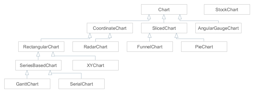
The chart interfaces are implemented in the following Chart components:
All these components have NAME constant, so they can be created using UiComponents.
2.5.1. AngularGaugeChart
The AngularGaugeChart component allows you to create gauge charts.

XML name of the component: chart:gaugeChart.
-
Elements of
chart:gaugeChart -
-
arrows– includes the nestedarrowelements for the chart arrow axes.<chart:arrows> <chart:arrow value="60"/> </chart:arrows> -
axes– includes the nestedaxiselements for the chart axes.<chart:axes> <chart:axis id="blue" axisColor="#67b7dc" axisThickness="3" gridInside="false" inside="false" radius="100%" valueInterval="20" tickColor="#67b7dc"/> <chart:axis labelsEnabled="true" axisColor="#fdd400" axisThickness="3" endValue="160" radius="80%" valueInterval="20" tickColor="#fdd400"/> </chart:axes>The
bandelement enables you to split an axis into several bands, as on the picture above:<chart:axes> <chart:axis axisAlpha="0.2" axisThickness="1" bottomText="60 km/h" bottomTextYOffset="-20" endValue="220" tickAlpha="0.2" valueInterval="20"> <chart:bands> <chart:band color="#84b761" endValue="90" startValue="0"/> <chart:band color="#fdd400" endValue="130" startValue="90"/> <chart:band color="#cc4748" endValue="220" innerRadius="95%" startValue="130"/> </chart:bands> </chart:axis> </chart:axes>The
endValueandstartValueattributes are used to set the range of values on the chart, thevalueIntervalattribute defines the gauge scale marks.
-
-
AngularGaugeChartevent listeners: -
-
ChartClickListener– click on the canvas. -
ChartRightClickListener– right click on the canvas.
-
For more details, see AmCharts documentation.
2.5.2. FunnelChart
The FunnelChart component allows you to create funnel/pyramid charts.

XML name of the component: chart:funnelChart.
- Data binding:
-
-
You can assign a collection data container to the chart and then define the
titleFieldandvalueFieldattributes for thefunnelChartelement:<chart:funnelChart id="ratingChart" align="MIDDLE_CENTER" dataContainer="ratingDc" height="200px" labelPosition="RIGHT" labelText="[[title]]: [[value]]" marginRight="120" maxLabelWidth="110" marginTop="20" titleField="mechanic" valueField="count" width="500px"> </chart:funnelChart> -
Using the chart:data element.
<chart:funnelChart id="ratingChart"
                   titleField="mechanic"
                   valueField="count">
    <chart:data>
        <chart:item>
            <chart:property name="mechanic" value="Jack"/>
            <chart:property name="count" value="1" type="int"/>
        </chart:item>
        <chart:item>
            <chart:property name="mechanic" value="Bob"/>
            <chart:property name="count" value="2" type="int"/>
        </chart:item>
        <chart:item>
            <chart:property name="mechanic" value="Sam"/>
            <chart:property name="count" value="3" type="int"/>
        </chart:item>
    </chart:data>
</chart:funnelChart>
-
-
FunnelChartevent listeners: -
-
SliceClickListener– click on a slice in a pie chart. -
SlicePullInListener– shift of a slice of a pie chart into the chart. -
SlicePullOutListener– shift of a slice of a pie chart out of the chart. -
SliceRightClickListener– right-click on a slice in a pie chart.
-
For more details, see AmCharts documentation.
2.5.3. GanttChart
The GanttChart component allows you to create Gantt charts.
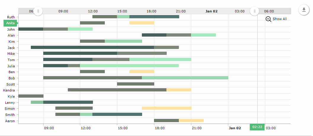
XML name of the component: chart:ganttChart.
-
Elements of
chart:ganttChart: -
-
categoryAxis– an element that describes the category axis. -
graph– an element that contains the collection ofchart:graphelements; the graph is described by thechart:graphelement.-
the
typeattribute defines the type of the graph and can be: line, column, step line, smoothed line, OHLC and candlestick. -
the
valueFieldattribute defines a key from the list of key-value pairs of data provider.
-
-
valueAxis– value axis of the chart. If the chart data is date- or time-based, you can set the value axis type todate.
-
-
Attributes of
chart:ganttChart: -
-
segmentsField– segments field of the chart. -
additionalSegmentFields– the list of additional segment fields that correspond to the entity attributes to be fetched from the data provider, similarly to the additionalFields attribute. -
endField/endDateField– the end value or the end date of the chart. -
startField/startDateField– the start value or the start date of the chart. -
startDate– the chart start date, if the value axis type is adate. -
categoryField– the category field of the chart.
-
- Data binding
-
You can assign a
CollectionContainerto the chart. In the example below thestartandendattributes of an entity are set for the attributesstartDateFieldandendDateField.<chart:ganttChart id="ganttChart" additionalSegmentFields="task" balloonDateFormat="JJ:NN" brightnessStep="7" categoryField="category" colorField="color" columnWidth="0.5" dataContainer="taskSpansDc" endDateField="end" height="100%" marginRight="70" period="DAYS" rotate="true" segmentsField="segments" startDate="2016-01-01" startDateField="start" theme="LIGHT" width="100%"> <chart:graph balloonText="<strong>[[task]]</strong>: [[open]] - [[value]]" fillAlphas="1" lineAlpha="1" lineColor="WHITE"/> <chart:valueAxis type="DATE"/> <chart:valueScrollbar autoGridCount="true" color="BLACK"/> <chart:chartCursor cursorAlpha="0" cursorColor="#55bb76" fullWidth="true" valueLineAlpha="0.5" valueBalloonsEnabled="false" valueLineBalloonEnabled="true" valueLineEnabled="true" valueZoomable="true" zoomable="false"/> <chart:export/> </chart:ganttChart> -
GanttChartevent listeners: -
-
AxisZoomListener– chart axis scaling. -
CategoryItemClickListener– click on a category in the category axis. -
ChartClickListener– click on the canvas. -
ChartRightClickListener– right click on the canvas. -
CursorPeriodSelectListener– selection of the display period with a cursor. -
CursorZoomListener– scaling of the chart area with a cursor. -
GraphClickListener– click on a graph. -
GraphItemClickListener– click on a graph item. -
GraphItemRightClickListener– right click on a graph item. -
ZoomListener– scaling of the canvas.
-
For more details, see AmCharts documentation.
2.5.4. PieChart
The PieChart component allows you to create pie/donut charts.

XML name of the component: chart:pieChart.
- Data binding:
-
-
Using a data container.
You can assign a
CollectionContainerto the chart and then define thetitleFieldandvalueFieldattributes for thepieChartelement:<chart:pieChart id="pieChart" dataContainer="countryLitresDc" height="100%" titleField="country" valueField="litres" width="100%"/> -
Using the chart:data element.
-
-
PieChartevent listeners: -
-
ChartClickListener– click on the canvas. -
ChartRightClickListener– right click on the canvas. -
SliceClickListener– click on a slice in a pie chart. -
SlicePullInListener– shift of a slice of a pie chart into the chart. -
SlicePullOutListener– shift of a slice of a pie chart out of the chart. -
SliceRightClickListener– right-click on a slice in a pie chart.
-
For more details, see AmCharts documentation.
2.5.5. RadarChart
The RadarChart component allows you to create radar/polar charts.

XML name of the component: chart:radarChart.
- Data binding:
-
You can assign a
CollectionContainerto the chart and then define thecategoryFieldattribute for theradarChartelement andvalueFieldattribute for the nestedgraphelement:<chart:radarChart id="radarChart" categoryField="country" dataContainer="countryLitresDc" height="100%" startDuration="2" theme="LIGHT" width="100%"> <chart:graphs> <chart:graph balloonText="[[value]] litres of beer per year" bullet="ROUND" valueField="litres"/> </chart:graphs> </chart:radarChart> -
RadarChartevent listeners -
-
AxisZoomListener– chart axis scaling. -
ChartClickListener– click on the canvas. -
ChartRightClickListener– right click on the canvas. -
GraphClickListener– click on a graph. -
GraphItemClickListener– click on a graph item. -
GraphItemRightClickListener– right click on a graph item.
-
For more details, see AmCharts documentation.
2.5.6. SerialChart
The SerialChart component allows you to create line, area, column, bar, step line, smoothed line, candlestick and OHLC charts. The charts support multiple axes with simple or logarithmic scales, the data points can be displayed at equal/irregular intervals or on timeline basis.

XML name of the component: chart:serialChart.
- Data binding:
-
You can assign a
CollectionContainerto the chart and then define thecategoryFieldattribute for theserialChartelement andvalueFieldattribute for the nestedgraphelement:<chart:serialChart categoryField="date" dataContainer="dateValueDc"> <chart:graphs> <chart:graph valueField="value" balloonText="[[value]]"> </chart:graph> </chart:graphs> <chart:categoryAxis dashLength="1" minorGridEnabled="true"/> </chart:serialChart> -
SerialChartevent listeners -
-
AxisZoomListener– chart axis scaling. -
CategoryItemClickListener– click on a category in the category axis. -
ChartClickListener– click on the canvas. -
ChartRightClickListener– right click on the canvas. -
CursorPeriodSelectListener– selection of the display period with a cursor. -
CursorZoomListener– scaling of the chart area with a cursor. -
GraphClickListener– click on a graph. -
GraphItemClickListener– click on a graph item. -
GraphItemRightClickListener– right click on a graph item. -
ZoomListener– scaling of the canvas.
-
For more details, see AmCharts documentation.
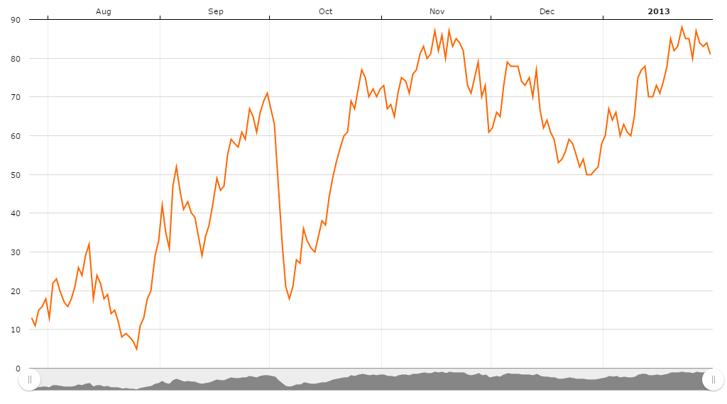
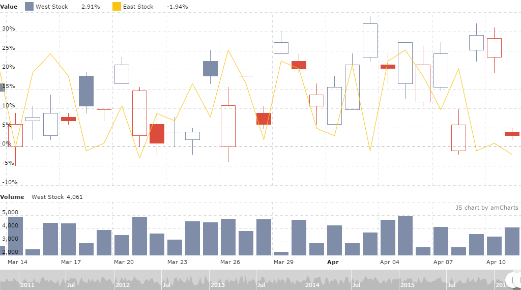
2.5.7. StockChartGroup
The StockChartGroup component allows you to create stock charts.
Stock chart supports multiple data sets and has a ready to use data set selector. Data sets might be compared one to another.

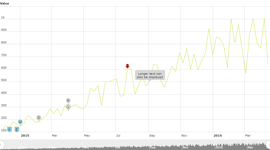
Stock chart can display a different kind of annotations on the graph or on the axis. These annotations are called stock events.
Stock chart can support any number of stock panels. Each Stock Panel can have any number of graphs. Each Stock Panel is a separate serial chart and is based on SerialChart and so it can do anything this chart can.
-
StockChartGroupevent listeners -
-
DataSetSelectorCompareListener– listener to dataset selector compare events. -
DataSetSelectorSelectListener– selection of the dataset selector. -
DataSetSelectorUnCompareListener– listener to the dataset selector uncompare events. -
PeriodSelectorChangeListener– selection of the display period with a selector. -
StockChartClickListener– click on the stock chart area. -
StockChartRightClickListener– right click on the stock chart area. -
StockEventClickListener– click on the stock event. -
StockEventRollOutListener– stock event roll-out. -
StockEventRollOverListener– stock event roll-over. -
StockGraphClickListener– click on the stock graph. -
StockGraphItemClickListener– click on the stock graph item. -
StockGraphItemRightClickListener– right click on the stock graph item. -
StockGraphItemRollOutListener– stock graph item roll-out events. -
StockGraphItemRollOverListener– stock graph item roll-over events. -
StockGraphRollOutListener– stock graph roll-out events. -
StockGraphRollOverListener– stock graph roll-over events. -
ZoomListener– scaling of the canvas. -
ZoomListener– scaling of the canvas.
-
2.5.8. XYChart
The XYChart component allows you to create XY/bubble/scatter charts. The charts support multiple axes with simple or logarithmic scales.
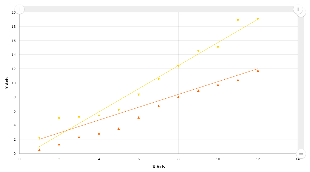
XML name of the component: chart:xyChart.
- Data binding:
-
You can assign a
CollectionContainerto the chart and then define thexFieldandyFieldsattributes for the nestedgraphelements:<chart:xyChart dataContainer="pointPairDc" startDuration="1"> <chart:graphs> <chart:graph balloonText="x:[[x]] y:[[y]]" xField="ax" fillToAxis="x" yField="ay"/> <chart:graph balloonText="x:[[x]] y:[[y]]" fillToAxis="y" xField="bx" yField="by"/> </chart:graphs> <chart:valueAxes> <chart:axis id="x" axisAlpha="0" dashLength="1" position="BOTTOM" title="X Axis"/> <chart:axis id="y" axisAlpha="0" dashLength="1" position="LEFT" title="Y Axis"/> </chart:valueAxes> </chart:xyChart> -
XYChartevent listeners -
-
AxisZoomListener– chart axis scaling. -
ChartClickListener– click on the canvas. -
CursorPeriodSelectListener– selection of the display period with a cursor. -
CursorZoomListener– scaling of the chart area with a cursor. -
GraphClickListener– click on a graph. -
GraphItemClickListener– click on a graph item. -
GraphItemRightClickListener– right click on a graph item.
-
For more details, see AmCharts documentation.
2.6. Example of Working with Charts
This chapter shows how you can use the chart display add-on.
2.6.1. Setting up the Application Project
-
Run CUBA Studio, create a new project as described in the Creating a New Project section of the CUBA Studio User Guide and name it
sampler. -
Add the Charts add-on to your project via CUBA Add-Ons window as described in the Installation section.
-
Click CUBA → Build Tasks → Deploy. At this point, the application will be assembled and deployed to the Tomcat application server located at
build/tomcat.
Once the steps above are complete, the chart display functionality will be connected to the application and ready to be used.
2.6.2. Creating Chart with Simplified Data Binding
For the first example, we will create the most simple chart using the simplified data binding API.
Add the chart component to the screen and use the addData() method to fill it with data, passing the MapDataItem instance with a set of key-value pairs as a parameter:
<chart:pieChart id="pieChart"
                titleField="key"
                valueField="value"/>
@Inject
private PieChart pieChart;
@Subscribe
private void onBeforeShow(BeforeShowEvent event) {
pieChart.addData(MapDataItem.of("key", "piece of apple pie",
"value", 70),
MapDataItem.of("key", "piece of blueberry pie",
"value", 20),
MapDataItem.of("key", "piece of cherry pie",
"value", 10));
}
2.6.3. Creating Chart with Data from an Entity
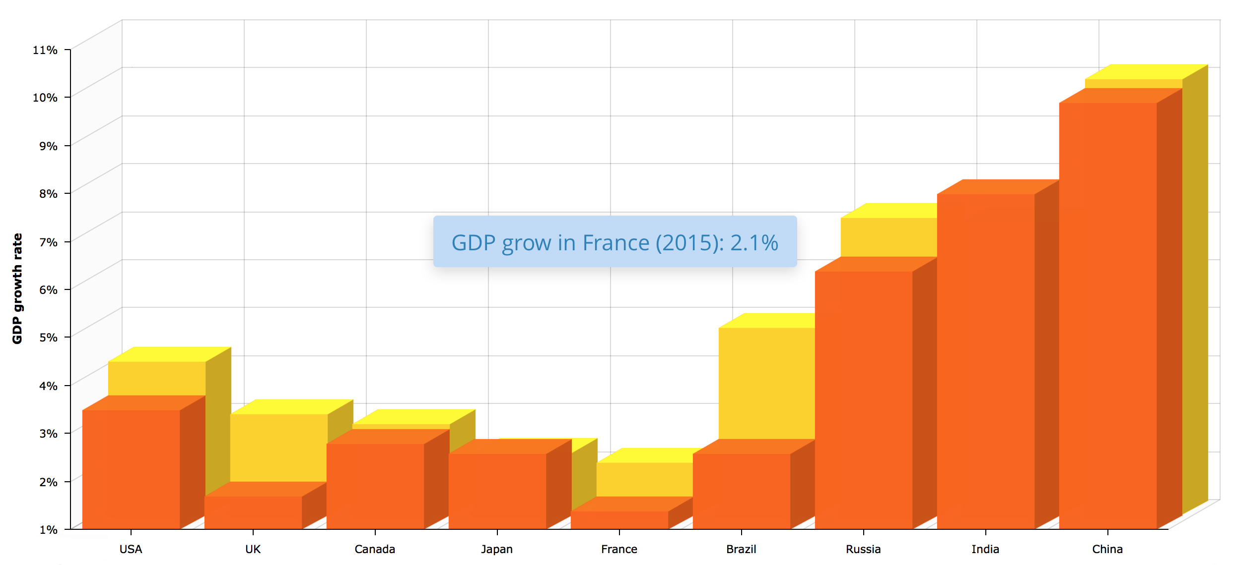
In this chapter we will create the chart similar to 3D Stacked Column Chart from AmCharts demos. This chart will retrieve data from a database, so the dataContainer attribute has to be defined. The JavaScript source code which amCharts use to define such chart is as follows:
var chart = AmCharts.makeChart("chartdiv", {
    "theme": "light",
    "type": "serial",
    "dataProvider": [{
        "country": "USA",
        "year2004": 3.5,
        "year2005": 4.2
    }, {
        "country": "UK",
        "year2004": 1.7,
        "year2005": 3.1
    }, {
        "country": "Canada",
        "year2004": 2.8,
        "year2005": 2.9
    }, {
        "country": "Japan",
        "year2004": 2.6,
        "year2005": 2.3
    }, {
        "country": "France",
        "year2004": 1.4,
        "year2005": 2.1
    }, {
        "country": "Brazil",
        "year2004": 2.6,
        "year2005": 4.9
    }, {
        "country": "Russia",
        "year2004": 6.4,
        "year2005": 7.2
    }, {
        "country": "India",
        "year2004": 8,
        "year2005": 7.1
    }, {
        "country": "China",
        "year2004": 9.9,
        "year2005": 10.1
    }],
    "valueAxes": [{
        "stackType": "3d",
        "unit": "%",
        "position": "left",
        "title": "GDP growth rate",
    }],
    "startDuration": 1,
    "graphs": [{
        "balloonText": "GDP grow in [[category]] (2004): <b>[[value]]</b>",
        "fillAlphas": 0.9,
        "lineAlpha": 0.2,
        "title": "2004",
        "type": "column",
        "valueField": "year2004"
    }, {
        "balloonText": "GDP grow in [[category]] (2005): <b>[[value]]</b>",
        "fillAlphas": 0.9,
        "lineAlpha": 0.2,
        "title": "2005",
        "type": "column",
        "valueField": "year2005"
    }],
    "plotAreaFillAlphas": 0.1,
    "depth3D": 60,
    "angle": 30,
    "categoryField": "country",
    "categoryAxis": {
        "gridPosition": "start"
    },
    "export": {
            "enabled": true
     }
});
2.6.3.1. Creating an Entity
Let’s create a CountryGrowth entity class.
-
In the Data Model section of the CUBA project tree click New → Entity. The New CUBA Entity dialog window will appear.
-
Enter the name of the entity class –
CountryGrowth– in the Entity name field, chooseNot persistentfor Entity type and click OK button. The entity designer page will be displayed in the workspace. -
Using Entity Designer add attributes:
-
countryof the typeString -
year2014of the typeDouble -
year2015of the typeDouble
-
-
Switch to the Text tab. It contains the source code of the
CountryGrowthclass.package com.company.sampler.entity; import com.haulmont.chile.core.annotations.MetaClass; import com.haulmont.chile.core.annotations.MetaProperty; import com.haulmont.cuba.core.entity.BaseUuidEntity; @MetaClass(name = "sampler_CountryGrowth") public class CountryGrowth extends BaseUuidEntity { @MetaProperty protected String country; @MetaProperty protected Double year2014; @MetaProperty protected Double year2015; public Double getYear2015() { return year2015; } public void setYear2015(Double year2015) { this.year2015 = year2015; } public Double getYear2014() { return year2014; } public void setYear2014(Double year2014) { this.year2014 = year2014; } public String getCountry() { return country; } public void setCountry(String country) { this.country = country; } }This class describes a non-persistent entity. An instance of this class contains the number of the country GDP growth rate for 2014 and 2015 years.
CountryGrowth entity creation is now complete.
2.6.3.2. Screen XML Descriptor
Now we will create a new screen to display a chart.
-
Select Generic UI in the project tree and click New → Screen in the context menu. After that, the template browser page will appear.
-
Select Blank screen in the list of available templates and click Next.
-
Enter the value
column3d-chartin the Descriptor name field and click Next. -
Open the Text tab and replace its content with the following code:
<?xml version="1.0" encoding="UTF-8" standalone="no"?>
<window xmlns="http://schemas.haulmont.com/cuba/screen/window.xsd"
caption="msg://caption"
messagesPack="com.company.sampler.web"
xmlns:chart="http://schemas.haulmont.com/charts/charts.xsd">
<data>
<collection id="countryGrowthDc"
class="com.company.sampler.entity.CountryGrowth"
view="_local"/>
</data>
<layout>
<chart:serialChart id="chart"
angle="30"
categoryField="country"
dataContainer="countryGrowthDc"
depth3D="60"
height="100%"
plotAreaFillAlphas="0.1"
startDuration="1"
width="100%">
<chart:categoryAxis gridPosition="START"/>
<chart:valueAxes>
<chart:axis position="LEFT"
stackType="BOX_3D"
title="GDP growth rate"
unit="%"/>
</chart:valueAxes>
<chart:graphs>
<chart:graph id="graph2014"
balloonText="GDP grow in [[category]] (2014): <b>[[value]]</b>"
fillAlphas="0.9"
lineAlpha="0.2"
title="2014"
type="COLUMN"
valueField="year2014"/>
<chart:graph id="graph2015"
balloonText="GDP grow in [[category]] (2015): <b>[[value]]</b>"
fillAlphas="09."
lineAlpha="0.2"
title="2015"
type="COLUMN"
valueField="year2015"/>
</chart:graphs>
<chart:export/>
</chart:serialChart>
</layout>
</window>The root element of the screen descriptor contains a new xmlns:chart attribute:
<window xmlns:chart="http://schemas.haulmont.com/charts/charts.xsd"
    ...
>
The chart retrieves data from the countryGrowthDc data container defined in the dataContainer attribute. Names and values are displayed using the country, year2014 and year2015 attributes of the CountryGrowth entity; the list of instances for this entity is stored in the data container.
The chart:serialChart component contains the following attributes:
-
angle– defines the chart angle. May has a value from0to90. -
balloonText– defines text for the tooltip that appears when hovering over a column. You can use the following tags:[[value]],[[title]],[[persents]],[[description]], as well as keys from theDataItemlisted in aDataProviderinstance, or names of the entity attributes from the data container. To usehtmltags you must escape them. -
depth3D– chart thickness. When used in combination with theangleattribute, helps to create a 3D effect. -
plotAreaFillAlphas– opacity of the plot area. -
startDuration– duration of the animation, in seconds. -
categoryField– a key from the set of pairs contained in theDataItemobjects listed in aDataProviderinstance; this key is used to determine the labels for the category axis.
The chart:serialChart component contains the following elements:
-
chart:categoryAxis– an element that describes the category axis.-
The
gridPositionattribute specifies if a grid line is placed on the center of a cell or on the beginning of a cell.
-
-
chart:valueAxes– an element that defines vertical value axes. In our case, only one vertical axis is used; the axis is described by thechart:axiselement.-
The
positionattribute defines position of the value axis relative to the chart. -
Setting
stackTypetoBOX_3Dmakes the chart display columns one behind the other.
-
-
chart:graphs– an element that contains the collection ofchart:graphelements; the graph is described by thechart:graphelement.-
The
typeattribute defines the type of the graph and can be: line, column, step line, smoothed line, ohlc and candlestick. -
The
valueFieldattribute defines a key from the list of pairs contained in theDataItemobjects listed in aDataProviderinstance; this key is used to determine the value. -
The
fillAlphasattribute defines opacity of fill. -
The
lineAlphaattribute defines opacity of the line (or column border). Value range is 0 – 1.
-
-
chart:export– an optional element that enables chart export.
2.6.3.3. Screen Controller
Open the Column3dChart screen controller and replace its content with the following code:
package com.company.sampler.web;

import com.company.sampler.entity.CountryGrowth;
import com.haulmont.cuba.gui.model.CollectionContainer;
import com.haulmont.cuba.gui.screen.Screen;
import com.haulmont.cuba.gui.screen.Subscribe;
import com.haulmont.cuba.gui.screen.UiController;
import com.haulmont.cuba.gui.screen.UiDescriptor;

import javax.inject.Inject;
import java.util.ArrayList;
import java.util.List;

@UiController("sampler_Column3dChart")
@UiDescriptor("column3d-chart.xml")
public class Column3dChart extends Screen {

    @Inject
    private CollectionContainer<CountryGrowth> countryGrowthDc;

    @Subscribe
    private void onInit(InitEvent event) {
        List<CountryGrowth> items = new ArrayList<>();
        items.add(countryGrowth("USA", 3.5, 4.2));
        items.add(countryGrowth("UK", 1.7, 3.1));
        items.add(countryGrowth("Canada", 2.8, 2.9));
        items.add(countryGrowth("Japan", 2.6, 2.3));
        items.add(countryGrowth("France", 1.4, 2.1));
        items.add(countryGrowth("Brazil", 2.6, 4.9));
        items.add(countryGrowth("Russia", 6.4, 7.2));
        items.add(countryGrowth("India", 8.0, 7.1));
        items.add(countryGrowth("China", 9.9, 10.1));
        countryGrowthDc.setItems(items);
    }

    private CountryGrowth countryGrowth(String country, double year2014, double year2015) {
        CountryGrowth cg = new CountryGrowth();
        cg.setCountry(country);
        cg.setYear2014(year2014);
        cg.setYear2015(year2015);
        return cg;
    }
}
The onInit method populates the countryGrowthDc data container with the data.
- Result
-
Now let’s see how the created screen looks in the actual application. Select CUBA → Start application server.
-
Log in using default credentials in the login window. Open the Application → Column3dChart menu item and you will see the chart like below:

2.6.4. Creating Chart with Data from DataProvider
This chart retrieves data through the DataProvider created in the controller, so the dataContainer attribute is not defined.
2.6.4.1. Screen XML Descriptor
Now we will create a new screen to display a chart.
-
Select Generic UI in the project tree and click New → Screen in the context menu. After that, the template browser page will appear.
-
Select Blank screen in the list of available templates and click Next.
-
Enter the value
stackedarea-chartin the Descriptor name field and click Next. -
Open the Text tab and replace its content with the following code:
<?xml version="1.0" encoding="UTF-8" standalone="no"?>
<window xmlns="http://schemas.haulmont.com/cuba/screen/window.xsd"
        caption="msg://caption"
        messagesPack="com.company.sampler.web"
        xmlns:chart="http://schemas.haulmont.com/charts/charts.xsd">
    <layout>
        <chart:serialChart id="chart"
                           categoryField="year"
                           height="100%"
                           marginLeft="0"
                           marginTop="10"
                           plotAreaBorderAlpha="0"
                           width="100%">
            <chart:chartCursor cursorAlpha="0"/>
            <chart:legend equalWidths="false"
                          periodValueText="total: [[value.sum]]"
                          position="TOP"
                          valueAlign="LEFT"
                          valueWidth="100"/>
            <chart:valueAxes>
                <chart:axis gridAlpha="0.07"
                            position="LEFT"
                            stackType="REGULAR"
                            title="Traffic incidents"/>
            </chart:valueAxes>
            <chart:graphs>
                <chart:graph fillAlphas="0.6"
                             hidden="true"
                             lineAlpha="0.4"
                             title="Cars"
                             valueField="cars"/>
                <chart:graph fillAlphas="0.6"
                             lineAlpha="0.4"
                             title="Motorcycles"
                             valueField="motorcycles"/>
                <chart:graph fillAlphas="0.6"
                             lineAlpha="0.4"
                             title="Bicycles"
                             valueField="bicycles"/>
            </chart:graphs>
            <chart:categoryAxis axisColor="#DADADA"
                                gridAlpha="0.07"
                                startOnAxis="true"/>
            <chart:export/>
        </chart:serialChart>
    </layout>
</window>
The root element of the screen descriptor contains a new xmlns:chart attribute:
<window xmlns:chart="http://schemas.haulmont.com/charts/charts.xsd"
    ...
>
chart:serialChart attributes:
-
categoryField– a key from the set of pairs contained in theDataItemobjects listed in aDataProviderinstance; this key is used to determine the labels for the category axis.
The elements of chart:serialChart:
-
chart:chartCursor– an optional element adding a cursor to the chart; the cursor follows the mouse pointer and shows a tooltip with the value of the corresponding point on a chart.-
The
cursorAlphaattribute defines opacity of the cursor line.
-
-
chart:legend– an element that defines the chart legend.-
The
positionattribute defines the location of the legend relative to the chart. -
The
equalWidthsattribute specifies if each of legend entry should be equal to the most wide entry. -
The
periodValueTextattribute defines the text which will be displayed in the value portion of the legend when the user is not hovering above any data point. The tags should be made out of two parts – the name of a field (value / open / close / high / low) and the value of the period you want to be show – open / close / high / low / sum / average / count. -
The
valueAlignattribute defines the alignment of the value text. Possible values areleftandright. -
The
valueWidthattribute defines the width of the value text.
-
-
chart:valueAxes– an element that defines vertical value axes. In our case, only one vertical axis is used; the axis is described by thechart:axiselement.-
The
positionattribute defines the position of the value axis relative to the chart. -
The
titleattribute defines the title of the value axis. -
Setting
stackTypetoREGULARmakes the chart display a rolling value. Setting this attribute tononerefers to a non-rolling value. -
The
gridAlphadefines opacity of grid lines.
-
-
chart:graphs– an element that contains the collection ofchart:graphelements; the graph is described by thechart:graphelement.-
The
typeattribute defines the type of the graph and can be: line, column, step line, smoothed line, ohlc and candlestick. -
The
valueFieldattribute defines a key from the list of pairs contained in theDataItemobjects listed in aDataProviderinstance; this key is used to determine the value. -
The
fillAlphasattribute defines opacity of fill. -
The
lineAlphaattribute defines opacity the line (or column border). Value range is 0 – 1. -
The
hiddenattribute specifies whether the graph is hidden.
-
-
chart:categoryAxis– an element that describes the category axis.-
Setting
startOnAxistotruecauses drawing the chart right from the value axis. The default value for this attribute isfalse. In this case, there will be a small gap between the value axis and the chart. -
The
gridAlphaattribute defines opacity of grid lines. -
The
axisColorattribute defines axis color.
-
-
chart:export– an optional element that enables chart export.
2.6.4.2. Screen Controller
Open the StackedareaChart screen controller and replace its content with the following code:
package com.company.sampler.web;

import com.haulmont.charts.gui.components.charts.SerialChart;
import com.haulmont.charts.gui.data.DataItem;
import com.haulmont.charts.gui.data.ListDataProvider;
import com.haulmont.charts.gui.data.MapDataItem;
import com.haulmont.cuba.gui.screen.Screen;
import com.haulmont.cuba.gui.screen.Subscribe;
import com.haulmont.cuba.gui.screen.UiController;
import com.haulmont.cuba.gui.screen.UiDescriptor;

import javax.inject.Inject;

@UiController("sampler_StackedareaChart")
@UiDescriptor("stackedarea-chart.xml")
public class StackedareaChart extends Screen {
    @Inject
    private SerialChart chart;

    @Subscribe
    private void onInit(InitEvent event) {
        ListDataProvider dataProvider = new ListDataProvider();
        dataProvider.addItem(transportCount(1994, 1587, 650, 121));
        dataProvider.addItem(transportCount(1995, 1567, 683, 146));
        dataProvider.addItem(transportCount(1996, 1617, 691, 138));
        dataProvider.addItem(transportCount(1997, 1630, 642, 127));
        dataProvider.addItem(transportCount(1998, 1660, 699, 105));
        dataProvider.addItem(transportCount(1999, 1683, 721, 109));
        dataProvider.addItem(transportCount(2000, 1691, 737, 112));
        dataProvider.addItem(transportCount(2001, 1298, 680, 101));
        dataProvider.addItem(transportCount(2002, 1275, 664, 97));
        dataProvider.addItem(transportCount(2003, 1246, 648, 93));
        dataProvider.addItem(transportCount(2004, 1318, 697, 111));
        dataProvider.addItem(transportCount(2005, 1213, 633, 87));
        dataProvider.addItem(transportCount(2006, 1199, 621, 79));
        dataProvider.addItem(transportCount(2007, 1110, 210, 81));
        dataProvider.addItem(transportCount(2008, 1165, 232, 75));
        dataProvider.addItem(transportCount(2009, 1145, 219, 88));
        dataProvider.addItem(transportCount(2010, 1163, 201, 82));
        dataProvider.addItem(transportCount(2011, 1180, 285, 87));
        dataProvider.addItem(transportCount(2012, 1159, 277, 71));

        chart.setDataProvider(dataProvider);
    }

    private DataItem transportCount(int year, int cars, int motorcycles, int bicycles) {
        MapDataItem item = new MapDataItem();
        item.add("year", year);
        item.add("cars", cars);
        item.add("motorcycles", motorcycles);
        item.add("bicycles", bicycles);
        return item;
    }
}
The onInit method submits data to the chart as a rolling value. This type of charts shows the ratio of separate parts to their total value.
- Result
-
Now let’s see how the created screen looks in the actual application. Select CUBA → Start application server.
-
Log in using default credentials in the login window. Open the Application → StackedareaChart menu item and you will see the chart like below:

2.6.5. Creating Chart with Incremental Data Update
This chart will retrieve data from a data container, and this data will be updated automatically. When new data is added to the data container, the chart is not refreshed completely: data points are added on the fly every 2 seconds. This approach will be useful, for example, for creating dynamically updated dashboards.
In this example we will show the dynamic of new orders amounts based on the Order entity from the Sales sample application.
-
Download the Sales application and add the charts component to it as described in Setting up the Application Project section.
-
Create a new screen in Studio. Call it orders-history, as it will display the history dashboard for new order entries.
-
Add the
serialChartcomponent to the screen layout. To use the incremental data update feature, we have to create a data container ofCollectionContainertype and bind the chart to it. We will not load the data from the container in this example, instead, the sample data will be generated on the fly, so you don’t need to create a loader.Set the
dateproperty for the category axis and theamountproperty for the value axis.<?xml version="1.0" encoding="UTF-8" standalone="no"?> <window xmlns="http://schemas.haulmont.com/cuba/screen/window.xsd" caption="msg://caption" messagesPack="com.company.sales.web" xmlns:chart="http://schemas.haulmont.com/charts/charts.xsd"> <data> <collection id="ordersDc" class="com.company.sales.entity.Order" view="_local"/> </data> <layout> <chart:serialChart id="orderHistoryChart" categoryField="date" dataContainer="ordersDc" width="100%"> <chart:graphs> <chart:graph valueField="amount"/> </chart:graphs> </chart:serialChart> </layout> </window> -
We will update the chart on the fly using a timer – a special UI component that will send HTTP-requests to the server side.
-
Switch to the Designer tab.
-
In the components palette find Timer in the Non-visual components group.
-
Drag this component to the screen components hierarchy panel.
-
Select the timer in the hierarchy panel and go to the Properties tab on the properties panel.
-
Set the timer id.
-
Let’s say the data should be updated every 2 seconds, so set the delay to 2000 milliseconds.
-
In the onTimer field we define the name of Java method –
updateChart. This method will be invoked each time the timer fires an event. Generate this method in the controller by clicking the >> button. -
Select repeating and autostart checkboxes.
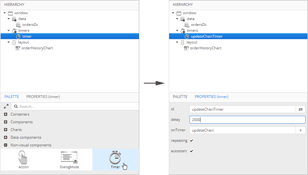 Figure 28. Creating a timer
-
-
Switch to the
OrdersHistorycontroller. Before starting to work on the timer logic, inject necessary dependencies:timeSource,metadataand the data container for theOrderentity. We will generate a newOrderinstance with random amount value each time the timer event is fired. The new instance is added to the collection data container using thegetMutableItems().add()method.Initialize the chart in the
onInit()method using the same logic for creating a randomOrderinstance.package com.company.sales.web; import com.company.sales.entity.Order; import com.haulmont.cuba.core.global.Metadata; import com.haulmont.cuba.core.global.TimeSource; import com.haulmont.cuba.gui.components.Timer; import com.haulmont.cuba.gui.model.CollectionContainer; import com.haulmont.cuba.gui.screen.*; import javax.inject.Inject; import java.math.BigDecimal; import java.util.Random; @UiController("sales_OrdersHistory") @UiDescriptor("orders-history.xml") public class OrdersHistory extends Screen { @Inject private Metadata metadata; @Inject private TimeSource timeSource; @Inject private CollectionContainer<Order> ordersDc; private Random random = new Random(42); @Subscribe private void onInit(InitEvent event) { Order initialValue = metadata.create(Order.class); initialValue.setAmount(new BigDecimal(random.nextInt(1000) + 100)); initialValue.setDate(timeSource.currentTimestamp()); ordersDc.getMutableItems().add(initialValue); } public void updateChart(Timer source) { Order orderHistory = metadata.create(Order.class); orderHistory.setAmount(new BigDecimal(random.nextInt(1000) + 100)); orderHistory.setDate(timeSource.currentTimestamp());; ordersDc.getMutableItems().add(orderHistory); } }At this stage the chart is already functional, but the data container size will increase rapidly, so we need to limit the number of items to be displayed.
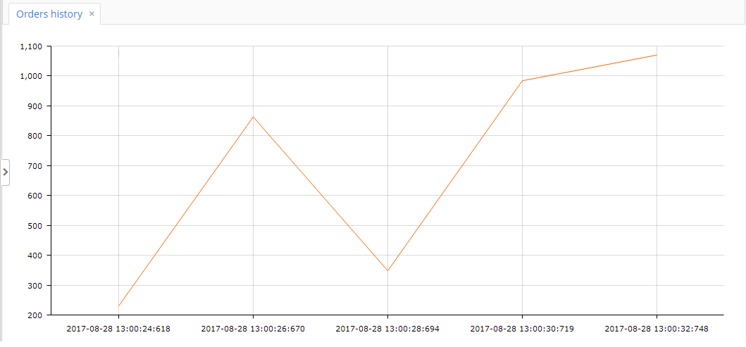 Figure 29. The data is automatically updated each 2 seconds
 -
Create a
Queueof orders. Each time the timer event is fired, the generated item is added to the top of theitemsQueue. When the queue size exceeds 10 items, the oldest item is excluded.private Queue<Order> itemsQueue = new LinkedList<>();public void updateChart(Timer source) { Order orderHistory = metadata.create(Order.class); orderHistory.setAmount(new BigDecimal(random.nextInt(1000) + 100)); orderHistory.setDate(timeSource.currentTimestamp());; ordersDc.getMutableItems().add(orderHistory); itemsQueue.add(orderHistory); if (itemsQueue.size() > 10) { Order item = itemsQueue.poll(); ordersDc.getMutableItems().add(item); } }
- Result
-
All the data is sent to the browser incrementally. If you open Chrome developer console on the Network tab, you will see that every 2 seconds our web page sends an HTTP request to the backend, and in response to that the backend sends very small JSON message. The JSON contains one
addand oneremoveoperation for the amount value. Thus, we do not re-send all the data.

2.6.6. Using Events
Let’s consider the use of events. We will add handling of a graph item click to the screen created in Screen Controller. Open the screen controller and inject the chart. In order to show a notification, inject the Notifications bean into the screen controller.
@Inject
private Notifications notifications;

@Inject
private SerialChart chart;
Then add a listener at the bottom of the onInit method. When a chart receives data from DataProvider, the getDataItemNN() method should be used to get the item clicked. In this example, the SerialChart component is bound to the data container, so another method should be used: getEntityNN():
@Subscribe
private void onInit(InitEvent event) {
    chart.addGraphItemClickListener(graphItemClickEvent ->
            notifications.create()
                    .withCaption(itemClickEventInfo(graphItemClickEvent))
                    .withContentMode(ContentMode.HTML)
                    .show());
}

private String itemClickEventInfo(Chart.GraphItemClickEvent event) {
    CountryGrowth countryGrowth = (CountryGrowth) event.getEntityNN();
    return String.format("GDP grow in %s (%s): %.1f%%",
            countryGrowth.getCountry(),
            event.getGraphId().substring(5),
            "graph2014".equals(event.getGraphId()) ? countryGrowth.getYear2014() : countryGrowth.getYear2015());
}
To see the results, rebuild the project using Run → Restart application server and log in to the system. Open the screen and click one of the columns.
2.6.7. Configuration using JSON
In order to configure a chart, in addition to assigning XML attributes, you can use a custom JSON described in the AmCharts documentation.
For example, we have a serialChart:
<chart:serialChart id="serialChart">
    <chart:valueAxes>
        <chart:axis axisAlpha="0" position="LEFT" title="Incidents"/>
    </chart:valueAxes>
    <chart:graphs>
        <chart:graph id="g1" bullet="ROUND" type="COLUMN" valueField="value"/>
    </chart:graphs>
    <chart:categoryAxis position="TOP" title="Time" labelsEnabled="false"/>
</chart:serialChart>
This chart has some data:
@Inject
private SerialChart serialChart;

@Subscribe
private void onInit(InitEvent event) {
    ListDataProvider serialChartDataProvider = new ListDataProvider();
    int[] serialChartData = {5, 7, 6, 9, 7, 8, 5, 6, 4, 6, 5, 7, 4, 5, 3, 4, 2, 0};

    for (int i = 0; i < serialChartData.length; i++) {
        serialChartDataProvider.addItem(graphData(serialChartData[i]));
    }

    serialChart.setDataProvider(serialChartDataProvider);
}

private DataItem graphData(int value) {
    MapDataItem item = new MapDataItem();
    item.add("value", value);
    return item;
}
And now we can change the chart’s configuration. As an example, let’s add a title:
serialChart.setNativeJson("{\n" +
        " \"titles\": [\n" +
        " {\n" +
        " \"size\": 15,\n" +
        " \"text\": \"Chart Title\"\n" +
        " }\n" +
        " ]\n" +
        "}");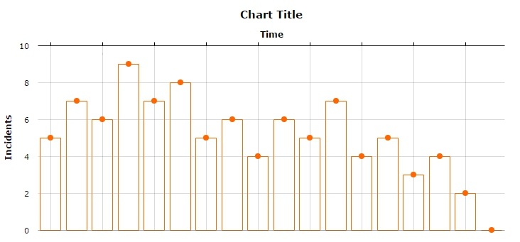
You can also set JSON configuration in the XML:
<chart:serialChart id="serialChart">
    <chart:nativeJson>
        <![CDATA[
        {
            "titles": [
                {
                    "size": 15,
                    "text": "Chart Title"
                }
            ]
        }
        ]]>
    </chart:nativeJson>
    <chart:valueAxes>
        <chart:axis axisAlpha="0" position="LEFT" title="Incidents"/>
    </chart:valueAxes>
    <chart:graphs>
        <chart:graph id="g1" bullet="ROUND" type="COLUMN" valueField="value"/>
    </chart:graphs>
    <chart:categoryAxis position="TOP" title="Time" labelsEnabled="false"/>
</chart:serialChart>
2.7. Replacing AmCharts Version
An instance of AmCharts library included in CUBA platform can be replaced with another one. To do this:
-
Download charts and stock charts from AmCharts site.
-
Merge
amchartsfolder from both archives into one. -
Copy
amchartsfolder to{project.rootDir}/modules/web/web/VAADIN/webjars -
Redeploy the application.
To use new attributes added in a new version you need to set custom JSON in your screen controller as shown below.
chart.setNativeJson("{\"valueScrollbar\":{\"autoGridCount\":true}}");3. Displaying Maps
CUBA platform map display subsystem is based on integration with a third-party map service provider. Currently, only Google Maps service is supported.
3.1. Map Display Capabilities
-
Response to events:
-
Mouse click.
-
Map pan and zoom.
-
Marker click and drag.
-
Close pop-up window.
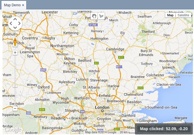 Figure 34. Map
 -
-
Adding markers. Marker may be either fixed or draggable by user. Markers can process mouse clicks and send corresponding events to the screen code.
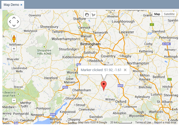 Figure 35. Map Marker
 -
Displaying polylines and polygons.
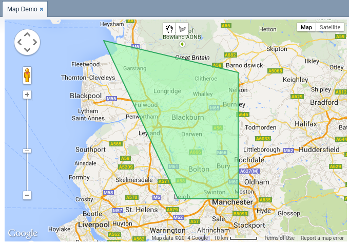 Figure 36. Polylines
 -
Drawing polygons.
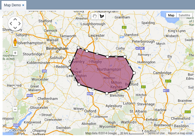 Figure 37. Polygons
 -
Heat map rendering.
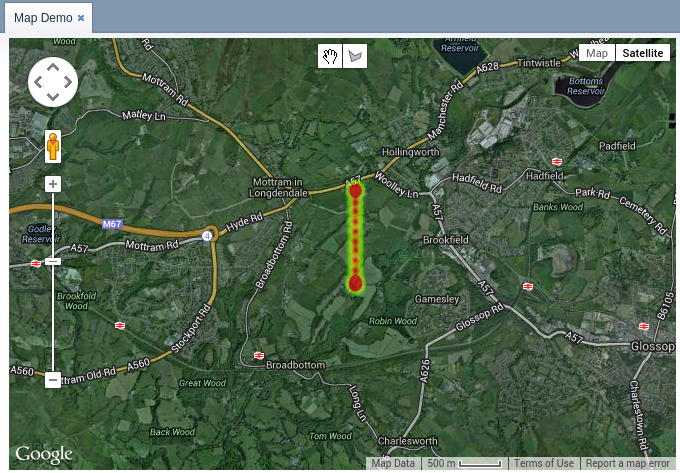 Figure 38. Heat Map
3.2. Setting up Application Project
In order to display maps in your application, you should add the charts application component, as it was described for the chart display add-on. Additionally, you should define the following application properties for the Web Client block:
-
One of the following parameters (see detailed information on these parameters in the Google Maps API documentation):
-
charts.map.apiKey– a browser key. -
charts.map.clientId– a client ID.
-
-
Optional parameters:
-
charts.map.defaultZoom– default zoom level for the map. -
charts.map.defaultLatitude– default latitude of the map center point. -
charts.map.defaultLongitude– default longitude of the map center point. -
charts.map.apiVersion– defines a version of Google Maps API that should be used. Default value is3.35. You can set this property to3to use the last released version of Google Maps API or to3.exp, if you want to use experimental version. Visit the official Google Maps API documentation for more information.
-
Example of a web-app.properties file:
charts.map.apiKey = my_key
charts.map.defaultZoom = 13.0
charts.map.defaultLatitude = 51.5001
charts.map.defaultLongitude = -0.1262
3.3. MapViewer Component
You can display maps in your application screens using the com.haulmont.charts.gui.components.map.MapViewer component.
To add the component, declare the chart namespace in the root element of the screen XML descriptor:
<window xmlns="http://schemas.haulmont.com/cuba/window.xsd"
        xmlns:chart="http://schemas.haulmont.com/charts/charts.xsd"
        ...>
XML-name of the component: mapViewer. Component declaration example:
<layout>
    <vbox id="mapBox" height="100%">
        <chart:mapViewer id="map" width="100%" height="100%"/>
    </vbox>
</layout>
You can define the following component parameters in the screen XML-descriptor:
-
id,width,height– standard component properties. -
mapType– map type corresponding to theMapViewer.Typeoptions:roadmap,satellite,hybrid,terrain. The default isroadmap. -
vendor– map service provider. Currently, the only supported value isgoogle.
The main configuration of the map and its components is performed in a screen controller. For this, you only need to inject the component declared in the XML-descriptor:
@Inject
private MapViewer map;

@Subscribe
protected void onInit(InitEvent event) {
    GeoPoint center = map.createGeoPoint(53.490905, -2.249558);
    map.setCenter(center);
}- Map configuration methods
-
-
fitToBounds()– sets the minimum map zoom as the one which will be sufficient to show in full an area limited by north-eastern and south-western coordinates. -
removePolygonVertex()– removes vertex from polygon. -
setCenter()– sets the map center point. -
setCenterBoundLimits()– sets map center possible locations bounds. -
setCenterBoundLimitsEnabled()– sets whether map center possible locations should be limited. -
setDraggable()– enables/disables map dragging mode. -
setKeyboardShortcutsEnabled()– enables/disables keyboard shortcuts. -
setMapType()– defines map type. -
setMaxZoom()– sets the maximum available zoom level. -
setMinZoom()– sets the minimum available zoom level. -
setRemoveMessage()– sets the popup message for vertex removal. -
setScrollWheelEnabled()– enables/disables map zoom with a mouse scroll wheel. -
setVertexRemovingEnabled()– toggles vertex removing availability. -
setVisibleAreaBoundLimits()– sets boundaries of the visible area of the map. -
setVisibleAreaBoundLimitsEnabled()– enables visible area limitation mode. -
setZoom()– sets the map zoom level.
-
- Map component interfaces
-
The interfaces listed below can be found in
com.haulmont.charts.gui.map.modelpackage.-
Circle– a component that displays a circle. ACircleproperties are similar to aPolygon, except that its shape is defined by two additional properties: center (GeoPoint) and radius. You can use thecreateCircle()andaddCircle()methods of theMapViewerinterface to create this object and put it on a map.Circle circle = map.createCircle(center, 130.5); circle.setDraggable(true);; circle.setFillOpacity(0.5); map.addCircleOverlay(circle);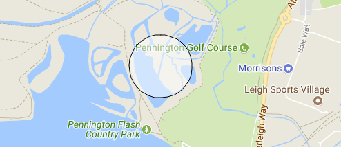 Figure 39. Map Circle
-
DrawingOptions– auxiliary drawing component. Only polygon drawing is currently supported. Drawing mode can be enabled by passing an instance ofDrawingOptionsto theMapViewer. Example:DrawingOptions options = new DrawingOptions(); PolygonOptions polygonOptions = new PolygonOptions(true, true, "#993366", 0.6); ControlOptions controlOptions = new ControlOptions( Position.TOP_CENTER, Arrays.asList(OverlayType.POLYGON)); options.setEnableDrawingControl(true); options.setPolygonOptions(polygonOptions); options.setDrawingControlOptions(controlOptions); options.setInitialDrawingMode(OverlayType.POLYGON); map.setDrawingOptions(options);
-
GeoPoint– an auxiliary component, which is not displayed on the map. This component can be used to set such map parameters as the center point, boundaries, or to create more complex map components. The object can be created using thecreateGeoPoint()method of theMapViewerinterface. For example:GeoPoint center = map.createGeoPoint(53.490905, -2.249558); map.setCenter(center);
-
HeatMapLayer– a map layer showing a heat map intended to display data density distribution across different geopoints. Data density is highlighted with color. By default, regions with higher points density are displayed in red and regions with lower density – in green. You can use thecreateHeatMapLayer()andaddHeatMapLayer()methods of theMapViewerinterface to create this object and put it on a map. For example:HeatMapLayer heatMapLayer = map.createHeatMapLayer(); List<GeoPoint> data = new ArrayList<>(); data.add(map.createGeoPoint(53.450, -2.090)); data.add(map.createGeoPoint(53.451, -2.095)); data.add(map.createGeoPoint(53.452, -2.092)); data.add(map.createGeoPoint(53.453, -2.093)); data.add(map.createGeoPoint(53.454, -2.093)); data.add(map.createGeoPoint(53.454, -2.092)); data.add(map.createGeoPoint(53.453, -2.092)); heatMapLayer.setData(data); map.addHeatMapLayer(heatMapLayer);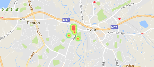 Figure 40. HeatMapLayer
The data used for the heat map layer can be changed using a separate
setData()method. This change does not require re-adding the layer to the map.
-
InfoWindow– a map component that displays information in a pop-up window. You can use thecreateInfoWindow()andopenInfoWindow()methods of theMapViewerinterface to create this object and put it on a map. For example:InfoWindow w = map.createInfoWindow("Some text"); map.openInfoWindow(w);Information window can be tied to a marker, for example:
map.addMarkerClickListener(event -> { Marker marker = event.getMarker(); String caption = String.format("Marker clicked: %.2f, %.2f", marker.getPosition().getLatitude(), marker.getPosition().getLongitude()); InfoWindow w = map.createInfoWindow(caption, marker); map.openInfoWindow(w); });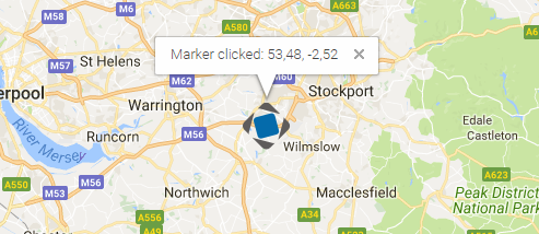 Figure 41. Info Window
-
Label– a component to display a text label on the map.Labelcan be created and put on a map with thecreateLabel()andaddLabel()methods of theMapViewerinterface. It can be removed, in turn, with theremoveLabel()method. For styling, it supports HTML markdown.The
Labelcomponent has the following attributes:-
value– string value of the label. If the content type is set toHTML, the label value will be parsed by the browser. -
position– an implementation ofGeoPointthat represents the geographical position of the label. -
contentType– sets whether label value will be parsed as HTML or not. Can take 2 possible values:PLAIN_TEXTandHTML. -
adjustment– sets the label adjustment relative to itsGeoPointposition marker. -
styleName– sets additional stylename to the label.Label label = map.createLabel(); label.setValue("<span style=\"color: #ffffff; font-size: 24px;\">White label</span>"); label.setPosition(map.createGeoPoint(42.955, 32.883)); label.setAdjustment(Label.Adjustment.BOTTOM_CENTER); label.setContentType(Label.ContentType.HTML); map.addLabel(label);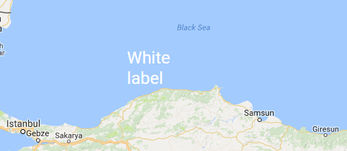 Figure 42. Map Label
-
-
Marker– a component that marks a location on the map. By default, a standard icon of the map service vendor is used. You can use thecreateMarker()andaddMarker()methods of theMapViewerinterface to create this object and put it on a map. For example:Marker marker = map.createMarker("My place", map.createGeoPoint(53.590905, -2.249558), true); marker.setClickable(true); map.addMarker(marker);The
clearMarkers()method, in turn, removes all the markers from map.The
MarkerImageinterface is used to set a Marker icon or shadow image.MarkerImage markerImage = map.createMarkerImage("https://www.cuba-platform.com/sites/logo.png"); GeoPoint center = map.createGeoPoint(21.11, -76.20); markerImage.setSize(map.createSize(44, 44)); markerImage.setOrigin(map.createPoint(0, 0)); markerImage.setAnchor(map.createPoint(-5, 50)); Marker marker = map.createMarker("Cuba", center, true, markerImage); map.addMarker(marker);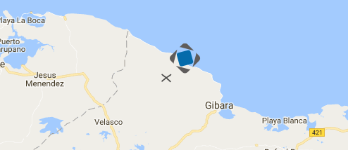 Figure 43. Marker Image
-
Polyline– a component that displays a polyline. You can use thecreatePolyline()andaddPolyline()methods of theMapViewerinterface to create this object and put it on a map. For example:List<GeoPoint> coordinates = new ArrayList<>(); coordinates.add(map.createGeoPoint(53.4491, -1.9955)); coordinates.add(map.createGeoPoint(53.6200, -1.9539)); coordinates.add(map.createGeoPoint(53.4425, -1.6196)); coordinates.add(map.createGeoPoint(53.1900, -1.4969)); coordinates.add(map.createGeoPoint(53.1926, -1.6197)); Polyline polyline = map.createPolyline(coordinates); polyline.setStrokeWeight(5); polyline.setStrokeOpacity(0.5); polyline.setStrokeColor("#7341f4"); map.addPolyline(polyline);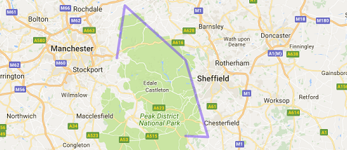 Figure 44. Polyline
-
Polygon– a component that displays a polygon. You can use thecreatePolygon()andaddPolygonOverlay()methods of theMapViewerinterface to create this object and put it on a map. For example:List<GeoPoint> coordinates = new ArrayList<>(); coordinates.add(map.createGeoPoint(48.560579, 7.767876)); coordinates.add(map.createGeoPoint(48.561386, 7.782791)); coordinates.add(map.createGeoPoint(48.541940, 7.782861)); coordinates.add(map.createGeoPoint(48.545641, 7.768749)); Polygon p = map.createPolygon(coordinates, "#9CFBA9", 0.6, "#2CA860", 1.0, 2); map.addPolygonOverlay(p);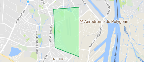 Figure 45. Polygon
-
- Event listeners
-
The listener below are located in the
com.haulmont.charts.gui.map.model.listenerspackage.-
CircleCenterChangeListener– user changes the position of a circle center in map editing mode. -
CircleCompleteListener– user creates a circle in map editing mode. -
CircleRadiusChangeListener– user changes a circle radius in map editing mode. -
InfoWindowClosedListener– user closes an information window. -
MapInitListener– map initialization complete. This listener is invoked once after the first load of the map when all the tiles are loaded and coordinates are available. -
MapMoveListener– user drags a map with a mouse button pressed. -
MarkerDragListener– user drags a marker. -
PolygonCompleteListener– user creates a polygon in map editing mode. -
PolygonEditListener– user edits a polygon (moves or adds a vertex to an existing polygon).
Left click listeners:
-
CircleClickListener– user clicks on a circle. -
MapClickListener– user clicks on a map. -
MarkerClickListener– user clicks on a marker. -
PolygonClickListener– user clicks on a polygon.
Right click listeners:
-
CircleRightClickListener– user right-clicks on a circle. -
MapRightCLickListener– user right-clicks on a map. -
MarkerRightClickListener– user right-clicks on a marker. -
PolygonRightClickListener– user right-clicks on a polygon.
Double click listeners:
-
MarkerDoubleClickListener– user double-clicks on a marker. -
CircleDoubleClickListener– user double-clicks on a circle.
-
For a more detailed information about the methods and parameters of map components, please refer to the corresponding JavaDocs.
4. Displaying PivotTable
PivotTable is a table component with drag-and-drop functionality that enables turning a data set into a summary table and manipulate it using 2D drag-and-drop UI. It is fully available via the CUBA Studio components library.
PivotTable is based on the external JavaScript library - https://github.com/nicolaskruchten/pivottable. You can find more examples of PivotTable on its author’s website: http://nicolas.kruchten.com/pivottable/examples/.
XML-name of the component: pivotTable
The component is implemented for the Web Client only.
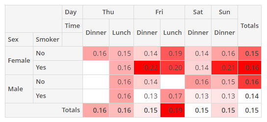
An example of component definition in an XML-descriptor of a screen:
<chart:pivotTable id="tipsPivotTable"
                  dataContainer="tipsDc"
                  renderer="HEATMAP">
    <chart:properties>
        <chart:property name="row"/>
        <chart:property name="totalBill"/>
        <chart:property name="tip"/>
        <chart:property name="sex"/>
        <chart:property name="smoker"/>
        <chart:property name="day"/>
        <chart:property name="time"/>
        <chart:property name="size"/>
    </chart:properties>
    <chart:aggregation mode="SUM_OVER_SUM">
        <chart:property name="tip"/>
        <chart:property name="totalBill"/>
    </chart:aggregation>
    <chart:rows>
        <chart:row value="sex"/>
        <chart:row value="smoker"/>
    </chart:rows>
    <chart:columns>
        <chart:column value="day"/>
        <chart:column value="time"/>
    </chart:columns>
    <chart:sortersFunction>
        function(attr){
            if(attr=="Day"){
                return $.pivotUtilities.sortAs(["Mon","Tue","Wed","Thu","Fri","Sat","Sun"]);
            }
        }
    </chart:sortersFunction>
</chart:pivotTable>- pivotTable elements
-
properties- a key-value map with the set of properties to be used in thepivotTable, where the key is the name of an attribute from the data container, and the value is its localized caption.
-
derivedProperties- can be used to add new attributes to the original data container, derived from the existing ones. This element is a key-value map, where the key is the name of a generated attribute, and the value is a JavaScript function that generates this attribute.-
the enclosed
derivedPropertyelements should have thecaptionattribute defined, as the caption’s value will be used as the key. -
the
functionelement is used as the value for thederivedProperty.
-
-
columns- the list of attributes to be used as table columns. Its value can be either apropertieskey or a generated attribute’s name.
-
columnOrder- the order in which column data is provided to the renderer.
-
rows- the list of attributes to be used as table rows. Its value can be either apropertieskey or a generated attribute’s name.
-
rowOrder- the order in which row data is provided to the renderer.
-
exclusions- a key-value map where the key is the names of attributes (either apropertieskey or a generated attribute’s name), and the value is the list of these attributes' values to be excluded from rendering. Only for editablepivotTable.
-
inclusions- a key-value map where the key is the names of attributes (either apropertieskey or a generated attribute’s name), and the value is the list of these attributes' values to be rendered. Only for editablepivotTable.
-
filterFunction- JavaScript function that will be used for filtration.
-
renderers- defines the collection of rendering functions that should be displayed in the list of available renderers in the UI.-
defaultattribute enables setting one of the predefined renderers. The selected renderer will be used as a default when the component is loaded. -
enclosed
rendererelement enables setting one of the predefined renderers using itstypeattribute:AREA_CHART,BAR_CHART,COL_HEATMAP,HEATMAP,HORIZONTAL_BAR_CHART,HORIZONTAL_STACKED_BAR_CHART,LINE_CHART,ROW_HEATMAP,SCATTER_CHART,STACKED_BAR_CHART,TABLE_BAR_CHART,TABLE,TREEMAP,TSV_EXPORT.Only for editable
pivotTable.
-
-
rendererOptions- defines the renderers' options. Actually, only two renderer types can be customized:-
all kinds of
heatmap. The cell colours can be set by the Javascript code. -
all kinds of charts. Options can be used to set the chart’s size.
-
-
sortersFunction- JavaScript function that will be used for rows and columns captions sorting.
- Aggregation elements of pivotTable
-
aggregation- sets up a function which will aggregate results per cell.aggregationattributes:-
modeattribute enables setting one of the predefined aggregation functions. -
captionis a localized value to be displayed in the UI. -
custom- iftrue, themodevalue is ignored in favor of the javaScript code from the enclosedfunctionelement.aggregationelements: -
function- contains JavaScript code of an aggregation function. -
property- the list of attributes to be used as input parameters of the aggregation function. Its value can be either apropertieskey or a generated attribute’s name. Only for non-editablepivotTable.For example:
<chart:aggregation mode="SUM_OVER_SUM" custom="true">
    <chart:property name="tip"/>
    <chart:property name="Total Bill"/>
</chart:aggregation>
-
-
aggregationProperties- defines the list of attributes that should be displayed in the dropdown lists of aggregators. Its value can be either apropertieskey or a generated attribute’s name. Only for editablepivotTable.<chart:aggregationProperties> <chart:property name="tip"/> <chart:property name="totalBill"/> </chart:aggregationProperties>
-
aggregations- defines the collection of aggregators that should be displayed in the dropdown list of available aggregators in the UI.aggregationsattributes:-
defaultattribute enables setting one of predefined aggregation functions. The selected function will be used as default when the component is loaded. -
enclosed
aggregationelement is used in the same way as aggregation except for the enclosedpropertyelement. Only for editablepivotTable.For example:
<chart:aggregations default="COUNT"> <chart:aggregation caption="Count"/> <chart:aggregation mode="SUM_OVER_SUM"/> </chart:aggregations>
-
- pivotTable attributes
-
dataContainer- sets a data container defined in thedatasection of the screen XML descriptor. TheCollectionContainertype is required.
-
editable- iftrue, the elements for manipulation with data will be displayed in the UI, otherwise only the data will be displayed.
-
renderer- enables setting one of the predefined data renderers. Only for non-editablepivotTable.
-
showColTotals- defines whether the column totals should be displayed. The default value istrue. Works only for table renderers.
-
showRowTotals- defines whether the row totals should be displayed. The default value istrue. Works only for table renderers.
-
showUI- hides or shows the UI elements in the editable pivot table. The default value istrue.
-
autoSortUnusedProperties- defines if unused attributes should be sorted in the UI. Only for editablepivotTable.
-
unusedPropertiesVertical- defines if unused attributes should be displayed vertically (iftrue) or horizontally (iffalse, or by default). If set to a number, then if the attributes names' combined length in characters exceeds this number, the attributes will be shown vertically.
- Listeners of pivotTable
-
addCellClickListener- adds a listener to thePivotTablecell click events. TheCellClickEventis fired only for table renderers (TABLE,HEATMAP,TABLE_BAR_CHART,COL_HEATMAP,ROW_HEATMAP).tipsPivotTableUI.addCellClickListener(event -> { showNotification("Value: " + event.getValue() + ",\n" + "Filters applied: " + event.getFilters()); });
-
addRefreshListener- adds a listener to thePivotTablerefresh events. TheRefreshEventis fired only for editablePivotTable.tipsPivotTableUI.addRefreshListener(event -> { showNotification("Row order :" + event.getRowOrder() + ",\n" + "Inclusions: " + event.getInclusions()); });The following values are available from the
RefreshEvent: aggregation, aggregationProperties, columns, columnOrder, exclusions, inclusions, renderer, rowOrder, rows.
- Attributes of pivotTable
-
autoSortUnusedProperties - dataContainer - editable - height - menuLimit - renderer - unusedPropertiesVertical - width
- Elements of pivotTable
-
aggregation - aggregationProperties - aggregations - columnOrder - columns - derivedProperties - exclusions - filterFunction - hiddenFromAggregations - hiddenFromDragDrop - hiddenProperties - inclusions - properties - rendererOptions - renderers - rowOrder - rows - sortersFunction
- API
4.1. Examples of PivotTable
4.1.1. Custom Aggregator and Derived Properties
Below is an example of the pivotTable which differs from the example above in the custom aggregator and derived properties added in the Java-controller of the screen.
<chart:pivotTable id="tipsCustomAggregatorPivotTable"
dataContainer="tipsDc">
<chart:properties>
<chart:property name="row"/>
<chart:property name="totalBill"/>
<chart:property name="tip"/>
<chart:property name="sex"/>
<chart:property name="smoker"/>
<chart:property name="day"/>
<chart:property name="time"/>
<chart:property name="size"/>
</chart:properties>
<chart:aggregation mode="SUM_OVER_SUM" custom="true">
<chart:property name="tip"/>
<chart:property name="Total Bill"/>
</chart:aggregation>
<chart:rows>
<chart:row value="sex"/>
<chart:row value="Smokes"/>
</chart:rows>
<chart:columns>
<chart:column value="day"/>
<chart:column value="time"/>
</chart:columns>
</chart:pivotTable>The sorting and aggregation functions can be set either in the XML-descriptor or in the Java-controller. In this example JavaScript functions are passed as parameters to the JsFunction class constructor.
Derived properties can be defined in the screen controller as well.
public class PivotSampleScreen extends Screen {
@Inject
private PivotTable tipsCustomAggregatorPivotTable;
@Subscribe
protected void onInit(InitEvent event) {
tipsCustomAggregatorPivotTable.setSortersFunction(
new JsFunction("function(attr){if(attr == \"Day\"){return $.pivotUtilities.sortAs([\"Mon\",\"Tue\",\"Wed\",\"Thu\",\"Fri\",\"Sat\",\"Sun\"]);}}"));
tipsCustomAggregatorPivotTable.getAggregation().setFunction(
new JsFunction("$.pivotUtilities.aggregators[\"Sum\"]([\"Tip\"])"));
DerivedProperties derivedProperties = new DerivedProperties();
derivedProperties.addAttribute("Smokes",
new JsFunction("function(record) {return record.smoker == \"Yes\" ? \"True\" : \"False\";}"));
tipsCustomAggregatorPivotTable.setDerivedProperties(derivedProperties);
}
}The result:
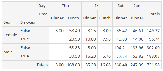
4.1.2. Editable PivotTable
In the example below, we make the pivotTable editable and set the default aggregation function. In the editable mode, we can change the appearance (chart type) and the table content (rows and columns) directly in the UI.
<chart:pivotTable id="tipsPivotTableUI"
autoSortUnusedProperties="true"
dataContainer="tipsDc"
editable="true">
<chart:properties>
<chart:property name="row"/>
<chart:property name="totalBill"/>
<chart:property name="tip"/>
<chart:property name="sex" localizedName="Sex"/>
<chart:property name="smoker"/>
<chart:property name="day"/>
<chart:property name="time"/>
<chart:property name="size"/>
</chart:properties>
<chart:hiddenProperties>
<chart:property name="row"/>
</chart:hiddenProperties>
<chart:aggregationProperties>
    <chart:property name="tip"/>
    <chart:property name="totalBill"/>
</chart:aggregationProperties>
<chart:aggregations default="COUNT">
    <chart:aggregation caption="Count"/>
    <chart:aggregation mode="SUM_OVER_SUM"/>
</chart:aggregations>
<chart:renderers default="BAR_CHART"/>
<chart:rows>
<chart:row value="sex"/>
<chart:row value="smoker"/>
</chart:rows>
<chart:columns>
<chart:column value="day"/>
<chart:column value="time"/>
</chart:columns>
<chart:sortersFunction>
function(attr){
if(attr=="Day"){
return $.pivotUtilities.sortAs(["Mon","Tue","Wed","Thu","Fri","Sat","Sun"]);
}
}
</chart:sortersFunction>
</chart:pivotTable>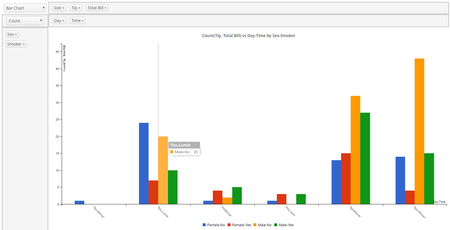
4.2. Exporting PivotTable Data
PivotTableExtension is the extension of the PivotTable component that provides API for downloading the table with aggregated data in the XLS format.
An instance of the extension should be created in the screen controller using the class constructor (i.e., not the UiComponents bean), for example:
@Inject
private PivotTable pivotTable;

private PivotTableExtension extension;

@Subscribe
private void onInit(InitEvent event) {
    extension = new WebPivotTableExtension(pivotTable)
}|
Tip
|
The extension works only for the following renderers types: |
The exportTableToXls() method allows you to download the table data as an XLS file, for example, on a button click:
extension.exportTableToXls();By default, the downloaded file name matches the localized caption of the entity in the PivotTable data container. The file name can be defined using the setFileName() method:
extension.setFileName("Orders of " + new Date());|
Tip
|
The XLS format implies the limitation for 65536 table rows. If |
Additionally, the PivotTableExtension provides two more ways to get the PivotTable data:
-
the JSON representation:
extension.getPivotDataJSON(); -
the serialized object of
PivotDataclass:extension.getPivotData();
4.3. Using ShowPivotAction
ShowPivotAction is a special action that enables exporting data from the components that extend ListComponent, such as Table, Tree, and DataGrid, to a pivot table. It provides a simple means of BI analysis without any additional application components.
The action should be created programmatically in the screen controller and used, for example, in a button:
ShowPivotAction showPivotAction = new ShowPivotAction(tipsGroupTable);
exportButton.setAction(showPivotAction);
ShowPivotAction has two modes for export: all rows and selected rows. If no rows are selected, all rows will be exported by default without confirmation.
The editable PivotTable component will be shown in a new tab. By default, all the attributes included in the component’s data container view will be displayed, except the following:
-
attributes of Collection type;
-
attributes of byte array type;
-
UUID attributes;
-
annotated with
@SystemLevel.
If you want to exclude certain attributes or include only a part of them, it can be done with the following fluent API methods:
-
withIncludedProperties(), for example:ShowPivotAction showPivotAction = new ShowPivotAction(tipsGroupTable) .withIncludedProperties(Arrays.asList("sex", "smoker", "day", "totalBill")); -
withExcludedProperties(), for example:ShowPivotAction showPivotAction = new ShowPivotAction(tipsGroupTable) .withExcludedProperties(Arrays.asList("sex", "smoker"));
These methods take the list of properties names, all incorrect properties names will be ignored.
You can change the default configuration of the pivot table using the withNativeJson() method that receives a JSON String. Note that the localized property names should be used:
ShowPivotAction showPivotAction = new ShowPivotAction(tipsGroupTable)
        .withNativeJson("{" +
                " \"cols\": [\"Time\", \"Day\"]," +
                " \"rows\": [\"Sex\", \"Smoker\"]," +
                " \"editable\": false," +
                " \"renderer\": \"heatmap\"," +
                " \"aggregation\": {" +
                " \"id\": \"d8fc3fdf-730d-c94f-a0c8-72a9ce3dcb3a\"," +
                " \"mode\": \"count\"," +
                " \"properties\": [\"Sex\"]" +
                " }" +
                " }");
Below is the JSON structure for a non-editable pivot table:
{
        "cols": ["localized property", "localized property"],
        "rows": ["localized property"],
        "editable": false,
        "renderer": "heatmap",
        "aggregation": {
                "id": "d8fc3fdf-730d-c94f-a0c8-72a9ce3dcb3a",
                "mode": "sumOverSum",
                "properties": ["localized property", "localized property"]
        }
}
And here’s the JSON structure for an editable pivot table:
{
        "cols": ["localized property"],
        "rows": ["localized property"],
        "editable": true,
        "renderers": {
                "selectedRenderer": "barChart"
        },
        "autoSortUnusedProperties": true,
        "aggregationProperties": ["localized property", "localized property"],
        "aggregations": {
                "selectedAggregation": "count",
                "aggregations": [{
                        "id": "647780f0-c6d0-6ade-a63a-542b5c8cdbd5",
                        "mode": "count",
                        "caption": "Count"
                }, {
                        "id": "c2663238-2654-67f0-2dec-add6962d867c",
                        "mode": "sumOverSum"
                }]
        }
}
The displayed pivot data can be easily exported to Excel (if the current renderer is supported). The corresponding button will be displayed by default in the opened tab.